#css media queries
Explore tagged Tumblr posts
Visit Tumblr Blog
Explore Tumblr blogs with no restrictions, modern design and the best experience.
Last Seen Tumblr Blogs


Fun Fact
The “We are the 99%” Tumblr blog became the slogan for the Occupy Wall Street movement.
Text
Purecode reviews | Work with CSS media queries
At this point I had not learned how to work with CSS media queries so I didn’t focus on making the websites responsive. By the time I got to the part of the course that taught me how to make website responsive, I already had three different projects of my own with which I could practice responsiveness with.
#CSS media queries#practice responsiveness#websites responsive#purecode ai company reviews#purecode software reviews#purecode#purecode reviews#purecode company#purecode ai reviews
0 notes
Text
I don't know if anyone knows coding but I need to ask and I don't wanna ask on Stack but do media queries not work for borders?
I'm trying to get this vertical line to disappear when the window is under a specific size but it just refuses to work.
.vertical-line { border: 0; }
@ media only screen and (min-width: 963px) { .vertical-line { border: 0 1px 0 0 solid;} }
Added a space between @ and media so it doesn't actually tag. Like I tried border-left too and others but it just doesn't want to work
Edit: found the solution. I just had to put the CSS in it's own file rather than in-line on the same HTML file because the stupid site is old as shit
#edit: reason why i didnt upload it as a css file is bc its a pain in the ass to go thru the process of re-uploading the css file for every#change. its infuriating since it doesn't actually replace the old file so i have to name it something new every time#etc#if it has to be max-width i will scream#i hate working with media queries
13 notes
·
View notes
Text
i need to become an ao3 coding volunteer specifically so that i can rewrite all their stylesheets to utilize css variables. i can't keep living like this (trying to write stylesheets that can work across multiple different site skins w/o being forced to utilize js to detect what site skin is currently being used)
#花話#i also need to become an ao3 coding volunteer so that i can make their css sanitizer accept functions like var and calc#and also @media queries for screen size. I Cannot Keep Living Like This (writing css like it's 2009)
1 note
·
View note
Text
Optimizando tus Páginas Web para la Impresión con CSS
Aunque la web está diseñada principalmente para su visualización en pantallas, a menudo necesitamos imprimir el contenido de nuestras páginas. CSS nos proporciona un conjunto de herramientas para controlar la apariencia de nuestras páginas cuando se imprimen, garantizando una presentación limpia y profesional. ¿Por qué utilizar hojas de estilo para la impresión? Las hojas de estilo nos…
#@media print#accesibilidad#accesibilidad.#archivo CSS#cabeceras#cartas#contenido#contraste#controlar#crear#CSS#definir#diseño de plantillas#Diseño web#documento#estilos#etiquetas#etiquetas alt#facilitar#facturas#Flexbox#Grid#hojas de estilo#HTML#impresión#informes#jerarquía visual#legibilidad#márgenes#media query
0 notes
Text
font-size Limbo
New Post has been published on https://thedigitalinsider.com/font-size-limbo/
font-size Limbo
You might recall that Alvaro suggests bumping up font-size to 1.25rem from the default user agent size of 16px. Sebastian Laube pokes at that:
I wouldn’t adopt Alvaro’s suggestion without further ado, as I would waste so much space on a smartphone, for example, and many users would probably be irritated by the large font.
I set a font size of 1.2rem from a certain viewport size. But this also has to be done carefully, because then grey areas arise in which media queries suddenly fall back into another area…
I personally agree with Alvaro that the default 16px size is too small. That’s just how I feel as someone who is uncomfortably close to wearing the bottoms of actual Coke bottles to see anything clearly on a screen.
On the flip side, I professionally agree with Sebastian, not that many users would probably be irritated by the large font, but to openly question an approach rather than adopting someone else’s approach wholesale based on a single blog post. It may very well be that a font-size bump is the right approach. Everything is relative, after all, and we ought to be listening to the people who use the thing we’re making for decisions like this.
The much bigger question is the one Sebastian poses right at the end there:
Should browsers perhaps use a larger font size on large screens from the outset if the user does not specify otherwise? Or do we need an information campaign to make them aware that they should check their system settings or set a different default font size in the browser?
Fantastic, right?! I’m honestly unsure where I’d draw the viewport breakpoint for 16px being either too large or small and where to start making adjustments. Is 16px the right default at any viewport size? Or perhaps user agents ought to consider a fluid type implementation that defines a default font scale and range of sizes instead? It’s great food for thought.
Direct Link →
#agent#agents#approach#Blog#browser#CSS#flip#fluid type#Food#how#it#Link#links#listening#media#media queries#One#scale#smartphone#Space#system settings#typography#waste
0 notes
Text
Centering an image with media queries when in mobile mode
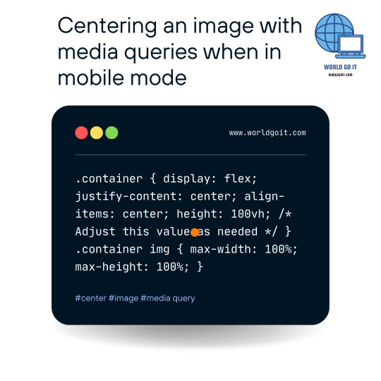
To center an image vertically and horizontally on a web page using CSS, you can use the following CSS code: .container { display: flex; justify-content: center; align-items: center; height: 100vh; /* Adjust this value as needed */ } .container img { max-width: 100%; max-height: 100%; } In this example, we create a container element with the class name "container" that will hold the image. The container is styled as a flex container using display: flex, which allows us to use flexbox properties for alignment.
The justify-content: center property horizontally centers the image within the container, and align-items: center vertically centers the image. The height: 100vh sets the height of the container to 100% of the viewport height, but you can adjust this value as needed. The img selector inside the container sets max-width: 100% and max-height: 100% to ensure the image doesn't exceed the container's dimensions. To use this CSS, you need to wrap your image with a container element like this: Replace "your-image.jpg" with the actual path or URL of your image, and "Your Image" with an appropriate alt text for accessibility purposes. With this setup, the image will be centered both vertically and horizontally on the page. Read the full article
0 notes
Text
Essentials You Need to Become a Web Developer
HTML, CSS, and JavaScript Mastery
Text Editor/Integrated Development Environment (IDE): Popular choices include Visual Studio Code, Sublime Text.
Version Control/Git: Platforms like GitHub, GitLab, and Bitbucket allow you to track changes, collaborate with others, and contribute to open-source projects.
Responsive Web Design Skills: Learn CSS frameworks like Bootstrap or Flexbox and master media queries
Understanding of Web Browsers: Familiarize yourself with browser developer tools for debugging and testing your code.
Front-End Frameworks: for example : React, Angular, or Vue.js are powerful tools for building dynamic and interactive web applications.
Back-End Development Skills: Understanding server-side programming languages (e.g., Node.js, Python, Ruby , php) and databases (e.g., MySQL, MongoDB)
Web Hosting and Deployment Knowledge: Platforms like Heroku, Vercel , Netlify, or AWS can help simplify this process.
Basic DevOps and CI/CD Understanding
Soft Skills and Problem-Solving: Effective communication, teamwork, and problem-solving skills
Confidence in Yourself: Confidence is a powerful asset. Believe in your abilities, and don't be afraid to take on challenging projects. The more you trust yourself, the more you'll be able to tackle complex coding tasks and overcome obstacles with determination.
#code#codeblr#css#html#javascript#java development company#python#studyblr#progblr#programming#comp sci#web design#web developers#web development#website design#webdev#website#tech#html css#learn to code
2K notes
·
View notes
Text
Resource: Responsive Web Design
Starter kit basically.. for those working on jcink skins. Viewport plus using media queries, css variables, grid, and flex will ease the process of making responsive skins but I advise keeping them in mind early on.
10 notes
·
View notes
Text
Raughh I gotta finish my website mobile update so I can upload intermission 2 so I can upload chapter 19 so I can show people scenes I've had in my head for 3 years grahhhh BUT THE CODING IS GOING SO SLOW AND I KEEP PROCRASTINATING ON IT BECAUSE AUGH HOW DOES CSS GRID WORK WHERE AM I AUGH MEDIA QUERIES I'm okay.
24 notes
·
View notes
Text
no shockers that by the end of the week, marketing consultant never responded to literally any of my emails. Pretty much par for the course, though. I mean she never speaks to me directly. Like there are exactly five of us and I'm not ~Important~ enough for this person to respond to.
Supervisor emailed me back without including anyone else to basically be like "um, excuse me, do what this person says." And then proceeded a back forth for the whole day of me basically reiterating my previous comments and responses. Like she thought I was just being "difficult" or something when, in reality, out of the five of us, I am the only one who knows how any of this works. I was trying to outline the issues with what was being asked and then asked for an alternative direction so I could make a plan for my time. It's like, idk, I have actual knowledge and experience to draw on when giving an answer!!11!
Like, sorry, Outlook does not support media queries in html/css so what you are asking for literally will not work in outlook emails. But, right, I just "can't take feedback".
Or how about the time we had to print new bags with our new branding and we only had the budget for 1 color, 1 side and the marketing consultant did not approve of the design being 1 color so her "feedback" was to do 2 colors. And then i was like "the issue is that we only have the budget to print 1 color, 1 side" and then three weeks went by until my supervisor had to prompt the conversation. And then her only response was, "my earlier feedback still stands." like what the fuck?
They ask me for things without knowing shit all about how any of it works and then assume I'm just uncooperative when I try to explain why what they are saying won't work. I, very often, give recommendations for what I think we should do only to get SILENCIO in response. Then we get into zoom meetings where I'm asked to present progress or some shit and I'm like "hello, I sent u all a document and email outlining all the things and included questions and recommendations" and no one remembers or listens to shit so I have to repeat myself 5 thousand times only to be treated like I'm just "unwilling" to do what I'm told!!!!1111!!!! FUUUUUUUCCCCCCK
#work rant#these are like 12 different issues and instances rolled into one rant#tbd#sorry for always fucking ranting on tumblr. com
7 notes
·
View notes
Text
AGARTHA Aİ - DEVASA+ (2)

In today’s digital landscape, a captivating and functional website is crucial for any business looking to thrive online. Full service web design encompasses a comprehensive approach, ensuring every aspect of your site is tailored to meet your unique needs. From the initial concept to the final launch, this service provides an array of offerings, including website service, responsive web design, and custom design services. Whether you’re a startup seeking to establish your brand or an established enterprise aiming to enhance your online presence, understanding the elements of full service web design is essential.
Full service web design
Full service web design encompasses all aspects of creating a website, from initial conceptualization to ongoing maintenance. This approach ensures that every detail is carefully considered to meet the specific needs of a business or individual. With a team of experienced designers and developers, full service web design offers a seamless experience that integrates aesthetics, functionality, and user experience.
One of the key advantages of opting for a full service web design is the cohesion of the website elements. Since all parts of the project are managed by a single team, there is less chance for miscommunication or inconsistency in design. This results in a more polished final product that reflects the brand’s identity while providing an engaging experience for visitors.
Additionally, full service web design allows for customized solutions tailored to unique requirements. Whether you need an e-commerce platform, a portfolio site, or a blog, a full service provider will offer dedicated support and expert advice throughout the entire process, ensuring your vision comes to life exactly as you imagined.
Website service
In today's digital landscape, website service is essential for businesses to thrive and maintain an online presence. A well-structured website serves as a powerful tool that encourages customer engagement and drives sales. By investing in a comprehensive website service, businesses can ensure that their website not only looks great but also functions seamlessly across all devices.
A key aspect of website service is the ability to optimize for search engines. By implementing SEO best practices, businesses can enhance their visibility and attract more organic traffic. This is where a reliable website service provider plays a crucial role, as they possess the expertise and techniques necessary to elevate your search engine rankings.
Furthermore, ongoing support and maintenance are vital components of a reliable website service. As technology evolves and user needs change, having a team that can promptly address issues or updates will keep your website relevant and effective in reaching target audiences. This ongoing relationship is instrumental in achieving long-term success in the digital realm.
Responsive web design
Responsive web design is an essential aspect of modern web development that ensures a seamless user experience across a variety of devices. With the increasing use of smartphones and tablets, having a website that adapts to different screen sizes is not just a luxury but a necessity.
The core principle of responsive web design is fluidity. This means that the layout of your website adjusts dynamically based on the screen width, ensuring that content remains accessible and visually appealing regardless of the device used. This approach improves usability and can significantly boost conversion rates.
Incorporating responsive web design techniques involves using flexible grids, images, and CSS media queries. These elements work together to create a layout that responds gracefully to changes in screen size, making your website not only functional but also competitive in the digital marketplace.
Custom design services
In today's digital landscape, custom design services have emerged as a vital component of creating a strong online presence. Businesses understand that a one-size-fits-all approach does not cater to their unique needs and branding. Therefore, opting for custom design services allows them to differentiate themselves in a crowded market.
These services offer tailored solutions that resonate with a company's specifics, from colors to typography and layout. By leveraging custom design services, businesses can ensure that their websites not only reflect their brand identity but also provide an intuitive user experience. This is crucial for keeping visitors engaged and encouraging them to take the desired actions.
Investing in custom design services ultimately contributes to better customer satisfaction and improved conversion rates. With a website designed specifically for their target audience, businesses can more effectively communicate their message and achieve their goals. This bespoke approach is invaluable in today's competitive environment.
43 notes
·
View notes
Note
hi so i was playing around with my codes and the link color does not work ? the hover , active , and visited does but the actual link itself will not change the color or text decoration. also wayfarer works pretty well on mobile nested nicely on screen. what code did you use because the code i am using makes it all squished thanks !
The CSS for the hover is separate from the CSS for the link.
Here's the CSS from the default Sugarcube UI. The element a (anchor, which creates links) controls your link styling. a:hover controls the styling for when the cursor hovers over it. a[disabled] controls a disabled/visited link. You can see how they have different colours and text decorations.
a { cursor: pointer; color: #68d; text-decoration: none; transition-duration: 200ms; } a:hover { color: #8af; text-decoration: underline; }
a[disabled], span.link-disabled { color: #aaa; cursor: not-allowed !important; text-decoration: none; }
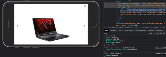
Making your game responsive isn't a one-size fits all scenario. It depends on the dimensions of your UI and a number of other unique factors. You can use media queries to change what your game looks like on different viewport sizes.
If you open your game in a browser, right click and hit Inspect, you can test what it looks like with different resolutions. Switch it to mobile mode and there will be a dropdown menu with the dimensions for different common phones and tablets.

You can switch through them to see how your media queries are working with each size; usually you will have to fiddle with things to get it to fit right.
10 notes
·
View notes
Text

CSS Landscape #22!
- Firefox & Safari updates, Batman-Comic.CSS & "if" CSS - Master forms, media queries & dynamic animations - Creative tips, tricks & videos to level up your skills
��� https://freefrontend.com/css-landscape-2024-07-28/
9 notes
·
View notes
Text
Listas y Tablas en HTML5: Una Guía Completa
Las listas y tablas son elementos fundamentales en la estructuración de contenido web. HTML5 nos proporciona una variedad de herramientas para crear listas ordenadas, no ordenadas y de definición, así como tablas altamente personalizables. En este artículo, exploraremos los diferentes tipos de listas y tablas, sus atributos y cómo personalizar su apariencia utilizando CSS. Listas en HTML5 Tipos…
0 notes
Note
Hola necro! Vengo con una duda por fascinación ya que es el segundo foro que veo tan responsivo ¿Cómo lograste que los subforos de goddess se acomodaran tan bien en Mobile? Harás algún tutorial o lo tienes?
¡Hola anon! Para los skins que tienen subforos así, lo que hago es que el diseño grid que les implemento (recomiendo los tutoriales de Kevin Powell si no saben usar grid: The EASIEST way to get started with CSS GRID, Learn CSS Grid the easy way, Get started with grid WITHOUT being overwhelmed, y tiene otros múltiples videos al respecto en esta playlist), se lo implemento directamente con una regla de media query. Goddess está hecho al revés; ambas opciones son viables, aunque últimamente estoy optando por la primera porque es mucho más eficaz. Básicamente, por defecto tus subforos están organizados uno debajo del otro (como se verán en móvil):
.frBody { display:grid; grid-template-columns:1fr; gap:1rem; }
Y con nuestra media query, establecemos nuestro diseño (retira la / después del arroba, tengo que ponerla para que tumblr no mencione a alguien llamado media 😂):
@/media (min-width:1440px) { #c1 .frBody { grid-template-columns:2fr 1fr; grid-template-rows:20rem 20rem; & .frow:first-of-type { grid-row:1 / 3; } } }
En este ejemplo random, en la categoría 1 tendremos dos columnas (siendo la de la izquierda más grande), y dos filas del mismo tamaño, y nuestro primer .frow va a empezar en la fila 1 y va a terminar en la tres, mientras que los otros dos .frow van a ocupar los otros dos huecos. Pero con grid puedes hacer el diseño que quieras, sobre todo si usas grid-template-areas/grid-area.
Me remito a los tutoriales anteriormente linkeados, fue como yo aprendí en su inicio a usar grid y hace ciertos diseños mucho más sencillos (todos mis tablones y estadísticas hoy en día están diseñadas con grid). También puedes usar el generador de grid, que en mis inicios me ayudó mucho a entender cómo funcionaba grid y cómo crear mis propios grids más tarde.
Dudo mucho que haga un tutorial de grid más que nada porque hay recursos que van a ser muchísimo más completos que lo que yo pueda hacer. Por eso les recomiendo lo que a mí me sirvió para aprender, que creo que es mucho más útil en este caso 💕
3 notes
·
View notes
Text
Auto and Manual Dark Mode Switch in JavaScript - dark-light-toggle
dark-light-toggle is a JavaScript library that makes it easy to implement a smart dark/light mode switcher on your web applications. It detects system-level dark/light mode settings through the prefers-color-scheme media query and provides a customizable web component for manual theme switching. The solution maintains accessibility standards and offers CSS variable customization. The automatic…
2 notes
·
View notes