#cssstyles
Explore tagged Tumblr posts
Visit Tumblr Blog
Explore Tumblr blogs with no restrictions, modern design and the best experience.
Last Seen Tumblr Blogs


Fun Fact
When “GIF” was named word of the year in 2012, Oxford Dictionaries U.S.A. credited Tumblr for pushing the word.
Text
Exploring CSS Heading Styles: Typography Tips

Introduction
Welcome to an exploration of the fascinating world of CSS heading styles and typography on CSS Monster! In the realm of web development, the way text is presented plays a crucial role in user experience and visual appeal. Cascading Style Sheets (CSS) serves as a powerful tool to control the styling of text, and in this blog post, we will delve into the nuances of CSS heading styles, offering valuable insights and practical tips to enhance your website's typography.
Understanding CSS Basics
CSS, or Cascading Style Sheets, is a fundamental component of web development that allows developers to control the presentation and layout of HTML documents. To harness the full potential of CSS for effective typography, it's essential to grasp some basic concepts. Selectors: CSS selectors are patterns used to select and style HTML elements. Understanding selectors is crucial for applying styles to specific elements on a webpage. Common selectors include element selectors, class selectors (.class-name), and ID selectors (#id-name). Properties and Values: CSS works on a system of properties and values. Properties define the aspects of an element to be styled, such as color, font-size, or margin, while values specify the settings for those properties. For instance, the property 'color' might have the value 'red'. Box Model: The CSS box model is a foundational concept for layout design. It comprises the content, padding, border, and margin of an element. Understanding how these components interact helps in creating well-structured and visually appealing layouts. Cascade and Specificity: The term "cascading" in CSS refers to the order of priority when multiple style rules apply to the same element. Understanding the cascade and specificity helps ensure that styles are applied as intended and that conflicts are resolved systematically. External and Internal Stylesheets: CSS can be implemented in various ways. External stylesheets, often stored in separate .css files, allow for a consistent style across multiple pages. Internal styles, on the other hand, are defined within the HTML document using the tag. List of CSS Properties: Here is a concise list of essential CSS properties for text styling: - font-family: Defines the font of the text. - font-size: Specifies the size of the font. - font-weight: Sets the thickness of the font. - color: Determines the color of the text. - line-height: Establishes the spacing between lines of text. - text-align: Aligns the text to the left, right, center, or justified. CSS Properties and Descriptions PropertyDescriptionfont-familyDefines the font of the text.font-sizeSpecifies the size of the font.font-weightSets the thickness of the font.colorDetermines the color of the text.line-heightEstablishes the spacing between lines of text.text-alignAligns the text to the left, right, center, or justified. By grasping these CSS basics, you lay the foundation for creating visually appealing and well-structured typography on your website.
CSS Heading Styles
Headings are a crucial element of web design, providing structure and hierarchy to content. CSS offers a variety of styling options to make headings not only visually appealing but also aligned with the overall design of a website. Default Headings: HTML provides six levels of headings, from
(the most important) to (the least important). These headings come with default styles, but CSS allows for customization to suit the design requirements of your website. Font Properties: CSS enables the modification of font properties for headings. You can use the font-family property to specify the type of font, font-size to set the text size, and font-weight to control the thickness of the font. This customization helps in creating a distinctive look for your headings. Text Color and Alignment: The color property allows you to define the color of your heading text. Additionally, the text-align property lets you align the text within the heading element, providing flexibility in design and layout. Margin and Padding: CSS provides the margin and padding properties to control the space around and within headings. Adjusting these properties helps in achieving the desired spacing and layout for your headings. Underlining and Decoration: Customize the appearance of your headings by using the text-decoration property. For example, you can underline or remove the underline from headings, adding a stylistic touch to your typography. Example CSS for Headings: CSS h1 { font-family: 'Arial', sans-serif; font-size: 32px; font-weight: bold; color: #333; text-align: center; margin-bottom: 20px; text-decoration: underline; } h2 { font-family: 'Helvetica', sans-serif; font-size: 28px; font-weight: bold; color: #666; text-align: left; margin-bottom: 15px; text-decoration: none; } Table: Commonly Used CSS Properties for Headings PropertyDescriptionfont-familySets the font for the heading text.font-sizeSpecifies the size of the heading text.font-weightControls the thickness of the heading text.colorDetermines the color of the heading text.text-alignAligns the heading text within its container.text-decorationAdds or removes decoration, such as underlining, from the heading text. By utilizing these CSS heading styles, you can enhance the visual appeal and readability of your content, creating a more engaging user experience on your website.
Typography Tips with CSS
Typography plays a pivotal role in web design, influencing how users perceive and interact with content. Leveraging CSS for typography allows developers to go beyond the default styles, providing a unique and visually appealing reading experience. Here are some key tips to enhance typography using CSS: Font Choices: Carefully selecting fonts contributes significantly to the overall aesthetic. CSS offers the font-family property, allowing you to specify a preferred font or a combination of fonts. Consider pairing a readable font for body text with a more distinctive font for headings to create a harmonious balance. Font Size and Line Height: Achieving an optimal font size and line height improves readability. Use the font-size property to set the text size and line-height to control the spacing between lines. Balancing these elements ensures a comfortable reading experience for users. Letter Spacing and Word Spacing: Adjusting letter and word spacing can add a touch of elegance to your typography. CSS provides the letter-spacing and word-spacing properties, allowing you to fine-tune the spacing between characters and words for a more polished look. Text Alignment: Proper alignment enhances the visual flow of content. Utilize the text-align property to align text left, right, center, or justify it. Consistent alignment across your website contributes to a cohesive design. Text Decoration: CSS allows you to customize text decoration, such as underlining or overlining, using the text-decoration property. Carefully consider whether to apply these decorations based on your design goals and overall aesthetic. Responsive Typography: Ensure your typography remains effective on various devices and screen sizes. Use relative units like percentages or ems for font sizes to create a responsive design that adapts to different viewing environments. Variable Fonts: Embrace the versatility of variable fonts, a modern CSS feature that enables dynamic adjustments to font weight, width, and other properties. This allows for more flexible and efficient typography, enhancing the visual appeal of your text. Example CSS for Typography Tips: CSS body { font-family: 'Open Sans', sans-serif; font-size: 16px; line-height: 1.5; letter-spacing: 0.5px; word-spacing: 2px; text-align: justify; text-decoration: none; } h1 { font-family: 'Roboto', sans-serif; font-size: 36px; line-height: 1.2; letter-spacing: 1px; word-spacing: 3px; text-align: center; text-decoration: underline; } Table: CSS Properties for Typography PropertyDescriptionfont-familySets the font for the text.font-sizeSpecifies the size of the text.line-heightControls the spacing between lines of text.letter-spacingAdjusts the spacing between characters.word-spacingDefines the spacing between words.text-alignAligns the text within its container.text-decorationAdds or removes decoration, such as underlining, from the text. By incorporating these typography tips into your CSS styles, you can elevate the visual appeal and readability of your website's content.
Responsive Typography
Responsive design is a critical aspect of modern web development, ensuring that websites provide a seamless user experience across various devices and screen sizes. Typography plays a significant role in responsiveness, and utilizing CSS for responsive typography is essential for maintaining readability and visual appeal. Here are key considerations and techniques for achieving responsive typography: Relative Units: When defining font sizes in CSS, opt for relative units like percentages (%), ems, or rems instead of fixed pixel values. Relative units scale more fluidly, allowing text to adapt to different screen sizes while maintaining proportionality. Viewport Units: CSS offers viewport units, such as vw (viewport width) and vh (viewport height), which are particularly useful for responsive typography. Using these units enables text to scale based on the dimensions of the viewport, enhancing readability on both large desktop screens and smaller mobile devices. Media Queries: Implementing media queries in CSS allows you to apply specific styles based on the characteristics of the device or screen. Utilize media queries to adjust font sizes, line heights, and other typographic properties for different breakpoints, ensuring optimal readability across a range of devices. Flexible Grid Systems: Incorporate flexible grid systems into your design to create a responsive layout. CSS frameworks like Bootstrap or custom grid systems enable you to establish a grid-based structure that adapts to the screen size, providing consistent spacing and alignment for text elements. Breakpoint Considerations: Identify key breakpoints in your design where the layout transitions to accommodate different screen sizes. At each breakpoint, evaluate and adjust typography styles to ensure a harmonious reading experience. This may involve modifying font sizes, line heights, and margins to maintain balance. Fluid Typography: Implementing fluid typography involves using CSS techniques like the 'calc' function and adjusting font sizes based on a percentage of the viewport width. This approach ensures that text remains legible and visually appealing as the screen size changes. Example CSS for Responsive Typography: CSS body { font-size: 16px; line-height: 1.5; } @media only screen and (min-width: 600px) { body { font-size: 18px; } } @media only screen and (min-width: 1200px) { body { font-size: 20px; } } Table: CSS Properties for Responsive Typography PropertyDescriptionfont-sizeSpecifies the size of the text.line-heightControls the spacing between lines of text. By implementing these responsive typography techniques with CSS, you can ensure that your website's text adapts gracefully to different screen sizes, providing an optimal reading experience for users on various devices.
Optimizing for Accessibility
Accessibility is a core principle in web development, and optimizing typography for accessibility is crucial for ensuring that your content is inclusive and usable by a diverse audience. CSS plays a significant role in making typography accessible. Here are key considerations and techniques for optimizing typography for accessibility: Contrast Ratios: Pay attention to the contrast between text and its background. Use the color property in CSS to ensure an appropriate contrast ratio, making text readable for users with visual impairments. The Web Content Accessibility Guidelines (WCAG) recommend a minimum contrast ratio of 4.5:1 for normal text and 3:1 for large text. Font Size and Scalability: Provide flexibility in font size by using relative units like percentages or ems. This allows users to adjust the text size according to their preferences. Avoid setting fixed font sizes, as this can hinder users with low vision who rely on larger text for readability. Proper Heading Structure: Organize content with a logical heading structure using
to tags. Screen readers rely on heading structure to navigate and understand content hierarchy. Ensure that headings accurately represent the content they precede and maintain a hierarchical order. Descriptive Link Text: When using hyperlinks, ensure that the link text is descriptive and provides context about the target. Avoid generic terms like "click here" and use meaningful phrases that convey the link's purpose. This improves navigation for users who rely on screen readers or other assistive technologies. Text Alternatives for Images: Include descriptive alt text for images using the alt attribute. This is crucial for users who are visually impaired and rely on screen readers to understand the content. The alt text should convey the content or function of the image. Focus Styles: Ensure that interactive elements, such as links and buttons, have visible focus styles. Users who navigate with keyboards or assistive technologies rely on these focus styles to understand which element is currently active. Use the :focus pseudo-class in CSS to customize focus styles. Accessible Color Choices: Consider color choices carefully, taking into account color blindness and other visual impairments. Ensure that information is not conveyed solely through color, and provide alternative indicators, such as patterns or labels, for users with different color perception. Example CSS for Accessibility: CSS body { font-size: 16px; line-height: 1.5; color: #333; background-color: #fff; } a { color: #0066cc; } a:focus { outline: 2px solid #ff9900; } Table: CSS Properties for Accessibility PropertyDescriptionfont-sizeSpecifies the size of the text.line-heightControls the spacing between lines of text.colorDetermines the text color.background-colorSets the background color of the element.aStyles the default link text color.a:focusStyles the focus state of links. By incorporating these accessibility considerations into your CSS styles, you contribute to a more inclusive web experience for all users.
Advanced CSS Techniques
As web development evolves, so do the possibilities offered by CSS. Advanced CSS techniques go beyond the basics, providing developers with powerful tools to create intricate and visually stunning designs. Here are some advanced CSS techniques to elevate your web typography and overall design: Variable Fonts: One of the cutting-edge features in CSS is variable fonts. Unlike traditional fonts, variable fonts allow for dynamic adjustments to various attributes, such as weight, width, and slant. This provides greater flexibility and control over typography, enabling smoother transitions and a more customized appearance. Custom Text Effects: CSS enables the creation of captivating text effects through properties like text-shadow and background-clip. Experiment with gradients, shadows, and other effects to add depth and dimension to your text, creating a visually engaging experience for users. CSS Grid for Layout: While not exclusive to typography, CSS Grid is a powerful layout system that significantly impacts the overall design. Utilize CSS Grid to create complex and responsive layouts, allowing for precise placement and alignment of text elements within a grid structure. Transform and Transition: Apply transformations and transitions to text elements using properties like transform and transition. Create smooth animations, rotations, and scaling effects to enhance the user experience and bring dynamism to your typography. Blend Modes: CSS blend modes provide the ability to blend elements with their background in various ways. Experiment with blend modes to achieve unique and artistic effects for text, allowing it to seamlessly integrate with background images or colors. Text Clipping: The text-overflow and white-space properties can be used to control text clipping and overflow behavior. This is particularly useful when dealing with limited space or designing elements like tooltips where concise text display is essential. Calc Function for Responsive Sizing: The calc() function in CSS allows for dynamic calculations, enabling responsive sizing based on mathematical expressions. This is useful for creating flexible and adaptive typography that adjusts based on screen size or layout requirements. Example CSS for Advanced Techniques: CSS h1 { font-family: 'VariableFont'; Read the full article
0 notes
Text
youtube
Mastering CSS: Complete Guide to Styling Web Pages | Learn CSS for Web Development
In this comprehensive CSS tutorial, we delve into the world of Cascading Style Sheets, covering styling techniques, selectors, declarations, properties, and values in CSS. Whether you're a beginner or a seasoned professional, this video is designed to equip you with a thorough understanding of CSS. We explore advanced CSS concepts such as descendant combinators, pseudo-classes, pseudo-elements, @rules, shorthands, functions, and more. By the end of this video, you'll have the skills to style your HTML documents with precision and finesse. Watch now and take your web development skills to the next level!
#CSS#WebDevelopment#LearnCSS#FrontEndDevelopment#CSSStyling#CSSTutorial#CSSGuide#Coding#WebDesign#HTML#JavaScript#Youtube
3 notes
·
View notes
Text
CSS (Cascading Style Sheets) is a styling language used to control the appearance of HTML elements. It allows developers to separate content from design, making web pages more visually appealing and easier to maintain.
#CSS#WebDevelopment#FrontendDevelopment#WebDesign#CSS3#TechEducation#CSSForBeginners#TechBooks#CSSStyling#CSSGrid#CSSFlexbox#ResponsiveDesign#WebAppDevelopment#CSSAnimation#CSSLayout#TechLearning#UIUXDesign#WebDesignTips#CSSBestPractices#TechTutorial#FrontendWebDesign#CSSDesign#WebDesignSkills#CSSVariables#MobileFirstDesign#CSSFramework#HTMLCSS
0 notes
Video
youtube
Divi Pro Tips: Transform Sub Menus with CSS Magic
Learn how to style your sub menu with CSS in the Divi Theme using the powerful Additional CSS panel! In this video, we’ll walk you through the step-by-step process to create visually stunning and functional sub menus that stand out. Whether you want to customize colors, fonts, spacing, or hover effects, this tutorial will show you how to transform your navigation menu without the need for advanced coding skills. By leveraging the built-in Divi Additional CSS panel, you can achieve professional results quickly and efficiently.
0 notes
Video
youtube
How To Creating a Shining Text Animation Effect Using HTML & CSS in 2021
#csstutorials#tutorials#web developers#web development#cssstyles#html5 css3#the shinning#shinning text#csstips#css tricks
2 notes
·
View notes
Text

CSS Recipe 😁 CSS Should have been like this!
0 notes
Photo

Beginning is always the hardest but once you start doing what you love happiness will start running after you. *** #day4 progress of #100daysofcode 1. I completed all my lessons from Basic #css. 2. Learned how to improve #compatibility with #browser fallbacks and how to create and use custom #CSS #variables. 3. Also learned how to prioritize one #style over another by using #class, #id, #inline style and !important #declarations. 4.Also learned how to use #media_queries. Stay Blessed and Happy 😊 * * * #100daysofcode #entrepreneurlife #codingbootcamp #freecodecamp #coding #femalecoder #growthmindset #laptop #cssstyle #lifestyle #codercommunity #codelife #Front_end #webdesigner #webdevelopment (at Islamabad, Pakistan) https://www.instagram.com/p/CJoKKNmgrZd/?igshid=eeoksfa6lno9
#day4#100daysofcode#css#compatibility#browser#variables#style#class#id#inline#declarations#media_queries#entrepreneurlife#codingbootcamp#freecodecamp#coding#femalecoder#growthmindset#laptop#cssstyle#lifestyle#codercommunity#codelife#front_end#webdesigner#webdevelopment
0 notes
Video
youtube
What's New in CSS 3 | CSS3 New Features | css 3 style sheets | Sekharmet...
0 notes
Text
Table Talk: Creating Beautiful Tables with CSS
Introduction
Welcome to the fascinating world of table design in web development! Tables play a crucial role in organizing and presenting data on websites, and with the power of CSS, we can transform them into visually stunning elements that enhance the overall user experience. In this blog post, we will embark on a journey to explore the art of creating beautiful tables with CSS. Whether you're a beginner seeking to understand the basics or an experienced developer looking to refine your skills, this guide will cover everything from the fundamentals to advanced styling techniques, responsive design considerations, accessibility best practices, and tips for optimizing performance. Join us as we delve into the realm of table talk, where we unravel the secrets of crafting tables that not only convey information effectively but also captivate and engage your website visitors. Let's bring life to your tables and make them an integral part of your website's visual appeal!
Understanding Table Structure
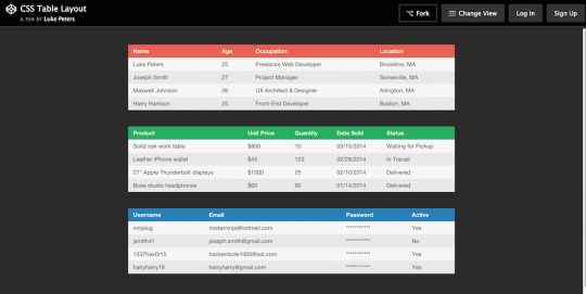
Before we embark on the exciting journey of styling tables with CSS, it's essential to have a solid understanding of the underlying structure of HTML tables. Tables are constructed using a combination of various HTML elements, each serving a specific purpose in organizing and presenting data. The primary elements involved in table structure include: - : The fundamental container for the entire table. - : Stands for "table row" and is used to define a row within the table. - : Represents a table header cell, typically used to label columns or rows. - : Signifies a standard table cell containing data. Let's break down the structure further: ElementDescriptionThe outermost element, encapsulating the entire table.Contained within the element, representing a row in the table.Used for header cells, providing labels for columns or rows. It is placed within the element.Represents a standard data cell within the table, residing within the element. Understanding this basic structure lays the foundation for effective table styling. As we proceed, we'll explore how CSS can be applied to these elements to create visually appealing and well-organized tables on your website.
Basic CSS Styling for Tables
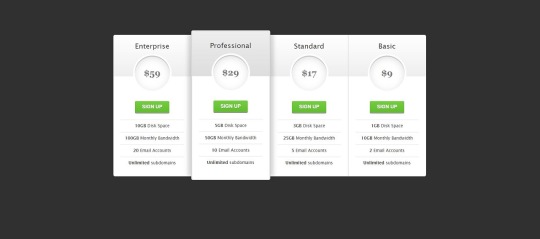
See the Pen CSS3 pricing table by Arkev (@arkev) on CodePen. Now that we have a grasp of the fundamental structure of HTML tables, let's dive into the exciting realm of CSS styling to enhance their visual appeal. Basic CSS properties can be employed to customize the appearance of tables, making them more aesthetically pleasing and aligned with your website's design. Here are some key CSS properties you can use for basic table styling: - border: Defines the border of table cells, allowing you to control the thickness, style, and color. - padding: Adds space within table cells, enhancing the overall spacing and readability of your table. - margin: Sets the margin outside the table, influencing its positioning within the surrounding elements. Let's explore a simple example of applying these properties: PropertyDescriptionborderDefine the border of table cells using properties like border-width, border-style, and border-color.paddingEnhance cell spacing by applying padding using the padding property.marginControl the table's positioning with the margin property, setting the space outside the table. For instance, to add a solid border to all table cells, you can use: CSStable { border-collapse: collapse; } td, th { border: 1px solid #dddddd; padding: 8px; text-align: left; }
Advanced Styling Techniques
As we continue our exploration of CSS table styling, it's time to elevate our design game with advanced techniques that go beyond the basics. These techniques allow you to unleash your creativity and transform your tables into visually stunning elements that capture the attention of your website visitors. Here are some advanced CSS styling techniques for tables: - Customization of Table Headers: Tailor the appearance of table headers by using CSS properties like background-color, color, and font-weight. This helps in creating a distinct visual hierarchy within the table. - Row and Cell Customization: Apply different styles to specific rows or cells using pseudo-classes such as :nth-child. This is particularly useful for highlighting important data or creating alternating row colors. - Background Colors, Gradients, and Shadows: Infuse life into your tables by incorporating background colors, gradients, and box shadows. These elements add depth and dimension to the table, enhancing its overall aesthetic appeal. Let's delve into an example to illustrate these concepts: TechniqueDescriptionCustomization of Table HeadersStyle headers with properties like background-color, color, and font-weight to make them visually distinct.Row and Cell CustomizationUse pseudo-classes like :nth-child to apply different styles to specific rows or cells, enhancing readability and organization.Background Colors, Gradients, and ShadowsIntegrate background colors, gradients, and shadows to add a touch of sophistication and depth to your table design. For example, to create alternating row colors, you can use the following CSS: CSStr:nth-child(even) { background-color: #f2f2f2; }
Responsive Tables
In the ever-evolving landscape of web design, responsiveness is key to ensuring a seamless user experience across various devices and screen sizes. Responsive tables adapt to different viewport dimensions, allowing your tables to remain functional and visually appealing on both desktops and mobile devices. Here are some essential considerations and techniques for creating responsive tables: - Importance of Responsive Design: Understand why responsive design is crucial for tables and how it enhances accessibility and usability on smaller screens. - Media Queries: Implement media queries in your CSS to apply different styles based on the device's screen size. This allows you to tailor the table's appearance for specific breakpoints. - Stacking and Hiding: Explore techniques like stacking and hiding table elements to optimize the layout for smaller screens. This involves rearranging and prioritizing content to maintain clarity. Let's delve into an example of using media queries to create a responsive table: TechniqueDescriptionImportance of Responsive DesignExplain why responsive design is essential for tables, emphasizing the diverse range of devices and screen sizes used by website visitors.Media QueriesIntroduce media queries in CSS to conditionally apply styles based on the device's screen size. This allows for a tailored and optimized table layout for each breakpoint.Stacking and HidingDiscuss techniques like stacking and hiding elements to rearrange and prioritize content, ensuring a user-friendly experience on smaller screens without sacrificing information. For instance, the following media query adjusts the font size for better readability on smaller screens: CSS@media only screen and (max-width: 600px) { td { font-size: 14px; } }
Accessibility Considerations
Ensuring that your tables are accessible is not just a best practice but a fundamental aspect of web development. Accessibility ensures that all users, including those with disabilities, can perceive, navigate, and interact with your tables. Let's delve into key considerations and best practices for creating accessible tables with CSS: - Importance of Accessibility: Understand the significance of accessibility and its impact on providing an inclusive user experience. Emphasize the diversity of users, including those with visual or cognitive impairments. - Semantic HTML: Utilize semantic HTML elements to enhance the structure and meaning of your tables. Use for headers, for table captions, and ensure proper attributes. - Contrast and Color: Pay attention to contrast ratios and avoid relying solely on color to convey information. Ensure that text and background colors provide sufficient contrast for users with visual impairments. - Keyboard Navigation: Test and optimize your table for keyboard navigation. Users who rely on keyboard input should be able to navigate and interact with the table efficiently. - Use of ARIA Attributes: Leverage Accessible Rich Internet Applications (ARIA) attributes to enhance the accessibility of dynamic content and interactions within your tables. Include attributes like aria-describedby and aria-labelledby. Let's illustrate the importance of semantic HTML and ARIA attributes with an example: ConsiderationDescriptionImportance of AccessibilityHighlight the significance of creating tables that are accessible to users with diverse abilities, fostering inclusivity and a positive user experience.Semantic HTMLEmphasize the use of semantic HTML elements, such as and , to provide meaningful structure and context to assistive technologies.Use of ARIA AttributesIntroduce ARIA attributes like aria-describedby and aria-labelledby to enhance the accessibility of dynamic content within tables, ensuring proper information relay for screen readers. By prioritizing accessibility considerations, you contribute to a web environment that is welcoming and usable for everyone, regardless of their abilities or disabilities.
Optimizing Performance
Efficient table styling not only contributes to a visually appealing website but also plays a crucial role in optimizing performance. Ensuring that your tables load quickly and smoothly is essential for providing a seamless user experience. Let's explore key tips and techniques for optimizing the performance of your CSS-styled tables: - Minimization of Styles: Strive for minimalism in your CSS styles. Avoid overloading your tables with unnecessary styles and prioritize only the essential design elements. This reduces the overall file size and improves loading times. - Consolidation of Stylesheets: If your website uses multiple stylesheets, consider consolidating them. Combining stylesheets into a single file reduces the number of HTTP requests, resulting in faster loading times. - Utilization of Browser Cache: Leverage browser caching to store frequently used styles and assets locally on the user's device. This reduces the need for repeated downloads, enhancing the overall performance of your tables. - Optimized Image Usage: If your tables include images, ensure they are optimized for the web. Compress images without sacrificing quality to reduce file sizes and accelerate loading times. - Browser Compatibility: Test your table styles across different browsers to ensure compatibility. Address any issues that may arise, preventing performance bottlenecks on specific browsers. Let's delve into an example that emphasizes the importance of minimizing styles for optimal performance: Optimization TechniqueDescriptionMinimization of StylesHighlight the significance of streamlining CSS styles to include only essential design elements. Avoid unnecessary styles to reduce file size and enhance loading speed.Consolidation of StylesheetsEncourage the consolidation of multiple stylesheets into a single file. This reduces HTTP requests and contributes to a more efficient loading process.Utilization of Browser CacheExplain the benefits of browser caching in storing frequently used styles and assets locally, reducing the need for repeated downloads and improving overall performance. By implementing these optimization techniques, you not only enhance the performance of your CSS-styled tables but also contribute to a faster and more enjoyable user experience on your website.
FAQ
Explore common questions and solutions related to CSS table styling in this Frequently Asked Questions section. Whether you're a beginner or an experienced developer, find answers to queries that may arise during your journey of creating beautiful tables with CSS. Q: How can I center-align text within table cells? A: To center-align text in table cells, you can use the CSS property text-align: center;. Apply this property to the or elements within your table. Q: What is the significance of the border-collapse property? A: The border-collapse property is crucial for controlling the spacing and appearance of borders between table cells. Setting it to collapse ensures a single border is shared between adjacent cells, creating a cleaner and more cohesive table layout. Q: How can I create alternating row colors for better readability? A: You can use the :nth-child(even) and :nth-child(odd) pseudo-classes in CSS to apply different background colors to alternating rows. This enhances readability and adds a visually appealing touch to your tables. Q: What role do media queries play in creating responsive tables? A: Media queries are instrumental in responsive design. They allow you to apply different styles based on the device's screen size. By using media queries, you can optimize your tables for various breakpoints, ensuring they remain user-friendly on both desktop and mobile devices. Q: How can I ensure my tables are accessible to all users? A: Prioritize semantic HTML, use ARIA attributes, and pay attention to contrast and color choices. Implementing these practices ensures that your tables are accessible to users with disabilities, providing an inclusive experience for all. Feel free to explore these FAQs to troubleshoot common issues and enhance your understanding of CSS table styling. If you have additional questions, don't hesitate to reach out for further assistance.
Conclusion
Congratulations on completing your journey into the world of creating beautiful tables with CSS! Throughout this comprehensive guide, we've covered essential concepts, techniques, and best practices to empower you in enhancing the visual appeal and functionality of your tables. As a quick recap, we started by understanding the basic structure of HTML tables, delving into the roles of elements such as , , , and . From there, we explored basic CSS styling to customize the appearance of tables, incorporating properties like border, padding, and margin. We then ventured into advanced styling techniques, learning how to customize headers, rows, and cells, as well as integrating background colors, gradients, and shadows to create visually captivating tables. The importance of responsive design was highlighted, with insights into media queries and techniques for optimizing tables on various devices. Accessibility considerations played a crucial role, emphasizing semantic HTML, contrast and color choices, keyboard navigation, and the use of ARIA attributes to ensure an inclusive experience for all users. We also explored performance optimization tips, focusing on minimizing styles, consolidating stylesheets, and leveraging browser cache. In the FAQ section, common queries were addressed, providing solutions to challenges you may encounter in your table styling endeavors. Whether you're a novice or an experienced developer, these FAQs serve as a valuable resource for troubleshooting and expanding your knowledge. As you continue refining your skills in CSS table styling, remember that practice and experimentation are key. Feel free to explore, test, and implement these techniques to create tables that not only convey information effectively but also contribute to the overall aesthetics and usability of your website. Thank you for joining us on this journey. May your tables be both functional and visually stunning, enhancing the user experience on your website! Read the full article
0 notes
Text
Mastering Series: CSS Styling
In this article, we delve into the intricacies of CSS, discussing various styling techniques, selectors, declarations, properties, and values.
#FrontEndDevelopment#CSS#KeyFeaturesOfCSS#CSSProperties#CSSRules#CSSTypes#CSSStyling#CSSComments#DescendantCombinator#CSSSpecialSelectors#PseudoClasses#PseudoElements#UniversalSelector#CSSFunctions#@Rules#CSSShorthands#CSSHints#CSSTips#OnlineCourse#FreeCourse#YouTubeCourse#YoutubeFreeCourse#YoutubeChannel
1 note
·
View note
Video
youtube
Divi Pro Tip: Jaw-Dropping Dropdown Menus Styling with CSS
Learn how to style the dropdown menu in the Divi Theme using CSS and Chrome Inspector tools in this step-by-step tutorial! In this video, we’ll guide you through customizing your dropdown menu to create a visually stunning and professional navigation experience. From tweaking colors and fonts to adding hover effects, we use simple yet powerful CSS techniques that will elevate the appearance of your website. Whether you’re a beginner or looking to refine your web design skills, this tutorial is perfect for anyone working with the Divi Theme.
0 notes
Text
Create Stylish Radio Buttons and Checkboxes with CSS!
🔘 Elevate your form design with custom radio buttons and checkboxes using CSS! Learn how to create visually appealing and user-friendly form elements without any JavaScript. Plus, make sure your HTML structure follows best practices for accessibility and usability. Watch our short tutorial now!
#CSS#WebDesign#FrontEndDevelopment#TechTutorial#RadioButtons#Checkboxes#HTMLStructure#FormDesign#WebAccessibility#Usability#CSSStyling#TechEducation#CodingTutorial#WebDevelopmentTips
1 note
·
View note
Video
youtube
Divi Magic Revealed: Create Irresistible Center Animated Underlines in M...
Unleash the power of Divi with our latest tutorial! In this video, we unveil the secrets of creating captivating center animated underlines that will elevate your website to new heights. With the Divi code module and a touch of CSS wizardry, you'll learn how to add irresistible animated underlines to your text elements in just a few simple steps. Whether you're a seasoned Divi user or a beginner looking to enhance your website's design, this tutorial is perfect for you. Join us as we dive into the world of Divi Magic and discover how easy it is to create stunning animations that will leave your visitors spellbound.
#youtube#DiviTheme CSSAnimation CenterUnderline WebDesign DiviTutorial WebDevelopment CSSMagic CreativeDesign DiviTips CSSStyling
0 notes
Text
Styling Excellence: Mastering Button Designs with CSS

Introduction
Welcome to a journey into the world of styling excellence! In this blog post, we'll delve into the art of mastering button designs using the power of CSS. Buttons are a fundamental aspect of web design, playing a crucial role in user interaction and navigation. Understanding how to style buttons effectively not only enhances the visual appeal of your website but also contributes to a seamless user experience. We'll explore the basics of button styling, advanced techniques to elevate your designs, and the importance of responsiveness. Additionally, we'll dive into creating interactive buttons and optimizing performance to ensure your styles not only look great but also load efficiently. Whether you're a beginner looking to grasp the fundamentals or an experienced developer aiming to refine your skills, this blog post has something for everyone. Let's embark on this journey to unlock the secrets of crafting visually stunning and highly functional buttons with the magic of CSS!
The Basics of Button Styling
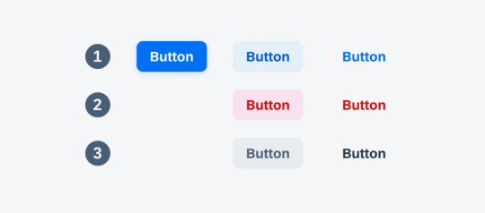
Button styling forms the foundation of creating visually appealing and user-friendly interfaces. In this section, we'll cover the fundamental CSS properties and techniques that lay the groundwork for crafting beautiful button designs. 1. Background and Color: The background-color property is essential for defining the base color of your button. Consider using a color palette that aligns with your website's overall design. Experiment with different shades to find the perfect match. Additionally, the color property determines the text color within the button, ensuring readability and contrast. 2. Border and Border-radius: The border property allows you to define the border style, width, and color of the button. Adding rounded corners is achieved through the border-radius property, providing a modern and softer aesthetic. Combining these properties allows for versatile button shapes and styles. 3. Padding and Margin: Adjusting the padding inside the button influences its size and spacing, contributing to a balanced and well-proportioned design. Meanwhile, the margin property controls the space between buttons and other elements, preventing overcrowded layouts. 4. Text Styling: Customize the font, size, and weight of the text within the button to enhance its visual appeal. Employ the text-align property for proper alignment, ensuring a polished and professional look. 5. Hover Effects: Introduce interactive elements by incorporating hover effects. This can include changes in color, shadow, or other visual cues to provide feedback to users when they interact with the button. Utilize the :hover pseudo-class for these effects. Now, let's explore a simple example to illustrate the application of these basic styling principles: HTMLClick me CSS.basic-button { background-color: #3498db; color: #ffffff; border: 1px solid #3498db; border-radius: 5px; padding: 10px 20px; text-align: center; } .basic-button:hover { background-color: #2078b4; border-color: #2078b4; } This example creates a button with a blue background, white text, and subtle hover effects. Feel free to experiment with these basic properties to craft buttons that align with your website's style and enhance the overall user experience.
Advanced Techniques for Button Designs
Take your button designs to the next level by exploring advanced CSS techniques that add sophistication and visual flair. These techniques allow you to create buttons that stand out, capturing the attention of your website visitors. 1. Gradient Backgrounds: Replace solid colors with gradient backgrounds to add depth and dimension to your buttons. Gradients can be simple two-color transitions or more complex combinations, providing a modern and vibrant aesthetic. Experiment with linear and radial gradients to achieve different effects. 2. Box Shadows: Introduce depth and realism to your buttons by utilizing box shadows. The box-shadow property allows you to cast shadows around the button, creating a lifted or floating appearance. Adjust the shadow's color, blur radius, and offset for varied visual effects. 3. Icon Integration: Enhance button designs by incorporating icons. Icons provide visual cues and can complement the button's purpose. Use the ::before or ::after pseudo-elements along with the content property to insert scalable vector icons into your buttons, ensuring a clean and modern look. 4. Custom Transitions: Implement smooth transitions to enhance the user experience. The transition property allows you to control the speed and timing function of changes in properties like color, background, or size. This creates a polished effect, especially when users interact with your buttons. 5. Border Gradients: Go beyond simple borders by applying gradients to border properties. This technique adds a dynamic and eye-catching element to your buttons. Experiment with different color combinations and gradient styles to achieve unique and visually appealing results. Let's explore an example that combines these advanced techniques: HTMLClick me CSS.advanced-button { background: linear-gradient(to right, #ff6b6b, #ffe66d); color: #ffffff; border: none; border-radius: 8px; box-shadow: 0 4px 6px rgba(0, 0, 0, 0.1); padding: 15px 30px; position: relative; overflow: hidden; transition: background 0.3s ease; } .advanced-button:hover { background: linear-gradient(to right, #ff8e6e, #ffec8b); } .icon::before { content: url('icon.svg'); margin-right: 10px; } This example showcases a button with a gradient background, a subtle box shadow, and an integrated icon. Feel free to customize and combine these techniques to create buttons that align with your design goals and captivate your audience.
Responsive Button Designs
Ensuring that your buttons look and function well across various devices is essential for providing a seamless user experience. Responsive button designs adapt to different screen sizes and orientations, catering to the diverse ways users access your website. 1. Media Queries: Start by incorporating media queries into your CSS to apply specific styles based on the device characteristics. Media queries allow you to set breakpoints where different styles take effect, ensuring a smooth transition between desktop, tablet, and mobile views. 2. Flexible Sizing: Utilize relative units like percentages or ems instead of fixed pixel sizes for your button dimensions. This ensures that buttons scale proportionally when viewed on different devices, preventing issues like buttons appearing too small or too large on certain screens. 3. Fluid Typography: Extend responsive design principles to text within buttons. Instead of using fixed font sizes, consider using relative units for font size, such as vw (viewport width) or ems. This ensures that text scales appropriately, maintaining readability on all devices. 4. Touch-Friendly Design: Recognize the prevalence of touchscreens on mobile devices. Adjust button sizes and spacing to accommodate touch interactions. Ensuring that buttons are large enough and well-spaced prevents accidental taps and enhances the overall user experience. 5. Hidden Elements: In certain situations, you may need to hide or rearrange elements for smaller screens. Use the display property and visibility property along with media queries to hide non-essential elements or present them in a more condensed form on smaller screens. Let's examine a practical example of a responsive button design: HTMLClick me CSS.responsive-button { background-color: #4caf50; color: #ffffff; padding: 10px 20px; font-size: 16px; border: none; border-radius: 5px; cursor: pointer; transition: background-color 0.3s; } @media (max-width: 600px) { .responsive-button { font-size: 14px; } } .responsive-button:hover { background-color: #45a049; } This example demonstrates a responsive button that adjusts its font size when viewed on screens smaller than 600 pixels wide. Implementing responsive designs ensures that your buttons remain visually appealing and functional across a spectrum of devices, contributing to a positive user experience.
Creating Interactive Buttons with CSS
Elevate user engagement on your website by making buttons interactive and visually appealing. In this section, we'll explore CSS techniques that add a dynamic touch to your buttons, making them responsive to user interactions. 1. Hover Effects: Implementing hover effects is a simple yet effective way to make buttons interactive. Use the :hover pseudo-class to define styles that activate when users hover over the button. This can include changes in background color, text color, or even subtle animations to provide visual feedback. 2. Transitions and Animations: Go beyond static styles by incorporating transitions and animations. The transition property allows for smooth changes in specified styles over a set duration. For more complex and dynamic effects, animations can be defined using the keyframes rule. Experiment with different easing functions and durations to achieve the desired impact. 3. Click Effects: Provide visual feedback when users click on a button. This can be achieved using the :active pseudo-class to define styles that activate during the click event. Consider incorporating effects like a change in background color or a slight shadow to simulate a button press. 4. Focus Styles: Enhance accessibility by styling the focus state of your buttons. When users navigate your site using the keyboard, a clear focus style ensures they know which button is currently selected. Use the :focus pseudo-class to define styles for the focused state, such as an outline or box shadow. 5. Interactive Icons: Integrate interactive icons within your buttons to convey additional meaning or functionality. Use pseudo-elements like ::before or ::after to insert icons into the button. Apply styles and animations to these icons to make them respond to user interactions. Let's dive into an example that combines hover effects and transitions: HTML Hover over me CSS.interactive-button { background-color: #3498db; color: #ffffff; padding: 10px 20px; border: none; border-radius: 5px; cursor: pointer; transition: background-color 0.3s; } .interactive-button:hover { background-color: #2078b4; } This example showcases a button with a smooth color transition on hover. Experiment with these techniques to create interactive buttons that not only capture user attention but also enhance the overall user experience on your website.
Optimizing Performance
Efficient button styling goes beyond aesthetics; it also plays a crucial role in the overall performance of your website. In this section, we'll explore best practices for optimizing CSS to ensure your button designs not only look great but also load quickly, contributing to a seamless user experience. 1. Minimize CSS File Size: Reduce the size of your CSS files by eliminating unnecessary code and comments. Utilize tools like minifiers to automatically remove whitespace and compress your stylesheets. Smaller file sizes lead to faster loading times, especially crucial for users on slower internet connections. 2. Use CSS Sprites: Combine multiple button images into a single sprite sheet. By doing so, you reduce the number of server requests needed to load individual images. This optimization technique is particularly beneficial when working with icon sets or buttons with diverse states. 3. Lazy Loading: Implement lazy loading for background images or other non-essential assets within your buttons. Lazy loading delays the loading of off-screen images until they are needed, reducing initial page load times. This is especially beneficial for pages with multiple buttons or images. 4. Optimize Background Gradients: If using gradients, consider simplifying them to reduce the load on the browser. Complex gradients can contribute to slower rendering times. Experiment with simpler gradient styles or use solid colors where possible to achieve a balance between aesthetics and performance. 5. CSS Hardware Acceleration: Leverage hardware acceleration for smoother animations and transitions. This is achieved by offloading graphics rendering to the device's GPU. Apply the transform property with 3D translations to trigger hardware acceleration, enhancing the performance of interactive elements like buttons. 6. Browser Caching: Configure your server to set appropriate cache headers for your CSS files. This enables browsers to cache the styles locally, reducing the need to download them on subsequent visits. Users will experience faster load times when returning to your site. Let's explore an example that incorporates some of these performance optimization techniques: HTML CSS/* Minimized and optimized CSS */ .optimized-button {background-color: #4caf50;color: #ffffff;padding: 10px 20px;border: none;border-radius: 5px;cursor: pointer; transition: background-color 0.3s;}.optimized-button:hover{background-color: #45a049;} Implementing these performance optimizations ensures that your button styles contribute to a fast and responsive web experience. By adopting these best practices, you enhance both the visual appeal and efficiency of your website's button designs.
Frequently Asked Questions (FAQ)
Explore answers to common queries about button styling with CSS. Whether you're a beginner or an experienced developer, these FAQs provide insights into various aspects of creating stylish and functional buttons for your website. - Q: How can I create a basic button with CSS? A: To create a basic button, define the background color, text color, padding, and border properties in your CSS. You can customize these properties to achieve the desired style. Consider using the :hover pseudo-class for interactive effects. - Q: What are the key properties for advanced button designs? A: Advanced button designs often involve gradient backgrounds, box shadows, icon integration, custom transitions, and border gradients. These properties add depth, interactivity, and visual appeal to your buttons. - Q: How can I make buttons responsive to different devices? A: Use media queries to apply specific styles based on device characteristics. Ensure flexible sizing, fluid typography, and touch-friendly design. Consider hiding or rearranging elements for smaller screens to maintain a responsive layout. - Q: What techniques can I use to make buttons interactive? A: Buttons can be made interactive through hover effects, transitions, animations, click effects, and focus styles. These techniques add dynamism and engagement to your buttons, enhancing the overall user experience. - Q: How do I optimize the performance of CSS for button styling? A: Optimize CSS performance by minimizing file size, using CSS sprites, implementing lazy loading for images, simplifying background gradients, leveraging hardware acceleration, and enabling browser caching. These practices contribute to faster loading times. Feel free to refer to these FAQs as you embark on your journey to master button styling with CSS. If you have additional questions, don't hesitate to reach out for further assistance!
Conclusion
Congratulations on completing your exploration of button styling excellence with CSS! In this comprehensive guide, we've covered a range of topics, from the basics of button styling to advanced techniques, responsive designs, interactive elements, and performance optimization. Let's recap the key takeaways from our journey: - Mastering the Basics: Understanding fundamental CSS properties such as background, border, padding, and text styling lays the groundwork for crafting visually appealing buttons. - Advanced Techniques: Elevate your button designs with advanced techniques like gradient backgrounds, box shadows, icon integration, custom transitions, and border gradients, adding depth and sophistication. - Responsive Design: Ensure your buttons look and function well across different devices by employing media queries, flexible sizing, fluid typography, touch-friendly design, and hidden elements for smaller screens. - Interactive Elements: Enhance user engagement by incorporating hover effects, transitions, animations, click effects, and focus styles, making your buttons dynamic and responsive to user interactions. - Performance Optimization: Optimize CSS for better performance by minimizing file size, using CSS sprites, lazy loading, simplifying background gradients, leveraging hardware acceleration, and enabling browser caching. Armed with these skills, you have the tools to create buttons that not only look visually stunning but also contribute to a seamless and efficient user experience on your website. Remember to experiment, iterate, and stay informed about evolving web design trends and best practices. Thank you for joining us on this journey to become a master of button styling with CSS. Keep pushing the boundaries of creativity, and may your buttons captivate and delight users across the digital landscape! Read the full article
0 notes
Text
Centering Headers in CSS: Stylish Layouts

Introduction
Welcome to the world of web design, where the visual appeal of a website plays a crucial role in engaging visitors. One fundamental aspect of creating stylish layouts is the effective use of CSS to center headers. In this blog post, we'll delve into the art of achieving aesthetically pleasing designs by mastering the techniques to center headers using CSS. Whether you're a novice or an experienced developer, understanding these methods will empower you to create visually stunning and well-balanced web pages. Let's embark on this journey to enhance your layout skills and bring a touch of style to your digital creations.
The Basics of CSS for Layout
Cascading Style Sheets (CSS) form the backbone of web design, providing the tools to control the layout and presentation of HTML documents. Understanding the basics of CSS is crucial for creating effective and visually appealing layouts. Let's dive into the essential concepts that lay the foundation for stylish web design. CSS Selectors CSS selectors are patterns used to select and style HTML elements. They can target specific elements, classes, or IDs on a webpage. For example, using the selector p { } will style all paragraphs, while .container { } will style all elements with the class "container." Box Model The CSS box model is fundamental to layout design. Each HTML element is treated as a rectangular box with properties like margin, border, padding, and content. Understanding how these properties interact is key to controlling the spacing and dimensions of elements on a webpage. Positioning Positioning allows you to control the placement of elements on a page. The position property can be set to relative, absolute, fixed, or static. Combine this with top, right, bottom, and left properties for precise control. Display Property The display property defines how an element is rendered. Common values include block, inline, and flex. Understanding these values is crucial for achieving the desired layout structure. Responsive Design In the era of diverse device sizes, responsive design is a must. Use media queries and relative units like percentages and ems to ensure your layout adapts seamlessly to different screen sizes. This is essential for providing a consistent user experience across devices. List of CSS Properties Here's a quick list of some essential CSS properties: - color: Sets the text color. - font-family: Defines the font used for text. - margin: Controls the space around an element. - padding: Defines the space between the content and the border. - border: Sets the border properties. Table of CSS Units Understanding units in CSS is vital. Here's a table summarizing some common units: UnitDescriptionpxPixels%PercentageemRelative to the font-size of the element Mastering these basic concepts lays a strong foundation for creating captivating layouts with CSS. As we progress, we'll explore advanced techniques, including centering headers to add that extra touch of style to your web pages.
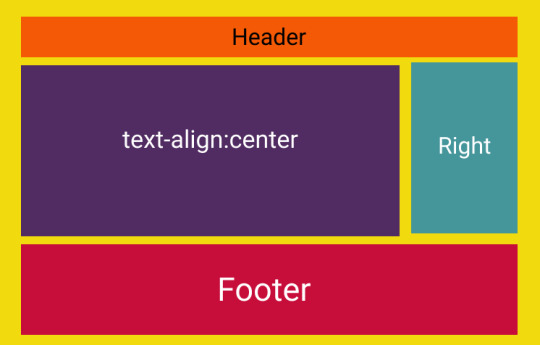
Centering Headers with CSS

Centering headers is a crucial aspect of creating visually appealing and well-balanced layouts in web design. In this section, we'll explore various methods to achieve this, ensuring your headers become eye-catching focal points on your web pages. Method 1: Text Alignment One of the simplest ways to center headers is by using text alignment. Apply the CSS property text-align: center; to the parent container of the header. This method is quick and effective for horizontally centering headers within their container. Method 2: Flexbox Flexbox provides a powerful and flexible layout model. To center headers using Flexbox, set the container's display property to display: flex; and use justify-content: center;. This method is especially handy for both horizontal and vertical centering, offering great control over the positioning of headers. Method 3: Grid Layout CSS Grid Layout is another robust option for centering headers. Create a grid container using display: grid; and set the place-items: center; property to center the header both horizontally and vertically. Grid Layout is excellent for more complex layouts and precise control over alignment. Responsive Design Considerations As you implement these centering methods, it's essential to consider responsiveness. Utilize media queries to adapt your centering techniques based on the device's screen size. This ensures that your headers look well-centered and aesthetically pleasing across various devices. Optimizing for Performance While achieving stylish layouts, it's important to optimize for performance. Minimize the use of unnecessary CSS properties and consider the impact of your chosen centering method on page load times. Striking the right balance between style and performance is key to providing a seamless user experience. List of CSS Properties for Centering Here's a quick reference list of CSS properties for centering: - Text Alignment: text-align: center; - Flexbox: display: flex; justify-content: center; - Grid Layout: display: grid; place-items: center; By mastering these centering techniques, you'll have the tools to create visually stunning headers that enhance the overall appeal of your web pages. In the next sections, we'll delve into specific details of each method, providing step-by-step guidance for implementation.
Method 1: Text Alignment
Text alignment is a straightforward method for centering headers in CSS. By using the text-align: center; property, you can effortlessly align text, including headers, within its containing element. Let's explore the details of implementing this method. Implementation Steps - Identify the container or element containing the header you want to center. - Apply the CSS property text-align: center; to the container. - Ensure that the header is a block-level element or inline-block to be affected by the text alignment. Example: Consider the following HTML and CSS example: HTML Centered Header CSS: CSS.header-container { text-align: center; } Advantages - Simplicity: This method is easy to implement and requires minimal CSS. - Compatibility: It is supported across all major browsers, making it a reliable choice. Considerations While text alignment is a quick solution for centering headers, it may not offer the same level of control as more advanced methods like Flexbox or Grid Layout. It primarily centers content horizontally, and additional techniques might be necessary for vertical centering. When to Use Text alignment is suitable for simple layouts where horizontal centering is the primary requirement. If your design involves more complex structures or vertical centering, exploring other methods like Flexbox or Grid Layout might be more appropriate. By employing text alignment, you can easily achieve visually centered headers in your web layout. However, as your design needs evolve, you may find it beneficial to explore other methods for more nuanced control over your header positioning.
Method 2: Flexbox
Flexbox, short for Flexible Box Layout, is a powerful and versatile method for centering headers and other elements in CSS. It provides a one-dimensional layout model that allows you to create complex designs with ease. Let's explore how to use Flexbox to achieve centered headers. Implementation Steps - Set the display property of the container to display: flex;. - Use the justify-content: center; property to horizontally center the child elements, including the header. - (Optional) For vertical centering, use the align-items: center; property on the container. Example: Consider the following HTML and CSS example: HTML Centered Header CSS: CSS.flex-container { display: flex; justify-content: center; /* align-items: center; (optional for vertical centering) */ } Advantages - Flexibility: Flexbox allows for easy manipulation of layout, offering flexibility in both horizontal and vertical alignment. - Responsive Design: It simplifies the creation of responsive designs, adapting to various screen sizes effortlessly. - Browser Compatibility: Flexbox is well-supported across modern browsers. Considerations While Flexbox is a versatile solution, it might be overkill for simpler layouts. Additionally, older browsers may have partial support, so it's essential to consider your target audience. When to Use Flexbox is an excellent choice when you need both horizontal and vertical centering, and when you want a straightforward way to distribute space within a container. It's particularly useful for creating dynamic and responsive layouts. By harnessing the power of Flexbox, you can achieve beautifully centered headers with minimal code, making it a valuable tool in your web design arsenal.
Method 3: Grid Layout
CSS Grid Layout is a robust method for creating two-dimensional layouts with precise control over both rows and columns. It provides an excellent solution for centering headers and other elements in a more structured manner. Let's explore how to use Grid Layout to achieve centered headers. Implementation Steps - Set the display property of the container to display: grid;. - Use the place-items: center; property to center both horizontally and vertically within the grid container. Example: Consider the following HTML and CSS example: HTML Centered Header CSS: CSS.grid-container { display: grid; place-items: center; } Advantages - Precision: Grid Layout provides precise control over both horizontal and vertical alignment, making it ideal for complex layouts. - Responsive Design: Like Flexbox, Grid Layout simplifies the creation of responsive designs by adapting to different screen sizes. - Grid Gaps: Easily incorporate gaps between rows and columns for added visual appeal and spacing. Considerations While Grid Layout is powerful, it might be more than necessary for simpler designs. Additionally, similar to Flexbox, browser compatibility should be taken into account. When to Use Grid Layout is an excellent choice when you need advanced control over the positioning of elements in both directions. It's particularly beneficial for creating intricate and responsive designs with a grid-based structure. By leveraging the capabilities of CSS Grid Layout, you can achieve centered headers with a high degree of precision, making it a valuable tool for sophisticated web layouts.
Responsive Design Considerations
In the modern era of diverse devices, ensuring that your centered headers look visually appealing across various screen sizes is a crucial aspect of web design. Responsive design allows your layout to adapt gracefully to different devices, providing an optimal user experience. Let's delve into the considerations for making your centered headers responsive. Media Queries Media queries are a cornerstone of responsive design. By using media queries in your CSS, you can apply specific styles based on the characteristics of the device, such as screen width or device type. For example: CSS @media only screen and (max-width: 600px) { /* Styles for devices with a maximum width of 600px */ .header-container { font-size: 18px; } } Relative Units Utilizing relative units, such as percentages and ems, instead of fixed units like pixels, ensures that your layout scales appropriately on different screens. This applies not only to the font size but also to padding, margin, and other layout properties. Fluid Grids Implementing a fluid grid system is essential for responsive design. Instead of using fixed-width containers, set container widths as percentages. This allows your layout to adjust proportionally to the screen size. For example: CSS.container { width: 80%; margin: 0 auto; } Viewport Meta Tag The viewport meta tag is crucial for controlling the viewport on mobile devices. Including the following tag in the head of your HTML document ensures proper scaling on various devices: HTML Testing on Multiple Devices Regularly testing your website on various devices and browsers is essential for identifying and fixing any responsiveness issues. Emulators, simulators, and real devices can all be valuable tools in your testing process. Conclusion By incorporating these responsive design considerations into your web development process, you ensure that your centered headers maintain their aesthetic appeal and functionality across the ever-expanding array of devices. Prioritizing responsive design not only enhances the user experience but also future-proofs your website in the dynamic landscape of technology.
Optimizing for Performance
While creating visually stunning layouts with centered headers is essential, it's equally important to optimize your web pages for performance. Users expect fast-loading websites, and optimizing your CSS can contribute significantly to a smoother user experience. Let's explore key strategies for optimizing the performance of your stylish layouts. Minimize CSS Files Reducing the size of your CSS files is a fundamental step in optimizing performance. Remove unnecessary styles, comments, and whitespace. Consider using tools like CSS minifiers to automatically compress your stylesheets without sacrificing readability during development. Concatenate and Bundle CSS Concatenating multiple CSS files into a single file and bundling them together can reduce the number of HTTP requests, leading to faster page loading times. This is particularly beneficial for larger projects with numerous stylesheets. Use Efficient Selectors Optimize your CSS selectors to ensure efficient rendering. Avoid overly broad selectors that may result in unnecessary styling calculations. Specific and targeted selectors contribute to a more streamlined rendering process. Implement Browser Caching Utilize browser caching to reduce load times for returning visitors. By setting an appropriate expiration date for your CSS files, users can retrieve previously loaded styles from their local cache rather than downloading them anew on each visit. Consider Critical CSS Implementing critical CSS involves identifying and inlining the minimal styles required for rendering above-the-fold content. This ensures that users see a styled page quickly, even before the entire CSS file is downloaded. Tools like critical CSS generators can automate this process. Optimize Images Images are often a significant contributor to page load times. Optimize images by compressing them without compromising quality. Use responsive image techniques to serve appropriately sized images based on the user's device and viewport. Lazy Loading Lazy loading is a technique that defers the loading of non-essential resources, such as images, until they are about to be displayed on the user's screen. This can significantly improve initial page load times, especially for content-heavy websites. Regular Performance Audits Perform regular performance audits using tools like Lighthouse, PageSpeed Insights, or browser developer tools. Identify and address any bottlenecks or issues affecting the loading speed of your web pages. Conclusion: By incorporating these performance optimization strategies into your web development workflow, you not only ensure a visually appealing user interface but also deliver a fast and efficient user experience, contributing to overall user satisfaction and engagement.
FAQ
Explore the frequently asked questions about centering headers in CSS and enhance your understanding of creating stylish and visually appealing layouts. Q: What is the simplest method to center a header horizontally? A: The simplest method is to use text alignment. Apply the CSS property text-align: center; to the parent container of the header. Q: Can I use Flexbox for both horizontal and vertical centering? A: Yes, Flexbox provides a versatile solution for both horizontal and vertical centering. Set the container's display property to display: flex;, and use justify-content: center; for horizontal centering and align-items: center; for vertical centering. Q: When should I choose CSS Grid Layout over Flexbox for centering headers? A: CSS Grid Layout is more suitable for two-dimensional layouts with precise control over rows and columns. If you need advanced control over both horizontal and vertical centering, particularly in a grid-based structure, Grid Layout is a better choice. For simpler layouts, Flexbox may be sufficient. Q: How can I ensure my centered headers remain visually appealing on different devices? A: Implement responsive design strategies, including the use of media queries, relative units, and a viewport meta tag. Test your layout on various devices to ensure your centered headers adapt gracefully to different screen sizes. Q: What are some tools for performance optimization of CSS? A: Tools like CSS minifiers for file size reduction, critical CSS generators for prioritized loading, and performance auditing tools such as Lighthouse and PageSpeed Insights can help optimize your CSS for better performance. Read the full article
1 note
·
View note
Text
Removing Underlines from Buttons with CSS: Clean Styling
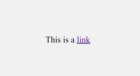
Introduction
Welcome to a journey into the world of clean and stylish button styling with CSS. In this blog post, we'll explore the significance of removing underlines from buttons and delve into the various techniques and best practices to achieve a polished and modern look for your web elements. Whether you're a seasoned developer or just starting with CSS, this guide will provide insights into creating buttons that not only catch the eye but also contribute to an enhanced user experience. Join us as we uncover the art of removing underlines from buttons, adding a touch of sophistication to your web design.
Why Remove Underlines?
Understanding the rationale behind the decision to remove underlines from buttons is crucial for crafting a visually appealing and user-friendly web interface. Let's explore the reasons driving this design choice: - Enhanced Aesthetics: Removing underlines from buttons contributes to a cleaner and more modern visual appearance. This aesthetic refinement aligns with contemporary design trends, providing a sleek and professional look to your website. - Reduced Visual Clutter: Underlines, though conventionally associated with links, can introduce unnecessary visual noise to buttons. By eliminating underlines, you declutter the visual space, allowing users to focus on the essential elements of your interface. - Consistency Across Elements: Achieving a consistent design language is essential for a harmonious user experience. Removing underlines from buttons aligns them visually with other non-link elements, promoting a cohesive and unified design language throughout your website. - Improved User Experience: Buttons without underlines present a more intuitive and user-friendly interface. Users can quickly identify actionable elements without the distraction of underlines, streamlining the navigation and interaction process. - Modern Design Trends: Following current design trends often involves breaking away from traditional styling conventions. Many contemporary websites opt for a minimalist and sleek appearance, and removing underlines from buttons aligns with this evolving design ethos. Beyond these key considerations, it's essential to recognize that the decision to remove underlines should be made thoughtfully, taking into account the overall design goals and user expectations. By doing so, you can create a visually appealing and user-friendly web environment that resonates with modern design principles.
CSS Basics
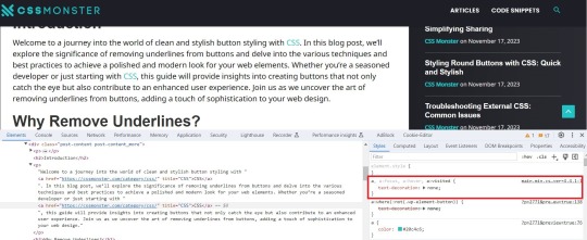
Before diving into the techniques for removing underlines from buttons, it's essential to revisit some fundamental CSS concepts. Familiarizing yourself with these basics will lay a solid foundation for effective button styling: - Selectors: Understanding CSS selectors is crucial for targeting specific HTML elements. Whether using class, ID, or tag selectors, choosing the right selector is the first step in styling buttons. - Properties and Values: CSS properties dictate the visual aspects of an element, such as color, size, and font. Familiarize yourself with common properties related to button styling, including background-color, border, and padding. - Box Model: The box model describes how elements are structured in terms of content, padding, border, and margin. Understanding this model is crucial for precise control over the sizing and spacing of buttons. - CSS Resets: Dealing with browser-specific styles can be challenging. CSS resets help standardize default styles across different browsers, providing a consistent starting point for your button styling. Once these basics are clear, you can proceed to explore more advanced techniques for removing underlines. One effective approach involves using the text-decoration property and setting it to none for buttons. Additionally, understanding the :hover and :active pseudo-classes allows you to create interactive and responsive button styles. Concept Description Selectors Identifiers used to target HTML elements for styling purposes. Properties and Values Attributes that define the appearance and behavior of CSS elements. Box Model Framework for understanding the layout of elements, including content, padding, border, and margin. CSS Resets Techniques to standardize default styles across different browsers. By mastering these CSS basics and exploring their application in button styling, you'll be well-equipped to implement underlines removal with precision and style.
Methods for Removing Underlines
When it comes to achieving a clean and stylish appearance by removing underlines from buttons, several methods are at your disposal. Each method offers its own set of advantages and considerations, allowing you to choose the approach that best aligns with your design goals. Let's explore these methods in detail: - Using the text-decoration Property: One of the most straightforward methods involves utilizing the text-decoration property in CSS. Setting this property to none effectively removes underlines from buttons. This method provides simplicity and ease of implementation. - Utilizing Class or ID Selectors: Applying the text-decoration property selectively through class or ID selectors allows for a more targeted approach. This method is advantageous when you want to remove underlines from specific buttons while leaving others unaffected. - Creating Custom Styles: Going beyond the basics, you can create custom styles for your buttons using advanced CSS techniques. This involves specifying properties such as border, background-color, and padding to achieve a tailored appearance without underlines. - Using Pseudo-classes: Employing pseudo-classes like :hover and :focus allows you to add interactivity to your buttons. These classes can be utilized to change the appearance of buttons when users hover over or focus on them, enhancing the user experience. Consider the nature of your website and the desired user interaction when selecting a method for removing underlines. Additionally, it's crucial to test your chosen method across various browsers to ensure consistent and reliable results. Method Description text-decoration Property Directly removes underlines by setting the text-decoration property to none. Class or ID Selectors Applies the text-decoration property selectively to specific buttons through class or ID selectors. Custom Styles Allows for the creation of unique button styles using a combination of CSS properties. Pseudo-classes Enhances interactivity by modifying button styles on user interaction, such as hovering or focusing. Experimenting with these methods will empower you to find the most suitable approach for achieving a polished and underline-free button styling on your website.
Best Practices
As you embark on the journey of removing underlines from buttons in CSS, adhering to best practices ensures a seamless and effective implementation. Consider the following guidelines to achieve clean and polished button styling: - Consistency is Key: Maintain a consistent design language across your website. Whether removing underlines from all buttons or specific ones, consistency enhances the overall user experience and fosters a cohesive visual identity. - Responsive Design: Ensure that your chosen method for removing underlines accommodates various screen sizes and devices. Responsive design principles help create a user-friendly experience on desktops, tablets, and smartphones. - Accessibility Matters: Prioritize accessibility by considering users with different abilities. Ensure that buttons remain distinguishable and interactive for users who rely on assistive technologies such as screen readers. - Test Across Browsers: Perform thorough testing across different web browsers to confirm the consistent application of your chosen styling method. This helps prevent unexpected visual discrepancies. - Optimize Performance: While focusing on aesthetics, be mindful of performance. Streamline your CSS code and consider the impact of your styling choices on page load times to create a smooth user experience. Additionally, incorporating user feedback and conducting usability testing can provide valuable insights into the effectiveness of your button styling. Remember that the ultimate goal is to create an intuitive and visually appealing interface that resonates with your target audience. Practice Description Consistency is Key Maintain a uniform design language throughout the website for a cohesive visual identity. Responsive Design Ensure that button styling remains effective across various screen sizes and devices. Accessibility Matters Prioritize the accessibility of buttons for users with different abilities, considering assistive technologies. Test Across Browsers Conduct thorough testing to ensure consistent styling across different web browsers. Optimize Performance Streamline CSS code and consider the performance implications of styling choices for improved page load times. By incorporating these best practices, you'll not only achieve a visually appealing design but also contribute to a positive user experience on your website.
Case Studies
Examining real-world examples of buttons without underlines provides valuable insights into the impact of this styling choice on different websites. Let's delve into a few case studies that showcase the effectiveness of removing underlines: - E-commerce Checkout Buttons: In the e-commerce sector, streamlined and clean checkout buttons play a pivotal role in guiding users through the purchase process. Removing underlines from these buttons creates a visually uncluttered interface, reducing distractions and enhancing the focus on completing the transaction. - Social Media Sharing Buttons: On social media platforms, the design of sharing buttons is crucial for encouraging user engagement. Many platforms opt for underlines-free buttons to maintain a sleek and modern appearance, aligning with the visual trends of contemporary web design. - Call-to-Action Buttons on Landing Pages: Landing pages often feature prominent call-to-action buttons to encourage user interaction. By removing underlines from these buttons, designers can draw attention to the action they want users to take, creating a visually compelling and persuasive design. - Mobile App Navigation Buttons: Mobile app interfaces prioritize simplicity and ease of use. Navigation buttons without underlines contribute to a clean and intuitive mobile experience, facilitating smooth navigation for users on various devices. Examining these case studies highlights that the decision to remove underlines is context-dependent and should align with the specific goals and design principles of each website. It's essential to consider the user journey, the nature of the content, and the overall aesthetic when implementing underlines removal. Case Study Observations E-commerce Checkout Buttons Streamlined checkout buttons without underlines enhance the focus on completing transactions in e-commerce scenarios. Social Media Sharing Buttons Underlines-free buttons on social media platforms contribute to a sleek and modern appearance, encouraging user engagement. Call-to-Action Buttons on Landing Pages Removing underlines from call-to-action buttons on landing pages draws attention to desired user actions, fostering interaction. Mobile App Navigation Buttons Navigation buttons without underlines contribute to a clean and intuitive mobile app interface, prioritizing simplicity. These case studies demonstrate the versatility of underlines removal and emphasize the impact it can have on user engagement and visual appeal across different website contexts.
Common Challenges
While the decision to remove underlines from buttons can enhance the visual appeal and user experience, it's essential to be aware of common challenges that may arise during the implementation. Understanding and addressing these challenges will help you navigate potential issues seamlessly: - Loss of Visual Cues: Removing underlines can result in a loss of traditional visual cues that indicate a clickable element. It's crucial to compensate for this by incorporating alternative design elements such as color changes, hover effects, or iconography to maintain interactivity. - Accessibility Concerns: Users with visual impairments may rely on underlines to identify links and interactive elements. Ensuring that your styling choices are accessible and considering alternative methods, such as using contrasting colors, helps address accessibility concerns. - Browser Compatibility: Different browsers may interpret CSS styles differently. Testing your underlines removal method across various browsers is essential to ensure a consistent and reliable user experience. - Impact on User Expectations: Users may have established expectations regarding the appearance of clickable elements. Deviating too far from these expectations can lead to confusion. Carefully balancing innovation with adherence to user expectations is key. Addressing these challenges requires a thoughtful approach to button styling. Consider incorporating subtle visual cues, leveraging ARIA roles for accessibility, and conducting thorough testing to mitigate potential issues. Challenge Considerations Loss of Visual Cues Compensate for the absence of underlines with alternative design elements like color changes, hover effects, or icons. Accessibility Concerns Ensure accessibility by considering the needs of users with visual impairments and using alternative methods such as color contrast. Browser Compatibility Test your underlines removal method across various browsers to ensure a consistent user experience. Impact on User Expectations Balance innovative design choices with adherence to established user expectations for clickable elements. By proactively addressing these common challenges, you can confidently implement underlines removal, creating a visually appealing and user-friendly button styling while mitigating potential issues that may arise. Backend developers after writing CSS for 20 minutes: pic.twitter.com/CzIvYuSQNK — Marko Denic (@denicmarko) November 13, 2023
FAQ
Explore answers to frequently asked questions about removing underlines from buttons in CSS to enhance your understanding of this styling choice: Q: Why should I remove underlines from buttons? Removing underlines from buttons offers a cleaner and more modern visual appearance, contributing to a polished design. It reduces visual clutter, enhances aesthetics, and aligns with contemporary design trends. Q: Will removing underlines affect accessibility? It can impact users with visual impairments who rely on underlines to identify clickable elements. To address accessibility concerns, consider alternative design cues, maintain color contrast, and test with assistive technologies. Q: What is the impact on user expectations? Users may have established expectations regarding the appearance of clickable elements. While removing underlines can offer a modern look, it's important to balance innovation with adherence to user expectations to avoid confusion. Q: How can I ensure a consistent experience across browsers? Testing your underlines removal method across various browsers is crucial to ensure a consistent user experience. Different browsers may interpret CSS styles differently, and thorough testing helps identify and address compatibility issues. Q: Are there alternative visual cues for clickable buttons? Yes, alternative visual cues such as color changes, hover effects, or iconography can compensate for the absence of underlines. Experiment with these elements to maintain interactivity and guide users to clickable buttons. These frequently asked questions provide valuable insights into the considerations and implications of removing underlines from buttons. Consider these answers as you navigate the process of implementing this styling choice on your website.
Conclusion
In conclusion, the decision to remove underlines from buttons in CSS is a design choice that can significantly impact the visual appeal and user experience of your website. By following the outlined methods, best practices, and considering real-world case studies, you can create a polished and modern interface that aligns with contemporary design trends. However, it's crucial to navigate the challenges associated with underlines removal, such as potential accessibility concerns, browser compatibility, and user expectations. Addressing these challenges with thoughtful solutions ensures that your design choices contribute positively to both aesthetics and usability. As you embark on the journey of styling buttons without underlines, keep in mind the importance of consistency, responsiveness, and accessibility. Test your chosen methods across various browsers and devices to guarantee a seamless user experience for all visitors to your website. By incorporating the insights from this blog post, you can confidently implement underlines removal, enhancing the overall look and feel of your website's buttons while maintaining a user-friendly and accessible design. Read the full article
0 notes