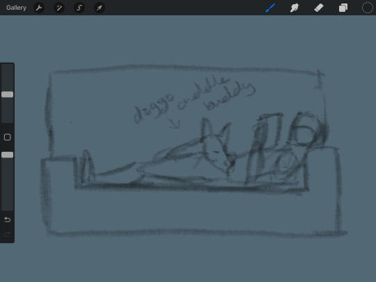
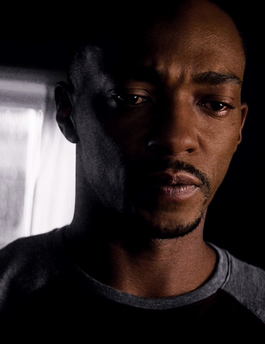
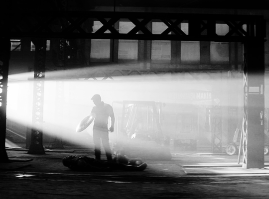
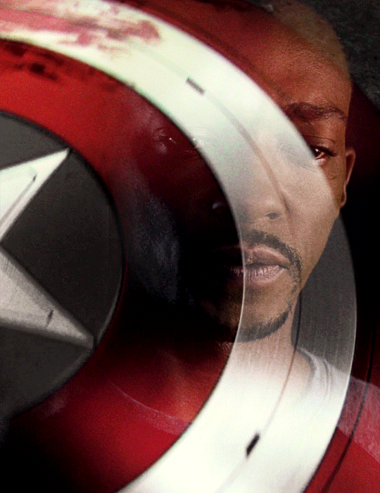
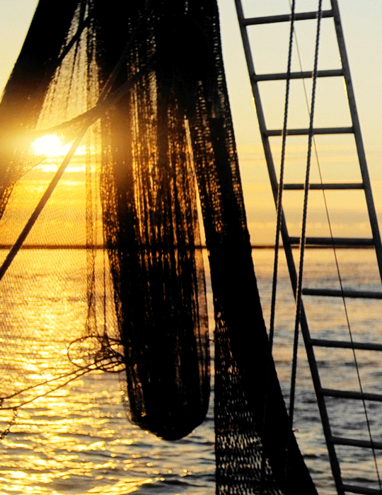
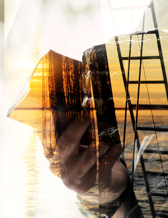
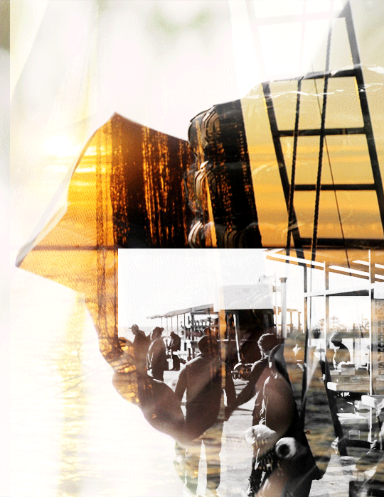
#did you know you can put photoshop files in canva?
Text
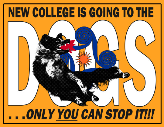
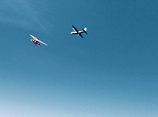
. . . what former president Bernie Machen of the University of Florida referred to as a “little jewel in the state of Florida”—was no more. What remained uncertain was what would replace it.
#ncf#new college of florida#color scribbles#newcollegeoffl#color.txt#did you know you can put photoshop files in canva?
4 notes
·
View notes
Text
* ( ❀ ˆ꒳ˆ˵ ) ♡ Ꮺ 𝗧𝗜𝗡𝗬𝗧𝗢𝗪𝗡𝗦 — 𝟩𝖯𝖬 ੭

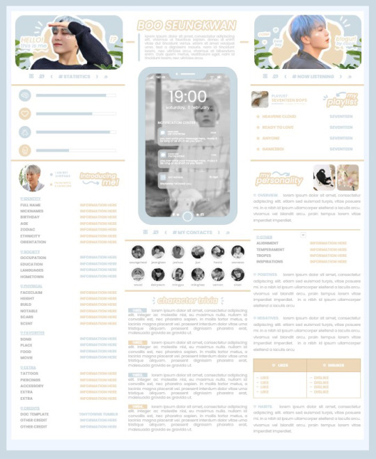
— introducing 7pm , the latest original google doc from tinytowns ! this document is designed to display the basics of a single - muse in one page &. captures a fun & youthful vibe with the inclusion of simplistic yet busy design , bright colours &. doodles ! features statistics , a playlist , basic info section along with character trivia & personality info ❀ the contacts section can be used as an exclusives section if desired ! space is left at the end of the doc so you can adjust easily & not have any of those annoying blank pages but it would be wise to take note of image positions as they are prone to moving. this doc can be considered moderate to difficult to edit due to the amount of edits that you will need to make in photoshop or photopea - but if you don't mind that then the document should be relatively simple to edit ❀ you can find the document link in the source code or under the cut , along with a known position issue + how to fix it , psd temps provided for this document , a video tutorial for adding your gif into a circle &. icon credits ! ( ˘͈ ᵕ ˘͈ ♡) ~
❀ PSD DOWNLOADS ( REQUIRED ! )
GIF CIRCLE - HERE
PHONE TEMPLATE - HERE
TOP IMAGES - HERE
♡ note : you will need to download the title cards to change the color , but if you don't mind the color then you don't need to - also , for full transparency on my end , i did need to touch up a few of the pngs after saving because the top text overlapped with the bottom text. be aware of that ! fonts used are poppins &. sant joan despi !
NAME TITLE - HERE
TRIVIA TITLE - HERE
INTRO TITLE - HERE
PLAYLIST TITLE - HERE
PERSONALITY TITLE - HERE
♡ note : you must change the color via layer style -> stroke for the title cards &. then save as png after deleting the background layer .
❀ KNOWN ISSUES
01. as a gdocs creator i use an external add-on called page resizer which is helpful for customizing the sizing of my canvas , as docs limits us with pre - set sizes. while this is nice to use , i'm aware that it can specifically cause an issue when you change the color of your background page. to fix this you must actually download the page resizer add-on through extensions -> add-ons -> get add-ons &. you should search for page sizer & download the one by nat burns. then you can access the sizer through extensions -> page sizer -> set page size &. what should be set for this document is a width of 9 &. a height of 12 !
this should fix the document , but i also know that sometimes , for what ever reason , the height &. width will flip. if that happens just make the height &. width opposite; so instead of a width of 9 , put 12 & for height , put 9 instead of 12.
02. i cropped the title cards in the document so that you wouldn't be trying to click something &. accidentally click on the titles ! however this means that when you replace image on the title cards they might go off center &. crop halfway through the word. just double click the title card that's bugging out & drag it to about the center of the black box. then it's fixed !
❀ DOCUMENT DOWNLOAD
7PM - HERE !
do not remove the credit , redistribute or profit off of my work.
❀ TUTORIAL
#01. go to file -> make a copy , in order to edit .
#02. to change the top two images double click on them &. a window should appear - in there you're going to click on it once &. hit replace image. the psd for this has been provided so it should be sized correctly !
#03. to change the title cards ( ex. boo seungkwan , my playlist , introducing me etc. ) you just need to click on them once &. hit replace image - please refer to #2 in the known issues section above this if you're going to do this though !! many thanks.
#04. to change the phone you're going to download the psd provided above &. when you've finished editing it you will click on the phone in the doc one time &. hit replace image !
#05. to change the thin color lines around seungkwan's name card you will press them once &. click edit - from there a window should open up &. you will click on it again & find the bucket tool which has a small yellow ( or blue if you clicked the long one ) line under it. that is where you change the color !
#06. the statistics represent intelligence , empathy , friendliness &. fighting skill ; to adjust the levels or colour you're going to double click &. a window will appear. from there you can either change colors with the bucket &. pencil tool ( pencil = outline color ) or you can shift the bars by clicking on the coloured parts of them and literally just dragging them.
#07. to change the playlist cover &. title you'll double click &. adjust inside the window by replacing image &. renaming things. the actual songs on the playlist can be typed normally !
#08. to change the gif circle , personality , &. contact images you again just double click &. replace image inside those windows. for the gif circle you must use the psd.
#09. to change the little bulletpoints beside the gif circle you will double click &. edit the text inside the window.
❀ VIDEO TUTORIAL 4 GIF CIRCLE
watch the tutorial right HERE !
make sure your timeline is checked ( the first thing i showed )
ignore the mistake i made while trying to show you where to end your gif LMFAOOO . . . im clumsy <3
to highlight all of your layers / frames click on the first one , then press shift + click on the last layer.
to bring up the list of options ( when i click convert into smart object ) you just right click.
❀ CREDITS
brain icon - Brain icons created by Vitaly Gorbachev - Flaticon
heart icon - Heart icons created by Chanut - Flaticon
support icon - Sport team icons created by Freepik - Flaticon
boxing icon - Boxing icons created by Freepik - Flaticon
plant png - josh ca.la.brese on unsplash
battery icon - Battery icons created by Stockio - Flaticon
wifi icon - Wifi icons created by Uniconlabs - Flaticon
signal icon - Signal icons created by Freepik - Flaticon
speech icon - Comment icons created by Freepik - Flaticon
close icon - Close icons created by ariefstudio - Flaticon
instagram icon - Instagram icons created by Prosymbols Premium - Flaticon
camera icon - Photo camera icons created by Kiranshastry - Flaticon
torch icon - Ui icons created by yaicon - Flaticon
#google docs#template#supportcontentcreators#gdocs#rph#google docs template#oc template#rpc#free rph#free rpc#docs#roleplay template#oc sheet#rp template#free#muse template#tinytowns#m: gdocs#m: original
2K notes
·
View notes
Text
I spent 6 grueling hours researching how to protect one's photos/scans so you wouldn't have to--And these are my findings:
As the title states, I spent 6 grueling hours researching how to protect one's photos/scans in case other collectors want to protect and/or receive credit for their photos.
Once more let me emphasize THEIR PHOTOS.
Backstory:
It's not a secret that I'm quite a big collector of official Spy x Family merchandise, specifically clear file folders, stationery, and acrylic stands. I own so much, in fact, I have a tendency to own a handful of duplicates and had the crazy idea to start a small business selling these duplicates via Ko-Fi. A thought came to me that since I had already invested in a light box and a scanner for selling my merch, why not also use them to share pictures of my collection for other fans to view and appreciate?
And that was when I had sought the opinions from my good friend, @yumeka-sxf. Yumeka has been kindly posting high-resolution scans of her SxF merch (clear files, pages, etc.) on Tumblr. She is someone I also deemed as an expert when it came to uploading merch on the internet. She gave me incredible advice with awesome foresight when it came to watermarking high-resolution pictures and scans. She easily predicted what disrespectful people would do if I hadn't moved my watermarks to certain (albeit not really appealing) spots. And, just like she said, someone did attempt to remove my watermark using AI. You can read about it here. @yumeka-sxf also provided her own insight to watermarking merch here--if ya'll are interested to read.
I won't go into too much detail, but essentially they're long posts meant to educate people on why fans, who own the official merch, put watermarks on their pictures. The bottom line is, we're claiming the picture for ownership, NOT the merch.
Second, did you know that people have found ways to remove watermarks?

That gives me enough incentive as to why I want to take it a step further to protect my photos/scans.
"If I take a picture of something do I own the picture that I took?":
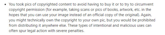
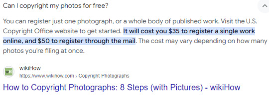
Yes and no. Yes as in, the picture is yours. No, because depending on your subject, it falls under numerous jurisdictions of copyright. You can find all the details in this insightful post from veteran photographers.
But since we're focusing on the topic of photos and scans of merchandise, I'd like to provide these screenshots:


And so, to re-iterate, the only thing you'll get out of copyrighting your photo is just the right to the photo--which is all I want.
The Findings:
6 grueling hours of research for protecting one's picture led me to several insightful directions--one of them amusingly brought me down a rabbit hole of how to protect one's real estate pictures. They did have some wonderful tips if you guys would like to read them!
Unfortunately, I do not own Photoshop so I could not make any edits on the metadata or create a layer that will prevent downloading the content of the picture. Preventing screenshots/right-clicking is limited to control on a website and/or can easily be canceled by plug-ins. So that just leaves me with finding something creative solutions the only tool I have: Canva (more on this later).
I spent some more time reading more journals and visited USCO (United States Copyright Office) and, finally, Pixsy.
I'm gonna be honest, USCO is THE BEST way to protect your media (merchandise, art, etc.) IF you have the money to support it.

Not only do I not have the funding for this type of service, but my photos don't exactly meet "originality" especially when the subject of the photo is copyright-protected merchandise, which means there are severe punishments for those who pursue any commercial purposes (such as selling my photos to make money rather than directing people to purchase the official work from the licensing site). And at the end of the day, I just care about the photo, itself, and receiving credit and source.
It's ridiculously simple to just credit and source a picture, and yet, it'll surprise you how many people just can't do that. This is why, I must take these extra precautions to ensure credit and sourcing.
So, I opted for Pixsy for its free plan that includes 500 images being monitored.

There's no doubt that I'll most likely invest in a monthly subscription if ever I amass beyond 500 pictures for monitoring.
Currently, it has already done an impressive job of identifying pictures I've posted with my watermarks on Ko-Fi, Twitter, and Tumblr. It has even identified reblogs/retweets.
For some odd reason, it uploads my pictures horizontally when it's normally vertical ^^; but it still gets the job done. Interestingly, it hasn't picked up my pictures from Mercari yet. I assume that if I were to upgrade to the subscription plan, Pixsy might be able to find it by then.
Procedures:
I'm sharing my procedures for protecting one's photo (and content, if applicable of course).
Step 1: Register on Pixsy. As I've addressed earlier, it's free.
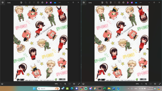
Step 2: Upload HIGH-RESOLUTION pictures (no watermark) to Pixsy's database. This is probably the most accurate way for Pixsy to identify pictures of the same (or similar) "blueprint". In the picture below, I provided a screenshot of my picture without the watermark (left) with a picture they found of my picture with my watermark on it from my ko-fi shop (right).
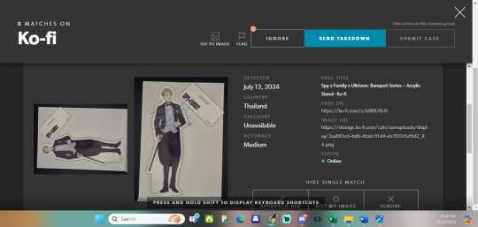
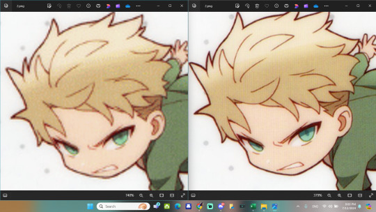
Step 3: If you plan to upload a photo/scan with or without watermark, it is recommended to upload your image at 550 pixel image and at 72 dpi. This makes it good for the internet (see first image below). But once you zoom in, you can tell the difference in quality (see second image below).
I mentioned before that I don't have photoshop, so I experimented with what I do have: Canva.
Since I have a premium membership (indicated by crown icons), I just use the following settings:
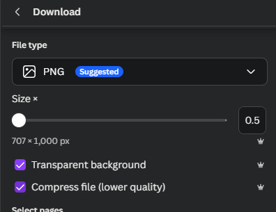
and it gets the job done.
I am planning to upload my photos without watermarks to the Spy x Family wiki quite soon, so I did all this research to prepare for possible theft and/or the lack of crediting and sourcing--just in case. A friend of mine told me that s/he can try to ensure crediting through the file name, which is a ridiculously kind gesture, but I'm not ignorant of people who change/completely ignore file names. That's unfortunately just the way it is on the internet.

Hopefully, I've curated enough research to help protect photos/scans from possible theft (if reposting is not allowed by the owner).
I don't mind if my photos are used for reference AS LONG AS they credit me and link the source directly to the image itself (not one of those cut-corner kind of way and just link my Ko-Fi gallery). I won't tolerate laziness when it comes to sourcing considering I invested a lot of money to purchase merch and invested hours--even days--to get the best photo/scan + researched information on the merch for public access.
#a long post#how to protect photos#how to protect scans#how to use pixsy#how to copyright photos#how to copyright scans#how to copyright merch#a post for merch collectors#merch collectors#photographing merch#scanning merch#scarlymadeathing#scarlydidathing#spy x family#type a shit#I know I've got organizing issues#collector work#acrhiving work
8 notes
·
View notes
Note
I love your art so much, the shapes are so neat and the style feels so visually interesting!!
I was wondering what software you used for the Spamton artwork? And what effect did you use for the Caine poster to create that old print effect? It looks amazing !!
Have a great day/night ^^
Edit: apologies if its weird im on mobile T_T
Hi! Thank you so much, i rwally appreaciate your kind words♡ they really help to keep me motivated it!
To answer your question however!
I use both illustrator and photoshop! Illustrator is used for all my drawings and photoshop for textures ☆
if you ever need the link for the free """"""version""""" *wink wonk* feel free to dm me!
For how to actually put textures!
1st! Open photoshop
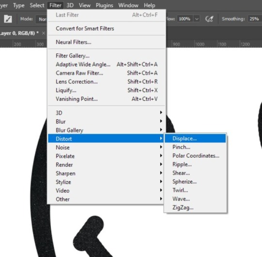
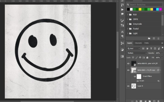
2nd! Make your graphic or import your image, here i just made a quick smily face
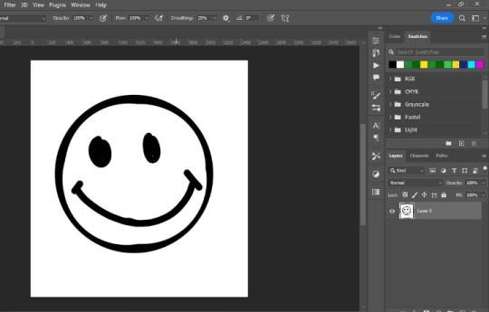
3rd! Import your texture! (You can easly find them by putting a word plus texture i.e. photocopy texture on google) and scale it to you preference, i normally just fit them as big as the canvas itself
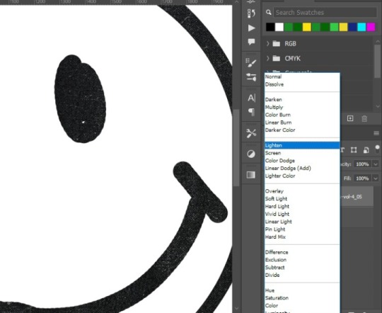
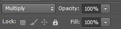
4rth! Blending modes! This is kinda experimental so feel free to browse all of them to see what fits better, in this case i use "lighter" so only the texture will be seen on the graphic, kinda like a layer mask
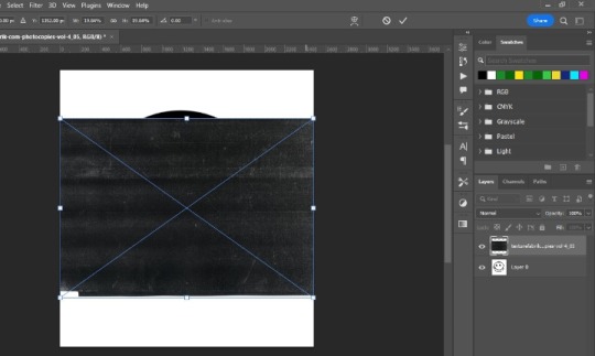
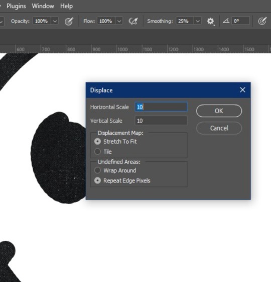
5th! Displace filter! Im not sure if other programs have this filter, but in photoshop basicly takes the texture of another photoshop file, and whatever things has on it, it applies it to the graphic (lets say that you have a photoshop file with a crumbled paper texture, the graphic will take the texture of this, giving it a more realistic look) akso i recommend converting the graphic to a smart object, so if youre not satisfied with it you can easily change the settings
You will get this little square thing, im not going to lie i dont really know exactly what it is for LMAO but, the numbers the bigger they are, the more dramatic the texture result will be
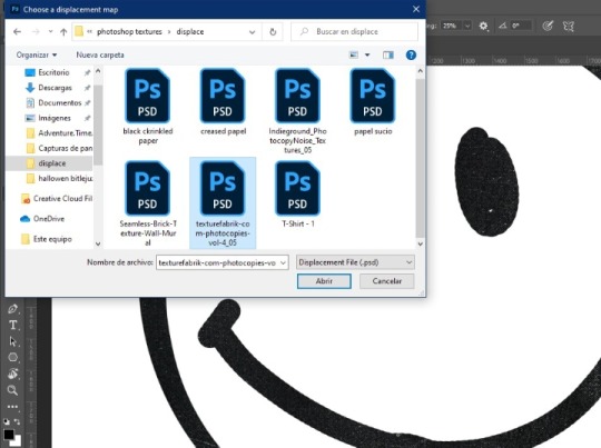
Then this window will pop up, it basicly tells you to choose the file you want, at the end i will tell you how you can make a displace file! And you click open:
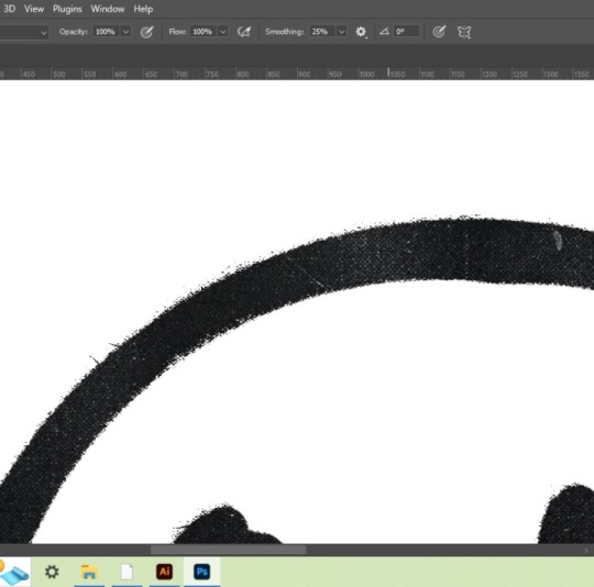
Results:
Then if the background looks a little flat you can copy the texture above your graphic, put it below it, inverte it and choose a blending mode, here i use multiply:
And thats how you get that sort of printed like texture!☆ you can use this method to get every variable of results, i hope you find it usefull hehe!☆ below the cut are the steps to make the displace file, just so this doesnt get too long haha
How to make a displace file:
1st! Choose your texture and open it on photoshop directly so the image is the background
2nd! Without doing anything youll just click on file>save as
3rd! Save it as a psd document
And there you go! You have a ready to go displace file so you can spice up your work☆
(I would put more pics but??? Appearently there is a 10 image maximum? Wtf?))
#mr k' s talk#thank you so much for the question! i hope you find this useful :D#texture#tutorial#graphic design
33 notes
·
View notes
Text

This tutorial is for @inferiorvibes who asked me how I did my Manacled set (pictured below) with art going over three book spines. I won't be covering how to use the design programs, so if you have any questions, or would like a boarder tutorial, please let me know.
This tutorial also works for dustjackets.

Tools:
Ruler or measuring tape
The hardcovers of the books you're going to be binding on
InDesign, Photoshop or Photopea (free online version of photoshop) -- I've never used Canva
STEP ONE: MEASURE THE SPINES / YOUR CANVAS
It's important to know what space you're working with, so put all your books side by side and measure the width of ALL the books next to one another + the height.
Yes, I do measure the little space between the spine and the front/back covers.

STEP TWO: CREATE YOUR CANVAS
In the program of your choice, open a document with the measurements you took above. Keep your books and rulers close though! You also do not need bleed, columns or margins for this step.


STEP THREE: OUTLINE EACH SPINE
Time to get your rulers out both physically and in your program. Start by measuring each spine. Then, using the rulers, drag them onto your screen. A little math is going to come into play, but bear with me!


It's important to also change your rulers in your design program to centimeters. I feel like it's a more precise measurement than inches, but feel free to do it however you're comfortable.
Here's how to access your rulers & change their measurement. To change the measurement, make sure to RIGHT-CLICK on the ruler.


The first spine is the easiest to mark-out, as you just drag and drop your ruler to the exact measurement. For the second spine, you'll have to do the measurement of your first + the second. So, I dragged my second ruler to 6.3cm (2.5cm + 3.8 cm) in the program. After this, the remaining space will be your third spine!
You should end up with something that looks like your books when they're placed next to each other!

STEP FOUR: INSERT YOUR ART!
Now, you can add your image to the canvas. I like to "Place" image and resize it! Ignore the purple line, what you're focusing on is the canvas outline and the blue rulers you've added.
You can also put your program in preview mode if you find the lines confusing. Now, you can see the whole image of your spines when they'll be placed together.
TIP: It's better to have an image that has "excess" that goes outside of the canvas. When you create your hardcover design or jacket, you'll want the art to "bleed" so that when you look over the top edge of your book, the art won't suddenly cut to white, but rather, extend far enough that it gets folded away and covered by your headband/book.


STEP FIVE-ISH: EYEBALL YOUR ART
I actually eyeball my art when I insert it to the final file. Yes, I'm saying it out loud, and yes, I do have to do tester prints to make sure they'd correct. One trick I have is to see what art markers there are for where/how I place the art.
For example, I know that the middle spine barely has his thumb. The side spines need to end one edge where his thumbs are.
STEP SIX: INSERT YOUR ART INTO YOUR COVER
Using the same measuring techniques, I build my hardcover. Then, I insert the spine art and adjust depending on which volume of the book it is.


I hope this made sense! I didn't really look up tutorials, I just cooked on InDesign and it worked in my favour.
Please let me know if you have any questions 🤗
8 notes
·
View notes
Note
Hello i've been browsing through your blog amd o wanted to know how do you do your icons?
✦ 𝙐𝙋𝘿𝘼𝙏𝙀𝘿 𝙁𝙊𝙍𝙈𝘼𝙏 𝙏𝙐𝙏 .
──── UNDER THE CUT !

by [ icon ] i'm gonna guess you mean the images i use for my responses!! the process is the same for any of my graphics though, so yeah!! here is a tut for how i make my graphics!
app used : ibispaint x
website used : photopea.com
1. PICK A BASE MASK.
─ pick a border? shape? whatever it's called, that you want your outline to be in! i chose a free resource for mine and will be using it on the tutorial. you can usually easily find one you like by searching up " frame overlay " on pinterest!

2. PUT IT INTO A LONGER CANVAS + CUT OUT THE INSIDE OF IT.
── like this! ( i changed the colour of mine a bit but that's not necessary! )

── to cut an area out, go to the tool selection stage and click " magic wand " and one-tap the area that you need to cut out. then go to the little square bar and click " clear layer ". that should only clear the selected area!


3. MAKE A LAYER UNDERNEATH AND FILL.


── make a new layer below the base colour and fill it using the bucket tool with any colour! make sure the layer is BELOW the base mask!
4. ADD THE IMAGE YOU WANT.

── make a new layer above the filled colour with your chosen image and clipping mask it to the shape! it should only show up on top of the filled colour.
5. CHOOSE A PSD.
── so there's this thing called a PSD when it comes to editting, and it's this fancy thing that changes the colours of your image. you can usually find some by searching up " psd " on deviantart, tumblr, and pinterest! download the files of a psd that you like!
example of searching up psd on deviantart :

6. GO TO PHOTOPEA.
── go to photopea.com ( or photoshop, either one works! ), and follow this tutorial! i know it says iOS, but it works for every device including computers!!
── once you did that, you should have a full result!

12 notes
·
View notes
Note
Hi! I'm wondering if it's too much to ask by wondering if you could explain how to do gifs like this: /post/665885361316233216. Or if you know of some other tutorial or just things to think about while making it? Thank you!
Not at all, I’m happy to know someone appreciated my template! I'm sure there are other tutorials out there on how to create layouts like this but I haven’t seen any lately to link you to so I'll go ahead and show you my approach to getting this type of layout. This will be very detailed and image heavy to make it easy for those who might have never worked with putting gifs into templates before to follow.
This tutorial assumes you have:
just about any version of photoshop (I use CC23)
basic knowledge of giffing with this program
some experience with layer masks
If you want to actually learn how to make a template like this from scratch, keep reading. Otherwise you can just download the template I created here and skip to step 3, or download this anyway for a visual and follow along.
(STEP 1): HOW DO I GET STARTED?
Create a new blank document with the dimensions of the entire size of the canvas (file > new) and change the highlighted settings to match these (with your own choice of dimensions of course):

Before you do anything else, make sure your timeline is visible (window > timeline) and select “create video timeline” from the drop down.

(STEP 2): MAPPING IT OUT AND CREATING THE TEMPLATE
With your blank canvas is where you have to use a little imagination to create your layout to fill in the space and where you start is up to you.

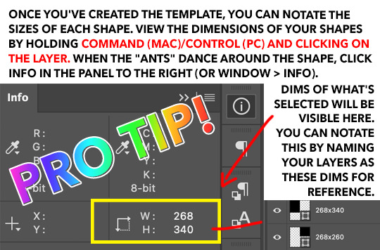
I started at the top of the canvas in the left corner and decided my first gif was gonna be 268 x 340. Why these dimensions? 268 is tumblr’s standard width for (2) side-by-side gifs and I want the gutter alignment at the top of this canvas to be centered. The height of the block just felt right. As you drag the tool, photoshop will tell you what the dimensions are.
Now I have this:

Our second shape will also have a width of 268px to ensure the transparent space between them is perfectly centered. My second block ended up being 268 x 260.
Make sure there is a gutter of 4px between all of the squares you create. This is important because tumblr’s standard gutter size between gifs is 4px, and this means you need to subtract 4px from your squares on all sides that face each other.
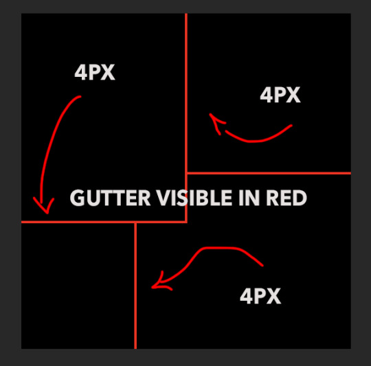
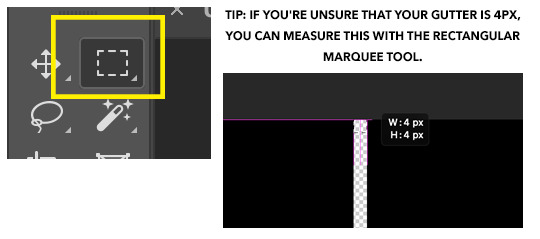
The easiest method to make and align the squares without spending too much time on it is to click off the canvas in the corner and drag the shape inward. Then click on the shape you’ve just created and align it with its designated 90 degree corner of the canvas first. [Edit > free transform] the sides until they align correctly by holding shift + control while dragging. Zoom in to a microscopic level to make sure the gutter is right if you have to 📐🔬🔎👀
If you’re not using weird shapes in your template, do the same thing with all the blocks until you get your desired outcome.
Otherwise, you’ll have to deal with this:
(STEP 2.1): THE ANGLE

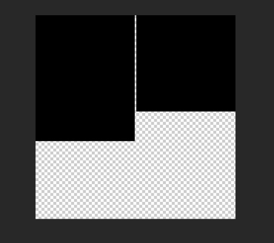
In order to create a template like this, you will need to delete the corner of your shape. Create your rectangle like normal as you did with the others, but this one is going to overlay the layer on the top left.
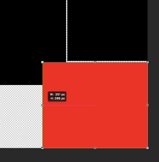
To make sure everything will be even, I used the rectangle tool again to measure and with a new square (in yellow for visibility), I determined that this corner overlay is 75x75, so I fixed the alignment of the red rectangle to make it even.
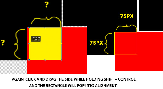
(STEP 2.2): DELETING THE CORNER OUT OF THE SHAPE
Using the yellow square as your new guide, extend its edges to cover the gutter on the two sides while maintaining its 1x1 proportion.
Keyboard command + click on your yellow square layer and once the “ants” dance around the square, hide the layer so it’s invisible on the canvas.
Right click on the red rectangle layer and select “rasterize” from the drop down menu, then you can hit “delete” or “backspace” on your keyboard which will remove the selected portion only to reveal the gutter. command + D will make the 🐜s go away. Then the yellow square layer can be deleted.
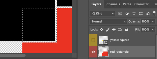
Once this is complete, you can finish up your template by adding your small rectangle in the left bottom corner in the space that remains and VOILA! You have a template!
3. REPLACING THE SHAPES WITH GIFS USING LAYER MASKS ETC
When you make your gifs, remember that they will need to be in timeline form in order to drag them onto the template. You can resize them to match the dimensions of the shapes, or you could just drag your gif—whatever be the size—directly onto the canvas, and “free transform” them to fit inside each space.
Create a group for each shape and create a layer mask for each group, containing it’s designated shape. I’ve colorized this visual to make it make sense.
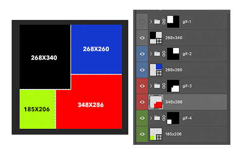
Now you can finally drag your gifs onto the template. The coloring can be added before or after, it doesn’t matter as long as you place your gifs and the colorings inside the groups with the layer masks to contain the effects of the color adjustments.
And the best thing about putting gifs in a template in timeline is you can move the groups containing the gifs from left to right to get your desired part of the clip.
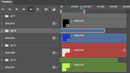
Once you’re finished with this, hide the original shape layers, as they were just guides and we no longer need them, but also if you don’t do this, you may be able to see them on the sides rather than transparency once you upload to tumblr. And AT LAST you can convert everything into frames as you normally would and save.
It seems like a lot, but these are very satisfying to make. Feel free to drop me another ask if you have any questions regarding some detail I might have left out.
#gif tutorial#tutorials*#resources*#templates#template tutorial#pshelp#completeresources#quirkyresources#answered#idk who to tag in tutorials tbh
70 notes
·
View notes
Text
@czigonas wanted to see me answer those artist questions and I did them all so it’ll be under the cut
1. Art programs you have but don’t use?
As of rn I cannot draw on my laptop/tablet so technically paint tool SAI and photoshop(idk what version). But I guess I hadn’t used photoshop for /years/ back before my drawing hiatus. Sorry but SAI is so much nicer to look at and to use, for me personally.
2. Is it easier to draw someone facing left,right, or forward?
I flip flop my canvas a ton to a) look at it for wonkiness and b) to get specific lines in a direction that feels good, but the actual act of drawing I typically like to have them looking left cause most the the lines flow from top right to bottom left which is nicer to do since I use my right hand to draw even tho I am ambidextrous.
3. What ideas come from when you were little?
This question confuses me on what it’s actually asking soooo? When I was like 12 I had to write a story for school so I did a story about a plane crash in which the survivor came face to face to a rat/bat/cat/dog creature thing? I’ve always wanted to redraw the creature, idk if I have the original drawing I did and I don’t feel up to digging to see if I kept it during all my moves.
4. Fave character/subject that’s a bitch to draw?
My favorite animal color patterns aka brindle, merle ,roan, spots/stripes. So time consuming. In terms of shape, human faces for sure.
5. Estimate of how much of your art you post online vs. the art you keep for yourself?
Before hiatus, probably 90% /shared/. Currently, probably 75% /posted/cause I can’t post the porn to tumblr lmaoooo but I have shared them with like half a dozen friends.
6. Anything that might inspire you subconsciously?
I’m sure there’s a ton but if it’s subconsciously then how would I consciously know?🤔 ok serious answer, probably every single 2D animated movie or show I’ve ever seen, and all the various artists I follow. I mean, there’s parts of my style I can pinpoint you to what it’s inspired by.
7. A medium of art you don’t work in but appreciate?
I’ve never /seriously/ tried oil paint, acrylic paint, or pastels but that shit always looks so good. Also watercolor even though i have tried and enjoyed using watercolors but I am far far faaarrr from being proficient in them. Non drawing wise, I fucking love dioramas, especially those that are then filled in(?) with acrylic(?). I watch a lot of those videos on YouTube.
8. What’s an old project idea you’ve lost interest in?
Most of my old animal ocs I had in the same universe in my mind and had a comic planned that I never got around to. I still love and wanna revisit those ocs. But also my dragon age ocs who I’ve SERIOUSLY BEEN CONSIDERING drawing in @soaps-hoe-141 universe 👀
9. What are your file name conventions?
Before hiatus/ on my laptop, subject or character and whatever was happening in the pic. Now using procreate on my iPad? I don’t think I’ve named a single one lol.
10. Favorite piece of clothing to draw?
Nothing, no clothes, nude, nakedness please and thank you. lol but I guess I do sorta enjoy figuring out clothing in general, folds and shit, getting that practice in. Like how it hangs and creases in poses since I’m not used to drawing it.
11. Do you listen to anything while drawing?
I don’t usually listen to /only/ music while drawing, I much prefer having a favorite movie playing in the background and/or a show I enjoy rewatching/am actively watching. I also watch a lot of gamer YouTubers I put on as background noise/short watch breaks that their voice is just soothing to me even if I’m not /watching/.
12. Easiest part of the body to draw?
I’m not sure… maybe boobs/pecs for humanoids. General body shape for animals?
13. A creator you admire but whose work isn’t your thing?
Honestly can’t think of a single one. I mean, plenty of artists do work(or with a medium) that I can’t or don’t want to do/use personally but I read the question of “isn’t your thing” as “subject you don’t enjoy”. If that’s correct, then idk what to tell you. I don’t follow or remember people who majority does things I can’t enjoy on some level.
14. Any fave motifs?
Quite a lot of religious imagery I guess ex. Circles around a persons head. Less serious answer is drawing characters in meme formats lol
15. Where do you draw?
Please don’t tell any physical therapists I live like this… on my back on my couch with my head on the arm rest while holding my iPad propped up on my chest like 8 inches away from my face lmao
16. Something you are good at but don’t really have fun doing?
Idk???? I do shit for my own enjoyment so I’m not sure? Maybe perhaps backgrounds? Like I could do something decent if i wanted to but I’m not into it so I usually just don’t?
17. Do you eat or drink while drawing?
I take breaks… but while actively drawing? I often drink aka let the horny demons out while I enjoy whiskey lol.
18. An estimate of how much art supplies you’ve broken?
Broken broken? Next to fucking none? some charcoal sticks but otherwise…. None… I majority do digital art so really nothing to break there lol
19. Fave inanimate objects to draw?
Idk? I like doing life charcoal drawings? Of whatever, but particularly statues if that counts? I usually have living beings as my subjects.
20. Something everyone else finds hard to draw but you enjoy?
Ok, I hate this question, cause we are all good at different things. Maybe it’s just most of those I follow have different strengths than me???? But I guess if I had to pick, recreating from life(or picture) is a lot easier for me than some others(like making it life like/very accurate).
21. Art styles nothing like your own but you like anyways?
Yooo, anything I’ve reblogged honestly. Love everyone.
22. What physical exercises do you do before drawing?
Absolutely none, again don’t let the pros know cause damn. But I will do stretches or take breaks as needed.
23. Do you use different layer modes?
Absolutely. Mostly for lighting and shading but yes, if I’m doing digital imma take advantage of it.
24. Do your references include stock images?
Yes? I don’t really understand what it’s asking?
25. Something your art has been compared to that you were not inspired by?
Idk? I don’t usually get feedback of that sort.
26. What’s a piece that’s viewed a wildly different interpretation from what you intended?
Again idk? I guess my shit is straight forward?
27. Do you warm up before getting to the good stuff?
Almost never, again don’t let the pros know lol I do sometimes jump between pieces or start a new sketch before going to something farther along.
28. Any art events you have participated in, like zines?
Nope, wanted to and have tried before but I tend to NOT do something if I feel pressured to do it.
29. Media you love but doesn’t inspire you artistically?
Again I feel like this is a weird question or maybe it’s just my understanding of it but I can feel inspiration from all sort of artist shit even if it’s something I’ll never do(ex making a crochet animal or dioramas). I guess I can feel inspired to create from other creators even if it’s not direct inspiration/subject/medium.
30. What piece of yours do you think is underrated?
Underrated as in no one has seen aside from a few people irl would be my colored pencil pieces I did during afternoon naps when I worked at a daycare a few years ago.
5 notes
·
View notes
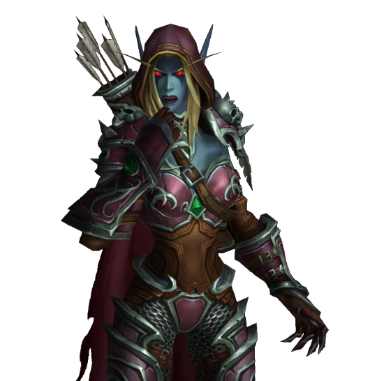
Note
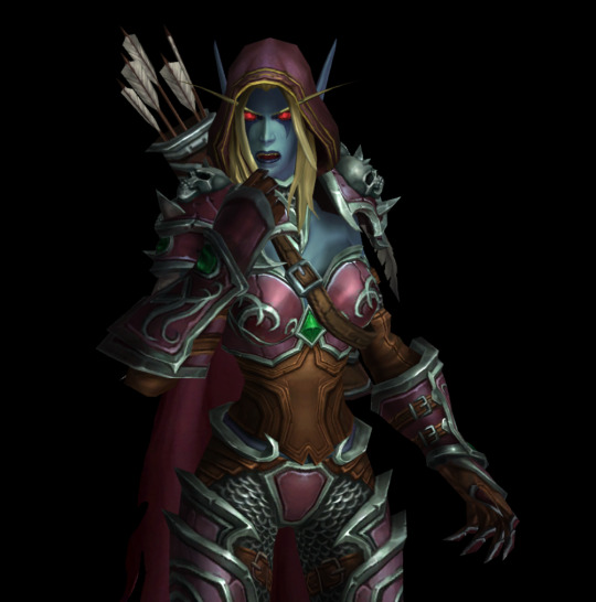
how do you make the background on the characters transparent? i'm trying to make a banner for my blog but i've never worked with WoW screenshots before.
I am not sure how familiar you are with editing software, so this tutorial is going to be detailed.
Step 1:
You need a simple screenshot of your character. Here are some ways you can get it:
a) in-game screenshot
b) Wowhead Dressing Room screenshot
c) Wow Model Viewer
d) WoW Tools
e) far stretch, but if you want to mess around with mogs, Epsilon Private Server is fantastic for that (they also support the Narcissus addon)
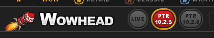
I prefer Wowhead's Dressing Room, so that's what I'll use. Recommendation: If you use Wowhead, use the PTR version of the page (right now it's 10.2.5) to remove Wowhead's watermarks in the background.
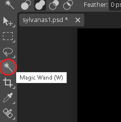
Step 2:
Take the screenshot of your character (Print Screen on Windows keyboard) + paste it to Paint.
Now you have your very own Screenshot with a background.
Step 3:
To remove the background, you will need an app that can do that for you. The two options I can personally recommend are:
a) Photoshop
b) Photopea (basically free in-browser photoshop) (link)
I will use Photopea for this tutorial.
Step 4:
Once you upload your screenshot to Photopea, you will need to select the character with the Magic Wand tool.
Everything you select will be outlined with a scissor line.
Step 5:
There will be some areas where the tool might 'overselect' and get bits of the background. There might also be areas which the tool will not select. To fix that, use the Lasso tool (red circle).
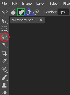
If there are any areas that are on the character, that the Magic Wand did not get, draw over them with the Unite option (green square). If there are bits of the background, exclude them with the Subtract option (blue triangle).
If you need to zoom in or out, hold Alt and use your scrolling wheel. It will make some smaller areas easier to see and select/deselect.
This is the most important step, so be meticulous.
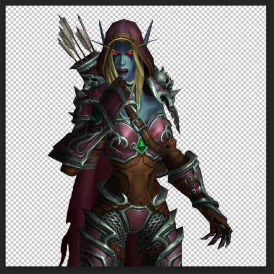
Step 6:
After you mess around with the Magic Wand and Lasso tools, you will have something like this.
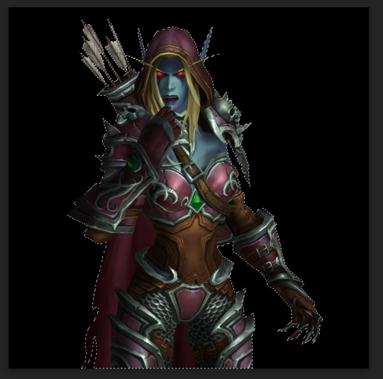
Now you need to remove the background completely. On the right side of the screen, there is the Add Raster Mask option. Click on it.
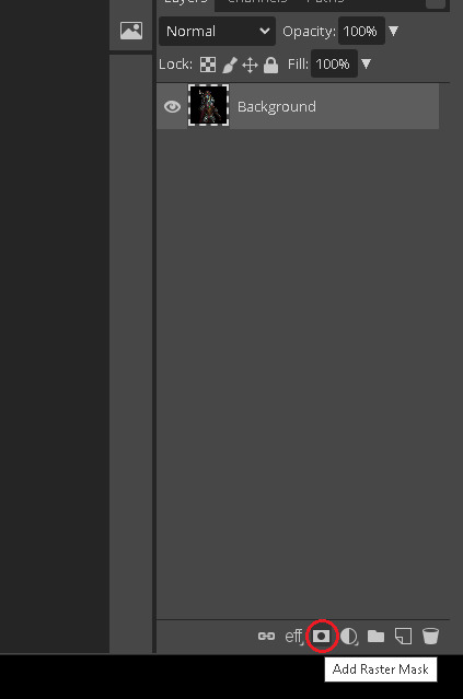
Voila!
Your character is separated from its background!
Step 7:
To save it, you will need to export it. Here's a quick how-to:
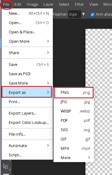
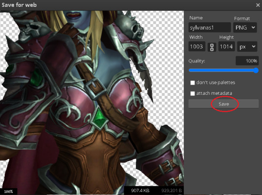
Press on File in the top left corner. Then Export as. Then save it as a PNG (make sure it's a .PNG as .JPG / .JPEG do not support transparency).
After that, you will be prompted again. Just click Save.
Step 8:
And here's your character, completely divorced from the background! Now you can use an editing app to put her in any background your heart desires. If you don't have any software of that sort, there are also plenty of websites that you can use.
Some that I know of:
a) Pixlr (link)
b) Canva (link)
c) BeFunky (link)
d) Picsart (link)
I often use BeFunky because it's easy to get the hang of, minimalistic and convenient to use!
At this point, only your creativity is the limit.
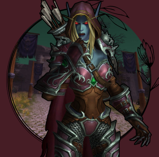
This is by far not the only way to do it (and not the fastest), but it's the simplest one that I could come up with.
It might seem a bit tedious, but I find it quite relaxing :3
Good luck, anon!
3 notes
·
View notes
Note
do u have any advice for making gfx? i really like yours and your concepts are always so creative
ahh, thank you so much, you have no idea how much this means to me 🥹 i'm really hard on myself about my gfx. but i absolutely love making them, and i'd love to share some advice with you!
i'm not sure if you already make gfx or not, so i'll include some things about getting started along with general advice / stuff geared to someone who already has some experience so that hopefully, wherever you are in your journey, something here might be helpful. i hope i'm not just giving you info you already know JBDJB 😭 so feel free to come back and let me know if you need something different ... if you have specific questions about a particular set or anything else like that, i always welcome that too! this got long, so i'll put it below the cut.
1. getting started
- i'll write this point assuming you've never made a gfx before, so if you have, feel free to skip it! the only program i use is photoshop for gfx. and the main thing with these that i didn't know at first is that you can (and should) use a bigger canvas than what you would for gifs ! my typical size for a gfx panel is somewhere around 1080x1200 px. if you are placing gifs anywhere in them, you will likely have to resize down to meet tumblr file size limits.
- some things that you should know how to do in ps: creating a clipping mask, rasterizing/resizing, smart filters, eyedropper tool, and different blending techniques such as overlays. if any of these things sound like 'omg what???' (they did to me as a beginner) let me know and i'm happy to explain more!
- for total beginners, my biggest recommendation is to start by using templates. this helps you get a feel for what layers go into a gfx in the styles that you like, and makes it easier to start making some cool things and boost your confidence before you feel comfortable starting entirely from scratch and developing your own style. you can search 'psd template' here on tumblr, or on deviantart (i'll talk more about sites i use to find things below). just make sure you read each creator's own rules before you use something. i also make templates! you can find them here. i don't require credit and you can edit mine basically however you want, aside from combining them with other templates.
2. finding inspiration
aside from things i see right here on tumblr, source material that just really speaks to me, or ideas that pop into my head while i'm driving (seriously ... almost all my gfx ideas come to me while i'm in my car or out taking a walk 😂), my favorite places to look for inspo are behance and deviantart (both of which are also great for finding elements you can use for free!).
usually i have at least a baseline idea before i go into any gfx, so i know what to search for to find some design ideas -- for example, 'yearbook design,' 'retro advertisement,' 'lyric poster,' 'zine,' 'y2k,' 'film photo story,' etc are all things i've searched before. if i have used a source for inspiration, it will always be linked in my caption, so definitely take a look if there are any in particular that you love to see that inspo source! (as a general note, you should always link back to your own inspiration sources, it's just the right thing to do)
3. my process (from idea into photoshop)
once i have an idea and i've gathered some inspiration, i usually sketch out my basic layout idea into a notebook. with gfx, composition is something you need to keep in mind within each individual panel as well as the set as a whole. i think about what i want the main focus to be and what basic elements i want in each panel. then i will start gathering my resources and start getting things in photoshop! often, i don't really know what it's going to look like until i start putting it together. that's kind of half the fun though.
throughout making most of my gfx, i consult at least one friend on layout, colors, etc especially if i'm not liking something or i'm just stuck and don't know what would make it better. i HIGHLY recommend getting feedback and utilizing other sets of eyes to get your best quality work. i know there are some things i just can't possibly think of on my own, especially when i've been thinking about and looking at something for way too long. once my panels are finished i export them as a png and arrange them on tumblr to see the whole thing together before i post!
4. finding elements i.e. fonts, textures, pngs, etc
again, behance and deviantart are great places for this! on behance, it's best to search 'freebie' with what you're looking for because otherwise all the options may be stuff you have to pay for. but they have SO many textures, pngs, fonts, any resource you can think of.
with deviantart, be mindful of people who just compile texture/png packs from other sources/artists, because that's basically impossible to properly credit (and you really should do your best to do that). but DA is a great source for things like brushes and hand-drawn elements, and templates too! again, just be sure to read all of op's rules before using their resources.
-places to find fonts: behance, fontspace, dafont, and ofc google!
-places to find free pngs/icons (i use these for all of my social media templates and more): flaticon
-photos you can use for free are available on unsplash
-mockups you can use for free are available on behance, unblast, and pixel surplus
5. other important bits
- as i've mentioned a few times throughout CREDIT is so important when you are using other people's resources, and using anyone else's work as your inspiration. i always credit when required and often credit even when not required, and just in general always try to mention where i find all my resources especially for sets that i've used a lot of different things for. of course, we can only do our best with this, and i've definitely made mistakes or just lost where i found something in the process of making things, so just have good intentions and try to do what you can to ensure you're giving credit where it's due - it also helps other people find things that they can use for their own work!
- don't be afraid to experiment and try things out, i think really what i love so much about gfx is that there are literally infinite possibilities, styles, and ways to improve. keep an open mind and know that nothing is out of your range if you can find the right resources.
happy creating, and please know i'm available to talk about anything you have questions on, or if you want to utilize me for feedback !! <3
#wah i hope this is helpful at all 😭 again if you have anything i can speak to more specifically i'm more than happy to#this comes at a good time bc i've been really beating myself up over some gfx i've been working on#so i'm really glad that you like mine and i'd really love to help in any way i can ~!#when i first got started making gifs i NEVER thought i'd be a gfx maker and then i was like i'll never NOT need a template#but now i make everything on my own and even make my own templates! so honestly just keep at it is my biggest advice#i have so much to improve on still but the journey is super fun and rewarding#alright i've written enough here i think JBDGJHB#erimail#mail from: anonymous friend!#.resource tag#gfx help
25 notes
·
View notes
Note
hi! i love the netflix previews and sc replicas you did for NEUD. i was wondering if there was any specific site or software you used, or if you just did them manually? i have to do something similar for an assignment for an assignment and yours just look so good 😅
Thank you!!! They're really fun to make!
So my answer is not a very good answer. I made them all without spending any money, so there was a lot of work arounds.
I basically found images of Netflix homepages and screenshots templates on Google and used my computer's default gallery editing to crop out the major parts. I saved each component as separate .png files. So, I ended up with a .png file of the back button, the progress bar along the bottom, the trending shows on the preview screen, etc.
These were some of the little parts I carved out of a whole screenshot (you're more than welcome to just download these straight from this post if you want to follow me deranged method).


I used Canva after that. I uploaded pictures for the "show" mostly from unsplash and just kind of cobbled everything together. Canva also had a few good photos for free, but I usually turned to unsplash.
I couldn't make the .png files transparent (I probably could have in gimp) and they had big black backgrounds boxing them in. I worked around this by using darker images as the still from the shows.
You can see in this one from NEUD when I included the back arrow, there's still a black background to it if you look closely. The progress bar at the bottom is also supposed to be transparent, but I figured that no one would really notice it was wrong.
But in this one I did for another project, Angel, I used darker images to hide the black backgrounds.

From there, it's just a lot of messing around with text and finding the right font/style and blacking out the parts of the original screenshots you don't want (I had to lay black rectangles over the original episode titles in the progress bars so that I could lay down my own text)
For the preview screens, it was way more frustrating and time consuming. All of the buttons on the previews were manually put in. The side bar and trending bar were manually put in.
I know that people make templates to do this a lot easier/better in Photoshop. But I don't have access to Photoshop, and I didn't really care so much that I wanted to go through the hassle of buying/installed/learning PS.
It does take me a very long time to do it this way and there are a lot of limitations, but I'm wayy more comfortable using Canva than other softwares like gimp. My background in graphic design is more of "making posters for school events."
3 notes
·
View notes
Photo

@buckypascal requested a tutorial on how I blend gifs, so here’s a basic overview of my process in case anyone else is interested!
This tutorial assumes at least a basic knowledge of gifmaking (how to crop, sharpen, and color gifs) and also assumes that you are working in photoshop.
Tutorial under the cut!
Step 1: Make Both Gifs
First you have to make your two gifs. This seems obvious of course, but there are a few things you should know before you start:
1. Both gifs need to be cropped to the same dimensions
2. Both gifs need to have the same amount of frames
For this gif, I’m using the dimensions 540px x 375px and the gifs have 60 frames each, however you can use whatever dimensions and frame amount you like. Keep in mind that the standard width for gifs on Tumblr is 540px and that 10mb is the size limit, so making a gif with a ton of frames might put you over that limit (I try to keep my gifs under 80 frames to prevent this).
Step 2: Move Both Gifs to the Same Canvas
Now that you have both of your gifs made, it’s time to start blending them. To do this, group all your gif’s layers by selecting them all, right clicking, and then clicking on “group from layers.” Name the group whatever name will be helpful for you to tell them apart, then click “ok.”


Do this again for your second gif.
Next, go to File -> new and make a new document. Make sure this new document has the same dimensions as your gifs (again, in this case that is 540 x 375 px).
Go back to your first gif and select the group. Copy that group, then go back to your new document and paste it. Your gif should now show up in this document exactly as it did in the old one. Do this again for your second gif.

They are now on the same canvas, but as you can see, only one gif is visible.
Step 3: Adjust Blending Mode
In order to blend the gifs together, we need to adjust the blending mode of the top gif. It’s up to you which gif you want to be in the top layer, if you’re unsure I recommend just playing around with it a bit and seeing what looks best to you. To start blending, adjust the blending mode of the top gif to “screen.” Sometimes screen mode doesn’t look right or it doesn’t match the look you’re going for, but it’s always a good place to start. If you aren’t satisfied with screen mode, play around with the other modes available and see if one works better. After changing my top gif’s blending mode to screen, my gif looks like this:

The gifs are blended now, but they’re not quite the way I want them yet. So I’m going to go to Edit -> Free Transform (or ctrl + T on Windows) and adjust the size/position of the top gif how I want it. Now my gif looks like this:

Step 4: Layer Mask
Now we need to clean up the top gif so it doesn’t obscure the bottom gif. To do this, we’ll add a layer mask to the top gif. You can add a layer mask by clicking the little box with a circle inside of it in the bottom right of the layers panel.

The layer mask will allow us to hide the parts of the top gif that we don’t want to be seen. Once you’ve added your layer mask, you’ll see a tiny white box appear beside your group’s name. Select that box, then go to the brush tool.


The layer mask responds to only grayscale shades. The darker the shade you have your brush set to, the more opaque your mask will be (in other words, the more you’ll hide your top gif). I want my mask to be the most opaque, so I’ll set my brush to black. Also, the larger the size of your brush, the softer your mask will be. I want a very soft mask, so my brush is set to 330.
To create your layer mask/hide parts of the top gif, simply draw over the parts you want hidden with the brush tool. A layer mask in progress should look something like this:

As you can see, this successfully hides the bottom gif. Continue to draw your layer mask until you’re satisfied with the result. This might require you to change your brush size or your brush shade depending on the look you’re going for. This is how my gif looks now, once I’m finished with my layer mask:

And that’s it! Hopefully I explained everything well (if not, feel free to send me an ask to clarify something). Blending is one of those things that seems daunting at first, but once you give it a try it’s really not so bad. Like everything, it will get easier with practice and the best way to improve is to just keep working at it. Good luck!
#rambling#mytutorials#usersole#userannalise#uservalentina#useralison#tuserdi#userstar#tuserheidi#userrclary#larlies#userkosmos#usermarcy#tuserecho#useryoshi#usercardigan#tuserjayla#userrlucie#usernanda#usernorah#this is my first tutorial so i hope everything makes sense
464 notes
·
View notes
Photo

Some of my lovely friends asked to show how I do my blending, so here is a very long tutorial! I will explain how to:
Blend GIFs with lots of movement
Blend three or more GIFs on one canvas
You will need:
Any version of Photoshop with a timeline
Basic-intermediate knowledge of GIF making (including cropping, how to use adjustment layers for color correction, applying layer masks, and placing multiple GIFs on one canvas)
Since the way I blend depends on the footage I'm able to work with, I often end up going in a different direction than I first planned. So this isn't a strict step-by-step guide that can be applied to everything you make. These are just some tips!
Read the rest under the cut.
TERMINOLOGY:
(Pretty sure you already know this but I will be repeating these a lot here, so just in case!)
Highlights & Shadows - The highlights are the brightest parts of the image. The shadows are the darkest parts. Remember that just because it's bright doesn't mean it's actually white, and just because it's dark doesn't mean it's actually black!
Negative Space - This refers to empty space around your subject. When there's negative space, it's easier to spot the focal point of the image.
BLENDING GIFS WITH LOTS OF MOVEMENT
Number of GIFs: 2
Main GIF: Closeup of Sam (“big!Sam”)
Secondary GIF: Sam flying (“flying!Sam”)
STEP 1: Find the right scenes
Since the subject of the secondary GIF is much smaller and basically cuts across the frame, it’s important (but not always essential!) that the main GIF has less movement and a decent amount of negative space.
STEP 2: Make your individual GIFs
Make your GIFs like how you usually do (Important: Remember that your GIFs need to have the same number of frames). When it’s time to crop, it’s best to have the two files opened in Photoshop at the same time so you can compare them against each other. It’s absolutely fine for them to overlap because that’s the whole point! The secondary GIF has Sam flying in from the top left to the bottom right, so I cropped the main GIF with him off-center so there would be space to see flying!Sam.
Now we have these two GIFs:

STEP 3: Combine your GIFs
Place the secondary GIF over the main one and adjust the blend mode. Setting the blend mode to Screen usually works, but in this case, this is how it looks:
As you can see, the highlights in the main GIF are obscuring flying!Sam in the first frames. You can only see him clearly when he’s flying over big!Sam’s face. This is because the shadows on the top GIF will lighten and/or disappear against the highlights of the bottom GIF when set to Screen. It would be too complicated to fix this with a brush (which we will get to later) because of the movement in the secondary GIF, so instead I set the blending mode to Multiply, which is the opposite of Screen. Now here is the GIF:
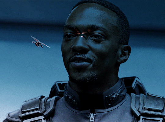
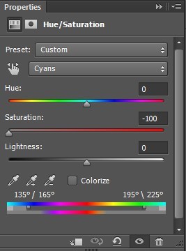
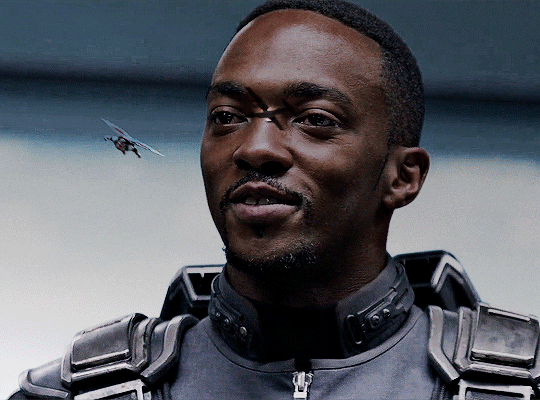
We can now see flying!Sam. But the blue of the sky is now a pseudo-filter over big!Sam’s face up until the last frames. So I applied a Hue/Saturation adjustment layer over the secondary GIF to remove those colors. The sky in the GIF is made up of cyans and blues, so I dragged those sliders down to -100. Here is how it looks now:
STEP 4: Erase the bits you don’t want
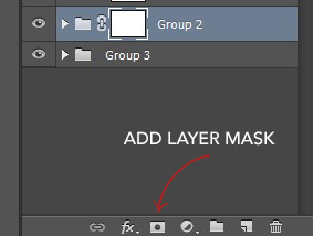
So that big!Sam’s face isn’t covered by flying!Sam’s wings and that pesky airplane up top, we have to use a brush to erase those parts. In the Layers panel, make sure your GIF layers (in this case, groups/folders) are selected and click the Add Layer Mask button. A little rectangle next to the layer/group name will show up like so:
Then in the Tools panel, click the Brush tool, pick a soft brush and set the size to around 180-210px. The larger the brush, the softer the look. I learned this from Becca (@inejz-ghafa) who made an amazing tutorial a while back (will link it in the source at the bottom)! Adjust the brush size if you have to.
Now click on the little rectangle layer mask of the group you want to erase (in this case, the secondary GIF). When you do this, the Foreground and Background Colors buttons in the Tools panel will revert to the default black and white.

Painting with black will erase and painting with white will undo the erasure. So I erased the airplane and the bits of the wings covering his face. I didn’t erase the parts that overlap with his uniform, just to keep the effect of flying!Sam zooming across the GIF. And here is our finished product:
BLENDING THREE OR MORE GIFS ON ONE CANVAS
We will be working with these two GIFs since they use different techniques:

STEP 1: Compose your image
Find the scenes you want to put in your GIF and choose which of those is the most important. Once you've decided on that, you can build the rest of the elements around it.
Sam's GIF: Multiple Exposure Effect
Number of GIFs: 3
Main GIF: Bloodied shield
Secondary GIF: Closeup of Sam
Tertiary GIF: Bucky with the shield
STEP 2: Make your individual GIFs
Since the shield is the most important part, I made it the largest GIF and cropped it close to emphasize the star and the blood. I made Sam's GIF the same size, but cropped it with his face off-center so that the star wouldn't completely cover his face. Again, it's totally fine for the images to overlap! The tertiary GIF is the least important so I cropped it smaller. To determine the size of that GIF compared to the shield, I made the Rulers visible (View > Rulers; or Ctrl+R) then clicked the top ruler and dragged down to create a guide to where I wanted the smaller GIF to end. Then I measured from the bottom of the GIF up to the guide to determine the height of the smaller GIF. (Tip: It's better to make the tertiary GIF too large than too small. That way, you have more to work with. So size it larger than it will appear on the final GIF.)
This is only a stylistic choice for this particular set, but I removed the blue from the shield and set the tertiary GIF to black and white, so that the only notable colors in the GIF are red, black and white. Varying up the coloring of each GIF (i.e. color vs. monochrome) adds some spice to the image, so play around with these different styles if you like!
Here are our three GIFs:
STEP 3: Combine your GIFs
At first, I made the main GIF of the shield the bottom GIF. Then I placed the secondary GIF over it and set the blend mode to Screen, but found that it lacked depth. So I switched them and made the Sam GIF the bottom GIF (blend mode: Pass Through) and placed the shield GIF (blend mode: Screen) over it. And this is what I got:

Notice how the window behind Sam on the left side is distracting? It also partially obscures the star. So I went back to Sam’s GIF, created a New Layer and painted over the window with a black brush. Now here is our GIF:
This is just my personal preference, but I wanted the area around the star to be a solid black rather than gray, so this time I created a New Layer over the shield GIF and applied a layer of black with the Paint Bucket tool, setting the blend mode to Soft Light. Now we’re done with the main and secondary GIFs:

Now let’s add the last GIF:
STEP 4: Erase the bits you don’t want
Lastly, I erased the warehouse rafters over Sam’s face and a bit of his shirt and the warehouse floor on the bottom right corner using Layer Masks and a soft brush (like in the first tutorial). And we’re done!

Bucky's GIF: Silhouette Effect
Number of GIFs: 3
Main GIF: Bucky holding the notebook
Secondary GIF: View of the sunrise from the boat
Tertiary GIF: Sam and Bucky walking away
STEP 2: Make your individual GIFs
To achieve this silhouette effect, the main GIF needs to have a clear focal point, which means it’s better to have negative space around the subject and for there to be minimal movement. In this case, the subject is made up of Bucky’s hands, notebook, and part of his shirt; and there’s some movement but we can still work with that. The other two GIFs will then be placed “inside” the subject. Because the negative space in the main GIF consists of highlights, I chose a secondary GIF which emphasized the shadows. For the smallest GIF, I used a guide like in the previous tutorial to measure its size.
We have these three GIFs:

STEP 3: Combine your GIFs
Place the secondary GIF over the main one. In my case, I didn’t measure it right so I had to nudge the top GIF a bit to the right to fit it inside the silhouette. The important thing is that the edge of the secondary GIF should not overlap with the silhouette itself, or else the illusion “breaks.”
Now let’s add the third GIF:
STEP 4: Erase the bits you don’t want
For this GIF, there’s a lot we need to erase! Using Layer Masks and a soft brush again, erase the parts of the secondary GIF that extend beyond the silhouette. It’s entirely based on personal preference if you want to keep some parts of the secondary GIF outside the silhouette (like I did here) or if you want them completely removed. And for the small GIF, erase the edges for it to blend with the secondary GIF while also staying within the silhouette of the main one.
Now here is our finished GIF:

And that’s it! If you’ve made it this far, thank you for reading. I hope this was useful! Remember, there is no definitive way to blend GIFs, so keep experimenting. And don’t be afraid to make mistakes either, because we learn a lot from those. Happy Photoshop-ing!
- Elle
#completeresources#allresources#blending tutorial#photoshop tutorial#userpavi#tusergabriela#usersae#userrex#usertk#supervalcsi#usernums#userringo#userkraina#usersmile#tuserlouise#usersof#mine#my tutorials
2K notes
·
View notes
Photo

requested by anonymous
I was asked by anon about how I did the blending in this edit. There are other ways to do this but I blend my gifs with layer masks. This method can work with any number of gifs, blending them horizontally or vertically. This tutorial assumes you already know how to gif, hence why the difficulty is easy. I’ve tried to explain it as best as I could but if you have any questions, don’t be afraid to send me an ask.
program: I’m using photoshop cc 2018 on mac but any version of photoshop with timeline should do.
difficulty: easy. previous knowledge of giffing is needed.
Instructions are under the cut with screenshots.
Feel free to like/reblog this post!
1. THE GIFS
The gifs you want to blend together need to have the same number of frames. The blending will also be smoother if the shots have similar colours in the background but it’s not essential. You don’t actually need to save each gif individually - you just need the working psd file not the actual .gif file. If your gifs are in video timeline, don’t change them back to frames. I have a giffing tutorial here if you’re interested.
For horizontal blending - crop your gifs slightly taller than half the final desired height so there is room for the blending to actually happen.
For vertical blending - crop your gifs at the desired size.
You can always resize the gifs later. I cropped these at 540px by 300px. Once your gifs have been coloured, group them all, colouring layers and the gif layers themselves into one group.

2. THE FINAL PANEL DIMENSIONS (for horizontal blending)
Next either create a new file or change the dimensions of the canvas of one of the files to your final desired dimensions. You only need to do this for horizontal blending. For this one, I changed the dimension of the top gif to 540px by 540px making sure to anchor it at the top. Make sure the timeline sliders end at the same place for both gifs.


3. PUTTING THEM TOGETHER
Duplicate the second gif over to the first - the whole folder. You can close the other file now if you want.

Next the gif needs to be moved into place. Make sure you are moving the entire group. I usually have the top gif on top. Don’t worry about the colouring being weird for the other section.

For vertical blending - move one group to the left and the other to the right or whatever is required to have them side by side.
You may need to add a bottom background fill at the same colour as the most prominent one in the background but this is not always needed.
4. THE LAYER MASKS
This is where the actual blending happens. Click on the top group then click on this button on the bottom.

Your group should go from this

to this

Next, making sure you are still selecting the layer mask, click on the brush. The brush colour needs to be black, size is large and at 0 softness. The larger the brush size the smoother the blending will be. I have my brush at 175px.
Now start brushing on the layer mask. Stop where you think it looks well blended.
For horizontal blending - start from the bottom of the canvas and go up.
For vertical blending - start from either side towards the centre.
The layer mask should now look like this.


As this blending was done on a layer mask, you can go back to the layer mask with the brush on either white or black, smaller or larger sizes to fix the blending until you are satisfied with it.
You can also resize the gif layers without affecting the layer mask as well as do any additional colour or elements on top.
Now you can change it back to frame mode and you’re done!

#completeresources#resourcemarket#allresources#*mine#*2021#*tutorial#it's actually really easy to blend like this with it all in a group#the original file of this had several masks on the colouring and the gifs themselves haha#I've only been grouping them all with my last few blended sets#(anyway I redid that gif in the edit with this higher quality lol that's why this is the example)
794 notes
·
View notes
Note
hiii! ^^ I'm really new to Tumblr and wanted to know how you make the dividers for your masterlist post? like the line with the symbol in the middle.
I'm not sure what programs to use or dimensions, yadda yadda.
thank you!
Hi! Before we start, I need to mention that it has been a long time since I made these and I've tried to make this as complete as possible BUT I use photoshop by clicking around until it freezes so be warned there might be some shortcuts or something I don't know about lol!
I'm using Photoshop 2020 but I have friends who use Photopea in desktop browsers and say it works just as well!! I've used it once or twice and most of the features are similar to Photoshop so hopefully you'll be able to figure it out from there.
Canvas Size: 2048 x 164
Rectangle Size: 1028.50 x 80.50
Okay, so first you want to draw your rectangle using the rectangle tool in the bottom left, as I've already done. The size of this doesn't matter, just do whatever looks right.

To make sure your rectangle is centered, You can create a background layer, shift + click both layers, click the select tool at the top left of the toolbar, then click this button at the top to center your top layer on the vertical axis. (When I create my background layer, I give it some sort of color so I can see what I'm doing and make sure the program doesn't mess something up because it's empty.)

Next, go to File > Place Embedded > and select your icon. I'm using Cat icon by Icons8. Center it on your canvas by ctrl + clicking it and your colored bg layer, then follow the steps as you did above.

Once your icon is sized the way you like it, take the eraser tool and size it until it fits around your icon. Click once behind the icon, creating a rounded edge on both ends of the rectangle.
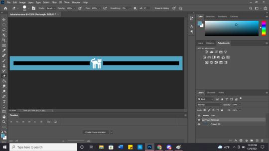
Next, chose a gradient you think fits the character, and create two layers - one above the rectangle and another above the icon. (I create one gradient and then copy that layer so I can ensure they're identical.) Finally, make those into clipping masks and you're good to go! (Both the 'duplicate' and 'make into clipping mask' options appear when you right click on a layer!)
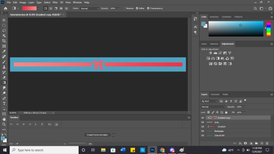
Don't forget to make your colored bg invisible and save as .png so the background it transparent!

You can also get a little fancy and play with shadows or put anything in the middle!


(gif credit: gifgenshin on twitter)
Let me know how they turn out! Good luck with your blog!
14 notes
·
View notes
Text

Put together the combat pose for the HWM, same as I've done with his idle pose!
I wanted to do the same for every class, but once again, this is not much fun. If anyone wants to give it a try, I explain under the read more how I use photoshop actions so I only need to assemble one color, and the software repeats it with the other sprites!
So if you don't know what I'm talking about, if you look for the hero's sprites in the game files you'll find them all, BUT if there's animation for them, they will actually be chopped up sorta like this:

What I'm doing is putting it together like a jigsaw puzzle. I record an action right after opening the file, so I won't have to do the same for every color. In photoshop, you can open the action's window with alt+f9 and then select that little square to create a new action! When the circle turns red, it means the action is recording, so you can start editing.

So now basically you start to select and cut each body part. I'd recommend you to take a good look at a good quality screenshot of what you're trying to assemble, so you can tell which parts go over which.

Then you start to select and cut the parts (I use that 'layer via cut' thing, but you do you). I start by the ones that go on top, leaving at last the pieces that go underneath (like the shirt with the black parts, which are clearly meant to be under the scarf and such.) I do this because it makes it easier to rearrange them later, you don't need to move the layers so much.

After separating each part, you can now start to assemble them! Make your canvas larger so you can put together the sprite away from the cloud of body parts.
Now, take that screenshot of the final pose, cut it and paste it on your file. I recommend you lowering its opacity and pasting it on a layer above all the body parts. Try your best to make its size match the sprites (you can drag the head part under it to see, it's a good indicator!) Now it's a good time to make a white background for easier viewing too. After everything is in place, make sure to lock the final pose layer and the background, you'll understand why in a bit.

So now all there is left to do is to drag the previously cut body parts and align them under the final pose! Here's a nifty trick so you won't need to comb over each layer to find the part you want: select the checkbox that says Auto Select on the Move Tool (V). Like the text says, this will make you select whatever layer you wish just by clicking on its contents (for instance, I'm on a completely different layer, but I click on the knife in my canvas and then suddenly I'm on the knife layer! Very handy.) This is why you need to lock the final pose and the background, so you don't select them accidentally while editing this out.

And that's pretty much it. Once you're done with your sprite, make sure to stop recording the action. Then open the next color and click on the play button for your recorded action, and it should repeat all the steps you just did!
I'm not sure if anyone will ever do this, but I wanted to explain it regardless! Cause assembling these sprites is a cumbersome task, but it's made easier with actions for sure. Let me know if you end up doing it for another character :) Or let me know if there is an easier way and I just wasted my time big time lol
29 notes
·
View notes
Last Seen Blogs

azndaddyyy
Asian Daddy
hiwelcometothemonstersancturary
a sanctuary for monsters🍉
jigglynjuicy
Jigglynjuicy
18+
genshinartsideblog
Genshin Art

physiquesofgreatness
Physiques of Greatness