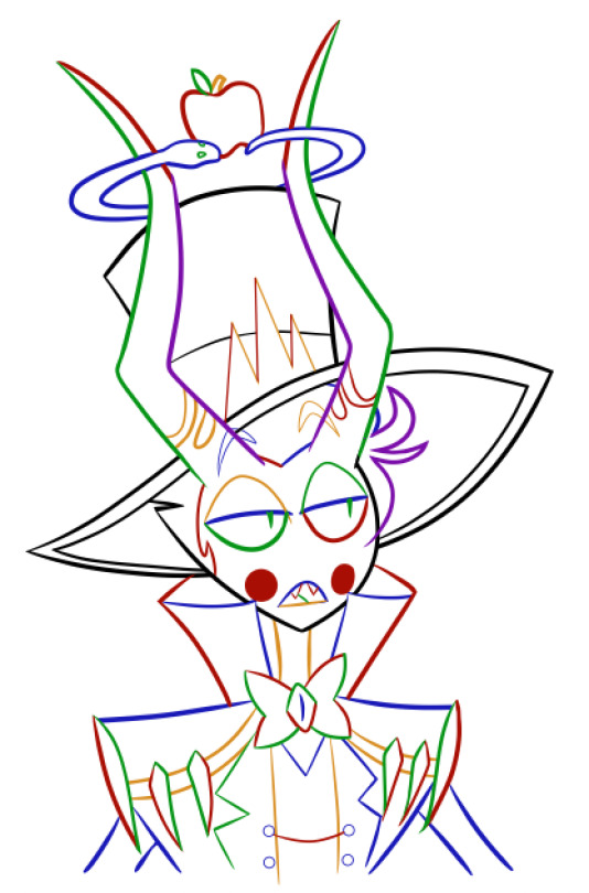
#edit: added a colored lines version-!
Text

YIPPEEE I GET TO PARTICIPATE IN THIS TREND EVEN THO ITS OLD!! :D
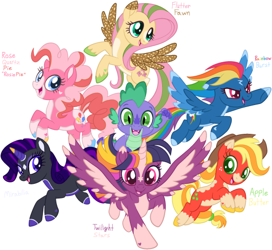
Have some redesigns (and renames) of the mane 6! I had some troubles but I had fun overall! :3
transparent coloring page rip by hvnlyrstrctn on Deviantart
#mlp#mlp fim#mlp redesign#mane 6#mane 6 redesign#twilght sparkle#rarity#fluttershy#pinkie pie#rainbow dash#applejack#apple jack#spike the dragon#click for better quality#edit: added a colored lines version-!
45 notes
·
View notes
Photo
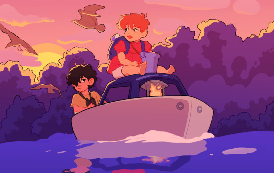
vmin + ponyo for the ghiblipop event!
[Image description: a digital drawing of Kim Taehyung and Park Jimin from BTS, drawn as Sosuke and Ponyo respectively. They ride together on a small boat, Taehyung sitting in the boat and Jimin perched on top holding a blue bucket. The sun sets behind a forest in the background. Three seagulls fly behind them. The color palette reflects a sunset, with blue water, purple trees, and a pink sky. End ID.]
#vmin#taehyung#jimin#ghiblipop#ponyo#kim taehyung#park jimin#also happy pride because the colors turned out to be the bi pride flag :D#bts#bangtan seonyondan#*loqdraws#idk i liked the lines for this a lot but idk how the color worked out tbh :(#i think im happy with it but only a little#but i still had fun!#also thinking about doing jihope howlsoph so we shall see#kpop#kpop art#bts art#my art#edit: forgot desc so i added it now! plz reblog this version!
150 notes
·
View notes
Text
My Favorite Cheap Art Trick: Gradient Maps and Blending Modes
i get questions on occasion regarding my coloring process, so i thought i would do a bit of a write up on my "secret technique." i don't think it really is that much of a secret, but i hope it can be helpful to someone. to that end:

this is one of my favorite tags ive ever gotten on my art. i think of it often. the pieces in question are all monochrome - sort of.

the left version is the final version, the right version is technically the original. in the final version, to me, the blues are pretty stark, while the greens and magentas are less so. there is some color theory thing going on here that i dont have a good cerebral understanding of and i wont pretend otherwise. i think i watched a youtube video on it once but it went in one ear and out the other. i just pick whatever colors look nicest based on whatever vibe im going for.

this one is more subtle, i think. can you tell the difference? there's nothing wrong with 100% greyscale art, but i like the depth that adding just a hint of color can bring.
i'll note that the examples i'll be using in this post all began as purely greyscale, but this is a process i use for just about every piece of art i make, including the full color ones. i'll use the recent mithrun art i made to demonstrate. additionally, i use clip studio paint, but the general concept should be transferable to other art programs.


for fun let's just start with Making The Picture. i've been thinking of making this writeup for a while and had it in mind while drawing this piece. beyond that, i didn't really have much of a plan for this outside of "mithrun looks down and hair goes woosh." i also really like all of the vertical lines in the canary uniform so i wanted to include those too but like. gone a little hog wild. that is the extent of my "concept." i do not remember why i had the thought of integrating a shattered mirror type of theme. i think i wanted to distract a bit from the awkward pose and cover it up some LOL but anyway. this lack of planning or thought will come into play later.
note 1: the textured marker brush i specifically use is the "bordered light marker" from daub. it is one of my favorite brushes in the history of forever and the daub mega brush pack is one of the best purchases ive ever made. highly recommend!!!
note 2: "what do you mean by exclusion and difference?" they are layer blending modes and not important to the overall lesson of this post but for transparency i wanted to say how i got these "effects." anyway!
with the background figured out, this is the point at which i generally merge all of my layers, duplicate said merged layer, and Then i begin experimenting with gradient maps. what are gradient maps?
the basic gist is that gradient maps replace the colors of an image based on their value.

so, with this particular gradient map, black will be replaced with that orangey red tone, white will be replaced with the seafoamy green tone, etc. this particular gradient map i'm using as an example is very bright and saturated, but the colors can be literally anything.

these two sets are the ones i use most. they can be downloaded for free here and here if you have csp. there are many gradient map sets out there. and you can make your own!
you can apply a gradient map directly onto a specific layer in csp by going to edit>tonal correction>gradient map. to apply one indirectly, you can use a correction layer through layer>new correction layer>gradient map. honestly, correction layers are probably the better way to go, because you can adjust your gradient map whenever you want after creating the layer, whereas if you directly apply a gradient map to a layer thats like. it. it's done. if you want to make changes to the applied gradient map, you have to undo it and then reapply it. i don't use correction layers because i am old and stuck in my ways, but it's good to know what your options are.

this is what a correction layer looks like. it sits on top and applies the gradient map to the layers underneath it, so you can also change the layers beneath however and whenever you want. you can adjust the gradient map by double clicking the layer. there are also correction layers for tone curves, brightness/contrast, etc. many such useful things in this program.
let's see how mithrun looks when we apply that first gradient map we looked at.

gadzooks. apologies for eyestrain. we have turned mithrun into a neon hellscape, which might work for some pieces, but not this one. we can fix that by changing the layer blending mode, aka this laundry list of words:

some of them are self explanatory, like darken and lighten, while some of them i genuinely don't understand how they are meant to work and couldn't explain them to you, even if i do use them. i'm sure someone out there has written out an explanation for each and every one of them, but i've learned primarily by clicking on them to see what they do.
for the topic of this post, the blending mode of interest is soft light. so let's take hotline miamithrun and change the layer blending mode to soft light.

here it is at 100% opacity. this is the point at which i'd like to explain why i like using textured brushes so much - it makes it very easy to get subtle color variation when i use this Secret Technique. look at the striation in the upper right background! so tasty. however, to me, these colors are still a bit "much." so let's lower the opacity.

i think thats a lot nicer to look at, personally, but i dont really like these colors together. how about we try some other ones?

i like both of these a lot more. the palettes give the piece different vibes, at which point i have to ask myself: What Are The Vibes, Actually? well, to be honest i didn't really have a great answer because again, i didn't plan this out very much at all. however. i knew in my heart that there was too much color contrast going on and it was detracting from the two other contrasts in here: the light and dark values and the sharp and soft shapes. i wanted mithrun's head to be the main focal point. for a different illustration, colors like this might work great, but this is not that hypothetical illustration, so let's bring the opacity down again.

yippee!! that's getting closer to what my heart wants. for fun, let's see what this looks like if we change the blending mode to color.

i do like how these look but in the end they do not align with my heart. oh well. fun to experiment with though! good to keep in mind for a different piece, maybe! i often change blending modes just to see what happens, and sometimes it works, sometimes it doesn't. i very much cannot stress enough that much of my artistic process is clicking buttons i only sort of understand. for fun.
i ended up choosing the gradient map on the right because i liked that it was close to the actual canary uniform colors (sorta). it's at an even lower opacity though because there was Still too much color for my dear heart.

the actual process for this looks like me setting my merged layer to soft light at around 20% opacity and then clicking every single gradient map in my collection and seeing which one Works. sometimes i will do this multiple times and have multiple soft light and/or color layers combined.
typically at this point i merge everything again and do minor contrast adjustments using tone curves, which is another tool i find very fun to play around with. then for this piece in particular i did some finishing touches and decided that the white border was distracting so i cropped it. and then it's done!!! yay!!!!!
this process is a very simple and "fast" way to add more depth and visual interest to a piece without being overbearing. well, it's fast if you aren't indecisive like me, or if you are better at planning.

let's do another comparison. personally i feel that the hint of color on the left version makes mithrun look just a bit more unwell (this is a positive thing) and it makes the contrast on his arm a lot more pleasing to look at. someone who understands color theory better than i do might have more to say on the specifics, but that's honestly all i got.

just dont look at my layers too hard. ok?
2K notes
·
View notes
Text
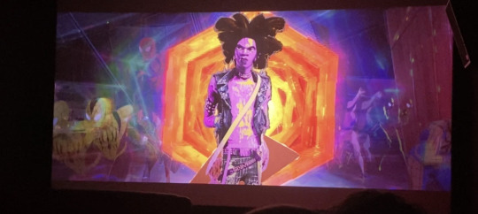
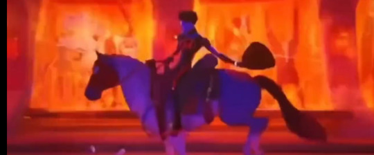
So apparently Across the Spider-Verse has MULTIPLE different versions of the movie out in theaters right now???
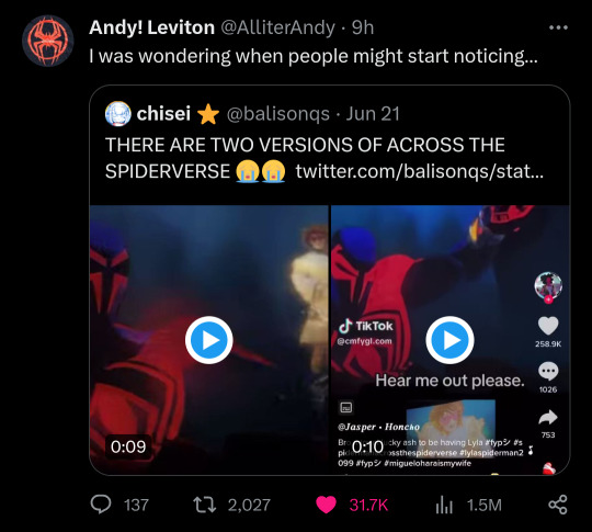
This reddit thread by Hohoho-you goes into the details but so far all the differences between the versions include
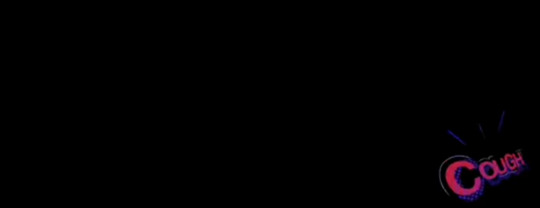
During the opening of the film one version has a "cough" text before the Sony logo appears and added comic frames during Gwen's monologue
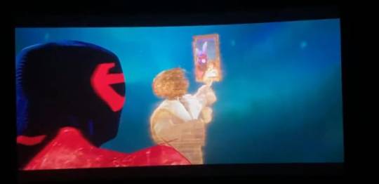
Lyla either takes a bunny selfie of Miguel or offers a fist bump after he calls for backup

When Gwen asks who Miguel is he either says "that’s classified” or “isn’t it obvious”
Miguel either says "that's funny" or "No" when Gwen calls him the blue panther
The build up from when Miguel was going to bite the Vulture is cut

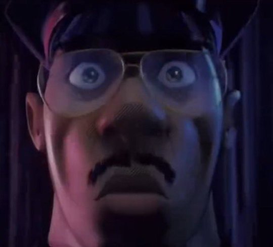
When Jefferson fell through one of Spot's spots he either groans and looks around, or has a quick frame reaction of his face
When the Spot is going to put his finger in the mini collider he either says "-which would... not be good" or "oh what the heck."
In the chai tea scene Miles either says "no! no." Or "sorry! im sorry" after getting called out by Pavitr
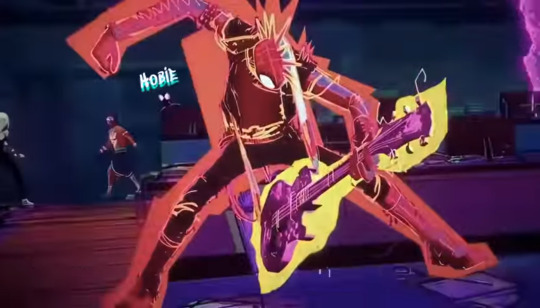
When Hobie first comes on screen and miles says "Hobie" a little text saying "Hobie" popping up above Hobie's head may or may not appear
One version has Gwen's lines when she's looking for Miles in the rubble removed
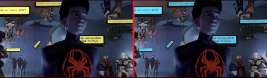
At the spider society, when Jessica asks if "anybody else got jokes" the text boxes that show up can either be yellow or blue in color
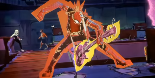
During the canon event scene Hobie has different coloring and lighting depending on the version
When Ben Reilly grabs Miles during the chase scene he either says “I’ve got you trapped in my well defined musculature so don't even-“ or “This one’s called the sleeper hold, I’m using my bicep to constrict your-"
During the chase scene Miles rides Web-Slingers horse through the villain prison and receives cheers from said villains all while the other spiders get boo’d. This scene is cut in an alternate version
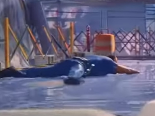
In the same chase scene when the spiders cross the tightrope they either fall or get launched in the air, with the falling scene being a slightly extended version

When Miles venom strikes Miguel the line where he says "sorry man I'm goin' home" is cut
When Peter B. Parker returns home MJ either says "Hi" or "How was work" upon his return
during the Prowler!Miles reveal one version has him with more lines and details on his face (thank you @cannibalgal for pointing this one out to me)

I've only seen the film once so far but based on other people's comments online the changes seem to be mixed and matched depending on when and where you go to see the movie
(edit: added more changes)
#also if anyone has more sc please send em so i can add onto the list#across the spiderverse#atsv#spiderverse#atsv spoilers#spiderverse spoilers#my post#atsv changes
8K notes
·
View notes
Text
Let's talk cover art!


Firstly, here is the first official look at the full jacket for my new book!
Camp Daze has had a really wandering path to publication, which I'll talk more about later, but back when I still didn't know what I wanted to do with it exactly, I got this crystal clear image of what I wanted the cover to look like. So I created that cover, just the front cover at the time, as more of a portfolio piece than anything. But even though it was meant to just be a portfolio piece, I loved it so damn much, and it stuck in my head hard. When I did finally decide to self publish the book, I knew I had to use this cover.
Usually, I go through a lot more iterations for my covers when it comes time to finally publish things, but this one has just stuck with me over the years as I tried to bring this novel out into the world. Back in 2023 some of you may remember I tested another cover featuring two of the main characters, and did some tumblr polls to see what people liked most, and the tent cover won by a LANDSLIDE each time. (That other cover, or the art from it anyway, will still be available other ways! Just not as THE cover for the book.)
I think the very stark, simplistic nature of the cover fits the themes of the book really well. It's do or die and all they've got is the resources in their camp--represented by the tent, the resources of the wilderness--represented by the mountains/forest, and the looming/hovering threat of a nuclear war that they don't actually know that much about. When it came time to create the full wraparound version of the cover, I added in a little archery target on the back cover because archery plays a major roll in their survival as well.
Colors wise, everything was built around the green tents. The tents are based off of the ones at my own childhood summer camp, and they play a big roll in how the camp manages to create better shelter for themselves. I think found a purple that worked well with the green because, well, they're in Colorado and "purple mountains majesty" and all that. Then it was just filling in other areas with colors that fit within the scheme. I kept everything a little more muted mostly because I just like more muted color schemes.
For the back cover I picked a few lines from the book that, I think, capture the overall vibe of the book which is "if we try, we MIGHT die, but if we DON'T try then we WILL die, so we may as well try."
And shoutout to @gallusrostromegalus for helping me write a new author bio while I was flailing around in the discord chat having a minor identity crisis, lol. The new bio kicks ass, even in this shortened version.
Something that is very important to me is to make sure cover artists are always credited, so I do have a credit for that under my author bio even though my cover artist is also, ya know, me. Just trying to set precedent so more people will start doing things like that.
So yeah! That's how this cover came together. I think it's one of my favorite covers I've ever done.
You can back the Kickstarter here to get your own special edition copy of this book!
302 notes
·
View notes
Text

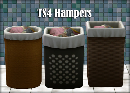
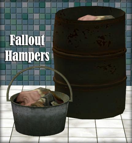
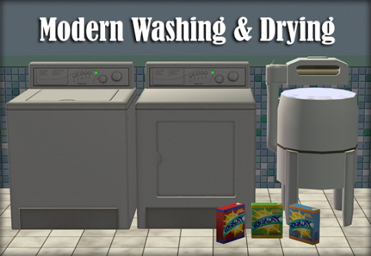
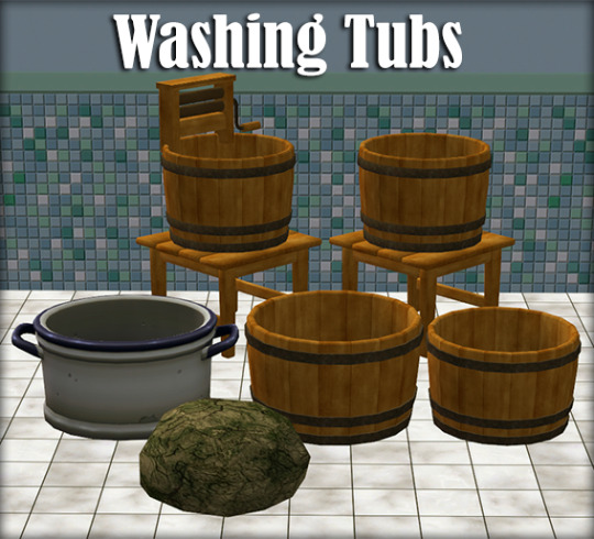
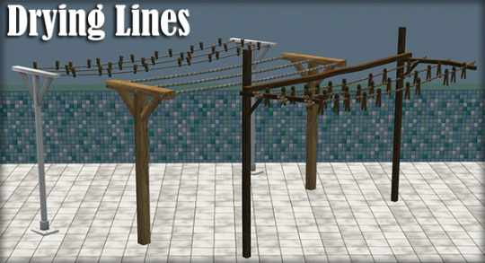
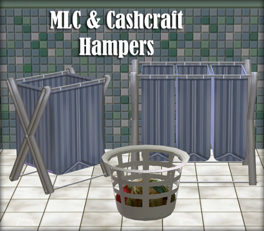
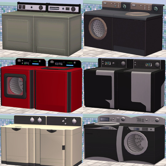
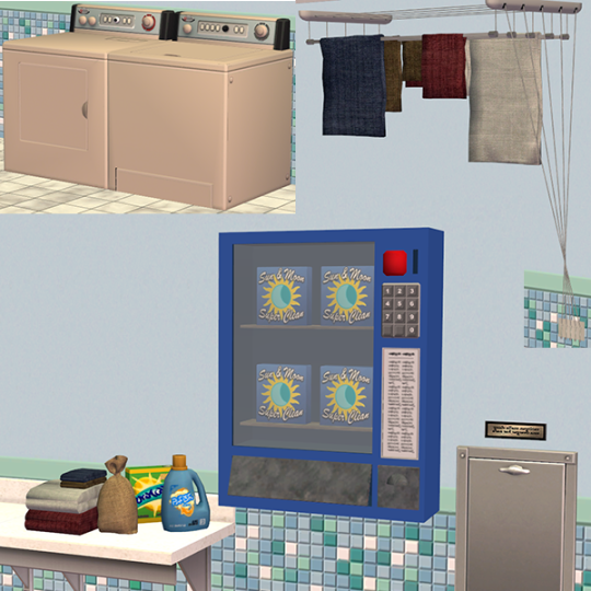
Loads o' Laundry 2.0
2 years after the release of Loads o' Laundry, we now present: Loads o' Laundry 2.0: a much-improved version of the Laundry mod and system!
Several gameplay features have been improved and many annoyances bigger and smaller have been resolved! A large number of new objects have also been added for your enjoyment. Sims 3 and 4 players may see some familiar things... Overall, it represents a marked improvement over the original version.
Furthermore, the Laundry Mod now comes with full language support for Dutch, French and European Portuguese with more coming soon... Edit: Polish has been added!
Before proceeding further, make sure you have the following requirements installed:
Requirements
Easy Lot Check
Easy Inventory Check
Smarter EP Check
Money Globals
Time-out Controller
Fetch Water (water bucket)
Suds 'n Bubbles (for making your own detergent)
Flowing Fabrics (for the fresh outfit)
Various master meshes (see Manual)
A more detailed list of requirements as well as detailed instructions can be found in the Manual.
Gameplay overview and Download links below the cut
Gameplay Overview
Your Sims will now generate laundry if their hygiene is low enough. This requires the Laundry Global Mod (offered separately from the objects) as well as a Laundry-related object being present on the lot.
Sims may store their laundry in a hamper. Sometimes automatically if it's close enough and your Sim is inclined to be neat....
Wash and dry your clothes: a variety of both historic and modern, manual and mechanical ways to wash and dry your laundry are included.
Tired of the laundry piling up? Simply place a "Laundry-Begone-Box" on your lot and your Sims will no longer generate laundry!
Laundry Global Mod
The global mod is the backbone of the laundry system. You will need it in order to have your sims produce laundry. As it is a Global Mod, it is in its own rar. The Laundry Mod also has various trait-related features for you to enjoy:
Support for the Nevernude, Neat and Slob trait
Support for the following custom lifestates: Ghost, Mermaid & SkeleBro
NEW: Support for @anachronisims' Nudist trait
NEW: Hamper magic! If your sims are neat enough, they may automatically put their dirty laundry in the hamper (if there's one in the room)
MAC-compatible!
You need to have the file "SunMoon-Laundry_Hamper_Wicker_Round-REQUIRED" in your folder in order for the global mod to work!
Washers, Dryers, Tubs and Lines
Your Sims may wash their laundry using a wide variety of both manual tubs and modern washers. Both of these require detergent to use. Of course, after your laundry has been washed, you can dry them using either a dryer or a line. Just make sure not to hang your laundry outside on a rainy day. Just a small overview of the features offered:
Laundromat mode: run your own laundromat business at home or on a community lot! Sims will actually wash their dirty laundry! Of course, it works for visiting Sims too!
NEW: @anachronisims Big Spender Trait now effects the likelihood of a Sim using a laundromat machine
NEW: Stock your washer or tub with a detergent of your choice; no longer will you need an entire box of detergent for a small load, now one detergent will last multiple loads!
NEW: 2 extra detergents have been added. You can now choose between a Box or Bottle of detergent, Soap Solution or even a Baggy of Soap Nuts!
NEW: The fabulous @jellymeduza has created a fantastic little ceiling rack for drying your laundry
NEW: Many more washers and dryers straight from the Sims 3 and 4
NEW: Modern laundry detergent vendor. You can still access any laundry product still despite its looks.
Custom sounds and animations: not only does laundry come with custom (Sims 4) animations courtesy of @mortia, there are also some custom sounds!
Color Controller
This set also comes with a "Color Controller". This object allows you to choose the look of not only your newly-spawned laundry, but also how the fabric on your drying lines looks like! Use only ONE per lot.
Bonus
Another new feature is the (optional) support for @lazyduchess Laundry token: players with FT installed, have the option of downloading his laundry mod and getting the same slower motive decay for comfort when changing into different clothes using our fresh outfit object. Players without FT and/or this token will get a small bonus to the comfort motive instead. This is NOT available for MAC-users! You will need the following files from his mod should you want this feature:
ld_BecksLaundryMotiveDecayController
ld_BecksLaundryMotiveDecayToken
Download links
Now for what you have all been waiting for: the download links. REMOVE all old files before updating! File names have been changed!
Download Laundry Global Mod (Required)
Download Loads o' Laundry (objects)
View Manual
Localization
Added support for Dutch
Added support for European Portuguese - Obrigada @logansimmingwolverine!
Added support for French - Merci @helene2troie !
Partial language support for many other languages has been added in the form of catalog descriptions for Sims 3 and 4 conversions. (NOTE: 3t2 conversions have no Simplified Chinese, 4t2 conversions have no Hungarian. None of them have Thai)
Polish, Russian and Brazilian Portuguese support is currently in progress and should hopefully become available sometime in early 2024
Would you like to have this set fully translated into YOUR language? Don't hesistate to make a translation using the localization strings. Just send it over when you're done and we will add it to the set! (send it via or Discord or PM fireflowersims)
Special credits and thanks: @gayars, @2fingerswhiskey, @picknmixsims, @lazyduchess, @jellymeduza, @logansimmingwolverine, Gaby, @hodgekiss, @mustluvcatz-reloaded, CashCraft, ATS/Sandy, EAxis, all the people who helped to localize The Sims 3 and 4, all our many wonderful Beta testers
369 notes
·
View notes
Note
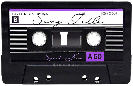
Hey!! I just wanted to say that your recent speak now gif set is sooo stunning. I was wondering how you managed to create that cassette tape effect if it isn’t any trouble? It’s really so pretty.
Have a great day! ✨
ahhh thank you so so much! first of all, i cannot take any credit for this effect, as it was greatly inspired by this amazing yellowjacket gifset by @thewintersoldier!!
but here's how i recreated the effect, from a cassette png (found on pngwing here), to this animated cassette effect (as seen in my speak now set):
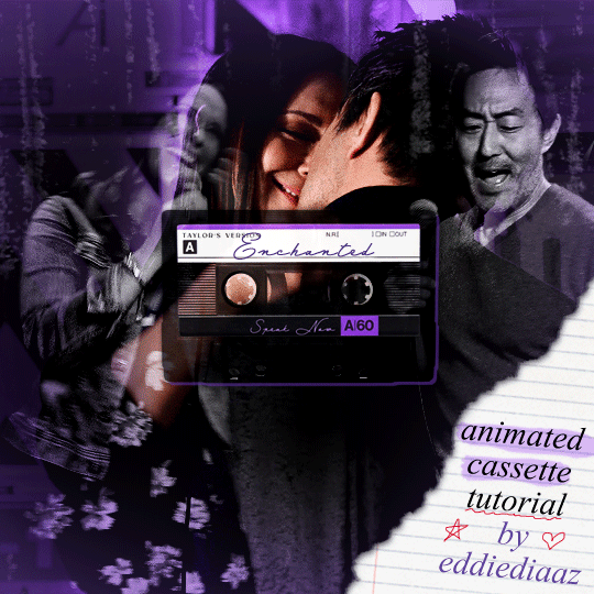
psst: i usually always create in photoshop cs5, but for this effect you need a recent version of photoshop because it's using transform keyframes (i think cs5 doesn't let you do that, or i just don't know how to lol). i used cc 2019 for this.
sorry if this is lengthy or has too much or too little details haha, but i hope it's comprehensible! english is not my first language so i also apologize in advance for any mistakes!
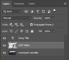
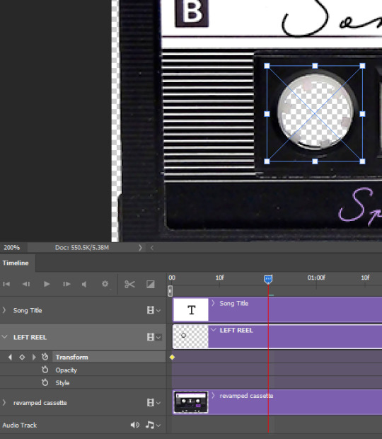
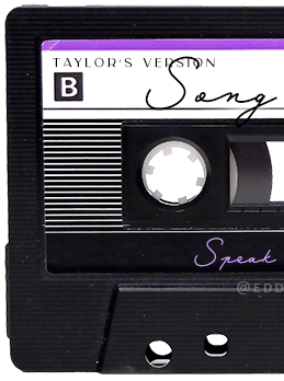
I. PREPARING THE CASSETTE
so, starting with the png here:
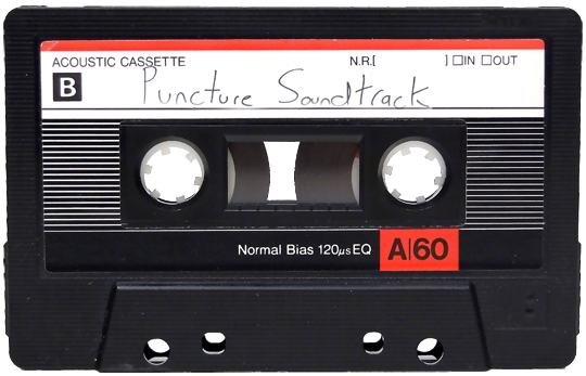
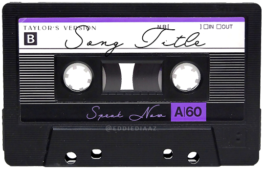
i removing everything i didn't want on the cassette png with the brush tool by just drawing the right color over the unwanted text. for the color, i then went to image > adjustments > hue/saturation and in the red tab, i played with the hue slider to get that purple color. finally, i added some text to my liking, and this is what i ended up with:
(not necessary but: i also selected the white lines on each side with the magic wand tool because i wanted these lines to be transparent. once your selection is done, go right click > layer via cut. it will create a new layer of the cutout you just made. you just need to disable or delete the layer to make the selection (lines) transparent.)
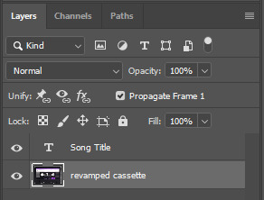
at this point you want to have only 2 layers: the revamped cassette and the text layer. you can remove the text layer actually, and just add the title back at the end, as it is not necessary for this effect. i just like to have the visual.
if you have multiple layers, you need to select all of them (except the song title layer), right click on the png layer and click on merge layers. this will create one layer with all the editing you made on the cassette. if you think you will need to edit this later though, i would save the file as a psd before merging the layers.
II. THE EFFECT
okay, so now that you have your cassette, make sure your video timeline is activated, not frame animation, and you are ready to go.
first, you want to create a perfect circle shape around one of the reel with the elliptical marquee tool (hold shift while dragging the circle). make sure it covers the entire area that will later be rotated. make sure this circle is perfectly centered around the reel or otherwise the animation will be a bit lopsided.
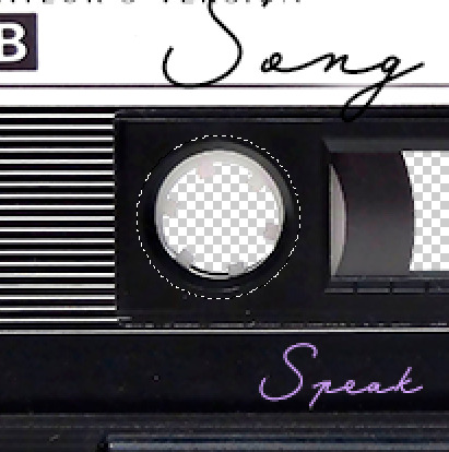
then right click on this selection and go "layer via copy". this will create a layer of only that circle selection. important step: right click on that new layer and go "convert to smart object". the layer should look like that, i've renamed mine:
now if you go to your timeline and open that new smart object layer, you will see that you have 3 keyframe options. we only need the transform one.
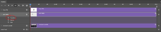
go to the start of the timeline and activate the transform animation by clicking on the stopwatch button. a keyframe will be created automatically.
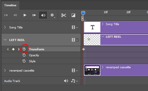
to create the actual animation, move the position of the cursor on the timeline further, i put mine at the 01:00f mark so it's easier to create the right timing.
then what you want to do is select the reel smart object layer and hit ctrl + T. a box will appear and this is how you will make the reel rotate.
to rotate the reel shape, move your cursor near the blue box on your canvas and drag it until you have rotated the shape halfway through and hit enter. another keyframe will be created and if you play your animation, the reel should rotate on itself for half a turn

move your position on the timeline to 02:00f and do the same thing: select the left reel smart object, hit ctrl + T, rotate for another half turn, and hit enter. this third keyframe should be the last one needed for the animation and you should have a full animated rotation of the reel.
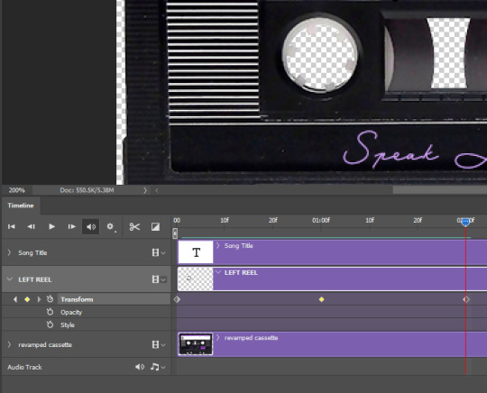
play your animation, and adjust the speed to your liking by dragging the keyframes on the timeline (but make sure they stay within the same distance from each other). the closer the keyframes are, the faster the animation are, and the further they are, the slower it'll be.
then you can just trim the smart object to your animation's length, and duplicate (right click the smart object > duplicate layer) this layer the amount of times needed (i find this less finicky than duplicating keyframes), and placing them one after the other. three full turns should be enough. this is what my timeline looks like right now:
and my animation for the left side looks like this:
as you can see, we can see the little "dents" peeking through behind the animation. we don't want that! to remove it, select the revamped cassette layer (that should be under the reel smart object), and create another perfect circle around it with the marquee tool. this time make sure it's smaller than the previous one, it just needs to cover these dents.
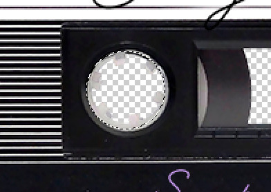
then right click on this selection on your canvas and go "layer via cut". this will create a new layer with that selection, and all you need to do is to disable it. this is removing the information in that circle.
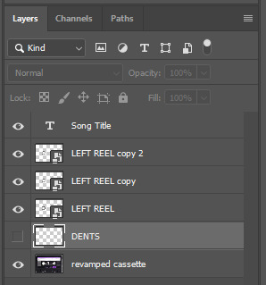
once you are happy and the animation works, you can just delete that cut layer. now the animation is done and looks like this:

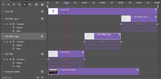
III. SECOND ANIMATION
one you have done it on the left side, you just gotta do the same thing on the right side. you can also try duplicating it, but i found it finicky for some reason (or maybe i'm just not used to the controls of this 2019 photoshop version?).
this is what i have once i've done the same thing on the right reel:
once i am happy with the speed and everything, i want to have only one layer so it's easier to use on gifs. first, i will save this animation as a psd file, in case i want to reuse it. then i am removing the song title layer and will be flattening everything and creating frames from this animation. to do so i am using the "save" action from here.
i'm not sure why it does that, but it's creating a couple of frames where the reels are a bit offset from their position everytime there's a full circle done, so i just delete these 5-6 frames. you can also change the speed here, but by default it should be 0.05.
once you are happy with it, just turn these frames into a smart object with the video timeline again (convert frame animation to video timeline and select all the frame layers > right click > convert to smart object)
now you have a smart object that is ready to be used anywhere!
IV. FINAL TOUCHES
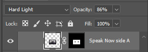
for my particular speak now gifset, i have multiple layers of the animated cassette on each gif:
1, bottom one - cassette layer set to the blending mode "hard light" and set to opacity 86%:
2, middle - this same cassette layer set to hard light, but with the opacity at 100%, AND with a layer mask so it's only applied to the animated reels (i wanted them to show up more):
3, top one - and finally a third layer with another layer mask because i wanted the white label and speak now area to be less see through. it's set to the normal blending mode and the opacity is at 75%

and then i just added the song title on top at 100% opacity and normal blending mode, and added some drop shadows, and tada!
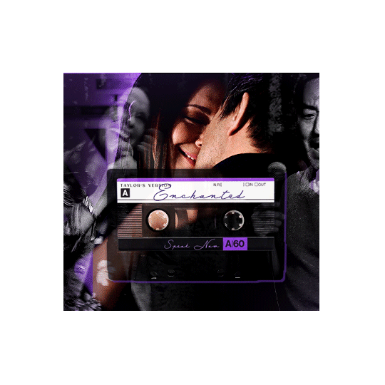
there we have it, i hope this was helpful <3
#alie replies#Anonymous#photoshop#tutorial#*ps help#completeresources#allresources#resourcemarket#userrobin#userraffa#userpjo#usertreena#tuservaleria#tuserheidi#userdean#userrainbow#usersalty#userzaynab#usernik#swearphil
360 notes
·
View notes
Note
AITA for my fanart and how I responded to someone's negative reaction of it?
Okay so some background to start. I'm (genderfluid, 18+) in a fandom that was originally a book and got a live action adaptation several years ago. The adaption is MUCH more popular than the book series and honestly very different from it (a lot of characters have different backstories, the main character doesn't have a brother in the adaption, and ages were changed) but very few people have read the book series. (Admittedly, the fandom is not very big. It's actually the smallest one I'm in, which means I'm kinda limited in the number of people to interact with) Anyways! I'm in a discord (it's 18+ tho I don't know the actual ages of anyone else involved) for this fandom and although they promote themselves as being for both book and adaptation fans, according to the roles I am one of five people of the 40+ people in the server who have read the books, so that's not a lot.
Now, for Valentine's day I made fanart of the main couple, the mc and his wife (they get married in the series. In the books they are already together in the beginning but the adaption wanted drama and decided to not have them be together in the beginning. One of the changes that I very much do not like.) They're the most popular ship in the fandom. I love them. Anyways, I shared it in the Discord for Valentines and did not get a nice reaction.
See, in the books, both characters are white, but in the adaptation the wife is black. (The mc looks different in the adaptation too, shorter and with different hair and eye color, but he's still white) I drew the book version, because that's what I like. They're my blorbos.
Another person in the server took MY art and recolored it so that the wife was black and posted it in the server with a comment about whitewashing characters of color. I told them that I didn't whitewash her and that it was really fucking rude to edit someone else's fanart. They replied that she was black, I was racist, and posted a screenshot of a Google search asking the race of the actress who plays the wife in the adaptation. I replied with a screenshot of the her books' fanwiki page and said that my fanart was of the books and if they wanted fanart of the adaptation they could make it themself. They asked how they were supposed to know it was from the books since nobody read them and they were shit. I replied that they could realize the mc AND his wife looked different, that I read the books, and they were better than the adaptation, and how would they know if the books were shit since they obviously hadn't read them?
Anyways then the mods stepped in and made us break it up. One of the mods (the only one to have read the books) dmed me and told me that they understood my frustration and that another mod was talking to the person I had been fighting with about respecting other people's work but I needed to understand that assuming I was racist and whitewashing wasn't going to be uncommon since the books weren't as popular as the adaptation and I needed to be respectful when people confronted me with this. I replied that if the other person had confronted me directly and not just assumed the worst and edited my work I would have been more respectful. The mod agreed that the other person was out of line, but the whole thing seemed to be one giant misunderstanding so neither of us were getting strikes against us this time.
Anyways, the mods added some rules about not editing people's work and a thing in the announcements channel explaining the differences between the books and the adaptation but everything in the server has been really tense especially since people in the server started vague posting on Tumblr, some people favoring me others favoring the other person. I blocked the person I fought with on Tumblr but neither them nor I were involved in the vague posting.
(also idk if it matters but I'm white, idk the ethnicity of of anyone else involved)
So! Tell me, AITA?
What are these acronyms?
102 notes
·
View notes
Text
Bonefall's Forgotten Warriors
If you've ever set out to make a WC fan project, you've surely heard of Su Susann's Missing Kits. It was a series of authorial statements giving names to previously unnamed cats, and adding interesting little stories to many of them.
But there's also a TON of "Forgotten Warriors" that were created through timeline inconsistencies, offhanded authorial statements, or single throwaway lines in super editions. By their nature, finding these cats on the wiki is a pain in the butt. In this post I hope to compile these cats as a resource for the fandom.
So first, let's define a Forgotten Warrior.
A Forgotten Warrior does not have a big presence.
Primrosepaw was first named as a Missing Kit with no mention of her name on the page or in the allegiances. Over time, she has appeared in several books and is now a widely known name in the fandom. But Blossomkit, whose only appearance is in Su Susann's Missing Kits and the worst field guide, will count as a Forgotten Warrior.
A Forgotten Warrior is not just a nondescript Clan cat.
For example, if a "ThunderClan warrior" speaks up at a gathering and their name and description is not mentioned, that could be anyone. Same applies to a description that could easily describe an existing character in a Clan-- if a "White ShadowClan Warrior" appears in a modern arc, that may just be Stonewing, BUT, the "Tabby Queen with Distinct Black Markings" of TPB doesn't match any other, so she is a Forgotten Warrior.
A minor appearance inconsistency is not a Forgotten Warrior.
Just to pre-empt wiseassery. Blue-eyed Dovewing and Green-eyed Dovewing are not two separate cats-- but I will note down MASSIVE appearance changes in background characters, like the magic color AND gender-changing Stoatfur (just add water!)
(also, I will not be compiling all of the random kittypets, rogues, and loners because there is too many of them. I could, however, be persuaded to compile all cats of a specific group, like The Kin, Sisters, BloodClan, etc.)
This post is an updating list as I find and catalogue more cats. Last update: 8/21/23, version 1.1
Added new category: Sudden Elders
Key:
X = No gender
F = Female
M = Male
Su Susann's Missing Kits
(WIP; will update with full descriptions later)
Cranberrypaw
Thistlepaw
Drizzlepaw
Rustlepaw
Elderkit
Tulipkit
Lynxkit
Cherrypaw
Chestnutkit
Cricketkit
Duckkit
Dragonflykit
Rubblekit
Turtlekit
Quietkit
Lavenderkit
Waterkit
Oatkit
Carpkit
Morningkit F
Dead child of Graypool. Gray-cream with a white dash.
Splashkit M
Dead child of Graypool, gray with lighter flecks.
Swankit F
Silver-and-black child of Graypool who lives just long enough to see her take Mistykit and Stonekit as fosters, and then dies.
Splashpaw F
RiverClan apprentice of the RiverClan Swallowtail, appears in the allegiances of Dawn, said to have drowned in human nets while fishing with Stonestream.
Storkkit
Quailkit
Eaglekit
Hillkit
Downkit
Swampkit
Blossomkit
Spirit Cats
Skunkpaw M
From Goosefeather's Curse, an ancient ThunderClan apprentice who helps him cheat at Hide and Seek. Has a white stripe that parts his face and heterochromia (right blue eye and left green eye)
Fenneldust F
A Dark Forest cat killed by Thistleclaw in Spottedleaf's Heart. Light brown tabby from ThunderClan
Batear M
Spottedleaf's Heart. Black and white with a disfigured half-face. From ShadowClan
Palefoot M
Gray tabby in Night Whispers who speaks to Flametail.
Lightningpaw M
Gives Crookedstar a life, from RiverClan
Lilyflower F
Gives Crookedstar a life, from RiverClan
Shiningheart, Brightspirit, Braveheart FFM
Cats modeled after a real family of WC fans who died in a natural disaster, appearing in Long Shadows
Mallowfur F
Spirit who greets Featherwhisker on his first trip to the moonstone.
Inconsistencies and Replacements
Cypresspaw F
Brown and white; appears in Thunder and Shadow and is replaced by four Lakeheart kits.
Wavepaw F
Silver and white; appears in Thunder and Shadow and is replaced by four Lakeheart kits.
Stoatfur X
First appearing as a ginger tom, they become a tortie-and-white molly between books.
Happykit M
A fan name for a kitten killed in the Great Battle which the author approved of. Changed to "Weaselkit" by the family tree.
Silverpaw X
Appears in the allegiances of Fire and Ice and Forest of Secrets and then vanishes.
Greenflower F
Supposed to be the foster mother for Feathertail and Stormfur, forgotten between books and replaced by Mosspelt.
Gorsetail M
A pale tom warrior who is trapped by humans during the destruction of the Forest, suddenly replaced by ANOTHER Gorsetail who is a silver-and-white molly in the Po3 arc
Unnamed Background Cats
Distinct Tabby Queen
From Into the Wild, greets Goldenflower as she leaves the nursery. ThunderClan.
Tortie Molly
From Fire and Ice, seems to be a friend of Morningflower. From WindClan.
Gray Tom
From Fire and Ice, another exiled warrior of WindClan who alerts the Clan to Fireheart's presence.
Tabby Tom
From Fire and Ice, another exiled warrior of WindClan. Carries Morningflower's kitten; May be Onewhisker.
Field Guide Exclusives
Smokepaw X
From Secrets of the Clans. May be a consistency error, given that the authors forgot that Smokepaw TNP fell off a cliff and they could be Smokefoot. Close with Tawnypelt, likes to climb trees and watch boats.
Pikepaw M
Large, dark gray. The only serious apprentice in his training session of BOTC while the siblings squabble. RiverClan.
Duckpaw F
Mean to Rushpaw while training. Sister of Tangle and Rush. RiverClan.
Tanglepaw M
Large, big-pawed, long-furred. Mean to Rushpaw. Brother of Rush and Duck. RiverClan.
Rushpaw F
Short legged, tiny, and pathetic. Awful at swimming. Girlfail. Sister of Duck and Tangle. RiverClan.
Silverpaw X
Sees Onestar and the POV kittypets on RiverClan territory, and brings them to Reedwhisker.
Adderkit M
Lost spirit baby in Cats of the Clans from WindClan. Killed by an adder and named after it. Forced to listen to Rock say dumb shit about Nightcloud at the world's most uncomfortable sleepover.
Spiderfoot M
Anxious, battle-averse ShadowClan warrior fresh out of Apprenticeship at the Eclipse Battle, tormented by RiverClan warriors while hiding in an abandoned building. Said to have left to become a kittypet
Rabbittail M
WindClan ancestor of Webfoot who was caught in a human trap for REAL rabbits, but chewed his way out.
Sudden Elders
These cats suddenly appear as elders despite never having been seen before.
Darkfoot M
Appears as a WindClan elder without warning when the Clans get to the lake.
Oatwhisker M
Appears as a WindClan elder without warning when the Clans get to the lake.
Snaketail M
Brown ShadowClan elder with a striped tail
Ivytail F
A brown tabby in RiverClan who dies of oil poisoning
240 notes
·
View notes
Text


Alternative NPD Symbol
"While working on a request I wanted to try and grab this NPD symbol and clean it up. However I found out that it existed prior to being used as an NPD symbol, originating as a vector image on Depositphotos dot com ( credit to user image4stock ) and it's license requires you to pay to use and access the high-quality file(s).
I don't like using symbols without attribution ( though I've made that mistake in the past ) and I don't like that the license requires payment ( with the possibility of up to a $5k fine which uh. I could not afford. ever. even if it's unlikely to be given to me. )
So I've taken the Daffodil / Narcissus symbol by omoonstd on flaticon and put it in a similar color-scheme / format to the original symbol ( their symbol only requires a simple attribution, which I've done here! ) I don't claim to have made the original symbol, but I did edit the colors, added the circles, and cleaned up the lines a bit."
This was originally published on my Deviantart ( isobug ) and all relevant external links can be found via the post source link! As Tumblr hates external links and sometimes removes them entirely.
The first image is the plain symbol and the second is a solid-background version meant for icons / pfps. Anyone is free to use this anywhere! No ableism will be tolerated on this post and I'll delete anything hateful.
Taglist - @revenant-coining, @radiomogai
#npd#npd flag#npd symbol#actually npd#actually narcissistic#narcissistic personality disorder#cluster b#cluster b safe#cluster b pds#npd safe#actually cluster b#npd positivity
70 notes
·
View notes
Note
hello! i'm not sure if you remember me, a while ago i asked about digital art and if it's possible to do on an ipad or something similar. i was really grateful for your response and i got an ipad over christmas! i didn't realize how expensive the pencils were though and was only able to get one recently. now that i have all of that, i download the first art program i saw (ibispaint x, i don't know how good that is) and feel super overwhelmed by everything, all the tools and brushes and i have no idea where to begin. i know this is a super broad topic, but i don't know if you have any advice for a beginner hoping to become a digital artist? or know of any resources? thank you so much in advance and no worries if this topic is too broad to really get into properly!
Oh hey!! Congrats on getting an iPad! And yeah, shopping for the pens is a big pain in the butt, but I'm glad you finally got it all setup!
So most of the advice I'm gonna give you is very basic, starter advice that can apply to virtually any digital art software, as the vast majority of them are built with the exact same base tools, they just vary in their intended purposes which means they may differ in more advanced settings and what they offer beyond the basics (ex. Photoshop has more colors than Clip Studio because it's built for editing high quality photos whereas Clip Studio is meant to emulate comic art, but Clip Studio offers more in the way of comic-creating tools such as specialized rulers, 3D material support, built-in screentoning, etc. and all of the software available will tend to have different brush engines, meaning it doesn't always 'feel' the same to draw in one software as it does in another).
Your bestest friends:
Layers! This is the biggest pro to going digital, because now you can work with layers! So anything you draw on each layer is preserved and can't touch or affect whatever's on the other ones :3 You can find the layers tab in Ibis Paint X in the bottom right, don't be afraid to make a bunch of them and mess around with what you can do. Play around with the different blending mode settings (in Ibis Paint it's the menu that's labelled 'Normal' in the layers popup) especially Multiply, Color Dodge, and Overlay, as those three are the most commonly used to make coloring more efficient and give your art some extra pop.
Lasso/marquee/magic wand tools! These are basic selection tools that allow you to select an area within the layer you're working on, so that whatever you paint won't travel outside of that area. The Lasso is a free draw tool, the marquee tool is typically 4 sides by default (so squares/rectangles) and the magic wand detects and selects a closed area with one click! (just note that by default it's only on the layer you're on, so if you use it on a layer that has nothing, it will typically select the entire canvas).
Alpha locking! This is a simple button setting you can click to 'lock' the layer you're working on, which basically means that whatever you've drawn on that layer, anything you add can't travel outside of that drawing. So if you want to quickly shade something without going outside the lines, alpha locking is your solution!
Clipping groups/layers! This is a bit more advanced but is basically an even better version of alpha locking that you can use in conjunction with it. Clipping layers are basically additional layers that , when you click the 'clipping group' button, 'attaches' that new layer to the layer that's below it. It performs the same function as the alpha lock by preventing whatever you draw on that layer from travelling outside of it, HOWEVER it comes with the added benefit that it's on an entirely different layer, meaning you can erase and mess with whatever's on that new layer as much as you like and it won't hurt the base layer. It kinda follows the same logic as animation cels !
Masking! Y'know when you're doing a traditional painting, and you put down tape to cover the area so you can paint over it and later remove the tape and everything underneath is untouched? That's basically what masking is! Once you put down a layer mask, using the erase tool on it will 'erase' whatever the mask is applied to, and using the brush will make it magically return! This may sound silly at first, but I find masking is especially helpful if you want to erase something on the layer you're working on without it disappearing forever! It's also really helpful for comic work because you can mask whatever's outside of the panels and voila, nothing you draw will travel outside of those panels!
Stabilization! I don't know how extensive Ibis Paint X is with offering stabilization tools, but many digital art software comes with it and it's a LIFE SAVER for new digital artists adjusting to the feel of digital art. It essentially 'slows down' the output of the ink on the canvas which helps a lot with getting cleaner lines in fewer tries. It's not quite as big of a deal when drawing on iPads because obviously you have more control by default by drawing directly on the screen, but it can still be really helpful when you need to pace your hand ahead of the actual drawing tool to pull cleaner lines!
That's pretty much all I can think of for now! But here are some other commonly asked questions:
1.) There are so many brushes to choose from, which one do I use?
The round brush is small but mighty. Virtually anything can be painted with it, it's simple, but malleable, especially when you start messing around with the hardness and opacity settings. Don't get too lost in the sauce with the brushes that are available to you, it can be very easy to get overwhelmed by all the options and variety. Some artists still work purely with just round brushes, some artists have custom brushes they like to use to speed up their drawing process or achieve certain textures. Play around with them, but don't get too stressed about which one you use because there's no wrong answer, the right brush to use is the one that gets the job done ! <3
2.) What canvas size should I use?
It depends on a variety of factors such as whether or not you're planning to print, where you're going to be posting it, etc. By default I like to work on 8.5 x 11 inch canvases (standard printer paper size) at 350 dpi, which if you want to make that canvas in Ibis Paint X, means you just have to make a canvas with a pixel ratio of 2975 x 3850 pixels! Just note that the lower you go in either pixel count or dpi, the lower the resolution, so it's typically encouraged you work at a minimum of 300 dpi (but you usually don't have to go any higher than 600) to ensure you don't wind up with any blurry low res JPG's/PNG's.
3.) Should I export my final drawing as JPG or PNG?
This is usually just up to personal preference, but like the canvas size, it depends on what you're using the image for. You can always export as both, the biggest difference between them is that PNG is lossless meaning you won't experience image compression like you will with JPG, BUT you're also going to have much larger image sizes. JPG is often fine for any standard posting, PNG is typically recommended if you want to have a drawing with a transparent background for printing (as JPG can't do transparent backgrounds) or if you just want to have a really high res image file for sharing outside of social media sites (as social media sites like FB/IG/etc. will typically compress the hell out of your images anyways)
Here are some other super helpful resources as well if you need some visual and/or audio guides:
Sinix Design - How to Learn Digital Painting (Beginners)
Marc Brunet - The Beginner's Guide to Digital Art
Skynix Art - 50 Digital Art Tips in 5 Minutes
One thing I also like to do is watch speedpaints of digital artists as it can really help pull back the curtain on what they're doing (or at least, it can help you see what they start with which can help you better picture the process of turning a blank canvas into a finished work of art!) And though I don't do it as often, if there's an artist whose work I REALLY like, I'll try and find their actual work files (many bigger artists sell them on their crowdfunding sites/Gumroad/etc.) so that I can actually break the drawings apart layer by layer for the purpose of analysis. Of course, all that is something that you'll grasp better over time as you learn the tools and learn to recognize what artists are doing in their own workflow, so don't worry if you don't glean a whole lot of info from the "big guys" right away, you should always be referencing artists who are higher along the skill ceiling from you but not too high that they're using techniques and tools that are outside of your realm of understanding.
Other than that, just try to have fun, don't stress too much about it, and save often!!! Part of creating art is learning to be at peace with the process, so don't stress too much if it takes you a while to get adjusted to the layouts and tools - at the end of the day, digital art is another medium entirely, so it's not uncommon at all for traditional artists to need a lot of practice to 'switch' to digital, because they both utilize different tools and techniques. Be patient with yourself, always be on the hunt for new resources and guides and references, and don't be afraid to experiment and make mistakes (the best part about digital art? Mistakes don't cost you any paint or materials!)
Good luck!! And congrats again! 🥰
57 notes
·
View notes
Text
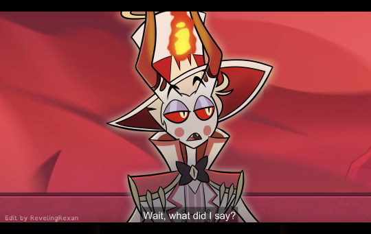

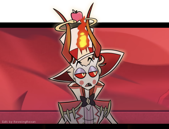
a silly screenshot edit i made of one of my favorite moments :)
...because i organized my bank accounts and wanted to give one of my cards a special cover!!
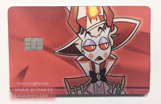
a brief note about applying the sticker to the card:
the directions said to line up the sticker to the opening for the chip, but it went better for me when i lined the sticker up to one of the long sides of the card. (but of course make sure the sticker would be in the right part for the chip)
bonus behind the scenes on my making the pic under the cut :)

i tend to make several lineart layers when doing REALLY CLEAN lineart so i can more easily erase overlapping lines. (the first screenshot has lines that "overshoot" because that gives nice sharp corners and line width variety, but i need to erase the extra parts of the lines)
(i like these screenshots because Lucifer looks extra clowny with this colorfulness)
i realized on this project, since the final lineart is just going to be black anyway, that i can use different colors for each layer and then LATER make the lineart black. (realized it after already making some lineart, so you see some black here)

SO, RIGHT. VERY EASY TO THEN GET BLACK OUTLINES: JUST SET BRIGHTNESS TO ZERO. i usually use a program called FireAlpaca, and the way you do that there is: Filter > Hue… > drag the Brightness cursor all the way to the left

in this screenshot, you can see some of the effects i added to Lucifer to give him the nice shadowed look that Hazbin Hotel has, as well as where i covered Charlie at the tip of Lucifer's hat lol
i included my layers on the right of the screenshot to show how i set up the outline layers in the final version: as you saw above, i named my outline layers with the color used for them, then, once i was done with the outline, i placed the "outline before color change" folder above the base black "outline" folder. that way, if i later notice a mistake, i can simply turn on the colored outline folder and i'll see what color that part of the outline is and jump to the necessary layer, rather than going on a quest turning off and on a bunch of layers each time
since i duplicated my outline folder before changing the outlines in one of them to black, the base outline folder already has the color names included in the layer names
NOT ALL DIGITAL ARTISTS USE AS MANY LAYERS AS I DO LOL. I GO WILD WITH THEM SOMETIMES. MANY OF MY PROJECTS HAVE WAY MORE THAN 80 OR EVEN 500 LAYERS. people just tend to figure out what works for them. i wouldn't be surprised if i end up using fewer layers in the future. or a lot more. or go either way depending on the project
so, yeah, this is a screenshot edit, so i traced the main part of Lucifer's body. for the background, i used two screenshots. had to cut together and cover some stuff. here's the two screenshots unedited followed by a scribbled version to make things work lol and then the scribbled version that includes some extra touch ups/covers

and some screenshots i took while working on this, when i unexpectedly got some cool-looking versions :3 first one reminded me of Day of the Dead looks (he DOES need to be more colorful to be more accurate) and the second is just rad


ANYWAY probably the most helpful thing to most people would be the colored outline thing talked about at the start lol, the stuff i bolded. that was IMMENSELY useful and i love black outlines more than ever XD
#hazbin hotel#hazbin lucifer#lucifer morningstar#hazbin hotel lucifer#screenshot edit#i feel like there's something else i wanted to mention under the cut but i'm forgetting lol#oH. IT WAS ABOUT CHANGING THE IN-PROGRESS COLORED OUTLINES TO BLACK LOL. GOT IT WOO#rexan's art#i got the sticker like two months ago and i STILL sometimes take my card out only to look at it XD#one of my best purchases ever lol#(it was about $15 in the U.S. and that includes shipping. i really wanted a Lucifer card)#(so worth it)
42 notes
·
View notes
Note
Could you review the ixi?


Briefly limited edition for a very short period after their release, Ixi are mostly just goats, and there's really nothing fancy about them beyond being goats (unless you want to count the collars). They are pretty nicely designed goats though, with distinct eye shapes, lots of black accents on the hooves, eyebrows, and horns, and some nice markings around the face and muzzle that really help to break up the body.

I also like the personality Ixis have, being mischievous and sort of sassy. This was more obvious in their old circle art, but you still get it a bit from the converted version as well. It's fun and helps make them stand out.

This might be a controversial Hot Take(TM), but I'd argue that Ixis mostly benefited from customization. The old art was just a bit janky all around—the circle pose mostly looks good, but the default happy poses could look kind of off. The converted version cleans up a lot of that, removing things like the second fur tuft on the head that's too close to the horn to be noticeable, the unpleasant lines around the mouth, the shaggy fur lines, etc.
It also refines some aspects, like giving the lighter tail tip an outline to match the rest of the lighter areas and fixing the hind torso, which was all kinds of screwed up on the original art. It also improves the eyes so they're closer to being the same size (it still looks a smidge off to me, but it's at least better). The shading is also less messy (what was up with that pink reflective light on the tail?), the eyebrows have been thickened to match the other black areas more, and it's easier to make out aspects of the design.
Another benefit is that the collars can be removed. I do think Ixi collars look better than Aisha collars (mostly because they can be interpreted as chokers when anthropomorphized, and they at least match the color of the eyes), but it's nice to have the option to remove it if one wants to.
However, there were a few things that don't look as good—namely, the head is both a bit too big and too wide compared to the original, giving it a weird rectangle shape that doesn't quite feel right. Here's a super quick edit of the converted version to try to get the point across:

Also, for some reason the chest fur also stops below the collar instead of under it, and the red Ixi's mouth is no longer the lighter shade like it is on every other Ixi. The sideways hair ruffle at the top is also weird due to them adding a line underneath. So overall an improvement—but not perfect.
Favorite Colours:

Mutant: What a great color! It's just messed up enough to look properly mutant-y, with the fangs, mismatched horns and ears, bipedal stance, spots, and a long, drooping tail. The color palette is subtle and muted, and it's detailed but still completely coherent as a whole. This design also didn't change with customization at all, so it's still as enjoyable as it ever was.

Grey: I already covered this one a bit in my grey color review so I won't get into it much here, but this color is great. The customized version is so-so (good as a neutral base, but the eyes look a bit weird due to lack of top lids), but the UC version is beautiful with its forlorned expression, huge droppy ears, and pretty dull red accents. Even the collar is drooping!


Robot: Converted robot Ixis unfortunately aren't very good—yes, they have to proportionally match the default base, but the chunky round legs, overly large head ridge, and completely botched shading look pretty bad. It looks weirdly rubbery in a really unpleasant way. On the plus side, the unclothed version is terrifying, so it has that much going for it.

However, the UC version is fantastic! It has a super sleek design that manages to look unusually elegant and cute for a robot pet, with a subtle dark green and black palette and high-contrast red eyes. There are lots of good details in there too, like how the neck matches the legs and ears.
#I didn't. realize I had so many opinions on Ixis before writing this#neopets#neotag#ixi#neopet reviews
50 notes
·
View notes
Text
Really fucking stupid patch notes, wizardposting edition
Fixed a bug where @the-gnomish-bastard could NOT turn back into a normal gnome when using "Become Lead Statue" in some cases. This somehow applied to every "Become Statue" spell but the Lead one was the most broken one
Fixed a bug where Meme Summons straight up couldnt work if you had more mana than usual. No, we have no idea what the fuck happened
Fixed interactions with every variant of @the-wizard-council-blog, including the Illegal one, the NSFW one, The worse one, The better one, and all other iterations
Fixed a bug where the stew arcanum was straight up uncraftable because all the data was gibberish. This was fixed a few versions ago and now you only need 3 high-tier gods to make it. Also you need Meme-Infused Magic Spellwood Bowls to hold this post-post endgame item. Yes, its still too much stew but we kept it like that because its unironically funny
Speaking of magical trees: fixed a bug where some types of trees straight up Did Not Grow unless some form of "chunk loading" was enabled. In other words, what the fuck.
Fixed a bug where stacking too many attack ups made the damage 0 on any "explosive" spell. @official-megumin can now deal 9 quintillion damage (as long as its not over the positive 64-bit integer limit, because then the bug stays) (also the code is less fucked)
Fixed a bug where some unusual but valid items for wands and staves (such as LITERALLY EVERY NUCLEAR METAL and some fantasy ones like orichalcum and australium) straight up couldnt exist.
Added more items to mythril, but this time everything you can do with mythril can be done with other materials, so now you can choose between mythril orichalcum AND adamantine depending on the color
Adamantium crafting now doesnt require a bordering-on-hyperbole amount of adamantine. Also you now need industrial steel instead of normal one.
Fixed a bug where "Triple Summon of Meth Berserk Chimps" not only was unobtainable, but required over 2.14 billion mana. Granted it was unreleased back then but then it was released and it still was in its testing stage
Fixed a bug with many spider-themed spells not really being "spidery", this one goes out for our boy @autism--wizard, may you find many cute spooders in ur life :3
Fixed a bug where "induce memetic stroke" accidentally... told people about the meme. Whoops.
"TACO BELL TACOSPELL OF INTESTINAL IMPLOSION" fixed to deal less damage than the psychological damage. We know its a forbidden spell but fuck you we are not sending people to the therapist because omega diharrea
Speaking of: fixed a bug where "steal item" could work on vital organs. Youre gonna learn "Spell Of True Thievery" and youre gonna shut the fuck up about it
Fixed a bug where non-sentient kobolds could be... "milked". Yes mr gnome. KILK existed and it was kobold sperm this entire time. This is why you said it didnt exist, CAUSE THAT SHIT WASNT MILK CHIEF! Anyways now KILK actually doesnt exist so y'all better shut the fuck up or FIND A MILKABLE SOMETHING WITH A K IN ITS NAME
Fixed a bug where familiars didnt familiar. Yes it was terrifying in every way ever, so thank @familiar-union for this. Yes thwy cant be tagged by us idfk why
Fixed mithril tools being literal reskins of their steel equivalents. Whoops!
Fixed a bug where that one April Fools joke of "summon cock" actually summoning a penis. Now it actually summons a rooster (and a really big one)
Speaking of that, Summon Rooster has been fixed and now its a better version of the aforementioned spell
Fixed the interaction between A LOT of spells. Turns out that 99% of harry potter being trash doesnt stop people from doing Dragonball Beam Struggles with their spells. Also yes, elements apply
Fixed a few lines of code so that now the "use pokemon typings" option doesnt disintegrate the UI. Over 120k spells and each and every single one of them now has functioning typing. Now shut the fuck up wE DID IT
Fixed retrocompatibility issues. Now runescape can scape the runes! (HR is fully aware that the joke is shit) (but fuck it, it was funny)
Fixed a bug where any "Robot" something would bug up and change colors. Considering that people somehow managed to make trans flags with this, we added a transgender flag skin for every "robot", "wulfrum", and similar tech spells.
Greatrererest Blahaj Blast Barrage now has a hitbox AND a cost. It can be set as your ult and we already have the Gold, Platinum, Uranium and other skins ready. Yes the transgender skin is unlocked by default if you already have the spell, and if you dont- Magical Battlepass has it at levels 10, 32, and 69 (otherwise you get materials and xp) Because the one battlepass that works without FOMO and Whaling had to be the magical one
Fixed a bug where "draconic" items were only easily obtainable by dupe glitches. We may not have fixed those but we upped the drop rates so you dont have to exterminate dragons for one singular heart. Now it takes 3 dragons at most! (Yeah so it turns out the drop rates were HELLA WRONG. Whoopsie daisy!)
Speaking of that: Draconic Evolution Backporting works now! Now when you use a staff of power, people wont think its an euphemism for your di-
Magical swords now can be made woth higher tier elements. No idea why would you need an Entropic Steel Magic Sword but fuck it. You deserve to put some sparkles on that Alien X looking ass blade
The Throngler's Gold Skin now doesnt make it a mess of metal and gold. Now its actually good
Fixed a bug where bad connection made the online version of "the potion seller's strongest potion" unplayable because some elements were only obtainable in multiplayer. Fuck you and your theories about thwnpotion seller being an eldritch dragon eater. LoL. KeK even
The Augur Dragon now doesnt get stuck flying in circles above the Forbidden Volcano Arena. Now it actually CAN hit you from 10000ft in the air!
The marble wyvern boss (and therefore all other marble wyverns) actually drop the dragon marble builders want
Added tier XVII to the Magical Engine. Also recipes for Tier Ascension were fixed.
N2O Blast was fixed to deal hellfire instead of fire. And also being blue. It was easier than you believe
Using "Golden Shower (Metal) actually rains coins instead of being "golden shower but identical and deals steel damage"
Sniler's quests now update in 1 hour instead of 24, and the quests are better. During multiplayer, there are 5 quests avaiable instead of 3
Ghastly Mist now actually blinds opponents instead of being really dense
"F.I.S.T." can no longer be boosted by attack boosts, but nOW its damage is "(999 × your level + (your attack stat × 2)) × 2", and its cast cost went from 1000 mana to 1200.
More scroll duplication bugs were fixed, but the "use Grant Spell Usage onto a low level non-magic enemy so they have a spell that they cant use and then using Turn Into Scroll" has been made into an ACTUAL feature. Go ahead and make a billion "Scroll of Imaginary Technique: Hollow Purple"!
"Starlight Thunderstorm" now has 1% paralysis
Removed the "domain expansion" function until we figure out how THAT works. Theres still the tab, and when it will be implemented just send screenshots of what "domain expansion customizations" and then youre getting them once we implement them
41 notes
·
View notes
Text
going on a deepdive into 3DS/DS purikura games
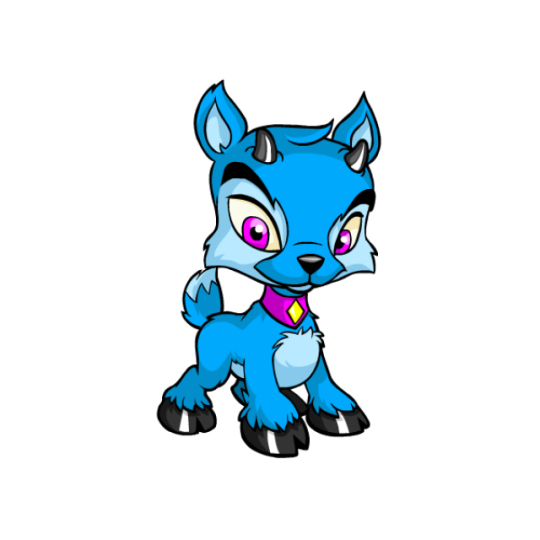
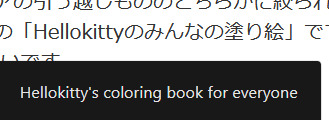
I saw this image on a tumblr post and I wanted to look for the original source (so I could properly credit the person and to find out what game it was):

I couldn't find the original, however, I did find this yahoo ask asking what game it was.
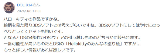
The person answering seemed to think it was a hello kitty game, likely because of the hello kitty sticker used to cover the face of the person taking the selfie, but it's clearly one that was added after the photo of the DS was taken, it's not a sticker that exists within that software.
As you can see here, it seems to be a piece of hello kitty fanart- it's not official art, and therefore not featured in the game. This helps with my search a bit.
Also, I believe this is a 3DS title, not a DSI/DS one like the person above suggested- the "select" button in the home menu is the same as the o3DSXL's. This suggests this game was published BEFORE the n3DS series was released.
I remembered playing a game in the past called "Sanrio Picross" that had some purikura elements, however, that game doesn't allow you to edit photographs, and upon looking at them side by side, the UI is completely different.
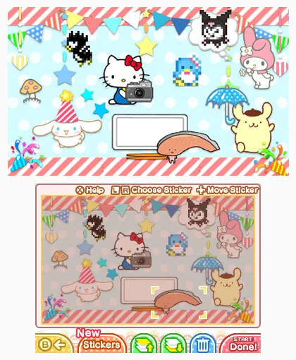
I googled "3DS purikura game" (purikura being the Japanese word for photo booth) and the only result was "Sparkle Snapshots." From what I could see, the 3DS title didn't have UI that matched either. I decided to look up the DSI game as a last ditch effort into this line of thinking and I didn't find anything.
I did find a screenshot of the title screen on khinsider VGM and the title song goes HARD.
It doesn't seem like this is a purikura game, (or at least not solely), so my research must continue. The next thing I looked into was the UI. I know some Japanese, not very much, but enough to read some basic katakana.

Under the X button it says "Zoom." The L button seems to say "Erase Button."
And it seems that R and A also say "Erase Button." Start obviously says "Menu" It seems like this is a very basic game.
For the bottom screen, it was taken at an angle and it contains some Kanji, so I put it through some photo editing to make it easier to read.
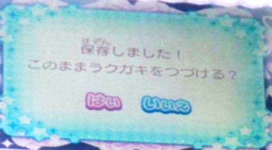
Typing that into google translate I got "Saved! Do you continue doodle?" (and then obviously yes/no)
The phrasing of doodle is interesting. This implies it could be an art program, like the yahoo commenter suggested earlier.
Searching up 3DS art programs doesn't really help me, and coloring games doesn't work either...
My last resort is to go through every 3DS game released in japan, (since we already have a copy of every game ever released for the 3DS online...) However, before I do that, I'm going to look for this image some more.
I found it running rampant on pinterest...

No one else seems to know what it is either LOL.
However, the version on pinterest is significantly higher quality!
Next step, finding more games. I simply need to try to find MORE games. Because I know what the UI looks like, it shouldn't be too hard.
I'll run this search again and just scroll till I see a new lead...

Oh, that was quick!
I found a series called "minna no" which seems to be similar to the "imagine" series in the US- just kind of children's shovelware that never got translated to english.
I ran a search for みんなの (Minna no) on google and...
Huh that sounds familiar... oh my god.
OH MY GOD.

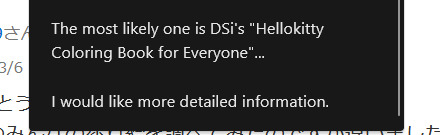
It'S THE SAME FUCKING GAME THE GUY FROM EARLIER WAS TALKING ABOUT. The one I dismissed entirely because it was a DSi title and the game's UI wasn't DSi? It was a 3DS title.
The best part about all of this... the best part about all of this... the UI doesn't even match at all. I went full circle and just accidentally proved this guy completely wrong.
I checked the rest of the minna no games, and yup, no dice. It's some other title.
Next up, I looked at Girls RPG Cinderella Life, mostly because it kept coming up over and over during my research- and holy shit their website is adorable.
Their website is an accessibility nightmare, but it's absolutely adorable. If you are into web design at all, I'd recommend checking it out.

super cute!! looking through the website only proves to me though that this is not the game we are looking for though, so let's move on.
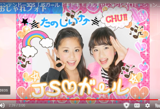
Okay okay okay, how about... JS GIRL: Doki Doki Model Challenge?
Found some information about it.... oh shit there's a camera function?

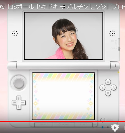
Dammit... Doesn't look anything like the image.
WAIT WAIT WAIT. A photo decoration option??????

While trying to find more images I found out the game was in this pretty holographic packaging. God I'm jealous. More games should do this.
Either way I can't seem to find any images on this, so it's going on the list of possible candidates. And While looking up this game, I found more under the same artstyle that also might be culprits.
While trying to find more information, I realized how many of these games there are. And also how many of them I have played in the past, lol.
I've been a big fan of Style Savvy (AKA Girls Mode) and I've tried out Girls Fashion Shoot, which was an english translation from a different game series about becoming a model.
youtube
Yet another knocked off the list!
By extension, the second game is also knocked off the list.
youtube
Another model game- this one called Neco*Petit Girls Runway. Another dud, but also very cute.
Pretty Rhythm series seemed to have a camera function but it didn't line up with the UI shown in the screen either.
If anyone has any more ideas or lists of games, please tell me below! I need to take a break from researching this, and I'll need to play some of that JS model game from earlier, since I doubt anyone has used the photo function during a youtube Let's Play, but based on the UI, I sincerely doubt that it's the one we are looking for.
36 notes
·
View notes
Note
do you think you could please do a tutorial for your greys anatomy edit (kinda similar to your brittana edits) i'm shocked if no one has ever asked you before for tutorials (and if you do i'd love to see them) your edits are so gorg and you're incredibly talented !
Totally! Bare with me, this is my first tutorial in like 8 years. Haha. I'll show you how I made this one:
For reference, I use Photoshop CS5. (My computer hates the newer versions. It'll run three different video editing softwares but hates photoshop. Idk lol.)
Okay, first you want to make 2 gifs with the same amount of frames. That's important. And then you want to convert them to a smart object.
So we have these two gifs.
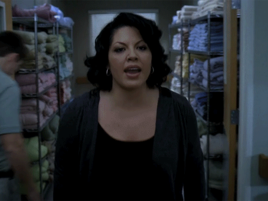

Now, depending on what you're doing, you can do this next step now or you can color your gifs how you like, save them separately and then reopen them with all the coloring on them. Sometimes I do this if I'm working with a lot of effects but since these two gifs have the same coloring, we're going right click on one of them (it doesn't matter which one tbh) and you're going to select "duplicate layer"
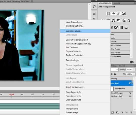
A little box will pop up and this is where you're going to select the project name that you want to essentially paste this gif on top of.
Set the top gif to Screen.
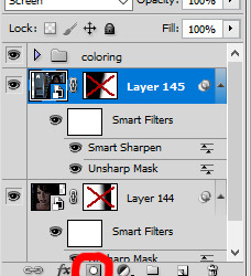
The first thing I usually do is sharpen them.
So I use Smart Sharpen and Unsharp Mask with these settings:
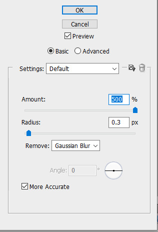
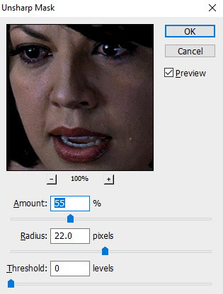
With Unsharp Mask, you have to tweak them depending on the gif, quality, what effect you're going for, etc.
Then we add some basic coloring:
Now, I have a base for specific shows because all shows are colored different. Grey's is more blue toned whereas Glee is more yellow toned. However, since coloring is a bitch sometimes, I'll add a PSD that I use ALOT. You can download it here.
So now that we've sharpened and added some coloring, this is what we have (separately):
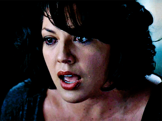
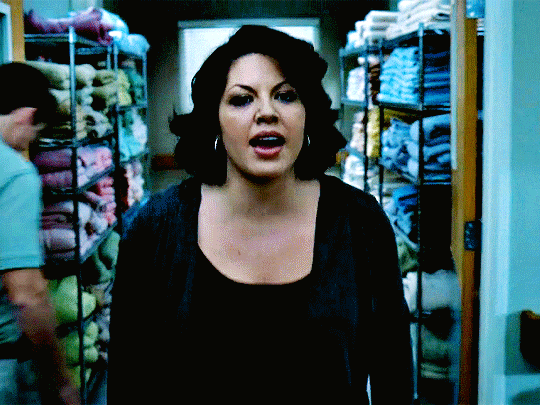
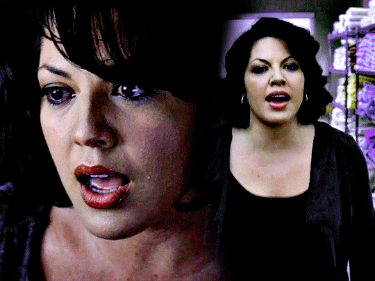
This is what it looks like after I set it to Screen (and I moved the top gif a little to the right.)
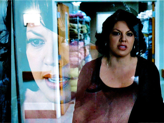
Obviously, we need to get rid of those lines and make it so that each gif is more visible.
So now we blend.
On the top gif, you're going to add a layer mask to that gif. So with that top gif selected, you're going to select the mask button that looks like this:
Select your brush tool and use a soft brush to erase what you want from the background of each gif. (Make sure to repeat the previous steps to get a layer mask on the bottom gif.)
I have this now, after using the brush tool.

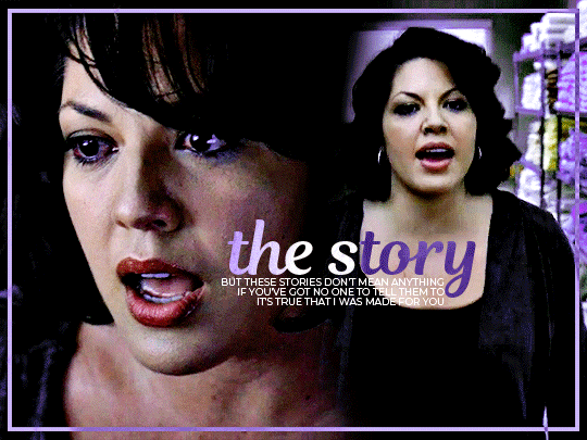
As you can see, it's very blue and I wasn't feeling blue for this gif so we want to change blue color. That's where the Selective Color comes in.
We're going to get rid of that cyan tone. So you're going to add adjustment layer and select Selective Color.
All I did for this one was adjust the cyan tones in the drop down box.
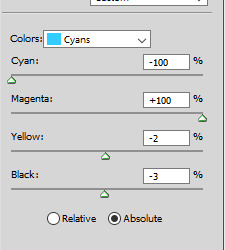
Now we have a pretty purple tone!
Now, we're going to add a light grey squareish box this to outline.
Set the blending mode to exclusion. To get the bar (and we'll do this again with the text) you're going to select the FX icon.
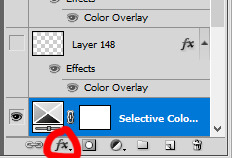
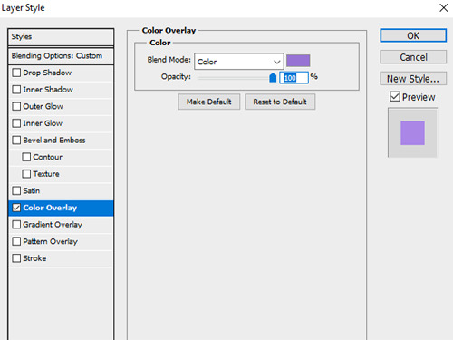
Select Color Overlay. A box will popup. You're going to set the blending mode to Color and then select whatever color you want the bar to be. (If it comes out with too much white, adjust the color of the bar itself to a darker shade.)
Lastly, we're going to add our text. For this gif I used Magnolia Script and Montserrat.
To get the purple effect on the "The Story" text, you're going to do the same thing you just did for the bar.
Voila! I hope this helped. If you need any further assistance, I'm always happy to help!
#tutorial#gif tutorial#blending tutorial#usergif#completeresources#mine#also anon you’re so fucking sweet
101 notes
·
View notes
Last Seen Blogs

kayden-gives-you-hell
Kayden
peng-lads
Barry Keoghan, Archie Madekwe & Jacob Elordi

changkyunsgalaxy
I'm Losing My Mind But You're Still Bright

lacarnemag
LaCarne Magazine
roseforviolet
୨୧⋆。˚ ⋆Blair ⋆˚。⋆୨୧