#file under: photoshop experiments
Explore tagged Tumblr posts
Visit Tumblr Blog
Explore Tumblr blogs with no restrictions, modern design and the best experience.
Last Seen Tumblr Blogs


Fun Fact
Women make up for the other 50% of Tumblr’s audience.
Text
Dazai Osamu and the Dark Era: the visual novel (a fan project)

On a whim, I've decided to finally just publicly release this project that I've had laying around for two years at this point, for Dazai's birthday today. It was originally made for my very dear friend @letmereachforthestars , when I first introduced her to the series and wanted her to be able to read my favorite BSD light novel in an easier-to-read format. You need a computer to be able to play. The details and links are under the cut:
If you've never played a visual novel before, it's basically a novel in the form of a video game. Text will appear line by line, one a time on the screen, and it will be accompanied by relevant background visuals, music, and sound effects, to make the reading experience more immersive, and more stimulating than just reading from a book. Some visual novels have actual gameplay elements to them, and some are just books and nothing else (oftentimes dating sims/choose-your-own-adventure novels), the latter of which this is. If you've played the mobile game Bungou Tales/Mayoi, the story sections of that game are basically mini visual novels.
This game was made with screenshots and music from the anime, sound effects from the anime and Bungou Tales and free sound effect online sources, as well as graphics and fonts and other assets from Bungou Tales and other official BSD art (particularly the official anime soundtrack cd covers). The script is taken entirely from the official Yen Press translation of Dark Era, with the exception of about two or three iconic lines that I used different translations of because I felt like they had more impact. Additionally, at the very, very end, I added on the original ending scene from the Dark Era stage play and wrote a few fanfic lines of my own to accompany it you can tell because they are very cringe and don't match Asagiri's writing style.
Before playing the game, there are a few very important things to keep in mind; PLEASE read all this:
I am not a professional in the slightest. I took some coding classes in high school, and have some photoshop skills (when it comes to the design elements of the menus), but for the most part the former wasn't much help here; this was my very first time ever using the Renpy engine, and I made this entirely from scratch. I used my knowledge of playing other visual novels to emulate the kinds of effects and timing that is typical for these games, and I think it turned out pretty well all things considered, but it's still very amateur. This is most evident in the sound effects. The sound effects have no volume consistency between them, and some of them, particularly the gun/battle sfx, can come on very suddenly and be loud. I highly, HIGHLY encourage going into the settings and turning down the sound effects volume (the music should be fine), so that you're not startled by certain sounds when they happen, and for a lengthy time. I wouldn't blame you if you decide to turn the sfx off entirely if's too distracting, honestly 🫠 I am no expert in sound files equalizing and making sound files loop seamlessly, so this was by far the most tedious and frustrating part of the process of making this for me. Hopefully it doesn't ruin the game or break immersion too much if you decide to leave them on (I hope you do, for the rain and clock sounds at least, but again I wouldn't blame you if you can't).
Dark Era is the most faithful light novel adaptation in the anime, but there are still a handful of scenes, mostly fight scenes, that got shaved down significantly. Because of this, there are numerous occasions where I had to simply linger on a black screen or the same screenshot for a long period of time, while tons and tons of narration happens, because there's simply nothing I can show to accompany said narration. This is not ideal, but unfortunately I didn't have much else of a choice in those instances, so I hope it's not too distracting. There are also a few instances of straight-up inconsistencies between the novel and the anime (ex. the fight between Oda and Akutagawa happens in the woods in the novel, but in the anime it's still right outside the art museum), so sometimes what you're reading won't quite match the screenshots I use. Fortunately it's never anything major, but it does happen.
There will sometimes be long, unchanging black screens. Don't worry, the game isn't broken; just wait long enough and it will continue.
Sometimes, a character will get cut off when speaking, and when that happens the dialogue will auto-force to the next line. If you didn't get a chance to see what was said before, check the text backlog/history (in the menu or the H key).
Last but not least, this game was made with the default text speed in mind. Meaning, that when it comes to certain specific scenes, the mood/tone of them, made up of the timing of music, transitions, sound effects, etc, all of it was arranged around the speed at which things progress when using the default text speed. I completely understand if you can't, but if at all possible, please try not to change the text to go too much faster or slower, especially faster, because certain scenes will lose a lot of impact otherwise. If you already know Dark Era, you probably have an idea of some of the scenes I'm referring to. At the very least, during the more high-stakes/intense scenes, please try to play through those all at once without stopping, for the greatest impact based on how I designed the game, and only pause/quit during the slower scenes. There are specific moments that I'm really proud of how they came out, and I'd like for them to have the maximum impact that I intended :') (also note that if you make the text appear instantly, the cut-off dialogue mentioned above simply will not appear at all, and you won't even know to look back for them, so please refrain from making the text instant at the very least)
Ignore the cringe sappy final message
...I think that's everything. With all that out of the way, here are the links for both PC and Mac:
Download the PC version
Download the Mac version
This was a passion project for me for a good many months back in 2022. It started out just as a gift for my friend, but in the end I was really satisfied with how it turned out, despite how tedious and frustrating it was to work on. I've been hesitant to share it with the fandom for all this time because I kinda doubt anyone would really be interested in something like this especially since it's not stormbringer or beast, but someone on discord who tried it told me that I should share it, so here it is. I'm sharing it not just because I'm proud of my work, but because Dark Era is a truly amazing light novel — underrated, in my opinion (yes, I said what I said) — and far better than the anime adaptation, as good as that is, and I want more people to read it. If reading the books is hard for you and you've never read Dark Era before, if I can help just one more person to read it with this, I'll be happy, and consider my job done. 💖
I so desperately want to make more of these visual novels for the other light novels, but sadly, some of them simply aren't possible thanks to how many scenes are missing from the anime, like with Entrance Exam in particular. I've also been waiting with vain, thin hope that Bungou Tales will eventually reach seasons 3 and 4, so I can use their Fifteen and Untold Origins title screens like I did here, if those ever exist. However, I'm also held back thinking about certain scenes that would require some redrawing/drawing additional details to match what's written in the novels. If anyone has any ideas on things I could do to possibly get around these issues, or just thoughts in general about how the other light novels might be tackled, or if you're an artist who can recreate the anime's style and takes commissions/knows someone who does, I'd absolutely love to hear from you! As well as any advice/help on how I can smooth out/improve this project here!
Anyway, sorry for the long wall of text. Thank you for reading all this, if you did, and if you do try the game, please let me know your thoughts; I crave any and all feedback. 💙✨
#bungou stray dogs#bsd#dazai osamu#osamu dazai and the dark era#dazai osamu and the dark era#stomach is turning upside down as i post this OTLLLLLLLLL#not ready for it to get absolutely no attention just like i expected lmfao#can you blame me for waiting so long :' )#if even just one person plays it and enjoys it though........ just one........ i will love you#it's really amateur and rough but i'm really proud of it still orzzzzz#i hope the love comes through....... i just want more people to love and appreciate dark era....... and oda and dazai and ango......... :'
309 notes
·
View notes
Text
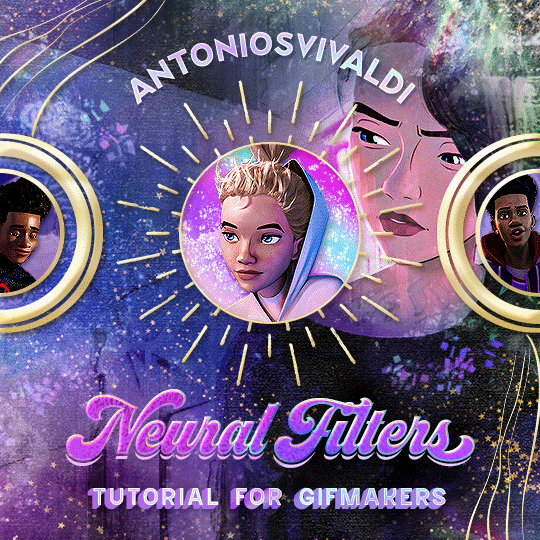


Neural Filters Tutorial for Gifmakers by @antoniosvivaldi
Hi everyone! In light of my blog’s 10th birthday, I’m delighted to reveal my highly anticipated gifmaking tutorial using Neural Filters - a very powerful collection of filters that really broadened my scope in gifmaking over the past 12 months.
Before I get into this tutorial, I want to thank @laurabenanti, @maines , @cobbbvanth, and @cal-kestis for their unconditional support over the course of my journey of investigating the Neural Filters & their valuable inputs on the rendering performance!
In this tutorial, I will outline what the Photoshop Neural Filters do and how I use them in my workflow - multiple examples will be provided for better clarity. Finally, I will talk about some known performance issues with the filters & some feasible workarounds.
Tutorial Structure:
Meet the Neural Filters: What they are and what they do
Why I use Neural Filters? How I use Neural Filters in my giffing workflow
Getting started: The giffing workflow in a nutshell and installing the Neural Filters
Applying Neural Filters onto your gif: Making use of the Neural Filters settings; with multiple examples
Testing your system: recommended if you’re using Neural Filters for the first time
Rendering performance: Common Neural Filters performance issues & workarounds
For quick reference, here are the examples that I will show in this tutorial:
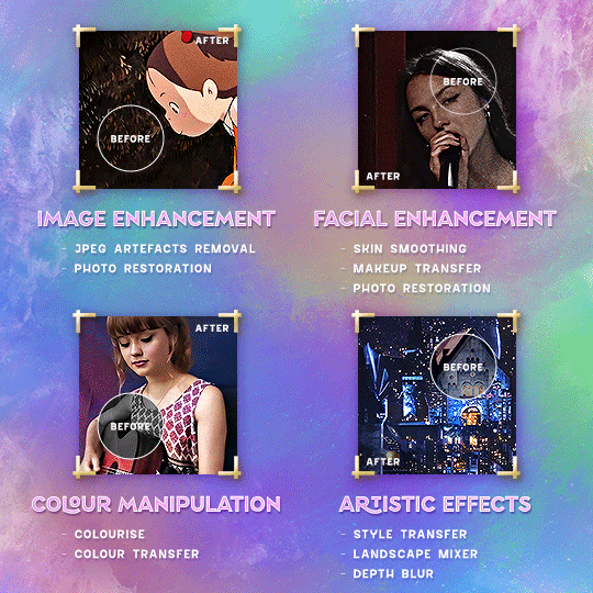
Example 1: Image Enhancement | improving the image quality of gifs prepared from highly compressed video files
Example 2: Facial Enhancement | enhancing an individual's facial features
Example 3: Colour Manipulation | colourising B&W gifs for a colourful gifset
Example 4: Artistic effects | transforming landscapes & adding artistic effects onto your gifs
Example 5: Putting it all together | my usual giffing workflow using Neural Filters
What you need & need to know:
Software: Photoshop 2021 or later (recommended: 2023 or later)*
Hardware: 8GB of RAM; having a supported GPU is highly recommended*
Difficulty: Advanced (requires a lot of patience); knowledge in gifmaking and using video timeline assumed
Key concepts: Smart Layer / Smart Filters
Benchmarking your system: Neural Filters test files**
Supplementary materials: Tutorial Resources / Detailed findings on rendering gifs with Neural Filters + known issues***
*I primarily gif on an M2 Max MacBook Pro that's running Photoshop 2024, but I also have experiences gifmaking on few other Mac models from 2012 ~ 2023.
**Using Neural Filters can be resource intensive, so it’s helpful to run the test files yourself. I’ll outline some known performance issues with Neural Filters and workarounds later in the tutorial.
***This supplementary page contains additional Neural Filters benchmark tests and instructions, as well as more information on the rendering performance (for Apple Silicon-based devices) when subject to heavy Neural Filters gifmaking workflows
Tutorial under the cut. Like / Reblog this post if you find this tutorial helpful. Linking this post as an inspo link will also be greatly appreciated!
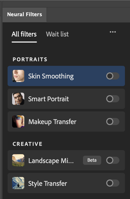
1. Meet the Neural Filters!
Neural Filters are powered by Adobe's machine learning engine known as Adobe Sensei. It is a non-destructive method to help streamline workflows that would've been difficult and/or tedious to do manually.
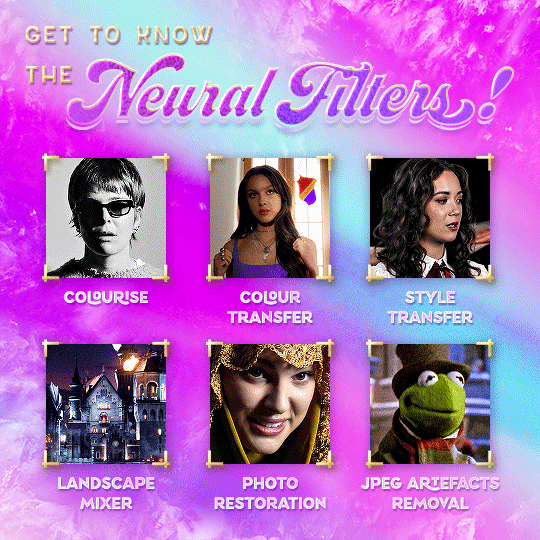
Here are the Neural Filters available in Photoshop 2024:

Skin Smoothing: Removes blemishes on the skin
Smart Portrait: This a cloud-based filter that allows you to change the mood, facial age, hair, etc using the sliders+
Makeup Transfer: Applies the makeup (from a reference image) to the eyes & mouth area of your image
Landscape Mixer: Transforms the landscape of your image (e.g. seasons & time of the day, etc), based on the landscape features of a reference image
Style Transfer: Applies artistic styles e.g. texturings (from a reference image) onto your image
Harmonisation: Applies the colour balance of your image based on the lighting of the background image+
Colour Transfer: Applies the colour scheme (of a reference image) onto your image
Colourise: Adds colours onto a B&W image
Super Zoom: Zoom / crop an image without losing resolution+
Depth Blur: Blurs the background of the image
JPEG Artefacts Removal: Removes artefacts caused by JPEG compression
Photo Restoration: Enhances image quality & facial details
+These three filters aren't used in my giffing workflow. The cloud-based nature of Smart Portrait leads to disjointed looking frames. For Harmonisation, applying this on a gif causes Neural Filter timeout error. Finally, Super Zoom does not currently support output as a Smart Filter
If you're running Photoshop 2021 or earlier version of Photoshop 2022, you will see a smaller selection of Neural Filters:

Things to be aware of:
You can apply up to six Neural Filters at the same time
Filters where you can use your own reference images: Makeup Transfer (portraits only), Landscape Mixer, Style Transfer (not available in Photoshop 2021), and Colour Transfer
Later iterations of Photoshop 2023 & newer: The first three default presets for Landscape Mixer and Colour Transfer are currently broken.
2. Why I use Neural Filters?
Here are my four main Neural Filters use cases in my gifmaking process. In each use case I'll list out the filters that I use:
Enhancing Image Quality:
Common wisdom is to find the highest quality video to gif from for a media release & avoid YouTube whenever possible. However for smaller / niche media (e.g. new & upcoming musical artists), prepping gifs from highly compressed YouTube videos is inevitable.
So how do I get around with this? I have found Neural Filters pretty handy when it comes to both correcting issues from video compression & enhancing details in gifs prepared from these highly compressed video files.
Filters used: JPEG Artefacts Removal / Photo Restoration
Facial Enhancement:
When I prepare gifs from highly compressed videos, something I like to do is to enhance the facial features. This is again useful when I make gifsets from compressed videos & want to fill up my final panel with a close-up shot.
Filters used: Skin Smoothing / Makeup Transfer / Photo Restoration (Facial Enhancement slider)
Colour Manipulation:
Neural Filters is a powerful way to do advanced colour manipulation - whether I want to quickly transform the colour scheme of a gif or transform a B&W clip into something colourful.
Filters used: Colourise / Colour Transfer
Artistic Effects:
This is one of my favourite things to do with Neural Filters! I enjoy using the filters to create artistic effects by feeding textures that I've downloaded as reference images. I also enjoy using these filters to transform the overall the atmosphere of my composite gifs. The gifsets where I've leveraged Neural Filters for artistic effects could be found under this tag on usergif.
Filters used: Landscape Mixer / Style Transfer / Depth Blur
How I use Neural Filters over different stages of my gifmaking workflow:
I want to outline how I use different Neural Filters throughout my gifmaking process. This can be roughly divided into two stages:
Stage I: Enhancement and/or Colourising | Takes place early in my gifmaking process. I process a large amount of component gifs by applying Neural Filters for enhancement purposes and adding some base colourings.++
Stage II: Artistic Effects & more Colour Manipulation | Takes place when I'm assembling my component gifs in the big PSD / PSB composition file that will be my final gif panel.
I will walk through this in more detail later in the tutorial.
++I personally like to keep the size of the component gifs in their original resolution (a mixture of 1080p & 4K), to get best possible results from the Neural Filters and have more flexibility later on in my workflow. I resize & sharpen these gifs after they're placed into my final PSD composition files in Tumblr dimensions.
3. Getting started
The essence is to output Neural Filters as a Smart Filter on the smart object when working with the Video Timeline interface. Your workflow will contain the following steps:
Prepare your gif
In the frame animation interface, set the frame delay to 0.03s and convert your gif to the Video Timeline
In the Video Timeline interface, go to Filter > Neural Filters and output to a Smart Filter
Flatten or render your gif (either approach is fine). To flatten your gif, play the "flatten" action from the gif prep action pack. To render your gif as a .mov file, go to File > Export > Render Video & use the following settings.

Setting up:
o.) To get started, prepare your gifs the usual way - whether you screencap or clip videos. You should see your prepared gif in the frame animation interface as follows:

Note: As mentioned earlier, I keep the gifs in their original resolution right now because working with a larger dimension document allows more flexibility later on in my workflow. I have also found that I get higher quality results working with more pixels. I eventually do my final sharpening & resizing when I fit all of my component gifs to a main PSD composition file (that's of Tumblr dimension).
i.) To use Smart Filters, convert your gif to a Smart Video Layer.
As an aside, I like to work with everything in 0.03s until I finish everything (then correct the frame delay to 0.05s when I upload my panels onto Tumblr).
For convenience, I use my own action pack to first set the frame delay to 0.03s (highlighted in yellow) and then convert to timeline (highlighted in red) to access the Video Timeline interface. To play an action, press the play button highlighted in green.

Once you've converted this gif to a Smart Video Layer, you'll see the Video Timeline interface as follows:

ii.) Select your gif (now as a Smart Layer) and go to Filter > Neural Filters
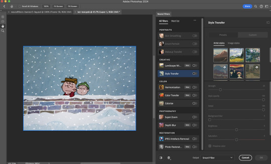
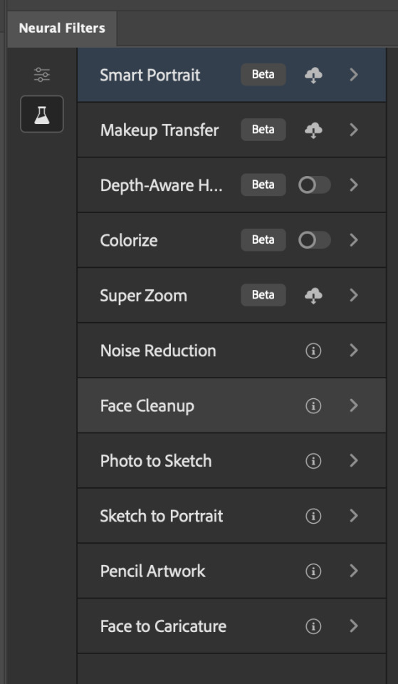
Installing Neural Filters:
Install the individual Neural Filters that you want to use. If the filter isn't installed, it will show a cloud symbol (highlighted in yellow). If the filter is already installed, it will show a toggle button (highlighted in green)
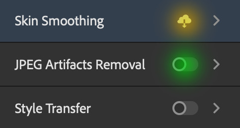
When you toggle this button, the Neural Filters preview window will look like this (where the toggle button next to the filter that you use turns blue)

4. Using Neural Filters
Once you have installed the Neural Filters that you want to use in your gif, you can toggle on a filter and play around with the sliders until you're satisfied. Here I'll walkthrough multiple concrete examples of how I use Neural Filters in my giffing process.
Example 1: Image enhancement | sample gifset
This is my typical Stage I Neural Filters gifmaking workflow. When giffing older or more niche media releases, my main concern is the video compression that leads to a lot of artefacts in the screencapped / video clipped gifs.
To fix the artefacts from compression, I go to Filter > Neural Filters, and toggle JPEG Artefacts Removal filter. Then I choose the strength of the filter (boxed in green), output this as a Smart Filter (boxed in yellow), and press OK (boxed in red).
Note: The filter has to be fully processed before you could press the OK button!
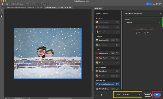
After applying the Neural Filters, you'll see "Neural Filters" under the Smart Filters property of the smart layer

Flatten / render your gif
Example 2: Facial enhancement | sample gifset
This is my routine use case during my Stage I Neural Filters gifmaking workflow. For musical artists (e.g. Maisie Peters), YouTube is often the only place where I'm able to find some videos to prepare gifs from. However even the highest resolution video available on YouTube is highly compressed.
Go to Filter > Neural Filters and toggle on Photo Restoration. If Photoshop recognises faces in the image, there will be a "Facial Enhancement" slider under the filter settings.

Play around with the Photo Enhancement & Facial Enhancement sliders. You can also expand the "Adjustment" menu make additional adjustments e.g. remove noises and reducing different types of artefacts.

Once you're happy with the results, press OK and then flatten / render your gif.
Example 3: Colour Manipulation | sample gifset
Want to make a colourful gifset but the source video is in B&W? This is where Colourise from Neural Filters comes in handy! This same colourising approach is also very helpful for colouring poor-lit scenes as detailed in this tutorial.
Here's a B&W gif that we want to colourise:

Highly recommended: add some adjustment layers onto the B&W gif to improve the contrast & depth. This will give you higher quality results when you colourise your gif.
Go to Filter > Neural Filters and toggle on Colourise.
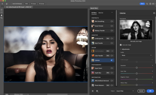
Make sure "Auto colour image" is enabled.
Play around with further adjustments e.g. colour balance, until you're satisfied then press OK.
Important: When you colourise a gif, you need to double check that the resulting skin tone is accurate to real life. I personally go to Google Images and search up photoshoots of the individual / character that I'm giffing for quick reference.
Add additional adjustment layers until you're happy with the colouring of the skin tone.
Once you're happy with the additional adjustments, flatten / render your gif. And voila!

Note: For Colour Manipulation, I use Colourise in my Stage I workflow and Colour Transfer in my Stage II workflow to do other types of colour manipulations (e.g. transforming the colour scheme of the component gifs)
Example 4: Artistic Effects | sample gifset
This is where I use Neural Filters for the bulk of my Stage II workflow: the most enjoyable stage in my editing process!
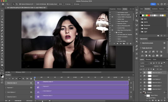
Normally I would be working with my big composition files with multiple component gifs inside it. To begin the fun, drag a component gif (in PSD file) to the main PSD composition file.
Resize this gif in the composition file until you're happy with the placement

Duplicate this gif. Sharpen the bottom layer (highlighted in yellow), and then select the top layer (highlighted in green) & go to Filter > Neural Filters

I like to use Style Transfer and Landscape Mixer to create artistic effects from Neural Filters. In this particular example, I've chosen Landscape Mixer
Select a preset or feed a custom image to the filter (here I chose a texture that I've on my computer)
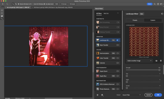
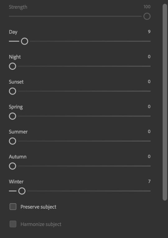
Play around with the different sliders e.g. time of the day / seasons
Important: uncheck "Harmonise Subject" & "Preserve Subject" - these two settings are known to cause performance issues when you render a multiframe smart object (e.g. for a gif)
Once you're happy with the artistic effect, press OK
To ensure you preserve the actual subject you want to gif (bc Preserve Subject is unchecked), add a layer mask onto the top layer (with Neural Filters) and mask out the facial region. You might need to play around with the Layer Mask Position keyframes or Rotoscope your subject in the process.
After you're happy with the masking, flatten / render this composition file and voila!

Example 5: Putting it all together | sample gifset
Let's recap on the Neural Filters gifmaking workflow and where Stage I and Stage II fit in my gifmaking process:
i. Preparing & enhancing the component gifs
Prepare all component gifs and convert them to smart layers
Stage I: Add base colourings & apply Photo Restoration / JPEG Artefacts Removal to enhance the gif's image quality
Flatten all of these component gifs and convert them back to Smart Video Layers (this process can take a lot of time)
Some of these enhanced gifs will be Rotoscoped so this is done before adding the gifs to the big PSD composition file
ii. Setting up the big PSD composition file
Make a separate PSD composition file (Ctrl / Cmmd + N) that's of Tumblr dimension (e.g. 540px in width)
Drag all of the component gifs used into this PSD composition file
Enable Video Timeline and trim the work area
In the composition file, resize / move the component gifs until you're happy with the placement & sharpen these gifs if you haven't already done so
Duplicate the layers that you want to use Neural Filters on
iii. Working with Neural Filters in the PSD composition file
Stage II: Neural Filters to create artistic effects / more colour manipulations!
Mask the smart layers with Neural Filters to both preserve the subject and avoid colouring issues from the filters
Flatten / render the PSD composition file: the more component gifs in your composition file, the longer the exporting will take. (I prefer to render the composition file into a .mov clip to prevent overriding a file that I've spent effort putting together.)
Note: In some of my layout gifsets (where I've heavily used Neural Filters in Stage II), the rendering time for the panel took more than 20 minutes. This is one of the rare instances where I was maxing out my computer's memory.
Useful things to take note of:
Important: If you're using Neural Filters for Colour Manipulation or Artistic Effects, you need to take a lot of care ensuring that the skin tone of nonwhite characters / individuals is accurately coloured
Use the Facial Enhancement slider from Photo Restoration in moderation, if you max out the slider value you risk oversharpening your gif later on in your gifmaking workflow
You will get higher quality results from Neural Filters by working with larger image dimensions: This gives Neural Filters more pixels to work with. You also get better quality results by feeding higher resolution reference images to the Neural Filters.
Makeup Transfer is more stable when the person / character has minimal motion in your gif
You might get unexpected results from Landscape Mixer if you feed a reference image that don't feature a distinctive landscape. This is not always a bad thing: for instance, I have used this texture as a reference image for Landscape Mixer, to create the shimmery effects as seen in this gifset
5. Testing your system
If this is the first time you're applying Neural Filters directly onto a gif, it will be helpful to test out your system yourself. This will help:
Gauge the expected rendering time that you'll need to wait for your gif to export, given specific Neural Filters that you've used
Identify potential performance issues when you render the gif: this is important and will determine whether you will need to fully playback your gif before flattening / rendering the file.
Understand how your system's resources are being utilised: Inputs from Windows PC users & Mac users alike are welcome!
About the Neural Filters test files:
Contains six distinct files, each using different Neural Filters
Two sizes of test files: one copy in full HD (1080p) and another copy downsized to 540px
One folder containing the flattened / rendered test files
How to use the Neural Filters test files:
What you need:
Photoshop 2022 or newer (recommended: 2023 or later)
Install the following Neural Filters: Landscape Mixer / Style Transfer / Colour Transfer / Colourise / Photo Restoration / Depth Blur
Recommended for some Apple Silicon-based MacBook Pro models: Enable High Power Mode
How to use the test files:
For optimal performance, close all background apps
Open a test file
Flatten the test file into frames (load this action pack & play the “flatten” action)
Take note of the time it takes until you’re directed to the frame animation interface
Compare the rendered frames to the expected results in this folder: check that all of the frames look the same. If they don't, you will need to fully playback the test file in full before flattening the file.��
Re-run the test file without the Neural Filters and take note of how long it takes before you're directed to the frame animation interface
Recommended: Take note of how your system is utilised during the rendering process (more info here for MacOS users)
†This is a performance issue known as flickering that I will discuss in the next section. If you come across this, you'll have to playback a gif where you've used Neural Filters (on the video timeline) in full, prior to flattening / rendering it.
Factors that could affect the rendering performance / time (more info):
The number of frames, dimension, and colour bit depth of your gif
If you use Neural Filters with facial recognition features, the rendering time will be affected by the number of characters / individuals in your gif
Most resource intensive filters (powered by largest machine learning models): Landscape Mixer / Photo Restoration (with Facial Enhancement) / and JPEG Artefacts Removal
Least resource intensive filters (smallest machine learning models): Colour Transfer / Colourise
The number of Neural Filters that you apply at once / The number of component gifs with Neural Filters in your PSD file
Your system: system memory, the GPU, and the architecture of the system's CPU+++
+++ Rendering a gif with Neural Filters demands a lot of system memory & GPU horsepower. Rendering will be faster & more reliable on newer computers, as these systems have CPU & GPU with more modern instruction sets that are geared towards machine learning-based tasks.
Additionally, the unified memory architecture of Apple Silicon M-series chips are found to be quite efficient at processing Neural Filters.
6. Performance issues & workarounds
Common Performance issues:
I will discuss several common issues related to rendering or exporting a multi-frame smart object (e.g. your composite gif) that uses Neural Filters below. This is commonly caused by insufficient system memory and/or the GPU.
Flickering frames: in the flattened / rendered file, Neural Filters aren't applied to some of the frames+-+
Scrambled frames: the frames in the flattened / rendered file isn't in order
Neural Filters exceeded the timeout limit error: this is normally a software related issue
Long export / rendering time: long rendering time is expected in heavy workflows
Laggy Photoshop / system interface: having to wait quite a long time to preview the next frame on the timeline
Issues with Landscape Mixer: Using the filter gives ill-defined defined results (Common in older systems)--
Workarounds:
Workarounds that could reduce unreliable rendering performance & long rendering time:
Close other apps running in the background
Work with smaller colour bit depth (i.e. 8-bit rather than 16-bit)
Downsize your gif before converting to the video timeline-+-
Try to keep the number of frames as low as possible
Avoid stacking multiple Neural Filters at once. Try applying & rendering the filters that you want one by one
Specific workarounds for specific issues:
How to resolve flickering frames: If you come across flickering, you will need to playback your gif on the video timeline in full to find the frames where the filter isn't applied. You will need to select all of the frames to allow Photoshop to reprocess these, before you render your gif.+-+
What to do if you come across Neural Filters timeout error? This is caused by several incompatible Neural Filters e.g. Harmonisation (both the filter itself and as a setting in Landscape Mixer), Scratch Reduction in Photo Restoration, and trying to stack multiple Neural Filters with facial recognition features.
If the timeout error is caused by stacking multiple filters, a feasible workaround is to apply the Neural Filters that you want to use one by one over multiple rendering sessions, rather all of them in one go.
+-+This is a very common issue for Apple Silicon-based Macs. Flickering happens when a gif with Neural Filters is rendered without being previously played back in the timeline.
This issue is likely related to the memory bandwidth & the GPU cores of the chips, because not all Apple Silicon-based Macs exhibit this behaviour (i.e. devices equipped with Max / Ultra M-series chips are mostly unaffected).
-- As mentioned in the supplementary page, Landscape Mixer requires a lot of GPU horsepower to be fully rendered. For older systems (pre-2017 builds), there are no workarounds other than to avoid using this filter.
-+- For smaller dimensions, the size of the machine learning models powering the filters play an outsized role in the rendering time (i.e. marginal reduction in rendering time when downsizing 1080p file to Tumblr dimensions). If you use filters powered by larger models e.g. Landscape Mixer and Photo Restoration, you will need to be very patient when exporting your gif.
7. More useful resources on using Neural Filters
Creating animations with Neural Filters effects | Max Novak
Using Neural Filters to colour correct by @edteachs
I hope this is helpful! If you have any questions or need any help related to the tutorial, feel free to send me an ask 💖
#photoshop tutorial#gif tutorial#dearindies#usernik#useryoshi#usershreyu#userisaiah#userroza#userrobin#userraffa#usercats#userriel#useralien#userjoeys#usertj#alielook#swearphil#*#my resources#my tutorials
544 notes
·
View notes
Note
hi i'm sorry to bother you but do you have any tips on giffing dark indoor scenes? yours always look so good!
hi there! not a bother at all :) i can definitely try to explain the steps i usually take under the cut!
this tutorial will assume that you already know the basic steps of gif-making — if you don't, there are lots of great tutorials floating around on this site that can help you out! :)
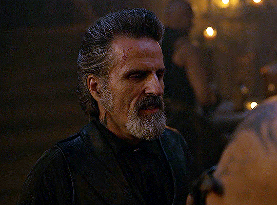
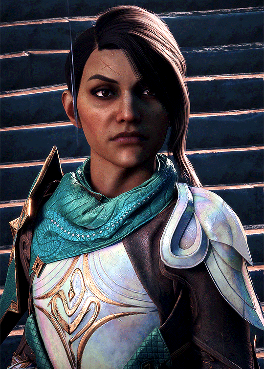
here's the gif i'll work with to explain my steps, the bottom being the original and the top being the coloured/brightened version.
before we start, a general tip i recommend keeping in mind: if you want to brighten a dark scene, you'll want to get your hands on the highest quality download you can find. 1080p is decent, but if your laptop can handle 2160p 4k hdr files* without sounding like it's about to explode, that'll get you even better results!
(*colouring hdr 4k files requires a different set of steps — the scene will appear washed-out on photoshop, so you need to make sure that you don't end up whitewashing anyone if you do choose to work with this type of file.)
since most of my downloads are 1080p, i'll use this type of file in this tutorial.
the first step of my gifmaking process with 1080p files is almost always the same no matter what scene i'm giffing. i make a brightness/contrast layer and set the blending mode to screen:
now my gif looks like this:
depending on the scene and how washed out it looks after this layer, i'll play around with the opacity. for this gif, i didn't touch the opacity at all. use your best judgement for this, because every scene is different!
i find that dark indoor scenes are usually tinted in yellow or green. one of my first goals is to try to fix the undertone of this scene before focusing on brightening it any further. i go to colour balance for this, and play around with the midtones, shadows, and highlights.
again, every scene is different, so the amount to which you use colour balance will differ, but for this specific scene, my goal was to neutralize the yellow. i focused particularly on the midtones and shadows of the colour balance layer, moving the scales to the opposite of the reds.
doing so will help with neutralizing the yellow. the only reason i moved the scales towards magenta and blue (therefore making it a bit more red than less) rather than green and yellow in shadows was because i wanted a darker contrast in the blacks. moving them to green and yellow made the overall scene more yellow since there were so many dark spots that shadows affected. (you'll see what i mean when you start experimenting with your own gif — this part of the process really just depends on your preferences!)
our gif might not look that much better yet, but it will soon! our best friend channel mixer is gonna help us out. for an in-depth post about how to use this adjustment layer, i recommend checking out this tutorial.
i'm someone who prefers to make more than one layer for the same adjustment layer for a reason i can't even explain (i just find that it helps me stay more organized). so don't think of this process like i can only use this layer once so i MUST fix it NOW. you can create multiple layers of the same adjustment layer, because every layer on top will affect the ones underneath it.
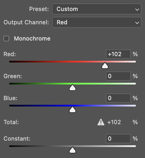
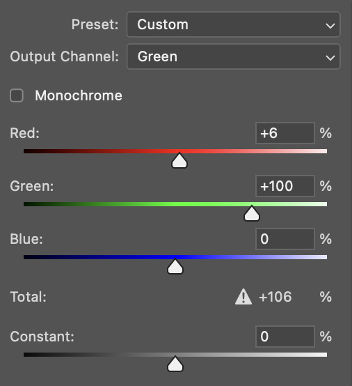
since my priority is getting rid of the yellow tint, i went to the Blue section of the channel mixer and increased it in all of the scales:
this step alone has helped us out so much, because look at our gif now!
not only does the background look less yellow, but so does izzy's skintone.
now i'm going to focus on trying to brighten the scene even more without destroying the quality. the levels layer can actually help out a lot with this.
the amount to which i move each toggle differs per scene, and i think experimenting depending on your gif works best for this layer.
side note: i prefer not to use the ink droppers on the side because the contrast in the result usually ends up feeling too strong for my preferences, but if you find that this works better for you, then go for it! basically, the first dropper with the black ink should be clicked before you select the darkest part of the scene that you can find, and vice versa for the third dropper with the white ink — click it, and then select the brightest part of your scene.
curves is the next layer that does fantastic work! unlike the levels layer, i do actually use the ink droppers for this. it's the same concept, with the first dropper being used on the darkest part of the scene, and the third dropper on the brightest.
try to think of curves as something that not only further brightens your scene, but also helps with the colour neutralizing process.
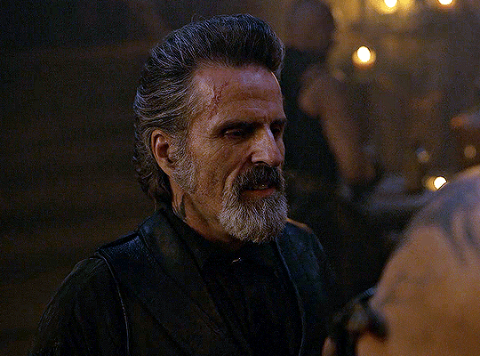
i grab the first dropper, then click the darkest parts of the gif that i can see. depending on the undertone of the blacks that you're clicking on, the tint of your gif might actually change significantly. this is why i prefer to click once, then undo the action if i don't like what it gives me. izzy's leather jacket was the sweet spot for this gif.
when i'm satisfied, i make another curves layer and use the third dropper to click the bright/white parts of the scene. for this gif in particular, the lights in the background were a good fit because they carried a yellow undertone — this meant that my curves layer actually helped to further neutralize the yellows in the scene as a whole!
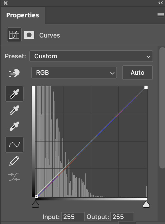
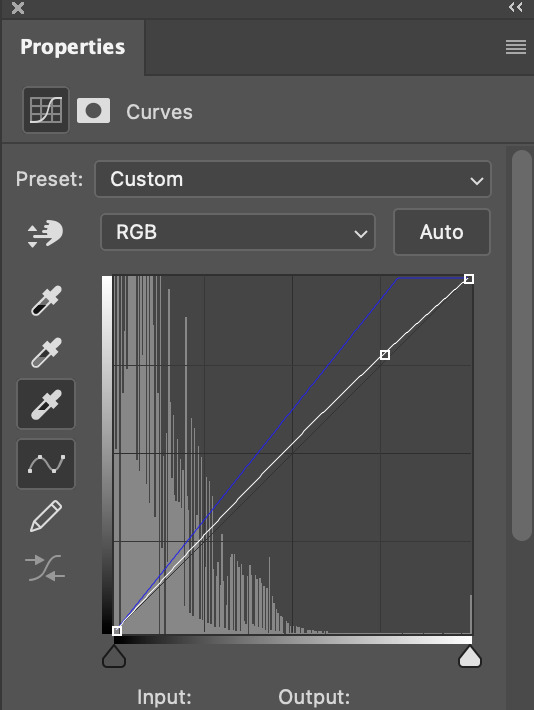
(i manually dragged the curves graph upwards for the third dropper to make it brighter. i don't need to do this if the dropper does this for me automatically, but since the lights were pretty bright, it only changed the tone of the scene and didn't increase the brightness — hence the manual step.)
pat yourself on the back, because this is what our gif looks like now!
this is good, but it's not great — there's still just a bit too much yellow in the scene for my liking (sorry, i'm picky! :P)
i created another channel mixer layer and played with the toggles until i was satisfied:
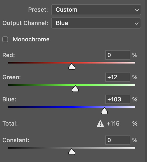
ta-da! the gif as a whole is much less red/yellow now:
this is when i start fixing the colouring now — namely, his skin tone. selective colour will be your best friend here. i wanted to make his face just a tad brighter and less of a yellow-ish magenta shade, so i focused on the reds and yellows.
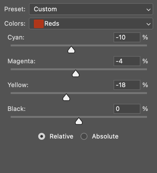
then, out of habit, i created another selective colour layer and took out more of the "yellow" in the whites to make them whiter, and increased the black (just by +1, since the contrast is pretty good enough already).
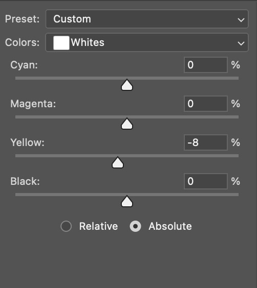
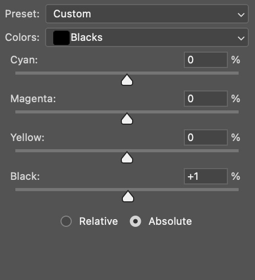
note: i switched to "absolute" for these two colours. basically, relative = less vibrant colour manipulation, and absolute = more vibrant/stronger colour manipulation. i prefer to stick to "relative" for fixing skin-tone since "absolute" can be a bit too strong for that.
our gif looks like this now!

his face looks brighter and much less yellow, so i'm satisfied!
this next step is not mandatory at all — again, i'm just picky and despise yellow-tinted scenes. i personally believe that indoor scenes that are yellow/green tinted make them look more dark than they actually are, so i do my best to get rid of these colours.
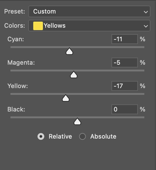
i also don't always do this, but for this gif, i just simply went to hue/saturation, selected the yellows from the drop-down menu and decreased its saturation.
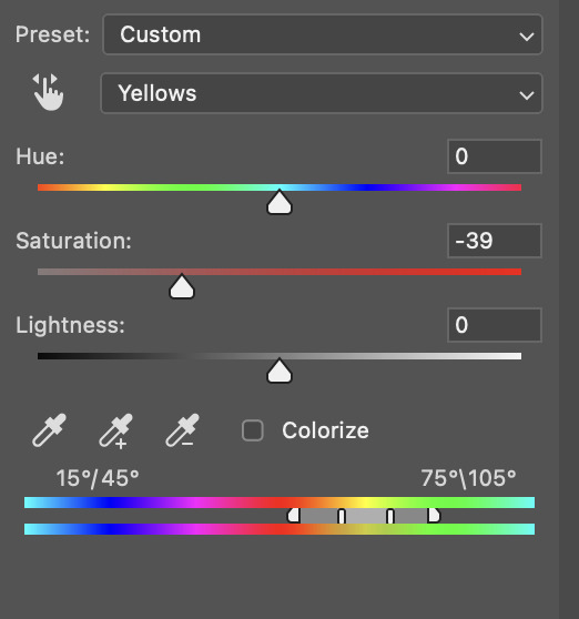
be careful not to do this too much. depending on the quality of your download, this can significantly decrease your gif quality. i tend to worry less about this when i'm working with 2160p files, but again, those files require an entirely different set of steps when it comes to brightening/colouring.
since this was a 1080p file download (and one that was actually less than 1GB, oops, don't do that), i played it safe and decreased it by -39 only.
note: you also want to be cautious of colour-washing skintone when it comes to this step. i find that another selective colour layer can help perfect the skintone in case the yellow drains out of it too much, but skip the hue/saturation step if it's too difficult to work with — better to be safe than sorry.
anyway, this is the final gif!
that's usually what i do when it comes to colouring dark indoor scenes! i hope this tutorial makes sense, and if you have any further questions, don't hesitate to reach out! :)
#tutorial#gif tutorial#resources#completeresources#coloring tutorial#allresources#dailyresources#userraffa#userdean#uservivaldi#alielook#usercats#usermoonchild#usernaureen#userbarrow#userabs#useraish#useralison#userisaiah#*mytutorials#i am so sorry if this is incoherent#it’s so hard to explain things coherently 😫
756 notes
·
View notes
Text
TS3: CAS Lighting Edit
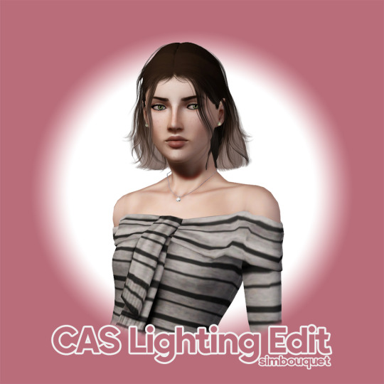
Last year, I was experimenting a little bit with the CAS lighting and managed to come up with this neat little mod that I’ve had sitting around up until now. I figured it was about time I shared, so here it is!💡
More info and download under the cut!
Click here to see a comparison preview!
This CAS lighting is much less flat than EA’s default, with defined shadows that draw attention to the Sim’s face and add depth to their features, overall making them more faithful to what they’ll look like during gameplay. It also happens to make the mirror reflection just a little more bearable to look at! :P
Compatibility
This mod is compatible with all your usual world lighting mods, since they edit completely different resources.
This mod is incompatible with any mods that edit the CustomLightRigging _INI resource. AFAIK, the only other mod like this that’s out there at the moment is @criisolatex's lovely Pure CAS Lighting Mod, which I recommend if you prefer a more stylized, silky-smooth look.
Download: SFS / MTS / Patreon
Place the .package file in your Packages or Overrides folder.
Credits & Thanks
s3pe: Exporting/Importing resources, creating the .package file.
Notepad++: Editing the .ini file.
Adobe Photoshop 2024: Creating the preview images.
@criisolate's CAS pose: Used in the main preview image.
ChérieDawn67's white CAS background: Used in the main preview image.
simsi45's CAS Room Recolored: Used in the comparison images.
Thanks to @misspats3, @antoninko, @simplyslow and @probablyzora for testing and giving feedback!
Thanks to the lovely community at TS3 Creators Cave!
429 notes
·
View notes
Text
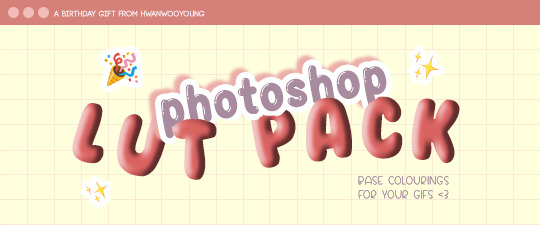
well well well... happy birthday to me 🥳
to celebrate, here's a lil LUT pack that you can use as a ✨base✨ for your colourings, whether you're a gifmaker, gfx artist or video editor!
thank you to all my moots for always being there for me and for blessing my dash with all your amazing works!! 💖 thank you for keeping this hellsite running; i hope this gift could be a small help to you if you're ever in a pinch 🥰
(also, moots! could i trouble you to help me fill in this form please? 💖 the form is open to all moots even if we haven't interacted 🥺)
to everyone else who supports me, my biggest heartfelt thanks to you all!! 😁😁 i wouldn't be where i am without you, so thank you so so much!!! 💕
🚨 [DOWNLOAD]
this LUT pack is open to everyone, so feel free to download and use as a lil stepping stone for your content! 😁 it'll be long, so everything will be under the cut!

Here’s how to use LUTs in your colouring:
✨ FOR ONE-TIME USE:
Make your gif as usual until the colouring process
In Photoshop, go to Adjustments > Colour Lookup
Make sure ‘3DLUT File’ is selected
In the dropdown menu beside ‘3DLUT File’, click ‘Load 3D LUT…’
Navigate to where you saved the downloaded LUTs
Click on the selected LUT to load it. It will be automatically applied to all your frames
Done! Now you can export the gif, or continue refining the colouring
✨ FOR PERMANENT USE:
Find your Photoshop folder (under Applications for Mac; under Documents for Windows)
Go to Presets > 3DLUTs
Drag in the .3DL / .CUBE LUTs that you downloaded into this folder
Close the Finder / File Explorer
Open Photoshop
Make your gif as usual until the colouring process
In Photoshop, go to Adjustments > Colour Lookup
Make sure ‘3DLUT File’ is selected
In the dropdown menu beside ‘3DLUT File’, click ‘Load 3D LUT…’
Navigate to where you saved the downloaded LUTs
Click on the selected LUT to load it. It will be automatically applied to all your frames
Done! Now you can export the gif, or continue refining the colouring

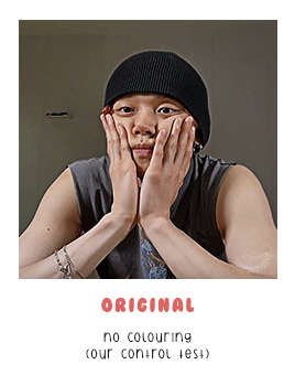
✨ LEFT GIF: ORIGINAL
- no colouring (used as a control test)
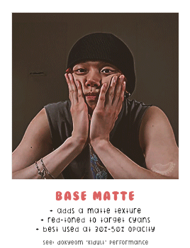
✨ RIGHT GIF: BASE MATTE
- adds a matte texture
- red-toned to target cyans
- best used at 30% - 50% opacity
- used in this set: dokyeom "kidult" perfomance


✨ LEFT GIF: BASE 1
- good for overly bright videos
- more blue-toned
- used in this set: seonghwa visual cam
✨ RIGHT GIF: BASE 2
- good for overly bright videos
- best used at 50% opacity
- used in this set: jennie "solo" perfomance


✨ LEFT GIF: BASE 3
- red-toned to target cyans
- best for green/yellow-toned videos
- used in this set: hoshi 'code:graphy' photoshoot behind
✨ RIGHT GIF: BASE 4
- good for overly bright videos
- best for green/yellow-toned videos
- used in this set: mingi "guerilla" 8K cam


✨ LEFT GIF: BASE 5
- aims to balance skin tone
- best for yellow-toned videos
- used in this set: yeonjun essence of dance
✨ RIGHT GIF: BASE 6
- red-toned to target cyans
- increases contrast
- used in this set: jeonghan caratland 2024

✨ LEFT GIF: BASE 7
- best for blue-toned videos
- increases contrast
- used in this set: wonwoo odg video
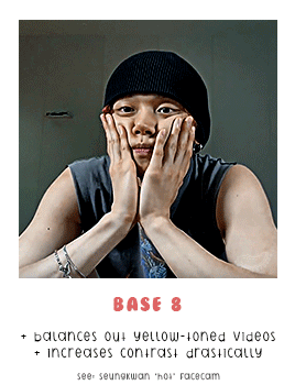
✨ RIGHT GIF: BASE 8
- balances out yellow-toned videos
- increases contrast drastically
- used in this set: seungkwan "hot" facecam


✨ LEFT GIF: MUBANK 1
- ideal for music bank interviews
- aims to balance skin tone
- used in this set: yeosang mubank interview
✨ RIGHT GIF: MUBANK 2
- ideal for music bank interviews
- more red-toned
- increases contrast
- used in this set: jeonghan mubank interview


✨ LEFT GIF: SPOTIFY
- ideal for spotify on! videos
- aims to balance skin tone
- slight matte texture
- used in this set: wooyoung spotify cat aegyo
✨ RIGHT GIF: WIRED
- ideal for (most) wired interviews
- aims to balance skin tone
- increases contrast slightly
- used in this set: jennie wired autocomplete interview

🚨 [DOWNLOAD]
to reiterate again, this is a ✨base✨ for colourings, not to replace your actual colouring! one base does NOT fit all 😇 experiment and see what works best for you!
and that's the end! if you scrolled all the way here, thank you for taking the time to do that 😄💖 i appreciate you so much!!
#igm.talk#igm.ref#useranusia#usertheos#useryeonbins#fordaniseyes#userchoi#useryenas#heysol#userzaynab#hanaablr#useroro#lucieblr#tuserflora#usersemily#chwedoutbox#vacantlook#forparker#tuserrowan#melontrack#forbelleseyes#useregoisthye#userkngld#userresa#anniehae#lunanuggets#moots please help to fill in the form at the top of the post 💖💖#it's 12am kst so it's my bday in korea teehee#im also going to bed now so sorry if i dont see anyones messages :(
86 notes
·
View notes
Text
Dev Pile 2025-06 — Starter Kit
Making dev piles is a new experience for the blog in that they are explicitly deliberately timely. Where most of the work on this blog is thrown weeks, sometimes months in advance if it doesn’t fit neatly in a single spot, I am trying to make sure I write any given Dev Pile article covering the ‘week before’ the article goes up. This is a new kind of work for me, and it’s necessitated working ahead.
The week this article is being ‘written in’ is the week after Cancon. I had a plan for this week: I was going to spend the week writing an article developing the game dev I did, at cancon, in the dull periods at the table between the sales. Thing is, this year, that did not happen – Cancon was pretty much completely constant, so much so that the first day I didn’t even notice I never pulled out my notebook and what notes did get taken during the whole event were surface, or sketching out some minor ideas.
Therefore instead of a single intense focus here, this is going to be something of a hello and hey, here’s how to get started article about game making, tools, and prototyping.
Who Can Make Games?
You can make games. I can make games. Anyone who wants to can make games. The access you have to industrial scale production equipment to make the game you’re designing into something that looks like conventional product is a little more attainable than you may think, thanks to modern tools.
The core of you making games is this: Can you explain a set of rules to another player that let them understand how to play the game?
Great, then you’ve made a game. The next step is working out how to make that game the kind of game you want it to be. And to paraphrase what Adam Savage once said, the difference between doing game development and screwing around is just writing things down.
Tools
First things first, if you have a tool you like for any of the stated purposes, then you should use the tool you like. The tools I describe here should all be free, but that can make them less convenient in ways you may not like.
To write rulebooks, I use LibreOffice. This is a text editor in the same vein as Pages and Word, and much like Google Docs. We’ve pretty much solved ‘writing in a document for a computer user to read’ as a format, and that format has been kinda the same for thirty years. Notably, a formal editor like this lets you do tables and give texts formatting entries like heading styles, which means you don’t have to work to translate that stuff to a website like a wordpress content management system. Under the hood, these two things know how to talk to one another.
Notepad is a valuable tool as well for when you need ‘scrap’ text – no formatting, just some numbers or the like, but literally anything will do here.
Almost inevitably any given game design I have will need a spreadsheet. Sometimes a spreadsheet lets me present a skeleton of a game, with say, a sheet of 52 entries that just indicate the information on a card’s face. That means I use LibreCalc, but I only started using that seven months ago, when I learned about the IFS function. The version of Excel I was using from 2007 didn’t have this ‘new’ functionality, and I found that very useful. You may ask: How often do you need ‘IFS’ in game development and the answer is never. There are definitely thihngs I can use spreadsheets for, but these functions are not super necessary.
To do visual editing I use GIMP, pronounced ‘noo-imp,’ because gimp is a silly word to use in everyday conversation and it has worn its welcome out in my tongue. GIMP is a program that takes some getting used to, but the heart of what it is is a powerful photoshop-level program that puts almost everything it has directly under your control, including warp tools, healing tools, stamp tools and other simple filters. I will usually use GIMP to generate a template file or example for how a card should look, and then, when I want to put those cards into a file to make a pdf for printing, I turn to…
Scribus! Scribus is my layout and DTP program that I avoid using in every situation I can. I dislike Scribus interface a lot, and as a result, I route around it – I try to make sure that if I’m doing something in a design that Scribus ‘could’ do, I will ensure that Scribus is the only thing that can do it, and if something else can do it, I’ll do it that way. This is a combination of familiarity and convenience: Scribus is by no means a bad program, I’m sure, but I don’t like using it and it feels very easy to break things, which means when I do use it, I’m probably using it ‘wrong,’ and a Scribus expert would want to correct my technique.
For making simple slideshow videos, where I just show a thing, talk about it, and move on, I use the program OBS, which you can use for rules tutorials or explainers. OBS has its own ability to do slides – which you can make in a slideshow program like Google Slides or powerpoint or Prezi if you like – and then you talk over it, advancing the slides in OBS. It’s a very powerful, very flexible tool, but I can understand if it’s a bit overwhelming to start with.
If you want to record audio for your game, which is a cool thing to do, I use Audacity. It’s a simple audio program if you’re just using it for its basic functions, but it can be great if (for example) you want to record audio diaries of your creation process.
Also, mixed in with this is, cardboard, paper, scissors and glue. Playing cards need a standardised form so you can make a ‘blank’ deck of cards by taking an ordinary deck of cards and putting large, white, laundry stickers on each face, ‘wiping’ it so you can write what you want on the face.
Art Though?
I use free art where I can. There’s a lot of art assets, paid and free over on itch.io, which you can definitely use to make your game work look more interesting than base. And of course…
Bandaid tearing off time,
There are free image generators that you can use if you are comfortable with that. My advice is that you should only ever use generators for ‘zero value’ forms of media; that is, nothing you intend to sell and nothing you intend to use as identifying for yourself; don’t use a generator for a logo for your identity or brand, for example, because that’s uncopyrightable and then someone can just copy it. Even if they don’t, the fact they can undermines the copyright value of designing your own logo and title.
But yeah, image generators are available online. When I need an image for an example, the one I recommend using is dezgo, because it doesn’t require a login, doesn’t require you to pay money, and all it asks of you is time to let it finish working. You’re not going to get timely bulk media out of it, but that means, in my mind, that any artwork it generates is going to be worth scrutinising and editing to make it more appropriate to your needs. This is part of a greater conversation, but for now, the important thing is that if you’re going to use generative tools you need to make sure you recognise what they’re bad at and what they’re bad for.
Getting Started?
Alright, you have some tools to make what you have in mind more possible. What I recommend you do, and I will delve more into this later in the week, is make a prototype, and then, once you have the prototype, look at it seriously.
You’re going to have to get your head around the question what do I like without asking the followup question why at first. What is it about your prototype that satisfies you? What would you change if you could? Why isn’t it satisfying to you, what about it makes you concerned. Are there things you haven’t thought about because of biases you have? Is it a game you can’t play with one hand?
The point is the prototype marks the point you start finding out. You don’t need a perfect game to prototype – indeed, I have a lot of very ugly games as prototypes and I think those ugly prototypes work really well as a place to start working out what to do next.
Check it out on PRESS.exe to see it with images and links!
19 notes
·
View notes
Text
holy shit this year marks 10 years of this blog and moz!! i can't remember the exact date i started posting here - my archive says i have one post from november 2013 but let's disregard that - but i do remember it was around late 2014/early 2015 :)
^ one of the very first moz art pieces i ever drew, for fallout week 2015!!
memories and art through the years under a read more bc it got long
2014 → baby's first rpg!! i started playing fnv on my cousin's jailbroken xbox late 2013 and finished mid 2014 and i loved every minute of it. i remember waking up at 8am and playing almost nonstop until 2am the next day haha!
i didn't play moz on my first playthrough - but i did start creating a character that would eventually become her: a shorthaired ex-boxer who punched her way through obstacles when diplomacy failed. i remember she spent a lot of time with boone. i liked him then, because he saved my ass more times than i can count. but i digress. this is draft 1 moz essentially
2015 → this is the year that i was doing my thesis so i could graduate but i was so depressed and stressed about it that i distracted myself by replaying fnv on pc, where i played through the dlcs for the first time. i fell in love with the dlcs' oversarching story; particularly ulysses, who i became obssessed with, especially since i couldn't find any content of him at the time. in the game, i played as moz; i had most of her personality and choices down, but her backstory was still up in the air.
fun fact: this was an existing sideblog that i remade to be a fallout blog so i could look for ulysses content, and when i couldn't find any, i made some myself, featuring moz as my main courier six. originally, i didn't ship them, but eventually i ended the year as a courier/ulysses otp shipper.
this was the year i started drawing digitally - my uncle let me borrow a drawing tablet and i used an old copy of photoshop i pirated hehe
2016 → i graduated this year!! and promptly fell deeper into my depression. this was the year that it got so bad that i had to be medicated. through it all, this blog and moz and ulysses and my fandom friends were with me. and for that i am truly grateful :) this was the year i figured out how to lock transparent pixels so that i could color my lineart lol
2017 → i started hammering out moz's backstory this year i think. there's a lot of sketches of her and her family in my files. i experimented with shading and backgrounds here but that experimentation was pretty short-lived
2018 → i started using references seriously!!!! i did a lot of oc on oc kissing this year, featuring mostly moz and many friend ocs haha

2019 → didn't draw much this year. actually this year was a blur and i can't remember much from it except from it being the year of my terrible no good bad copywriting jobs... anyway i did manage to continue my courier/ulysses brainrot and make this piece, which i'm still proud of
2020 → pandemic time. i spent a lot of time asleep at home and i think this was also the year i started doing commissions?? shoutout to anyone who has ever commissioned me - thank you so much, i truly appreciate it!!

2021 → i switched from my old-ass pirated photoshop to clip studio paint and never looked back. also i did a bunch of commissions for my grandmother's surgery, which failed, and i distracted myself from the sadness by drawing my ocs over and over and playing disco elysium

2022 → by this year, i've got moz down pat and have started vaguely developing other ocs instead. but she's still always at the back of my mind

2023 → i bought new brushes from true grit texture supply and immediately found new favorites that i started using for everything. i tentatively started incorporating background elements in some pieces!
2024 → while it's still too early to say where this year will lead me art-wise, i will say that i started experimenting in realistic paint studio (which i bought in 2021, the same time as clip studio paint) a few days ago and i'm liking the results so far. we'll see!

all in all, these last 10 years have been quite a ride, but i'm glad i stuck around and i'm glad you guys stuck around too!! much much love 💖💖💖
#shh peri shhh#god. look at that old art... i took the ones that i still kinda liked but the rest...#well i don't hate them. but they're old and of their time and i wish i could redo them lmao#my art#moz
96 notes
·
View notes
Text

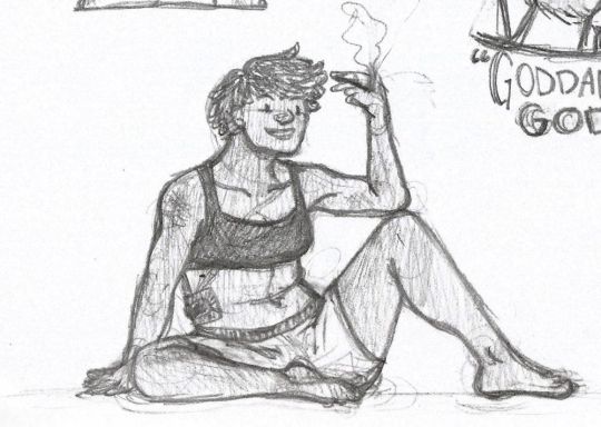
A scene from a ghost in the shell that latched on to my brain and refused to let go
So, bit of a tangent under the cut, nothing to do with the fic lol
I switched over from an iPad pro with procreate to a Samsung tablet and lemme tell you I have WORDS
It's been ages since I owned Samsung anything, I've been balls-deep in the Apple ecosystem for like a decade, and then I got a gaming laptop and realized how shitty imacs were. Then I got a Samsung tablet and realized how shitty ipads are. Procreate is a great drawing app when you're somebody who's never used a professional program to draw and is just getting into the digital art space. Or if you're someone who draws casually, but would like the power to draw professionally and doesn't want a computer/drawing tablet set up. It's a great meet-in-the-middle kind of thing, but the brushes are kind of ass,
(Yes I know you can import brushes, yes I know photoshop brushes are also compatible, yes I know all the settings you can customize for your brushes. The experience is still ASS, and it has a bit to do with ipads filing system, and a bit to do with procreates confusing windows, because you can't actually just download a brush and go, you have to (and this depends on what browser you're using) download them, drag them to an appropriate folder within your ipads files app, unload them, then drag the over to your procreate app, then spend 15 minutes figuring out if procreate made a new folder for them or stuck it in an already existing one.)
the smudge tool high key sucks, the whole app engagement being gestures/icons and not buttons was kind of annoying at best, and straight up caused me to lose hours of work at worst. You have to really fennangle with the app and it's gazillion settings to set it up just right so that it works for you, which is fine. Every app has a learning curve, Photoshop is the same way and that's the industry standard.
But I'm not a professional artist, and ipads are kind of really fucking expensive to buy just for procreate.
And then there's the "how the fuck do you save/back up your art" issue. IpadOS does have a files system, but it's genuinely the worst to navigate, the tagging system barely works, renamimg and sorting stuff is annoying to do, and the search feature doesnt work half the time. Procreate has no option to save (auto or not) anything anywhere, it all stays on the app, and files can get pretty big to just leave them on there. Not to mention if something goes wrong, something gets corrupted, there's no way to restore anything. Once it's gone, it's gone. If you want to back anything up you have to manually, one by one, bring the files over from procreate to the files app, then from the files app to a computer of your choice (and then from there to a hard drive if you want) because guess what, you can't plug a hard drive directly to your ipad, and you can't stick a micro USB in there either. The process of moving my art from my ipad files to my windows laptop was a fresh kind of hell I wouldn't wish upon anyone. Now, I've only had this happen to me once in the 8 years I've had procreate, but there is a very real chance that with an ipad software update procreate will just kill itself and all your art with it. I've since learned to back everything up before my ipad decides to auto update, despite me turning off auto updates.
Ipads also give you no other option than procreate to draw. Yes, ibis paint and auto desk and like 3 other apps are on the app store, but they are ass anus on the iPad, especially in comparison to procreate. They're laggy, they lack a lot of key features, they have ads plastered everywhere, (which you can pay to take those away, but it doesn't really make the app any better), and there's no flexibility with brushes and textures and layers or just anything you'd really need.
The ipad itself kind of sucks too. It's pretty limited in what you can do with it given all the power the pros especially have. There's a video by dankpods on YouTube that explains it better than I can but for something that's trying to be a laptop replacement, it seriously sucks at it. All throughout college I used my ipad for note-taking, projects, assignments, and just general school work, but please don't be me and get yourself an actual laptop. The only thing my ipad was good for was note taking, and that was only because the app notability auto saved all my notes to my Google drive. That's it. The native notes app SUCKS. Multitasking on the ipad? Ass. Researching? Ass. Writing papers? Ass. Hell even the picture in picture thing was so annoying to get working and move out of the way enough to get other stuff done too. I really did try to do everything on there, it was easier and lighter to carry around, but I ended up grabbing my laptop for everything anyways. Ipads are good for watching movies here and there, maybe doodling, taking notes, but that is ALL they're good for.
Side note: I'm Bilingual, and that thing ios does where it changes the language of my keyboard whenever it just assumes I need it is actually so annoying, and I haven't found a way to stop it from doing that outside of just deleting the other keyboards.
The Apple pencil isn't getting away from this rant either. I'll scream this from the top of my lungs, the only reason the Apple pencil costs as much as it does is because it's the ONLY pen you can get for the ipad for drawing. NOTHING ELSE WILL WORK. NOTHING ELSE WILL GIVE YOU PRESSURE SENSITIVITY/TILT SUPPORT. and I personally think that's an incredibly evil scam. Apple can get away with charging whatever they want for the Apple pencil, which is truly no better than the Wacom bamboo one I got for my Samsung, because they've designed in such a way that only they can make their stuff compatible. It's so stupid. $1200 usd for an ipad and the damn thing doesn't even come with the stupid ass pen.
Side side note: scribble or whatever it's called, that thing where you can write with the Apple pencil and it turns it into text? Genuine booty with the Apple pencil/ipad, it's so useless I forget that it's even an option. It takes forever to think what it was that you wrote, even if you have beautiful handwriting. Its laggy, and inaccurate, the auto correct drives me nuts. And good luck trying to use it with any other language that isn't English.
Samsung has the same feature, and so far I've had ZERO issues with it. It goes letter by letter rather than word by word like the ipad does, it's so much better at accurately typing what I wrote, there virtually no lag, and it works just as well with other languages.
I've had my Samsung tablet for about 2 months, and it was, one, cheaper! The screen and colors are beautiful, krita and infinite painter are great drawing apps (the sketch posted here was done in infinite painter) the tablet CAME WITH A PEN, which admittedly was kinda shit for drawing specifically, but i got another one because there are other options!!! Other affordable well working options!!! Infinite painter and krita save backups of your art locally! AND I can both stick a micro USB AND a hard drive in it! It runs smoother than my ipad ever did, taking notes on it is a much smoother experience, apps are more diverse, and multitasking works so much better. I also think the aspect ratio of Samsung tablets make more sense for art/creative works than the ipads since it's more monitor/computer screen shaped but that's just me.
Side side side note: you have to charge the Apple pencil to use it at all, and the only way to store it is on the charger, which makes the pencil hot if actively charging, and ruins the battery capacity over time. I've had my 2nd gen apple pencil for about 4 years, (I had the Apple pencil 1st gen for the same amount of time before that) and the battery has depleted a bit, though it still lasts a pretty long time. They do last a good day or two with little use off the charger, and about 6 hours of constant use be it note taking or drawing. I havent had too many issues with finding it dead and having to wait for it to charge, it charges pretty fast, but it still happens.
The Samsung s pen doesn't need to be charged to work. It has a battery, but you only need it for the Bluetooth features like gesture and whatnot, but I don't use them at all, so I don't charge it since the placement of the charger is awkward. But it doesn't matter cause it works anyways. Same with the Wacom pen I bought with it! It doesn't charge at all it just works!
Moral of the story; if youre a professional artist and you have the money/want a portable option, power to you get an ipad. Not a professional artist? Don't wanna spend that money? Get literally anything else.
#keki draws#rottmnt#a ghost of a shell#tmnt#rant#ipads#procreate#samsung#infinite painter#I FORGOT LEOS TAIL FUCK
10 notes
·
View notes
Note
hi! i hope it isn’t annoying to ask but i really wanna get into gif making and was just wondering what you used to make your gifs? photoshop or premiere? any advice? its cool if you ignore this i just wanted to try asking
Hi! It's not annoying at all!
I use photoshop to make my gifs and nvidia geforce experience (I think that's what it's called at least) to record gameplay.
My personal favorite giffing "trick" is this set of photoshop actions made by @redbelles
I know a lot of people like to use screen caps to make their gifs but I think that's way too time consuming so my method is:
Open PS -> File -> Import -> Video Frames to Layers
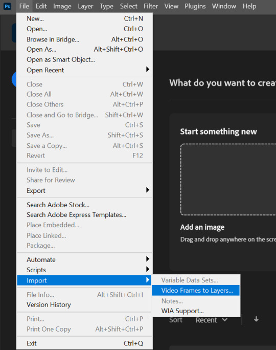
Then select the video you want to gif:
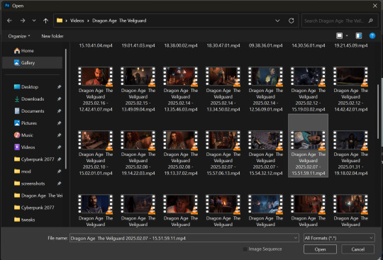
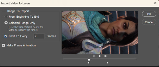
A little box will pop up. Now select "Selected Range Only" & "Limit To Every [2] Frames" and drag the little markers to the parts of the video you want in your gif & hit OK
You should have something that looks like this:
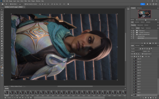
If you don't have the timeline at the bottom go to Window -> Timeline
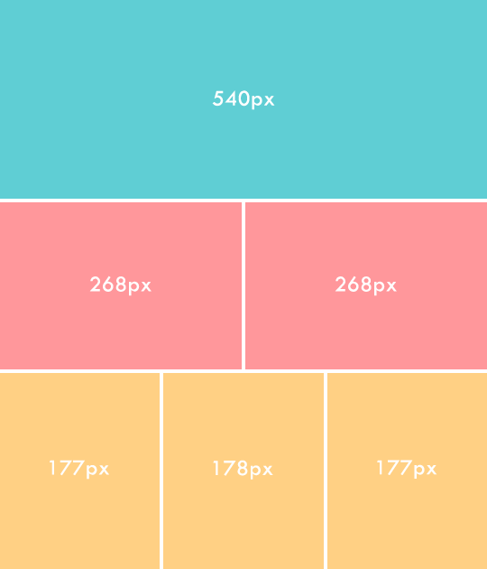
Next you'll rotate, crop, and resize to whatever you want. These are the basic tumblr dimensions (by width) you'll want to stick to these or your gifs will look funny. (I don't remember who made this little graphic, sorry)
After cropping and resizing it's time to use the action I linked above. Run the DICOM ACTION and hit okay on both smart sharpen windows (change the settings here if you want)
Your timeline will now look like this:
Now is when you'll color your gif. I'm not gonna go into too much detail here because I'm simply not good at explaining my process but I know there's a bunch of tutorials out there on how to color. For reference, my adjustment layers end up looking something like this:
I usually just go for an enhanced version of the original coloring. Play around with opacity and blend modes until you find something you like. I typically keep everything on normal, except for gradient maps which I set to soft light.
So I've done some really basic coloring and now it's time for the second action. Run the SAVE ACTION
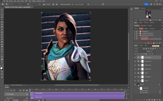
Hit OK. I personally have never had to change the frame delay from 0.05.
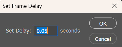
Your timeline will now look the way it did after importing the video. In the bottom left corner, make sure your gif is set to loop forever
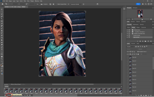
Next up is saving your gif. Go to File -> Export -> Save for Web (Legacy)
The gif size limit on tumblr is 10mb. You can see in the bottom left corner that I'm way under. If you happen to go over that limit there are a couple things you can do
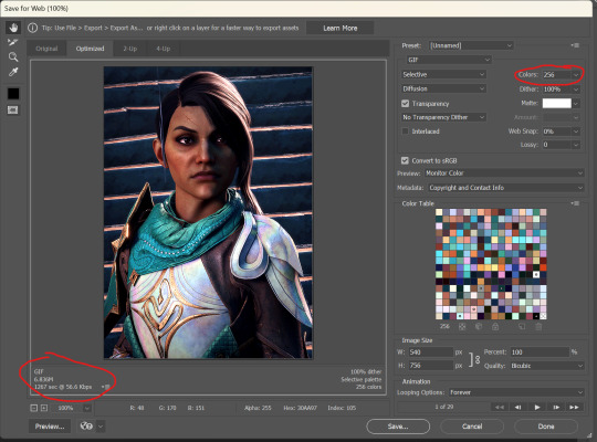
You can go back and delete frames from your timeline until you are under the size limit. Or you can change the number of colors in your where I've circled on the save screen. The fewer colors in your gif, the smaller the size. Luckily, with the 10mb size limit, I usually don't have to worry about going over unless I'm making something really big.
There are a lot of other settings on the save screen and to be quite honest, I don't really know what a lot of them do. Worth looking into if you're curious, but I only ever mess with the colors and I like how my gifs turn out for the most part
Here are some more links to tutorials I found helpful: Giffing 101 by @redbelles Coloring Tutorial by @magnusedom Coloring Tutorial by @the-borgias
Hope this helps! Tutorials are very much not my thing but I'm always happy to share knowledge. hmu if you have any questions
9 notes
·
View notes
Note
What is considered both a reasonable and maximum polycount for custom content hair and other types of custom content in The Sims 2 and does it depend on gaming specs? Also your work is great!
Thank you for taking the time to read it.
I, personally, use hair that is under 25K polys unless it's unique and cute. Anything over that is overboard and should get decimated. Any furniture or clothing over 10K is extreme for me.
As for specs, I'm inclined to believe that it's a game limitation, how powerful your computer specs are, and a secret third and fourth thing, your OS, and if you're a laptop user.
This OS talk is a side tangent, so bear with me:
Big disclaimer that this is all my opinion, not a factual piece. Don't take this as gospel and I'm far from an expert on operating softwares, computers, and CC for that matter. I went a little bit insane with the OS talk because you mentioned specs and this has been on my mind for a while 🥴
Every single time I've heard that someone installed TS2 on Linux, they are able to play on maximum settings with a BUNCH of CC for a long time and experience no pink soup or pink soup related crashing. I want to do my own research and play the same heavily detailed lot for the same amount of time on Windows and Linux and compare the differences as well as compare how they use resources differently. If I already did not have an attachment to Photoshop CC 2017, I would have made the switch by now.
Okay so Windows... I've played TS2 on my Asus laptop from 2020 and on my new desktop. Here's the spec difference
Laptop: Intel Core i7-9750H 6 Core Processor, 8 GB RAM, NVIDIA GeForce GTX 1650 (Windows 10)
Desktop: AMD Ryzen 5 2600X Six-Core Processor, 16 GB RAM, NVIDIA GeForce GTX 1080 Ti (Windows 11)
My laptop was really good for it's time (I bought it in March 2020), but it was pink soup galore for any cluttered CC lot, even with all of the fixes and GRM edits. My current setup is a mish mosh of my bf's and ex's computer parts and it runs perfectly fine, but I do not play long enough to encounter pink soup. (I have a job and I mainly play to get CC previews these days.) If you noticed, both my CPU and GPU were made before my laptop was sold, and yet it still performs way better. Laptops with top of the line hardware will never be more powerful than PCs with even mid to high level hardware from 5 years ago. Don't forget that laptops will throttle performance to protect itself from overheating and causing damage.
There is also no difference between installing and playing the game on Windows 10 and Windows 11, except that you should absolutely uninstall OneDrive if you haven't already. There might be some issue if you install with discs, but I don't own the discs.
And as for Mac, I truly believe that Mac is the worst way to experience Sims 2. Between the Super Collection crap, not being able to use third party tools (SimPE, Hair Binner, any other .exe files made to run for Windows), and the file limit that really hits you hard if you download a bunch of CC that you can't merge anyway because CCMerger can't run on Mac. I should say I have never played Sims 2 on a Mac, but this is my opinion after reading about the struggles of other MacOS users online.
The point of this OS tangent? None, really. I'm not trying to persuade you to use Linux or stop using Mac, this is simply what I've noticed and my opinions on the matter. There's millions of variables I did not cover such as DXVK, texture sizes, difference in specs between each OS and user and many other things I am forgetting.
Feel free to correct, add on, extrapolate or whatever. If you have any thoughts, please comment, add it in reblogs, or tag me in your post. I'm very interested in the current topics about high polys, pink soup and big textures for this game.
#spell.txt#cc discussions#my opinion on macs wont change though#sorry mac users#only thing im qualified for in this discussion is my photoshop certificate lmao
17 notes
·
View notes
Note
Oh I’m sorry I have GOT to ask! How did you do the text animation in the first gif of 718688291365502976/pscentral-event-15-favourite-ships-kanej?? It’s just. It’s so beautiful
Hi anon! I've used After Effects to create the text animation in the first panel of this post. I'll show you the basic idea of how I've created the animated text effect here :D
What you need:
A cutout font (the font that I've used is Trouble Child Outblack by @justlikethistrain)
Adobe Photoshop with Video Timeline feature
Adobe After Effects
Supplementary files: gif prep action pack / golden outline layer style / assorted textures
Difficulty: advanced; knowledge in gifmaking with the video timeline interface assumed
Note: This tutorial assumes that you're working with all of the composite gifs in a Photoshop composition file and using the video timeline interface
Other useful tutorials to refer to: Text overlay effect / After Effects text animation / clipping mask vs layer mask
Tutorial under the cut. Like / reblog if you find this useful!
1) Photoshop: Preparing your gif panel
Setting up your PSD composition panel: Create a blank PSD file and set it to Tumblr dimensions (540px x 540px in this particular gifset)
Enable Video Timeline and drag all of the component gifs from your folder to the PSD composition file. Resize / move these gifs around until you're happy with the placements.
Trim the timeline work area so it's the same length as the shortest component gif you've added to the PSD composition file. You can also add some textures & additional adjustment onto this panel.
2) Photoshop: Exporting your base gif
I highly recommend exporting the base gif right now, to ensure a smoother experience scrubbing through the video timeline when adding finishing touches later on in the workflow.
My preferred method is to render the composition as a video clip from File > Export > Render video.
To get the optimal export quality, I use the following settings:
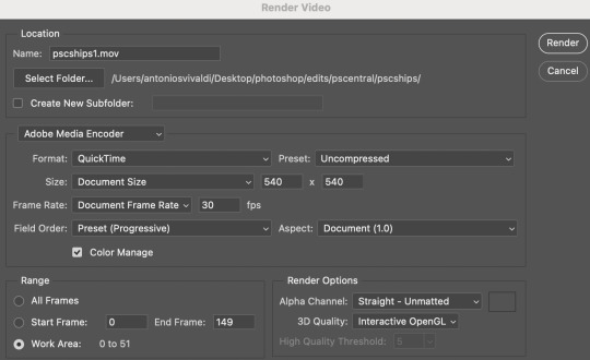
3) Photoshop: Preparing your text layer
Make a new Photoshop composition file of Tumblr dimensions

Drag in the video clip that you've just rendered (the base gif) to this composition file
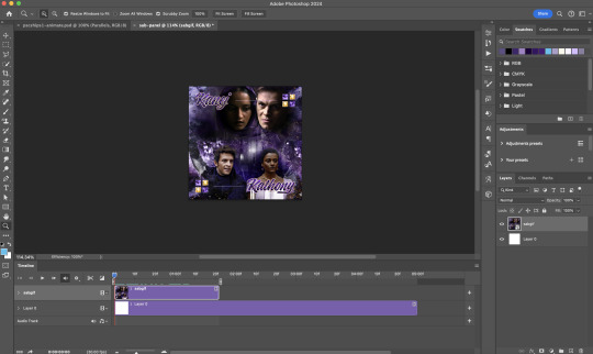
Add a new text layer in your PSD composition file and set the colour to white then tweak this layer until you're happy with the text placement.
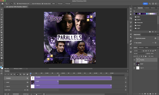
For performance optimisations on After Effects, I duplicate the PSD composition file and delete all other layers. This PSD file contains only the text layer that will be animated.
4) Photoshop: Adding overlays & decorations on the text layer
This step allows you to preview the text effect without the animations (i.e. allows you to tweak the texturings & colourings)
Duplicate the text layer. Set the bottom layer's (highlighted in red) blend mode to Exclusion and apply the gold outline layer style to the top layer (highlighted in green). Make sure the Inner Shadow is disabled!
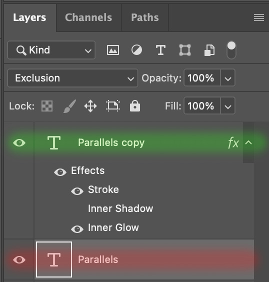
The panel now looks like this
I want to have the liberty to use different colours & textures on the bottom text layer with animation, so the next thing I do is to right click on the bottom text layer and select "Group from Layers"
To change the colour of the filled text layer to purple:
Collapse the Group that you've just created
On top of the collapsed Group a purple Colour Fill layer,
Set the Fill layer's blend mode to "Colour"
Right click on the Fill layer and select "Create Clipping Mask"
Now the colour of the filled text layer is purple
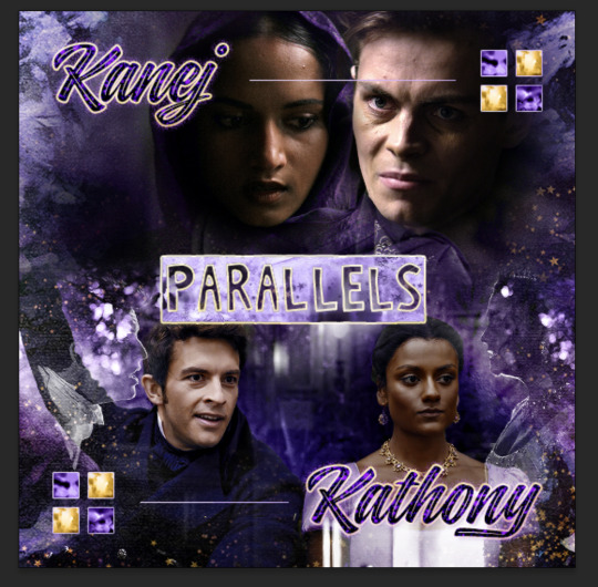
After adding more textures & decorations on the text layer (with photo negative effects) I get the following:
5) Photoshop: Adding overlays & decorations on the text layer
To avoid performance issues on After Effects, I make a new PSD file of the same dimension. With both the PSD files open, I select the text layer (highlighted in red) while holding Shift, I drag this to the blank PSD file (see the green arrow)
Holding Shift ensures that the layer's placement is preserved when it's copied to a separate PSD file.

In the new PSD file, I set the text layer's blend mode to "Normal"
6) After Effects: Animating your text layer
Make a new project on After Effects and drag in the text layer PSD file. Import this file as a Composition

Also drag in the base gif video clip to the AE project.
While we won't be exporting anything with the base gif visible, having this file in the project file is useful if you want to have a better picture of how the animation will look in tandem with the gif.
Double click on the composition. Hide the colour fill and background layers. Then right click on the text layer, go to Create > Convert to Editable Text
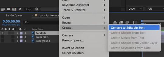
To be able to preview the animation with the base gif, drag the video clip to the composition file and below the text layer. The visibility of the layer can be toggled on / off anytime in the After Effects workflow
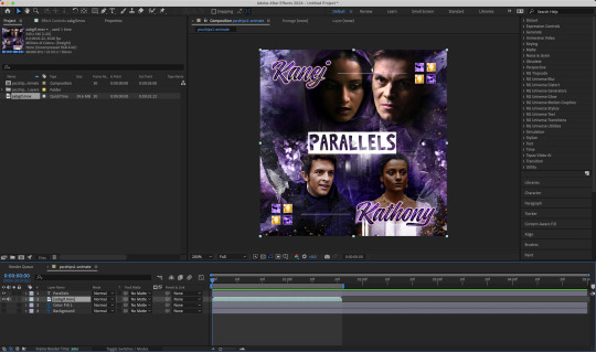
Now we prepare the text layer to be animated. Because the final animated effects is 3D & has motion blur, right click on the text layer and select "3D layer" (highlighted in green) and Switches > Motion Blur (highlighted in red)

Go to Animation Presets > Text to browse through some presets that you could use to animate the text layer. For this gifset, I've used a preset within the 3D Text folder called "3D Random Spike Tumble in".
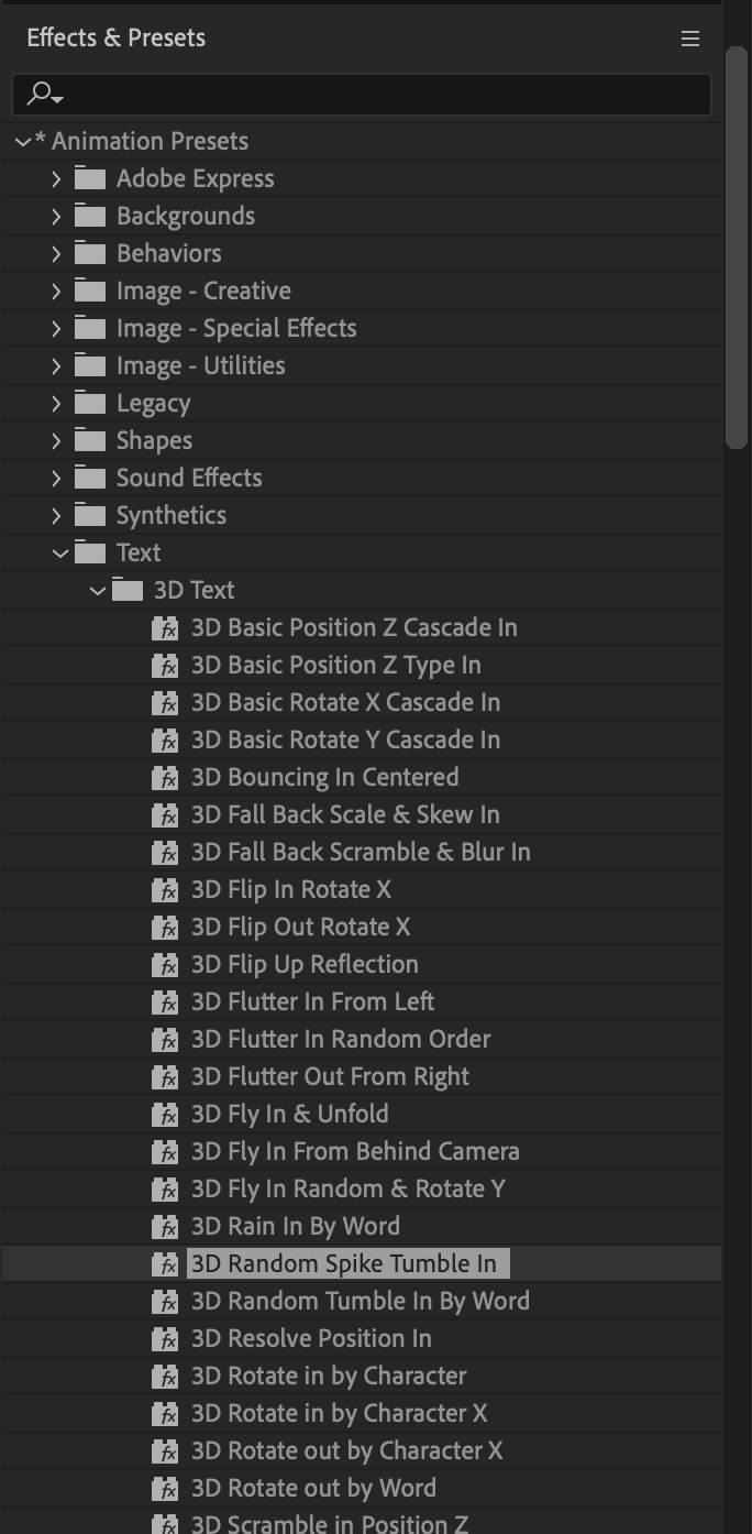
While selecting your text layer, press U to view the keyframes and you can adjust the position of these keyframes until you're happy.
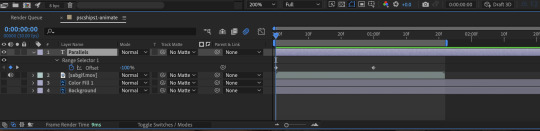
For more finishing touches, press U again to tweak more options in this preset. In this case, I do to Animato 1 > Range Selector and changed the Colour Fill to #fff (the default colour is light yellow)
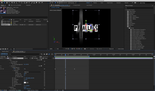
Then do you File > Export > Add to Render Queue
Click on the Output Module and use the following settings to render the text layer as a video file with transparency
Then after specifying the folder in which you'll export the video to, click "Render" to render the video file containing your animated text layer.

7) Photoshop: Adding the animated text & finishing touches
On Photoshop, drag the rendered clip containing animated text, to the PSD composition file with the static text layers.
Duplicate the animated text video layer
Drag one of the layers inside Group 1 and set the blend mode to "Exclusion" (Highlighted in green)
Move the other layer to the top and apply the gold outline layer style with Inner Shadow disabled (highlighted in red)
Hide both text layers (highlighted in yellow)

By scrubbing through the timeline, I've noticed that the animation didn't look clean enough, so I'll add some finishing touches
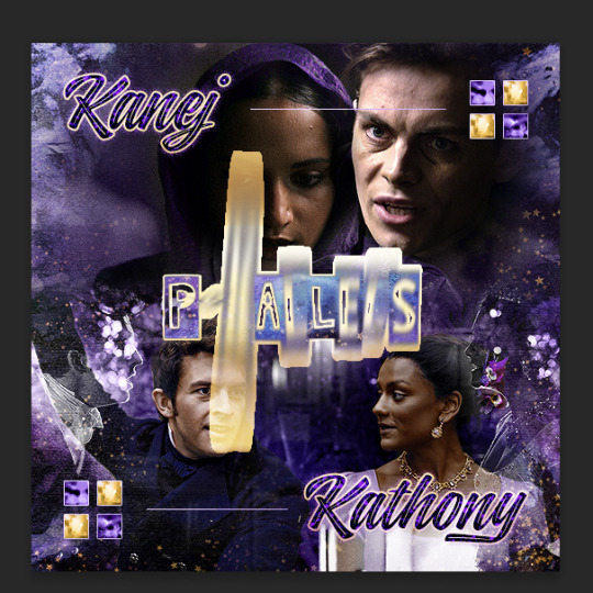
By selecting the upper text layer containing layer styles, go to the timeline and add opacity keyframes going from opacity 0% to 100% a few frames apart
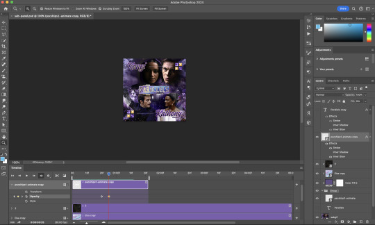
Once you're happy with the finishing touches, flatten / render your PSD composition file, change the frame delay to 0.05s and export your gif and voila!

I hope this helps 💖
#tutorial#gif tutorial#photoshop tutorial#after effects#chaoticresources#dearindies#userriel#useralien#userraffa#usershreyu#user.tee#useryoshi#usernik#userjoeys#usersole#arthurpendragonns#userhallie#*#my tutorials#my resources
154 notes
·
View notes
Text
How to make Tattoos/Skin Textures for Final Fantasy 14
Hi there! I made a video about this a long time ago, essentially it is still the same work flow even though the Textools UI has changed a little bit with the Dawntrail update. Please mind that the video is a little old, recorded with a free software and I personally have zero editing skills. From experience and from what other creators told me it helped them a lot so I would like to bring it to more people and share my wisdom. This is a "beginners guide" for now, I can and will expand on it if necessary. You're always welcome to ask me questions. Join my discord or send me a dm! Let's start with what we need to make a tattoo/skin texture:
- Textools - Final Fantasy 14 with subscribtion - Substance Painter - Any Photo editor (Photopea is a free Photoshop online clone) - Not required but it could help: my videos
Step 1
Open your fbx in Substance Painter by clicking "Open" then "New" or Ctrl + N, with the following settings: PBR Metallic Roughness (Starter Assets) Resolution 2048 You can find the Bibo+, Gen3 and TBSE .fbx file here!
Step 2
Import your assets by dragging and dropping them into the Asset Library, then set them to "Texture" and import into your preferred Asset Library Category.
Step 3
Drawing: You can draw directly onto the 3D model and on the UV/2D planes. For that create a paint layer, select your brush, set your color in "base color". Assets: You can drag and drop your assets onto the 3D model, then select "Base color". This will project the asset in 3D. You can change the projection properties on the right under your layer selection or by right clicking in either of the windows. You can also create a "Paint Layer" and drag and drop the asset into the "Base color" slot. This will replace the fill color with the asset. Please make sure to make linework have a transparent background before using your assets.
Step 4
Whenever you're done arranging your tattoos/textures, it is time to export. Export with the following settings: - Output template: Document channels + Normal + AO (With Alpha) - Size: 2048 is more than enough for skin textures in FF14!! 4096 is almost overkill but will result in better quality, if you're a Mare user, please don't blast others with a 4k tattoo/skin texture unless it's really necessary - Padding: Dilation + Transparent
Step 5
Export the Skin Diffuse Material from Textools by selecting Character then choose your Characters race and gender. Midlanders share their skin material with Miqote and Elezen.
Step 6
Open a photo editor of your choice, open the skin Diffuse png and your Substance Painter Export. Adjust the layers if needeed so your tattoo/skin texture is above the skin texture. Export as png.
Step 7
Replace the Skin Diffuse png with the one you've just created, save to FFXIV to apply your changes to the game files and then launch the game to check the results!
If you have any questions please don't hesitate to DM me here or on discord @arimaemae
#ffxiv tattoos#tutorial#guide#skin texture#tattoo guide#ffxiv tutorial#ffxiv#ffxiv oc#final fantasy xiv#ff14#final fantasy 14#texture
14 notes
·
View notes
Note
hi soph, do you have any tips for good quality gifs? i have 1080p files but then the gifs look grainy when i export them (& then the gb size is too big if they do look good.) wondering if you might know what to do? i love your gifs, they're always so crisp and gorgeous. thank you for sharing them with us 🌻
Hey anon!
Aww, that's so sweet of you to say, tysm & you're welcome 💛🥰
It wasn't always the case, like everyone else I started out not great but after lots of practice have gotten better.
Gifs will NEVER look as good as they do in Photoshop rip, the minute you export them the quality lessons and once again when you upload to tumblr, so cherish them in there while you can 😆
From my experience the graininess, struggling to get the gifs within the 10mb limit and under could be due to these factors:
low quality download files
your gif dimensions
the quality of your sharpening
your colouring
You've already said you're working with 1080p which is great. So if we look at the other options, it's your gif dimensions, colouring, and sharpening that may be the issue.
For eg this gif has a 540x350 dimension and I have used a softer, more basic sharpen which results in a 5.5 mb gif which has grain to it and is not exactly crisp, bright and sharp.

This gif below has a 540x450 dimension (I prefer to make large gifs ranging from 540x430 to 540x540 depending on the scene, so I'm always fighting to keep within the gif limit. To be honest tumblr should up it every year at least by a mb). The sharpen here is much stronger which results in a crisp, bright hd gif and has a larger 6.2mb size.
My advice is look at what size gifs you're making: the smaller the gif, the smaller the final mb size and the easier it is to stay within the gif limit. The larger the gif, the higher the final mb size and you have play around and decide what's the most important part you want to keep in the scene when you're trimming it down.
The graininess can be resolved by altering your sharpening and your colouring. There are lots of options out there: if you want a soft, light, glowy sharpen, a basic sharpen or a crisper sharpen. Again the stronger the sharpen, which may eliminate the graininess results in a higher final mb gif so take that into consideration.
With colouring the more adjustment layers you use, the higher the mb goes up. Less is sometimes more, you can achieve a great colouring base with simply 4/5 layers, just play around with all the adjustments and read tutorials to help. The more curves/brightness/gif effects you add makes the mb go up, so try and get a good balance with curves and levels between dark and light.
A final few tips are even when you're working with 1080p files they can still end up looking grainy and low quality no matter what you do, more so when the media is maybe older. In those instances I would suggest doing smaller gifs side by side a 268x268/268x350 dimension within that range as seen in this gifset. This helps hide the graininess as the gifs are condensed side by side and the grain is less visible but still look great.
This might sound strange but when I have a LQ 1080p gif I will sometimes add grain on top, that sounds crazy you might say. But for me when in doubt I add a touch of noise on top within 2-5% and voila the grain actually makes it look HQ. But some people don't like the grain effect so it's personal preference.
I hope this firstly makes sense to you lmao and ultimately helps you create more beautiful, wonderful gifs. Good luck, anon!
#soph asks#gif advice#i am incoherent at the best of times so when i'm giving gif advice i hope i make sense#it feels wild when people ask me as i think mine suck & everyone hates me but im so flattered when people do & try to help best i can
7 notes
·
View notes
Text
The Curse of Artistic Vision
I think being an artist comes down to developing an image in your head and then feeling compelled to manifest it. Sometimes you are able to improve upon that image in your head. Or you end up with something different that you like better.
But sometimes, for various reasons, you can't quite make that image a reality. And I don't know if other artists feel this way, but it feels like heartbreak every time. Not quite on the level of an incident of human decoupling, but it definitely sticks with you for a long time.
Sometimes I am limited by the current state of my skillset. I just haven't learned enough and gained enough experience to take a photo like the one in my brain.
And sometimes I am limited by my body, which puts huge restrictions on the amount of energy I can dedicate to crafting a photo.
I feel my knowledge and experience has never been at the level I am currently at. I think I have the *potential* to shoot just about anything I can imagine. Which is a cool feeling. I also feel like my image editing and manipulation skills are at the highest they have ever been. Which means anything I can't do in-camera, I can achieve in Lightroom and Photoshop.
But I just don't have a lot of energy to capture photos right now. And I am very limited by how much physical effort I can dedicate to the photographic process. Which is very frustrating. I'm hoping if I build a new studio in the house that will help a lot.
In the meantime, I have this library of images I took before 2017. Many of them I was not able to achieve my artistic vision.
But... I came close.
Which means on many of these old images I can use my editing skills of today to achieve what I could not back then.
And so I have started a huge re-edit project where I go back and realize my images as I wanted them to be.
I had this idea for an image of someone in the middle of a dark forest in an open field reading a book and the only illumination was a lamp that seemed to be plugged into nothing. It popped into my head and it just seemed like a cool photo to create.
In July of 2016, my friend Ryan was visiting and we decided to try it. We even rented a big fancy 50 megapixel camera for a few days. I had never used a professional level camera and it was my birthday and I wanted that experience.
I even had this cool idea to hide a flash in the lamp so it would look like it was illuminated.
The resulting image was not anything like I had in my head. And for some reason, I edited it super bright, and you can barely even notice the cool lampshade flash trick. If you lower the exposure of the RAW file there is a well-defined circle of light in the grass, but it is hard to see in the 2016 edit.
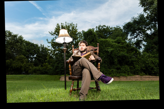
Where is the dark background? Why didn't I underexpose the background to make it look like night or sunset? I knew how to do that back then. I totally could have crafted the photo in my head at that time.
But then I noticed I only took like 8 photos of this scene. And I *always* overshoot. I took 300 photos of a bridge recently.
Then I remembered what happened. We moved a giant rocking chair, a lamp, and lighting equipment to the middle of my neighbor's yard and by the time I was ready to take the photo, I was about to pass out. I believe it was very hot as well.
And so the above was the best I could do under that circumstance. My body limited my artistic vision. And this has been bothering me for years. Sometimes I will think back on this photo and how cool it looked in my head and I will feel that heartbreak again.
When I look at the RAW file... it is actually much better than my edited image.
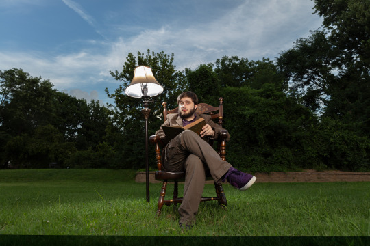
Which makes me curious why I made it so damn bright. My best theory is I had a monitor that was slowly dying and I didn't realize how dim it got because our eyes are so good at adjusting, and it's possible all of my images from that era were overly bright because I was overcompensating for a dying display.
That fancy camera (Canon 5DS R) was a dream to work with. And having so many extra megapixels to play with is such a joy. People say you don't need more megapixels these days, but when you are doing high level image manipulation, having as much information as possible makes it a lot easier. Especially when making complex selections.
So, I've got a good start. I have a lot of pixels to play with. I was almost certain I could manifest my vision with modern knowledge and tools.
I'll start with the baseline edit in Lightroom. I'm not going to worry about the sky, as that will need to be swapped for my nighttime aesthetic.
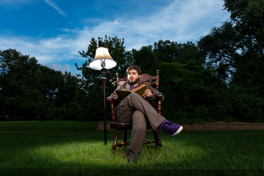
The circle of light was there! It was just hiding in my bright exposure. So that's neat. And when you lower the exposure of the background, the lampshade trick presents itself as well.
At this point I was getting excited because I could see the potential. I just had to find the right sky. This one looks perfect.
Okay, it is time for the big reveal.
Did I finally get this image out of my brain and into reality?

I DID!
I don't know if people will like this or find it artistically interesting, but Ryan and I were both very happy with the new version.
Also, I think Ryan's purple shoes really steal the show.
Though I had one idea that was never in my head originally.
Should I try it?
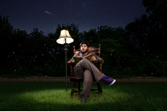
I still haven't decided on the fireflies yet, but Ryan and Katrina like them.
I can't state how nice it was to work on a 50 megapixel photo from a full frame sensor coming from a 10 year old camera with 4 stops less dynamic range and 24 megapixels.
This is zoomed in to 100%!
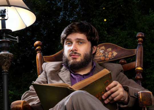
And the image doesn't even get soft at 300%.
Sorry, I got caught up in the megapixels.
And there is one detail you'll probably never notice unless I point it out, but I completely rebuilt the lampshade because I overexposed it.
I always say small details add up to big results. Plus I had to use some creative problem solving to figure out how to recreate a lampshade and I always enjoy that part of the process—where you don't know how to do something and then you figure it out. Very satisfying.
In any case, my brain feels better now. I feel like I was able to settle something that has been bothering me for ages. And I am grateful I was able to realize my artistic vision—even if it took 8 years.
Here is the before and after. It's fun to switch back and forth.

On to the next photo. And it may involve a furry little orange friend.
57 notes
·
View notes
Note
hii i love ur gifs so i have been wondering if u know how to low down the size of a gif without losing its quality?? i hate when i want to post a certain gif and it being 13MB but if i cut it it's ugly 😔😔😔 sorry for my english 😔
hi, thank you 💕 i think i have answered similar questions before in my gif help tag, but i can offer some more (hopefully) helpful tips and things you should consider to help keep your gif under 10mb.
1. crop size & amount of frames
the two go hand-in-hand. big cropped gifs with a large number of frames will result in a big file size. if you're making a 540px wide gif, you're either gonna wanna make the gif shorter in height or use fewer frames. for a square gif, i try to keep it between 50-70 frames, but sometimes i still have to trim it down depending on how bright or colorful the gif is (i'll get to that in the next points).
however, making the gif a shorter height like 350px or 400px might give you a little more room for more frames without having to delete any. i like big gifs if i have a great quality file. 600px tall is as far as i'll go (though it's rare) and in that case, i try to keep it limited to 40-50 frames.
basically:
540px wide gifs = fewer frames or shorter height
268px wide gifs = more frames, more potential
tip: for the sake of convenience, i really recommend making presets of all your go-to crop sizes by selecting "save preset" in the drop down menu next to your chosen dimensions. note that mine are all set two pixels more than i need because some photoshop versions leave a transparent border around gifs. when i use my convert to frames action, it deletes those two extra pixels for me and my gif will have the proper tumblr dimensions before i export.
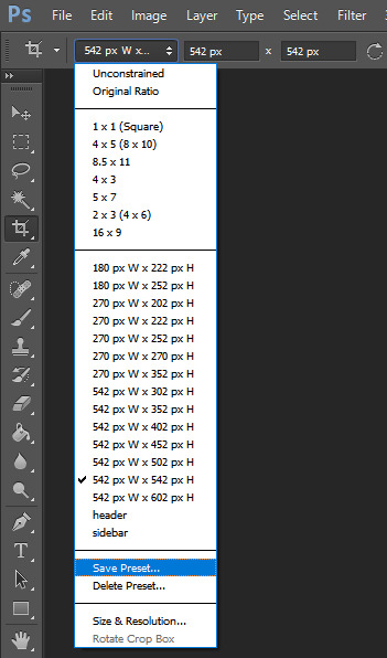
more tips to get rid of extra frames:
delete frames with camera flashes, you will rarely notice a difference.
always check for duplicate frames.
original footage is slow motion? it's got duplicated frames. delete them.
2. sharpening
your sharpen settings can also increase the file size. here is a great post with examples of when to know when your sharpening is crossing into unchartered territory and how to avoid it. manually adding noise effects can also increase file size, so keep that in mind when you're doing it for aesthetics (i personally love noisy gifs too!).
3. brightening
adjustment layers that handle the "light" in a gif such as curves, levels, and exposure can all affect the file size in different ways. darkening the black points using these tools in your gif helps reduce grain as well as the amount of colors in the final product.
curves: use the white and black eye droppers to find the lightest and darkest points in the gif, thus adjusting the white balance of the footage if needed.
levels: move the left and right sliders inward to balance them out even more and bring back more details.
exposure: my favorite trick EVER to lowering the file size if it's over 10mb when i go to save for web is moving the "offset" slider of an exposure layer slightly to the left. it will darken the black points even more and add some contrast to your gif and it can minimize the file size by quite a lot.
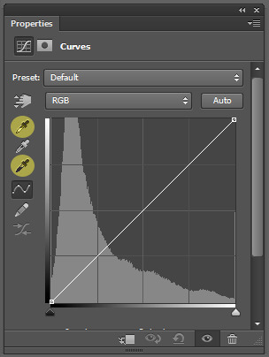
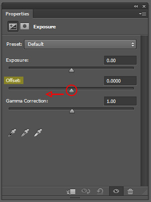
3. coloring
you want to be able to save your gif with 256 colors without reducing the number manually in order to get it under 10mb (we've all been there). sometimes you can get away with doing that without losing much of your quality, but it's always ideal to NOT have to do this. selective coloring and color balance are your friends when it comes to enhancing and/or getting rid of tones you don't want. i can't give you a whole course on coloring alone, but i can say that ONCE AGAIN, darkening the blacks under the black tab in selective coloring will help. i usually go up to about +5 or more if i need to. neutralize your reds and yellows for skintones, especially when giffing idols. don't go too overboard with the vibrance if you use it. be conscious of colorwashing. experiment with photo filters or gradient maps if you're aiming for a cooler or warmer look.
i hope this helps, i am not a magician but i do think a lot of these key details help me a lot when my final gif is over 10mb and i need to go back and make adjustments.
19 notes
·
View notes
Note
Let me preface this: I'm an architecture major
I used to be a big LO fan but obviously fell out of love of it like a lot of us did, and I know LO uses SketchUp for backgrounds. That is not an issue I have with the comic or any comic, I want artists to have an easier time in any way they can. I was always under the impression Rachel imported the models into Photoshop and drew over them like you can see in the early episodes with the sketchy lines. Well, school just started recently for me and I now have access to SketchUp for my coursework, and I made a few discoveries: 1. Photoshop cannot read SketchUp files, and while you can import them into Clip Studio through some configuring, they can be finicky and will lose parts in the importing process, so they are best used into the original SketchUp program to export as PNGs. 2. Many of the models Rachel uses are incredibly easy to find, especially if you put "modern", "luxury", or "classy" before the main part of the search. Many of the houses and rooms for example are first page results. 3. The biggest discovery: You know how we all assumed Rachel was hand-drawing all the lines over the SketchUp models and how she gave up the longer LO went on? Well, it's actually worse. It turns out SketchUp has a thing called "Styles" in it, which means you can mess with the lines and look of the model, such as making it look more like a blueprint or playing with the colors. Well, they have a lot of styles on SketchUp known as "sketchy lines", which are the exact ones Rachel used early in the comic to fit with her style, and it takes a literal click of a button to do. All she would do is pose the model, click the sketchy line style, and export the PNG. That's it. So, yeah, Rachel is so checked out of the comic that she can't even bother to click a single button to make the models fit into the comic's style anymore. Use that information however you like.
Ouhhh sorry OP, I'm about to like, undo all the work you just put into that ask. We've already known about the 3D background problem for a long while now.
First off, it's more likely LO doesn't use SketchUp but actually Acon3D, which is a website that offers 3D models both for free and at cost, which are actually compatible with software like Clip Studio. As soon as you open it up you'll likely see a lot of very familiar backgrounds that are often used in romances, isekais, and period pieces. It's literally the go-to spot for Webtoon Originals creators. Like, to the point that I wouldn't be surprised if Naver was partnered with them because of how many of their creators use it.
Second, there's plenty of up-to-date evidence to support the fact that Rachel doesn't exclusively stick to one software, sometimes she's drawing in Photoshop, sometimes she's drawing in Clip Studio Paint, sometimes she's drawing in Procreate. She's undoubtedly using Clip Studio for her paneling, speech bubbles, and backgrounds, as there are built in tools to utilize and convert 3D materials into lineart, among other features that are recognizable as coming from CSP because they're not available in PS or Procreate.
Third, yes, she just uses filters to turn her backgrounds into lineart, this has been apparent since S1. The only backgrounds she's ever 'hand drawn' were the ones involving lots of nature and even those are mostly just Photoshop brushes stamped on.
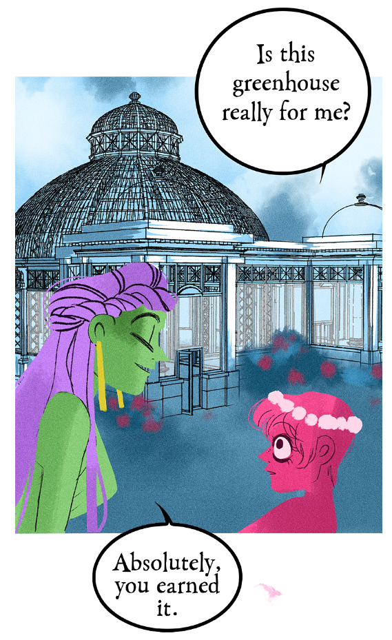
Like I realize I'm probably bursting your bubble here and I apologize for that lmao but these buildings were never hand-drawn, this is not new information ( ̄﹏ ̄;) I appreciate you mentioning your own experiences with it as you're learning it though, I find once you start to learn the process yourself you really start to notice what others are doing. Even I've gone through that over the past couple years as I started to use 3D models and more advanced tools specifically for drawing webtoons.
I will mention btw, there's nothing wrong with using 3D models for your character drawing and backgrounds. The only time it tends to get frustrating is when you're reading a comic that isn't making any attempts to blend the background in with the art style.
Like, The Kiss Bet probably uses 3D models to help with perspective and laying out scenes quickly without second-guessing, but you can tell they still hand-draw over the models because they look natural and like they belong to the comic's stylization. The characters don't look out of place sitting in a living room and the living room doesn't look distracting.
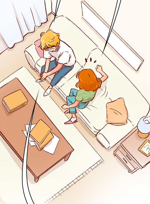
But then you get stuff like Lore Olympus, Let's Play, and Midnight Poppy Land, and it becomes a bit more obvious they're not giving a shit about backgrounds lmao


I get it, WT's deadlines are cutthroat as fuck, but if it's getting to the point that you have an entire team behind you and you're literally just copy pasting video game models from Phantom Hourglass, then it's probably time to re-focus your priorities a bit. There are comics with as few as 1-2 assistants (and even in some cases no assistants at all!!) pulling off backgrounds better than this, even when they're taking shortcuts.
(Nevermore and City of Blank)
But a lot of that does come down to how WT manages its expectations as well as support for their creators. The deadlines and requirements WT puts their creators under are insane and awful in the long-term, and they're not acting with the amount of professionalism they ought to be for a platform that's trying to breakout as a major publisher here in the West. I feel like it comes down to WT loosening the choke chain around their creators, but also creating a standardized level of quality to ensure it's not suffering for the sake of quantity. The traditional literature industry has real editors and stages of quality control for a reason, whereas WT is more interested in just throwing as many series at the wall and dumping all their stock into the ones that stick.
#lore olympus critical#lo critical#webtoons critical#antiloreolympus#anti lore olympus#ama#ask me anything#anon ama#anon ask me anything
90 notes
·
View notes