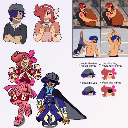
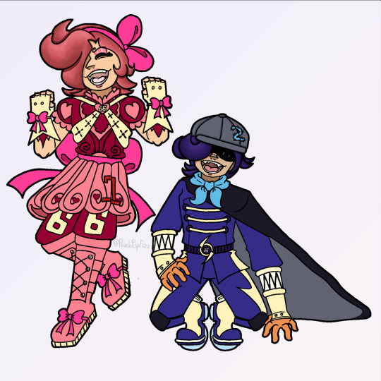
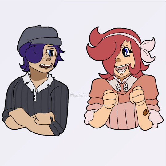
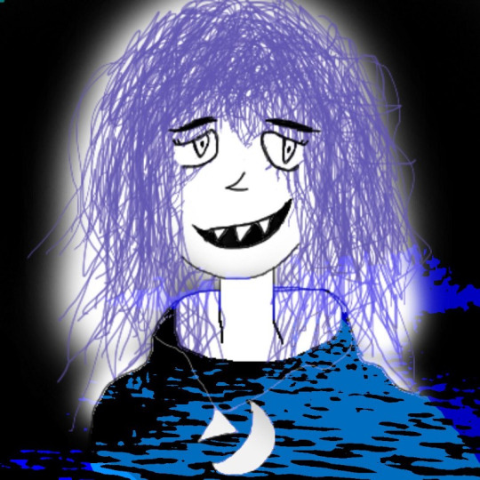
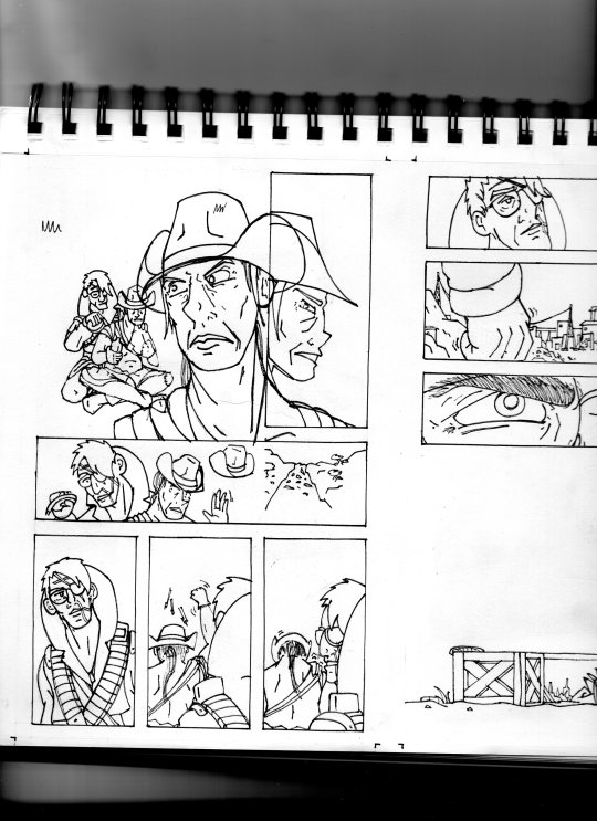
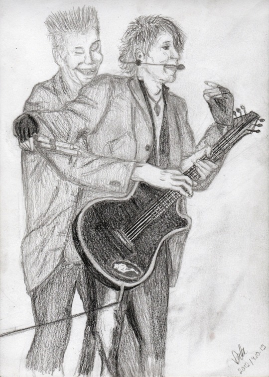
#first time actually doing lineart in a while i forgot how much i like this style
Text

i made this post better i think
idk why this bit is so funny to me but it has been occupying my brain for a while. i think it’s the pure Distress with which will said “p-pe..nis…”. it’s just so good
#he’s so silly#what a guy#first time actually doing lineart in a while i forgot how much i like this style#it does take much longer though#art#my art#digital art#comic#will wood#litwtc#life in the world to come
122 notes
·
View notes
Note
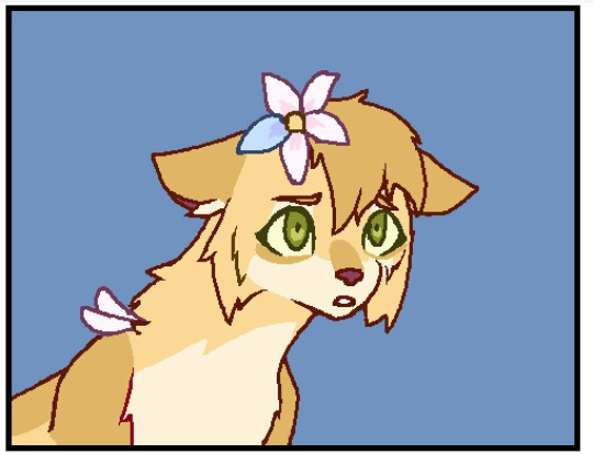
Also could you make a kouign-amann x capsaicin fanchild?
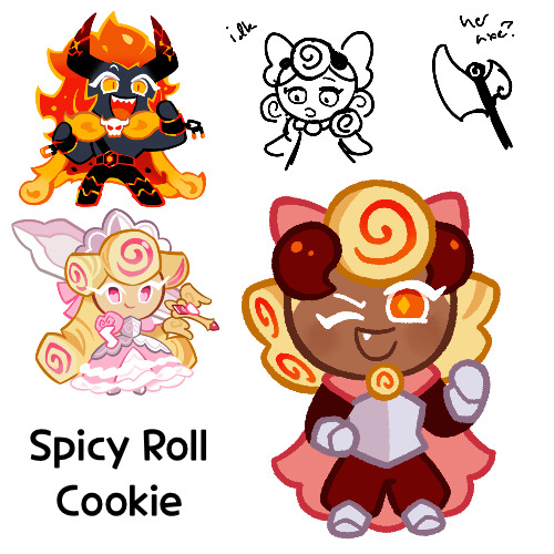
@amythecat2001 also asked for this before, but I made the other part of that ask previously and posted just that one with the ask, so I’m tagging
Anyways, she’s been done for a few days now, I just forgot to post, this is Spicy Roll Cookie
So she’s an absolute sweetheart, she just tends to be really loud. She’s great at giving motivational pep talks, and she’s someone you’d want as a friend. She’s also an incredibly powerful fighter. I didn’t draw her with a weapon, but she is supposed to have an axe, as shown by me trying to sketch one out somewhat in the top
She’s a Paladin in the Crème Republic, and tends to be more fond of their types of outfits, but she still has some fondness for her Dragon’s Valley heritage
That’s about it for her, I mostly just have vibes
As for her name, she’s basically just a cinnamon roll, but spicy. It was because pastry + spicy. I remember this pairing was giving me a lot of trouble because I didn’t know how to combine the two, and I eventually just kind of made something up. But I still like the name
Cinnamon roll:
I was considering making her color scheme more brown/orange, to fit in with the cinnamon roll thing, but ah well I suppose. That is half the reason her dough’s brown, as well as it just working as a medium between Kouign Amann and Capsaicin. And it’s also the reason she has all those swirls
Oh, another thing I should mention, this wasn’t the original design I made for Spicy Roll. It’s not that much different, but it is somewhat different

I had asked my Discord group if it looked good, since I had been watching Venture Bros while working on her, and I felt like I hadn’t been giving Spicy Roll my full attention as a result. I got some critiques and changed her accordingly. I do think the final design looks better tbh, but I still have some fondness for this version
I also did it on the same layer as the original lineart, so this you see here is the only physical proof of the original design
Anyways, back to her actual design, because I took a detour there
So when I was first rough sketching her back some time ago, I had planned on giving her the down facing horns, but I couldn’t get a hairstyle that looked good with it, so she got shelved temporarily. But I think I have something that works now
Her diamond pupils were supposed to be like a combination of Capsaicin’s slit pupils and Kouign Amann’s heart eyes. With the colors of Capsaicin’s eyes semi reversed because I like it better that way, at least on Spicy Roll
And yeah I think that’s all I have to say on her design right now. I like it overall
Oh wait, one last thing about her, in the notes on my list, the original first thing I put was “Barbenheimer?” Since I think that was going on or had just gone on at the time of the first request
Anyways, that’s it for Spicy Roll, I hope you like her!
#I’m realizing now that her name is a lot simpler than her parents’#but whatever#it’s a name that works#cookie run#cookie run kingdom#kouign amann cookie#capsaicin cookie#flaming heart#that’s their ship name right?#fankid#fanchild#cookie run oc#spicy roll cookie#my ocs#my art#requests#answers
42 notes
·
View notes
Text
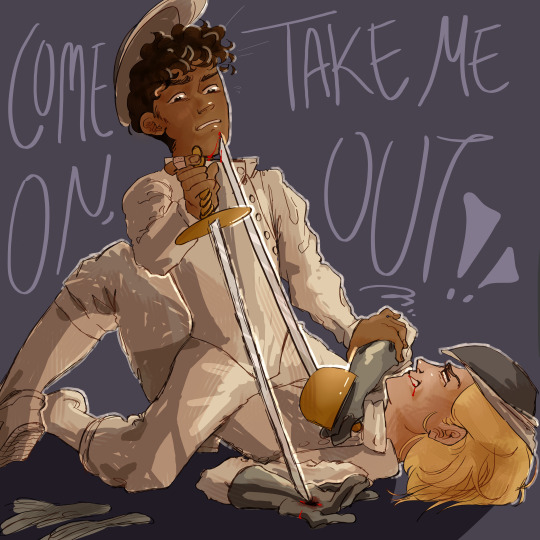
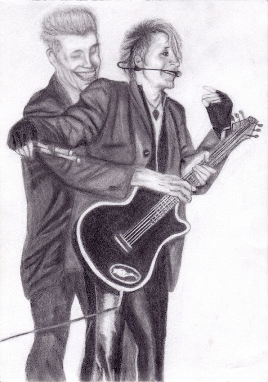
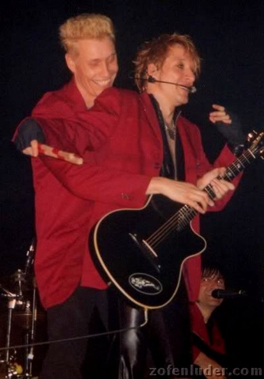
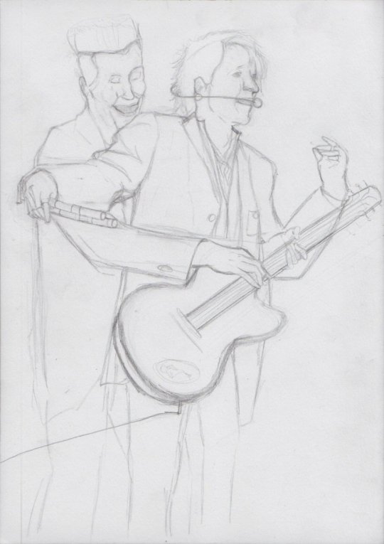
i'm just a shot away from you.
sketch here and here.
hihi! long time no see! i'm gonna infodump about this piece down here.
so when i first started drawing, i focused really heavily on lineart. i was super into finding my "style" in terms of how i would stylize faces and bodies. my coloring style was kind of an afterthought and wasn't really in the place i wanted it to be, so this is me kind of experimenting and trying to go wild in that department.
i think the reason for my years long art block was perfectionism. specifically for digital art, i was very focused on making things pristine and clean looking. i mean that may or may not be obvious from my more recent pre hiatus art, i don't remember, but 😭 mentally that was the issue. i used to always like my sketches more than my lines, and at a certain point i was like, i may as well just have the lines be really sketchy and irregular and chunky or edgy in parts because i seem to be drawn to that, and clearly this precision thing isn't working out. i'd definitely attempted that at other points, but i hadn't really committed and was never really confident about it before now. i think ultimately i just had to reach enough of a 'fuck it' point before i could do it. it's a similar philosophy with the coloring and shading. i'm just letting all the textures and irregularities come through without worrying too much
the idea for the piece changed a LOT. like i started sketching and attempting to color this well before my art block, and i've only just finished it. initially, the doctor and the master were wearing their normal clothes and were holding daggers to one another while locked in an embrace, so the idea was like, the closer they get, the deadlier it is. for some reason i just couldn't get that to work? at some point i gave the doctor navy wings, so there was almost an angel of death thing going on (think the master asking her to kill him), but eventually i went for this! there's still kind of the erotic element with the master straddling the doctor and her Thrusting up, but now they are fencing, and the weapons are a little more front and center instead of hidden, as they were initially. i don't know how obvious it is, but what's happening is the master seemingly has the doctor pinned, both physically and with his rapier, but as she thrusts up, she actually moves his face closer to her blade. his hand on her elbow looks like it's part of the pin, but actually he's trying to stop himself from getting cut more. this thing of the master looking like he's winning, but the doctor actually holding the deadlier (though not necessarily better) position was very important to me, i don't know why. it was a feature of all of the sketches, although in the dagger sketches, there was an element of the doctor's blade being more hidden than the master's, ie in the embrace, the master (facing her) has an arm wrapped around the back of her neck with a blade at her throat, and she wraps her arms around him with a blade pointed directly at his back. you are going to have to figure out the symbolic intricacies of that yourself because i was just doing what felt right sjdjsdk
almost forgot: it's not just the positioning that sorta favors the doctor, it's also the fact that she is slightly more armored than the master. i don't know if you would call that armor, but let's go with that. her mask is pulled slightly more over her face than the master's, she wears her gloves and shoes while the master wears neither, and her rapier has a little cover that goes over her hand, while the master's just fans out. obviously they both have minor injuries, but the doctor also has some Ambiguous blood at her mouth. is it his? is it hers? i don't know. but she has blood in her mouth vibes when it comes to her interactions with the master so there u go
there's also an element of like, fencing is not supposed to get this crazy, so something has gotten severely out of hand here. but mostly i thought it looked cool.
if i could change anything about this, i would make it so that the doc's blade is pointing directly at the master's chin instead of having just grazed his lower face, with the master trying to lift his head away from the blade as he slides down, just so that the threat felt a little more.. i don't know, imminent? so that the strain is more pronounced? they're simultaneously being pulled toward one another (by gravity) and desperately trying to push away. i might've also fucked around with the text a little more because i'm realizing now that it could very easily be misread shjshdjs. but mostly i'm just glad that it's done and it looks cool. it's been YEARS and i finally feel like i'm back on my art feet. but don't hold me to that
#spydoc#thoschei#doctor who#no id#doctormaster#there's a good chance i've gotten something about the uniforms or rapiers wrong but hsjdhsjdh shhhh#dhawan master#thirteeth doctor#13th doctor#fartposting
35 notes
·
View notes
Text
JUNE UPDATE
WASSUP BROS AND HOES, IT’S ME, YOSA FRICKING JAE. BACK AT IT AGAIN WITH ANOTHER UPDATE ABOUT THE JMC 🔥🔥🔥‼️‼️‼️
Last time, I remember saying it’ll be different and things will spice up, and I am indeed gonna provide more stuff piled into these updates because the debut comic is taking so long. I wanna make sure you all get full when consuming these updates instead of being like “oh, nothing happened lol”. I have a good chunk of shit to talk about that’s outside of the comic itself, but it’s like behind the scene stuff about it :3
With that out of the way, let’s finally get started!
The Comic

(W.I.P OF THE OFFICAL DEBUT COMIC)
The comic is slowly making progress, the first thing that’s changing is me showing progress of the comic itself and giving ya’ll w.i.ps in order for me to give you guys content to look over, and because I just want ya’ll to see it yk? The honest truth is that it’s moving slow because of burnout. It was huge and made me wanna give up on the comic and leave the fandom, I was struggling for a good while but my best friend told me it was best to take a break and recharge instead of pushing further. They told me to do something else so I can regain my motivation and passion for the project, and she was right, because I’ve been having fun hanging out, watching her play Stardew Valley, and letting loose without the pressure for the debut comic to come out. I have to prioritize my health and well-being before anything else, and I know the comic will be done!
Also for you all to know, the team I had disbanded, and right now I don’t have a full official one to help with the debut. I have amazing friends that have helped look over the script, one did some sketch compositions, one helped fix up grammar in the script. They helped me greatly and I’m so grateful for them and their loving support even through all of the rough patches. For the most part, I’ve been doing everything on my own, and it can get stressful easily because of how much I’ve had to change my plans and shuffle around when the team disbanded. I’ve been the one doing the scripting, sketches, lineart, color, management, and just everything. Even if I try to act like things are fine behind the scenes, I definitely got more anxious and depressed after events occurred, so this break (not hiatus) has helped me recharge after going through a bit for this comic. To end this section on a good note, I’m feeling so much better and I’m recharging absolutely greatly, I even renewed my love for Donnie after a friend drew him 🦐 Sooooo…The JMC is still in good hands.
Bonus Content: The Villain
YosaJae, what is this? This is the section that’s hella new, the place where I show you guys some cool concept art, ideas, and plots that show the origins of the JMC or even scrapped/cut content. Today we’re gonna talk about the villain of Arc 1. Fun fact, two were created at the same time but one of them was finalized to be the primary villain for Arc 1!
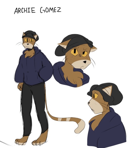
(First ever concept art of Archie Gomez)
Here he is! The cat himself, ✨Archie✨ I needed some variety and needed an anthropomorphic character since Rise has lots of their mutants and yokai. Archie was a character that was a lot more serious and hella threatening but he was toned down after more arcs were created. For some reason, I included freckles because I originally thought, “Ginger people…..” then included the freckles to make him more recognizable. Let’s just say that they weren’t as rememberable as I thought because I forgot them after a while-

Fun fact, Archie was originally gonna be a native Spanish speaker but not be able to speak English. The actual conflict was gonna be about the turtles and Archie fighting due to language miscommunication, but it was later scrapped because of the issue with translating each of his sentences and being truly accurate with his dialogue. He also at first was a one off character that would never return, but he was popular that he became the reoccurring bad for Arc 1.
(Archie Gomez Evolution 2022-2024)
Archie had went through a good bit of design changes over the years and I changed him to be more easier to draw by giving him a more unique silhouette by drawing his head as a pentagon instead of a circle. The transition was at first a circle to triangle, but then the shape was too complicated to recreate so I had to go with a pentagon (as an accident at first too). That changed him A LOT but I was hella happy with the way he turned out because he started to look more unique and iconic. Pretty cool, eh~?
Aaaand that’s it! Thank you all for stopping by and coming in to read this update! I hope it was fun to go through and very refreshing. I wanna make my updates more like this instead of what was said above. Especially because this is taking so long, I wanna be able to go over behind the scenes with you all since ya’ll at least deserve that; I can’t keep being mysterious about the comic since it is taking years for it to be made, but it’s trial and error so I gotta do this in order for it to be worth the progress. I’m strong, I can do this! Hopefully your day/night is amazing, and take care until next time 😋🫶💜
#rottmnt#rottmnt oc#rise of the teenage mutant ninja turtles#rise of the tmnt#tmnt oc#oc#oc x canon#jmc update#jmc related#jmc#comic update#art
15 notes
·
View notes
Text
appears looking at you with autism creature eyes. hello @sangerie your vs bros fankids (one of which i had a hand in making bc. glances at the reblogs/notes in @loopyarts post. i have confessed there fskakfafsga) are really really neat .u.
SPEAKING of loopyarts ty for allowing me to take inspo for nijis kids raid suit fit!! i really liked the softer yellow and the thicker lightning bolts on his pants you gave him so tysm for letting me yoink it <3
uh uhh individual pieces and also design/character rants under the cut bc. i wanna.
RAID SUIT RAMBLING TIME bc i spent the most time on those. also you might be asking 'why is only their hair rendered in those pieces?' well the answer is because i am Lazy. moving on . (/HJHJ i AM lazy but also rendering it further would mess up the colors and i didn't wanna do that lmao. carrying on..)
Ichiji's daughter i am so SO proud of her fit. i did not look up a reference or even inspo ideas at all, that all came from the ole noggin baybeee. anyways she is obviously based off a magical girl(s) fit bc she wants and DESERVES to be. also since Reiju doesn't have any kids of her own (based wine aunt) i also decided to let Little Red have some of her motifs instead of just purely Ichiji's!! primarily the 66 on her pants but also all the pink on her instead of just red :) and obviously she has her dads number and while she DOES have a (white? bc like daddy shes a special little princess /aff) cape i didn't include it here bc it looked reallly bad lmao. but she does have one tucked into the bow probably!! there she is, Sparkling Red Neo!!! (get it.. sparkling instead of sparking... bc magical girl.... im funny i think.) onto Little Ocean Boy
OKAY LET ME TALK ABOUT THE MOST MINISCULE YET MOST IMPORTANT DETAIL TO ME AND ME ALONE FIRST. that being the symbol on the brats belt. it was actually inspired/based off of this post which really stuck with me with me after reading it which i later realized was bc the "that something has been completely reversed" REMINDED ME OF THIS POST OF YOURS. i don't think im especially good at theory crafting but. idk i think there could be Something about how after judge came and turned germa into mercenaries their symbol turned from what once symbolized 'purity' into the skull of war mongers and then BACK to purity after 0124 get germa on the right path... poetry or smthn. ANYWAYS yah shoe shiners got a pretty basic fit bc like i said in the og ask, hes a sora warrior of the sea fan, once he saw the raidsuits irl methinks he'd want to stay pretty close to the og design. HOWEVER he refuses to drop the hat (much to Niji's dismay) and i came up with a reason besides 'its one piece and therefore there's GOTTA be a kid with a weird hat that they're attached to': and that is the fact that it hides his eyebrows. Little Red has the curly brows, all of Yonji's cabbage patch does too, and the brats the only one without. even if literally no one else notices or cares, he wants to hide the fact that he doesn't have em because it Separates him. and he doesn't want that. at all. he really, Really wants to be a part of this family (oh no i made it. angsty). ANYWAYS UHH YAYYY HE HAS A TWO ON HIS HAT (that he sewed on himself which is why i made sure you can see the stitch-lines) BC NIJIS HIS DAD WAHOO YIPPEE :D:D:D Dengeki Blue Neo: little shoe shiner edition!!
UHH second image is just a refined piece of that first doodle i sent you. with lineart and a better color pallet and all. actually looking at it again now i realize i forgot little brats freckles and i am now punching the air bc its too late to fix. just act like they're there. please :,,,) edit: nvm its the next morning i fixed that kjahsdah
i don't even have much to say about the last two because i Think i am Rightgksfjgasjkfa but for the third i think the brats a bad influence on Little Red especially. ALSO FOR THE FOURTH NO I DIDNT FORGET ICHIJIS TATTOO. I AM JUST LAZY. (and I also forgot his tattoo :]) ANOTHER edit: i also. fixed this :]
CHRIST i am incapable of contacting you on Tumblr via any way that includes anything less than 250 words i am so sorry sangerie.. i hope you like these tho cause i really do tbh :3 (PS you have to take literally NONE of what I said here [mostly about shoe shiner] as like.. canon about them?? these are YOUR ocs obvi so please, change Little Red's raidsuit design if you find it unappealing!! make shoe shiner have a backstory of your own!!! i hope that isnt weird or rude to say, i just thought it was important too bc i threw sm at you so strongly ^^' okay thats all tysm for reading this it means to world to me byebye <3)


#one piece#vinsmoke ichiji#vinsmoke niji#one piece ichiji#one piece niji#others ocs tag#vinsmoke siblings#my art#im so happy with how the raid suits especially turned out like i can't get over it#i haven't been truly proud of an art piece for MONTHS this is so refreshing#like this aint perfect in a lotta other places but that alone is carrying this for me#also sangerie i am SO sorry if it looks like im virtually stalking you fjagskdakfsfa first the trans vs sisters and now this..#i promise im not there's just not a lot of ppl in the Vinsmokes tags and you and your stuff is really cool 😭 im normal i prommy /irony#okay ive literally said enough in the post im shutting up now gday or gnight take care#OH WAIT YEAH throwing in a#scopohobia tw#scopophobia cw#bc little brats eyes are borin into ya#OKAY now gday/night <3<3
32 notes
·
View notes
Text
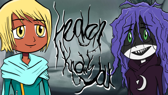
heaven knows you postmortem
hi! i’m drinkrust. i made a kinetic novel called heaven knows you back in july together with my dear friend Enzo. it was the first time i ever made a game, even if some don’t consider a visual novel with no choices a game (i kinda do). now that i’m a few months removed from the process of making it, i feel like i can better look back at my experience with the project.
heaven knows you was made in 15 days for VN Cup, which was a yuri game jam that had some people from team cpu behind it. it was because of them that i ended up hearing about it. i love archangel:nemesis and instantly got interested when i saw the jam announcement. even better: it seemed like something feasible. i was surprised to see a bunch of artists i really admire were also going to make a VN for it, so the pressure started to build up. it was especially frightening since our artstyle was pretty different from the other projects in there. it's kinda traditionally cartooney with thick lineart and angular faces. even though i was nervous, i think it made me more compelled to actually finish the game.
VN Cup had few restrictions: the VN had to be less than an hour long, have no choices and be yuri as hell. that was it. for someone with absolutely 0 programming experience, it was also helpful to know that the engine we’d be using was ren’py, which is made for babies like me to understand without much trouble. that was it. why not make my first game there? my main problem was that i was a completely awful artist. like, really, i’ll show a few of my pieces in a few paragraphs. so i talked to my friend Enzu which is an extremely talented artist with many cool potential artstyles and he agreed to help out. during the 15 days we had to develop hny, he had work and college and i had some freelancing stuff to work on and also college, so we had less than ideal free time.
still, we managed to pull on with only one or two days of crunch!! i mean, that could’ve probably been avoided, but i personally did not know what the hell i was doing most of the time… so i can prolly avoid it in the future if i can help it. Enzo had a lot of work to do as well: multiple backgrounds and 7 character sprites, three detailed ones and four silhouettes, all with a full range of expressions. he also did the logos and part of the graphic design.
i got a bit ahead of myself. what is heaven knows you?? well, it’s the final manifestation of an idea that had been floating around my head for a long while. it’s first draft in my head was that of a first person dungeon crawler where you played as an adventurer that got stuck in a castle with witches that were waiting hundreds of years to seal a person there to execute a spell to open one’s mind. so, basically the same idea that ended up on the final game. but the tone was drastically different, and it was going to be more of an adventure-puzzle dungeon crawler thingy. the witches were going to be unhelpful and barely talk, and there was *probably* not going to have any romance.
so i started thinking about ways to make it work as a yuri VN, and it kinda just wrote itself. one of the witches is Selena, and she even had some sprites already done that i could use for inspiration for the eventual redesign. in the original dungeon crawler version she was going to be a mysterious character that forgot how to comunicate properly with humans because she was stuck in the upper section of the castle without talking to the rest of her coven. brace yourself for her icon below.

her hair was supposed to look withered and her face scary and pale because of how recluse she was. a perfect fit for the love interest of my newly conceptualized VN! Enzo redesigned her with his style while inspired by Deep Sea Prisoner’s games and my insane references, which gave her a more welcoming and charming look. i think her design in hny makes her come off as clumsy as well which is nice.
as for the protagonist, Inno, i wanted her to be androgynous and represent the culture and look of the people of the fictional city she came from, Calandria. her and Tara’s outfit were inspired by the weirdo retrofuturistic take on clothing from the early Phantasy Star games.
i wanted Inno to be a little annoying at first. someone who’s ghosted her friends and justified to herself that abandoning most of her connections in order to forge a path alone was worth it. one of the themes is making her realize that, you know, that was a mistake and all. she’s that kind of simple and curious protagonist that works well for this kind of story, but with a little dumb edge that (in my mind at least) makes her a bit more active in the plot.
her and Selena are kinda similar in how they aren’t thaat great at talking, but each have their own quirks. writing their interactions was pretty easy because of their dynamic. but then there’s the rest of the coven, which is made of extremely ambitious witches that dealt with their situation stuck at the castle way better than Selena, and started to bully her.
they were all completely created by Enzo, and i like their presence in the story! they’re mean out of boredom, mostly, and i tried to make the way they teased Selena to not be completely awful. they’re not bad guys, but they do fuel some conflict throughout the plot. i wish i had written more for them…
then there’s Tara, a character that i won’t really talk about much because she only shows up near the end. she’s a weird one.
writing the whole thing was an extremely fun endeavor, but damn it was tiring. there are many pieces which i constantly altered up until the last day before the deadline, and i cut a bunch of stuff out to streamline it a bit. if i had known more ren’py before starting, i would’ve done some fancier tricks to shake up the visuals, but i had already spent a couple days just trying to figure character portraits out, so that was probably way out of reach.
honestly, i’m extremely happy that i could get one of my stories out there. i have a bunch just lying on my mind, and i wish to make them all one day. in my mind, heaven knows you was a great success. more than 60 people downloaded it!! like, getting people to take time out of their day to download my game was something i was straight up not expecting. i’ve made a bunch of art in different disciplines over the last eight years or so, and never before had this much attention to one of my first projects on it. it’s crazy.
now i really feel like digging deeper into the development side of videogames and making more stuff. first of all, i’ll update heaven knows you. there aren’t that many songs on it, so i’ll add a couple more. also, maybe better programming on some of the particularly barren sections. maybe more art as well? i wanna make a “post-jam” edition so that it becomes a more polished experience.
after that’s done, i’ll get deep into work on my next game project, which is a unity thing. i also wanna do a sequel to heaven knows you. it’s already mapped out, so maybe i’ll work on it before the unity project? oh no, this postmortem is turning into a diary. thanks for reading. bye!!! here’s an extra Selena artwork i did on my own weirdo artstyle a few months back!!!
2 notes
·
View notes
Text
Of course it does feel a little silly to make big update posts about how im burned out and am trying to take a break from drawing right in the middle of a time where im uploading new art more relatively consistently than i have in a very long time it feels like but i guess it was still important to make the distinction, between things that i enjoy drawing and can keep doing vs things i dont enjoy doing at all and need to stop immediately, just for my own sake.
Openly telling people "yuuup i'm not going to be drawing anything other than super basic shit from now on for a long time" means that whenever i think of drawing anything post-worthy i know i will feel silly for posting it after saying that, and from there if i still decide to go through with it anyway it was probably something i actually wanted to draw and enjoyed doing while if this thought made me self conscious enough to not go through with it then it was probably something i wanted to draw only due to impulsive obligation rather than something i wanted to spend time making just for the fun of doing it so the spell gets broken. So its a functional enough system, i guess.
&now that this distinction has been made in my brain i can spend more time doing shit i actually enjoy instead of letting it get beaten out by the things i "should" be working on every time
Putting my foot down and going "no, i am not going to keep forcing myself to do detailed clean lineart on even more detailed sketches when i get much more enjoyment out of just doing really rough and simple shit instead" after i have found myself independently coming to realizations about what kinds of art just suck the life out of me over and over again and then just disregarding these realizations every single time to go back to the shit that kills me because "well this is how you normally do it" or "this technically looks nicer, in some aspects" and finally just fucking forcing myself to stop doing that is probably overall more helpful to my mental health than just forcing myself to stop drawing altogether when thats a drastic move that may or may not be the actual solution. Now i am finding and re-learning ways to create things that don't make me feel like i am a walking corpse so i think i will take the feeling of thinking i look a little silly for seemingly disregarding my big life updates over never having found these things out for myself at all any day.
I don't really know why i feel like making update posts in the first place when to be honest i dont think it really matters, people arent paying me for any of this and i stopped feeling "sorry" for "not posting enough" or such things as that a long time ago so it's not like i feel any kind of legitimate need to tell people about what my status is creative-wise. But i guess a large part of it is just that i like talking and have a lot of things to say but for various personal reasons have no desire to post 99% of these thoughts publicly so it's the like rare chance i get to actually start saying shit on any of my art accounts that is actually relevant to the subject at hand without crossing my own boundaries and saying more than i am comfortable with
It is a little weird feeling writing update posts though because i dont really know how to word them in any way that doesnt come off as a fanfic authors note going "sorry its been a whole 20 minutes since the last update i got mugged and all my money was stolen and he broke my leg also but im trying my best to write more despite this" like girl focus on the mugging not this shit. When in reality i actually dont care very much about providing Content as much as the hypothetical fanfic author i just felt the need to say something because why not and didnt know how to word it in a way that makes me not come off like that. which is how you get this i guess. anyway i already forgot what the point of this post was i guess i just wanted to say some shit. which tracks i suppose.
The moral of the story or some shit i guess is that even if you are not doing art as a job it can still end up feeling like one and killing your creative spirit like one would and you need to be able to identify when this is happening and what things you dont actually want to create even though you feel like you "should" so you can kill these practices before they kill you
or something like that
I dont really care about having a point here i wrote this at 2 am
i just like talking
1 note
·
View note
Text
I posted this on my Facebook (only for irl friends and family) but I wanna post it here too, I got really into talking about how I did the art process on my Neptune piece. This is only how I did one drawing, but I wanna share it because I think it’s so cool.
1. MS PAINT START
Pretty self explanitory. I get super perfectionist on other program so MS Paint is a good place to start because I lose my perfectionism there for some reason. I do my sketching, first lineart and first coloring there.
Lumine’s lines are colored as you can see, and the coloring is sadly a but inconsistient with one spot being more red. Her eye lineart is also colored.
2. MOVE TO KRITA

I basically trace over and recolor the ms paint drawin in krita, refining it and putting the coloring and lineart on different layers, I also put the eye’s coloring and lineart on it’s own pair of layers.
I also make adjustments to the expression, anatomy and design where I see fit. I was gonna add the darker color in the flower still but I actually just forgot about it.
Her line color for her fur is now consistientm and her eye lineart, while still colored, is much darker, which in my opinion looks much better.
I used Krita for the rest of this piece.
3. MAKING THE BACKGROUND PART 1
Pretty self explanitory, I begin my background. I expanded the canvas size and all of Lumine’s pieces in a group layer and moved it. Just basic blobs, but I ended up detailing the sky a bit. There is a loud brush on Krita, but I like how the watercolor brus looked more, I used a handful of layers to make it.
3. MAKING THE BACKGROUND PART 2
Same thing kinda but more additions. I used a waves brush tool for most of the water, using a handful of layers to get the look I wanted but I thought the water looked too flat so I started adding more waves.
I also detailed the sky a bit more, and added grass.
I want to make an entire post about how I did the grass but I didn’t take screenshots. So stay tuned for that, next time I have a piece where grass is involved.
3. MAKING THE BACKGROUND PART 3

Not super important but I had this screenshot of more waves.
4. MY FAILED SHADING ATTEMPT

I struggled with the shading at first and my first idea was not good but I wanted to share it. I used a blue-grey color and used multiply for it, which is what I still do for my good shading.
It’s important to see that sometimes you have an attempt at something that doesn’t go well and you have to start over, this does not mean you’re a bad artist. You’re just human.
I also just cropped it so Lumine’s little bubble self underneath is no longer visible. I probably should have just moved her but that’s alright, we all make mistakes, and even finished pieces have errors. But thankfully this was a minor one and more down to my personal opinion.
4. MY SECOND SHADING ATTEMPT

A lot simplier than my first try, this one was instantly better as a starting point. I just slapped the whole character with the blue-grey I used from before and then on a different layer grabbed a lighter shade of blue-grey and put the luminosity fliter over it. I put both layers over my lineart. She’s now starting to look like she belongs in this piece.
5. MORE SHADING AND RAIN

I added more shading which I think looks good, exact same method from before with the same shade of blue and the multiply tool, just less shaded.
I also added rain. There’s a dots tool on Krita so I used that to put in the rain and added motion blurr to varying degrees.
I didn’t take screenshots sadly but I added a layer underneath the water for the first rain, making the dots super tiny, and i made the motion blur on the very little.
The second layer is over the water, slightly bigger with more motion blur, I made sure all drops were still going in the same direction.
And the last layer is in front of the water, bigger dots with more motion blur. I did this to hopefully give the illusion of depth.
6. MORE RAIN

I added rain in front of Lumine. And made her fur look wet by adding squiggily white lines, using the same shade I used for the rain, and adjusting the opacity.
I probably could’ve added a few little dots in the wter to look lish splashes from the rain at this stage, but I forgot to.
7. SHADING, RAIN, AND EYES, OH MY

So I adjusted the opacity of my rain squiggilies (maybe a bit too much if you want my honest opinion) and put in highlighted rain bits.
I added more shading, first just a big gradient over it for a big shadow at low opacity, and then some more refined soft shadows. I also added some purple-red shaddows in some areas to add depth.
The eyes are a bit complicated because I barely remeber what I did there, all O reember was using the blur tool and the luminosity filter a lot and using a good handful of layers for the eyes and the tears.
8. OVERLAY AND BLUR HACKING

If you take away anything from this, use overlay and blur tools. I used a blue overlay for the whole piece. In fact, I used multiple overlay layers, one for lighting and two for everything else, it ended up being more blue than I intitially intended, but I like how it looks so not a problem.
I worried the background and it’s amount of details would overpower the focus od the peice, so I blurred everything in the background by a low amount. I think it worked but I’m still not entirely sure.
1 note
·
View note
Text
WELCOME TO PART 2 : THE ULTIMATE SLEEP AWAKE TALENTSWAP ! BEFORE YOURE EYES NOW !!!!! i have . SO much to say about this its mostly me ranting about colours . be WARE !
EDIT I FORGOT TO TAG VENUS @chihirolovebot HEYY LOL
typical yelling below ! and Lots of it ! open at your own risk
brought to you by : my mikuification project ! ive spent so much fucking time on that Please . please . ill upload sdr2 when i finish thh and im almost done with it PLEASE !!
OKAY . this took a while . not nearly as long as i expected it to THANK GOD but still a bit . hands downt he most DIFFICULT part of this project was the colour choice .
first of all : these are ordered by the danganronpa v3 wiki character page , which is in alphabetical order by first name except for akamatsu who is at the top .
SECOND OF ALL : the red . physicists colour palette consists of the primay colours of white and olive green , with the secondary colour being black and the accent being gold . fine , right ? WELL its fine for a simple design like the regular physicist , where a 3rd dominant colour isnt needed . Howver most of the rest of thse designs GREATLY needed that 3rd , and i had a bitch of a time trying to figure out what exactly to make it . it took 10 minutes and a colour palette randomizer to give me the most Obvious solution of RED . Their eyes are literally red . How did i not think of that .
anyways youll also see a little but ofyellow in there too - my friend actually suggested that . the yellow on the artist look was already there when i showed this to it and its feedback was that the yellow seeme a little jarring compared to the rest and to add a little more and i said Wowie okay ! the yellow isnt as prevalent as i wanted but its fine as is i think ! other than that i tried to keep the dominant colours to green , black and red while preserving the general Colour blocking fromthe og . aka white shirt , green bottoms , black shoes . it didnt always work that way but it did most of the time !
OH and i also changed the colours here and there depending on what looked best in the moment . mainly astronauts purple graphic shirt and anthropologists brown shorts . originally astronauts socks were purple but that friend from earlier said it clashed so i switched it over [: the main colour on any one design depends entirely on what i thought looked best when i was colouring .
OK NO MORE COLOUR TALK . my favs are absolutely magician , detective , maid and anthropologist . Theyre so skrunkly .
idk if its obvious but i was kinda running out of steam while designing the last 2 , aka the aikido master and cosplayer . the way i did this was doing the lineart first all in one go and Then colouring them all soi dont get too hung up on one specific part , and designing those last 2 was So hard . some of these talents Were nightmares trying to design for , because the whole point behind this was 1: to make sleep awake fanart and 2: to practice outfit design while keeping the characters personality , tastes and colour palette . some talents dont really fit the reader , like maid , assassin or leader ( supreme leader is so weird of a talent name btw ) and i had to alter their persoality a bit to make it work . where others were just , kind of . not very tangible ? or have no specific visual references to go off of like entomologist , anthropologist or adventurer . so i got a little creative i guess .
THE DETAIL NOTES MY BELOVED !
- if it isnt obvious I have a very clear idea of what readers fashion sense would be . aka Minimal layering , SHORTS !!!! , gloves when possible , tall socks <3 and comfort above all else .
- most designs have a clearly visible pocket or pouch where their notepad is . usually the notepad is visible ! AND everyone DOES have the ring . the only 3 places i put them were necklace , finger and as an earring
- THE PLAID !!! designing the leader was already hard enough bc itsone of those non tangible talents . So i said What if ouma and reader had matching freak outfits and used oumas beta designs as reference ! the plaid is supposed to be readers checker print , and its onlyused in this and the adventurer . also i just really love berets
- MAGICIAN HAS A CARD EARRING AND IM OBSESSED WITH IT . its also onthe gay ear SMILE !
- maid .... was hard . i actually had 2 different versions of that fit and had to have my friends choose for me </3 heres the alt version sketch
FOR NOW ? i think thats all . my brain is running on empty rn bc im writing this the day before posting like idk half an hour after typing up the sprites post . i might come back and add more later if i feel like it but for now im done .
as always , thank you for reading ! ( u can really see where i got my physicist music taste headcanon from )
44 notes
·
View notes
Note
Hello how are you? Still accepting feh artist opinion? Not sure if this has been asked, but how about Hagiya Kaoru? I've known this artist because of the mobage I played long time ago (Chain Chronicle). He was like Rika Suzuki who only drew fe cipher before joining feh with resplendent Ike or Galle as his first one I think.
I think my fav part of his art is the face. Especially the eyes and the shading near eyes. Whenever I see the art, I can tell pretty much that must be Hagiya Kaoru works. Though I'm not fan off his normal portait L.Byleth face. Maybe it's because hair color which is more soft tone if you compare to female one. Oh and his Yen'fay is top notch👌good unit as well and really worth it to +10
I want you to know I wasn't ignoring this ask, I was just at work and I've been itchin' to answer this one all day ;w;
I LOVE Hagiya Kaoru's artwork. Their lineart is really well defined and gives the pieces a really crisp feel. I think "crisp" is how I'd describe their artwork when I look at it, because it's just sharp and angular and I love that about the art. Although to be honest I actually like L!M!Byleth's hair more than L!F!Byleth's hair more simply because it's easier on the eyes whereas F!Byleth's hair is like... a lime, lol. But that's just my opinion! I totally understand where you're coming from though, because it IS supposed to be more drastic and the lime green is a good color.
But getting back to Kaoru's artwork, their color palette choices are great, their anatomy is accurate, and they've got some great posework!

Though I will say that Yen'Fay's pose, while absolutely true to character, feels a little... too rooted:

Which again, it's not a bad stance and it's absolutely in-character, but for an attack pose you need a forward dynamic when the pictures are panning in from the left or right side of the screen.
And I almost forgot to mention it, but as you guys saw from my post this morning, it was just revealed that they did Lon'qu:

Awh MAN look at that pose! And that special effect! And they even made it reflect in the lighting! They were honestly the best pick for Lon'qu.
Now I think the only true criticism I can think of for Kaoru's artwork is that we haven't really seen them draw a huge variety of characters, only men. But according to their Twitter (which I clicked today out of curiousity) they DO draw women as well.
All in all, Hagiya Kaoru's a 9.9999999/10. I just wanna see them draw a wider variety of characters but everything about their artwork is practically perfect; they've pretty much got a grasp on all the important stuff for FEH art.
#Fire Emblem Heroes#FEH#Hagiya Kaoru#ask game#Kaoru's artwork is so damn appealing to look at#And look I DO like artists like PenekoR and Kita Senri but#I think IS needs to give those artists a break and let Kaoru draw some more characters#I'd like to see them draw a Ranulf alt; I bet they'd make it look REALLY awesome!#Or draw Muarim's base unit#If it wasn't for the fact that I have... negative feelings towards Galle's English VA I would have built him#But that's just a personal thing and honestly I'm not here to get into drama and if people like that VA that's okay#ANYWHO#Here's to hoping that we'll see more of Hagiya Kaoru's artwork this year!... even though we're already in August lawl
15 notes
·
View notes
Photo
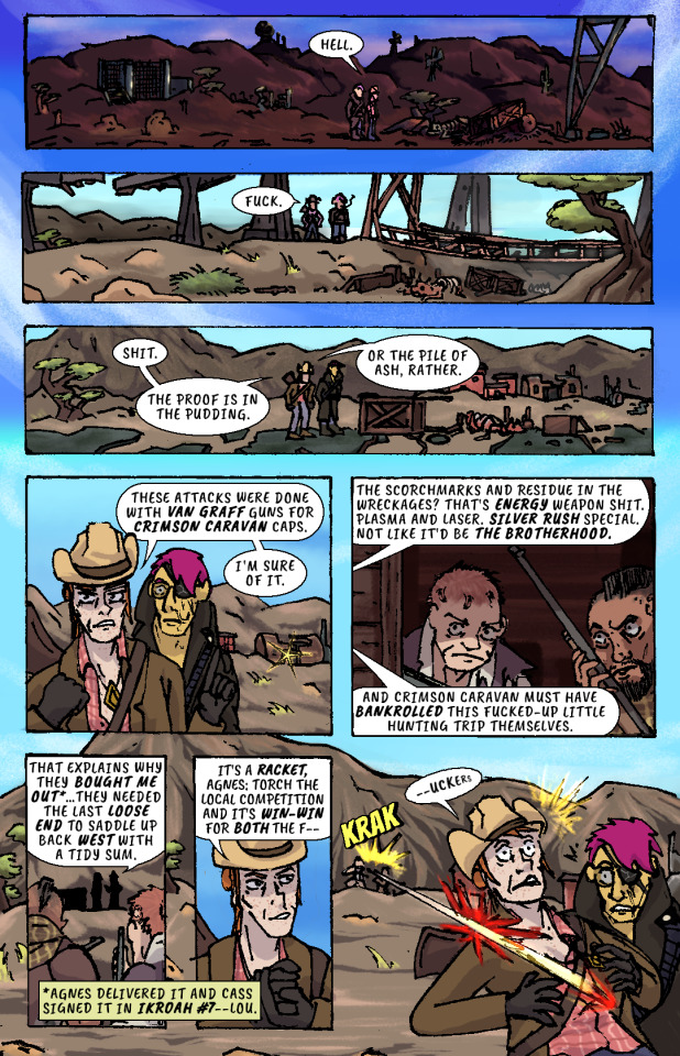
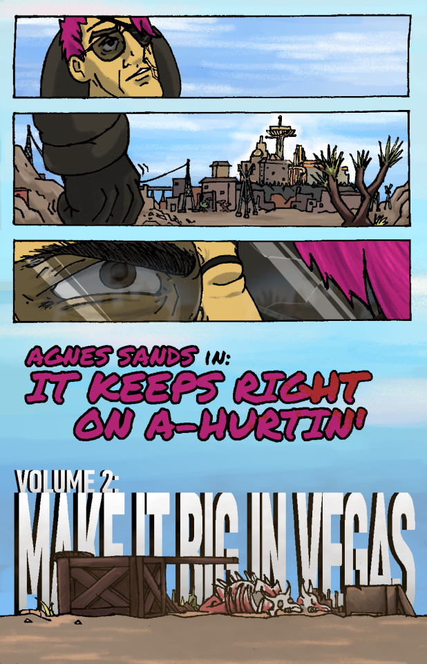
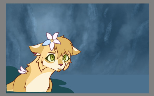
Whiskey river, take my mind,
don't let her memory torture me.
Whiskey river, don't run dry,
you're all I got, take care of me.
—“Whiskey River,” Shotgun Willie (1973)
It Keeps Right On a-Hurtin’
#15 - Vegas Outskirts
Collaborative Issue!
Guest Colorist: @malpaislegate / @socksual-innuendos
Archive Links
«« First | « Previous || Next » | Last »»
Read IKROAH on Archive of Our Own
Notes / Original Pencils / Transcript:
Notes:
MAN that’s gotta hurt!! Volume 2 kicks off with a bang, literally if you count the gunshot and honorifically if you count Socks’ knockout color job on this issue. Look at those lovingly rendered bullet wounds!! Muah!!!
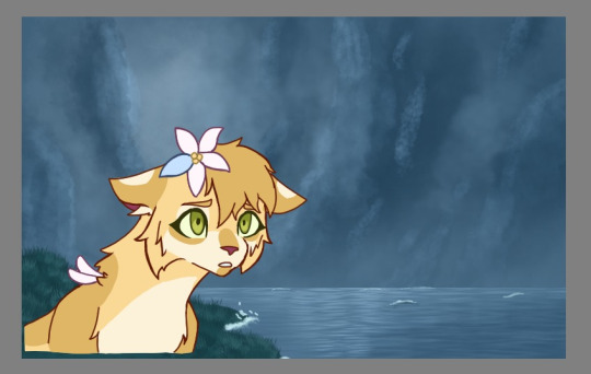
It’s been a relief having a month off from the comic as I handled a bunch of other things but there’s a lot to look forward to in Volume 2, as you can probably tell from that very forboding fist clench at the end there. Will Agnes and Cass get the revenge they’re looking for? Can they make it big in Vegas? Will it keep right on a-hurtin’? Find out next ish as Cass leads Agnes to meet the first of their new “friends.”
Original Pencils:
The pencils for this issue are like an autopsy report of all the things that can go wrong with your art if you don’t plan ahead and pay attention. Listen, friend, to my tale of woe, and learn from my mistakes so they don’t become yours!
First, you can see a lot of places where there’s floating objects, empty backgrounds, and incomplete heads. Part of this is because I always intended to just copy and paste repeated elements across each panel instead of drawing them multiple times, but other times I was forced to just because of my lack of planning. The top three panels on page two, for example, required me to draw the background I’d use for them on a separate page.
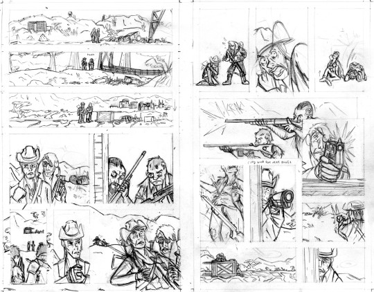
Second, you can probably tell that I actually had to flip the two raiders around in the final lineart because I forgot to keep the hands their were holding their guns in consistent—and since I couldn’t flip the middle panel on the second page without ruining the composition, I decided to flip all of their other appearances so that they’d be lefties. I doubt you even can seamlessly wield those particular guns left-handed.
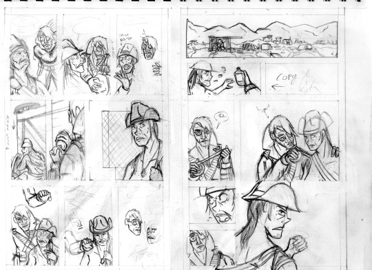
Third, the size of the cart that Agnes and Cass are kneeling behind changes CONSTANTLY and is dramatically oversized from the third page onward. After inking these pages, it took a lot of work to correct the inks and shrink that cart in each panel, but fortunately it came out looking good.
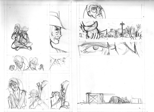
And finally, I completely redrew the second panel on the fifth page because it wasn’t until I had already handed he pages off to my colorist that I realized having a second profile shot of Cass so soon after a first one was just...redundant and lazy-looking. So I went back to my sketchbook and whipped up a much more unique, striking angle (I also just wasn’t satisfied with the quality of my art on that panel, so I’m very glad I redrew it). But again, my failure to plan ahead bit me in the ass and my redraw attempt wound up taking up a lot more space than I thought it would, so after inking it I had to basically surgically remove it from the other inks.
I’ll be honest with you folks: part of the reason that I work in such simple, thick, high-contrast lineart is because it’s very easy to make corrections and adjustments with stuff you could technically color in Microsoft Paint.
Transcript:
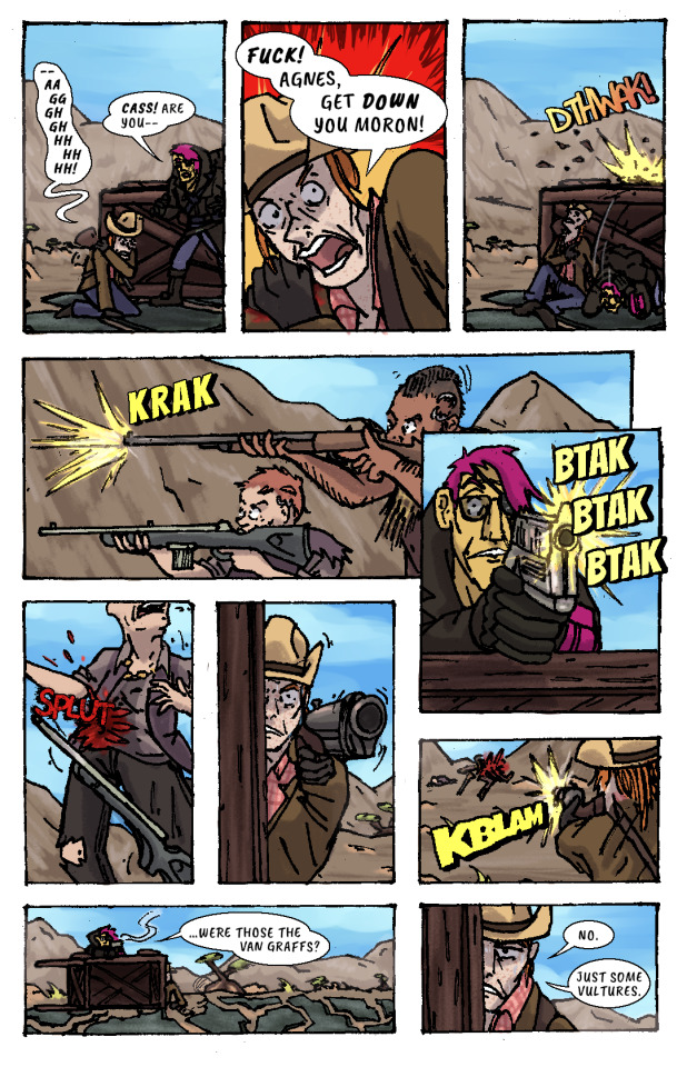
EXT. SOMEWHERE IN THE MOJAVE, morning. AGNES SANDS and ROSE OF SHARON CASSIDY stand over the wreckage of a caravan, scattered over a dirt road.
CASS: Hell.
EXT. SOMEWHERE ELSE IN THE MOJAVE, midday. Looking over a second wrecked caravan, at the bottom of a ditch.
CASS: Fuck.
EXT. PRE-WAR HIGHWAY OUTSIDE OF VEGAS, mid-afternoon. AGNES and CASS survey a third wrecked caravan.
CASS: Shit. The proof is in the pudding. Or the pile of ash, rather. These attacks were done with Van Graff guns for Crimson Caravan caps. I'm sure of it.
As CASS explains her theory to AGNES, a short distance from the caravan two RAIDERS peer at the two of them from inside a barn at a ruined farmstead. They have snake-bite tattoos on the sides of their shaved heads and are holding rifles.
CASS: The scorchmarks and residue in the wreckages? That's energy weapon shit. Plasma and laser. Silver Rush special. Not like it'd be the Brotherhood. And Crimson Caravan must have bankrolled this fucked-up little hunting trip themselves.
The RAIDERS move out from the barn, sneaking up on two passers-by who’ve stopped at the caravan wreckage.
CASS: That explains why they bought me out...they needed the last loose end to saddle up back west with a tidy sum.
(NOTE: *Agnes delivered it and Cass signed it in IKROAH #7—Lou.)
CASS: It's a racket, Agnes: torch the local competition and it's win-win for both the f—
SFX: KRAK
A gunshot rips out from one of the RAIDERS’ rifles and sears across CASS’ shoulder.
CASS (gasping): —uckers.
CASS slumps down beneath the overturned caravan wagon on the road, clutching her shot shoulder.
CASS: —Aaggghghhhhhhh.
AGNES: Cass! Are you—
CASS: Fuck! Agnes, get down you moron!
AGNES ducks behind the cover of the wooden caravan wagon just as another gunshot splinters the top lip of it.
SFX: DTHWAK!
The RAIDERS advance on CASS and AGNES’ position, firing at them from off the road.
SFX: KRAK
AGNES leans over the top of the wagon with her pistol, returning fire.
SFX: BTAK BTAK BTAK
AGNES lands a shot right in one of the RAIDERS’ guts, and she drops her weapon and falls down.
SFX: SPLUT
CASS, leaning out the side of the wagon, takes as careful of aim as she can with her shotgun by holding it with her good arm. Trembling, she fires, connecting with the other RAIDER.
SFX: KBLAM
The would-have-been RAIDERS are dead.
AGNES: ...were those the Van Graffs?
CASS: No. Just some vultures.
CASS leans back behind cover to sit against the bottom of the overturned wagon again, wincing from her shoulder injury.
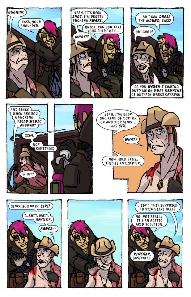
CASS: Ugghhn.
AGNES (slipping off duffel bag): Cass, your shoulder—
CASS: Yeah, it's been shot. I'm pretty fucking aware.
AGNES (unzipping bag): Quick, can you take your shirt off—
CASS: What!?
AGNES: —so I can dress the wound, Cass!
CASS: Oh! Good! So you weren't coming onto me on what remains of Griffin Wares Caravan.
CASS starts removing her shirt while AGNES produces a bottle of something from her duffel bag, and dampens a rag with its contents.
CASS: And since when are you a fucking field medic, anyway?
AGNES: 2269. NCR Certified.
CASS: What?
AGES: Yeah. I've been one kind of doctor or another since I was six.
CASS: What?
AGNES: Now hold still, this is antiseptic.
CASS: Since you were six!? I...shit, wait, hang on, Agnes—
AGNES pressess the rag onto CASS’ shoulder wound, and CASS winces instinctively. But, confusingly, there isn’t any pain.
CASS: ...isn't this supposed to sting like hell?
AGNES: No, not really. It's an acetic acid solution. Vinegar, basically.
AGNES begins cleaning the wound with the rag.
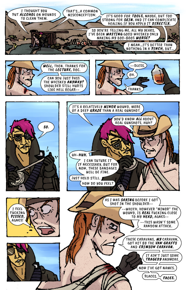
CASS: I thought you put alcohol on wounds to clean them.
AGNES: That's...a common misconception. It's good for tools, maybe, but too strong for skin. And it can complicate healing if you apply it directly.
CASS: So you're telling me, all my years, I've been wasting good whiskey only making my boo-boos worse?
AGNES: I mean...it's better than nothing in a pinch, but...
CASS: Well, then. Thanks for the lecture, doc. Can you just pass the whiskey anyway? Shoulder still hurts like hell regar—
AGNES hands her the whiskey bottle. She’d already gotten it out.
CASS: —dless. Oh. Thanks.
AGNES unspools a roll of bandages in her hands, then begins wrapping it over CASS’ shoulder and across her chest..
AGNES: So. It's a relatively minor wound, more of a deep graze than a real gunshot.
CASS: You'd know all about real gunshots, huh?
AGNES (unfazed): Uh-huh. I can suture it if necessary, but for now, these bandages will be fine. Just hold still. How do you feel?
CASS: I feel fucking pissed, Agnes!
AGNES recoils, taken aback slightly.
CASS: As I was saying before I got shot in the shoulder—which, however "minor" the wound, is real fucking close to my head, Agnes—this wasn't some random attack. These caravans, my caravan, got hit by the Van Graffs and Crimson Caravan. It ain't just some tragedy anymore. Now I've got names. Places. Faces.
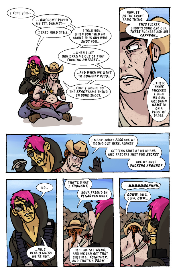
AGNES resumes bandaging CASS.
CASS: I told you—ow! Don't pinch my tit, dammit—
AGNES: I said hold still.
CASS: —I told you, when you told me about this guy who shot you...when I let you drag me out of that fucking outpost...and when we went to Boulder City...that I would do the exact same thing in your shoes. Now, it is the exact same thing. This fucker shoots your eye out, these fuckers ash my caravan...these same fuckers I sold my own goddamn name to on a piece of paper. I mean...what else are we doing out here, Agnes? Getting shot at by Khans and Raiders just for kicks? Are we just fucking around?
AGNES finishes bandaging CASS, then leans back, pensive.
AGNES: No...no, I really guess we’re not.
CASS: That's what I thought. Your friend in Vegas can wait. Help me get mine, and we can get that shitheel together, and that's a prom—
CASS raises her arm to shake her fist as she speaks, straining her shoulder injury.
CASS: —mmmmmmghhhh. Ooww, oww, oww, oww...
CASS grabs her shoulder in pain while AGNES looks off in the distance and stands up. She looks out towards the horizon—towards VEGAS, and the pre-war casinos and hotels that still gleam and glitter in blinding sunlight.
Her fist clenches. Her brow furrows. Her body tenses, all over, staring at that city, that place.
The caravan wreckage remains alone on the highway, brahmin bones long picked clean by scavengers.
AGNES SANDS IN: IT KEEPS RIGHT ON A HURTIN’
VOLUME 2: MAKE IT BIG IN VEGAS
177 notes
·
View notes
Note
are you a fashion student?? or textiles? i love your redesigns so much!! they're so well put together, im jealous 🥺
Thanks for the ask!
No actually, I just rlly like fashion! I tend to spend hours online looking at outfits lol
And thank you! You dont know how much that means! ❤
Some outfits I get online, like the first two outfits from Julekas piece; others i just come up with myself, tho often theyre just outfits that i saw online a while ago that my brain mashed up together
(Im placing a cut here since i put some stuff that helps me make the outfits more put togther, but it ended up kinda long)
What rlly helps to make the outfits look more put together and noice is to have a limited colour palette! Thats also something handy abt this series - i have a colour palette that i need to make work, and it also pushes me to do stuff i normally wouldnt try!
Also spoken of colours, a handy thing to keep in mind is the 70% 20% 10% rule (i think thats what its called) So like have a colour that overall dominates plus some others that are less. Obviously ya can change the rule up a bit to fit to you, like if you have 4 colours
What also helps a lot is to look and study other artists and how they draw outfits! I follow @zoe-oneesama and I just try and see how she does stuff, and then see if that works for me
And if youre drawing a specific character, then it usually helps to keep in mind what they would wear. So like Chloe would have a more chic style, Alya more streetstyle + cute, Alix sporty, Sabrina more preppy + maybe dark academic? Tho I completely disregarded that with Kagami lol so it doesnt rlly matter
OH and obviously this doesnt apply to everything, but dont forget stuff like jewelry and stuff! Like ofc some outfits are just better without and are supossed to be more minimalistic, but otherwise it rlly helps!
Oh and this isnt excactly related to the outfits directly, but it does help a lot to make everything look more put together: if you're drawing digitally. flip. the. canvas. trust me. it helps so much. (oh and do it before the lineart, i forgot a couple of times and i regretted it deeply, had to do the lineart all over cuz it looked horrible flipped)
Anyway sorry for making this so long lol, and thanks again for the ask! ❤
Oh and if you want to, you can send me a request for a redesign of an ml character (with if you want a specific outfit)! More info here!
#ask#ask me anything#miraculous#miraculous ladybug#mlb#ml#tales of ladybug and cat noir#les aventures de ladybug et chat noir#miraculous les aventures de ladybug et chat noir#ml redesign#my art#ml fanart#fanart#mlb fanart#my posts
11 notes
·
View notes
Photo

Characters: Tommy and Wilbur
Time: 5 hours
SPEEDPAINT!
This wasn’t intended as ship art but if that’s what you want to take it as, go for it. If you just like the brotherly duo, that also is fine. I just wanted to draw something cute.
I usually draw more serious things so dropping everything to have fun was nice. This was a one-day make (from drawing to editing the video) and I honestly, adore it. Maybe I’ll do this more often. It certainly was less stressful than everything else I do.
However, I do have a bone to pick with some of it – as I always do with my art. It was supposed to look like Wilbur was pulling Tommy’s face closer but it didn’t translate very well so Tommy’s head is a little strange. And, I desperately wish I had done better on Wilbur’s hand. But, otherwise, I think it looks good. Much less issues than I usually see in my work. :)
My Process (for anyone curious):
1. Construction – figuring out the poses and composition. I usually don’t film this part and didn’t for this video. It can… sometimes take a while. This is the struggle step I don’t like showing because of how pathetically long it can take me to figure things out.
2. Sketch – Sometimes I can cut this into multiple steps depending on how much I need to do. This was a simpler drawing so I only had the one you see when the video starts.
3. Color Theory – I’ll start by eye-dropping colors straight from the reference (their skins, in this case). Then, I go through with overlays and filters to change the saturation and color skew so things harmonize better. Minecraft skins tend to clash a lot when you’re trying to make colors work. That’s why you’ll see the video go grayscale often. Pictures look better if the values contrast each other. So, I check them often. Usually, I draft the shading here too.
4. Lineart – I tend to lean for thicker lines but recently was upset with the way my drawings were turning out so I tried to keep these ones more regular. I think it worked. I was very happy with the lines this time around.
5. Base Colors – Using the colors I figured out in the color theory step, I just transfer them over in a neater fashion.
6. Rendering – To make things less flat, I’ll go through with detail. In this piece, I actually totally forgot this step at first, which is why I go straight into shadows and highlights for some reason. I completely blanked. I go back later and add it, though.
7. Shadows and Highlights – This step can either be really quick or really, really long. I went for a simple cell-shading style for this art so it was fast. Other times, the shading process can take hours alone.
8. Background – If I’m doing a background, it usually happens after I make the foreground. It uses the same steps as listed previously.
9. Touch-Ups – This consists of my signature, outlines, coloring lineart, yadda-yadda.
My Programs:
Paint Tool SAI ver. 2
#tommyinnit#wilbur soot#wilbur soot fanart#tommyinnit fanart#sbi#sbi family dynamic#family dynamic#cute#fanart#tombur
48 notes
·
View notes
Text
Guys, I have this one pencil WIP I need a bit help with...
It’s still a WIP as I said but I wanted to ask: what’s wrong with Bela’s face? I can’t see it properly anymore. Does it even look like Bela yet? The reference photo is not the best one and believe me or not - Bela’s eye is the most difficult part in this whole thing. Here’s the reference photo and of course it’s easy to tell from this it’s Bela because why wouldn’t it be him, but it’s super difficult to draw right when this is the original:
The 21-years-old me really was a genius while choosing this photo to draw. Not.
Based on the eyes of the photobombing Rod (lol), I think also Bela’s eye do the same red-eye thing (how is it called in English? In Finnish it’s just red-eye...) and I tried to draw this without such effect but idk how to draw eyes from that angle. I googled for reference photos but it’s still so small that it’s hard to really draw that way with a pencil (the iris/pupil thing literally the size of the tip of the pencil). Also Bela’s head is slightly tilted and my hand is so good at drawing straight lines even without rulers that it feels almost impossible to draw anything that is even slightly tilted. I sometimes try to tilt the reference photos as well as the paper so that I could still draw not-tilted images but I just struggle at figuring out which way to turn the paper to make it look tilted on the paper, and tilted on the right direction too. I think there’s also something about the shape of Bela’s skull that I need to fix, I’m just not entirely sure what is it... move his forehead forward or make the back of his head bigger? I’m not entirely sure yet.
I also have to point out that this is actually a very old WIP originally. I started it in 2012 (yes I’m old, yes I turned 21 that year...) and I left it as a lineart that I thought I’d never continue, but I did in 2019 but wasn’t happy with the faces which is why I never posted it anywhere but also never used fixative on. (The old scans are under the cut for the first time ever to see.) So, almost everything that you see in today’s WIP is original (at least from the 2019 version) but just blended because I got a bit too much into blending so that I just needed to try that out with this one too and see if they (the eyeshadow applicators mainly) still work like little magic wands. And oh yes, they do indeed.
What I have drawn again or fixed are: the heads, Bela’s right hand (aka the one at Farin’s side), the side/back line of Farin’s jacket and his left leg (right one in the drawing). I might still need to do something about Bela’s legs because they look a bit weird for some reason but as you can see, the background in the reference photo is black so I have had to improvise there a little. That’s also the reason for why the end of the guitar looks really bad - it gets cropped out in the photo, but I might still try to fix that one too eventually.
Talking of the other things wrong in the drawing and what I’m still gonna fix one way or another - Farin’s mouth is too big (woooow). I haven’t had the courage to resize it because I’m afraid it would never look as nice as it does now but I’m afraid I have to do that anyway if I want to make it look correct. His whole head actually ended up being way too big and I have managed to narrow everything else down so far but not the mouth because I haven’t wanted to, yet. Also I have given him this cunning grin instead of just a smile so I need to move his lower jaw backwards a little, I see.
So my question is the same as in the beginning: does Bela look like Bela yet? Or does he at least look like he does in that photo? Is there something in particular that is still way too off that I should fix since I can’t see that? I do have this photo turned into black and white to make it easier to draw, and I’m still going to soften some lines in the final piece but atm I’m just trying to get Bela’s face look correct, as well as Farin’s mouth, and I will be going through everything else in this drawing later on to see if there’s anything else with proportions and such to fix (plus just cleaning up the highlights etc.) before I can call it finished.
Feel free to point out also if there’s something you see that I didn’t mention. Chances are that I either a) haven’t see it myself yet or b) just forgot to mention it.
Here’s the lineart WIP from 2012:
This is how it looked like in 2019 - I redrew almost everything in that original WIP actually:
I somehow had completely forgotten about blending because I hadn’t drawn anything in YEARS. So after my previous really successfull attempt with blending, I decided to try with this one again and it alone made already a huge impact on the drawing.
#mcrmadness draws#my wips#dä fanart#die ärzte#belafarin#and I appreciate CONSTRUCTIVE feedback!!!#I wanna know WHAT is wrong with it because 'it already looks good' is not helping! I know it's not good ENOUGH and I wanna know#what is it that I need to do and that is why I'm posting this wip here in the first place!#I usually never post wips because I don't want to 'spoil' anything but this time I need help.
28 notes
·
View notes
Text
A totally self indulgent compilation of my favorite works on this blog of the year June 13, 2019 - June 13, 2020
I wanted to do this for the blog's first anniversary but then completely forgot about it lol.
The following lists are all in chronological order according to the date each post was first published.
Top 10 panel edits:

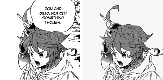
#1: Don and Gilda - Chapter 138: Demon serch (1)
Date: Jun 14th, 2019
Time: ~ 1:30 h
My very first redraw from my very first edit posted here, so it deserves an honorable mention. Back then I was young and inexperienced, I didn't even apply a gray filter (lmao I was so unskilled I even unintentionally scratched the picture, I hadn't realized until today). I'm actually very happy my first redraw was of Don, boy deserves all the love.

#2: Emma and Ray - Chapter 140: I’m Here!
Date: Jun 28th, 2019
Time: ~ 1 h
Back then this looked like so much work to me!!! And to this day, I think it turned out pretty well. I'm particularly proud of how the bow turned out. This is one I was really proud of right after having finished it; it gave me the confidence to try redrawing bigger areas. Also, the edit were I first applied the opacity of layer / opacity of brush for the gray filter that would have stuck with me.

#3: Krone's birthday edit
Date: Jul 15th, 2019
Time: 15 mins
I don't know I just really like how Krone's hair vanish to a more sketch-like style here– and consequently, how I managed to replicate such effect. I think Krone's beautiful.
#4: Emma, Norman and Ray - Chapter 153: Coward
Date: Oct 4th, 2019
Time: 4:07 h (and 67 layers lmao)
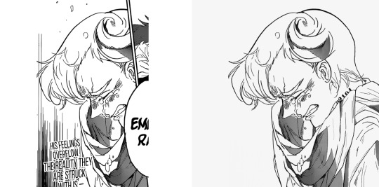
Probably the single panel redraw I'm the most proud of. That Norman panel was beautiful and very poignant at the end of a chapter I adored, so I believe it deserved all the time I've spent working on it. It's far from being perfect - the back of his head is too plain, and the difference between my brushes and the original brushes is pretty visible - but I still like it very much and am extremely attached to it. The horn looks kinda big but I honestly believe it to be more of an issue with the original than with what I had redrawn lol. Funny enough, the whole picture didn't make it to the final edit and had to be trimmed.
#5: Full Score Trio - Chapter 154: A Breakthrough
Date: Oct 11th, 2019
Time: 29 mins
I don't have a particular reason for this I just think Emma's hair turned out amazing. It took just half an hour and I didn't even use references like. Wow. @Redrawing skills where did you go please come back
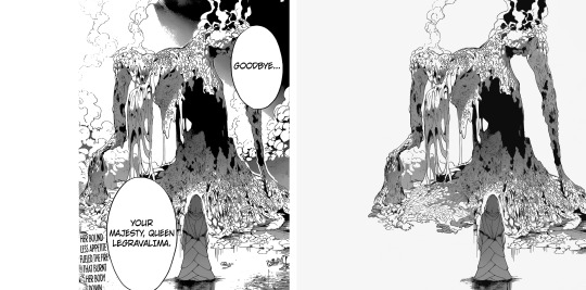
#6: Mujika and Queen Legravalima - Chapter 158: The Reason I Was Born
Date: Nov 17th, 2019
Time: 2:09 h
Sis I love this so freaking much. The shift from redrawing almost exclusively people and clothes to redrawing this mess was so fun and refreshing. Even though it's a mess I think it turned out very clean and overall it looks beautiful? I remember after finishing this I felt so powerful, like now that I had redrawn this thing I would have been able to redraw anything I set my mind on lol.
#7: Emma - Chapter 161: Never Be Alone
Date: Dec 13th, 2019
Time: 57 mins
Again no particular reason except this is a very cute Emma and I think the redraw turned out pretty well. There's this big lock on the left that doesn't make a lot of sense but overall I really like it. Cute Emma is cute, and I love her determination.
#8: Emma - Chapter 166: Going Back Home
Date: Mar 9th, 2020
Time: 3:45 h
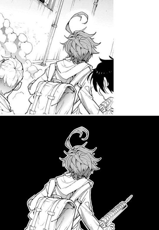
I'M SO FREAKING PROUD OF THAT RIFFLE I have not the slightlest idea why this took so damn long BUT I'M SO PROUD OF IT
#9: Norman's birthday edit
Date: Mar 21st, 2020
Time: 1:04 h
This is cool! I didn't know I could manage to draw this, but I did it! The feathers were particularly hard to clean but I think they turned out fine.
#10: Full Score Trio - Chapter 174: A New World (part 1)
Date: Apr 6th, 2020
Time: 2:11 h
I just think they're very pretty? I can't understand if I like Ray's face a lot, or not at all, but I think overall there was a lot to redraw and it turned out pretty cute! Sorry Gillian.
(Also insert pretty much every panel from the chapter 177 Isabella edit– I've spent so many hours on basically every panel there's no way I could choose only one).
Top 5 edits as whole:
#1: Emma and Ray - Chapter 140: I’m Here!
Date: Jun 29th, 2019
Complessive time: 2:57+ h
The very first edit I'm actually proud of; I'm really attached to it. It's the first edit I had put all of my effort into, and I remember feeling anxious people would have left it without notes. It kinda feels weird to think about it now, because I really don't care about notes anymore; yet, it somehow makes me happy to think that past-me wasn't let down. Thank you @neverlandstrio for your support, you may not remember but it really meant a lot to me back then! And it still makes me smile. You're the best!!!!!!
#2: Mujika and Queen Legravalima - Chapter 158: The Reason I Was Born
Date: Nov 20th, 2019
Complessive time: 7:12+ hours
This whole edit was an hella wild ride. It's midnight before a school day, when I think: "Mh, it's been a while since I last made an edit, why not make one about Musica and the queen from the last chapter?" And seven hours after this was born. I'm particularly proud of the queen's redraws on the 3rd, 7th and 9th picture (ofc), the areas which have been redrawn are pretty huge yet I think the difference with the original is almost impossible to notice?? @Redrawing skills where did you go please come back (part 2)
#3: Emma - Chapter 174: A New World (part 1)
Date: Apr 12th, 2020
Complessive time: 6:53+ h
I think the panels that were selected work very well together, especially considering the close-up / full body alternation. I love Emma, and I've always been kinda sad noticing that edits that focus one her take the less notes... She deserves all the love. Also, fun fact: for the last but one panel, I had redrawn Emma's whole left ear before remembering she doesn't have one, so I had to redraw the panel from the start. Besides from the error with the ear, the reason why this (and all the others after) took so long is because official panel take way longer to clean.
#4: Isabella and her children - Chapter 177: Mother
Date: May 22nd, 2020
Complessive time: 13:41+ h (ahah.)
Lmao tbh I can't understand how this has so few notes it's like. Technically speaking, probably the best edit I've ever done. I don't even like Isabella that much, I haven't got the slightlest idea why I decided to spend so many hours on this. Anyway, I find the composition (full body on the left / headshots on the right) really good looking in this as well! And I think the redraws turned out fine, especially Isabella's.
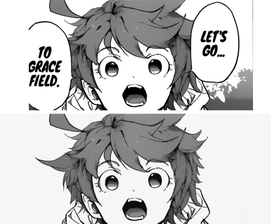
#5: The Promised Neverland manga ending countdown→ 1/7 chapters: chapter 1 - Grace Field House
Date: Jun 9th, 2020
Complessive time: 1:59+ h
I don't know how I came up with that idea for the composition but I find it really beautiful??? I think it does a pretty good job conveying the sudden, terrific shift of atmosphere from the first chapter, and I think that sharp bridge is very nice. I'm very, very proud of this.
Honorable mention #1: Full Score Trio - Chapter 154: A Breakthrough
Date: Oct 13th, 2019
Complessive time: 3:44+ h (+ 1:13 h of working on a panel that ultimately didn't make it to the final edit)
A very good chapter, and the edit turned out surprisingly amazing??? All the redraws look great and make it almost impossible to distinguish them from the original; honestly I feel like I'll never be able to redraw so neatly again lol.
Honorable mention #2: Don and Gilda (+ Norman) - Chapter 160: Shackles
Date: Dec 11th, 2019
Complessive time: 3:14+ h
That one is really one of my favorite scenes; I'm telling you peoples, Gilda and Don are a blessing to the earth. I think I've never mentioned it, but Gilda's hair is a nightmare to redraw??? More specifically, it takes me h o u r s to fill the texture without making it look too weird, it's the worst.
Honorable mention #3: Norman and Ray - Chapter 179: Compensation
Date: Jun 6th, 2020
Complessive time: 4:16+ h
I was so glad to finally be able to make a Norman / Ray edit, and it turned out it was just in time before the series' finale. I like how it turned out and I'm pretty satisfied with the redraws (even though my sister helped me with the lineart of some panels - it was exams time and I really couldn't afford to spend more time on it), too bad we didn't have more chapters that focused on the boys. Ray sweetie one day I'll fix your ear it's just today's not that day.
Btw, I justed realized I have never done an Emma / Norman centered edit? I'll have to make one eventually. I remember considering focusing on them alone for the chapter 154 one, but then I thought "even if the manga is gonna ignore Ray, I will chose to do not" lol.
Top 5 long posts:
#1: Reconstruction of how the Grace Field children were settled in the three bedrooms
Date: Aug 28th, 2019
I just had really a lot of fun doing it. I love putting all the little things to their own place, it's so calming to do and that's why I love making this kind of things. Also, loved how @temporoom contributed to the post! It was so nice of them to add what they had noticed to come up with more exact conclusions, that's one of the things I love the most about the internet.
#2: A study of how many times the characters of The Promised Neverland call each other through the first season of the anime
Date: Sep 10th, 2019
I REALLY LOVE IT! I mean it *was* kinda stressing to note everything, but it was very also very satisfying to see everything methodically divided and organized! And it's not just that– it's also the fact that it looks good. That's one post I have fun rereading because it's actually pretty! Also, even though it can be very stressing to learn to use new programs and sites, it's always very satisfying to look at the final result. Again, I really adore compiling these tiny little details! I would love to make more posts of that kind if i had the time.
#3: The Promised Neverland musicals headcanons
Date: Oct 27th, 2019
I mean it's literally. Putting my two favorite fandoms together how could I not love it. This is another one I really enjoy rereading, I find all the musical / character associations so fitting! I really want to make a second part, I hope to find some time to do it.
#4: Considerations on the reward / eventual series' finales (and Emma's sacrifice)
Date: May 7th, 2020
It's always nice to put down all your thoughts regarding a particular matter. It can take a lot of time (at least for me it does because... I need time to think about things), but it's so satisfying to see all of them there once you're done. Bonus points when, like in this case, it was something asked by someone else because “Wow! Somebody wants to hear my opinion on this subject! I'm flattered (◍•ᴗ•◍)”
#5: Some other considerations on the series' finale and Emma sacrificing herself
Date: Jun 13th, 2020
Pretty much the same as above. It's like some kind of clarity when the post is done and signed. Another fun fact, I had to censore the post a lot; the first version was extremely sharp and harsh, but I believe it's right to express your opinions calmly and politely.
Bonus: A thread of what the tpn characters would wear at the Oscars
Date: Feb 9th, 2020
Imagining all the children in those pretty dresses makes me so incredibly happy (╥﹏╥) I go back to look at that post a lot. I really love red carpets, I love looking at pretty dresses!!!!!
Lmao it's so funny how the post of mine I like the most are also the ones with the less notes
Anyway this was just a personal report! You don't have to read it all (or any of it actually). But it was indeed fun making it! Here's to many more months in the fandom!!!
#This was supposed to be posted on July 13th as one year and one month since I made the blog#but Tumblr decided to be a jerk and deleted all of it 😊#So here we are#tpn#tpn manga spoilers#long post#Again this is just a personal report don't stress over reading all of it#But it was fun to make!#To the people I tagged: sorry for tagging you in this long post but also it would have felt weird not to do so? I hope you don't mind#It felt like... Giving credits foe something you've done y'know
40 notes
·
View notes
Text
Hyacinthus Art Process! (Part One)
ART PROCESS BELOW!!! (forgive me if I’m salty, I was looking for the link for Step One for almost HALF AN HOUR)
Also end and forgive me I made the bunning Hyacinthus PURPLE. Luckily I change it but S T I L L I’m ANGRY ABOUT IT
Step One - Rough Draft

Okay! So I started this album around October 20th, 2020 on a Tuesday (lol).
When I was thinking of the song (while doing the covers of the last two), I really wanted to show that power and desperateness of Jamil (and how he indulges and relishes in it). I remembering see this pose by yama_kome and I really liked how they represented Jamil’s overblot.
Ever since I saw this incredible piece of art, I wanted it to be done in this kind of way. Now, since I’m releasing covers of Scarabia (Mystique and Cardenalia), I decided to do it this time for his overblot.
Besides, I wanted to change things up a little bit!
This took me a while to get (almost a day I believe?), but when there’s a will - there’s way.
Just to let you know: I was originally going to name the song Hyacinth but if you say all the Scarabia Trilogy’s Tracks in order - it wouldn’t sound right. So that’s why I changed it to Hyacinthus.
Secondly, I feel like if you say a flower’s scientific name than its common name - it gives that effect of a beginning, of a source and of an origin. I feel like the Overblots are a representation of their true feelings and emotions (in this case, Twisted Wonderland) so that’s partly the reason why I changed it as well.
Step Two - Rough Lineart

This dang lineart took me till Thursday, October 22nd. Here’s why.
1. I COULDN’T WING IT THIS TIME - there was a lot going through my head as well as references about what I wanted him to wear. Other ideas popped into my head such as, “Should I add some blot there?” or “What should I do for the shirt?”.
So many ideas, but few were added.
2. The DESIGNS. - So many interpretations and stuff were everywhere, and they all looked good. But the problem was the amount of time to put such beautiful details. That killed me.
To sum up one and two, my brain for ideas went brrrrrrrrrrrrrrrrrrrrrrrr-
Steps of Lineart (at the top of my head - yes. I don’t write this in the time I’m doing it because it slows me down lol):
1. Face (was done already) - more specifically the side profile to the neck
2. Nose Piercing (yE-)
3. Mouth Piercing (hOt-)
*4. Braided Hair (*dies*)
*5. Veil on Face (then the pattern waaaaaay after)
*6. Dazzling-Jewelry-Neck (more sure about doing the neck first, but #6 and #7 can be interchangeable)
*7. Snakes (only the right of the art piece though/snakes nearest to braids or plaits)
8. Upper Body
9. Robes
*10. Chest
11. Shoulders
12. Right Hand - Fingers
13. Right Hand - Fingernails
14. Right Hand - Palm
15. Left Hand - Fingers
16. Left Hand - Fingernails
17. Veil on Body
18. Ear (YUP, I FORGOT THE BUNNING EAR-)
*19. Snakes (left of Jamil and his beautiful hair strand)
20. Right Earring
21. Left Earring
22. Thing on his head (nope, don’t know the name and I ain’t bothering)
*For numbers 4, 5, 6,7,10, 17 and 19 in particular, I had to do multiple layers to make the detail. I would say:
#4 - Two layers: One for the plaits and one for the line...thingy...
#5 - Six layers: It’s technically two, but I had made multiple to get the pattern I wanted. Sadly, I didn’t achieve it so I decided to stick with the one above.
#6 - Six layers: THE FULL DANG TRUTH. The diamonds were first (1), then the line separating the pearl and diamonds (2), Later the designs of the pearls + rectangular thingies (3), The triangle into multiple triangle thingies were next (4), Soon after was the circles into multiple circles + Two triangles overlapping each other (5) and then that last bit at the end of the neck (6).
There’s actually more due to the designs of the diamonds and pearls, but I’m not going that far into memory lane.
#7 - Eight layers: If you count them, that’s how much layers I had to go through.
#10 - Four layers (without counting the two (or three) patterns that you see up there): That darn pattern (1), Them s p i k e s (2), That thing it’s being held up in (3), that pattern near the spiky pattern (4).
#17 - Four layers: Just count, please. Going up and down with my eyeballs is killing me.
#19 - Seven layers: Not as bad (because it’s pretty small), but whatever. (1 - 3) First three ear piercings you see (you may see two though), that tail, long thingy (4) that crap Bubbles wear...them circles (5 & 6), and that diamond. (hehe cATER DIAMOND)
HI!!!
You better read that crap. I took a good while writing it. If you did, you earn my biggest respect and time in the inbox.
Step Two and a Half: Cleanup WITHOUT the Background

Ah. The nostalgia. That feeling when you forgot the flower you were supposed to be working on...
Words, text and speech can not even compare to the feeling I had when I rEALiZED, I foRGOT the BUNNING FLOWER-
Step Three: COMPLETE Cleanup
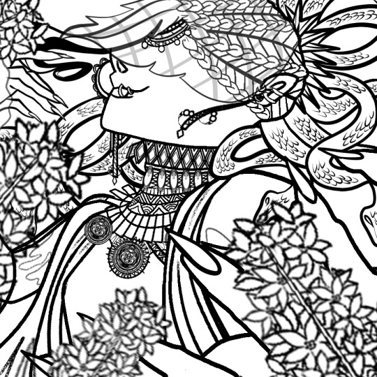
Perfection. Isn’t that nice?
Step Four: Coloring
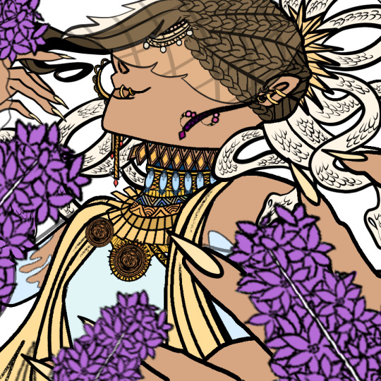
October 22nd, 2020 at 11:03 AM...
Immediately when I thought of Jamil I immediately wanted to give him that w h i t e s c h e m e
The reason why I wanted to was because he hard more darker colors in his normal design, and besides - his power has something related to the meaning of white ;). Anyways, I made sure that the ivory (celestial?) theme continued to flow through the whole art piece. Basically, making this smol boy a goddess-
Also, I was thinking that this Overblot scheme would be his true form or something, but he kept it locked away maybe due to how much it takes up his health. Consider this idea though as 100% “Not-Fully-Developed-But-Getting-There” Idea.
I really wanted them snakes to be white. Sorry not sorry.
Plus, I wanted that veil black instead of white, but I was way too into it to ever think of that apparently. In particular, them f i n g e r n a i l s. I absolutely wanted Jamil to have that light peach color and all that so I did it! Makes my heart go UwU-
<>
Annnnnnnd cut! That’s Part One for you.
Hyacinthus [ Art Process - Part Two ] here!
Thank you for your continuous support!
#just#please#end me here and now cause I'm just like ://///////////////#it's easy to fix though so anyways-#TWSTxDAL art process#TWSTxDAL overblot#TWSTxDAL#twisted wonderland#date a live#scarabia#kalim al asim#jamil viper#twst kalim#twst jamil#this is the final one...:(((((#at least original Jamil's back again!#Requests are open - including Overblot Jamil HEHEH-#finally I queued this! Thank goodness...#now you guys don't have to wait! YAY!#but dang#ever since I've made music for scarabia I've started to love the characters in them espECIALLY JaMIL-#YE#UwU
4 notes
·
View notes
Last Seen Blogs

thesims4cc-mm
✩ CC ✩

kimcampbellillustration
Kim Campbell Illustration

rgaywala
The world through my eyes

cwcphotosandstories
Untitled

roman-stan-first-human-second
I REALLY LOVE THE RED ONE