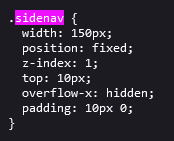
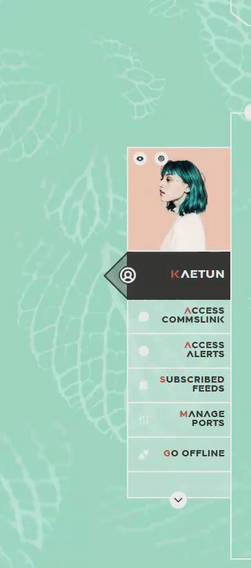
#fixed sidebar html css
Explore tagged Tumblr posts
Visit Tumblr Blog
Explore Tumblr blogs with no restrictions, modern design and the best experience.
Last Seen Tumblr Blogs


Fun Fact
The most popular pages on Tumblr are about Minecraft, GIFs, and David J. Peterson.
Text

Fixed Sidebar Menu
#fixed sidebar html css#fixed sidebar menu#codenewbies#html css#frontenddevelopment#html5 css3#code#css#css navbar#side navigation menu#html css tutorial#pure css tutorial
1 note
·
View note
Text
chat. i will never know peace i fear
#.txt#realised that while the custom css applies to all your pages. the custom html does Not#the sidebar does inchrestingly enough#but the actual body? no.#so if you were being a smartass like i am and used a custom container#it doesn't show.#which is. a problem !#when you send people to your Other Pages!#AAAAA#pain and suffering on planet earth.#i can fix this and i will but i'm annoyed
3 notes
·
View notes
Text
You know what, I'll bother making this post. It's long overdue.
PSA: Please don't install uBlock Origin rules for Tumblr that use :nth-of-type(), and please remove or fix any you have installed. They can and will hide the wrong things. I'll show you a few alternatives below.
First, an example of how we get here. I've used the uBlock Origin element picker to try to hide the "Get a Domain" sidebar item:
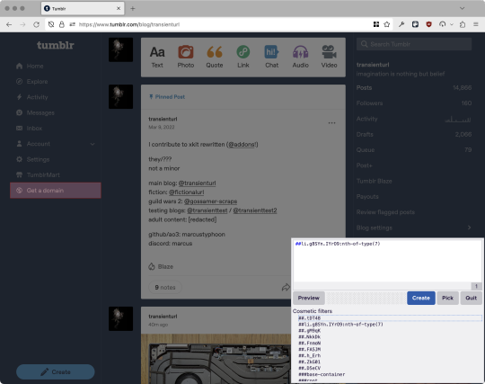
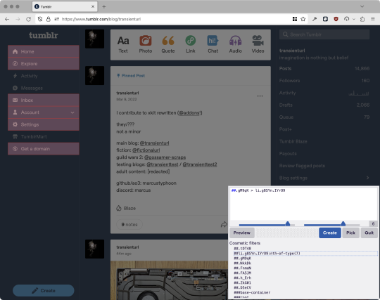
With some different adjustments of the sliders, it gave me these two snippets, one of which targeted a whole bunch of sidebar items, and the other of which selected the right one. Great, right? Read on.
www.tumblr.com##li.g8SYn.IYrO9:nth-of-type(7) www.tumblr.com##.gM9qK > li.g8SYn.IYrO9
As you can see, these both target a particular kind of sidebar item via "li.g8SYn.IYrO9"—fine—and as you can probably guess, the second one counts them all up and hides the seventh it finds.
This is bad, because what it actually hides depends on exactly how many sidebar items there are! Users can "snooze" Tumblr Live, which will make an item appear or disappear, and users with/without Ad-Free subscriptions will have or not have another. I have seen many, many people accidentally hide their activity, messages, inbox, etc using someone else's rule that's supposed to hide Live. Worse, some rules intended for e.g. recommended post carousels that use nth-of-type translate to something like "hide item number three on the dashboard no matter what it is," which will lead to a seemingly random post on your dashboard disappearing!
This isn't a problem specific to Tumblr, of course—I personally think uBlock Origin should never autogenerate these rules—but Tumblr has a ton of elements that aren't in fixed positions, so I feel comfortable wording that PSA the way I did. On a very static site, those rules might be fine. Here they almost always aren't.
So how do we fix this? First of all, as a developer of XKit Rewritten (check out @addons!), I must suggest you check if it has a feature to do what you want. Plenty of times it won't, though, and if not, we want to make a rule that hides an element based on what it is, not where it is. Here are three ways to make a robust rule:
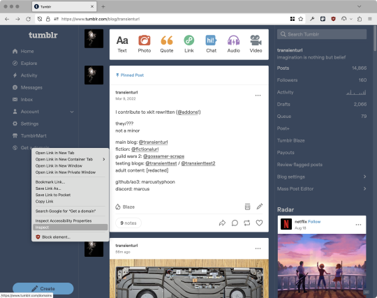
First, I'll right-click the element I want and use the inspect element tool in my browser's developer tools to look at the element I really want (Firefox and Chrome/Edge/Opera have different but overall similar interfaces for this):
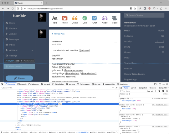
The HTML looks, for reference, like this (Tumblr sucks at code blocks but I'll try):
<li class="IYrO9 g8SYn" title="Get a domain"> <a class="tDT48" href="/domains"> <div class="kn4U3"> <svg> <use href="#managed-icon__earth"></use> </svg> </div> <div class="a132D"> <span class="ZC1wz">Get a domain</span> <!-- other unimportant stuff removed--> </div> </a> </li>
What's something unique about this element, preferably about the outermost element, and preferably contained within the <angle brackets> (HTML tags)? In this case, we have it easy: title="Get a domain" is definitely unambiguous and fulfills all of those three. If you're very familiar with web design using CSS, you'll know how to target that; if you've vaguely heard of CSS, you may be able to look at a reference sheet of CSS selectors, see [attribute=value], and figure it out, and if neither is true, I'll spoil it for you and say that we just put it in square brackets in this case.
So—taking the rule uBlock Origin made, removing the :nth-of-type() and replacing it with our better selector—here's our first working, bug-free uBlock Origin rule:
##li.g8SYn.IYrO9[title="Get a domain"]
Okay, great. But what if we didn't have that attribute to target? What if our top-level element looks the same as the other ones? What if we want this rule to work if we change our Tumblr language to Spanish? Let's move on to :has().
:has() is a CSS selector (supported in uBlock Origin even in browsers where you can't use it for web development yet, i.e. Firefox), that lets you check the contents of an element for whatever is in the parentheses. Let's assume that Tumblr would never make two sidebar items with the same icon, and target that href="#managed-icon__earth" property:
##li.g8SYn.IYrO9:has([href="#managed-icon__earth"])
Yep, that works too!
Finally, what if we couldn't use either of those because we need to target the content of the page that's not contained within the <angle brackets>? We can take a look at the uBlock Origin documentation and find that it has something for that too: :has-text(). You can do very powerful things with this (e.g. you can sort of implement Blacklist entirely using uBlock Origin using something like article:has-text), but it doesn't perform well and can pretty easily be used incorrectly, so I'd suggest you avoid it when possible.
However, let's try using it here to target the "Get a domain" label text:
##li.g8SYn.IYrO9:has-text(Get a domain)
And that also works!
With these techniques, you should be able to target any specific thing you'd want to hide without using any fragile positional selectors. If you're going to share your uBlock Origin rules with others, please make use of this! If you're just using your rules for yourself, then hopefully I've given you enough information so that you can understand what a rule does and decide for yourself if it's worth bothering to fix (menu item order might not change that often, so maybe you're fine with certain rules being a bit prone to breakage; if your rule hides the first post in your timeline you really do need to fix that one!)
-
And, of course, a note for you web developers out there: :has() isn't natively supported in Firefox quite yet, so you can't really use it (I would not recommend using JQuery's simulated version—it's not quite the same). And :has-text() is just not a thing for CSS at all. Just use javascript at that point! Edit: No longer true in 2024; style away!
Final note: any rule with a random 5-character string like g8SYn will eventually break when Tumblr rebuilds its CSS map, though they haven't done that in ages. But when they do: no, it's not "Tumblr devs breaking our rules because they hate us." (Yes, I hear that sentiment a lot in contexts when it almost always makes zero sense.) If you're fairly experienced with CSS you can sometimes make Stylus/uBlock Origin rules that don't reference any, but it's usually convoluted and more trouble than it's worth.
81 notes
·
View notes
Note
hi there!! there isn’t a need to publish this ask I literally just am so curious if you had any resource or tutorial regarding your neocities! I’m sorry if this is so out of the blue but I saw your site and really adored the layout!! I’m specifically just wondering about the method you used for your blog posts - I’ve found some recommended ways to do it but i feel like yours is integrated really well imo :) also if you’re not comfortable answering or anything that’s totally fine lol pls don’t feel obligated. lastly your art is so gorg!!!
i'm finally going to answer this ask...!! it's going to be a very long read so i'll keep it all under this cut
i know you are specifically curious about the blog posts page but i figured this was a great time to thoroughly explain my website layout too since i had another person asking about it (i'll put that at the bottom though) :D
please bear with me btw because i... i have never made a tutorial like this before LOL
--
blog posts guide

1. scrollbox
i made a super low effort format for my blog entries. i honestly just wanted it to be a super simple scrollable box with all of my entries being in one general place. CSS to do this, i created an all encompassing <div class> that had the styling property of overflow.
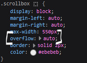
fyi, i also added a <div class> within the scrollbox class that would handle the padding but TBH i'm not sure... i needed to make an entire class for that LOL REFERENCES - scroll box
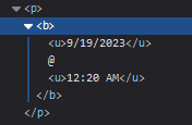
2. date & time
HTML ok honestly i just used a <p> element and made it bold....
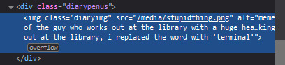
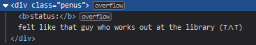
3. images (optional)
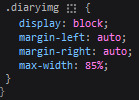
HTML i don't always attach an image to my entries but when i want to, i use this <div class> that sits below my date & time. i style it with an <img class> that i created and add an <alt text> too to make it more accessible!
CSS this is what the <img class> looks like. i like my images centered and on their own "line."
4. status
HTML again, another <div class> specifically made for the status. i just made the font size smaller to visually differentiate it from the actual entry itself.
5. blog entry text
HTML my blog entries are simply typed up between <p> tags and i use <br> to start a new line... it literally just looks like this LOL....

THAT'S ALL...>!!!!!! :)
--
website guide

1. general page layout
HTML in order to establish where i want all of my blog's content to lie, i created a <div class> specifically to store it all.
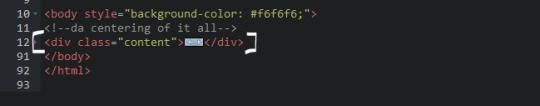
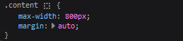
CSS the styling for it is pretty simple! just setting a max-width to limit the size of everything that will be in it and also centering the page with the margin.
2. sidebar
HTML my sidebar just comprises of a heading tag and navigation links.
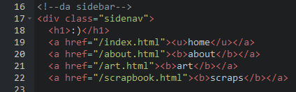
CSS this is all personal taste aside from the fixed position
REFERENCES - fixed sidebar - responsive sidebar
3. main content
HTML because everything is stored in the <div class="content">, the sidebar and the page contents are limited to the constraints of the it.
that is all pt. 2...... bless <3
#THANK U FOR ASKING BTW!!!!#it brings me so much joy when people ask me . things and i then get to answer these things#i am so sory if this is somewhat incomprehensible or a pain to read through IF YOU HAVE ANY NEEDS FOR CLARIFICATION... JUST ASK ME..!!!!#textoffun#inbox
32 notes
·
View notes
Note
Ur website so cool!! ❤️❤️ Do you have by any chances coding tips? Been trying to make my own website for a while but adhd won't let me concentrate a second when it comes to learning coding
Thank you! And 100% It is deceptively approachable but also time consuming, I'm familiar enough with html from a highschool class where we did need to write code out by hand, and then soft practice with coding toyhou.se profiles and futzing around with free code snippets. Largely though I don't think you need to know everything or to write everything by hand, you just need to frankenstein code pieces together (As long as they're free ofc).
I used this first, it's fucking insanely handy and lets you make a simple layout with sidebars, navigation, header, footer and a body base ect, and then just generate and copy the code. The html itself also has greyed out little notes about what parts do what!
I'll be real the rest of it after that is just me googling what I want to do or googling html snippets bc I forgot them. So like html image link with size attributes ect ect, how to make a html image gallery. I don't use one site exclusively but w3schools.com has a bunch of common ones and also has a little live code editor in its tutorials.
Like I still get greatly stumped for hours bc code's kinda sensitive and one or two characters out of place will break sections of it especially when ur just frankensteining. Trying out little segments in live code editors is really helpful because you can kinda break it apart and diagnose the issue before putting it into your site html.
Also if it helps this is kind of how I break it down in my brain as another ADHD-er. so fuckign sorry for how this looks im doing it in snipping tool. But code bits love to live in cages even if it all looks the same, iit would also help if you clean your code up mine is pretty horrid but you just want to familiarize yourself with the little "Sections" ig that's where doing things by hand would help because you would 100% know what each chunk is for but yk yk.
CSS is a different beast I barely understand. The parts of code where it starts stacking on top instead of being horizontal is css and it's basically how you do fancier things to your code, it's linked to stuff you already have down. So like changing the background in the body text box or something, you can only do so much in there. Css targetting the body text box is where you can level it up. Again the sadgrl layout builder has notes so you're not completely blind in there. There's also 100% so many resources to explain what all these words mean, my mmethod is incredibly avoidant I don't know what flex is I haven't needed to fight her yet ect ect.

Sorry if this is confusing this is just my hack and slash understanding atm. Be humbled by code I've spent too long trying to fix up hysterical margin issues just because I had a random apostrophe somewhere or because I tried to spell it colour and not color ect.
33 notes
·
View notes
Note
hi!!! i love for custom blog theme,, do you have a link to the code or creator 0:?
ya!
so my theme is actually a heavily modified version of redux edit #1 by lopezhummel (current url: holyaura). i always remind users that most tumblr themes are old and that you'll need to replace all instances of "http://" in the code with "https://" so tumblr will save the theme. i had to do it with this one
these are the modifications i made to the theme. i edited this theme over the course of at least a year or so and don't quite recall how i did all of these things. but to the best of my ability:
i moved the "left side img" to the right side of the screen. i also made this element "responsive" so the image will never get cropped when you resize your screen. this was a bitch and a half to figure out and i truthfully do not remember how i did it
i deleted the text in the drop-down navigation so it appears as a little line that is otherwise not noticeable. this type of theme, the "redux edit," used to be very popular because having a drop-down menu let you cram a bunch of links that lead to sub-pages on your blog. i've done away with my sub-pages, but i still like the format of the "redux style" tumblr theme, for its minimal UI and for its customization options.
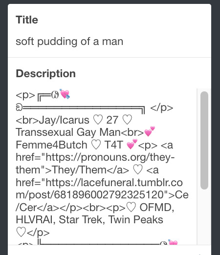
i separated my mobile description from my web description for formatting reasons. basically, most elements in tumblr themes are connected to specific text fields and toggles. i simply went to the section that was connected to my blog description and deleted it. the web description has to be manually typed inside of the CSS/HTML editor when i want to change it. whereas my mobile description is whatever i type in the "description" box of the normal tumblr theme editors.
i added code someone else made ("NoPo" by drannex42 on GitHub) which allows you to hide posts with certain tags on them. i did this to hide my pinned post, as it looks bad on desktop.
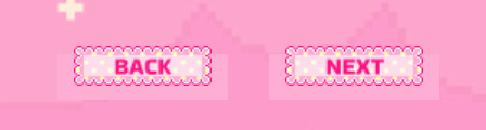
i replaced the tiny pagination arrows at the bottom with images that literally say "next" and "back" because the arrows were far too small/illegible. i know they aren't centered in the container i'm not sure how to fix that lol
i added a cursor

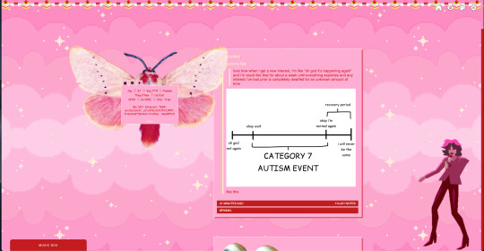
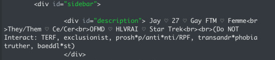
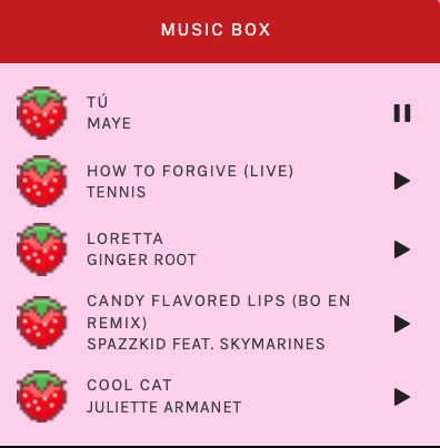
i installed a working music box ("music player #3" by glenthemes), and then added music by uploading MP3 files to discord and then using the links of those files as the audio sources. iirc i also had to make this element responsive and i aligned it so it would sit on the left side of my screen. i made the "album art" for each one the same strawberry pixel art
the moth is just a PNG i added and then moved around so it was behind my sidebar using the options that came pre-packaged with the theme
if you want something like the strawberry shortcake decoration at the top (called "banner" in the theme) your best bet is to google "pixel divider"
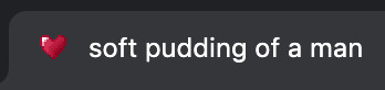
theme didn't support favicon so i added that in so i could have a little heart
ALSO:
this theme is. really weird about backgrounds. any background that i have ever set for it, i've had to do weird shit in photoshop. like making the background HUGE, mirroring it, etc. - because it would crop the image weird, or there would be a gap where there was no image. idk man, it's haunted. i'm sure there's a way to fix this but i am NOT tech savvy enough. anyway, patterns are probably your best friend. and if you DO want something that isn't a pattern, it's going to take a lot of trial and error. but i love this theme so i deal with it 😭
the sidebar image and the floating image do not scale. if your image is 1000 pixels, it will display at 1000 pixels. you'll either have to edit the code so that the theme scales the image for you, or resize any images before you add them
my white whale of theme editing (aside from the Weird Background thing) is that i cannot get infinite scrolling to work. i have tried every code out there. all of them break my theme. it makes me sad because like. i have music there for a reason. the idea is that people would listen to it while they scroll. unfortunately, the way it's set up now, the music will stop every time someone clicks "next" or "back" 💀
anyway sorry for rambling but i hope you enjoy the the theme and customizing it in the way that you want to!
24 notes
·
View notes
Text
Universal Scroll Button(Autochange Direction) For Any Host
Hey, do you have a site with a lot of forums? Does your host allow you to use Javascript? Boy does this weirdo have a deal for you! For the low low price of free, you can get right now access to a scroll button that swaps directions when you scroll automatically, as well as changing the target & title on hover! Act fast, this deal won't last! I kid, but enough of the ShamWowery. In reality, this is a very simple script that reads how far you have scrolled a window, & applies or removes a class to your scroll button, as well as changing the target of said scroll button & adjusting the title to reflect which way it will take you!
It's so simple, crediting me seems superfluous but if you want, feel free to credit with a link to my blog <3 I hope the new verse of our song is eminently kind to everyone!
See it In Action(Click, or look Below):
I currently use this code on two different WIPS, so feel free to check out some gifs;
To Begin
Before the end of your </body> tag in your wrappers(for Jcink) or wherever the HTML templates go on other sites, you want to place this script:
<script> $(window).scroll(function() { if ($(this).scrollTop() > 800) { $('#scroll').attr("title","To Top?").attr("href","#Top").addClass('totop'); } else { $('#scroll').attr("title", "To Bottom?").attr("href","#Bottom").removeClass('totop'); } });</script>
This seeks out an id of Scroll to adjust the href & title as needed depending on the scroll position within the relevant window. The scroll amount is in px, so to change how quickly it changes the button, alter the number 800 to whatever you desire, fiddle with it; one size never fits all.
The Styling
Once you've saved that, move to your CSS, or wherever your Style tag is to add styling for the link itself. Keep in mind the link should be contained within a container that handles its positioning for it as otherwise the script will fuck with the positioning as well as the transformation & you really just want it to spin upwards.
The styling for the link should be as follows;
#scroll { display: inline-block; positioning: relative; transform: rotate(0deg); transition: transform .5s ease-in-out; /*** ^ change the .5s to alter duration or the ease-in-out to alter the timing of the transition between button states ***/ }
#scroll.totop { transform: rotate(180deg); }
The first statement defines the default state (linking to the bottom) of the scroll button on the load of the page, the second defines the change of position once the window has been scrolled far enough to activate one's script.
The HTML
Now you've got the behaviour defined via JS & the styling defined via CSS, it's time to input the HTML, or the bone structure of the code itself. In your wrappers, template, or wherever HTML goes on your host, locate three places;
One, where you want the TOP scroll location to be. This is where the scroll button will take you once it has changed states on scrolling a certain distance. Here, you place an anchor span as follows;
<span id="Top"></span>
Two, Where you desire for the BOTTOM or BODY scroll location to be, as in where the scroll button will take you on click initially. This could also be a scroll to the start of content, in which case I recommend changing #Bottom & id="Bottom" respectively to reflect the syntax, it's entirely up to you. Here, you place an anchor span as follows;
<span id="Bottom"></span>
Finally, It's time to add the scroll button. Keep in mind, where you put it is a function of utility & design choice. Some like it persistently hovering in a fixed position, some like it in a sidebar or on userlinks, some prefer it in the navigation bar.
Wherever you place it, try to ensure that it's easily accessible on any device, screen size, & matches the User Interface logic you've used everywhere else. If you have all text buttons, don't use just an icon, if you have all icons, don't suddenly use just text. Match your action calls, so users don't feel confused while using your site.
Once you've decided where you want it, place the following code, NOTING that there should be a container for this code that positions it for you. I've provided two options; the Icon Font option (courtesy of Phosphoricons -- a free & reliable Icon Font I recommend -- As well as one which includes text, so both UI/UX design philosophies are accommodated.
Note the option with text will only rotate the caret from downwards to upwards, so the scroll text shouldn't need editing unless you want to add or supplement flavourtext.
Please choose the appropriate option for yourself;
Icon Font
<a id="scroll" class="ph-fill ph-caret-down"></a>
Icon Font with Text
<span>Scroll <a id="scroll" class="ph-fill ph-caret-down"></a>?</span>
Some Notes:
I just want to add a bit of info:
If your browser isn't scrolling smoothly to your anchors? Check your settings, & be sure the root of your CSS has scroll-behaviour: smooth; in it.
If you use this guide & have problems getting it to work, please let me know! I will troubleshoot this for you & tumblr has strange coding, I may have futzed something up, I want this to be as accessible as possible, so don't be silent; questions help!
If you are not using Jcink, or another host with a Jquery library pre-loaded, be aware that one is needed for this script to work. Most hosts will have a default Jquery library, but if yours doesn't or you're self hosting, any should do. The Jcink file is below, however, if you want to just use that.
10 notes
·
View notes
Text
Website Coding Help!
How do I stop the main text from hiding behind the sidebar? HTML fix or CSS fix? I am adding 'padding-left: 280px;' to my codes but to no avail!
Website in question:
6 notes
·
View notes
Text
How to Handle Complex PSD Designs During WordPress Conversion
Converting complex PSD designs to WordPress can be a challenging task, but with the right approach, you can achieve a seamless transition. Here’s a step-by-step guide to help you navigate the PSD to WordPress conversion process efficiently.
1. Understand the Design Thoroughly
Before starting the PSD to WordPress conversion, ensure you fully understand the PSD design:
Analyze Layout: Break down the design into sections like header, footer, content, and sidebar.
Identify Features: Note any special features such as sliders, forms, or interactive elements.
Check Responsiveness: Ensure you understand how the design should adapt to different screen sizes.
2. Prepare Your Tools
Equip yourself with the necessary tools for a successful PSD to WordPress conversion:
Design Software: Use Adobe Photoshop or a similar tool to inspect and slice the PSD.
Development Environment: Set up a local WordPress environment for testing.
Plugins and Themes: Install necessary plugins and choose a base theme if needed.
3. Slice the PSD
Slice the PSD into manageable pieces for the PSD to WordPress conversion:
Header and Footer: Extract these elements as separate images.
Content Areas: Slice images used in the content area, such as backgrounds and icons.
Buttons and Icons: Save these as individual images for easy integration.
4. Convert to HTML/CSS
Create a static HTML/CSS version of the design as a precursor to the PSD to WordPress conversion:
HTML Structure: Write clean, semantic HTML to match the design structure.
CSS Styling: Apply CSS to achieve the visual appearance. Use responsive design techniques like media queries for mobile optimization.
5. Integrate with WordPress
Convert your static HTML/CSS into a WordPress theme in the PSD to WordPress process:
Create a Theme: Set up a new WordPress theme directory and create necessary files (style.css, index.php, etc.).
Template Files: Break down the HTML into WordPress template files (header.php, footer.php, sidebar.php).
Theme Functions: Add theme support features in functions.php and enqueue styles/scripts properly.
6. Implement Functionality
Add dynamic functionality during the PSD to WordPress conversion:
Custom Post Types: Create custom post types if the design requires special content types.
Widgets and Menus: Set up widgets and custom menus as needed.
Plugins: Integrate plugins to add features like sliders, contact forms, or SEO enhancements.
7. Test Thoroughly
Ensure everything works as intended:
Cross-Browser Testing: Check compatibility across different browsers.
Mobile Responsiveness: Verify that the site looks good on various devices.
Performance: Test site speed and optimize images and scripts for better performance.
8. Debug and Optimize
Fix any issues that arise:
Debugging: Use debugging tools to identify and resolve errors.
Optimization: Optimize CSS and JavaScript files, and implement caching to enhance site speed.
9. Deploy and Monitor
Deploy the site to the live server:
Migration: Use migration tools or plugins to move from the local environment to the live server.
Monitor: Keep an eye on the site’s performance and user feedback to make necessary adjustments.
10. Documentation and Maintenance
Document the conversion process and plan for ongoing maintenance:
Documentation: Write detailed documentation for future reference.
Updates: Regularly update WordPress, themes, and plugins to ensure security and functionality.
By following these steps, you can effectively handle complex PSD designs during the PSD to WordPress conversion, ensuring a smooth transition from design to a fully functional website.
0 notes
Note
if it's not too much, would it be possible for you to reference the font you used and/or how u got the sidebar to the bottom left corner? it looks GORGEOUS and i'd love to figure out how to do it T__T. thank u for ur time!
no problem, i'm happy to help!!
with reference to the customize page
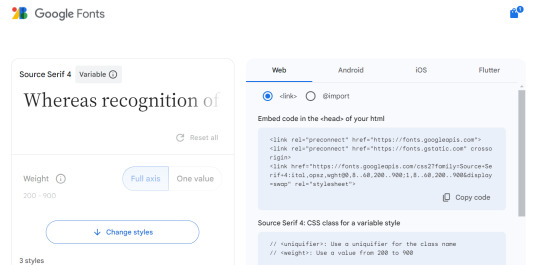
1. when i was editing this theme, the font family was Source Serif Pro, but now it's called Source Serif 4. in order to add support for special fonts you need to go to google fonts and get the URL (see below where it says "custom stylesheet url".

paste [https://fonts.googleapis.com/css2?family=Source+Serif+4:ital,opsz,wght@0,8..60,200..900;1,8..60,200..900&display=swap] into the custom stylesheet URL box.
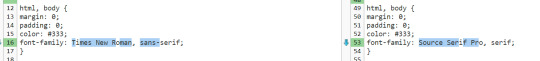
then in the "use embedded css" section, any time it says font-family you need to replace whatever font family name is there with the new font family. like so (text comparison: left being the original, right being my modified version). the serif/san-serif thing after is to provide a default in case the font doesn't load properly. if you were doing this with the above URL you'd type "Source Serif 4" in that spot though!
-----
2. the sidebar will be more difficult because i made so many changes and i don't remember what did what LOL but feel free to ask me again if it's not working for you. these steps are going to be somewhat specific to recessional though and i don't know how well they would apply to a different theme...
the sidebar is controlled by the div id called "secondary"... this page might help you tell the sections apart and the tool that helps me troubleshoot is the f12 key (windows) which shows you the elements of the webpage you're on.
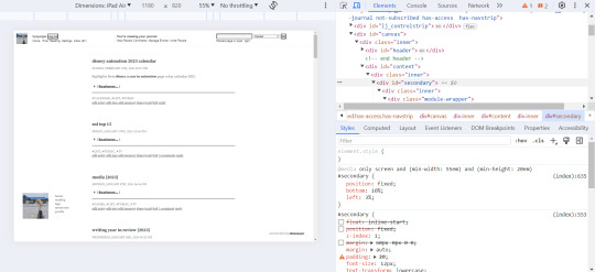
for the widescreen/desktop version of the layout, i fixed the secondary module to 10% page height off the bottom of the page and 3% width off the left... more info on pages like this. i usually just experiment with those numbers until they look good and test them on a few screen sizes.
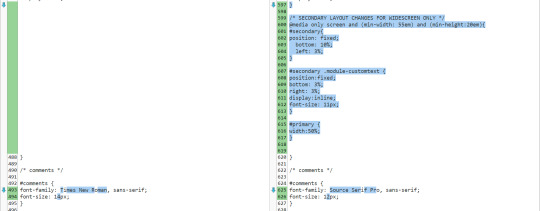
i made some other changes that apply to the mobile version as well, but i added this code at the end of the secondary "section" of the css and right before the comments section (lines 599-605 are the relevant ones here).
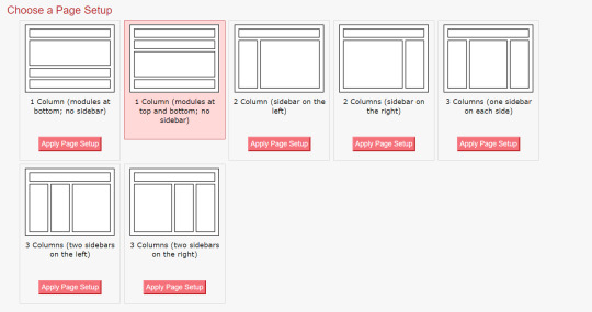
something else i had to do to get my sidebar to work properly was change the page setup in dw to 1 column (different to what was specified in the theme install). i'm not sure why, i'm by no means a css/html expert T__T
i hope this helps and you can figure out how to customize your theme to your liking!
#response#ironically discovered a coding error in my tumblr theme thanks to that long link text i put in this... i do not want to fix that rn LOL
0 notes
Text
Convert PSD into WordPress: A Comprehensive Guide
Introduction:
In today's digital era, having a stunning and functional website is crucial for businesses and individuals alike. If you have a Photoshop Design (PSD) file and want to transform it into a fully functional WordPress website, you've come to the right place. In this article, we'll explore the process of converting a PSD into a WordPress theme, step by step. So, let's dive in and uncover the secrets of turning your PSD design into a remarkable WordPress website.
Understanding PSD to WordPress Conversion
Why Convert PSD into WordPress?
WordPress has emerged as the most popular content management system (CMS) due to its flexibility, user-friendliness, and extensive theme options. Converting a PSD into a WordPress theme offers numerous benefits, such as:
Dynamic Website: WordPress allows you to create dynamic websites with interactive features, including blogs, image galleries, contact forms, and more.
SEO-Friendly: WordPress follows best practices for search engine optimization (SEO), helping your website rank higher in search engine results.
Easy Content Management: With WordPress, you can effortlessly manage and update website content, eliminating the need for technical expertise.
Wide Range of Themes and Plugins: WordPress offers a vast library of themes and plugins, allowing you to customize your website as per your requirements.

The Conversion Process
Step-by-Step Guide for PSD to WordPress Conversion
Step 1: Analyzing the PSD Design Before diving into the conversion process, carefully analyze the PSD design to understand its structure, elements, and functionality. Identify sections, such as headers, footers, sidebars, and content blocks, to effectively convert them into WordPress templates.
Step 2: Slicing the PSD In this step, use image editing software like Adobe Photoshop to slice the PSD design into individual image files. Ensure that the images are optimized for the web to enhance website performance.
Step 3: Create HTML/CSS Markup Transform the sliced PSD elements into HTML and CSS code. Focus on creating a well-structured markup with clean and semantic code. This ensures better website performance and easier integration with WordPress.
Step 4: Break the Markup into WordPress Theme Components Now, break the HTML/CSS markup into distinct components of a WordPress theme, such as header.php, footer.php, sidebar.php, and index.php. Utilize WordPress template tags and functions to make the theme dynamic and customizable.
Step 5: Adding WordPress Tags and Functions Integrate WordPress tags and functions into the theme components to enable dynamic content generation. These tags allow you to display posts, categories, tags, and other WordPress-specific elements on your website.
Step 6: Enqueue Stylesheets and Scripts Use WordPress' enqueue functions to add stylesheets and scripts to your theme. This ensures proper organization and loading of assets, improving website performance and maintainability.
Step 7: Implement Theme Options and Customization Add theme options and customization features to your WordPress theme. This allows users to modify colors, fonts, layouts, and other visual aspects of the website without touching the code.
Step 8: Test and Debug Thoroughly test your newly created WordPress theme across various browsers, devices, and screen sizes. Identify and fix any bugs, layout inconsistencies, or compatibility issues to ensure a seamless user experience.
Best Practices for PSD to WordPress Conversion
Ensure a Smooth Conversion Process
Optimize Images: Compress and optimize images to reduce page load times and improve website performance.
Maintain Responsiveness: Ensure your WordPress theme is fully responsive, adapting to different screen sizes and devices.
Use Child Themes: Create a child theme to preserve your modifications when the parent theme receives updates.
Follow WordPress Coding Standards: Adhere to WordPress coding standards to ensure compatibility, maintainability, and security.
Utilize Custom Post Types: Leverage custom post types to handle different types of content, such as portfolios, testimonials, or team members.
Conclusion
Unlock the Potential of Your PSD Designs
Converting a PSD into a WordPress website opens up a world of possibilities. It allows you to unleash the power of WordPress's robust features while showcasing your design skills. By following the step-by-step process mentioned above and implementing best practices, you can transform your static PSD design into a dynamic, user-friendly, and highly customizable WordPress website. So, go ahead and convert your PSD into WordPress to unlock the potential of your designs and create a remarkable online presence.
0 notes
Text
might... custom code myself a new theme eventually or just desperately search for one that display posts better bc theyre wonky w/ the way tumblrs changed things...
#fox talks#i LOVE the sidebar on my theme but dont like the way photo and video posts show up#id just go in and fix it but its been forever since ive practiced html/css so i cant find whats WRONG
8 notes
·
View notes
Text

Fixed Social Media Sidebar widget
#codenewbies#html css#webdesign#css animation examples#pure css animation#css#frontenddevelopment#css animation tutorial#html5 css3#code#css sidebar#widget#animation#fixed sidebar widget#css tricks
0 notes
Text
i’m editing my theme and oml,,,,, i forgot how much i both love and hate this shit
#and hhhh i kinda wanna change it from being watchmen related??? but also i love watchmen and don’t have any better ideas#so ¯\_(ツ)_/¯#but yeah i definitely don’t know enough about html and css to be fucking with this stuff#i did get the sidebar to be fixed tho!!! and i got my background gif back#(the new theme i’m using didn’t have an option for making the background an image)#(so i had to go in and change the code)#(which isn’t technically difficult to do?? but idk what i’m doing so it was definitely harder than it should’ve been)#jx.txt
0 notes
Text
someday: windows-inspired blog theme by @taezs
includes:
400px posts
optional navigation box, sidebar image, and updates box
responsive to smaller screens and mobile devices
npf photoset fix courtesy of/by @glenthemes
draggable boxes
blend mode overlays over sidebar image & nav image - will change on dark mode
dark mode toggle
note: this is not overly color-customisable due to the dark mode toggle. you can choose for the default to be dark or light, and the three colours that make up the gradient accent, that's it.
preview / code
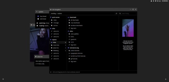
matching explore page
can be an all-in-one, can be a tags page - up to you. add/delete as many subfolders as you want. but! it may be a bit confusing so some html experience is recommended.
faq/ask section
blogroll
about me section
as many links sections as you want
two images - you can change them if you don't want them
updates tab/description same as index page. again, delete if you don't want.
preview / code
credits: post styling/defaults by @seyche, day/night mode by @eggdesign, css photosets by @eggdesign & @annasthms
#theme#tumblr theme#free tumblr theme#themehunter#rp theme#tags page#navigation page#tumblr page#also notice im gonna start posting themes on this blog instead from now on#cheers#creatreth#this took foreeeeeeveeeeerrrr#ive been staring at it so long now idk if i like it#also theres probs issues ive had to redo the code like 1283795 times#my: codes#my: themes#my: pages
2K notes
·
View notes
Photo

Fixed Sidebar Menu Using HTML & CSS
#fixed navbar#sidebar navigation menu#menu html css#css menu#codenewbies#html css#html5#css3#Web Design Tutorial#100daysofcode#codingdays#codingisfun
0 notes