#fixed sidebar menu
Explore tagged Tumblr posts
Visit Tumblr Blog
Explore Tumblr blogs with no restrictions, modern design and the best experience.
Last Seen Tumblr Blogs


Fun Fact
If you dial 1-866-584-6757, you can leave an audio post for your followers.
Text

Fixed Sidebar Menu
#fixed sidebar html css#fixed sidebar menu#codenewbies#html css#frontenddevelopment#html5 css3#code#css#css navbar#side navigation menu#html css tutorial#pure css tutorial
1 note
·
View note
Text
to everyone who has sent me the xkit fix. I appreciate it. however. I had all those things toggled on xkit already, I came to tumblr with the full xkit fix in effect, I still cannot stand the new dash
#I want the toggle dropdown menu again not a sidebar#take the sidebar AWAY I HATE it#and the center column is ever so slightly smaller than it used to be????#and that's bothering me????????#this is just. Bad.#even the 'fixed' version is Bad#xkit put the sidebar back into a dropdown or so help me god this might just. stop me from spending that much time on tumblr.
4 notes
·
View notes
Text
sigh, new tumblr layout is surprisingly similar to twitter. I wonder why.
#xellafail#tumblr is hard#needless to say i don't like it#but I don't know if I care enough at this point to expend the energy to fix it#edit: having scrolled through darla's morning reblog session I can now safely say#I don't like it enough that yeah I'm on the lookout for a way to change it back#hopefully xkit hooks me up#it just feels very claustrophobic for some reason?#tumblr needs to not have a left sidebar#idk it'd probably grow on me but I really really don't like having what used to be a menu exposed at all times#also live is there#AGAIN
4 notes
·
View notes
Text


Theme #09: Astral by @pneuma-themes
May this Song lead us to our Paradise.
Live Preview (Temporary) / Static Preview: [Index] [Permalink] / Get the code: [Pastebin] [Github]
A sleek and minimalist sidebar theme created around the idea of having a music player and a monochrome aesthetic. Suitable for all kinds of blogs.
Features:
Optional monochrome images. Can be enabled or disabled from the Customize page.
One accent, 8 color options.
Customizable post width and font size. The live preview uses 600px posts and 13px font size.
4 custom links.
Optional audio music player. Can be enabled or disabled from the Customize page. Paste the direct link of your audio file to the song url field in the Customize page and type the name of your audio file into the song title field. To add the artist name of your audio file, type the artist's name into the song artist field.
Custom link menu title, can be filled by typing the title of your custom link menu into the custom link menu title.
Customizable photoset gutter.
Built-in lightbox for photoset posts.
Mostly NPF-friendly.
Notes:
Usual disclaimer applies.
The audio player only supports one song.
Credits:
Un-blue polls, NPF Image Fix 3.0, NPF Audio Player, Music Player #07, minified spotify player: @glenthemes
customAudio.js: @annasthms
NPF reverse compatible template: @eggdesign
photoset.css: @eggdesign, @annasthms
Icon fonts: Lucide
Sidebar image: たえ (tae402 @ X/Twitter)
Font: Rubik @ bunny.net
Toggle tags on click: @alydae
Responsive video script: @nouvae
Song on preview: Class::DISTLLISTA; by Shimotsuki Haruka from the game Ar nosurge: Ode to an Unborn Star.
Please like and reblog if you like or are using this!
#themehunter#theme hunter#tumblr themes#blog theme#dailyresources#*mine: all#*mine: theme#*theme: astral#she so prettyy i love the sidebar#fun fact this is the first theme i released after getting hitched!#life is good
825 notes
·
View notes
Text
Friday, January 26th, 2024
🌟 New
On web, we added “View previous reblog” to the post meatball menu. Find it by clicking the three horizontal dots in the top-right corner of a post!
We also tidied up some of the other items in the post meatball menu on web, while we were there. The ordering of some items were adjusted, and “Subscribe to conversation” is now called “Follow post”.
On Android, “View previous reblog” is now in the meatball menu of reblogs for all users on the latest version of the app.
To comply with the European Union’s Digital Services Act (DSA), you can now mark a post as containing commercial content, which simply adds a “Commercial Content” banner to the post and does not affect your post’s visibility or ranking on Tumblr.
🛠 Fixed
Users can no longer send asks to blogs that have blocked them, or that they have blocked.
On web, the blog selector in the post editor would incorrectly appear on top of the text format bar. This is now fixed.
On web, the settings page for your blog (tumblr.com/settings/blog/blogname) used to show the account settings menu in the right-hand sidebar. We updated this area to show the blog sidebar instead (Posts, Drafts, Queue, etc).
We made some tweaks which should fix that specific problem where you see a non-zero unread count on your inbox, and so you click into your inbox only to find nothing there. Let us know if you continue to encounter that issue.
🚧 Ongoing
On Android, a small number of users were unable to access their messages on app version 32.9. This issue will be fixed in the next app version (33.0).
We’re still working to fix an issue in the iOS app that’s preventing folks from editing draft posts.
🌱 Upcoming
We just wrapped up another Hack Week, where we got to build whatever cool feature we wanted! Follow @engineering to see what we made 👀
Experiencing an issue? File a Support Request and we’ll get back to you as soon as we can!
Want to share your feedback about something? Check out our Work in Progress blog and start a discussion with the community.
Wanna support Tumblr directly with some money? Check out the new Supporter badge in TumblrMart!
817 notes
·
View notes
Text
New Desktop Dash, No Bueno
Okay so, new dash layout on desktop.
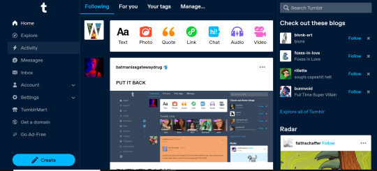
As seems to be a common reaction: not a fan.
Let's talk about some of the issues:
1. Really visually cluttered
The new sidebar crowds out the dashboard content and the bright blue popup notifications (now at the side AND top) and create-post bar pull your eyes in different directions. There is no space for the eye to rest on anymore - it's all noise. The end result is that everything flattens - there's no focal point anymore.
It's also pretty overwhelming - even for someone like me - so I can't imagine it would be very user-friendly to someone who was photosensitive or struggled with visual overload (especially when paired with the high-contrast 'true blue' default site palette and animated icons for the changes-on-tumblr/staff-picks/trending buttons).
2. The activity pop-up now covers dashboard content
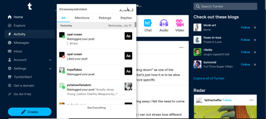
This is really bad from a usability standpoint. In the old layout the activity pop-up used to drop down over the recommended blogs sidebar. Now it actively gets in the way of looking at core content. The dash is why we are here, burying it like this is baffling.
The search bar now drops down over the recommended blogs banner instead, but where the old design had non-critical space on each side of the dashboard to visually allow both features to pop in, this new layout is way worse for efficiency. And for what? Having a rarely-used former drop-down menu now permanently active? The old banner with quick-links for the key use-features (notes, messages, askbox) made much more design sense.
It also means that the activity pop-up gets now completely covered by the blog pop-up that opens when you click the notification, so double demerit there. 0/10.
3. It's harder to navigate to the activity page, and the new page-stretch means you can't see new notes without scrolling down
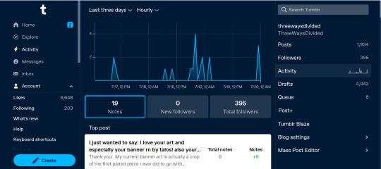
That first bit is kind of a nitpick but cramming the 'See everything' link down at the bottom of a browser window isn't a great navigation choice. (Again, the visual signifiers and eye-direction in this new design are incredibly poor.)
That the main activity page now requires you to scroll to even see the top note due to the new display ratio is really egregious. It makes another key site feature just slightly less convenient and accessible in a very irritating way. Bad choice.
4. The new ratio pushes the Radar and Main Sponsored slot completely off-screen
This one is directed the tumblr staff: that's also a bad choice, guys. That's your main ad-slot for people loading into Tumblr so hiding it is going to hurt both your ad-impressions and your ability to promote the ad-free option. The new layout ratio also means that the in-dash ads are going to be a lot more invasively screen-filling - and let's be real most users will either add-block or leave before purchasing ad-free. I have no idea what the new layout is trying to achieve but if ad optimisation is the goal then this ain't it, chief.
To be honest I cannot comprehend the rationale for this change. I guess it's visually a bit more like Twitter... but that site is currently being demolished from the inside by poor management decisions so maybe it's not the best aesthetic to be aping.
Well then, what do?
Okay so, new dash bad. And so, in true Tumblr spirit: we complain. However, to get results we must deploy the art of kvetching productively.
If you want the old dash back (or at least, a better new-dash design that corrects some of these big weaknesses) what you should do is head over to https://www.tumblr.com/support and lodge a feedback ticket pointing out the problems. The more users who do that, the more likely you are to see an effective response.
Remember, tagging @staff and @support in posts won't fix this. There's no guarantee they'll see it among the notes barrage.
Also: please don't be rude or abusive when you lodge tickets. Whoever is manning those blogs and inboxes probably isn't the person who forced through this change. Save an intern, be polite.

Go forth in disgruntlement to keep this hellhole a hellhome.
#tumblr#tumblr problems#new dashboard#yes it's bad#but there is a way#I've already lodged tickets about it
1K notes
·
View notes
Text
vanguard update - ver 1.1
HI EVERYONE here is the bug fixing update, as promised.
ver update includes:
bug fixed where sidebar menu on mobile takes up screen with no way of closing it
character creation other option textbox removed, with more pre-made options instead
minor grammar issues fixed (hopefully)
a bit more writing
chapter one is steadily being worked on, and i'm really aiming to get it out by the end of summer LATEST before i get back to uni (august). hope everything is alright now ARGHHH. also, you’ll probably have to restart your saves again :]
#vanguard if#vanguard#twine interactive fiction#interactive fiction#if wip#interactive game#announcement#game update#update
63 notes
·
View notes
Text
SFM for first time users wanting to get started! (and how i personaly use my sfm)
so here you're gonna first load up sfm. make sure the launch option is NOT launch SDK and its just "launch source filmmaker.

black screen flickering when trying to move the camera or pose a character? eeeeasy fix! just copy down what on the pictures and i'll explain!

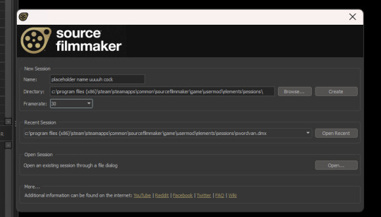
you want to make sure the "auto hide engine window is OFF, and you want to make sure that when creating your file that you DONT LEAVE THE FRAMRATE AT 24! i recommend the frame rate to be 25-30 since that's what i personally use. and boom! problem should be fixed!
2. "HOW DO I EXPORT MY POSTERS!? 😭😭😭" fear not, its WAY easier than you thought :3
ok so first of all before you even OPEN sfm, is go down to the sidebar, right click sfm and go to properties and it'll give you this popup.


now you see that little textbox there? i want you to copy paste that code into it, which is this ⬇️
-insecure -sfm_resolution 2160 -w 3840 -h 2160 +flex_smooth 0 -sfm_shadowma
now you'll have CRRRRISP, HIIIGH QUALITY posters in 4K resolution :3 beautiful
now once you've done tha, you can go make your poster and whatnot. and once you're done with it and want to export it, you go up and press file, and scroll down to export and select "movie". now dont worry, you're NOT exporting a VIDEO, just bare with me a sec. and once you've pressed that a new box will appear like so.
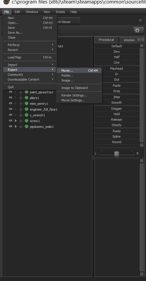

you're gonna want to press the three dots on the side of the "output path" and then a menu will come up of your files and stuff. you see where it says "ypapa"? on your puter or mac it should be your name. dont press "my computer". you wanna click downloads since thats where you want your posters to end up!

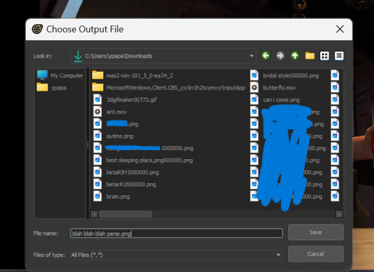
now that you've selected the output path, you're gonna name your file. DONT USE KEYS LIKE "/, (, :,{" since the system doesnt like it and wont let you, and remember to end the name with ".png" since you want it to be a png.

now i want you to copy the way i've set it out here. :) press export or click your enter key and boom! finished product! way to go man!
sorry if this is rambly or yappy im not good at explaining things :(
17 notes
·
View notes
Note
Hi! just wanted to ask on how you personally use Twine I've been a fan of OM, and wondered how u made the remake in that system lmao. I was wondering if you had any tips / tutorials u used, I've spent some time testing and have got the hang of variables and linking but i was really confused on how you designed it / removed the borders around the side bar and everything, along with how you made the intimacy system, Especially the notify / achievement bar system! No tutorials were helping me lol
Sure! I'll do my best to explain below; feel free to ask me to expand on anything if it's confusing.
Changing sidebar:
The way you do this is basically through CSS ("Story Stylesheet"). When your game is open in the browser, you can inspect elements to figure out what they're called, then change their styles. For example, I removed the border of the menu buttons by putting the following in the stylesheet:
(for the overall borders)
menu ul {
border: none;
}
(for the borders between each link)
menu li a {
border: none;
}
w3schools.com is a great website if you'd like to learn CSS - it's what will help you completely restyle your story. There are also plenty of Twine design templates for something easier to use without having to learn code.
Intimacy system:
This one is a little more complicated. I'm actually completely rehauling the intimacy system for version 1.1. Right now, it uses a lot of if statements to check the amount of intimacy the player has collected with a character - and this intimacy is in a variable initialized in the special StoryInit passage. However, that's bandaid code which is messy and easily runs into bugs, as has happened ever since release lol. To fix it, I've essentially created a proper levelling system using custom macros and JavaScript. That requires a good grasp on behind-the-scenes programming, though. If your game isn't a huge project, keeping intimacy in variables should work just fine. Just make sure to keep a spreadsheet or notes somewhere that list how much intimacy is possible to gain and in which passages. It will make your life easier in the long run.
Notifications:
This one I actually got from one of Chapel's custom macros! They're super easy to use and do a lot of cool things. I highly recommend checking these out because they can make your life easier: link
Achievements:
I'm going to assume you're talking about achievements that persist over different saves - for this, you'll need to utilize Twine's special StoryInit passage again. In case you are not sure of what that is, it's essentially all the variables that will be initialized when the game is first loaded into the browser. Your achievements and important story-spanning variables (like personality traits, intimacy counters, etc) will go here. To create an achievement, you'd put something like this in your StoryInit:
<<set $achievement1 to recall('achievement1')>>
If the player hasn't obtained the achievement, $achievement1 will automatically be set to false. To have them actually get the achievement, put
<<run memorize($achievement1, true)>>
<<set $achievement1 to true>>
in the passage where the achievement is gained. Also, be sure to have your players know that keeping saves and achievements like these relies on browser cache - if that's cleared, their progress will be lost.
Hope that helps! I wasn't sure how familiar you are with Twine beyond variables and linking as it's a pretty big engine with many things, so I just covered things without going into deeper mechanics like Twine's special passages, scripts/stylesheets, macros, etc. I'm happy to explain those too if you're having trouble. Also, everything I explained is specifically in the Sugarcube language - it won't work in Harlowe, Snowman, etc.
Helpful links:
Twine cookbook
Chapel's custom macros
Cycy's custom macros
Albie's Twine Tutorial with tons more resources
13 notes
·
View notes
Text

Game fixes update (4.1.0)
ofc no release happen without some bug-fixing updates...
A couple of game-breaking issues (especially for mobile-players), a wrong map showing, and visible error messages. Also some QOL fixes.
Also, if you want/can, consider sharing that update post or leave a rating/comment? Thanks!
NEW:
Mobile: auto close the sidebar when clicking on any menu link
CHANGES:
Totem puzzle (Ch5) has a different format in Mobile (solved issue)
FIXED:
Wrong map was appearing in Chapter 5
Choice options sending to an error passage (Chapter 5-6)
Fix the error message when returning to the idol door room (Chapter 5)
Custom Pronoun popup confirmation error
Pronoun error after starting the NewGame+
Error of the Restart Maze popup
Typos and light formatting
Size of the mobile popups (should) have been fixed
Codex entry of Chapter 2, if going to the pub in the afternoon
#the trials and tribulations of edward harcourt#ttateh#interactive fiction#interactive games#update#bug fixes
19 notes
·
View notes
Text
SysNotes devlog 2 - retrieving data from the database and NEW profile features!
Welcome back to my SysNotes update! SysNotes is a system management app for people with DID, OSDD, and those who are otherwise plural.
Today I will flesh out the backend of the application (which was completely missing in the first devlog) and add some new profile fields.
First Devlog (1) | Previous Devlog (1.5)
Pulling data from the database and populating the profiles
If you remember, in the first devlog I used hardcoded data to test the interface like so:

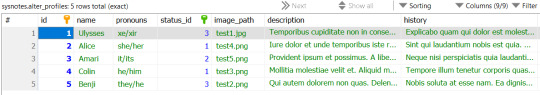
Storing data in code is not sustainable or maintainable, so in devlog 1.5 I have identified the most suitable database structure, created some tables, and filled them with test data. To populate the tables I generated dummy data using the Faker library which uses random Latin words to create sentences. This was the result for the Alter Profiles table:
First, let's delete the hardcoded data from the code. Wow, the user interface is looking so empty now!
I already implemented the basic code for processing alter data and displaying it on the page in devlog 1. However, I had to make some tweaks to it due to the nature of database queries.
Firstly, when loading Alter Profiles for the side menu, I'm only selecting their name and ID, without the other fields (description, history, etc). A common mistake beginner developers make in simple cases like this is retrieving the entire DB record. But the side menu does not need the extra information, and loading it in alongside the name would make the page slower!
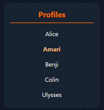
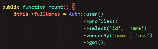
You may also notice that I'm getting the names in alphabetical order - I thought this would look nicer on the sidebar than if the names were all random, and make it easier to navigate. I'm only getting the profiles that belong to the current user.
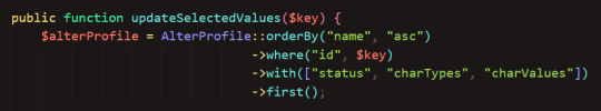
When I get the actual profile data, I retrieve it with its status and characteristics, which are stored in separate tables:
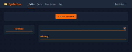
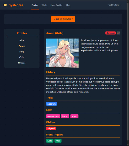
And here we go, the profile page now uses the data stored in the database!
New profile features
But this is all just using the the proof of concept profile fields I mocked up in devlog 1. In this devlog, I want to add NEW fields to allow the profile page to do more powerful things, and better integrate with the future features of Inner World and Front Decider (still looking for a better name for it 😩).
(By the way, I assigned the Ulysses profile to a different user for testing, so you won't see that profile in the sidebar from now on)
Alter origins
One new profile field I've been wanting to add is an alter's origins. Some of my alters split from trauma, others from loneliness, and others through being AuDHD. I created a new table called "Alter Origins" with an optional owner ID. This means that some origins are universally available to all users, while others can be created by users themselves to customize their profile. In this example, "stressgenic" is a custom origin my user (Test System) created.
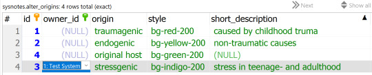
To use this table, I need to connect it to the Alter Profiles table using a foreign key:
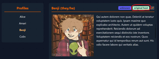
Now we can access it on the front end!
(It shows on the top line, highlighted red)
Side note: I had issues with most Tailwind v4 colors not working so I had to manually define the origin badge color classes based on the official Tailwind values 😓 I'm not sure how to fix it, I wanted to leverage Tailwind to allow users to select "custom colors" from the Tailwind palette... I'll look into it at another time.
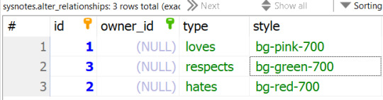
Relationships
I wanted the ability to set up bidirectional relationships between alters and display them after the character traits area.
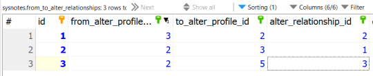
I created an Alter Relationships table with some relationships and their badge colors:
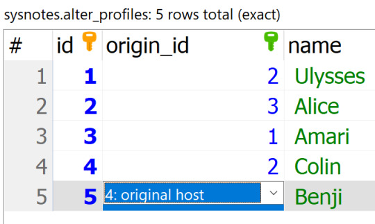
And then I created a pivot table where alter 2 is Alice, alter 3 is Amari, and alter 5 is Benji:
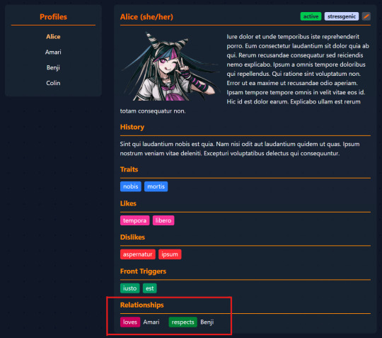
Now if we go to Alice's page, we will see:
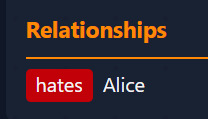
And Amari's will show:
This feature took a long time to implement because I ran into some issues with the pivot table and model relationships. I'd be lying if I said I have a good grasp of Eloquent 😅
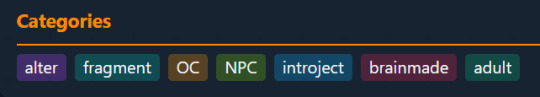
Alter categories
One last thing I want to add in this devlog is to add custom categories that the names in the sidebar could be sorted into, which would be helpful for systems with many alters (or those who want to store their alter data and OC data in one place but want to distinguish between them, like me).
I will add some default categories to the database - however, you will be able to add new custom categories to suit your needs. I also want each profile to have one OR MORE categories for flexible filtering. This means, annoyingly, that I have to tinker with yet another pivot table 😩
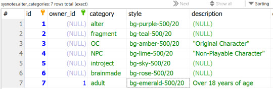
Here is my Alter Categories table. Like with origins and relationships, "owner_id" refers to the user who made the category, and NULL categories are available to all users.
The pivot table looks like any standard pivot table so I'll omit it for this feature. I've had enough of pivot tables. Luckily, I got the model relationships correct the first time 😎
And now, Alice's profile shows her categories under her relationships:
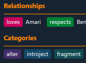
(And here are all the category badges so far)
But this isn't all! I want to be able to filter my profiles by category in the sidebar.
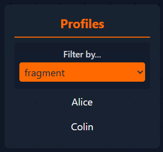
Let's create a drop down! I think this looks alright:
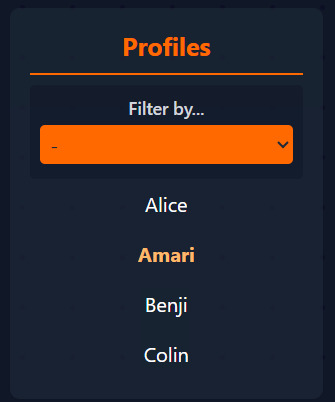
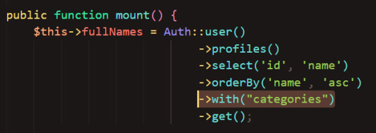
Now let's load the categories of our available profiles into the dropdown. For this, I will need to fetch the categories table when getting the profile names.
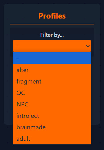
The dropdown code basically takes the array (list) of all profiles, compares each profile's category to the selected category, and adds them to the array of filtered profiles, then displays them. If the selected value is "-" it just displays the full list of profiles.
And here we go, our fragments are Alice and Colin:
I also wanted to add the ability to group profiles by their categories (e.g. grouping by Age will split the names in the side bar into "syskid" and "adult" boxes). But this devlog has gone on for quite a while, so I'll save that for another time ;)
What next?
I wanted to finish the whole Profile section and move on to the more exciting inner World and Front decider features, however the complexity of the profile section so far requires me to spend a few more devlogs on it, oops 😅 So here is what you can expect in the next few devlogs:
Rethink the User Interface of the Profile page (all these badge colors are getting messy! And is the current layout the best for displaying the data? Find out next on Dragon Ball Z!)
Add a way to create new profiles using the New Profile form
Add ability to edit the profile information and delete profiles
Do you have ideas on other fields and features I could add to SysNotes? Or maybe you have suggestions on how to clean up the UI? I'd love to hear your thoughts! Thanks for reading 🙌
6 notes
·
View notes
Note
hello! im a newby gimaker and i want to follow your tutorial on sharpening but i dont know how you got to the photoshop page you started from where it looks like a video timeline. can you tell me how you got there? <3
Hey!!
Welcome to the wonderful world of gifmaking <3 yes i can lead you through to that point. I have a mac so this might look different for you, but all the steps stay the same - I just shifted from windows to mac so i know this xD
I'm going to show you how to do this on this gif:

I prefer to use screenshots for my gifs (I also don't know how else to make them), so I use Mplayer for that. I used to use MPV player but that stopped working with my new computer system.
First, you want to make sure that you're using a high-quality file. If 1080p is available to you, use 1080p at the very least. This will make sure your gifs are crisp and sharp.
Open your file with Mplayer. Then find the bit that you want to gif. I sometimes search forward by frame by using the ">" key. Once you're at the start point of your desired gif, pause the video. Then, Cmd/Ctrl + Shift + S to start screenshotting. The video will start to play slowly as the screenshots are captured. (They go to the desktop automatically but you can change that in interface settings).
The rest of the tutorial is under a cut:
Once you get your screenshots, you're going to go Photoshop. File > Scripts > Load Files Into Stack.

You're going to get a dialogue box. Click Browse and load the screenshots that you want. This is what that looks like when you finish:
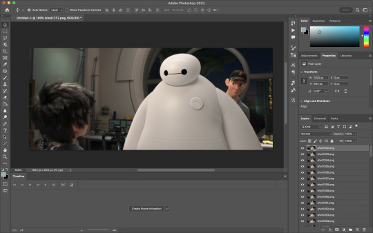
Next, you're going to crop your gif, using the crop tool. You can press C on your keyboard for this or use the tool with this icon in the sidebar.

For this, I'm using an aspect ratio of 540 x 400:

Click that checkmark to crop. Once you do, we're going to resize the image. Use the Cmd/Ctrl + I function to bring up this box. For tumblr gifs, you want to change the width. The height doesn't really matter but if the width doesn't match up, Tumblr is going to fix it for you and it'll look funky. Per row:
1 gif , we use 540px
2 gifs, 268px each
3 gifs, 177, 178, 177 px
We're just doing one, so I'm using 540px.

Now, you want to make sure you can add the timeline. In the top bar, go to Window > Timeline
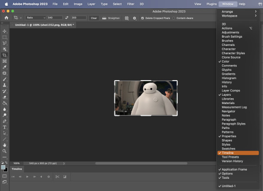
This will bring up the timeline.

From there, click "Create Frame Animation" (you might have to press the arrow in the timeline bar first.)
It's going to look like this:
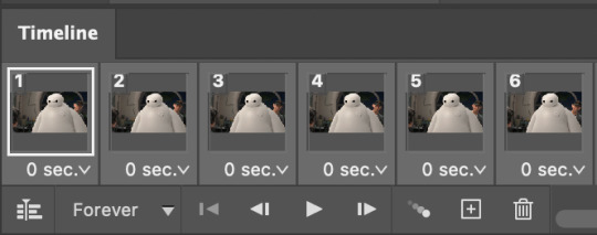
We're going to use those three lines in the corner of the picture above. The first option we'll select is "Make Frames From Layers"
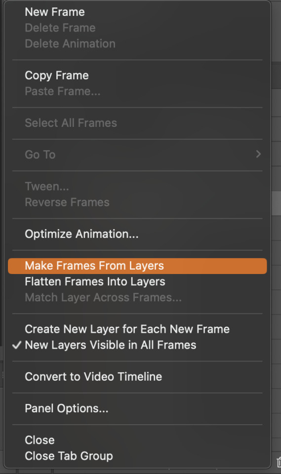
That looks like this:
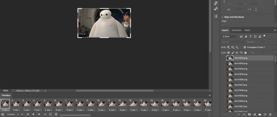
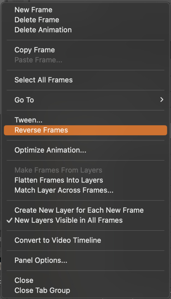
Now, when these load in, you may notice that they're all in reverse. To make them go back in order, we're going to go back to that menu and click "Reverse Frames."
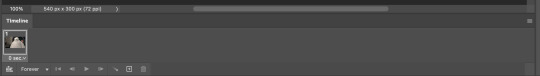
Then, in that same menu, click "Select all Frames." We're going to change the animation speed. You want to make sure you have the first frame selected. We're going to click the arrow next to the "0 sec"
When you click that, it will give you a menu. Click, "other..." You should get a dialogue box that says "Set Frame Delay", just like the one below.
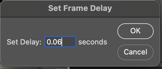
You want to use anywhere between 0.05-0.1 seconds. I find that anymore more is just too slow, so I prefer 0.06. This is fully changeable at the end of my sharpening tutorial, and you can use what you want, but that's what I prefer.
When you do that, it'll change the frame speed of all the gifs.
Now, go back into that little menu, and click, "Convert to Video Timeline."
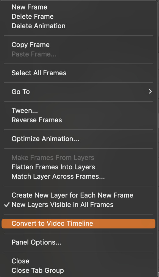
This is what it'll look like:

Now we're going to select all the layers in the right-hand pane. Once we do that, right-click and select, "Convert to Smart Object."
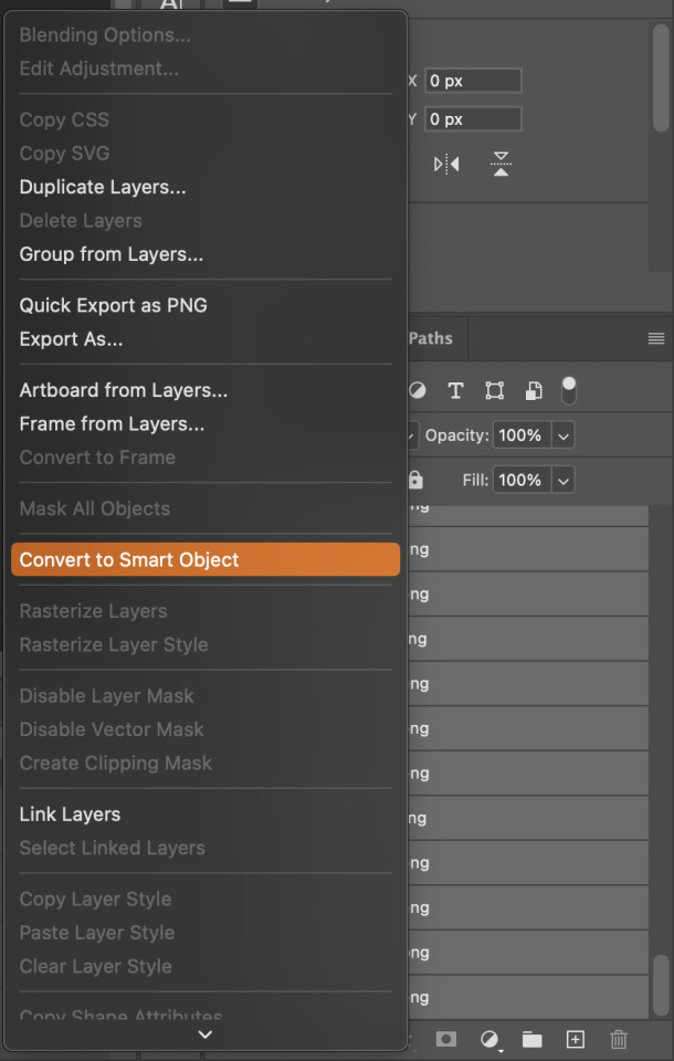
And you're there! Now you can use the sharpening tutorial to your liking.
Pro tip: Make an action with all these steps so you don't have to do them by hand with every single gif you make.
Hope this helps and it wasn't super long winded. Let me know if you have any questions <3 Happy giffing!
#zee answers#zee's tutorials#sharpening#gif creation#tutorials#gif tutorial#photoshop tutorial#resources#ps help#dailyresources#userphotoshop#completeresources
45 notes
·
View notes
Text


yippee i got a new monitor! but do i have to live with the black sidebars when were in the world menu or is there a way to fix it (either way idm! doesnt affect my gameplay hehe)
34 notes
·
View notes
Note
hi! ive been using the old tumblr dashboard style you made and recently like in the past few days its been glitching... my reblogged posts don't show up on my dashboard and when i click on the posts in my archive and click to view it on my blog it glitches and reloads and kinda freaks out and then my blog only shows original posts i made...
i checked on a different browser and on my phone to make sure it wasn't a problem on my end and i reinstalled the style with the latest update. I'm not sure if this is fixable but i wanted to bring it to your attention.
thank you! <3
Hello! This is something that's physically impossible for Old Tumblr Dashboard to do! All my code does is move things (the sidebar to create a header, some menu items, etc) around on the screen, it cannot force your page to reload or hide any posts.
I've heard some people having similar issues with Dashboard Unfucker too. If you're not using dashboard unfucker as well, then it sounds to me like something else might be causing these problems for everyone!
After some quick testing, I can recreate these issues WHILE UBLOCK ORIGIN is turned on. I turned off all of my addons and tested each one by one, if I turn Ublock off and on again I can see my reblogged post being hidden.
Anyone who has been having weird glitching test out firefox with Ublock Origin or any other filter list/adblock/etc turned off. Edit: Or do the below. I don't know if this will fix the issues people were having with Dashboard Unfucker but it might!
After testing out what might be the cause, I believe it might be one of the filters applied, everything seemed to work again when I removed it; www.tumblr.com##div.W45iW.KYCZY.rZlUD:nth-of-type(1)
So click on Ublock Origin, click the three cogwheels on the bottom right, go into My Filters, and see if you have that or something similar flagged to be blocked by Ublock Origin. If you don't, remove all filters that have https://www.tumblr.com written above/next to them and start fresh.
If that doesn't fix it, I'd definitely recommend turning literally every extension/add-on off and seeing if you still have the issue - even extensions that are unrelated to Tumblr, every single one! If you still have issues with Tumblr after that definitely contact Tumblr support tumblr.com/support
If you don't have any issues, turn each extension/add-on back on one by one until you find whatever one is causing problems!
17 notes
·
View notes
Text
Obsidian Quick Tip - Pinning Sidebar Notes
So you know you can drag notes into your sidebar? Did you know you can pin them there, same as pinning a regular note tab?
Just right-click on the note in the side-bar, or use the command palette and select the ‘pin’ option, and you’re done!
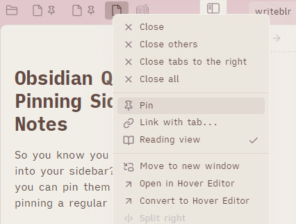
[ID - a screenshot of notes in the Obsidian sidebar. The context menu for one has the ‘Pin’ option highlighted. The two that aren’t selected have a pin icon next to the note icon.]
I like this personally because it saves me from losing notes I want to keep in my sidebar when I open a new note with one of them selected. ‘just don’t do that, space’ well look i can’t fix my own issues, so I just mitigate them. By pinning them.

[ID - a purple decorative divider]
check out my obsidian tag for more posts
check out the tutorials tag for other obsidian tutorials
obsidian resources masterpost
download obsidian
got questions? tutorial suggestions? want to say hi?
#obsidian md#obsidian.md#obsidian tutorials#obsidian tips#writing tools#i have to do this for all my RPG workspaces because i WILL accidentally lose the timeline and the session note and my mini DM screen#given half the chance
7 notes
·
View notes
Text
Thursday, September 26th, 2024
🌟 New
We’ve launched new search operators that work on all platforms so you can find the exact post you’re looking for.
You can now mute the unread count from a joined community via the meatballs menu at the top-right of the community.
Community admins can now allow moderators to invite new members too. Check out your community’s settings!
The ability to search for communities on web is rolled out to everyone. There’s a new dropdown option on search that lets you browse communities related to your search term on the web (this will be in the apps with the next update), and there’s a new “Related Communities” section in the sidebar on the web.
We’re recommending communities for folks who have already joined communities in more places, including a new carousel in For You.
Backdating posts has always had the potential to act in unexpected ways, so we’ve added new warnings about this.
🛠 Fixed
Ads in the iOS app no longer interrupt your background audio. Please update to version 36.4 for the fix.
When leaving a longer reply on desktop web in certain cases or mobile web on Android devices, the cursor will no longer jump up unexpectedly in the text area.
Custom domain verification emails were briefly not being sent September 18th. This was fixed and all pending verification emails were re-sent.
🚧 Ongoing
No ongoing incidents to speak of right now.
🌱 Upcoming
No upcoming launches to announce today.
Experiencing an issue? Check for Known Issues and file a Support Request if you have something new. We’ll get back to you as soon as we can!
Want to share your feedback about something? Check out our Work in Progress blog and start a discussion with other users.
Wanna support Tumblr directly with some money? Check out Premium and the Supporter badge in TumblrMart!
347 notes
·
View notes