#gis spatial analysis
Explore tagged Tumblr posts
Visit Tumblr Blog
Explore Tumblr blogs with no restrictions, modern design and the best experience.
Last Seen Tumblr Blogs


Fun Fact
In February 2021, Tumblr had 518.6 million blog accounts.
Text
Discover the top 7 benefits of Landscape Character Assessment with Tracevisualplanning. Enhance your projects and make informed decisions for sustainable landscapes.
#Landscape Character Assessment#visual analysis techniques#gis spatial analysis#environmental impact statements#visual impact assessment criteria
0 notes
Text
absolutely fuckin. riveting insight from the GIS textbook. thank you so much. also great job using language like a human person, really nailed it there.
#now it is the migration season for the older criminals#once they develop greater mobility they can travel en masse to the central business district#where they gather for their annual Crime Displays#(I've started writing CRIME MENTION!!! in my lecture notes every time ~crime analysis~ gets brought up as a use for GIS)#(literally at least once almost every. damn. week.)#(part of this class is supposed to be like. developing a critical eye toward irl equity dynamics with spatial analysis)#(Y'ALL. CAN WE START WITH THE FUCKING TEXTBOOK.)#(Official How To ArcGIS Book from Official ArcGIS Developer Organization =/= good critical pedagogy)#(but don't worry; it's also not good at teaching (me) how to use the program too!)#James liveblogs grad school#hi. I'm in. a goddamn mood this week. apparently.#stabbing mood. many stabbings.
9 notes
·
View notes
Text
actually it is, its called an equal-area projection:
there are 3 core properties (there are more but we're not going there) that a map can represent about a physical space: shape, area, and distance. these 3 properties can be picked and chosen while deciding how to project your map but its impossible to have all 3 because, well, like said above, Earth is a spheroid.
a map that preserves shape (mostly at small scales) is called conformal, which is what the Mercator projection is, and they are mutually exclusive with equal area maps. there's also equidistant maps which preserve distance, but they typically only function at a small scale across one meridian. Mercator is also what you'd call a true direction map, meaning that unlike the equal area example above, the landforms are arranged essentially the way they would be on a globe. in other types of projections, the angles are a bit off
so, Earth being round doesn't mean its not possible to project a map where the sizes are accurate. it just means that maps that have accurate areas sacrifice the accuracy of shape and/or distance
i know this probably wasnt the question asked, they may have been more interested in the impossible map that normalizes all 3 of those constants, but i feel like projections like this that have mathematic or scientific appeal but not practical or aesthetic appeal don't get the appreciation they deserve.

In their defence, a lot of it is sand.
40K notes
·
View notes
Text
How GIS Helps in Identifying High-Growth Areas for Real Estate Investment
In an ever-changing real estate landscape, identifying areas poised for rapid development isn't just a competitive advantage—it's a necessity. Traditional methods of forecasting growth often fall short in addressing the complex interplays of infrastructure, demographics, and access to essential amenities. That's where Geographic Information Systems (GIS) step in as a transformative force.
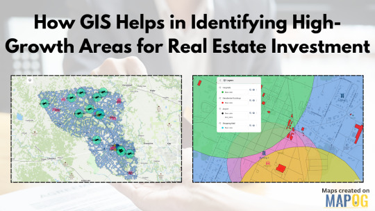
GIS as the Eye Behind Data-Driven Real Estate
GIS technology allows users to visualize and analyze layers of geographic and statistical data all in one view. From traffic congestion and transportation routes to proximity to hospitals, schools, malls, and airports—all of this can be layered spatially to make more informed investment decisions. For real estate developers, this is more than just data; it's a dynamic decision-making tool.
By using GIS, stakeholders can map out locations with strategic access to critical infrastructure. Suppose you're analyzing a city for future residential projects. You could create buffers around public transit lines, shopping centers, and educational institutions to isolate high-potential zones. These buffers offer clarity where raw data often fails to paint the full picture.
Solving the Real Estate Guesswork
One of the biggest pain points in real estate is uncertainty: will a particular neighborhood rise in value? Will upcoming infrastructure really influence demand? GIS helps answer those questions by showing not just what exists, but how it interacts across space and time. For instance, you could track development permits over time or visualize environmental constraints like flood zones or green cover. These insights are crucial for mitigating risk and spotting overlooked opportunities.
Industries like urban planning, government housing departments, logistics, and commercial development firms increasingly rely on GIS to plan smarter. Even small-scale investors are catching on, thanks to platforms that simplify GIS applications into more user-friendly formats.
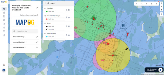
One Platform, Many Possibilities
Some mapping tools now let you not only import transportation and amenities data but also define your area of interest, set proximity buffers, and drop pins for future projects. You can even share interactive maps with teams or stakeholders. One such example is a GIS platform like MAPOG, which simplifies the entire GIS workflow from analysis to visualization without needing deep technical skills.
Whether you're evaluating urban corridors for commercial hubs or scoping out suburban areas for housing, GIS offers the clarity you need. Try exploring platforms like MAPOG if you're looking for a seamless way to start.
#realestateinvestment#gis#mapog#gismapping#smartcities#urban planning#urban growth#mapping#data visualization#spatial analysis#propertydevelopment
0 notes
Text

Advance your career with IGMPI’s industry-oriented PG Diploma in Geoinformatics. Learn GIS, remote sensing, spatial data analysis & more. Enroll online today!
Enroll in the Post Graduate Diploma in Geoinformatics offered by IGMPI – a government-recognized institute. This distance learning course provides in-depth knowledge of GIS, remote sensing, spatial data analysis, and practical tools used in geosciences and urban planning. Ideal for professionals in geography, environmental science, agriculture, and infrastructure sectors.
#Geoinformatics course India#PG Diploma in Geoinformatics#GIS course online#IGMPI Geoinformatics program#remote sensing training#spatial data analysis course#GIS distance learning#Geoinformatics certification India#GIS and mapping course#online Geoinformatics diploma
0 notes
Text
Mastering QGIS Desktop 3.34 LTR: From Beginner to Pro.
English Video tutorial, just for $9.99 (NORMAL price $19.9). Get it once and you will get endless access right.
Unlock the full potential of QGIS Desktop 3.34 LTR! This comprehensive guide takes you from the basics to advanced spatial analysis, helping you master GIS techniques, data visualization, and automation with Python. Whether you're a beginner or an experienced user, this book will elevate your GIS skills.
#QGIS 3.34#QGIS tutorial#GIS software#spatial analysis#QGIS Python#mapping software#open-source GIS#QGIS for beginners
0 notes
Text
Harnessing the Power of GIS Data for SEO: Transforming Digital Marketing Strategy
Harnessing the Power of GIS Data for SEO: Transforming Digital Marketing Strategy
Having recently completed comprehensive training in Geospatial Data Collection, Analysis & Interpretation using GIS Technology, I’ve discovered fascinating intersections between my established background in SEO and digital marketing and the powerful capabilities of geospatial analysis. This educational journey, covering everything from fundamental GIS concepts to advanced geospatial analysis and…
#AI-Geospatial#Business-Intelligence#Digital-Marketing-Strategy#Geospatial-Analytics#GIS-Data-Analysis#GIS-Marketing#Local-SEO-Optimization#Location-Intelligence#Marketing-Technology#Spatial-SEO
0 notes
Text
The Power of GIS in Urban Planning: A Comprehensive Overview
Urban planning is a dynamic and complex process that involves designing, organizing, and managing the physical, social, and economic aspects of cities. In the modern age, Geographic Information Systems (GIS) have emerged as a critical tool for urban planners, helping visualize, analyze, and manage city data efficiently. GIS allows city administrators to make data-driven decisions that shape sustainable, resilient, and smart urban environments.
This blog explores how GIS technology is transforming urban planning by providing better data integration, infrastructure management, environmental analysis, and more.
Read at https://www.cyberswift.com/blog/the-power-of-gis-in-urban-planning-a-comprehensive-overview/

#GIS in urban planning#Urban planning GIS software#GIS for city planning#Smart cities and GIS#GIS-based urban development#GIS in land use planning#Urban mapping using GIS#GIS spatial analysis in urban planning#GIS applications in urban planning#Urban planning solutions using GIS#Geospatial technology in urban planning#GIS for urban management#Land use analysis with GIS#GIS for sustainable cities#Urban planning mapping tools#GIS for infrastructure planning#GIS for transportation planning#GIS for zoning and land use#GIS and urban sprawl analysis#GIS for population density mapping#How GIS supports urban planning and development#Role of GIS in sustainable urban planning#Best GIS tools for urban planners#Applications of GIS in smart city projects#Using GIS to analyze urban growth
0 notes
Text
me fr
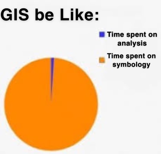
why is the default symbology the ugliest thing ive ever seen like Who want a map that looks like That
57 notes
·
View notes
Text
man I love maps I love geography even spatial analysis and shit I think it's neat and can be valuable but sometimes I have sort of a master's tools crisis about it bc like. I'm in this GIS program and oh turns out that classmate's a cop. that other classmate works in national security. that classmate works for the air force. I look for GIS jobs and it's like "would you like to work for the CIA? would you like to work for Homeland Security? how about Consulting Companies A-Z who are also, incidentally, CIA or DHS contractors??" and no, I really would not like that. that's the last thing I would like. is there anyone out there who would pay me to use these skills to not be evil
#gis/gps/all of that came out of the military and yea you can kind of tell#bro i just want to make maps! or even analyze data i guess! but not in order to help the fucking govt kill or police or surveil people#geography things#skravler
63 notes
·
View notes
Text
Discover cutting-edge GIS spatial analysis techniques at Tracevisualplanning. Explore innovative solutions that enhance your geographic data insights and decision-making.
#GIS spatial analysis#visual impact assessment criteria#visual analysis techniques#environmental impact statements#visual amenity assessment
0 notes
Text
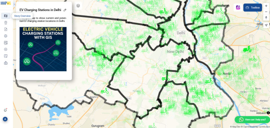
Mapping Electric Vehicle Charging Stations Using GIS
As cities embrace cleaner transportation, the demand for electric vehicle (EV) charging infrastructure is surging. Yet while EVs gain popularity, many urban areas are still figuring out where to place charging stations most effectively. Without careful planning, some neighborhoods end up with clusters of chargers while others are left underserved. That’s where Geographic Information Systems (GIS) come in—offering a smarter, data-driven way to visualize and plan for EV needs.

How GIS Makes the Network Smarter GIS lets you see beyond the street level. By uploading spatial data like traffic density, residential zones, and current EV station locations, urban planners can create layered maps that highlight gaps and overlaps. You can also add custom fields like “charger type” or “station usage” to analyze performance and capacity.
One powerful technique is spatial buffering—drawing influence zones around each station to visualize coverage. Combine this with cross-layer analysis, and you can pinpoint underserved areas based on traffic flow, proximity to major roads, or even power grid access. These insights aren’t just helpful for long-term planning—they’re essential for avoiding grid strain and ensuring accessibility across income groups.
Who’s Using It? Governments, transport planners, and sustainability teams are now turning to GIS to guide EV infrastructure rollouts. Private companies use it to select profitable locations. Utility providers rely on spatial analysis to prepare for increased electricity demand. Even environmental groups and tech startups are tapping into GIS tools to support EV adoption through better planning and advocacy.
Simple, Powerful Mapping Tools You don’t need to be a GIS expert to start mapping. Browser-based platforms like MAPOG are lowering the barrier, allowing users to upload Excel files, style data, and analyze spatial relationships without complicated software installs. Want to compare EV charger density across cities? Or see how charger accessibility overlaps with income levels? Tools like these make that kind of insight easy to visualize—and easier to act on.
Charging Toward a Greener Future The road to sustainability is paved with good data. With GIS tools in hand, EV infrastructure planning becomes more equitable, efficient, and transparent. Whether you're part of a government initiative, a startup, or a local community group, these maps can help you answer a simple but powerful question: where should we build next?
Have you tried mapping EV stations in your city? Upload your data, run some spatial analysis, and see the electrified future unfold—one layer at a time.
2 notes
·
View notes
Text
Visualizing Population Density Map by Districts
In many parts of the world, one recurring challenge for urban planners, governments, and researchers is the imbalance of population distribution. Some districts are bursting at the seams, while others remain underpopulated and under-resourced. This uneven spread often leads to strained public transport, overloaded health services, or inefficient infrastructure development. But there's a solution to visualize, understand, and tackle this issue effectively—population density mapping by districts.
Geospatial technology, specifically GIS (Geographic Information Systems), provides a powerful lens to identify where resources are most needed. By analyzing district-level population data on a map, you can spot trends, gaps, and growth zones in a matter of minutes. But how do you actually bring this analysis to life?

What Is a Population Density Map and Why Is It Useful?
A population density map shows how many people live in a given area—often visualized using a choropleth style, where different shades represent population levels. The darker the color, the higher the density. When broken down by administrative districts, such maps reveal precise hotspots and offer insight that spreadsheets simply cannot deliver.
This becomes especially useful when you're trying to:
Allocate public funds for education, healthcare, or transportation.
Predict migration trends and future settlement expansion.
Support emergency response planning by identifying vulnerable zones.
Whether you're working in urban governance, public health, real estate, logistics, or research, understanding population patterns is a strategic advantage.
The GIS Approach: Upload, Style, and Analyze
With modern GIS tools, creating a district-level population map is now easier than ever. You typically start by uploading a vector shapefile that contains district boundaries along with embedded population data. Next, you style it using quantity-based symbology (graduated colors or size) that visualizes varying density levels.
One such platform that allows you to create grid-based or district-level density maps without requiring a steep learning curve is MAPOG. Without getting too technical, it lets you upload your spatial files and customize styles based on population values, helping transform raw data into interactive, readable insights.
You can also layer additional datasets—like infrastructure, healthcare centers, or transportation networks—to see correlations or plan improvements. Think of it as visual storytelling backed by real-time data.

Who Benefits From These Maps?
Population density analysis has applications across multiple industries:
Urban Planners use it to shape future housing projects and avoid overcrowding.
Policy Makers rely on it for smarter fund allocation and resource planning.
Environmentalists assess human pressure on ecosystems and biodiversity.
Retail Brands scout high-footfall districts for new store locations.
NGOs plan intervention strategies in underserved communities.
In essence, population mapping helps bridge the gap between where people are and what they need—be it roads, water, jobs, or public safety.
Closing Thoughts: Making Data Visually Intelligent
Creating a district-wise population density map isn’t just a technical task—it’s a step toward more informed decisions. It gives data a face, tells a story, and reveals patterns that static reports often miss.
If you're ready to take your spatial analysis to the next level, consider exploring platforms that allow you to build these maps intuitively and interactively. Tools like MAPOG make it surprisingly easy to visualize demographic data in a way that’s both functional and visually striking.
#mapog#Population Mapping#spatial analysis#gismapping#data visualization#gis#GISForDevelopment#smartcities#urban planning#mapping
0 notes
Text
How GIS Is Improving Traffic Management and Road Safety
The Growing Urban Traffic Crisis
Traffic congestion and road safety have become major urban issues in cities worldwide. With more vehicles on the road each year, traditional approaches to traffic planning often lag behind the realities on the ground. Poorly timed signals, accident-prone intersections, and missing data on high-risk zones contribute to delays and danger for drivers, cyclists, and pedestrians alike. Addressing these challenges requires more than just street-side observations—this is where Geographic Information Systems (GIS) come into play.

Visualizing Risk with GIS Tools
GIS is transforming the way cities approach traffic safety by turning raw data into spatial intelligence. By layering different types of information—road networks, traffic volume, crash reports, and population density—GIS allows urban planners to see beyond static maps. With tools like Buffer Tool and Vector Files , it’s now possible to identify high-risk zones with pinpoint accuracy.
In my own traffic mapping project, I used vector files to highlight major accident zones across several key intersections. By applying buffer analysis, I could define impact areas surrounding those hotspots and understand how nearby roads, pedestrian paths, and intersections were affected. These layers helped create a visual story of risk that was far more effective than any spreadsheet or report could convey.
Why It Matters: From Data to Safer Streets
The insights gained from GIS analysis aren’t just theoretical—they directly inform real-world actions. Transportation departments use this data to prioritize intersection redesigns, add traffic-calming measures, or optimize signal timing. Public safety officials use GIS to plan for emergency response routes, while urban designers rely on it to avoid placing new schools, hospitals, or bus stops near high-incident zones.

By identifying accident clusters through GIS, resources can be allocated more efficiently. Instead of reacting after the fact, cities can anticipate and prevent problems. It’s proactive planning instead of reactive patchwork.
Who Uses GIS for Road Safety?
Government traffic departments, city planners, and transportation engineers are leading the charge in using GIS for safer roads. But the reach goes beyond institutions. Community groups, researchers, and even independent analysts can use web-based GIS tools to advocate for safety improvements in their neighborhoods. Clear spatial visualizations help communicate traffic issues more effectively to decision-makers.
Smarter Mapping Through Accessible Platforms
What’s exciting is how accessible GIS has become. Web-based platforms now allow users to upload GIS data, overlay Vector Files, and perform spatial analysis directly in the browser—no specialized software or technical background required. Platforms like MAPOG, for example, offer these capabilities in a user-friendly interface that makes it easy to visualize accident hotspots, create buffer zones, and explore traffic flow scenarios. These tools are especially helpful for projects where quick, visual insights are needed.

Conclusion: From Congestion to Clarity
Cities can’t afford to keep guessing when it comes to traffic management and road safety. GIS offers a smarter, clearer, and more data-driven way to understand and solve traffic challenges. By mapping accident trends, simulating traffic changes, and visualizing risk zones, GIS helps create safer roads for everyone.
Whether you're working with a city planning team, leading a research project, or simply curious about local traffic patterns, modern mapping tools—like those offered by platforms such as MAPOG—make it easier than ever to turn spatial data into safer streets.
Have you explored your local traffic data? Try visualizing it with a GIS platform that supports buffer analysis and vector mapping—you might just uncover insights that could prevent the next accident.
2 notes
·
View notes
Text

Mastering QGIS Desktop 3.34 LTR: From Beginner to Pro. Unlock the full potential of QGIS Desktop 3.34 LTR! This comprehensive guide takes you from the basics to advanced spatial analysis, helping you master GIS techniques, data visualization, and automation with Python. Whether you're a beginner or an experienced user, this book will elevate your GIS skills.
English Video tutorial, just for $9.99 (NORMAL price $19.9). Get it once and you will get endless access right. Visit:
#QGIS 3.34#QGIS tutorial#GIS software#spatial analysis#QGIS Python#mapping software#open-source GIS#QGIS for beginners
0 notes
Text
How to use GIS in Disease spreading?
Why is it important to use GIS for Disease mapping?
Mapping disease outbreaks provides critical opportunities to leverage Geographic Information Systems (GIS) for pandemic response, analysis, and decision-making.
Steps to Add GIS Data to an Online Map
Choose an Online Mapping Tool
Choose an online platform to perform the basic needs for creating maps, adding layers and data visualization.
Online mapping platforms are powerful tools that combine geographic data, visualization, and interactivity to solve real-world problems across industries.
There are user-friendly websites for beginners as well as professional users like MAPOG. Where it provides different types of build-in tools.
Prepare Your Data
To prepare GIS data, download the required data in csv, kml. Shapefile or geojason format.
Organize your data layers based on their thematic importance, like roads, administrative boundaries, or climate zones.
Most platforms provide an option to upload or import GIS data directly. Ensure the spatial attributes are preserved during upload.
3. Steps for preparing mapping
By applying these simple steps in MAPOG one can easily make disease spreading maps.
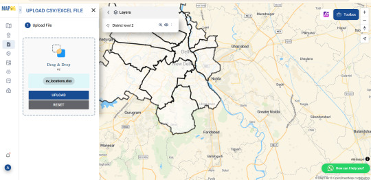
To upload boundary ‘add upload’ > upload vector file to add area of interest > select the vector file > open > upload.
Upload csv data that has latitude and longitude > upload csv file > open > publish.
To change the symbols and color click > ‘Action’ > edit feature > change according to preference for both the layers.
Steps to add polygon in the disease affected area using “point to polygon”
By applying “points to polygon”, it shows the area that is affected.
Click “processing tool” > select “point to polygon” > select the point layer data > click “convert”.
Click the “action” button > rename > style editor > change the symbols and colours.

Conclusion
The purpose of using online map making is to research and make maps affordable, user-friendly, its simplicity and collaborative features make it ideal for individuals that need quick sharable maps without heavy investment in training or setups. Finally, future trends like AI integration mapping show the evolving nature of these platforms.
3 notes
·
View notes