#gradient adjustment layer
Explore tagged Tumblr posts
Visit Tumblr Blog
Explore Tumblr blogs with no restrictions, modern design and the best experience.
Last Seen Tumblr Blogs


Fun Fact
Tumblr has 16.74 million mobile monthly users in the US.
Text

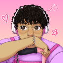
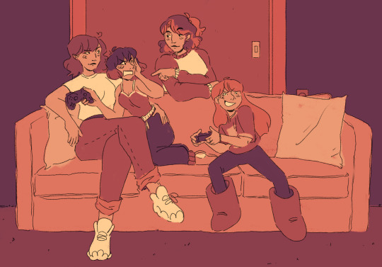
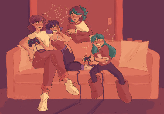
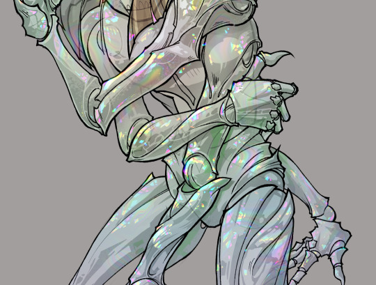
trying new coloring methods. 0/10 do NOT recommend, but hey at least i got something kinda okay out of it
#this was based on a sketch i posted a few days ago cuz i didnt have any ideas for compositions#-and i wanted to try a new rendering method i saw on youtube#the method btw is to start in greyscale so you can get the values right before using the curves tool to adjust colors#i ended up hating it though because my colors always wound up feeling basic#i think it works better in lighting situations where the light’s color is neutral#i used a bunch of gradient maps and overlay layers to try and fix it bc it was looking VERY muddy and weird#and i think i did successfully save it after a lot of frustration#but i will likely not be trying this method again cause i like using funky lighting and colors#art#fanart#digital art#dc comics#tim drake fanart#tim drake robin#tim drake#red robin fanart#robin fanart#dc robin#robin#red robin
1K notes
·
View notes
Text
last summer afternoons ☀️
#rendered this piece in grayscale -> colored with gradient maps and adjustment layers so it’s a lil weird but I think it turned out okay lol#bnha#bnha fanart#boku no hero academia#my hero academia#mha#mha fanart#bakudeku#tododeku#bakushima#kiribaku#todobaku#bakugou katsuki#izuku midoriya#todoroki shouto#kirishima eijiro#bakugou#Midoriya#deku#todoroki#kirishima
3K notes
·
View notes
Text


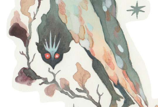
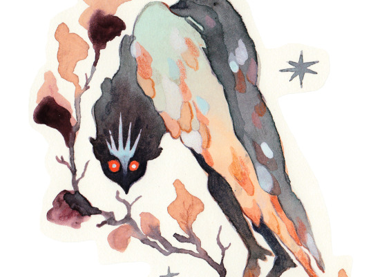
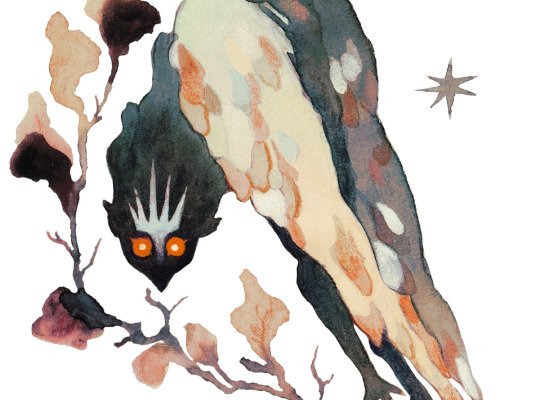
TOWNIE – MITSKI
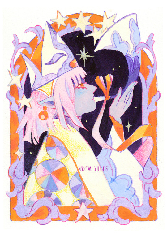
#wyll ravengard#wyll#bg3#bg3edit#baldur's gate 3#*mine#absolutely destroying the gradient map adjustment layer :-P
233 notes
·
View notes
Text

#tsubasa reservoir chronicle#tsubasa chronicle#heres a fun fact: i made the sketch for this one almost 4 years ago and the lineart over a year ago i think#clone sakura#clone syaoran#once again i attempt to use a gradient map and then have 50 billion adjustment layers over it anyway#my art#digital art#trc#clamp#cloneposting
141 notes
·
View notes
Text

too nice a day for sorrow
grayscale under the cut

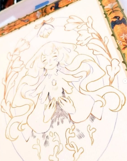
#messed with gradient maps and color adjustment layers#so it might look a little weird loll#my art#digital art#original character#enrais#paper's elves#paper aliens#enrais comes to this grave when he has the time‚ in order to meditate‚ or to just relax.#he placed the stones himself to help remember where it is.#sometimes he'll have a meal here‚ give updates about his life‚ leave small offerings and clean around the site.#sometimes he just sits in silence until he's ready to leave
51 notes
·
View notes
Note
The archivists when they were the collector's age, when?


Technically, it's only the Wayfarer around Collector's age, but hey, here they are:D
also please don't teach children about value of life by letting them helplessly watch everyone die
#toh#the owl house#toh archivists#the archivists#toh collectors#toh fanart#owl house#the collector#toh collector#this is the last time im shading with gradients xD#almost 1k layers weeks of desperation and it STILL could use more adjustments#c:i Anatomist#c:i Wayfarer
847 notes
·
View notes
Text

fuckign Creature
#doing a little doodle dump and messing with the gradient map + adjustment layer combo again i have a problem akjsdh#blurry babbles#blurry_art#i guess#i mean it aint done but theres your carb#got a little tired of following the calendar notes sooooo next 2 weeks drawings were Unplanned akjsdhkj#still have a bit for a month or 2 but ye#we gamin#just realized#has carby ever been on all fours for more than just a tail waggle#never thought about it till a couple seconds before i was gonna post it oop#anywayyyyyyy its almost 3am im going to bed goodBYE
13 notes
·
View notes
Text

i 4got 2 pozt a pic wen mils n me wnet on this job a wile back but chek dis fit im cute as shit 💕
#ic#my art#me: I'm gonna do some replies today#also me: spends way too long doing this instead#can you tell I haven't settled on a style for coloring him? lmao#the struggle of being a realism painter trying to draw in a cartoon style 😅#there's like a million gradients and adjustment layers and it feels like too much and not enough at the same time haha
13 notes
·
View notes
Note
If I may, how do you typically approach choosing colors in your art? It always has just a lovely feel to it, so I was a bit curious; don't feel pressured to answer ofc :]
I’ve been using a lot of gradient maps lately, they work by switching the greys in your piece with a corresponding colour according to its value. Basically, I colour in black and white, grab a gradient map, and then I adjust the colours by hand until I’m happy with it. This isn’t the only kind of colouring I do, but it works great if you’re in a rush or you’re struggling to find a good starting point for your colours. I’ve been operating under a time crunch for these Sketchbook Week drawings and the Plenism promo stuff I made, so for all except one I used gradient maps. I’m actually in a bit of a funk with my colours right now soooo I’ll come back and do a proper colouring tutorial for my style once I’m happier with how my non gradient mapped colours are looking !
#after sketchbook weeks over I wanna sit and do some colour studies to find palettes I’m more happy with#even these gradient map ones I’m not thrilled with#they’re fine! but I could do better#in terms of other tricks I use I’ll often adjust the hues and saturations if the whole piece to give things more unity if I’m struggling#and/or add a new layer on top of everything and fill it with one base colour#and play around with different layer settings and opacities on top#I’ve found a luminosity layer on a low 5-10% setting is quite nice#basicslly I fuck around and find out#and if I’m in a rush I use a gradient map#they’re not neccesarily a quick fix! if you’re like me you’ll still want to do some tweaking after it’s been applied#and you need to pay attention to your values when you’re colouring in black and white#but that’s another good thing about gradient maps - they force you to focus on value over hue which is an important skill to build#so yeah I’ll come back to this and make an actual colouring tutorial once I feel like I have actual good advice to give#cause rn I’m just very meh in my colouring and I don’t think I have anything very helpful to add#need to find some tutorials myself first !#ty for the ask!#ask#art#my art#bpcol-reblogs#textpost#blethering#for this piece the adjustments were minimal in comparison to what I usually do btw#because I was rushinggggg lol#I did more for my Plenism posters n such#but I can’t really show good comparisons because I. didn’t save them like that#I usually smush all my layers together when I’m drawing sooo yeah makes it hard to go back my bad whoops#but I saved as I was going whilst drawing this so I could provide examples yipee!#if I’d been smarter and remembered more I could’ve had more process screenshots butttt oh well lmao
19 notes
·
View notes
Text
i can Feel myself getting to a point with my art where i want things to improve but i think for the first time in a long time i don't know how to teach myself the skills i want
bellyaching in the tags
#i want more control over the colors bc right now the great color work compliments#i feel are entirely owed to the gradient map adjustment layers i use at the end#which are great! they do create a nice sense of cohesion without the pieces feeling monochrome#but there's very little control in that it's a Lot of throwing shit at a wall to see what sticks#i don't know how people shade digitally without using multiply layers#and have things Not come out looking muddy#and i feel like ''oh use color theory'' isn't enough bc i've looked up a lot of color theory#but i'm still missing something#i also. don't know how people do digital Paintings that look like oil paintings#that shit is so impressive to me#and maybe i should understand and accept where my skills lie#and lean into my dependency on ink layers etc and lean into art nouveau styles even more#but i'm just not that kind of person#i want to be able to do more
8 notes
·
View notes
Text
lost hours of my life today to photoshop and still lost the battle
4 notes
·
View notes
Text
gonna show u guys a little opalescent highlight hack i threw together today
rainbow gradient above your main figure (i usually have all my main figure folders/layers in one big folder, so i can clip gradient maps + adjustments to it!). liquify tool to push the colors around a bit. STAY WITH ME I KNOW IT LOOKS STUPID RN I'M GOING SOMEWHERE WITH THIS
THEN: set it to add/glow (or the equivalent in ur drawing program), lower the opacity a bit, and apply a layer mask. then u can edit the mask with whatever tools you like to create rainbow highlights!!
in this case i'm mostly using the lasso fill tool to chip out little facets, but i've also done some soft airbrushing to bring in larger rainbow swirls in some areas. it's pretty subtle here, but you can see it better when i remove the gradient map that's above everything, since below i'm working in greyscale:
more granular rambling beneath the cut!
u could also just do this with a brush that has color jitter, but what i like about using layer masks for highlight/shading layers is how simple and reversible it makes everything. i can use whatever brushes i want, and erasing/redoing things is super low stakes, which is great when i often approach this stuff with a super trial-and-error approach.
example: have u ever thrown a gradient w multiple colors over an entire piece, set it to multiply etc, and then tried to erase it away to carve out shadows/highlights? it's super frustrating, bc it looks really good, but if u erase something and then change ur mind later, u basically would have to like. recreate the gradient in the area u want to cover up again. that's how i used to do things before figuring out layer masks!! but masking basically creates a version of this with INFINITE undo bc u can erase/re-place the base layer whenever u want.
anyway, back to rambling about this specific method:
i actually have TWO of these layers on this piece (one with the liquified swirls shown above, and another that's just a normal concentric circle gradient with much broader stripes) so i can vary the highlights easily as needed.
since i've basically hidden the rainbow pattern from myself, the colors in each brushstroke i make will kind of be a surprise, which isn't always great -- but easily fixable! for example, if i carve out a highlight and it turns out the rainbow pattern in that area is way too stripey, i can just switch from editing the mask to editing the main layer and blur that spot a bit.
also, this isn't a full explanation of the overall transparency effect in these screencaps! there's other layer stuff happening below the rainbow highlights, but the short version is i have all this character's body parts in different folders, each with their own lineart and background fill, and then the fill opacity is lowered and there's multiply layers clipped to that -- blah blah it's a whole thing. maybe i'll have a whole rundown on this on patreon later. uhhh i think that's it tho! i hope u get something useful out of this extremely specific thing i did lmao
12K notes
·
View notes
Note
asfhdkhgjadskjl oh no i know about changing skin color too well. u gotta like do 3 different color filters than color adjustment and then u gotta do that for each skin tone u want and sometimes u gotta manually fix things and UAGAHHA that stuffs like nightmares to me. there is so much set up u gotta do if u want to make it easy later and thats a nightmare too
see u do it the right way im out here raw dogging it. i change my base colors like 7 times & then. well u see i dont do separate layers for shading so i just color the base color right. which means if the shadow isnt right & im too far in for ctrl+z to save me we have to repaint the whole base again. reflective light usually isnt too bad bc thats based on other existing colors but getting the saturation right is its own challenge & then only after i like that do i think okay time to add in adjustments to make it more interesting. legit if i dont think it can pass without them its not even moving to the adjustment stage. i just live like this. its not picrew friendly.
#asks#kuki#i dont even do real color adjustments on like. anything#ill make a layer to make my shadows darker#& then like. in my actual pieces if im not tired of working on it already ill do a 2+ color gradient overlay#not necessarily overlay layer style but u get me. just so it's noticeable. makes it not so flat#hair a lot of time ill do a low opacity addition layer too#but thats really it#if my color choices ever look weird its bc its my own point & click adventure with the color wheel#always & forever#i suck at color mixing traditionally tho that is NOT a skill ive picked up yet
1 note
·
View note
Text
The best years of my life...

... what I wouldn't give to have them back.

I had the great pleasure of working with @spiderscribe on a DeadCeptor work for the @tf-bigbang, which you can (and should!) read [ HERE ]!
Details and artist commentary under the cut!
Okay, first off, I just wanna say, thank you so much to @spiderscribe for picking up my very loose scribble and taking the jump. She's an absolute champ, and I IMPLORE you to read her writing. She did a knockout job on the fic, and guaranteed, these two pieces wouldn't have been so elaborate without her. If you're a fan of deadceptor, parallels, lovers to enemies to apocalyptic teammates to ???s, I'm sure you'll find that and more in there.
[ HERE ] is the link to that, if you missed it the first time around.
The background for the supermarket was a MASSIVE undertaking. I ended up blurring it in the final to keep the dream-like quality, but there is a lot happening there! Most of the time I spent on the background was (jokingly) complaining though.

Anyone who works retail will know the agony of customer-misplaced stock. The little canisters of energon additives seem like prime candidates to be placed willy-nilly.
The little warning sign... My favorite soda, apple sidra, has a carcinogen warning, so I'm familiar with it. It was slightly surprising to me that those warnings are not countrywide, despite the fact that they very clearly say "California Proposition 65", and well. Not something else, like "Federal" or whatever.
The bags of nuts and bolts below, I asked several people what flavor they would be, and I suppose I failed in my job, because I wanted the purple to be the "regular" flavor, and the green to be the "sour". But grape and lemon-lime work as well!
The tub is full of rust-sticks. I have no idea if that came across. My friends kept calling the individually wrapped ones slim jims, which I mean, I guess!

The car batteries... My idea was that they were similar to shots, in a way? So that's how I ended up with a battery with enough terminals to rival an international airport. It's also sunset-coloured, because, I don't know, that's what Party Flavor is to me.
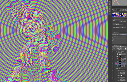
Okay. The second illustration. This one was a headache, mostly due to my own lack of planning, and the fact that I lost the file for... basically everything I did, including the above illustration. So it was a bit of a rush job.

The background bots started off as these very vague silhouettes, which I'm a little proud of. Look at how nice and somewhat readable they are! Okay, now what if I ruined it? What? You don't like that? That's rather unfortunate, because that's what I proceeded to do. In fact, if I take off all.. 10 or something adjustment layers, they look like this:

My process went: Shadow block> Fill rest of form> Color randomiser> Copy and skew (to populate background)> Hue adjustment> Gradient map> Fill Light> Chromatic aberration> Vignette> Levels> Curves.
The.... Magenta cube is there because due to the nature of the color randomiser, the foot had a high value, and stuck out like nobody's business in the end.


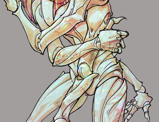
Here's what it would look like without the cube. Begone, distracting white blob! (I didn't have to worry about the lava arm because Percy happened to cover it up. What a save! But if he didn't then... there would have been a second cube.)
Basically, it was a mess. But... at least it came out fine in the end! I hope!
I'd love to have speedpaints on hand, but I was switching between CSP and PS for a good majority of the work.
I'd say that's it for these two pieces! I actually have more, but those demand more time. I'm much slower at doing inks than I am at painting, but I hope you'll get to see them soon.
#phew! been a while since I last did some commentary for a piece#I didn't even go over what everything was on the background shelves but just know if you asked me i'd probably be able to tell you#I have... an additional several pages of a comic based off of the fic that I unfortunately have not finished in time#but I definitely will#again it was amazing working with caroline and I hope to work with her again in future!#maccadam#transformers#tf perceptor#tf dead end#transformers cyberverse#tfc#deadceptor#perceptor#dead end
1K notes
·
View notes
Text
My Favorite Cheap Art Trick: Gradient Maps and Blending Modes
i get questions on occasion regarding my coloring process, so i thought i would do a bit of a write up on my "secret technique." i don't think it really is that much of a secret, but i hope it can be helpful to someone. to that end:

this is one of my favorite tags ive ever gotten on my art. i think of it often. the pieces in question are all monochrome - sort of.

the left version is the final version, the right version is technically the original. in the final version, to me, the blues are pretty stark, while the greens and magentas are less so. there is some color theory thing going on here that i dont have a good cerebral understanding of and i wont pretend otherwise. i think i watched a youtube video on it once but it went in one ear and out the other. i just pick whatever colors look nicest based on whatever vibe im going for.

this one is more subtle, i think. can you tell the difference? there's nothing wrong with 100% greyscale art, but i like the depth that adding just a hint of color can bring.
i'll note that the examples i'll be using in this post all began as purely greyscale, but this is a process i use for just about every piece of art i make, including the full color ones. i'll use the recent mithrun art i made to demonstrate. additionally, i use clip studio paint, but the general concept should be transferable to other art programs.


for fun let's just start with Making The Picture. i've been thinking of making this writeup for a while and had it in mind while drawing this piece. beyond that, i didn't really have much of a plan for this outside of "mithrun looks down and hair goes woosh." i also really like all of the vertical lines in the canary uniform so i wanted to include those too but like. gone a little hog wild. that is the extent of my "concept." i do not remember why i had the thought of integrating a shattered mirror type of theme. i think i wanted to distract a bit from the awkward pose and cover it up some LOL but anyway. this lack of planning or thought will come into play later.
note 1: the textured marker brush i specifically use is the "bordered light marker" from daub. it is one of my favorite brushes in the history of forever and the daub mega brush pack is one of the best purchases ive ever made. highly recommend!!!
note 2: "what do you mean by exclusion and difference?" they are layer blending modes and not important to the overall lesson of this post but for transparency i wanted to say how i got these "effects." anyway!
with the background figured out, this is the point at which i generally merge all of my layers, duplicate said merged layer, and Then i begin experimenting with gradient maps. what are gradient maps?
the basic gist is that gradient maps replace the colors of an image based on their value.

so, with this particular gradient map, black will be replaced with that orangey red tone, white will be replaced with the seafoamy green tone, etc. this particular gradient map i'm using as an example is very bright and saturated, but the colors can be literally anything.

these two sets are the ones i use most. they can be downloaded for free here and here if you have csp. there are many gradient map sets out there. and you can make your own!
you can apply a gradient map directly onto a specific layer in csp by going to edit>tonal correction>gradient map. to apply one indirectly, you can use a correction layer through layer>new correction layer>gradient map. honestly, correction layers are probably the better way to go, because you can adjust your gradient map whenever you want after creating the layer, whereas if you directly apply a gradient map to a layer thats like. it. it's done. if you want to make changes to the applied gradient map, you have to undo it and then reapply it. i don't use correction layers because i am old and stuck in my ways, but it's good to know what your options are.

this is what a correction layer looks like. it sits on top and applies the gradient map to the layers underneath it, so you can also change the layers beneath however and whenever you want. you can adjust the gradient map by double clicking the layer. there are also correction layers for tone curves, brightness/contrast, etc. many such useful things in this program.
let's see how mithrun looks when we apply that first gradient map we looked at.

gadzooks. apologies for eyestrain. we have turned mithrun into a neon hellscape, which might work for some pieces, but not this one. we can fix that by changing the layer blending mode, aka this laundry list of words:

some of them are self explanatory, like darken and lighten, while some of them i genuinely don't understand how they are meant to work and couldn't explain them to you, even if i do use them. i'm sure someone out there has written out an explanation for each and every one of them, but i've learned primarily by clicking on them to see what they do.
for the topic of this post, the blending mode of interest is soft light. so let's take hotline miamithrun and change the layer blending mode to soft light.

here it is at 100% opacity. this is the point at which i'd like to explain why i like using textured brushes so much - it makes it very easy to get subtle color variation when i use this Secret Technique. look at the striation in the upper right background! so tasty. however, to me, these colors are still a bit "much." so let's lower the opacity.

i think thats a lot nicer to look at, personally, but i dont really like these colors together. how about we try some other ones?

i like both of these a lot more. the palettes give the piece different vibes, at which point i have to ask myself: What Are The Vibes, Actually? well, to be honest i didn't really have a great answer because again, i didn't plan this out very much at all. however. i knew in my heart that there was too much color contrast going on and it was detracting from the two other contrasts in here: the light and dark values and the sharp and soft shapes. i wanted mithrun's head to be the main focal point. for a different illustration, colors like this might work great, but this is not that hypothetical illustration, so let's bring the opacity down again.

yippee!! that's getting closer to what my heart wants. for fun, let's see what this looks like if we change the blending mode to color.

i do like how these look but in the end they do not align with my heart. oh well. fun to experiment with though! good to keep in mind for a different piece, maybe! i often change blending modes just to see what happens, and sometimes it works, sometimes it doesn't. i very much cannot stress enough that much of my artistic process is clicking buttons i only sort of understand. for fun.
i ended up choosing the gradient map on the right because i liked that it was close to the actual canary uniform colors (sorta). it's at an even lower opacity though because there was Still too much color for my dear heart.

the actual process for this looks like me setting my merged layer to soft light at around 20% opacity and then clicking every single gradient map in my collection and seeing which one Works. sometimes i will do this multiple times and have multiple soft light and/or color layers combined.
typically at this point i merge everything again and do minor contrast adjustments using tone curves, which is another tool i find very fun to play around with. then for this piece in particular i did some finishing touches and decided that the white border was distracting so i cropped it. and then it's done!!! yay!!!!!
this process is a very simple and "fast" way to add more depth and visual interest to a piece without being overbearing. well, it's fast if you aren't indecisive like me, or if you are better at planning.

let's do another comparison. personally i feel that the hint of color on the left version makes mithrun look just a bit more unwell (this is a positive thing) and it makes the contrast on his arm a lot more pleasing to look at. someone who understands color theory better than i do might have more to say on the specifics, but that's honestly all i got.

just dont look at my layers too hard. ok?
2K notes
·
View notes
Note
I don’t know if anyone’s ever asked this before so I’m sorry if I missed it! But I was really curious about your general process? Do you do purely watercolor works or a mix of watercolor and then digital additions/edits? Of course only if you’re up to/willing to share! I’m trying to learn more in regards to watercolor and love your works so much!
I hope you have an amazing day!!
Hi!! Sorry it took me a moment!:D I am doing a bit of everything to be honest! I consider myself more of a mixed media artist! (Meaning different type of traditional and digital edits!) So some of my work is fully watercolor while other is mixed! For example, take this doodle of mine! Here's the freshly unadjusted scan:
Then with color adjustement to correct what my scanner washed out:
And then some light digital correction to make it a bit nicer!
For pieces like this, I normally work with a base of watercolors and inks on top of a colored pencil lineart.
Then I work in gouache and acrylic gouache for the part I want to "carve out" more. Then I finish everything with another layer of colored pencils on top to add more details and gradients, before scanning and touching up with digital. (sometimes I can go all out with digital edits and sometimes not at all! it depends on the piece!) For example here's one that was not retouched digitally at all beside correcting the washed out scan + watermark.
Hope this helps!:D
#my art#art process#watercolor#gouache#mixed media#digital art#I think using procreate or digital art to retouch a traditional piece is fine as long as its a tool#this is why i always try to remember to tag it as mixed media#AI IS A NO OF COURSE#FUCK AI#but yeah!#especially since my life got busy lets say due to health things in my familly the last few years#I didnt had the time required to do fully just watercolor paintings like i did before#so that way I could do a bit of both near my sick familly member
368 notes
·
View notes