#♡: tutorials! *
Explore tagged Tumblr posts
Visit Tumblr Blog
Explore Tumblr blogs with no restrictions, modern design and the best experience.
Last Seen Tumblr Blogs


Fun Fact
Users from the US are the majority of Tumblr visitors.
Text

w w w . carrd . co // ⋆ 𐙚 ₊ ˚ 🐇 ⊹ ♡ ˚ .
✿ CARRD INSPO // © misamory
like or reblog if saveㅤ⿻ㅤᐢ..ᐢㅤ♡ㅤ2023.
#⋆ ˚ 。 just an rkive — ★. *#♡✮☁️✧˖°💿⋆。°✩#carrd.co#carrd inspo#carrd template#carrd templates#carrd icons#carrd stuff#carrd material#carrd resources#carrd moodboard#carrd inspiration#carrd#carrd layouts#carrd symbols#carrd help#carrd tutorial#carrd theme#carrd things
2K notes
·
View notes
Note
hi I really like your mb and I'm new here. Do u have any suggestions or tips to make mb? like where did u get the pics and the captions.
𝓜oodboards: a guide for beginner blogs!


I decided to bring here a small tutorial that can help other blogs that are starting out and still have questions that need clarification, with tips and links that you may need. I wrote this from my point of view of creating moodboards and I tried to be as brief as possible in my explanation, there may be errors in English as I'm not fluent in that language and everything here was translated using Google Translate, any questions you can contact me via asks or by message.
how do I find pics for moodboards?
Pinterest is where you'll find most of the images you'll use on your moodboards, so create boards on Pinterest separating by color and aesthetic to make it easier to find. On Tumblr there are some blogs with cool stuff too (like @/m0ney, @/angelicdewdrop, @/rkivo, @/ohimesama-okinawa and @/bambiiis for example), but in this case I recommend putting the credits in the alt text.
Some blogs have a pinned post or carrd where they put the link to their Pinterest account (my Pinterest here). You can follow them and save the pins they post/save on the app. I also suggest looking at the other profiles they follow on Pinterest to find more photos to use. By doing this, you will influence the Pinterest algorithm, which will recommend more related pins in the feed.
You can also search on Pinterest for the aesthetic and color you want (like hime gyaru, y2k, dollcore, coquette pink aesthetic, coconut girl e etc.).
how to make moodboards + tips:
Well, it's not such a complicated thing for me. I generally make moodboards with 6 or 9 images, taking inspiration from the moodboards of other blogs that I admire, so I can get an idea of how to make the captions and how to position the photos in a way that matches them.
To make it easier, first I create the moodboard and then I look for an icon of a kpop idol that can match the aesthetics and color of the moodboard. The reverse can also be done: first choose an icon and make a moodboard for that image, paying attention to the color palette and tonality (and for some reason, for me it's better to create moodboards in Tumblr's light mode instead of dark mode).
When I finish the moodboard, I add the caption, the hashtags (which will be very important for your post to reach other blogs) and a divider or blinkies. Dividers can be found on tumblr by searching for "dividers", on my blog there are some (other blogs with beautiful dividers that I recommend: @fairytopea, @v6que, @plutism, @h-aewo).
If you need png, I recommend these blogs here: @slipng, @pngcabinet, @heemeiji, @honeyluvsw, @hibscubus. Tip: If you want to add more than 10 photos in a single post, add it via Chrome.
tutorial on how to make this gif here


tutorial on how to make this gif here

tutorial on how to make this gif here
tutorial on how to make this gif here
tutorial on how to make these gif here

website to split a photo into two or more parts
how to create captions:
To make the captions, I use parts of songs that I like, but they can also be album or song names, movie names, a phrase you thought, etc. The symbols you will put in the caption can be found on this website or just by searching for "symbols", "kpop symbols", "kaomojis" on tumblr (blogs with cute symbols that I recommend: @v6que, @l-unitas)
If you want to use a different font for the letters, there are these two websites (01 and 02). And to change the color, there are also these two tutorials (01 and 02).
what to do to make your blog "popular":
Add popular hashtags that relate to the content you are posting. If you use almost the same tags as other big blogs, your posts will have more reach. Posting frequently and your account looking nice and organized helps too.
Ask several other popular blogs to promote your account. This was very important for my profile to grow in the number of followers and engagement, Also make friends with other blogs that make moodboards, reblog and comment on their posts and tag them in your own moodboards.
Join the events that some blogs do, as they offer good prizes like reblogs if you win and join some tumblr communities. And remember to have patience, as it often takes a while to get good engagement on Tumblr.
343 notes
·
View notes
Note
hai again :3 here's the link : https://www.tumblr.com/seldomstardom/775600751839985664/beast-nakajima-atsushi-rentry-graphic?source=share
( https://www.tumblr.com/seldomstardom/775602591153438720/haii-ki-really-love-your-works-they-look?source=share <- this anon!)

aa , okai !! sooooo :
( uuu i don’t really know what i’m doin so bear with me .,…… i use ibispaintx for all my stuff !! )
blood warning again !!

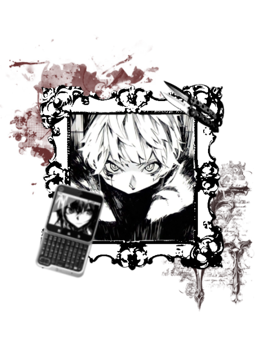
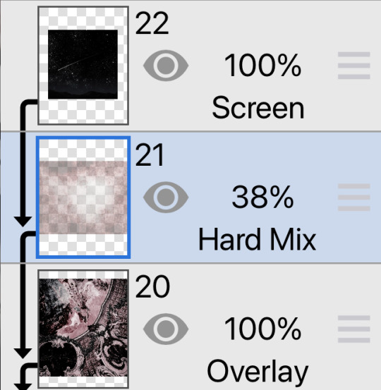
dunno if i need 2 show this but this is the uncolored graphic !! the media i used was already monochrome , but i reccomend using the grayscale filter instead of black and white when you have a colored image , so the overlays actually show .. and i reccomend having high contrast ! ( the colors for the extra things in the back are #271515 and #5D2626 ^_^ )
and theennn ,, i used these three images :
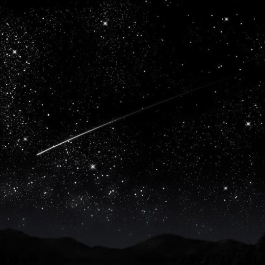
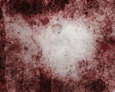
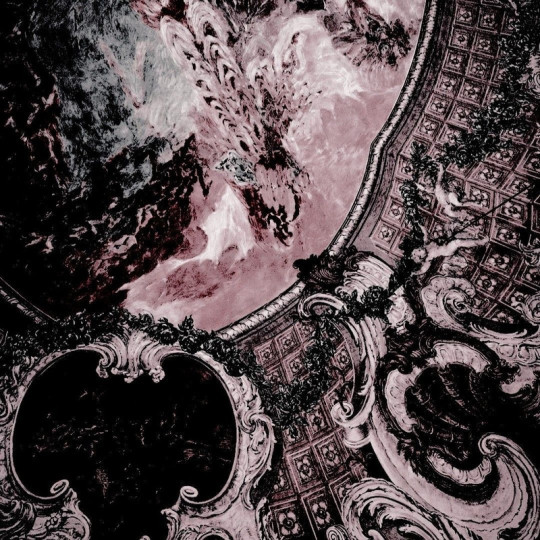
order these by puttin the stars on top and the pink conglomerate at the bottom ! change the stars from normal > screen , the blood > hard mix , and the pink thing > overlay !! mess with the opacity cus it’ll probably look weird , i put the hard mix at 38% and the others at 100 ദ്ദി(。•̀ ,<)
( photo if anyone needs it ! )
aaanand . yjeah !! throws confetti ….. hopfully that makes sense .,. plis ask more if you need !!!!
#tw blood#cw blood#edit blog#editors on tumblr#editing#rentry decor#layouts#rentry inspo#rentry stuff#ibispaintx#tutorial#⑅ ݁𓈒݂݂♡ colorings ໒꒱𓈒ׅৎ◞⠀#sorta#═╪ GRAVITATIVES 。 ͜ ̣̣̥ ͝ །#𓊆ྀིྀི◟ ͜‿ ̣̣̥ᣟྀིྀི݂ ۪۪۪⠀⠀ cherished nobles ♡ྀིྀི ! ྀི‿ ͜𓊇ྀི
49 notes
·
View notes
Note
hiii….im trying to get into flamaking, where does everyone get their stripes from ? I have seen posts with them but all of them are white and I can’t see them at all, which makes flagmaking a use struggle for me…
~🍒💄 anon [so you can recognize me if I end up sending another ask :3]
hello dear anon! here is a list of the posts that i use for flagmaking purposes... if you cannot see the white stripes, i personally recommend changing your tumblr theme or opening the images— both of these options will help greatly with viewing the fancier stripes!
i've made a reply like this in the past but i cant find it, so, here goes ^_^
FLAG STRIPES & TEMPLATES:
divider bases by @\futwb (link)
@\scythidel's banner resource dump (link)
multiple-stripe flag templates by @\crowdsourcedgender (link)
@\shepherd4409's multiple-stripe flag templates (link; deactivatwd account)
part 1 of @\webby-mogai's resource dump (link)
part 2 of @\webby-mogai's resource dump (link)
@\laughdiamond's legendary stripe post (link)
FLAG SYMBOLS:
flaticon's open-source vectors (link)
the noun project's 'credit-to-use' vectors (link)
that should be all, i believe... i'll put this in the "link" section of my pinned post, so hopefully it becomes easy access to everyons ^0^ thank you anon for your ask! i might update this in the future :]
#mogai#liom#liomogai#liommogai#liom coining#mogai coining#qai#qai coining#term coining#flag coining#coining help#coinblr#mogaiblr#liomblr#qaiblr#tutorial tag#buhgposting#buhggytalk#𓏵⠀shiny coins⠀♡
38 notes
·
View notes
Note
How do you make Rentry templates? I tried but it never worked for me 😔 can you make a video tutorial pls 🫶🏼 thank you if you do!
Hi! First step to making a rentry template is making a graphic :) Idk how to explain it but I have a video here showing how I made a Gangle one for a request
Other tutorials for rentry stuff -> 01⠀⠀02⠀⠀03
Now for the actual rentry itself, the easiest way I can explain it is to simply make it as if you're making a personal rentry
Here's some tutorials for making a rentry -> 01⠀⠀02
And, if you want, you can add metadata!
You can find more tutorials (including a metadata one) on here and here
And once you're done, you should have smth like this!


Hopefully this makes sense - my inbox is open for any other questions!!
50 notes
·
View notes
Note
hello! do you have any tips for creating your own psds? right now I'm just sort of throwing things at the wall and hoping it sticks!

Hi hi nonnie! I am NOT the best person for you to ask this (not in a miiile) BUT I tried making this in the most concise way I could and prayed to god it didn't get too confusing since a lot of the times I too just throw things at a wall and call it a day. I'll teach my usual psd making style and a more general one just in case that's what you were looking for! They're under the cut since it probably will get a tiny bit long but I hope it's helpful to you! <3 as always reminder that there is no correct way to make a psd this is just how i do etc etc
This has a lot of text and images so beware of the big scary maica


First of all: While you certainly *can* make a psd based solely out of one image or a compilation of your own edits (as i have done on the past), I'd say in general it's more useful and easier to make something when you have more than a singular image to check and a color spread to use. I made this little template in 5 minutes (which is a lie because my photopea crashed at first and so I had to re-do it) and I'll link it here alongside the psd itself so you can poke around and check how I do things! If you want to do your own template or anything, though, here's the color spread I use! :]

It has a spectrum, a bar line and some skin tones so it should be helpful! You can also use Travi3sapsd swatches if you'd like, since I know some people would prefer having a view of the colors before and after the psd to check!
Talking about skin tones, Amemcth also has a nice collage with characters of varying skin tones so you can check how your psd look on different skin tones. I don't think it's obligatory for all psds to look fine with every skin tone, however, I think if you're not doing it for a singular character and are indeed posting that psd for public use, making it work with darker skin tones is something good and that I encourage. If it doesn't work, remember to always indicate it by adding a "Works fine on most skin tones" or "Doesn't work on poc characters". Those warnings can also be useful for other things, like not indicating the usage of the psd on irl pictures, cartoon pictures etc.
So, final thing before we get into psd making itself (if you are using a image mask template to check colors) is adding the images! I always recommend adding characters from different sources and irl images to be sure, and with either varying colors across the spectrum so you can be certain the psd is working nicely OR images that feel similar enough in vibes so you can be certain the vibes of the psd are going towards where you'd like them to. However, it's also important to consider which colors you will be working with to make the psd, since I think it's easier to make a psd for a character when you have something in mind. For my own psds, I usually limit myself to a maximum of three colors + black and white (which I'll mess with to change their tones), so for this tutorial I'll be using yellow, purple and pink! This is the where we start. (I won't be trying to keep skintones working for this since it's all pale characters, but please have the common sense to make psds that work if you're editing a black character. don't make them white and for the love of god don't make them grayish)
Also reminder before anything that if you're editing a card and that card works weirdly with the psd you can always add adjustment layers to the card itself and mess up with the hues on it hashtag editing some characters just are a pain in the ass to edit because of colors being too similar etc so don't be afraid to fight them

First: Make A Folder for your psd to be built on. It makes things a lot easier to drag around once you have it done and arranged. Name it after the psd name, name it psd folder, whatever, just put your layers under that folder. Onto the layers.
My autistic ass mostly does psds only following one single pattern, but in case you want to mess around and play, feel free to have fun and mess around. A lot of psd making really is just messing around. In my case, these are the main adjustment layers i use: Threshold, Selective Color, Hue/Saturation, Photo Filter, Color Balance, Vibrance and, on occasion, Gradient Map and Curves. You can use others but I am >not< the best person to tell you what they do and how to work with them.
So, you now have your pretty little image layout down and the colors you want to work with in mind (pink purple yellow + bw), so what now? Well, I usually like to think on which direction I want to take this psd towards. People will always have different methods and directions on psd making. Some of them like to make some of the most eyestraining things I've ever seen which somehow work, some of them like to make a pastel so bright I can feel my eyes burning, some of them prefer to make desaturated tones, some of them like to lower the vibrancy of the image so much I almost can't see shit. Everyone has their own preferences and I work w pretty much anything, but for this I'll try to keep a standard bright view, if a little pastel and desaturated, for this.
So now, we have our colors, our images, our color swatches and a direction in mind.
First thing I like to do whenever I'm making psds is to add a threshold layer. However, not in the way I usually see around editblr. When you add a threshold layer, it should look like this

Don't just do that. Go there on that little normal bar and click it. I know people who use others, but I usually settle with either Multiply or Soft Light for it, then lower the opacity down until it's somewhere I'm satisfied with.


So this is where we end up at. I don't let my threshold opacity go any higher than a 30%. threshold basically serves to bring out the shadows on your images and bring out the shapes on them. it helps make the focus on the image clearer yadda yadda yadda. Be careful when using it on darker images, but for brighter ones it sure helps w making everything easier to see.
After adding a threshold, I add my Selective Color layer. With this you'll basically be playing around with the sliders until your colors look the way you want them to. This messes *slightly* with the hue without fully changing them (we'll get there soon), so it gives you some chance to balance out the initial shades of the psd. For the current method i'm teaching (focused colors), i usually recommend you to make the colors you >dont< want on your psd brighter or in a shade that still feels coherent with the colors you dont want in it. we'll be dealing with them soon.

So we get there. HOWEVER! don't think we're done once you mess with the main colors. the 1st selective color white is, what i'd say, one of the most important parts of psd making. you know how most anime characters in gacha games these days look pale white? Yeah. this can change it. What i usually do is bring the black slider on the white layer to the right and then increase a bit of the magenta and yellow. Boom.

It's quite tricky to use on images with heavier shadows, but for the standard pale white anime gacha character? it helps give some life to them. its quite subtle, but can help a lot to make the image get more lively. A counter thing to this is that yeahhh this can mess a lot if you want to make, you know, a >white< psd since it will also mess with the white tones themselves, so there's no 100% settled need to mess with it, just keep it in mind in case you wanna make the character a bit more tan or, you know, have a normal skintone. It also helps a lot with defining shadows, so keep it in mind :]
I usually don't mess with the neutral since it can fuck around a lot w skintones and, if i do, i always make sure to keep them on less than 20% for all levels. be careful when playing w it.
Black is a tricky one. I know a lot of you pastel girlies across editblr and psd making communities like turning it all the way down so theres no black but honestly, contrast is important. I usually make sure to bring the black scale to the right and then mess around w the other three so the black is still visible and bringing contrast to the image, but w the help of the other three, make it so the black looks softer and matches the psd itself. So, here we are!

After the selective color in my psd process, that's where we erase any unwanted color and shift the hues to where we'd like them to be. Make a hue/saturation layer and go to the colors you dont want (in our case, green and cyan) and move that hue slider to a color you want babyyy. I encourage to mess around with the color scale on the specific color so you have more power over what colors change or don't, in case it's messing with colors close to it on the scale (cyan messing with greens, greens messing with yellows etc). Be aware that doing this will fuck uppp certain images with those colors, cry about it for a bit, and go back to making your psd

If you're a picky mf just like me, you WILL add 1 or 2 more hue/saturation layers to fully clean that bar of any color you do not want. If you're normal, you'll be chill with how this looks and call it a day, so onto the next step.

After arranging your colors and possibly finding out how green is an absolute shit color to try and erase traces of, we get to color balance which is, well, where you balance the colors. go around and mess w the scale until your colors lean more towards what you want them to look like. I personally don't mess much here and the difference will be suuubtle subtle, this is more if you're just picky with colors like me and want them to look perfect in the idealized version of the psd you hold in your head.

Photo filter will basically bring the whole thing together. It serves as a filter to bring eeevery tone you have going on into a cohesive line. Always remember to lower down the density of it so the other colors are still noticeable. a lot of the time i will add more than one photo filter and play with it until I'm satisfied with how it looks <3

Then this is the time where I'll usually add ANOTHER selective color layer just to mess more with the tones and finally get them down to where I usually stop playing around.

A few more touches and you should be done! I really don't know how to even explain curves and gradient maps so play around with them for a bit and you should at least understand how they work. One thing I do a lot with my psds is make toggles to make colors darker/bring more focuses etc etc, so if you're someone who struggles to make decisions, toggles might be a good thing to add to your psds!
Now... If you don't want to limit yourself to a set number of colors? Quite simple! Simply skip the hue/saturation layer steps or delete them altogether once you're done with your psd and there, a psd that plays with the tones of the image to make them more harmonious while keeping everything cohesive! You can mess around a bit more on the two selective color layers you have if you do this by deleting the huesat layers, but it should generally look pretty nice still!

This should be it! So, to summarize everything Ive been yapping about so far...
Before diving head in, decide if you want to limit your colors or not. Also decide on a set type of psd (bright, pastel, desaturated, dark...) you want to go towards
Use multiple images to make your psd, either with similar vibes so you can ensure it's becoming something you wanted or with varying colors so you can cover your ground
Use a threshold layer with lowered opacity before anything else so the shadows on your images have more contrast
You can use a selective color layer on the white part to darken pale characters skintone and bring some more life to them, but be careful when doing this because of cards with heavier shadows, if you want to keep white as a color on the psd etc
Don't lighten the black part on the selective layer as that messes with contrast and might make your psd harder to comprehend when looking from afar
Try to still make your colors distinct enough so you're able to tell apart shapes if from afar, it can be a difficult thing to do but it helps a lot with readability
Don't be afraid to go back and forth between layers! If you're on a photo filter layer, you can always go back to make a specific color more prominent if you miss it overall
Use hue/sat as a way to change colors you don't want instead of replace color. It's tricky, but it covers more ground
Use photo filter to bring all colors more cohesion and make it so they look more harmonious
Have a headache trying to work around cards with harsher shadows
DO NOT make poc characters gray or straight up orange/red for the love of god
Feel free to make different toggles for your psds if you can't decide on which path to go towards, you can always duplicate layers and make different paths depending on what you want!
If a specific image you're using has difficult shadows or different tones to work around with the overall set, you can always just mess with that image alone and make adjustments to make it work out with the rest of the set
Remember that psds work differently on photopea and photoshop, so make sure to check that out if making them/using them/posting them anywhere and make it clear for which app they were made for!
Good luck with psd making and have fun overall! <3
Here's my psd test yet again if you'd like to mess around with it! Just don't repost and it should be fine ^^
47 notes
·
View notes
Text
writing tutoring
status: open for those interested in learning how to write (from your hopefully favourite fanfiction author) :3
author's note: skills taught may include but are not limited to nsfw content. all ages are welcome.

hi! i’m going to assume that you’re reading this post because you’re interested in learning how to write. if so, you’re in the right place! (if not, i’m not entirely sure why you’re reading this :sob:)
as you (probably?) know by now, i am a fanfiction author. i primarily write dark romance with heavy angst and smut. i am also currently studying for a certificate in creative writing. my credientials are not that impressive, but hopefully, you’ve read my work and decided that i am sufficiently skilled at my craft. if not, here’s my masterlist, i guess?
anyway, sorry for the excessive yapping. let’s get to the point...
i am now offering one-on-one tutoring services for those interested in learning how to write. i am able to work with all ages and skill levels, so everyone’s welcome! all you need is some basic interest in writing.

so, what can i even do?
i can:
brainstorm ideas with you
help formulate an outline for your work
give guidance on the actual writing process
analyze your work and provide feedback
discuss ways to improve your writing
teach you methods that i employ myself when writing
answer questions regarding writing, ie: plot, characterization, pacing, phrasing, etc
explain certain specifics of the genres i write, ie: how to best write a reader insert, second person pov, nsfw content, etc
and various other things along these lines...
i wanted to say that i tried outlining what a regular lesson would be like, but honestly, it would be completely dependent on the individual and their goals. if you are looking for elaborate feedback on your work, then that’s what we’ll do. if you want help structuring a plot and adding depth to your characters, then i’ll advise you accordingly. if you want to discuss your story ideas with me, then i’m more than happy to yap.
i am able to give lessons over video call, voice call, and even text for those uncomfortable with calls.
and lastly, pricing!
a standard tutoring session will be an hour long, at the rate of 15EUR/session.
however, you can also pre-purchase packages for:
40EUR/3 sessions.
65EUR/5 sessions.
for those interested, please send me a dm here (on tumblr) or add me on discord: bloodblanks (。・ω・。)ノ and if anyone has any questions, feel free to send in an ask or message me privately.
thank you for reading! ♡

#yandere writing#bloodblanks updates ♡#angst writing#writing#creative writing#fanfic#fanfiction#ao3 fanfic#ao3 writer#writeblr#writers on tumblr#writing advice#writing tips#writing community#writer stuff#creepypasta fanfic#homicipher fanfic#tokyo ghoul fanfic#tokyo debunker fanfic#smut#headcanons#yandere nsft#yandere#yandere x reader#writing tutorial#writing inspiration
30 notes
·
View notes
Note
Please make a tutorial on how you made the gifs in this post!
Hellow! I'm not the best at explaining, but I'll try my best. Not comfortable doing a video tutorial. My apologies!
Basic Tutorial of This Post
Or, how I did this:

Applications -> ibisPaint X, CapCut, Photopea
Step 1 -> Separate your edit into layers
Please see below for reference.

Notes:
Don't make too many layers. I recommend no more than 5 if possible. Doing so will create more difficulty later on.
Have a background for your edit. This will be the image you will first import into CapCut.
By background, I mean this in my example.

Step 2 -> Save each layer individually as a transparent PNG.
Select which layer you want to save.
Click the three dots at the bottom right of your screen
Click "Save Layer as Transparent PNG."

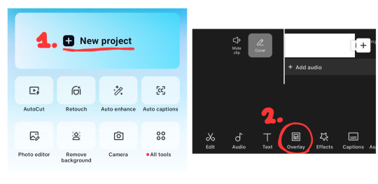
Step 3 -> Import your background into Capcut.
Click on "New Project" — this will open your gallery.
Import your background, then click the check mark at the top.
Click "Overlay" at the bottom to add your layers.
NOTE: If your layers aren't layering properly, scroll to the right. There's a "Layer" button to adjust.
Step 4 -> Animate your layer.
Click "Animations".
Stay on "In" animations. Choose an animation to your liking.
Repeat for all layers.
Once done, export by clicking the export button at the top right.
NOTE: CapCut has a watermark at the end of each export. Make sure to remove it using your gallery editor.

Step 5 -> Import your video into Photopea
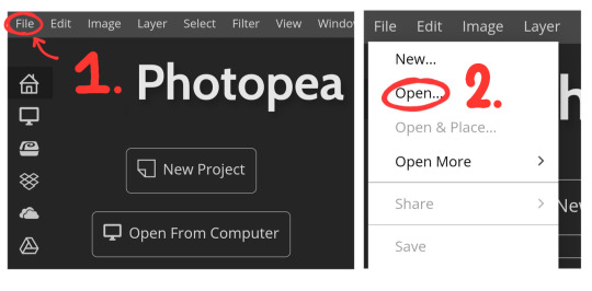
Open Photopea
Click "File" in the top left.
Click "Open..." — this will open your gallery.
Select your video.
It will ask to input your FPS. I personally do 13 FPS, I recommend 10-15 FPS if your device lags a lot like mine. But you can use whatever FPS you like.
Step 6 -> Exporting your GIF
Click "File" again.
Click "Export as..."
Click "GIF".
Click "Save". You're done!
NOTE: This might take awhile for some devices, please be patient.
OPTIONAL, Step 7 -> Making it repeat once
Before saving, change the "Repeat" to 1.
Click "Save". You're done!

Conclusion
I hope this was simple and explanatory enough! 😓 If you have any questions, feel free to ask!
Thank you for reading! Spheal wishes you a great day/night. 🌟🦭
22 notes
·
View notes
Note
hey balu, do you know how to recolor skin / how a coloring psd works for that? like for a character that's pale and not the shade they should be ( cough cough natlan ) asking bc I want to that but idk how
Hiya, anon! I can explain how I personally do it, but here's a huuuuuuge disclaimer: I'm colourblind, so I heavily rely on colour wheel pointers. Throughout this tutorial, you'll see me constantly comparing where the pointer is and trying to use my somewhat limited knowledge of colour theory. I'm sure other creators have other ways to do this that are much simpler and/or more effective; you should look for and check out other tutorials here on Tumblr, YouTube, or Twitter!
Due to the limited previews of images on Tumblr, you can also open the images on new tabs to see more details.
For religious and political reasons, I will not use a Natlan character as an example. Instead, I'll use Candace (also from Genshin Impact) as our muse. Specifically, I will use her character card art image, which can be found on the Genshin Impact fandom wiki. The image quality is not so great, so that's why we'll see some bleeding pixels here and there. Dealing with those is another tutorial altogether. Also, if you meant an absolutely pale character (with littler to no melanin), that would be another tutorial, too. So, I'll be sticking with these examples and explanations here! This can give you a starting point.
In this tutorial, we will go from this before (left) to this after (right):

Also, I'd like to point out that these steps are for this specific picture/character. Though the same logic can be applied to other characters and images, it's imperative to remember, especially when you're starting your editing adventures, that there is no fool-proof and 100% universal PSD. I'm just explaining the logic behind how a colouring PSD works and some of my mental processes behind it.
Please consider reblogging, liking this post, and/or supporting me on ko-fi if this helped you! That way, I can keep bringing you tutorials like this faster and more effectively. ~
Now, let's begin!

First, we must notice that skin colours (even paler ones) are shade variations of yellows and reds. If we check the hex code colour/colour pointer on the colour wheel, we will see that Candace's skin colour is at the intersection between red and yellow, and is on the lighter/less saturated part.

Here, I am deepening/saturating the blues of her clothes by creating a Hue/Saturation layer, changing from Master > Blues and adjusting the Hue and Saturation values. Colour theory basics: opposing colours on the colour wheels will give a more significant idea of contrast; the bluer colours will appear colder, and the warmer colours will appear hotter and, therefore, more saturated.

In this second step, I am creating a Selective Colour layer, focusing on the Reds. I want this to be highly reddish for now, so I'm lowering the Cyans to the minimum values I can. Notice how the colour wheel pointers went down, meaning we are in a redder, more saturated and more precise zone. The darker the skin, the redder its colours will be in pictures.

Thirdly, I am now creating a Colour Balance layer. Since I want to adjust the warmer colours (e.g., Reds), I am adding more reds, magentas, and yellows.

The exact process I did for Candace's clothes, I'll do for her accessories. Her accessories blended too much with her skin tone (hex code-wise and I imagine that for the normal eye, too). So, to make the yellows on her accessories pop and be more different from her skin, I created yet another Hue/Saturation layer and changed from Master > Yellows, altering the Hues, Saturation and Lightness values.

Now that we have the image's primary colours (blues, reds, yellows) separated, it is time to deepen/saturate the reds. So here, I made another Selective Colour layer, also focusing on the Reds. Notice that now I'm also increasing the Cyan values. Why? Because Cyans make the reds look darker, and I want exactly that. So everything will increase in value.

To further deepen these colours, I created a Curves Layer and tweaked each RGB curve. I made the blues lighter; meanwhile, the greens and reds went darker. Again, colour theory! Notice on the colour wheel that her skin is extremely red and saturated. This is precisely what I want. Why? Well...

... Because now, by using a Selective Colour layer again, I can make her skin magentaish. Pure magentas are rare in pictures, even fantasy/2D characters. Generally, you will find variations of purples, pinks or reds, but magentas are more difficult to find. Therefore, they're easier to work with/edit. Even if the character had magenta colours, we could've isolated them beforehand, too. This step guarantees that my PSD will solely focus on her skin tone, basically.

Our final step is to create another Hue/Saturation layer and change the setting from Master > Magentas. We will decrease the Saturation and Lightness values and slide the Hue bar to the right. And now, check the colour wheel: it's a beautiful dark brown! It's popping a lot against the yellows and blues. ~
This is where we started vs where we finished!
So there you have it! A speedy but hopefully informative tutorial on how colouring PSD works and how you can quickly love your characters a bit more when doing edits and graphics for them!
Again, please consider reblogging, liking this post, and/or supporting me on ko-fi if this helped you! That way, I can keep bringing you tutorials like this faster and more effectively. ~
If you have any questions, please let me know!
#♡: tutorials! *#gfx tutorial#graphics tutorial#graphic tutorial#gfxs tutorial#resources#rolep#ps tutorial#ps tutorials#photoshop#photoshop tutorial#photoshop resources
51 notes
·
View notes
Note
Heyyy. . :3
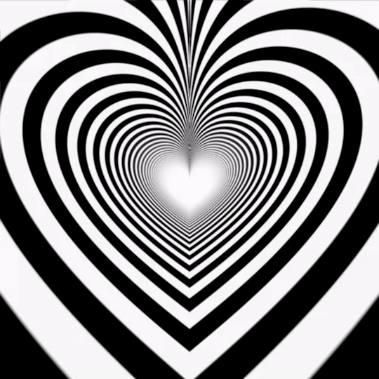
Idk if you are fine with questions but I'd like to ask where you get these gifs from.. And how u color them..

Your post with these banners
haiii!!!!!!!! these r the overlays below :3 i get most of these from pinterest,, i recommend searching up keywords like "gif overlays for editing" but im pretty sure u can find these also on tenor
and the coloring tutorial is under the cut !!!!!!!! (it is again, long)
how do i color my overlays?
... is what ill be teaching u today! follow my steps
step zero : make the color first !!!
this will be used to color the overlays, your free to make it look like anything, throw in some gradients or some dots!!!

first, ill show you how to color the heart tunnel! ill be doing this on capcut, but this can probably work on most programs! follow my steps!
step one : add the images
make sure to first add the background and then add the overlay!!!


step two : color it
to do this first click on the overlay, scroll till you find "blend" and then click "dodge"

then save! this will be the end result, tada!

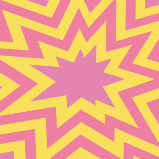
wasnt that hard, was it? now lets do the other overlay! ill be doing this again on capcut but this can work on most programs!
lets keep going!
step one : add the images
this time, add the overlay first and then the color! scroll til you find "overlay" -> "add overlay"
step two : color it
scroll til you find "blend" -> "filter"


and now save! and you are finished!
tada! now this is the end result!
additional steps: if u need to make it a gif, convert it on ezgif
hope this tutorial is easy to understand and helpful!
178 notes
·
View notes
Text
☆★ gradient effect tutorial ★☆

sooo it has come to my attention that the gradient effect i use is pretty eye catching & you guys wanted to learn how to do it yourself!
so here’s my *hopefully* quick and easy tutorial! :3
—
☆ this is the website i mainly use: https://www.stuffbydavid.com/textcolorizer ☆
it can be done on your computer (where as some may find it easier) but i just use my phone! you can use safari, google, whatever works!
1st, type the words, sentence, characters etc that you’d like to have said color!

2nd, decide what kind of gradient you’ll like to use! there are THREE types: horizontal, middle & 3-colored. (i personally use the 3-colored often!)

3rd, choose your color scheme!! you can type in a code or just press different sections! the side bar is also to mess with the shadow of the color!
here are what each gradient looks like!
ex. three-colored gradient

ex. middle gradient

ex. horizontal gradient

4th, once tour satisfied with everything, you’re gonna go to the very last box and copy everything!

once you finish all that, you’re going to go to the tumblr website! (you can use a computer or google on your phone) go to said draft you want to edit, and click on the settings button in the corner. click on HTML, it’s gonna look CRAZY! but all you have to do is highlight the words you want to colorize and then hit paste!

hit preview ! your text should now be colorized to how you wanted it to look!

and that’s it! just make sure you hit save! then you can go back to editing or typing as normal :)
i tried to make this as simple as i could haha 🥲 hopefully it’s easy to understand 💔 i will also link the original post that i learned from as well however i do skip a few steps since i foudn they’re not needed anymore haha
☆ original tutorial i used: https://www.tumblr.com/kylos/181695757101
23 notes
·
View notes
Text
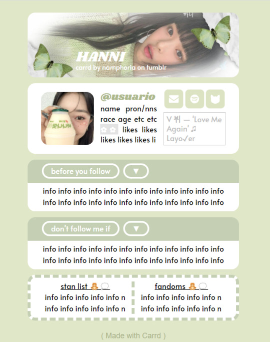
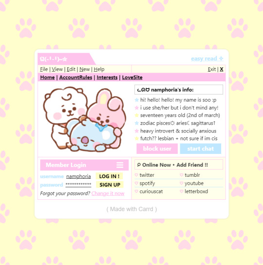
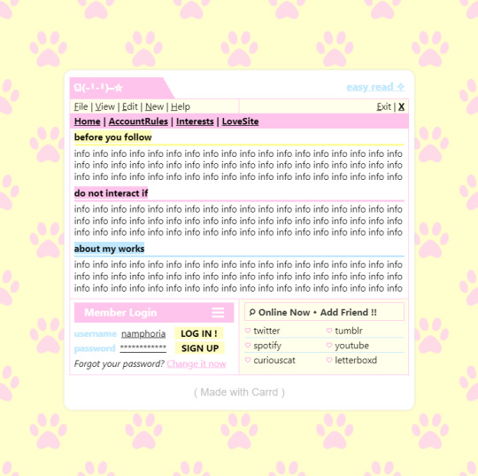
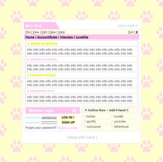
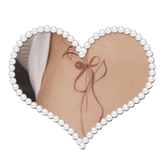
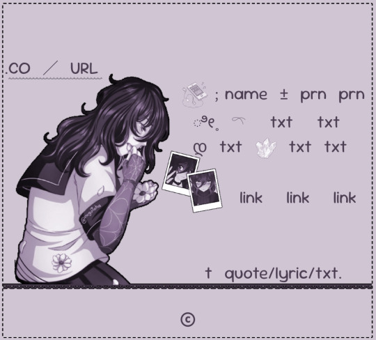
✿ CARRD INSPO
like or reblog if saveㅤ⿻ㅤᐢ..ᐢㅤ♡ㅤ2023.
❛ please, credit me as "namphoria on tumblr" if you remake! ⁾⁾
#⋆ ˚ 。 just an rkive — ★. *#♡✮☁️✧˖°💿⋆。°✩#carrd.co#carrd inspo#carrd template#carrd templates#carrd icons#carrd stuff#carrd material#carrd resources#carrd moodboard#carrd inspiration#carrd#carrd layouts#carrd symbols#carrd help#carrd tutorial#carrd theme#carrd things
2K notes
·
View notes
Text


#sturnsflirt ✧#꣖ ⸝⸝ chitchat w/ adeline . 𓏲 ♡#how are you gonna kiss my ass on ig stories#ask me for makeup tutorials AND hair tutorials#while still talking shit about me like r u stupid#and the fact that you think i'm blissfully unaware about it is so stupid ! i'm just trying not to start anything#DUMB UGLY BITCH CAN NEVER BE ME AND I DONT WANNA BE YOU EITHER#ok i needed to get that off my chest because omgie#sturniolo
15 notes
·
View notes
Text
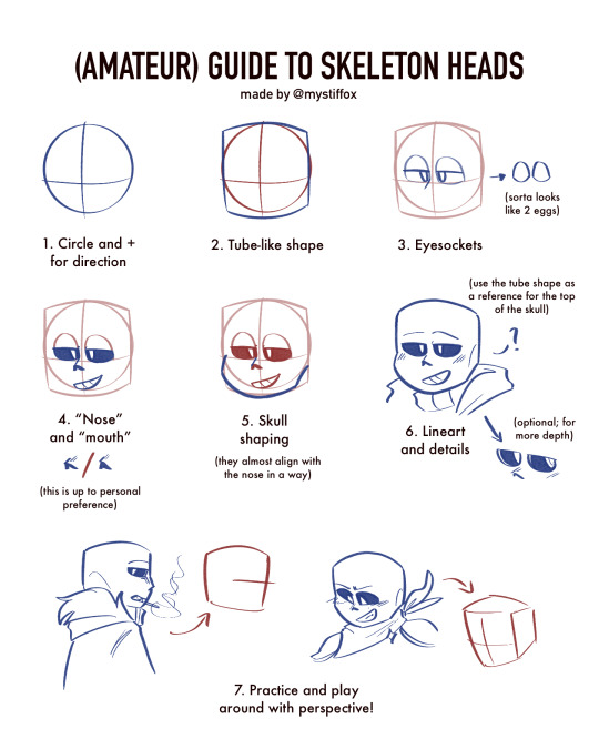


— the (amateur) (unreliable) (silly) guide to the sans skull
take all of this with a grain of salt! i admire all yall who draw him and i don't intend to compete with that ever. just make me your artist for humanized designs /lh

see my beef with his dumb skull has always been there i just learn how to hide it better lol. srsly props to yall who can draw him easily i have to redo the top part of his skull like 5 times at minimum. but its not like i hate that i cant draw him, i just think that if i wanna draw for myself, im gonna own it and make it how i wanna and if that means human designs, so be it! its called free will🙏
#mystfox art#blue's verse#shoutout to the artfight msg that prompted me to ask on instagram if people wanted a tutorial#i had to make it silly#bc ive been posting human designs more nowadays so i am not a reliable person for advice HAHA#if you wanted to really learn just do art studies! just dont copy people's fanart and make it ur own ♡♡#undertale au#utmv#bluesonas#sans undertale#underfell sans#underswap sans#human sans#human design#art guide#<- but very unreliable
23 notes
·
View notes
Text

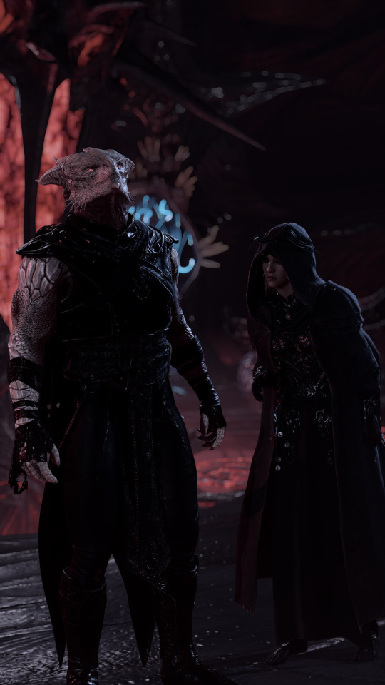

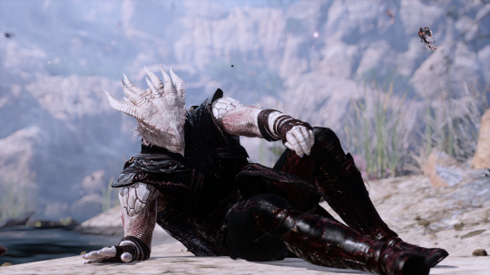
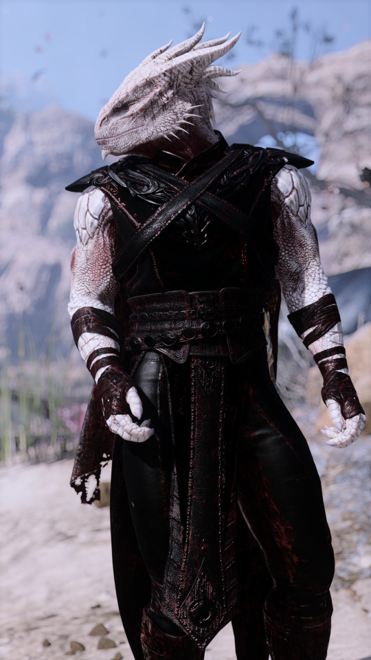
she def looks like some creepy obsessed cultist in these 😭😭 durgetav playthrough 2/?
#♡ durgetav playthrough#bg3#baldur's gate 3#bg3 screenshots#the dark urge#bg3 oc#bg3 tav#durgetav#just some tutorial shots for fun since im doing a default durge playthrough#im kind of rping it as an au where she is an bhaalist priestess that is like CRAZY IN LOVE with default durge and just follows bro everywhe#thank u lae'zel for having the exact body language i needed
135 notes
·
View notes
Note
hii! how do you make the letters in the post match the colors on the moodboard? I love them they are so perfect ><🥺🫶🏻💓
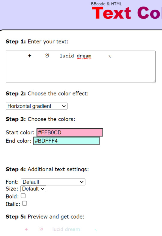
છ tutorial: how to put the text color (gradient) in your posts! ✦
1. First,go to tumbrl website and you must have your text ready! 2. Then go to this link, copy and paste your text 3. There are many options, choose to your liking! 4. In this part you can change the colors, choose the main colors of your moodboard (you can vary it as you want)
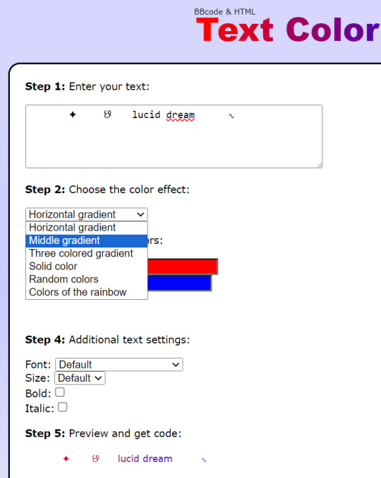

5. In my case, my moodboard will be blue and pink! Extra: If you want to have the exact colors, take a screenshot of your mb then go to an app/website that has the eyedropper, that way you will have the hex! (color code / example: #ffe4e1)

6. After you have chosen the colors, we will go to down and copy all the text from "HTML code for this text" 7. Let's go to our draft and go to the ⚙ symbol
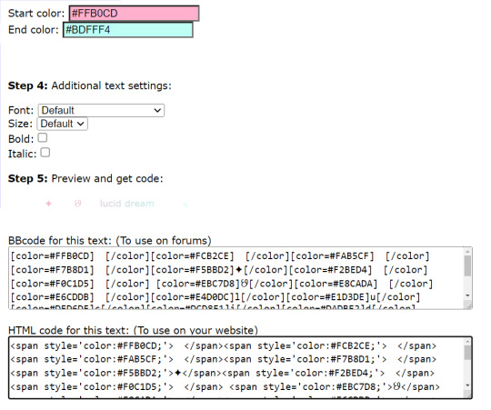
8. We go down until, we find "text editor" and choose html 9. We go down again and paste the text from before!

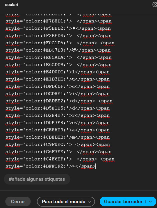
10. We will do the same as before, go to the ⚙ symbol and choose "rich text" or the first option! 11. The images will be messy but down you will find your color text! 12. Finally, put the rest of the images on your moodboard and click "save draft"
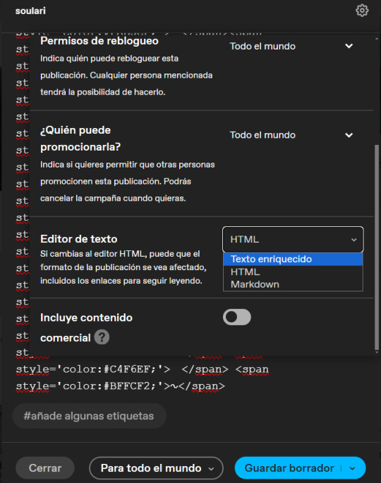

13. In the end it would be like this! I know that at first it may be difficult for you but with time and practice it will become easier! - karina moodboard = click here

I hope you liked my first tutorial! I hope you understood TT. If you have any questions, you can comment! Tysm and sorry if it took me a while to publish the tutorial!
136 notes
·
View notes