#he's learning tho
Text
i'll see when i can finish and post this draft
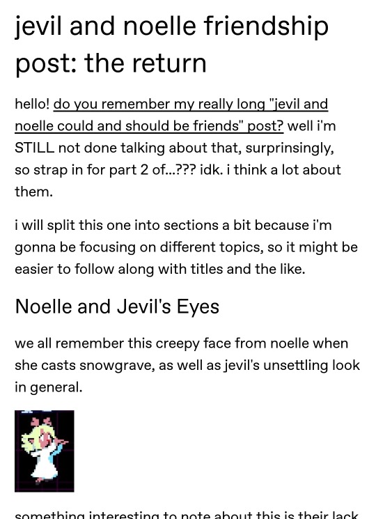
#txt#i should probably clarify in the post that it's not only about their friendship potential#but also about noelle and jevil's parallels#and how they are subtle but strangely similar to spamton and kris#and when i say friendship i mean jevil absolutely becomes an uncle figure to her#that clown adopts her he doesnt care#spamton might realize he treats kris as found family at some point but jevil... he just#i mean it's not like he denies it but he's genuinely confused when someone points it out to him#it takes him a while ok#jevil's not that used to bonds and connection due to his own detachment from reality and feelings#he's learning tho#noelle helps with that#it's sweet#she's also the ultimate spamvil wingman and no one can tell me otherwise#jevil#noelle holiday
132 notes
·
View notes
Text
*After a fight with teenage Tom*
MC: I need to go destress.
Sebastian: Where are you going?
MC: There's a poacher camp near Brocburrow. Bigger than the others, too.
Ominis *sighing*: I'm coming with you.
Sebastian: You can't leave me here with him!
Tom *hissing*
#adopted dark lord au#hogwarts legacy#ominis gaunt#sebastian sallow#hogwarts legacy mc#tom riddle#teenagers are difficult right?#I was an angry teenager xd#tom is just overwhelmed#he wants more freedom but he's already free#he lashes out#he's learning tho
32 notes
·
View notes
Text
chomps you affectionately
#touden siblings love language is being open freaks including biting their loved ones#laios touden#kabru#kabru of utaya#< is this how ppl tag him idk i just got here. i have to learn tho he is rotting my brain#labru#falin touden#marcille donato#farcille#dungeon meshi#delicious in dungeon#art#my art#xanders art#digital art#fan art
17K notes
·
View notes
Text
she would've told them unlike her canon! version who decided not to be an ally smh
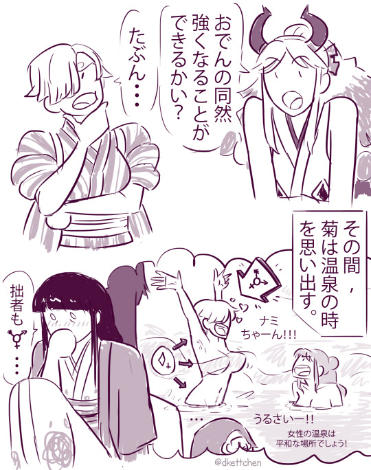
#one piece#trans!sanji#sanji#kiku#yamato#ワンピース#I'm practicing my japanese shhhhhh#(日本語のペラペラ人:俺は文法とか書く方とか間違ったら教えてください😅ありがとうございます)#translation:#Yamato: I'll be able to get as strong as Oden?#Sanji: Probably... 🤔#[meanwhile Kiku is remembering the time in the hot spring]#(Sanji: Nami-chan!!!)#(Nami: Shut up!! The women's bath is supposed to be a peaceful place!)#Kiku: I am also ⚧️ ... o.o#(y'all english speakers had me all to yourselves for a decade it's about time I start to also sometimes make stuff in my next language lol#notably for media *from* that language#same as it made sense to make fan content in english for [american superhero franchise we don't talk abt anymore] back in the day#(happy seasonal reminder that Ren Is Not A Native English Speaker and This Is My 5th Language hi 😅))#while looking up reference for this I learnt that the straps to tie back the kimono sleeves are called tasuki#also I decided yamato get big muscles cause he got them kaido genes in im (I also gave him his dad's young-man-facial hair)#the more I do transition projections for one piece characters while tryna adhere to the style the more I learn that sometimes stylisation#uses bones less as literal determinants for where things go and just kinda exaggerates shapes based on vibes alone instead#meaning trans characters' bones wouldn't literally stay looking the same in that stylisation in the way they do irl#they'd get exaggerated differently based on what the surrounding stuff is doing#I still think oda's transition demonstration when we first met iva was unreasonable even with that in mind tho
1K notes
·
View notes
Text
Had this Headcannon that when Multi-Lingual Dick and Jason get drunk they start singing Ballads in Spanish. Yeah some classical shit like Vicente Fernandez but also the most wild Selena you've ever heard.
#is this a post about Latinx Jason todd? Bitch it might be#Don't ask me about it tho cuz I'll deny it to my core#I imagine jason drunk off his ass belting No Me Queda Mas like he fuckin wrote the song#Dick's got Como la Flor Energy but he has ugly Sobbed NMQS too#they are so infamous for their drunk spanish ballads that they actually rub off on TIm#imagine young justice suprise when the whitest kid you've ever seen wasted on 7/11 liquor is hiccuping his way through a selena song#worst accent you've ever heard sounds like a dog from New Jersey learning to bark and yet the emotion is kinda on point#TIm denies it#refuses to believe he has ever done it#Dick and Jason get a copy of the video and someone edits a mash up of all three of them warble singing that banger#anyway this was a nothing post of nothing I made for myself#fr just for me#DC#Batman#Batfam#Jason todd#Tim drake#Dick Grayson
2K notes
·
View notes
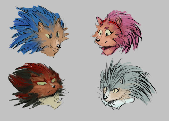
Text
shadow goin thru it, getting comfyy
#he just like me fr#shadow the hedgehog#team dark#rouge the bat#e-123 omega#art#doodle#fanart#sketch#sonic#sonic the hedgehog fanart#pleas appreciate my drawing of omega its my first time and it was bad but i hope to learn to draw him better gfdsfgfdg#i did kind of peak while drawing rouge tho
5K notes
·
View notes
Text
Titans Tower AU where Jason arrives to beat the shit out of Tim, only to find Tim waiting for him with a resume.
"As you can see, I would be a fantastic sidekick. I have also made a power point."
Apparently, the little Birdie and Bruce had gotten into a fight, and this was Tim's version of acting out.
#dcau#batman au#red hood#jason todd#robin#tim drake#tim isn't joking tho#he's been seriously considering it#dick got to have his fling with being a villains sidekick#and learned all sorts of neat tricks he refused to use to fight#so now it's Tim's turn.#story prompt
1K notes
·
View notes
Text
Hes dieded
#my art#trolls#dreamworks trolls#trolls band together#trolls 3#trolls floyd#trolls clay#im still learning how to draw these guys#clays been a blast to doodle tho#cuz he so funky like#why he so long#mans built like a makeup brush#also can i just say the family guy death pose is my fav to draw#its just so silly#in such a specific way#anyway
854 notes
·
View notes
Text

When you need to lie, but you're a good boy.
#Lies of P#lop#neowiz#pinocchio#fanart#comics#interrupting your local d2 art fever for puppet time -- we shall return soon#I'm not done with the game yet so i ain't checking tags#steamrolled this one bc i still wanna do another d2 comic for the weekend#cant lose momentum yet yelp#as i prepare this post i'm stuck on the cathedral boss for two afternoons already#like-- i am having progress with the battle and improving my timing so i guess that's something?#i'm not a souls player -- that's my brother -- but when i doubt myself he pats me and#'nah you are a souls player - you have persistence' and honestly he's not wrong#i'm actually enjoying the learning process of the battle even tho i'm stuck for two afternoons#i mean i spent 37 hours on the demo so at least i am taking my time sdfghjhgfd
1K notes
·
View notes
Text
Okay so this idea has been rocking around my empty skull for some time now just we know that Eddie can be a pretty mean DM and a shithead and I've been thinking abt romances in D&D and how it would work in Hellfire
And I had this thought that Eddie would like be "no romances!!" to the Corroded Coffin group (before the kids joined) and they're like why? and Eddie just to tease them says that he doesn't want to pretend to fall for their smelly ugly faces
Which just motivates them to try and seduce like every character that Eddie introduces for a fucking month and it leads to the creation of the rule: Every romance/seduction directed roll must be rolled above 15 to succeed AND if Eddie decides that the attempt is particularly bad the roll is with disadvantage
The Corroed Coffin boys are obviously teasingly like ohhh so we get an advantage if it's good?
"Doubt that would happen boys, but sure, if you make me, Eddie fucking Munson, to blush like a fair maiden then you'll get the advantage on the roll"
They try, they really do, but all the CC boys succeed in doing is killing off all of their party in three sessions and Gareth who is a little shit is actually rolling his third character (because the consequences of a failure are fucking brutal) by the time Jeff and [unnamed freak] give up
After that they know better (except Gareth who still sometimes does that just to annoy Eddie and be a little shit) to try and then the kids join Hellfire and Eddie has even less of an desire to flirt with fucking Wheeler, Henderson and Sinclair (they're baby children!!)
But the kids are a little shits too and they see Gareth being a little shit so they copy
It ends badly for them, they gripe about Eddie being unfair because like "all three of us have girlfriends Eddie and you don't so we clearly know more about romance then you do" Dustin not only gets a flick on the head for that but his character might have ended up being put into situations™ throughout the session that are "totally unfair!"
But fair to say all of Hellfire knows the rules and all of hellfire knows that no matter how well they try and how smooth they are (they really aren't ever smooth) Eddie will not blush or even consider they attempts as "good", the best they got was "tolerable" (Lucas got it and he's still very proud of it, as he deserves okay?), Eddie is impossible to fluster and so it's just is this fun thing they sometimes do when they feel particularly like little shits
And that's it about it
Until Vecna and all the upside down shit and the surprising friendship of Eddie and Steve happens
And suddenly Steve Harrington is not only sitting but playing D&D
Everything is going actually pretty good and Dustin practically vibrates out of his chair at how proud he is of Steve for how well he is doing so far and then
And then Steve tries to flirt with a pretty bard
Dustin deflates, he is ready for the absolute disaster that is going to fall upon Steve, he makes eye contact with Lucas - both of them ready with "it was actually a pretty good line tho!" at the tip of their tongues to defend Steve's decisions, he doesn't know Eddie's special rules after all and it would be funny to see Steve fail, sure, but it's Steve's first game and the kids wanted it to be good for Steve so convincing him to play again would be easier
But now Eddie is going to absolutely rip into him and Steve will never want to play again and-
"Roll with advantage" Dustin gasps, audibly, loudly, the room is silent, except for Steve who's very unaware of the chaos he just created and just rolls the dices, his usual confidence in place
And if someone looked closely - and all of the hellfire is fucking looking - Eddie Munson has indeed a light blush on his face
#i feel like it would have been so funny#steve and eddie just spend the rest of the session flirting through the bard and steve's character#steve also doesn't know why Lucas looks so in awe of him after the session Mike is scowling and Dustin is looking at him#as if he's a weird matemathical equasion#the CC boys give Eddie so much shit tho after the session#'oh so ours ugly mugs don't do it but king steve's jocky ass does?' 'it's a pretty great ass!'#steve doesn't really learn abt the rules until like a month later#also this is my gareth is a little shit agenda and i will be always pushing it#steddie#fic idea#stranger things#eddie munson#steve harrington#dom's au idea of the day#corroded coffin#also hahaha yes this is my official my brain cannot keep my ideas in my head anymore so im going to unleash all of them slowly here
6K notes
·
View notes
Text
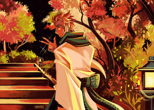
"Know your place, fool." ⛩
I really want to know more about how he became the King of Curses
#Sukuna#Ryomen Sukuna#Ryoumen Sukuna#Jujutsu Kaisen#JJK#Jujutsu Kaisen fanart#JJK fanart#luxites art#loosely based on the unwanted child / ''I bet I was a creepy kid'' line#he already has 4 arms here btw I just think he hid them in his kimono early on#he was already seen as a walking calamity/natural disaster as a human#so I'm just really interested in how others perceived him as he grew up#and when he started refining his skills and learning how far he could go#THOUGHT THAT THE BG WOULD BE SIMPLE BUT IT TOOK FOREVER#I don't usually work with these colors it was fun#I can show process pics of this if anyone want to sends an ask#I just didn't want to put them under a read more#EDIT: UPDATED CUZ TUMBLR?? CROPPED IT A BIT???#it was only noticeable to me tho
488 notes
·
View notes
Text
DPxDC Prompt: I Got You Brother
Danny has been in Gotham for a while after things went south with his parents. But that's what happens when one's parents are convinced by the G.I.W. that Phantom killed "Real Danny" and took his place as a way to fill his sick obsession of "being alive" which - they couldn't be further from the truth - but his parents were so convinced by the evidence that they refused to listen. Vlad expected Danny to go with him and when Danny refused it made part of him snap.
Danny fled from his parents, the GIW and Vlad in the dead of the night. No family, no friends, nobody knew where he was and that was how he liked it.
He lived at the cave with the bats but refused their offer to come upstairs. He knew who they were and that they were safe but he also knew that if he took one step onto that elevator they would be his family. They would be his family and he couldn't risk losing another family.
He thought that living in the cave would prevent any of them from getting attached. So quickly his schedule turned into a cycle of patrols. Start patrols, stop in for lunch, patrol until dinner, patrol until breakfast, patrol again until lunch. Repeat day in and day out.
He told the team he didn't need to sleep and told them that he was fully a 'Ghost' from another dimension. As many details as he could keep from them the better.
Or so he thought.
Until after nearly a week of these endless patrol things changed. A fight with a particularly powerful ghost had wiped him out and while he managed to stay on his feet when he tried to continue patrol his vision blurred and his transformation dropped.
And so did Danny.
Danny wasn't even aware somebody was tailing him until a thick rope wrapped around his wrist and stopped his fall. Danny swung, hitting the side of a building with a tired grunt as he looked up.
Orphan.
"New brother! Got you!" Orphan called down to him as Danny tried to get his powers to respond, desperate to do anything to protect Orphan who was sliding closer to the edge.
Spoiler showed up within seconds, grabbing Orphan's ankles just as Orphan went over the edge and Red Robin grabbed Spoiler around her ankles. Frantic shouting echoed as Nightwing grabbed Red Robin around his ribs, the weight threatening to pull them all over before Red Hood grabbed Nightwing.
Danny reached up, trying to grab the rope when another wrapped around his free wrist from next to them. Batman was there and by his side was Robin, also there to help Danny and the others up.
He hadn't wanted a family.
He had run from who he was and the ones he loved.
But he found more people to love him.
It wasn't until Signal showed up - having been alerted to the situation and called to the scene - that Danny let the tears drip down his face.
He was home.
#dcxdp#I got you brother#I love Cass#I love all of them ngl#I need to learn more about Tim Duke and Damian tho#they're just little guys#he's never done nothing wrong his entire life#danny is traumatized and that's okie#I didn't read through this so there are probably mistakes~#but it's late#and I'm a tired bee#tired bee with big ideas#dcxdp prompt
2K notes
·
View notes
Text
guhhh... even more hogs......
#my stuff#sonic#sonic fanart#sth#sonic the hedgehog#sth fanart#amy rose#shadow the hedgehog#silver the hedgehog#ignore that the art style changes w every character#i am Learning and thriving. and plaiyng#i like shadows the best tho hes sillay
815 notes
·
View notes
Text

He was just 15.... but his empty eyes spoke of years worth of incurable darkness
#I dunno he got a little silly ig#i was getting frustrated with one of my illustrations not looking right so i painted dazai out of annoyance#i rlly like it tho :))) (i need to learn how to draw backgrounds)#bsd#dazai osamu#my art
2K notes
·
View notes
Text
we should have a spin-off and it's just aya helping bram discover the world. call it adventures of aya and bram-pack (she carries him around on her back like a backpack)
#enas.txt#bungou stray dogs#it's bram learning about all this modern technology and being SO amazed#and aya's like wait til u hear about AI...#just picturing them exploring the world and taking selfies#aya posing really cutely and bram with his deadpan face#he's enjoying himself a lot tho#they're so silly and funny together#bsd s5
1K notes
·
View notes
Text
why Aurora's art is genius
It's break for me, and I've been meaning to sit down and read the Aurora webcomic (https://comicaurora.com/, @comicaurora on Tumblr) for quite a bit. So I did that over the last few days.
And… y'know. I can't actually say "I should've read this earlier," because otherwise I would've been up at 2:30-3am when I had responsibilities in the morning and I couldn't have properly enjoyed it, but. Holy shit guys THIS COMIC.
I intended to just do a generalized "hello this is all the things I love about this story," and I wrote a paragraph or two about art style. …and then another. And another. And I realized I needed to actually reference things so I would stop being too vague. I was reading the comic on my tablet or phone, because I wanted to stay curled up in my chair, but I type at a big monitor and so I saw more details… aaaaaand it turned into its own giant-ass post.
SO. Enjoy a few thousand words of me nerding out about this insanely cool art style and how fucking gorgeous this comic is? (There are screenshots, I promise it isn't just a wall of text.) In my defense, I just spent two semesters in graphic design classes focusing on the Adobe Suite, so… I get to be a nerd about pretty things…???
All positive feedback btw! No downers here. <3
---
I cannot emphasize enough how much I love the beautiful, simple stylistic method of drawing characters and figures. It is absolutely stunning and effortless and utterly graceful—it is so hard to capture the sheer beauty and fluidity of the human form in such a fashion. Even a simple outline of a character feels dynamic! It's gorgeous!
Though I do have a love-hate relationship with this, because my artistic side looks at that lovely simplicity, goes "I CAN DO THAT!" and then I sit down and go to the paper and realize that no, in fact, I cannot do that yet, because that simplicity is born of a hell of a lot of practice and understanding of bodies and actually is really hard to do. It's a very developed style that only looks simple because the artist knows what they're doing. The human body is hard to pull off, and this comic does so beautifully and makes it look effortless.
Also: line weight line weight line weight. It's especially important in simplified shapes and figures like this, and hoo boy is it used excellently. It's especially apparent the newer the pages get—I love watching that improvement over time—but with simpler figures and lines, you get nice light lines to emphasize both smaller details, like in the draping of clothing and the curls of hair—which, hello, yes—and thicker lines to emphasize bigger and more important details and silhouettes. It's the sort of thing that's essential to most illustrations, but I wanted to make a note of it because it's so vital to this art style.
THE USE OF LAYER BLENDING MODES OH MY GODS. (...uhhh, apologies to the people who don't know what that means, it's a digital art program thing? This article explains it for beginners.)
Bear with me, I just finished my second Photoshop course, I spent months and months working on projects with this shit so I see the genius use of Screen and/or its siblings (of which there are many—if I say "Screen" here, assume I mean the entire umbrella of Screen blending modes and possibly Overlay) and go nuts, but seriously it's so clever and also fucking gorgeous:
Firstly: the use of screened-on sound effect words over an action? A "CRACK" written over a branch and then put on Screen in glowy green so that it's subtle enough that it doesn't disrupt the visual flow, but still sticks out enough to make itself heard? Little "scritches" that are transparent where they're laid on without outlines to emphasize the sound without disrupting the underlying image? FUCK YES. I haven't seen this done literally anywhere else—granted, I haven't read a massive amount of comics, but I've read enough—and it is so clever and I adore it. Examples:


Secondly: The beautiful lighting effects. The curling leaves, all the magic, the various glowing eyes, the fog, the way it's all so vividly colored but doesn't burn your eyeballs out—a balance that's way harder to achieve than you'd think—and the soft glows around them, eeeee it's so pretty so pretty SO PRETTY. Not sure if some of these are Outer/Inner Glow/Shadow layer effects or if it's entirely hand-drawn, but major kudos either way; I can see the beautiful use of blending modes and I SALUTE YOUR GENIUS.
I keep looking at some of this stuff and go "is that a layer effect or is it done by hand?" Because you can make some similar things with the Satin layer effect in Photoshop (I don't know if other programs have this? I'm gonna have to find out since I won't have access to PS for much longer ;-;) that resembles some of the swirly inner bits on some of the lit effects, but I'm not sure if it is that or not. Or you could mask over textures? There's... many ways to do it.
If done by hand: oh my gods the patience, how. If done with layer effects: really clever work that knows how to stop said effects from looking wonky, because ugh those things get temperamental. If done with a layer of texture that's been masked over: very, very good masking work. No matter the method, pretty shimmers and swirly bits inside the bigger pretty swirls!
Next: The way color contrast is used! I will never be over the glowy green-on-black Primordial Life vibes when Alinua gets dropped into that… unconscious space?? with Life, for example, and the sharp contrast of vines and crack and branches and leaves against pitch black is just visually stunning. The way the roots sink into the ground and the three-dimensional sensation of it is particularly badass here:

Friggin. How does this imply depth like that. HOW. IT'S SO FREAKING COOL.
A huge point here is also color language and use! Everybody has their own particular shade, generally matching their eyes, magic, and personality, and I adore how this is used to make it clear who's talking or who's doing an action. That was especially apparent to me with Dainix and Falst in the caves—their colors are both fairly warm, but quite distinct, and I love how this clarifies who's doing what in panels with a lot of action from both of them. There is a particular bit that stuck out to me, so I dug up the panels (see this page and the following one https://comicaurora.com/aurora/1-20-30/):

(Gods it looks even prettier now that I put it against a plain background. Also, appreciation to Falst for managing a bridal-carry midair, damn.)
The way that their colors MERGE here! And the immense attention to detail in doing so—Dainix is higher up than Falst is in the first panel, so Dainix's orange fades into Falst's orange at the base. The next panel has gold up top and orange on bottom; we can't really tell in that panel where each of them are, but that's carried over to the next panel—

—where we now see that Falst's position is raised above Dainix's due to the way he's carrying him. (Points for continuity!) And, of course, we see the little "huffs" flowing from orange to yellow over their heads (where Dainix's head is higher than Falst's) to merge the sound of their breathing, which is absurdly clever because it emphasizes to the viewer how we hear two sets of huffing overlaying each other, not one. Absolutely brilliant.
(A few other notes of appreciation to that panel: beautiful glows around them, the sparks, the jagged silhouette of the spider legs, the lovely colors that have no right to make the area around a spider corpse that pretty, the excellent texturing on the cave walls plus perspective, the way Falst's movements imply Dainix's hefty weight, the natural posing of the characters, their on-point expressions that convey exactly how fuckin terrifying everything is right now, the slight glows to their eyes, and also they're just handsome boys <3)
Next up: Rain!!!! So well done! It's subtle enough that it never ever disrupts the impact of the focal point, but evident enough you can tell! And more importantly: THE MIST OFF THE CHARACTERS. Rain does this irl, it has that little vapor that comes off you and makes that little misty effect that plays with lighting, it's so cool-looking and here it's used to such pretty effect!
One of the panel captions says something about it blurring out all the injuries on the characters but like THAT AIN'T TOO BIG OF A PROBLEM when it gets across the environmental vibes, and also that'd be how it would look in real life too so like… outside viewer's angle is the same as the characters', mostly? my point is: that's the environment!!! that's the vibes, that's the feel! It gets it across and it does so in the most pretty way possible!
And another thing re: rain, the use of it to establish perspective, particularly in panels like this—

—where we can tell we're looking down at Tynan due to the perspective on the rain and where it's pointing. Excellent. (Also, kudos for looking down and emphasizing how Tynan's losing his advantage—lovely use of visual storytelling.)
Additionally, the misting here:

We see it most heavily in the leftmost panel, where it's quite foggy as you would expect in a rainstorm, especially in an environment with a lot of heat, but it's also lightly powdered on in the following two panels and tends to follow light sources, which makes complete sense given how light bounces off particles in the air.
A major point of strength in these too is a thorough understanding of lighting, like rim lighting, the various hues and shades, and an intricate understanding of how light bounces off surfaces even when they're in shadow (we'll see a faint glow in spots where characters are half in shadow, but that's how it would work in real life, because of how light bounces around).
Bringing some of these points together: the fluidity of the lines in magic, and the way simple glowing lines are used to emphasize motion and the magic itself, is deeply clever. I'm basically pulling at random from panels and there's definitely even better examples, but here's one (see this page https://comicaurora.com/aurora/1-16-33/):

First panel, listed in numbers because these build on each other:
The tension of the lines in Tess's magic here. This works on a couple levels: first, the way she's holding her fists, as if she's pulling a rope taut.
The way there's one primary line, emphasizing the rope feeling, accompanied by smaller ones.
The additional lines starbursting around her hands, to indicate the energy crackling in her hands and how she's doing a good bit more than just holding it. (That combined with the fists suggests some tension to the magic, too.) Also the variations in brightness, a feature you'll find in actual lightning. :D Additional kudos for how the lightning sparks and breaks off the metal of the sword.
A handful of miscellaneous notes on the second panel:
The reflection of the flames in Erin's typically dark blue eyes (which bears a remarkable resemblance to Dainix, incidentally—almost a thematic sort of parallel given Erin's using the same magic Dainix specializes in?)
The flowing of fabric in the wind and associated variation in the lineart
The way Erin's tattoos interact with the fire he's pulling to his hand
The way the rain overlays some of the fainter areas of fire (attention! to! detail! hell yeah!)
I could go on. I won't because this is a lot of writing already.
Third panel gets paragraphs, not bullets:
Erin's giant-ass "FWOOM" of fire there, and the way the outline of the word is puffy-edged and gradated to feel almost three-dimensional, plus once again using Screen or a variation on it so that the stars show up in the background. All this against that stunning plume of fire, which ripples and sparks so gorgeously, and the ending "om" of the onomatopoeia is emphasized incredibly brightly against that, adding to the punch of it and making the plume feel even brighter.
Also, once again, rain helping establish perspective, especially in how it's very angular in the left side of the panel and then slowly becomes more like a point to the right to indicate it's falling directly down on the viewer. Add in the bright, beautiful glow effects, fainter but no less important black lines beneath them to emphasize the sky and smoke and the like, and the stunningly beautiful lighting and gradated glows surrounding Erin plus the lightning jagging up at him from below, and you get one hell of an impactful panel right there. (And there is definitely more in there I could break down, this is just a lot already.)
And in general: The colors in this? Incredible. The blues and purples and oranges and golds compliment so well, and it's all so rich.
Like, seriously, just throughout the whole comic, the use of gradients, blending modes, color balance and hues, all the things, all the things, it makes for the most beautiful effects and glows and such a rich environment. There's a very distinct style to this comic in its simplified backgrounds (which I recognize are done partly because it's way easier and also backgrounds are so time-consuming dear gods but lemme say this) and vivid, smoothly drawn characters; the simplicity lets them come to the front and gives room for those beautiful, richly saturated focal points, letting the stylized designs of the magic and characters shine. The use of distinct silhouettes is insanely good. Honestly, complex backgrounds might run the risk of making everything too visually busy in this case. It's just, augh, so GORGEOUS.
Another bit, take a look at this page (https://comicaurora.com/aurora/1-15-28/):

It's not quite as evident here as it is in the next page, but this one does some other fun things so I'm grabbing it. Points:
Once again, using different colors to represent different character actions. The "WHAM" of Kendal hitting the ground is caused by Dainix's force, so it's orange (and kudos for doubling the word over to add a shake effect). But we see blue layered underneath, which could be an environmental choice, but might also be because it's Kendal, whose color is blue.
And speaking off, take a look at the right-most panel on top, where Kendal grabs the spear: his motion is, again, illustrated in bright blue, versus the atmospheric screened-on orange lines that point toward him around the whole panel (I'm sure these have a name, I think they might be more of a manga thing though and the only experience I have in manga is reading a bit of Fullmetal Alchemist). Those lines emphasize the weight of the spear being shoved at him, and their color tells us Dainix is responsible for it.
One of my all-time favorite effects in this comic is the way cracks manifest across Dainix's body to represent when he starts to lose control; it is utterly gorgeous and wonderfully thematic. These are more evident in the page before and after this one, but you get a decent idea here. I love the way they glow softly, the way the fire juuuust flickers through at the start and then becomes more evident over time, and the cracks feel so realistic, like his skin is made of pottery. Additional points for how fire begins to creep into his hair.
A small detail that's generally consistent across the comic, but which I want to make note of here because you can see it pretty well: Kendal's eyes glow about the same as the jewel in his sword, mirroring his connection to said sword and calling back to how the jewel became Vash's eye temporarily and thus was once Kendal's eye. You can always see this connection (though there might be some spots where this also changes in a symbolic manner; I went through it quickly on the first time around, so I'll pay more attention when I inevitably reread this), where Kendal's always got that little shine of blue in his eyes the same as the jewel. It's a beautiful visual parallel that encourages the reader to subconsciously link them together, especially since the lines used to illustrate character movements typically mirror their eye color. It's an extension of Kendal.
Did I mention how ABSOLUTELY BEAUTIFUL the colors in this are?
Also, the mythological/legend-type scenes are illustrated in familiar style often used for that type of story, a simple and heavily symbolic two-dimensional cave-painting-like look. They are absolutely beautiful on many levels, employing simple, lovely gradients, slightly rougher and thicker lineart that is nonetheless smoothly beautiful, and working with clear silhouettes (a major strength of this art style, but also a strength in the comic overall). But in particular, I wanted to call attention to a particular thing (see this page https://comicaurora.com/aurora/1-12-4/):

The flowing symbolic lineart surrounding each character. This is actually quite consistent across characters—see also Life's typical lines and how they curl:

What's particularly interesting here is how these symbols are often similar, but not the same. Vash's lines are always smooth, clean curls, often playing off each other and echoing one another like ripples in a pond. You'd think they'd look too similar to Life's—but they don't. Life's curl like vines, and they remain connected; where one curve might echo another but exist entirely detached from each other in Vash's, Life's lines still remain wound together, because vines are continuous and don't float around. :P
Tahraim's are less continuous, often breaking up with significantly smaller bits and pieces floating around like—of course—sparks, and come to sharper points. These are also constants: we see the vines repeated over and over in Alinua's dreams of Life, and the echoing ripples of Vash are consistent wherever we encounter him. Kendal's dream of the ghost citizens of the city of Vash in the last few chapters is filled with these rippling, echoing patterns, to beautiful effect (https://comicaurora.com/aurora/1-20-14/):

They ripple and spiral, often in long, sinuous curves, with smooth elegance. It reminds me a great deal of images of space and sine waves and the like. This establishes a definite feel to these different characters and their magic. And the thing is, that's not something that had to be done—the colors are good at emphasizing who's who. But it was done, and it adds a whole other dimension to the story. Whenever you're in a deity's domain, you know whose it is no matter the color.
Regarding that shape language, I wanted to make another note, too—Vash is sometimes described as chaotic and doing what he likes, which is interesting to me, because smooth, elegant curves and the color blue aren't generally associated with chaos. So while Vash might behave like that on the surface, I'm guessing he's got a lot more going on underneath; he's probably much more intentional in his actions than you'd think at a glance, and he is certainly quite caring with his city. The other thing is that this suits Kendal perfectly. He's a paragon character; he is kind, virtuous, and self-sacrificing, and often we see him aiming to calm others and keep them safe. Blue is such a good color for him. There is… probably more to this, but I'm not deep enough in yet to say.
And here's the thing: I'm only scratching the surface. There is so much more here I'm not covering (color palettes! outfits! character design! environment! the deities! so much more!) and a lot more I can't cover, because I don't have the experience; this is me as a hobbyist artist who happened to take a couple design classes because I wanted to. The art style to this comic is so clever and creative and beautiful, though, I just had to go off about it. <3
...brownie points for getting all the way down here? Have a cookie.
#aurora comic#aurora webcomic#comicaurora#art analysis#...I hope those are the right tags???#new fandom new tagging practices to learn ig#much thanks for something to read while I try to rest my wrists. carpal tunnel BAD. (ignore that I wrote this I've got braces ok it's fine)#anyway! I HAVE. MANY MORE THOUGHTS. ON THE STORY ITSELF. THIS LOVELY STORY#also a collection of reactions to a chunk of the comic before I hit the point where I was too busy reading to write anything down#idk how to format those tho#...yeet them into one post...???#eh I usually don't go off this much these days but this seems like a smaller tight-knit fandom so... might as well help build it?#and I have a little more time thanks to break so#oh yes also shoutout to my insanely awesome professor for teaching me all the technical stuff from this he is LOVELY#made an incredibly complex program into something comprehensible <3#synapse talks
749 notes
·
View notes
Last Seen Blogs

zenkotsu
Some Asian Guy and Asian Stuff

howtowargames
Warcry Battle Reports & More

nash64990
제목 없음

doctorduh
THE DRZA KILL TEAM

comma-i-have-more-to-say
lighthouse,