#how to change default font in word
Explore tagged Tumblr posts
Visit Tumblr Blog
Explore Tumblr blogs with no restrictions, modern design and the best experience.
Last Seen Tumblr Blogs


Fun Fact
Post activity is at the highest at 4:00 pm EDT; notes peak at 10:00 pm EDT.
Text
does updating a resume ever get easier?
#original entry#i just never know what to say#i'm also struggling with formatting bc my resume was prev written in word but i dont have the license anymore so im in google docs#but it keeps changing my font back to the default and i dont like how the bullet points look
5 notes
·
View notes
Text
You should be using an RSS reader
On OCTOBER 23 at 7PM, I'll be in DECATUR, GEORGIA, presenting my novel THE BEZZLE at EAGLE EYE BOOKS.

No matter how hard we all wish it were otherwise, the sad fact is that there aren't really individual solutions to systemic problems. For example: your personal diligence in recycling will have no meaningful impact on the climate emergency.
I get it. People write to me all the time, they say, "What can I change about my life to fight enshittification, or, at the very least, to reduce the amount of enshittification that I, personally, experience?"
It's frustrating, but my general answer is, "Join a movement. Get involved with a union, with EFF, with the FSF. Tell your Congressional candidate to defend Lina Khan from billionaire Dem donors who want her fired. Do something systemic."
There's very little you can do as a consumer. You're not going to shop your way out of monopoly capitalism. Now that Amazon has destroyed most of the brick-and-mortar and digital stores out of business, boycotting Amazon often just means doing without. The collective action problem of leaving Twitter or Facebook is so insurmountable that you end up stuck there, with a bunch of people you love and rely on, who all love each other, all hate the platform, but can't agree on a day and time to leave or a destination to leave for and so end up stuck there.
I've been experiencing some challenging stuff in my personal life lately and yesterday, I just found myself unable to deal with my usual podcast fare so I tuned into the videos from the very last XOXO, in search of uplifting fare:
https://www.youtube.com/@xoxofest
I found it. Talks by Dan Olson, Cabel Sasser, Ed Yong and many others, especially Molly White:
https://www.youtube.com/watch?v=MTaeVVAvk-c
Molly's talk was so, so good, but when I got to her call to action, I found myself pulling a bit of a face:
But the platforms do not exist without the people, and there are a lot more of us than there are of them. The platforms have installed themselves in a position of power, but they are also vulnerable…
Are the platforms really that vulnerable? The collective action problem is so hard, the switching costs are so high – maybe the fact that "there's a lot more of us than there are of them" is a bug, not a feature. The more of us there are, the thornier our collective action problem and the higher the switching costs, after all.
And then I had a realization: the conduit through which I experience Molly's excellent work is totally enshittification-proof, and the more I use it, the easier it is for everyone to be less enshittified.
This conduit is anti-lock-in, it works for nearly the whole internet. It is surveillance-resistant, far more accessible than the web or any mobile app interface. It is my secret super-power.
It's RSS.
RSS (one of those ancient internet acronyms with multiple definitions, including, but not limited to, "Really Simple Syndication") is an invisible, automatic way for internet-connected systems to public "feeds." For example, rather than reloading the Wired homepage every day and trying to figure out which stories are new (their layout makes this very hard to do!), you can just sign up for Wired's RSS feed, and use an RSS reader to monitor the site and preview new stories the moment they're published. Wired pushes about 600 words from each article into that feed, stripped of the usual stuff that makes Wired nearly impossible to read: no 20-second delay subscription pop-up, text in a font and size of your choosing. You can follow Wired's feed without any cookies, and Wired gets no information about which of its stories you read. Wired doesn't even get to know that you're monitoring its feed.
I don't mean to pick on Wired here. This goes for every news source I follow – from CNN to the New York Times. But RSS isn't just good for the news! It's good for everything. Your friends' blogs? Every blogging platform emits an RSS feed by default. You can follow every one of them in your reader.
Not just blogs. Do you follow a bunch of substackers or other newsletters? They've all got RSS feeds. You can read those newsletters without ever registering in the analytics of the platforms that host them. The text shows up in black and white (not the sadistic, 8-point, 80% grey-on-white type these things all default to). It is always delivered, without any risk of your email provider misclassifying an update as spam:
https://pluralistic.net/2021/10/10/dead-letters/
Did you know that, by default, your email sends information to mailing list platforms about your reading activity? The platform gets to know if you opened the message, and often how far along you've read in it. On top of that, they get all the private information your browser or app leaks about you, including your location. This is unbelievably gross, and you get to bypass all of it, just by reading in RSS.
Are your friends too pithy for a newsletter, preferring to quip on social media? Unfortunately, it's pretty hard to get an RSS feed from Insta/FB/Twitter, but all those new ones that have popped up? They all have feeds. You can follow any Mastodon account (which means you can follow any Threads account) via RSS. Same for Bluesky. That also goes for older platforms, like Tumblr and Medium. There's RSS for Hacker News, and there's a sub-feed for the comments on every story. You can get RSS feeds for the Fedex, UPS and USPS parcels you're awaiting, too.
Your local politician's website probably has an RSS feed. Ditto your state and national reps. There's an RSS feed for each federal agency (the FCC has a great blog!).
Your RSS reader lets you put all these feeds into folders if you want. You can even create automatic folders, based on keywords, or even things like "infrequently updated sites" (I follow a bunch of people via RSS who only update a couple times per year – cough, Danny O'Brien, cough – and never miss a post).
Your RSS reader doesn't (necessarily) have an algorithm. By default, you'll get everything as it appears, in reverse-chronological order.
Does that remind you of anything? Right: this is how social media used to work, before it was enshittified. You can single-handedly disenshittify your experience of virtually the entire web, just by switching to RSS, traveling back in time to the days when Facebook and Twitter were more interested in showing you the things you asked to see, rather than the ads and boosted content someone else would pay to cram into your eyeballs.
Now, you sign up to so many feeds that you're feeling overwhelmed and you want an algorithm to prioritize posts – or recommend content. Lots of RSS readers have some kind of algorithm and recommendation system (I use News, which offers both, though I don't use them – I like the glorious higgeldy-piggeldy of the undifferentiated firehose feed).
But you control the algorithm, you control the recommendations. And if a new RSS reader pops up with an algorithm you're dying to try, you can export all the feeds you follow with a single click, which will generate an OPML file. Then, with one click, you can import that OPML file into any other RSS reader in existence and all your feeds will be seamlessly migrated there. You can delete your old account, or you can even use different readers for different purposes.
You can access RSS in a browser or in an app on your phone (most RSS readers have an app), and they'll sync up, so a story you mark to read later on your phone will be waiting for you the next time you load up your reader in a browser tab, and you won't see the same stories twice (unless you want to, in which case you can mark them as unread).
RSS basically works like social media should work. Using RSS is a chance to visit a utopian future in which the platforms have no power, and all power is vested in publishers, who get to decide what to publish, and in readers, who have total control over what they read and how, without leaking any personal information through the simple act of reading.
And here's the best part: every time you use RSS, you bring that world closer into being! The collective action problem that the publishers and friends and politicians and businesses you care about is caused by the fact that everyone they want to reach is on a platform, so if they leave the platform, they'll lose that community. But the more people who use RSS to follow them, the less they'll depend on the platform.
Unlike those largely useless, performative boycotts of widely used platforms, switching to RSS doesn't require that you give anything up. Not only does switching to RSS let you continue to follow all the newsletters, webpages and social media accounts you're following now, it makes doing so better: more private, more accessible, and less enshittified.
Switching to RSS lets you experience just the good parts of the enshitternet, but that experience is delivered in manner that the new, good internet we're all dying for.
My own newsletter is delivered in fulltext via RSS. If you're reading this as a Mastodon or Twitter thread, on Tumblr or on Medium, or via email, you can get it by RSS instead:
https://pluralistic.net/feed/
Don't worry about which RSS reader you start with. It literally doesn't matter. Remember, you can switch readers with two clicks and take all the feeds you've subscribed to with you! If you want a recommendation, I have nothing but praise for Newsblur, which I've been paying $2/month for since 2011 (!):
https://newsblur.com/
Subscribing to feeds is super-easy, too: the links for RSS feeds are invisibly embedded in web-pages. Just paste the URL of a web-page into your RSS reader's "add feed" box and it'll automagically figure out where the feed lives and add it to your subscriptions.
It's still true that the new, good internet will require a movement to overcome the collective action problems and the legal barriers to disenshittifying things. Almost nothing you do as an individual is going to make a difference.
But using RSS will! Using RSS to follow the stuff that matters to you will have an immediate, profoundly beneficial impact on your own digital life – and it will appreciably, irreversibly nudge the whole internet towards a better state.
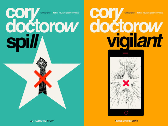
Tor Books as just published two new, free LITTLE BROTHER stories: VIGILANT, about creepy surveillance in distance education; and SPILL, about oil pipelines and indigenous landback.
If you'd like an essay-formatted version of this post to read or share, here's a link to it on pluralistic.net, my surveillance-free, ad-free, tracker-free blog:
https://pluralistic.net/2024/10/16/keep-it-really-simple-stupid/#read-receipts-are-you-kidding-me-seriously-fuck-that-noise
1K notes
·
View notes
Text
Parallels and contrasts between Stan and Bill in the new book and website
Aka miscellaneous thoughts that I'm too lazy to condense into something comprehensible– what you see is what you get folks! (Book stuff, DVD commentaries! The website that came out when I was trying to write this out and is now making me pull my hair out! But in like a good way? That god damn poem!)
not necessarily same coin stuff but I sure am thinking about it.
It’s been said that a large part of Ford’s relationships with Bill, Fiddleford and Dipper was him trying to fill a hole that his estrangement with Stan had left, with none of them clicking in that same way. Dipper was directly compared to Fiddleford as someone who was completely charmed by Ford but is ultimately too anxious of a person to properly deal with the life he's offering nor pull him back when he starts going too far. Meanwhile, Bill is more analogous to Stan but to the extreme with all the doubts that Ford had been fed about Stan (that he was using him, he never grew up, he betrayed him, sabotaged the machine on purpose) turning out to be exactly true with Bill.
The book has Bill saying flat out that Ford wanted the charisma Bill had and then shows that at the peak of Ford's loneliness he was being envious of Stan's charisma, social skills and hands.

[STANLEY COULD HAVE MADE HER LAUGH]
(There’s an irony that Stan always thought that Ford was the popular twin even after doing embarrassing stuff like the kissing machine – if you haven’t seen the Swine Before Time Stan commentary get going, it’s great)
Then Bill swoops in with jokes and endless encouragement and the nickname only Stan used for him, all this in a way tailored for Ford to immediately like him while also reminding him of Stan but "better."
(The show rarely used it but Bill’s use of Sixer is extremely frequent in Journal 3 alone but the comics solidify it as being a pretty personal childhood nickname that kid!Stan used as his default way to call Ford.)
And then you see all of this working because Ford straight up writes Bill’s words using Stan's handwriting (and it turns out that Ford’s capital letter ‘for emphasis/angry’ font in general is the same as Stan’s handwriting too)


(It’s important to note that this is different from all the fonts that Bill uses for himself!)
All of this leads to the deja vu of Ford getting stabbed in the back by someone he was codependent on over a machine he thought was going to change his life for the better
Other things in the book that I’ve seen others point out and noticed myself:
Bill trying to reinforce that Ford would be alone without him, and threatening to tell Stan that Ford never loved him but the first thing Stan does in his letter is tell Ford that he loves him with their childhood code
Stan also only uses ‘Sixer’ in his letter when he normally tends to use a mix of nicknames post-Weirdmaggedon (sure it’s only twice but idk I find it noticeable)
Stan ripped a dollar in half when Bill taunted the reader earlier about how they wouldn’t do that
The promo photo vs the one in the book, Ford’s face being untouched vs Stan’s. While I initially interpreted this as “Bill’s book being a way to torment Ford” and then “him ending up having a meltdown at the thought of Stan”, the new poem kinda gives off an ominous vibe of "him moving on to focus on Stan instead whether he wants to or not"


Ford writing “miss you” in the bro code soon after arriving at Backupsmore which is shown in the Fiddleford photo, then Bill taunting Ford that he misses him
Bill and Stan now have another parallel of losing everything because of a genuine mistake but only Stan was willing to work to make up for it while Bill doubled down and became far far worse
The utter hatred Bill has for Stan being able to win in the end and get back his family
Both of them being institutionalized, with Stan’s mentioned in Guide to Mystery and Nonstop Fun (which has references to Bill liking Mabel for her chaos, silly straws, etc. Also Dipper basically came up with the Author theory but slightly wrong from theorising about the ink blot like a year before the Ford reveal)

(saturn devouring his son perfectly depicts my emotions when reaching this part of the book)


(EDIT: I was thinking about how Bill giving Ford three days to open the portal striked me as odd for some reason... and then I remembered;
Stan gave Mabel 3 days for their bet as well. Both of them specifically say 72 hours too.)
And now for the stuff we know from the website:
Bill having severe family issues with daddy issues implied since only his mum is mentioned directly with her trying to comfort him as a kid vs Stan having severe family issues with a definite focus on his dad while his mum was the only one to ask about Stan during that meeting with the principal and her being the only one to show up to his funeral
Both of them wear their dad’s hat despite of all of this

Bill starting a billion cults and has a lawyer called Multilevel Mark, Stan having his Scientology-esque cult being shot down by irl Disney and as a kid having his “technically a pyramid scheme” comic being shot down by a publisher

(I doubt that Stanentology would’ve gotten far but also you can see that a trend that the main way Bill gathers followers is by reading minds and revealing secrets only the victim would know, so let's hope that Disney-let-him-start-a-cult AU Stan never gets mind reading abilities)
Despite how we know how Stan is traumatised as hell from losing Ford, it’s noticeably isn’t referred directly in the Wheel of Shame (like you can’t tell me that the time between pushing Ford into the portal and starting the Shack isn’t as rock bottom as it gets, Bill literally recognises Stan in the first place by thinking about his brand). This probably is because Bill knows that they managed to repair their relationship and he’s fucking pissed about it.
There's further parallels between Stanley and Bill in poem; with lies and redemption and home, and further association with fire for the both of them

“Saw his own dimension burn.
Misses home and can't return.”
“Always dragged his family down.
One mistake, disowned, denied,
Only thing to do was hide.”
“One way out: the open road.
Reinvent, retry, reload.
A girdle, eyepatch, fathers fez,
"I'm a new man!" so he says”
“One way to absolve his crime.
A different form, a different time”
“His big break, it finally came,
Redemption from a life of shame.”
“Says he's happy. He's a liar.”
“Truth is just whatever sells.
When you've lost track of your lies,”
“Lie until you aren’t lying anymore”

Bill in a rotting corpse of a snake oil salesman

This triangle can fit so much self-loathing projection while being a hater
(Also it's funny that Bill is so insistent that Ford had to be the one who came up with the plan
Like look at this


See ‘em cogs turning in Stan’s head while Ford has clearly given up hope)

“How dare he dress up fancy when his jokes suck!!”
There's a parallel of Ford projecting onto Dipper in a way that makes him feel like kindred spirits with his nephew but Stan projects on Dipper in a way that causes him to be more harsh even if he has good intentions. Meanwhile Bill projects onto Ford in a more positive light in comparison to Stan, who in this case Bill wants to rip him and himself into shreds whenever he thinks of the guy. Bill’s shared love for fun/chaos with Mabel (despite them being so different at their core) is why he likes her the most out of all the Pines but that doesn’t stop him from trying to murder her (although I think most folks don’t know about that interview where Alex was like “yeah, I think Bill would’ve burnt Ford alive the moment he got the equation, he’s done playing with his toys at that point”)
Other tidbits:
I find it interesting that the full version of the Wheel of Shame has blue sparks and fades to grey scale (which automatically reminded me of his mindscape)


Stan signing off as Stanley in the book – this ain’t anything huge to chew on I'm just very over emotional about this… but also there’s Bill being called Billy by his family/in the codes
Ford thinking of Stan as childish/someone who never grew up and then we get hit by “yeah Ford always had some part of himself stuck at 18” oof
Ford underestimating Stan’s control over the mindscape, not knowing that he’s able to hide memories in Dreamscaperers, manipulate the layout of his mindscape enough to trick Bill and memory!Stan telling Dipper how to use the mindscape which Bill was genuinely surprised by
I'm headcanoning that Stan doing so bad at that history test is due to some latent bs from what Bill knows which is all crazy conspiracy level stuff
I think it's also intensely funny that all of the Pines promise that they'll murder Bill if they ever see him again and then they immediately turn to Stan and go “now it's your turn to write a letter! :D!!”
(I feel like the main requirement that the Theraprism has for Bill before he can reincarnate is mainly acknowledging his family idk which honestly would fit even better if his soul becomes Stan’s)
EDIT: I FORGOT TO MENTION THE OUROBOROS PASSWORD (or... uh oroborous which is a typo when theres a suspicious amount on the site which may mean somethng but i digress) anyway that leads to the Shack Axolotl lore where it bluntly states that Ford released it despite it showing up 30 years later anyway
and theres....
#gravity falls#stanley pines#stan pines#bill cipher#ford pines#stanford pines#book of bill spoilers#same coin theory#i guess?#thisisnotawebsitedotcom#stan twins#two sides of the same dollar bill#gf meta
649 notes
·
View notes
Text

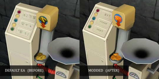
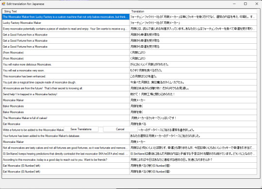
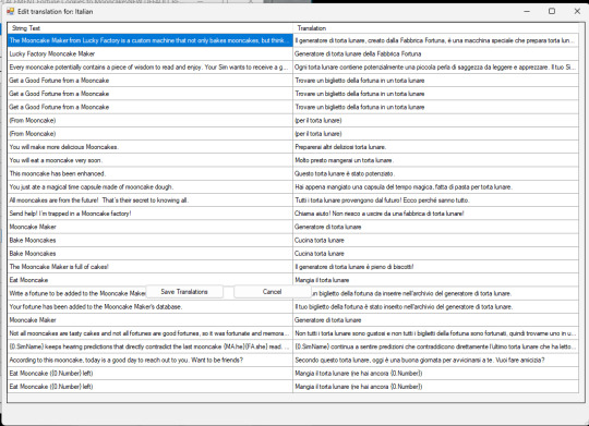
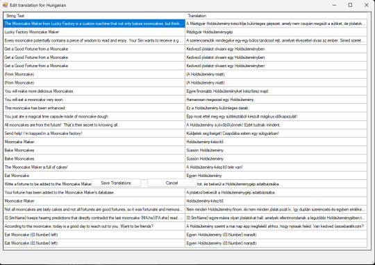
TS3 World Adventures - Mooncakes & Mooncake Machine Maker Remastered: Mooncake Mesh & Texture with Enhanced Graphics & Enabled to Buy Mode & Renamed Mod (All Languages) & Icons Replacement Mod
D E F A U L T R E P L A C E M E N T
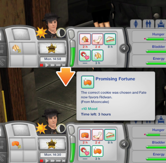
New custom Mooncake mesh & texture, to replace EA's "Fortune Cookies" machine maker and edible cake taken from machine maker with working Geostates & animation


EA's graphics from 512x512 with noise was enhanced to 1024x1024 with less noise and adding Simlish Hanzi to replace EA's "bad handwriting" texture on the machine maker. Click this picture below to enlarge.
Enabled to Buy Mode (Appliances > Miscellaneous Appliances), for easy access no need to type cheat "Buydebug" mode ever again.

STBL Renamed mod, from "Fortune Cookies" to "Mooncakes" translated to all languages.
月餅 (Yuèbǐng)= Moon Cake
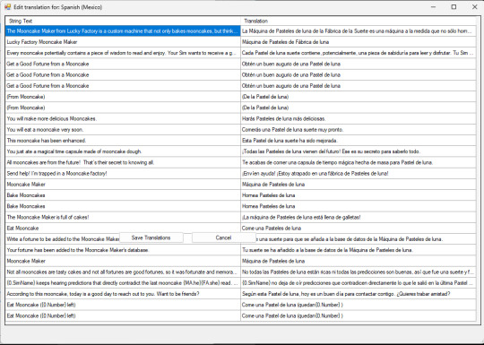
ⓘ For language translations except Chinese, I use online translator to change word "Fortune Cookies" ---> "Mooncakes" & "Mooncake" depending on singular and plural context. Feel free to correct in comment section if you feel the translation and the grammar is wrong or I accidentally deleted other word.


Icons changed from EA's Fortune Cookies to Mooncake

Reason why I made the change:
Because Shang Simla is taking place in China, not American Chinatown, thus the portrayal of the cookies should be authentic of actual China in real life, not American cookies that are foreign to actual Chinese people. Fortune Cookies are U.S.A.- made cookies: American invention originating in California. History of Fortune Cookies (source: fancyfortunecookies.com) Mooncakes are cakes originated from China, dates back over 3,000 years to ancient China. Mooncakes are a traditional treat during the Mid-Autumn Festival, which is celebrated on the 15th day of the eighth month of the lunar calendar.
Mooncakes are the must-eat Mid-Autumn food in China. They are a traditional Chinese pastry. Their round shape and sweet flavor symbolize completeness and sweetness. At the Mid-Autumn Festival, people eat mooncakes together with family, or present mooncakes to relatives or friends, to express their love and best wishes. Mooncakes are usually eaten after dinner while admiring the moon. History of Mooncakes in China... (source: chinahighlights.com) Fortune Cookies are made in USA and only exist in USA, but mistaken by USA people themselves as "Chinese" cookies just because the cookies are sold in American Chinese restaurant in USA. We actual Chinese live on our country have never seen Fortune Cookies, as we only know the presence of those cookies in Hollywood (U.S.A.) movies. Not just culture inaccuracy, I enabled this machine maker in Buy Mode section for easy access because this item must have been forgotten in the corner and only been played once when the player visit Shang Simla.
Colour & Presets: Same as original EA's: 3 Presets & original EA's Fortune Cookies Machine Maker colour channels.
How to Change Default EA's Fortune Cookies to Mooncake in Shang Simla world.
Fortune Cookies maker in Shang Simla doesn't automatically change to Mooncake due to different coding in-game.
❗You must buy Mooncake Machine Maker from Buy Mode (Appliances > Miscellaneous Appliances) to load the texture first, then travel to Shang Simla world, do "Reset Textures" using Nraas' Debug Enabler.
You need to install Nraas' Debug Enabler (Core mod by Twallan) in order to work correctly ❗
Follow these steps to reset textures:
Click on the Fortune Cookies Maker > Nraas > Debug Enabler > Options: Lucky Factory Mooncake Maker > Object… > Reset Textures > (Choose one) All Sims3.Gameplay.Objects.Appliances.FortuneCookieMaker or This Object
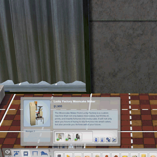
Requirement: World Adventures Expansion Pack
Thank you credits: - Simlish Hanzi: Komorebigo font by Deastrumquodvicis - Mooncake Vector: by Shutterstock - Mid-Autumn Festival Vector & Images by Freepik
Instance code compatibility: 0x010F16B00BA8342B

As usual, install one of these packages on Package folder. You can safely delete the package if you no longer want to use the default replacement.
[ Download Mooncake Machine Default Replacement ]
Language Translations: Click this picture below to enlarge.

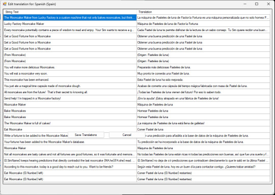
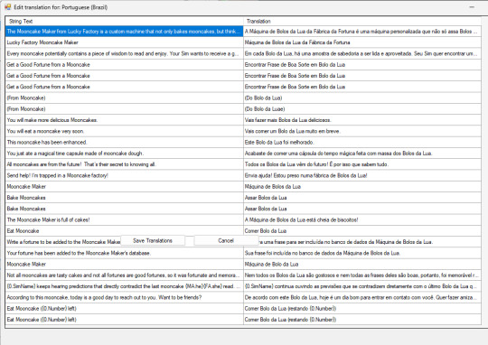

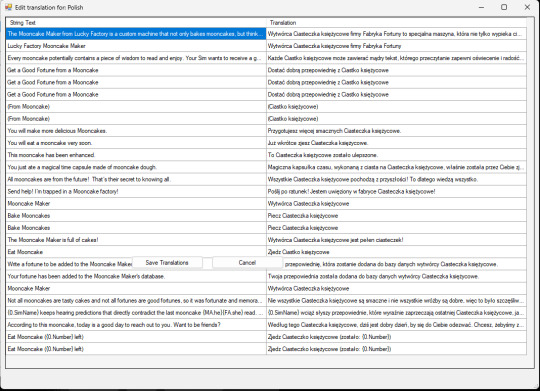


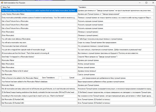


#EA The Sims 3 employees from San Francisco please do some research about Chinese culture from your fellow employees from EA Shanghai#ts3#ts3cc#ts3 mod#ts3 default replacement#ts3 chinese#the sims 3#tumblrts3cc#the sims 3 mod#ts3 asian#shang simla#ts3 world adventures#happy mid autumn festival#mooncakes#中秋節快樂#月餅#renamed mod#ts3 override mod#chinese culture
167 notes
·
View notes
Note
I LOVE this set and i was wondering if you could pls explain how you did the text, including how you added texture to the ripped text and the highlighting/circling/etc of words? thank you for posting your beautiful gifs 😊
thank you!! 🥺 & of course! (photopea tutorial)
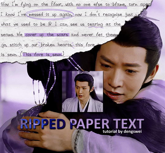
the majority of the texture for the ripped paper effect i can't really take credit for it's on the paper it's self all i did was make the paper white (because the texture was yellow) and used curves to darken the texture), i got the texture from one of photopea's templates but it seems their whole template section has changed drastically and no longer has like anything i used to see before ???? so i'll just share both versions here:
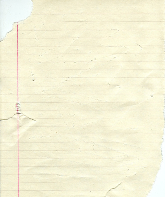
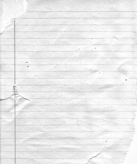
(original & my edited version)
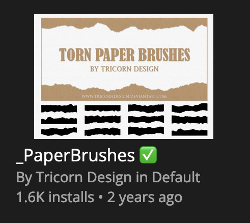
for the ripped parts i just played around with this brush set in the plugins
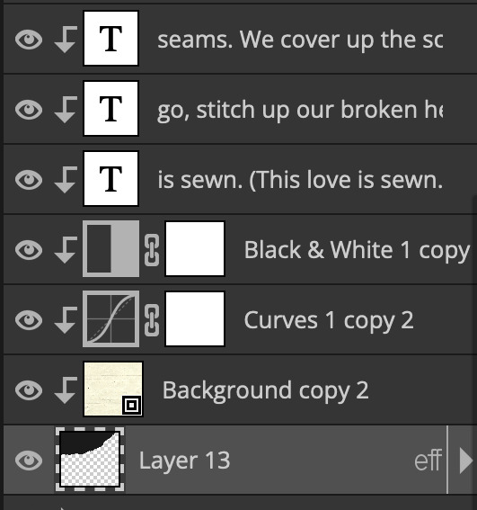
once i decided which of the paper brushes to use i had a new layer and used it where i wanted, so top left in the gif above, i clip masked the paper texture (and the adjustment layers as well) onto it so you get that ripped effect (if you don't like or want to add to that you can always use the brush tool again (or the erasure tool) set as the paper brush to add or remove sections i did this a lot when i realised certain words i wanted to show weren't on there (also changing the size of the paper brush when wanting to add a little bit or take a little bit away was a massive help)
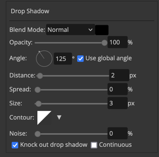
i also always add a drop shadow to my paper textures, the settings i used is mostly the same EXCEPT for the angle for all of the ripped paper (it's also my text drop shadow settings) because depending on how the ripped paper looks you might have to change the angle
also i know in the screenshot below it's on but make sure the use global angle is off if you're going to have multiple different angles of drop shadow in your one gif (so if you want your paper texture on 125° but anything else on 60° the global angle needs to be off but if you want them the same then you can keep that on, which is why it's on for me because the angle is the same for both the text & the ripped paper) (and by text this isn't the text on the ripped paper, there isn't any drop shadow on the text itself there, just to clarify this was for my "ripped paper text tutorial by dengswei" text)
as you can see i also clipped my "handwriting" text to the paper layer this is so it stayed on the paper rather then going onto the gif itself (and it saved the fiddly part of masking it away & it felt more authentic this way too)
i found for me it was easier to seperate the text line by line so i knew exactly which part of the text was on which and if i wanted to change anything either it being a typo, changing the paper texture, or wanting a different word on a different line it was easier that way because it didn't end up messing up all of the text (though you don't have to do it that way, it's just what worked for me here)
font i used was: vag-handwritten (a default photopea font)
all of the next part needs to be above the text on your ripped paper:
for the highlighting, circles, and the lines it's pretty much all the same, i chose the colour which matched the gif (so say purple), for the highlight used the rectangle select & colour fill tools and set that to multiply & then played around with opacity (for most of my highlighting it's set to 50%), for the circles it was the same except the circle shape tool (no fill just stroke) set to purple, set to multiply, with 100% opacity (i found the circles looked better with 100% on some gifs depending on what colour i used), & then duplicated it once or twice and then just moved each circle to where i thought it looked best & the double lines is also the same using the line tool, set to multiply, & playing around with the opacity, & positioning them where i like
for the squiggly lines, the hearts, the 3 small doodle lines at either side of a word, & any other doodles i had on there i doodled them myself with my drawing tablet (you probably don't have to use a drawing tablet i just found it easier that way) using the free pen tool and then did the same thing set it to multiply and played with the opacity
if the colour you choose looks too dark or too light with it set to multiply either try a lighter/darker colour, try out something else like lighten, or screen, or increase/decrease the opacity more (i found i had this issue with the yellow being hard to see on the white paper so i used a darker yellow and kept everything at 100% opacity rather than 50%)
hope that helps! and please if anything is confusing or you want to ask any more don't hesitate to ask i know i ramble on a bit and it can sometimes get a bit confusing 🤣 or if there was anything i missed feel free to ask again 🥰
#replies#edwinas#mine | tutorials#gifmakerresource#photopeablr#photopea tutorial#photopea tutorials#gif tutorial#gif tutorials#usergif#tutorial#tutorials#photopea has so many great default fonts i just spend hours searching through them i barely download fonts now 🤣#i hope i didn't miss anything#also i don't know why the paper textures & my screenshots posted this way i had them side by side#okay they're side by side on mobile but not desktop ??? but mobile doesn't have the read more okay
125 notes
·
View notes
Note
Hey so I'm not very tech savvy but I was wondering if adding random silly lines or just something that makes no sense between paragraphs/sentences on our fics can poison AI if the fics are scraped?? I tried something by adding some random lines with white text between paragraphs of my fic which don't show up on default ao3 mode but they are a part of the text nonetheless. Of course that'll involve more efforts on part of the writers to add lines and format the white text using html and workskins but if it does turn out to be effective it might make ao3 less lucrative for AI scraping if a major amount of works contain this and it'll make it harder for AI training. It does have drawbacks that it'll only work on default mode so anyone using dark skin on ao3 might have to switch to be able to read properly and it'll make works less accessible to readers who use text to audio if there are random lines in between but what other options are we left with if even archive locking our works doesn't work??
You absolutely could, but there are limitations to that.
For one, like you said, you're making your work inaccessible to certain readers. That's fully within your rights, though I think most of us strive not to exclude people using screen readers.
Second, from what I know, when you download a dataset like this and intend to use it to train an AI model, you first go through the dataset looking for obvious junk data and toss that out. So if you're putting something that is clearly not real fanfic in there, any decent data analyst is probably going to spot it and toss your fic. If that's your goal, that's a win for you. Personally, if I'm making the effort to inject poison data, my goal is to be included in the training data used so I can trash the model, so I don't want it to be obvious.
Third, I don't see anything explicitly in AO3's TOS against adding data poison in this way, but I don't see them endorsing doing that either. It feels like a grey area to me, and I'm not sure you're allowed to do it, so I am not recommending anyone do this. Rest of this post is theoretical.
So theoretically, how I would do it is putting the junk data at the end of the fic/chapter. Hide it like you're saying, by changing the font and/or background color of the section with CSS. Then put a nice, clear message right after the chapter ends and the junk data starts, something like, "Hey, readers! This chapter is over. Turn off your screen reader and move to the next chapter now." That gives your real humans a warning and stops them from being confused or wasting their time. Then dump your poison. You can also write something in the beginning A/N, I believe. I know this most recent scraper never ever pulled data from the author's notes, so the AI wouldn't see anything you put in that section.
Scrapers are typically pulling your work without the workskin enabled, so for formatting, you're really just trying to make it look nice for your real readers so they don't have to see your poison.
As far as actual poison, my suggestions:
Your own writing or writing you have explicit permission to use, so you're not breaking anyone's copyright. Easy mode: jumbled paragraphs of your own past works for any fandom except the one your current fic is for.
As mentioned above, don't put absolute nonsense in there. If it's bad enough, it'll be spotted and filtered out. Like, if it's not even real words, anyone feeding it to AI is probably going to catch that and toss your data out, excluding it from the model. It might be fine if it's all real words, but not in any sensible order. Not sure on that. But don't just insert keysmashes if you want your data to be used in the AI training.
Terrible crackfic would be good. So would writing for a completely different fandom and different tags. The writing should not fit well with the tags you use for the fics. (So if the real fic is tagged Fluff and Alternative Universe - Coffee Shop, your poison should not include that. Make the poison a hurt no comfort canon-compliant fic or something else different.)
Keep in mind you should not be putting E-rated data poison in a G-rated fic. Real humans may still see this no matter how much you hide it, particularly if they download a PDF copy of your fic. If it's content that requires a warning per AO3's rules (explicit content, graphic violence, etc), you do still have to tag for that, even if it's designed to be invisible to humans.
Use unique writing, so even if someone later using it for AI catches it once, they can't just search for the exact wording you used in one fic and easily filter out all the rest of your poison. Again, this is if you want to be included in the AI training to throw the model off.
Again, theoretically, if I were going to do this, this is the CSS code I might use for my poison section of the fic:
#workskin .fuckai { background: #333333; color: #333333; font-size: 1%; }
It would theoretically look like a weird grey gap to mobile users or be nearly invisible to desktop users, even if it contained, say... 1,000 additional words.
Finally, scrapers are trying to grab millions of fics from AO3 when they do it. They're not looking closely at 13 million fics. They're only searching for the most obvious junk. So the only reason you would want to hide it like that is to make a better experience for your real readers. You don't need to hide it to get it into a scraper's AI model.
38 notes
·
View notes
Text
custom font colors tutorial
note: this is for my bb @tobaccosunbxrst but also just wanted to post it to public for anyone curious on how to do custom fonts w html on tumblr. i originally made this tutorial privately for my mutual @certainlysyko so apologies for the silly choice of example text that i used lol. anyways.
so as we know, tumblr only has the following default color options for text:
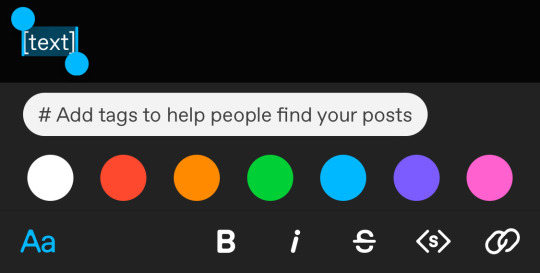
but what if we want some other cool colors like coral pink or cerulean blue or barf green?
to do custom fonts, it’s very simple, but it needs to be done on pc/laptop (cannot be done on app). we are going to start with a post:
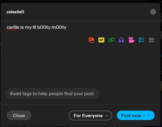
then, you’re just gonna change whatever word that you want the custom color for into one of the tumblr defaults. you do this by just selecting the text with your cursor and then tumblr’s default colors pop up. you can change into any of them, this just establishes the code in the html and makes it easy to spot
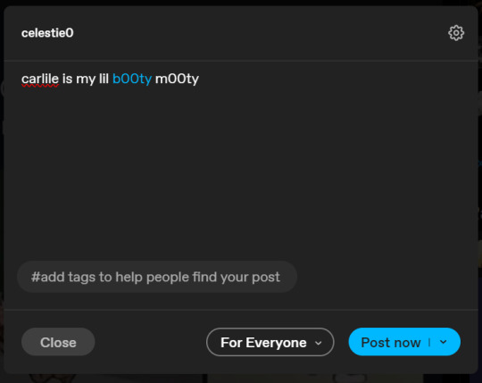
then you're going to go to the little settings thingy at the top right of the post (the settings wheel) and click on this drop down, then click on "html" which will switch it to html
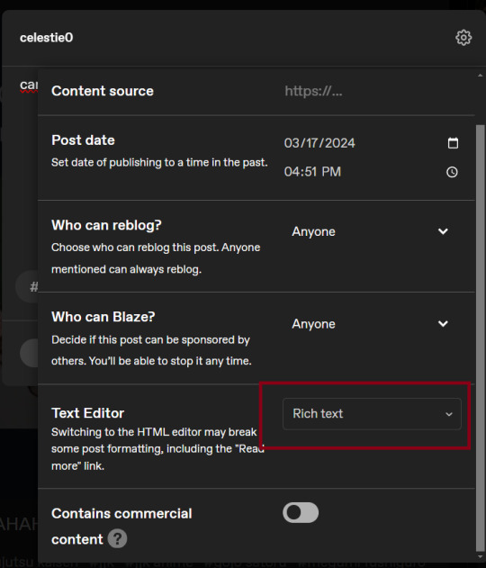
now it's in html. this looks very simple bc there is only one statement here. i’ll touch on how to deal with more lengthier blocks of html code later. but for now, note this section only:
<span class="npf_color_rachel">
this is ALL we need to work with in the code
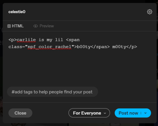
we're going to change it from
<span class="npf_color_rachel">
to
<span style="color: #[hex code]">
so, for example, something like
<span style="color: #81b7ce">
note. you can also just copy paste the lines above so you don’t have to type it out
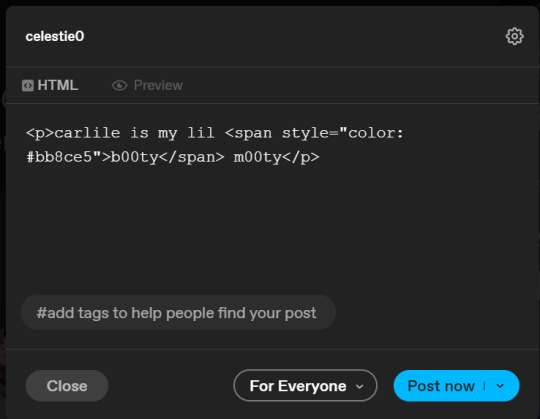
soooo all we did was delete the class=npf_color_rachel part and just replaced it with style=“color: #[hex code]
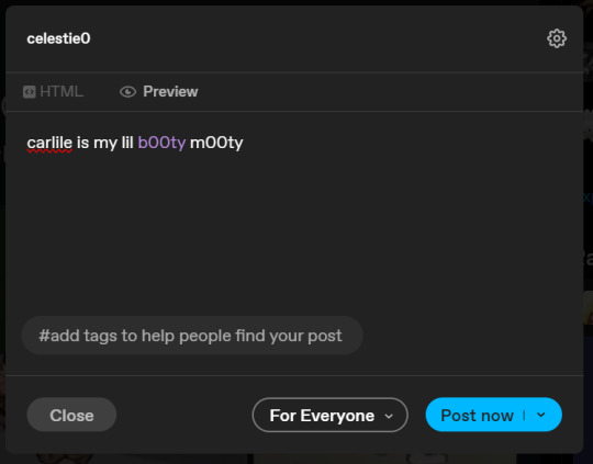
and here's the preview! all done :)
this is the website i use to find the hex codes. a hex code is basically those codes after the hashtag so like #81AACE (don't forget to input the hashtag)
now, for those lengthier posts i mentioned, you can use ctrl+f and search the word "color". it will show up any place on the post where you have a colored font (so do this after you’ve already changed all the places you want custom colors into default tumblr colors, like in the 1st step)
this way, you can easily find the places with <span blah blah> that you need to edit
here is an example of that in one of my posts:
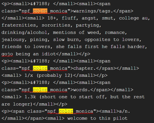
and yeah! that’s basically it. disclaimer, i’m not a software engineer nor so i know much about tech haha, this is just for tumblr aesthetics
alright peace out! 🧚♀️✨ hope this is helpful
#tumblr#tumblr tips#tumblr html#tumblr hacks#tumblr colors#html#tumblr custom colors#tumblr girls#custom colors#tumblr tutorial#custom colors tutorial#html tutorial#hacks
233 notes
·
View notes
Note
7, 27, 29!
7. your preferred writing fonts
the fonts i'm partial to change over time :) previously it was IM Fell DW Pica (still highly recommend for fantasy stuff). used Helvetica Neue for laid to rest bc i wanted something simple and not too distracting. now i've switched to ellipsus and i'm quite partial to their default font, Literata!
27. your favorite part of the writing process
oooh i gotta think about this one. i think my favorite part is first drafting, especially when i'm feeling the inspiration and the words are just flowing. i draft most of my fics on paper these days, and i always use pen to encourage myself to draft without making any edits.
29. how easy is it for you to come up with titles?
pretty difficult! i have such a love-hate relationship with titling things... they're so hard to come up with, but part of the reason they're difficult is that i always want the title to be Special. whether it's a clever double-meaning or a memorable phrase, i want the title to be notably connected to the plot & memorable.
i used to have a rule for myself that every title had to be some kind of pun or double-meaning, but i had to relax that rule when i started posting more short fics and there simply wasn't enough material to work with. i've used song lyrics or even plot descriptions (reunion and a terrible hug, for example) when i can't think of anything clever.
anywayyyy all this title talk made me want to talk about some of my favorite ones!! i put that under the cut bc this post is already long
Laid to Rest -> pun. "laid to rest" means dead but also the story is all about forsyth learning to rest physically
Double or Nothing -> pun. the fic is about a bi character and an aro character becoming friends. (this fic is one of my oldest ever and i forget it exists but still proud of that title)
Fifty Ways to Leave Your Lover -> song lyric title, and a joke: the plot is about characters trying to stage a fake breakup, but they can't agree on why they would have broken up
Lukas's Guide To Getting Into (and Subsequently Out Of) A Political Marriage -> i really like the excessively-long-title gag
Lucky (Or: A Recounting of the Events That Lead Joshua, Prince of Jehanna, to Kill the Demon King in Two Spectacular Blows) -> excessively long title gag part 2, but "Lucky" is also kind of a joke bc joshua has a gambling addiction
9 notes
·
View notes
Text
PGR Writing Game!
Pick a prompt and character of your choice and write it! There's no competing or any requirements to join, just write something!
Tag me, or use the #PGR writing game to participate! Time period is Aug 5th - November 1st
Further details and prompts (if you need them) below...
Info:
There is no specific trope or genre that you need to follow.
You can write whatever you want! Fluff, smut, action, horror, romance, whatever inspires you to write!
You can either post your work yourself, or submit a post!
Just make sure you give a pen name of some sort so I can credit you, otherwise I won't post it
Time frame is Aug 5th - November 1st
There is no word limit or requirement.
It can be 100 words, or 100,000. It's whatever you wanna write
You can post your work even if you're late
Struggling to write, or nervous about participating?
It can be hard to post your own work in fandom, maybe you don't feel like your work is "good enough" (there is no such thing, fandoms are community spaces, not corporate ones), or maybe you don't think anyone will like it.
Well, I've been there too! In fact, I think that all the time. Some things that have helped me keep posting my work despite that are...
Writing what you want to read
If you ever thought "I wish there was more X type fanfic", this is your sign! Writing what you want to read means you're passionate about it, and if you're passionate about what you're working on, it shows in your writing and other people will notice it too!
If you don't like what you've written, change it up!
Re-read what you've written and ask yourself "Would I read this?", "Would I enjoy it?", "Why, or why not?"
Identifying what's missing in your story will help you write with better direction. It could be as simple as adding more interesting and unique vocabulary, taking more time to describe scenarios or places to capture whatever vibes or feelings you want, or maybe adding something to the plot point.
Of course, these can be difficult to identify so you could try asking for help through the event tag, asking a friend, or asking me for help
What if people don't like it?
They can suck a dick. Okay, seriously though, most people won't do or say anything and if they do, I will eat them. You go post that lovely piece of art
My work isn't getting as much attention as X persons/Why aren't I getting a lot of notes?
Well, there can be a lot of reasons behind that. First and foremost, tags. Are you using all the tags that you could be? The PGR fandom is pretty niche in and of itself, so chances are that there a lot of people who would love to read some PGR fanfic, but they think the scene is dead and aren't looking for it, or they're only looking in the #pgr, #punishing gray raven, or #punishing: gray raven tags
Secondly, your font. Other fonts like
This
Or this
can be busy on the eyes which can make it both difficult to read and unappealing to look at it. Using the default font at a normal, or smaller size is generally your best bet.
Lastly, why is X person's work getting more attention than mine?
Like how writing is a hobby, so is reading. Some people may not have been interested at the time, or you just have to wait. Writing has the benefit of being pretty timeless, so that means people will come to read your work months or years after it's been posted.
It's also important to remember that PGR isn't a large fandom, so unlike other fan works on Tumblr, notes won't accumulate as quickly
Focus on your enjoyment of what you're making
Remember, fandom is a community space and this is a community event. You should be having fun, first and foremost
Everyone is scared
Everyone from a random blog who just posted their first writing ever, to your favorite author of several years with hundreds of works is scared of posting sometimes. It can be easy to fall into the pitfalls of thinking you're somehow annoying everyone in the fandom by posting a bunch of words, or being scared that a post won't do well. You're not alone in your paranoia, so try to be nice and encourage both yourself and others you see who might be struggling. You've got this!

Prompts:
You can write with any perspective or character(s) you want, I only have the "you" here to help you get immersed in the prompt. You may change the prompts as you like to fit your story telling.
The artificial sun of Babylonia's sky warms your skin. It's lively today, with children playing, couples shopping, and individuals heading for their morning coffee. You were no different, briskly walking towards a cafe you had agreed to meet someone.
You push the cafe door open and a bell chimes above you as you walk into the establishment. The golden rays of sunlight stream through the large, glass windows, cascading down on the patrons inside and giving the cafe a new sense of warmth. The aroma of freshly made coffee fills the air, pastries sit tantalizingly in the display cabinets, and a barista is busy making a drink behind the counter.
Just as you're about to step forward to the counter, the bell chimes behind you and you turn to see a familiar figure.
The Science Council is busy today, well- they're busy everyday, but today feels especially important. Scientists frantically type on their terminals, constructs and officers going in and out. Even Celica stopped by for a moment, hurriedly exchanging words and documents with Asimov before leaving just as fast. You tried asking what was going on, but everyone seemed too busy to talk to you. At that moment, Asimov walks up to you.
The scent of salt and water fills your lungs, sand shifting beneath your feet. You wander along the shoreline, various hopes and worries aimlessly run through your mind, coming and going as quickly as they came to you. You're so lost in thought that you didn't hear the soft crunches of sand coming up behind you.
The stars twinkled above you, cold wind rustling the trees and biting at your skin. You did your best to ignore the cold, after all, it was part of why you could travel without running into too many enemies on the way. Even still, the air held a strange tension, as if even the trees were holding their breaths, waiting for something, or someone.
The lounge felt uniquely quiet. That shouldn't be surprising, it was just you here right now, the other members of your squad were busy with their own duties at the moment. Even so, you couldn't help but feel a tinge of loneliness. Sighing, you stood up and wondered what you should do to occupy yourself. Should you clean and organize equipment? Maybe clean the lounge? Or...do something less productive? Look at old photos and logs, indulge in a private hobby? It has been a while since you found yourself with so much free time.
"Ah, there you are." Vonnegut's voice reverberates throughout the room, he speaks evenly, calmly, but you still feel the tension rise in your shoulders. A heavy gaze of displeasure and expectation weighing down your soul and keeping you from moving an inch.
Vonnegut sits on his throne, hands folded, legs crossed, golden mask and eyes glinting in the limited light.
"You've kept me waiting for quite a while."
You exhaled shakily, nervously readjusting your formal wear for the upteenth time. You could hear the cacophony of chattering voices, and clinking silver wear, occasionally cut through with the chime of a glass knocking against a plate through the other side of the door. You knew the moment you opened it, the sounds would become overwhelming, drowning out all personal thoughts and suffocating you.
Nevertheless, you couldn't linger in this dark, isolated hallway any longer than you already have.
The library was quiet as always, but it was even quieter now that the nighttime hours on Babylonia had begun. It was a perfect place to hide in solitude and wander in your thoughts, or even go through old memories of your life.
It felt eerie. The stained wallpaper, scattered furniture, broken windows with beams of moonlight streaming through. You had received a comms signal in this abandoned mansion, but now that you had stepped foot inside, it was gone. You walked quietly, keeping an eye out for any potential traps as you stepped through the halls. A creak of floorboards sounds above you, a door opens, footsteps...and silence. You froze, should you retreat? Call out? Try sending out a comms signal? Investigate? You chewed your bottom lip and as you're still deciding what to do, you hear another creak.
Right down the hallway.

31 notes
·
View notes
Note
Hello Krad. You are a massive inspiration to me, and I have adored your art ever since stumbling across it a couple of months ago. I have a love for early 2000's media, and was wondering if you could talk a bit about how making art around FE9's time was like! I would love to be able to recreate the aesthetic of games from around the early 2000's, they just have a unique atmosphere to me that I really love. Thank you in advance.
oh wow, you are so very kind to say so, and so eloquently! ;_;
early 2000's... now that was a special time. i think the biggest difference is how utterly small the world felt back then, online. limited.
i read a good article recently how portal (and the infamous 'the cake is a lie' meme) percolated in a very specific time of the internet where people across the globe were just getting online in larger waves than the true diehard nerds and outcasts before, but it was still absurdly cozy. that meme went viral across the entire internet in a way that i truly don't think could ever happen again, since everyone was figuratively rubbing shoulders with each other - shoot, even 2010-era tumblr? i knew everyone in the main #fireemblem tag.
media limitations were remarkably similar - most teens had maybe seen all but two classic anime series before getting online, especially if you were out in the rural areas / on the east coast versus the west where the hot anime was being bootlegg'd before youtube was a thing. seeing a new series or getting your hands on the truly quality titles was more precious than diamonds. you were obsessed with the same show for genuine decades.
deviantART (where i was right before then) was a unique incubator similar to that - where young teens were getting influenced for the first time by art styles, resources and inspiration that their parents, teachers, and grandparents steeped in local visual traditions could not dream of. people arrived with very strikingly specific art styles you could tell who was raised in korea, russia, france, etc very easily - just as easily as you could tell who spent decades in ff7 fen versus naruto.
occasionally clumsy were those first attempts. but the drawings were genuine, and it was the next chapter in a very interesting visual dialogue between the old guard of illustrators (who only drew physically and were trained in local painting and inking traditions) and the new crop of teens hungry for the taste of dynamism and emotion they had seen in animanga. hungry to mix and match.
it was also truly a bridge from the tactile-first world to the digital-first world. nowadays like microplastics - you really can't go anywhere without running into a toy or trend or game or a drawing that hasn't been influenced to some degree by a dozen different other digital ideas before it reached you-the viewer.
in a way, since you're talking about recreating aesthetics, let's go back to the "limited" word.
limited is a good concept.
some of the best art i've seen consistently uses limitations. limitations of only using one medium, only using three default tools in your painting software (like dodge and burn since digital brushes were either crude or nonexistent). pull up programs like the Gimp (it's what I used back then for forum signatures and hasn't changed all that much) - limit yourself with specific tools of that era. look at isutoshi's hentai from about then (if that's within your bandwidth) and notice all the comic sans fonts everywhere-since nobody had gotten around to making specific manga fonts. limit yourself to being inspired by one or two artists from the 80's.
those limitations and patiently asking why (like you're doing now) will get you so very far ~
#not art#humorously related: whoever called sephiroth the sans of 2001 aged me like twenty years (but accurate)
23 notes
·
View notes
Text

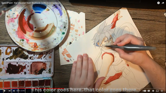
Please watch the IMPROVED version of my Kai video!
I'm putting photos here instead of the video. Please click on this link to see the video! If I put the video on tumblr, and people watch it on here, it looks like it doesn't count towards my views on youtube!
I reuploaded the Kai painting video with the HUGE addition of audio commentary, which was very daunting! Please watch and give me some encouragement!
This video took me 3-4 hours to put together, and I had to do it all in one sitting, since the free version of ClipChamp doesn't let me save my progress before exporting the final video file. After importing the videos from my phone and putting them together, I decided to use Sound Recorder for the first time. I was very nervous and realized I had no idea how to talk during these videos. The problem wasn't so much what to say but how to say it. I quickly realized my intonation sounded like I was unenthusiastically reading a powerpoint for a class. I want to figure out how to make myself sound more natural. I'll probably experiment with my tone through my videos. For this, I decided to talk softly and steadily and tried not to sound too nervous. I almost felt like I was voice acting. I want to find the right voice for my videos. I like my voice a lot, but it's a complicated instrument. After a lot of trial and error, I think these recordings turned out okay. After adding audio, I decided my voice needed closed captions, since I'm so quiet and stumbled on my words a little. This was a tricky procedure, as the text had a lot of defaults that I couldn't change. This meant that for every sentence I added, I had to adjust the size, placement, and color of the font. It was a lot of tedious work. Despite that, I'm happy with how this turned out. I imagine it will get easier as it goes on. I want to find a way to improve the lighting, either in the room where I'm recording, on my camera, or digitally after uploading. I tried adjusting the hue of the video clips, but it just turns out a weird blue-ish color rather than making the paper look white. The yellow tint at least has a nice warm sunlight feel. If you like my videos, please subscribe! Please consider supporting me with a "coffee" on ko-fi.com/idrawprettyboys or subscribing to patreon.com/idrawprettyboys Thank you for your time!
41 notes
·
View notes
Note
sorry i couldn't find out how to ask on your other blog.
that book binding you posted is gorgeous btw !!
I noticed that in one of the photos you included the disclaimer that you also edited it. I just had a question about how you formatted the text.
one of my biggest gripes with AO3 is text formatting (i often feel like i'm reading a legal document vs a novel/story) . Did you change how it is formatted on AO3 compared to printed?
I feel like i'm in the 0.5% that hate AO3 formatting but i thought i might as well ask in case you have any tips for that. >,>
(also how do you decide on the page size, do you just choose a standard size for all your projects? or do you vary it depending on what you are binding?)
thanks so much for taking the time to answer and for sharing your projects :) !!!!!!!!!!!
hey anon! I have asks turned off for the sideblog, but happy to answer here. Thanks very much!
I'm taking this opportunity to info-dump and link a lot of resources. I think they're useful for people new to either typesetting or bookbinding, but not all are directly related to your queries. That said, hope this is of use!
one of my biggest gripes with AO3 is text formatting (i often feel like i'm reading a legal document vs a novel/story) . Did you change how it is formatted on AO3 compared to printed?
I do a fair bit of editing when I'm binding a fic; typesetting is often the longest part of the process. Your mileage will vary depending on your experience with using word processor software, particularly the paragraph style and page style settings. Another factor is how simple/complicated you want your typeset to look. Replicating a published novel in format is difficult but learnable for a complete beginner.
I'm not equipped to give a full tutorial on how to typeset, but I'll point you towards some useful resources for ficbinding then talk about my own process.
ArmouredSuperHeavy has a tutorial on how to make Ao3's HTML downloads into a printable book in Microsoft Word. I use LibreOffice Writer myself, so this adaptation of the same tutorial is what I follow. Both are very helpful to reference as you're learning the typesetting ropes.
Personally, I don't mess around with HTML. I find it easiest to start by doing a Ctrl+A copy of the Entire Work fic view on Ao3 then pasting that into my word processor. This video tutorial by Beautifully Bound runs through how to do this in Microsoft Word using an AO3 fic as an example, including the associated steps needed to make the fic look novel-like. This is probably the best tutorial to address your gripe with AO3 formatting. Other than that, I'd recommend looking into videos or tutorials about typesetting novels for print. Same idea, and you may get more hits than searching for fanbind/ficbind typesetting tutorials.
More under the cut! Once I start yapping, it's hard to shut me up 🤷♀️
As a point of comparison, here's one of my fics on Ao3 and the corresponding typeset side by side:


Beautifully Bound explains this in far better detail than I will, but off the top of my head, the steps involved:
making a new document and setting the default page size to whatever size I want the book's pages to be (A5 or A6 usually). You can also set the margins at this point, taking account of your printer settings.
CTRL+A and copying the entire work's text on AO3 then pasting it into the document.
removing all hyperlinks and AO3 frontmatter, things like the author tags, summary, notes, etc as well as any website text that got copied over alongside the fic.
(optional) running a spell check and ensuring grammar usage is consistent. For me that's substituting em dashes for hyphens between clauses, enforcing curly double quotation marks for dialogue, etc. LibreOffice Writer automates a lot of this with customisable settings, via Tools -> Auto-Correct. Here's also where to make sure character names are all spelled right, convert the text to or from US to UK English, etc.
picking out fonts for the body text, headers, page numbers, etc. This is where you'll want to use paragraph style settings. Page style settings also comes in clutch if, for example, you'd like different headers on alternating pages. I like having the author on the right, the fic title on the left.
setting the body text first line indent to whatever makes sense visually). This in particular helps make the fic feel more like a novel. You can also play around with line spacing and space between paragraphs at this stage. For this A6 typeset, I had a 0.75cm first line indent, 1.15 line spacing, and 0.15 spacing between paragraphs.
(optional) formatting the first line of the work to use small capitals and to add a drop caps to the first letter of the first word. Again, this is a convention in publishing which add a novel-like feeling to a printed fanwork.
Inserting page numbers, adding images, coming up with how I wanted the "copyright" page to look—optional for the most part, but these are details that make a fic appear more like a novel.
For multi-chapter works, there's extra work in formatting chapter titles as headings so that they're referenced correctly in the automatic table of contents word processors can generate.
Once you have a typeset you're happy with, and if you're considering printing and binding it as a book, then you'll need to look into how to create and print signatures. Personally, this is something I had to actually try (and mess up a bunch of times) before I got to grips with it. Understanding how both your printer and your PDF reader work, particularly printer margins and booklet print settings, is key.
I won't go into as much detail on this, but if it's something you have an interest in, I'd recommend starting with DAS Bookbinding's tutorial. DAS has tutorials for everything bookbinding related so when in doubt, check his channel! Plenty of other YouTubers also have good videos on making signatures.
This resource is extremely useful once you've got your head around how to print signatures manually, so here's a link for anyone in that space: GitHub Bookbinding Imposer. Essentially, this does the signature creation for you, removing the need for booklet print settings in your PDF reader.
also how do you decide on the page size, do you just choose a standard size for all your projects? or do you vary it depending on what you are binding?
I have access to both A4 and A5 sized paper and my printer can handle printing on either size. In bookbinding, normally two pages are printed per side of the paper (which are then folded in half as part of a signature). That is, when I print on A4 paper, it's to make an A5 sized book. Printing on A5 paper will yield an A6 sized book.
Before I begin typesetting, I'll usually know what paper I plan to use, so the typeset will be one size down from the paper. So far, I've made softcover pamphlets at A6 size and casebound books in A5. No real method of choice for me, it's whatever I feel most suits the project.
---
If you made it this far anon, thanks for reading! Here's links to a few general resources if bookbinding is something you'd like to explore more:
DAS Bookbinding (YouTube, bookbinding in all forms)
Sea Lemon DIY (YouTube, bookbinding and other crafts)
bitter melon bindery (YouTube, bookbinding, particularly beginner friendly!)
Jess Less (YouTube, demonstrations of fanbinding and re-binding existing novels)
Papercraft Panda (blog, lots of detailed tutorial on bookbinding)
Renegade Bookbinding Guild (collective and website, loads of fanbinding-specific resources from their members and they have a helpful Discord).
24 notes
·
View notes
Text
7 Writing Tips From An Amateur Writer
Let’s get to the point: I’m an amateur writer. I am unqualified to give professional advice on the art of storytelling, grammar, or syntax. My only published work is a letter to the editor from the newspaper. Writing advice comes better from proofreaders, editors, published authors, and English majors.
On the other hand, my experience as an amateur is filled with wisdom. I learned to write as I wrote unintended novellas and short stories, watching YouTube videos from other published authors, and editing my manuscripts with the tips I found online. By learning how to write, I learned other writing-related skills to improve my craft.
In this blog post, I have 7 writing tips for amateurs, by an amateur writer. Most of them came from my own experimentation and thought processes, others are adapted from non-writing related ideas on the Internet.
Focus on your own path. This is one of the most important writing tips, because people often get caught up in what others do, to the point where they forget about their own craft. The phenomenon of “comparisonitis” can leave us feeling drained after spending time comparing ourselves to other writers.
When you read a novel, keep in mind it has been edited to be neat and organized. When you see another amateur with a high word count on their NaNoWriMo novel, keep in mind you have different circumstances than them. Create your own goals and stick with them, making sure they are tailored to your own needs!
Write with quality in mind. Before I decided I wanted to write as a hobby, my “chapter books” ranged from 10 to 20 pages. When writing became my biggest passion in life, my first draft of Secrets came out as 60 pages. For reference, a page in Microsoft Word or Google Docs is usually 400 words long with the default font.
These stories helped me form an understanding of outlining, plotting, and character creation. Without these stories, I would not know how to develop my characters throughout the story and move the plot.
This is why I do not recommend for beginners to try NaNoWriMo when they recognize their passion. The focus on the 50,000 word count creates a heightened importance of words while putting plot development, setting, and characters on the back burner. However, that’s a topic for November.
Writing will not always be enjoyable. Writing is one of my favourite hobbies. Writing in my diary helps relax me after a stressful day. I vent my emotions and frustrations through my characters, reflecting my personality onto them. I care about my craft deeply, more so when the words flow smoothly. However, the words will not always be smooth.
Sometimes, it will frustrate you to fill a plot hole. Editing can be mind numbingly boring. Writing can sometimes leave you with anxiety, wondering if it is something you truly want to pursue. Writing will not always come easily. If you love writing, it is worth keeping around when it gets difficult.
Do not edit while writing a chapter. When it comes to writing, it is better to write out everything instead of pressing “backspace” every time you believe something sounds weird. Finish writing the chapter, or any chunk of writing, then go back and review it. As long as you are writing with an erasable object, you can always go back and change what your past self has written.
Back in my elementary school days, I overheard two fellow writers speaking about this issue, discussing how they always went to edit after writing a chapter. Remember: you do not need to edit a chapter after you have written it. Many authors on Authortube will recommend waiting a week to two months, or after the whole draft has been written. Personally, I choose not to edit after the draft is finally finished, and my waiting time depends on the piece of work.
Join a community of writers. This can be done through clubs at schools, social media, or online chat rooms. You can either be interacting often, or lurking. This will keep your brain in the mindset of “writing” and remind you of your craft. It can help you learn more about the craft of writing through simple conversations. This can help you make connections to other authors as well as potential beta readers.
When you are in a community, remember to be civil. Keep an open mind and give constructive criticism when wanted. If you make a mistake, apologize and move on from it.
Balance reading and writing. If you have looked online for writing advice, you know people recommend reading as a way to get better at writing. I agree with this, because it can help a young writer come up with ideas and understand how to write.
Before I started to write, I read voraciously. The reason I know so many dialogue tags is because of the Abby Hayes series by Anne Mazer. When I started writing more often, many of my ideas for Secrets came from the book Masterminds by Gordon Korman. If you read, you may start absorbing ideas from other authors and colliding them together to create your own, unique masterpiece.
And finally, enter a writing contest once you have developed your skills. As of January, I have never entered a writing contest. In fact, I never thought my writing would be worthy of a writing contest. After spending 5 years improving my craft, I am confident in my writing for it to be judged.
Winning isn’t everything in life, but preparing to win is important. If you decide to start publishing your novels, entering a writing contest will encourage you to edit and proofread your submission, making sure it is as perfect as possible.
A quick search for “creative writing contests” can bring quick results. If you are Canadian, CBC is an invaluable resource for writing contests. Wattpad has writing contests as well. These will be linked at the end of the article.
These 7 tips are unrelated to setting, character development, and plotting. Still, they are an important part of the writing journey. They all came from what helped me learn to write, and what I believe will benefit other amateur writers.
Does anyone else have any other advice to share? Let me, and others, know in the comments below. All advice and friendly debate is appreciated!
CBC Literary Prizes A Guide To Writing Prizes For Young Canadians | CBC Books Writing Contests On Wattpad
Wattpad Contests | Ambassadors
#writing#writing advice#writing tip#writing tips#writers#on writing#tip#tips#writers on tumblr#writerscommunity#7 tips#amateur writer#aspiring author#this was written a good few years ago don't judge me#still applies now#still an amateur i promise
12 notes
·
View notes
Note
aliens’ aesthetic ranking
let's take it as read I have no taste. I also barely know what the word aesthetics means. I'm including a broad range of attributes like recognisable symbols, liveries + helmets, distinctiveness... recurring motifs, brand consistency, general vibes. what sponsors they happened to have and how they looked. personal bugbears like on-track recognisability (?). amount of variability. fun
1. valentino
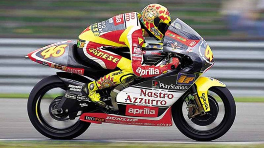
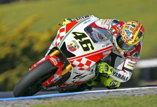
this list does mostly reflect the philosophy of 'more is better'. pure maximalism. I also don't really care as much about whether things look 'good' or 'bad' but whether they are funny to me personally. valentino kind of clinches the first spot by default because he is just unambiguously doing the most. I'll say it: I like the yellow. I like the muted nice yellow he used to feature more and I like the fluorescent eyesore. it's bright and vivid and iconic and just kind of fun. AND it generally made him very easy to spot on the track, which is SUCH a plus point to me given how many races I've watched with him in them. it's probably for the best that in his actual career, valentino was generally shackled to having another base colour for him to then put yellow highlights on (rather than going full yellow) - and obviously the best combination here was all the yamaha stuff. objectively pleasing
he's gone through a lot of different eras and has a lot of different Bits. haircuts, symbolism, styling, fonts. (note: hair is something I am only mentioning with valentino because quite frankly it's not worth bringing up for any of the others, except maybe jorge. the other ones just kinda have 'generic men's haircuts' for the most part.) the rossifumi thing was cute, the lesbian era was strong, I like when he got plot significant haircuts (2003 brno hair dyeing which the commentators speculated were mind games, 2004 complete change-up of his look with the substantive curls, 2008 'time to get serious' buzz cut). 'the doctor' styling also personally works for me and the colourful font is fun. a lot of his styling until about the mid noughties was very children's cartoon in a way that didn't ALWAYS appeal to me but like. I love the Muchness of it. I love when valentino had two horrendously clashing shades of yellow during his nastro azurro honda days. the dumb 'WLF' stuff, with the W to escape sanction. baby's first counterculture. I love the turtles!! like the misano 2015 fish, there's just that slight self-effacing irony of you know... with the turtle, he's associating himself with a slow animal and it's got a cute story attached and he's got that dumb tattoo, it's all just got a fun vibe to it. all these stickers he's got on his bike with all his different lil symbols. there's an adolescent charm to a lot of valentino's branding that just adds to his appeal, like I want to roll my eyes over it in a vaguely fond way

plus he had a bunch of banger liveries and special helmets, that weren't part of his consistent 'aesthetic' per se but did just add to his general vibe and charm. I think probably my favourite very valentino-esque special liveries are valencia 2003 (incidentally the best the yellow has ever worked with the repsol orange), assen 2007, and catalunya 2008. for the special helmets, my personal faves off the top of my head are... mugello 2011 eyeball, misano 2020 viagra, mugello 2008 scream, mugello 2010 joker, misano 2013 'wish you were here', misano 2015 shark, misano 2010 clock. it's a good set
and I like the sun and the moon stuff!! cute bit of basic symbolism, it's fun and it's spawned a lot of lovely designs over the years. I don't MASSIVELY mind the minimalism that's crept into the picture here with some of these: I can admit that some of the simpler designs are quite nice... shout out to 2007 where you can kinda get into fun symbolism territory depending on whose perspective is foregrounded in photos

ymbolism goes brr. valentino also had a similar design around 2018-19 which was quite nice and classy, the black yamaha of 2019 worked well with it. but generally speaking I do prefer when the sun and the moon were a bit less minimalist and had more stuff going on, especially when they had faces. mostly a thing in his 125cc-250cc days, early 500cc. also no faces but one of the nicest sun + moon designs is what he was sporting in phillip island 2007
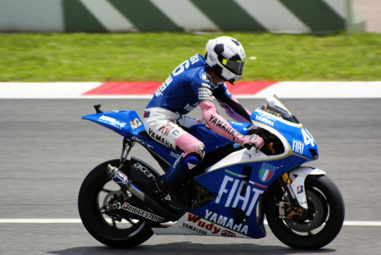
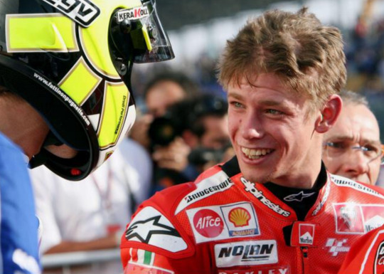
anyway. look. we could stick with this one for a while because obviously valentino had so so so much going on aesthetic-wise. I haven't even mentioned him doing his semi-regular doctor drag, how various celebrations played into his wider aesthetic sense, the chicken thing... there's a lot to get into here, way more than with the others, so I'm cutting myself off here for a general assessment. the whole aesthetic's recognisable + distinctive, there's a bunch of different fun recurring motifs, but there's also enough diversity of looks to keep things fresh. obviously they don't all work for me... I don't actually mind the ones that are just aggressively poor taste, like for instance the current vr46 livery makes me laugh every time I see it, I dislike valentino's output more when it's just a bit drab. 2002 'just some guy' era was kinda painful, the yellow plus repsol just... did not really work and he looked like Just Some Guy. also, while casey's little 'yellow has CORRUPTED the BRAND' bit is obviously silly, I will agree with him that the ducati era just did not work for valentino on any level. I don't even like the shade of the ducati back then, like it's just not red enough. troubling haircut situation. but to me those are the two main rough patches. I am pro buzz cut and I am pro sleazy sideburns and I am pro clashing shades of yellow. it's all good
2. jorge
given my previous position on maximalism, it shouldn't be a surprise that second place goes to the rider who has been doing the second most aesthetically. obviously this also existed in this fun space where it was... kinda inspired by valentino, kinda not... is he copying valentino or doing his own thing... trying to establish his own identity... I also unironically adore that a fair share of the jorge stuff makes a part of my soul cringe. I am thinking first and foremost of 'lorenzo's land', which I adore mainly because of how determinedly he stuck with that schtick over the years. look at him claiming his territory. dumbass
I feel similarly about the jump he does on the podiums, though I will say I am continually impressed how much elevation he achieved without ever fucking up the landing. I have to say I reckon I would have fallen off the podium at least once, not least because I can imagine riding a motorcycle for fifty minutes doesn't do great things for your sense of balance when you're walking again
the other big thing he had going on was the x-fuera thing, as is visible on the lorenzo's land logo and many of his helmets. I really like this!! it's original, it's a way of paying homage to his first victory (where he overtook the other riders 'around the outside', aka por fuera). my only mild quibble is I think it would've been good for him to... uh, how do I put this delicately. he should've overtaken more riders around the outside. like it's tough to do in motogp (though ironically the best overtake he's ever been involved in is casey overtaking him around the outside at laguna 2011) but idk. just my personal note. 2003 was a long time ago
then there's the glorious time in which chupa chups was sponsoring him (came back in 2019 for one more go) as the big sponsor on his helmet AND he was always sucking on a lollipop on podiums. which just added so so so much to his annoying brat energy and is infinitely superior to everyone having to hold those bloody energy drink cans these days. this to me is where capitalism peaked

another motif that's quite nice is the shark one which... this might have just been because he switched to a helmet company literally called 'shark' in 2016. though there was something quite nice and fitting about it, given that... I'm not 100% sure on this, but I think the first time anyone associated jorge with sharks was when valentino did his misano 2015 helmet design portraying jorge as the big bad shark? so as a fan of that particular dynamic, obviously I think it's very cute jorge leaned into this. then again, the shark was never a massive part of his branding, otherwise acosta presumably wouldn't have been so ready to nick it
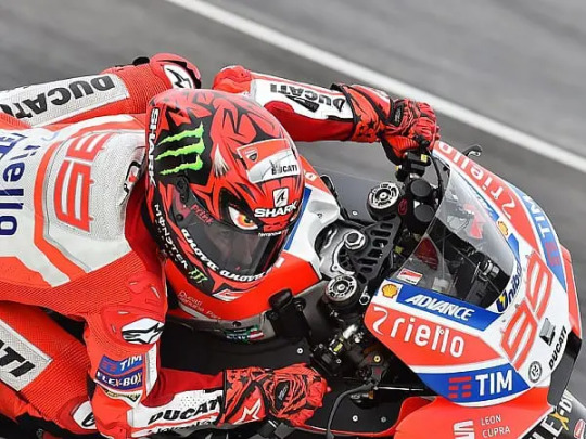
in general, obviously jorge was another rider who like valentino took his branding very seriously - partly of course precisely because he'd watched how much valentino got out of it. he liked his symbolism, he associated a lot of meaning with replacing his '48' with the '99' in 2009, he put plenty of thought into this stuff. the lorenzo's land thing was part of him getting more into the spirit of celebrations generally in 2007, proper set pieces in the valentino mould. now obviously we're not going to go through those here, just like with valentino, but I do want to give a shout out to jorge's thing for body doubles. idk how I'd describe the 'aesthetics' of this beyond 'we don't have time to unpick all that', but it is a bit of a motif 2 me
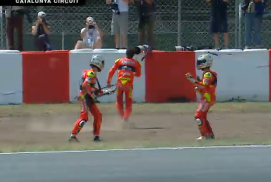
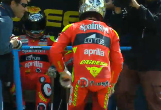
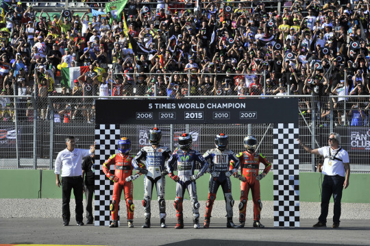
and then, of course, there's the whole angel/devil thing he had going on. like the sun/moon stuff for valentino, this is all very basic dualism, the competitor who's both a good and a bad guy, bastard on track etc etc but like... it works, it's quite flexible, it's a nice design with the 99, no complaints. I also like that he changed it up for 2017 and was willing to have a bit of an aesthetic switch up when the time was right *squints at certain names further down this list* when he went for a two devils approach and ditched the angel
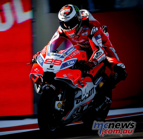
and the last thing I want to give him a shout out for - being a yamaha rider who decided in 2008 that he was going to have a highlight colour and that highlight colour was going to be Red. this counts as aesthetics to me.... I like his 2009 era asymmetric red/white shin area padding, but what I like most about it is that it is visibly very different from yellow. it means that despite jorge and valentino regularly fighting on the track (I mean not really given what the alien era was like but pretend they did) and riding for the same team, they were easily distinguishable at all times. it makes a difference!! good job for both of them!! hall of shame here goes to sete/valentino, who in 2004-05 rode for completely different manufacturers and were somehow still a nightmare to distinguish (even funnier because vale's 2004 literal teammate had a red livery). there's been plenty of teammates who are way too tricky to tell apart and we're heading for that situation again this year. but valentino and jorge were truly the platonic ideal for being easily distinguishable teammates. bless them
3. marc
confession time: I don't really like the repsol honda colours. I mean, first off, I think it suffers from overexposure. the liveries from like... 2003 to 2023 fundamentally look too similar to each other. maybe this is unfair because I don't judge yamaha from going from 'blue' in 2003 to 'still blue' now, but those liveries have changed more over the years!! google 2004 yamaha, 2010 yamaha and 2020 yamaha, like they've stagnated a bit in recent years but generally there's way more willingness to try out some different stuff. even ducati, whose only concept is 'what if a bike were red', has managed to change things up more. with honda... it's just that particular combination of orange and white and slightly darker orange that I have seen too much of by now. you'll note that I included valentino's 2003 valencia livery above, which to me is a glimpse into a better, kinder timeline where honda allowed itself to explore alternative ideas for what one can do with the colour orange. now I imagine repsol didn't want too much change for brand integrity reasons, but quite frankly I do not care. change your fucking livery, you guys win WAY too much to be this creatively bankrupt. also, would it kill you to rustle up a special livery? they genuinely did a great job when they had a gun to their head last year silverstone (albeit by reworking a livery from back when they had interesting liveries) so apparently it's possible. come on
the reason I bring this up here is that marc's aesthetics have been so synonymous with honda for so long that like... when I close my eyes and picture 'marc marquez aesthetic', I do see a respol honda bike. which in a way isn't ideal because obviously there are quite a lot of other honda riders, including literally every other rider on this list. but like... he was synonymous with the brand for a long while there. so it is worth mentioning that I don't particularly like the brand. I have nothing against orange, I think orange is a perfectly nice colour. I am sick of seeing repsol orange. it also doesn't help that marc's OTHER brand he's synonymous with is RED BULL which is like... listen, I don't HATE the red bull branding per se, I regularly see photos of laguna seca where it's got the bulls painted in big on things in the background and I go 'huh that actually looks quite good'. but this is another one where in motorsports, I think we've all seen more than enough red bull branding. and (prior to this year) it's just so bloody prominent on all of marc's stuff
obviously the main thing marc has got going for him in terms of recognisable symbolism is the ant thing. he's also got a thunder-related nickname but like... he's never really leaned into it as far as I can remember, so it's a bit of a dud to me. the ant stuff is nice!! it's got the same basic appeal as the turtle thing in terms of 'imagine if a non-threatening thing were actually winning everything'. it plays into marc's whole thing of emphasising how short he is, which I always found kinda funny given he spent much of his premier class stint with the one teammate he was decisively taller than. and also like... there's really only one alien who has more than two cm on him, plus he's taller than dovi. but it's still His Thing and I support riders having Things. when you google 'marc marquez ant', you get this --
-- which I quite like but also... does he ever actually use this? has he ever worn anything with this logo? I would support it if he did, but also this seems more of a fan thing than it does a marc thing. which to me is a shame. but in the spirit of brand integrity, I do support the actual ant helmets he's sported over the years. generally quite classy with colours that compliment the horrendously familiar repsol colours well

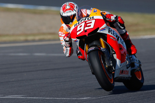
idk I don't have much to say about these. they look nice. I don't need every rider to go all in on the cutesy cartoon style, though I wish marc did SOME other stuff with the whole ant thing. like it is quite a basic ant. at first glance that could easily be a spider
I do have a bone to pick with some of his other helmet designs. first off, as a rule I don't like his american helmets
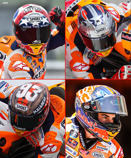
again this might just be a lack of taste thing, but I find all of these quite... you know. they're fine. they're helmets. to me they look quite messy in quite uninteresting ways. generic. you're in america so you've got a bunch of stars on your helmet. yay
the catalunya helmet situation is way better:
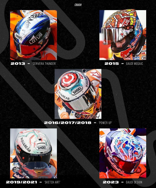
though it does have to be said. the divorce drama did also generally cause a bit of a hit on marc's helmet quality post-2015. for one thing, I do not want to see multiple years listed next to a special helmet. come up with a new one!! power up is particularly egregious here because the design was just never that interesting, like it looks like just another sponsor logo
the gresini era I have no real thoughts about because in all honesty I've never massively vibed with this era of gresini liveries in terms of colour, but I like what they do (or did, apparently) with the red stripes forming continuity between rider and bike. and that worked with marc's preference for the colour red for his highlights. crucially I could usually tell quite easily where he was on the track, which I'm generally a fan of and will very much end this season
which. speaking of. I can and will judge marc for what he's gone for with this entire red-on-red situation with his number and helmet --
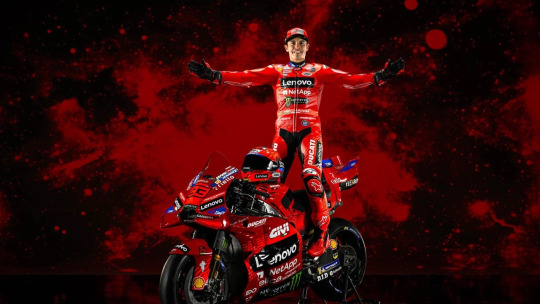
-- first of all. it's kind of boring. second of all it's a bit of a visibility nightmare. pecco at least has gone for a black number on his bike (deeply necessary given how '63' and '93' are already way too similar) but that's like... it's still going to be exhausting, especially if they've both gone for vaguely reddish helmets. I would've put it into their contracts they need to have completely different helmet colours, make one of them wear green for all I care. idk at this point, just choose a different colour that isn't red. choose the bloody repsol orange to reverse what you were doing back at honda, pay tribute to your roots or some shit. this is too much red. I appreciated the red testing leathers in a sort of 'well this is horrendously tacky' way - very much cheap porn vibes which suits marc well. but this is not that red. this is just... ducati red, it's also all quite dark and threatens to be drab. get a brighter highlight colour. looking forward to a lot of squinting at race starts this year
4. dani
we are getting into the 'what aesthetic' part of the ranking. I have already made my feelings on the whole repsol colour situation clear, and unfortunately for dani.... he was at that team for his entire stint as a full-time motogp rider. thirteen years of essentially identical liveries. the only fun livery during that time I can remember is aragon 2011

casey disliked this livery btw. we'll get to him in a moment
dani grabbing fourth place in this list is basically solely down to his 'little samurai' branding bailing him out. it's something he kept returning to in his career so it very much qualifies as a recurring motif, he does a celebration with a sword, he talks about how much he'd like to have swords in interviews... it's got a long history, he's already been doing some variation of it since his lower class title-winning days (very cute shirts with the lil guy with the sword).... he's got the recognisable branding that is featured on his pit board, on merch, on helmets. it's his thing!! I'm pro having a thing. also obviously the 'little' thing, in a way he's so synonymous with his height that it IS a big part of his like... brand. he's short, that's his thing. but he's also dangerous. hence the samurai
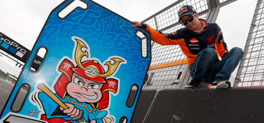

and ofc he's talked about the nickname in interviews, why he wants to adopt the 'spirit' of the samurai, general affinity for japanese culture which is just a bit of a thing in motogp - the weeb sport - so he's also talked about that stuff... I also liked this helmet, just quite nicely designed
another critique I have to get off my chest... given the remarkably small number of times marc and dani had any sort of on-track confrontation, at the end of the day it ended up being kinda irrelevant.... but real hall of shame territory for both of them to have white numbers and no heavy use of highlight colours. every single year. (this is also why I don't understand why marc is so committed to a red number NOW, like you didn't even have one during your honda years.) at least casey's number was in a different colour - though an actual highlight colour would have also made that teammate pairing easier to distinguish - but the marc and dani situation was just egregious. you look the same
um. not much more to say than that. nothing offensively bad going on with dani's branding and again, I am very pro him having a Thing. I am also pro the thing. but it's also just the one thing and apart from that, he really was mostly associated with those repsol honda colours. which, as we've established, simply always look the same. shame
5. casey
ah, casey. well. the best thing you can say in casey's defence is that he wasn't really trying. he kinda just rejected the idea of that sort of outreach work. above the idea of recognisable branding. it's like the thing where he was kinda baffled by the idea of europeans 'celebrating' their 'victories'... he just didn't really like engaging with the commercial elements of the sport, which extended to not doing much on the symbolism front
casey's one bit of consistent branding can be summed up as 'left his home country at age fourteen and yearns after a simpler, less stressful time that he expresses in this extremely generic, non-specific patriotism'. it's like a way of expressing he's perma-homesick - for a country he has in reality acquired a lot of distance to. the only australian stuff that actually gets included in the branding is 1) the australian flag, and 2) kangaroos

this is a four year old's understanding of australia. it's extremely vague and regionally non-specific - compare and contrast to marc and especially valentino's deep connection to and identification with their home town. there you have an actual sense of PLACE that forms the bedrock of any patriotic affiliation, rather than a generic link to a massive landmass. australia is a big country and yet casey's just kind of stuck associating with the whole thing. as far as I can tell from his autobiography, it's also fair to say kangaroos did not play a particularly prominent role in his childhood. it's as if he's saying his one character trait is 'australian' - particularly dumb given he wasn't the only australian rider on the grid (cf vermeulen who has basically zero australian branding but did model himself after his BRITISH racing hero) and australia had another very recent premier class champion (some bloke called doohan who apparently won five of the things)
to some extent it's normal that when you're living in a place where you know almost nobody of the same nationality, suddenly your nationality becomes a way more salient trait. but obviously casey's biography and psychology has made this rather extreme, where defining himself against the europeans he had so many issues with was a big priority. which is reflected in his branding. unfortunately it is also very boring. the colours 'red white and blue' have thanks to historical british overenthusiasm found their way onto rather a lot of flags - which means that if I saw his helmet without context, 'australian' probably isn't even where my mind would go first. I don't necessarily mind the design of his helmets and his number, but I also just don't have particularly strong feelings about them either way. the kangaroo in the logo is cute enough I suppose, but it's also the only thing he's doing with the kangaroo
in casey's ducati era, not only was he blessed with generally quite nice looking bikes in quite nice looking colours, but he also got pretty lucky with the aesthetics of his sponsors. obviously I'm a big fan of the alice eye popping up regularly on both team kits and around circuits, but I also like whatever sponsor the barcode-type stripes belong to. they pop up on casey's caps too. and in general... I mean, he just sort of hit the aesthetic jackpot with the valentino rivalry. I haven't ranked him up for this because it's so completely not his own doing... or, I mean, I suppose it kinda is given he was probably the only guy who would've been in a championship fight on the red bike. in any case, you do just have to say this was aesthetically kinda peak as far as rivalries go

in general, aesthetically casey was the beneficiary of circumstance. the valentino rivalry just Looked Good because having a red team and a blue team is kind of ideal, and valentino's busier aesthetic contrasted quite nicely with casey's simpler faring. valentino was also tossing out descriptors like 'god' and 'devil' and 'demon' in casey's direction with reasonable regularity - which, while never obviously getting integrated into any branding, to Me contributes to the Vibe. you've got valentino's sun/moon stuff happening in casey's vicinity, you've got the nicely placed alice eyes adding a certain je ne sais quoi to some photos
am I allowed to mention valentino's name on casey's 2007 championship shirt as one of casey's heroes? important aesthetics In My Opinion. I'd also be remiss not to mention casey's favourite livery, the 2009 phillip island one. I'm gonna be honest, when I first saw this one I was kinda like. it's fine. not sure what the fuss is about. partly because I feel noughties motogp had a few too many white special liveries, so it just kinda felt like One More of those. but I suppose it is the nicest of those liveries, I do like it, it's nice and classy and I'm glad casey loved it ig. off the bike and on the podium celebrations, the white leathers with red highlights really do look quite lovely
though, as previously mentioned, he disliked the fun cute aragon 2011 livery. because he needs to be forcibly reconnected with his sense of whimsy. which brings us to the repsol honda era... a vibes collapse in many ways, across the premier class really. 2011 is a bad casey year - I mean, it's a good casey year in that he won a lot and was generally happy, but it's a bad casey year in that it's in some ways his dullest season in the premier class. (excepting jerez, which was deeply necessary to inject some narrative juice into proceedings.) and this vibes-shortage is reflected in his aesthetics. again, I think at this point my feelings on the respol honda liveries are fairly clear, but it did just take something from the ducati casey charm... also he was flirting with too much facial hair in both those years, making him susceptible to Just Some Guy-territory. the kindest thing I can say is that his gloves in 2012 were quite nice
#i was gonna say marc should have sachsenring special helmets but given what his cota ones look like it's probably fine#//#brr brr#//at#batsplat responds#this is the kind of dumb long post that really forms the bedrock of this blog#//brr brr
7 notes
·
View notes
Text
Fake logo designs of various districts/companies in Hermitcraft S8! Something about Hermitcraft brings out the graphic designer in me (*cough* it’s because I love worldbuilding and making tiny details in a world) anyway!
Design notes under cut! (Alongside some headcanons - it is quite long)
Horse Head Farms: this is the logo that started this idea basically. I got such a cool image of an eclipse with a repeated b+w horse head pattern and I really wanted to make it happen. M.C. Esher has done designs like these but as tiles, which I used as inspiration. I think I could have made it look a bit clearer but for my first time drawing something like this I’m pretty happy. The text is from one of the default Procreate fonts and kinda makes HHF look like a law firm (which is the vibe I was going for, soul-stealers and lawyers are often sorta linked in fiction, and supposedly xB and Hypno are their own legal team). xB and Hypno are the only employees other than the people they blackmail into doing stuff for them.
Big Eyes: I wanted a red eyeball as a reference to Tango’s amazing prank on Boatem and I imagine it’s a goofy little mascot for the company. Some big goofy text felt fitting alongside this. I wanted to make a Pass n Gas specific logo too but I wanted to focus on the main “districts” rather than specific shops. I feel like this is kind of obvious but in-universe Big Eyes are VERY unsuccessful and actively losing money.
Hohenzollern Castle: not really a company but Joe and Cleo are cool so I wanted to include them and I had a tiny bit of blank space left on the page so here we are. I actually really love how the sign looks, the wood texture came out nice. They don’t have a logo as much as they do a sign outside their area, created by Joe, with the text written by Joe’s dyes. The “Hohenzollern” is kinda squished because he began to run out of room but was too stubborn to split the word in half. Cleo argues that it isn’t a logo and is just a sign with the castle’s name on it. Joe argues back with a deconstruction of “what is a logo, really?” and something about companies and capitalism and Cleo doesn’t care enough to respond.
Octagon: I am a fool who initially thought it was spelt “Octogon” and had to fix it well after I finished. Oh well. I wanted this to have a very evil look about it. You can instantly tell they’re the evil tech company running experiments on the quantum realm or whatever in a Hollywood movie. Between the unsafe work conditions and the tax fraud, it is a miracle they haven’t been shut down (reason: the government is scared of Doc)
The Evil Empire: the “the” wouldn’t fit so I had to make some sacrifices. Evil Xisuma is dramatic and edgy so he wanted the logo to be in fancy black calligraphic medieval looking text. It fits the evil castle aesthetic the whole area has pretty well too. The Evil Empire is kinda like a Hot Topic store and a Renaissance Fair combined, but it is also involved with Crypto. Despite being so weird it has a perfect niche of marketing to edgy teenagers so it is quite successful. The employees hate it there because their work mandated uniform is to “dress like an evil minion”. Jevin is a slime monster, Wels cosplays a knight and Beef turned into an alien so they thankfully didn’t have to change.
Boatem (BTM): heavily inspired by Grian’s simplified logo he made in Minecraft, where he shortened it to BTM. Despite already having a reference to work off, this was the hardest design. I knew I wanted it to be simple, all-white and leaning back dramatically but I spent ages fiddling with it. Boatem is the most successful company, being perfect for the general public and their shopping district a tourist destination in of itself. It nearly went into bankruptcy when Mumbo was CEO but has been very successful since his Robot took over.
Zedaph Laboratories: my favourite design. Hand writing the text was a nightmare but it came together nicely other than that. Sheep symbol because sheep are his brand. I used the same colour palette as his laboratory. “Laboratory” is misspelled for two reasons: 1) I realised my mistake too late to change it, 2) I think it is completely in character for Zedaph to not know how to spell laboratory and only realise after Tango points it out and be forever haunted by his mistake. Don’t let the sleek corporate design fool you, Zedaph is still wild and is the only person in the “Zedaph Labratories”.
#btw I did this on procreate rather than photoshop#and it was such a pain. Procreate is better for drawing imo but text editing and transformation options are so limited#locus fandom time#locus art time#long post#how the hell am I supposed to tag this lmao#Hermitcraft#hermitcraft s8#hermitblr#Boatem#horse head farms#Zedaph#logo design#graphic design#fanart#hermitcraft fanart
111 notes
·
View notes
Text
Welcome to Dyslexiboxes!
This blog is run by @lesboylycan, a polyfragmented multi-origins spiritual collective with DID and dyslexia, among many other things. This blog is aimed towards fellow plurals and neurodivergents, and our userboxes will be made to be easy to read.
This blog is a safe space for endogenic, multi-origins, and spiritual & metaphysical plurals; good-faith IDs (lesboys, gaybians, mspec monos, etc); schizo-/psychosis-spectrum folks and folks with personality disorders; and alterhumans and nonhumans, including physical alter/nonhumans. DNI if any of these are in your DNI or you otherwise cannot say the same. We are anti-fakeclaiming and anti-harassment; if you cannot say the same about yoursel[f/ves], DNI. We use the block button liberally.
Radfems are not welcome under any circumstances. I don't care if you're "trans-inclusionary"; radical feminism cannot be reclaimed in any way that doesn't end up hurting marginalized people. The core pillar of radical feminism is a hatred of men for the sake of being men; no matter how you spin it, there is no possible way to make it "good".
All hate will be deleted. Blatant harassment will be reported AND deleted.
[Guidelines and examples below cut]
General Guidelines
> All userboxes will come with an alt ID, formatted as "A userbox that states '[x]'. On the left in the image box is a/the [photo/flag/drawing/etc] depicting [y]".
> You can request different fonts for userboxes, but the default will be OpenDyslexic. The only alterations we will otherwise make to the text is changing the color and adding an outline to make it as easy to read as possible. You can also send different font types if you want something other than OpenDyslexic, but aren't sure for certain what specific font you want (serif, sans serif, script, or decorative).
> If you want a specific image, please either send the image or a link to it as part of your request; otherwise, we will pick based on what we think will be most thematically appropriate. If you want a specific kind of image, send a description of such (eg., "An image of wolves cuddling"; "An image of ocean waves"; etc).
> If you want a very specific color or color scheme, please send hexcodes (If you're looking for a good website to help, colorhexa.com is a great website for finding hexcodes)! If you just send the name of the color, we will do our best, but different colors (and shades/tints of them) often are all grouped under the same name (there are a million different kinds of "emerald green", for example). You can also send a basic idea of a color scheme ("Dark colors"; "Light colors"; "Pastels"; "Monochrome"; "Greyscale"; etc).
> Credit isn't necessary if you use our userboxes, but it is much appreciated!
> We reserve the right to not do certain requests if we're uncomfortable with them; if you aren't sure and would like to know where your request stands, feel free to send an ask!
> Please only send one request per ask. You can send multiple asks, just keep each request within its own ask; that way, we have a better idea of what our workload will be when looking at our inbox.
What we will do
> Plural-focused userboxes! Include system, sisasystem, and headmate origins; layer types; system functions; etc. For plural-focused userboxes, by default, we will make four versions that say "This user...", "This system...", "This plural...", and "This collective..."; for headmates, by default, we will make five versions that say "This user...", "This headmate...", "This alter...", "This member...", and "This part...". Feel free to request specific words (eg., constellation, hivemind, drone, sysmate, etc), though!
> General neurodivergency-focused userboxes! Eg., "This user has schizophrenia", "This user has NPD", etc.
> Miscellaneous userboxes! Eg., "This user needs a nap"; "This user is normal about [x]"; "This user loves plushies"; etc. (We're aware this category can intersect with the above, but we figured we'd mention it for folks that aren't totally sure what is allowed)
> Modifications of previously made userboxes upon request (Note: you must link the post with the userbox in question so we know which one you're talking about)
What we WON'T do
> Userboxes that directly break the DNI (Eg., "This user is anti-endo"; "This user hates therians"; "This user believes in narcissistic abuse"; "This user hates fakers"; etc). This includes any and all bigotry.
> Userboxes with hard-to-read fonts (eg., fonts that are highly stylized with little distinction between letters)
> Userboxes with severe unreality or paranoia-inducing text
Examples


Tags
#userbox - Userboxes we've made #not a userbox - Any posts that don't contain userboxes (including responses to requests) #off-topic - Any posts that aren't userboxes or requests for userboxes
#asks - All asks, including requests #requests - Asks that are specifically requests #request updates - Asks looking for updates on whether their request has been received, worked on, etc #not requests - Asks that specifically are not requests
#blog upkeep - Updates about the blog itself (Pinned post updates, theme updates, etc) #availability tracker - Updates on whether we are or not open for requests; you can also check our bio. Requests sent while we're closed will be deleted, but you can send again once requests are open. #intro post - This post!
#tw [thing] - Trigger warning tags. #tw [thing] mention refers to when something is mentioned, but is not the focus of the ask/request; #tw [thing] is when the thing in question is the focus of the ask/request OR talking about it takes up two or more full sentences (in multi-sentence asks).
9 notes
·
View notes