#html box shadow generator
Explore tagged Tumblr posts
Visit Tumblr Blog
Explore Tumblr blogs with no restrictions, modern design and the best experience.
Last Seen Tumblr Blogs


Fun Fact
When “GIF” was named word of the year in 2012, Oxford Dictionaries U.S.A. credited Tumblr for pushing the word.
Text
Getting Creative With HTML Dialog
New Post has been published on https://thedigitalinsider.com/getting-creative-with-html-dialog/
Getting Creative With HTML Dialog
Like ’em or loath ’em, whether you’re showing an alert, a message, or a newsletter signup, dialogue boxes draw attention to a particular piece of content without sending someone to a different page. In the past, dialogues relied on a mix of divisions, ARIA, and JavaScript. But the HTML dialog element has made them more accessible and style-able in countless ways.
So, how can you take dialogue box design beyond the generic look of frameworks and templates? How can you style them to reflect a brand’s visual identity and help to tell its stories? Here’s how I do it in CSS using ::backdrop, backdrop-filter, and animations.
Design by Andy Clarke, Stuff & Nonsense. Mike Worth’s website will launch in June 2025, but you can see examples from this article on CodePen.
I mentioned before that Emmy-award-winning game composer Mike Worth hired me to create a highly graphical design. Mike loves ’90s animation, and he challenged me to find ways to incorporate its retro style without making a pastiche. However, I also needed to achieve that retro feel while maintaining accessibility, performance, responsiveness, and semantics.
A brief overview of dialog and ::backdrop
Let’s run through a quick refresher.
Note: While I mostly refer to “dialogue boxes” throughout, the HTML element is spelt dialog.
dialog is an HTML element designed for implementing modal and non-modal dialogue boxes in products and website interfaces. It comes with built-in functionality, including closing a box using the keyboard Esc key, focus trapping to keep it inside the box, show and hide methods, and a ::backdrop pseudo-element for styling a box’s overlay.
The HTML markup is just what you might expect:
<dialog> <h2>Keep me informed</h2> <!-- ... --> <button>Close</button> </dialog>
This type of dialogue box is hidden by default, but adding the open attribute makes it visible when the page loads:
<dialog open> <h2>Keep me informed</h2> <!-- ... --> <button>Close</button> </dialog>
I can’t imagine too many applications for non-modals which are open by default, so ordinarily I need a button which opens a dialogue box:
<dialog> <!-- ... --> </dialog> <button>Keep me informed</button>
Plus a little bit of JavaScript, which opens the modal:
const dialog = document.querySelector("dialog"); const showButton = document.querySelector("dialog + button"); showButton.addEventListener("click", () => dialog.showModal(); );
Closing a dialogue box also requires JavaScript:
const closeButton = document.querySelector("dialog button"); closeButton.addEventListener("click", () => dialog.close(); );
Unless the box contains a form using method="dialog", which allows it to close automatically on submit without JavaScript:
<dialog> <form method="dialog"> <button>Submit</button> </form> </dialog>
The dialog element was developed to be accessible out of the box. It traps focus, supports the Esc key, and behaves like a proper modal. But to help screen readers announce dialogue boxes properly, you’ll want to add an aria-labelledby attribute. This tells assistive technology where to find the dialogue box’s title so it can be read aloud when the modal opens.
<dialog aria-labelledby="dialog-title"> <h2 id="dialog-title">Keep me informed</h2> <!-- ... --> </dialog>
Most tutorials I’ve seen include very little styling for dialog and ::backdrop, which might explain why so many dialogue boxes have little more than border radii and a box-shadow applied.
Out-of-the-box dialogue designs
I believe that every element in a design — no matter how small or infrequently seen — is an opportunity to present a brand and tell a story about its products or services. I know there are moments during someone’s journey through a design where paying special attention to design can make their experience more memorable.
Dialogue boxes are just one of those moments, and Mike Worth’s design offers plenty of opportunities to reflect his brand or connect directly to someone’s place in Mike’s story. That might be by styling a newsletter sign-up dialogue to match the scrolls in his news section.
Mike Worth concept design, designed by Andy Clarke, Stuff & Nonsense.
Or making the form modal on his error pages look like a comic-book speech balloon.
Mike Worth concept design, designed by Andy Clarke, Stuff & Nonsense.
dialog in action
Mike’s drop-down navigation menu looks like an ancient stone tablet.
Mike Worth, designed by Andy Clarke, Stuff & Nonsense.
I wanted to extend this look to his dialogue boxes with a three-dimensional tablet and a jungle leaf-filled backdrop.
Mike Worth, designed by Andy Clarke, Stuff & Nonsense.
This dialog contains a newsletter sign-up form with an email input and a submit button:
<dialog> <h2>Keep me informed</h2> <form> <label for="email" data-visibility="hidden">Email address</label> <input type="email" id="email" required> <button>Submit</button> </form> <button>x</button> </dialog>
I started by applying dimensions to the dialog and adding the SVG stone tablet background image:
dialog width: 420px; height: 480px; background-color: transparent; background-image: url("dialog.svg"); background-repeat: no-repeat; background-size: contain;
Then, I added the leafy green background image to the dialogue box’s generated backdrop using the ::backdrop pseudo element selector:
dialog::backdrop background-image: url("backdrop.svg"); background-size: cover;
Mike Worth, designed by Andy Clarke, Stuff & Nonsense.
I needed to make it clear to anyone filling in Mike’s form that their email address is in a valid format. So I combined :has and :valid CSS pseudo-class selectors to change the color of the submit button from grey to green:
dialog:has(input:valid) button background-color: #7e8943; color: #fff;
I also wanted this interaction to reflect Mike’s fun personality. So, I also changed the dialog background image and applied a rubberband animation to the box when someone inputs a valid email address:
dialog:has(input:valid) background-image: url("dialog-valid.svg"); animation: rubberBand 0.82s cubic-bezier(0.36, 0.07, 0.19, 0.97) both; @keyframes rubberBand from transform: scale3d(1, 1, 1); 30% transform: scale3d(1.25, 0.75, 1); 40% transform: scale3d(0.75, 1.25, 1); 50% transform: scale3d(1.15, 0.85, 1); 65% transform: scale3d(0.95, 1.05, 1); 75% transform: scale3d(1.05, 0.95, 1); to transform: scale3d(1, 1, 1);
Tip: Daniel Eden’s Animate.css library is a fabulous source of “Just-add-water CSS animations” like the rubberband I used for this dialogue box.
Changing how an element looks when it contains a valid input is a fabulous way to add interactions that are, at the same time, fun and valuable for the user.
Mike Worth, designed by Andy Clarke, Stuff & Nonsense.
That combination of :has and :valid selectors can even be extended to the ::backdrop pseudo-class, to change the backdrop’s background image:
dialog:has(input:valid)::backdrop background-image: url("backdrop-valid.svg");
Try it for yourself:
Conclusion
We often think of dialogue boxes as functional elements, as necessary interruptions, but nothing more. But when you treat them as opportunities for expression, even the smallest parts of a design can help shape a product or website’s personality.
The HTML dialog element, with its built-in behaviours and styling potential, opens up opportunities for branding and creative storytelling. There’s no reason a dialogue box can’t be as distinctive as the rest of your design.
Andy Clarke
Often referred to as one of the pioneers of web design, Andy Clarke has been instrumental in pushing the boundaries of web design and is known for his creative and visually stunning designs. His work has inspired countless designers to explore the full potential of product and website design.
Andy’s written several industry-leading books, including ‘Transcending CSS,’ ‘Hardboiled Web Design,’ and ‘Art Direction for the Web.’ He’s also worked with businesses of all sizes and industries to achieve their goals through design.
Visit Andy’s studio, Stuff & Nonsense, and check out his Contract Killer, the popular web design contract template trusted by thousands of web designers and developers.
#:has#2025#Accessibility#ADD#amp#animation#animations#applications#aria#Art#Article#Articles#Assistive technology#attention#background#background-image#book#Books#border#box#box-shadow#Branding#change#Color#content#CSS#css animations#data#Design#designers
1 note
·
View note
Text
### ✅ How to Run the Web Dashboard
#### 1. **Install Flask** (if not already):
```bash
pip install flask
```
---
**Python Web App: `engine.py`**
```python
from flask import Flask, request, render_template_string, jsonify
import json
# Load checklist JSON from file
with open("checklist.json", "r") as f:
checklist = json.load(f)
app = Flask(__name__)
# Simple HTML frontend
TEMPLATE = """
<!DOCTYPE html>
<html>
<head>
<title>False-Flag Detection Dashboard</title>
<style>
body { font-family: Arial, sans-serif; background-color: #f4f4f4; margin: 20px; }
h2 { color: #333; }
.container { background: white; padding: 20px; border-radius: 8px; box-shadow: 0 0 10px #ccc; }
input, textarea { width: 100%; padding: 10px; margin: 10px 0; border-radius: 4px; border: 1px solid #ccc; }
.button { background-color: #007BFF; color: white; padding: 10px 20px; border: none; border-radius: 4px; cursor: pointer; }
.button:hover { background-color: #0056b3; }
.output { background-color: #eee; padding: 10px; border-radius: 4px; margin-top: 20px; }
</style>
</head>
<body>
<div class="container">
<h2>False-Flag Event Evaluation</h2>
<form method="POST">
<label for="event_json">Enter Event JSON:</label>
<textarea id="event_json" name="event_json" rows="10">{{ event_json }}</textarea>
<button class="button" type="submit">Evaluate Event</button>
</form>
{% if result %}
<div class="output">
<h3>Evaluation Report:</h3>
<pre>{{ result }}</pre>
</div>
{% endif %}
</div>
</body>
</html>
"""
# Rule evaluator
def evaluate_event(event, rules):
flags = []
halt_triggered = False
for condition in rules["auto_halt_conditions"]:
if condition["id"] == "halt_001" and event.get("rescue_time_hours", 999) <= 6 and not event.get("biomarker_evidence", True):
flags.append(condition["description"])
halt_triggered = True
if condition["id"] == "halt_002" and event.get("criminals_included"):
flags.append(condition["description"])
halt_triggered = True
if condition["id"] == "halt_003" and event.get("distress_signal_blocked"):
flags.append(condition["description"])
halt_triggered = True
if condition["id"] == "halt_004" and event.get("duplicate_pattern_count", 0) >= 2:
flags.append(condition["description"])
halt_triggered = True
results = {
"incident_id": event.get("incident_id", "Unknown"),
"flags": flags,
"halt_triggered": halt_triggered,
"narrative_similarity_score": event.get("narrative_similarity_score", 0),
"extraction_targets": event.get("extraction_list", []),
"independent_confirmation_count": event.get("independent_confirmations", 0)
}
return results
@app.route("/", methods=["GET", "POST"])
def dashboard():
event_json = ""
result = None
if request.method == "POST":
try:
event_json = request.form["event_json"]
event_data = json.loads(event_json)
evaluation = evaluate_event(event_data, checklist)
result = json.dumps(evaluation, indent=4)
except Exception as e:
result = f"Error parsing input: {e}"
return render_template_string(TEMPLATE, event_json=event_json, result=result)
if __name__ == "__main__":
app.run(debug=False, port=5000)
```
---
### 🖥️ Run It:
From your terminal:
```bash
python engine.py
```
Then open [http://localhost:5000](http://localhost:5000) in your browser to interact with the dashboard.
---
Would you like help generating sample event inputs or connecting this engine to a file or database for batch evaluations?
0 notes
Text
Sorry I am not treating your post as less important, I was reblogging it to get eyes on it and to try to get tumblr to crowd source a tutorial from someone who knows how and has the spoons.
I recognize your post was a simple request to do it, but all the posts about it I see are a request to do it and I cannot ever find instructions anywhere on how in a way that's confirmed to work, and I was hoping someone could confirm a process. So there is usually a button to submit alt text, and if not there's html code that can be inserted into the post directly, is what I am getting from this?
Sometimes i just add text to a post describing the image but I have no way of knowing if it is "tagged" correctly, etc for the screen reader to acknowledge it as the alt text for the image, like as proper official alt text as a proper descriptor to a program, like the name of a string it would retrieve and output, which is why I was putting it in quotes. That's what I mean by "formatting", do we just add html to the post and then what is html that someone knows actually works on tumblr, because a lot of inserted html doesn't [I have tried].
These questions are rhetorical and to the larger audience, not me trying to grill you personally for answers. I am asking this of anyone who wants to answer on tumblr at large.
I have looked for a button on tumblr or an option and have never seen it, does someone [not to be passive aggressive, but to literally ask for someone who might need to be able to visually describe tumblr and knows where it is] know where the button is and can they add it to this post? Or to any post they see asking for people to add alt text, because the only reason I don't do it more habitually is I literally can't figure out how to. I am not saying that argumentatively, I am trying to give the literal reason it isn't happening more from my personal experience of the site.
I'm saying if someone wanted to figure out how this actually works on tumblr and the actual process of how to do it, and add that to the posts asking for alt text, someone who has the time and energy to figure it out, it might get a lot done. Not "more than your post" but as a helpful addition to all of these posts so that the people who only aren't doing it because they don't know how to get their answer.
I would have made a separate post asking if anyone knew how, but generally if I make a post asking questions myself they sit there with 0 notes forever and don't help anything. It seemed like asking the question where people would see it and could respond much more publicly might get more done.
The reason I didn't look it up is because I had before multiple times and gotten nowhere and I didn't have the energy, I was busy going through boxes and totes and am suffering with some cognitive symptoms at the moment, but since I'm typing this anyway, now, I tried again and it says this:
"After adding an image to your post, tap the 3 dots in the lower right corner to add alt text. The alt text should be a brief description of your image, as if you were describing it to someone over the phone, to make your post accessible to folks using a screen reader."
Which I was never able to do before because I can't find the circles they are talking about.
So let's try to confirm if this is updates and works!

The option doesn't show for me except as a transparent -now grey- circle in the bottom right and it took actual work to click on at all because of how skinny the image is, but it is not three dots and I am not sure it has always loaded properly for me before because I could never find it. It is showing as a grey shadow behind the red x button to close the image and I am not sure if it always does that or if it's the image dimensions, but it would explain me not being able to find it.
it should read: "A badly drawn image of 9 dots coloured red, orange, yellow, bright green, cyan, royal blue, purple and magenta, the last one being split between black and white. They are sloppy attempted circles by someone with poor coordination using a mouse"
Did that work? [anyone who wants to answer]
Is that the preferable process compared to:
[image id: A badly drawn image of 9 dots coloured red, orange, yellow, bright green, cyan, royal blue, purple and magenta, the last one being split between black and white. They are sloppy attempted circles by someone with poor coordination using a mouse"]
?
Which is what I usually see done on posts. Should we use both? Are other people having trouble finding the option/button to add alt text?
My frustration isn't at you, and was never intended to sound that way, if I sounded frustrated, it has always been that no one seeing -who knows how to describe the process- has been piping up to actually explain how anyone is supposed to actually go about adding alt text. I see posts all the time asking for it to be done, and I always reblog them to boost the issue, but -as a tech savvy person who can program and is good with computers- could not find a button or get a straight answer about how to, until now, which no one was adding to any of the posts.
It has been my thinking that it shouldn't be up to the visually impaired to know the exact process, because I am assuming they are not the ones ever actually adding the description, and may not even be able to see the site at all. The "someone" isn't me passive aggressively saying "you", it's me putting out a general call to help.
I was fully expecting some other seeing person would know the answer and do the work of explaining it to the class, so that someone in your position doesn't have to, but no one ever has.
For anyone else curious, it is supposed to be 3 white dots at the bottom right of the photo that only comes up if you mouse over it, and for me is a circle that ranges from grey to invisible, and if the options load at all, one of them is "update image description", which gives you a box to type in with some instruction. I personally just put plain text in the box and someone is probably going to tell me whether or not it worked.
Maybe part of my problem has been parts of tumblr refusing to load properly or at all for me, but if other people are unable to see the option at all, maybe staff could check on that and do something to at least optimize the page or prioritize it loading properly?
There was, up until just now, to the best of my knowledge, nowhere to actually input a description on this site other than just literally adding a text description under the image, which I figured would have to be denoted or 'tagged' a specific way if screen readers were going to catch it and realize it was a proper description of the image.
Part of the problem is that most people who don't use them do not know how screen readers work or how they are coded to function with the site, and the people requesting descriptions largely maybe don't know how visually hidden or -absent- the option to add alt text is, and I was trying to get this disconnect solved, because I figured that was the fastest rout to way more people adding proper alt text.
I literally have not seen that grey circle until today, but also sometimes the site just loads up blank for me for a half hour at a time and I was shadow banned for something like 3 years, so it might mostly be me. I just keep going "okay I have a banger of a description to add but WHERE" and I figured a lot of people were in the same boat as me.
Please forgive how horrifically this was recorded (the screen reader mutes itself in recordings, which made it entirely useless for this post, which required a second camera) but I wanted to show people what alt text Actually Does for screen readers because I think a lot more people would take the time to add it if they knew why.
This is how the default screen reader function built into my phone "reads" an image, one without alt text and one with.
(I can't add alt text description to videos, it seems, which feels a little ironic given the post.)
When the first image, without alt text, is selected by a screen reader, it just reads out "photo".
When the second image, with alt text, is selected, it reads out the alt text - in this case, "A blurry picture of a gray tabby cat sitting on a white carpeted floor.".
Being able to use alt text is far easier on screen readers because the image is a larger object to select - descriptions in plain text below an image are still helpful, but require enough vision to accurately select, and enough vision to know they're an image description to begin with.
So please, when possible, add alt text to photos, art, and screenshots you're uploading! A lot of phones can copy text from images now, which is how I add image IDs to other people's text heavy posts - there's really no reason to post a bunch of text heavy screencaps and not at least copy and paste the text into the alt text, and it makes a huge difference for accessibility.
Thank you! ^w^
3K notes
·
View notes
Link
Box Shadow Generator - Best box shadow generator - CSS box shadow
#box shadow generator#css box shadow generator#css shadow generator#css drop shadow generator#border shadow generator#border shadow css generator#css box generator#css inner shadow generator#shadow box css generator#box shadow creator#html box shadow generator#div shadow css generator#font shadow css generator#box shadow css generator online
1 note
·
View note
Text
Y is Y2K Appealing?
As you can observe, my blog has been made with a particular aesthetic focus: the simple HTML and CSS, the glow effect on all the texts, and the WoW-inspired cursor. All of these call back to the Early Internet age of graphic design, and I'm not the only person to like this nostalgic wave of aesthetics.
The Aesthetics Wiki defines Y2K as:
"Y2K (also known as Kaybug) is an aesthetic that was prevalent in popular culture from roughly 1997 to 2004. Named after the Y2K Bug, it is characterized by a distinct aesthetic period, encapsulating fashion, hardware design, music, and furnishings shining with tech optimism — sometimes literally."


People are now returning to this very recognisable style for many reasons. But first, As Günseli Yalcinkaya points out in her Dazed Digital article "Why are we all so obsessed with early web nostalgia?" we have to understand why it started at all:
From a Political standpoint, early cyberspace provided a liberating and autonomous dream world beyond the confines of capitalist structures. People could design their own websites thanks to services like Geocities, which allowed users to create, publish and browse websites for free, and each of them was unique in its own kind of way. Considering the almost inexistence of Big Tech in the early 2000s, being online was virtually living in a borderline socialist dimension.
From an Aesthetical standpoint, Y2K is glittery, brash, pixelated, and generally in-your-face. On the web, this kind of visual style is derived from the utter freedom of personalization—even if the elements were mostly just images, gifs, texts, and the background—and, as pointed out by several users on Quora, most people had no design training at the time. They just did what they liked, not thinking about usability or readability. But Y2K, at its peak, had lots of excellent and sleek designs, and most of them derived from optimism about the future of technology as the world reached a new millennium.
These two reasons for existence, translated and morphed into the modern era, are almost identical. The brash look contrasts the minimalist corporate look that we are now used to, setting an uprising both on the visual and political meaning of the modern style. One of the first things they taught me at Design school was "Less is more", and here that theorem is inverted. More is, in fact, more, as it is transparent of what is happening behind the curtains of tech. Ed Finn, in his book "What Algorithms Want. Imagination in the age of computing", compares this technological shadowing to a black box:
"As I click on the link to the news site, a cascading series of actions unfurls behind the static pixels of my screen, obscured from human view not just by design but also by the boundaries of my temporal perception. In a matter of milliseconds, my request for the page has reached one of the company’s servers, triggering a flurry of activity as the site identifies me through cookies, IP address, and other means. The server contacts other machines in the company network to pull together not just “the news” but my news, curated in various ways to capture and maintain my attention (e.g., through recommendations for what to read next) and establish a familiar context by referencing previous interactions with the site (e.g., items saved in my “history”). But before the page loads, my query also triggers a number of other requests to companies, including Google, Facebook, and Twitter. Advertising algorithms engage in an automated auction to decide which ads will be shown to me on the news site, taking into account prevailing bids as well as my own history, social media presence, and membership or nonmembership in various predetermined target populations."
The Y2K style goes back to the roots of the internet, trying not to shadow anything and show a bit too much.
The tech optimism characteristic of that Era instead translates into the possible modern transition into Web3, which promises a decentralized web removed from tech monopolies. The contemporary tech evolution corresponded with shrinking possibilities, and now those monopolies control most of the time we spend online. With their economies of scale, they seem to be able to crush all up-and-coming challengers. The optimism is not the same, though: when the style was created, it was a hope for the future, as it could change how we lived and interacted. Now that change has happened, we don't want it to go the way Web2 did. We're not optimistic; we're just frustrated over how things have been going for the last 20 years, and we want to do better. Although the founding spirit is commendable, Web3 has the potential to ruin everything even more, as several sources point out [1] [2] [3]. But that's a topic for a different blog post.
As we can tell, the political premises are fundamentally intertwined with the aesthetical choices of Y2K.
But we haven't tackled the most crucial factor of Y2K: Nostalgia. According to the article "Why Do Fashion Trends Come Back?"¹: "Trends repeat every 20-30 years because of generational changes as well as designers taking inspiration from styles their parents wore." But now something is different: the style is from our youths, not our parents. We have been influenced by the celebrities we know and love, and now we're bringing back what they represented back then. Of course, this is not the first time fashions have worked like this, but the swiftness with which it exploded is incredible, considering how minimalism was and still is very big. This, in my opinion, has two different reasons:
Thanks to our current technology, every type of information travels faster than before. What needed to be known through television, newspapers, magazines and so on can now be discovered through smartphones. This allows the growth of styles at a rate before unimaginable. Still, studies suggest that, due to the ever-growing stream of information present on the web, shorter intervals of collective attention are given to individual topics. We now embrace and forget as fast as we ever did, but Y2K seems to remain².
The second reason is a bit more philosophical and delves into my personal experience. The 2000s was not a happy decade. First, the twin towers collapsed, changing the political stance that the USA, sadly one of the most influential countries in the world, had towards foreign countries. Then, the 2007-2008 financial crisis happened, making our upbringing in the world desperate, not even considering the climate crisis that is now upon us. But Y2K was not sad: it was the opposite. It was hoping for a brighter future, and we are nostalgic for that. The article "The Brain and Nostalgia" by Heidi Moawad says, "Sometimes nostalgic triggers [...] are sought out as a means to bring comfort and happy feelings." And that is precisely what we are searching for. It's not essential that we lived that age or not; what we thrive for is the peace and hopefulness that the 2000s had in their own personal way. It may have been through the sparkly gifs, the neon colours and the overall nonchalance of the people who used to live it, but Y2K means something important to the youth now: the hope for happiness and peace. The longing to not live like we've always lived.

1: Interestingly, the article cites a DSN English report on fashion trends, which is now down. Thanks to the Wayback Machine, I found a snapshot of it, which led me to another article, accessible as well only by a snapshot. This article points to other websites as sources, and I couldn't find any "report" on this matter, but multiple websites cite it talking about fashion throwbacks. My only explanation for this occurrence is that someone mentioned it as a "report", and other writers started using the first article source without checking it.
2: One of the first instances of the throwback to this style I've found online was Hailey Bieber's 2019 Met Gala Look.
3 notes
·
View notes
Text
Tutorial: Simple Carousel without using <input>
Hello everyone!
I always wanted to create a Carousel-based theme, upon researching, I found yeoli-thm‘s tutorial (link is at the demo) but I had a difficulty in understanding it as I am not a huge fan of <input>. Luckily, I managed to create a simpler version of the carousel without using <input>.
Here's the result:
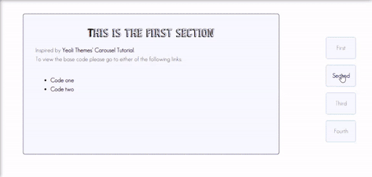
Preview
By having this result, you can create your very own pages and all-in-one themes! The base code will be provided in the demo but if you want to learn how to create this from scratch, please do read this till the end!
IMPORTANT!:
Please like and/or reblog this post if you like this tutorial. If you intend of using this code as a based code, you are required to mention me in your theme post.
This tutorial consists of four aspects:
General styling
Basic Container
Navigation
Carousel
The concept of creating a carousel derives from my smooth scrolling tutorial. If you haven’t check that out, I highly recommend for you check it out.
General Styling
1. Firstly, you need to add the basic code for your carousel. You can retrieve it from this site.
2. Add the universal selector at the style/CSS area:
/*GENERAL STYLING*/ *{ margin:0; box-sizing: border-box; scroll-behavior: smooth; }
It is pertinent to add scroll-behavior:smooth. This is to create a smooth scrolling effect.
3. Once you're done with it, you can create a basic styling for the body, fonts, etc at the style/css area. In my demo, I made a basic styling of the body, paragraph, title, and scrollbar. Example can be seen as follow:
/*BODY AND FONTS*/ body{ background: rgb(248,248,255); background-image: linear-gradient(180deg, rgba(248,248,255,1) 0%, rgba(223,223,255,1) 50%); font-family:geo sans light; text-align:justify; line-height:150%; } @font-face { font-family: geo sans light; src: url(https://static.tumblr.com/v6akjgz/MQbqf9ocl/geosanslight.ttf); } p{ margin-bottom:2rem; } h1{ font-family:vintage fair; text-align:center; color:#1f1b1b; text-shadow:-1px 0 black; font-weight:300; margin-bottom:1rem; line-height:1.15; } @font-face { font-family:vintage fair; src: url(https://static.tumblr.com/v6akjgz/SNhqfaujo/vintage_fair.ttf); } /*SCROLLBAR*/ ::-webkit-scrollbar { width: 18px; height: 18px; } ::-webkit-scrollbar-track { border: 8px solid #fff; background-color: rgba(0,0,0,.05); } ::-webkit-scrollbar-thumb { background-color: #acacff; border: 8px solid #fff; }
NOTE!: There's no need for you to copy and paste the above code. You can always edit it or create other designs that you like to add.
Basic Container
A basic container is a place where you'll be adding the carousel. You can design it however you want in the style/CSS area but at the most basic, you can style it this way:
/*BASIC CONTAINER*/ .content{ /*Basic*/ width: 50%; height: 60%; /*Position*/ position: fixed; top: 50%; left: 50%; transform: translate(-50%, -50%); /*Important*/ overflow: hidden; /*Design*/ background-color:lightblue; border-radius: 5px; border: 1px solid rgb(58, 2, 58); }
Please do take note that this is one of the many ways of creating the basic container. If you know your ways in CSS, you can style it however you want!
IMPORTANT: It is very important for you to add overflow:hidden;. Without this, it will cause the scrollbar to appear and make it less pleasing to see.
For the HTML area, add the following code:
<!--CONTENT--> <div class="content"> <!---THIS IS WHERE THE CODE FOR CAROUSEL WOULD BE SITUATED AT--> </div>
By now, if you click [Update Preview] and [Save], you will now see the container on your page.
Navigation
Navigation is the place where all the links to the section will be wrapped in.
1. Add the code below /body.
<!--NAVIGATION--> <div class="contentlink"> <ul> <li><a href="#partone">First</a> <li><a href="#parttwo">Second</a></li> <li><a href="#partthree">Third</a></li> <li><a href="#partfour">Fourth</a></li> </ul> </div>
2. After that, you are required to style it at the CSS/style are (preferably below the content). The most basic ways to do it is by doing it this way:
/*NAVIGATION*/ .contentlink{ width:5rem; height:10rem; position:fixed; top:30%; right:10%; } .contentlink ul{ list-style-type: none; padding:0; } .contentlink li{ background-color:ghostwhite; border:1px solid lightblue; border-radius: 5px; display: block; margin-bottom: 1rem; padding:1rem; text-align: center; } .contentlink li a{ text-decoration: none; color:rgb(24, 91, 136); transition: 0.25s ease-in; } .contentlink li a:hover{ color: midnightblue; font-weight: 600; transition: 0.25s ease-out; }
So let me explain one-by-one what's the function of each selector:
.contentlink: This is the wrapper for all the navigation links for the carousel.
.contentlink ul: This is the wrapper for the list. Since we don't want any bullets nor padding/indents, it is essential for us to set the list-style-type and padding to none and 0 respectively.
.contentlink li a & .contentlink li a:hover: These are essential to customize the link.
Take Note!
If you are the kind of person who focuses on accessibility, this type of code may not suit your needs. So, you may need to modify both the HTML and CSS code.
Again, this is one of the many ways of styling the navigation section. If you know your ways in CSS and HTML, you can always modify it however you like.
The number of navigation sections does not necessarily be four. It can be two or even six if you like! So, add/remove the link that suits your need.
If you intend to create an effect where whenever you click the section, it will show an indication to it, I would say that it may not be possible to do so as it requires input.
By now, you will see that everything is starting to come up to life. But if you click the button, you'll see that it won't move to another section. This is because we have yet to create the content section.
Carousel
This is where the content of each section lies. Firstly, you need to add the code inside the the div class="content" :
<!--CAROUSEL--> <div class="default" id="partone"> <!-- YOUR CONTENT--> </div> <div class="default" id="parttwo"> <!-- YOUR CONTENT--> </div> <div class="default" id="partthree"> <!-- YOUR CONTENT--> </div> <div class="default" id="partfour"> <!-- YOUR CONTENT--> </div>
Take note!:
class="default" is where you uniformize all the settings to be the same instead of rewriting the same setting in each id
partone,parttwo, etc represents the 'section for the link'. If you refer back tp the navigation above, you'll see that the link/href name is the same as this section. You may change the name to whatever you want to. However, you need to ensure that you also do the same with the link in the navigation area.
Now that you done with this, you can customize default and/or the sections at the css/style area. This is what I did for it:
.default{ width: 100%; height: 100%; overflow: auto; padding:2rem; } .default a{ color:rgb(58, 2, 58); text-decoration:none; font-weight:bold; } .default a:hover{ text-decoration:underline; font-weight:normal; } .default img{ width:100%; margin-bottom:1rem; margin-top:0.5rem; } #partone{ background: rgb(248,248,255); background: linear-gradient(180deg, rgba(248,248,255,1) 0%, rgba(223,223,255,1) 50%); } #parttwo{ background: rgb(223,223,255); background: linear-gradient(180deg, rgba(223,223,255,1) 0%, rgba(197,197,255,1) 50%); } #partthree{ background: rgb(197,197,255); background: linear-gradient(180deg, rgba(197,197,255,1) 0%, rgba(172,172,255,1) 50%); } #partfour{ background: rgb(172,172,255); background: linear-gradient(180deg, rgba(172,172,255,1) 0%, rgba(134,134,254,1) 50%); }
Take note!
If you want to uniformize everything (ie not wanting each section to have a different background-color/image), you can simply remove #partone all down to #partfour.
It is important to set the width and height to 100%. This is to ensure that your section will have its own section.
Set the overflow to auto. This is to allow the carousel to scroll in case if the contents overflow.
With that, you’re done! Please take note that what I’m sharing with you is just an idea of how to create a carousel effect using CSS and HTML. There are myriads of ways of creating this design as long as you follow the said concept:
Set your scroll behavior to smooth.
For the basic container, make sure that overflow is set to hidden.
For the navigation, make sure that the link is set to #THE NAME OF THE SELECTOR.
For the carousel, make sure that height and width are set to 100% + overflow is set to auto.
For each carousel, make sure its id is the same as the navigation.
All the best!
18 notes
·
View notes
Text
show your process
To continue supporting content makers, this tag game is meant to show the entire process of making creative content: this can be for any creation.
RULES - When your work is tagged, show the process of its creation from planning to posting, then tag up to 5 people with a specific link to one of their creative works you’d like to see the process of. Use the tag #showyourprocess so we can find yours.
I rarely keep my psds or keep record of my process but luckily I saved the ones for these edits. Depending on how lazy I am it takes me between 2 hours and a week to finish a full set.
I don’t exactly remember each step but here are layer by layer breakdowns of the final product of the first gif i made for each set. Explanation down below
@essercipertuttienonperse tagged me for this Miss You edit

and @letsbealone-together tagged me for this Defenceless edit
I chose not to question the difference in quality between these two btw.
Planning i rarely plan tbh i just go with where the editing takes me with the first gif. bc once i have the first gif down it’s just a matter of making the others match to have a cohesive set.
Choosing the clips to gif + lyrics
Since these two gifsets are song based it was relatively easy to choose the clips because I’ve identified specific shots before that would fit a certain lyric.
For Miss You I used clips from the mv, the royal variety performance and the x factor performance. + maybe i miss you
For Defenceless I used clips from wmi mv, miss you mv and walls mv. + 1st verse.
Making the gifs
I don’t want to turn this into a giffing tutorial rip, but i basically follow a very basic gifmaking routine and use 2 actions for loading and sharpening. (most of the giffing guides i based mine on can be found here.
But it goes: loading > cropping > sharpening > base colouring.
For refence, I either use PS CS5 or PS CS6. For Miss You: 540x300 px | For Defenceless: 540x400px Sharpening settings: smart sharpen twice (500/0.4 + 10/10) + gaussian blur (blending 30% opacity)
The base colouring is mostly there to brighten and colour correct the gif. For that I mainly use curves, levels, colour balance, selective color and vibrance.
For particularly dark shots I use a trick I learned from @stardustony using white color fills and b&w gradient map.
Colouring-Colouring This is where the fun begins.
Sometimes before even beginning I have a dominant and accent colour in mind, but more often than not the final result is very different from the first round lmao. I use multiple layers of selective colours to get everything to match and get what I want + different blending modes. For Miss You i knew I wanted blue and red/orange, so it was a matter of bringing out the cyans and reds of the scenes without making it too grainy. For Defenceless, the colour choices were based on the colours Nyx associated with the song, in this case pastels, blue, pink and yellow/beige. + Additional step for this gif because it was an experiment: i added an empty layer at some point, painted on it with big brushes of blue and peach, then set it to substract to get that rainbow-ish effect on the water.
Adding text
I choose the fonts:
For Miss You --> Gobold Bold (regular) 18pt/36pt
For Defenceless --> Kiona 7pt, Boiling Demo 18pt, Amalia 36pt
Then I add inner + outer shadows to the text.
Then for colours I usually just add two layers with random colour gradients as clipping marks on each text box OR change the font colour and play around with blending modes
Then placement, depends on the vibes lbr
The boxes
Shape > Rectangle Tool (make the box, choose size, stroke, fill) For Miss You : we have a dashed box thingie going on + the b&w/colour separation For Defenceless: the box lines are lyrics hehe, i actually forgot how to do it, but it involves making the text follow the path of the lines of the box using the direction selection tool.
Exporting
Save for Web (Alt + Ctrl + Shift + S) Selective or Adaptative, Pattern, Bicubic
Drafting
To check if the gifs are cohesive, arrange placements and check if the colouring is ok on different devices. I also send the links to friends to see if it’s ok.To add caption (html + edit fiddle)
To add tags: generic tags for louis edits + user tags + tag i use for my edits (usually louis tomlinson, louisupdates, tracksintheam, belletracks, *mine)
It’s also a hack to avoid no showing up in the tags.
Posting
I either let the gifset rot for weeks before I post it, or post it right away because I can. Some people schedule for specific hours for maximum engagement. I only schedule self-reblogs for after posting, 12 hours after, then 9pm my time, then 3am.
Bonus: camping in the notes of my own gifsets for the two first days.
Tagging people some oldish edits I really liked, don’t feel obligated to: @stanwalls for this pink gifset @stormyhale for this edit @tomthenetherlands for this edit
11 notes
·
View notes
Text
225 CSS PROPERTIES IN ALPHABETICAL ORDER
When it comes to CSS, it’s all about selector, properties and value. Here is the list of all CSS properties you need to take control of the front-end appearance.
A
align-content: Specifies the alignment between the lines inside a flexible container when the items do not use all available space
align-items: Specifies the alignment for items inside a flexible container
align-self: Specifies the alignment for selected items inside a flexible container
all: Resets all properties (except unicode-bidi and direction)
animation: A shorthand property for all the animation-* properties
animation-delay: Specifies a delay for the start of an animation
animation-direction: Specifies whether an animation should be played forwards, backwards or in alternate cycles
animation-duration: Specifies how long an animation should take to complete one cycle
animation-fill-mode: Specifies a style for the element when the animation is not playing (before it starts, after it ends, or both)
animation-iteration-count: Specifies the number of times an animation should be played
animation-name: Specifies a name for the @keyframes animation
animation-play-state: Specifies whether the animation is running or paused
animation-timing-function: Specifies the speed curve of an animation
B
backface-visibility: Defines whether or not the back face of an element should be visible when facing the user
background: A shorthand property for all the background-* properties
background-attachment: Sets whether a background image scrolls with the rest of the page, or is fixed
background-blend-mode: Specifies the blending mode of each background layer (color/image)
background-clip: Defines how far the background (color or image) should extend within an element
background-color: Specifies the background color of an element
background-image: Specifies one or more background images for an element
background-origin: Specifies the origin position of a background image
background-position: Specifies the position of a background image
background-repeat: Sets if/how a background image will be repeated
background-size: Specifies the size of the background images
border: A shorthand property for border-width, border-style and border-color
border-bottom: A shorthand property for border-bottom-width, border-bottom-style and border-bottom-color
border-bottom-color: Sets the color of the bottom border
border-bottom-left-radius: Defines the radius of the border of the bottom-left corner
border-bottom-right-radius: Defines the radius of the border of the bottom-right corner
border-bottom-style: Sets the style of the bottom border
border-bottom-width: Sets the width of the bottom border
border-collapse: Sets whether table borders should collapse into a single border or be separated
border-color: Sets the color of the four borders
border-image: A shorthand property for all the border-image-* properties
border-image-outset: Specifies the amount by which the border image area extends beyond the border box
border-image-repeat: Specifies whether the border image should be repeated, rounded or stretched
border-image-slice: Specifies how to slice the border image
border-image-source: Specifies the path to the image to be used as a border
border-image-width: Specifies the width of the border image
border-left: A shorthand property for all the border-left-* properties
border-left-color: Sets the color of the left border
border-left-style: Sets the style of the left border
border-left-width: Sets the width of the left border
border-radius: A shorthand property for the four border-*-radius properties
border-right: A shorthand property for all the border-right-* properties
border-right-color: Sets the color of the right border
border-right-style: Sets the style of the right border
border-right-width: Sets the width of the right border
border-spacing: Sets the distance between the borders of adjacent cells
border-style: Sets the style of the four borders
border-top: A shorthand property for border-top-width, border-top-style and border-top-color
border-top-color: Sets the color of the top border
border-top-left-radius: Defines the radius of the border of the top-left corner
border-top-right-radius: Defines the radius of the border of the top-right corner
border-top-style: Sets the style of the top border
border-top-width: Sets the width of the top border
border-width: Sets the width of the four borders
bottom: Sets the elements position, from the bottom of its parent element
box-decoration-break: Sets the behavior of the background and border of an element at page-break, or, for in-line elements, at line-break.
box-shadow: Attaches one or more shadows to an element
box-sizing: Defines how the width and height of an element are calculated: should they include padding and borders, or not
break-after: Specifies whether or not a page-, column-, or region-break should occur after the specified element
break-before: Specifies whether or not a page-, column-, or region-break should occur before the specified element
break-inside: Specifies whether or not a page-, column-, or region-break should occur inside the specified element
C
caption-side: Specifies the placement of a table caption
caret-color: Specifies the color of the cursor (caret) in inputs, text areas, or any element that is editable
@charset: Specifies the character encoding used in the style sheet
clear: Specifies on which sides of an element floating elements are not allowed to float
clip: Clips an absolutely positioned element
color: Sets the color of text
column-count: Specifies the number of columns an element should be divided into
column-fill: Specifies how to fill columns, balanced or not
column-gap: Specifies the gap between the columns
column-rule: A shorthand property for all the column-rule-* properties
column-rule-color: Specifies the color of the rule between columns
column-rule-style: Specifies the style of the rule between columns
column-rule-width: Specifies the width of the rule between columns
column-span: Specifies how many columns an element should span across
column-width: Specifies the column width
columns: A shorthand property for column-width and column-count
content: Used with the :before and :after pseudo-elements, to insert generated content
counter-increment: Increases or decreases the value of one or more CSS counters
counter-reset: Creates or resets one or more CSS counters
cursor: Specifies the mouse cursor to be displayed when pointing over an element
D
direction: Specifies the text direction/writing direction
display: Specifies how a certain HTML element should be displayed
E
empty-cells: Specifies whether or not to display borders and background on empty cells in a table
F
filter: Defines effects (e.g. blurring or color shifting) on an element before the element is displayed
flex: A shorthand property for the flex-grow, flex-shrink, and the flex-basis properties
flex-basis: Specifies the initial length of a flexible item
flex-direction: Specifies the direction of the flexible items
flex-flow: A shorthand property for the flex-direction and the flex-wrap properties
flex-grow: Specifies how much the item will grow relative to the rest
flex-shrink: Specifies how the item will shrink relative to the rest
flex-wrap: Specifies whether the flexible items should wrap or not
float: Specifies whether or not a box should float
font: A shorthand property for the font-style, font-variant, font-weight, font-size/line-height, and the font-family properties
@font-face: A rule that allows websites to download and use fonts other than the "web-safe" fonts
font-family: Specifies the font family for text
font-feature-settings: Allows control over advanced typographic features in OpenType fonts
@font-feature-values: Allows authors to use a common name in font-variant-alternate for feature activated differently in OpenType
font-kerning: Controls the usage of the kerning information (how letters are spaced)
font-language-override: Controls the usage of language-specific glyphs in a typeface
font-size: Specifies the font size of text
font-size-adjust: Preserves the readability of text when font fallback occurs
font-stretch: Selects a normal, condensed, or expanded face from a font family
font-style: Specifies the font style for text
font-synthesis: Controls which missing typefaces (bold or italic) may be synthesized by the browser
font-variant: Specifies whether or not a text should be displayed in a small-caps font
font-variant-alternates: Controls the usage of alternate glyphs associated to alternative names defined in @font-feature-values
font-variant-caps: Controls the usage of alternate glyphs for capital letters
font-variant-east-asian: Controls the usage of alternate glyphs for East Asian scripts (e.g Japanese and Chinese)
font-variant-ligatures: Controls which ligatures and contextual forms are used in textual content of the elements it applies to
font-variant-numeric: Controls the usage of alternate glyphs for numbers, fractions, and ordinal markers
font-variant-position: Controls the usage of alternate glyphs of smaller size positioned as superscript or subscript regarding the baseline of the font
font-weight: Specifies the weight of a font
G
grid: A shorthand property for the grid-template-rows, grid-template-columns, grid-template-areas, grid-auto-rows, grid-auto-columns, and the grid-auto-flow properties
grid-area: Either specifies a name for the grid item, or this property is a shorthand property for the grid-row-start, grid-column-start, grid-row-end, and grid-column-end properties
grid-auto-columns: Specifies a default column size
grid-auto-flow: Specifies how auto-placed items are inserted in the grid
grid-auto-rows: Specifies a default row size
grid-column: A shorthand property for the grid-column-start and the grid-column-end properties
grid-column-end: Specifies where to end the grid item
grid-column-gap: Specifies the size of the gap between columns
grid-column-start: Specifies where to start the grid item
grid-gap: A shorthand property for the grid-row-gap and grid-column-gap properties
grid-row: A shorthand property for the grid-row-start and the grid-row-end properties
grid-row-end: Specifies where to end the grid item
grid-row-gap: Specifies the size of the gap between rows
grid-row-start: Specifies where to start the grid item
grid-template: A shorthand property for the grid-template-rows, grid-template-columns and grid-areas properties
grid-template-areas: Specifies how to display columns and rows, using named grid items
grid-template-columns: Specifies the size of the columns, and how many columns in a grid layout
grid-template-rows: Specifies the size of the rows in a grid layout
H
hanging-punctuation: Specifies whether a punctuation character may be placed outside the line box
height: Sets the height of an element
hyphens: Sets how to split words to improve the layout of paragraphs
I
image-rendering: Gives a hint to the browser about what aspects of an image are most important to preserve when the image is scaled
@import: Allows you to import a style sheet into another style sheet
isolation: Defines whether an element must create a new stacking content
J
justify-content: Specifies the alignment between the items inside a flexible container when the items do not use all available space
K
@keyframes: Specifies the animation code
L
left: Specifies the left position of a positioned element
letter-spacing: Increases or decreases the space between characters in a text
line-breakSpecifies how/if to break lines
line-height: Sets the line height
list-style: Sets all the properties for a list in one declaration
list-style-image: Specifies an image as the list-item marker
list-style-position: Specifies the position of the list-item markers (bullet points)
list-style-type: Specifies the type of list-item marker
M
margin: Sets all the margin properties in one declaration
margin-bottom: Sets the bottom margin of an element
margin-left: Sets the left margin of an element
margin-right: Sets the right margin of an element
margin-top: Sets the top margin of an element
mask: Hides an element by masking or clipping the image at specific places
mask-type: Specifies whether a mask element is used as a luminance or an alpha mask
max-height: Sets the maximum height of an element
max-width: Sets the maximum width of an element
@media: Sets the style rules for different media types/devices/sizes
min-height: Sets the minimum height of an element
min-width: Sets the minimum width of an element
mix-blend-mode: Specifies how an element's content should blend with its direct parent background
O
object-fit: Specifies how the contents of a replaced element should be fitted to the box established by its used height and width
object-position: Specifies the alignment of the replaced element inside its box
opacity: Sets the opacity level for an element
order: Sets the order of the flexible item, relative to the rest
orphans: Sets the minimum number of lines that must be left at the bottom of a page when a page break occurs inside an element
outline: A shorthand property for the outline-width, outline-style, and the outline-color properties
outline-color: Sets the color of an outline
outline-offset: Offsets an outline, and draws it beyond the border edge
outline-style: Sets the style of an outline
outline-width: Sets the width of an outline
overflow: Specifies what happens if content overflows an element's box
overflow-wrap: Specifies whether or not the browser may break lines within words in order to prevent overflow (when a string is too long to fit its containing box)
overflow-x: Specifies whether or not to clip the left/right edges of the content, if it overflows the element's content area
overflow-y: Specifies whether or not to clip the top/bottom edges of the content, if it overflows the element's content area
P
padding: A shorthand property for all the padding-* properties
padding-bottom: Sets the bottom padding of an element
padding-left: Sets the left padding of an element
padding-right: Sets the right padding of an element
padding-top: Sets the top padding of an element
page-break-after: Sets the page-break behavior after an element
page-break-before: Sets the page-break behavior before an element
page-break-inside: Sets the page-break behavior inside an element
perspective: Gives a 3D-positioned element some perspective
perspective-origin: Defines at which position the user is looking at the 3D-positioned element
pointer-events: Defines whether or not an element reacts to pointer events
position: Specifies the type of positioning method used for an element (static, relative, absolute or fixed)
Q
quotes: Sets the type of quotation marks for embedded quotations
R
resize: Defines if (and how) an element is resizable by the user
right: Specifies the right position of a positioned element
S
scroll-behavior: Specifies whether to smoothly animate the scroll position in a scrollable box, instead of a straight jump
T
tab-size: Specifies the width of a tab character
table-layout: Defines the algorithm used to lay out table cells, rows, and columns
text-align: Specifies the horizontal alignment of text
text-align-last: Describes how the last line of a block or a line right before a forced line break is aligned when text-align is "justify"
text-combine-upright: Specifies the combination of multiple characters into the space of a single character
text-decoration: Specifies the decoration added to text
text-decoration-color: Specifies the color of the text-decoration
text-decoration-line: Specifies the type of line in a text-decoration
text-decoration-style: Specifies the style of the line in a text decoration
text-indent: Specifies the indentation of the first line in a text-block
text-justify: Specifies the justification method used when text-align is "justify"
text-orientation: Defines the orientation of the text in a line
text-overflow: Specifies what should happen when text overflows the containing element
text-shadow: Adds shadow to text
text-transform: Controls the capitalization of text
text-underline-position: Specifies the position of the underline which is set using the text-decoration property
top: Specifies the top position of a positioned element
transform: Applies a 2D or 3D transformation to an element
transform-origin: Allows you to change the position on transformed elements
transform-style: Specifies how nested elements are rendered in 3D space
transition: A shorthand property for all the transition-* properties
transition-delay: Specifies when the transition effect will start
transition-duration: Specifies how many seconds or milliseconds a transition effect takes to complete
transition-property: Specifies the name of the CSS property the transition effect is for
transition-timing-function: Specifies the speed curve of the transition effect
U
unicode-bidi: Used together with the
direction: property to set or return whether the text should be overridden to support multiple languages in the same document
user-select: Specifies whether the text of an element can be selected
V
vertical-align: Sets the vertical alignment of an element
visibility: Specifies whether or not an element is visible
W
white-space: Specifies how white-space inside an element is handled
widows: Sets the minimum number of lines that must be left at the top of a page when a page break occurs inside an element
width: Sets the width of an element
word-break: Specifies how words should break when reaching the end of a line
word-spacing: Increases or decreases the space between words in a text
word-wrap: Allows long, unbreakable words to be broken and wrap to the next line
writing-mode: Specifies whether lines of text are laid out horizontally or vertically
Z
z-index: Sets the stack order of a positioned element
Reference: https://www.w3schools.com/cssref/
#web developing dublin#web developers#web development#web design#website#css properties#css#dublin#ireland
36 notes
·
View notes
Note
i’ve been meaning to ask: where do you write aftermath? do you do it on google docs, word, or just straight up onto ao3? if you write it on docs or word how many pages is the story now if you know? big fan so this is super interesting to me
Hello there!
AO3 is wayyyyy too finicky for me to write directly into and it always, somehow, messes with the HTML tags I code in and, in general, its editor stresses me out.
But, lemme tell you something, the entire Google Suite is a lifesaver. Google Docs, Keep, and Tasks are the best thing to ever grace this planet and I rely on every single one of them to get Aftermath out on time.
I use Keep to make notes throughout the day, cuz inspiration strikes at really weird times and I have the memory of a goldfish with amnesia so I write down literally anything and everything from plot points to dialogue inspo
I use Tasks to make a rough outline // checklist for my chapters before moving into Docs.
Also, if it's a dialogue-heavy chapter // scene, I move over to a site called Celtx that's primarily used for screenwriting. It helps me whip out dialogue without losing my train of thought with 'he said this while doing this...'
But, to answer your question, I use Google Docs.
I make a new document for every chapter, default spacing, size 11 font in Avenir.
I tried once to combine all the chapters together and I crashed the googles ...
sooooo ... I'm not sure how long it is page wise. I know I shoot for between 5,000 to 10,000 words per chapter and that's usually around 20 to 30 pages. United We Stand was ~7500 words and 23 pages. Shadow Boxing was ~12,000 words and 38 pages.
I do plan on compiling everything together once I'm done and I would love to get it printed and bound for my bookshelf. But we're still a long way off from that.
Sorry for the long post, I get excited when people ask me this kind of thing and I get overly detailed 🤷🏼♀️ but, hopefully, it answers your question
🖤 Darke 😘
#talk to me goose#anonymous avengers#anonymous avengers ask away#ask me things#ask me literally anything#darke's rambles
4 notes
·
View notes
Text
Revisiting CSS border-image
New Post has been published on https://thedigitalinsider.com/revisiting-css-border-image/
Revisiting CSS border-image
In my last article on “Revisiting CSS Multi-Column Layout”, I mentioned that almost twenty years have flown by since I wrote my first book, Transcending CSS. In it, I explained how and why to use what were, at the time, an emerging CSS property.
Ten years later, I wrote the Hardboiled Web Design Fifth Anniversary Edition, covering similar ground and introducing the new CSS border-image property.
Hint: I published an updated version, Transcending CSS Revisited which is free to read online. Hardboiled Web Design is available from my bookshop.
I was very excited about the possibilities this new property would offer. After all, we could now add images to the borders of any element, even table cells and rows (unless their borders had been set to collapse).
Since then, I’ve used border-image regularly. Yet, it remains one of the most underused CSS tools, and I can’t, for the life of me, figure out why. Is it possible that people steer clear of border-image because its syntax is awkward and unintuitive? Perhaps it’s because most explanations don’t solve the type of creative implementation problems that most people need to solve. Most likely, it’s both.
I’ve recently been working on a new website for Emmy-award-winning game composer Mike Worth. He hired me to create a highly graphical design that showcases his work, and I used border-image throughout.
Design by Andy Clarke, Stuff & Nonsense. Mike Worth’s website will launch in April 2025, but you can see examples from this article on CodePen.
A brief overview of properties and values
First, here’s a short refresher. Most border-image explanations begin with this highly illuminating code snippet:
border-image: [source] [slice]/[width]/[outset] [repeat]
This is shorthand for a set of border-image properties, but it’s best to deal with properties individually to grasp the concept more easily.
A border-image’s source
I’ll start with the source of the bitmap or vector format image or CSS gradient to be inserted into the border space:
border-image-source: url('/img/scroll.png');
When I insert SVG images into a border, I have several choices as to how. I could use an external SVG file:
border-image-source: url('/img/scroll.svg');
Or I might convert my SVG to data URI using a tool like Base64.Guru although, as both SVG and HTML are XML-based, this isn’t recommended:
border-image-source: url('data:image/svg+xml;base64,…');
Instead, I can add the SVG code directly into the source URL value and save one unnecessary HTTP request:
border-image-source: url('data:image/svg+xml;utf8,…');
Finally, I could insert an entirely CSS-generated conical, linear, or radial gradient into my border:
border-image-source: conical-gradient(…);
Tip: It’s useful to remember that a browser renders a border-image above an element’s background and box-shadow but below its content. More on that a little later.
Slicing up a border-image
Now that I’ve specified the source of a border image, I can apply it to a border by slicing it up and using the parts in different positions around an element. This can be the most baffling aspect for people new to border-image.
Most border-image explanations show an example where the pieces will simply be equally-sized, like this:
However, a border-image can be developed from any shape, no matter how complex or irregular.
Instead of simply inserting an image into a border and watching it repeat around an element, invisible cut-lines slice up a border-image into nine parts. These lines are similar to the slice guides found in graphics applications. The pieces are, in turn, inserted into the nine regions of an element’s border.
The border-image-slice property defines the size of each slice by specifying the distance from each edge of the image. I could use the same distance from every edge:
border-image-slice: 65
I can combine top/bottom and left/right values:
border-image-slice: 115 65;
Or, I can specify distance values for all four cut-lines, running clockwise: top, right, bottom, left:
border-image-slice: 65 65 115 125;
The top-left of an image will be used on the top-left corner of an element’s border. The bottom-right will be used on the bottom-right, and so on.
I don’t need to add units to border-image-slice values when using a bitmap image as the browser correctly assumes bitmaps use pixels. The SVG viewBox makes using them a little different, so I also prefer to specify their height and width:
<svg height="600px" width="600px">…</svg>
Don’t forget to set the widths of these borders, as without them, there will be nowhere for a border’s image to display:
border-image-width: 65px 65px 115px 125px;
Filling in the center
So far, I’ve used all four corners and sides of my image, but what about the center? By default, the browser will ignore the center of an image after it’s been sliced. But I can put it to use by adding the fill keyword to my border-image-slice value:
border-image-slice: 65px 65px 115px 125px fill;
Setting up repeats
With the corners of my border images in place, I can turn my attention to the edges between them. As you might imagine, the slice at the top of an image will be placed on the top edge. The same is true of the right, bottom, and left edges. In a flexible design, we never know how wide or tall these edges will be, so I can fine-tune how images will repeat or stretch when they fill an edge.
Stretch: When a sliced image is flat or smooth, it can stretch to fill any height or width. Even a tiny 65px slice can stretch to hundreds or thousands of pixels without degrading.
border-image-repeat: stretch;
Repeat: If an image has texture, stretching it isn’t an option, so it can repeat to fill any height or width.
border-image-repeat: repeat;
Round: If an image has a pattern or shape that can’t be stretched and I need to match the edges of the repeat, I can specify that the repeat be round. A browser will resize the image so that only whole pieces display inside an edge.
border-image-repeat: round;
Space: Similar to round, when using the space property, only whole pieces will display inside an edge. But instead of resizing the image, a browser will add spaces into the repeat.
border-image-repeat: space;
When I need to specify a separate stretch, repeat, round, or space value for each edge, I can use multiple keywords:
border-image-repeat: stretch round;
Outsetting a border-image
There can be times when I need an image to extend beyond an element’s border-box. Using the border-image-outset property, I can do just that. The simplest syntax extends the border image evenly on all sides by 10px:
border-image-outset: 10px;
Of course, there being four borders on every element, I could also specify each outset individually:
border-image-outset: 20px 10px; /* or */ border-image-outset: 20px 10px 0;
border-image in action
Mike Worth is a video game composer who’s won an Emmy for his work. He loves ’90s animation — especially Disney’s Duck Tales — and he asked me to create custom artwork and develop a bold, retro-style design.
My challenge when developing for Mike was implementing my highly graphical design without compromising performance, especially on mobile devices. While it’s normal in CSS to accomplish the same goal in several ways, here, border-image often proved to be the most efficient.
Decorative buttons
The easiest and most obvious place to start was creating buttons reminiscent of stone tablets with chipped and uneven edges.
I created an SVG of the tablet shape and added it to my buttons using border-image:
button border-image-repeat: stretch; border-image-slice: 10 10 10 10 fill; border-image-source: url('data:image/svg+xml;utf8,…'); border-image-width: 20px;
I set the border-image-repeat on all edges to stretch and the center slice to fill so these stone tablet-style buttons expand along with their content to any height or width.
Article scroll
I want every aspect of Mike’s website design to express his brand. That means continuing the ’90s cartoon theme in his long-form content by turning it into a paper scroll.
The markup is straightforward with just a single article element:
<article> <!-- ... --> </article>
But, I struggled to decide how to implement the paper effect. My first thought was to divide my scroll into three separate SVG files (top, middle, and bottom) and use pseudo-elements to add the rolled up top and bottom parts of the scroll. I started by applying a vertically repeating graphic to the middle of my article:
article padding: 10rem 8rem; box-sizing: border-box; /* Scroll middle */ background-image: url('data:image/svg+xml;utf8,…'); background-position: center; background-repeat: repeat-y; background-size: contain;
Then, I added two pseudo-elements, each containing its own SVG content:
article:before display: block; position: relative; top: -30px; /* Scroll top */ content: url('data:image/svg+xml;utf8,…'); article:after display: block; position: relative; top: 50px; /* Scroll bottom */ content: url('data:image/svg+xml;utf8,…');
While this implementation worked as expected, using two pseudo-elements and three separate SVG files felt clumsy. However, using border-image, one SVG, and no pseudo-elements feels more elegant and significantly reduces the amount of code needed to implement the effect.
I started by creating an SVG of the complete tablet shape:
And I worked out the position of the four cut-lines:
Then, I inserted this single SVG into my article’s border by first selecting the source, slicing the image, and setting the top and bottom edges to stretch and the left and right edges to round:
article border-image-slice: 150 95 150 95 fill; border-image-width: 150px 95px 150px 95px; border-image-repeat: stretch round; border-image-source: url('data:image/svg+xml;utf8,…');
The result is a flexible paper scroll effect which adapts to both the viewport width and any amount or type of content.
Home page overlay
My final challenge was implementing the action-packed graphic I’d designed for Mike Worth’s home page. This contains a foreground SVG featuring Mike’s orangutan mascot and a zooming background graphic:
<section> <!-- content --> <div>...</div> <!-- ape --> <div> <svg>…</svg> </div> </section>
I defined the section as a positioning context for its children:
section position: relative;
Then, I absolutely positioned a pseudo-element and added the zooming graphic to its background:
section:before content: ""; position: absolute; z-index: -1; background-image: url('data:image/svg+xml;utf8,…'); background-position: center center; background-repeat: no-repeat; background-size: 100%;
I wanted this graphic to spin and add subtle movement to the panel, so I applied a simple CSS animation to the pseudo-element:
@keyframes spin-bg from transform: rotate(0deg); to transform: rotate(360deg); section:before animation: spin-bg 240s linear infinite;
Next, I added a CSS mask to fade the edges of the zooming graphic into the background. The CSS mask-image property specifies a mask layer image, which can be a PNG image, an SVG image or mask, or a CSS gradient:
section:before mask-image: radial-gradient(circle, rgb(0 0 0) 0%, rgb(0 0 0 / 0) 60%); mask-repeat: no-repeat;
At this point, you might wonder where a border image could be used in this design. To add more interactivity to the graphic, I wanted to reduce its opacity and change its color — by adding a colored gradient overlay — when someone interacts with it. One of the simplest, but rarely-used, methods for applying an overlay to an element is using border-image. First, I added a default opacity and added a brief transition:
section:before opacity: 1; transition: opacity .25s ease-in-out;
Then, on hover, I reduced the opacity to .5 and added a border-image:
section:hover::before opacity: .5; border-image: fill 0 linear-gradient(rgba(0,0,255,.25),rgba(255,0,0,1));
You may ponder why I’ve not used the other border-image values I explained earlier, so I’ll dissect that declaration. First is the border-image-slice value, where zero pixels ensures that the eight corners and edges stay empty. The fill keyword ensures the middle section is filled with the linear gradient. Second, the border-image-source is a CSS linear gradient that blends blue into red. A browser renders this border-image above the background but behind the content.
Conclusion: You should take a fresh look at border-image
The border-image property is a powerful, yet often overlooked, CSS tool that offers incredible flexibility. By slicing, repeating, and outsetting images, you can create intricate borders, decorative elements, and even dynamic overlays with minimal code.
In my work for Mike Worth’s website, border-image proved invaluable, improving performance while maintaining a highly graphical aesthetic. Whether used for buttons, interactive overlays, or larger graphic elements, border-image can create visually striking designs without relying on extra markup or multiple assets.
If you’ve yet to experiment with border-image, now’s the time to revisit its potential and add it to your design toolkit.
Hint: Mike Worth’s website will launch in April 2025, but you can see examples from this article on CodePen.
About Andy Clarke
Often referred to as one of the pioneers of web design, Andy Clarke has been instrumental in pushing the boundaries of web design and is known for his creative and visually stunning designs. His work has inspired countless designers to explore the full potential of product and website design.
Andy’s written several industry-leading books, including Transcending CSS, Hardboiled Web Design, and Art Direction for the Web. He’s also worked with businesses of all sizes and industries to achieve their goals through design.
Visit Andy’s studio, Stuff & Nonsense, and check out his Contract Killer, the popular web design contract template trusted by thousands of web designers and developers.
#2025#ADD#amp#animation#anniversary#ape#applications#Art#Article#Articles#assets#attention#background#background-image#background-position#Blue#book#Books#border#borders#box#box-shadow#browser#buttons#Cells#challenge#change#Children#clockwise#code
1 note
·
View note
Text
The “Swinging City Revolution”: Garner in the Land of the Rolling Stones
This post was written by Deanna Witkowski, pianist-composer, graduate student in Jazz Studies at the University of Pittsburgh, and author of Mary Lou Williams: Music for the Soul (Liturgical Press, August 2021).
In May and June of 1966, Erroll Garner played in London for several weeks with his longtime triomates, bassist Eddie Calhoun and drummer Kelly Martin. Leslie (Les) Perrin and Associates, publicity firm for the Rolling Stones and other big name pop acts, served as Garner’s publicist for his English tour dates. In many photos from 1966-1970, Perrin is seen with the Stones, Frank Sinatra, and Joni Mitchell. Mitchell’s website includes a feature page on Perrin with this article from a tabloid-looking paper entitled “Weekend— Feb. 25-Mar. 3, 1970.”
On June 12, after Garner had already been in England for over two weeks, Glaser typed a letter to Perrin, chastising him for not contacting her with any press coverage of Garner’s tour dates thus far—or, for that matter, with any news at all. Dispensing with formal niceties, Glaser begins her correspondence using all capital letters: “ABSOLUTELY NOTHING RECEIVED FROM YOU (EXCEPT BRIEF CABLE THIS WEEK) since tour began. Our disappointment beyond expression. We needed reviews for Variety ad. Blew the space reservation since you didn’t send reviews.”
Image from folder “Correspondence from Leslie Perrin (Associated LTD. UK Bookers),” Erroll Garner Archive, 1942-2010, Box 1, Folder 119, Archives & Special Collections, University of Pittsburgh Library System.
As in my earlier post on his 1959 date at Kleinhans Music Hall in Buffalo, Glaser’s letter shows the interdependence of multiple behind-the-scenes players in shaping Garner’s career. Glaser cannot move forward with future publicity needs until Perrin generates publicity for the current tour and communicates the results of that publicity with her.
Glaser pulls no punches in her critique of Perrin—and is compelled to fight these battles so that Garner can focus on his own labor: creating music. Two-thirds of the way through her letter, she writes, “I can only surmise that with the ‘swinging city revolution’ of London, as we keep reading, your office has become too busy to write us . . . Leslie—I don’t know how or why this tour is different—but your silence and the lack of any written word from [Jack] Higgins or Harold [Davison] leads me to conclude that your operations now have bigger-money projects, and that is that.”
The two other names that Glaser mentions, Jack Higgins and Harold Davison, are additional players in Garner’s British tour production and publicity. Both names appear on the final page of this program from June 11, 1966:
(Above) “Erroll Garner Souvenir Brochure London, November 6, 1966.” PicClick UK. Accessed April 5, 2021. https://picclick.co.uk/1966-Erroll-Garner-Souvenir-Brochure-London-11-06-1966-373506567730.html.
Davison is listed as being the concert presenter, with Higgins handling “promotion direction” and Dougie Tobutt handing “tour direction.”
Enclosed with her letter Glaser includes a marked-up copy of a document titled “Backgrounder to Erroll Garner,” a one-sheet apparently created by Perrin for local press reporters. Claiming to provide “a fact-a-phrase for journalists-in-a-hurry,” the document is a list of twelve bullet-point facts about Garner.
Image from folder “Correspondence from Leslie Perrin (Associated LTD. UK Bookers),” Erroll Garner Archive, 1942-2010, Box 1, Folder 1119, Archives & Special Collections, University of Pittsburgh Library System.
In response to two of the points, Glaser pens handwritten corrections:
Where the one-sheet reads: “ERROLL was a classmate of Dodo Marmarosa, brilliant contemporary of Charlie Parker at the advent of the bop era.”
Glaser responds:
“Garner had nothing to do with the “bop” scene—“ and “Why do you keep repeating Parker in the Garner bio?’” The truth is that Garner was indeed a childhood friend of bop pianist Marmarosa, who recorded with Parker on numerous occasions. Garner recorded with Parker as well, but was not a bop pianist, while Marmarosa was closely identified with that musical style.
And where the sheet reads:
“GARNER was also an early associate of Ellington’s colleague Billy Strayhorn.”
Glaser simply writes: “False info.”
In her letter, she goes into further detail on each point, writing, “I don’t know where this junk about being a contemporary etc of Parker in bog (sic) reveolution (sic) days keeps cropping up from . . .out of context, it is totally misleading.” And to the second point: “Garner and Strayhorn friends—never associates or associated, in any music situation.”
Perrin did respond to Glaser. Although his reply is undated, it likely followed soon after, as he references recent British concert dates and signs off promising “more tomorrow.” Most importantly, he sends ten quotes on Garner’s appearances from press including Melody Maker, the Evening News, and New Musical Express. He only includes this material, however, after making a snide comment: “My dear Martha, It is a warm afternoon, the shadows are creeping across the desk, and I am asking myself, “Do you think that Martha came to the Albert Hall after all? Because the concert was at the Royal Festival Hall?”

Image from folder “Correspondence from Leslie Perrin (Associated LTD. UK Bookers),” Erroll Garner Archive, 1942-2010, Box 1, Folder 119, Archives & Special Collections, University of Pittsburgh Library System.
Snide comment or not, Perrin produced the results that Glaser was asking for. This snapshot of two documents shows how sharp and direct she had to be in order to acquire the material she needed to continue her own work in moving Garner’s career forward.
————————
For additional listening:
Check out some of the the Garner albums included on the final page of the concert ad shown in the concert program shown above:
CBS ad: Concert by the Sea 1955 https://www.errollgarner.com/listen-new (scroll down)
The Most Happy Piano 1956
youtube
(Above) Audio for “Full Moon and Empty Arms” off The Most Happy Piano by Erroll Garner, originally released in 1957 by Columbia Records.
EMI ad: A Night at the Movies 1965— original liner notes and audio samples at https://www.errollgarner.com/anightatthemovies-ors
Listen to the all-of-five-seconds “Newsreel Tag (Paramount on Parade)”
youtube
(Above) Audio for “Newsreel Tag (Paramount on Parade)” off A Night at the Movies by Erroll Garner, re-relseased by Octave Records in 2019.
Works Cited:
Erroll Garner Archive, 1942-2010, AIS.2015.09, Archives & Special Collections, University of Pittsburgh Library System.
Erroll Garner - Topic. “Full Moon and Empty Arms.” YouTube Video, 4:19. July 30, 2016. https://www.youtube.com/watch?v=dxlVnUXJApY.
Erroll Garner - Topic. “Newsreel Tag (Paramount on Parade).” YouTube Video, 0:08. October 17, 2019. https://www.youtube.com/watch?v=s0hqVABcPSk
prettyjohn888. “1966 Erroll Garner Souvenir Brochure London 11/06/1966 • £4.00.” PicClick UK. Accessed April 5, 2021. https://picclick.co.uk/1966-Erroll-Garner-Souvenir-Brochure-London-11-06-1966-373506567730.html.
2 notes
·
View notes
Photo

A
align-content
Specifies the alignment between the lines inside a flexible container when the items do not use all available space
align-items
Specifies the alignment for items inside a flexible container
align-self
Specifies the alignment for selected items inside a flexible container
all
Resets all properties (except unicode-bidi and direction)
animation
A shorthand property for all the animation-* properties
animation-delay
Specifies a delay for the start of an animation
animation-direction
Specifies whether an animation should be played forwards, backwards or in alternate cycles
animation-duration
Specifies how long an animation should take to complete one cycle
animation-fill-mode
Specifies a style for the element when the animation is not playing (before it starts, after it ends, or both)
animation-iteration-count
Specifies the number of times an animation should be played
animation-name
Specifies a name for the @keyframes animation
animation-play-state
Specifies whether the animation is running or paused
animation-timing-function
Specifies the speed curve of an animation
B
backface-visibility
Defines whether or not the back face of an element should be visible when facing the user
background
A shorthand property for all the background-* properties
background-attachment
Sets whether a background image scrolls with the rest of the page, or is fixed
background-blend-mode
Specifies the blending mode of each background layer (color/image)
background-clip
Defines how far the background (color or image) should extend within an element
background-color
Specifies the background color of an element
background-image
Specifies one or more background images for an element
background-origin
Specifies the origin position of a background image
background-position
Specifies the position of a background image
background-repeat
Sets if/how a background image will be repeated
background-size
Specifies the size of the background images
border
A shorthand property for border-width, border-style and border-color
border-bottom
A shorthand property for border-bottom-width, border-bottom-style and border-bottom-color
border-bottom-color
Sets the color of the bottom border
border-bottom-left-radius
Defines the radius of the border of the bottom-left corner
border-bottom-right-radius
Defines the radius of the border of the bottom-right corner
border-bottom-style
Sets the style of the bottom border
border-bottom-width
Sets the width of the bottom border
border-collapse
Sets whether table borders should collapse into a single border or be separated
border-color
Sets the color of the four borders
border-image
A shorthand property for all the border-image-* properties
border-image-outset
Specifies the amount by which the border image area extends beyond the border box
border-image-repeat
Specifies whether the border image should be repeated, rounded or stretched
border-image-slice
Specifies how to slice the border image
border-image-source
Specifies the path to the image to be used as a border
border-image-width
Specifies the width of the border image
border-left
A shorthand property for all the border-left-* properties
border-left-color
Sets the color of the left border
border-left-style
Sets the style of the left border
border-left-width
Sets the width of the left border
border-radius
A shorthand property for the four border-*-radius properties
border-right
A shorthand property for all the border-right-* properties
border-right-color
Sets the color of the right border
border-right-style
Sets the style of the right border
border-right-width
Sets the width of the right border
border-spacing
Sets the distance between the borders of adjacent cells
border-style
Sets the style of the four borders
border-top
A shorthand property for border-top-width, border-top-style and border-top-color
border-top-color
Sets the color of the top border
border-top-left-radius
Defines the radius of the border of the top-left corner
border-top-right-radius
Defines the radius of the border of the top-right corner
border-top-style
Sets the style of the top border
border-top-width
Sets the width of the top border
border-width
Sets the width of the four borders
bottom
Sets the elements position, from the bottom of its parent element
box-decoration-break
Sets the behavior of the background and border of an element at page-break, or, for in-line elements, at line-break.
box-shadow
Attaches one or more shadows to an element
box-sizing
Defines how the width and height of an element are calculated: should they include padding and borders, or not
break-after
Specifies whether or not a page-, column-, or region-break should occur after the specified element
break-before
Specifies whether or not a page-, column-, or region-break should occur before the specified element
break-inside
Specifies whether or not a page-, column-, or region-break should occur inside the specified element
C
caption-side
Specifies the placement of a table caption
caret-color
Specifies the color of the cursor (caret) in inputs, textareas, or any element that is editable
@charset
Specifies the character encoding used in the style sheet
clear
Specifies on which sides of an element floating elements are not allowed to float
clip
Clips an absolutely positioned element
color
Sets the color of text
column-count
Specifies the number of columns an element should be divided into
column-fill
Specifies how to fill columns, balanced or not
column-gap
Specifies the gap between the columns
column-rule
A shorthand property for all the column-rule-* properties
column-rule-color
Specifies the color of the rule between columns
column-rule-style
Specifies the style of the rule between columns
column-rule-width
Specifies the width of the rule between columns
column-span
Specifies how many columns an element should span across
column-width
Specifies the column width
columns
A shorthand property for column-width and column-count
content
Used with the :before and :after pseudo-elements, to insert generated content
counter-increment
Increases or decreases the value of one or more CSS counters
counter-reset
Creates or resets one or more CSS counters
cursor
Specifies the mouse cursor to be displayed when pointing over an element
D
direction
Specifies the text direction/writing direction
display
Specifies how a certain HTML element should be displayed
E
empty-cells
Specifies whether or not to display borders and background on empty cells in a table
F
filter
Defines effects (e.g. blurring or color shifting) on an element before the element is displayed
flex
A shorthand property for the flex-grow, flex-shrink, and the flex-basis properties
flex-basis
Specifies the initial length of a flexible item
flex-direction
Specifies the direction of the flexible items
flex-flow
A shorthand property for the flex-direction and the flex-wrap properties
flex-grow
Specifies how much the item will grow relative to the rest
flex-shrink
Specifies how the item will shrink relative to the rest
flex-wrap
Specifies whether the flexible items should wrap or not
float
Specifies whether or not a box should float
font
A shorthand property for the font-style, font-variant, font-weight, font-size/line-height, and the font-family properties
@font-face
A rule that allows websites to download and use fonts other than the "web-safe" fonts
font-family
Specifies the font family for text
font-feature-settings
Allows control over advanced typographic features in OpenType fonts
@font-feature-valuesAllows authors to use a common name in font-variant-alternate for feature activated differently in OpenType
font-kerning
Controls the usage of the kerning information (how letters are spaced)
font-language-overrideControls the usage of language-specific glyphs in a typeface
font-size
Specifies the font size of text
font-size-adjust
Preserves the readability of text when font fallback occurs
font-stretch
Selects a normal, condensed, or expanded face from a font family
font-style
Specifies the font style for text
font-synthesisControls which missing typefaces (bold or italic) may be synthesized by the browser
font-variant
Specifies whether or not a text should be displayed in a small-caps font
font-variant-alternatesControls the usage of alternate glyphs associated to alternative names defined in @font-feature-values
font-variant-caps
Controls the usage of alternate glyphs for capital letters
font-variant-east-asianControls the usage of alternate glyphs for East Asian scripts (e.g Japanese and Chinese)
font-variant-ligaturesControls which ligatures and contextual forms are used in textual content of the elements it applies to
font-variant-numericControls the usage of alternate glyphs for numbers, fractions, and ordinal markers
font-variant-positionControls the usage of alternate glyphs of smaller size positioned as superscript or subscript regarding the baseline of the font
font-weight
Specifies the weight of a font
G
grid
A shorthand property for the grid-template-rows, grid-template-columns, grid-template-areas, grid-auto-rows, grid-auto-columns, and the grid-auto-flow properties
grid-area
Either specifies a name for the grid item, or this property is a shorthand property for the grid-row-start, grid-column-start, grid-row-end, and grid-column-end properties
grid-auto-columns
Specifies a default column size
grid-auto-flow
Specifies how auto-placed items are inserted in the grid
grid-auto-rows
Specifies a default row size
grid-column
A shorthand property for the grid-column-start and the grid-column-end properties
grid-column-end
Specifies where to end the grid item
grid-column-gap
Specifies the size of the gap between columns
grid-column-start
Specifies where to start the grid item
grid-gap
A shorthand property for the grid-row-gap and grid-column-gap properties
grid-row
A shorthand property for the grid-row-start and the grid-row-end properties
grid-row-end
Specifies where to end the grid item
grid-row-gap
Specifies the size of the gap between rows
grid-row-start
Specifies where to start the grid item
grid-template
A shorthand property for the grid-template-rows, grid-template-columns and grid-areas properties
grid-template-areas
Specifies how to display columns and rows, using named grid items
grid-template-columns
Specifies the size of the columns, and how many columns in a grid layout
grid-template-rows
Specifies the size of the rows in a grid layout
H
hanging-punctuation
Specifies whether a punctuation character may be placed outside the line box
height
Sets the height of an element
hyphens
Sets how to split words to improve the layout of paragraphs
I
image-renderingGives a hint to the browser about what aspects of an image are most important to preserve when the image is scaled
@import
Allows you to import a style sheet into another style sheet
isolation
Defines whether an element must create a new stacking content
J
justify-content
Specifies the alignment between the items inside a flexible container when the items do not use all available space
K
@keyframes
Specifies the animation code
L
left
Specifies the left position of a positioned element
letter-spacing
Increases or decreases the space between characters in a text
line-breakSpecifies how/if to break lines
line-height
Sets the line height
list-style
Sets all the properties for a list in one declaration
list-style-image
Specifies an image as the list-item marker
list-style-position
Specifies the position of the list-item markers (bullet points)
list-style-type
Specifies the type of list-item marker
M
margin
Sets all the margin properties in one declaration
margin-bottom
Sets the bottom margin of an element
margin-left
Sets the left margin of an element
margin-right
Sets the right margin of an element
margin-top
Sets the top margin of an element
maskHides an element by masking or clipping the image at specific places
mask-typeSpecifies whether a mask element is used as a luminance or an alpha mask
max-height
Sets the maximum height of an element
max-width
Sets the maximum width of an element
@media
Sets the style rules for different media types/devices/sizes
min-height
Sets the minimum height of an element
min-width
Sets the minimum width of an element
mix-blend-mode
Specifies how an element's content should blend with its direct parent background
O
object-fit
Specifies how the contents of a replaced element should be fitted to the box established by its used height and width
object-position
Specifies the alignment of the replaced element inside its box
opacity
Sets the opacity level for an element
order
Sets the order of the flexible item, relative to the rest
orphansSets the minimum number of lines that must be left at the bottom of a page when a page break occurs inside an element
outline
A shorthand property for the outline-width, outline-style, and the outline-color properties
outline-color
Sets the color of an outline
outline-offset
Offsets an outline, and draws it beyond the border edge
outline-style
Sets the style of an outline
outline-width
Sets the width of an outline
overflow
Specifies what happens if content overflows an element's box
overflow-wrapSpecifies whether or not the browser may break lines within words in order to prevent overflow (when a string is too long to fit its containing box)
overflow-x
Specifies whether or not to clip the left/right edges of the content, if it overflows the element's content area
overflow-y
Specifies whether or not to clip the top/bottom edges of the content, if it overflows the element's content area
P
padding
A shorthand property for all the padding-* properties
padding-bottom
Sets the bottom padding of an element
padding-left
Sets the left padding of an element
padding-right
Sets the right padding of an element
padding-top
Sets the top padding of an element
page-break-after
Sets the page-break behavior after an element
page-break-before
Sets the page-break behavior before an element
page-break-inside
Sets the page-break behavior inside an element
perspective
Gives a 3D-positioned element some perspective
perspective-origin
Defines at which position the user is looking at the 3D-positioned element
pointer-events
Defines whether or not an element reacts to pointer events
position
Specifies the type of positioning method used for an element (static, relative, absolute or fixed)
Q
quotes
Sets the type of quotation marks for embedded quotations
R
resize
Defines if (and how) an element is resizable by the user
right
Specifies the right position of a positioned element
S
scroll-behavior
Specifies whether to smoothly animate the scroll position in a scrollable box, instead of a straight jump
T
tab-size
Specifies the width of a tab character
table-layout
Defines the algorithm used to lay out table cells, rows, and columns
text-align
Specifies the horizontal alignment of text
text-align-last
Describes how the last line of a block or a line right before a forced line break is aligned when text-align is "justify"
text-combine-uprightSpecifies the combination of multiple characters into the space of a single character
text-decoration
Specifies the decoration added to text
text-decoration-color
Specifies the color of the text-decoration
text-decoration-line
Specifies the type of line in a text-decoration
text-decoration-style
Specifies the style of the line in a text decoration
text-indent
Specifies the indentation of the first line in a text-block
text-justify
Specifies the justification method used when text-align is "justify"
text-orientationDefines the orientation of the text in a line
text-overflow
Specifies what should happen when text overflows the containing element
text-shadow
Adds shadow to text
text-transform
Controls the capitalization of text
text-underline-positionSpecifies the position of the underline which is set using the text-decoration property
top
Specifies the top position of a positioned element
transform
Applies a 2D or 3D transformation to an element
transform-origin
Allows you to change the position on transformed elements
transform-style
Specifies how nested elements are rendered in 3D space
transition
A shorthand property for all the transition-* properties
transition-delay
Specifies when the transition effect will start
transition-duration
Specifies how many seconds or milliseconds a transition effect takes to complete
transition-property
Specifies the name of the CSS property the transition effect is for
transition-timing-function
Specifies the speed curve of the transition effect
U
unicode-bidi
Used together with the
direction
property to set or return whether the text should be overridden to support multiple languages in the same document
user-select
Specifies whether the text of an element can be selected
V
vertical-align
Sets the vertical alignment of an element
visibility
Specifies whether or not an element is visible
W
white-space
Specifies how white-space inside an element is handled
widowsSets the minimum number of lines that must be left at the top of a page when a page break occurs inside an element
width
Sets the width of an element
word-break
Specifies how words should break when reaching the end of a line
word-spacing
Increases or decreases the space between words in a text
word-wrap
Allows long, unbreakable words to be broken and wrap to the next line
writing-mode
Specifies whether lines of text are laid out horizontally or vertically
Z
z-index
Sets the stack order of a positioned element
5 notes
·
View notes
Video
tumblr
PREVIEW OF UPDATES TO COME!!!
Hey so it’s been a while since I posted an update on this thing, but I just did a ton of work so here ya go. (To be honest I lost the motivation to work on more updates after the last time I posted an update... for probably obvious reasons. I mean, real life stuff and pandemic aside. That said, just in case another “misunderstanding” happens... I should probably put a disclaimer or something...)
*NOTE!!! This is only a PREVIEW. This update is NOT released yet!
As usual, the original non-updated templates are still available on this blog. Click here to go to the downloads page to check out the other templates too!
Alrighty, on with the news!
tl;dr version:
Same as from last time, text is now editable in-template (preview video just shows a lot more of that)
UI design is hard
New feature: style editor bars!
There are still bugs in the new features
UI design is hard
Help button is more visible and obvious (but suggestions for improvements are welcome)
UI design is hard
Full update under the readmore because it’s 4am, I’m incredibly tired and loopy, and a lot of it is probably technical rambling. :D Anyway, enjoy!
If you’ve decided to read on... here we go!
So I just spent the past... I dunno, 4 or 5 days straight working on this (it’ll probably be day 5 or 6 by the time this pops out of the queue. I haven’t slept. It’s very unhealthy, don’t do as I do kiddos!) and this monster of an HTML page/program was like... nearly 4000 lines? Maybe 3900? I managed to clean it up some and get it down to 3600 or so lines, and it also helped that taking the long break between the last update and now really helped me get a fresh perspective on how to more efficiently get things done so I was able to cut out some redundant code/features. It’s actually still not done though (lol). There’s... a lot going on. (Both in the code and in the update!)
As you can see from the preview video (which I made because at this point it was easier than giffing... my poor near-decade-old laptop nearly exploded on me, it can barely handle making a 3-minute video...), the text may be editable in-template and the new style bars are in (which is a new feature!! That the old online generator didn’t have!! Made to make your template generating easier! So no more trying to figure out where to place HTML if you don’t know any!), but admittedly the style bars are not 100% functional yet, I still have to work out some bugs (like bolding/italicicizing/etc. not working on multiple lines, though as you can see in the video you CAN style the whole text area or individual words). Also the very essential feature of uploading your own images is still not in, and the personal data section is... not working right now. ^_^;;;
Still, kinda excited about the style bars, which as you can see are slightly different from the last update. (There’s a highlight color when you hover over them now! I figured that’s an easy way to show it’s interactable.) I maintain that UI design is hard though (it took forever to figure out how to translate the original online generator’s input forms into dropdown menus and such), because while I do like the rows of circle buttons and whatnot going on right now I might actually change it again because I’m not a huge fan of how bulky it looks for some of the smaller editable areas (like the hero name, the hero aptitude box, the quote sections... actually the hero name was supposed to have some style buttons for the strikeout effect and a few others too, but I’m still trying to figure out how to fit them).
Not entirely sold on the help box either. Not sure why? I think it’s the red color. Red was a good color for the button, but not the help box. I’ve always kinda felt like “pale yellow” was the color of “help” so this is throwing me off. Is it just me? Red just doesn’t seem friendly or conductive to helping?? And I’m not totally happy with the positioning either. (Not sure I’m liking that it’s just. In the middle of the page like that? Maybe it needs a shadow or a border or something... it just looks a little off somehow to me? Maybe I need to make it bigger/smaller??) On the plus side, though, the help box is much bigger and more obvious than the tool tips from the original generator.
Right, one last thing before I stop rambling: the style bars currently have buttons for small text, bold, italics, underline, and strikethrough. If you wanted any other font features let me know and I’ll take it into consideration! (I thought about adding a “color” section but honestly I’m not entirely sure how I’d do that... or how many people would use it.) Though that being said, I did have to exclude some font effects from certain areas (as you can see in the video)--like, the strikeout style doesn’t even work on the “manga temple” font (I mean, it DOES, but it’s less of a strikeout and more of an underline) so I just didn’t include it on the bar. So stuff like that might happen if the font effect suggestions don’t work out. (Also more buttons contributes to the bulkiness of the style bar...... again, something I’m working out. Gotta find a way to redesign it, uhg...)
Anyway that’s it for now?? I know it doesn’t seem like much on the front-end of stuff, but I’ve got a list of at least a dozen bugs in these new features/UI alone that need fixing (beyond needing to add image uploading to this new UI and re-implementing save data exports, among other non-debugging stuff I need to do) so it’s... kinda a lot, on the back-end. Still, I hope you enjoyed this preview and didn’t mind my rambling too much!
On the issue of the help box and style bar setup, if yall have any suggestions, I welcome and encourage them!
#archivist#updates#video#I'll probably be refreshed and inspired for some of these issues after a good night's rest... but tonight is not that night
12 notes
·
View notes
Text
Animated Scroll to Top Button
This is a pretty simple lil drag and drop bit of code, and you can stick the button itself pretty much anywhere. It creates a nice, smooth scrolling animation that can take as long as you like, and you can customize it to scroll the whole page, your post container element, or even just a random little box that holds your likes or something.
Full disclosure; I pulled the original JS code used here from this StackOverflow answer and modified it slightly to be a little easier to drop in place. It comes in two parts; one for the button itself, and one for the styles to make it all pretty however you like!
Button Code
First, you’ll want to figure out where you want to put your scroll to top button in your theme. I’d recommend putting it just inside your sidebar for most themes, but it’s really up to you. If you want to stick it in the corner of your page directly in the element that’s entirely up to you!
<script type="text/javascript" src="https://static.tumblr.com/au4xbaf/Pn3qdtfva/animated-scroll-to-top.js"></script> <!-- scrollToTop function arguments are: - the element you need to scroll - the duration of the animation. Some examples: - scroll whole window: scrollToTop(document.scrollingElement, 500); - scroll a container (select by ID): scrollToTop(document.getElementById('containerIdName'), 500); - scroll a container (select first thing with a class name): scrollToTop(document.getElementsByClassName('containerClass')[0], 500); --> <button role="Scroll to Top" id="scroll-top-button" onclick="scrollToTop(document.scrollingElement, 500)" >︽</button>
If you look at the <button> lines near the bottom, you'll see an onclick line. This is what you need to edit. You need to provide the scrollToTop() function with two bits of information:
What exactly it's supposed to scroll for you. (Page, container element, etc.)
How long (in milliseconds) you want it to take to reach the top.
Non-Container Themes
If your theme is not a container theme, you can usually just tell it to scroll the whole page (this is the first example in the code comments) by giving it document.scrollingElement as the thing in the to scroll.
Container Themes
If your theme is a container theme, you need to know some information about the container. Oftentimes you'll see the container element in your theme labelled class="container" or id="posts-container" or something along those lines, but not all theme creators play fair and name it something easy to find!
I'd recommend looking for {block:Posts} in your theme. The container element will generally be just above / before this token. You need something with an id or a class that you can reference (id is easier).
Locate container by ID
if you have an id on your container, awesome, that's the easiest way to go. You should see id="value", take that value and replace document.scrollingElement in the onclick line with document.getElementById('INSERT ID VALUE HERE'). When you're done that line should look something like this:
onclick="scrollToTop(document.getElementById('YOUR_ID')", 500)
Locate container by Class
If you have only a class="some classes" value on your container (each class is separated by a space), see if you can find the most unique one. Ctrl+F each class name if you must and try to find one that no other elements are using in their class="...". Then, add that class name into the onclick line as follows:
onclick="scrollToTop(document.getElementsByClassName('YOUR_CLASS')[0], 500)
Styles
Once you have your button element added in where you want it, you can look at adding some styles! This is the basic set of CSS blocks you'll need:
#scroll-top-button { background: transparent; color: rgb(200, 180, 50); text-shadow: 2px 2px rgb(125, 100, 20); transition: color 0.2s; font-size: 2em; font-family: 'Segoe UI', Consolas, sans-serif; border: none; padding: 0; } #scroll-top-button:hover { color: rgb(255, 255, 255); }
You can adjust the CSS here to fit your theme however you'd like. Insert it as a new set of blocks between your <style scoped="scoped"> and </style> tags in your theme's code. If you're not sure where you want it, just stick it immediately before `` and you should be set. You could also put it in the Custom CSS part of your blog's theme customisation settings (under Advanced from the screen where you edit your description etc.)
6 notes
·
View notes
Text
Wall of History: The Nuva Update
After hours upon hours of hard work, it’s finally here — the “Nuva Update,” as I call it. In this blog post, I’ll be going over the changes made to Wall of History in detail, as well as outlining where the site is going from here.
For starters, the site has been redesigned from the ground up, allowing for aesthetic improvements (such as adding nice background images to some MNOG pages) as well as full mobile compatibility. The redesign of the site will also make the development of future updates much faster, as the HTML, CSS, and JavaScript utilized have been streamlined in key areas (which should also make the site load a tiny faster).
The next major change is the introduction of the settings page, accessible by visiting the table of contents and clicking on the gear icon in the upper right corner. This page allows users to modify the ordering of the story content, as well as choose which items are and are not included. This customization feature was particularly difficult to test by myself, and as a result, it is still very much a work in progress. As such, I would very much appreciate any and all criticisms or suggestions users might have regarding it.
Use of this customization tool is, of course, entirely optional. On a user’s first visit to the new Wall of History, the site will automatically set itself to use the default, recommended reading order, which includes most of the story content in an ordering that several fans had input on.
Speaking of content... we’ve got new content! Several story items not previously on the site have finally been added, including, in release order:
BIONICLE: Quest for the Masks Story Cards
BIONICLE: Mask of Light — The Movie
BIONICLE 2: Legends of Metru Nui
BIONICLE 3: Web of Shadows
“BIONICLE News Update”
BIONICLE: Journey of Takanuva
Takanuva’s Blog
The Rising
The Truth
BIONICLE: Secret of Certavus
BIONICLE: Desert of Danger
BIONICLE: Challenge of Mata Nui
Mata Nui’s Diary
Guidebook content is also being added to Wall of History beginning with this update, and this is another area where user feedback would be appreciated. Currently, there are two guidebooks available in their entirety, which can be accessed by visiting the table of contents. I’ve also been experimenting with what I call “guidebook integration” — the inclusion of guidebook content in story pages, an example of which can be seen on this page.
My current plan is for all the information from all the guidebooks to be integrated into story pages using similar modal boxes — once this process is completed, users would be able to click on the name of virtually any place, character, or object and learn more about them. As previously mentioned, though, this is a project I would appreciate user feedback on before going further with. Is this something people would like to see? Are there any better ways this could be implemented? If modals are fine, should they only be accessible the first time something is mentioned, or every time? If you have any thoughts, please share them with us through a DM on Twitter, or by joining our Discord server.
This update also brings e-book downloads for all the BIONICLE novels, available on the pages for each series of novels, once again accessible from the table of contents. If there is significant user demand for them, and no issues arise with the e-books published today, e-book downloads of other story materials, such as the serials, will be made available in the future.
Speaking of the future, I also said on Twitter that the Nuva Update would be accompanied by a rough timeline of planned future updates. So, without further ado...
During Q2 2020, further improvements to the design and structure of Wall of History will be made, based on user input. For obvious reasons, the Nuva Update was difficult to test, and there may still be some kinks to work out. I also want to keep making the site look better, and this will be easier to do now that the CSS utilized has been simplified.
During Q2 and Q3 2020, all guidebooks will be added to Wall of History and integrated into story pages (if the latter does prove to be something users would want).
During Q2 and Q3 2020, I will attempt to make all the Game Boy Advance BIONICLE games playable on the site, using a JavaScript-based emulator.
From Q2 2020 onwards, I will be adding higher-quality scans of all visual media to Wall of History.
From Q3 2020 onwards, I will be working on Wall of History's most ambitious project yet: converting Mata Nui: The Online Game from a Flash game to an HTML5 game, so future generations of BIONICLE fans can experience it the way it was meant to be.
Should the aforementioned project prove successful, I would like to do the same with MNOG II: The Final Chronicle, probably around Q4 2020.
I think that about covers it for now. For more information on future updates to Wall of History, be sure to follow this blog, follow our Twitter account, and join our Discord server.
9 notes
·
View notes
Text
Introduction to Web Components

When you begin your journey as a developer, you learn that you should reuse code as much as possible. For front-end development, though, it is not so easy. When you have to create custom markup structures, they end up in being complex in style and script and using them multiple times can turn your page into a mess. Web Components, that are called the building blocks of web applications, promise to solve such problems.
Web components are a set of web platform APIs that allow us to create custom, reusable and encapsulated HTML tags for web pages and web apps. Such custom components and widgets build on the established standards, can work across various browsers, and can be used with any JavaScript library or framework that works with HTML.
Web components specifications
Web components incorporate four (in certain classifications, three) main technologies that can be used together to create versatile custom elements with encapsulated and reusable functionality:
Custom Elements
Custom elements are in essence fully-valid HTML elements, just like <div>, or <article>, but they have custom templates, behaviors and tag names (e.g. <one-dialog>) made with JavaScript APIs. They would always have a hyphen in their name, like <calendar-slider> and browser vendors have committed to create no new built-in elements containing a dash in their names to prevent conflicts. They can be used out-of-the-box with today’s most popular frameworks, including Angular, React, Vue, etc. with minimal effort. Custom elements contain their own semantics, behaviors, markup that can be checked in the HTML Living Standard specification.
Example:
class ComponentExample extends HTMLElement { connectedCallback() { this.innerHTML = `<h1>Hello world</h1>`; } }customElements.define(‘component-example’, ComponentExample);
As you can see, custom elements (in this case, <component-example>) must in some way extend an HTMLElement in order to be registered with the browser.
Shadow DOM
The shadow DOM is an encapsulated version of the DOM. It isolates DOM fragments from one another, including anything that could be used as a CSS selector and the corresponding styles, in a somewhat similar to <iframe> manner. At the same time, when we create a shadow root, we still have total control over that part of our page, but scoped to a context. It is critically important as it ensures that a component will work in any environment even if the page has other CSS or JavaScript. More information on how to use encapsulated style and markup in web components can be found in the shadow DOM specification.
Example:
To attach a shadow root, we should run something like:
const shadowRoot = document.getElementById(‘shadow’).attachShadow({ mode: ‘open’ });shadowRoot.innerHTML = ' <style> button { color: purple; } </style> <button id=”button”>Switch to use the CSS color purple <slot></slot></button>';
HTML Template
The HTML <template> element allows us to stamp out reusable templates of code inside a normal HTML flow that is not immediately rendered, but can be used at a later time when called upon. You can write a template of any shape or structure that could be created at a later time. To learn how to declare fragments of markup that go unused at page load, but can be instantiated later on at runtime you can check the HTML template element specification.
Example:
<template id=”movie-template”> <ul id=”movies”><li> <span class=”name”></span> — <span class=”year”></span> — <span class=”director”></span> </li></ul> </template>
The example above doesn’t render any content until a script has consumes the template, instantiates the code and tells the browser what to do with it.
ES Modules
ES Modules is the recent ECMAScript standard for working with modules. The standardization of a module system for browsers completed with ES6 and browsers started implementing it, so that now ES Modules are supported in Chrome, Safari, Edge and Firefox (since version 60). Modules as collections of smaller components that can be reused in our application, let developers encapsulate all kinds of functionality, and expose this functionality to other JavaScript files, as libraries. The process of including JS documents in a standards based, modular, performant way is defined in the ES Modules specification.
Example:
// From component folder import { Users } from ‘../components/users.js’; import { Issues } from ‘../components/issues.js’;class Dashboard { loadDashboard(){ // Create new instances const users = new Users(); const issues = new Issues(); console.log(‘Dashboard component is loaded’); } }export { Dashboard }
Benefits of web components
Web Components provide multiple benefits for developers and business.

Benefits for code:
Reusability: Once created, web components can be imported, used and reused in applications;
Readability: Compartmentalized, reusable code reduces the application size, simplified debugging and makes it more readable;
Declaration: You can more easily declare components on your page;
Composability: Shadow DOM allows composing applications with smaller chunks of code;
Extensibility: Custom elements API can extend browser elements or custom web components;
Scoping: Shadow DOM ensures DOM and CSS scoping so that styles don’t leak out and component DOM is local;
Interoperability: Native web components are interoperable at the browsers lowest (DOM) level.
Benefits for project
Brand consistency: Having your front-end application code split up into component libraries or even design systems can ensure brand consistency through the company. It also provides an additional benefit of the ability to be used by all teams, regardless of tech stack;
Cost-efficiency: Developers will have the ability to focus solely on making native reusable components, similar to LEGOs, and use these blocks in other applications across teams, which in the end saves money;
Faster deployments: Having ready-made code blocks, developers will be able to build and deploy applications more quickly. This leads to less time devoted to developing new features;
Quality improvement: As a by-product of reusing and reviewing the same code multiple times, the overall quality will improve in the course of time.
How to use web components?
To use a custom element you can simply import it and use the new tags in an HTML document. The ways to install custom elements, though can vary. Most elements today can be installed with NPM, but it is recommended to look at the README for the commands to install the specific element. NPM also handles installing the components’ dependencies. For more information on NPM, see npmjs.com.
Generally speaking, using a custom element is no different to using a <div> or any other element. Instances can be declared on the page, created dynamically in JavaScript, event listeners can be attached, and so on.
Libraries for building web components
Many libraries already exist that make it easier to build web components, including the following that we find useful:
Polymer provides a set of features for creating custom elements.
Slim.js provides data-binding and extended capabilities for components, using es6 native class inheritance.
Stencil generates standards-compliant web components.
Hybrids is a UI library for creating Web Components.
Angular provides the createCustomElement() function for converting an Angular component, together with its dependencies, to a custom element.
HTML and DOM specs already add features to support web components, letting web developers easily extend HTML with new elements with encapsulated styling and custom behavior. This proves that web components are already our present and it is time we start using them in applications.
3 notes
·
View notes