#border shadow css generator
Explore tagged Tumblr posts
Visit Tumblr Blog
Explore Tumblr blogs with no restrictions, modern design and the best experience.
Last Seen Tumblr Blogs


Fun Fact
Tumblr’s website traffic is steadily declining.
Text

Here is the image we use for the border frame on the website https://wearyourdictionary.blogspot.com/, as of June 2025. It’s a free-to-use image.
Below is the portion of CSS where we apply the border frame image:
.main-content { flex-grow: 1; width: 100%; max-width: 100%; padding: 20px; margin: 0 auto; background-color: var(--color-background); border-radius: 8px; border-width: 20px; border-style: solid; border-image-source: url('https://i.imgur.com/WWCGIdJ.png'); border-image-slice: 40%; border-image-repeat: stretch; box-sizing: border-box; }
.sidebar { position: sticky; top: 40px; left: -250px; padding: 20px; background: #131314; border-radius: 8px; color: #ececeb; height: fit-content; max-width: 280px; flex-shrink: 0; margin-left: calc(-1 * var(--sidebar-width) - var(--padding-general) + 110px); margin-right: var(--padding-general); border-width: 20px; border-style: solid; border-image-source: url('https://i.imgur.com/WWCGIdJ.png'); border-image-slice: 40%; border-image-repeat: stretch; transition: font-size 0.3s ease; box-shadow: none; width: 250px; height: 100%; }
The full code, including a breakdown and the Blogger XML file, is freely available here: 👉 https://github.com/WearYourDictionary/wear-your-dictionary-blogger-theme
0 notes
Text
Learn How to Build a WordPress Block Theme Style Variation — Speckyboy
New Post has been published on https://thedigitalinsider.com/learn-how-to-build-a-wordpress-block-theme-style-variation-speckyboy/
Learn How to Build a WordPress Block Theme Style Variation — Speckyboy
WordPress block themes offer plenty of flexibility. You can make style and layout changes within your web browser – no coding knowledge is required. They can also include extras like block patterns and style variations.
Style variations give you a head start on design. They allow us to create multiple color and typography combinations. They also house custom block styles defined in the Site Editor. Anything in a theme.json file can also be included in a style variation.
This is handy for web professionals and users alike. Choose the variation that suits your needs and start building your site.
Creating a custom block theme style variation is easier than you think. The entire process takes place in the WordPress Site Editor. A simple variation can be built in minutes.
So, follow along as we build a style variation! We’ll show you how to point and click your way to a custom design.
Style Variation Project Requirements
The requirements for building a custom style variation are minimal. You’ll need:
We don’t recommend using a production website for this process. A staging or local WordPress installation is the safer way to go.
Let’s Build a Style Variation
Now, it’s time to start building! Log in to your WordPress website and follow the steps below.
Step 1: Open the WordPress Site Editor
First, navigate to Appearance > Editor in the WordPress admin to open the Site Editor. Then, click the Styles link in the left sidebar.
The Styles panel includes links for Typography, Colors, Background, Shadows, and Layout. You’ll also find a Browse Styles link that displays available style variations for the theme.
Finally, the Blocks link allows you to customize individual block styles across the site.
Step 2: Change Your Theme’s Styles
This step is all about personal preference. Work your way through the Styles panel and start making changes.
Color and typography are the most obvious changes, but you can take things further. For example, you can change the layout width and spacing. Plus, every block included with WordPress can be customized. Add margins, padding, borders, or custom CSS.
We covered the basics in our variation, including:
Created a custom color palette;
Installed new fonts from Google Fonts;
Added custom spacing for the Group and Paragraph blocks;
Changed the look of the Button block;
The result is an earthy look that aims for simplicity. But you can do as much or as little as you like. Just remember to save your changes when done.
Step 3: Save Your Style Variation
Our next task involves saving our custom style variation. This functionality is part of the Create Block Theme plugin.
The feature is located within the Site Editor. Here’s how to find it:
While in the Site Editor, click on the right panel, highlighted in green below:
Click the wrench icon on the upper right of the screen and select Create Theme Variation:
Name the variation and ensure the Save Fonts box is checked. We’ll call ours “Beautiful Earth.”
Click the Create Theme Variation button to save the settings.
Once saved, the new variation is added to the list in the Browse Styles area of the theme editor. Hovering over the variation reveals its name.
How to Use Your Style Variation on Another Site
Style variations are portable and can be used on multiple websites. The process involves copying the generated JSON file and adding it to the desired site.
Locate the style variation’s JSON file in /wp-content/your-theme/styles/ Replace your-theme with the name of the theme you’re using (ours is twentytwentyfive).
For reference, our JSON file is called beautiful-earth.json
Copy your style variation’s JSON file.
On your new website, paste the file into /wp-content/your-theme/styles/ – you may need to upload the file via SFTP or your web host’s file manager.
You’ll now be able to choose the style variation within the Site Editor.
About Custom Fonts
Earlier, we mentioned the ability to add custom fonts to a style variation. It requires a few extra steps to work when moving your variation to a new site.
Locate the custom fonts you added at /wp-content/themes/your-theme/assets/fonts/
Copy each font’s respective folder.
Paste the font folders into the same directory on your new site. Once again, you may need to upload them.
Give Your Block Theme a Custom Look
Style variations are a convenient way to add personality to your block theme. You can build them to suit your project requirements.
They also act as a starting point for designers. You can continue to add custom styles after applying a variation. The changes you make will be saved in the site’s database.
There’s also an option to reset the styles to the variation’s defaults. That makes it easy to experiment without losing the key elements of your design.
The best part is that style variations don’t require coding expertise. That puts custom design within everyone’s reach.
Related Articles
Related Topics
Written by Eric Karkovack
Eric Karkovack is a web designer and WordPress expert with over two decades of experience. You can visit his business site here. He recently started a writing service for WordPress products: WP Product Writeup. He also has an opinion on just about every subject. You can follow his rants on Bluesky @karks.com.
Read more articles by Eric Karkovack
#ADD#admin#Articles#assets#background#borders#box#browser#Building#Business#change#coding#Color#colors#content#CSS#Database#Design#designers#displays#earth#easy#folders#fonts#Google#google fonts#green#how#how to#How to Use
1 note
·
View note
Text
ToolsToEdit.in – Your Ultimate Free Toolkit for Everyday Digital Tasks
In today’s fast-moving digital world, being productive means using the right tools at the right time. But what if you could access over 30+ essential online tools in one place—without paying a cent? That’s exactly what ToolsToEdit.in offers: a centralized, no-cost platform built for students, teachers, professionals, content creators, and anyone who wants to get things done—fast and efficiently.
🌐 What Is ToolsToEdit.in?
ToolsToEdit.in is a multi-purpose online toolkit that combines the functionality of dozens of individual tools into one convenient, browser-based hub. From quick calculations to SEO audits, PDF conversions to text clean-up—this platform is designed to simplify your work, save you time, and help you perform complex tasks with just a few clicks.
👥 Who Is It For?
This site isn’t just for techies or web developers. ToolsToEdit.in is built for everyday users:
🎓 Students can calculate percentages, solve EMI questions, or convert between binary and text.
👨🏫 Teachers can create resources, check text readability, or compress files.
🧑💻 Content Creators & Bloggers can analyze SEO, clean content, and manage PDFs.
👥 General Users can generate strong passwords, spot phishing links, and much more.
🔧 Key Tool Categories and Features
Here’s a breakdown of what ToolsToEdit.in offers:
🧮 Calculator Tools
No need for separate apps—just launch and use:
BMI Calculator – Check body mass index.
Discount Calculator – Know how much you’re saving.
EMI Calculator – Plan your finances smartly.
Age Calculator – Get accurate age from date of birth.
Percentage Calculator – Solve quick percentage problems.
✍️ Text Utilities
Content handling made easy:
Word Counter – Know your length before publishing.
Case Converter – Switch between uppercase, lowercase, and more.
Remove Duplicate Lines – Clean up large text files.
Find & Replace – Mass replace words or phrases.
Binary ⇄ Decimal/Text Converters – Useful for coding and education.
Text Encoder/Decoder – Encrypt and decode web-safe content.
🔐 Security Tools
Keep your data secure:
Password Generator – Create complex passwords.
Password Strength Checker – Test how secure your password is.
Phishing URL Detector – Protect yourself from scams.
🔍 SEO Optimization Tools
Get your website found:
Meta Tag Analyzer – Improve search engine visibility.
Mobile-Friendly Test – Make sure your site works on smartphones.
Page Speed Analyzer – Identify and fix performance issues.
Sitemap Generator – Generate XML sitemaps for indexing.
Keyword Density Checker – Analyze your content for keyword balance.
Robots.txt Generator – Guide search engine bots effectively.
🎨 Design & Image Tools
Handy for bloggers, designers, and developers:
Color Picker Tool – Find and copy hex codes easily.
CSS Gradient & Animation Previews – Visualize effects before using them.
Box Shadow & Border Radius Preview – Quick CSS styling helpers.
Image Compressor – Reduce image file sizes without losing quality.
Image to Base64 Converter – Embed images in web code.
Image Color Picker – Get exact color details from any picture.
📄 PDF Tools
Manage documents like a pro:
Merge PDF Files – Combine multiple documents into one.
PDF to Image/Text/Word – Convert PDFs into different formats.
Image to PDF Converter – Make professional documents from images.
💡 Why ToolsToEdit.in Stands Out
✅ No Installations: Everything runs right in your browser.
✅ Free Forever: No subscriptions, no sign-ups, no hidden fees.
✅ Mobile-Friendly: Use it seamlessly across devices.
✅ Time-Saving: Get tasks done in seconds.
✅ Clean UI: Easy to use even for beginners.
📢 Final Thoughts
In a world of scattered tools, ToolsToEdit.in brings clarity and convenience. Whether you're a digital marketer doing an SEO audit, a student calculating your GPA, or a teacher preparing resources—this site empowers you to work smarter, not harder.
Visit www.toolstoedit.in and explore the full suite of tools today. It’s time to edit, create, calculate, optimize, and convert—all in one place.
1 note
·
View note
Text
Newspaper v12.6.7 - News & WooCommerce WordPress Theme
https://themesfores.com/product/newspape-news-woocommerce-wordpress-theme/ Newspaper v12.6.7 WordPress Theme is Best selling for Blog, News, and Magazine theme. Features Unlimited shop layouts SEO Ready Optimized for mobile Core Web Vitals Ready Light, Fast Performance Performance Optimized No Coding Skills, Click and Create Pre-Built Website Optimized for Mobile Theme Lazy Load Effect Drag & Drop No coding skills required SEO: Schema Built-in translation support 120+ One-Click Pre-Built Websites How to Install & Activate Newspaper Theme First Unzipe > Then find Newspaper.zip file and Upload only Newspaper.zip > Then Install Now Newspaper is a WordPress theme that lets you write articles and blog posts with ease. Create a great news website with our newspaper template. This bestseller theme is perfect for blogging and excellent for news, newspaper, magazine, publishing, or review sites. Changelog Version 12.6.6 – May 15th, 2024 new: 4 New one-click installable Pre-Build Websites (demos): new: Trucking Services – View Demo new: Free News – View Demo new: Office Nexus – View Demo new: Cassio Lovo – View Demo new: Theme Panel option to enable loading WebP images on blocks; new: Inline text and Column title shortcodes replaced with new shortcodes simplified for a better structure; new: New twitter X account connect app for social counter; new: Option for Global Fonts to specify alternative font stacks for iOS and Android for better Speed Performance on mobile; new: Sticky column and inner-column – the option is now responsive; new: Multiple filter: support for taxonomy name using prefix tdtax_ (e.g. tdtax_movies); misc: We’ve updated the Revolution Slider plugin to the latest version; misc: Single Post Content – added button color/background/fonts; misc: List block – added the option to keep icon and text aligned; misc: Tabbed Content – increased the limit of pages from 5 to 10; misc: Form Title – added the option to set font settings separately for the input; misc: Single Post Taxonomies – added the option to display the terms as columns and an option to display terms’ images; misc: Posts List – added the option to display the credit cost of posts; misc: Gallery – added the options to set padding, border radius, background color and background shadow on the arrows; misc: Custom Field – option to open the CF image in modal lightbox; misc: Image Box – added Seo title option; misc: Added ids for inline javascripts generated by theme misc: Theme color now accepts global colors; fix: Custom Field block – CSS issues; fix: Fix loading google fonts on standard templates; fix: ToTop css issue; fix: tdLoadingBox.js script was loading when it wasn’t supposed to; fix: Modal Popup – fixed an issue with the close button; fix: Form Input – fixed an issue with the font settings for labels; fix: Fatal error on zone when Youtube key is missing; fix: Flex Loop – ajax issue; fix: Module Builder – exclusive tag doesn’t appear on CPTs; fix: XSS vulnerability; fix: Header Menu – page mega menu ui delayed load issue; fix: The reCaptcha on comments interferes with other reCaptcha plugins; fix: Show/hide ToTop on mobile issue; fix: Form File Upload – Fixed an issue related to the input height; fix: Preloading Featured image on CPT issue; fix: Random order on Authors Box; fix: Module Title – CSS fix; fix: Row – vertical align issue (space between); fix: Post Loop – replace “No posts” message on pagination with a redirect; fix: Social Icons PHP warning; fix: Security fixes – vulnerability report from Wordfence; fix: Woo Products Loop – PHP notice; NEWSPAPER – VERSION: 12.6.4 new: Forest Beat – View Demo new: Featured audio – added support for Spotify; new: Module templates – New reading time shortcode; improvement: Woo Product description – added the possibility to set an initial height for the content, with the user being able to expand it; improvement: Modal popup – Added the option to remove the opening/closing transition effect; improvement: Eliminated attachment_url_to_post() function used on Theme Panel header/footer logos; improvement: Column title – Added the option to change the default margins of the H1-H6 tags; improvement: Added the option to change the background color for the content of a mega menu; improvement: Added option to use Woo classic pagination on Woo Loop; improvement: Single Post Date – added the option to custom format the date; improvement: Custom Field – Added support for the ‘user’ type field; improvement: We’ve updated the Revolution Slider plugin to the latest version; improvement: Added Alt on author image; improvement: Option in theme panel to deactivate Product schema from posts when reviews active; fix: Colorpicker – Fixed a UI issue with selected global colors; fix: CSS Analyze tool deprecated – removed; fix: Issue while saving textareas for a user; fix: User description field is now displayed as a textarea; fix: Popular(all time) sorting option doesn’t appear; fix: Inline Image html width and height; fix: Menu Cart – Fixed an issue where the menu cart was not being dynamically updated when changing products quantity or removing them from the cart page; fix: Single Post User Reviews List – Fixed an issue where only a maximum of 5 reviews were displayed. Changed that to unlimited. fix: Yoast analyzer; fix: Product structured data; fix: Removed instagram ID & personal accounts sources (discontinued); fix: Row – Fixed hide on pagination option when using Flex Loop Builder; fix: Tag Description – Fixed some style issues; NEWSPAPER – VERSION: 12.6.3 new: Interior Designer- View Demo new: Added a new shortcode – Module Automatic Numbering; new: Footer delayed load option in Theme Panel; new: Option to stop zones render on mobiles for Header Menu and Header Menu Sticky; new: Option to stop zones render on desktop for Mobile Menu and Mobile Menu Sticky; improvement: Moved the posts autoload options in the website manager; improvement: We’ve updated the Revolution Slider plugin to the latest version; improvement: Header main menu – option to not load desktop menu on mobile devices; improvement: Delay option works also for category Mega Menu; improvement: Update translations po_mo files; improvement: Option to show/hide links in Excerpts; improvement: Option to replace self hosted video row background with an image or video on mobile; fix: Title name for author social icons; fix: Issue on List Menu; fix: Slider width orientation change; fix: Scroll on mobile search; fix: Urban Observer demo without content; fix: Scroll on iOS when popup modal is used; NEWSPAPER – VERSION: 12.5.1 new: One-click installable demo – Korean News Insight NEWSPAPER – VERSION: 12.5 new: 5 New one-click installable Pre-Build Websites (demos): new: World Matters – View Demo; new: InsightAI – View Demo; new: App Find – View Demo; new: UrbanEdge – View Demo; new: Coaching Pro – View Demo; new: Form Gallery shortcode; new: Option to use global domain on Google recaptcha; new: Filter posts using “current” in Multiple terms input; new: Filter posts by custom field (include/exclude input); new: Search cloud template CPT support; new: Archive cloud template CPT support; new: Single User Reviews Form – custom login url option; new: Google recaptcha will apply also on WP Register page; new: Form Location Finder & Single Post Location Display – Implemented Bing Maps as an alternative API service provider; new: Single Post Location Display – Added option to fill in the complete location meta from which to pull the address from; new: Added support for acf date picker, date time picker and time picker; improvement: Improved the way posts are linked together; improvement: Added Highest and Lowest rated (user reviews) sorting options on blocks; improvement: Posts Form Submit – added the option to assign a cloud template to the newly created post; improvement: Posts list – new form fields (childs); improvement: Posts list – hierarchically sort posts; improvement: Update google fonts; improvement: Display CPT templates settings on post edit; improvement: Posts Form Link To Post – added the options to specify the max depth or to select the depth from which to display posts; improvement: Optimize fonts css; improvement: Form FIle Upload – Added new options to adjust the height of the input and the image preview; improvement: Custom Field – text cut option; improvement: Custom Field – set html image width and height automatically; improvement: Module Template Image -added border options; improvement: Header Main Menu – added an option to set the border radius for sub-menus; improvement: Single User Reviews Overall – Added the possibility to display a full breakdown of the rating (meaning all criterias and their scores) improvement: Module Date – options to display ‘ago’ text before and after the date; improvement: Custom Field – Enabled on woo products, categories and tags; improvement: Added term ID as class for each checkbox/radio term; improvement: Form Taxonomies – Added options to display the term’s custom fields, on each level independently; improvement: Hide button if no URL option (on all the shortcodes with button); improvement: Url option for Modal Popup title; improvement: Added the possibility to sort by user reviews rating (high/low); fix: XSS vulnerability – courtesy to Automattic team; fix: Stop views count for standard and cloud templates if Theme Panel option is disabled; fix: Demo import php warning; fix: Lazy load on Module Image; fix: Error custom field on Woo Shop page; fix: Smartlist template if is set globally; fix: Cloud templates import not importing template options(global colors/fonts & custom svg icons); fix: Show Manager settings only for admin; fix: Retina image on block pagination; fix: Linked posts option on flex blocks filter updated to show only parent; fix: Modules cloud tpl icons/google fonts; fix: Flex loop builder cpt tax; fix: Prevent panel settings update(save) for editor user role; fix: Php 8.1 warnings; fix: Single Background Image – replaced ‘a’ tag with ‘span’ when url is not set; fix: Extra class on video embed shortcode; fix: Restrict subscribers to view only media library items they uploaded; fix: Border size multiple values Flex Block/Loop Builder; fix: Single Post Table of Contents – fixed an issue with smooth scroll; fix: Flex Block/Loop Builder – fixed an issue with the modules bottom space option; fix: Download the size of the avatar according to the… … set width (Single Post Author Box, Author box and Author Image); fix: Scroll issue on Mobile Search; fix: Search in taxonomies terms; fix: Reviews system custom post types updates; fix: Display hidden on desktop hides the element on the other viewports; fix: Post reading time – strip all tags from post content; fix: Image border radius when TP placeholder is set; fix: Megamenu border radius. For License Key: themesfores.com products are functional without entering a product license code. We are unable to provide a license code for you, and it’s because we already obtain the Plugin/Theme to the original developer. The use of a license code usually is for automatic updates and premium support from the original developer. Besides, we guarantee you to deliver a free manual update and minor assistance for your convenience of using the product. Refund Policy: If the plugin or theme is not working properly and we also fail to help you then, in that case, you will get the money back. If the plugin and theme are working properly then you will not get the money back. How to fix “style.css missing” error while uploading themes? A common issue that can occur with users new to installing WordPress themes is a “Broken theme and/or stylesheets missing” error message being displayed when trying to upload or activate the theme. This is because the theme download package on ThemeForest includes additional files to the theme such as the documentation, license etc. https://themesfores.com/product/newspape-news-woocommerce-wordpress-theme/ #NewspaperThemes #WooCommerceTheme #WordpressTheme
0 notes
Text
The Property Monthly Instalment Calculator is a user-friendly online tool meticulously crafted to simplify the process of estimating monthly instalments for property purchases in Malaysia. Property Monthly Instalment Calculator /* Add your custom CSS styles here */ body font-family: Arial, sans-serif; .calculator-container max-width: 500px; margin: 0 auto; padding: 20px; border: 1px solid #ccc; border-radius: 5px; box-shadow: 0 0 10px rgba(0, 0, 0, 0.1); input[type="number"] width: 100%; padding: 10px; margin-bottom: 10px; border: 1px solid #ccc; border-radius: 5px; box-sizing: border-box; button width: 100%; padding: 10px; background-color: #007bff; color: #fff; border: none; border-radius: 5px; cursor: pointer; button:hover background-color: #0056b3; .result margin-top: 20px; text-align: center; font-weight: bold; Property Calculator Property Price (RM) Loan Period (years) Interest Rate (%) Calculate function calculateMonthlyInstalment() var propertyPrice = parseFloat(document.getElementById('propertyPrice').value); var loanPeriod = parseFloat(document.getElementById('loanPeriod').value); var interestRate = parseFloat(document.getElementById('interestRate').value); var monthlyInterestRate = (interestRate / 100) / 12; var numberOfPayments = loanPeriod * 12; var monthlyInstalment = (propertyPrice * monthlyInterestRate) / (1 - Math.pow(1 + monthlyInterestRate, -numberOfPayments)); document.getElementById('result').innerText = 'Monthly Instalment: RM ' + monthlyInstalment.toFixed(2); Utilizing advanced algorithms and up-to-date market data, Carlistmalaysia calculator provides users with accurate estimations of their monthly instalments based on various factors such as property price, down payment amount, loan tenure, and interest rates. By inputting these key details into the calculator, users can swiftly generate a comprehensive breakdown of their potential monthly financial commitments, allowing for better financial planning and decision-making. Features and Benefits Property Monthly Instalment Calculator Carlistmalaysia calculator boasts a sleek and intuitive interface, ensuring a seamless user experience for individuals of all backgrounds and expertise levels. With the ability to adjust variables such as loan tenure and interest rates, users can tailor their calculations to align with their unique financial circumstances and preferences. Gone are the days of lengthy manual calculations. With just a few clicks, users can obtain instant and accurate estimations of their monthly instalments, saving time and effort in the process. Armed with a clear understanding of their monthly financial commitments, users can make well-informed decisions regarding property purchases, thereby mitigating the risk of potential financial strain in the future. FAQ (Frequently Asked Questions) How Accurate are the Calculations Provided by Carlistmalaysia's Property Monthly Instalment Calculator? Carlistmalaysia calculator leverages sophisticated algorithms and real-time market data to ensure the accuracy of its calculations. While the estimations provided may serve as a reliable guide, it's important to note that actual instalments may vary based on factors such as loan approval, prevailing interest rates, and additional fees. Can I Use the Calculator for Different Types of Properties? Absolutely! Whether you're considering a condominium, landed property, or commercial real estate, Carlistmalaysia calculator accommodates a wide range of property types, allowing users to assess monthly instalments across various segments of the market. Is Carlistmalaysia Property Monthly Instalment Calculator Free to Use? Yes, Carlistmalaysia calculator is completely free to use, providing users with unrestricted access to its powerful features and functionalities without any hidden costs or subscription fees.
0 notes
Text
Tag Template - Default PRO
New Post has been published on https://www.aneddoticamagazine.com/tdb_templates/tag-template-default-pro/
Tag Template - Default PRO
/* custom css - generated by TagDiv Composer */ /* custom css - generated by TagDiv Composer */ /* custom css - generated by TagDiv Composer */ .tdi_676_4e5 min-height: 0;
/* custom css - generated by TagDiv Composer */ /* custom css - generated by TagDiv Composer */ /* custom css - generated by TagDiv Composer */ .tdi_678_9f7, .tdi_678_9f7 .tdc-columns min-height: 0; .tdi_678_9f7, .tdi_678_9f7 .tdc-columns display: block; .tdi_678_9f7 .tdc-columns width: 100%; /* inline tdc_css att - generated by TagDiv Composer */ .tdi_678_9f7 margin-top:21px !important; .tdi_678_9f7 .td_block_wrap text-align:left /* portrait */ @media (min-width: 768px) and (max-width: 1018px) .tdi_678_9f7 margin-top:16px !important; /* phone */ @media (max-width: 767px) .tdi_678_9f7 margin-top:11px !important;
/* custom css - generated by TagDiv Composer */ /* custom css - generated by TagDiv Composer */ /* custom css - generated by TagDiv Composer */ .tdi_680_544 vertical-align: baseline; .tdi_680_544 > .wpb_wrapper, .tdi_680_544 > .wpb_wrapper > .tdc-elements display: block; .tdi_680_544 > .wpb_wrapper > .tdc-elements width: 100%; .tdi_680_544 > .wpb_wrapper > .vc_row_inner width: auto; .tdi_680_544 > .wpb_wrapper width: auto; height: auto;
/* custom css - generated by TagDiv Composer */ /* custom css - generated by TagDiv Composer */ .tdi_681_95e .tdb-bread-sep font-size: 8px; .tdi_681_95e .tdb-bread-sep margin: 0 5px; .td-theme-wrap .tdi_681_95e text-align: left;
Sample Page
"@context": "https://schema.org", "@type": "BreadcrumbList", "itemListElement": [ "@type": "ListItem", "position": 1, "item": "@type": "WebSite", "@id": "https://www.aneddoticamagazine.com/", "name": "Home" , "@type": "ListItem", "position": 2, "item": "@type": "WebPage", "@id": "", "name": "Sample Page" ]
/* custom css - generated by TagDiv Composer */ /* custom css - generated by TagDiv Composer */ /* custom css - generated by TagDiv Composer */ .tdi_683_8f3, .tdi_683_8f3 .tdc-columns min-height: 0; .tdi_683_8f3, .tdi_683_8f3 .tdc-columns display: block; .tdi_683_8f3 .tdc-columns width: 100%;
/* custom css - generated by TagDiv Composer */ /* custom css - generated by TagDiv Composer */ /* custom css - generated by TagDiv Composer */ .tdi_685_a34 vertical-align: baseline; .tdi_685_a34 > .wpb_wrapper, .tdi_685_a34 > .wpb_wrapper > .tdc-elements display: block; .tdi_685_a34 > .wpb_wrapper > .tdc-elements width: 100%; .tdi_685_a34 > .wpb_wrapper > .vc_row_inner width: auto; .tdi_685_a34 > .wpb_wrapper width: auto; height: auto;
/* custom css - generated by TagDiv Composer */ /* custom css - generated by TagDiv Composer */ .tdi_686_397 .tdb-title-line:after height: 2px; .tdi_686_397 .tdb-title-line height: 50px; .tdi_686_397 .tdb-title-line:after bottom: 40%; .td-theme-wrap .tdi_686_397 text-align: left; .tdi_686_397 .tdb-first-letter left: -0.36em; right: auto;
Tag: Sample Page Title
/* custom css - generated by TagDiv Composer */ /* custom css - generated by TagDiv Composer */ .tdi_687_afe .entry-thumb background-position: center 50%; .tdi_687_afe .td-module-container flex-direction: column; border-color: #eaeaea; .tdi_687_afe .td-image-container display: block; order: 0; .ie10 .tdi_687_afe .td-module-meta-info, .ie11 .tdi_687_afe .td-module-meta-info flex: auto; body .tdi_687_afe .td-favorite font-size: 36px; box-shadow: 1px 1px 4px 0px rgba(0, 0, 0, 0.2); .tdi_687_afe .td-module-meta-info border-color: #eaeaea; .tdi_687_afe .td_module_wrap:not(.tdb_module_rec) width: 50%; .tdi_687_afe .tdb_module_rec width: 100%; .tdi_687_afe .td_module_wrap padding-left: 24px; padding-right: 24px; .tdi_687_afe .tdb-block-inner margin-left: -24px; margin-right: -24px; row-gap: calc(18px * 2); .tdi_687_afe .td-module-container:before bottom: -18px; border-color: #eaeaea; .tdi_687_afe .td_module_wrap:nth-last-child(-n+2) .td-module-container:before display: none; .tdi_687_afe .td-post-vid-time display: block; .tdi_687_afe .td-post-category:not(.td-post-extra-category) display: inline-block; .tdi_687_afe .tdb-author-photo .avatar width: 20px; height: 20px; margin-right: 6px; border-radius: 50%; .tdi_687_afe .td-excerpt display: none; column-count: 1; column-gap: 48px; .tdi_687_afe .td-audio-player opacity: 1; visibility: visible; height: auto; font-size: 13px; .tdi_687_afe .td-read-more display: none; .tdi_687_afe .td-author-date display: inline; .tdi_687_afe .td-post-author-name display: inline-block; .tdi_687_afe .td-post-date, .tdi_687_afe .td-post-author-name span display: inline-block; .tdi_687_afe .entry-review-stars display: inline-block; .tdi_687_afe .td-icon-star, .tdi_687_afe .td-icon-star-empty, .tdi_687_afe .td-icon-star-half font-size: 15px; .tdi_687_afe .td-module-comments display: block; html:not([class*='ie']) .tdi_687_afe .td-module-container:hover .entry-thumb:before opacity: 0; /* landscape */ @media (min-width: 1019px) and (max-width: 1140px) /* custom css - generated by TagDiv Composer */ .tdi_687_afe .td_module_wrap padding-left: 20px; padding-right: 20px; .tdi_687_afe .tdb-block-inner margin-left: -20px; margin-right: -20px; row-gap: calc(18px * 2); .tdi_687_afe .td-module-container:before bottom: -18px; /* portrait */ @media (min-width: 768px) and (max-width: 1018px) /* custom css - generated by TagDiv Composer */ .tdi_687_afe .td_module_wrap padding-left: 14px; padding-right: 14px; .tdi_687_afe .tdb-block-inner margin-left: -14px; margin-right: -14px; row-gap: calc(18px * 2); .tdi_687_afe .td-module-container:before bottom: -18px; /* phone */ @media (max-width: 767px) /* custom css - generated by TagDiv Composer */ .tdi_687_afe .td_module_wrap:not(.tdb_module_rec) width: 100%; .tdi_687_afe .tdb-block-inner row-gap: calc(18px * 2); .tdi_687_afe .td-module-container:before bottom: -18px; .tdi_687_afe .td_module_wrap:nth-last-child(1) .td-module-container:before display: none; var block_tdi_687_afe = new tdBlock(); block_tdi_687_afe.id = "tdi_687_afe"; block_tdi_687_afe.atts = '"modules_on_row":"eyJhbGwiOiI1MCUiLCJwaG9uZSI6IjEwMCUifQ==","modules_gap":"eyJsYW5kc2NhcGUiOiI0MCIsInBvcnRyYWl0IjoiMjgifQ==","modules_category":"image","show_excerpt":"none","show_btn":"none","ajax_pagination":"numbered","block_type":"tdb_loop","separator":"","custom_title":"","custom_url":"","block_template_id":"","title_tag":"","mc1_tl":"","mc1_title_tag":"","mc1_el":"","limit":"","offset":"","open_in_new_window":"","post_ids":"","include_cf_posts":"","exclude_cf_posts":"","sort":"","installed_post_types":"","ajax_pagination_next_prev_swipe":"","ajax_pagination_infinite_stop":"","review_source":"","container_width":"","m_padding":"","m_radius":"","all_modules_space":"","modules_border_size":"","modules_border_style":"","modules_border_color":"#eaeaea","modules_divider":"","modules_divider_color":"#eaeaea","h_effect":"","image_size":"","image_alignment":"50","image_height":"","image_width":"","image_floated":"no_float","image_radius":"","hide_image":"","show_favourites":"","fav_size":"2","fav_space":"","fav_ico_color":"","fav_ico_color_h":"","fav_bg":"","fav_bg_h":"","fav_shadow_shadow_header":"","fav_shadow_shadow_title":"Shadow","fav_shadow_shadow_size":"","fav_shadow_shadow_offset_horizontal":"","fav_shadow_shadow_offset_vertical":"","fav_shadow_shadow_spread":"","fav_shadow_shadow_color":"","video_icon":"","video_popup":"yes","video_rec":"","spot_header":"","video_rec_title":"- Advertisement -","video_rec_color":"","video_rec_disable":"","autoplay_vid":"yes","show_vid_t":"block","vid_t_margin":"","vid_t_padding":"","video_title_color":"","video_title_color_h":"","video_bg":"","video_overlay":"","vid_t_color":"","vid_t_bg_color":"","f_vid_title_font_header":"","f_vid_title_font_title":"Video pop-up article title","f_vid_title_font_settings":"","f_vid_title_font_family":"","f_vid_title_font_size":"","f_vid_title_font_line_height":"","f_vid_title_font_style":"","f_vid_title_font_weight":"","f_vid_title_font_transform":"","f_vid_title_font_spacing":"","f_vid_title_":"","f_vid_time_font_title":"Video duration text","f_vid_time_font_settings":"","f_vid_time_font_family":"","f_vid_time_font_size":"","f_vid_time_font_line_height":"","f_vid_time_font_style":"","f_vid_time_font_weight":"","f_vid_time_font_transform":"","f_vid_time_font_spacing":"","f_vid_time_":"","meta_info_align":"","meta_info_horiz":"content-horiz-left","meta_width":"","meta_margin":"","meta_padding":"","meta_space":"","meta_info_border_size":"","meta_info_border_style":"","meta_info_border_color":"#eaeaea","meta_info_border_radius":"","art_title":"","art_btn":"","modules_category_margin":"","modules_category_padding":"","modules_cat_border":"","modules_category_radius":"0","show_cat":"inline-block","modules_extra_cat":"","show_author":"inline-block","author_photo":"","author_photo_size":"","author_photo_space":"","author_photo_radius":"","show_date":"inline-block","show_modified_date":"","time_ago":"","time_ago_add_txt":"ago","time_ago_txt_pos":"","show_com":"block","show_review":"inline-block","review_space":"","review_size":"2.5","review_distance":"","art_excerpt":"","excerpt_col":"1","excerpt_gap":"","excerpt_middle":"","excerpt_inline":"","show_audio":"block","hide_audio":"","art_audio":"","art_audio_size":"1.5","btn_title":"","btn_margin":"","btn_padding":"","btn_border_width":"","btn_radius":"","pag_space":"","pag_padding":"","pag_border_width":"","pag_border_radius":"","prev_tdicon":"","next_tdicon":"","pag_icons_size":"","f_header_font_header":"","f_header_font_title":"Block header","f_header_font_settings":"","f_header_font_family":"","f_header_font_size":"","f_header_font_line_height":"","f_header_font_style":"","f_header_font_weight":"","f_header_font_transform":"","f_header_font_spacing":"","f_header_":"","f_pag_font_title":"Pagination text","f_pag_font_settings":"","f_pag_font_family":"","f_pag_font_size":"","f_pag_font_line_height":"","f_pag_font_style":"","f_pag_font_weight":"","f_pag_font_transform":"","f_pag_font_spacing":"","f_pag_":"","f_title_font_header":"","f_title_font_title":"Article title","f_title_font_settings":"","f_title_font_family":"","f_title_font_size":"","f_title_font_line_height":"","f_title_font_style":"","f_title_font_weight":"","f_title_font_transform":"","f_title_font_spacing":"","f_title_":"","f_cat_font_title":"Article category tag","f_cat_font_settings":"","f_cat_font_family":"","f_cat_font_size":"","f_cat_font_line_height":"","f_cat_font_style":"","f_cat_font_weight":"","f_cat_font_transform":"","f_cat_font_spacing":"","f_cat_":"","f_meta_font_title":"Article meta info","f_meta_font_settings":"","f_meta_font_family":"","f_meta_font_size":"","f_meta_font_line_height":"","f_meta_font_style":"","f_meta_font_weight":"","f_meta_font_transform":"","f_meta_font_spacing":"","f_meta_":"","f_ex_font_title":"Article excerpt","f_ex_font_settings":"","f_ex_font_family":"","f_ex_font_size":"","f_ex_font_line_height":"","f_ex_font_style":"","f_ex_font_weight":"","f_ex_font_transform":"","f_ex_font_spacing":"","f_ex_":"","f_btn_font_title":"Article read more button","f_btn_font_settings":"","f_btn_font_family":"","f_btn_font_size":"","f_btn_font_line_height":"","f_btn_font_style":"","f_btn_font_weight":"","f_btn_font_transform":"","f_btn_font_spacing":"","f_btn_":"","mix_color":"","mix_type":"","fe_brightness":"1","fe_contrast":"1","fe_saturate":"1","mix_color_h":"","mix_type_h":"","fe_brightness_h":"1","fe_contrast_h":"1","fe_saturate_h":"1","m_bg":"","shadow_shadow_header":"","shadow_shadow_title":"Module Shadow","shadow_shadow_size":"","shadow_shadow_offset_horizontal":"","shadow_shadow_offset_vertical":"","shadow_shadow_spread":"","shadow_shadow_color":"","title_txt":"","title_txt_hover":"","all_underline_height":"","all_underline_color":"#000","cat_bg":"","cat_bg_hover":"","cat_txt":"","cat_txt_hover":"","cat_border":"","cat_border_hover":"","meta_bg":"","author_txt":"","author_txt_hover":"","date_txt":"","ex_txt":"","com_bg":"","com_txt":"","rev_txt":"","shadow_m_shadow_header":"","shadow_m_shadow_title":"Meta info shadow","shadow_m_shadow_size":"","shadow_m_shadow_offset_horizontal":"","shadow_m_shadow_offset_vertical":"","shadow_m_shadow_spread":"","shadow_m_shadow_color":"","audio_btn_color":"","audio_time_color":"","audio_bar_color":"","audio_bar_curr_color":"","btn_bg":"","btn_bg_hover":"","btn_txt":"","btn_txt_hover":"","btn_border":"","btn_border_hover":"","nextprev_border_h":"","pag_text":"","pag_h_text":"","pag_a_text":"","pag_bg":"","pag_h_bg":"","pag_a_bg":"","pag_border":"","pag_h_border":"","pag_a_border":"","ad_loop":"","ad_loop_title":"- Advertisement -","ad_loop_repeat":"","ad_loop_color":"","ad_loop_full":"yes","f_ad_font_header":"","f_ad_font_title":"Ad title text","f_ad_font_settings":"","f_ad_font_family":"","f_ad_font_size":"","f_ad_font_line_height":"","f_ad_font_style":"","f_ad_font_weight":"","f_ad_font_transform":"","f_ad_font_spacing":"","f_ad_":"","ad_loop_disable":"","el_class":"","tdc_css":"","td_column_number":2,"header_color":"","td_ajax_preloading":"","td_ajax_filter_type":"","td_filter_default_txt":"","td_ajax_filter_ids":"","color_preset":"","border_top":"","css":"","class":"tdi_687_afe","tdc_css_class":"tdi_687_afe","tdc_css_class_style":"tdi_687_afe_rand_style"'; block_tdi_687_afe.td_column_number = "2"; block_tdi_687_afe.block_type = "tdb_loop"; block_tdi_687_afe.post_count = "18"; block_tdi_687_afe.found_posts = "4283"; block_tdi_687_afe.header_color = ""; block_tdi_687_afe.ajax_pagination_infinite_stop = ""; block_tdi_687_afe.max_num_pages = "238"; tdBlocksArray.push(block_tdi_687_afe);
edit
Sample post title 0
Author name - Jan 5, 2024 11
edit
Sample post title 1
Author name - Jan 5, 2024 11
edit
Sample post title 2
Author name - Jan 5, 2024 11
edit
Sample post title 3
Author name - Jan 5, 2024 11
edit
Sample post title 4
Author name - Jan 5, 2024 11
edit
Sample post title 5
Author name - Jan 5, 2024 11
edit
Sample post title 6
Author name - Jan 5, 2024 11
edit
Sample post title 7
Author name - Jan 5, 2024 11
edit
Sample post title 8
Author name - Jan 5, 2024 11
edit
Sample post title 9
Author name - Jan 5, 2024 11
edit
Sample post title 10
Author name - Jan 5, 2024 11
edit
Sample post title 11
Author name - Jan 5, 2024 11
edit
Sample post title 12
Author name - Jan 5, 2024 11
edit
Sample post title 13
Author name - Jan 5, 2024 11
edit
Sample post title 14
Author name - Jan 5, 2024 11
edit
Sample post title 15
Author name - Jan 5, 2024 11
edit
Sample post title 16
Author name - Jan 5, 2024 11
edit
Sample post title 17
Author name - Jan 5, 2024 11
123Page 1 of 3
/* custom css - generated by TagDiv Composer */ /* custom css - generated by TagDiv Composer */ /* custom css - generated by TagDiv Composer */ .tdi_689_90e vertical-align: baseline; .tdi_689_90e > .wpb_wrapper, .tdi_689_90e > .wpb_wrapper > .tdc-elements display: block; .tdi_689_90e > .wpb_wrapper > .tdc-elements width: 100%; .tdi_689_90e > .wpb_wrapper > .vc_row_inner width: auto; .tdi_689_90e > .wpb_wrapper width: auto; height: auto;
/* inline tdc_css att - generated by TagDiv Composer */ .tdi_690_56a margin-bottom:48px !important; /* custom css - generated by TagDiv Composer */ /* custom css - generated by TagDiv Composer */ .tdi_690_56a.td-a-rec text-align: center; .tdi_690_56a.td-a-rec:not(.td-a-rec-no-translate) transform: translateZ(0); .tdi_690_56a .td-element-style z-index: -1; var td_screen_width = window.innerWidth; window.addEventListener("load", function() var placeAdEl = document.getElementById("td-ad-placeholder"); if ( null !== placeAdEl && td_screen_width >= 1140 ) []).push(); ); - Advertisment -
/* custom css - generated by TagDiv Composer */ /* custom css - generated by TagDiv Composer */ /* custom css - generated by TagDiv Composer */ .tdi_691_584 .td-image-wrap padding-bottom: 70%; .tdi_691_584 .entry-thumb background-position: center 50%; .tdi_691_584 .td-image-container flex: 0 0 30%; width: 30%; display: block; order: 0; .ie10 .tdi_691_584 .td-image-container, .ie11 .tdi_691_584 .td-image-container flex: 0 0 auto; .tdi_691_584 .td-module-container flex-direction: row; border-color: #eaeaea !important; .ie10 .tdi_691_584 .td-module-meta-info, .ie11 .tdi_691_584 .td-module-meta-info flex: 1; body .tdi_691_584 .td-favorite font-size: 36px; box-shadow: 1px 1px 4px 0px rgba(0, 0, 0, 0.2); .tdi_691_584 .td-module-meta-info padding: 0 0 0 16px; border-color: #eaeaea; .tdi_691_584 .td_module_wrap padding-left: 20px; padding-right: 20px; padding-bottom: 13px; margin-bottom: 13px; .tdi_691_584 .td_block_inner margin-left: -20px; margin-right: -20px; .tdi_691_584 .td-module-container:before bottom: -13px; border-color: #eaeaea; .tdi_691_584 .td-video-play-ico width: 24px; height: 24px; font-size: 24px; .tdi_691_584 .td-post-vid-time display: block; .tdi_691_584 .td-post-category:not(.td-post-extra-category) display: none; .tdi_691_584 .td-author-photo .avatar width: 20px; height: 20px; margin-right: 6px; border-radius: 50%; .tdi_691_584 .td-excerpt display: none; column-count: 1; column-gap: 48px; .tdi_691_584 .td-audio-player opacity: 1; visibility: visible; height: auto; font-size: 13px; .tdi_691_584 .td-read-more display: none; .tdi_691_584 .td-author-date display: inline; .tdi_691_584 .td-post-author-name display: none; .tdi_691_584 .entry-review-stars display: inline-block; .tdi_691_584 .td-icon-star, .tdi_691_584 .td-icon-star-empty, .tdi_691_584 .td-icon-star-half font-size: 15px; .tdi_691_584 .td-module-comments display: none; .tdi_691_584 .td_module_wrap:nth-last-child(1) margin-bottom: 0; padding-bottom: 0; .tdi_691_584 .td_module_wrap:nth-last-child(1) .td-module-container:before display: none; .tdi_691_584 .td-block-title a, .tdi_691_584 .td-block-title span text-transform:uppercase !important; .tdi_691_584 .entry-title font-size:14px !important;line-height:1.4 !important;font-weight:500 !important; html:not([class*='ie']) .tdi_691_584 .td-module-container:hover .entry-thumb:before opacity: 0; /* landscape */ @media (min-width: 1019px) and (max-width: 1140px) /* custom css - generated by TagDiv Composer */ .tdi_691_584 .td_module_wrap padding-bottom: 13px; margin-bottom: 13px; .tdi_691_584 .td-module-container:before bottom: -13px; .tdi_691_584 .td_module_wrap padding-bottom: 13px !important; margin-bottom: 13px !important; .tdi_691_584 .td_module_wrap:nth-last-child(1) margin-bottom: 0 !important; padding-bottom: 0 !important; .tdi_691_584 .td_module_wrap .td-module-container:before display: block !important; .tdi_691_584 .td_module_wrap:nth-last-child(1) .td-module-container:before display: none !important; /* portrait */ @media (min-width: 768px) and (max-width: 1018px) /* custom css - generated by TagDiv Composer */ .tdi_691_584 .td-module-meta-info padding: 0 0 0 13px; .tdi_691_584 .td_module_wrap width: 100%; float: left; padding-left: 10px; padding-right: 10px; padding-bottom: 10px; margin-bottom: 10px; padding-bottom: 10px !important; margin-bottom: 10px !important; .rtl .tdi_691_584 .td_module_wrap float: right; .tdi_691_584 .td_block_inner margin-left: -10px; margin-right: -10px; .tdi_691_584 .td-module-container:before bottom: -10px; .tdi_691_584 .td_module_wrap:nth-last-child(1) margin-bottom: 0 !important; padding-bottom: 0 !important; .tdi_691_584 .td_module_wrap .td-module-container:before display: block !important; .tdi_691_584 .td_module_wrap:nth-last-child(1) .td-module-container:before display: none !important; .tdi_691_584 .entry-title font-size:12px !important; /* phone */ @media (max-width: 767px) /* custom css - generated by TagDiv Composer */ .tdi_691_584 .td_module_wrap width: 100%; float: left; .rtl .tdi_691_584 .td_module_wrap float: right; .tdi_691_584 .td_module_wrap padding-bottom: 13px; margin-bottom: 13px; padding-bottom: 13px !important; margin-bottom: 13px !important; .tdi_691_584 .td-module-container:before bottom: -13px; .tdi_691_584 .td_module_wrap:nth-last-child(1) margin-bottom: 0 !important; padding-bottom: 0 !important; .tdi_691_584 .td_module_wrap .td-module-container:before display: block !important; .tdi_691_584 .td_module_wrap:nth-last-child(1) .td-module-container:before display: none !important; var block_tdi_691_584 = new tdBlock(); block_tdi_691_584.id = "tdi_691_584"; block_tdi_691_584.atts = '"modules_on_row":"eyJwb3J0cmFpdCI6IjEwMCUiLCJwaG9uZSI6IjEwMCUifQ==","image_size":"","image_floated":"float_left","image_width":"30","image_height":"70","show_btn":"none","show_excerpt":"none","show_com":"none","show_author":"none","show_cat":"none","meta_padding":"eyJhbGwiOiIwIDAgMCAxNnB4IiwicG9ydHJhaXQiOiIwIDAgMCAxM3B4In0=","f_title_font_size":"eyJhbGwiOiIxNCIsInBvcnRyYWl0IjoiMTIifQ==","f_title_font_line_height":"1.4","f_title_font_weight":"500","all_modules_space":"eyJwb3J0cmFpdCI6IjIwIiwicGhvbmUiOiIyNiIsImFsbCI6IjI2In0=","category_id":"","modules_gap":"eyJwb3J0cmFpdCI6IjIwIn0=","show_date":"","custom_title":"Most Read","ajax_pagination":"","sort":"","f_header_font_transform":"uppercase","video_icon":"24","limit":"4","block_type":"td_flex_block_1","separator":"","custom_url":"","block_template_id":"","title_tag":"","mc1_tl":"","mc1_title_tag":"","mc1_el":"","post_ids":"","taxonomies":"","category_ids":"","in_all_terms":"","tag_slug":"","autors_id":"","installed_post_types":"","include_cf_posts":"","exclude_cf_posts":"","popular_by_date":"","linked_posts":"","favourite_only":"","offset":"","open_in_new_window":"","show_modified_date":"","time_ago":"","time_ago_add_txt":"ago","time_ago_txt_pos":"","review_source":"","el_class":"","td_query_cache":"","td_query_cache_expiration":"","td_ajax_filter_type":"","td_ajax_filter_ids":"","td_filter_default_txt":"All","td_ajax_preloading":"","container_width":"","m_padding":"","modules_border_size":"","modules_border_style":"","modules_border_color":"#eaeaea","modules_border_radius":"","modules_divider":"","modules_divider_color":"#eaeaea","h_effect":"","image_alignment":"50","image_radius":"","hide_image":"","show_favourites":"","fav_size":"2","fav_space":"","fav_ico_color":"","fav_ico_color_h":"","fav_bg":"","fav_bg_h":"","fav_shadow_shadow_header":"","fav_shadow_shadow_title":"Shadow","fav_shadow_shadow_size":"","fav_shadow_shadow_offset_horizontal":"","fav_shadow_shadow_offset_vertical":"","fav_shadow_shadow_spread":"","fav_shadow_shadow_color":"","video_popup":"yes","video_rec":"","spot_header":"","video_rec_title":"","video_rec_color":"","video_rec_disable":"","autoplay_vid":"yes","show_vid_t":"block","vid_t_margin":"","vid_t_padding":"","video_title_color":"","video_title_color_h":"","video_bg":"","video_overlay":"","vid_t_color":"","vid_t_bg_color":"","f_vid_title_font_header":"","f_vid_title_font_title":"Video pop-up article title","f_vid_title_font_settings":"","f_vid_title_font_family":"","f_vid_title_font_size":"","f_vid_title_font_line_height":"","f_vid_title_font_style":"","f_vid_title_font_weight":"","f_vid_title_font_transform":"","f_vid_title_font_spacing":"","f_vid_title_":"","f_vid_time_font_title":"Video duration text","f_vid_time_font_settings":"","f_vid_time_font_family":"","f_vid_time_font_size":"","f_vid_time_font_line_height":"","f_vid_time_font_style":"","f_vid_time_font_weight":"","f_vid_time_font_transform":"","f_vid_time_font_spacing":"","f_vid_time_":"","meta_info_align":"","meta_info_horiz":"layout-default","meta_width":"","meta_margin":"","meta_space":"","art_title":"","art_btn":"","meta_info_border_size":"","meta_info_border_style":"","meta_info_border_color":"#eaeaea","meta_info_border_radius":"","modules_category":"","modules_category_margin":"","modules_category_padding":"","modules_cat_border":"","modules_category_radius":"0","modules_extra_cat":"","author_photo":"","author_photo_size":"","author_photo_space":"","author_photo_radius":"","show_review":"inline-block","review_space":"","review_size":"2.5","review_distance":"","art_excerpt":"","excerpt_col":"1","excerpt_gap":"","excerpt_middle":"","excerpt_inline":"","show_audio":"block","hide_audio":"","art_audio":"","art_audio_size":"1.5","btn_title":"","btn_margin":"","btn_padding":"","btn_border_width":"","btn_radius":"","pag_space":"","pag_padding":"","pag_border_width":"","pag_border_radius":"","prev_tdicon":"","next_tdicon":"","pag_icons_size":"","f_header_font_header":"","f_header_font_title":"Block header","f_header_font_settings":"","f_header_font_family":"","f_header_font_size":"","f_header_font_line_height":"","f_header_font_style":"","f_header_font_weight":"","f_header_font_spacing":"","f_header_":"","f_ajax_font_title":"Ajax categories","f_ajax_font_settings":"","f_ajax_font_family":"","f_ajax_font_size":"","f_ajax_font_line_height":"","f_ajax_font_style":"","f_ajax_font_weight":"","f_ajax_font_transform":"","f_ajax_font_spacing":"","f_ajax_":"","f_more_font_title":"Load more button","f_more_font_settings":"","f_more_font_family":"","f_more_font_size":"","f_more_font_line_height":"","f_more_font_style":"","f_more_font_weight":"","f_more_font_transform":"","f_more_font_spacing":"","f_more_":"","f_title_font_header":"","f_title_font_title":"Article title","f_title_font_settings":"","f_title_font_family":"","f_title_font_style":"","f_title_font_transform":"","f_title_font_spacing":"","f_title_":"","f_cat_font_title":"Article category tag","f_cat_font_settings":"","f_cat_font_family":"","f_cat_font_size":"","f_cat_font_line_height":"","f_cat_font_style":"","f_cat_font_weight":"","f_cat_font_transform":"","f_cat_font_spacing":"","f_cat_":"","f_meta_font_title":"Article meta info","f_meta_font_settings":"","f_meta_font_family":"","f_meta_font_size":"","f_meta_font_line_height":"","f_meta_font_style":"","f_meta_font_weight":"","f_meta_font_transform":"","f_meta_font_spacing":"","f_meta_":"","f_ex_font_title":"Article excerpt","f_ex_font_settings":"","f_ex_font_family":"","f_ex_font_size":"","f_ex_font_line_height":"","f_ex_font_style":"","f_ex_font_weight":"","f_ex_font_transform":"","f_ex_font_spacing":"","f_ex_":"","f_btn_font_title":"Article read more button","f_btn_font_settings":"","f_btn_font_family":"","f_btn_font_size":"","f_btn_font_line_height":"","f_btn_font_style":"","f_btn_font_weight":"","f_btn_font_transform":"","f_btn_font_spacing":"","f_btn_":"","mix_color":"","mix_type":"","fe_brightness":"1","fe_contrast":"1","fe_saturate":"1","mix_color_h":"","mix_type_h":"","fe_brightness_h":"1","fe_contrast_h":"1","fe_saturate_h":"1","m_bg":"","color_overlay":"","shadow_shadow_header":"","shadow_shadow_title":"Module Shadow","shadow_shadow_size":"","shadow_shadow_offset_horizontal":"","shadow_shadow_offset_vertical":"","shadow_shadow_spread":"","shadow_shadow_color":"","title_txt":"","title_txt_hover":"","all_underline_height":"","all_underline_color":"","cat_bg":"","cat_bg_hover":"","cat_txt":"","cat_txt_hover":"","cat_border":"","cat_border_hover":"","meta_bg":"","author_txt":"","author_txt_hover":"","date_txt":"","ex_txt":"","com_bg":"","com_txt":"","rev_txt":"","audio_btn_color":"","audio_time_color":"","audio_bar_color":"","audio_bar_curr_color":"","shadow_m_shadow_header":"","shadow_m_shadow_title":"Meta info shadow","shadow_m_shadow_size":"","shadow_m_shadow_offset_horizontal":"","shadow_m_shadow_offset_vertical":"","shadow_m_shadow_spread":"","shadow_m_shadow_color":"","btn_bg":"","btn_bg_hover":"","btn_txt":"","btn_txt_hover":"","btn_border":"","btn_border_hover":"","pag_text":"","pag_h_text":"","pag_bg":"","pag_h_bg":"","pag_border":"","pag_h_border":"","ajax_pagination_next_prev_swipe":"","ajax_pagination_infinite_stop":"","css":"","tdc_css":"","td_column_number":1,"header_color":"","color_preset":"","border_top":"","class":"tdi_691_584","tdc_css_class":"tdi_691_584","tdc_css_class_style":"tdi_691_584_rand_style"'; block_tdi_691_584.td_column_number = "1"; block_tdi_691_584.block_type = "td_flex_block_1"; block_tdi_691_584.post_count = "4"; block_tdi_691_584.found_posts = "4283"; block_tdi_691_584.header_color = ""; block_tdi_691_584.ajax_pagination_infinite_stop = ""; block_tdi_691_584.max_num_pages = "1071"; tdBlocksArray.push(block_tdi_691_584);
Most Read
edit
Vasco Gargalo: Abortion Rights
Jul 3, 2022
edit
La riunione dei BRICS e la creazione di un nuovo ordine economico mondiale
Jul 1, 2022
edit
Il caso Elisa Lam
Jul 1, 2022
edit
Alagon: Desideri
Jun 21, 2022
0 notes
Link
Box Shadow Generator - Best box shadow generator - CSS box shadow
#box shadow generator#css box shadow generator#css shadow generator#css drop shadow generator#border shadow generator#border shadow css generator#css box generator#css inner shadow generator#shadow box css generator#box shadow creator#html box shadow generator#div shadow css generator#font shadow css generator#box shadow css generator online
1 note
·
View note
Text
Hacer un skin solo con CSS parte 5
¿Ha llegado finalmente un nuevo tutorial?
Así es mis queridos olimpicos es momento de continuar haciendo un skin con solo CSS. ¿El tema de hoy? LAS CATEGORÍAS.
Retomando la línea de mis tutoriales anteriores hoy les traigo las categorías, a esta sección la dividiré en dos contenidos: 1. Cómo crear categorías y sus opciones. 2. Editar con css la zona.
¿Tienes ya tu café, té, chocolate o cerveza? Entonces empecemos.
#1 ¿Cómo crear categorías y qué opciones tiene?
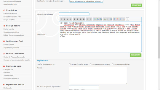
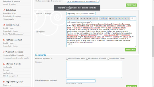
• Panel de Administración - General - Categorías y foros
Aquí en el mismo renglón del título del foro encontrarán un + en verde. ¿Lo ven? Está medio escondido así que no se preocupen si no lo localizan a la primera. Una vez lo tengas podrás crear una categoría y señalar si quieres un foro.
¿Cuál es la diferencia entre categoría y foro?
La categoría ordena y agrupa los foros. Es el enorme título que suelen llevar arriba. En cambio los foros son los sitios destinados a crear temas y los que permiten la interacción con el usuario.
Una vez has elegido entre foro y categoría crearemos una categoría con foro.
Tenemos las opciones de poner una imagen, una descripción o ambos. Nosotros haremos las tres cosas así pueden aprender.
• Foro con imagen: En este caso yo elegiré un tamaño de 465x120px peeeroo... pueden elegir lo que quieran, les recomiendo que no sea más ancha que el wrap ni demasiado larga porque podría ser demasiado pesado para el foro y además podría quedar muy mal si se sale, lo pueden poner en la descripción o en la dirección de la imagen en este caso lo pondré en la primera.
• Foro con texto: Les recomiendo poner en inicio uno largo para que no tengan imprevistos. En esta parte Sí les diría que añadan un simple html que quede así:
• Foro con texto e imagen: Podemos ponerlo todo en la descripción ó poner la imagen en Dirección de la imagen y en descripción añadir
Para la explicación con hover:

ó para la explicación sin hover
.Recomiendo la segunda opción si quieres que el texto quede fijo o la primera si deseas ponerle un hover.
#2 Editar todo con css
Con esta base comenzaremos a codear el css. 1) ul.topiclist.forums : Esta zona abarca la totalidad de los foros en esa categoría. Aquí definiré un color, un borde abajo que marque el final, un borde que redondee la parte de abajo y cuanto espacio (margen) habrá entre categorías:
ul.topiclist.forums{ background: var(--oscuro); border-bottom: 2px solid var(--acento1); margin-bottom: 10px; border-radius: 0px 0px 12px 12px; }
2) li.row : Esto abarca cada una de los subforos individuales, en este caso le pondremos un fondo, un borde abajo, y un margen, pero pueden probar lo que gusten.
li.row { border-bottom: 3px dotted var(--acento2); margin: 5px; background: var(--fondo); }
3) dd.dterm : Honestamente muchas veces en los skins me he salteado adrede esta zona, en otros no, el código de esta parte aplica a la zona del título de la categoría, el icono del costado y la descripción del foro, en esta oportunidad para mostrarles le pondré algunas cosas como un ancho y un padding.
dd.dterm { padding: 5px; width: 62%!important; }
4) a.forumtitle : Es la zona del título del foro ¡Es hermoso andarlo editando! Les diría que jueguen mucho y se diviertan haciéndolo con cualquier idea que se les ocurrá en este caso añadiré los siguientes atributos.
a.forumtitle { display: block; text-align: center; background: linear-gradient(45deg,var(--acento1),var(--acento2)); font-family: April Fatface; text-transform: uppercase; color: white; font-size: 18px; text-shadow: 1px 1px black; letter-spacing: 1px; width: 101%; }
5. Nuestra imagen se encuentra en dd.dterm img aquí pondremos algunas cosas, en mi caso difiniré el tamaño de imagen para que todas sean iguales, también pueden jugar con los blend-mode o ponerle simplemente bordes.
dd.dterm img { border: 5px solid var(--oscuro); outline: 1px solid var(--acento1); margin-top: -5px; width: 465px; height: 120px; }
6. Nuestro texto bueno aquí usamos un poco de html por lo que nuestra clase sería:.nuestrotextocate ¿Qué le pondremos? El tamaño (width, height, padding), el tipo de fuente y su color (font-size, font-family, color), la forma (display, overflow), bordes y decorados (border, outline). Recuerden que las cosas que les dejo realizadas son simplemente de muestra.
.nuestrotextocate { width: 455px; text-align: justify; color: #ccc; font-size: 13px; height: 120px; display: block; font-family: 'Montserrat', sans-serif; overflow: auto; border: 5px solid var(--oscuro); outline: 1px solid var(--acento1); padding: 5px; }
7. Cómo se habrán dado cuenta nosotros hicimos dos tipos de texto así que ahora usaremos el que está junto a una imagen... y aquí viene la hora de jugar mucho.
Les dejaré algunas opciones: → Hacer que el texto este sobre la imagen (cambia el color del background por transparent o uno con la opacidad bajada):
.nuestrotextocate2 { background: #58c3664d; height: 110px; display: block; position: absolute; width: 455px; margin-left: 5px; padding: 5px; text-align: justify; font-size: 12px; overflow: auto; }
→ Hacer que el texto este a un costado de la imagen (juega con el margen-left para ponerlo del lado que desees), recuerda que puedes ponerle el color de background que quieras:
.nuestrotextocate2 { background: #58c3664d; height: 110px; display: block; position: absolute; width: 216px; margin-left: 5px; padding: 5px; text-align: justify; font-size: 12px; overflow: auto; }
→ Hacer que el texto aparezca vía hover ¡UY UY UY SE COMPLICA LA COSA! Bueno no desesperen esta parte puede ser más compleja pero intentaré explicarlo lo mejor posible.
¿Recuerdan que les había dado esta opción? :
Lorem impusi...
Bueno con esto usaremos dos partes en el css la primera se llamará .nuestrotextocate1 y la segunda .nuestrotextocate1:hover
Les explicaré el más simple (en mi humilde opinión), lo primero será ponerle altura, ancho, color de fondo, display: block; la posición: absolute y opacity: 0; con esto estaremos realizando una cajita (que no la podremos ver porque le pusimos 0 de opacidad), además hay que añadir las propiedades de fuente y las transiciones (esto nos dirá el tiempo que tarda en realizarse el efecto). Les debería quedar algo así:
.nuestrotextocate1 { background: var(--acento2); position: absolute; height: 110px; display: block; margin-left: 3px; padding: 5px; width: 455px; text-align: justify; color: #ccc; overflow: auto; opacity: 0; -webkit-transition: all 0.4s ease-in-out 0s; -moz-transition: all 0.4s ease-in-out 0s; transition: all 0.4s ease-in-out 0s; }
Luego hay que añadir la palabra :hover y la opacidad: 1, nos quedaría así:
.nuestrotextocate1:hover {opacity: 1;}
Llegamos al último tramo del tutorial ¡Se hizo gigante! Ahora tenemos que acomodar los números del costado y el último tema.
dd.topics : Es para editar la zona que nos dice la cantidad de temas.
dd.posts : Es el sitio de la cantidad de post.
Yo pondré ambos con el mismo código para ahorrar líneas de css
dd.topics, dd.posts { width: 17%; display: inline-block; background: linear-gradient(45deg,var(--acento1),var(--acento2)); margin: 5px; text-align: center; color: #ccc; }
Bueno aquí pondré algo extra en el panel de administración iré a "Índice - Estructura y Jerarquía: Mostrar los avatares en la columna "Últimos mensajes" Sí" con eso nos mostrará el avatar del último usuario en responder (no es necesario añadirlo).
dd.lastpost { background: linear-gradient(45deg,var(--acento1),var(--acento2)); margin: 5px; width: 35%; height: 103px; font-size: 17px; color: #ccc; }
La parte de la imagen:
.lastpost-avatar img { width: 65px; height: 90px; border-radius: 5px; -moz-border-radius: 5px; -webkit-border-radius: 5px; }
¡Y ahora sí se ha acabado! Nos vemos en el siguiente :D
#Apolo:tutoriales#tutorial#css#skin#foroactivo#forumactif#diseño#web#juego de rol#rol#español#ayuda#recursos
16 notes
·
View notes
Text
Tutorial: Simple Carousel without using <input>
Hello everyone!
I always wanted to create a Carousel-based theme, upon researching, I found yeoli-thm‘s tutorial (link is at the demo) but I had a difficulty in understanding it as I am not a huge fan of <input>. Luckily, I managed to create a simpler version of the carousel without using <input>.
Here's the result:
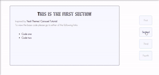
Preview
By having this result, you can create your very own pages and all-in-one themes! The base code will be provided in the demo but if you want to learn how to create this from scratch, please do read this till the end!
IMPORTANT!:
Please like and/or reblog this post if you like this tutorial. If you intend of using this code as a based code, you are required to mention me in your theme post.
This tutorial consists of four aspects:
General styling
Basic Container
Navigation
Carousel
The concept of creating a carousel derives from my smooth scrolling tutorial. If you haven’t check that out, I highly recommend for you check it out.
General Styling
1. Firstly, you need to add the basic code for your carousel. You can retrieve it from this site.
2. Add the universal selector at the style/CSS area:
/*GENERAL STYLING*/ *{ margin:0; box-sizing: border-box; scroll-behavior: smooth; }
It is pertinent to add scroll-behavior:smooth. This is to create a smooth scrolling effect.
3. Once you're done with it, you can create a basic styling for the body, fonts, etc at the style/css area. In my demo, I made a basic styling of the body, paragraph, title, and scrollbar. Example can be seen as follow:
/*BODY AND FONTS*/ body{ background: rgb(248,248,255); background-image: linear-gradient(180deg, rgba(248,248,255,1) 0%, rgba(223,223,255,1) 50%); font-family:geo sans light; text-align:justify; line-height:150%; } @font-face { font-family: geo sans light; src: url(https://static.tumblr.com/v6akjgz/MQbqf9ocl/geosanslight.ttf); } p{ margin-bottom:2rem; } h1{ font-family:vintage fair; text-align:center; color:#1f1b1b; text-shadow:-1px 0 black; font-weight:300; margin-bottom:1rem; line-height:1.15; } @font-face { font-family:vintage fair; src: url(https://static.tumblr.com/v6akjgz/SNhqfaujo/vintage_fair.ttf); } /*SCROLLBAR*/ ::-webkit-scrollbar { width: 18px; height: 18px; } ::-webkit-scrollbar-track { border: 8px solid #fff; background-color: rgba(0,0,0,.05); } ::-webkit-scrollbar-thumb { background-color: #acacff; border: 8px solid #fff; }
NOTE!: There's no need for you to copy and paste the above code. You can always edit it or create other designs that you like to add.
Basic Container
A basic container is a place where you'll be adding the carousel. You can design it however you want in the style/CSS area but at the most basic, you can style it this way:
/*BASIC CONTAINER*/ .content{ /*Basic*/ width: 50%; height: 60%; /*Position*/ position: fixed; top: 50%; left: 50%; transform: translate(-50%, -50%); /*Important*/ overflow: hidden; /*Design*/ background-color:lightblue; border-radius: 5px; border: 1px solid rgb(58, 2, 58); }
Please do take note that this is one of the many ways of creating the basic container. If you know your ways in CSS, you can style it however you want!
IMPORTANT: It is very important for you to add overflow:hidden;. Without this, it will cause the scrollbar to appear and make it less pleasing to see.
For the HTML area, add the following code:
<!--CONTENT--> <div class="content"> <!---THIS IS WHERE THE CODE FOR CAROUSEL WOULD BE SITUATED AT--> </div>
By now, if you click [Update Preview] and [Save], you will now see the container on your page.
Navigation
Navigation is the place where all the links to the section will be wrapped in.
1. Add the code below /body.
<!--NAVIGATION--> <div class="contentlink"> <ul> <li><a href="#partone">First</a> <li><a href="#parttwo">Second</a></li> <li><a href="#partthree">Third</a></li> <li><a href="#partfour">Fourth</a></li> </ul> </div>
2. After that, you are required to style it at the CSS/style are (preferably below the content). The most basic ways to do it is by doing it this way:
/*NAVIGATION*/ .contentlink{ width:5rem; height:10rem; position:fixed; top:30%; right:10%; } .contentlink ul{ list-style-type: none; padding:0; } .contentlink li{ background-color:ghostwhite; border:1px solid lightblue; border-radius: 5px; display: block; margin-bottom: 1rem; padding:1rem; text-align: center; } .contentlink li a{ text-decoration: none; color:rgb(24, 91, 136); transition: 0.25s ease-in; } .contentlink li a:hover{ color: midnightblue; font-weight: 600; transition: 0.25s ease-out; }
So let me explain one-by-one what's the function of each selector:
.contentlink: This is the wrapper for all the navigation links for the carousel.
.contentlink ul: This is the wrapper for the list. Since we don't want any bullets nor padding/indents, it is essential for us to set the list-style-type and padding to none and 0 respectively.
.contentlink li a & .contentlink li a:hover: These are essential to customize the link.
Take Note!
If you are the kind of person who focuses on accessibility, this type of code may not suit your needs. So, you may need to modify both the HTML and CSS code.
Again, this is one of the many ways of styling the navigation section. If you know your ways in CSS and HTML, you can always modify it however you like.
The number of navigation sections does not necessarily be four. It can be two or even six if you like! So, add/remove the link that suits your need.
If you intend to create an effect where whenever you click the section, it will show an indication to it, I would say that it may not be possible to do so as it requires input.
By now, you will see that everything is starting to come up to life. But if you click the button, you'll see that it won't move to another section. This is because we have yet to create the content section.
Carousel
This is where the content of each section lies. Firstly, you need to add the code inside the the div class="content" :
<!--CAROUSEL--> <div class="default" id="partone"> <!-- YOUR CONTENT--> </div> <div class="default" id="parttwo"> <!-- YOUR CONTENT--> </div> <div class="default" id="partthree"> <!-- YOUR CONTENT--> </div> <div class="default" id="partfour"> <!-- YOUR CONTENT--> </div>
Take note!:
class="default" is where you uniformize all the settings to be the same instead of rewriting the same setting in each id
partone,parttwo, etc represents the 'section for the link'. If you refer back tp the navigation above, you'll see that the link/href name is the same as this section. You may change the name to whatever you want to. However, you need to ensure that you also do the same with the link in the navigation area.
Now that you done with this, you can customize default and/or the sections at the css/style area. This is what I did for it:
.default{ width: 100%; height: 100%; overflow: auto; padding:2rem; } .default a{ color:rgb(58, 2, 58); text-decoration:none; font-weight:bold; } .default a:hover{ text-decoration:underline; font-weight:normal; } .default img{ width:100%; margin-bottom:1rem; margin-top:0.5rem; } #partone{ background: rgb(248,248,255); background: linear-gradient(180deg, rgba(248,248,255,1) 0%, rgba(223,223,255,1) 50%); } #parttwo{ background: rgb(223,223,255); background: linear-gradient(180deg, rgba(223,223,255,1) 0%, rgba(197,197,255,1) 50%); } #partthree{ background: rgb(197,197,255); background: linear-gradient(180deg, rgba(197,197,255,1) 0%, rgba(172,172,255,1) 50%); } #partfour{ background: rgb(172,172,255); background: linear-gradient(180deg, rgba(172,172,255,1) 0%, rgba(134,134,254,1) 50%); }
Take note!
If you want to uniformize everything (ie not wanting each section to have a different background-color/image), you can simply remove #partone all down to #partfour.
It is important to set the width and height to 100%. This is to ensure that your section will have its own section.
Set the overflow to auto. This is to allow the carousel to scroll in case if the contents overflow.
With that, you’re done! Please take note that what I’m sharing with you is just an idea of how to create a carousel effect using CSS and HTML. There are myriads of ways of creating this design as long as you follow the said concept:
Set your scroll behavior to smooth.
For the basic container, make sure that overflow is set to hidden.
For the navigation, make sure that the link is set to #THE NAME OF THE SELECTOR.
For the carousel, make sure that height and width are set to 100% + overflow is set to auto.
For each carousel, make sure its id is the same as the navigation.
All the best!
18 notes
·
View notes
Note
¡Hola, Necro! Gracias por todos tus hermosos tutoriales e infinita paciencia. Ahora bien, venía a preguntarte si sabrías cómo lograr algo similar a Reddit: Cuando el usuario que comienza el hilo responde su propio tema, aparece un cartelito al lado que dice "OP". ¿Es posible lograrlo en foroactivo? (ModernBB) Ando intentando hacer un foro de discusiones y esas cosas(?). Gracias desde ya (人 •͈ᴗ•͈)❤️✨
¡Interesante idea anon! He estado haciendo algunos testeos y esto es más que posible. Lo único que tienes que tener en cuenta es un par de cosas. Explico bajo el cut.
Lo primero es tener activado el recordatorio del primer mensaje. Esto es para que el JS pueda encontrar el primer post correcto y no te cambie el OP en cada página. Esto se activa en General > Mensajes y Emails > Siempre anunciar el 1er mensaje del tema en todas sus páginas.
Ahora, nos toca ir al template y buscar las variables <!-- BEGIN postrow --> y <!-- END postrow -->. Justo antes y después vamos a rodearlo con un div llamado .posteos (o el que quieras, pero para el ejemplo, usaré esta clase). Vamos, para que te quede tal que:
<div class="posteos"> <!-- BEGIN postrow --> tu HTML del post <!-- END postrow --> </div>
También tendremos que asegurarnos de tener localizado nuestro username. En mi caso, el div que lo contiene es .ppname, si el tuyo es diferente, esa es la class a cambiar en el JS.
Ahora que tenemos eso puesto, simplemente nos toca poner nuestro JS.
$('.posteos').each(function(){ var $firstpost = $(this).find('.post:first-of-type'); var firstId = $firstpost.find('.ppname a').attr('href'); $('.post').each(function(){ var postId = $(this).find('.ppname a').attr('href'); if (postId === firstId) { $(this).addClass('post-op'); } }); });
Revisa comillas y toda la parafernalia. Ahora, te quedará poner una cajita con el texto de op. Aunque puedes hacerlo con JS directamente (en lugar de añadir una class, simplemente agrega HTML donde quieras), yo he preferido hacerlo con CSS:
.post-op .postbody .content:before { content: 'OP'; background: var(--accent2); padding: 1px 20px; display: block; width: fit-content; font-weight: 700; color: white; text-shadow: var(--shadow-d); border-radius: 0 0 0 10px; margin: -20px -20px 20px 20px; font-size: 12px; margin-left: auto; }
Y ya estaría:

¡Espero que te sirva!
5 notes
·
View notes
Text
225 CSS PROPERTIES IN ALPHABETICAL ORDER
When it comes to CSS, it’s all about selector, properties and value. Here is the list of all CSS properties you need to take control of the front-end appearance.
A
align-content: Specifies the alignment between the lines inside a flexible container when the items do not use all available space
align-items: Specifies the alignment for items inside a flexible container
align-self: Specifies the alignment for selected items inside a flexible container
all: Resets all properties (except unicode-bidi and direction)
animation: A shorthand property for all the animation-* properties
animation-delay: Specifies a delay for the start of an animation
animation-direction: Specifies whether an animation should be played forwards, backwards or in alternate cycles
animation-duration: Specifies how long an animation should take to complete one cycle
animation-fill-mode: Specifies a style for the element when the animation is not playing (before it starts, after it ends, or both)
animation-iteration-count: Specifies the number of times an animation should be played
animation-name: Specifies a name for the @keyframes animation
animation-play-state: Specifies whether the animation is running or paused
animation-timing-function: Specifies the speed curve of an animation
B
backface-visibility: Defines whether or not the back face of an element should be visible when facing the user
background: A shorthand property for all the background-* properties
background-attachment: Sets whether a background image scrolls with the rest of the page, or is fixed
background-blend-mode: Specifies the blending mode of each background layer (color/image)
background-clip: Defines how far the background (color or image) should extend within an element
background-color: Specifies the background color of an element
background-image: Specifies one or more background images for an element
background-origin: Specifies the origin position of a background image
background-position: Specifies the position of a background image
background-repeat: Sets if/how a background image will be repeated
background-size: Specifies the size of the background images
border: A shorthand property for border-width, border-style and border-color
border-bottom: A shorthand property for border-bottom-width, border-bottom-style and border-bottom-color
border-bottom-color: Sets the color of the bottom border
border-bottom-left-radius: Defines the radius of the border of the bottom-left corner
border-bottom-right-radius: Defines the radius of the border of the bottom-right corner
border-bottom-style: Sets the style of the bottom border
border-bottom-width: Sets the width of the bottom border
border-collapse: Sets whether table borders should collapse into a single border or be separated
border-color: Sets the color of the four borders
border-image: A shorthand property for all the border-image-* properties
border-image-outset: Specifies the amount by which the border image area extends beyond the border box
border-image-repeat: Specifies whether the border image should be repeated, rounded or stretched
border-image-slice: Specifies how to slice the border image
border-image-source: Specifies the path to the image to be used as a border
border-image-width: Specifies the width of the border image
border-left: A shorthand property for all the border-left-* properties
border-left-color: Sets the color of the left border
border-left-style: Sets the style of the left border
border-left-width: Sets the width of the left border
border-radius: A shorthand property for the four border-*-radius properties
border-right: A shorthand property for all the border-right-* properties
border-right-color: Sets the color of the right border
border-right-style: Sets the style of the right border
border-right-width: Sets the width of the right border
border-spacing: Sets the distance between the borders of adjacent cells
border-style: Sets the style of the four borders
border-top: A shorthand property for border-top-width, border-top-style and border-top-color
border-top-color: Sets the color of the top border
border-top-left-radius: Defines the radius of the border of the top-left corner
border-top-right-radius: Defines the radius of the border of the top-right corner
border-top-style: Sets the style of the top border
border-top-width: Sets the width of the top border
border-width: Sets the width of the four borders
bottom: Sets the elements position, from the bottom of its parent element
box-decoration-break: Sets the behavior of the background and border of an element at page-break, or, for in-line elements, at line-break.
box-shadow: Attaches one or more shadows to an element
box-sizing: Defines how the width and height of an element are calculated: should they include padding and borders, or not
break-after: Specifies whether or not a page-, column-, or region-break should occur after the specified element
break-before: Specifies whether or not a page-, column-, or region-break should occur before the specified element
break-inside: Specifies whether or not a page-, column-, or region-break should occur inside the specified element
C
caption-side: Specifies the placement of a table caption
caret-color: Specifies the color of the cursor (caret) in inputs, text areas, or any element that is editable
@charset: Specifies the character encoding used in the style sheet
clear: Specifies on which sides of an element floating elements are not allowed to float
clip: Clips an absolutely positioned element
color: Sets the color of text
column-count: Specifies the number of columns an element should be divided into
column-fill: Specifies how to fill columns, balanced or not
column-gap: Specifies the gap between the columns
column-rule: A shorthand property for all the column-rule-* properties
column-rule-color: Specifies the color of the rule between columns
column-rule-style: Specifies the style of the rule between columns
column-rule-width: Specifies the width of the rule between columns
column-span: Specifies how many columns an element should span across
column-width: Specifies the column width
columns: A shorthand property for column-width and column-count
content: Used with the :before and :after pseudo-elements, to insert generated content
counter-increment: Increases or decreases the value of one or more CSS counters
counter-reset: Creates or resets one or more CSS counters
cursor: Specifies the mouse cursor to be displayed when pointing over an element
D
direction: Specifies the text direction/writing direction
display: Specifies how a certain HTML element should be displayed
E
empty-cells: Specifies whether or not to display borders and background on empty cells in a table
F
filter: Defines effects (e.g. blurring or color shifting) on an element before the element is displayed
flex: A shorthand property for the flex-grow, flex-shrink, and the flex-basis properties
flex-basis: Specifies the initial length of a flexible item
flex-direction: Specifies the direction of the flexible items
flex-flow: A shorthand property for the flex-direction and the flex-wrap properties
flex-grow: Specifies how much the item will grow relative to the rest
flex-shrink: Specifies how the item will shrink relative to the rest
flex-wrap: Specifies whether the flexible items should wrap or not
float: Specifies whether or not a box should float
font: A shorthand property for the font-style, font-variant, font-weight, font-size/line-height, and the font-family properties
@font-face: A rule that allows websites to download and use fonts other than the "web-safe" fonts
font-family: Specifies the font family for text
font-feature-settings: Allows control over advanced typographic features in OpenType fonts
@font-feature-values: Allows authors to use a common name in font-variant-alternate for feature activated differently in OpenType
font-kerning: Controls the usage of the kerning information (how letters are spaced)
font-language-override: Controls the usage of language-specific glyphs in a typeface
font-size: Specifies the font size of text
font-size-adjust: Preserves the readability of text when font fallback occurs
font-stretch: Selects a normal, condensed, or expanded face from a font family
font-style: Specifies the font style for text
font-synthesis: Controls which missing typefaces (bold or italic) may be synthesized by the browser
font-variant: Specifies whether or not a text should be displayed in a small-caps font
font-variant-alternates: Controls the usage of alternate glyphs associated to alternative names defined in @font-feature-values
font-variant-caps: Controls the usage of alternate glyphs for capital letters
font-variant-east-asian: Controls the usage of alternate glyphs for East Asian scripts (e.g Japanese and Chinese)
font-variant-ligatures: Controls which ligatures and contextual forms are used in textual content of the elements it applies to
font-variant-numeric: Controls the usage of alternate glyphs for numbers, fractions, and ordinal markers
font-variant-position: Controls the usage of alternate glyphs of smaller size positioned as superscript or subscript regarding the baseline of the font
font-weight: Specifies the weight of a font
G
grid: A shorthand property for the grid-template-rows, grid-template-columns, grid-template-areas, grid-auto-rows, grid-auto-columns, and the grid-auto-flow properties
grid-area: Either specifies a name for the grid item, or this property is a shorthand property for the grid-row-start, grid-column-start, grid-row-end, and grid-column-end properties
grid-auto-columns: Specifies a default column size
grid-auto-flow: Specifies how auto-placed items are inserted in the grid
grid-auto-rows: Specifies a default row size
grid-column: A shorthand property for the grid-column-start and the grid-column-end properties
grid-column-end: Specifies where to end the grid item
grid-column-gap: Specifies the size of the gap between columns
grid-column-start: Specifies where to start the grid item
grid-gap: A shorthand property for the grid-row-gap and grid-column-gap properties
grid-row: A shorthand property for the grid-row-start and the grid-row-end properties
grid-row-end: Specifies where to end the grid item
grid-row-gap: Specifies the size of the gap between rows
grid-row-start: Specifies where to start the grid item
grid-template: A shorthand property for the grid-template-rows, grid-template-columns and grid-areas properties
grid-template-areas: Specifies how to display columns and rows, using named grid items
grid-template-columns: Specifies the size of the columns, and how many columns in a grid layout
grid-template-rows: Specifies the size of the rows in a grid layout
H
hanging-punctuation: Specifies whether a punctuation character may be placed outside the line box
height: Sets the height of an element
hyphens: Sets how to split words to improve the layout of paragraphs
I
image-rendering: Gives a hint to the browser about what aspects of an image are most important to preserve when the image is scaled
@import: Allows you to import a style sheet into another style sheet
isolation: Defines whether an element must create a new stacking content
J
justify-content: Specifies the alignment between the items inside a flexible container when the items do not use all available space
K
@keyframes: Specifies the animation code
L
left: Specifies the left position of a positioned element
letter-spacing: Increases or decreases the space between characters in a text
line-breakSpecifies how/if to break lines
line-height: Sets the line height
list-style: Sets all the properties for a list in one declaration
list-style-image: Specifies an image as the list-item marker
list-style-position: Specifies the position of the list-item markers (bullet points)
list-style-type: Specifies the type of list-item marker
M
margin: Sets all the margin properties in one declaration
margin-bottom: Sets the bottom margin of an element
margin-left: Sets the left margin of an element
margin-right: Sets the right margin of an element
margin-top: Sets the top margin of an element
mask: Hides an element by masking or clipping the image at specific places
mask-type: Specifies whether a mask element is used as a luminance or an alpha mask
max-height: Sets the maximum height of an element
max-width: Sets the maximum width of an element
@media: Sets the style rules for different media types/devices/sizes
min-height: Sets the minimum height of an element
min-width: Sets the minimum width of an element
mix-blend-mode: Specifies how an element's content should blend with its direct parent background
O
object-fit: Specifies how the contents of a replaced element should be fitted to the box established by its used height and width
object-position: Specifies the alignment of the replaced element inside its box
opacity: Sets the opacity level for an element
order: Sets the order of the flexible item, relative to the rest
orphans: Sets the minimum number of lines that must be left at the bottom of a page when a page break occurs inside an element
outline: A shorthand property for the outline-width, outline-style, and the outline-color properties
outline-color: Sets the color of an outline
outline-offset: Offsets an outline, and draws it beyond the border edge
outline-style: Sets the style of an outline
outline-width: Sets the width of an outline
overflow: Specifies what happens if content overflows an element's box
overflow-wrap: Specifies whether or not the browser may break lines within words in order to prevent overflow (when a string is too long to fit its containing box)
overflow-x: Specifies whether or not to clip the left/right edges of the content, if it overflows the element's content area
overflow-y: Specifies whether or not to clip the top/bottom edges of the content, if it overflows the element's content area
P
padding: A shorthand property for all the padding-* properties
padding-bottom: Sets the bottom padding of an element
padding-left: Sets the left padding of an element
padding-right: Sets the right padding of an element
padding-top: Sets the top padding of an element
page-break-after: Sets the page-break behavior after an element
page-break-before: Sets the page-break behavior before an element
page-break-inside: Sets the page-break behavior inside an element
perspective: Gives a 3D-positioned element some perspective
perspective-origin: Defines at which position the user is looking at the 3D-positioned element
pointer-events: Defines whether or not an element reacts to pointer events
position: Specifies the type of positioning method used for an element (static, relative, absolute or fixed)
Q
quotes: Sets the type of quotation marks for embedded quotations
R
resize: Defines if (and how) an element is resizable by the user
right: Specifies the right position of a positioned element
S
scroll-behavior: Specifies whether to smoothly animate the scroll position in a scrollable box, instead of a straight jump
T
tab-size: Specifies the width of a tab character
table-layout: Defines the algorithm used to lay out table cells, rows, and columns
text-align: Specifies the horizontal alignment of text
text-align-last: Describes how the last line of a block or a line right before a forced line break is aligned when text-align is "justify"
text-combine-upright: Specifies the combination of multiple characters into the space of a single character
text-decoration: Specifies the decoration added to text
text-decoration-color: Specifies the color of the text-decoration
text-decoration-line: Specifies the type of line in a text-decoration
text-decoration-style: Specifies the style of the line in a text decoration
text-indent: Specifies the indentation of the first line in a text-block
text-justify: Specifies the justification method used when text-align is "justify"
text-orientation: Defines the orientation of the text in a line
text-overflow: Specifies what should happen when text overflows the containing element
text-shadow: Adds shadow to text
text-transform: Controls the capitalization of text
text-underline-position: Specifies the position of the underline which is set using the text-decoration property
top: Specifies the top position of a positioned element
transform: Applies a 2D or 3D transformation to an element
transform-origin: Allows you to change the position on transformed elements
transform-style: Specifies how nested elements are rendered in 3D space
transition: A shorthand property for all the transition-* properties
transition-delay: Specifies when the transition effect will start
transition-duration: Specifies how many seconds or milliseconds a transition effect takes to complete
transition-property: Specifies the name of the CSS property the transition effect is for
transition-timing-function: Specifies the speed curve of the transition effect
U
unicode-bidi: Used together with the
direction: property to set or return whether the text should be overridden to support multiple languages in the same document
user-select: Specifies whether the text of an element can be selected
V
vertical-align: Sets the vertical alignment of an element
visibility: Specifies whether or not an element is visible
W
white-space: Specifies how white-space inside an element is handled
widows: Sets the minimum number of lines that must be left at the top of a page when a page break occurs inside an element
width: Sets the width of an element
word-break: Specifies how words should break when reaching the end of a line
word-spacing: Increases or decreases the space between words in a text
word-wrap: Allows long, unbreakable words to be broken and wrap to the next line
writing-mode: Specifies whether lines of text are laid out horizontally or vertically
Z
z-index: Sets the stack order of a positioned element
Reference: https://www.w3schools.com/cssref/
#web developing dublin#web developers#web development#web design#website#css properties#css#dublin#ireland
36 notes
·
View notes
Text
Getting Creative With HTML Dialog
New Post has been published on https://thedigitalinsider.com/getting-creative-with-html-dialog/
Getting Creative With HTML Dialog
Like ’em or loath ’em, whether you’re showing an alert, a message, or a newsletter signup, dialogue boxes draw attention to a particular piece of content without sending someone to a different page. In the past, dialogues relied on a mix of divisions, ARIA, and JavaScript. But the HTML dialog element has made them more accessible and style-able in countless ways.
So, how can you take dialogue box design beyond the generic look of frameworks and templates? How can you style them to reflect a brand’s visual identity and help to tell its stories? Here’s how I do it in CSS using ::backdrop, backdrop-filter, and animations.
Design by Andy Clarke, Stuff & Nonsense. Mike Worth’s website will launch in June 2025, but you can see examples from this article on CodePen.
I mentioned before that Emmy-award-winning game composer Mike Worth hired me to create a highly graphical design. Mike loves ’90s animation, and he challenged me to find ways to incorporate its retro style without making a pastiche. However, I also needed to achieve that retro feel while maintaining accessibility, performance, responsiveness, and semantics.
A brief overview of dialog and ::backdrop
Let’s run through a quick refresher.
Note: While I mostly refer to “dialogue boxes” throughout, the HTML element is spelt dialog.
dialog is an HTML element designed for implementing modal and non-modal dialogue boxes in products and website interfaces. It comes with built-in functionality, including closing a box using the keyboard Esc key, focus trapping to keep it inside the box, show and hide methods, and a ::backdrop pseudo-element for styling a box’s overlay.
The HTML markup is just what you might expect:
<dialog> <h2>Keep me informed</h2> <!-- ... --> <button>Close</button> </dialog>
This type of dialogue box is hidden by default, but adding the open attribute makes it visible when the page loads:
<dialog open> <h2>Keep me informed</h2> <!-- ... --> <button>Close</button> </dialog>
I can’t imagine too many applications for non-modals which are open by default, so ordinarily I need a button which opens a dialogue box:
<dialog> <!-- ... --> </dialog> <button>Keep me informed</button>
Plus a little bit of JavaScript, which opens the modal:
const dialog = document.querySelector("dialog"); const showButton = document.querySelector("dialog + button"); showButton.addEventListener("click", () => dialog.showModal(); );
Closing a dialogue box also requires JavaScript:
const closeButton = document.querySelector("dialog button"); closeButton.addEventListener("click", () => dialog.close(); );
Unless the box contains a form using method="dialog", which allows it to close automatically on submit without JavaScript:
<dialog> <form method="dialog"> <button>Submit</button> </form> </dialog>
The dialog element was developed to be accessible out of the box. It traps focus, supports the Esc key, and behaves like a proper modal. But to help screen readers announce dialogue boxes properly, you’ll want to add an aria-labelledby attribute. This tells assistive technology where to find the dialogue box’s title so it can be read aloud when the modal opens.
<dialog aria-labelledby="dialog-title"> <h2 id="dialog-title">Keep me informed</h2> <!-- ... --> </dialog>
Most tutorials I’ve seen include very little styling for dialog and ::backdrop, which might explain why so many dialogue boxes have little more than border radii and a box-shadow applied.
Out-of-the-box dialogue designs
I believe that every element in a design — no matter how small or infrequently seen — is an opportunity to present a brand and tell a story about its products or services. I know there are moments during someone’s journey through a design where paying special attention to design can make their experience more memorable.
Dialogue boxes are just one of those moments, and Mike Worth’s design offers plenty of opportunities to reflect his brand or connect directly to someone’s place in Mike’s story. That might be by styling a newsletter sign-up dialogue to match the scrolls in his news section.
Mike Worth concept design, designed by Andy Clarke, Stuff & Nonsense.
Or making the form modal on his error pages look like a comic-book speech balloon.
Mike Worth concept design, designed by Andy Clarke, Stuff & Nonsense.
dialog in action
Mike’s drop-down navigation menu looks like an ancient stone tablet.
Mike Worth, designed by Andy Clarke, Stuff & Nonsense.
I wanted to extend this look to his dialogue boxes with a three-dimensional tablet and a jungle leaf-filled backdrop.
Mike Worth, designed by Andy Clarke, Stuff & Nonsense.
This dialog contains a newsletter sign-up form with an email input and a submit button:
<dialog> <h2>Keep me informed</h2> <form> <label for="email" data-visibility="hidden">Email address</label> <input type="email" id="email" required> <button>Submit</button> </form> <button>x</button> </dialog>
I started by applying dimensions to the dialog and adding the SVG stone tablet background image:
dialog width: 420px; height: 480px; background-color: transparent; background-image: url("dialog.svg"); background-repeat: no-repeat; background-size: contain;
Then, I added the leafy green background image to the dialogue box’s generated backdrop using the ::backdrop pseudo element selector:
dialog::backdrop background-image: url("backdrop.svg"); background-size: cover;
Mike Worth, designed by Andy Clarke, Stuff & Nonsense.
I needed to make it clear to anyone filling in Mike’s form that their email address is in a valid format. So I combined :has and :valid CSS pseudo-class selectors to change the color of the submit button from grey to green:
dialog:has(input:valid) button background-color: #7e8943; color: #fff;
I also wanted this interaction to reflect Mike’s fun personality. So, I also changed the dialog background image and applied a rubberband animation to the box when someone inputs a valid email address:
dialog:has(input:valid) background-image: url("dialog-valid.svg"); animation: rubberBand 0.82s cubic-bezier(0.36, 0.07, 0.19, 0.97) both; @keyframes rubberBand from transform: scale3d(1, 1, 1); 30% transform: scale3d(1.25, 0.75, 1); 40% transform: scale3d(0.75, 1.25, 1); 50% transform: scale3d(1.15, 0.85, 1); 65% transform: scale3d(0.95, 1.05, 1); 75% transform: scale3d(1.05, 0.95, 1); to transform: scale3d(1, 1, 1);
Tip: Daniel Eden’s Animate.css library is a fabulous source of “Just-add-water CSS animations” like the rubberband I used for this dialogue box.
Changing how an element looks when it contains a valid input is a fabulous way to add interactions that are, at the same time, fun and valuable for the user.
Mike Worth, designed by Andy Clarke, Stuff & Nonsense.
That combination of :has and :valid selectors can even be extended to the ::backdrop pseudo-class, to change the backdrop’s background image:
dialog:has(input:valid)::backdrop background-image: url("backdrop-valid.svg");
Try it for yourself:
Conclusion
We often think of dialogue boxes as functional elements, as necessary interruptions, but nothing more. But when you treat them as opportunities for expression, even the smallest parts of a design can help shape a product or website’s personality.
The HTML dialog element, with its built-in behaviours and styling potential, opens up opportunities for branding and creative storytelling. There’s no reason a dialogue box can’t be as distinctive as the rest of your design.
Andy Clarke
Often referred to as one of the pioneers of web design, Andy Clarke has been instrumental in pushing the boundaries of web design and is known for his creative and visually stunning designs. His work has inspired countless designers to explore the full potential of product and website design.
Andy’s written several industry-leading books, including ‘Transcending CSS,’ ‘Hardboiled Web Design,’ and ‘Art Direction for the Web.’ He’s also worked with businesses of all sizes and industries to achieve their goals through design.
Visit Andy’s studio, Stuff & Nonsense, and check out his Contract Killer, the popular web design contract template trusted by thousands of web designers and developers.
#:has#2025#Accessibility#ADD#amp#animation#animations#applications#aria#Art#Article#Articles#Assistive technology#attention#background#background-image#book#Books#border#box#box-shadow#Branding#change#Color#content#CSS#css animations#data#Design#designers
1 note
·
View note
Photo

A
align-content
Specifies the alignment between the lines inside a flexible container when the items do not use all available space
align-items
Specifies the alignment for items inside a flexible container
align-self
Specifies the alignment for selected items inside a flexible container
all
Resets all properties (except unicode-bidi and direction)
animation
A shorthand property for all the animation-* properties
animation-delay
Specifies a delay for the start of an animation
animation-direction
Specifies whether an animation should be played forwards, backwards or in alternate cycles
animation-duration
Specifies how long an animation should take to complete one cycle
animation-fill-mode
Specifies a style for the element when the animation is not playing (before it starts, after it ends, or both)
animation-iteration-count
Specifies the number of times an animation should be played
animation-name
Specifies a name for the @keyframes animation
animation-play-state
Specifies whether the animation is running or paused
animation-timing-function
Specifies the speed curve of an animation
B
backface-visibility
Defines whether or not the back face of an element should be visible when facing the user
background
A shorthand property for all the background-* properties
background-attachment
Sets whether a background image scrolls with the rest of the page, or is fixed
background-blend-mode
Specifies the blending mode of each background layer (color/image)
background-clip
Defines how far the background (color or image) should extend within an element
background-color
Specifies the background color of an element
background-image
Specifies one or more background images for an element
background-origin
Specifies the origin position of a background image
background-position
Specifies the position of a background image
background-repeat
Sets if/how a background image will be repeated
background-size
Specifies the size of the background images
border
A shorthand property for border-width, border-style and border-color
border-bottom
A shorthand property for border-bottom-width, border-bottom-style and border-bottom-color
border-bottom-color
Sets the color of the bottom border
border-bottom-left-radius
Defines the radius of the border of the bottom-left corner
border-bottom-right-radius
Defines the radius of the border of the bottom-right corner
border-bottom-style
Sets the style of the bottom border
border-bottom-width
Sets the width of the bottom border
border-collapse
Sets whether table borders should collapse into a single border or be separated
border-color
Sets the color of the four borders
border-image
A shorthand property for all the border-image-* properties
border-image-outset
Specifies the amount by which the border image area extends beyond the border box
border-image-repeat
Specifies whether the border image should be repeated, rounded or stretched
border-image-slice
Specifies how to slice the border image
border-image-source
Specifies the path to the image to be used as a border
border-image-width
Specifies the width of the border image
border-left
A shorthand property for all the border-left-* properties
border-left-color
Sets the color of the left border
border-left-style
Sets the style of the left border
border-left-width
Sets the width of the left border
border-radius
A shorthand property for the four border-*-radius properties
border-right
A shorthand property for all the border-right-* properties
border-right-color
Sets the color of the right border
border-right-style
Sets the style of the right border
border-right-width
Sets the width of the right border
border-spacing
Sets the distance between the borders of adjacent cells
border-style
Sets the style of the four borders
border-top
A shorthand property for border-top-width, border-top-style and border-top-color
border-top-color
Sets the color of the top border
border-top-left-radius
Defines the radius of the border of the top-left corner
border-top-right-radius
Defines the radius of the border of the top-right corner
border-top-style
Sets the style of the top border
border-top-width
Sets the width of the top border
border-width
Sets the width of the four borders
bottom
Sets the elements position, from the bottom of its parent element
box-decoration-break
Sets the behavior of the background and border of an element at page-break, or, for in-line elements, at line-break.
box-shadow
Attaches one or more shadows to an element
box-sizing
Defines how the width and height of an element are calculated: should they include padding and borders, or not
break-after
Specifies whether or not a page-, column-, or region-break should occur after the specified element
break-before
Specifies whether or not a page-, column-, or region-break should occur before the specified element
break-inside
Specifies whether or not a page-, column-, or region-break should occur inside the specified element
C
caption-side
Specifies the placement of a table caption
caret-color
Specifies the color of the cursor (caret) in inputs, textareas, or any element that is editable
@charset
Specifies the character encoding used in the style sheet
clear
Specifies on which sides of an element floating elements are not allowed to float
clip
Clips an absolutely positioned element
color
Sets the color of text
column-count
Specifies the number of columns an element should be divided into
column-fill
Specifies how to fill columns, balanced or not
column-gap
Specifies the gap between the columns
column-rule
A shorthand property for all the column-rule-* properties
column-rule-color
Specifies the color of the rule between columns
column-rule-style
Specifies the style of the rule between columns
column-rule-width
Specifies the width of the rule between columns
column-span
Specifies how many columns an element should span across
column-width
Specifies the column width
columns
A shorthand property for column-width and column-count
content
Used with the :before and :after pseudo-elements, to insert generated content
counter-increment
Increases or decreases the value of one or more CSS counters
counter-reset
Creates or resets one or more CSS counters
cursor
Specifies the mouse cursor to be displayed when pointing over an element
D
direction
Specifies the text direction/writing direction
display
Specifies how a certain HTML element should be displayed
E
empty-cells
Specifies whether or not to display borders and background on empty cells in a table
F
filter
Defines effects (e.g. blurring or color shifting) on an element before the element is displayed
flex
A shorthand property for the flex-grow, flex-shrink, and the flex-basis properties
flex-basis
Specifies the initial length of a flexible item
flex-direction
Specifies the direction of the flexible items
flex-flow
A shorthand property for the flex-direction and the flex-wrap properties
flex-grow
Specifies how much the item will grow relative to the rest
flex-shrink
Specifies how the item will shrink relative to the rest
flex-wrap
Specifies whether the flexible items should wrap or not
float
Specifies whether or not a box should float
font
A shorthand property for the font-style, font-variant, font-weight, font-size/line-height, and the font-family properties
@font-face
A rule that allows websites to download and use fonts other than the "web-safe" fonts
font-family
Specifies the font family for text
font-feature-settings
Allows control over advanced typographic features in OpenType fonts
@font-feature-valuesAllows authors to use a common name in font-variant-alternate for feature activated differently in OpenType
font-kerning
Controls the usage of the kerning information (how letters are spaced)
font-language-overrideControls the usage of language-specific glyphs in a typeface
font-size
Specifies the font size of text
font-size-adjust
Preserves the readability of text when font fallback occurs
font-stretch
Selects a normal, condensed, or expanded face from a font family
font-style
Specifies the font style for text
font-synthesisControls which missing typefaces (bold or italic) may be synthesized by the browser
font-variant
Specifies whether or not a text should be displayed in a small-caps font
font-variant-alternatesControls the usage of alternate glyphs associated to alternative names defined in @font-feature-values
font-variant-caps
Controls the usage of alternate glyphs for capital letters
font-variant-east-asianControls the usage of alternate glyphs for East Asian scripts (e.g Japanese and Chinese)
font-variant-ligaturesControls which ligatures and contextual forms are used in textual content of the elements it applies to
font-variant-numericControls the usage of alternate glyphs for numbers, fractions, and ordinal markers
font-variant-positionControls the usage of alternate glyphs of smaller size positioned as superscript or subscript regarding the baseline of the font
font-weight
Specifies the weight of a font
G
grid
A shorthand property for the grid-template-rows, grid-template-columns, grid-template-areas, grid-auto-rows, grid-auto-columns, and the grid-auto-flow properties
grid-area
Either specifies a name for the grid item, or this property is a shorthand property for the grid-row-start, grid-column-start, grid-row-end, and grid-column-end properties
grid-auto-columns
Specifies a default column size
grid-auto-flow
Specifies how auto-placed items are inserted in the grid
grid-auto-rows
Specifies a default row size
grid-column
A shorthand property for the grid-column-start and the grid-column-end properties
grid-column-end
Specifies where to end the grid item
grid-column-gap
Specifies the size of the gap between columns
grid-column-start
Specifies where to start the grid item
grid-gap
A shorthand property for the grid-row-gap and grid-column-gap properties
grid-row
A shorthand property for the grid-row-start and the grid-row-end properties
grid-row-end
Specifies where to end the grid item
grid-row-gap
Specifies the size of the gap between rows
grid-row-start
Specifies where to start the grid item
grid-template
A shorthand property for the grid-template-rows, grid-template-columns and grid-areas properties
grid-template-areas
Specifies how to display columns and rows, using named grid items
grid-template-columns
Specifies the size of the columns, and how many columns in a grid layout
grid-template-rows
Specifies the size of the rows in a grid layout
H
hanging-punctuation
Specifies whether a punctuation character may be placed outside the line box
height
Sets the height of an element
hyphens
Sets how to split words to improve the layout of paragraphs
I
image-renderingGives a hint to the browser about what aspects of an image are most important to preserve when the image is scaled
@import
Allows you to import a style sheet into another style sheet
isolation
Defines whether an element must create a new stacking content
J
justify-content
Specifies the alignment between the items inside a flexible container when the items do not use all available space
K
@keyframes
Specifies the animation code
L
left
Specifies the left position of a positioned element
letter-spacing
Increases or decreases the space between characters in a text
line-breakSpecifies how/if to break lines
line-height
Sets the line height
list-style
Sets all the properties for a list in one declaration
list-style-image
Specifies an image as the list-item marker
list-style-position
Specifies the position of the list-item markers (bullet points)
list-style-type
Specifies the type of list-item marker
M
margin
Sets all the margin properties in one declaration
margin-bottom
Sets the bottom margin of an element
margin-left
Sets the left margin of an element
margin-right
Sets the right margin of an element
margin-top
Sets the top margin of an element
maskHides an element by masking or clipping the image at specific places
mask-typeSpecifies whether a mask element is used as a luminance or an alpha mask
max-height
Sets the maximum height of an element
max-width
Sets the maximum width of an element
@media
Sets the style rules for different media types/devices/sizes
min-height
Sets the minimum height of an element
min-width
Sets the minimum width of an element
mix-blend-mode
Specifies how an element's content should blend with its direct parent background
O
object-fit
Specifies how the contents of a replaced element should be fitted to the box established by its used height and width
object-position
Specifies the alignment of the replaced element inside its box
opacity
Sets the opacity level for an element
order
Sets the order of the flexible item, relative to the rest
orphansSets the minimum number of lines that must be left at the bottom of a page when a page break occurs inside an element
outline
A shorthand property for the outline-width, outline-style, and the outline-color properties
outline-color
Sets the color of an outline
outline-offset
Offsets an outline, and draws it beyond the border edge
outline-style
Sets the style of an outline
outline-width
Sets the width of an outline
overflow
Specifies what happens if content overflows an element's box
overflow-wrapSpecifies whether or not the browser may break lines within words in order to prevent overflow (when a string is too long to fit its containing box)
overflow-x
Specifies whether or not to clip the left/right edges of the content, if it overflows the element's content area
overflow-y
Specifies whether or not to clip the top/bottom edges of the content, if it overflows the element's content area
P
padding
A shorthand property for all the padding-* properties
padding-bottom
Sets the bottom padding of an element
padding-left
Sets the left padding of an element
padding-right
Sets the right padding of an element
padding-top
Sets the top padding of an element
page-break-after
Sets the page-break behavior after an element
page-break-before
Sets the page-break behavior before an element
page-break-inside
Sets the page-break behavior inside an element
perspective
Gives a 3D-positioned element some perspective
perspective-origin
Defines at which position the user is looking at the 3D-positioned element
pointer-events
Defines whether or not an element reacts to pointer events
position
Specifies the type of positioning method used for an element (static, relative, absolute or fixed)
Q
quotes
Sets the type of quotation marks for embedded quotations
R
resize
Defines if (and how) an element is resizable by the user
right
Specifies the right position of a positioned element
S
scroll-behavior
Specifies whether to smoothly animate the scroll position in a scrollable box, instead of a straight jump
T
tab-size
Specifies the width of a tab character
table-layout
Defines the algorithm used to lay out table cells, rows, and columns
text-align
Specifies the horizontal alignment of text
text-align-last
Describes how the last line of a block or a line right before a forced line break is aligned when text-align is "justify"
text-combine-uprightSpecifies the combination of multiple characters into the space of a single character
text-decoration
Specifies the decoration added to text
text-decoration-color
Specifies the color of the text-decoration
text-decoration-line
Specifies the type of line in a text-decoration
text-decoration-style
Specifies the style of the line in a text decoration
text-indent
Specifies the indentation of the first line in a text-block
text-justify
Specifies the justification method used when text-align is "justify"
text-orientationDefines the orientation of the text in a line
text-overflow
Specifies what should happen when text overflows the containing element
text-shadow
Adds shadow to text
text-transform
Controls the capitalization of text
text-underline-positionSpecifies the position of the underline which is set using the text-decoration property
top
Specifies the top position of a positioned element
transform
Applies a 2D or 3D transformation to an element
transform-origin
Allows you to change the position on transformed elements
transform-style
Specifies how nested elements are rendered in 3D space
transition
A shorthand property for all the transition-* properties
transition-delay
Specifies when the transition effect will start
transition-duration
Specifies how many seconds or milliseconds a transition effect takes to complete
transition-property
Specifies the name of the CSS property the transition effect is for
transition-timing-function
Specifies the speed curve of the transition effect
U
unicode-bidi
Used together with the
direction
property to set or return whether the text should be overridden to support multiple languages in the same document
user-select
Specifies whether the text of an element can be selected
V
vertical-align
Sets the vertical alignment of an element
visibility
Specifies whether or not an element is visible
W
white-space
Specifies how white-space inside an element is handled
widowsSets the minimum number of lines that must be left at the top of a page when a page break occurs inside an element
width
Sets the width of an element
word-break
Specifies how words should break when reaching the end of a line
word-spacing
Increases or decreases the space between words in a text
word-wrap
Allows long, unbreakable words to be broken and wrap to the next line
writing-mode
Specifies whether lines of text are laid out horizontally or vertically
Z
z-index
Sets the stack order of a positioned element
5 notes
·
View notes
Photo

Chrome extension - CSS3 Generator
Taken from the description page...
CSS3 Generator is a handy extension that will create the code you need for your CSS. It currently generates cross-browser (as far as possible) code for the following CSS3 properties
So while looking for a lazy way to do a box-shadow, I stumbled upon this nifty chrome extension which generates different css3 options, which includes
Text Shadow
NEW, multiple shadows can now be added
Hex/RGBA
Transforms
Border Radius
Box Shadow
NEW, multiple shadows can now be added
NEW, box shadows can be set to inset
Columns
Gradients
Linear
Radial
Striped (NEW!)
Arrows (for tooltips etc)
If you like what you see, please go check it out by using the link I included above. Enjoy!!!
#yeahps#resources#extensions#i wouldn't be surprised if I am the last person to find this out#but nonetheless i'm glad i did#hopefully this is useful for you guys
155 notes
·
View notes
Text
Kereta Moto's Property Monthly Instalment Calculator is a user-friendly online tool meticulously crafted to simplify the process of estimating monthly instalments for property purchases in Malaysia. Property Monthly Instalment Calculator /* Add your custom CSS styles here */ body font-family: Arial, sans-serif; .calculator-container max-width: 500px; margin: 0 auto; padding: 20px; border: 1px solid #ccc; border-radius: 5px; box-shadow: 0 0 10px rgba(0, 0, 0, 0.1); input[type="number"] width: 100%; padding: 10px; margin-bottom: 10px; border: 1px solid #ccc; border-radius: 5px; box-sizing: border-box; button width: 100%; padding: 10px; background-color: #007bff; color: #fff; border: none; border-radius: 5px; cursor: pointer; button:hover background-color: #0056b3; .result margin-top: 20px; text-align: center; font-weight: bold; Property Calculator Property Price (RM) Loan Period (years) Interest Rate (%) Calculate function calculateMonthlyInstalment() var propertyPrice = parseFloat(document.getElementById('propertyPrice').value); var loanPeriod = parseFloat(document.getElementById('loanPeriod').value); var interestRate = parseFloat(document.getElementById('interestRate').value); var monthlyInterestRate = (interestRate / 100) / 12; var numberOfPayments = loanPeriod * 12; var monthlyInstalment = (propertyPrice * monthlyInterestRate) / (1 - Math.pow(1 + monthlyInterestRate, -numberOfPayments)); document.getElementById('result').innerText = 'Monthly Instalment: RM ' + monthlyInstalment.toFixed(2); Utilizing advanced algorithms and up-to-date market data, Kereta Moto's calculator provides users with accurate estimations of their monthly instalments based on various factors such as property price, down payment amount, loan tenure, and interest rates. By inputting these key details into the calculator, users can swiftly generate a comprehensive breakdown of their potential monthly financial commitments, allowing for better financial planning and decision-making. Features and Benefits Property Monthly Instalment Calculator Kereta Moto's calculator boasts a sleek and intuitive interface, ensuring a seamless user experience for individuals of all backgrounds and expertise levels. With the ability to adjust variables such as loan tenure and interest rates, users can tailor their calculations to align with their unique financial circumstances and preferences. Gone are the days of lengthy manual calculations. With just a few clicks, users can obtain instant and accurate estimations of their monthly instalments, saving time and effort in the process. Armed with a clear understanding of their monthly financial commitments, users can make well-informed decisions regarding property purchases, thereby mitigating the risk of potential financial strain in the future. FAQ (Frequently Asked Questions) How Accurate are the Calculations Provided by Kereta Moto's Property Monthly Instalment Calculator? Kereta Moto's calculator leverages sophisticated algorithms and real-time market data to ensure the accuracy of its calculations. While the estimations provided may serve as a reliable guide, it's important to note that actual instalments may vary based on factors such as loan approval, prevailing interest rates, and additional fees. Can I Use the Calculator for Different Types of Properties? Absolutely! Whether you're considering a condominium, landed property, or commercial real estate, Kereta Moto's calculator accommodates a wide range of property types, allowing users to assess monthly instalments across various segments of the market. Is Kereta Moto's Property Monthly Instalment Calculator Free to Use? Yes, Kereta Moto's calculator is completely free to use, providing users with unrestricted access to its powerful features and functionalities without any hidden costs or subscription fees.
0 notes
Text
Animated Scroll to Top Button
This is a pretty simple lil drag and drop bit of code, and you can stick the button itself pretty much anywhere. It creates a nice, smooth scrolling animation that can take as long as you like, and you can customize it to scroll the whole page, your post container element, or even just a random little box that holds your likes or something.
Full disclosure; I pulled the original JS code used here from this StackOverflow answer and modified it slightly to be a little easier to drop in place. It comes in two parts; one for the button itself, and one for the styles to make it all pretty however you like!
Button Code
First, you’ll want to figure out where you want to put your scroll to top button in your theme. I’d recommend putting it just inside your sidebar for most themes, but it’s really up to you. If you want to stick it in the corner of your page directly in the element that’s entirely up to you!
<script type="text/javascript" src="https://static.tumblr.com/au4xbaf/Pn3qdtfva/animated-scroll-to-top.js"></script> <!-- scrollToTop function arguments are: - the element you need to scroll - the duration of the animation. Some examples: - scroll whole window: scrollToTop(document.scrollingElement, 500); - scroll a container (select by ID): scrollToTop(document.getElementById('containerIdName'), 500); - scroll a container (select first thing with a class name): scrollToTop(document.getElementsByClassName('containerClass')[0], 500); --> <button role="Scroll to Top" id="scroll-top-button" onclick="scrollToTop(document.scrollingElement, 500)" >︽</button>
If you look at the <button> lines near the bottom, you'll see an onclick line. This is what you need to edit. You need to provide the scrollToTop() function with two bits of information:
What exactly it's supposed to scroll for you. (Page, container element, etc.)
How long (in milliseconds) you want it to take to reach the top.
Non-Container Themes
If your theme is not a container theme, you can usually just tell it to scroll the whole page (this is the first example in the code comments) by giving it document.scrollingElement as the thing in the to scroll.
Container Themes
If your theme is a container theme, you need to know some information about the container. Oftentimes you'll see the container element in your theme labelled class="container" or id="posts-container" or something along those lines, but not all theme creators play fair and name it something easy to find!
I'd recommend looking for {block:Posts} in your theme. The container element will generally be just above / before this token. You need something with an id or a class that you can reference (id is easier).
Locate container by ID
if you have an id on your container, awesome, that's the easiest way to go. You should see id="value", take that value and replace document.scrollingElement in the onclick line with document.getElementById('INSERT ID VALUE HERE'). When you're done that line should look something like this:
onclick="scrollToTop(document.getElementById('YOUR_ID')", 500)
Locate container by Class
If you have only a class="some classes" value on your container (each class is separated by a space), see if you can find the most unique one. Ctrl+F each class name if you must and try to find one that no other elements are using in their class="...". Then, add that class name into the onclick line as follows:
onclick="scrollToTop(document.getElementsByClassName('YOUR_CLASS')[0], 500)
Styles
Once you have your button element added in where you want it, you can look at adding some styles! This is the basic set of CSS blocks you'll need:
#scroll-top-button { background: transparent; color: rgb(200, 180, 50); text-shadow: 2px 2px rgb(125, 100, 20); transition: color 0.2s; font-size: 2em; font-family: 'Segoe UI', Consolas, sans-serif; border: none; padding: 0; } #scroll-top-button:hover { color: rgb(255, 255, 255); }
You can adjust the CSS here to fit your theme however you'd like. Insert it as a new set of blocks between your <style scoped="scoped"> and </style> tags in your theme's code. If you're not sure where you want it, just stick it immediately before `` and you should be set. You could also put it in the Custom CSS part of your blog's theme customisation settings (under Advanced from the screen where you edit your description etc.)
6 notes
·
View notes