#css drop shadow generator
Explore tagged Tumblr posts
Visit Tumblr Blog
Explore Tumblr blogs with no restrictions, modern design and the best experience.
Last Seen Tumblr Blogs


Fun Fact
Mobile Tumblr US users spend an average of 4.04 minutes per session on the app.
Text
learned something interesting trying to make pets reappear on their lookups
.contentModuleContent img {display: none;}
^ short answer, this line was to blame for CSS hiding the pet image. I wrote my own PL code so my fault. it was intended to hide the customization rating stars and some other cruft. Pretty quick to fix, no need to remove the above line.
#pet_anim img {display:block;}
But...... that means the pet is an image separate from their customization items? You can manipulate the size and margins, but it gets off center really easily. how about transform
#pet_anim img {display:block; transform: rotate(180deg) scale(2)}

it doesn't save because [whatever neopets reason here]. how about filter? people used to go nuts grayscaling their shops back in the late 00s...
#pet_anim img {display:block; filter: grayscale(0.8) drop-shadow(3px 2px 30px #ff0000) hue-rotate(210deg)};
and this one does save!

it's lookup CSS so it doesn't generated into the images on userlookups/forums but on their lookup your pet can glow (or radiate darkness) or be grayscale or inverted idk.
Also clothing may or may not share the pet layer so prepare for a scare if doing it on customized pets. maybe you'll make something better looking


#neopets#petlookups are the only places you can use transition and [target=] properties too#someone with design skill can make good w that
159 notes
·
View notes
Text
Web Components Demystified
New Post has been published on https://thedigitalinsider.com/web-components-demystified/
Web Components Demystified
Scott Jehl released a course called Web Components Demystified. I love that name because it says what the course is about right on the tin: you’re going to learn about web components and clear up any confusion you may already have about them.
And there’s plenty of confusion to go around! “Components” is already a loaded term that’s come to mean everything from a piece of UI, like a search component, to an element you can drop in and reuse anywhere, such as a React component. The web is chock-full of components, tell you what.
But what we’re talking about here is a set of standards where HTML, CSS, and JavaScript rally together so that we can create custom elements that behave exactly how we want them to. It’s how we can make an element called <tasty-pizza> and the browser knows what to do with it.
This is my full set of notes from Scott’s course. I wouldn’t say they’re complete or even a direct one-to-one replacement for watching the course. You’ll still want to do that on your own, and I encourage you to because Scott is an excellent teacher who makes all of this stuff extremely accessible, even to noobs like me.
Chapter 1: What Web Components Are… and Aren’t
Web components are not built-in elements, even though that’s what they might look like at first glance. Rather, they are a set of technologies that allow us to instruct what the element is and how it behaves. Think of it the same way that “responsive web design” is not a thing but rather a set of strategies for adapting design to different web contexts. So, just as responsive web design is a set of ingredients — including media fluid grids, flexible images, and media queries — web components are a concoction involving:
Custom elements
These are HTML elements that are not built into the browser. We make them up. They include a letter and a dash.
<my-fancy-heading> Hey, I'm Fancy </my-fancy-heading>
We’ll go over these in greater detail in the next module.
HTML templates
Templates are bits of reusable markup that generate more markup. We can hide something until we make use of it.
<template> <li class="user"> <h2 class="name"></h2> <p class="bio"></p> </li> </template>
Much more on this in the third module.
Shadow DOM
The DOM is queryable.
document.querySelector("h1"); // <h1>Hello, World</h1>
The Shadow DOM is a fragment of the DOM where markup, scripts, and styles are encapsulated from other DOM elements. We’ll cover this in the fourth module, including how to <slot> content.
There used to be a fourth “ingredient” called HTML Imports, but those have been nixed.
In short, web components might be called “components” but they aren’t really components more than technologies. In React, components sort of work like partials. It defines a snippet of HTML that you drop into your code and it outputs in the DOM. Web Components are built off of HTML Elements. They are not replaced when rendered the way they are in JavaScript component frameworks. Web components are quite literally HTML elements and have to obey HTML rules. For example:
<!-- Nope --> <ul> <my-list-item></my-list-item> <!-- etc. --> </ul> <!-- Yep --> <ul> <li> <my-list-item></my-list-item> </li> </ul>
We’re generating meaningful HTML up-front rather than rendering it in the browser through the client after the fact. Provide the markup and enhance it! Web components have been around a while now, even if it seems we’re only starting to talk about them now.
Chapter 2: Custom Elements
First off, custom elements are not built-in HTML elements. We instruct what they are and how they behave. They are named with a dash and at must contain least one letter. All of the following are valid names for custom elements:
<super-component>
<a->
<a-4->
<card-10.0.1>
<card-♠️>
Just remember that there are some reserved names for MathML and SVG elements, like <font-face>. Also, they cannot be void elements, e.g. <my-element />, meaning they have to have a correspoonding closing tag.
Since custom elements are not built-in elements, they are undefined by default — and being undefined can be a useful thing! That means we can use them as containers with default properties. For example, they are display: inline by default and inherit the current font-family, which can be useful to pass down to the contents. We can also use them as styling hooks since they can be selected in CSS. Or maybe they can be used for accessibility hints. The bottom line is that they do not require JavaScript in order to make them immediately useful.
Working with JavaScript. If there is one <my-button> on the page, we can query it and set a click handler on it with an event listener. But if we were to insert more instances on the page later, we would need to query it when it’s appended and re-run the function since it is not part of the original document rendering.
Defining a custom element
This defines and registers the custom element. It teaches the browser that this is an instance of the Custom Elements API and extends the same class that makes other HTML elements valid HTML elements:
<my-element>My Element</my-element> <script> customElements.define("my-element", class extends HTMLElement ); </script>
Check out the methods we get immediate access to:
Breaking down the syntax
customElements .define( "my-element", class extends HTMLElement ); // Functionally the same as: class MyElement extends HTMLElement customElements.define("my-element", MyElement); export default myElement // ...which makes it importable by other elements: import MyElement from './MyElement.js'; const myElement = new MyElement(); document.body.appendChild(myElement); // <body> // <my-element></my-element> // </body> // Or simply pull it into a page // Don't need to `export default` but it doesn't hurt to leave it // <my-element>My Element</my-element> // <script type="module" src="my-element.js"></script>
It’s possible to define a custom element by extending a specific HTML element. The specification documents this, but Scott is focusing on the primary way.
class WordCount extends HTMLParagraphElement customElements.define("word-count", WordCount, extends: "p" ); // <p is="word-count">This is a custom paragraph!</p>
Scott says do not use this because WebKit is not going to implement it. We would have to polyfill it forever, or as long as WebKit holds out. Consider it a dead end.
The lifecycle
A component has various moments in its “life” span:
Constructed (constructor)
Connected (connectedCallback)
Adopted (adoptedCallback)
Attribute Changed (attributeChangedCallback)
Disconnected (disconnectedCallback)
We can hook into these to define the element’s behavior.
class myElement extends HTMLElement constructor() connectedCallback() adoptedCallback() attributeChangedCallback() disconnectedCallback() customElements.define("my-element", MyElement);
constructor()
class myElement extends HTMLElement constructor() // provides us with the `this` keyword super() // add a property this.someProperty = "Some value goes here"; // add event listener this.addEventListener("click", () => ); customElements.define("my-element", MyElement);
“When the constructor is called, do this…” We don’t have to have a constructor when working with custom elements, but if we do, then we need to call super() because we’re extending another class and we’ll get all of those properties.
Constructor is useful, but not for a lot of things. It’s useful for setting up initial state, registering default properties, adding event listeners, and even creating Shadow DOM (which Scott will get into in a later module). For example, we are unable to sniff out whether or not the custom element is in another element because we don’t know anything about its parent container yet (that’s where other lifecycle methods come into play) — we’ve merely defined it.
connectedCallback()
class myElement extends HTMLElement // the constructor is unnecessary in this example but doesn't hurt. constructor() super() // let me know when my element has been found on the page. connectedCallback() console.log(`$this.nodeName was added to the page.`); customElements.define("my-element", MyElement);
Note that there is some strangeness when it comes to timing things. Sometimes isConnected returns true during the constructor. connectedCallback() is our best way to know when the component is found on the page. This is the moment it is connected to the DOM. Use it to attach event listeners.
If the <script> tag comes before the DOM is parsed, then it might not recognize childNodes. This is not an uncommon situation. But if we add type="module" to the <script>, then the script is deferred and we get the child nodes. Using setTimeout can also work, but it looks a little gross.
disconnectedCallback
class myElement extends HTMLElement // let me know when my element has been found on the page. disconnectedCallback() console.log(`$this.nodeName was removed from the page.`); customElements.define("my-element", MyElement);
This is useful when the component needs to be cleaned up, perhaps like stopping an animation or preventing memory links.
adoptedCallback()
This is when the component is adopted by another document or page. Say you have some iframes on a page and move a custom element from the page into an iframe, then it would be adopted in that scenario. It would be created, then added, then removed, then adopted, then added again. That’s a full lifecycle! This callback is adopted automatically simply by picking it up and dragging it between documents in the DOM.
Custom elements and attributes
Unlike React, HTML attributes are strings (not props!). Global attributes work as you’d expect, though some global attributes are reflected as properties. You can make any attribute do that if you want, just be sure to use care and caution when naming because, well, we don’t want any conflicts.
Avoid standard attributes on a custom element as well, as that can be confusing particularly when handing a component to another developer. Example: using type as an attribute which is also used by <input> elements. We could say data-type instead. (Remember that Chris has a comprehensive guide on using data attributes.)
Examples
Here’s a quick example showing how to get a greeting attribute and set it on the custom element:
class MyElement extends HTMLElement get greeting() return this.getAttribute('greeting'); // return this.hasAttribute('greeting'); set greeting(val) if(val) this.setAttribute('greeting', val); // this setAttribute('greeting', ''); else this.removeAttribute('greeting'); customElements.define("my-element", MyElement);
Another example, this time showing a callback for when the attribute has changed, which prints it in the element’s contents:
<my-element greeting="hello">hello</my-element> <!-- Change text greeting when attribite greeting changes --> <script> class MyElement extends HTMLElement static observedAttributes = ["greeting"]; attributeChangedCallback(name, oldValue, newValue) if (name === 'greeting' && oldValue && oldValue !== newValue) console.log(name + " changed"); this.textContent = newValue; customElements.define("my-element", MyElement); </script>
A few more custom element methods:
customElements.get('my-element'); // returns MyElement Class customElements.getName(MyElement); // returns 'my-element' customElements.whenDefined("my-element"); // waits for custom element to be defined const el = document.createElement("spider-man"); class SpiderMan extends HTMLElement constructor() super(); console.log("constructor!!"); customElements.define("spider-man", SpiderMan); customElements.upgrade(el); // returns "constructor!!"
Custom methods and events:
<my-element><button>My Element</button></my-element> <script> customElements.define("my-element", class extends HTMLElement connectedCallback() const btn = this.firstElementChild; btn.addEventListener("click", this.handleClick) handleClick() console.log(this); ); </script>
Bring your own base class, in the same way web components frameworks like Lit do:
class BaseElement extends HTMLElement $ = this.querySelector; // extend the base, use its helper class myElement extends BaseElement firstLi = this.$("li");
Practice prompt
Create a custom HTML element called <say-hi> that displays the text “Hi, World!” when added to the page:
Enhance the element to accept a name attribute, displaying "Hi, [Name]!" instead:
Chapter 3: HTML Templates
The <template> element is not for users but developers. It is not exposed visibly by browsers.
<template>The browser ignores everything in here.</template>
Templates are designed to hold HTML fragments:
<template> <div class="user-profile"> <h2 class="name">Scott</h2> <p class="bio">Author</p> </div> </template>
A template is selectable in CSS; it just doesn’t render. It’s a document fragment. The inner document is a #document-fragment. Not sure why you’d do this, but it illustrates the point that templates are selectable:
template display: block; ` /* Nope */ template + div height: 100px; width: 100px; /* Works */
The content property
No, not in CSS, but JavaScript. We can query the inner contents of a template and print them somewhere else.
<template> <p>Hi</p> </template> <script> const myTmpl = documenty.querySelector("template").content; console.log(myTmpl); </script>
Using a Document Fragment without a <template>
const myFrag = document.createDocumentFragment(); myFrag.innerHTML = "<p>Test</p>"; // Nope const myP = document.createElement("p"); // Yep myP.textContent = "Hi!"; myFrag.append(myP); // use the fragment document.body.append(myFrag);
Clone a node
<template> <p>Hi</p> </template> <script> const myTmpl = documenty.querySelector("template").content; console.log(myTmpl); // Oops, only works one time! We need to clone it. </script>
Oops, the component only works one time! We need to clone it if we want multiple instances:
<template> <p>Hi</p> </template> <script> const myTmpl = document.querySelector("template").content; document.body.append(myTmpl.cloneNode(true)); // true is necessary document.body.append(myTmpl.cloneNode(true)); document.body.append(myTmpl.cloneNode(true)); document.body.append(myTmpl.cloneNode(true)); </script>
A more practical example
Let’s stub out a template for a list item and then insert them into an unordered list:
<template id="tmpl-user"><li><strong></strong>: <span></span></li></template> <ul id="users"></ul> <script> const usersElement = document.querySelector("#users"); const userTmpl = document.querySelector("#tmpl-user").content; const users = [name: "Bob", title: "Artist", name: "Jane", title: "Doctor"]; users.forEach(user => let thisLi = userTmpl.cloneNode(true); thisLi.querySelector("strong").textContent = user.name; thisLi.querySelector("span").textContent = user.title; usersElement.append(thisLi); ); </script>
The other way to use templates that we’ll get to in the next module: Shadow DOM
<template shadowroot=open> <p>Hi, I'm in the Shadow DOM</p> </template>
Chapter 4: Shadow DOM
Here we go, this is a heady chapter! The Shadow DOM reminds me of playing bass in a band: it’s easy to understand but incredibly difficult to master. It’s easy to understand that there are these nodes in the DOM that are encapsulated from everything else. They’re there, we just can’t really touch them with regular CSS and JavaScript without some finagling. It’s the finagling that’s difficult to master. There are times when the Shadow DOM is going to be your best friend because it prevents outside styles and scripts from leaking in and mucking things up. Then again, you’re most certainly going go want to style or apply scripts to those nodes and you have to figure that part out.
That’s where web components really shine. We get the benefits of an element that’s encapsulated from outside noise but we’re left with the responsibility of defining everything for it ourselves.
Select elements are a great example of the Shadow DOM. Shadow roots! Slots! They’re all part of the puzzle.
Using the Shadow DOM
We covered the <template> element in the last chapter and determined that it renders in the Shadow DOM without getting displayed on the page.
<template shadowrootmode="closed"> <p>This will render in the Shadow DOM.</p> </template>
In this case, the <template> is rendered as a #shadow-root without the <template> element’s tags. It’s a fragment of code. So, while the paragraph inside the template is rendered, the <template> itself is not. It effectively marks the Shadow DOM’s boundaries. If we were to omit the shadowrootmode attribute, then we simply get an unrendered template. Either way, though, the paragraph is there in the DOM and it is encapsulated from other styles and scripts on the page.
These are all of the elements that can have a shadow.
Breaching the shadow
There are times you’re going to want to “pierce” the Shadow DOM to allow for some styling and scripts. The content is relatively protected but we can open the shadowrootmode and allow some access.
<div> <template shadowrootmode="open"> <p>This will render in the Shadow DOM.</p> </template> </div>
Now we can query the div that contains the <template> and select the #shadow-root:
document.querySelector("div").shadowRoot // #shadow-root (open) // <p>This will render in the Shadow DOM.</p>
We need that <div> in there so we have something to query in the DOM to get to the paragraph. Remember, the <template> is not actually rendered at all.
Additional shadow attributes
<!-- should this root stay with a parent clone? --> <template shadowrootcloneable> <!-- allow shadow to be serialized into a string object — can forget about this --> <template shadowrootserializable> <!-- click in element focuses first focusable element --> <template shadowrootdelegatesfocus>
Shadow DOM siblings
When you add a shadow root, it becomes the only rendered root in that shadow host. Any elements after a shadow root node in the DOM simply don’t render. If a DOM element contains more than one shadow root node, the ones after the first just become template tags. It’s sort of like the Shadow DOM is a monster that eats the siblings.
Slots bring those siblings back!
<div> <template shadowroot="closed"> <slot></slot> <p>I'm a sibling of a shadow root, and I am visible.</p> </template> </div>
All of the siblings go through the slots and are distributed that way. It’s sort of like slots allow us to open the monster’s mouth and see what’s inside.
Declaring the Shadow DOM
Using templates is the declarative way to define the Shadow DOM. We can also define the Shadow DOM imperatively using JavaScript. So, this is doing the exact same thing as the last code snippet, only it’s done programmatically in JavaScript:
<my-element> <template shadowroot="open"> <p>This will render in the Shadow DOM.</p> </template> </my-element> <script> customElements.define('my-element', class extends HTMLElement constructor() super(); // attaches a shadow root node this.attachShadow(mode: "open"); // inserts a slot into the template this.shadowRoot.innerHTML = '<slot></slot>'; ); </script>
Another example:
<my-status>available</my-status> <script> customElements.define('my-status', class extends HTMLElement constructor() super(); this.attachShadow(mode: "open"); this.shadowRoot.innerHTML = '<p>This item is currently: <slot></slot></p>'; ); </script>
So, is it better to be declarative or imperative? Like the weather where I live, it just depends.
Both approaches have their benefits.
We can set the shadow mode via Javascript as well:
// open this.attachShadow(mode: open); // closed this.attachShadow(mode: closed); // cloneable this.attachShadow(cloneable: true); // delegateFocus this.attachShadow(delegatesFocus: true); // serialized this.attachShadow(serializable: true); // Manually assign an element to a slot this.attachShadow(slotAssignment: "manual");
About that last one, it says we have to manually insert the <slot> elements in JavaScript:
<my-element> <p>This WILL render in shadow DOM but not automatically.</p> </my-element> <script> customElements.define('my-element', class extends HTMLElement constructor() super(); this.attachShadow( mode: "open", slotAssignment: "manual" ); this.shadowRoot.innerHTML = '<slot></slot>'; connectedCallback() const slotElem = this.querySelector('p'); this.shadowRoot.querySelector('slot').assign(slotElem); ); </script>
Examples
Scott spent a great deal of time sharing examples that demonstrate different sorts of things you might want to do with the Shadow DOM when working with web components. I’ll rapid-fire those in here.
Get an array of element nodes in a slot
this.shadowRoot.querySelector('slot') .assignedElements(); // get an array of all nodes in a slot, text too this.shadowRoot.querySelector('slot') .assignedNodes();
When did a slot’s nodes change?
let slot = document.querySelector('div') .shadowRoot.querySelector("slot"); slot.addEventListener("slotchange", (e) => console.log(`Slot "$slot.name" changed`); // > Slot "saying" changed )
Combining imperative Shadow DOM with templates
Back to this example:
<my-status>available</my-status> <script> customElements.define('my-status', class extends HTMLElement constructor() super(); this.attachShadow(mode: "open"); this.shadowRoot.innerHTML = '<p>This item is currently: <slot></slot></p>'; ); </script>
Let’s get that string out of our JavaScript with reusable imperative shadow HTML:
<my-status>available</my-status> <template id="my-status"> <p>This item is currently: <slot></slot> </p> </template> <script> customElements.define('my-status', class extends HTMLElement constructor() super(); this.attachShadow(mode: 'open'); const template = document.getElementById('my-status'); this.shadowRoot.append(template.content.cloneNode(true)); ); </script>
Slightly better as it grabs the component’s name programmatically to prevent name collisions:
<my-status>available</my-status> <template id="my-status"> <p>This item is currently: <slot></slot> </p> </template> <script> customElements.define('my-status', class extends HTMLElement constructor() super(); this.attachShadow(mode: 'open'); const template = document.getElementById( this.nodeName.toLowerCase() ); this.shadowRoot.append(template.content.cloneNode(true)); ); </script>
Forms with Shadow DOM
Long story, cut short: maybe don’t create custom form controls as web components. We get a lot of free features and functionalities — including accessibility — with native form controls that we have to recreate from scratch if we decide to roll our own.
In the case of forms, one of the oddities of encapsulation is that form submissions are not automatically connected. Let’s look at a broken form that contains a web component for a custom input:
<form> <my-input> <template shadowrootmode="open"> <label> <slot></slot> <input type="text" name="your-name"> </label> </template> Type your name! </my-input> <label><input type="checkbox" name="remember">Remember Me</label> <button>Submit</button> </form> <script> document.forms[0].addEventListener('input', function() let data = new FormData(this); console.log(new URLSearchParams(data).toString()); ); </script>
This input’s value won’t be in the submission! Also, form validation and states are not communicated in the Shadow DOM. Similar connectivity issues with accessibility, where the shadow boundary can interfere with ARIA. For example, IDs are local to the Shadow DOM. Consider how much you really need the Shadow DOM when working with forms.
Element internals
The moral of the last section is to tread carefully when creating your own web components for form controls. Scott suggests avoiding that altogether, but he continued to demonstrate how we could theoretically fix functional and accessibility issues using element internals.
Let’s start with an input value that will be included in the form submission.
<form> <my-input name="name"></my-input> <button>Submit</button> </form>
Now let’s slot this imperatively:
<script> customElements.define('my-input', class extends HTMLElement constructor() super(); this.attachShadow(mode: 'open'); this.shadowRoot.innerHTML = '<label><slot></slot><input type="text"></label>' ); </script>
The value is not communicated yet. We’ll add a static formAssociated variable with internals attached:
<script> customElements.define('my-input', class extends HTMLElement static formAssociated = true; constructor() super(); this.attachShadow(mode: 'open'); this.shadowRoot.innerHTML = '<label><slot></slot><input type="text"></label>' this.internals = this.attachedInternals(); ); </script>
Then we’ll set the form value as part of the internals when the input’s value changes:
<script> customElements.define('my-input', class extends HTMLElement static formAssociated = true; constructor() super(); this.attachShadow(mode: 'open'); this.shadowRoot.innerHTML = '<label><slot></slot><input type="text"></label>' this.internals = this.attachedInternals(); this.addEventListener('input', () => this-internals.setFormValue(this.shadowRoot.querySelector('input').value); ); ); </script>
Here’s how we set states with element internals:
// add a checked state this.internals.states.add("checked"); // remove a checked state this.internals.states.delete("checked");
Let’s toggle a “add” or “delete” a boolean state:
<form> <my-check name="remember">Remember Me?</my-check> </form> <script> customElements.define('my-check', class extends HTMLElement static formAssociated = true; constructor() super(); this.attachShadow(mode: 'open'); this.shadowRoot.innerHTML = '<slot></slot>'; this.internals = this.attachInternals(); let addDelete = false; this.addEventListener("click", ()=> addDelete = !addDelete; this.internals.states[addDelete ? "add" : "delete"]("checked"); ); ); </script>
Let’s refactor this for ARIA improvements:
<form> <style> my-check display: inline-block; inline-size: 1em; block-size: 1em; background: #eee; my-check:state(checked)::before content: "[x]"; </style> <my-check name="remember" id="remember"></my-check><label for="remember">Remember Me?</label> </form> <script> customElements.define('my-check', class extends HTMLElement static formAssociated = true; constructor() super(); this.attachShadow(mode: 'open'); this.internals = this.attachInternals(); this.internals.role = 'checkbox'; this.setAttribute('tabindex', '0'); let addDelete = false; this.addEventListener("click", ()=> addDelete = !addDelete; this.internals.states[addDelete ? "add" : "delete"]("checked"); this[addDelete ? "setAttribute" : "removeAttribute"]("aria-checked", true); ); ); </script>
Phew, that’s a lot of work! And sure, this gets us a lot closer to a more functional and accessible custom form input, but there’s still a long way’s to go to achieve what we already get for free from using native form controls. Always question whether you can rely on a light DOM form instead.
Chapter 5: Styling Web Components
Styling web components comes in levels of complexity. For example, we don’t need any JavaScript at all to slap a few styles on a custom element.
<my-element theme="suave" class="priority"> <h1>I'm in the Light DOM!</h1> </my-element> <style> /* Element, class, attribute, and complex selectors all work. */ my-element display: block; /* custom elements are inline by default */ .my-element[theme=suave] color: #fff; .my-element.priority background: purple; .my-element h1 font-size: 3rem; </style>
This is not encapsulated! This is scoped off of a single element just light any other CSS in the Light DOM.
Changing the Shadow DOM mode from closed to open doesn’t change CSS. It allows JavaScript to pierce the Shadow DOM but CSS isn’t affected.
Let’s poke at it
<style> p color: red; </style> <p>Hi</p> <div> <template shadowrootmode="open"> <p>Hi</p> </template> </div> <p>Hi</p>
This is three stacked paragraphs, the second of which is in the shadow root.
The first and third paragraphs are red; the second is not styled because it is in a <template>, even if the shadow root’s mode is set to open.
Let’s poke at it from the other direction:
<style> p color: red; </style> <p>Hi</p> <div> <template shadowrootmode="open"> <style> p color: blue; </style> <p>Hi</p> </template> </div> <p>Hi</p>
The first and third paragraphs are still receiving the red color from the Light DOM’s CSS.
The <style> declarations in the <template> are encapsulated and do not leak out to the other paragraphs, even though it is declared later in the cascade.
Same idea, but setting the color on the <body>:
<style> body color: red; </style> <p>Hi</p> <div> <template shadowrootmode="open"> <p>Hi</p> </template> </div> <p>Hi</p>
Everything is red! This isn’t a bug. Inheritable styles do pass through the Shadow DOM barrier.
Inherited styles are those that are set by the computed values of their parent styles. Many properties are inheritable, including color. The <body> is the parent and everything in it is a child that inherits these styles, including custom elements.
Let’s fight with inheritance
We can target the paragraph in the <template> style block to override the styles set on the <body>. Those won’t leak back to the other paragraphs.
<style> body color: red; font-family: fantasy; font-size: 2em; </style> <p>Hi</p> <div> <template shadowrootmode="open"> <style> /* reset the light dom styles */ p color: initial; font-family: initial; font-size: initial; </style> <p>Hi</p> </template> </div> <p>Hi</p>
This is protected, but the problem here is that it’s still possible for a new role or property to be introduced that passes along inherited styles that we haven’t thought to reset.
Perhaps we could use all: initital as a defensive strategy against future inheritable styles. But what if we add more elements to the custom element? It’s a constant fight.
Host styles!
We can scope things to the shadow root’s :host selector to keep things protected.
<style> body color: red; font-family: fantasy; font-size: 2em; </style> <p>Hi</p> <div> <template shadowrootmode="open"> <style> /* reset the light dom styles */ :host all: initial; </style> <p>Hi</p> <a href="#">Click me</a> </template> </div> <p>Hi</p>
New problem! What if the Light DOM styles are scoped to the universal selector instead?
<style> * color: red; font-family: fantasy; font-size: 2em; </style> <p>Hi</p> <div> <template shadowrootmode="open"> <style> /* reset the light dom styles */ :host all: initial; </style> <p>Hi</p> <a href="#">Click me</a> </template> </div> <p>Hi</p>
This breaks the custom element’s styles. But that’s because Shadow DOM styles are applied before Light DOM styles. The styles scoped to the universal selector are simply applied after the :host styles, which overrides what we have in the shadow root. So, we’re still locked in a brutal fight over inheritance and need stronger specificity.
According to Scott, !important is one of the only ways we have to apply brute force to protect our custom elements from outside styles leaking in. The keyword gets a bad rap — and rightfully so in the vast majority of cases — but this is a case where it works well and using it is an encouraged practice. It’s not like it has an impact on the styles outside the custom element, anyway.
<style> * color: red; font-family: fantasy; font-size: 2em; </style> <p>Hi</p> <div> <template shadowrootmode="open"> <style> /* reset the light dom styles */ :host all: initial; !important </style> <p>Hi</p> <a href="#">Click me</a> </template> </div> <p>Hi</p>
Special selectors
There are some useful selectors we have to look at components from the outside, looking in.
:host()
We just looked at this! But note how it is a function in addition to being a pseudo-selector. It’s sort of a parent selector in the sense that we can pass in the <div> that contains the <template> and that becomes the scoping context for the entire selector, meaning the !important keyword is no longer needed.
<style> * color: red; font-family: fantasy; font-size: 2em; </style> <p>Hi</p> <div> <template shadowrootmode="open"> <style> /* reset the light dom styles */ :host(div) all: initial; </style> <p>Hi</p> <a href="#">Click me</a> </template> </div> <p>Hi</p>
:host-context()
<header> <my-element> <template shadowrootmode="open"> <style> :host-context(header) ... /* matches the host! */ </style> </template> </my-element> </header>
This targets the shadow host but only if the provided selector is a parent node anywhere up the tree. This is super helpful for styling custom elements where the layout context might change, say, from being contained in an <article> versus being contained in a <header>.
:defined
Defining an element occurs when it is created, and this pseudo-selector is how we can select the element in that initially-defined state. I imagine this is mostly useful for when a custom element is defined imperatively in JavaScript so that we can target the very moment that the element is constructed, and then set styles right then and there.
<style> simple-custom:defined display: block; background: green; color: #fff; </style> <simple-custom></simple-custom> <script> customElements.define('simple-custom', class extends HTMLElement constructor() super(); this.attachShadow(mode: 'open'); this.shadowRoot.innerHTML = "<p>Defined!</p>"; ); </script>
Minor note about protecting against a flash of unstyled content (FOUC)… or unstyled element in this case. Some elements are effectively useless until JavsScript has interacted with it to generate content. For example, an empty custom element that only becomes meaningful once JavaScript runs and generates content. Here’s how we can prevent the inevitable flash that happens after the content is generated:
<style> js-dependent-element:not(:defined) visibility: hidden; </style> <js-dependent-element></js-dependent-element>
Warning zone! It’s best for elements that are empty and not yet defined. If you’re working with a meaningful element up-front, then it’s best to style as much as you can up-front.
Styling slots
This does not style the paragraph green as you might expect:
<div> <template shadowrootmode="open"> <style> p color: green; </style> <slot></slot> </template> <p>Slotted Element</p> </div>
The Shadow DOM cannot style this content directly. The styles would apply to a paragraph in the <template> that gets rendered in the Light DOM, but it cannot style it when it is slotted into the <template>.
Slots are part of the Light DOM. So, this works:
<style> p color: green; </style> <div> <template shadowrootmode="open"> <slot></slot> </template> <p>Slotted Element</p> </div>
This means that slots are easier to target when it comes to piercing the shadow root with styles, making them a great method of progressive style enhancement.
We have another special selected, the ::slotted() pseudo-element that’s also a function. We pass it an element or class and that allows us to select elements from within the shadow root.
<div> <template shadowrootmode="open"> <style> ::slotted(p) color: red; </style> <slot></slot> </template> <p>Slotted Element</p> </div>
Unfortunately, ::slotted() is a weak selected when compared to global selectors. So, if we were to make this a little more complicated by introducing an outside inheritable style, then we’d be hosed again.
<style> /* global paragraph style... */ p color: green; </style> <div> <template shadowrootmode="open"> <style> /* ...overrides the slotted style */ ::slotted(p) color: red; </style> <slot></slot> </template> <p>Slotted Element</p> </div>
This is another place where !important could make sense. It even wins if the global style is also set to !important. We could get more defensive and pass the universal selector to ::slotted and set everything back to its initial value so that all slotted content is encapsulated from outside styles leaking in.
<style> /* global paragraph style... */ p color: green; </style> <div> <template shadowrootmode="open"> <style> /* ...can't override this important statement */ ::slotted(*) all: initial !important; </style> <slot></slot> </template> <p>Slotted Element</p> </div>
Styling :parts
A part is a way of offering up Shadow DOM elements to the parent document for styling. Let’s add a part to a custom element:
<div> <template shadowrootmode="open"> <p part="hi">Hi there, I'm a part!</p> </template> </div>
Without the part attribute, there is no way to write styles that reach the paragraph. But with it, the part is exposed as something that can be styled.
<style> ::part(hi) color: green; ::part(hi) b color: green; /* nope! */ </style> <div> <template shadowrootmode="open"> <p part="hi">Hi there, I'm a <b>part</b>!</p> </template> </div>
We can use this to expose specific “parts” of the custom element that are open to outside styling, which is almost like establishing a styling API with specifications for what can and can’t be styled. Just note that ::part cannot be used as part of a complex selector, like a descendant selector:
A bit in the weeds here, but we can export parts in the sense that we can nest elements within elements within elements, and so on. This way, we include parts within elements.
<my-component> <!-- exposes three parts to the nested component --> <nested-component exportparts="part1, part2, part5"></nested-component> </my-component>
Styling states and validity
We discussed this when going over element internals in the chapter about the Shadow DOM. But it’s worth revisiting that now that we’re specifically talking about styling. We have a :state pseudo-function that accepts our defined states.
<script> this.internals.states.add("checked"); </script> <style> my-checkbox:state(checked) /* ... */ </style>
We also have access to the :invalid pseudo-class.
Cross-barrier custom properties
<style> :root --text-primary: navy; --bg-primary: #abe1e1; --padding: 1.5em 1em; p color: var(--text-primary); background: var(--bg-primary); padding: var(--padding); </style>
Custom properties cross the Shadow DOM barrier!
<my-elem></my-elem> <script> customElements.define('my-elem', class extends HTMLElement constructor() super(); this.attachShadow(mode: 'open'); this.shadowRoot.innerHTML = ` <style> p color: var(--text-primary); background: var(--bg-primary); padding: var(--padding); </style> <p>Hi there!</p>`; ) </script>
Adding stylesheets to custom elements
There’s the classic ol’ external <link> way of going about it:
<simple-custom> <template shadowrootmode="open"> <link rel="stylesheet" href="../../assets/external.css"> <p>This one's in the shadow Dom.</p> <slot></slot> </template> <p>Slotted <b>Element</b></p> </simple-custom>
It might seem like an anti-DRY approach to call the same external stylesheet at the top of all web components. To be clear, yes, it is repetitive — but only as far as writing it. Once the sheet has been downloaded once, it is available across the board without any additional requests, so we’re still technically dry in the sense of performance.
CSS imports also work:
<style> @import url("../../assets/external.css"); </style> <simple-custom> <template shadowrootmode="open"> <style> @import url("../../assets/external.css"); </style> <p>This one's in the shadow Dom.</p> <slot></slot> </template> <p>Slotted <b>Element</b></p> </simple-custom>
One more way using a JavaScript-based approach. It’s probably better to make CSS work without a JavaScript dependency, but it’s still a valid option.
<my-elem></my-elem> <script type="module"> import sheet from '../../assets/external.css' with type: 'css' ; customElements.define('my-elem', class extends HTMLElement constructor() super(); this.attachShadow(mode: 'open'); this.shadowRoot.innerHTML = '<p>Hi there</p>'; this.shadowRoot.adoptedStyleSheets = [sheet]; ) </script>
We have a JavaScript module and import CSS into a string that is then adopted by the shadow root using shadowRoort.adoptedStyleSheets . And since adopted stylesheets are dynamic, we can construct one, share it across multiple instances, and update styles via the CSSOM that ripple across the board to all components that adopt it.
Container queries!
Container queries are nice to pair with components, as custom elements and web components are containers and we can query them and adjust things as the container changes.
<div> <template shadowrootmode="open"> <style> :host container-type: inline-size; background-color: tan; display: block; padding: 2em; ul display: block; list-style: none; margin: 0; li padding: .5em; margin: .5em 0; background-color: #fff; @container (min-width: 50em) ul display: flex; justify-content: space-between; gap: 1em; li flex: 1 1 auto; </style> <ul> <li>First Item</li> <li>Second Item</li> </ul> </template> </div>
In this example, we’re setting styles on the :host() to define a new container, as well as some general styles that are protected and scoped to the shadow root. From there, we introduce a container query that updates the unordered list’s layout when the custom element is at least 50em wide.
Next up…
How web component features are used together!
Chapter 6: HTML-First Patterns
In this chapter, Scott focuses on how other people are using web components in the wild and highlights a few of the more interesting and smart patterns he’s seen.
Let’s start with a typical counter
It’s often the very first example used in React tutorials.
<counter-element></counter-element> <script type="module"> customElements.define('counter-element', class extends HTMLElement #count = 0; connectedCallback() this.innerHTML = `<button id="dec">-</button><p id="count">$this.#count</p><button id="inc">+</button>`; this.addEventListener('click', e => this.update(e) ); update(e) if( e.target.nodeName !== 'BUTTON' ) return this.#count = e.target.id === 'inc' ? this.#count + 1 : this.#count - 1; this.querySelector('#count').textContent = this.#count; ); </script>
Reef
Reef is a tiny library by Chris Ferdinandi that weighs just 2.6KB minified and zipped yet still provides DOM diffing for reactive state-based UIs like React, which weighs significantly more. An example of how it works in a standalone way:
<div id="greeting"></div> <script type="module"> import signal, component from '.../reef.es..min.js'; // Create a signal let data = signal( greeting: 'Hello', name: 'World' ); component('#greeting', () => `<p>$data.greeting, $data.name!</p>`); </script>
This sets up a “signal” that is basically a live-update object, then calls the component() method to select where we want to make the update, and it injects a template literal in there that passes in the variables with the markup we want.
So, for example, we can update those values on setTimeout:
<div id="greeting"></div> <script type="module"> import signal, component from '.../reef.es..min.js'; // Create a signal let data = signal( greeting: 'Hello', name: 'World' ); component('#greeting', () => `<p>$data.greeting, $data.name!</p>`); setTimeout(() => data.greeting = '¡Hola' data,name = 'Scott' , 3000) </script>
We can combine this sort of library with a web component. Here, Scott imports Reef and constructs the data outside the component so that it’s like the application state:
<my-greeting></my-greeting> <script type="module"> import signal, component from 'https://cdn.jsdelivr.net/npm/reefjs@13/dist/reef.es.min.js'; window.data = signal( greeting: 'Hi', name: 'Scott' ); customElements.define('my-greeting', class extends HTMLElement connectedCallback() component(this, () => `<p>$data.greeting, $data.name!</p>` ); ); </script>
It’s the virtual DOM in a web component! Another approach that is more reactive in the sense that it watches for changes in attributes and then updates the application state in response which, in turn, updates the greeting.
<my-greeting greeting="Hi" name="Scott"></my-greeting> <script type="module"> import signal, component from 'https://cdn.jsdelivr.net/npm/reefjs@13/dist/reef.es.min.js'; customElements.define('my-greeting', class extends HTMLElement static observedAttributes = ["name", "greeting"]; constructor() super(); this.data = signal( greeting: '', name: '' ); attributeChangedCallback(name, oldValue, newValue) this.data[name] = newValue; connectedCallback() component(this, () => `<p>$this.data.greeting, $this.data.name!</p>` ); ); </script>
If the attribute changes, it only changes that instance. The data is registered at the time the component is constructed and we’re only changing string attributes rather than objects with properties.
HTML Web Components
This describes web components that are not empty by default like this:
<my-greeting></my-greeting>
This is a “React” mindset where all the functionality, content, and behavior comes from JavaScript. But Scott reminds us that web components are pretty useful right out of the box without JavaScript. So, “HTML web components” refers to web components that are packed with meaningful content right out of the gate and Scott points to Jeremy Keith’s 2023 article coining the term.
[…] we could call them “HTML web components.” If your custom element is empty, it’s not an HTML web component. But if you’re using a custom element to extend existing markup, that’s an HTML web component.
Jeremy cites something Robin Rendle mused about the distinction:
[…] I’ve started to come around and see Web Components as filling in the blanks of what we can do with hypertext: they’re really just small, reusable chunks of code that extends the language of HTML.
The “React” way:
<UserAvatar src="https://example.com/path/to/img.jpg" alt="..." />
The props look like HTML but they’re not. Instead, the props provide information used to completely swap out the <UserAvatar /> tag with the JavaScript-based markup.
Web components can do that, too:
<user-avatar src="https://example.com/path/to/img.jpg" alt="..." ></user-avatar>
Same deal, real HTML. Progressive enhancement is at the heart of an HTML web component mindset. Here’s how that web component might work:
class UserAvatar extends HTMLElement connectedCallback() const src = this.getAttribute("src"); const name = this.getAttribute("name"); this.innerHTML = ` <div> <img src="$src" alt="Profile photo of $name" width="32" height="32" /> <!-- Markup for the tooltip --> </div> `; customElements.define('user-avatar', UserAvatar);
But a better starting point would be to include the <img> directly in the component so that the markup is immediately available:
<user-avatar> <img src="https://example.com/path/to/img.jpg" alt="..." /> </user-avatar>
This way, the image is downloaded and ready before JavaScript even loads on the page. Strive for augmentation over replacement!
resizeasaurus
This helps developers test responsive component layouts, particularly ones that use container queries.
<resize-asaurus> Drop any HTML in here to test. </resize-asaurus> <!-- for example: --> <resize-asaurus> <div class="my-responsive-grid"> <div>Cell 1</div> <div>Cell 2</div> <div>Cell 3</div> <!-- ... --> </div> </resize-asaurus>
lite-youtube-embed
This is like embedding a YouTube video, but without bringing along all the baggage that YouTube packs into a typical embed snippet.
<lite-youtube videoid="ogYfd705cRs" style="background-image: url(...);"> <a href="https://youtube.com/watch?v=ogYfd705cRs" class="lyt-playbtn" title="Play Video"> <span class="lyt-visually-hidden">Play Video: Keynote (Google I/O '18)</span> </a> </lite-youtube> <link rel="stylesheet" href="./src.lite-yt-embed.css" /> <script src="./src.lite-yt-embed.js" defer></script>
It starts with a link which is a nice fallback if the video fails to load for whatever reason. When the script runs, the HTML is augmented to include the video <iframe>.
Chapter 7: Web Components Frameworks Tour
Lit
Lit extends the base class and then extends what that class provides, but you’re still working directly on top of web components. There are syntax shortcuts for common patterns and a more structured approach.
The package includes all this in about 5-7KB:
Fast templating
Reactive properties
Reactive update lifecycle
Scoped styles
<simple-greeting name="Geoff"></simple-greeting> <script> import html, css, LitElement from 'lit'; export class SimpleGreeting extends LitElement state styles = css`p color: blue `; static properties = name: type = String, ; constructor() super(); this.name = 'Somebody'; render() return html`<p>Hello, $this.name!</p>`; customElements.define('simple-greeting', SimpleGreeting); </script>
Pros Cons Ecosystem No official SSR story (but that is changing) Community Familiar ergonomics Lightweight Industry-proven
webc
This is part of the 11ty project. It allows you to define custom elements as files, writing everything as a single file component.
<!-- starting element / index.html --> <my-element></my-element> <!-- ../components/my-element.webc --> <p>This is inside the element</p> <style> /* etc. */ </style> <script> // etc. </script>
Pros Cons Community Geared toward SSG SSG progressive enhancement Still in early stages Single file component syntax Zach Leatherman!
Enhance
This is Scott’s favorite! It renders web components on the server. Web components can render based on application state per request. It’s a way to use custom elements on the server side.
Pros Cons Ergonomics Still in early stages Progressive enhancement Single file component syntax Full-stack stateful, dynamic SSR components
Chapter 8: Web Components Libraries Tour
This is a super short module simply highlighting a few of the more notable libraries for web components that are offered by third parties. Scott is quick to note that all of them are closer in spirit to a React-based approach where custom elements are more like replaced elements with very little meaningful markup to display up-front. That’s not to throw shade at the libraries, but rather to call out that there’s a cost when we require JavaScript to render meaningful content.
Spectrum
<sp-button variant="accent" href="components/button"> Use Spectrum Web Component buttons </sp-button>
This is Adobe’s design system.
One of the more ambitious projects, as it supports other frameworks like React
Open source
Built on Lit
Most components are not exactly HTML-first. The pattern is closer to replaced elements. There’s plenty of complexity, but that makes sense for a system that drives an application like Photoshop and is meant to drop into any project. But still, there is a cost when it comes to delivering meaningful content to users up-front. An all-or-nothing approach like this might be too stark for a small website project.
FAST
<fast-checkbox>Checkbox</fast-checkbox>
This is Microsoft’s system.
It’s philosophically like Spectrum where there’s very little meaningful HTML up-front.
Fluent is a library that extends the system for UI components.
Microsoft Edge rebuilt the browser’s Chrome using these components.
Shoelace
<sl-button>Click Me</sl-button>
Purely meant for third-party developers to use in their projects
The name is a play on Bootstrap. 🙂
The markup is mostly a custom element with some text in it rather than a pure HTML-first approach.
Acquired by Font Awesome and they are creating Web Awesome Components as a new era of Shoelace that is subscription-based
Chapter 9: What’s Next With Web Components
Scott covers what the future holds for web components as far as he is aware.
Declarative custom elements
Define an element in HTML alone that can be used time and again with a simpler syntax. There’s a GitHub issue that explains the idea, and Zach Leatherman has a great write-up as well.
Cross-root ARIA
Make it easier to pair custom elements with other elements in the Light DOM as well as other custom elements through ARIA.
Container Queries
How can we use container queries without needing an extra wrapper around the custom element?
HTML Modules
This was one of the web components’ core features but was removed at some point. They can define HTML in an external place that could be used over and over.
External styling
This is also known as “open styling.”
DOM Parts
This would be a templating feature that allows for JSX-string-literal-like syntax where variables inject data.
<section> <h1 id="name">name</h1> Email: <a id="link" href="mailto:email">email</a> </section>
And the application has produced a template with the following content:
<template> <section> <h1 id="name"></h1> Email: <a id="link" href=""></a> </section> </template>
Scoped element registries
Using variations of the same web component without name collisions.
#:not#2023#Accessibility#ADD#adobe#amp#animation#API#approach#aria#Article#assets#attributes#author#avatar#background#background-image#barrier#bass#Behavior#Blue#board#Bootstrap#box#browser#bug#buttons#cascade#cdn#cell
0 notes
Text
Newspaper v12.6.7 - News & WooCommerce WordPress Theme
https://themesfores.com/product/newspape-news-woocommerce-wordpress-theme/ Newspaper v12.6.7 WordPress Theme is Best selling for Blog, News, and Magazine theme. Features Unlimited shop layouts SEO Ready Optimized for mobile Core Web Vitals Ready Light, Fast Performance Performance Optimized No Coding Skills, Click and Create Pre-Built Website Optimized for Mobile Theme Lazy Load Effect Drag & Drop No coding skills required SEO: Schema Built-in translation support 120+ One-Click Pre-Built Websites How to Install & Activate Newspaper Theme First Unzipe > Then find Newspaper.zip file and Upload only Newspaper.zip > Then Install Now Newspaper is a WordPress theme that lets you write articles and blog posts with ease. Create a great news website with our newspaper template. This bestseller theme is perfect for blogging and excellent for news, newspaper, magazine, publishing, or review sites. Changelog Version 12.6.6 – May 15th, 2024 new: 4 New one-click installable Pre-Build Websites (demos): new: Trucking Services – View Demo new: Free News – View Demo new: Office Nexus – View Demo new: Cassio Lovo – View Demo new: Theme Panel option to enable loading WebP images on blocks; new: Inline text and Column title shortcodes replaced with new shortcodes simplified for a better structure; new: New twitter X account connect app for social counter; new: Option for Global Fonts to specify alternative font stacks for iOS and Android for better Speed Performance on mobile; new: Sticky column and inner-column – the option is now responsive; new: Multiple filter: support for taxonomy name using prefix tdtax_ (e.g. tdtax_movies); misc: We’ve updated the Revolution Slider plugin to the latest version; misc: Single Post Content – added button color/background/fonts; misc: List block – added the option to keep icon and text aligned; misc: Tabbed Content – increased the limit of pages from 5 to 10; misc: Form Title – added the option to set font settings separately for the input; misc: Single Post Taxonomies – added the option to display the terms as columns and an option to display terms’ images; misc: Posts List – added the option to display the credit cost of posts; misc: Gallery – added the options to set padding, border radius, background color and background shadow on the arrows; misc: Custom Field – option to open the CF image in modal lightbox; misc: Image Box – added Seo title option; misc: Added ids for inline javascripts generated by theme misc: Theme color now accepts global colors; fix: Custom Field block – CSS issues; fix: Fix loading google fonts on standard templates; fix: ToTop css issue; fix: tdLoadingBox.js script was loading when it wasn’t supposed to; fix: Modal Popup – fixed an issue with the close button; fix: Form Input – fixed an issue with the font settings for labels; fix: Fatal error on zone when Youtube key is missing; fix: Flex Loop – ajax issue; fix: Module Builder – exclusive tag doesn’t appear on CPTs; fix: XSS vulnerability; fix: Header Menu – page mega menu ui delayed load issue; fix: The reCaptcha on comments interferes with other reCaptcha plugins; fix: Show/hide ToTop on mobile issue; fix: Form File Upload – Fixed an issue related to the input height; fix: Preloading Featured image on CPT issue; fix: Random order on Authors Box; fix: Module Title – CSS fix; fix: Row – vertical align issue (space between); fix: Post Loop – replace “No posts” message on pagination with a redirect; fix: Social Icons PHP warning; fix: Security fixes – vulnerability report from Wordfence; fix: Woo Products Loop – PHP notice; NEWSPAPER – VERSION: 12.6.4 new: Forest Beat – View Demo new: Featured audio – added support for Spotify; new: Module templates – New reading time shortcode; improvement: Woo Product description – added the possibility to set an initial height for the content, with the user being able to expand it; improvement: Modal popup – Added the option to remove the opening/closing transition effect; improvement: Eliminated attachment_url_to_post() function used on Theme Panel header/footer logos; improvement: Column title – Added the option to change the default margins of the H1-H6 tags; improvement: Added the option to change the background color for the content of a mega menu; improvement: Added option to use Woo classic pagination on Woo Loop; improvement: Single Post Date – added the option to custom format the date; improvement: Custom Field – Added support for the ‘user’ type field; improvement: We’ve updated the Revolution Slider plugin to the latest version; improvement: Added Alt on author image; improvement: Option in theme panel to deactivate Product schema from posts when reviews active; fix: Colorpicker – Fixed a UI issue with selected global colors; fix: CSS Analyze tool deprecated – removed; fix: Issue while saving textareas for a user; fix: User description field is now displayed as a textarea; fix: Popular(all time) sorting option doesn’t appear; fix: Inline Image html width and height; fix: Menu Cart – Fixed an issue where the menu cart was not being dynamically updated when changing products quantity or removing them from the cart page; fix: Single Post User Reviews List – Fixed an issue where only a maximum of 5 reviews were displayed. Changed that to unlimited. fix: Yoast analyzer; fix: Product structured data; fix: Removed instagram ID & personal accounts sources (discontinued); fix: Row – Fixed hide on pagination option when using Flex Loop Builder; fix: Tag Description – Fixed some style issues; NEWSPAPER – VERSION: 12.6.3 new: Interior Designer- View Demo new: Added a new shortcode – Module Automatic Numbering; new: Footer delayed load option in Theme Panel; new: Option to stop zones render on mobiles for Header Menu and Header Menu Sticky; new: Option to stop zones render on desktop for Mobile Menu and Mobile Menu Sticky; improvement: Moved the posts autoload options in the website manager; improvement: We’ve updated the Revolution Slider plugin to the latest version; improvement: Header main menu – option to not load desktop menu on mobile devices; improvement: Delay option works also for category Mega Menu; improvement: Update translations po_mo files; improvement: Option to show/hide links in Excerpts; improvement: Option to replace self hosted video row background with an image or video on mobile; fix: Title name for author social icons; fix: Issue on List Menu; fix: Slider width orientation change; fix: Scroll on mobile search; fix: Urban Observer demo without content; fix: Scroll on iOS when popup modal is used; NEWSPAPER – VERSION: 12.5.1 new: One-click installable demo – Korean News Insight NEWSPAPER – VERSION: 12.5 new: 5 New one-click installable Pre-Build Websites (demos): new: World Matters – View Demo; new: InsightAI – View Demo; new: App Find – View Demo; new: UrbanEdge – View Demo; new: Coaching Pro – View Demo; new: Form Gallery shortcode; new: Option to use global domain on Google recaptcha; new: Filter posts using “current” in Multiple terms input; new: Filter posts by custom field (include/exclude input); new: Search cloud template CPT support; new: Archive cloud template CPT support; new: Single User Reviews Form – custom login url option; new: Google recaptcha will apply also on WP Register page; new: Form Location Finder & Single Post Location Display – Implemented Bing Maps as an alternative API service provider; new: Single Post Location Display – Added option to fill in the complete location meta from which to pull the address from; new: Added support for acf date picker, date time picker and time picker; improvement: Improved the way posts are linked together; improvement: Added Highest and Lowest rated (user reviews) sorting options on blocks; improvement: Posts Form Submit – added the option to assign a cloud template to the newly created post; improvement: Posts list – new form fields (childs); improvement: Posts list – hierarchically sort posts; improvement: Update google fonts; improvement: Display CPT templates settings on post edit; improvement: Posts Form Link To Post – added the options to specify the max depth or to select the depth from which to display posts; improvement: Optimize fonts css; improvement: Form FIle Upload – Added new options to adjust the height of the input and the image preview; improvement: Custom Field – text cut option; improvement: Custom Field – set html image width and height automatically; improvement: Module Template Image -added border options; improvement: Header Main Menu – added an option to set the border radius for sub-menus; improvement: Single User Reviews Overall – Added the possibility to display a full breakdown of the rating (meaning all criterias and their scores) improvement: Module Date – options to display ‘ago’ text before and after the date; improvement: Custom Field – Enabled on woo products, categories and tags; improvement: Added term ID as class for each checkbox/radio term; improvement: Form Taxonomies – Added options to display the term’s custom fields, on each level independently; improvement: Hide button if no URL option (on all the shortcodes with button); improvement: Url option for Modal Popup title; improvement: Added the possibility to sort by user reviews rating (high/low); fix: XSS vulnerability – courtesy to Automattic team; fix: Stop views count for standard and cloud templates if Theme Panel option is disabled; fix: Demo import php warning; fix: Lazy load on Module Image; fix: Error custom field on Woo Shop page; fix: Smartlist template if is set globally; fix: Cloud templates import not importing template options(global colors/fonts & custom svg icons); fix: Show Manager settings only for admin; fix: Retina image on block pagination; fix: Linked posts option on flex blocks filter updated to show only parent; fix: Modules cloud tpl icons/google fonts; fix: Flex loop builder cpt tax; fix: Prevent panel settings update(save) for editor user role; fix: Php 8.1 warnings; fix: Single Background Image – replaced ‘a’ tag with ‘span’ when url is not set; fix: Extra class on video embed shortcode; fix: Restrict subscribers to view only media library items they uploaded; fix: Border size multiple values Flex Block/Loop Builder; fix: Single Post Table of Contents – fixed an issue with smooth scroll; fix: Flex Block/Loop Builder – fixed an issue with the modules bottom space option; fix: Download the size of the avatar according to the… … set width (Single Post Author Box, Author box and Author Image); fix: Scroll issue on Mobile Search; fix: Search in taxonomies terms; fix: Reviews system custom post types updates; fix: Display hidden on desktop hides the element on the other viewports; fix: Post reading time – strip all tags from post content; fix: Image border radius when TP placeholder is set; fix: Megamenu border radius. For License Key: themesfores.com products are functional without entering a product license code. We are unable to provide a license code for you, and it’s because we already obtain the Plugin/Theme to the original developer. The use of a license code usually is for automatic updates and premium support from the original developer. Besides, we guarantee you to deliver a free manual update and minor assistance for your convenience of using the product. Refund Policy: If the plugin or theme is not working properly and we also fail to help you then, in that case, you will get the money back. If the plugin and theme are working properly then you will not get the money back. How to fix “style.css missing” error while uploading themes? A common issue that can occur with users new to installing WordPress themes is a “Broken theme and/or stylesheets missing” error message being displayed when trying to upload or activate the theme. This is because the theme download package on ThemeForest includes additional files to the theme such as the documentation, license etc. https://themesfores.com/product/newspape-news-woocommerce-wordpress-theme/ #NewspaperThemes #WooCommerceTheme #WordpressTheme
0 notes
Link
Box Shadow Generator - Best box shadow generator - CSS box shadow
#box shadow generator#css box shadow generator#css shadow generator#css drop shadow generator#border shadow generator#border shadow css generator#css box generator#css inner shadow generator#shadow box css generator#box shadow creator#html box shadow generator#div shadow css generator#font shadow css generator#box shadow css generator online
1 note
·
View note
Note
If you don't mind my asking, how did you get that glowy effect on the text in your banner?
It's a bit of CSS I stumbled upon completely by accident. Basically, there's a way to do a drop shadow in text, and the parameters let you specify position, color, and blur percent.
So if you pop open the web page source on my blog, near the top, you'll see this in the script section inside the header:
cooltext{text-shadow:0 0 0.9em #22FFFF, 0 0 0.4em #44FFFF, 0 0 0.1em #66FFFF;}
This effectively lets me establish my own HTML tag where anything I put in the <cooltext></cooltext> tag will glow. It applies the three layered CSS text-shadow properties. I also have a "coollink" class for sidebar links, so they only light up when you mouse over them.
It's worth mentioning that I am a super CSS novice and basically I stumbled upon someone else's code to make text glow and understood just enough of it to adapt to fit here. It's probably sloppy and I could make a lot of parts about it better, but I'm happy with the way it looks.
Generally my CSS knowledge comes from just googling for stuff on the w3schools website. Usually I can bang rocks together from there and figure it out.
I was pretty decent with HTML back in my day, but my expertise was like, tables and iframes, which aren't exactly in vogue anymore. I still lean on tables a lot when I design pages, even though I know there's fancy CSS alignment stuff that negates most of what tables were used for.
But my motto is "if it works, it works."
4 notes
·
View notes
Text
Animated Scroll to Top Button
This is a pretty simple lil drag and drop bit of code, and you can stick the button itself pretty much anywhere. It creates a nice, smooth scrolling animation that can take as long as you like, and you can customize it to scroll the whole page, your post container element, or even just a random little box that holds your likes or something.
Full disclosure; I pulled the original JS code used here from this StackOverflow answer and modified it slightly to be a little easier to drop in place. It comes in two parts; one for the button itself, and one for the styles to make it all pretty however you like!
Button Code
First, you’ll want to figure out where you want to put your scroll to top button in your theme. I’d recommend putting it just inside your sidebar for most themes, but it’s really up to you. If you want to stick it in the corner of your page directly in the element that’s entirely up to you!
<script type="text/javascript" src="https://static.tumblr.com/au4xbaf/Pn3qdtfva/animated-scroll-to-top.js"></script> <!-- scrollToTop function arguments are: - the element you need to scroll - the duration of the animation. Some examples: - scroll whole window: scrollToTop(document.scrollingElement, 500); - scroll a container (select by ID): scrollToTop(document.getElementById('containerIdName'), 500); - scroll a container (select first thing with a class name): scrollToTop(document.getElementsByClassName('containerClass')[0], 500); --> <button role="Scroll to Top" id="scroll-top-button" onclick="scrollToTop(document.scrollingElement, 500)" >︽</button>
If you look at the <button> lines near the bottom, you'll see an onclick line. This is what you need to edit. You need to provide the scrollToTop() function with two bits of information:
What exactly it's supposed to scroll for you. (Page, container element, etc.)
How long (in milliseconds) you want it to take to reach the top.
Non-Container Themes
If your theme is not a container theme, you can usually just tell it to scroll the whole page (this is the first example in the code comments) by giving it document.scrollingElement as the thing in the to scroll.
Container Themes
If your theme is a container theme, you need to know some information about the container. Oftentimes you'll see the container element in your theme labelled class="container" or id="posts-container" or something along those lines, but not all theme creators play fair and name it something easy to find!
I'd recommend looking for {block:Posts} in your theme. The container element will generally be just above / before this token. You need something with an id or a class that you can reference (id is easier).
Locate container by ID
if you have an id on your container, awesome, that's the easiest way to go. You should see id="value", take that value and replace document.scrollingElement in the onclick line with document.getElementById('INSERT ID VALUE HERE'). When you're done that line should look something like this:
onclick="scrollToTop(document.getElementById('YOUR_ID')", 500)
Locate container by Class
If you have only a class="some classes" value on your container (each class is separated by a space), see if you can find the most unique one. Ctrl+F each class name if you must and try to find one that no other elements are using in their class="...". Then, add that class name into the onclick line as follows:
onclick="scrollToTop(document.getElementsByClassName('YOUR_CLASS')[0], 500)
Styles
Once you have your button element added in where you want it, you can look at adding some styles! This is the basic set of CSS blocks you'll need:
#scroll-top-button { background: transparent; color: rgb(200, 180, 50); text-shadow: 2px 2px rgb(125, 100, 20); transition: color 0.2s; font-size: 2em; font-family: 'Segoe UI', Consolas, sans-serif; border: none; padding: 0; } #scroll-top-button:hover { color: rgb(255, 255, 255); }
You can adjust the CSS here to fit your theme however you'd like. Insert it as a new set of blocks between your <style scoped="scoped"> and </style> tags in your theme's code. If you're not sure where you want it, just stick it immediately before `` and you should be set. You could also put it in the Custom CSS part of your blog's theme customisation settings (under Advanced from the screen where you edit your description etc.)
6 notes
·
View notes
Text
Webcomic Recommendations
Check out this plethora of webcomic recommendations archived from Comic Tea Party’s Webcomic Recommendations Channel!
Nutty (Court of Roses)
Children of Shadow: Ashes https://spiderforest.com/comics/children-of-shadow-ashes/ Genre: Anthro/Horror/Urban Fantasy Trigger Warnings: Rated Mature for blood, gore, and intense scenes Reasons: Some of the most lovely pencil work I've ever seen, well-rendered animal art and a compelling world!(edited)
Heirs of the Veil https://spiderforest.com/comics/heirs-of-the-veil/ Genre: Drama/Urban Fantasy Trigger Warnings: Rated PG-16+ for transphobia, dysphoria, mental illness, blood, trauma, body horror Reasons: Absolutely gorgeous artwork, really compelling illustrations of the lgbt experience
Aloe https://spiderforest.com/comics/aloe/ Genre: Adventure/Drama/Sci-Fi Trigger Warnings: Rated Teen for violence and blood Reasons: I'm normally not into sci-fi but this comic is so bright and colorful, I really love it a lot. Also the main character is non-binary!
Millennium https://spiderforest.com/comics/millennium/ Genre: Adventure/Fantasy/Sci-fi Trigger Warnings: Rated PG-13 for Mild Violence and Mild Language Reasons: Lovely art, fun characters, and an engaging space world! I love it so so much.
Sombulus https://spiderforest.com/comics/sombulus/ Genre: Adventure/Comedy/Fantast Trigger Warnings: Rated Young Adult, no warnings Reasons: An absolute blast, super fun story and characters, with a nice long archive too!
Arbalest https://spiderforest.com/comics/arbalest/ Genre: Fantasy/Horror Trigger Warnings: Rated Mature for partial nudity, blood/gore, sex, themes of abuse Reasons: A really compelling story in a non-traditional narrative style, and super spooky to boot.
And finally, to top this off, I'll drop in my own comic as well! Court of Roses https://spiderforest.com/comics/court-of-roses/ Genre: Adventure/Fantasy/Comedy Trigger Warnings: Rated Teen, for Fantasy Violence and Alcohol Use Reasons: Because this is my comic and it's my pride and joy and I love my bards a lot. :3
AntiBunny
Dead Winter http://deadwinter.cc/ Genre: Zombie Apocalypse Trigger Warnings: Violent Reasons: Well it's a straightforward zombie survival comic. What's impressive is how well the artist has studied comics as an art form and put thought and purpose into every panel.
HiddenElephant
http://welcome2earth.webcomic.ws/ Snarky alien crashes onto Earth. Not enough people are reading it in my opinion.
snuffysam (Super Galaxy Knights)
Super Galaxy Knights Deluxe R: http://sgkdr.thecomicseries.com/ Genre: Action, Comedy Trigger Warnings: Blood, Dismemberment Reasons: A recommendation for @Goobatron . It's my comic. The creator is me. Super Galaxy Knights is a story about Mizuki Sato, who goes on adventures through a strange world, making friends along the way. The dialogue is like... 70% banter, 30% total non-sequiturs. The art style uses 3D models, in like a weird cel-shaded style that's meant to be reminiscent of games like Wind Waker and Dragon Ball FighterZ. And there's also a bunch of animated panels/pages. There's also a ton of really strange characters. Like there's a dude whose power is that he always wins knife fights. There's a wizard who shrinks hot dogs and carries them around in capsules. Etc. One warning - the early pages are a bit rough-looking. Some have been redrawn recently, but others haven't yet, so it can be a bit jarring to go back and forth between styles.
Cap’n Lee (Flowerlark Studios)
Clockwork http://www.clockwork-comic.com/ Genre: Fantasy / Drama CW: Some language and violence Clockwork is a comic about Cog Kleinshmidt, a moody teenager with an uncanny talent for repairing machinery. He feels he’s a nobody, but is swept into the turbulent world of politics, and is forced to learn magic in a world where magic is strictly forbidden. The art in this comic is incredibly polished and lively, and the characters are all instantly endearing. The writing is also top-notch. The first time I read it, I was completely sucked in after only a few pages. It’s currently on hiatus while the creator prepares the next chapter, but it’s well worth the wait.(edited)
Moral_Gutpunch
Micheal Morbius: Freelance Vampire http://freelancevampire.thecomicseries.com/ Genre: Drama, comedy Trigger: mentions of death and violence, talk of abusive relationships, mention of rape. It's all in dialog. Micheal Morbius, from Marvel comics, struggles to adjust to a as normal a life as a vampire can have. He helps a friend get back on her feet, he goes through therapy, and he's visited by Spider-heroes, this time a new one. Meanwhile, a true monster lurks int he shadows. The art isn't good, but the story and dialog are worth it. It's my comic. I hope after I get a few more pages going people will enjoy the story. It's a story I've been wanting to write for ages and I figured I'm not going to write for Marvel anytime soon (yes, I checked copyright law, Marvel allows this). Dedicated to Stan Lee.
Pakky
The Boy Who Fell http://boywhofell.com/ Genre: Drama, Adventure, Action, Comedy TW: Violence, blood, fighting, ptsd, suicide, death Synopsis (from the website): The Boy Who Fell revolves around an innocent, softhearted and almost-spineless boy named Ren who suddenly finds himself in Hell after accidentally falling off a school rooftop. He is then forced to partake in a tournament full of powerful and vicious beings in order to attain his only way of going home: an all-powerful wish from the ruler of Hell himself. As the story progresses, lines between allies and enemies are blurred, dark pasts are revealed, political issues come to light and all the while, Ren slowly realizes that in order to survive this journey, he might have to give up the very things that make him human I love this webcomic and have been following this artist for over 10 years now and recommend their work to anyone who will listen haha! Super long running webcomic with a well developed storyline and world.
Shizamura 🌟 O Sarilho
Broken http://broken.spiderforest.com/ Genre: Horror Trigger Warnings: Military, death, monsters Reasons: Broken offers a very interesting twist on the concepts of fairies, presenting you with a fairy general on the battlefield fighting against corrupted abominations. The concepts and worldbuilding here are very interesting and the battle/action scenes are great. Often makes use of animation and some HTML/CSS for extra effect. Of Magic and Muses https://xiicomic.com/magic-and-muses/ Genre: Magical Girls, mystery Trigger Warnings: There's a big monster at some point? Reasons: It's a magical girl story! Except nobody knows what's happening, the powers the girls get are maybe not of a friendly nature and they wear armor? The escalation of events is suberb. It has a large (and growing) cast, but each character has their own unique personality, making them super easy to follow and love. Ghost Junk Sickness https://www.ghostjunksickness.com/ Genre: action, sci-fi Trigger Warnings: violence, limb loss, death Reasons: There's a lot to be said about this comic! I really like the characters, who are deeply flawed and charming and make a lot of mistakes (the main duo having an especially interesting, yet sorta problematic dynamic). The worldbuilding is interesting and quirky to match. The mysterious bounty The Ghost is a looming presence, and apparently we'll be learning more about them soon. Super exciting and fun action scenes too!
Desnik
https://monsterhead.net/ Genre: LGBT+ American rural occult fantasy Trigger Warnings: Animal death, mild body horror Reasons: The author/artist is an OC-loving member of the LGBT+ community, and her work deals with self-love in the face of weird circumstances. Love the colors, Carter is an appealing and relatable main character, and the worldbuilding is something I've never seen before.
LadyLazuli (Phantomarine)
http://www.phantomarine.com/ Genre: Fantasy, Supernatural Trigger Warnings: Death, Mild Body Horror, Mild Violence, Mild Language Reasons: ...This is my comic! (edited)
Phantomarine is a spooky-but-sweet fantasy webcomic about a ghostly princess and her perilous journey across a haunted sea, hoping to save her soul from a devious, shapeshifting death god known as the Red Tide King. Expect all manner of maritime mysteries – monstrous sea creatures, sacred lighthouses, strange afflictions, accursed marauders, feuding gods, grand sea battles, and a heaping helping of humor in-between.
eliushi [Keyspace]
https://tapas.io/series/KEYSPACE-A-Winged-Tale/ https://www.webtoons.com/en/challenge/keyspace-a-winged-tale/list?title_no=322364 Genre: YA Science Fantasy, LGBT+ Trigger warnings: Mild body horror/violence/monsters, death Reasons: My comic Blurb: Florence thought her idyllic life living with the winged beings would last forever. However, when her mother disappears from a mysterious expedition, she fears for the worst. Through exploring hidden laboratory tunnels beneath the forest, facing Machines from a century-long war against humans, and seeking guidance from the Lost people from a civilization gone by, Flo and her winged friends must piece together the past in order to save all those they love.
Shizamura 🌟 O Sarilho
O Sarilho https://www.sarilho.net/en Genre: Post-Apocaliptic/Sci-fi Trigger Warnings: War, military, death Reasons: I make it Short description: A small team goes on a mission to enemy territory to find the remains of an ancient satellite and they end up finding a lot more. There are computers and dams and electricity-worshipping future romans (edited)
GGY
Tile: Over 8 Miles https://tapas.io/episode/859067 Genre: Drama, Comedy, Slice of Life Reasons I make it: Cause its fun and I enjoy sharing the existence of my characters and their life outside my brain
Emma (Friends or Lovers?)
Dreamwalker Felix by KT and TK https://tapas.io/series/Dreamwalker-Felix and https://www.webtoons.com/en/challenge/dreamwalker-felix/list?title_no=182487 Genre: Fantasy/Supernatural Trigger Warnings: There's some body horror in there Reasons: The art is just beautiful, and it has tons of funny moments Friends or Lovers? by yours truly https://tapas.io/series/friendsorlovers and https://www.webtoons.com/en/challenge/friends-or-lovers/list?title_no=49520 Genre: Romance/school slice of life Trigger Warnings: Mentions and depictions of bullying Reasons: It's my comic, so I'll just quote a reader: "Your comic is more accurate to real teens in love in high school than most. It's really good stuff"
keii’ii (Heart of Keol)
Earth in a Pocket http://earthinapocket.spiderforest.com/ Genre: Retro Sci-fi, Iyashikei Trigger Warnings: none Reasons: This comic posted its final page very recently! It's a relatively short read; very gentle and hopeful without being cavity-causingly sweet. The creator has put together such a heartwarming story that I've been adoring for a while. One of my faves, now complete!
renieplayerone
O Human Star https://ohumanstar.com/ Genre: Scifi, Robots, Drama TW: Dysphoria, Depression Reasons: The characters are so well written and emotional, plus I love the simplistic color palette. They get across the journey of self-discovery in such an interesting way.(edited)
carcarchu
Arcane Flames https://tapas.io/series/Arcane-Flames Genre: Fantasy Trigger Warnings: death? Reasons: I've been following kutty sark for many years now and I've really been looking forward to this comic which I'm pleased to say even exceeded my expectations. Fantastic art and the tone of the story is just lovely, i adore al'vis
Eightfish (Puppeteer)
https://sfeertheory.com/ The art is incredible. Every character, even the background ones, is full of personality. I love a good underdog story, and Luca's speech in chapter three made me scream into my hands and tear up. I can't recommend it highly enough
Tantz Aerine (Without Moonlight)
http://secondcrimeanwar.thecomicseries.com/
The Second Crimean War is a powerful and fun story in an alternate 1990s decade in Ukraine. The art is black and white and improves in leaps and bounces as you move on in the story! The story itself draws you in from page one. There's suspense, there's (black) humor, there's atmosphere and adventure. Highly recommended if you like war/action/suspense.
varethane
Have you ever read Nasty Red Dogs? https://nastyreddogs.com/
oh golly, haha
yeah, it's a fun and twisted and surreal little tale, the early parts especially are like walking through a really bizarre dream that if you describe it, it ought to be called a nightmare, but at the moment you're in it, it doesn't FEEL like one lol
the creator also does a comic called Feast For A King, which I think is more well-known but I haven't read yet (will at some point tho): https://feastforaking.com/comic/
kelly-zine
Title: Zyra Slash Genre: Sci-Fi, Comedy, Slice-Of-Life TW: None (for right now at least, it just started!) Reasons: I love Alex and their characters so much! ZS is a project I’ve been following and chatting with them about for a long time and it’s amazing to see it come to fruition. I think you’ll like it too. (Note that it’s on hiatus at the moment!) https://www.webtoons.com/en/challenge/zyra-slash/list?title_no=373763
keii’ii (Heart of Keol)
Title: Ark https://www.arkcomic.com/ Genre: Fantasy, Drama, Anthro TW: violence (nothing heavy yet, but my Spider Senses are tingling) Reasons: A 1920s-inspired, extremely believable fantasy setting. Hints of racial tension and a possible war brewing on the horizon. It's pretty early in the story, so hop in and claim the front row seats for this gorgeously illustrated comic! (edited)
Joichi [Hybrid Dolls]
Tamberlane https://www.tamberlanecomic.com/ Genre: slice of life, heartwarming, Anthro It has a cast of colourful characters. Charming story of a clumsy bat named Belfry who adopts a little human. Various animal neighbors to love
Joichi [Hybrid Dolls]
I found one of the Chinese webcomics I use to follow, is now on Webtoons. They rename the title to: The Emperor's New Body because it's about body swapping and has interesting depth while some silly hijinks https://tapas.io/series/the-emperors-new-body(edited)
trinketfox
May as well rec my first ever favorite webcomic! Warrior U! https://warrior-u-thecomic.tumblr.com/ It's so expressive and funny that I've always wished it would become a show on cartoon network or something. Only the first few pages are still up on this tumblr since the official site is down, but all chapters are on the artist's gumroad!
It's an episodic comedy fantasy that goes from page-long gags to full episodes. Reccomended for it's humor and a really fun art style.
SteffieMusings
Nebula Beings https://tapas.io/series/Nebula-Beings Genre: Sci-Fi, Fantasy, Horror/Thriller Trigger Warnings: Violence, scary imagery (especially in chapter 7), talks/implied past abuse Reasons: It's a fun series and the two main characters learn to overcome challenges during their travels.(edited)
Eightfish (Puppeteer)
http://humoncomics.com/elftaken-1
Very short comic about the fae!
shadowhood {SunnyxRain}
For anyone who wants really strong character development/plot/art in general, I’m recommending Heir’s Game https://www.webtoons.com/en/drama/heirs-game/list?title_no=1445 For slapstick humor and characters with strong platonic bonds I give you Waffles and Pancakes https://www.webtoons.com/en/slice-of-life/waffles-and-pancakes/list?title_no=1310 And because why not, and if you like Victorian romance with a cute bickering couple, I give you Miss Abbott and the Doctor https://www.webtoons.com/en/romance/miss-abbott-and-the-doctor/list?title_no=707
LadyLazuli (Phantomarine)
Encephalon Genre: Sci-Fi, Horror Trigger Warnings: Blood, Gore, Strong Language A rescue crew sent to an abandoned space station comes face-to-face with a bio-computer experiment gone horribly wrong. A sci-fi webcomic with body-horror elements. Very creepy stuff! It's just getting started, but after seeing the rest of the story in thumbnail form (my IRL friend is the making it), it's going to AWESOME places. Please check it out! https://encephalon-comic.com/
Joichi [Hybrid Dolls]
This is: Mirror Mirror for 'Brain' short story contest entry. The 1st ep caught my eye and I'm invested in it https://www.webtoons.com/en/challenge/mirror-mirror-b/list?title_no=427186(edited)
carcarchu
https://www.lezhin.com/en/comic/freak Genre: fantasy Trigger Warnings: violence? Reasons: sakon's art is brilliant and incredibly consistent. season 1 is now available to read for free!
sagaholmgaard
Genre: Supernatural, urban fantasy, slice of life Trigger Warnings: Maybe abusive parents? idk i feel like it will be explored in the future Reasons: I love the art style and the latest chapter have some CHAOTIC ENERGY and im living for it!! https://tapas.io/series/bygonesbe
GGY
Just got back from hiatus! If y’all are interested in some slice of life + comedy drama I’d like to share my webcomic Over 8 Miles: https://tapas.io/series/O8M/ep39
carcarchu
Veni Vidi Vici https://vevivi.blog.fc2.com/blog-entry-1.html Genre: slice of life, comedy Reasons: reading this comic feels so comfy and it reminds me of being in roman studies class again. you can really see the love and care that Ruby has put into this comic and her passion for ancient rome is really on full display in this work
Joichi [Hybrid Dolls]
This is the comic books for Cafe Suada I used to read way back. It's a fun slice of life about a teahouse shop keeper rivals with a coffee shop manager https://tapas.io/series/Cafe-Suada The artist used some traditonal tea staining for the textures. The story inspired me to draw my own slice of life series(edited)
sierrabravo (Hans Vogel is Dead)
The Strange Tale of Oscar Zahn https://www.webtoons.com/en/fantasy/the-strange-tales-of-oscar-zahn/list?title_no=685&page=1 Genre: Paranatural Investigation with just a dash of Cosmic Horror Kinda spooky, some light/fantasy violence From the website: Follow the journey of the world's greatest paranormal investigator - Oscar Zahn. Friend to lost souls, enemy of evil, he may lack a body but that doesn't mean he's missing a heart! The art is INCREDIBLE, the tone is really fun with some neat Hellboy vibes, it's complete and it's a good binge read. I really enjoyed it!
carcarchu
Short story about a cat, make sure you've got tissues ready https://akimiya.tumblr.com/post/129049384624
boogeymadam
just caught up with wychwood and it's such a huge treat!! there's some amazingly fun worldbuilding, a lot of intrigue about how the protagonists came to have the powers they do, and the motives behind the things that made the world the way it is * _ * it's also got soooo many pretty derelict environments, cool creature design and fun training montages! http://wychwood.sevensmith.net/comic/1
Yung Skrimp (Carefree)
I started reading Cloven Hearth, it’s interesting and has a really cool art style
https://twitter.com/ruinationcomics/status/1254126660007399425?s=21(edited)
carcarchu
Hana and Mr. Arrogant https://www.ciayo.com/en/comic/hana-mr-arrogant Genre: romance Reasons: Easy breezy read, with nice art and a super likeable heroine! Nothing we've never seen before, but delivered with genuine heart that makes it stand out
LabsZach
This one esp, with the greenery shifting into dirt, roots, and mushrooms, and how it compliments the figures on it is just aces. https://www.webtoons.com/en/challenge/cloven-hearth/touch-of-the-divine/viewer?title_no=396780&episode_no=14
boogeymadam
recently binged malverav's comic Love and War and it is sooo satisfying, about 2 competitors in a medieval tournament involving jousting, archery and more! The banter between Svanhildur and Marinelle had me grinning a lot. Also, it's a wlw rivals-to-lovers romance aka a GREAT kinda love story!! (my favorite kind ) it's on tapas https://tapas.io/series/Love-and-War/info
carcarchu
cronaj's sports comment got me thinking about this and how damn good it is https://tapas.io/episode/968762 Genre: Sports, drama Reasons: it's insanely creative and the art is so intense, i found it extremely memorable and powerful to read(edited)
carcarchu
Came across this stunning webtoon today. It was originally published on taiwanese webtoon and the author has decided to tl into english to share with a wider audience https://www.webtoons.com/en/challenge/intertidal/list?title_no=371176 Really gorgeous traditionally drawn comic and a lovely poetic writing style
carcarchu
the winner of this year's eisners awards for best webcomic. definitely worth checking out! https://friedricecomic.com/
3 notes
·
View notes
Text
10 Best Free WordPress Plugins for 2020
It is safe to say that you want to design your own website or upgrade the current one? Here we present to you a rundown of 15 most famous free WordPress plugins for you. The rundown contains various kinds of plugins designed for the various needs of users. Be it streamlining, relocation, store, displaying of images or availability, these plugins have loads of elite highlights to coordinate your prerequisites that will make your site more useful and appealing!
Yoast SEO

Yoast is a WordPress SEO plugin. It accompanies numerous advanced and prepared to utilize highlights and offers the most exceptional sitemap functionalities, absolute power over breadcrumbs and consequently sets authoritative URLs for keeping away from copy content. It gives SEO examination to SEO agreeable writings and comprehensibility investigation for better substance. Yoast is accessible in both free and premium versions.
Features
Page & post optimization
Content Optimization
Social Card
Focus Key Phase
WooCommerce
WooCommerce is a modern WordPress eCommerce plugin that accompanies bunches of themes and blocks, customizable store extension and effective payment options. It likewise accompanies MailChimp, Google Analytics, and Facebook integration.
Features
SEO Optimization
Inventory Management
Order Management
Customer Account & Guest Checkouts
Elementor

Elementor is a WordPress pluguin for advanced page building that accompanies box shadows, background overlays, hover effects, headline effects, gradient background, shape divider, and animations.It permits versatile altering and fixes or redo update history.
Features
Drag & drop editor
300+ Designer Premade Templates
Responsive Editing
WooCommerce Builder
MailChimp

MailChimp is basic and ready to use WordPress plugin for connectivity. It permits users to remain associated with clients and assists with conveying the correct message to the perfect individuals at the perfect time. With this plugin, you can have unlimited authority over the form fields and send anything they wish to.
Features
WooCommerce
Buddy Press
Contact Form 7
Event Manager
Jetpack

Jetpack is a plugin for security and site management that accompanies helpful widgets, custom widgets galleries, site insights and analysis, improved distribution and mass website managements. It offers users simple and easy site management.
Features
Brute force attack protection
Malware Scanning
Easy CSS Editing
Social Sharing
W3 Total Cache
W3 Total Cache is a WordPress cache lugin that improves the SEO highlights of the sites by reducing loading time with CDN integration and improving website execution. It permits caching of posts, pages, feed, CSS and Javascript in memory, disk or CDN. It is likewise viable with shared hosting, virtual private servers, and dedicated clusters.
Features
Transparent Content delivery network
Secure Socket Layer
Mobile Support
Minification of Post, Pages and RSS Feed
Redirection

Redirection is a famous WordPress divert plugin that accompanies redirect manager, HTTP Headers and fine-grained authorization. It offers users an excessively quick redirection.
Features
Login Status Analysis
404 Error Tracking
Apache and Nginx Support
Import & Export System
MonsterInsights

MonsterInsights is a simple method to install Google Analytics that permits e-commerce tracking, an affiliate link and ad tracking, document download tracking and custom link tracking. It offers page-level analytics and empowers Google to optimize for A/B testing and changes speed and sample rate. You can integrate with Google Analytics’ Chrome browser opt-out extension and implicit cookie opt-out system.
Features
Universal Tracking
Real-Time Stats
Google Analytics Dashboard
GDPR Compatible
OptinMonster

OptinMonster is a famous pop-up and email opt-in tool that offers advanced page-level tracking and behavior personalization. You can simply incorporate with all email marketing services with this plugin. It accompanies MonsterEffect Technology for alluring popup animations.
Features
Drag & Drop Page Builder
Optin Forms Templates
A/B Split Testing Tool
Conversion Analytics
Mashshare

Mashshare is a professional WordPress social media plugin that is a customizable ecosystem social media sharing and content optimization. It is extendable with many additional items like Google, Whatsapp, Pinterest, Linkedin, Reddit, Tumblr, and so on. It likewise accompanies high-resolution lossless vector font share button icons.
Features
Social Share Buttons
Many Short Codes
Multi-Language capable
Developer Friendly
ShortPixel

Shortpixel is a WordPress plugin for picture enhancement that accompanies a one-click backup, installed features and and offers outright picture security. It works with any well-known gallery and supports JPG, PNG, and GIF and is E-commerce prepared.
Features
Automatic & bulk optimization
One API key for many sites
PHP Compression Tools
No file size limit
Final Thoughts
I trust we could give you some alleviation in your journey to website creation. Did you get what you were searching for? Experience this rundown, get the one generally reasonable for you and add it to your dashboard. Adding additional highlights or functionalities to your website is not, at this point a fantasy. With the previously mentioned plugins, everything can be made simple.
1 note
·
View note
Text
Tips to Help You to Lose Weight Effectively

Many individuals battle when it comes to weight reduction, and also it is no very easy accomplishment to attain. For those that are very obese, there can be all type of issues consisting of significant wellness problems, self-confidence concerns, and more.
Fortunately, there are numerous pointers that can help you when it comes to dropping weight efficiently and also this is something that can change your health and wellness as well as your life in general.
There are lots of alternatives you can choose from when it concerns the food you consume consisting of expert diets such as the Banting meal plan, which concentrates on consuming high fat low carb foods.
You need to take your tastes and also any kind of special dietary needs right into consideration when you are picking the ideal dish plan for you, as this will certainly guarantee you can appreciate foods that match your nutritional needs.
Other Tips to Help You
There are different other suggestions that can assist you when it comes to dropping weight successfully. One of the important things you can do is check out utilizing all-natural cravings suppressants, which can assist to decrease the chances of snacking or overwhelming your plate at meal times.
You must ensure you check that the supplements you get are all-natural as well as that they do not contain any type of ingredients that you might be delicate to.
Another thing you can do is plan your dishes beforehand and afterwards freeze them. This makes it much less complicated to stay with a diet strategy and also indicates that you will not be hanging around wondering what to prepare.
You will certainly also recognize precisely what has actually entered into your meals since you will certainly be preparing them on your own. It also means that after a difficult day at work, you can basic warm via your pre-cooked frozen meals, which implies that you get toe conserve yourself time and inconvenience.
Using modern-day innovation to help you with weight loss is additionally a great suggestion, as this is something that can really help you. There are various tools that you can utilize in order to do this consisting of fat burning apps and even physical fitness applications, which can be easily downloaded and install and are typically without charge.
There are several applications that you can pick from so you should have no worry finding ones that can assist you with various aspects of your weight loss.
It is very important to also think of your physical task and health and fitness degrees when it pertains to slimming down, as this is something that can make a large distinction to your results.
Doing some regular exercise several times a week can aid you to shed the extra pounds and strengthen. You do not need to fret about costly fitness center memberships either, as you can merely choose regular runs and also listen to your favored music.
All of these suggestions can assist you to reduce weight more conveniently and also extra efficiently. You can then expect better health as well as a better quality of life.
@import url( https://fonts.googleapis.com/css?family=Open+Sans:400,400i,700,700i&subset=cyrillic,cyrillic-ext,latin-ext);#mlb2-8534062,#mlb2-8534062 *, #mlb 2-8534062 a: hover, #mlb 2-8534062 a: visited, #mlb 2-8534062 a: emphasis, #mlb 2-8534062 a: active [overflow: noticeable, placement: static, background: none, border: none, bottom: automobile, clear: none, cursor: default, float: none,letter-spacing: normal,line-height: normal,text-align: left,text-indent:0, text-transform: none, presence: visible,white-space: normal,max-height: none,max-width: none, left: auto,min-height:0, min-width:0, right: auto, top: vehicle, width: auto,z-index: auto,text-shadow: none,box-shadow: none, overview: tool none] #mlb 2-8534062 a: hover [cursor: pointer!important] #mlb 2-8534062 h4 [font-weight:400] #mlb 2-8534062. subscribe-form [extra padding:20 px, width:700 px!important, border:2 px strong # 27AE60! important, history: #f 6f6f6 none!important, border-radius:0 px!important, box-sizing: border-box! vital] #mlb 2-8534062. ml-block-form [margin-bottom:0] #mlb 2-8534062. subscribe-form. form-section [margin-bottom:20 px, width:100%] #mlb 2-8534062. subscribe-form. form-section. mb10 [margin-bottom:10 px, float: left] #mlb 2-8534062. subscribe-form. form-section. mb0 [margin-bottom:0] #mlb 2-8534062. subscribe-form. form-section h4 [margin:0 0 10px 0px! vital, extra padding:0 px!important, color: # 000000! important,font-family:' Open up Sans', sans-serif! important,font-size:28 px!important, line-height:100%, text-align: left!important] #mlb 2-8534062. subscribe-form. form-section p, #mlb 2-8534062. subscribe-form. form-section li [line-height:150%, padding:0 px!important, margin:0 0 10px 0, color: # 000000! important,font-family:' Open Sans', sans-serif! important,font-size:14 px!important] #mlb 2-8534062. subscribe-form. form-section a [font-size:14 px] #mlb 2-8534062. subscribe-form. form-section. confirmation_checkbox [line-height:150%, extra padding:0 px!important, margin:0 0 15px 0px! important, shade: # 000000! important,font-family:' Open up Sans', sans-serif! important,font-size:12 px!important, font-weight: normal!important] #mlb 2-8534062. subscribe-form. form-section. confirmation_checkbox input [type=' checkbox'] [display screen: inline-block, margin-right:5 px!important, opacity:1,- webkit-appearance: checkbox,-moz-appearance: checkbox, look: checkbox] #mlb 2-8534062. subscribe-form. form-section. form-group [margin-bottom:15 px] #mlb 2-8534062. subscribe-form. form-section. form-group label [float: left,margin-bottom:10 px, size:100%, line-height:100%, shade: # 000000! important,font-family:' Open up Sans', sans-serif! important,font-size:14 px!important] #mlb 2-8534062. subscribe-form. form-section. checkbox [size:100%, margin:0 0 10px 0] #mlb 2-8534062. subscribe-form. form-section. checkbox tag [shade: # 000000! important,font-family:' Open up Sans', sans-serif! important,font-size:14 px!important] #mlb 2-8534062. subscribe-form. form-section. checkbox input [margin:0 5px 0 0] #mlb 2-8534062. subscribe-form. form-section. checkbox input [type=' checkbox'] [screen: inline-block, opacity:1,- webkit-appearance: checkbox,-moz-appearance: checkbox, appearance: checkbox] #mlb 2-8534062. ml-subscribe-form. form-group. form-control [size:100%, font-size:13 px, padding:10 px 10px, height: auto,font-family: Arial,border-radius:0, border:1 px strong # 16A085! crucial, shade: # 000000! important,background-color: #FFFFFF! important,-webkit-box-sizing: border-box,- moz-box-sizing: border-box, box-sizing: border-box, clear: left] #mlb 2-8534062. ml-subscribe-form switch [border: none!important, arrow: pointer!important, size:100%! important,border-radius:0 px!important, height:40 px!important, background-color: # 2ECC71! important, shade: #FFFFFF! important,font-family:' Arial', sans-serif! important,font-size:16 px!important, text-align: center!important, padding:0! vital, margin:0! essential, setting: relative!important] #mlb 2-8534062. ml-subscribe-form button.gradient-on [history:- webkit-linear-gradient( leading, rgba( 0,0,0,0) 0%, rgba( 0,0,0,.2) 100%), history:- o-linear-gradient( top, rgba( 0,0,0,0) 0%, rgba( 0,0,0,.2) 100%), history:- moz-linear-gradient( leading, rgba( 0,0,0,0) 0%, rgba( 0,0,0,.2) 100%), background: linear-gradient( leading, rgba( 0,0,0,0) 0%, rgba( 0,0,0,.2) 100%)] #mlb 2-8534062. ml-subscribe-form button.gradient-on: hover [background:- webkit-linear-gradient( leading, rgba( 0,0,0,0) 0%, rgba( 0,0,0,.3) 100%), history:- o-linear-gradient( top, rgba( 0,0,0,0) 0%, rgba( 0,0,0,.3) 100%), background:- moz-linear-gradient( leading, rgba( 0,0,0,0) 0%, rgba( 0,0,0,.3) 100%), background: linear-gradient( top, rgba( 0,0,0,0) 0%, rgba( 0,0,0,.3) 100%)] #mlb 2-8534062. ml-subscribe-form switch [impaired] [cursor: not-allowed! essential] #mlb 2-8534062. ml-subscribe-form. form-section. ml-error label [color: red!important] #mlb 2-8534062. ml-subscribe-form. form-group. ml-error label [color: red!important] #mlb 2-8534062. ml-subscribe-form. form-group. ml-error. form-control [border-color: red!important] #mlb 2-8534062. ml-vertical-align-center [text-align: center, display screen: block] #mlb 2-8534062. ml-block-success, #mlb 2-8534062 form.ml-block-form [screen: inline-block, width:700 px] @media (max-width:768 px) [#mlb 2-8534062 [width:100%! crucial] #mlb 2-8534062 form.ml-block-form, #mlb 2-8534062. ml-subscribe-form. subscribe-form [width:100%! essential]] #mlb 2-8534062. subscribe-form. horizontal [padding-bottom:0] #mlb 2-8534062. subscribe-form. form-section. straight [float: left,margin-bottom:5 px, size:70%] #mlb 2-8534062. subscribe-form. form-section. horizontal.form-group [float: left, size:100%, padding-right:10 px,box-sizing: border-box] #mlb 2-8534062. subscribe-form. form-section. horizontal.form-group. form-control [elevation:40 px] #mlb 2-8534062. subscribe-form. ml-form-visible-xs [screen: none] #mlb 2-8534062. subscribe-form. form-section. horizontal.ml-button-position [size:30%, extra padding:0] #mlb 2-8534062. subscribe-form. form-section. horizontal.ml-button-position. top-padding [padding-top:24 px] @media (max-width:768 px) [#mlb 2-8534062. ml-subscribe-form. subscribe-form. form-section. horizontal [float: none] #mlb 2-8534062. ml-subscribe-form. subscribe-form. form-section. straight, #mlb 2-8534062. ml-subscribe-form. subscribe-form. form-section. horizontal.ml-button-position, #mlb 2-8534062. ml-subscribe-form. subscribe-form. form-section. horizontal.form-group [size:100%, cushioning:0] #mlb 2-8534062. subscribe-form. form-section. horizontal.ml-button-position [margin-bottom:20 px] #mlb 2-8534062. subscribe-form. ml-form-visible-xs [screen: block] #mlb 2-8534062. subscribe-form. ml-form-hidden-xs [display: none]]
Subscribe to Our Newsletter
Thank you! A verification email has been sent to your address, so examine your inbox to start getting health updates from us.
Subscribe to Our Newsletter
Join 100 000+ subscribers to obtain the current health news regarding GMO's, Alternative Treatments, Cancer Avoidance, Diets and also numerous more!
Subscribe
I grant having Get Holistic Wellness gather my email address
#diet#fitness#health and wellness#low carb#low carb foods#slimming#vinegar diet#weight loss#wellness
1 note
·
View note
Text
Netbeans jlabel icon resize

#Netbeans jlabel icon resize code
#Netbeans jlabel icon resize free
The problem is that the icon can be any image (there's no set size for it) and is loaded dynamically. In relation to its label icon (image) it is centered horizontally, and vertically it uses Bottom. I am designing a label on Netbeans so it has a label caption (text) that is centered both horizontally and vertically. 1.7K Training / Learning / Certification.165.3K Java EE (Java Enterprise Edition).7.9K Oracle Database Express Edition (XE).3.8K Java and JavaScript in the Database.
#Netbeans jlabel icon resize code
So, we have to add the code as shown in the following block just after the tag in the Html document. All the icons in the icon libraries below, are scalable vectors that can be customized with CSS (size, color, shadow, etc.) Add the name of the specified icon class to any inline HTML element (like or ). The simplest way to add an icon to your HTML page, is with an icon library, such as Font Awesome.
Use the HTML alt attribute to define an alternate text for an image, if it cannot be displayed.
Use the HTML src attribute to define the URL of the image.
Use the HTML element to define an image.
All the icons in the icon libraries below, are scalable vector icons that can be customized with CSS (size, color, shadow, etc.) The and elements are widely used to add icons. To insert an icon, add the name of the icon class to any inline HTML element.
Step 4: Rename all the icons and define a unicode character for each (optional).
Step 2: Select all the icons you wish to include in the font.
Step 1: Drag & drop selected SVG’s and create a new set.
Step 1: Search for icons that you like.
#Netbeans jlabel icon resize free
The IcoMoon App allows you to import your own icons as well as include icons from the IcoMoon icon set and other free icon sets. Fontello offers a simple platform you can use to generate your own icon font. Choose “to ico” Choose ico or any other format you need as a result (more than 200 formats supported)Ħ Free Tools for Creating Your Own Icon Font.Upload jpg-file(s) Select files from Computer, Google Drive, Dropbox, URL or by dragging it on the page.It is used to get the Icon of the button. The application result in some action when the button is pushed….Commonly used Methods of AbstractButton class: Methods The JButton class is used to create a labeled button that has platform independent implementation. Which method is used to display icon on a button? The Icon’s paintIcon() method draws the icon at the specified location. Images can be created from a URL, filename, or byte array. ImageIcon is an implementation of the Icon interface that paints icons from images. Icon is small fixed size picture, typically used to decorate components. Which method is used to display icon on a component in Java? jar and then you can change it: Right button > Properties > Change Icon. Image icon = Toolkit.getDefaultToolkit().getImage(“D:\icon.png”).How do I change the default Java icon in NetBeans?Įxample to change TitleBar icon in Java Swing Create an ImageIcon from the resized BufferedImage.Resize the BufferedImage to another BufferedImage that’s the size of the JLabel.How do I change the size of a JFrame image? Obtain a Graphics2D object from the output image’s BufferedImage object.Create a BufferedImage object for the output image with a desired width and height.Create a BufferedImage object for the input image by calling the method read(File) of the ImageIO class.
0 notes
Text
Coreldraw graphics suite x8 (lanzada en 2016) 無料ダウンロード.CorelDRAW Graphics Suite X8 8.2.0.840 Download Pc
Coreldraw graphics suite x8 (lanzada en 2016) 無料ダウンロード.CorelDrawを無料で合法的に入手する方法

無料CorelDrawの利点:.CorelDRAWを無料で合法的に入手する方法
ツール、CorelDRAW® Essentials の新バージョン「CorelDRAW® Essentials Suite X8」を 年11月11日(金)に発 売します。 フトウェア CorelDRAW Graphics Suite X8 をベースに、カラーマネジメントや本格的な印刷機能といった高度な機能File Size: 1MB CorelDRAW Graphics Suite X8 – CorelCAD の無料体験版をダウンロードできます。本試用版 は 32 ビット版および 64 ビット版の両方をご用意しております。 · The latest version of CorelDRAW Graphics Suite can be downloaded for PCs running Windows /XP/Vista/7/8/10, both 32 and bit. The default filenames for the program's installer are , , , or etc. The most popular versions of the program , and
Coreldraw graphics suite x8 (lanzada en 2016) 無料ダウンロード.Corel のグラフィックデザイン ソフトウェア CorelDRAW 無料体験版
CorelDRAW Graphics Suite で創造性に火が付く。ベクター イラストレーション、レイアウト、写真編集、タイポグラフィー、その他数多く。 CorelDRAW Graphics Suite X8 – CorelCAD の無料体験版をダウンロードできます。本試用版 は 32 ビット版および 64 ビット版の両方をご用意しております。 · The latest version of CorelDRAW Graphics Suite can be downloaded for PCs running Windows /XP/Vista/7/8/10, both 32 and bit. The default filenames for the program's installer are , , , or etc. The most popular versions of the program , and
March let designers upgrade their workflows once more, with the use of CorelDRAW Graphics Suite X8. It was software introduced to the current digital world, with advanced support for Windows 10, multi-monitor viewing and 4K displays to cater for professional designers and enthusiasts. Brochures, web graphics, logos, social media ads could all be created quickly and easily thanks to the enhanced intuitive workflow of CorelDRAW X8.
The RAW image editing of Corel PHOTO-PAINT X8 was enhanced by the introduction of the Healing Clone tool to let designers refine photos even further, and the Straighten Image dialog box which was designed to correct perspective distortions. The software was upgraded to keep up with the available hardware, so CorelDRAW X8 introduced the ability to switch between a desktop and a touchscreen setup, as well as support for pressure-sensitive styluses and devices.
This gave designers full control of their brushstrokes, unlocking full creative potential. The digital world was opened up by Corel Website Creator, a website design application with a Site Wizard that made it easier than ever to design websites. With templates, drag-and-drop functionality and integration with HTML, CSS, and JavaScript, CorelDRAW X8 introduced users to much more than just print and digital logos.
We put community at the heart of this application, with users being able to connect and share ideas at CorelDRAW Community. Resources, custom tools, templates, all available at the click of a button. Toggle navigation. Looking for CorelDRAW X8? CorelDRAW Graphics Suite is the newest version available Download Free Trial Download Free Trial. Learn more. Top reasons to upgrade from CorelDRAW X8 NEW!
Draw in perspective NEW! AI-powered bitmap-to vector tracing NEW! AI-Powered upsampling and artifact removal NEW! app NEW! Next-generation collaboration NEW! Non-destructive effects NEW! Symmetry drawing mode NEW! Block Shadow tool NEW!
AfterShot 3 HDR NEW! Multipage view Download Free Trial Download Free Trial. Access free valuable resources when moving to the newest version from CorelDRAW X8. Master CorelDRAW more quickly. Check out some art created with CorelDRAW. Give the latest version of CorelDRAW a try Download Free Trial Download Free Trial.
0 notes
Text
Front-end development software for PSD to HTML conversion

PSD to HTML conversion works best to convert the design files into lively HTML-coded websites. Still, some individuals and designers fancy transforming their design files to websites on their own.
Thus, many professional companies provide PSD to HTML services. That being said, they need tools and software to handle the development part. Software is said to be automating the process. There is an abundance of tools and software that can help you convert the PSD file to HTML. So here are some of the usable front-end development software for PSD to HTML conversion.
Let's get started!
PSD to HTML software for Front-end Development
Sublime Text
Sublime Text is an advanced commercial source text editor for coding, markup, and prose. Also, it has a slick user interface, extraordinary features. For instance, it has built-in support for multiple programming and markup languages. You might not know, but it is an upgraded version of Notepad++, and it uses colors to differentiate the languages and codes. You can even convert between Apple and Windows smoothly than the other editors.
The highlight is that you can expand its functionality with plugins, as it features a Python API to ease the plugin's usage. You can download and evaluate the Sublime Text software as a freebie, but you have to purchase the license if you like it and want to use it continuously.
Figma
Figma is a web-based vector graphics editing, user interface (UI), and UX design application. Furthermore, it has robust features when it comes to design, prototyping, and code-generation tools. Thus, you can leverage it for all wire-framing websites, designing mobile app interfaces, prototyping designs, and more.
It is free to use, being an online UI tool. However, it has additional offline features enabled by desktop applications.
CSS Hat
The next in line in the list of Front-end development software for PSD to HTML conversion is CSS Hat.
CSS Hat converts layer styles to CSS pretty fast by providing you with the CSS code for your layer styles. It is an add-on of Photoshop that is a Photoshop plugin. When you click on a layer, CSS Hat renders the code, so you can copy it to the clipboard and paste it to get started. It also translates the PhotoShop effects like drop shadows, gradient overlays, inner shadows, inner glows, outer glows, color overlays, strokes, etc.
Avocode
Avocode is a cloud-based app and works best to develop the web, iOS, and Android apps exactly like they were designed. You can run it on all Mac, Windows, or Linux. Using this software, many developers and designers export assets and collaborate with each other. It is such a tool that assists in opening, sharing, scrutinizing, and combining the Sketch, Adobe XD, Photoshop, Illustrator, and Figma designs.
CSS3ps
CSS3Ps is a cloud-based tool and is a PhotoShop plugin. This software is similar to CSS Hat in that you can convert the design layers to CSS3. However, CSS3Ps is free to use for everyone. Like CSS Hat, it also supports the PhotoShop effects like drop shadows, gradient overlays, inner shadows, inner glows, outer glows, color overlays, strokes, and so forth.
Adobe PhotoShop
You have heard about Adobe Photoshop, primarily for graphic designing. However, you can use it for front-end designing and development.
Thankfully, Photoshop APIs and SDKs are assisting the developers at another level with modern HTML, CSS, JavaScript, etc. So they can use it to build plugins and integrations and transform the creative workflows. Besides, you can automate Adobe Photoshop using actions and scripts.
Whatever software from Front-end development software for PSD to HTML conversion you use, all are best. However, the front end should be fulfilling the code requirements. In addition, it has to be meeting the latest design standards and trends. On top of all, one should be able to identify and fix the bugs. Also, have the know-how of coding for the smooth conversion with the software. Otherwise, the software will be a burden to handle and gnarled the file or the website.
So it seems that skills are a must to ensure quality development. If you have no expertise in handling the conversion, you can find a way out by hiring the best PSD to HTML services. The design and code experts integrate the pixel-perfect front end of the website. Besides, hand-coding of the PSD file will let you have an excellently custom website.
0 notes
Link
Best CSS Generator Tool of 2022
#box shadow generator#css grid generator#gradient generator#css box shadow generator#css shadow generator#css generator#text shadow generator#best css generator#top 10 css generator#border generator#border radius generator#css animation generator#css text shadow generator#css shapes generator#css3 generator#css drop shadow generator#css filter generator#css border generator#css background generator#filter css generator#css maker#css tool#css code generator#image shadow generator#css image shadow#css cursor#cursor generator
0 notes
Photo

Download YellowPencil - Visual CSS Style Editor on Codecanyon
Description YellowPencil - Visual CSS Style Editor :
Download YellowPencil - Visual CSS Style Editor. The theme releases on Saturday 9th May 2015 By The author WaspThemes on Codecanyon. It’s uses with css,css3,custom,customize,editor,style,stylesheet,theme,yellow pencil. Item Title: YellowPencil - Visual CSS Style Editor Category: wordpress/utilities Price: $26 Author: WaspThemes Published Date: Saturday 9th May 2015 06:53:08 AM More Info / DownloadDemo
YellowPencil – Visual CSS Editor
Version 7.4.0 is out! – The last update was released on 12 March 2020
YellowPencil is a WordPress CSS style editor plugin that allows you to customize your website design in real-time.
The plugin allows you to customize any page and theme without coding. Click on an element and start visual editing. Adjust colors, fonts, sizes, positions and a lot more. Take full control over your website’s design with more than 60 styles properties.

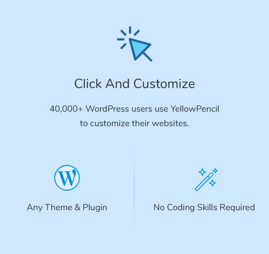

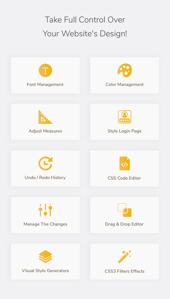


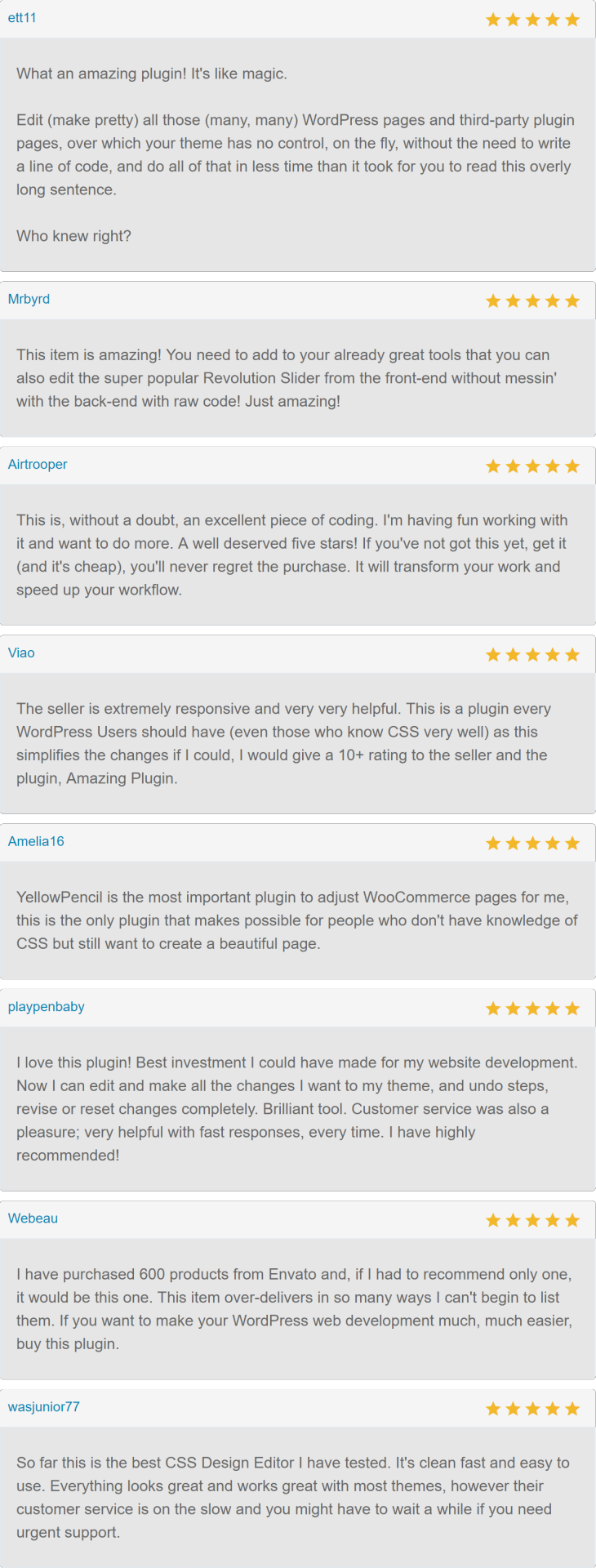
Visual CSS Editor
YellowPencil provides everything that you need for customizing your site design. The plugin comes with advanced features like visual resizing, drag & drop, measuring tool as well as a ton resource that background patterns, google fonts, and trend color palettes also it has an advanced responsive tool which allows you customize your site for any screen size.
Key Features
Customize any page, any element
Customize WordPress login page
Automatic CSS selectors
60+ CSS properties
Visual Drag & Drop
Visual Margin & Padding editing
Live CSS editor
Live preview
Manage the changes
Undo / Redo history
Export stylesheet file
Design Tools
The plugin provides you advanced tools and ready-to-use libraries for styling your website effortlessly.
Flexible element inspector
Single element inspector
Responsive tool
Element search tool
Measuring tool
Wireframe view
Design information tool
Gradient generator
Animation manager
Animation generator
Design Assets
Reach many design assets with one click. Customize your website’s design to fit your needs!
800+ Google fonts
300+ Background patterns
Unsplash background stock images
Material and flat color palettes
50+ Animations
CSS Properties: Text
Font Family
Font Weight
Color
Text Shadow
Font Size
Line Height
Font Style
Text Align
Text Transform
Letter Spacing
Word Spacing
Text Decoration
Text Indent
Word Wrap
CSS Properties: Background
Background Color
Background Image
Background Clip
Background Blend Mode
Background Position
Background Size
Background Repeat
Background Attachment
Other CSS Properties
Margin
Padding
Border
Border Radius
Position
Width
Height
Lists
Flexbox
Animation
Box Shadow
Transition
Filter
Transform
Opacity
Display
Cursor
Float
Clear
Visibility
Pointer Events
Overflow
Compatible With Any Theme & Plugin
This works seamlessly with almost any WordPress theme and plugin. You can use it for editing the pages that you created with the page builders.
Compatible with All Page Builders
The plugin allows you to customize the pages created with Gutenberg block editor, Elementor or another page builder. Re-design your website today.
How Does This Work?
The plugin generates CSS codes like a professional web developer in the background while you are editing the web page visually.
The plugin doesn’t modify any theme file, instead of it loads the generated CSS codes to the website in a dynamic way so that you can manage the changes anytime.
Documentation and Support
For documentation and tutorials go to our Documentation.
If you have any more questions, visit the Support forum.
For more information, check out our website at YellowPencil Visual CSS Style Editor.
Community
Join Facebook Community for Discussion, feedback, and help. More Info / DownloadDemo #YellowPencil #Visual #CSS #Style #Editor
#All_Code_amp_plugin#Code_amp_plugin_New_releases#CSS#css3#custom#customize#editor#New_releases#plugin#style#stylesheet#theme#Wordpress_New_releases#Wordpress_plugin#yellow_pencil
0 notes