#i also experimented with using textured brushes to add more visual interest but that worked less well. time-consuming for fairly-
Text
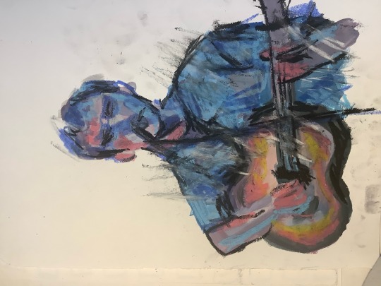
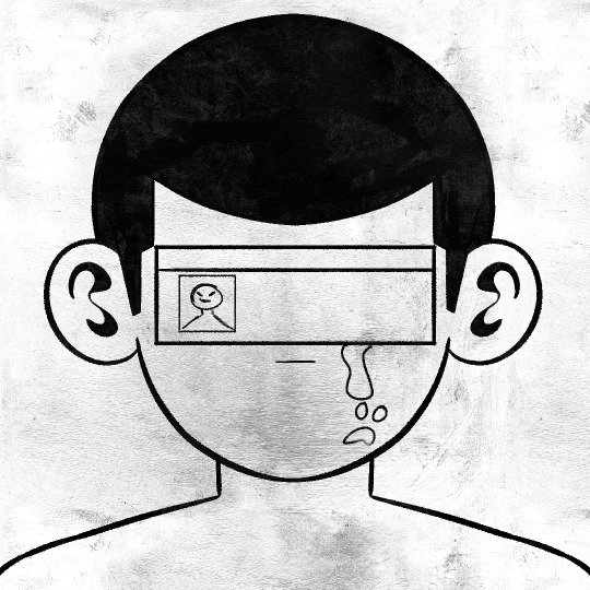
Drew some family portraits to figure out how I want to draw everyone!! I was so brave and basically kept them in canon greyscale even though coloring is my favorite thing in the world 😤
#in stars and time#isat siffrin#isat isabeau#isat mirabelle#isat odile#isat bonnie#silverstarsart#gotta say. no matter what website you're on 5 pics is an awkward amount#i experimented with using tints to bring in a little color without actually inserting color and i think that worked well#i also experimented with using textured brushes to add more visual interest but that worked less well. time-consuming for fairly-#imperceptible results since i also put my usual watercolor textures on top too#woulda been a lot quicker and less frustrating to just do flat colors and a couple extra texture layers!!#oh well i'm sure i've gained useful knowledge from the attempt#anyway i was so nervous about translating SUCH cartoony designs but it ended up less scary than i thought! i forgot i have fun doing that#though the one thing i got stuck on was bonnie's hat. if anyone knows like an irl equivalent PLS show meee i don't understand pillow hat 😭#anyway i'm excited to draw them in more interesting ways now >:333
51 notes
·
View notes
Note
Hey Maue.
I made a redesign for Stolas in Helluva Boss and wanted to know what you think of it.
My redesign:


Original:
This is probably impossible to animate. I mostly just made this for fun.
It’s actually pretty animatable, all things considered. You’d just have to mask out his tail and head feathers for the star texture like they did for his cape in “Ozzie’s”, as well as keep track of how many spots his fur ruff has, and where they’re located. Spongebob Squarepants animators do the same with Spongebob’s pores and Patrick’s freckles to keep them consistently on model. It’s doable; it just requires a bit more work.
It’s nice that your design features more star elements (hell, ANY star elements) to convey Stolas’ interest in astronomy, and cuts down on line mileage by reducing the prongs on his crown. Feels like the edges of his ruff and gloves could be a bit more streamlined, though:

Because the ruff and glove edges were drawn with the same fluffy-looking texture, I thought they might be made of the same material. Upon closer inspection, though, it seemed like you might have been going for a more lacy, frilly material for the gloves. How a material will look in a drawing depends on several factors, including how thick, rough, and flexible it is in real life. I recommend the Etherington Brothers’ awesome tutorials on drawing different pieces of clothing if you haven’t checked them out already.
Most of this redline is pretty self-explanatory; mainly notes concerning extremities and size variety. Just as an experiment, I tried out a moon shape for Stolas’ brooch, as the star motif is already clear enough without the brooch itself being a star, plus a circle would cut back on line mileage and reduce the risk of forming awkward tangents with the cape and ruff.
I think the version with the purple vest works better since it lets his body stand out from the red of the cape rather than blending into it. You might use slightly darker values for his sleeves, glove edges, and bottom edge of his shirt, though, as they’re fighting with his face for attention. Usually (not always, but usually), a main goal of character design is to draw attention toward the character’s face rather than away from it. If the facial area has a higher value contrast than the rest of the design, that’s where the viewer’s eye will immediately go.
Seems like the stars on his feathers, because they’re so bright, are also competing with his face. An easy way to remedy this digitally is to create a layer mask for the layer the stars are on, and paint swaths of black with a large, soft brush. This will give the stars a naturally “dimmed” look and add a touch of realistic depth. It’s also easy to pick out certain stars to make brighter than others (using white on the mask) rather than leaving every star to fight for visual dominance. Here’s a quick star field I painted on my own, with the left side without the mask and the right side with it for comparison.

Hope that helps!
32 notes
·
View notes
Text
Workshop

experiment more with how my video can be more visual , i watched lots of music videos and did some water colour swatches using different colours and shapes. I think it would be interesting to see the contrast of the lightness of the watercolor to the texture of oil pastel. i personally like the swirls , splashes , pointillism and brush strokes. I think these would be interesting to incorporate into the photography and some abstract frames too. It would also be interesting to see these as overlays. These swatches communicate different beats within the music and the senses. I feel with these being more soft they won't make the video too overwhelming but would add more.
moving on i further decided to test pastels and watercolour together
these were interesting tests but I didn’t Decide to include them in the final piece as i didnt think they fit very well and also due to time restraints. i also think that it was too much portraiture /figurative
As i was incorporating oil paints and photographs in my work. I needed to find a way to overlay these patterns as the watercolour may not work as well being on shiny paper and it would not show on oil paints.
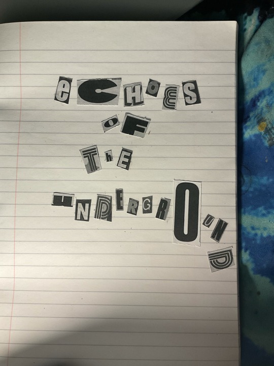
so to develop this i traced over the patterns on procreate and then transformed it into a stencil that i could 3d print. I did this with my 3 favourite designs. These all turned out really well but i had to model them thinner than as this one as the paint would end up tunneling in the plastic rather than going through. This in the end worked well in 2mm but unfortunately as the design is so intricate some spirals snapped when lifting them off the bed. I still used these though as it created a different image and pattern. This developed my skills in blender but also testing spray paint. I had colours such as black, purple and blue but i chose black in the first scene as this i think shows the texture and the smoke of the underground tube coming through. it made some square imprints around the outside of the stencil which is a bit frustrating but this was also down to how far away i sprayed the stencil. As i was painting the oil and spray paint on plastic sheet so i could wipe and edit better , it created some fun ghost prints where it had dried a little which
0 notes
Text
PSA CAMPAIGN | BELL LET'S TALK MENTAL HEALTH ILLUSTRATION
Topics of interest
Propaganda | Manifest, distort, manipulate
Typically a familiar style of messaging of mine, wouldn't push that many boundaries that I've attempted before.
Culture Jamming | Mockery, anti-capitalism, mass media
Also another style of messaging I tend to lean towards, for this instance I haven't created a design criticizing a corporation yet, could be a great exercise to tackle my usual form of narrative and pointing it towards capitalism.
PSA Campaign | Informative, spread awareness, do good
Never attempted before, a bit outside my comfort zone as it would have to take my usual narratives and bring it into a more positive light. This would also be a good chance to start illustrating since there a lot of PSA campaigns that use illustrations instead of photos and type to spread awareness.
CHOSEN TOPIC -> PSA CAMPAIGN
This is it, the final three weekly explorations! Although I really wanted to attempt propaganda, I believe the decision to only being able to work with PSA campaigns will benefit me in the long run and ensure that my batch of designs/illustrations are unique from one another. My goal for these last three weekly explorations are to ensure that they visually and compositionally look different from the past 7 I've posted. So it felt great to power on my drawing tablet and actually illustrate for once.
Creative Concept
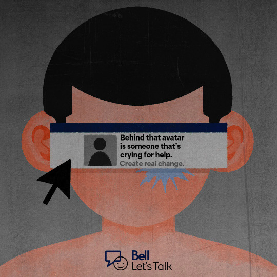
Despite never having experience with designing or illustrating a piece of work for a PSA campaign, it never felt too distant from what I have had previously designed (whether that be in school or for clients). However, it did take some time to figure what I was actually going to inform the viewer of. Throughout last week Mackenzie allowed me to take a sneak peek of her illo, during that week I was helping her with her process and giving critiques when needed. At the end I was really inspired by her design this week and the messaging it has. So, I decided to base mine of mental health and how sometimes when you're online you never really know if someone is doing okay. I've been a huge follower of Bell Let's Talk as I think it's a great resource for those that are struggling with mental health and is fighting for the overcoming of the stigma when it comes to mental health. I thought this was the perfect time to incorporate their logo within the composiotion as the subject matter suited the organization.
Description
With the goal that I've set on myself for these last three explorations, that meant that I'll have to be full on illustrating or incorporating other elements that aren't just type and images with a bit of illustrating. For this week I wanted to keep it flat yet convey depth the shading technique that I used, my reasoning behind that is based on corporate art styles and the more (subtle) recent shift towards blending 2D flat styles with 3D shading.
Since this is based on mental health online, I added elements that symbolize the presence of the internet. Such as the pop up window in the middle of the composition representing Facebook with a dark blue and grey colour scheme and a cursor to guide the eye towards that same popup element. Texture was added by me with a brush rather than texture overlays to give it more of a grunge and "real" aspect to the design.
There are tiny little things I would add to this illustration that I may add and repost later on but for now I think it gets the message across. Definitely a bit more illustrative than last time but a solid start to inspire me to push even harder for the final two illos.
KEYWORDS FOR INSPIRATION
Stranded
Isolate
Forward
Dry
Pit
Tear/Shed
ROUGH -> PROCREATE
FINAL -> PROCREATE + ADOBE PHOTOSHOP
1 note
·
View note
Text
July Art Books ARC Reviews
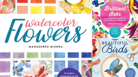
Contemporary Color Theory: Watercolor Flowers by Manushree Mishra, Brilliant Inks by Anna Sokolova, and Embroidery Made Easy: Beautiful Birds by Beth Hoyes
***Reviews, ratings, synopses, etc below the cut.
Contemporary Color Theory: Watercolor Flowers: by Manushree Mishra

Preorder
Add to Goodreads
Publication Date: July 5, 2022
Synopsis:
Explore the basics of color theory and color mixing, and then apply your new skills to create your own beautiful floral watercolor paintings, step by colorful step.
Color theory and color mixing are essential topics for all artists to know, and Contemporary Color Theory: Watercolor Flowers covers both in an easy-to-follow way with simple, actionable steps that any artist can do. Learn how to:
Mix paint colors
Avoid “dirty” mixes (those that look too brown, for example)
Create your own color wheel
Create neutral colors and pastels
Mix vintage colors
And much more
This book is ideal for all skill levels and ages, and while it focuses on watercolor, the same tips and techniques can be applied to other media as well, including acrylic, oil, and gouache.
Once you’re familiar with color theory and feel comfortable creating your own color mixes, dive into the step-by-step painting projects. Each project is done in the style seen on the author’s popular Instagram account (@thewhimsicalcreative) and features beautiful, romantic florals painted in watercolor. Learn how to paint floral wreaths, bouquets, and different types of leaves and plants.
Contemporary Color Theory: Watercolor Flowerscombines the essential topics of color theory and color mixing with watercolor painting projects for a comprehensive book that’s perfect for beginning and aspiring artists.
My Rating: ★★★★★
My Review:
This has a LOT of great information on color theory and color mixing. Not just your standard primary/secondary/tertiary colors, but how to create a variety of color palettes and mix exactly the colors you want. A lot of the information was new to me and I will definitely refer back to it. I also found the example color palettes and pieces using those palettes very useful and eye-opening.
There are also instructions for creating various leaves and petals with different brushstrokes and angles and several example projects of various arrangements of flowers and leaves in a variety of color palettes discussed earlier in the book. While most of these weren't particularly of interest to me, there were some that I would definitely like to try.
I am new to watercolor and to be honest it tends to baffle me, but I look forward to experimenting further using these exercises as a guide. I also look forward to using the color theory and color mixing examples in some of my other preferred media.
*Thanks to NetGalley and Walter Foster Publishing for providing an e-arc for review.
Brilliant Inks by Anna Sokolova
Preorder
Add to Goodreads
Publication Date: July 5, 2022
Synopsis:
Discover a world filled with vibrant color and creative possibilities as you explore an array of painting, drawing, printing, and lettering techniques and styles using vivid colors of artist’s ink.
In Brilliant Inks, artist, illustrator, and top Skillshare teacher Anna Sokolova shares her own unique methods that get the most out of this versatile medium. With her guidance, create beginner-friendly florals and foliage, animals, still lifes, figures and portraits, and hand lettering.
Learn about the various types of inks and the best tools and surfaces to use with them. Then, try basic techniques such as color mixing, creating visual texture, negative painting, and splattering.
Work with a variety of brushes, dip pens, and droppers to get different looks, and see how adding common household supplies such as salt and bleach can create the most amazing effects.
Use these methods in lessons designed to improve skills and boost confidence. Be inspired to make projects such as a bracelet, paper art dolls, a tote bag, and a decorated book. Full instructions and templates make projects fun and stress free.
This incredible material offers so much that’s waiting to be discovered:
Vivid monotypes made in minutes using a combination of painting and printmaking methods
Custom palettes created with unique blended colors
Watercolor-like translucent washes and opaque silhouettes
Techniques for creating beautiful motifs using simple brushstrokes and patterns.
Begin your colorful journey today with Brilliant Inks and see how far your creativity can go!
Perfect for all skill levels, the books in the Art for Modern Makers series take a fun, practical approach to learning about and working with paints and other art mediums to create beautiful DIY projects and crafts.
My Rating: ★★★★
My Review:
This book showcased a variety of techniques for working with inks, but especially highlighted ways to simplify a piece while still retaining the essence of the subject. This is a very useful skill, especially when working small and with delicate media. It also stressed the importance of color palettes and ways to combine color most effectively in an ink piece.
I wasn't terribly interested in recreating most of the projects, but they did inspire me to think of other uses for each technique - many of which I had previously been unfamiliar with - so I definitely feel like it was a useful book for me.
*Thanks to NetGalley and Quarry Books for providing an e-arc for review.
Embroidery Made Easy: Beautiful Birds by Beth Hoyes
Preorder
Add to Goodreads
Publication Date: July 12, 2022
Synopsis:
Learn to create a variety of birds following the newest embroidery trend: thread painting.
Through a collection of 12 detailed, full-color patterns, aspiring and established embroidery artists will discover how to employ the art of thread painting to create a range of popular birds and waterfowl from around the world, including North America, the Amazon rain forest, and Europe.
Thread painting is the name for using single strands of embroidery floss to create lifelike images with beautifully blended gradients of color and detail. Fortunately, the process is not as hard as it sounds! After learning a bit about how to create gradients and blend colors, anyone can create incredible embroidered masterpieces.
Embroidery Made Easy: Beautiful Birds includes:
A primer on embroidery materials, setup, and thread painting techniques
Patterns that indicate where each color should go and when the gradients should begin
For each project, step-by-step instructions and reference images of the finished piece
Perfect for needlepoint artists of all skill levels, there is no better time to learn how to create beautiful birds in embroidery.
My Rating: ★★★★
My Review:
The birds showcased in this book are beautiful and very colorful. I greatly enjoyed looking at the photos of each completed thread painting and the progress photos, and I feel like I could get a decent sense of how to recreate them using my prior embroidery experience, though I have no experience in thread painting.
However, I found the diagrams and some of the written instructions hopelessly complicated and found that my eyes glazed over while reading through / about them and I learned very little from them. This could be due at least partly to my learning style, however.
I think this book would be best for those with a decent amount of embroidery experience under their belt and not those who are complete beginners.
*Thanks to NetGalley and Walter Foster Publishing for providing an e-arc for review.
#art books#embroidery#thread painting#inks#color theory#watercolor flowers#watercolor#shilo reads#arc review#netgalley#manushree mishra#beth hoyes#anna sokolova
1 note
·
View note
Note
Hi ^^
First of all – your Art is INCREDIBLE!!!
I especially love your use of colors and textures :) Everything is so bright and colorful, but still cohesive. And your images are so clear without being overly detailed! It’s all literally perfection!!!
I like to draw digitally as well and your art-style is a huge inspiration for me. So I wanted to ask if you have any work in progress videos or pictures? Or if you could explain your process in general? Like, are you using a sketch layer underneath, with how many layers are you normally working, what kind of brushes do you use or any tips overall to improve digital painting?
Of course you don’t have to answer this (kinda a lot of questions, sorry 😅 ). Just know that I adore your art and that you’re helping me on my own art-journey just by sharing your work with the world – so, thank you!!! <3
Hey!! So first of all thank you so much for everthing you said about my art, I really appreciate it! But also omg thank youuu for this amazing ask like this is for real the kind of ask I've always wanted to get, where a total stranger is interested in my process XD So yeah don't worry about asking a lot of questions, they were great and I loved them!
Also I'm super flattered that my art has inspired you in your own digital art journey and I hope the stuff I say here can also help somewhat! This will get pretty long so sorry in advance everyone for making you scroll so much cause for some reason the read more option doesn't work on mobile :/
But anyway to answer your questions!
Sadly I don't have videos but I do have some pics I'll share. This is actually my second attempt at answering this because before I was going to use some WIP pics of the Majid drawing as example but then I didn't want to because it was in black and white and color is kind of one of the main things I like to emphasize in my art so I wanted to talk about it in the example XD Then I started a couple new drawings and was taking pics of those but I got super artblocked, but luckily I just finished one out of the blue that I can use. Okay so... I started answering this, again, and it was getting way too long and rambly so I'm gonna try to keep it simple this time and maybe I can elaborate more another time if you're still interested/ if anyone else wants know X'D
My process in general: I always start by making a simple basic background to work on, just fill it in and add some blotches of color. Then on a new layer I just start painting the subject, no sketch, so again just laying down some colors (I usually take whatever color in the bg is closest to skin tone and adjust the new color from there) and I just start blocking some shapes in aproximately the right places to start defining where things will be and how they fit together and just go from there. It's hard to explain it more cause that's kinda it, I just paint until things look like they're supposed to or at least visually appealing enough XD I add or adjust whatever colors seem necessary along the way (in this particular drawing I left the darker values until way too late which I don't recommend) and just refine and refine and refine things and add as many or as few details as I feel like, working on everything simmultaneously bit by bit.
Layers: like I mentioned before there's no sketch, and I try to use as few layers as possible so usually I'll have about 3-5. One for the basic background, one to three (though sometimes I merge them) additional layers for more background effects/colors/value fixes that I usually add later in the process, and I try to have just one for the subject. Sometimes I have one or two more if I'm feeling too hesitant but I always merge them in the end.
Brushes: I only use one brush at 50% opacity the whole time for everything. It's a squarish/rectangular brush that has some sort of jagged edges and a bit of a watercolory texture.
Tips: so this part is especially hard cause like.. I feel like any tips I could give are only applicable to drawing portraits and even then it'd be for doing it in the particular way that I prefer.. Like for example I could say it's best to work on every area at the same time and never spend too long one thing before moving on to the next but.. some people actually prefer finishing the eyes completely before moving on to the nose for example you know? So honestly the main thing I'll say is kinda to just experiment with a lot of methods and styles and see what works or doesn't work for you. Something that I think always helped me a lot was watching speedpaints of people who were more skilled than me and had a distinct style, just literally watch how they did their thing and every once in a while I might notice something I'd be interested in trying for myself and yeah with practice and experience you just kinda figure out what kind of things you not only like seeing but actually want in your own art. Like years ago I used to sketch but then I saw enough videos of people painting without sketching that I wanted to try it and I realized it's just more fun and makes more sense to me that way. So yeah try lots of different things and see what works for you and what you want to incorporate into your own art style!
Some more standard digital art tips I could give I guess are like.. the thing I said about not spending too much time on just one area (if it applies to your prefered process XD). Flip the drawing every now and then to catch stuff that's off. Stay zoomed out as much as possible and when you do zoom in for details always keep an eye on how the bigger picture's looking. Take your time finding or arranging a good reference pic that really inspires you cause it'll save you time and frustration later. And aaa idk I could say more but I don't think it's that informative or helpful, and all of this is probably really basic obvious stuff anyway and this is long enough as it is so yeah I'll leave it there...
I hope any of this can help in some way or that I've at least answered your questions in a satisfying enough way haha And finally here are some of the WIP pics I took. Where you can see some parts of the process. I did a lot more after that last pic but yeah at that point it's just about fixing little things, refining and adding details, but there you can see the color adjustment thing I usually do as the very last step (though not for this pic). I don't always have to do it, and there are probably times when I shouldn't, but I almost always like to do it anyway and that's why my colors look so exaggerated and bright XD I usually make the midtones more red and/or magenta, the shadows more blue, and the highlights more yellow (and sometimes a bit cyan) but if you wanna try something like that it's definitely fun to experiment with the different color possibilities ;u;

And yeah that's it for now! I'm sorry this is so long, and this was the short version lol I hope you like the answers at least a fraction of how much I loved the questions X'D
#asks#asks and stuff#sorry for the late reply#ugh this is so long sorry#but seriously I love questions#feel free to ask me stuff lol#I apparently also love to talk X'D
43 notes
·
View notes
Text
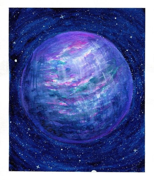
Three hour virtual meeting today means morning art project! Today’s prompt is “horizon”
I think this came out pretty damn cool. It’s not amazing concept art or anything like that, but I played a lot with textures and canvas grain that I haven’t touched before, and it was really fun! I can tell there’s a LOT of capabilities there that I haven’t fully explored. Today I was mostly feeling around based on stuff I could kinda sorta remember from tutorials and just experimenting with options and what different texture and stencil brushes do, because I’m listening to this meeting and can’t currently look up video tutorials like I usually do.
I did use a reference pic (included below) for the color and the vibe, but I ended up doing most of the composition myself--I like bigger planets for more “otherworldly” impact, and I used one of the built in Corel textures to add some visual interest to both the planets and the landscape.
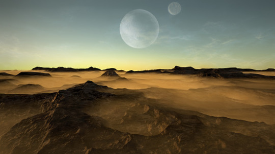
I do like the sharper contrast of the reference pic, but I think I’ll need to look at some more texture options and some more brush combinations to do this kind of sharp mountains and hazy atmosphere/sand contrast, because it just wasn’t working right for me today. I also realized now that I didn’t do any sort of clouds in mine, but I’m not sure if I want them... hmm, the atmosphere itself might be enough.
This was really fun though, and I think when I have some time, I want to go on a hunt for some interesting textures of my own to add to my library. I definitely need to watch some videos about using textures specifically. I just know there’s so much cool stuff that can be done with it, and it’s fascinating.
7 notes
·
View notes
Text
Clean White - Evaluation
The aim of this project was to capture a image that focuses entirely on the story of the sitter. I chose to show my models creative and artsy side. I had to consider the visual aspects that would help show this e.g. the sitters clothes, hairstyle expressions, poses and props. Also I had to decide after experimenting what lighting would add most interest and compliment the main idea.
I most enjoyed taking the photographs in college as it was fun experimenting with different lighting styles and working with my model. I liked being in charge of poses and expressions whilst talking to my model. I feel like I learnt the most here concerning the lights and also how to work with a model under time pressure.
Throughout all the class days and shoot days that I was in he studio I learnt new lighting techniques light side lighting, frontal lighting and Rembrandt lighting, I saw how this could change the mood and style of the photo drastically.
Next time I would like to further practice the studio set up prior to taking photos like setting up the lights and apertures. I usually had to ask my tutor for help it this but I think with further practice my understanding of how everything works will be better. I want to be able to it up right independently so i can use my time more effectively.
For my research and inspiration I researched Richard Avedon because I liked how his photograph’s were unique an catered to the personality and life of the model. I also liked the artistic aspect with the nice tones and textures seen in his work. I tried to take some of these ideas on board by trying poses that reflected the story I was trying to show and also used different patterns and tones on my models outfit so I could add interest.
I think the part that worked the best was achieving the look I wanted during optimisation. I liked how on black and white I could get all the dark tones and light tones that I wanted creating a high contrasting image. Also using a local adjustment brush mean that I could change the appearance of the shirt and hair.
Some issues in the shoot were with the white balance. There was a very warm colour cast on my Raw colour versions, but this is easily fixed, Also another easy fix is the light leak u can see by the hazy effect in the pictures. this could easily be blocked out by something to flag the back.
Overall I'm happy with my final image, technically it is sharp and has the right exposure and look which that I achieved in post production. The models expression and pose helps show her creative side along with her painter style clothes and props. I think the image has a unique quirky feel to it and the model shows the story I was trying to get across.
2 notes
·
View notes
Text
Tactile Witchcraft
(taught on The Alexandria Archives 5/16/2020)
Today we shall be exploring witchcraft from a specific sensory perception- touch. While there is absolutely no wrong sense to use to experience and practice witchcraft; I would say that sight and hearing are the most common; followed by scent. I’d like to offer an alternative inspiration with tactile focused witchcraft and show that it can be intermingled with a witch’s routine quite easily. This is especially helpful for those of us who have trouble with the common “visualizing” side of witchcraft.
Using my own experiences, I’ll explain how tactile witchcraft can be incorporated into the following routines and practices:
raising energy/charging
grounding and cleansing
meditation
divination
protection
ritual framework
Raising Energy and Charging Objects
Raising energy is used for almost any focused activity in witchcraft. The act of awakening your focus and intention in a ritual way. Many use visualizing for this- imagining energy flowing upwards into their hands or outward from their body like an expanding bubble. There are some common tactile methods that you may not even be aware of! Such as:
rubbing your hands together until they’re warm
posturing in a certain way (a certain standing or sitting position)
stomping or dancing
touching certain favored objects (like on an altar or other tools)
This can be expanded on further into a more intense tactile action to raise your energy. Certain complex hand motions (think like the show The Magicians!), or physically connecting with objects that help you raise energy. You could run your fingers through a pot of dirt or sand, put your feet in the tub or a basin and run water over them, toss a special stone or coin from hand to hand (carefully of course), rub a particular lotion or oil on your face, arms, shoulders, or feet.
Notice tactile sensations rather than visual ones to know that your energy is being called forth. Feel the heat, the goosebumps or tingles, a tightening or adjusting of your body’s muscles or stance, a small breeze or touch perhaps.
When it comes to charging objects and tools- get into using your body to do so! My personal method is called “massaging the bones” and can be read about here.
You can also use your lips to kiss or blow your breath onto the object. You can jump or dance with it. You can hug it, cuddle it, wrap it in a special blanket, stroke it with a brush, feather, leaf, etc. Just the act of focusing your attention with this activities imbues the object with energy. It might be harder than raising energy to feel a direct effect but you can still get the temperature change or goosebumps/prickles sensation when charging objects like this. Especially if you take it slow and give it emotional depth during the process.
Do you have any special things you do to welcome a new special object into your home? Especially something emotional like a stuffie or sentimental decorative object. What about things you enjoy yourself when visiting a close friend or family member? Think about how you can incorporate those kind of actions in altered ways to charging objects and ritual tools.
Grounding and Cleansing
The act of grounding frequently involves a tactile element already. Touching the floor with your hands or feet is the most common. You can add onto this with having a bowl or pot of soil, sand, marbles/stones, or other substance (you could use salt or flour!) that you run your fingertips through. When you use food or drink to ground, incorporate observing the tactile element along with the taste- the texture and the temperature.
Grounding is basically using deliberate observation to bring ourselves gently back into focus with the mundane world. Stroke a pet, a blanket, a stuffie. Shuffle a deck of cards or shake and roll some dice. Stack or unstack a favorite pile of books. Flip through one of those books. What do the pages feel like? What about the cover and binding? And there is nothing wrong with branching out to include multiple senses at once when focusing on tactile grounding- while flipping through the book and observing the pages, notice what they smell like. What does the book smells like? You can also focus on your own limbs and body, give yourself a brief massage limb by limb (lotion optional). Or trace your skin with a brush or fingertip, even a pen if you like to draw or write.
What actions tend to help bring you back to yourself when emotions overwhelm you? That’s mundane grounding! Think about how to incorporate some of those into a practice for grounding after a ritual or working.
When it comes to cleansing, the easiest way to do it tactilely is to literal clean the space (or your own body) that you are wanting to cleanse. Create a floor wash with particular correspondences and ingredients and then wash your floor, walls, and doorways with it. Mix a scented powder to sweep into corners to collect negative energy and then vacuum it up after a couple days (make sure to check if it’s pet safe ingredients if needed; they love to lick their paws after walking all over!). But you can also do variations on this if you don’t have the ability or spoons to physically clean a room.
Take a small scrap of fabric and charge it with the rooms energy. You can do this by walking around wiping down surfaces or just by sitting in the room or area needed to be cleansed holding the cloth and focusing on how the room feels, smells, sounds, and letting it “collect” into the cloth. Now get a small bowl of water, add some cleansing herbs or even just a squeeze of lemon juice and sprinkle of salt. Now wash that cloth gently but thoroughly. Let the energy of that washing spread outwards from the cloth to tie to the room. The cloth is the space’s taglock. And it can be reused- hang the fabric to dry as the room is cleared of bad energy and then gently fold it and place it in a safe place until needed again. This can be stacked on in other purposes- painting or stitching protection sigils on it to protect the space.
It’s important that the tactile cleansing action is something you associate personally with removing debris and dust but otherwise be as creative as you like!
Meditation
So much of mainstream meditation books, articles, and videos focus on auditory meditation. If any of you are like me, that can get old or lose it’s effectiveness on some days. I’m not a big meditator personally; especially of the type that’s “zone out and don’t think of anything” so this section will be short but here are a couple ways I do focused tactile meditations for inspiration:
Walking path meditations: I like to do cemeteries, but it can be parks, hikes, even just a walk in your neighborhood or in a shopping/urban district. The goal is mostly to not focus on any one thing too long and to observe your surroundings, especial natural ones. The weather, the vegetation, the structures/architecture, creatures, even energy/ vibes/feelings.
Strand or String based mediation: this involves knotting a long strand of string or rope, crocheting/knitting, braiding (even your own hair), sewing or embroidering, etc. Basically anything semi-repetitive that involves a fabrics, yarn, or string-like materials. It’s not about entirely zoning out, but about noticing the feel of your activity and how it makes you feel. You can include music as well if you like, again it’s okay to combine senses.
Kitchen based mediation: Kneading dough, mixing batter, combining a soup or stew, stirring a drink, chopping ingredients (safely of course), shaping cookies, tenderizing meat, rolling out and cutting pasta, etc. So many aspects of creating a dish in the kitchen have a meditative quality to them. Again, the idea isn’t to “think of nothing”, especially when working around heat and sharp objects. The idea is the almost repetitive action that you know is going to lead to nurturing sustenance. This can also be a good way to teach kiddos a gentler version of meditating without it being a huge chore. It was while kneading dough that my grandmother taught me to reflect on my day and what I wanted from the upcoming one- a version of focused meditation.
Self-care meditation: Soaking in a bath, smoothing on lotion, applying a face mask, brushing hair, massaging aching muscles, mixing up a favorite cuppa, etc. Give yourself that well deserved attention and gentleness while you let your mind also be soothed. Focus on the texture of your products on your skin, the feel of tea in your mouth and belly, the way you feel after giving yourself that treat.
Divination
Even divining has a tactile component that can be expanded! A deck of cards being shuffled is already about the feel, but you can also take the time to feel each card facedown before you turn them over. Do you notice anything different when you touch each one? If you take the time to truly shuffle your cards slowly and deliberately as a focusing activity to help get you in the zone of divining (before you even start considering a specific question or inquiry), you may be surprised to notice your ability to shuffle improve, especially if you do this daily. I encourage shuffling a deck at least once or twice a day regardless of whether you actually do a reading. Bond with that deck physically. Let your fingertips become so familiar with your deck(s) that you could pick it out of lineup, merely by the touch.
Other ways to divine with tactile focuses are:
casting objects (throwing the bones: the feel of each piece should go into what associations it gets ascribed.
aleuromancy: toss, mix, or knead the flour with your hands. The shaping of dough for the paper slips is tactile. And you can use physical differences in each cookie in your interpretations as well.
wax divination: there is a variation on fire scrying that specifically uses wax and the way it melts. There is a physical aspect to this in holding the candle, feeling the wax when it’s still warm or after it has cooled. I’ve even kept interesting shaped drippings as charms or offerings on shrines
dowsing: using the touch and movement of an object in your hands to divine location of specific things (classically water).
palmistry: taking the feel and texture of the skin and lines into account
astragalamancy: feeling the dice and the act of throwing them
Protection
The act of protecting one’s practice and self is quite a varied one but most witches do practice some form of protection work in their practice. Whether for a space, self, or other persons they care about. It’s another practice that has a common visualizing methodology with imagining stacked bricks, hammered shields, pricking thorns, biting teeth, etc.
Much like what was discussed in the raising energy section, there are a lot of actions that can be done to focus your energy on protection without needing to invoke a sense that doesn’t work as well for you. Braiding a belt or bracers with protective colors or materials and affixing to a taglock or poppet. Creating a sympathetic magic wall of legos or blocks for a personal shield or property ward. Stitching protective sigils onto your clothing or on curtains in your home. Sympathetic magic is when a “stand in” object or representation of your goal or person is used to connect the will of influence. It’s very useful for tactile witchcraft and I find it especially effective in protective magic.
As with the gentle massaging mentioned in the charging objects section, the emotional side of your tactile action is important. When it comes to protection, if you need to smash, squish, stab, tear, flush, or stomp your sympathetic magic object during this process, go with that desire! (safely of course) Using a nail to puncture a potato over and over before you pour a withering potion over it is doubly effective at hex or curse breaking.
Protection doesn’t have to be something violent either; you can tap into loving feelings and give a protective bath or massage to a popper or taglock. You can gently weave a protective square of material as a shield. You could sculpt something out of clay or dough. Feeling where your protective strength and comfort stems from and build upon it!
Ritual Framework
This last section will outline how to tie a lot of what has been discussed together into a longer ritual framework. Multiple tactile actions during a ritual when it something you find effective in raising and directing your energy will only pack a stronger punch, so to speak.
Start by choosing a method of energy raising that involves touch and texture but relates well to your ritual goal. For example; if doing a ritual to heal a friend I wouldn’t choose something like stomping or throwing objects. The lotion or oil anointing would work well; or even the running water over the body. It might be hard to do with a faucet since I’d have to move from my bathroom to my ritual space afterwards but this can be accounted for either in mindset or by altering it. Bring a large basin of water and bowl or cup to your ritual space and pour the water over your feet and hands.
Then you might use some sympathetic magic to send healing energy to your friend. Create a poppet for the loved one that you can literally massage or give a soothing bath to. You might go beyond simple tactile actions and tuck the poppet into a comfy spot to sleep, read it a favorite story or sing a favorite song. Paint a healing sigil on the scrap of fabric you use as a blanket.
Use some tactile divination if needed to help guide you and your friend to the most ideal way to deal with this time while they heal. The fortune cookie variation of aleuromancy would be a good choice; you and your friend can reap the rewards of the baked goods together.
Grounding yourself after is important- don’t forget! This ritual would take a lot out of your, especially emotionally, with it being focused on healing a loved one. You might stroke a special blanket, stuffie, or pet to bring that soothing connection along with your grounding. Or stacking some favorite books that you might even pick from to unwind is a good choice too.
You can see from the example laid out how building on all these suggestions can work in tandem together for various forms of witchcraft and intentions.
What sort of ritual do you think could be built with a tactile focus? If you don’t usually do traditional rituals, what sort of working have you been inspired to add a new tactile element to?
#witchcraft#witchy#witchblr#witchcraft 101#tactile witchcraft#sensory witchcraft#alternative witchcraft#spoonie witch#spoonie friendly witchcraft#witchcraft lessons#TAA#baby witch#beginner witchcraft
143 notes
·
View notes
Photo
AGP504: Self-Directed Project
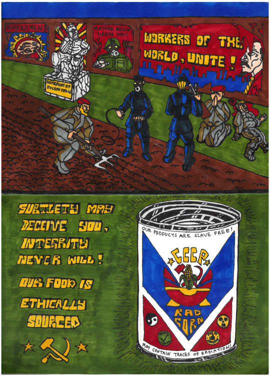
For this piece, I wanted to convey a satirical advert for a food product. The contrast of the farmers/slaves being mistreated and the text below stating that the food is ethically sourced creates a clashing visual satirical narrative. The text ‘subtlety may deceive you, integrity never will’ also emphasises the satire of the scene above. In addition, the food product is radiated corn which is in itself a ridiculous product to sell. On the can it states ‘our products are slave free’ which again supports the satirical narrative. The can was inspired by a popular Soviet brand of condensed milk, as I wanted to convey the Soviet aesthetic and theme convincingly.
Furthermore, the posters on the wall in the background is a way to add context and background narrative to support the concept. For example the poster of Lenin stating the USSR slogan ‘workers of the world, unite !’ contrasts with the actions of the Soviet government in the scene, where its workers are being mistreated. Hence the irony of the scene as the communist values are being twisted. In addition, there is a recruitment poster along side another food advertisement, promoting radiated ramen. This is to enrich the narrative and setting of the dystopian Soviet Union. Overseeing the workers are not only the guards, but a statue of Joseph Stalin to show the socialist realism aspect of the Soviet Union as well as the irony of a statue of your leader sitting down whilst the working class are forced to serve in labour.
The colour palette in this piece is a lot more varied as I wanted to experiment with the use of the colours effect on the scene. The use of the blue highlights on the officers’ uniforms reflects the sky whereas the brown highlights on the grey workers’ uniforms reflects the dirt on the ground. This creates a separation of class and status which is befitting to the scene. I used red caps for the workers as it synonymous with labour, and blue uniforms for the officers to indicate the law. And as usual the green for radiation and grass, and red and yellow for the Soviet colours.
However, the typography is not as neat as I wanted it to be due to the messy alignment. Some of the finer details on the officer’s uniform were also lost due to the dark blue. Although you can see the brush strokes, this was intended as I was recommended to keep the texture so that it looks vintage and faded. Therefore, the texture looks more interesting and gives a sense of directional flow.
2 notes
·
View notes
Text
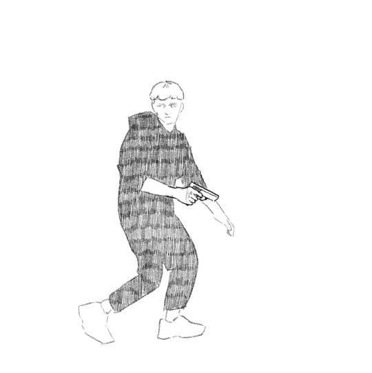
𝕮𝖗𝖊𝖆𝖙𝖎𝖓𝖌 𝖗𝖔𝖙𝖔𝖘𝖈𝖔𝖕𝖎𝖓𝖌 | 23/10/19
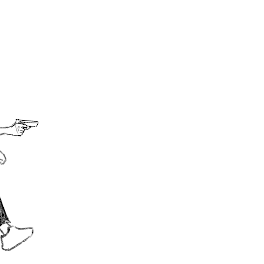
During the morning we went to the photography department of the school where we would start the day off there by filming our own footage to rotoscope later on. There were no restrictions as to what we were allowed to do in front of the camera and green screen, but we had to move from one side of the screen to the other. I decided to go for a gun man or James Bond type of vibe. I didn’t want to just do a simple walk or run cycle, but instead I wanted to challenge myself a little. I did this by sneaking into frame, holding my hands up as if I was holding a gun (this added a prop that I would have to draw form scratch during the process of rotoscoping) then doing a turn and running back out the frame. When recording the clips in the green screen room, I also decided to turn around and then turn back while moving to add to the difficulty of animating everything together. This is how both of them turned out:

I decided to go with the first of the two clips for my rotoscope. I did this simply because of the turn being slower and therefore making it more challenging to animate the gun to follow the movement in such a way that it won't look “out of place”.
I didn’t find the time during college hours to actually do the rotoscope for this, so I did it at home using my own program (Krita) and my drawing tablet.
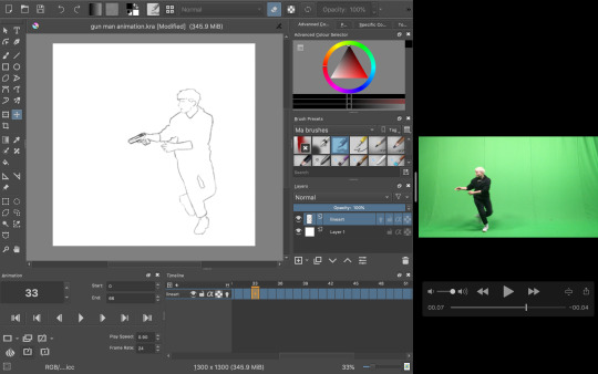
The process was relatively simple; I took the video and took a screenshot of each frame as I went, dragging the screen grab onto the canvas and began tracing my figure. As I went, I also drew in the gun for each frame, lining it up with the position with my hands.
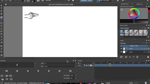
To keep the appearance of the gun consistent I copied most of the frames, up until I came to the part where I had to change the perspective of which the gun is seen from (during the turn).
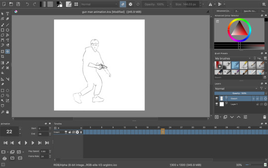
Once I had finished the whole rotoscope this is what I was left with:
The finished amount of frames came to 66. Quite a high number for such a short animation, but I didn’t want to take away from the fluidity and smoothness. Now I could have just left it here, but I wanted to do some more experimenting. I tried out filling in the clothes with some texture to create a more interesting looking sequence, but half way through I decided to go back to the original linework since I just wasn’t happy with how it was turning out, but here was that in motion:
Instead I did a bit of brainstorming, thinking about what I could do to improve what I had already made. Here’s the mindmap of the brainstorm that I did:

So as you can see, I ended up wanting to experiment with depth, leading me to be doing something to the background. Most of the mind map is based off visual language. I found using this as the root for my brainstorm really useful due to the way you can interpret each term differently to whatever the context is. I will definitely be doing this again and experiment with it further in the future.
I had also settled on wanting to keep it monochrome (misspelling in mind map) and more specifically drawing towards the style of the classic black & white manga comic book style. Based on this, what immediately popped into my mind was this program I recall trying out years and years ago called Medi Bang Paint Pro, or as I think it was used to called; Medi Bang. I was probably around 12 or 13 when I first downloaded it, but I didn't know what I was doing what so ever, so I quickly gave up. For a long time it wasn’t compatible with Mac up until recently; so I decided to take a shot and download it again. The program is free; but that wasn’t the main reason to why I wanted to try out this program again in particular. It has a lot of great tools for drawing and building comic pages, and I thought “What would it look like if I made a background inspired by traditional manga?���- so that’s what I did.
I wasn’t sure if I was going to be able to pull it off at first, so I did a little test run beforehand and I really liked the result:
So the way that I did this was by taking a picture (that I unfortunately have lost now) and then proceeding by changing the levels of the picture, playing around with it until it’s primarily just blacks and whites. With a brush tool I began cleaning everything up a little by either erasing unwanted bits or adding additional linework just to emphasise on the subject and shapes within the drawing. I added leaves and other vegetation with some pre-made brushes that came with the program. The last step was to add a screentone of a clouded sky to add a bit of texture, shading and general interest to the whole piece, and voila! Done. This technique is super quick and efficient for creating backgrounds for comics of this style, though I still prefer when everything is painted by hand. The screentone has a very recognisable style to it and is quite often used in manga’s. One of the ones that come to mind for me is Berserk. I have always loved the artwork of that comic series; it’s the kind of art that you could stare at for hours on end and not get bored with. When looking at the artwork from the series, you can clearly see the technique of screentones are being used to create a lot of additional detail to each panel.
Here are some examples of some screentones:
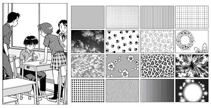

In this example, it has been used for the background. A screentone with blobs lightly shaded has been added to almost create some sort of mist, changing the whole mood and feel of the panel very effectively.

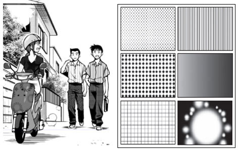
Like mentioned before, in Berserk, the screentones are mostly used as an extra bit of atmospheric detail, rather than being used for any of the shading which is all hand drawn. In this example, it has been used for the lettering/type and again for the background. It creates a gritty and sort of dirty effect, emphasising how he is in a battlefield with monsters around him; definitely not a place you could call “clean”.

In this example, different kinds of sceentones have been used in each panel. In the panel to the left, the opaque stripes are a type of screentone very often used to indicate either speed, focal point or action of some kind. Not only that, but at the bottom of the panel a softer pattern of screentone has been used to create the look of dirt or sand, again with a gritty texture to emphasise on the fact that the character, Guts, is inferior at this moment.
In this super epic and intense illustration, you can again see the great use of screentones, most notably used for the background yet again. It really helps to create a strong feel to each illustration. The use of tone is especially important in manga or comics, since it so often is done in just black & white, so you have no use of colour; this is where screentones come in as a great tool to use for just this.
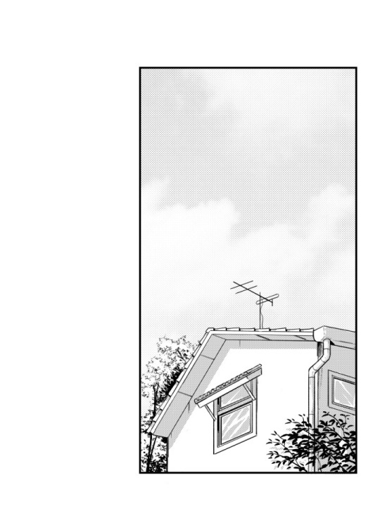
So, with all of this brainstorming and researching done, and by using the same technique as I did when doing the “test”, I began drawing. I used this picture which I recall taking somewhere on the border to Germany as the base image:

I chose this because it has that “street” vibe to it, which I thought could be cool with the whole theme of “gun man”. Very edgy, very edgy indeed.
This gif above shows loosely the process of the piece from start to finish. It was mostly just me playing around and figuring out all the tools of the program, but it was quite fun to put together.
With the background now complete, I put it into my rotoscope, went over each frame and painted the shape of myself in the animation white and was finally finished with the final rotoscope; being the third version or option that I did.


I am very happy with how it turned out in the end, and I have definitely learnt masses with this exercise of rotoscoping something that that I have filmed myself. I think if I were to further improve on this, I’d definitely consider animating the background itself (birds flying or leaves rustling), or maybe even try shading the subject somehow, taking inspiration from manga’s such as Berserk or any of Junji Ito’s work.
I decided to try out asking a few of my peers in the class what their opinion was on the final rotoscope. The feedback that I received was purely positive; the people I asked said they couldn't think of any particular way of improving the finished product. They said it both looked great as well as it answered what the task was questioning and challenging us to do.
To me, this really shows and proves that the work I have done here is successful work that I can be proud of and take what I have learnt through doing this task with me for the future, without doubting if what I have learnt is of quality.
✄┈┈┈┈┈┈┈┈┈┈┈┈┈┈┈┈┈┈┈┈┈┈┈┈┈┈
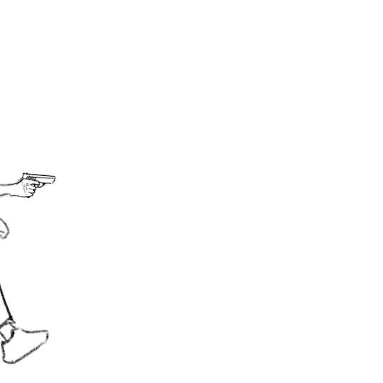
As a little extra note, here are the same frames (frame 23) in the three different versions:


4 notes
·
View notes
Text
My name is Nick Stewart, from Rochester, Kent, UK, and I create art using fountain pen ink. Chromatography is a big part part of my art process and explores the properties of fountain pen inks. By saturating an area of heavy rough textured watercolour paper, usually a Bockingford 200lb, and then adding a drop of ink into the wetted area, the ink blends with the water and reduces in concentration as it spreads away from the point of entry. As the ink comes out of solution the dyes that make up the ink can be observed in different areas as the paper dries. It’s taking chromatography into an art context.
By employing water-based techniques, one can achieve a convincing watercolour style painting by simply letting the inks do what they do. The demonstration below, has been created using one ink, Diamine Earl Grey. At first glance, one might assume that 3 or 4 colours have been employed.
The wonderful thing is that this simple wet in wet technique is actually easier and quicker than watercolour painting! Without even touching upon the word ‘serendipity’ I think this may appeal to all amateur artists for this one reason alone. The sky and foregrounds have created themselves!
What is also of interest is that all ink ranges are made differently. Each ink maker has their own recipes and processes. So, one range of inks may suit a particular subject matter better than another. Robert Oster Signature inks are ideal for bright conditions. KWZ inks are more suited to soft focus. Diamine are great for more graphic use. Noodler’s are more experimental and abstract but also check out: Vinta Inks, Troublemaker Inks and Sailor Ink Studio for more intense chromatic behaviours.
For enthusiasts of art journaling, diary keeping and sketching, this simple and natural process enables a simple and seamless visual continuity and a medium continuity between image and the written word. Why not give it a go?
Paper: Bockingford Watercolour Paper 200lb Rough
Equipment: 2 jars of water, Bottle of Diamine Earl Grey, Watercolour brush size 24, Watercolour brush size 5, Noodler’s Nib Creaper pen.
Instructions
Take swatch card measuring 70mm x 95mm and place lain landscape format and wet 3/5 of surface with large brush
With small brush add Diamine Earl Grey
Turn card upside down and wet surface 2-3mm below the wetted area above.
Dip pen into ink and draw line in through newly wetted area
Dip pen into ink and repeat step above
With pen, add a couple of ink marks to top area as this is now semi wet, the spread will be less and the ink more intense
Allow the chromatography to happen and enjoy watching the greys, purples, reds and turquoises slowly come out of the Earl Grey
Finished and dry landscape created with serendipity. Totally non contrived and utterly beautiful.
Works with most inks that display chromatic behaviours.
Please share your experiments on Instagram using: @quinkandbleach #fountainpeninkart #nickstewartinkart
TUTORIAL: Create Simple Landscapes Using Fountain Pen Ink And Water by Nick Stewart - #doodlewash #ink #painting #water #colour My name is Nick Stewart, from Rochester, Kent, UK, and I create art using fountain pen ink.
1 note
·
View note
Text
Texture and Tone 4/11/19
Today's lesson we discussed how we need to conclude our brief and make sure all tasks are completed. We have been reminded that the dead is the 14th November at 4pm and we have been told the steps we should take to complete and improve work.
The checklists for both the production file and the blog posts were shown and explained again so everyone can understand what they are meant to be doing and see what they need to do so they can catch up.

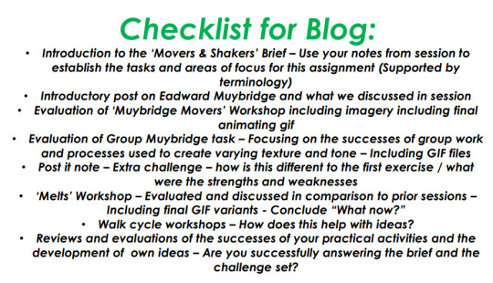
Whenever you are trying to write a blog post it is important that it is laid out correctly. First you start with the introduction where you explain what the aim was in that lesson and what you would like to achieve. The body is the main part of the post where you explain in greater depth what you have done to achieve your goal. You should make sure this is detailed and interesting but don’t go too far with the amount of text as this could overwhelm the reader. It helps to add pictures related to the topic so you can separate the writing and make it easier for the reader to visually look at. The last part is the conclusion/evaluation where you explain why this has been useful, how can you improve your work and what went well. You need to consider what you are going to do next.
Because we are animators we need to understand what we are saying. It is good to know all the relevant terminology so you can understand as in any language what others are saying and they can understand you. Terminology is a system of using words to communicate with others and using the correct vocabulary to communicate our ideas and work and to also understand theirs.
I am beginning to make a glossary of the common terms we use in class related to animation. It is important that I am confident in specific vocabulary required in my studies and furthermore in my work life so I can understand relevant concepts and will be able to follow briefs with confidence. If I do not understand what I am saying, mistakes and time will be wasted also I will not be taken seriously and with respect if I do not understand.
After understanding the importance of how your blog post is formed we learnt about texture and tone. We discussed what Texture and Tone could be in class. Texture and tone combine together to create the overall effect of your artwork. Tone refers to the lightness or darkness of the image. This could be shading or the setting of a mood. It can create the illusion of form or depth and distance. Texture is how an image feels visually this can be through the use of brush strokes, cross hatching or another technique. whether the desired effect is soft, smooth, rough or pitted, texture can visually be seen if not felt.
Bellow are the many textures and tones that could be used in my art work.
So far I have mainly used pencil and digital processes to create my animations. I decided to Rotoscope my classmate and myself doing a wrestling move, experimenting with different techniques throughout the process. The colours of the two characters clothing are purposely chosen to show good versus evil with one side being darker and the other character being white. Often bright colours are quite attractive and give a feeling of happiness or excitement whereas dark colour such as black often seems quite sad and somber. For instance night time makes us feel more vulnerable because of the shadows and limited vision,white is symbolic of purity and innocence. The darker characters jacket mainly consists of cross hatching which I personally think makes his clothes look more rough and gritty like he’s been in a lot of battles and differentiates the two characters.
Once the character slammed onto the ground I scrunched up the paper on each frame to show the impact of the slam. It almost exaggerates the power of the move. When I showed my class the animation, I wanted to get some constructive criticism. They all said the scrunched up paper did create a rough hard texture. They didn’t notice the diffrence of good and evil between the characters. They suggested that I make any characteristics are extremely obvious. I said that if I had to do this again I may use red to represent the bad character and green to represent good. My friends agreed, red is seen all the time in day to day life such as stop signs for warning and green often represents nature and being good. In the future I must ensure that I have a better understanding of colour theory and the meanings of colours.
Overall I feel this has helped me think about using more than one process while I am working. You don’t always have to use digital or pencil outlines and often other methods create different effects and emotions in your work such as ink bleeding on the paper or scrunched up paper. I noticed how the speed of the animation was quite quick which makes it quite anticlimactic. Next time I do a fighting type animation I will add more anticipation. This is where you a character prepares for the move they are going to do so the viewer visually sees what's going to happen next. Perhaps I will make the other character grabbed for the longer.
youtube
1 note
·
View note
Photo
The Realm of Gouache
I did it! I finally got that gouache set I'd been eyeing down the way my cats watch their food containers!
The gouache I'm referring to is this Miya/Himi Gouache set of 18 for anyone who's curious. It seems to have sort of taken the art community corner of Youtube by storm lately, and that combined with the way the set is designed, I've been really wanting to try gouache lately anyway, and it's pretty reasonably priced at around $20, depending on where you get it, it seemed like a good place to start with the medium.
Gouache, to those that might not know, is a cousin to watercolor. (Well, traditional gouache is, anyway. There's also acrylic gouache, which is a closer cousin to acrylic paint, but that's a discussion for another day; I'm focusing on the typical kind of gouache here) It's made with the same binding agent--water-soluble gum arabic--but usually it's processed differently. Most companies use more pigment (the substance that gives any paint its color) and larger particles of it in their gouache compared to what you would find in watercolor, and there's usually some additional chalk-like additive to make the paint more opaque than watercolor. You'll sometimes even see gouache referred to as "opaque watercolor." For the same reasons, gouache is usually more expensive than watercolor or acrylics and while with a little patience you can make it into cakes/pans, it normally works much better fresh from the tube, and so it's much more often sold in tubes.
What does all that mean, though? Well, gouache paint is more opaque and less transparent than watercolors without much water, giving it the color and covering power one might expect more from acrylic paints. But you can reactivate gouache with water, so you can also water it down and use it more like watercolors if you want to, and when you start layering it you can reactivate the layers underneath to aid with blending, which in my opinion is a trait that reminds me a little of how oil paints are praised for their slow-drying, "superior" blending capabilities.
Based on that, personally, I continue to be surprised how little-known and how much of a niche painting option gouache seems to be. The only real "culprit" to me for why that is is the usually higher price tag, but even then...I don't know, it still doesn't make sense to me. The qualities it has that put it somewhere between acrylics and watercolors just make it seem like a really good beginner's choice to me, since you can learn some techniques for both and then if you branch out to one of the other two, it might make the transition easier.
But I digress; we can debate on the finer points of gouache's place in the art world some other time.
This was my first time using gouache at all, so I can't really give a proper review on this specific set of gouache (as I have nothing else to compare it to and I have no experience with the medium; it just wouldn't be fair), but I can give my thoughts on working with gouache in general and give a first-timer's perspective on it. Although I do have to say I found it interesting that there is pigment information available for the set online, even though the actual set doesn't have the pigment information or color names printed anywhere. (At least not in English.) Most lower/student-grade art supplies don't list that information anywhere.
This specific set of gouache also stands out because the gouache isn't in tubes, but rather in little 30ml. cups that look like tiny jello or pudding containers. These cups all have their own slot in a very sturdy plastic case with a lid that snaps shut on both sides and a mixing plate that fits inside the lid. And I cannot stress enough that when this thing is listed as being about 2.5 lbs, they're not kidding! I was surprised by how heavy it actually was when it came in the mail, and after taking all the gouache cups out so I could peel off the little foil seals (most of which did try to take some paint with them, but I saved them short-term to try and make use of as much of it as possible before chucking them in the trash), I can confirm that most of the weight is coming from the paint itself. And it's really nice actually since most paint sets that come with a lot of individual containers of colors (usually tubes), the standard size is anywhere between 5 and 22 ml. By comparison, 30ml. seems pretty generous.
The color choices in the set are pretty interesting, but also pretty well-rounded for a smaller, possibly more beginner-oriented set. You get both a warm and cool of the primaries (red, yellow, blue), a black, two whites (which we're going to talk about more in a moment), some earth tones in the form of a darker brown, a rust color, and an ochre color, and some "convenience" colors including a purple, magenta/hot pink/rose color, a teal, and some greens.
Now about those whites...
I'll try and spare you the nitty-gritty details of pigments and their uses, but in general most well-versed paint companies have more than one type of white paint on offer, and not all white paints and/or pigments are equal. Usually, you'll find a "Titanium White" and some other variation of White, possibly a "Zinc" or "Chinese" white. Normally, Titanium White is a specific pigment that's different from the other whites, but that same pigment can be processed differently in order to look and function more like the other white pigments (and other white pigments don't always have to be listed if they've been added to it). This matters because "Titanium White" is the most common type of white, and it's meant to be used primarily as white by itself because of its specific traits. The other whites are usually more transparent and work better for mixing with other colors. This is most likely why this set and others you'll find come with two whites; in this case, one specifically labeled as "Titanium White" and the other as just "White." One so you have a white color, and one for mixing.
(Don't you just love how amazingly confusing pigment information can make things! )
This is fine and actually preferable to me, as it keeps you from using twice as much of just one white, so hopefully, you won't go through it quite so fast. The only problem I have with this is that I feel like my two whites might've gotten switched at some point since so far my "Titanium White" seems to act more like a white for mixing, and my "White" seems to act more like a traditional Titanium White. I did take all of the paint cups out at one point so I could open them and put them back in the palette/container, but I tried to make specifically sure I didn't get any of the colors mixed up. Still, accidents happen, and it could be they were switched before my set even arrived to me, if they are indeed switched. I intend to do some more testing to try and make sure if that's what happened or if it's some kind of user-error in using them.
Anyway.
After I did my swatching and a tiny bit of extra swatching/playing to get a taste of how the gouache worked beyond what my research beforehand had told me, it was time to play with it in a more proper art setting.
I had a piece of Canson XL watercolor paper leftover from another project that I sliced in half to make it a more manageable size, and I used a circular cardstock insert that I saved from a roll of tape to give me a nice large circle to work with. I figured a planet out in space would provide a good opportunity to play with gouache's more watercolor-like properties and it's more opaque unique properties. And plus a cursory Pinterest search told me that when you're making fictional planets there's not much in the way of right or wrong, which was comforting since I barely knew what I was doing.
So I masked off the circle and started out with a couple of coats of the beautiful Prussian Blue from the set (seriously, I don't know why but I was really enamored with this color) and varying amounts of water to do the sky. I had already found out that while you technically can use gouache without water, it feels a lot better to me if you add just a little to make it flow and spread more readily, and this was no different. I'm just not an expert yet at getting just enough to smooth it out without also thinning out the color. Still, I actually really like this stroked look for this piece, which is why I didn't try harder to layer it up to make it more solid.
And I wish I could describe my process for the planet itself just as concisely, but I really just started going in with the colors I liked the most from the set--Ultramarine, Violet, Rose, Jade Green--and layering up thinner washes of color a little at a time in lines and curves to try and get a visual texture that makes sense for a planet. The most issues I had here were really my fault and not the paints', as I was trying to any color mixing pretty straight-on the paper and I had a tendency to put some color down and try a little too hard to blend it out, to the point it was just kinda mixed into what was already there. And I will note here that it seemed like the less watered-down the gouache was, the more quickly it dried. and the more water was added to it, it dried very noticeably more slowly.
Now to be fair, that's usually how paint works anyway, but it just felt a lot more noticeable here for some reason. It could've been the paper, or the paint, or just me, or a combination of all of those things. I'm not sure.
At that point it was getting late, I was getting tired, and I felt like the painting could probably benefit from being left to dry overnight before I played with it anymore.
The next day I came back to it, starting with some spots of white since one of my whites did have a tiny circle in it where some of the binder had separated from the paint and it was bothering my brain to leave it unmixed, which naturally ended up in me having some white paint loaded on to my brush to use. I don't count that against the paint though since even some professional quality paints can settle out from the binder, especially if it's been sitting unused for a while. Usually, you just have to mix it back in and it's fine.
The white was a wee bit too intense just sitting on top, so then I went back it with a little here and a little there of the colors I'd been using before and tried to fade out a bit of a curve shadow with the Prussian Blue. I even went as far as to try using a different, flat, brush and blending it a little bit differently, which created this effect that kind of reminds me of a waterfall in some areas.
Then was that was dry, I decided that the planet itself was pretty much done. Which meant there was one more thing I needed to try...
I masked off the circle again and went back to the "titanium white" and a little water, and starting tapping my brush against another brush to make splatter-stars. I was actually kind of surprised by how well this worked since I usually use my white ink, which seems to spend all of its usable splatters a lot faster than the gouache did. (For instance, I could usually get about 3 taps out of the ink before I'd have to dip back into it; the gouache I was able to get about 5+ good taps per dip.) And fortunately getting the water-to-gouache balance wasn't as hard as I thought it would be for effective splattering, and I managed to not get too much any one time so I didn't have any notable spots or problems from that.
I did, of course, go back and add a few extra star details with my white gel pens, but that's standard practice even when I use the white ink.
It may not be the most complex or thorough usage of the gouache, but for a first attempt, I felt pretty content with how it came out and to what ends I'd explored the properties of the gouache.
That said, anyone who knows me knows I already have plans bubbling for some more involved tests/projects involving the gouache. Some of which I even decided on before the gouache got here in the mail.
But either way, so far I really like the gouache and I'm looking forward to playing with it more and really seeing what it can do. Thanks to watercolors and alcohol markers, I've gotten pretty used to working from light to dark, but it is really nice to be able to add light back in a lot more easily if you need to. And I really love that the gouache reactivates the way that it does; Usually, I can get my watercolors to reactivate but I have to be exceedingly careful to keep from getting back runs or waterlines. I didn't seem to have that problem here at all, so I'm hoping this means I'll have an easier time trying to blend certain things when using gouache as opposed to watercolor going forward.
Time will tell, I suppose.
Now if you'll excuse me, Inktober is upon us and I have work to do!
____
Artwork © me, MysticSparkleWings
____
Where to find me & my artwork:
My Website | Commission Info + Prices | Ko-Fi | dA Print Shop | RedBubble | Twitter | Tumblr | Instagram
1 note
·
View note
Text
IPO UPDATE
IPO Update for summative. Amendment #2
Intent: (50-100 words):
In one or two sentences describe your intention: what your interests are, what will you make art “about”.
I’m very intrigued with the senses, more specifically touch and how it enhances our connections with others and our surroundings. I’m interested in exploring the sensation of touch (figuratively and literally) and its relation to memories and self through skin and the body. I want the work I create this year to convey the impressions of touch and how it embodies our experiences and memories within this world. I believe we are who we are because of the experiences we have lived. My touch is a physical expression of my identity and self and I think making it visual is an exploration I’d like to look into.
Background: (200-300 words):
Briefly describe what you did last semester, what you intend to develop from this work, and what (if anything) you are not going to continue to work with.
Last year my work focused on touch and the embodiment of our identity and emotions through the process of mark making and line. I also explored light and shadows and their relation to emotion. Using thin sheets of plastic, I etched self portraits into the sheets and then layered them together with frames. They created a ‘tunnel’ of my mark making and self, the portraits only visible when you looked through the layers at a certain angle with certain lighting.
I’m still interested in touch and the relationship between touch, ourselves and others and I’d like to develop my knowledge in the subject, however I’d like to portray it more literally. I’m hoping to make the connection to tactility more direct and visually overwhelming. Last year I went out of my comfort zone exploring a lot of mediums like the etching and the use of plastic. This year I’d like to return to painting to create my work.
I’ve decided I’m not going to continue with the etching into plastic, the focus on the actual physical line and act of mark making, as well as the connection to emotions and the exploration into light and shadow.
Method and resources: (100-200 words):
What do you intend to make (i.e., painting, sculpture, video, etc., etc.), and how (materials and processes). Do you need an individual studio space or can you use the shared space? What knowledge and skills do you need to gain, and what investigations do you plan to undertake?
I’m wanting to expand my experience and knowledge of paint by painting my work and ideas this semester. Even if I’m using a tool or brush to paint, the touch through the action and gesture of painting will help me create work that’s meant to intensify a connection to our senses, tactility and memory. I’d like to explore oil paint in works that require painting body or skin as I like how it can be manipulated and smoothed into different textures and I think it mimics skin really well. I’m also interested in using my hands and thicker paints and mediums like modeling paste, if I’m exploring touch and sensation, there’s not really any easier way to experience it apart from directly using my hands. I think abstract expressionism and styles like impasto and tachisme will be important in creating tactile and textural works - using these styles and ideas will also require some research.
I think for my idea, different scales will create different readings of the work. I’d like to explore a smaller ‘canvas’ and make the work quite intimate but I think I’d like progress to work bigger and really overwhelm the audience with the sensation of touch. I could use quite a few materials to create larger scale work like a sheet of MDF or plywood etc but I have always wanted to paint on un-stretched canvas. I think it holds a lot of possibilities for manipulation ect If I wanted to do something to it, unlike a canvas that has already been stretched onto bars. The canvas texture can also look quite similar to skin.
I have very basic knowledge of oil paint but I need to learn how to properly look after my tools when using the medium and how to work with the medium better when blending and mixing etc. For larger scale works maybe more specifically if I were to use my hands, I think I’d need to practice not being so restricted and hesitant when creating work and not being afraid of what it looks like. Not all art is pretty!
I’m going to need to gain knowledge on artists that use the body, create abstract and textural works and draw from memory and identity.
Schedule:
Produce a timeline of the above. Some key dates/events have already been populated:
Week 1: Research and brainstorming and add to workbook
Week 2: Reflect on work from last year, research artist models, explore different techniques and mediums, add to workbook
Week 3: Draft IPO due Tues Mar 9, First group crit Fri Mar 12, start creating work for crit and more research and add to workbook
Week 4: create work and more explorations and add to workbook
Week 5: Formative assessment crits Fri Mar 26, create work, investigations and clarify ideas. Finish work for formative. and add to workbook
Week 6: reflect on feedback from formative, progress, and add to workbook
Study Break: visit galleries - search for inspiration - work on painting techniques
Week 7: Brainstorm continuation, reflect on formative feedback, research, and add to workbook
Week 8: Start creating final work/s, research and add to workbook
Week 9: Continue making final work for crit week and add to workbook
Week 10: Crit Week , reflect on feedback and add to workbook
Week 11: Finalise work for hand in/make new work and add to workbook - update IPO
Week 12: Final hand in Tue May 25
References:
Begin a list of a minimum of 6 references, four of which must be artists or artworks whose work is inspirational and whom you intend to continue to use to develop your own work, and two other references (text, music, film, other writing, etc.) Briefly describe how each reference is relevant to your own intended research.
Reference both texts and artwork images properly: you should use the system recommended for visual material on OWLL, which includes the artist’s name, the date of the artwork and a URL, book or exhibition note.
Jean Dubuffet - I like how Dubuffet challenges the idea of ‘beautiful art’. I’ve been struggling to accept the idea of finger-painting in art school so it’s nice to see the success of Dubuffet’s work and his process.

Dubuffet, Jean. Site habité d’objets, 1965, Barbican Art Gallery, London, https://www.tate.org.uk/art/artworks/dubuffet-site-inhabited-by-objects-t00870
Yves Klein - I’m really interested in Klein’s idea of anthropometry and I think it has an interesting correlation with touch, tactility and the body. I also like his use of him famous blue paint.
Klein, Yves. Anthropometry: Princess Helena, 1960, Not on view, https://www.moma.org/collection/works/80530
Jackson Pollock - Pollock’s texture and abstraction is something I think can be related to my own ideas and practice at the moment. His process also really interests me, I think the controversy surrounding his practice is interesting too.

Pollock, Jackson. Number 23, 1948, Not on display, Tate, https://www.tate.org.uk/art/artworks/pollock-number-23-t00384
Anselm Kiefer - The way Kiefer’s comes off the canvas/page is a really engaging aspect of his work and I’d like my own work to have similar affects with the viewer with my use of modeling paste and paint.

Kiefer, Anselm. Margarethe, 1981, SFMoMA,
https://www.sfmoma.org/artwork/FC.595/
Gerhard Richter - I feel myself drawn to Richters work, mostly the blurred paintings or photographs he created. The blurred technique makes me think of memories that are fading, always there but never 100% can remember all the details. I often think about the blurring technique relaying a touch that is missed or craved.

Richter, Gerhard. Sailors. 1966, Oil on Canvas, Gerhard Richter, https://www.gerhard-richter.com/en/art/paintings/photo-paintings/everyday-life-18/sailors-5764
Jenny Saville - Her visceral, thick paintings of flesh make me experience them through my own senses, every though I can only visually see them through a screen. I love the 3D texture that she gives the forms and body.

Saville, Jenny. Rosetta 2. 2005-2006, Oil on watercolour paper mounted on board, Jenny Saville, https://gagosian.com/artists/jenny-saville/.
Emilie Louise Gossiaux - Relying on the senses like touch and using memories to create work. Creating by feeling.

Gossiaux, Emilie Louise. After Image. 2018, unknown medium, Emilie Louise Gossiaux, http://www.emiliegossiaux.com/after-image/.
Classen, Constance. The Book of Touch. Routledge, Taylor & Francis Group, 2020. - Explores tactile sensations and touch with boundaries and experiences.
Fowler, Caroline O. Drawing And The Senses: An Early Modern History. Turnhout, Belgium, 2016. - How touch and senses were expressed through drawing earlier in history.
Resources:
Do you need a studio space, and/or access to any particular equipment? What kinds of materials do you think you will be using and where and how you will get these? Identify any health and safety issues (and how you intend to deal with these issues), This will probably take the form of an annotated list.
For summative :
Big canvas 2 x 160m
Modeling paste - 1L
Palette knives
Acrylic paint - several tubes of each colour or bigger bottles of each
Nails and hammer
Access to nice printer to print reference image
Artist pins/really thin and small nails to hang photo
Level
Drop sheet or something to protect floor
Old clothes
Wipes and or towel or paper towels
Access to water to wash hands and tools
Studio space = desk and wall.
Oil paint and appropriate solvents/oils etc - be safe when using the solvents (inhalation, skin)
Canvases and brushes
0 notes
Text
Cyanotypes-
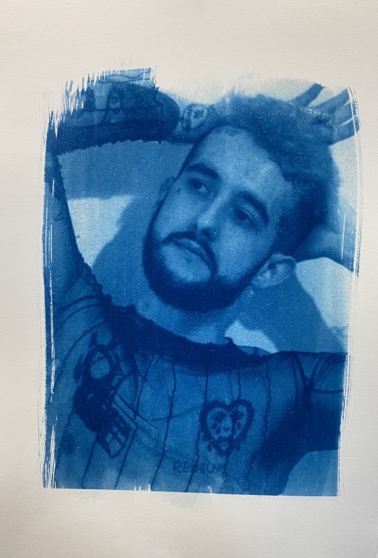
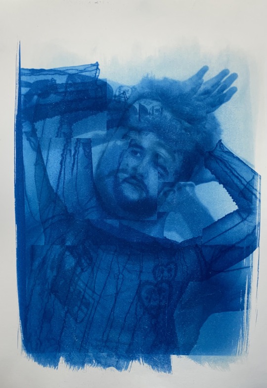
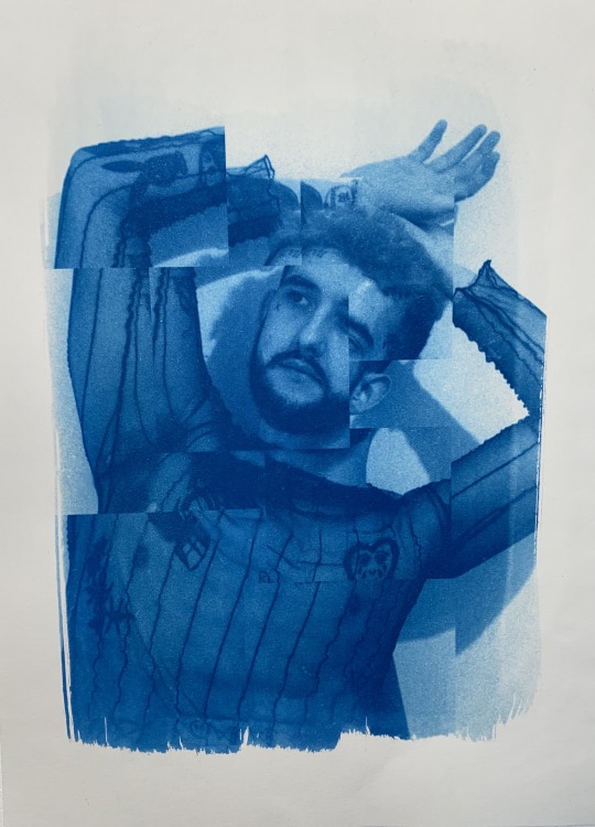
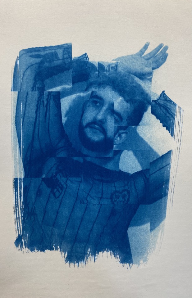
Normal Cyanotypes -
After looking at lumen prints I wanted to relook at other types of photographic printing processes I could use as part of my Studio work. I wanted to look at different prints to see different ways of presenting my work using different types of printing processes. Cyanotypes link to my practice because it is an alternative process. Also the process involves dark rooms and UV lights to create the prints, as well as a range of chemicals that often come around when using alternative processes.
I decided to use images from one of my shoots last trimester because I wanted to use images that were more simple rather than something that has a lot going on visually. I really like the visual effect of the brush lines as I think it adds texture to the prints and it’s also aesthetically pleasing. I like the prints that fully fit into where the chemicals are painted so that there isn’t a sharp cut off line where the image ends, instead you can see the texture of the paint brush.
In the future I would like to experiment with cyanotypes, to see how my distressed films would look like presented using this type of printing process.
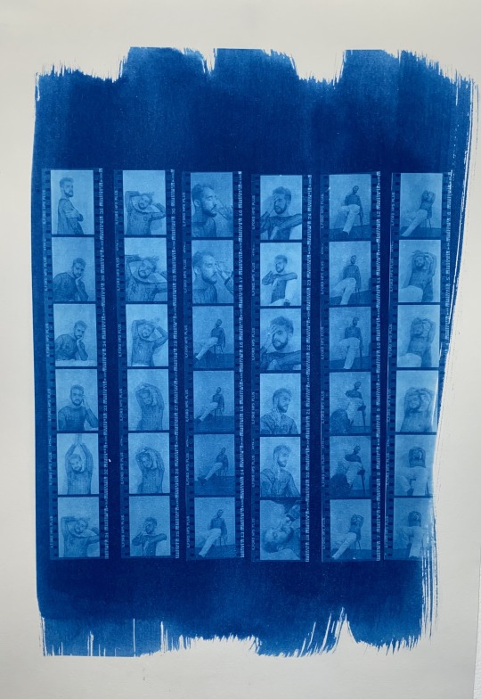
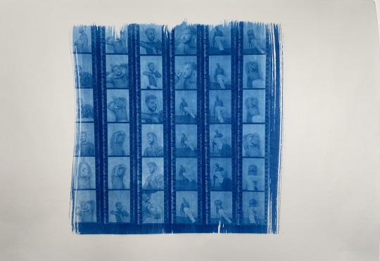
Contact Sheet Cyanotype -
Recently I have been looking/thinking of different ways to present my contact sheets and to create them. So After doing the first round of cyanotypes I wanted to see if I could make a contact sheet using this printing process. I really like the outcome of these cyanotypes because I think it is a unique and interesting way to present my contact sheets. However it did have some difficulties with the process, after placing the films strips in place it was difficult to keep them perfect as once placing the paper on top they would move. Also trying to get them placed perfectly within the paper was really difficult, especially trying to fit them properly into the painted surface.
Nonetheless, I thought the use of cyanotypes to present contact sheets has been really interesting and I really like the outcomes. They are a riveting and captivating way to present my film strips, the blue prints create a different type of feeling towards the way the contact sheets are seen.
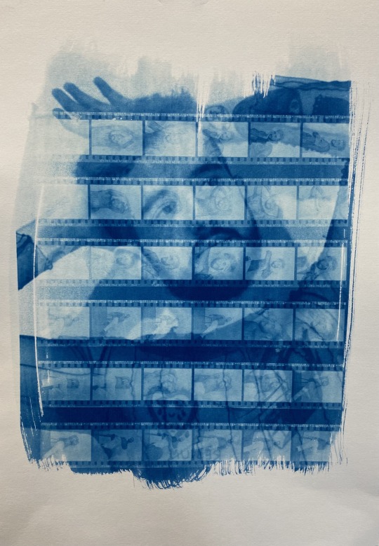
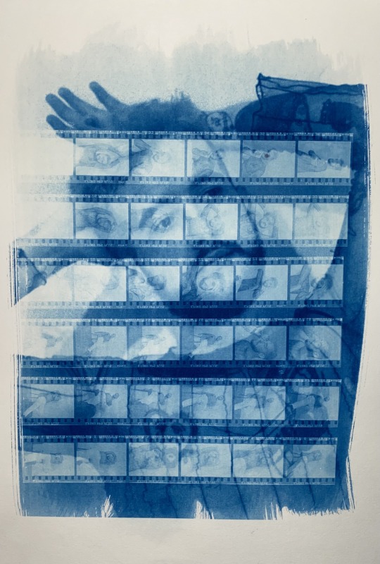
Double Exposure Cyanotypes -
After, creating the last two types of cyanotypes I wanted to experiment with bringing the two together. So I decided to incorporate both ideas together to create double exposed cyanotypes.
I tried two different processes for the double exposed experiment. The first one was to expose one image onto the paper and do the same process as normal and then paint the chemical back on over the top of that print. I then did the process all over again but instead used a different image to create that double exposure. The second lot I placed two images on top of each other to then be exposed together, this process allowed me to only do the process once instead of using the chemicals twice and making the process twice as long.
I prefer the second process where I only exposed the paper once as I think the overall blueness is too strong and too over powering, the blue is too dark in the first process. I also think the images blend together and integrated, the overall print looks more come together.
In the future of this trimester I would like to look more at cyanotypes and experiment with them. Maybe looking at scale, materials, images and even the prints themselves.
0 notes
Last Seen Blogs
discountscoobyart
i'll be there for you

solarhyperion
Untitled

eurekalogistics
Eureka Logistics (Pusat)
aylahcatigbe
Aylah

jin-kki
lovely