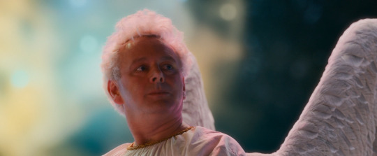
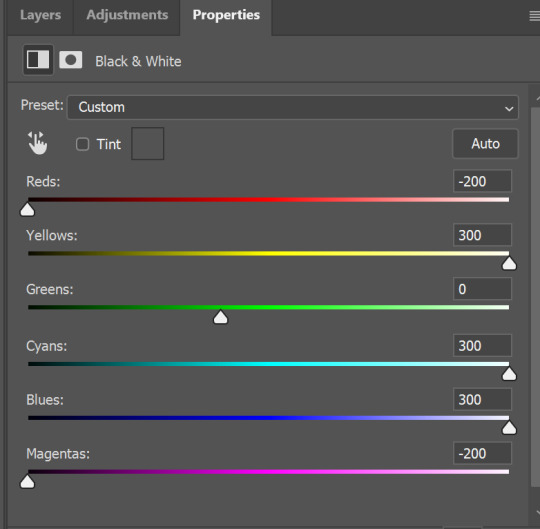
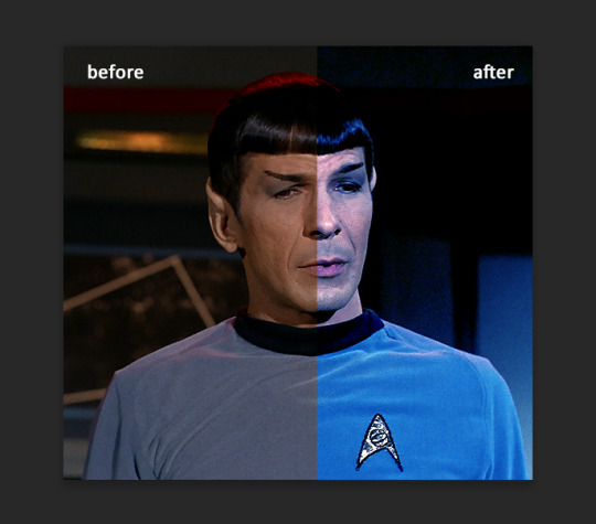
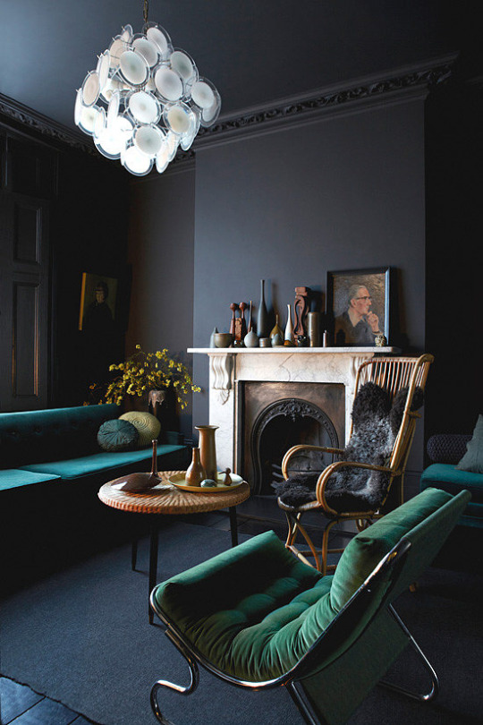
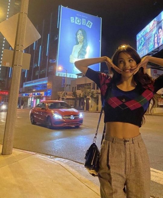
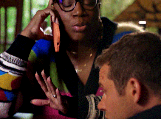
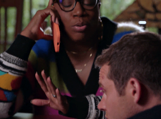
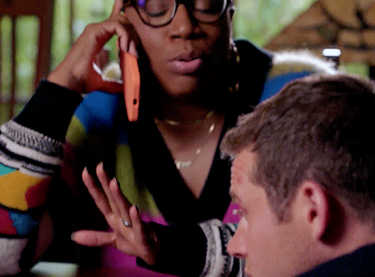
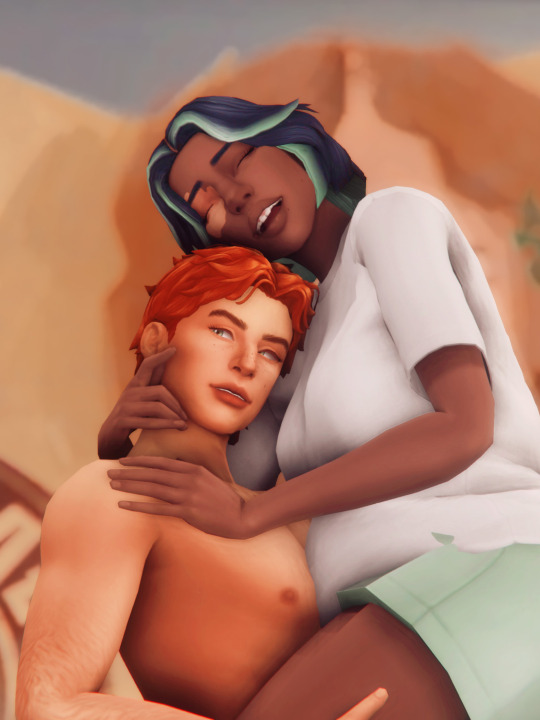
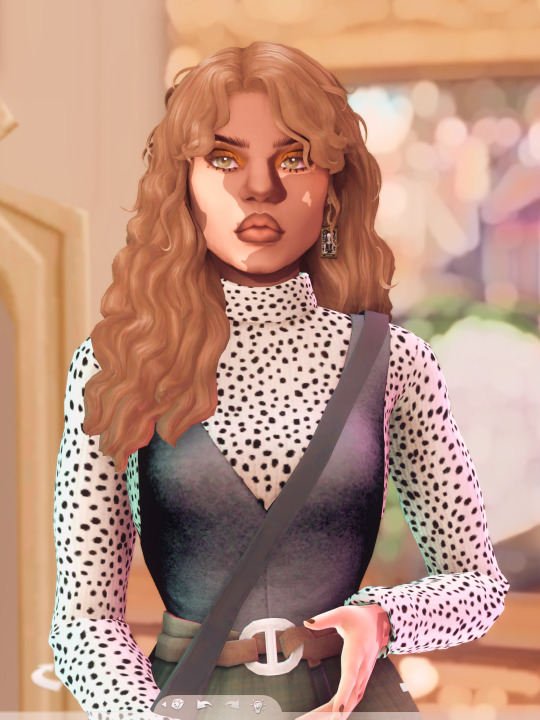
#i brightened the colors of this image a little bit
Photo

Tenel Ka Djo // Jacen Solo
[ young jedi knights series ]
#Tenel Ka Djo#Jacen Solo#SWEU#star wars: legends#star wars: expanded universe#color palettes#ch: tenel ka djo#ch: jacen solo#i brightened the colors of this image a little bit#but i love the colors in it so much#i wish i could turn jacen's saber green tho :P
39 notes
·
View notes
Text
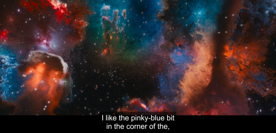
Alright, not to be too predictable, but I wanna talk about space and color as it's used in the intro to episode 1 for a minute. And you know, show some gorgeous space shots.
So we open in the dark. There's distant lights and the occasional flare from them moving through space but for the most part we get the angel that would eventually become Crowley alone in enough darkness that he himself isn't even giving off particularly significant amounts of light.

But then, enter Aziraphale. He arrives in a big ball of blue light shining above him that really emphasizes Crowley's red hair. They get tied to the colors we most often see them attached to, especially in promotional materials.

From here the entire scene gets slightly brighter, even once Aziraphale's light dims down. They're both lit up once they're together, even it the middle of literal nothingness.
They start the universe next, using Crowley's hand crank, which gives off a magic that's a combination of their two colors - purple.
A very similar color to this shows up in heaven as a signal flare for their accidentally too powerful half a miracle. It's a color tied to a miracle so big it could've revived someone 25 times and also a miracle that got the engine of the universe running.
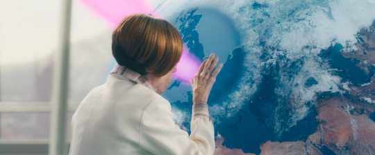
And then. Creation starts. Our first image is a very Heavenly aesthetic. It's a blueish light cutting through the clouds much like Az just cut through the dark.
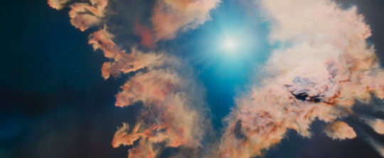
And what explodes from that is the thing that set me down this little rabbit hole in the first place: it's purple scattered through with red and blue lights.
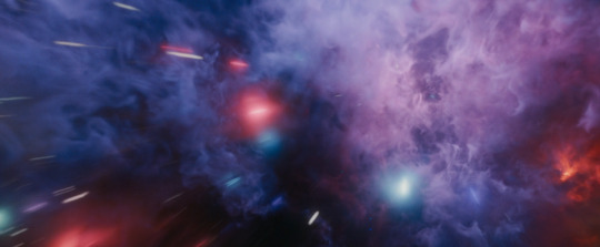
As the initial burst fades, the blue and the red separate, the color fading except for this tiny blue dot and this growing red zone on the right.
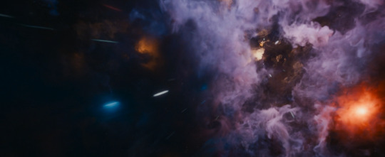
The blue then fades, leaving us with an extremely Crowley coded palette here and a very orangeish red. There's shades of gray, a little bit of light, but not nearly as much color. As the sequence moves the darkness grows but does start slowly filling with small points of light.

We then end up with shades of gray both light and dark. There's balance here, even if it's not particularly colorful.

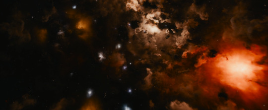
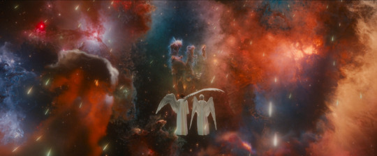
And then all at once a pinkish red bursts forth with these intense clawing tendrils. At the core of it, from the heart of it, is a bright blue ball of light.

It fades into a blue heart surrounded by darkness with whisps of white resembling a certain someone's hair. Or, as some friends pointed out two people embracing.

As the nebula settles a few other colors set in but the primary scheme is still red and blue. An almost violent plume of red emerges on the left side of the image.
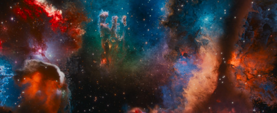
And from this moment on most shots of the two of them back them with their respective color schemes.


They chat and Aziraphale gets anxious. He looks for a distraction and is immediately drawn to the space where the colors mix.
And as we fade out the other colors in the picture fade. We get the most balanced blue and red get. And on the far corners fairly clear dark and light.
So what does this mean? The purple speaks to them being very powerful together. And, the rest is arguably just representative of the plot. We have Aziraphale as a beacon in the dark - a signal flare we know Crowley has throughout history been aware of and drawn to. We have them brightening each other. We have Az's color breaking out of heaven to mix with Crowley's to create something new and wonderful and powerful. Aziraphale's color fades, leaving Crowley alone. We then get a burst of a red closer to Crowley's current hair, with Aziraphale's blue in the core of it that eventually becomes a blue heart surrounded by darkness. That too fades, replaced by the pillars becoming their familiar hand shape and slightly more colors seeping in. As they talk together and move closer together their own colors settle back in and come to balance.
#good omens#good omens spoilers#good omens season 2#gos2 spoilers#Aziraphale#Crowley#space#good omens meta
3K notes
·
View notes
Text
THIS KITCHEN IS FOR DANCING – k. sunwoo


you never knew a kitchen was more than just a place to cook in.
pairing: kim sunwoo x gn! reader
genre: established relationship au (omg who is she..), hurt/comfort, domestic, fluff, tiniest bit of angst. slice of life !!
warnings: hinting at dysfunctional families, the reader has unspecified mental issues
wc: 1.7k
listen to: matilda by harry styles
a/n: thank u sm sweetie pie @csenke for beta reading in such a short time 💞 also this is very loosely inspired by the book happy all the time by laurie colwin!

this fic is dedicated to my best friend @from-izzy 🤍 I originally wanted to write you something else (as you may know), but I hope even this small thing translates just how much you mean to me. happiest birthday to you, i love you so much
The apartment grows silent after everyone leaves and the door is shut behind them, the only sound accompanying your thoughts being the water running in the kitchen sink, the song lowly playing through the radio and your boyfriend’s occasional, quiet humming as he helps you dry off the dishes and put them away into their respective cupboards. Not a single word was shared between the two of you since the guests departed your new place, your thoughts running a thousand miles per hour, eyes hypnotizing the tap as you focus on washing off all the food and grease remains off your cutlery. Your brain is buzzing with the memories of the past couple of hours, each moment replaying in the back of your head once, twice before it moves to another one, trapping you in an endless cycle of motion bouncing against the walls of your skull.
You relive the whole evening again.
The sound of the doorbell ringing, a yelled-out “Surprise!” landing into your ears as the little crowd materializes at your doorstep. The kisses pressed to your cheeks, the potted plant forced into your hands, the kettle your boyfriend’s sister drags inside and places onto your kitchen counter without even asking you, plugging it in. The image of your boyfriend’s dad pressing Play on your old, beaten-up radio, the grin he sends you as he admires your empty apartment.
The bottle of wine your boyfriend puts into your hold when you finally find a place to put the plant down, the soft, apologetic smile sent your way as he kisses the corner of your mouth. The sight of 3 pairs of shoes waiting next to the door, the sound of their socked feet shuffling across the floor.
The side-hug his mother brings you into, her sweet words landing into your ears. “You made it look so pretty and homey,” she says.
You reply that the apartment is still half-empty and looks a little naked. She tells you it’s nothing a few picture frames won’t fix, and his sister suggests getting a colorful rug for your living room to brighten the space up a bit. You nod to her words, taking them all in.
You’re not used to all of this.
People visiting you, people throwing you a housewarming party. People caring enough about your comfort to bring you kitchen appliances you lack and asking you if there’s anything more you need that their son forgot to mention when they asked.
You’re not used to so much care. So much tenderness. To a family so loving their care feels kind of overbearing to your small, fragile heart.
“Are you mad at me?” Sunwoo asks through the endless stream of your thoughts, making you look up from the kitchen sink. You forgot he was here– but then again, where would the dishes be magically disappearing into if not his hands?
The question shocks you. Not because you don’t expect him to ask– just because you don’t really expect your own answer.
“No,” you shake your head, voice a little hoarse. Your eyes burn with emotion, turning into water pools begging to be tipped over if you don’t pay enough willpower to make the streams stop. You bite at your lower lip.
It doesn’t help.
“Then why are you crying?” he asks.
There’s no use stopping it now. There’s no use refusing the apartment that’s now warm from the body heat it received from all the people visiting it this evening. There’s no use rejecting something you never knew you wanted– something you never knew you needed.
“Look, I’m sorry. I know you said you didn’t want anyone to visit for a bit before you get used to the new apartment and all, and you also wanted to have it fully done before anyone else saw it, but my parents insisted, and–”
“Thank you,” you utter out silently, like a prayer, making him stop in his tracks.
It’s only been a few months since you and Sunwoo started dating. Right from the start, the boy knew it would be different with you. He wouldn’t say it was difficult– no, loving you has always been easy for him– but he knew that he had to have much more patience with you.
His love is patient when he listens to your requests and boundaries. When he listens to you cry and picks up your calls even in the middle of the night, staying up with you until early morning just so you wouldn’t feel alone during your sleepless moments. Sunwoo’s love is patient when he gently holds you and kisses you slowly, setting the pace just right. His love is patient when he helps you pick out an apartment that’s just right for you– with the right size, location, on the right floor, not once thinking of his own convenience.
He always listens– just not this once.
Somehow, you can’t find it in you to be mad at him.
You used to think you wanted the world to be quiet for a while. To stop– to leave you alone so you could breathe. You wanted your own place for yourself– your own space, uninvaded by anyone else, stranded from any contact. You used to think you don’t want guests over or family members helping with the move– not that the effort was made anyways.
You used to think you wanted a place for one– a quiet nook to bring you comfort, four silent walls to make you calm. A bedroom to make you sleep soundly, a living room with nothing but a TV and a sofa to keep you company. A kitchen to make food and a table to eat it at before you get off for work. That’s what you wanted.
But after the evening is over and your boyfriend’s family leaves the walls echoing with laughter, the radio playing lowly in the background, tea made from the new kettle waiting on your coffee table, steam warming up the place with gentle cinnamon, your heart squeezes on itself at the realization of just how wrong you were.
Sunwoo turns the water off as he walks closer to you, enveloping you in a tight hug. Your hands are dripping water up to your forearms, making wet puddles glisten onto the tiles of your kitchen floor, yet he doesn’t mind stepping his socks in and having your arms sneak around his waist, all your built-up emotion releasing as he gently rocks you to the beat of the music in the background– action something akin to reaching for your soft, tender heart into your ribcage and gently holding it in his palms, protecting it and keeping it safe.
You never knew you were made for love like this.
You never knew you wanted two pairs of arms holding you to them, the smell of Sunwoo’s cologne clogging up your nose. You didn’t know all you needed was his presence to doze off on evenings that are difficult– a garden in his soul made for you to sleep safely. You never knew the sound of his voice was enough to fight off thunder and make sunlight cut through the clouds, like the sweet chirping of birds waking up in the morning.
You never knew you wanted a place that’s a walking distance from your boyfriend’s– just in case either of you wanted to quickly come over. You didn’t know you wanted a bedroom with soft sheets in it to cuddle in with someone, beams of sunlight dripping into the space through the blinds in the mornings caused by the location of the windows being towards the east. You didn’t know you wanted a living room decorated with gifted house plants and picture frames filled with people you care for the most.
You didn’t know that a kitchen is more than just a place to cook in. You now realize, amongst all the other things, that your kitchen is now also a space for shared meals, chatter and a bottle of wine opened after a long day at work.
Sunwoo’s low voice keeps humming the familiar song into your ear, rocking you from side to side. The dishes are long forgotten and your worries disappear like the last remains of rain puddles left outside after a storm on a sunny day.
The gentle, patient love Sunwoo has for you slowly slips into your heart, mending all the damaged pieces back together and opening up your eyes to so many more things you wanted to stay blind to. You were patient for long enough, though– and you finally see it, right there in front of you, tangible and believable– after all of the love you put out into the world selflessly, tirelessly, it finally came back to you.
And it will stay.
Your new apartment– although you live alone– is a place for love and kindness. A new chapter for new memories, each one brighter than the other. This place is for you to come back to after a long day to rest your limbs and soul in the quiet comfort of it all. This place is made for two people that turn a simple house into a home.
This kitchen is not just for cooking food and heating up leftovers over a cup of coffee during lunchtime. Kim Sunwoo and his endless love show you that a housewarming party is nothing to be scared of if you don’t have an anxious, quiet voice in your ear constantly telling you that there will always be people waiting on the side to somehow ruin your special day for you.
This kitchen is for whispered conversations over sleepy mornings during the weekday. This kitchen is for making pancakes after making love, two arms sneaking around your waist from behind, naked chest pressed against your back. This kitchen is for washing the dishes together, a smiley boy helping you with even the simplest task. This kitchen is for laughter when you burn an omelet or overseason your food, trying out new meals. This kitchen is for matcha in the evenings, a worried pair of eyes rushing you to sleep instead.
This kitchen is for love trapped between four walls, with no way for it to get out and disappear into the wind.
But tonight, most of all, you realize–
This kitchen is for dancing.
#deoboyznet#bjnet#sunwoo#kim sunwoo#the boyz#tbz#sunwoo fluff#sunwoo scenario#sunwoo x reader#kim sunwoo fluff#kim sunwoo x reader#kim sunwoo imagine#sunwoo imagine#the boyz fluff#the boyz x reader#the boyz fic#the boyz scenario#the boyz imagine#tbz x reader#tbz fic#tbz fluff
126 notes
·
View notes
Text
Oranges put Isidor on the spot.
The way they defied Hive regulations.
An obscene fruit, so unashamed about its non-synthetic heritage, so unabashed in its presentation, so decadent, as its blinding hues brightened up the dull gray of McHale’s cell.
Teeyama Averon McHale’s decorative bowls were filled to the brim with them, overflowing. Currently, her right hand is lurking in between, her dark skin contrasting against the bright colors. She lifts up one tiny tangerine and it stops right in front of a face, that is nothing but Hive regulation standard, in the midst of all this opulence, as she sits in a chair, that isn’t just a chair.
It's beautiful, ornately detailed and stitched by hand. It is also, obscene.
McHale is bred for leadership. All soft and sweet, despite her age, and in the middle, piercing eyes that look beyond the surface.
Aryu Isidor Tichy feels naked.
He inches backwards.
His voice is low, “I’m honored you sent for me to entertain you again”
McHale smiles that charming taskmaster smile, that is supposed to put lower units at ease. Isidor is soothed by it, he really is. But something hasn’t been quite right with his thinking for a while. He can’t let himself be lulled into feeling safe, when he wasn’t.
McHale’s eyes seem too large, too shiny. Her oranges too insulting.
“I’m here to help you”, she says and she sounds so friendly and cute, “You’ve applied for reeducation?”
“Yes”
“Why?”
What an inane question.
The minute Isidor thinks that his eyes widen, his stance loosens, and he starts to sweat. He’s not supposed to doubt a taskmaster. Not even in his thoughts. Not even a little bit. No-
“Are you okay, Isidear?”
The pet name feels doubly humiliating, doubly insulting. Precisely because Isidor feels like he’s the one keeping with the rules, while McHale, his Teeyama, was decidedly not, was hoarding oranges as if one could just do that, as if it held no significance.
“I think I might have caught a dissident thoughtvirus”, Isidor says quietly. His thick shoulders square up, cage in his plump cheeks. “I think I might become a liability to the Hive”
McHale doesn’t stop smiling.
Which confuses Isidor. “That’s not good, Teeyama McHale …” he clarifies.
“It's not good at all, no”
She starts peeling the tangerine. Her fingers are now sticky and wet.
Disgusting.
Isidor flinches at his own thought. He quickly opens his mouth again, “Why haven’t you fulfilled my request?”
“For reeducation?”
Isidor nods.
Instead of explaining herself, McHale bites into the tangerine, completely forgoes the bite-sized pieces it's already made of, completely ignores how a tangerine is supposed to be eaten.
Drops of fruit juice spill onto the table underneath her.
The sound makes Isidor’s skin crawl and sweat even more. “I’m not used to tasks of this nature”
She says, “But you’ve excelled so far”
He cries, “Its highly unconventional”
She shrugs. “Its pretty simple”
It was. Objectively. Isidor’s tasks used to be comprised of low level engineering in the field of household robotics. Sometimes a whole automaton. A bit of programming on the side. And that’s it. Endless days of fixing cat food dispensers, and chatting up sexbots, and all in all feeling useful, feeling fulfilled, feeling … not stressed.
But then McHale took over his sector, and McHale, well.
Now he’s getting very specific, but simple tasks. Not all the time. But some of the time. Like now.
She gives one orange a little push. Makes it roll towards Isidor. Her hair sways up and down the tiniest amount, her non-regulation stiff curls like a halo around her head, as she continues to smile. She says, “I want you to eat this … ”
Isidor curls into himself, his wrinkles morphing his face into a near parody of disgust. It looked like he was playing it up. He wasn’t.
McHale continues, “ … and enjoy it”
By now, Isidor is whimpering. A man his age, early forties, big like a boulder, thinning curly hair, and even thinner beard hanging off of him, whimpering. It made an amusing image, and that fact was reflected in the way McHale started snickering.
“I will do what you ask of me Teeyama, but I cannot control my emotions. I have to protest against this heinous act being forced upon me!”
“Are you, a loyal and goodhearted unit of this Hive … defying a taskmaster?”, McHale whispers.
“NO!”, Isidor cries out, because of course, that would be even worse. “No, I- I’m sorry-” As he grumbles out more apologies he grabs the orange.
It tasted good.
It tasted great.
And then the joy makes way for dread.
“I’m not cleared for a toilet, McHale!” He hadn’t even addressed her by title, he was so shocked, “I can’t eat non-regulation food, I’ll- I- My body is designed to eat manna! You know how there’s talks of removing the workers’ digestive system, since- And- Well-”
“You can use my toilet, Isidor”
He doesn’t calm down. In fact, he gets even redder.
Bites into the orange again. Munches quietly. Fights down the little sounds of joy at the bursts of grotesque sweet and sour on his tongue.
–
So. The next steps were obvious.
Denunciating McHale. Make a report with her taskmaster. It was easy. It would be done in mere minutes. Isidor could be rid of this nuisance, could be rid of her in seconds.
But that orange had tasted nice.
And those occasional “Just enjoy yourself” tasks. What bad could they in effect do? Other than make him feel guilty. He wasn’t feeling guilty all the time of course. And during those “fun” tasks he usually ended up feeling rather good. Nice. Well.
But oh. Oh. The Hive couldn’t be sustained like this. What if McHale wasn’t just doing this to him, but to their entire sector!
For the first time Isidor wished he could have comm clearance, could actually speak with his fellow units. Until now it had never turned up as something desirable to him.
“Why me?”, Isidor asks, sitting in her massage chair and not having enough mindspace to actually care about what he’s asking.
“Because I like you”, McHale says.
“I’m Isidor Tichy, Aryu of C-2-4 and most days I clean gunk out of motherboards. I’m not special enough to be considered for procreation, not pretty enough to be a toy someone would keep, not smart enough to climb ranks-”
McHale had been smiling, but now her eyes wander. Her nose wrinkles. “You’re the perfect drone, yes. But with you its self inflicted. With you, there’s effort”
“Yes. I strive to be the best worker I can be-”
“Yes. You strive. You struggle”
“Why thank you”
Defiant sarcasm. Taskmasters were legally obligated to put a drone into the freezing pod for that.
McHale just continues talking, “With you, there’s effort to be the perfect drone. No one else has to try, Isidor. All the other units don’t even think about it. They just are. The perfect drone, I mean”
Isidor’s eyes are half lidded. He’s melting into the chair. He’s never gotten a massage in his life. This. This could be worth it.
“I want to fit in”, he says. Truthfully.
“But you don’t”, McHale concludes. “Just like me”
–
That conversation is what sets him off. Back in his cell (which was perfectly cut to his body, barely room enough to take one step; really, only enough space to fall on top of the regeneration mat), back in his cell, Isidor replays the last conversation.
Then all of their conversations.
And comes to a decision.
He never sees McHale again. She vanishes, along with her spacious cell, her massage chair, her toilet, her oranges.
Isidor regrets it immensely. Isidor also justifies it with every thought.
And in the end he realizes he’s alone.
Maybe more alone than before, where he hadn’t even known of a possibility to not be.
#artificial idiocy#caro tag#isidor tichy#averon mchale#writing#oc#original#scifi#dystopia#queue#heheheheh have my little orange short story
47 notes
·
View notes
Text
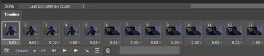
a very foking detailed GIF tutorial you asked for and how I color my gifs
However, I color them individually, so there will be explanation of tools I choose instead of showing what settings I used for this specific gif in this tutorial.
I will go through entire process of how I create gifs, the process of gifmaking can be different for others and there is no obligation of how to create a gif. Basically, do it however you like and enjoy the process.
this is part I, part II is here\in reblogs.
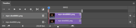
First, you will need to prepare everything, you choose the moment you want to gif and make screencaps. I use mpv player to create them, here is a great tutorial on how to install it. So I won't go over it, just follow it and or use another player which allows to make screencaps, such as kmplayer.
Once you make screencaps go to photoshop - file - scripts - load files into stack - browse - select screencaps and upload them.
At this point I will also add that I use keyboard shortcuts a lot, you can set them up to your preference, that is much easier for me and might be for you too, and I am so used to them that I forget where are some settings. You can do it from edit - keyboard shortcuts, you may set up anything there.
You will have all screencaps uploaded into one file. Once I have it I change canvas/image size, I also remove 10 pixels from each side, because I hate that some files have that weird black line which looks awful on gifs. But that's up to you. Use proper dimensions for tumblr, that is important since your gifs will look 'not good' when you upload them. I will go with 540x500px this time. (correct dimensions for tumblr are 540px for big gifs, 268px for two gifs along each other and 177-178-177px for the three gifs together)
Go to images - image size (crtl+alt+i) and change the size.
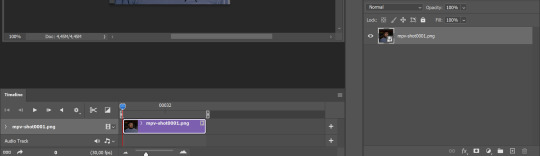
After that I make animation, because without it we would not be able to convert all the screencaps into smart filters. Go to windows - timeline
you will have something like this by default

click on create frame animation - then on 4 horizontal lines which will open menu - make frames from layers
click on convert to video timeline (that 3 horizontal lines and 1 vertical line or whatever it is, right under the first layer) you will get something like this.
now, this will be animated. If you choose convert to video timeline right away it will not be animated.
Now, select all the layers - filters - convert to smart filters
You will have something like this, and if you play it - it will be animated anyway. That way you can edit ALL the screencaps at once.
I usually start with sharpening, settings may change according to the files I have, for some you will need more sharpening, for some less. I go with filters - sharpen - smart sharpen and usually that's enough
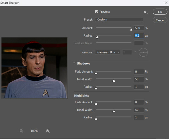
but I sometimes add more sharpening, just change radius to 0,2. So, repeat the action.
You will have it like this
and at any point of making gif you will be able to change settings for it, if after coloring it will look not as good as you wanted to.
I will not go into a lot of details about coloring for this gif, because does not matter how good the coloring on this gif will be, it won't work as good on another gif.
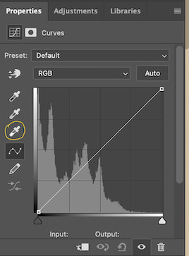
There is no right way to start coloring, you may start with curves, levels or selective colors depending on the screencaps you want to edit.
Well, this time I did start with layer - new adjustment layer - curves. (yeah, i guess by the end of the day we all do lmao)
(Always use 'layer - new adjustment layer'. That's the only thing I suggest to remember when you color. )
Just to brighten gif a little bit, but you also can change colors with it.
those are not settings I used for this gif!
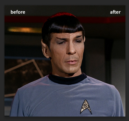
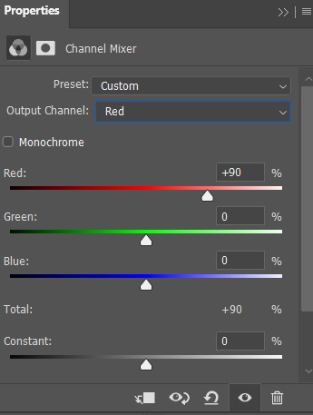
Curves have option to edit colors, just press RGB and you will see options for RED, GREEN, BLUE. Upper slider adds the said color, the slider at the bottom removes it. That's a great tool if you have a very red\yellow\blue\green scene, with those settings and moving sliders here and there you will be able to add the color you want, for red scene I suggest to use more green and blue, as well as for yellows but with less green. Just move them to see what fits your gif better.


there are also eyedrop tools which will help you to edit picture, with the first one you need to find the darkest part of your gif and click, it will adjust your picture according to it. If there's too much red, it will make it bluer, etc. The middle one is the one I use the most out of them, cos it changes the midtones, it's great if you have very yellow picture, just press the yellow part and it will make it bluer\greenish, depends on the picture, and then you can adjust it to make it look better. And the last one you can use to lighten picture as well, just find the brightest part of the picture and press it. It will adjust other colors accordingly.
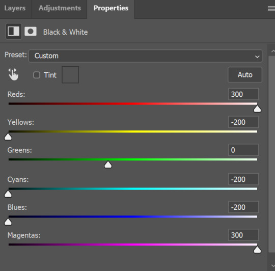
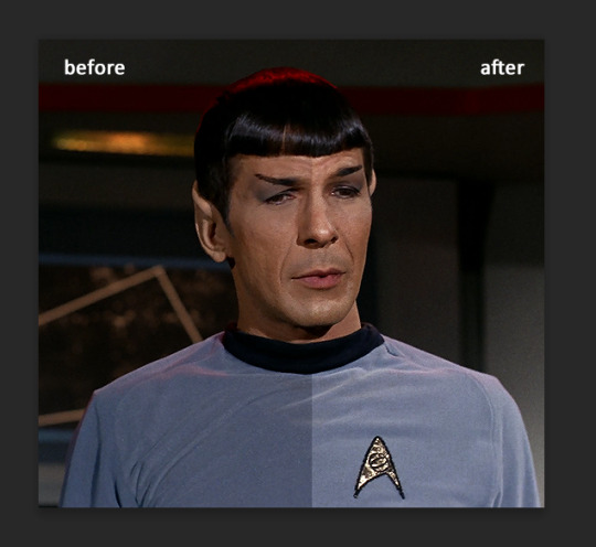
I like to play with settings, I could add more darkness to the gif by levels, by selective colors making dark colors even darker, but sometimes I just use layer - new adjustment layer - black & white. Putting it on soft light blending mode and changing opacity. Idk, I like the effect :D Also, by using these, you will be able to darken part or lighten specific colors
so yeah, play around and figure out what is the best way for you.
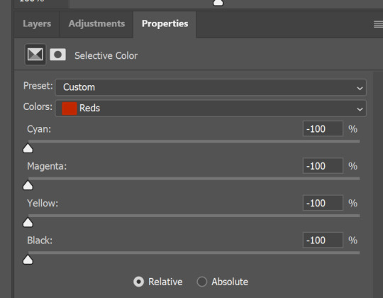
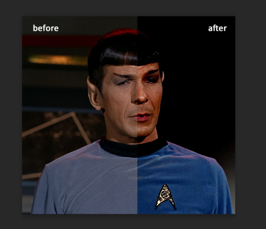
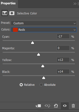
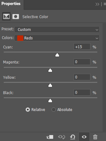
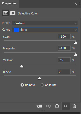
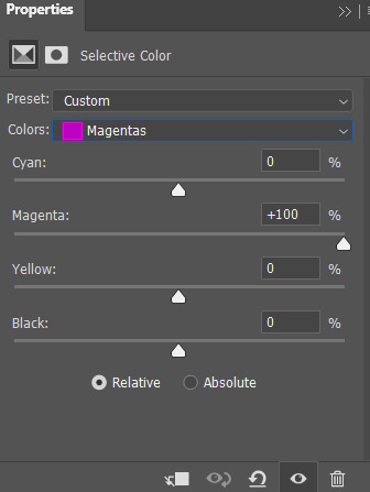
after that I used layer - new adjustment layer - selective colors. I think this is one of my favorite tools out there, I love it, I usually end up with 30 selective color layers if I make a super complex gif :D
You can change colors with it, make them more vibrant, or less.

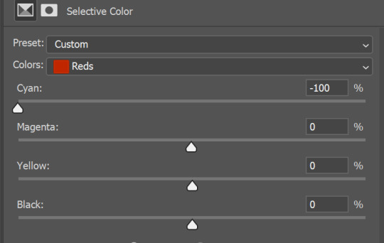
for each color you will have 'cyan, magenta, yellow and black' and by dragging sliders you can change colors, make them darker or lighter for the lovers of those paster gifs :D

But don't worry, that's not where I will go with the gif, so it will look better, i promise.
You know how much I love making blue even more blue. So I go with more selective color layers to enhance it.
You do not have to use just one, and you won't be able to make it with just one sometimes. So add as many as you like to get the result you want.
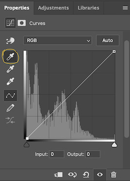
next is one of my favorites - layers - adjustment layers - levels
with it you can darken colors or lighten them, there's also auto, as well as on curves, which will find the most suitable settings for your picture.
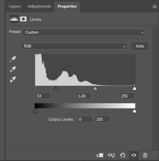

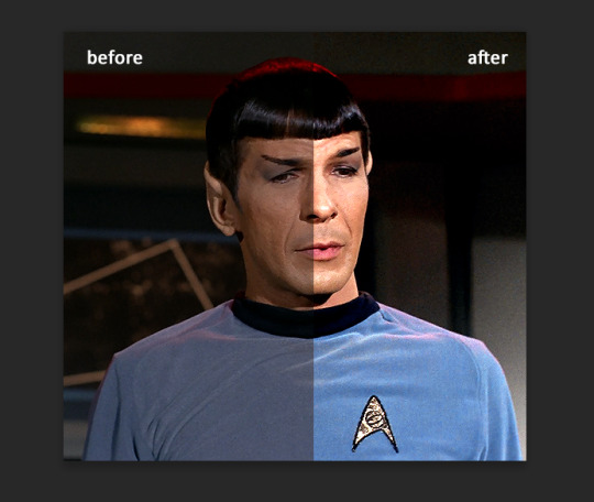
I hardly ever change the middle slider, cos
nope.
so, we are at this part of the gif by dragging sliders.
next one I used is layers - adjustment layers - color balance.
right now I will stop adding directory, this tutorial is already long enough, so most of the things are there in layers - adjustment layers.
Absolutely love it, most of settings do the same things but a little differently, this one changes colors but also entire picture, not just part of it. You have shadows, midtones and highlights
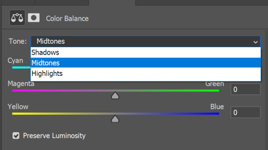
Each of them is really great when you have a yellow\red\blue\green picture to edit. And each of them has 3 sliders cyan\magenta\yellow.
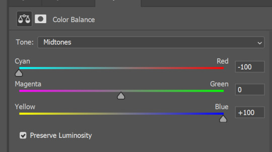
You see, if you drags sliders the other way it will make picture more yellow.
END OF PART I
since tumblr
108 notes
·
View notes
Note
GAH!!! I’ve had this question on my mind for so long, but do the boys have any particular tastes when it comes to interior design? Minimal, eclectic, etc… whatever boys you want to choose! Thank you!!!
This was interesting, I had to go on a bit of adventure through interior décor styles because I’m not too familiar with all the terms, but I definitely had fun~
Forgive any misuse of interior design words below, I am not an expert! XD
(Featuring many images stolen from Google)
Sans (Undertale): Sort of a revival post-modernist, not quite as loud as the original post-modern look in terms of colors, but still a mix-and-match of shapes and materials, spacious areas, not afraid of décor or accenting a space with unique pieces that don’t perfectly coordinate with the others. Comfort and space over rigid adherence to an aesthetic.
Papyrus (Undertale): Memphis style designs really capture his imagination, lots of shapes and bold, bright colors, circles and checkerboards and zig-zags. It’s fun, he likes fun things! Abstractly-shaped furniture and weird objets d’art—could use some more stuff with cool flame-patterns, or maybe some spikes here and there, but he can experiment to get the right balance in there!
Sky (Underswap Sans): Into modern styles, mostly, he does like the minimalist look but absolutely goes in for strategic splashes of color to brighten things up. Sleek shapes and clean lines are great, but absolutely must be offset by some rich lively colors for an open, welcome feel, can’t let it feel too sterile.
Paps (Underswap Papyrus): Favors sort of a regence look, tends toward curving lines and intricate elegance in the little details. Chair arms that swirl, fleurs in the carving of a cabinet, decorative patterns and motifs to tie everything together as a cohesive whole. He finds the charming elegance comfortable and easy to settle into.

Jasper (Underfell Sans): Definitely more of an artisan/arts and crafts style kind of guy, cares less about the Look of things than he does the craftsmanship of it—he wants things to be well-made and able to stand up to consistent use, so most of what he favors are sturdy pieces and designs without ostentation or elaborate details. It may not be the prettiest, but it is homey and comfortable and ready to be actually lived in.
Pyre (Underfell Papyrus): Empire style, he is all about the ostentation and elaborate details, silk and velvet, ebony and gold, it has to be bold and artful and dramatic (just like he is). If something’s a little too plain and simple, he’ll pass on it or find a way to dress it up prettier.

Mal (Swapfell Sans): Contemporary design is more his thing, sleek lines and sharp angles, with a strong aesthetic preference for more industrial materials (glass, metal, marble, etc). Tends to avoid most color, sticking with black and white, and just a few decorative objects here and there to draw the eye. He likes the clean look over a more comfortable, lived-in one.

Rus (Swapfell Papyrus): Big fan of art nouveau, swirling lines and curving forms. Stained glass lamps, art, and windows are big hit with him, as well as wrought iron railings or table frames and the like. He likes colors and things that feel like they flow, mostly, and any intricate detail-work that catches the eye.
Slate (Horrortale Sans): Cottage style is more his speed, a little rustic and a lot cozy, with a special emphasis on plush furniture. He’s all about the comfort and the homey feel, nothing pristine that an accident or a bit of wear-and-tear will ruin quickly.
Papy (Horrortale Papyrus): More of an English country sort of guy, big on patterns and florals, but also into a bit of delicacy and charm—some more ornate accent chairs here, decorative curtains there, unique antiques and plants everywhere. Definitely cozy and comfortable but done in a very thoughtful and deliberate way.

Ash (Undergloom Sans): Clutterbitch—wait no, I mean maximalist. He likes having a lot of stuff and putting it on display, and bright colors (especially turquoise!) make him happy to look at, so he’s drawn to that kind of thing when customizing a space. Lots of knickknacks and prints related to his hobbies, maybe a novelty end table or two, shaped like a record or a cloud or something. A bit chaotic but he probably knows where everything in it is, so ¯\_(ツ)_/¯
Yrus (Undergloom Papyrus): He goes for a bit of a modern farmhouse look, soft neutrals with warmer rustic touches. Likely to spruce it up a little further with some bright yellows and greens, but mostly in the accents—flowers, artwork, et cetera. Also likely to decorate with lots of candles and mason jars and anything he comes back with from the home goods store, because he is very passionate about the home goods store.
Brick (Horrorfell Sans): Tends toward Tuscan style, warm tones, wood and tile and wrought iron, sturdy and well-crafted furniture. Not opposed to some intricate designs here and there, but not that intricate, just enough to look a little nice. Maybe a bit nicer than the absolute basics, but he’s not trying to impress anybody, he just wants cozy and comfortable, and maybe he’s earned the right to a tiny bit of fance here and there, y’know?

King (Horrorfell Papyrus): Something of a traditionalist, with a strong appreciation for clean, elegant, and cohesive styles. The classics never go out of fashion—dark wood, damask patterns, ornate detailing, maybe some fine red drapery and a chandelier or two, but nothing too ostentatious. Less is more, but no need to go full minimalist to show your class, after all.
Merc (Horrorswap Sans): Definitely about the shabby chic, clean and simplistic styles but with a touch of wear or softness to keep it inviting. Not a sterile space that can’t be lived in, but still a bit neat and thoughtfully arranged!

Ell (Horrorswap Papyrus): More a fan of the urban look, exposed brick and beams but some softening elements incorporated too, like abstractly shaped furniture and décor, and lots of lighting. More minimalist than cluttered and probably not a huge fan of rugs, but he definitely wants a good balance between hard and rough, and soft and wavy aesthetics.
Pitch (Horrorswapfell Sans): He can’t actually see it, but tends to favor Mediterranean styles. He likes a lot of sunlight, open floor plans, and wide doorways, and he’s a little less picky about his furniture but anything with ornate designs and detailing that he can physically feel to appreciate is a bonus. Function over form, though, comfort and utility is always foremost in his consideration.
Nemo (Horrorswapfell Papyrus): Fond of mission style, slatted wooden furniture, simple and clean designs and only a couple accent colors that work well with them—autumnals are a favorite. Some nature-inspired touches like plants, artwork, and other accents to bring a little of the outdoors in, but not so much as to be cluttered.
Sunny (Gastertale Sans): Mid-century modern, for the most part, uniquely shaped items to stand as conversation pieces, but still primarily designed for utility. A little off-beat and retro, but still a homey and comfortable place to chill in.

Aster (Gastertale Papyrus): Big into art deco, metal and glass, geometric patterns and angular designs with bold, rich colors. He finds it to have a very fun and classy feel and likes things that make a statement—so he’s likely to incorporate a lot of centerpieces and décor wherever he can to draw the eye.

Spectr (Transcendtale Sans): Full-on industrial, brick and metal and hardwood, ideally with open and lofted spaces. It’s kind of what he’s gotten used to and gained an appreciation for along the way, so it may not be the most innately homey-feeling place, but he’s comfortable in it. Likely to accent the space with art—wall or sculpture—rather than rugs or blankets.
PapAIrus (Transcendtale Papyrus): He’s a minimalist. He doesn’t actually have a physical body most of the time, so his taste in decorating a space tends to prioritize aesthetic over what it would be like to actually live in it. Still, he is fond of aesthetics so he’s sure to pick out at least a few interesting and attractive centerpieces—light fixtures, table décor, an accent pillow, something—to make it a little prettier.

Xanth (Ascendswap Sans): Sort of an eclectic/boho thing going on, lots of color and design and pretty much anything fun that catches his eye-socket. He’s very into crystals and wall hangings and art (or plants!) that can be strung up to dangle from the ceiling, so any space he’s involved in decorating is bound to look a little messy, but it’s comfortable and fun so it works out in the end!
Piper (Ascendswap Papyrus): Give him that Hollywood glam, glossy high-shine surfaces—glass, gold, mirrors—mixed with soft velvets and satins. Mostly black and white but with a prominent accent color or two to really make the eleganza pop, he’s decorating to impress and show off his taste in design.
Carmine (Underfell Fruition Sans): Ends up falling into a bit of a steampunk style in terms of décor, lots of metal and lighting, plenty of stuffed shelves, and clockwork junk and tools lying around. He certainly has nothing against brass and leather either so y’know, if that’s what you wanna call it, there it is.
Tank (Underfell Fruition Papyrus): Country house design is more his speed, very fond of gingham and natural light and an overall homey feel. It’s not what he’s used to, per se, but that’s kind of…better. He likes light and open spaces, big tables for activities and soft furniture for sitting, but nothing so clean and new that it doesn’t feel like it’s meant to be used.

Vi (Swapfell Fruition Sans): International/modernist is mostly what he goes for, emphasis on steel and glass and concrete, and sharp minimalist lines. If he’s going to splurge on any patterns or color, it’ll only be in a few select pieces, nothing too outrageous.
Hunter (Swapfell Fruition Papyrus): He prefers a bit of a rustic look to things, with a high preference for natural materials, like stone and wood. Lofts are cool, as are sturdy shelving and exposed beams, but he’s especially into a good view, so if there’s high windows or just a lot of them, he’ll be happy.

Kohl (Descendtale Sans): Tends toward a dark romance style, deep rich (but of course, dark) colors, soft lighting, and graceful, sometimes ornate lines. Not one to overclutter with décor and accents, mostly simplistic, but a few items here and there—quilts and dried flowers and overstuffed pillows.
Bram (Descendtale Papyrus): Whimsigoth, a fondness for the ornate and intricate and elegant, but a tendency towards eclectic amounts of décor—wall hangings, candles, bones, and books all artfully arranged. Very into patterned furniture with texture, from the pattern being either pressed or stitched into the fabric. A little messy at first glance but he’s actually very deliberate with his arrangements for the most balanced look.

#anonymous#headcanons#undertale#underswap#underfell#swapfell/fellswap#horrortale#undergloom#horrorfell#horrorswap#horrorswapfell#gastertale#transcendtale#ascendswap#underfell fruition#swapfell fruition#descendtale
70 notes
·
View notes
Text
how i made this type of edit


picsart
After choosing the image you want to edit, open picsart and select a blank canvas. On this canvas, open the image (click on 'add photo' and select the image). After opening it on the blank canvas, click on the little eraser icon on the top of your screen. You can erase the background manually or use the automatic feature. I usually use a combination of the two to get the cleanest result.
When you're done erasing, click the little 'check' icon in the top right corner of your screen. You'll be left with an erased figure on top of a blank canvas. Download the image by clicking on the 'download icon on the top of your screen. You'll have something like this:

After these steps are complete, you can discard the canvas entirely and you back to the 'create' screen.
Now we need to select a blank white canvas. Head over to 'trending backgrounds', 'color backgrounds' and select the white canvas.
After this new canvas has opened, select 'add photo' again and add the cutout image from before. Duplicate it. Position the cutouts. I like to stretch out the images either vertically or horizontally. You'll be left with something like this.
Now it's time to add the stickers. I have a bunch of maps on picsart, you can head over to my socials page to view my account. I use these white stickers and change their 'blend' to 'add' to give it a brightening effect. I used this sticker a bunch of times in the centre and along the border. Then I added some music notes cus idk.

the last step in picsart will be slightly blurring the image. I don't even know why I do this step fr. It just looks better. Now the edit looks like this:
2. prequel
I use the app 'prequel' ('adjust') to get the colours right. you can also use 'polarr' or just the photo app (depending on what kind of phone you have you can achieve similar effects).
Significantly raising the exposure and contrast give the image a bright feel and makes the sticker I added earlier really pop. You can choose whether you make it very colourful or a bit more dull looking. In the first haerin image I made everything bright by raising the saturation of the entire image, as well as the individual colour saturation (in HSL). With this icon, however, I simply raised 'dehaze' (in 'details') all the way to 60. I liked the way it looked.
This is the end result:
#kpop icons#messy icons#haerin#newjeans#newjeans edit#hyein#newjeans hyein#newjeans haerin#kpop gg#kpop edit#୨♡୧ likeme ! * tutorial
10 notes
·
View notes
Note
Hello! I love your gifs! How do you make yours so clear and high quality/What's your process? <3
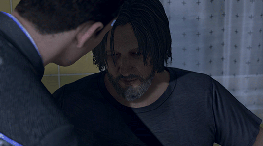
Hi!! Thank you so much!! I've never really had to explain out my process to anyone and I don't know how much detail you need, but I'll try my best and try to be as thorough as possible just in case!!
For my D:BH gifs, the process starts out with recording my own game play. I have a gaming computer that already had the GeForce Experience app downloaded, so I use that to record my game play. It records at 1920 × 1080p, 60 frames per second, so the files can get... rather large 😅 The video of my playthrough of the Russian Roulette chapter (~11 minutes long) was just under 4 GB. So its not light...
From there, I figure out what in particular I want to gif (for the timestamp roulette series, I let a random number generator figure out whereabouts I'm looking). Once I know that, I open up VLC and use it to isolate that particular shot + a little more on either end.
After I have the shot(s) I want to gif isolated, I open up Photoshop. I use "File" > "Import" > "Video Frames to Layers" and choose the video I want. You can do this straight from the video of your playthough, but I find that the shorter the video is, the easier it is to work with in this step. I trim my video more, to about a click or two outside of the specific shot I want. Like so:

From there I delete any extraneous frames from the "timeline" section that comes up.
Then is cropping: my go-to crop uses the "W x H x Resolution" option - I put 540 px in the first box, 300 px in the second and leave the third blank.

After that, I have an action in Photoshop that does the next steps for me (to make things quicker), but what it does is sets the frame rate (which will have to be done again after saving the gif because Photoshop hates everyone apparently), converts all the layers into a single object, and sharpens the gif. I've only been gif-ing for about a year and a half, and before that I had exactly zero experience with Photoshop at all, so all the numbers from these steps are still the same as the numbers I pulled from the tutorial I used when trying to figure everything out. For those, you can look at this absolutely AMAZING tutorial, by hayaosmiyazaki, specifically steps 7. gif speed and 8. sharpening.
From there, I start adjusting the colors. From what I've noticed, I seem to do a good bit less color adjustment than some, or maybe even most, other gif makers. It's honestly all about personal preference, so play around with it and find what you like! I personally like to stick as close as possible to the original colors, while still brightening the image up enough to make it clearer and more legible. So, for a majority of my gifs, I only apply an "Exposure" layer, a "Brightness/Contrast" layer, and a "Hue/Saturation" layer (from the "Layer" > "New Adjustment Layer" menu.) The numbers here change dependent upon the lighting in the shot.
For example, here's a before and after of this shot I just did so I could type this out and make sure I got every step 😅 For this one, I did Exposure +1.0 (no change to Offset or Gamma Correction), Brightness +20, Contrast +10, and Saturation +5 (no change to Hue or Lightness).
Once I'm satisfied with my coloring, I go to "File" > "Export" > "Save for Web (Legacy)". I watch the gif there to make sure it looks how I want, maybe go back and do a few tweaks to the coloring if I'm not quite happy, check the file size and then save it!
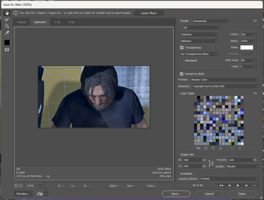
Tumblr's maximum file size is 10MB so if your gif is over that, you won't be able to use it on tumblr - in order to fix that, you may have to delete a few more frames. Or you can crop it to so there's less pixels in the "Save for Web" pop-up by changing the numbers in the "Image Size" section
And now, once I have my gif named and saved. I go back to "File" > "Open" and open up that gif. From there, I go to the little three lines icon in the top right corner of my "Timeline" section, click "Select All Frames" and then click the three dots on one of the frames and change the frame delay. For my DBH gifs, I do 0.02 seconds cause it looks best to me. Depending on how many frames per second your recording software does/what you personally like speed wise, this may be different for you. This is also different for gifs from live action or other media (for those, I prefer 0.05 seconds - it looks the most realistic to me.)
Then, I just save again, overriding the file from before I changed the speed, and voila! That's my process!
I hope this helps; if you have any more questions, my ask box is always open!! And again, thank you so so much 🥰 I'm so glad you like my gifs!!
21 notes
·
View notes
Note
yes would love a tutorial please bc i struggle w coloring for the most part
ok SLAY! i promise coloring isnt as daunting as it may seem<3
i'll just walk u through the process of what i usually do!
we're gonna be using this very cute pic of olivia rodrigo!

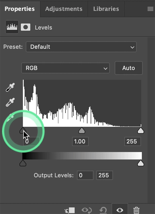
as of late, i always start with a levels layer!
i move the little white square to the left to brighten the highlights/pic as a whole (how far to the left depends on how dark ur original image is! bcuz this one was kinda dark, i moved it pretty far!)
i move the middle gray square to bring back depth that you lose when brightening an image, aka im increasing the contrast
i move the little black square to dark the shadows and darker parts of the pic!
with the levels layer, you're basically just changing the lighting of ur image!

next i used a curves layer to brighten the image even more! this is optional and i dont always do it, but i wanted to make things pop!

next i use the selective color (which changes only certain colors in an image, instead of the entire thing like you'd get with a hue/saturation layer) bcuz the picture is yellow as HELL
bcuz i was trying to make it less yellow, i went to the yellow tab, and moved the yellow slider! i moved the slider to the left to subtract it basically!

bcuz that didn't entirely remove the yellow tones, i did the same thing but only the "neutrals" tab, which effects the entire pictures color, not just a certain one

bcuz the blacks/dark tones now weren't as dark as i wanted, i then went to the blacks tab and increased the black!

lastly i just increased the vibrance to make the colors pop! (i usually do this after my levels and curves but i forgot and its all the same in the end fhhfh)
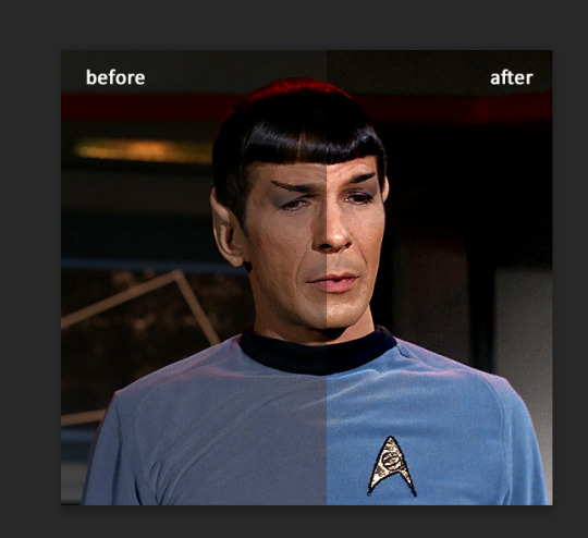
here's the original pic and the colored one side by side so u can see the differences!

let me know if this was unclear and if u have any more questions!! i hope this was at least a little bit helpful <3
9 notes
·
View notes
Note
hi! do you mind sharing what steps you use to color your gifs? your colorings are always so nice
hi! since i've gotten quite a few people asking about this, i thought i'd do a full tutorial on it! 🥰 i'll go into two aspects—how i color gifs normally, for properly lit/neutrally colored scenes, and how i color when the scenes are unnaturally yellow/red/orange.
fair warning for a lot of images and me rambling way too much under the cut!
we'll start with how i color normally, i'll show you how to achieve something like this:
before we start, a couple of things to keep in mind:
i won't be going into the basics of gifmaking (screencaping, loading your frames in, sharpening, and all that). this is assuming you know the basics of giffing and have an idea of adjustment layers.
i use PS 2020, but you can do this in pretty much any version.
i always do all my editing with my gif converted into a smart object, but you can do this in frame animation too!
the way i'm coloring is quite specific to the way 911 is lit, and while this should work with any other show that has similar lighting, you can't use the same principles for shows that are washed out or have weird filters or really dark lighting.
so, i start off by brightening up my gif. i add an exposure and levels layer for this purpose:


this gives it sufficient brightness, but doesn't adjust it drastically the way some gifmakers like to do. the brightness usually isn't my focus, i'll adjust it if i need to, but i prefer to focus on color correction/enhancement, and so on. this is what my gif looks like now:

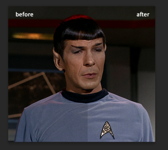
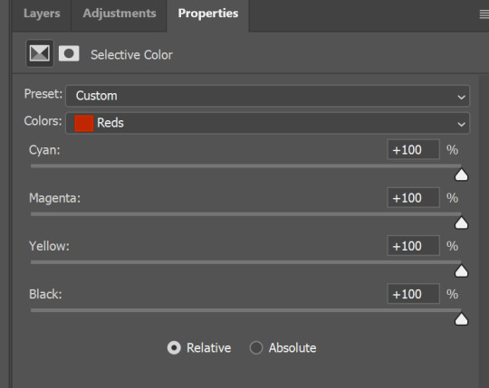
i like my gifs to have a LOT of contrast to reduce pixellation and because i think it gives it more clarity and crispness. i also like to them to be vibrant, but not in a way that makes the skin tones of the characters look unnatural. so i start off with adding a selective color layer with the blacks increased, for contrast (i know people usually use levels or curves, but i really prefer selective color in this instance) and a color balance layer to make the hue and tones of the gif cooler.

this is what i end up with:

of course, buck's skin looks way too unnatural. we'll fix this in selective color—i use a LOT of selective color layers just for the skin tone of the characters. i used at least 4 for this gif alone. the majority of your coloring process can take place there, if you're not going for anything fancy.
i'll share the settings i used, but keep in mind this is very subjective to each gif and scene. even if the scenes are very similar, you'll definitely have to make at least some adjustments.

i also added selective color to brighten majentas (for buck's lips and cheeks) and blues (for the background behind him). since there are only a handful of major colors in this scene, i didn't have to do much. but if there were green, yellow and other cooler colors, i would be working on making them look as vibrant as possible.


this was my result:

i decided i wanted my gif to look a little brighter, after all, and i used a brightness/contrast layer. i also decided to darken the reds a tad bit more, and highlight the whites, like so:


to complete it, i added a grey to white gradient map at about 22% opacity, set to soft light, to add a little more contrast. this step is optional, unless you're a stickler like me for the greys and blacks to be darkened lmao.
the finished product:

next, let's move on to color correcting!
there are a lot of layers you can use to color correct, and i'll be using channel mixer for the purposes of the tutorial. it's not too complicated—but in case you want a more detailed explanation into how it works, this tutorial is perfect!
so, this is the scene we'll be working with. 911 has good lighting compared to a lot of shows, but there are a lot of scenes—especially in s1 and in the characters' houses—that are washed way too yellow or red. the characters of color, unfortunately, seem to get the brunt of it. so i'll be showing you how to color correct, while staying true to their skin tones!
this is the gif without any coloring at all:

before brightening the gif, i'm gonna add a channel mixer layer. i'll go straight to the blue channel, and increase the red and green channels slightly.

this is what the gif looks like:

it looks better, but her skin is too majenta. we'll fix this with another channel mixer layer, this time in the red channel. reduce the red slider slightly, like so:
she looks better now! still a little too red, but our next steps will fix that. next, brighten up the gif and add contrast like normal:

of course, now she looks waay too pale. we'll fix this using vibrance:

better, but it's not close enough to her original skin tone for my liking. let's use selective color. i adjusted the reds:

i also adjusted the yellows, greens, cyans and blues; to make the other colors more vibrant. this is the finished gif:

if you want the gif to look brighter—i'm aware that the way i've done it gives it minimal brightness—you can add a brightness contrast layer, while upping both the brightness and contrast sliders. this should brighten up your gif, while keeping hen's skin tone as dark as it should be.
i really hope this tutorial helps! 💞 let me know if you have any questions!
#neethu answers#anon#*tutorial#resources#completephotoshop#allresources#userisha#useralie#tuserzee#alielook#userkourt#usergif
343 notes
·
View notes
Note
Hii! I'm absolutely in love of how good your screenshots are, both in game and in cas, I was wondering is it possible you could make a little tutorial on how you do it? Idk why mine always look like blurry or something idk it's very uninspiring
hi @simsinfinitylt. thank you so much 🥺! and please do not feel discouraged. it really is all trial and error, i promise. it definitely took me a minute myself to find what worked best for me. this is my current editing system:
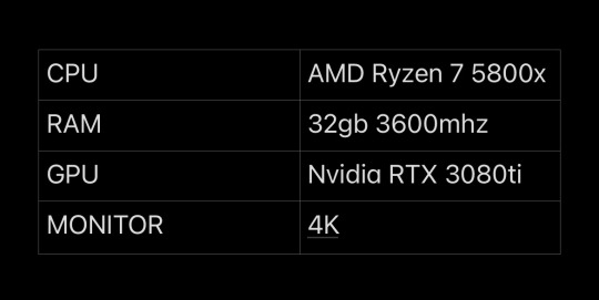
chapter 1: a pc for me
the most important thing is to have a good computer that can play the game on max settings. make sure all your settings are maxed out, with laptop mode and edge smoothing off. i also play the game in 4k resolution (3840 x 2160), the max for my monitor (but it might be different for you).
additionally, i use the graphics overhaul overrider by simp4sims, the 'ultimate quality' preset.
graphic overhaul: graphics rules setters
here are my pc specs...
chapter 2: maybe she's born with it. maybe... it's reshade
reshade honestly does most of the work as well as the world lighting mods by @softerhaze. i hope to be able to find time to make my own preset one day, but for now, i use the daisies reshade by @breezytrait. here are my lighting and visual mods...
reshade: daisies (i tweaked the preset a bit, mostly increasing the mxao here)
world lighting mods: twinkle toes, shadows for days
light replacements: no glow v2, out of the dark, inner glow
cloud replacement: studio ghibli clouds
chapter 3: say click. take a pic
i take all of my screenshots in tab mode. i find that it's best to go into tab mode further away than you want the picture, then slowly move the camera forward with the arrow keys to frame the screenshot. this is especially great for really up close photos of sims faces.
i capture all my screenshots with the built in reshade capture function and use the no drift camera mod to keep the tab camera steady
tab mode mods: no drift
chapter 4: call me by your lightroom
now that the screenshots are taken, off to lightroom they go. i honestly don't do much editing in lightroom in terms of color grading. i mainly focus on the details and lights sections. here are my settings...
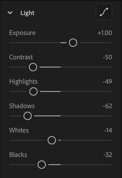

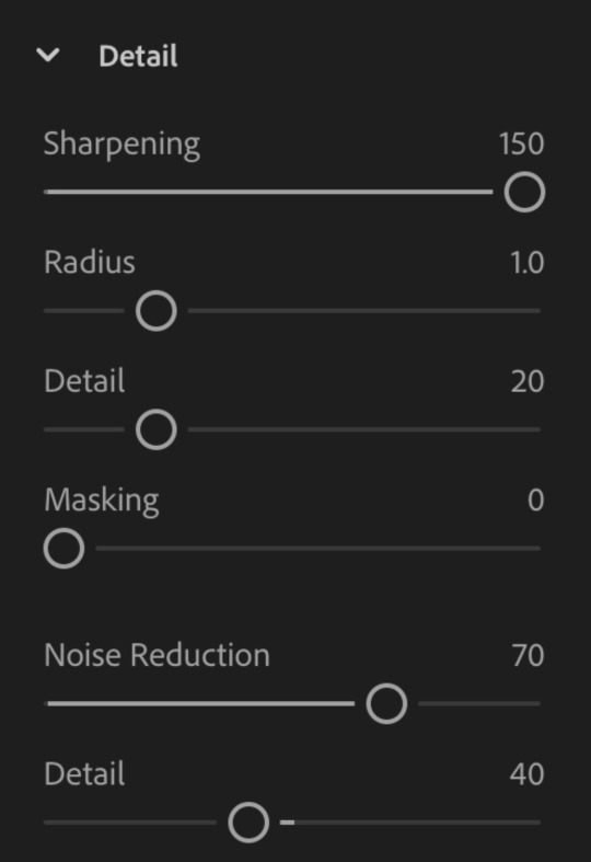
here are examples, before and after, of what the edits look like on top of the reshade


these are the same settings i use for all my photos. with the exception of the 'contrast' slider which I sometimes bring up for sims with darker skin tones. and the 'shadows' slider i sometimes bring down for night photos.
chapter 5: shout out to picsart. gotta be one of my favorite genders
from lightroom, i'll then import the photos into picarts to finish them off with light leaks and dust particles (as needed). i use the 'detail' brush under 'retouch' to color in sims and objects in the foreground (rocks, plants, bottles, etc.) to make them pop even more.
i also use this app to blur things that the reshade dof couldn't get to. here are some finished examples before and after.

chapter 6: the sons of picsart
for overlay graphics and texts, i use photoshop and phonto. for the psds, i'll import them into photoshop first to make edits then send them off to picsart to add them to my image. i'll use phonto to add texts and sometimes doodles
here are links to some of my favorite psds and other useful resources
photoshop psds: moodlets, promotions, holiday, ui mockups
other resources: sims 4 icons, text message
chapter 7: she doesn't even go here
for cas photos, since there is no tab mode, i just take screenshots as is, with the reshade dof from my preset on to blur out most of the background.
i use the cas lighting by @breezytrait to brighten the cas room up.
cas lighting: hard side light
then edit them in lightroom with he same edits as in-game photos (see chapter 4).
chapter 8: the bell doesn't dismiss you, i do
and that is how i typically edit my photos. i hope this helps inspire you for your future content... and was extensive enough. but of course if you have anymore questions feel free to leave them down below. my inbox is always open and i'm happy to help 😊.
155 notes
·
View notes
Photo

As requested by a recent anon, here is a quick tutorial on my gifmaking process! I will be using the newest version of Photoshop as of November 2022 to make my gifs, as well as mpv to take screencaps before importing to Photoshop - I recommend this tutorial to get started on installing mpv and take screencaps of the scene you want to gif.
Once you get the scene you want to gif ready to go, open Photoshop and import your screencaps in a stack under the “scripts” section of the files tab. From there, you can select “browse” and highlight all of your screencaps, and click “okay” to load all the screencaps in Photoshop’s “layers” tab.

Next, create a frame animation in the timeline tab underneath your main workspace window, and use the icon with lines at the top right corner of the “timeline” section to select all the screencaps you’ve entered as frames and reverse their playback order.

With all the frames selected, click one of the down arrows next to the “0 sec.” tab and enter the frame delay to 0.05 seconds, it gives me the most natural playback after exporting my final gif.

After that, you can crop the gif to the dimensions you want using the “crop” tool towards the top of the left column. Next I update the size of my gif under the “image” tab under “image size” - I’m setting this gif to be 540 pixels wide, since I’m making just one gif by itself instead of 2 or 3 in a row.

Now that the gif’s frames are all loaded with their updated size, I’ll sharpen the frames with a sharpening action - I usually use this one. If you import a sharpening action to use, you can find it under the “actions” tab under the right-side column second from the top.

Now we can start on adding adjustment layers for coloring! Every gifmaker’s coloring style is a bit different, but I mainly lean towards bright and vibrant coloring. You can add new adjustment layers either on the bottom right section under the “layers” window or under the “layers” on the top left. If you’re working in frames instead of converting to a smart object, make sure to have all of your frames highlighted to make sure that the adjustment layer shows up on every frame. I usually start with a curves layer and find the lightest and darkest points in the first screencap to set as my black point and white point.


I’ll add an exposure layer to help brighten up the gif after that, plus a levels layer to add more to the shadows and highlights. My settings for that layer generally look like this:

After that, I’ll add a vibrance layer (set to +24 for saturation and -12 for vibrance) and a hue/saturation layer. I also tend to decrease the reds a little bit from the hue/saturation layer (by about 10 points) to separate Taylor’s skin tone from other parts of the gif, and add or reduce saturation of colors I want to emphasize from there - in this example, I mostly enhanced the blues and magentas. To make the gif itself slightly more cool-toned overall, I added a deep blue photo filter layer:

I also usually add a black and white gradient map on the “luminosity” blending mode - it adds extra depth for my coloring style, shown with the gradient map applied on top vs no gradient map on the bottom:

Lastly for coloring, I’ll add a color balance layer and selective color layer to bring out certain colors and neutralize others as needed. Once you’re happy with the coloring, you can export your gif! Go under the file tab and click export, then save for web.

From here you can get a preview of the first frame of your gif and an idea of the 256 colors included in your final gif file - press “save” and rename your file, and you’re done!

This is my final resulting gif after following this tutorial and exporting it onto my desktop:

This is just a rundown of my general process of making and coloring a gif - I highly recommend checking out @usergif for other resources on adding typography or more complicated effects like blending and layouts with more than one gif!
#gif tutorial#completeresources#allresources#userkosmos#userng#tuserheidi#userzesty#usercim#userdanni#userpjo#userdean#*
165 notes
·
View notes
Note
Hi! I'm curious how you make such amazing gifs. I know you're talented & skilled, but what advice would you give to a beginner? (No, I'm not talking about myself :) I'm also curious if you've ever made fanvids.
P.S. Have a nice day 🌞
You're too kind! My gifs are pretty basic actually compared to what some people on this site do nowadays. I do like to keep it simple, both by personal aesthetic, and cause I can't spend half a day on a gifset.
Anyway, the main things for a good quality gif are:
Get a good quality video file, to start with. 1080p if possible. 4K if you have the hard drive space for it (I do not). 720p if you must, but the better the quality, the lesser the noise, the better the gif. I stick to 1080p.
Add a little bit of sharpness to, well, sharpen the image. Going from a 1080x1920 to a 540px wide image makes the gif a little blurry. Sharpening corrects that. Don't over do it though, or it'll look weird.
Brighten your gifs. The original images are 99% of the time too dark. So, do what you want (levels, brightness, curves, etc...), but tweak the colors. Cause I'm lazy I usually do a basic "level" thing, but it's worked well for me. For gifs and screencaps.
et voilà :)

Ah and yes, I made a few fanvids back in the days. Mostly for White Collar. I do enjoy it, but it's very time consuming. I do have a couple of ideas for DOC fanvids, but I need to find the time and the motivation. One would be to do a side by side comparison with the trailer of the US remake, cause some shots are uncannily similar. And the other would be a regular fanvid based on Charlie Winston's "I Love Your Smile". But again, fanvids are gigantic beasts. Especially when your source material is made of 3x16 episodes.
Thank you for the ask :)
8 notes
·
View notes
Text
Part two
Beware spoilers for life on mars series one and two
Hello, hello, hello
(some brainrotted fellows will understand this reference)
Welcome to another edition of
*me rambling at you about life on mars (the UK version)*
Most important thing: this is my interpretation/analysis.
So, these are my personal, quite uneducated opinions.
Also: I bought the series on DVD. No one will be safe.
Today, we'll be talking about the usage of colours in lom in general. If I do start and finish a rewatch and find some interesting scenes – I will add my commentary on them.
Like I already said many times before – there aren’t really many scenes in 2006/2007.
The shooting script of the first episode (I found it while floundering around on the waybackmachine) originally includes a scene in Sam and Maya’s appartement.
(Context my beloved: Sammy boy is being kind of an ass, too busy with his job to solve his issues with Maya. She attempts talking to him but fails. I don’t know why they deleted it, because it would have really provided more context to their relationship and – most importantly, for my cause, a sneak peek of their apartment – I imagine it as very clean and kind of impersonal, a few personal touches, Maya’s attempt to brighten up the place. I think they’re both really busy, they started decorating but then Sam became DCI and he got too busy to use the apartment for anything except for sleeping. #Overwhelmed king)
Anyway, let’s take a look at....
a shot that to me represents a big theme of the show and some ✨️colors✨️.
After Sam gets hit by the car , he wakes up in this construction site with a poster of the soon to come high way.
An image of the Future.

There’s a really distinct difference between the colour palates. The “future” sky is a nice light-blue, not a cloud to be seen, with some touches of orange and green. Everything is all white, clean and perfect – and it’s all coming soon(er or later).
Of course, it’s a very idealized version of the future. Because it’s how Sam perceives it – at this point in time, he’s very desperate to return.
(Just look at the scene where he first gets contacted through the math programme through the TV. The way Sam crawls towards the TV….. SIR, YOUR ACTING CHOICES. PLEAAASEEE.)

But it’s still surprisingly accurate. However, the idealistic picture of the future is quickly shattered, if you consider that – let’s squint our eyes - to see little Sam’s limp body lying on the ground.
Surprisingly, in the 1970s we don’t really see a person being hit by a car (as far as I can remember - except Sam ofc)-
But – let’s be honest in 1973 the streets are just every ground that is remotely driveable on.
The past still contains traces of those colours, mostly orange as seen in the dirty underneath the bridge. The air is heavy and greyish, trash and building material is littered on the ground.
The only bits of white are the high-flats in the background, but they are far far away.
Those buildings and streets are still being built – everything’s in flux. Things can change. But, should they?
Sam is generally really unsure in that whole department
but that’s the thing about it:
We never actually find out, (side note: I haven’t yet seen ashes to ashes) if Sam’s choices actually make an impact in the present. It certainly gives you the impression – his father staying away, his mentor teaching him those lessons, Maya’s birth, etc. etc..
But does it really matter in the end?
Or is it just all in his head?
Is he still Sam Tyler in a hospital bed in 2006
or
is he an amnesiac Sam Williams in 1973 on an undercover operation?
In the past, there are several buildings – bound to Sam Tyler’s identity, and which I will be further explaining in another ramble.
Let’s get back to colours. Two examples where a similar concept applies: The interrogation room and the general office space of the police department.

The room is flooded with light – courtesy of the huge windows (side note: privacy??? What’s that?). The situation is very transparent as the interrogation is literally being recorded.
The person being interrogated has their whole support team with them, including lawyer, social worker and psychiatrist.
This scenario is as by the books as you can get it.
I also really like that little shot of Sam adjusting the pens, character go brr.
Same thing in the general offices – a 2010s fever dream with all those clunky computers – which school computer lab have you magically transported me to?

Imagine the absolute horror that Sam feels when he sees the past police department.
Look at it

Without considering the lighting and furniture, the room looks sort of modern – it has a lot of windows and could be causing the same effect as the interrogation room on a visitor.
The officers are working diligently and carefully through every case and issue – investigating every clue and they never rest until they catch the perpetrator.
But that’s wishful thinking -
In reality (at least in the past)the room is tinged with brownish yellow lighting, there’s no order to the tables, paper strewn all over the desks and even spending a second in this room will lead you to smelling like smoke for the next 55 years.
I would faint.
And I’m not even talking about the consequences of not being a white straight guy….
This police department doesn’t even have an interrogation room, they also rarely record any interrogations (leaving a lot of room for interpretation or using some creativity to catch the suspect or get an important lead) and mishandle, don't notice or even collect crucial evidence.

In the lost and found
Even asking for a lawyer – leads to being laughed at and insulted by the literal governor of the department.
It’s quite dark and very cramped – it’s quite private – so no one will notice you beating up an innocent person….
But I still feel the office feels very lived in.

There’s a giant dart board, random trophies, dirty dishes strewn about…
Good luck getting your case solved. Where’s the evidence that could solve your murder? It’s probably buried under some spicy magazines and a bunch of cigarette buds.

For all the time the police spend at the office, they sure do know when to stop and start going to the pub.
One scene in the later seasons – in the episode about the false imprisonment of the teenager who murdered his younger girlfriend, Gene Hunt is determined to catch her killer for good. He’s made a promise to her father and he’s willing to do almost everything to make his city a safer place (any means necessary). He urges the police men to do anything they can, work day and night and not sleep a wink until they’ve put the right person in prison.
And then, he peeks at his watch and drops everything because they need to get drunk in the pub.
and that's it, hope you enjoyed :)
BONUS: have some cinematic shots
For u @roxannepolice <3
featuring: desperation, isolation and crippling loneliness


lom 1
lom 2
#well if youve made it this far#thank you#hopefully that makes sense#heavy on the ramble - i recommend copy pasting it somewhere and reading it there#still yeah#i have thoughts - and many of them#the last one wasn't really about colours#life on mars#Lom
6 notes
·
View notes
Text
yet another gif coloring tutorial
Okay, so, I posted a coloring tutorial for one of my moots a few years ago on my main, @zackmartin (I believe I've since deleted it) but that was the technique I was using when I started making gifs 7ish years ago, and I’ve since updated my routine so I decided to post a new tutorial with my new technique.
I'm going to show you how I achieved this:
I'm using Photoshop for this. I'll try to make this as detailed as possible so it's beginner-friendly, but you do at least need to know how to make and export a gif. If you have any questions, don't hesitate to reach out! just be aware, this tutorial really image-heavy
A few notes before I begin: 1) this is like, the bare minimum most basic way to color a gif. This is what I’d be doing if I was giffing a scene and that’s it. If you’re interested in different coloring styles (like my suite life episode series) then let me know!
2) When coloring gifs with POC, you need to make sure not to change their skin color by making them too light, too orange, too yellow etc. The JATP source blog posted a masterpost of different tutorials to teach you how to color gifs in different ways (like with the pastel coloring for instance) without whitewashing/orangewashing POC. But, honestly there’s a ton of tutorials out there that show you how to avoid this if you do a little digging. NO EXCUSES!
Anyway, let's get started! Before I do the coloring, I ofc make my gif, crop it, set the frame rate, resize, and sharpen. (you can find my sharpening tutorial HERE)
I. BRIGHTENING
(as a quick note, I don't focus much on London's skin tone during this stage, because I'm going to fix it during later steps)
The first thing I do is white balance using a curves layer. To do this, I click the little circle thing in the toolbar below the layers, and then click curves like so (you'll do this every time you want to add a new layer):

And then I click the bottom eyedropper tool on the left-hand side:
Then I click the lightest white part of the gif. (I’m not sure how to explain this well, but it basically white balances that spot to make it pure white. Like, if I clicked on the gold part of London's bracelet, then the whole gif would turn out really blue because it would be trying to white balance the gold) (hopefully that makes at least a little bit of sense)
Anyway, there’s a trick I use to find the lightest part of the gif; hold down the option key (or alt if you’re on windows) and while you’re holding down the option key, drag the little white arrow on the right-hand side:
(i apologize for the quality of the screenshots, tumblr keeps destroying them :/ let me know if I need to clarify anything)
Then I use another curves layer to do the same thing with but with the blacks. So, I add another curves layer, and then click the eyedropper tool at the top this time:
And then I click the darkest, black part of the gif. You can use the same trick by holding the option/alt key and dragging the triangle on the left-hand side:

Next, I add a levels layer. I drag the middle lever thing to the left, and the left lever to the right. (I don’t usually touch the little lever thing on the far-right, but it’s really up to personal preference. I learned to color gifs by basically messing around with settings, so I’d recommend doing the same and just seeing what you like best):
Finally, if I want to go even brighter, I usually add a brightness/contrast layer. I typically turn up the brightness a bit, and turn down the contrast. But, since I brightened a lot with the curves and levels, I usually don’t go that far. These were the settings I used for this particular gif (even though I'm going to share most of the settings that I used, I wouldn't recommend using the exact same ones on your own gif as it'll really depend on the scene you're using):
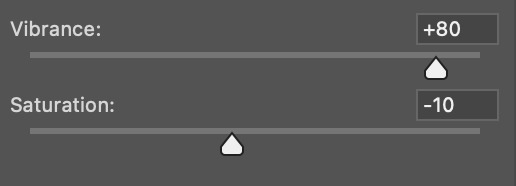
II. VIBRANCE
Now I add a vibrance layer. I like my gifs to be bright and vibrant, so I usually turn up the vibrance, and turn down the saturation a bit. These are the settings I used for this particular gif:
And this is what the gif looks like so far with just brightening it up a bit and adding vibrance (it might look a bit too bright right now, but I'm going to fix that in later steps):
III. SELECTIVE COLOR
Now, I add a selective color layer. The reds and yellows typically affect skin tones, so this is where I'll start to fix London's. These are the settings I used for this gif (I usually wouldn't change all of the colors, but this is just one of those situations where they happened to be present in the scene I'm giffing):
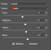
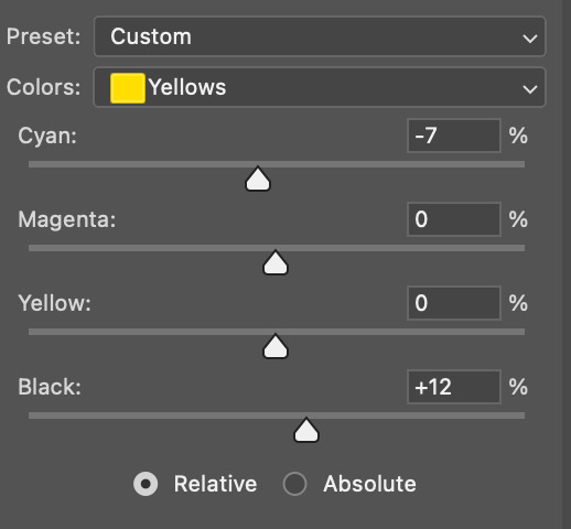
IV. HUE/SATURATION
now I add a hue/saturation layer. I typically turn up the master saturation to +10 and the lightness between +3 - +5 regardless of the gif. Then if I still need to fix skin tones, I'll mess around with the reds and yellows. These are the settings I used:
V. PHOTO FILTER
Next, I add a photo filter. I usually stick with the default one, I keep the layer set to normal, and I turn the opacity down to 25%:
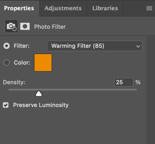
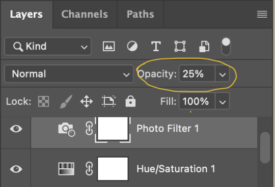
VI. B&W GRADIENT MAP
finally, I add a black & white gradient map, and I click the little box to reverse it:
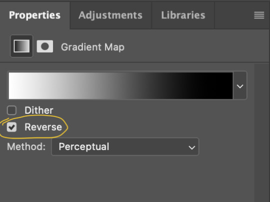
Then I set the layer to soft light and I turn the opacity down, between 10% - 20% depending on the gif:
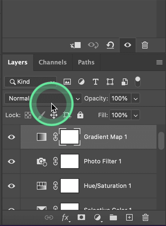
A lot of times, I'll stop here. If I'm satisfied with the way the gif looks, and London's skin isn't too pale/orange/yellow etc, then I could just add my watermark, export and be done. But, there a few other optional steps I might take if I'm still not quite happy with it.
VII. OPTIONAL
Usually the next thing I'll add if I've decided to keep going is a color balance layer. It obviously does as it says, helps balance out the colors, but some gifmakers also like their gifs to have like, a reddish tint or a bluish tint or what have you, so this can help with that too. I wanted to balance out the reddish/yellowish tint, so these are the settings I used:
and this was the gif before the color balance:
and after:
And if I want to play around with the colors a bit more, or fix the skin tones further, I might add another selective color layer or a hue/saturation layer (or both, depending).
Rarely, I might add an exposure layer. (I added one to this gif for the purposes of this tutorial). These are the settings I used for that:
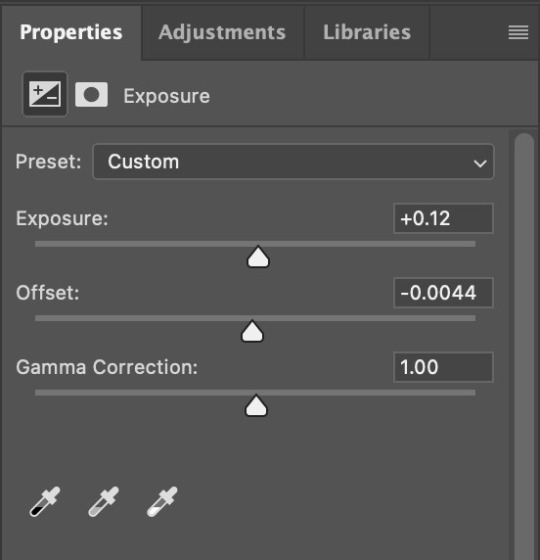
And if the gif came out a bit too bright, I might add another brightness/contrast layer, except this time I would turn down the brightness and turn up the contrast (again, I did that with this gif for the purposes of this tutorial).
And, that's pretty much it! This is my finished gif!
Like I said earlier, I pretty much learned how to color by messing around in photoshop, so I would really recommend playing with the different layers and settings for yourself, as well as checking out other coloring tutorials and other gifmakers methods and see what you like and what you don't. And finally, the best thing you can do is just,,, practice. I've been gifmaking for about seven years, but I feel like I didn't really become decent at it until this year
Again, If you have any questions let me know! and feel free to tag me in your creations! #userzackmartin 💕
#*tutorials#tutorials#gif tutorials#coloring tutorial#gif coloring tutorial#flashing gif#flashing gif tw#i'm not really sure it counts but just in case#flashing tw#dailyresources#photoshop tutorials#*
50 notes
·
View notes
Note
Nik. Hi. Real talk. I need to know /how/ you colored the top gif in this set bc whenever I color Mustafar it always comes out too green or too red or even too blue
https://at.tumblr.com/starwarsblr/hayden-christensen-as-anakin-skywalker-star-wars/2lzo9t926g76
Please and thank you!!!
hi shale!!! I can definitely try to explain it but tbh I just kept slapping new adjustment layers on until I got to something I liked lskdjfklsjd
under the cut, I'll try to explain how I went from the faded, almost all-yellow HDR coloring to this natural-looking skin tone and monochromatic background!
I'm just going to mention each adjustment layer and try to describe why I used them:
1. Brightness/Contrast — No adjustments, just set this layer to screen and it helps create an even brightness across the gif

(I'll keep that masked circle there so we can keep track of the original)
2. Color Balance — I just toggled the sliders and I honestly can't explain any rhyme or reason so I'll just include screenshots of my settings ldkjflsd
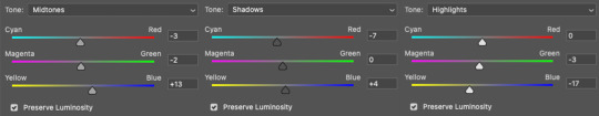
3. Levels 1 — I increased the highlights (the right-most slider) A LOT

4. Selective Color 1 — After doing stuff to get rid of yellow, I... added yellow lmao. But you can see the difference from the masked section. It feels more like a natural-looking yellow now imo
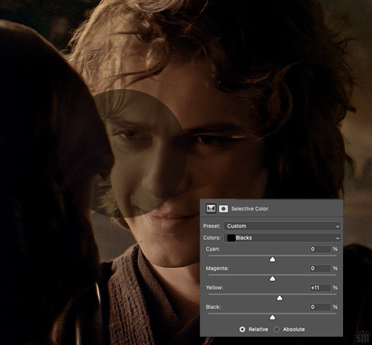
5. Selective Color 2 — This time, I used the red, yellow, neutral, and black channels. For red and yellow, I mainly focused on neutralizing the yellow by adding more cyan
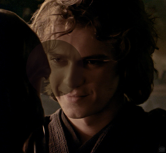
6. Hue/Saturation 1 — This was just a baby hue/sat layer where I reduced the saturation of red by -7, pulled the hue slider down for red by -2 and for yellow by -4, and then I fully desaturated greens, cyans, blues, and magentas

7. Hue/Saturation 2 — In this layer, I fully desaturated the yellows and masked Anakin's face! Working towards making the background monochromatic
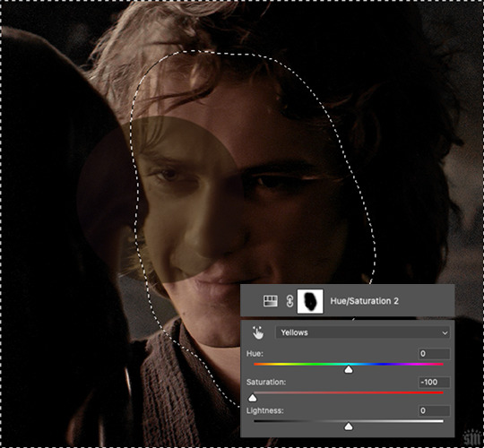
8. Hue/Saturation 3 — This time I fully desaturated the reds and fully darkened them, using my brush to apply these settings only to select parts of the background and Anakin's robes where I saw red peaking through

9. Levels 2 — In addition to using the RGB channel to brighten and add shadows, I also used the Red channel to make the shadows more cyan. You can see below how it made the background a bit more blue. Later, when I come back in with another hue/sat layer, I’ll be able to desaturate the cyan again and further neutralize the background.
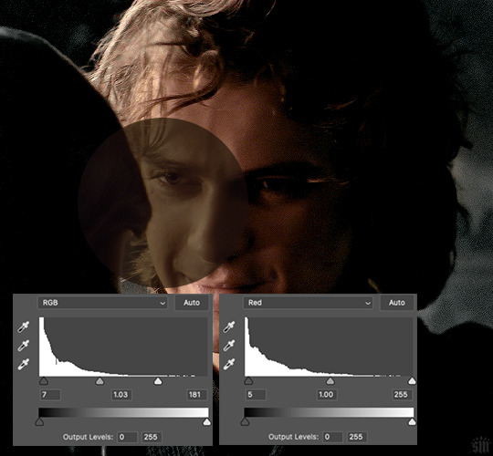
10. Hue/Saturation 4 — Fully desaturated cyans and blues like I said I would! Now the background is neutral again
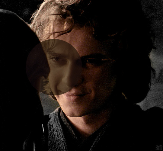
11. Hue/Saturation 5 — This time fully desaturating the yellows and masking out Anakin’s face. If you look at the difference between the image above and the one below, you can see the one above just had a tinge of yellow still in the background. And now that’s gone!
12. Selective Color 3 — I mainly added blacks to the red and yellow channels to deepen the shadows of Anakin’s face!

13. Levels 3 — Just making things a bit brighter again
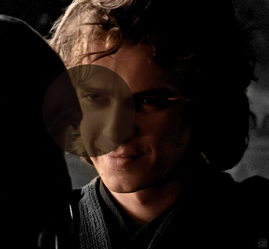
14. Hue/Saturation 6 — His skin was looking a little too yellow, so I neutralized it a bit using the red and yellow channels

15. Levels 4 — Uh, brightening again sdlkfjsld

16. Hue/Saturation 7 — His skin was still looking a bit too saturated imo, so I desaturated the reds by -6 and desaturated the yellows by -28

17. Levels 5 — Lastly, there was some heavy grain in the upper corners from brightening the gif, and the dots were moving so violently that it was distracting, so I decided to darken it a bit only on those corners!
And that’s it! :jerrycry:

I hope something of this was coherent and helpful!! lsjdflksj
56 notes
·
View notes
Last Seen Blogs
mychessboard-blog1
Franch

leviatann1
You can show me, don’t hide

bain64
Untitled

vsegdavkusno
Всегда Вкусно!
dame-sky
Milk Chocolate Cookie°•.🍫