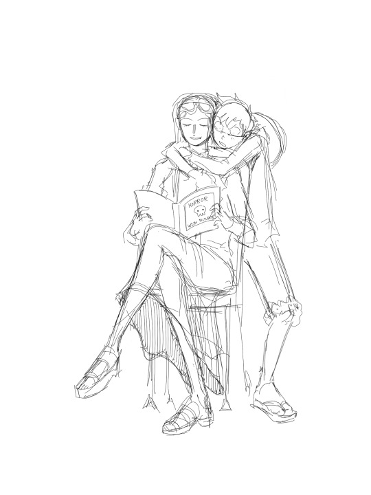
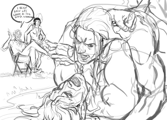
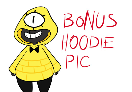
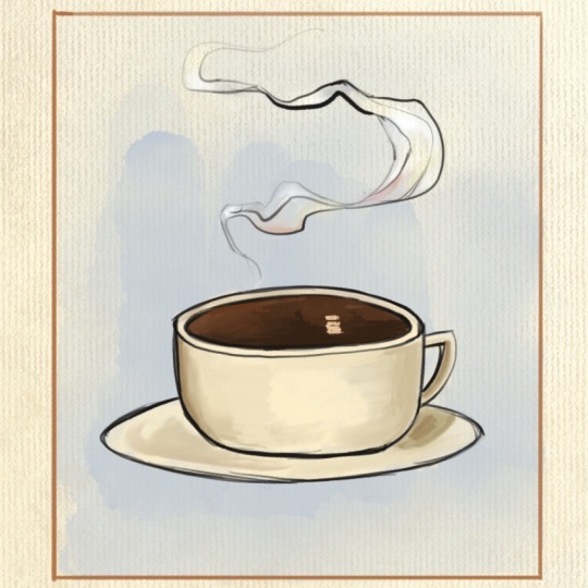
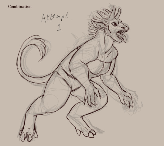
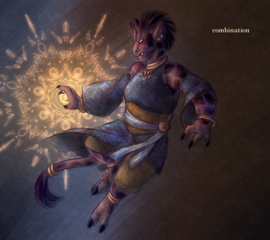
#i decided i wanted to color one of the sketches lol
Text

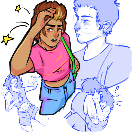
today's drawing efforts
#if you saw me post this earlier & delete it no u didn't#i decided i wanted to color one of the sketches lol#i'm once again stating that i cannot pick a consistent style#maybe i should just embrace it at this point#n e way.#i actually meant to sit down & do a mbz drawing today but. didn't happen. it's fine#rainyrambles#myart#<- putting it in the actual art tag bc i'm never gonna finish the other sketches so#this is done as far as i'm concerned#dhestyn#kelly
24 notes
·
View notes
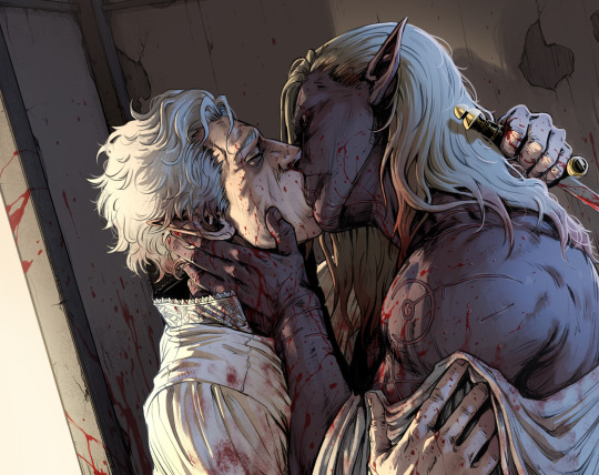
Text

Man meets Morbol
#ffxiv#sketch#zenos yae galvus#adventurer zenos#oc#tsukiko date#camilla lunae#as per the rules of fighting games- blocking is all well and good until something finally decides to grab you instead#or- how durante's challenge to zenos backfires horribly#independent- face-tanker zenos learns the meaning of waiting for his party LOL#I also want to make another garlean armor set for zenos- so its time for me to be toying with a couple of different designs#I just know I want it to be the opposite of his original 'demon' armor#with the new one more focused on movement and the intake/focus of aether- an angel theme and im thinking of#giving the armor the color palatte of Kain's sanctified armor because... hehehe-#so the one here is basically the first draft of that LOL#...I will fully acknowledge that I treat the man like a dress up doll- he's very fun to design outfits for#zenos' iron stomach does not appreciate meeting its match in the form of taking on a morbol's power head on#dont mind this also just being inspired by the 1.0 trailer- I will always find it so funny that poor meteor's first bit of action we see#is against one of these damned things#so I had to make it so zenos unintentionally follows his long forgotten footsteps
86 notes
·
View notes
Text

all i see is red
#decided to finish that traditional sketch doodle guy from my sketchbook :3#art#doodle#sketch#artwork#my art#arin moss art#arin moss#like i want to add more like i feel like it needs SOMETHING but idk what#so im calling it done lol#also made the edges too soft the original had a slightly more angular face but alas i dont feel like fixing it#also the colors on my laptop dont look saturated but end up looking wayyy tooo saturated on my phone so idk how the colors are on this one#tried to desaturate it a but cause i didnt want it too bright but also idont want it too dulll but i guessill never know
60 notes
·
View notes
Text
got the posting anxiety bad tonight
#click clack#ok a peak into my thought process and anxiety here we go#ok so the art is almost done and up to standard I would post onto my art blog#BUT for some reason the thought of posting art of my ocs there scares me#because even tho it’s my art blog in my mind it’s the equivalent to a art gallery that demands being detached????? from the art#like once I share it there it’s no longer ‘mine’ but to the public#and my ocs (plus the stories that go with them) are like the closest to my heart and relinquishing them feels like a lot#a part of my imagination that I spent so much time with developing over the years to be placed up for judgement…#so then the solution could be to put it here on my personal! the online space cozy enough and filled with other posts that could easily bury#the original posts I put here#but there goes my other dilemma. i don’t want them too associated with my personal for if one day i do muster up something for publication#my big fear is that ppl will find this space and go thru everything. the fear of being perceived and judged 😵💫#all the hypotheticals and anxiety for something that may not even happen#dumb mind problems my head made up 🙄#anyway writing it out helped lol I’m posting it to my art blog I decided 👍#I have to work on getting that blog to be comfortable space to post… i should lower that silly self imposed standard I set for myself#and be whatever about ppl being aware of my online presences#maybe… [grinding my teeth] I should post my messy sketches onto my art blog…#I should take my friends suggestion and make a website to feature my ocs…🤔#idk my only other solution that doesn’t feel viable to mitigate the anxiety is to slowly introduce my ocs in the background of setting art#just a slow drip until they are in the forefront#bleghhh whatever much ado about nothing it’s like I never posted my ocs ever when I have indeed posted them before on both places ( º_º )#I’m realizing it happens too when I post too much fanart in a row… I have curator disease??? 🫨#or something I used to be very particular about what order I reblog stuff like it used to be by color and content balanced out#I still do to a lesser degree… but it used to be pretty bad#post order compulsion????#the fear of being abrupt and incohesive in between posts…#if you read this far thanks you can now see how much this consumes me 🙃
7 notes
·
View notes
Photo

how fucked up would it be if there was a pmd game and you get told there’s a group of pokemon no one’s ever seen before, like you--claiming they were from the human world, one even claiming to BE a human too, but no memories of said world. it’d be even FUNNIER if it was a game about "establishing pokemon rescue/expedition teams" and these mfs just went off and fucked up mystery dungeons when everyone else was still scared shitless of them.
also i know boltunds hidden ability is competitive but boltund learns 90% physical moves so. also 2 they had to adapt their movesets to survival and not competitive short battling. tldr i do what i want
i had more planned for this but drawing motivation 0 rn fwhehehw
#zekus stuff#submas#emmet#chandelure#eelektross#YES i am using nicknames because like its so weird to me that you would just call your pokemon after their name like ??#and YES i used freight for chandelure because its such a good pick#cred to blueisquitetired for it#pmd#pokemon mystery dungeon#i had a whole thing planned out and evgerything but i dont wanna draw it hdfsdkf#so you can take the colored sketch instead <3#also i couldnt decide on a lot of things so i just threw it against a wall and went with it#likie emmets nature LOL#i wanted him to have an attack boosting one#though hasty could fit maybe idk natures are weird he just gets to be full attack
15 notes
·
View notes
Note
How to draw like you no borax
Good question!
I'd warn against following my process (at least if you want to learn), but I'll be honest and show you, lol. (Heads up: this is just how I do FAN art. When having fun, I generally care less about the fundamentals.)
1. I slap down super rough sketches, jotting lines/expressions like bullet points of my idea. Pretty much stick figures with just enough detail to remember who's who later. Not shown here, I also move, resize, and add details to express the intended composition if I'm planning something larger. You may notice a lot of curved lines / haphazard circles.
2. I refine the sketch by drawing it with more intention and build structure with slightly blockier shapes. If I'm really struggling with a pose, this is also where I'll find references or look at myself for bits and pieces to fill in the gaps. (When practicing, I would highly recommend using a reference from the start so all your limbs are an appropriate length and you don't need to say things like "that's passable" right before posting. If you're a perfectionist you'll leave that thought with the rough sketch.)
3. I'll decide around here whether or not to leave the sketch as is or commit to lineart (not likely). I guess I'd say I "shape the lines" here by going over some to add thickness/weight, and by adding basic sort-of-shading to break things up a little. Then I'll just fill in space if the page looks empty. (Usually this is where I incorporate the borax, but I hear baking soda works nicely if you're worried.)

4. Onto coloring. I don't feel confident enough to pretend I know what I'm doing here, lol. I just choose my base colors, imagine the general direction of the light source, then add minor gradients to the light and dark layers so they don't look flat. Then I just add some BS highlights and outline them. I've only recently found the motivation to properly practice coloring and just go with the flow tbh.

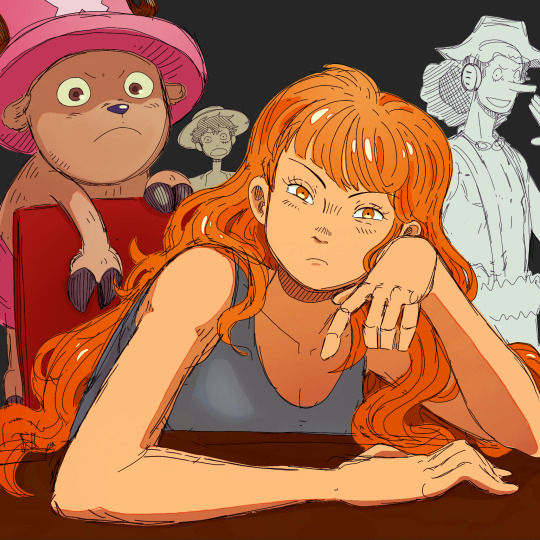
You may notice that Nami's forearm is too long, her hand looks like a pancake and Chopper has no joints! My kind sibling explained to me once that my anatomy is poor, but cohesive enough that nothing stands out too bad, lol. That's why it is important to use references!! And if you're me, practice all parts of anatomy at the same time with full bodies so that even when you're at a loss, your hands aren't that much better than your feet.
All in all, to draw like me, just have a very hedonistic approach to art, ha. Draw what you want, avoid getting burnt out on any single piece (sometimes that happens when you try to perfect drawings one at a time), and follow my personal motto:
Make fun, not masterpieces.
Idk how helpful this was, but there you have it!
456 notes
·
View notes
Text
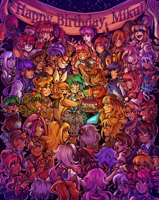
Happy birthday to the number one princess in the world!! 💖
~from her biggest fans :)
ramble of my scattered thoughts on the piece under cut as usual cuz i love talking 😋
This has been an idea I've been cookin for a while, and it was so cluttered and unlike any other ensemble piece I've made... and I decided I oughta do it anyway. I love Miku, I love Vocaloid, and I wanted to do something really ambitious and crazy for her anniversary. Crazy that she's turning her "canon" age this year TwT
I had the idea floating around since like, May...? And then finally started acting on it around June 18. I'm terrible with deadlines, obvious with how I can never make a silly birthday post in time, so I started wayyyy ahead to make sure I have some room to be lazy lol, especially with an idea as ambitious as this.
This was finished on July 12! So I had to sit on this for an annoying amount of time. Very difficult for someone like me who just wants to talk about everything I'm working on to the masses. But at the very least, that gave me the time to work on the draft for this post.
~~~
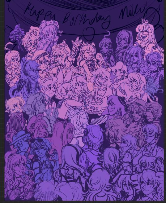
Here's some ~behind the scenes~ scribbles leading up to the finished piece!
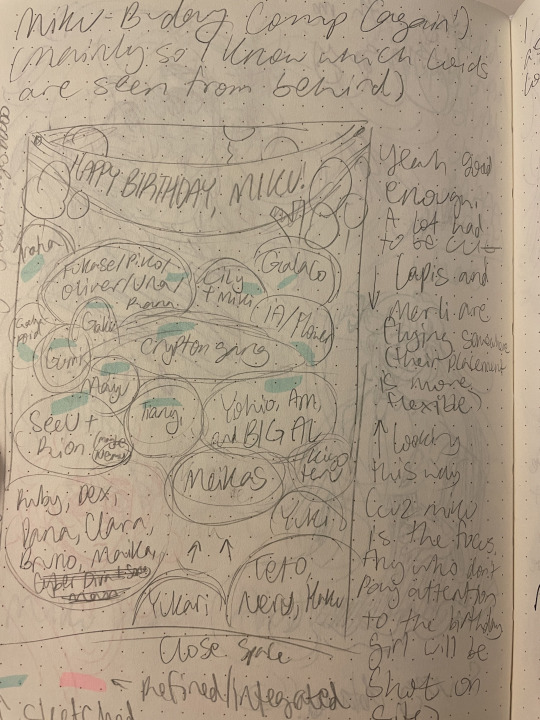
Left is the chicken scratch plan i made in my handy dandy notebook (whenever things are getting real and ambitious, i always made a rough ROUGH plan in there. Usually I'd do a rough pass of the full thing, but this was too complicated for me to do traditionally. I majorly benefited from digital tools to make this possible). CyberDiva and CyberSongman were considered, but I ended up cutting them cuz I just didn't feel like drawing them sorry-- (just pretend they're off to the side. They gave Ruby and Clara the pizza lol).
Right is the "final" completed sketch (before I decided to include Chika mid-way through coloring and VY1 and VY2 near the finish line). I started by drawing the main "groups" separated on a different canvas so I can plop them into the main canvas for easy rearranging and transforming. However I got lazy and ended up drawing everyone in the bottom right corner directly on the canvas since I liked seeing the big picture of everyone's positions. Y'know.
Almost excluded Chika! But I like her design so much that I just felt like including her last-minute. You win this time, Chika fans.
VY1 and VY2 were very close to being cut! I added them when I began doing the banner and thought "eh why not". I figured their non-human designs would be pretty easy to include pushed back in the bg. Ik VY1 is more commonly associated with the fan design, but I referenced the hairpin cuz it was simpler and the fan looked very annoying to draw 😭
Sorry to the fans of many Vocaloids I had to cut because this composition was insane enough as is. I promise I wanted to include fellas like CUL, LUMi and Sachiko 😭 I will admit I was a little biased on who I wanted to include over others. Like, I don't normally care for Bruno and Clara, but I wanted to get some more international 'loids in the mix. Also wanted to stick in the realm of official designs and not fan-designs since, as much as I can appreciate those, are just a whole "wait who is that guy supposed to be" situation I didn't wanna deal with.
I also did wanna include even more character references through the balloons, but they ended up being kind of ugly and overcomplicated the BG :,)
(Oh, and while this was originally planned to be a Vocaloid-only piece, I did end up including Teto, Neru, and Haku 'cuz those are Miku's besties dude!!! They may not be Officially in the club but they're her girls and it would be criminal to not invite them to her birthday).
Anyway, this project marks the first time I've drawn a lot of Vocaloids. Lily, Piko, Rana, Yuki, Yukari, Miki, Maika, and many more lol. All of 'em I've heard or seen in passing, but now I actually drew them, and some have really cool and fun designs!! I got into a habit of drawing Merli after this since I just love her design for example. And I'll probably be drawing more lol!!
Oh and the last thing I'll add for now!! The cake is indeed made up of various song references!! I wanted to reference the "big four" producers, just absolute icons in Vocaloid history. The pink/black checkerboard is "World is Mine" (Ryo), the crescents on the side is "Rolling Girl" (Wowaka), the smiley faces is "Matryoshka" (Hachi), and the three hearts on the side is "The Vampire" (DECO*27, which is sort of a symbol of his whole Mannequin album tbh). I know "The Vampire" is a bit modern but I couldn't think of anything else off the top of my head. I'm a fake DECO fan I know 😔 "Matryoshka" was originally going to be referenced in the colors of the candles but believe me it looked like shit so I just went for something else last minute 😭
That's all I have to say!!! Hope you didn't mind the text wall if you made it here. I hope you like it as much as I do!!!! Happy freakin' birthday Miku!!!!
I have to deal with tagging all these characters now for my page,,, in the drafts my tags got cut off after a certain point so I think I'm massively breaching the tag limit 😭 um... I'll figure that out later...
not losing sleep that i can't tag everyone, even for page organization purposes because some characters have pretty generic names and some are a little hard to see in full yknow. If you're one of those people who tag every character in the art piece you reblog... I am very sorry.
#mayor doidles#fanart#vocaloid#hatsune miku#miku#kagamine rin#kagamine len#rin and len#meiko#kaito#megurine luka#gumi#kamui gakupo#ia#vflower#mayu#kaai yuki#oliver#otomachi una#fukase#sf-a2 miki#utatane piko#yohioloid#big al#sweet an#kasane teto#i literally dont think i can tag everyone. um. so you get the idea right#digital art#cell shaded
2K notes
·
View notes
Text
Oh boy, VaM is kind of a trial and error experience LOL I couldn't really show you how to use the interface and stuff without a whole video or something, but it's not THAT difficult to get a hang of if you just give yourself a day or two to play around, not to mention the number of tutorials you find out there. Luckily, if you only want to use it as a reference software that makes the process far easier (to this day I have no idea how to animate on that thing, since that's not what I use it for)
As for how I use it, it's pretty self explanatory - if there's a complicated pose I want to draw but I'm either having trouble with it, or just want to double-check angles/anatomy, I will use it as a resource! I use for most of my "proper" pieces (y'know, the nicer looking ones) and every once in a while for my silly comics if I'm having trouble with a pose.
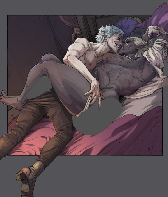
Lets use this drawing for example (the character on top of DU drow belongs to @namespara )
I don't draw a lot of mud-wrestling (shocking, I know) but I had an idea of the kind of pose I wanted them to be in. So the very first thing I did was make a rough sketch of what I was envisioning:
I often do a rough sketch first, even If I know I'm going to be pulling the program up because A) It's less tedious than adjusting the models over and over again until I pick a pose and B) because sometimes I'll decide I don't need the reference, after all, and so that's 30 minutes I'll have spared myself of playing around on the software.
Now, this is a pretty complicated pose! It's in a weird angle and the bodies are making contact in ways I'm not used to depicting, so I did choose to whip out VaM for this one. I went into the program and after some messing around, I flopped my little dolls together like this:
Now something really cool about VaM is that you can completely customize your models, and if you have the patience, I would definitely encourage you to do so! Obviously, you don't have to make picture perfect replicas of every single character you have, but as you can see here I have made a DU drow "decoy" to help me better understand some of his features when I draw him: he has a strong brow, a short nose, a square jawline - these are all going to look a very specific way from certain angles, and I might not always be sure of how to draw it right! So it's useful to have models that bear SOME semblance to the character so you can better understand how different viewpoints will affect their bone structure and mass.
Also thank fucking god for the elf-ear slider. Figuring out how to draw those shits from certain angles was a huge pain in the ass when I started drawing DnD races.
So, with the reference in hand, I go over the sketch again:
Now you may notice that I don't stick to the reference 100%. There's three reasons for this:
posing on VaM is tedious as hell. You can get something incredibly natural looking and picture-perfect to reference from if you wish, but it's going to take you hours to do. So, for the most part I just slap guys together until the results are "close enough" and use that.
In my opinion, you should always aim to ENHANCE your reference material, not replicate it exactly!
While VaM is a PRETTY DANG GOOD source of anatomical reference, it isn't perfect, I often supplement it with further reference from real life resources or make tweaks based on my own knowledge where I catch it falling short (and, antithetical to what I just said, I sometimes fuck the anatomy up further on purpose if I think it looks better that way LOL it's all jazz baby).
Then lines, color, yada yada. I don't have a tutorial on that and I don't think I could make one, because my process is chaotic as hell, but I do at times use Virt-a-mate as loose reference for lighting too when coloring - waaaaayyyy less so however, because that process is even more tedious and I feel like I often get better results by just winging it. It is a feature of the program though, and I'm sure it would be helpful for someone who has a difficult time visualizing lights and shadows. I only started using this program a few months ago, so I happened to already have a pretty good understanding of that kind of thing and just don't personally feel like I get much out of that particular mechanic.
Here's a few other examples of pieces that I made reference for (WARNING: Suggestive)
Now, for the question many of you may want to ask:
"Can I trace this junk?"
And to that, I say: Buddy, you can do whatever the hell you want with the reference material you created.
However,
If your goal is to learn and improve your art, and to recreate realistic proportions and anatomy from memory, tracing won't help you.
Developing your own style, your muscle memory, and personal technique will all be hindered by choosing to trace instead of drawing from observation, so I would encourage against it. Hell - even when tracing is employed as a technique, it's usually by high-skill realism & concept artists who are looking to either cut some corners, save time, or just double-check their own proportions in order to improve further - if you try tracing as a beginner, you will most definitely find the result to still look stiff and "off".
So trust me, there is so much more to be gained from drawing from observation. Make note of tangents, compare proportions, use all the elements of the picture to dictate where and how things should go - it will be a far more rewarding experience.
Hopefully this has been helpful! VaM is a really cheap program (you get it on the guys' patreon for I think 8 dollars, just google it!) and it's definitely been worth my money as an artist since I found it. Learning to use it can be a little intimidating at first glance, but as I said above you only really need a day plus one or two tutorials to get a hang of the interface.
A fair warning though, IT IS A SOFTWARE MADE FOR VIRTUAL SEX/ADULT ANIMATION So when looking it up expect to see a some spicy content.
#Funfact THIS is the post that got me flagged last time so i'm really tempting fate right now LOL#ask#art#tutorial#resource
644 notes
·
View notes
Note
How did you come up with your human Bill design?
I described my goal in the first post I made about his design:
After seeing dozens of tall dapper skinny white twinky anime boy Bills, I wanted a design that matches none of those words. My other two goals were to use the show’s art style; and to lightly pay homage to Alex Hirsch’s “canon” human Bill with the triangle body… except not deliberately hideous.
My unspoken final goal was "and I'm gonna make him damn good looking."
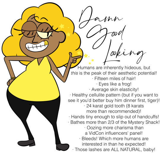
All the colors were sampled from Bill & Bipper, except his skin (which I sampled off a background character and tweaked until it looked good with the yellows) and his gold tooth (which I sampled off of Ergman Bratsman's).
On top of the fact that I was tired of specifically white dude Bills, brown skin tone was chosen because of the emphasis on Bill's interactions with ancient Egypt; I wasn't sure at the time how much of an influence I was gonna headcanon he had on the region, and it woulda felt weird depicting Egyptians bowing down to a white dude. (And then I decided to deemphasize his influence on Egypt almost completely lol.) It woulda been more accurate to go darker, but I was worried it would start to tilt his design into Nyarlathotep-esque Creepy Pitch-Skinned Mysterious Demonic Threat From The Orient racist territory, especially when he's already got demon eyes.
The triangular torso is the most important part of his design, I usually draw an equilateral triangle in the sketch layer and then pad it out.
If I were a better artist a year ago, I would have given him a double chin so his head+torso together would be triangular. But when I tried, I couldn't figure out a way to draw it that looked appealing instead of like a mean fat joke. So I took the coward's way out and gave him a skinny neck with a vaguely triangular chin, and now write him complaining about having a neck every few chapters.
I think the skinny neck, thinner face, noodle limbs, and typical baggy hoodie fooled people into assuming he's skinny. I figured out a way to draw a rounder face with less neck that looks more appealing to me than the original face, so I do that now. Can't do anything about the noodle limbs tho, those were chosen to match Bill's canon noodle limbs.
I went for a hoodie instead of the typical suits you see on human Bills for two reasons.
One: several years ago I had an OC I'd conceived of as a dumb kid who'd given Bill permanent standing permission to use her as a puppet, and when letting Bill take over she'd hide her human features by wearing a hooded poncho and tying a blindfold with an eye on it over the hood, and that idea stuck with me.
And two: for the story I came up with this design for, the premise is that Bill's been recently unhappily stuffed in a human body and dumped on his enemies' doorstep. So, he doesn't have the freedom or money to get fancier clothes; he's too depressed over being stuck in a human body to care much about his human appearance; and he's most comfortable in something that obscures his human anatomy and reminds him of his real form. If he was rich, free, and able to ditch the body any time he wanted, he'd be wearing suits.
#anonymous#ask#bill cipher#human bill cipher#gravity falls#gravity falls fanart#fanart#my art#reference#bill goldilocks cipher#(might use this as part of an updated character design sheet?? i've been meaning to replace the old one)#hazbin hotel
189 notes
·
View notes
Text

Been working on some sketches of my mer!Zoro, since he's one of my favorite designs. What started as me figuring out what his markings look like under his bandana turned into some of them ending up a bit more uh... sluttier than I imagined 😅😆
And then, while drawing these, I started to spiral and wonder what Tera and Arashi would look like as well, what traits Zoro inherited from each parent. Well, all this pondering resulted in new mer designs!

I had already designed a human form of Tera which is on my insta, so all she really needed were some tweaks, but I hadn't drawn Arashi yet so I had to come up with his from scratch. Originally I had wanted to take more inspiration from Kurogane from Tsubasa Reservoir Chronicles (sole reason being he and Zoro share the same English VA lol) and while I could see human Arashi wearing a similar outfit, I decided to make his overall look more distinct. I made him a blunette since a lot of the Shimotsuki have blue or blue-ish hair, and, like Zoro and Ushimaru, Arashi inherited Ryuma's huge-ass forehead 😂
Obviously, Arashi is a tiger shark, and originally Tera was going to be a leopard shark, but I ultimately decided to make her a thresher shark instead as I think the long tail matched her hair. This now makes Zoro half-tiger/half-thresher. Her eye color is a little detail I enjoy, as in fics I often find that people can't decide if Zoro's eyes are gold or silver, I prefer silver personally, but I made Tera's eyes gold in reference to that lol
I also wanted Tera to have an obvious sun theme, to go along with the Shimotsuki's moon theme. If I remember correctly, Shimotsuki Village was founded after the people from Wano drove off bandits, and Tera is the daughter of bandits, sooo... what if she was the child of the very bandits that were driven off? Maayybe there was a little Romeo and Juliet thing going on with her and Arashi? Maybe a diamond-in-the-rough bandit's daughter met the descendant of Wano's sword god and it was the greatest romance in One Piece history?!! Lol I just think it would be so funny if Zoro's parents were pretty much a Disney couple. She's the Megara to his Hercules, the Aladdin to his Jasmine, the Eugene to his Rapunzel 😆🤣🤣
Bonus for those who made it though my rant:

Other designs
#one piece#one piece fanart#op fanart#fanart#digital art#digital drawing#digital illustration#my art#long post#one piece zoro#op zoro#roronoa zoro#merpeople#merfolk#mermaid art#mermaid au#mer au#mer!zoro#mer!roronoa zoro#sanji cameo#roronoa arashi#roronoa tera#one piece tera#one piece arashi#op tera#op arashi#suprise bebe at the end#zosan
170 notes
·
View notes
Text
Whitewashing in Anime - Agni ft. Cithis
Browns of the Same Shade
Hello again! I decided to revisit this topic again now that we have Agni's official appearance in the anime. I also wanted to go over some aspects that I did not get to include in my first post.
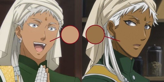
In the end, Agni also got lightened! His skin tone was always somewhat darker than Soma's in both the anime and manga appearances. Yana does describe his appearance as a "dark-skinned woman" in her genderbend sketches. So, for the anime to lighten him this much to such an degree is disappointing.
The skin diversity in the anime has been pretty lacking so far. Once again, A1 studios was not perfect, but they did manage to give all three Indian characters different dark skin tones, while this anime has every Indian generally the same lightened shade.
(every indian character in the anime are the same skin tone... cloverworks stand up, you can't let a-1 studios beat you like this)
Personal opinion of mine, I feel like animation studios aren't willing to play with skin color values as much anymore. I remember even seeing white characters being various shades of brown, especially under certain lighting and environments. Unlike now, when every character looks bleached the second they hit the sun.
I also wanted to review what I think of Soma's appearance. Soma's skin tone isn't any darker than it was in the teaser shot sadly, so we can't blame the lighting. I already was expecting it, but it's still a shame.
One positive feature I'll give to the anime is that Soma's nose isn't pronounced all the time. In certain scenes, his nose isn't as sharp as it would be for other characters. I believe that's just the style for the anime and its dependent on the shot.
Anyway, I felt this image was pretty on topic with Soma and Agni's situation and just anime remakes/reboots in general lately:
Brown ≠ Grey
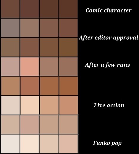
Something I'm embarrassed I forgot in my last post is saturation! I mentioned often how darker skin tones tend to be neglected, but not only that, but the color! The vibrancy in the skin, the life!
A common feature I noticed, especially in East Asian media, is how they avoid the "brown" in dark-skinned characters, by constantly making their skin tone duller, ending up with more grey-toned skin.
I often see art advice for digital artists that they should pick desaturated colors or colors in the "grey zone" as to not overwhelm the art piece. Which is fine most of the time! But when you apply that advice for brown skin, what you get are mostly grey tones, and end up having your character look like a zombie.
Here are some colors I randomly picked. The colors on the left are those sandy, dull grey tones I was talking about. If you want to get those richer, deeper-toned browns, you need to pick colors with more saturation like the ones on the right.
Now of course, color is relative and you can't just color pick your way around without considering how it fits in with the rest of the piece. You can even end up washing out your brown character despite choosing a strong brown color. You have to consider the background, lighting, undertones, the environment, and how they'll affect your character. There may even be times desaturated colors work better, but you have to at least consider why it works "better".
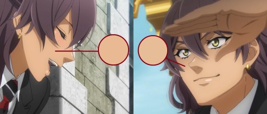
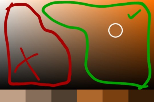
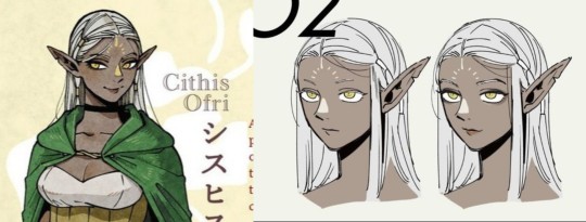
Let's take a look at everyone's favorite manga artist right now, Ryoko Rui! Ryoko Rui is praised often for her diverse character roster and creature design, however I always found her darker skin tones rather... lacking, as such for the elf Cithis.
(I color picked her skin tone and it matched my light grey shades above lol)
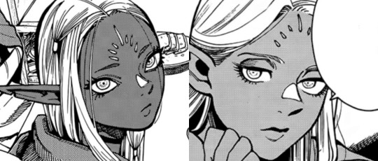
Her skin tone is very washed out and grey. She not nearly as dark as she appears in the manga. Once again, there's that dissonance between skin tones. Now take a look at the manga's grey tones.
When you see this, what skin tone do you imagine for her? Do you imagine the greyish, washed out tones from above or do you imagine something more akin to these black fae models I found?
(credit: @jaharajayde on twitter and @glassmarigolds on pinterest)
I'll give Rui credit that her color illustrations of Cithis improved and she's gotten better giving Cithis stronger undertones. I really like how the fandom has been illustrating her too, there's been some amazing fanart of Cithis such as these (the lighting in the last one is lovely).
Just adding saturation helps so much with skin tone. I even found an fan edit of Soma that added more color back into his skin, and he looks so much better for it.
One might say, "Oh what's wrong with having grey skin tones in a fantasy story!" Well... nothing really! You can have green or purple or blue characters if you like. But when there's already a startlingly lack of brown characters in a fantasy story, it can get awfully uncomfortable seeing the story portray different fantasy "races" with obviously non white racial features... but don't want to include any black/brown skin tones.
(fantasy artists would sooner give an orc dreads than a human, forget a "noble" creature like an elf... such decisions only reveals the artists' viewpoints)
It all just comes back down to avoiding that dreaded "brown". When it comes to these "reasons", we have to question whether they aren't just more excuses to not include black and brown people in stories, which makes me come to my next point:
Essence of Brown
There's some severe misinformation I want to address about Soma. I saw a fan a while ago say that Soma has a white mother which explains why he has light skin.
Firstly, that information is false. It was a concept Yana had for Soma, but quickly decided to drop it. Soma is not half white.
In the early drafts of the series, Soma had a white mother and, thus, white skin. However, this was later omitted in final revisions.
(quoted from the official kuroshitsuji wiki as an excerpt from the character guide)
Yes, you can have mixed parents and any kind of skin tone really! But it feels... dishonest to create "reasons" why the manga's first major Indian character, joining a cast of white people in a European country, should have white skin as well. Especially considering Yana's artstyle, without Soma's skin tone and Indian wardrobe, is his physical characteristics like his face even distinguishable enough for him not to be mistaken as white?
Imagine I wrote a story set in France, and teased an appearance of an African character in story that only had white characters until now, only for him to be completely white in appearance, and identical to every other white man, except for the occasionally exotic dress and other drab stereotypes.
What would you think? That his race is only a dressing to fulfill an exotic need at times? That he's a supposed homage to another culture, but it's wrong to have him actually look like the majority of people who made said culture? Why is he even this way?
Did he have a white parent? A white upbringing? Lived in a white culture, lived a white life? Maybe he was separated from birth! From his hometown, his country, his people, anything to justify why my "brown" character is so divorced from that part of his identity, from that side of the family whose skin tone runs a little too dark.
And I think that's why Yana decided to drop the concept of giving him a white mother. Why go through all those loopholes and explanations? Why all that justification for him to have white skin?
It's just another way to avoid the "browness" again for a character, what makes them brown in the first place and related to black/brown cultures. It's what we should consider in the future when we find ourselves coming up with "reasons" why black/brown characters should be anything but themselves.
Whitewashing in Anime - Soma ft. Usopp
#awgh so many links#this was floating around in my drafts for a while#glad i can get it out now#i really wanted to address the white mother rumor#soma asman kadar#agni#b.txt#yana toboso#kuro#kuroshitsuji#kuroshitsuji season 4#public school arc#weston arc#cithis#dungeon meshi#ryoko rui#dunmeshi#racism#whitewashing#fandom racism
151 notes
·
View notes
Text
So I FINALLY got the art of wish book which is so so good and? I’m honestly a little surprised that the only things that got leaked online were the starboy and evil amaya concepts when it’s literally filled with gems? Here’s a few but first let me tell you, the art alone makes it worth it. It’s amazing
THE HAMLET! LET ME TELL YOU ABOUT THE HAMLET!! Apparently in an early draft Asha and her community had left Rosas and started living hidden in the forest so their wishes could be safe from Magnifico. This hidden place was called “The Hamlet” and it still exists in the final movie, though it’s just a part of Rosas and doesn’t have the original lore. I really hope this trope gets reused for a future Disney movie because it’s a really cool concept!
Live action Valentino??
Some Sakina dump because I love her (also meet Tomás)
Oh and you know the wishing tree in the movie? It’s based on Walt Disney’s own actual wishing tree?? Wtf???
Also there’s a whole 2 pages about Dahlia explaining how much effort and care were put into her creation as a character with a disability. They actually had consultants making sure that ANY form of representation felt authentic and positive. They did not just made the cast multi-ethnic, they actually did their research so that any culture was well portrayed, all the way to the littlest details like textures on their clothing or even each character’s way of greeting.
And about the animation not being fully 2D… Haters conveniently forget mentioning that the movie is expressly made to celebrate both the past AND future of WDAS. Then like it or not, but you can’t possibly celebrate all of Disney without CGI animation. CGI is also Disney. Tangled and Frozen and Moana became instant Disney classics. I would die for a traditional animated movie, but when you put it this way, it makes perfect sense to me that they went with hybrid style for this movie specifically. It just feels right.
Also going through these pages… you just feel the love the producers and animators put in every single reference to older classics. Animation techniques were literally inspired by actual frames from Snow White, Pinocchio, Fantasia, Cinderella, Sleeping Beauty and Peter Pan. So were coloring techniques, lighting, cinematography… There was a breathing effort of paying homages to these movies with tremendous talent in them, while also creating something new. So hate on this movie as much as you want, but mind you calling it “AI-made”. It’s not. It’s made by humans.
Oh, and finally, Starboy. Well, yeah, I fell for it. People literally made it all up. There’s zero indication that he was gonna be Asha’s love interest, let alone be the one singing At All Costs instead of Magnifico. From what the book says (there’s literally two short paragraphs about him, before Star comes in) I think they didn’t even have a plot then, they were just exploring ideas and made some brainstorming sketches deciding how Star could have been. Same with evil Amaya! That one pic that leaked of her with Magnifico is all we got. There’s no indication that it was gonna be “a better movie” because there is no plot for that lol
307 notes
·
View notes
Text

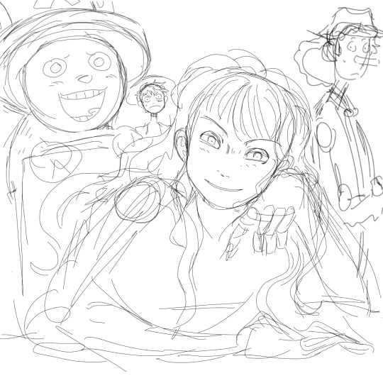
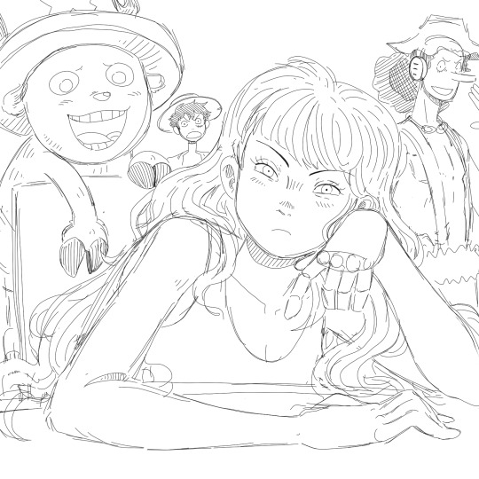
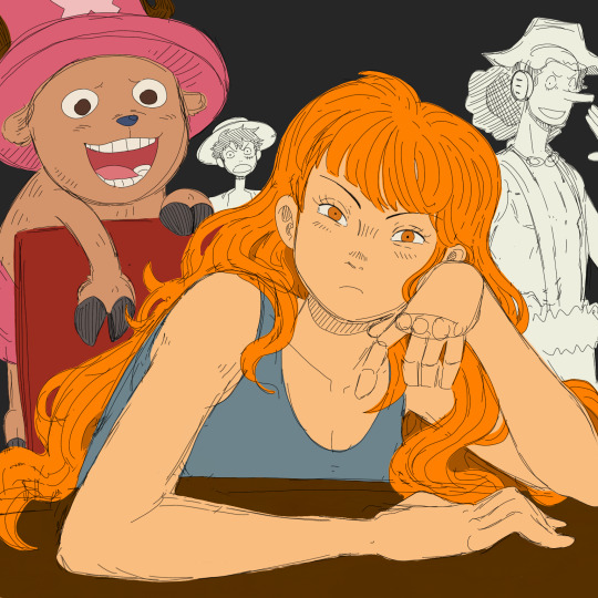
Obligatory coffee shop au art
Close-ups and ramblings under the cut because I spent waaay too long on this
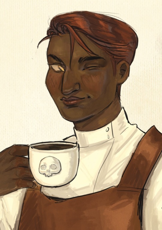
Welcome to my brain soup.
Disclaimer, I didn’t really plan this piece and just kept adding concepts as I went, so it’s kind of all over the place. It’s more a big patchwork of dumb ideas I got excited over, rather than a well thought-out drawing, but I like it as it is! It feels like my brain did when I was reading htn :]
1. The whole concept behind this is just "Vintage coffee ad but make it the griddlehark coffee shop au". I was aiming for cheerful but also not quite right, in a very stock photo kind of way if that makes sense. Gideon is smiling but she is not a willing participant in this. Also that coffee is cold.
I - very predictably - took inspiration from Leyendecker’s work, since his ads and posters are the first that come to my mind when I think "vintage ad", and also because I do feel like his painting technique is close to how I naturally paint. This is not meant to be a study of his style tho, I didn’t try to break it down on more than a very superficial level.
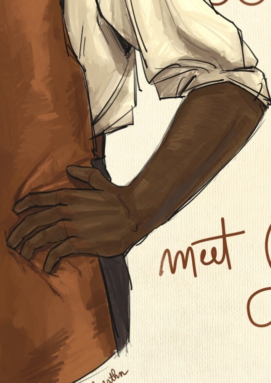
2. 3. Nothing special to say, just Gideon’s arms (her perfect biceps are hidden from view lest they cause a riot in the cafeteria). Also arm hair. I feel like it’s becoming a recurring feature in my art lol
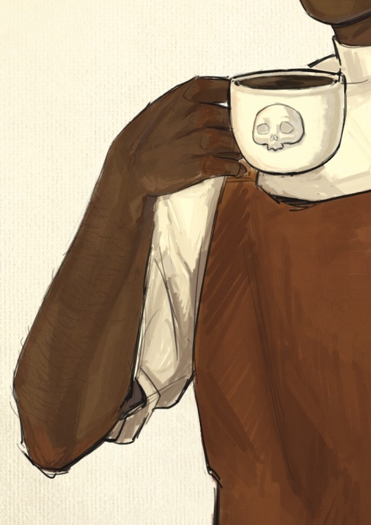
4. I debated whether or not to add a foam skull on the coffee then ultimately decided against it. That’s one skull too many, and honestly Gideon neither has the skill nor the patience to attempt one. Let’s be real, if they let her have access to the pitcher she’d make tits. So here is your tits-free coffee, courtesy of the Cohort photoshop editors.
5. Isaac, sporting the Fourth’s blue not only in dress but also in his questionnable choice of eye makeup. They have matching haircut only so Jeanne can showcase how much better it looks on her.
6. This is where I finally have something clever-ish to say. Thoughts ! I have them ! Sometimes. So. Harrow. You can’t see it but she has a nose piercing as well - this is relevant to spreading my agenda that Harrow is full of bone (piercings, that is). Sue me, I forgot that they let her keep her face paint in this scene. Onto the actual thought process.
This is where Abigail interrupts the scene, before Harrow can catch a glimpse of barista!Gideon. Her interruption is shown by the unfinished look of this panel : the sketch lines peeking through (in a reddish hue, to mimic sanguine, the red chalk that artists used to draw sketches and studies - and also because the contrast of the colors makes it pop better against her skin) + the rendering is messier from the neck and down.
Abigail is blocking half of Harrow from view - I wanted to have her hide Harrow’s eyes and thus line of sight entirely, but I feared Harrow wouldn’t be as recognizable with more than half her face hidden, frowny eyebrows and all.
Abigail herself is meant to look out of place here, without taking too much attention away from Gideon. I drew her in a much simpler style, using a more monochromatic palette and cell shading, to contrast against the rest of the gang, where I used a lot more color variation and a more detailed & textured painting style.
That’s about all I have on this, if you got this far thank you! Your support is much appreciated. If you liked this drawing I’d be overjoyed if you reblogged it and left your thoughts in the tags/notes! I’m always happy when I read them, even just a "#nice" makes my day.
#my art#tlt#griddlehark#coffee shop au#you know the one#the locked tomb#harrow the ninth#htn#gideon nav#harrow nonagesimus#ft the terrible teens#isaac tettares#jeannemary chatur#and the woman the myth herself#abigail pent#artists on tumblr#tlt fanart
100 notes
·
View notes
Text
Making Humanoids Less Human
I did make a small post on this, but now I've got the art for a much bigger and more detailed post! so here we go.
I had several anonymous asks that all came in quick succession weeks ago. Every single one of them was basically just a variation on "how would you take (typically humanoid) fantasy being, and make them look less human?"
This blog does not exist for me to just give people original designs for free, my goal is to show off my own personal thoughts about fantasy design and help people figure out how to adjust their own designs to fit their vision better. That means when people ask me questions about how to do something, I want to give them things to think about so they can come to their own conclusion. I don't mind making original designs to illustrate concepts, but a whole flood of "show me how to make this specific thing look different" all at once like that was too much. I'm not answering them all individually, it's just not what I want to do.
But what I can do is show my own thoughts and ideas about how to take any fantasy design and push it further away from "human", and you all can look at my ideas and figure out your own way to do things!
So here are the main 4 methods I've come up with to make humanoids look less human.
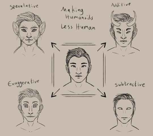
(image description: a simplified drawing of a humanoid face surrounded by four altered versions of the same face. clockwise starting from the top left, they are:
Speculative, drawn as a cat person. Additive, drawn with horns, pointy ears, sharp teeth, and a second pair of eyes. Subtractive, drawn with blank eyes, no nose, and no eyebrows. Exaggerative, drawn with a long face and huge eyes, as well as a wide mouth, narrow nose, and big ears.
end description)
I am personally a fan of the speculative route, which means exploring an alternate root of evolution to create a new design. Through this method, I've created monkey elves, frog goblins, and pig orcs.
the additive option is the most common, I think. adding new feature or doubled features to a humanoid form is a very intuitive way to change the design and make it look less human. you see this in most fantasy and scifi designs, like star trek aliens and the dnd player races.
subtractive and evaggerative are the most common options for people that like the uncanny valley. it's really easy to make uncomfortable designs by removing or exaggerating recognizable features, and they're often used together. Slenderman, for example, removes all facial features and skin color but also exaggerates the limbs and body.
Combining the four methods will give you a really interesting design as well! So for practice I decided to explore an alternate design for Tieflings, the part-demon player race in dnd.


(image description: four examples of differnt tiefling designs using the previously described methods. the additive example is just offical dnd art of a tiefling woman with purple skin, horns, and a long tail.
the subtractive sketch looks very alien, with a bald head, empty eyes, and no other facial featuers aside from a small mouth. it has three fingers per hand and two toe per foot.
the exaggerative sketch shows a hunched humanoid figure with huge eyes and big ears. the neck, limbs, and digits are all long with claws at the ends of the fingers and toes, and the limbs are also quite muscular.
the speculative sketch shows a bipedal figure with features similar to a giraffe, including a long neck, ossicones, and hooves.
end description)
now, because tielflings have such a distinct look to them, obviously my new sketches don't really look like tieflings, do they? the only one that comes close is the giraffe. relying only on one type of alteration to the human form has left the designs rather empty and lacking in the more iconic traits of the original concept. so i tried a sketch that combined my ideas! it came out looking like a completely different creature lol, like it could be a kobold or something, still not really a tiefling.
(image description: a sketch of a creature with a giraffe-like head, long tongue, and sharp teeth. it appears to be roaring at something and stands in a half-crouch. it has long limbs with hoof feet and clawed hands, as well as a long tufted tail curled behind it. end description.)
didn't work out. too far into the animal side of the speculative evolution, I think. so I tried again and got a design I liked much better!
(image description: a digital painting of a tiefling leaping back and casting a glowing orange spell. she is wearing a tunic with a corset and detached sleeves, as well as several pieces of jewelry. Her skin is purple with dark patches like a giraffe's spots, and she has a giraffe's ossicones as well as hoof-like hands and two-toed hoof feet. Her tail is long with a tuft at the end. She has glowing eyes and a flat nose, and there is a single sharp tooth visible poking out of the side of her mouth. end description.)
Brought the face back into slightly more human proportions and that helped a lot. Sometimes designs just take a few tries! that's normal.
and hopefully this is helpful to all of you! there are so many ways to alter humanoid designs to come up with something original and unique to you!
#humanoids#making humanoids less human#altered humanoids#non primate humanoids#tiefling#long post#my designs#and btw ai cannot do this#does not matter how detailed you prompt it#it can't really get things to look this original and unique#it can't really blend different features like this in a way that makes sense#you have this power#the computers cannot replicate it
253 notes
·
View notes
Text
Rachie cannot stop making up AUs

This is my 20//80 AU!! Yap sesh + closeups under the cut
(Takes the mlb ddvau love square and reverses it)
What led me to making this AU was coming up with a Cute Guy design and wanting to use it so so badly -> Coming up with a matching Hot Guy design -> Getting a funny idea and reversing the love square that Double Hearted AU has going on -> Actually building a story onto it

Pretty proud with how they turned out!! My first design on HG for the AU and my second of CG (who originally had a popped collar which I didn't like)
My main inspiration for the designs was the desert duo coffeehero au by @/enka-antix, which I then realized also has the reverse love square.. oops lol


Here's the full sketches for CG+HG and Grian+Scar
Two main details I want to point out that is outside of the outfit changes themselves is the fact Grian parts his hair differently than CG, and Scar wears makeup while HG doesn't.
I struggled a bit with what bird I wanted Grian to be, and decided he's a black capped finch, however he uses a bit of powder on his wings to give them a pink hue for when he's Cute Guy.
And yes I decided to be self indulgent and give Grian tailfeathers and Scar a long tail

^ Wheelchair users does this look comfortable
Genuinely this is my first time drawing a wheelchair ever I think, unless I did once and completely forgot. But yeah! Cue transformer bot stuff cause I don't know what I'm doing
A lot of the tracks that the parts travel along to turn into the legs or the wheelchair aren't actually drawn I've realized, but if you're not colorblind (/lhj) you can see I've colored where all the bits and bobs go
Btw that point at the top is rounded and padded off so it doesn't dig into Scar's back
It was an artistic mistake whoopsieee

Some of their thoughts on each other and why Grian thinks Scar and HG can't POSSIBLY be the same person and why Scar thinks Grian is SO much better than CG.

And my most favorite drawing from the sheet (^_^) It's the introduction to the AU where Hot Guy saves Grian from the fourth floor of a burning building! Grian's a little cooked but he's fine.
Also I didn't draw his sweater burnt up cause I didn't feel like it so I slapped some texture on there and called it a day.

Finally, their logos :D
If you couldn't tell, I put the notes on this one in Hot Guy's point of view
#20//80 au#grian#goodtimeswithscar#cUtEgUy#hOtgUy#pls ask me about this plsplsplsplspls#I want to talk about it so much PLEASE be insane with me#rachie art#no 20//80 is not the year it's like 50//50
103 notes
·
View notes
Text
edwina / edith in her lingerie as inspired by @hannaloony and @arisprite ‘s fanart !!! this one’s on the simpler side but I’m planning to do a companion piece with charlotte (and might do more with the backgrounds to really sell the whole “getting ready in their respective eras” thing, not sure yet) and hopefully doing something a little more suggestive with the both of them, again inspired by @hannaloony ‘s piece but using my own interpretations of fem!payneland w/ butch!edwina and fem!charlotte bc i love them
(side note: I know everyone is using Edith and not Edwina but I think Edwina suits my interpretation better for some reason ?? something about ppl hearing “Edwina and Charlie” and getting jumpscared when Edwina is the butch is funny to me,,, still undecided if she uses any nicknames but I’m open to suggestions lol)
previous artwork I’ve done of these characters can be found here: part one (original duo piece) ; part two (alt outfit for Edwina, Edwina sketches)
notes on the costuming choices for anyone interested:
- i specifically designed these undergarments to work under either of the outfits I’ve given her so far!!
- I decided on combinations as her base layer as they were seen as younger/more casual/athletic, all of which im aiming for with this design. technically these are probably too plain for the era, especially if she was attending a girl's college/finishing school where sewing and adorning and the like would have been taught, but I wanted to keep the masculine energy so I figured some ruffly hems and blue ribbon was a good enough middle ground
- the color palette is inspired by several reproductions I’ve seen online as well as keeping with Edwin’s blue color motif/existing palette
- researching the corset took AGES so here’s a rundown: I wanted it to keep with the casual/sportswear look so I went with a sports corset, meaning it wouldn’t have any hard boning (it was just the hella reinforced material without the actual bones/metal), would have elastic at the sides, and would most likely be an overbust corset despite that not being the trend during the Edwardian era (for the most part/to my knowledge). the examples I was inspired by of sports corsets technically didn’t have visible garters, but literally every other corset I saw did and I can't imagine why sports corsets would have to have the more impractical thigh garters ??? surely you also want to keep your stockings up when running around ??? so I gave them to her anyway
- im keeping the socks/stockings the same as my other illustrations but honestly i struggled to find similar historical examples :/ surely someone at some point wore some heavy duty knit stockings, but maybe my idea of knit is just different from how knit garments, especially socks, were in the era ? regardless im keeping them like this, especially since Charlotte has pantyhose on and I feel like silk/cotton stockings would look too similar
- i went back and forth on a corset cover, but ultimately went without one bc 1. it gave me a more interesting way to pose her lol and 2. i couldn't tell if corset covers (and similar garments that went over top what we have here) would have been worn with athletic attire ? like I have her in bloomers in both of her outfits thus far so I figured no petticoat or slip, but early brassieres/corset covers/bust improvers/etc are just a big ??? from me
- a note on her hair: so if you look at all three of my illustrations of her you’ll see that her hair is totally consistent and while I can try to say that’s intentional it’s really just bc I keep going back and forth on little details about it. for example, in the first illustration her ears are completely exposed vs in the second they’re mostly covered—the exposed ears read as more butch to me but also would’ve been pretty inappropriate and I wasn’t sure if that’s an area would Edwina would rock the boat too much, hence me going back on it in the second illustration. also, I’ve gone back and forth several times before on it her hair is actually cut short or if it’s worn in a faux/“nervous” bob (which I just learned that name for lmao). on one hand, having it actually cut short is 100% more butch and leans into the practical/athletic vibes. on the other hand, it would be a drastic move for a repressed, bullied, 16 year old at an all-girls school to pull, plus it would put her ahead of the trend by several years. in the end, I think of it this way: the Edwin that we meet reads as effeminate to a modern audience, but 80% of that is through mannerisms, not direct costuming, and even what we do get from costuming is skewed bc we are a modern audience perceiving an Edwardian subject. so I figured sticking Edwina with traits she could wear as either masc or fem but chooses to wear bin a more masculine style would shorthand that sort of how-you-wear-it approach to gnc (plus I’ve been there done that when closeted so it felt extra fitting)
- that whole rant aside: I went with the faux bob but, in the name of her being in the process of getting ready, wanted to show it in a half-done state that we would never see Edwina in otherwise ! the idea with the undone side is that she’s taken out the rags she wore her curls in overnight (I don’t see her using heat but if she did it would be before this) but only tucked half up before putting her corset on. is that the actual order of how you would/should do this? fuck if I know. I also am not 100% certain if the curl pattern/hair density is accurate between one side of her head and the other, but without an exact reference this is the best you’re getting
- speaking of things being out of order, I do know that if you’re deciding to don a corset anytime soon, it’s best to put your shoes on beforehand! especially if they’re lace-up boots like our girl here wears, as bending over in a corset to tie them is not fun. thankfully, she’s in a sports corset so it wouldn’t be too bad, plus she has to step into her bloomers so I figured keep her in her socks was the right choice
- there’s a halfhearted attempt at a background here with some dark wood panelling and red/orange/brown tones thats honestly just me wanting some contrast/interest while also keeping it simple. we'll see if i do anything more complicated than that anytime soon lmao, these pieces take long enough as is !!
hopefully tumblr doesn’t fuck up the cut (again) so not everyone has to read all of this, but tysm to those of you who do!! I put a lot of thought and research into these pieces and love sharing what info I find so feel free to talk to me about any and all of it !!!! and hope you enjoyed ofc
#fem!payneland#fem!edwin Payne#butch!edwin payne#dead boy detectives#dbda#dbda fanart#dead boy detective agency#dead boy detective netflix#dead boy detective fanart#my art#lesbian#butch lesbian#edwin paine#edwin payne#edwin x charles#edwin dead boy detectives#edith payne#edwina payne
65 notes
·
View notes
Last Seen Blogs
miapinescloset
Miapine's Dream Closet

apotheke1
APOTHEKE_STORE

cq-uz
CQ:z

eugene22joker
Eugene22joker
cpriceceo
Internal Framework