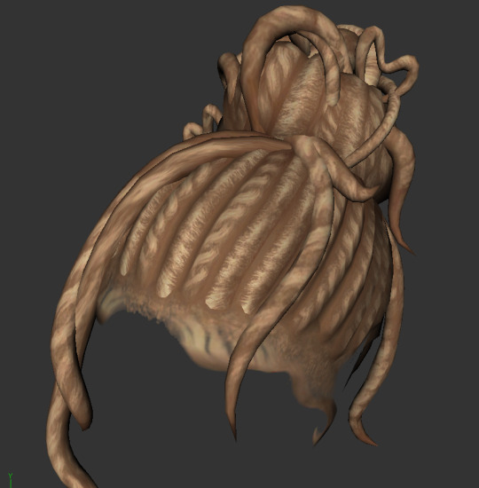
#i don't think what i want can be done with photoshop
Text
So I’m out hunting commissions again, both on my new blog and this one because there are more people over here.
I’m looking for someone that’s good at doing digital art of buildings/spaces. It can be sketch work, full color, whatever at the moment. I just want someone who might be able to bring Harper’s office/lab spaces to life. If anyone on here might be interested or they know someone who might be interested, please lmk.
1 note
·
View note
Text
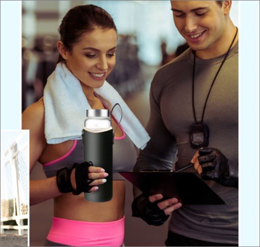
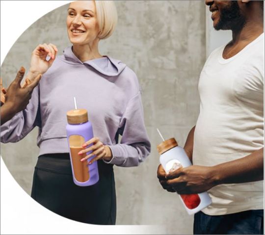
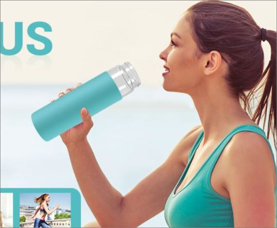
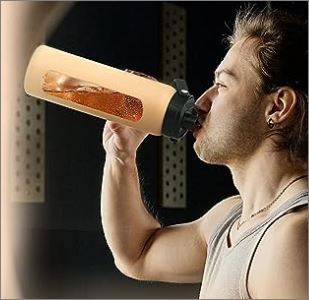
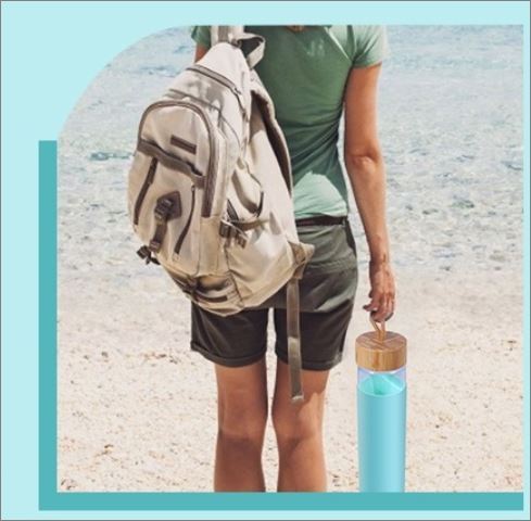
I love all of these goofy product photos where the water bottle is extremely obviously just photoshopped onto a stock image of someone pretending to hold something or whatever.. very convincing..
#the last one where the water bottle is like nearly the size of the woman's entire leg ghbjbjhh#ALSO I know.. gross.. nasty.. amazon.. I was only looking there because I was trying to find an exact replica of an old water bottle#I bought like 6 years ago in a store and I just wanted another one of those and it seemed like the only place the old manufacturer#still sold was through amazon but.. alas.. I think they just don't make them anymore. so I have abandoned my hunt#I didn't actually buy anything. but I did get distracted clicking through product images for a few of them#it's bizarre how like............... idk.. WHY is this done??? Isn't this offputting to basically ANY potential customer?? or do people#not look at every photo/read the entire page/all product information before buying??#all of these are from like front page ''top sellers'' or whatever like........... how does this not hurt the brand????#If the company can't even bother to take a single photo of a real life person using their real life product then... that to me#is kind of red flaggy..?? even if you're an indie start up small business with hardly any funds.. still#A real photo of the product you are selling in a real actual non-photo shopped environment does not seem that inacessible#Maybe it's because everyone does everything on phones now?? So it's harder to see the pictures when they're smaller?#Kind of the same thing with ai art and also hair color photoshops lol.. On my full comptuer screen it is SOOO easy to spot ai art#like IMMEDIATELy from the little tells and ways certain details morph into each other etc. I dont even mean obvious dalle mini stuff but#like the Fancy High Quality Photorealistic AI art is still pretty blatant 98% of the time if you know what to look for. But I still catch#people sharing it a lot like 'omg where can I buy this pair of shoes!! :O <3' .. erm you cannot.. that is the most balatantly fake looking#pair of shoes I have seen in my life hhjbj.. the heels are both different heights. there's a different number of straps on each one. etc.#AND that phase back before colored hair was Mainstream and people would post photos like 'omg going to bring this to the salon!! dream hair#and it's like.. you can LITERALLY see the parts where it's 'colored outside of the lines' and is so clearly just a person with blond hair#that someone drew over with a tint brush or something not even very neatly. etc. etc. ANYWAY.. Maybe with phones it's harder to tell these#things?? To me so much of it is instantly recognizable and it's suprising to me that people either don't notice or don't care and will#interact with it anyway by buying the product or acting like some ai art fake furniture is real or etc. etc. ..hewwoo#Aslo sidenote - I think I've become soo cynical and tired of constantly being advertised to that I literally cannot shop without getting#exhausted. I do not see how marketing is anything but obnoxious and transparent. Every item description having stuff like ''Our company is#commited to bringing you the highest quality water products! we set out with a mission to bring high quality products to people all over#the world and we believe in spreading health and happiness and'' just like SHUT THE HELL UP!! youre a fucking company#you don't ''beleive'' in anything you are here to sell a product. stop trying to talk like you're my bff who cares deeply about my health#or something just tell me the materials and product specifications of your stupid fucking water bottle and move on. Idont need to hear your#whole bullshit spiel about what ~your company stands for~ that is SO much MORE offputting. you make me want to buy the item LESS..#longing for the type of ads from my 1800s magazines that are just like 'this product is good. please buy it. okay thank you much. bye'
9 notes
·
View notes
Text
Chiho Saito’s 1999 Revolutionary Girl Utena Original Illustration Collection
IT’S HERE. IT’S DONE. IT’S FINISHED. NOW…IT’S YOURS. Happy Holidays, my friends.
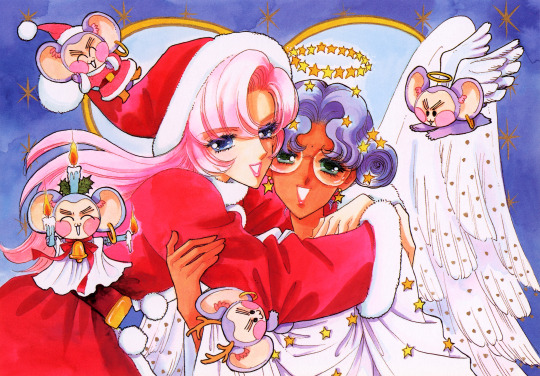
Vanna here! I have posted some already about this project, and the responses I got, public and otherwise, have been absolutely incredible. Y’all have been reblogging and hyping this before it even finished…I haven’t felt so encouraged about an Utena project since the musicals! (Yes, streams soon, I promise.) You can read the other post to get more details, and catch my post here with more details about the process if you’re interested. The long and short of it?
This is the first artbook I ever scanned. I did it in 2001. In Photoshop, using multiple scans per page that took hours to process. But it was 2001. A half megabyte file that was 1250px wide was considered extremely hardcore and impressive. That’s just always been the business I’m in when it comes to Utena art, you know?
It’s now the latest artbook I’ve scanned, and so much of the process, and effort involved, is unchanged. What has changed, is the result. Welcome to your new desktop background. Your new phone background. Your new poster print.
What I’ve done here is attempt to create definitive digitized images of Chiho Saito’s work as offered by this book--I have removed the print moiré of the original scans, and used my literal decades of experience to try and tease out as much information from them as possible. Without being physically in front of the original artwork (which is a thing I’ve had the great fortune to get to do) this is The Most Chiho Saito you are ever going to get. I’ve tried my best to make sure there is a way to get it that works for everyone:
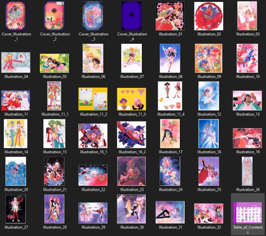
Do you just wanna scope 'em out? Look at some disaster gays? Grab your favorite one or two? This is the path for you! Check out the ‘compressed’ (not very) 10k ‘web friendly’ (not really) copy at the Bibliothèque, the media archiving wing of the Something Eternal forums at Empty Movement*. All the following links are also available from here.
Do you want these copies? All of them? Don't just grab them individually, friend. This batch is 375MB and can be downloaded as a zip of the individual files here on our Google Drive.
Do you like digital archiving? Are you looking for a copy that preserves the archival quality of the effort but sits nice and comfy in a single file? This is for you. A minimally compressed 10k, 513MB version worked into a PDF is now up, shiny and chrome, on the Internet Archive.
Do you like the idea of the minimal compression, but want the individual files in a zip? Yep I did that too, here's the drive link.
Are you looking to print these in a larger size? This is probably the only reason on Earth you’d ever want them, and yet a bunch of you are going to go straight for these. Here are the zero-compression JPG full size copies, most of them are 15k across, like simply a ridiculous size. Pick your fave and download it from our Google Drive!
I am genuinely really proud of this work.** I was able to tease out so much new detail from these…her incredible layering techniques, the faintest brush of her highlights, and the full range of her delicate hand at whites and blacks… details commonly lost in digitization. I sincerely hope you find something here that you’re looking for, as an artist looking for inspiration, as a weeb looking for a desktop, as an archiver excited to see incredible 90s manga artwork saved forever in the digital realm. I feel like I have already said so much about them, and could keep going, but you know what? This work speaks for itself. Enjoy, use, explore, and definitely tell us what you think!
We love y’all. ~ Vanna & Yasha
* AHEM ASTERISK AHEM
You might be wondering what any of that is. Something Eternal? Biblewhatawhat??? EmptyMovement.com? You might even have done a double take at the word ‘forum.’ And you should!!!
I have a confession. This artbook was my ‘side project’ as I worked on this, *the main project.* For a couple years I’ve been banging around with a new domain, and originally I had other plans for it, but Elon Musk ruined my Twitter and Discord is well along on its way to enshittification, and well….we joke on the Discord a lot about ‘reject modernity, embrace forums’ and you know what? We’re right. So Yasha and I are putting our money where our mouths are once again, and doing something insane. We are launching, in 2023, a website forum. Obviously, this is not the official ‘launch’ per se, but I cannot announce the artbook without directing you to the forum, since it sits on the attached very cool gallery system. Oops! Told on myself. Another post more focused on the forum will be forthcoming, but if you are just that motivated to get in right away, you absolutely can! (This will help stagger new arrivals anyway, which is good for us!) If you would rather wait for the ‘official’ launch, by all means that’s coming, including a lengthy screed about how and why we’re doing this. In either case, remember: this is a couple weebs trying to make internet magic happen, we are not website developers by trade. Give us grace as we iron things out and grow into this cool new website thingie…hopefully along with some of you! :D
If you do join up, naturally, there is a thread about this project!
** If you like this kind of content, consider helping us pay for it! We do have a Patreon! If you’re wanting to use these in some public-facing distributive way, all we ask is for credit back to Empty Movement (ohtori.nu or emptymovement.com, either will work.)
I would like to say ‘don’t just slap these files on RedBubble to get easy money’ but I know that saying this won’t effectively prevent it. Y’all that do that suck, but you’re not worth letting it rain on the rest of this parade. :)
#revolutionary girl utena#utena#rgu#sku#empty movement#chiho saito#90s manga#digital archives#manga aesthetic#shoujo kakumei utena#utena art
2K notes
·
View notes
Note
Hi, I apologize if I'm being annoying but I love your shipping au and I was thinking of something and wanted to tell you
What if once the shipp that is most trending is MC x the worst possible noble of that country. Like, people notice mc has a lot of chemistry with glasya or bimet and instead of a king there is now a whole thread talking about how mc should stay with the noble instead of the king? I think it would be really funny
Oh, I love this. Mc that has terrible taste in men is so real.
*Glasylabolas posts a photo of him kissing Mc*
Glasylabolas: Task failed succesfully
Foras: I'm glad you like the dead so much because there's no way you're going to keep on living after this
Barbatos: I'm preparing the candles
Glasylabolas: It's fineeeeee I made it so only people that follow me can see it. His majesty Leviathan doesn't follow anyone.
Dantalian: BROOOOOOOO THIS IS SO COOOOOOL
Glasylabolas: I know, right? The child of Solomon is my significant other now. Everyone else can go cry about it.
Dantalian: You'll be sharing with your bestie, right
Dantalian: 🥹👉👈
Glasylabolas: Of course
Dantalian: Yepeeeee
Glasylabolas: Tell Ronové to check his dms
Dantalian: He's busy. We're in the middle of a battle
Glasylabolas: I don't care, I want to see if he has time in his scheduel for our threesome
Dantalian: wait... I thought I was your bestie!
Glasylabolas: I have many besties, Dantalian
Glasylabolas: Most of them from Abaddon. You people trully understand me
Dantalian: It's fine. Wanting to fuck corpses is tame. Just yesterday someone died from getting fucked by a horse.
Glasylabolas: Crazy
Dantalian: Can I have more pics with you and Mc? I want to make an edit
Glasylabolas: Absolutely, just send it to me directly
Dantalian: sure sure
*Glasylabolas posted 10 more photos*
Dantalian: wiat ill doiy when i grt homt
Glasylabolas: Are you having a stroke?
Dantalian: m typng wjth m feert
Glasylabolas: Pop off
5 hours later
*Dantalian posted an edit*
Dantalian: It's done!
Glasylabolas: This is great! Though why is the song "Be my bad boy"
Dantalian: Because you're the bad boy and Mc is the badass dom
Glasylabolas: They haven't dommed yet
Dantalian: yet
Gamigin: WHAT THE FUCK IS THIS??????
Paimon: It's not even photoshopped... Glasy, how could you?!
Eligos: Nooooooo out of all the bad decisions, Mc made the worst one
Amon: I think I just lost my appatite for the next century
Dantalian: Come on, guys, it's not that bad!
Amon: @Gamigin are there any free beds in Paradise Lost? I think I need emergency medical attention
Gamigin: I'll send Buer over
Amon: Thx
Eligos: This is fucking outragous
Paimon: My main question is how Glasy is still alive
Foras: @Glasylabolas I think you should brace yourself
Gamigin: What happened?
Barbatos: Hi guys!!!! So, his handsome majesty Leviathan took care of everything. His last words were "This is hot"
Gamigin: Is he dead?
Paimon: Good
Dantalian: He was a good devil.
Dantalian:
youtube
Dantalian: Stay strong, brothers
Foras: He's not dead, just unconcious
Paimon: Bumeeeer
*This forum has been terminated at the request of his majesty Leviathan*
#whb#what in hell is bad#whb glasylabolas#whb foras#whb barbatos#whb leviathan#whb dantalian#whb eligos#whb paimon#whb amon#whb gamigin#shipper au#whb x reader
131 notes
·
View notes
Text
First, I LOVE Crowley and Aziraphale. LOVE THEM. I mean, just take a glance at my pfp. And my sketchbook. And my fanfics.
Second, I LOVE David Tennant and Michael Sheen. LOVE THEM. Probably more than is reasonably necessary, given when I mention "my favorite actor," my family and friends know exactly who I'm talking about (It's David, btw).
I'm also sort of new to the fandom on Tumblr, and I've become baffled by some of the comments I've seen about David and Michael and their friendship. I think it's adorable and lovely that they seem to have such a special bond after filming Good Omens, a bond that continues and has included their partners (partly out of necessity while filming Staged, but I think that only helped cement their friendships even further).
But what truly baffles me is the picking apart of every image that features David and Michael, especially when Anna and Georgia are included and when they aren't. I've seen fans wondering where Anna and Georgia are if they're not in the image with their partners (and what that could mean for their relationships with Michael and David), speculations on whether or not the women have been photoshopped in when they are in the pictures, cruel comments about Anna (especially) and Georgia (sometimes) about their age or their acting choices or their relationships with their partners or with each other (especially when they're being silly on Instagram) or . . .
Anyway, as someone with a spouse who works in a very busy, very public (in our city) profession and who is well respected in that profession, I feel for Anna and Georgia. It's as though there is this obsession or even downright desperation to make everything about how Michael and David feel about each other, to push Anna and Georgia out of the picture, literally and figuratively, forgetting there are families involved. As if Michael and David really are Aziraphale and Crowley and really feel for each other like Aziraphale and Crowley feel for each other. And who knows? Maybe they do?
But we don't truly know what goes on behind closed doors, and the comments and speculations are cruel towards Anna and Georgia, who have real life relationships with Michael and David.
They're all human. Celebrities, yes, but even celebrities deserve to have some privacy outside their jobs. And that's what Aziraphale and Crowley are at the end of the day. A job for Michael and David. A very enjoyable one, based on their interviews with each other, but afterwards, they have homes and families and lives outside the work.
David and Michael's relationship is theirs. Not the fandom's. Theirs.
Anna and Georgia's relationship is theirs.
Michael and Anna's relationship is theirs.
David and Georgia's relationship is theirs.
The relationship the four of them and their families have with each other is theirs. And they all deserve to not have people speculating on public forums about what's happening between them like some tabloid magazine. If they want us to know, they can tell us. Let them make that call for themselves.
In the meantime, we can write fanfics, make fanart, fantasize about who they truly are and how they truly feel. Delight in the images they share and the work they do together. Whatever. But I think it would be great if we could just let them live their private lives, too, and have as much normalcy they can get under the circumstances.
And, finally, Anna and Georgia seem like such lovely humans and deserve as much love and kindness and respect as is bestowed on their partners every single day in this fandom. Because they're human too, and all humans deserve that.
That's all I have to say about that.
Edited to add: I guess I'm not quite done, because someone in the comments said they were like me until they read/heard some of the things David, Michael, Georgia, and Anna have said, presumably about each other.
I'm not so online that I know everything they've put out there, but I do follow those in the group who have social media, and have watched/heard all kinds of interviews and convention Q&As.
My takeaway: Whatever they say about each other, whether it's Michael or David, or Georgia or Anna, I take it with a grain of salt. They're all actors. What we're seeing or hearing from them may not actually be their real personalities and feelings behind closed doors or even in their own heads. I think they just like to be snarky or silly about each other, because it makes the fans smile and swoon. And maybe they just enjoy being playful with each other and about each other. I mean, it's fun.
What's not fun is the fans reading too much into every single thing they do or say with each other and try to turn it into something that it probably isn't, especially at Anna and Georgia's expense.
Okay, now I'm done.
#good omens#aziraphale and crowley#david tennant#michael sheen#david and michael#anna lundberg#georgia tennant#i may regret this#but it needed to be said#david tennant and michael sheen#david and michael shipping#david and michael shippers#just let them be#neil gaiman#crowley#aziraphale#my thoughts#thoughts that keep me up at night
150 notes
·
View notes
Text

tutorial contents:
1 ‣ gshade & photoshop actions
2 ‣ template or cropping & colouring
3 ‣ notifs & pop-ups
okay hi! i have a really old editing tutorial from back in january that i've been linking people to, but it's pretty outdated by now. i also keep getting anons asking about the same things, which is fine, but i always have to go searching for the post explaining it, so having it all in one place will be a lot more convenient lol
i use a ☠ copy of photoshop cc 2017 to edit my screenshots, however the majority of everything i'm doing also works on photopea
photopea is an online version of photoshop that's 100% free and works very well! i can't recommend it enough, it's fantastic
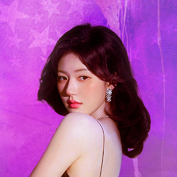
first things first, you're going to need some screenshots to edit. for the sake of this tutorial i'll be working with this one of raffy:
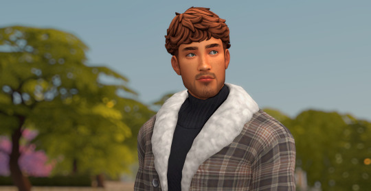
in all honesty, gshade will do most of the work for you. of course it's not needed, but i definitely don't think i could live without it! in this screenshot i used sunset n' vinyl by nesurii
when opening the screenshot, the first thing i do is run it through 2 photoshop actions:
butter action by early-grape
smooth sharp (no topaz) by poolbrop
to add actions in photoshop go:
windows > actions > the 4 lines at the upper right corner of the newly opened window > load actions > your downloads folder > open up the .atn files!
if you're using photopea, as far as i'm aware you can't use photoshop actions, but i've found that 'filter > stylize > oil paint' and 'filter > sharpen > smart sharpen' have a very similar effect when using the right settings. try these:
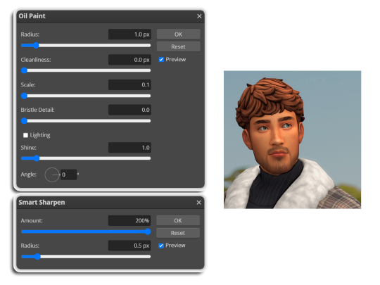
i like these two actions because they smooth everything out nicely, but keep it sharp at the same time! i always run butter before i run smooth sharp, however butter may leave you with 2 layers. make sure to merge these layers before running smooth sharp to achieve the full effect.
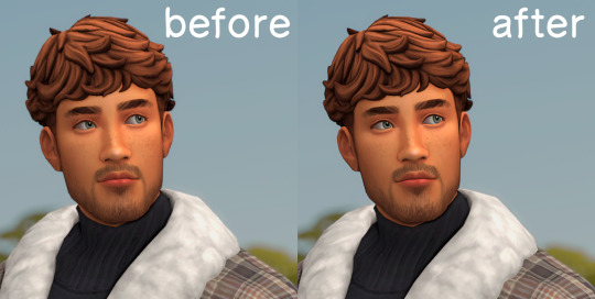
here's a before and after (of the photoshop action):
from here you can move on to step 2
before anything else i want to share the template that i use to make editing a lot faster. you don't need to use it but it's definitely made things a lot easier for me! it's a .psd file and will work perfectly in photopea
download (simfileshare)
if you're using the template you can skip right on to the next section, as it's already cropped to the right size and has the colouring folder included. just drag your screenshot into it and resize to fit the height.
if you're not using it, crop your edited screenshot to:
1707 width x 1280 height
then adjust the colours to your liking. it always varies slightly depending on the picture but my regular process for each screenshot would be:
up the saturation by 8%
up the lightness by 3%
up the contrast by 12%
all of this can be done by looking in the 'images > adjustments' tab
you should end up with something similar to this!
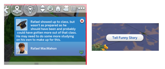
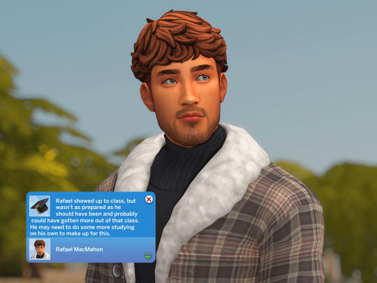
if you want to add a moodlet or social interaction or anything similar, it's all the same process. what you'll need is a screenshot of it straight from the game. i just press the 'c' key to capture them! i'll be working with these two:
for the blue notification i'm going to select it using the box select tool. try to get it as exact as possible. one you have it selected
for photoshop users:
click on the 'select and mask...' option located at the top
adjust the global refinements at the side as follows:
smooth: 70
feather: 0.0px
contrast: 50%
shift edge: 0%
for photopea users:
go to select > modify > smooth
set it to 15
select 'ok' and press 'ctrl + c' to copy it, then 'ctrl + v' to paste it into your screenshot. adjust the size and position and you should end up with something like this:
next you want to add the transparent border around the notification. if you're using my editing template, right click on the reference notif in the layers tab and select 'copy layer style' (photopea > 'layer style > copy'). from there you can paste that layer style onto your own notif through the layers tab.
if you're not using the template, here's how to set it up on photoshop:
right click your notification layer and select 'blending options'
under styles, tick the checkboxes for stroke and drop shadow
input these settings:
on photopea, it should be more or less the same. repeat the exact same process with the social menu option, but instead of selecting it with the box select tool, use the magic select tool. in the end you should end out with this!
from here you're finished! thanks for reading! go to file and export as png
if you've got questions never hesitate to ask, just make sure to read the faq in my pinned. i might edit this post soon to include the gen intro traits and aspirations bit, but this is all for now. hope it helps, my editing process post has been in need of a revamp for a very long time. i haven't proof-read this so apologies for any mistakes!
#ts4#sims 4#ts4 tutorial#5 anons in my inbox asking the same question after not reading my faq#this ones for you#3 anons in my inbox asking about cas pics#ones coming for you soon#okay maybe not soon but sometime#all my free time has been eaten up#i signed up for extra saturday morning classes and not having a lie in is sucking the life out of me lmao#when i'm busy i just wanna play video games and when i get the chance#to play games i just wanna sleep#its a vicious cycle#i'm currently playing resident evil biohazard tho#enjoying it very very much#i've only got 2 and 3 left to play and i've played every mainstream re game 💪💪#it was a very fun journey! i played them all within this year#long post
1K notes
·
View notes
Note
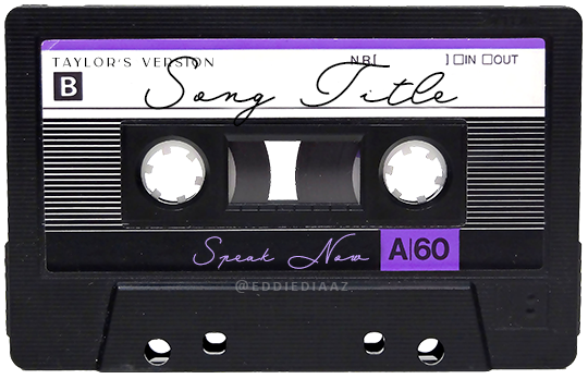
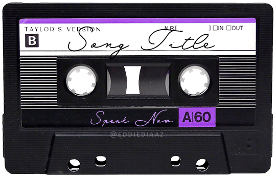
Hey!! I just wanted to say that your recent speak now gif set is sooo stunning. I was wondering how you managed to create that cassette tape effect if it isn’t any trouble? It’s really so pretty.
Have a great day! ✨
ahhh thank you so so much! first of all, i cannot take any credit for this effect, as it was greatly inspired by this amazing yellowjacket gifset by @thewintersoldier!!
but here's how i recreated the effect, from a cassette png (found on pngwing here), to this animated cassette effect (as seen in my speak now set):
psst: i usually always create in photoshop cs5, but for this effect you need a recent version of photoshop because it's using transform keyframes (i think cs5 doesn't let you do that, or i just don't know how to lol). i used cc 2019 for this.
sorry if this is lengthy or has too much or too little details haha, but i hope it's comprehensible! english is not my first language so i also apologize in advance for any mistakes!
I. PREPARING THE CASSETTE
so, starting with the png here:
i removing everything i didn't want on the cassette png with the brush tool by just drawing the right color over the unwanted text. for the color, i then went to image > adjustments > hue/saturation and in the red tab, i played with the hue slider to get that purple color. finally, i added some text to my liking, and this is what i ended up with:
(not necessary but: i also selected the white lines on each side with the magic wand tool because i wanted these lines to be transparent. once your selection is done, go right click > layer via cut. it will create a new layer of the cutout you just made. you just need to disable or delete the layer to make the selection (lines) transparent.)
at this point you want to have only 2 layers: the revamped cassette and the text layer. you can remove the text layer actually, and just add the title back at the end, as it is not necessary for this effect. i just like to have the visual.
if you have multiple layers, you need to select all of them (except the song title layer), right click on the png layer and click on merge layers. this will create one layer with all the editing you made on the cassette. if you think you will need to edit this later though, i would save the file as a psd before merging the layers.
II. THE EFFECT
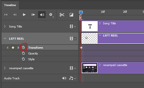
okay, so now that you have your cassette, make sure your video timeline is activated, not frame animation, and you are ready to go.
first, you want to create a perfect circle shape around one of the reel with the elliptical marquee tool (hold shift while dragging the circle). make sure it covers the entire area that will later be rotated. make sure this circle is perfectly centered around the reel or otherwise the animation will be a bit lopsided.
then right click on this selection and go "layer via copy". this will create a layer of only that circle selection. important step: right click on that new layer and go "convert to smart object". the layer should look like that, i've renamed mine:
now if you go to your timeline and open that new smart object layer, you will see that you have 3 keyframe options. we only need the transform one.
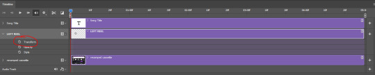
go to the start of the timeline and activate the transform animation by clicking on the stopwatch button. a keyframe will be created automatically.
to create the actual animation, move the position of the cursor on the timeline further, i put mine at the 01:00f mark so it's easier to create the right timing.
then what you want to do is select the reel smart object layer and hit ctrl + T. a box will appear and this is how you will make the reel rotate.
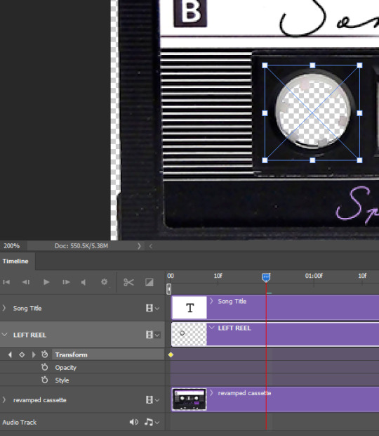
to rotate the reel shape, move your cursor near the blue box on your canvas and drag it until you have rotated the shape halfway through and hit enter. another keyframe will be created and if you play your animation, the reel should rotate on itself for half a turn

move your position on the timeline to 02:00f and do the same thing: select the left reel smart object, hit ctrl + T, rotate for another half turn, and hit enter. this third keyframe should be the last one needed for the animation and you should have a full animated rotation of the reel.
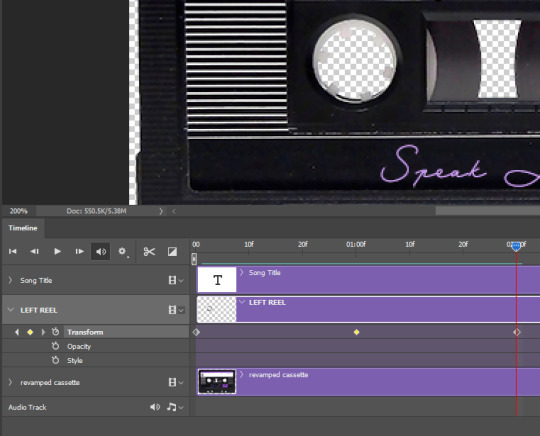
play your animation, and adjust the speed to your liking by dragging the keyframes on the timeline (but make sure they stay within the same distance from each other). the closer the keyframes are, the faster the animation are, and the further they are, the slower it'll be.
then you can just trim the smart object to your animation's length, and duplicate (right click the smart object > duplicate layer) this layer the amount of times needed (i find this less finicky than duplicating keyframes), and placing them one after the other. three full turns should be enough. this is what my timeline looks like right now:
and my animation for the left side looks like this:
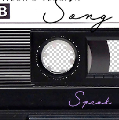
as you can see, we can see the little "dents" peeking through behind the animation. we don't want that! to remove it, select the revamped cassette layer (that should be under the reel smart object), and create another perfect circle around it with the marquee tool. this time make sure it's smaller than the previous one, it just needs to cover these dents.
then right click on this selection on your canvas and go "layer via cut". this will create a new layer with that selection, and all you need to do is to disable it. this is removing the information in that circle.
once you are happy and the animation works, you can just delete that cut layer. now the animation is done and looks like this:

III. SECOND ANIMATION
one you have done it on the left side, you just gotta do the same thing on the right side. you can also try duplicating it, but i found it finicky for some reason (or maybe i'm just not used to the controls of this 2019 photoshop version?).
this is what i have once i've done the same thing on the right reel:
once i am happy with the speed and everything, i want to have only one layer so it's easier to use on gifs. first, i will save this animation as a psd file, in case i want to reuse it. then i am removing the song title layer and will be flattening everything and creating frames from this animation. to do so i am using the "save" action from here.
i'm not sure why it does that, but it's creating a couple of frames where the reels are a bit offset from their position everytime there's a full circle done, so i just delete these 5-6 frames. you can also change the speed here, but by default it should be 0.05.
once you are happy with it, just turn these frames into a smart object with the video timeline again (convert frame animation to video timeline and select all the frame layers > right click > convert to smart object)
now you have a smart object that is ready to be used anywhere!
IV. FINAL TOUCHES
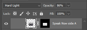
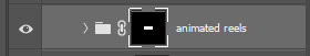
for my particular speak now gifset, i have multiple layers of the animated cassette on each gif:
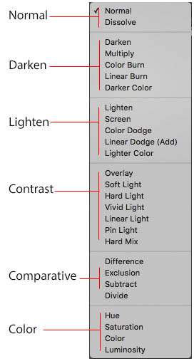
1, bottom one - cassette layer set to the blending mode "hard light" and set to opacity 86%:
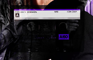
2, middle - this same cassette layer set to hard light, but with the opacity at 100%, AND with a layer mask so it's only applied to the animated reels (i wanted them to show up more):
3, top one - and finally a third layer with another layer mask because i wanted the white label and speak now area to be less see through. it's set to the normal blending mode and the opacity is at 75%

and then i just added the song title on top at 100% opacity and normal blending mode, and added some drop shadows, and tada!
there we have it, i hope this was helpful <3
#alie replies#Anonymous#photoshop#tutorial#*ps help#completeresources#allresources#resourcemarket#userrobin#userraffa#userpjo#usertreena#tuservaleria#tuserheidi#userdean#userrainbow#usersalty#userzaynab#usernik#swearphil
360 notes
·
View notes
Text
Oh this is going to hurt... a lot.
I should be worried if the first thing I do after an episode isn't open Photoshop. Normally, I would now recall the best scenes of the series and decide on a set… But not today, even though I have the time. I once wrote that when a series can no longer catch me, you can tell by the fact that I stop making gifs… Okay, sometimes I just don't have the time. But today… I wouldn't even know which scene to choose, because there was nothing that got me, nothing that excited me and nothing that I felt emotional connected to. Instead, I have a lot of thoughts in my head that all want to get out somehow.
After the over-emotionalization of the last episode, I had actually already given up on Last Twilight. And that really hurts to admit. I loved the series from the very first second and I just thought it was so good! The problem for me was that they tried to just touch the audience's tear triggers, their emotions, all of them. And they forgot that too much of a good thing is simply not good. For me, episode 11 was right on the edge of what was bearable and I still don't think Day did the "right" thing. You're allowed to argue in a relationship and hold different opinions and then talk about why you hold a certain point of view, for example. If the other person can't deal with it, if you can't find a compromise, then you have to take the consequences, yes. But that wasn't even done here.
Day insinuated that Mhok pitied him, didn't listen to Mhok's side and today we learn that Mhok really only felt pity? Really? And that he is happy Day broke up with him so he could grow? Really? That is so fucking stupid. Day has problems with pity, that's understood and ok, but it's also ok for Mhok to make his own priorities in life and decide for himself not to want to leave, but to stay with the person he loves. But Day took that decision away from him. They could have talked about it. Different perspectives can also make a big difference. But no. Day pushes Mhok away and Mhok lies to Day… But back to tonight's episode. I was actually done with last week (yeah nope, I know). You can see that they tried to find a highly emotional ending that everyone seems to agree with and can cry into their handkerchiefs. The number of fuck yous I hurled at my laptop today shows me that the trick didn't work on me. It was all so over-emotionalized that it just felt fabricated and fake. And that's so sad, because the show felt so fucking real until episode 10. And now it was a weird cliché-ridden cringe-fest.
Honestly, if I had been dumped like Mhok and then ignored for three years, the time I spend thinking about that person would be really wasted. I'd be so fucking angry (probably not anymore after three years, I just wouldn't care). But Mhok immediately starts flirting. They pick up where they left off, but there's three years and thousands of kilometers between them. Unrealistic for me. And then Mhok just carries on, whispering to Day about what's happening and what's going on and just acting like his boyfriend again, holding his hand, helping him get dressed, showing him where everything is. I was a bit surprised that he didn't feed him. And Day is confused and just smiles. I think as a viewer I was the only person who was angry at the end. There were no bad emotions. Nothing. And that felt so fucking wrong!
And then comes the wedding and talk of second chances and of course Day says no because he's too scared someone will take pity on him. Yeah, fuck man, shit happens. and Mhok can't or won't give up. An emotional chase begins and the bride and groom leave their own wedding for the two of them and I lost faith in everything. And of course the plane is gone and of course they're all checked in because the passport was scanned and of course Mhok turned around and went back and of course he clued Night in and of course they end up doing the same dance they did back then and of course the family watches them get back together. And of course the series ends with a bunch of sugary sweet scenes from "call me mom" to sunset and let's repeat this most beautiful and heartbreaking moment from the past epsiode without any emotional impact. It was so predictable and so, I'm sorry, so bad. I'm so angry! And of course he gets his sight back. After all, what kind of a message would it be if Day remained blind? Is that possible? That a blind protagonist can find happiness and love and lead a successful life? No, it's not possible. He has to be able to see again. He has to become normal again in order to lead a normal life. What a shitty message! Damn!
Sometimes less really is more. Not everything has to be perfect and normal. At least that's the lesson I thought I should learn from this series.
If anyone has any gif requests, my inbox is open, but I don't think I'll be making any on my own. At least not today and not with this anger in my stomach.
#josi watching bl#just my thoughts#just my opinion#last twilight#last twilight the series#last twilight ep 12#I want to scream right now#I am still so fucking angry with this ending#bl drama#bl series#thai drama#thai series
134 notes
·
View notes
Note
I remember this one time when Meghan said in her interview/podcast (or someone said this in her behalf) that Meghan was bullied relentlessly in school because everyone thought she was perfect, and I laughed my ass off at how off kilter someone's self assessment can be. Ifnwo deed then how she and why she was saying this. And now I think that was major projection because at some point she may done some reflection on why she has so many problems with Catherine of all people.
I think this photogate scandal explains that theory - that someone can be bullied because of their perfect image. A lot of other celebs are able to shake off major scandals of they have a perfect public image. For example, if someone came and said a horrible thing about Meryl Streep most people would simply ignore it. But it's because there is a huge PR machinery behind a celeb,and a huge celeb is a huge money making opportunity for those directly linked to them. So everyone from the agent to the associated brand goes into salvage mode.
When it comes to Catherine though, because her position she does not and cannot rely on a project created narrative. she is not an celeb, or a performer, she is a famous person. And even though she has been in the public eye for nearly 20 years, her role wasn't even constitutionally relevant till 8th Sept 2022, the day she became Princess of Wales. And even now, it is because of the constitutionally relevant role that her husband has.
This uniqueness of her position, the subltle nuance of that, is hard for the layman to grasp. Especially an American audience that culturally is very celeb and money centric. I say this because I do believe that controversial opinions and the wildfire of speculations about her are majorly coming from American commentators. American social media creators who rely on 40/20 sec clips on tiktok and insta have found that "where is Kate" is the biggest most lucrative click bait right now, and everybody and their grandma now has an opinion on it.
We live in a world of Charlene, Dubai princesses, Thai prinesses, North Korean dictators daughters/sisters/wife but we don't touch that with a 100 ft pole. Because it's uncomfortable. Because we know that noone is going to do anything to look into that.
But Catherine and husband's relationship is a free for all, all day buffet. Because she made herself available and catered to public's sensibilities. And when she drew a boundary she wouldn't budge. So everyone's sentiments get hurt now. The same people who gossip about her now would happily call her a step Ford wife and a clothes horse but ohh and ahh over her coat dresses and shiny hair and lovely shoes.
Noone stops for a second to think that maybe this woman is feeling unwell, is recovering from a surgery, has a serious medical issue and would like to recover at home without having to put on makeup and fake small talk with strangers.
We cry about feminism and equality and women's rights, but only applaud women who exhibit overt ambition. If a woman wants to stay at home, and is able to afford that, it's problematic. We want a woman to value self love and self care but if she prioritizes her health and care above public opinion she is dragged through the mud. Her health, her looks, her morals, her husband's morals, integrity, family values, privacy, her children's health, children's right to privacy....everything is open to discussion. And it's ok.
It's shameful and appalling that not ONE journalist, not one person with power, not one paper, publication or news Network has publicly spoken out in her favour and called out the bullying. This is not a Photoshop issue. It's just disguised as one. This gleeful gossiping about her "disappearance" is a gross violation of her rights.
Everything you've said is spot on. It is 100% American busybodies driving the criticism, controversy, and scandal. We/they don't understand what it's like to have someone who is above celebrity because our culture sees celebrity fame as the objective end-goal, so we demand for everyone to fit into our model of celebrity.
And while I have to give Meghan the benefit of the doubt and agree that she may have been bullied at school, I don't think it was for being perfect. That's Kate's story. All Meghan has done, since 2016, is portray Kate's life story as hers.
79 notes
·
View notes
Text
Because apparently I can't let anything go...
So a few days ago I made a post about Buddy Daddies' first anniversary coming up and I wasn't going to make something "official" but the brainrot is too strong so here we are...
This Sunday, January 7th, it's exactly one year since the first episode of Buddy Daddies was released! And I think that calls for a celebration!
I put everything under a cut because this got really long
I came up with a few things that the fandom could do to celebrate this adorable family! Of course these are not exclusive things! If you want to contribute anything that's not listed below, go for it!
1. A weekly rewatch of the episode that aired a year ago
Starting Sunday January 7th, we rewatch the episode that aired on that date last year. Nothing is stopping you from binging the rest of the episodes that day, of course! It would just be fun that a lot of us watch the same episode on the same day (or through a watch party if anyone knows how to do that)!
2. Create!!
This is literally what it says: create! Just anything related to the episode of that week!
There are so many options, but I'm just giving a few things I could come up with
- Fanfics surrounding that week's episode. Dive into a scene you wished had more details. Write a scene you feel should've happened in the episode but didn't. Write a scene for a headcanon that you have. Really anything you want (it would be fun if it had something to do with that week's episode, but no one's going to punish you if it isn't).
- Make a gifset for that week's episode. Make a set about your favourite character from that episode, your favourite moment, favourite quotes, favourite outfits,... Anything goes really!
- Make fanart! There are so many talented artists in this fandom who make amazing pieces of art! It would be fun to see you make something that links back to that week's episode. I'm thinking about redrawing your favourite screenshot in your style. Draw your favourite moment. Draw a scene that you wish happened in the episode. Redraw your favourite piece of Lily art in your style! (I know this last one is less linked to the episodes but who cares). You brilliant people can probably come up with other things still!
- Write a theory/headcanon/character analysis/... I have seen so many people write insightful posts about things that weren't explicitly shown on screen. There are characters we get very little background info over. Characters that we know a few things about but it feels like there can be so much more written about them! Write about your headcanons, both for past and future versions of the characters. Write your theories about certain things. It feels like there's still so much to say about this anime and a lot of people out there who know how to put those things into words!
- Make an edit! This can be a video edit, a literal photoshop edit. Make wallpapers, phone backgrounds, profile pictures, memes,... Anything you want really!
3. HAVE FUN!!
I know it sounds like it, but there really aren't any rules to this! Just have fun! It would just be fun that whatever you decide to post is in some way linked to the episode, but that's not set in stone, obviously! Just enjoy!
I think it would be fun to dedicate a week to each episode (so a 12/13 week event if we count the recap episode), starting on the day that episode first aired last year and ending the day before the new episode aired (ex. for episode 1: starting on Sunday, January 7th and ending on Saturday, January 13th). You can decide if you just want to post something about your rewatching the episode or if you want to create something. If you want to make something, you can do multiple things if you want.
And again: no one is going to punish you if you posted something from episode 1 during episode 2's week! We're all busy and don't always manage to get something done in time, so don't stress about not being able to finish something "on time".
Lastly, I think it would be fun to make this into a hashtag as well! I thought of using the tag #Buddy Daddies Anniversary (very on the nose, I know, so if someone knows something more fun, please share it with the group).
And like I said before: HAVE FUN!!
#Buddy Daddies#Rei Suwa#Kazuki Kurusu#Miri Unasaka#KazuRei#Buddy Daddies Anniversary#Me 2 days ago: I'm not making this anything official#Also me the past 2 days: but what if I did#It really doesn't matter what you make#It would just be cool if it was linked to that week's episode but again not an obligation!#We're just celebrating this family!
84 notes
·
View notes
Note
your icons are soooooo so cute honestly!!! i wanted to ask if there's any way you can make a tutorial on how to make them? of course if you want, if you don't want to, that's okay :)
Hi! I really appreciate that you like my icons, thank you so much! 💖💖💖🥹
It's been a long time since I've done a tutorial so I hope I can explain it well haha
So I will explain how i go from the original picture and the final icon below:
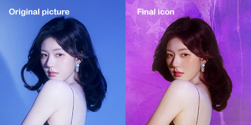
I'm using Adobe Photoshop 2024 but you can use other versions too!
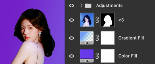
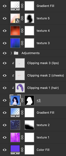
First, I create a 250x250px document and apply a random color fill layer to be the background color of the icon, you can do it by going on Layer > New Layer Fill > Solid color (the color in this moment doesn't matter because I change them later according to the picture I choose to edit).
Then I place the picture I want, adjust the size to make the subject on the center and apply some smart sharpen:
I apply some adjustments to try to color correct if the original picture using Levels, Selective Color and Color Balance to get something like this:
If you want to know the exact adjustments settings I used on this picture you can download the psd here.
To remove the background, I do the hack where I go to the Properties panel (Window > Properties) and click on the "Remove background" option. It's not always that I will get a perfect result but I think it makes easier for me to adjust the little details such as hair and accessories, etc. And I do that using the Lasso tool (shortcut L).
Now, with the background removed I pick a color that I think will match the icon in the Color Fill layer that I created before. To make the background more "fun" I like to add a Gradient Fill layer (Layer > New Layer Fill > Gradient) with a color that might go well with the one I picked earlier to make a smooth and light gradient.
My result until now:
Now it comes the fun: adding textures! I like to add some textures to make the icon more lively and I usually download them on deviantart or on resources websites. You can download some cool textures here, here and here. On this part I really test a lot of textures with different Layer blending. There are a lot of different blending options so you can try as much as you want.
Other thing I like to do is add a clipping mask above the subject layer when I want to color something specific in my picture such as the hair, the clothes or even applying some "fake" blush on the cheeks. I do this adding a new layer, then using the shortcut option (or alt) + command (or ctrl) + g to make it a clipping mask and then using the Brush layer to color what I want. For the blending mode I usually use Soft Light and sometimes Color if I want the color to really stand out.
And in the end I will have something like this:
And my layer tab will be like this:
For using on the dashboard I usually resize it to 100x100 to make it look more sharper and defined but it's really a choice, you can already start making your icon using the size you want, I just prefer doing on 250x250px because i'm used to.
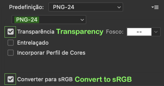
To save it I use the shortcut shift + option (alt) + command (ctrl) + s to save it for web with these settings:
And that's it! Sorry for not going to deep in each step but I guess you can get the feeling when you try making your own icons! Is really about trying different methods and things until you became satisfied with your result.
54 notes
·
View notes
Text
Middle Kingdoms "Tale of the Five" Mark V covers, minimalist (type 1) group, TDIF
This is the only one of these where I'm not going to put the work under a cut, because there are going to be twelve of them before I'm done, and I don't want to bore people with the roughs in progress.
So this was the sketch for this group's Door Into Fire cover the other day...
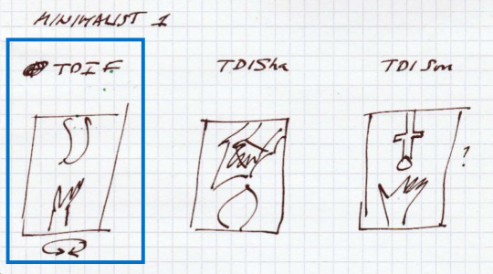
And here's a rough example of what I was seeing in my head.
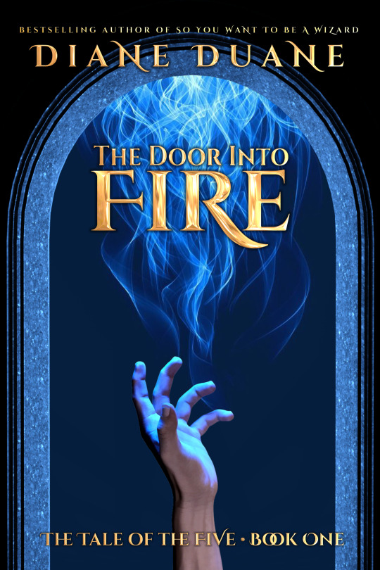
Possibly a little on the nose, but (a) I had to start somewhere, and (b) it was 1 AM when I finished work on this one and I was beyond caring. :)
The "since we're talking about doors, let's lean into that" concept is one that's appeared in previous covers on this series—both mine and other people's—but none of mine have looked this polished, because I just wasn't as good at this stuff ten years ago as I am now, and I've now got far better tools.
...Though one hilarious exception to this situation has been applied to the lettering. The extremely nice Eye Candy plugin from Exposure Software once in its much earlier versions ran on both Corel Photo Paint (my preferred design software for pushing three decades now) and Adobe's various versions of Photoshop. But for whatever reason(s), that situation came to an end. Now, I have Eye Candy for Photoshop... but I really hate Photoshop, and avoid using it whenever possible.
So in order to add some pop to the Cinzel Decorative font on this page, I had to go elsewhere... which in my case means to the little Samsung notebook computer that lives (mostly snoozing) in the front window of the living room, and is still running Windows XP. (Because of this it's never allowed to go online any more, as it can't be made secure.) I refuse to get rid of it because we've traveled too far together, and I've written too many books on it, and I love it too much. But its other chief virtue is that it will still run Corel 11 (which my newer Windows machines refuse to do). And the install of Corel PP 11 in the Samsung will still happily run the old version of Eye Candy, which has all the familiar presets that I tinkered together over years of use. I really need to sit down, eventually, and figure out how to train the current version of Eye Candy to accept the presets from the older one.
But today is not that day. Today I just plugged in the .cpt Photo Paint file and edited it to add the golden-colored effect on those letters. That was all this rough needed for me to kick it to one side and get on with thinking about the next one.
Anyway, for those interested in materials: the hand and the doorway were created using Daz Studio. The blue fire is stock art. (I do have a very nice app called Flame Painter, from Escape Motions, but I'm not yet expert enough with it to use it much in cover work.) The basic (parent) font is Cinzel, as I mentioned: both Cinzel Bold and Cinzel Decorative Bold variants are used in this cover.
There are still a number of things that can use some tweaking in this one, but as I said, this is a rough. Over the next week or so I'll get around to the other two in this set, and get a better sense whether this whole idea is workable—as if the style doesn't work well across all three covers in the trilogy, it's useless.
And now I'm going to go make some oatcakes, as @petermorwood someone seems to have eaten all the ones I made last week. :)
(cc: @mutantenfisch: Links to the print copies at Amazon are over here, if you don't feel like waiting for the new covers...)
#Middle Kingdoms#Middle Kingdoms meta#The Door Into Fire#cover design#tag to make finding these easier:#MK Mk 5 covers
57 notes
·
View notes
Text
Poe's Giffing Tutorial (From One Beginner to Another)
Hey, everyone! So, I've been thinking about this for a while, and decided to finally make it happen. This post aims to be a giffing tutorial that isn't a bunch of technical jargon that nobody except experienced giffers understands. This is for the person that I was when I first started out: someone who wants to make gifs, for free, without having to learn the entirety of a new program. As such, if you're already familiar with the basics, this probably won't be super helpful to you.
In this, I'll cover the basics of actually capturing a gif, the how-to of color correction (though without getting into the nitty-gritty detail of it), some basic text effects, and some more decorative effects like overlays and ~fancy coloring. I'll also show you the program I use to resize gifs.
I don't have a fun quip to lead us into the next part, so, uh, let's just dive in.
Tools*:
A PC capable of handling heavy processor loads (I use a mid-range gaming laptop; it's a little slow sometimes, but it works)
Whatever you're giffing (obviously...)
ScreenToGif (a free, basic screencapture program)
Photopea (a free, in-browser Photoshop dupe)
RedKetchup (a free file resizer/converter)
*Note: These are not the end-all, be-all of gifmaking. They may not even be the best tools for the job! But they're free, they work well, and they're relatively intuitive.
Step 1: Capture your gif.
I'm going to use ScreenToGif for this. The first thing I do is open the program and click Recorder, which opens the recording interface.

I click and drag (or manually input dimensions in the boxes next to the recording button in the lower right corner) to set my dimensions, and then I press record. The red "Record" button will change to a blue square that says "Stop," and a timer will appear in the upper right corner, showing how many seconds your gif is.
Generally, I'll pause the video 5-10 seconds before my desired start time, to give myself a buffer (you'll be able to delete those frames later), start the recording, and then start the video. You'll probably find a system that works for you once you do it a few times.
Once the scene that I want to capture is done, I'll click the blue "Stop" button, and the overlay will close itself. A few seconds later, depending on how long/complex/large your gif is, the program will pop up with a new window where you can edit. Here's what it looks like:
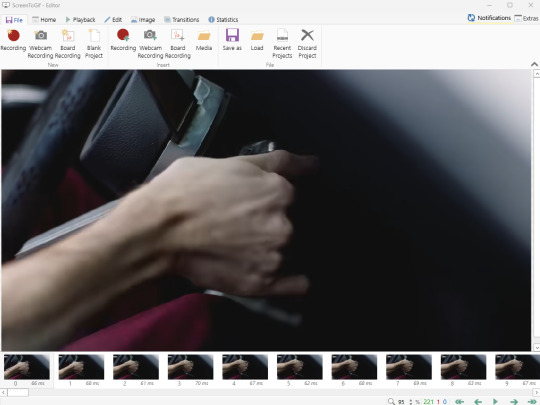
You can do a lot with ScreenToGif, but we'll be using the dead simple stuff today. Click the "Edit" tab, fourth from the left, and this will show up.
"Delete All Previous" and "Delete All Next" are our friends here. Go to the FIRST frame that you want in your gif, using either your arrow keys or just dragging the slider, and select it. Then hit "Delete All Previous." This will make that frame the first frame of your gif. Then, go to the LAST frame of your gif, and hit "Delete All Next." This makes the last frame of the scene that you want the last frame of the gif. You can also use the "Delete" option to delete frames by selecting them with your cursor if you want a more manual option.
Now you have your raw gif! Go to the "File" tab, the first one on the left, and select "Save As" from the menu. You want to make sure that it's saving as a .gif file, not an .mp4 or .apng --- you can check this up at the top. Don't worry, though, as .gif is the default, so unless you change it, you should be golden. Select whatever folder you want to put it in, name it, and save it.
You could absolutely stop here. It is by no means required to color your gifs or slow them down or any other number of things associated with giffing. But if you want to, here's how I do it.
Step 2: Edit your gif.
Head on over to Photopea. You'll see this:
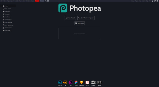
What we want is the "Open From Computer" option. Click it, and your File Explorer will show up. Navigate to whatever folder you saved your gif in and select it by double clicking or clicking once and hitting "Open."
It'll open in a new workspace that looks like this.
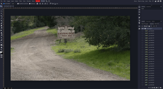
You may be saying, "Gee, Poe, that sure looks a lot like Photoshop!" Yes, it absolutely does. If you're familiar with Photoshop, you will most likely be able to find your way around Photopea just fine, and can probably go from here. But if you're not familiar with Photoshop, here's the basics.
First thing's first: gifs are frequently pretty fuzzy/blurry. Luckily, sharpening them is easy.
Select all your frames (the list on the right with all the numbered layers) by clicking one end, scrolling up/down, holding Shift, and clicking the other end. Then go up to the tabs and do Filter > Sharpen > Smart Sharpen. This will automatically sharpen each frame using a percentage; the default is, I believe, 150%, and this is usually what I use because I am fundamentally lazy.
If you don't select all your frames, only the one that you're currently on (the one highlighted in a lighter color) will get the effect applied to it. This goes for basically anything you do, so it's good to get in the habit of selecting all.
Now that it's sharpened, we can color it. Go up to the tabs again, and go to Layer > New Adjustment Layer > [whatever you want to adjust]. Most commonly in Escape the Night, you'll have to adjust brightness, because there's a lot of dark, moody scenes; Season 3 is also especially yellow/orange tinted, so you'll probably want to color correct it, too, using the Color Balance adjustment layer. This is a total guessing game based on the exact scene you're doing and my method is just selecting random things and adjusting sliders until it looks good (remember: fundamentally lazy). Honestly, I'm not an expert in coloring gifs, so I won't pretend to be — especially since people can and do write entire posts just dedicated to it. For this gif, I'm just lightening it a little.
And if this is all you want to do — no text, no effects — you're done! Go to File > Export As > GIF. It will take a few moments to load, so don't panic when your page freezes. A new window will pop up that allows you to do things like set looping, time, etc. but you can also just "Save" and you're done!
But let's say you want something fun. Maybe you'd like to overlay a quote or make it a cool color. If that's the case, continue on...
Step 3: Make your gif shine.
Three parts in this: text, fun colors, and overlays. You can combine these three to do some awesome things, and they're all very simple to do, once you know what you're doing. Think of them less like steps and more like a mix-and-match deal. You can use one, two, or all three!
So, here we go.
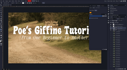
Option 3a: Add some text.
The easiest option of the three, this one works exactly like you think it does. The uppercase T symbol on the sidebar will create a new text layer where you can type something and set a font, size, and color.

I'll spare you the lecture on typography that I could give you — you can find better ones than I could make. Generally, though, you have a decorative/display font for headings and emphasis, and then a different, more generalized font for subheadings and other things. In this, the display font is Heavy Heap, which was used on the Season 3 tarot cards, and the general font is a relatively generic serif font.
(Sidenote: you can load fonts into Photopea! Just go to a font website like Dafont, download the font you want, and then open it as you would any other file by going to File > Open and selecting it from your files. You should get a message that says "Font [Your Font Name Here] Loaded," and then you'll be able to use it in your design. That's how I got Heavy Heap in there.)
You can change size and color with these, which will show up at the top when you select the text tool. Keep in mind that if you're making changes after you type something out, you will need to select (highlight) the text you want to change — it won't do it automatically.

I will admit that Photopea's text editor is not the cleanest, simplest, or nicest to use, especially at first. I came from Canva where it was much faster and easier. The downside, of course, is that Canva is highly limited with what you can do.
There are also ways to warp the text, change the blending, and do outlines, but I'll leave that for another time as to avoid making this any longer than it already is.
Option 3b: Make it a cool color.
You have a couple different ways to do this. Probably the most intuitive is to go to Layer > New Adjustment Layer > Photo Filter. Select the color box, pick the color you want using the picker or a hex code, select your desired density, and click OK. Boom, color over your gif.
It defaults to this vintage-y orange, but you can pick whatever color your heart desires.
However, I usually use a different method using Gradient Maps. This is also pretty easy; Layer > New Adjustment Layer > Gradient Map. If you leave it black and white, by the way, you get a B&W gif (you can also just select the Black and White option in the Adjustment Layer menu). Click on the gradient, select the white square on the right side of the gradient line, and then select the square down at the bottom of the window and change it to whatever color you want.

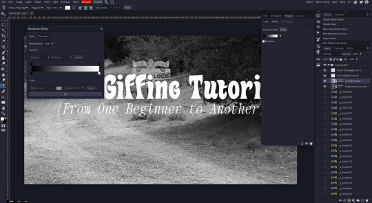
For this gif, I'm leaving it B&W.
(You can have a lot of fun with gradient maps. Play around with them!)
Option 3c: Overlay another gif on top.
Ooookay, so, this is the most advanced and tedious of effects to do (at least of the ones documented in this post), but it's worth it, I promise. For this, you'll need at least one other gif. I usually use a base gif that's relatively neutrally colored, oftentimes B&W but sometimes just faded or pastel, plus one (or more than one) colored, brighter gif. These are, of course, just guidelines — combine whatever gifs you want. The only real requirement, per se, is that they have the same amount of frames. If they don't, it'll look weird. (But if you do end up with two gifs that have different amounts of frames, you can delete the difference right in Photopea, so I don't stress about it too much.)
You also generally want to add text after this step, so if you're planning on doing this, save the text for last.
First things first: color your gifs the way you want and then save both of them. Then re-open them both in Photopea. Yes, this is annoying. I did say it was tedious.

So now I have both of them in my navbar, labeled as "tutorial base" and "tutorial overlay."
Go to your overlay gif and right-click on the gif folder. This is the top layer with a little arrow and folder icon next to the name of the gif.
Select "Duplicate Into" and then pick your base gif in the popup. In my case, it's named "tutorial base."

Now you'll click over to your base gif, and you'll see that your accent has been put on top of your base. Now you get to have fun with blending!
Right click on the overlay gif's folder again. Then, select Blending Options, which is the first menu item. It'll bring up a popup with all sorts of options for styling your layer.

The default setting is Pass Through, which is what we see here. If you want, you could just change the opacity to get your desired effect.
You could also play around with blending options such as Overlay, Color Burn, Lighten, and Screen. Every gif is different, and every gif will look different with different options, so experiment and see what looks best! You may have to go back and recolor it a few times, so I recommend just keeping the project open in your navbar for easy access.
For this gif, I think I'll go with Darker Color at 67%.
One last step, and then you're done with blending!
Go to Layer > Animation > Merge. This will merge each frame of your animation (the gifs) with each other, meaning that they'll play at the same time. If you forget this step, as I do frequently, you'll go to save your gif and find that it plays as a sequence.
Once you've merged your gifs, you can add texts, more effects, PNG overlays, whatever you want! Congrats! You did it!
Step 4: Resize your gif (if necessary).
Maybe you've made a gif, and it's beautiful, and it's amazing, and you wanna show everyone...but it's five million megabytes and you can't send or post it anywhere. Tumblr's max file size is 10 MB, while Discord's (standard) max file size is..7 MB, I think? Either way, if you try to upload something bigger than that, you'll get an error message and the familiar taste of disappointment.
Never fear, Redketchup is here!

This is Redketchup, and it's super simple.
Go to "GIF Resizer" under Animation Tools. Upload your gif, then scroll until you see the Resize GIF section. Input the percentage you'd like to reduce it by (presets are 25%, 50%, and 75% smaller, but you can set it manually, as well).
This is also the step where you can slow it down if you desire if you didn't do it in Photopea — it's in the next section down. Set the speed, if you'd like, and then go down to the bottom and hit Download.
It'll take you to a preview tab where you can check if your gif is small enough. If it is, hit Download again up in the top left, and that's that! Go share your gif with the world!
Conclusion:
Thank you for reading! I am by no means an expert gifmaker, but I want to spread the love and give other people the option to do it. I wouldn't know any of this stuff without the people who taught me, and I'll put a list of tutorials down at the bottom that I referenced when I was first learning to make gifs.
At any rate, if you use this post to make a gif, feel free tag me or send it to me so I can see! And for those of you who are on the fence about learning or starting to gif...
Do it. I double-dog dare you.
:)
References:
Blending Gifs by @the-mother-of-lions
Photopea Coloring Tutorial by @heroeddiemunson
Merging in Photopea by @bellamyblakru
And, though not a specific reference, I frequently browse @usergif for inspiration (they have tutorials there, as well, but I haven't checked them out yet).
#gifset#giffing#gif tutorial#how to gif#how to make a gif#photopea#escape the night#etn#I wrote this instead of socializing at my family's thanksgiving dinner#because that's just who I am
98 notes
·
View notes
Note
Hi! Do you mind sharing your coloring tutorial or tips? especially for the animation ones, they're so good! your gifs are crisp and HD
hi, anon. tysm! 🫶 i don't mind at all since i’ve gotten more than a few requests from before, ig it's time to give it a go. (more) details are under the cut. 😁

before we start, i want you to take note of the following things that will be helpful in the process of making/coloring gifs.
if you want to get the know-how on making gifs, @redbelles did us a solid and gave us this comprehensive guide that will save me the time for explaining lmao. 😅✌️
make gifsets without skipping frames. keep frame delay 0.05 and 0.06 for less than 25 frames. anything more or less is too fast or too slow. additionally, it's also important to note that if you're dealing w videos that are faster than 30fps you change the frame delay to 0.04.
gif using the the new dimensions (in this tutorial i used the dimensions of 540px x 510px since it's all about big gifs now 🙄).
use the standard sharpening settings (smart sharpen, amount 500%, radius 0.3px, remove gaussian blur and tick more accurate) also note the sharpening settings for 2d as you've specifically requested.
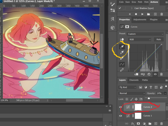
you can use action that will convert your gif back to frames and set your timing to 0.05 with a single click. basically photoshop will follow out all of these time-consuming steps for you! just download the action and double click it. it should now be added to your list of actions. to see your actions, go to window > actions. find the folder that says "GIF ACTION" and select the lines that says "CLICK HERE" and voila! ps will do all the hard work for you.
the coloring on your gifs will look good if you have a good base so try not to skip on video qualities. use high quality copies like 1080p or 2160p (4k ones are good) the higher the gb the better. it makes coloring so much easier and reduces grains.
*cracks knuckles* let's start!
for 2d animation's sharpening settings, it usually varies so i just move the amount around and see what looks or works better for a specific gif. i used amount: 189 and radius: 0.2 for this ponyo gif. anything can work between 189 to 350 for me but i maintain the radius at 0.2. again, you can just play the amount around until you find the one that looks good for your gif.

when i’m making gifs. i look for that notorious contrast between the light and dark parts. i think it gives life to the gif- so exposure, levels and curves are best to achieve that. for curves, just go to layer > new adjustment layer > curves. this layer is going to help brighten up the gif in certain areas, and darken others. select the white eyedropper. click the lighter part of the gif like the white/light part of the ship.
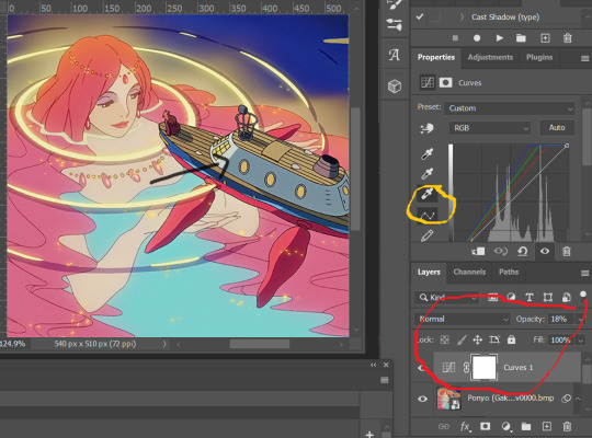
next, select the black eyedropper and click on a black/dark area of the gif (refer to the arrow bc i don't know which part of the ship is that called lmao).
you can skip the black eyedropper if you're already satisfied w the result of the white one.
color balance and selective color are your two best buddies. they’re great when you’re trying to change some tones or specific colors of the gif, like the skin tone which is very tricky.
using selective color is pretty simple, here’s a really useful guide:
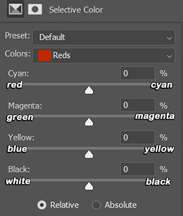
if you pull any of the tabs to the right, it increases the amount of color (cyan, magenta, yellow and black), and reduces the amount of opposite color (red, green, blue and white).
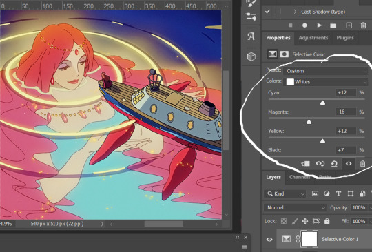

i also use the blacks and whites in selective color especially if the gif is saturated w colors to tone down some parts and make shadows more visible (idk if this is still making sense 😅).

in working with color balance, i use midtones and highlights sparingly. it's really helpful in removing or balancing out a certain tone.

here's my save setting ⬆️
idk why but ps puts the default frame delay to 0.07/0.03 so open your gif in ps again and don't forget to change the delay to 0.05.
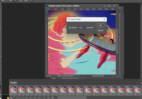
and we're done!

i sometimes go back and forth and do some tweaking until i’m satisfied with the result. this is how i color and i know it’s not perfect but i learn by constant practice. there’s really no standard in coloring so you can make yours the way you like it. just enjoy- until you get the hang of it and it becomes less daunting (or something like that). i hope this helps. if you have more questions, my askbox is always open 😊.
#completeresources#usergif#userpayton#usersugar#rresources#yeahps#itsphotoshop#userbells#dailyanimatedgifs#usercharl#usersavana#Chaoticresources#hisources#ps help#tutorials#ask replies#anon
172 notes
·
View notes
Note
hi, i've been learning how to make hair retextures and clothing recolors and your tutorials and tips have been super helpful! i was wondering if you could explain how you retexture clay hair? i'd want to add more realistic looking textures to some clay afro hairstyles but i don't know how to do it and i haven't find a tutorial for it
Hi anon, that's great! Making CC is really fun. 😊 I think so, anyway.
So, I do have a tutorial about how to retexture clay hair, but instead of just providing you with that link, let's talk a little bit more about what you're interested in: adding more realistic looking textures to clay afro hairstyles.
You're in luck - that's a thing I like to do sometimes too! Clay hairs often lend their shape very well to locs, braids, puffs, knots etc.
So this hair, @miniculesim's 4t2 conversion of okuree's Clementine. I have done before but didn't change the texture at the time.
But I could! Let's try it.
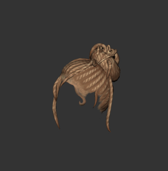
This is the mesh and texture we will be working with.
Sometimes I like to view a mesh in UV Mapper so I can get way up in the mesh. Like way up in there.
I'd like to use my fave TS4 texture on this mesh.
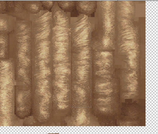
This is the original texture for Clementine.
Where I have circled in red is where I am going to paste one long rectangle section of the TS4 Dread texture I prefer.
See? That's not so bad.
One big difference between retexturing alpha hairs and retexturing clay hairs is how the texture looks when the hair5 connects to the head.
See these starred red areas? We will come back to this. Because I don't like how that looks, and I can do better.
So, this is Clementine, with all of the locs texture that I'd like to have on it.
It has the original scalp texture, however. It is okay, but not the vision I had in mind.
What I am going to do is put my afro texture underneath the locs.
I use Photoshop which allows me to have many many layers in an image.
My layers would be like:
1)Locs 2) Afro texture 3) the original texture.
It looks a little better. Not quite done yet, though.
When it comes to clay hair, I'm always on the side of 'if you can't beat em, join em!'.
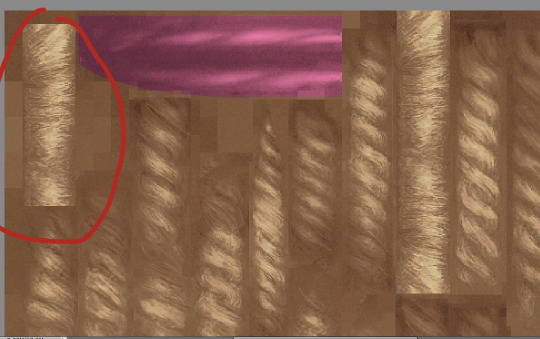
Clay hair meshes have their textures painted to match their UV maps exactly. So, retexturing is tricky. I don't mind leaving in a little of the original texture, because why put it to waste when it's useful, you know?
I need to adjust the hairline texture though. That's not quite right.
What I have here is the 1) original texture around the hairline, then the 2) TS4 dread texture I added, and then 3) my afro texture layered both underneath and on top.
This works, I think! I like it.
And then in a black recolor of course, very important that that looks good on any afro/protective style.
I hope that this is helpful! Please feel free to DM me if you have questions. :)
32 notes
·
View notes
Note
So, what’s your honest opinion of the full #picturegate drama?
I’ve seen many people believing that KP used The PoW as scapegoat and she doesn’t did the photoshop. But what are your thoughts? In case some are correct, why do you think they are blaming Kate? Why not blame the ‘real’ responsible (some suggested it’s her staff)
As we have discussed, their PR team is awful, but this new nonsense takes the cake
The situation leading up to the "photo kill" I've already described here:
That basically summarizes the situation leading up to the photo and its very public dismissal.
2. One of the other problems is the staff they have working for them. Clearly the KP communications department is not up to par. It should have been the communications head/chief taking the blame for this instead of Kate. Instead, he thought that a statement from Kate would quell the drama, when all it did was pour more gasoline on the fire.
So Kate can take the blame for the photo but couldn't make any comments about any messages she received from well wishers in the previous weeks? WTF?!
But then there's KP spokesperson giving statements to People magazine today!
A palace insider downplayed the PR crisis, telling PEOPLE exclusively that although the situation is a "bump in the road, it's not an earthquake."
"[Kate] has apologized and graciously so," the insider says. "She has done something that 99% of us do — and we don’t have the scrutiny that they do."
"Think of the level of scrutiny of pictures of her, as people pore over them," the insider continues. "You’re always on display and always got to be perfect."
The insider adds, "She might be a member of the royal family, but she’s also a human being. If you've just had an operation, you want to look your best with the first photograph that’s published for the outside world."
I'm sorry but why is this person still in the employ of Kensington Palace and why are they speaking to People magazine? "We don't have the scrutiny that they do." FUCKING DUH!! That's why all sorts of people who don't pay attention to the BRF are like, "What the actual fuck is going on over there right now???"
So the KP comms people are continuing to dig the hole they are in. They haven't stopped digging and are unlikely to do so as long as they are calling up People magazine to give them exclusives on their professional fuckups!

3. Guess who hired and continues to employ the professional fuckup?
William!
William is an emotionally damaged, thin skinned, control freak with a privacy fetish. And William found his perfect YES MAN to accede to his control freak nature and his unhealthy demand for privacy with Lee Thompson.
YES MAN + Control Freak - connection to reality = the mess we have today
And the mess we have today continues to roll on. And will continue to roll on. Just as it has since he was hired in 2022...
There was the fuckup at Boston in 2022 when William issued a statement throwing his godmother under the bus when all he had to say was "This is an issue for Buckingham Palace." Except he didn't.
There was the bizarre photo op of Andrew being driven to church by William last August (2023), when everyone with a working, long-term memory knows that William has never kowtowed to his father.
Kate's stretch of wearing thirteen pantsuits in a row, 'cause she was all about "the work." Somehow, she didn't go on a crusade about wearing pantsuits when she was only The Duchess of Cambridge.
Announcing Kate had "planned abdominal surgery" the day after said planned abdominal surgery. If it was "planned," then wouldn't they have said something at least the day of rather than the day after?
Then there's the timeline of fuckery that's happened from Christmas until 09 March 2024 that I collated before The 2024 Mother's Day Photo Disaster.
And it's going to keep going on and on because the root of the problem is William!

4. Then there's The Princess of Wales, aka Kate or Catherine. She is the woman with likely more sense than either Lee or William put together. Do those two fuckups listen to her? Doubtful. Did they listen to any concerns or feedback she gave these two last summer? Or fall/autumn? Also doubtful.
So there's a woman who is a globally known public figure that does not have an easy way out of the mess the two men created, and also she may share some of the blame for decisions made last summer and fall?
And it's a very depressing situation being trapped with a husband who won't listen to you and takes you for granted, yet your husband will listen to the YES MAN at his employ. Because the husband is a emotionally damaged, thin skinned, control freak with a privacy fetish.
A very depressing situation when she knows that her reputation of twenty plus years in the public eye is about to go down the drain as a result of the choices these two men have made. (And no, I'm not talking about the Mother's Day photo.) Gee, what kind of situation could that lead to over the holidays?

5. Then you have Charles, Camilla, and the officials working at Buckingham Palace.
They know about all the communications problems taking place at KP since last summer. Oh, they know. BELIEVE ME. They know.
Charles is someone who believes people should learn from their mistakes and isn't going to interfere in his sons' lives and mistakes. Charles resented his parents interfering in his dating life long before he ever dated or married Diana. (Sabrina Guinness, anyone?) He also resented them interfering in his marriage to Diana.
Basically, Charles won't do what one of my friends from college did: write about her college roommate's pregnancy and due date in a Christmas letter. Yup. Charles isn't that man.
So, yes, BP's communication and pr about Charles's BPH treatment and cancer treatment veers toward being over the top. They have been very transparent with the press for a reason. They know there is a metaphorical nuclear bomb about to go off due to KP's lack of transparency and accountability to the UK public. The monarchy cannot be seen as complicit in it. It is KP's problem. Always has been a KP problem.
This is why Queen Camilla made so many visits to the front entrance of The London Clinic. Transparency. Proper communication with the UK public. The public can trust that The Crown is being honest with them. Kensington Palace clearly not so much.
It's why King Charles has been photographed doing mundane things such as greeting cards and going to church.
And yes, BP communications team is undoubtedly shading the KP comms team when King Charles got photographed in a car at Windsor last week, four days after Kate's pap shot with her mother.
So yeah, we're about to get the biggest scandal since the 90s when Diana died or the War of the Waleses. Pick your throwback reference. Get your popcorn. Because it is going to be that bad.
And the reputations of Will & Kate will never be the same.
Ever.

#ask#my gif#media#fleet street#PR fail#fail!#kensington palace#palace officials#William The Prince of OWN GOALS#William The Weak#William The Terrible#prince william#William The Prince of Wales#british royal family#kate middleton#Catherine The Princess of Wales#reddit#magazines#the disgusting one doesn't get his name in a tag#clothes#clothing#fashion#Wales fandom ARMAGEDDON#buckingham palace#King Charles III#queen camilla
32 notes
·
View notes
Last Seen Blogs

nothingwithouthislove
Untitled
naga-tradingplatform
NAGA

dogiadungpalado
Palado
broadwaynaturalarchive
Broadwaynatural baby
mazhbimulla
Untitled