#i honestly like the jacket design for him more than the canon one because he looks more comfy in it
Text
Well since my bachelorette designs were received so well, I decided to complete the marriage set! Here’s my bachelors!
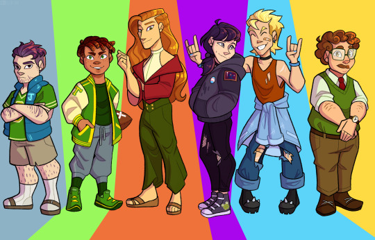
Individual pics and thought processes under the cut:
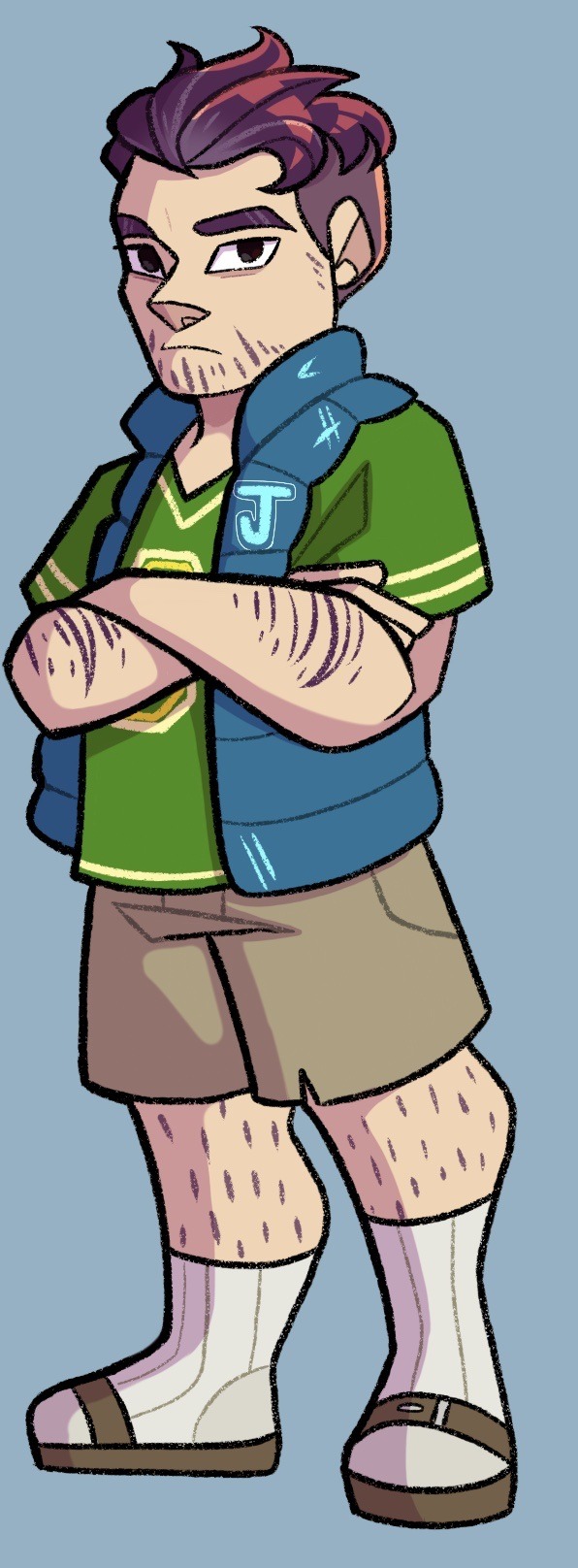
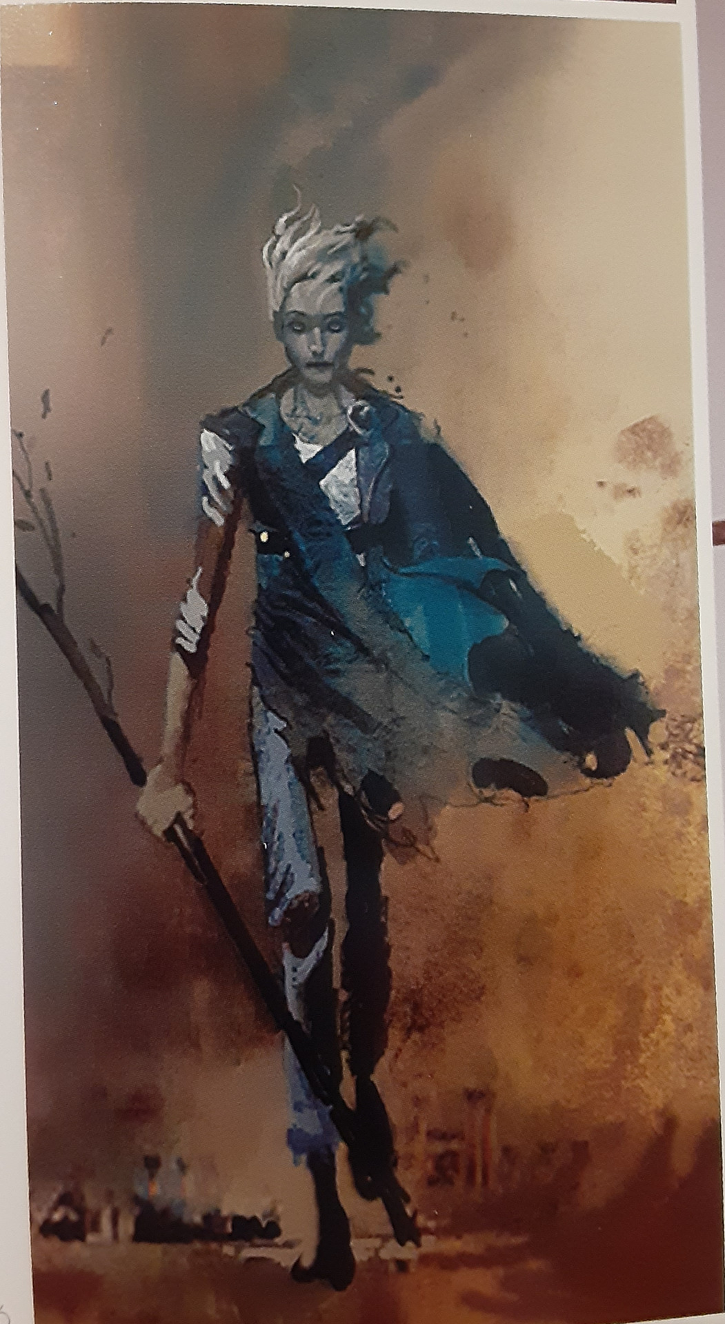
I’m drawing these from the perspective of how they’d look on day 1, but I’d definitely like to do a post-Joja higher heart design for Shane at some point. Overall for this one I just tried to make him look unkempt and dull, I desaturated his skin tone to make him look sickly and he’s the only one without eye shines, signifying how he’s lost the spark for life.
Also sorry about the socks and Birkenstocks.
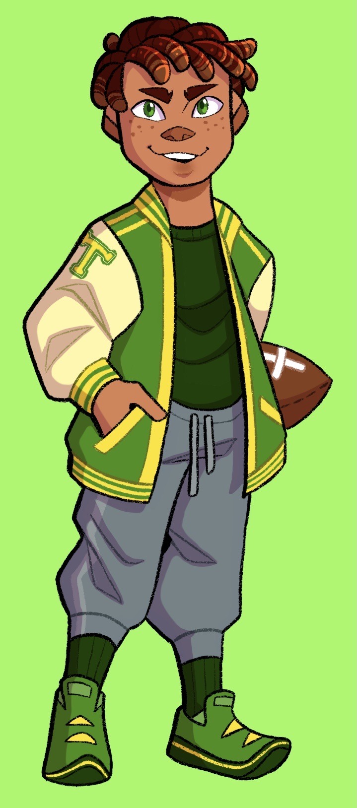
Decided to make Alex mixed, since there’s absolutely no diversity in the bachelors. Had a lot of fun translating his canon hairstyle into those short locs. Other than that the biggest change was turning his jacket into a proper varsity jacket. Short Alex gang unite!
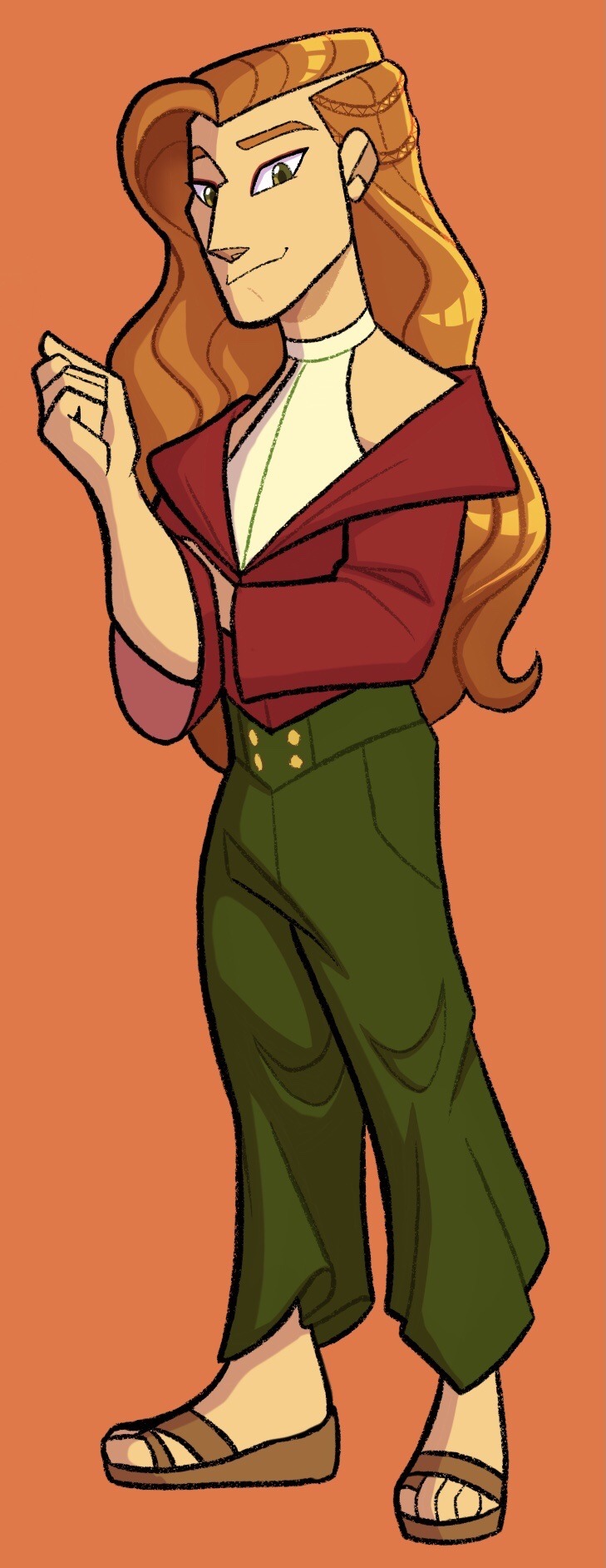
Okay sorry Haley, Elliot takes the win for the most changed design. Like it’s so obvious he’s meant to have a Victorian jacket and fancy trousers and all that, but after I drew him all tall and slender and I gave him little braids and beach waves he just started taking on a Boho vibe? When I drew the jacket it just looked tight and restrictive. So I decided to let the beach influence carry and we ended up with this fancy yet comfy loungewear with sandals. And I love him?
Also this was heavily inspired by ginjaninjaowo’s male espeon design
Sebastian was honestly a pain, like I know his design plays off the emo teen archetype, but compared to the others npcs he’s actually got a lot of variety. Like he’s obviously got some emo influence, but there’s also some nerd thanks to his interest in coding and ttrpgs, and he’s also a bit of a tough guy with the bike and the smoking. So there were a lot of directions to lean. Still, his sprite is clearly going for a dark hoodie and dark jeans, so I didn’t think I could change it up without making it not feel like Sebby. Does he have a muscle tee underneath for working on the bike? I’ll never say.
Biggest change is probably the hair, just wanted something less stereotypical, and have some variety in bachelor hair length. Definitely leans into the biker side a bit lol. Otherwise I just tried add detail to his dark outfit and adorn it with his interests. So frog embroidery on his shoes, a patch on his jacket and some motor oil stains on his hoodie. Also as promised he and Maru have matching dimples.
Also happy pride month, enjoy trans Sebastian and also the head canon that he and Sam start dating provided the farmer doesn’t get there first lol.
And with Sam the ASS trio is complete! Now with matching chokers because I said so.
Just like with Sebby I wasn’t sure which direction to go for Sam, whether to lean more into skater boy or rockstar. Ultimately he ended up more rockstar, though he’s still always roughed up from skating (probably because he refuses to take off the platform boots). He thinks the torn clothes make him look more legit though.
I had fun making his shape language compliment Sebby; he’s very top heavy from the giant hoodie so I made Sam bottom heavy with the baggy jeans and jacket. Also I had so many thoughts about him and Kent, given that Sam and Sebby are a thing and Sam isnt exactly gender conforming.
And last but not least, Harvey. He’s sweet, he’s simple, all his heart events are charming. And yet he is always the last one I reach max hearts with because I can’t be bothered to go to the doctors office. Sorry bby, I hope I can make it up to you by designing you as an adorable cherub of a man.
I know I’m being super controversial, giving him a pushbroom mustache when the sprite is obviously a handlebar /s. But like, he’s such a square; it fits him so well. My little lawful good guy.
Ya know, I think I gave him a sweater so Elliot’s jacket would stand out, then proceeded to not give Elliot his jacket. Huh.
Anyway bonus of the boyfriends together to close us out, thanks for reading!
#stardew valley#stardew fanart#sdv#sdv fanart#sdv bachelors#stardew bachelors#sdv shane#sdv alex#sdv elliott#sdv sebastian#sdv sam#sdv harvey#shane stardew valley#alex stardew valley#elliot stardew valley#sebastian stardew valley#sam stardew valley#harvey stardew valley#stardew harvey#stardew alex#stardew elliott#stardew sebastian#stardew sam#stardew shane#pride#pride month
243 notes
·
View notes
Text
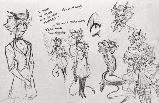
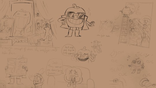
in the middle of working on a lucifer redesign :)
thoughts/explanations + minor character analysis under the cut (this was supposed to be short but it ended up being very thorough lmao):
honestly love his canon design so I'm kind of working from that more than I'm trying to rethink stuff from scratch
I'm gonna admit right now that a lot of the design choices were very self indulgent lol; I just want him to be pretty :<
circus stuff~
I've seen a lot of people raise their eyebrows at the circus motif, so I was going to try something different, but I actually think it makes a lot of sense!
I think freakshows/circus acts have been tied to this idea that certain identities/abilities are strange and shameful, only valuable as dehumanizing entertainment -- they're mistakes, freaks of nature
but at the same time many circus performances require a lot of skill and work and love that can go unappreciated, each and every performer at the very least a person worth respecting
I think lucifer sees hell as a freakshow/circus he's been forced to lead and try to control
a bunch of wayward toys meant to be bright and beautiful that have been twisted into something terrifying
and he needs to discover a more empathetic, appreciative, and loving way to think about sinners
and also to realize that it's not about him or his mistakes; it's about a group of people with their own emotions and autonomy that he needs to respect
anyway
all that to say: we're keeping the circus ringleader thing!
I think a whip would make more sense for a ringleader, esp since alastor has a staff already (but they're enemies/foils so maybe their designs should reflect each other?)
there's room to turn the whip into a snake maybe
in the pic I made it look like his tail bc I considered making his actual tail a goat tail (cute! but the longer one suits him better I think)
maybe an apple on the top/handle still
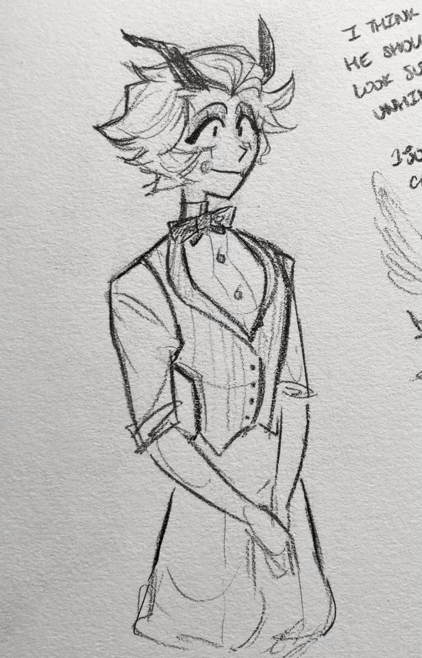
the tux honestly looks a little too formal/cool for him most of the time lmao
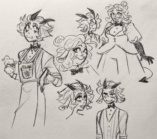
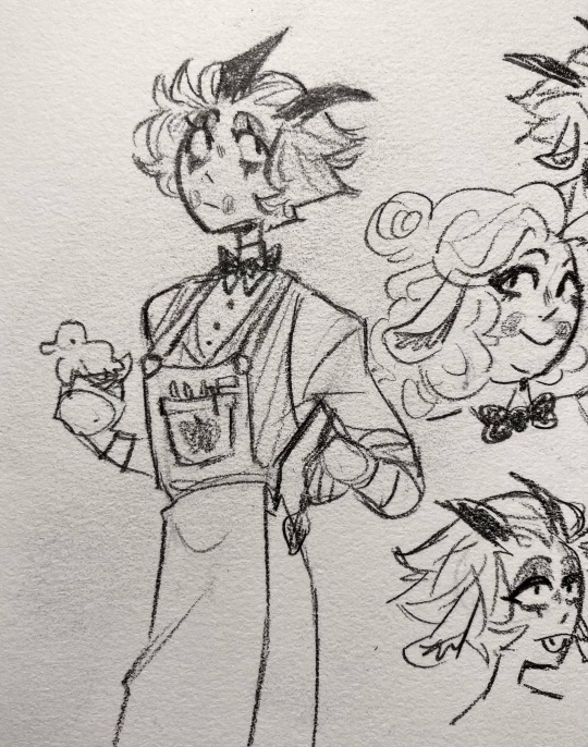
so I think he should take off the jacket/have the toymaker apron on instead unless he's fighting
vaudeville doll~
lucifer has a lot going on tbh: circus ringleader, angel, devil/demon, snake, goat, vaudeville porcelain doll, toymaker, etc.
I think I'm gonna take out snake just to simplify a little, but I'll talk about that more later
I was also going to take out porcelain doll but
1) the rosy cheeks are super cute
2) fits with the circus theme
3) fits with the idea that he's both a toy and toymaker (an angel that tried to play god)
uhhh there's a couple self indulgent doodles of him in a vaudeville doll dress lol. not relevant to the design at all; I just like drawing stripes and ruffles
I ended up making him sort of androgynous in a lot of ways? (not that he wasn't already lol) which works for him I think
part of it was the vaudeville doll thing; I wanted to give him (keep?) the eyeshadow and add those little vertical marks you see on them sometimes
also because I really liked the puff sleeves in one of the references I used; it kind of emphasizes an extended hourglass shape with the puffy pants
plus I love drawing the more classic tuxedo shape <3 very yummy lines and details
hair/shape~
I fucking LOVE when people draw him with messy hair, so I made that permanent
I also think (esp since he's blond) having the hair stick out in tufts kind of makes it look like a star (morningstar, lightbringer, etc. etc.)
even more so with the pointy horns (those are also fun to draw cause they're right in the corners of his widow's peak)
I drew a random triangle on one of these as a reminder to keep the pointy/triangular shape language throughout lol
squares would def be wrong with the implications of sturdiness and stability
I think circles would be wrong too? he's vulnerable and ultimately very soft inside so I kept a lot of round lines, but I don't think he's the traditionally bubbly/friendly/peaceful archetype circles are usually used for
triangles are apparently dynamic, dangerous, and unpredictable, which is a little closer to what I'm going for
(shape language is a very flexible rule btw; I'm not saying they determine everything about a character or that one shape has to mean exactly one thing)
he's also a depressed, tortured soul, so I feel like he should look just a little unhinged and exhausted <3 (hence the eyebags on top of the messy hair)
angel stuff~
(sidenote: cherub and seraph are singular, cherubim and seraphim are plural. even the show gets this wrong tho, so feel free to say whatever ig)
I'm pretty sure most people agree lucifer was probably a cherub? cherubim only have 4 wings so I might go with that
I do think it makes more sense if he's higher ranking like a seraph tho ... it's hard to decide whether to go with the show's ideas about angels or actual religious texts cause both are interesting in their own ways
snake~
ARHHGHJF idk how I feel about his nose
again I thought about taking out the snake motif, but he honestly looks good w/o a nose (I mean it's there obviously but you can't see it if it's just snake slits lol), and I definitely like the idea of him having a forked tongue or his eyes turning into slits when he's angry
also also
mini rant on animal motifs in hazbin:
I get the impression that a lot of people think it's a bad thing that you can't tell what animal a character should be? and/or that a motif has to be clearly present in the entire design to be good
and I kind of just accepted that until I started thinking about ozzie's design from helluva boss
like the original demon he's based on is really just that fucked up and mixed with animals you can't always identify
and chinese dragons are like a billion different animals even though they sort of just look like lizards at the end of the day
like obviously if you want the audience to associate a character with a specific animal (like if you want people to think a character's spooky because they're a spider or something), then you do want the animal motifs to be clear/consistent
but sometimes you just want certain elements there and it doesn't matter if the audience picks up on it (at least consciously)
and I think with someone like lucifer, having a lot of animals/concepts mixed together in an ungodly combination makes sense lol
so idk
maybe we'll just give him the nose/tongue
I did try just giving him a button nose in some of these for the doll thing tho
goat/charlie~
urgh I hate realizing I should've designed certain characters together lol
I took out the rosy cheeks in my original charlie design since I wasn't thinking about lucifer, so I put them back in this time lol (and generally thought about how they should be visually related)
I like that it enforces the idea that charlie's lucifer's creation (toymaker makes a doll in his own image yk)
also they both have puff sleeves now :) (charlie's design is basically princess dress silhouette but make it a suit)
I also gave her goat ears, so I figured lucifer should have them too? idk because I like the way his hair looks a lot better without them, and I kind of like the idea of giving them diff combinations of goat features (maybe she should have a goat tail?)
also drawing this made me realize I have no idea why charlie has a puppy nose??? I thought it was the goat thing for some reason but that doesn't make any sense
maybe I'll just give her no nose
anyway! fucking incredible if you read all of that; idk what possessed me to write so much about a half-finished design lol. feel free to leave suggestions/answers to the questions I had!
#I was gonna draw some radioapple stuff and then realized I hadn't touched lucifer's design yet lol#still not done obviously but I have a working version now at least#hazbin hotel#hazbin hotel redesign#hazbin hotel lucifer#hazbin hotel charlie#art#my art#character design#oh yeah I guess there's one#hazbin hotel alastor#in this one#oops
129 notes
·
View notes
Text
Gravity Falls Headcanons/Things I Think About Often (Cont.)

⍋ ⍋ ⍋ ⍋ ⍋ ⍋ ⍋ ⍋ ⍋ ⍋ ⍋ ⍋ ⍋ ⍋ ⍋ ⍋ ⍋ ⍋ ⍋ ⍋ ⍋ ⍋ ⍋ ⍋ ⍋ ⍋ ⍋ ⍋ ⍋ ⍋ ⍋ ⍋ ⍋ ⍋ ⍋ ⍋ ⍋ ⍋ ⍋ ⍋ ⍋ ⍋ ⍋ ⍋ ⍋ ⍋ ⍋ ⍋ ⍋ ⍋ ⍋ ⍋ ⍋ ⍋ ⍋ ⍋ ⍋ ⍋ ⍋ ⍋ ⍋ ⍋ ⍋ ⍋ ⍋ ⍋ ⍋ ⍋ ⍋ ⍋ ⍋ ⍋ ⍋ ⍋
- Blubs & Durland got married on the 2nd anniversary of Weirdmageddon. They picked that day specifically so instead of tragedy, it's their love that's focused on.
- the Manotaurs find the Several Timez boys and raise them, make sure they get proper care (look i really don't want them to do some weird genetic freak shit)
- after being on the Stan O' War II, Stan starts drawing again. He & Ford try to learn from each other and draw in each other’s styles.
- Stan is a canonical erotic fiction writer. He has self published work and sold it on amazon. He also uses Ao3,
- Mabel and Dipper would try & help Ford catch up on new music like they try to do with Stan, it goes about as well as you would expect
- Fiddleford & Tate have father-son bonding, Fidd finally teaches his son the banjo like he said he would when he was younger
- You know how McGucket reads at the library to kids. I feel like he works there, doing something like archival while working on his inventions on the side
- When the grunkles get back home from their adventuring on the Stan O’ War II, Ford asks about the Axolotl. Stan says that it just appears sometimes, & has been doing so since he's lived in the house.
- Ford thinks that it's Frilliam (he's right).
- in Lost Legends Dipper recives a new journal with his pine tree hat mark on it. it functions like his own diary rather than a super scientific, documentation thing like the journals did
- the twins do a lot of research & work to make sure Waddles gets properly taken care of in suburban California, he lives the good life
- Mabel learns boxing with Stan, Dipper learns forensics from Ford
- Giffany develops romantic feelings for Hatsune Miku
— Bill is an unreliable narrator. I feel like some aspects of his story are either made up or half-truths. He isn't exactly a master manipulator for example. Bill's just a being that utilized Ford's pride and insecurity to get what he wanted.
— Tambry feels like a creepypasta girlie. She wrote her own in the 2010s & she's actually pretty good with horror writing.
— Manly Dan and Mayor Tyler are at the very least besties. these guys hang out, watch wrestling, drink at bars together, they are each other's hypeman.
— Soos got McGucket into anime, Ford hears what anime is like through him and is honestly a bit confused
— the Pines family during one summer went to disneyland for a week. within 2 days they have killed walt disney's disembodied cryogenically frozen head, stolen some of the pyrotechnics, pet all of the stray cats, and ate the strange pickledog

— Mabel would introduce her family to it, Dipper would be confused and curious but not want it. Stan would buy it for Mabel but not eat any himself, and Ford would be just as curious Mabel and eat one.
— Robbie starts working hospitality at his parent's mortuary. He still has his attitude but overall, hes more mellowed out than before.
— in their elder teens Mabel, Candy, and Grenda become kpop fans. I say this because oh my god would they all love doing the dances, toploader decor, the lightsticks
— Stan's exes will sometimes visit the shack. In Eda's case it's to catch up, in Rick's case it's to either do karaoke or to get something from him. In the case of his biker ex Stan will just run him off the property because that man sucks.
— Mabel learns how to paint on leather to create a new design on stans old biker jacket. She does it because she notices that it makes him sad when he looks at it
— Once Mabel shows him what she did Stan just starts bawling in joy and pride. He wears it whenever he and Ford go on adventures.
— When Fidd visits the Mystery Shack, he will always gravitate towards Frilliam. Fidd and Ford can usually be found feeding him, changing the water in Frilliam's tank together, talking in front of him.
— Gideon has a twitter
— Soos is pretty business savy. He's really good at appealing to people online, he knows the trends but doesn't stick to them religiously, he maintains that work-life balance. He is the perfect man.
— Toby Determined x Tad Strange ???
— Multibear and Dipper do karaoke in front of the family, it doesn't matter how, I need them to do this
— Mabel, though she doesn't get visibly like, buff, does get super strong due to her practicing boxing and carrying waddles as he grows
— all the windows of the shack get changed to circular ones or normal, square windows.
— Manly Dan is willing to do the work because he's wanted to punch that triangle ever since he saw it in Weirdmageddon
— Soos suggests full on question mark windows, the next best thing they would do is create question mark designs within rectangular/circular windows
— Ford and Stan sometimes donate what they find to museums. It's usually stuff neither would want in the house anyways
— like old ass art that isn't cursed, anything related to taxadermied heads (they can make their own, thanks), all false gold/money, wax figures
— neither Stan or Ford use hard labels for their sexualities, i feel like labels dont really connect with them specifically,
— Stan would go with unlabeled (he’s fine living life not knowing exactly what he is, he cares more about how he feels)
— Ford would use the word queer (reclaiming how he’s been labeled as odd as a good thing)
— aromantic Mabel, i feel like she would experiment a lot with labels before settling on it (girl likes the idea of love, just like me)
— trans Dipper. doesn't matter, they could be transmasc, transfem, genderqueer, agender, dipper is trans
— lumberjack lesbian Wendy, self explanatory
#p#gravity falls#dipper pines#mabel pines#stanley pines#stanford pines#kings of new jersey#mystery twins#there are more characters involved but i dont want to tag them all#NO STANCEST YOU FREAKS#the fact that it needs to be specified at all is upsetting#text post#long post
31 notes
·
View notes
Text
Hi guys ! I’d like to share with you my take on a possible DLC (or even sequel) for Pizza Tower:
Overturned Pizza Tower
(Yeah it’s a working title, I’m not even sure if "overturned" is english…)
Basicaly in the game, Peppino is forced in another dimension by a familiar looking but oddly different Pizzahead and has to conquer the Tower all over again, some stuff here and there are different with different levels and a much more different atmosphere, that being that this alternative tower looks far more luxurious than the canon one, let me know in the comments if you want be to develop on how the tower could look like in this mysterious alternative world
first cutscene rough storyboard:
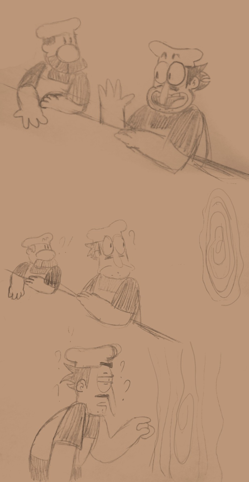

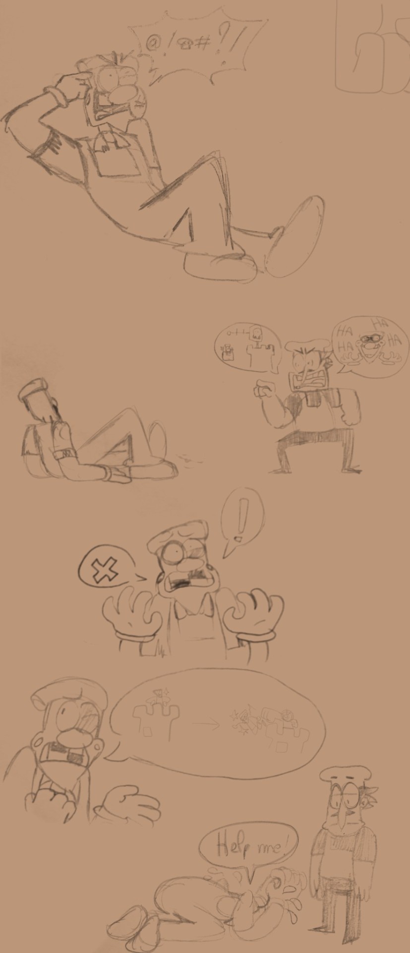
And now for the juicy part >:) hehehe
The bosses:
When designing new designs for the bosses, I kept in mind to not go overboard with the modifications, what makes Pizza Tower’s characters so fun to draw is their sheer simplicity, and I must say in some of my early sketches, I was awfully close to the “ORIGINAL CHARACTER, DO NOT STEAL PLEASE” limit. So without further ado, here they are:
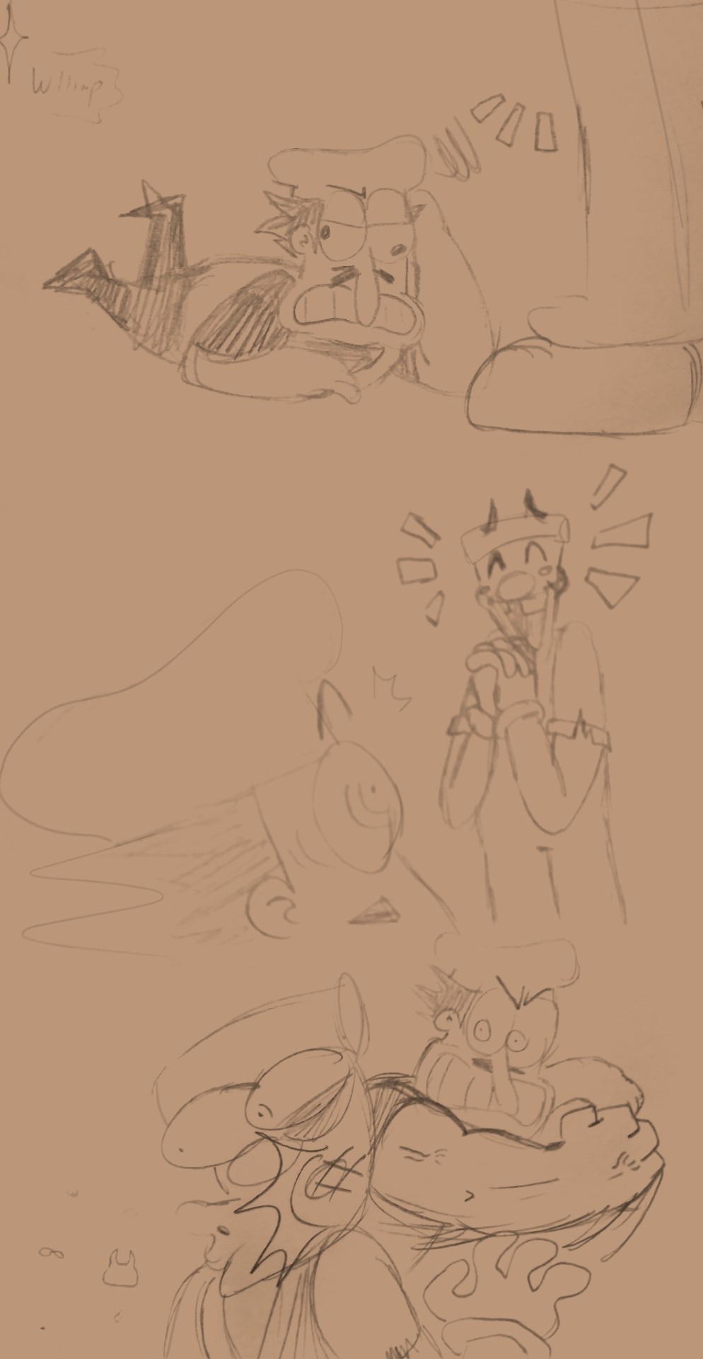
Pepperman:
So as you can see, our favourite fabulous pepper is rocking some boots, shades and a jacket, In this timeline his talent was recognised and became quite a celebrity in the tower, experimenting in other forms of art outside of painting such as photography, origami and clothing. I honestly think that the two drawings I did on the bottom left corner that Pepperman would absolutely embrace his fame and wouldn’t mind that much if people always ask him for an autograph in any place he walks in, he would be quite a diva if he could wouldn’t he ? Let me know your opinion on his design and if you think I should change some stuff.
The Vigilante:
Nothing much changes with Vigi here except a tiny scare under his left eye and a peace of turquoise on his hat, in this timeline the Vigilante is known as the "Bullseye" due to the extraordinary capacity of never in any circumstances miss a shot that it be with his gun, lasso or anything else he can throw at you (unless he misses willingly of course), outlaws truly quiver in fear at the site of him because they know they’re doomed. I must say Vigi was the hardest to redesign, because there’s so much you can modify with him until he just looks a slime with goggly eyes, a funny hat and an angry expression with random details… which…is kind of what he is but in a bad way… you know… Again let me know in the comments what is your opinion and if you think something should change.
Fake Peppino:

And here he is, the fan favourite, the goofy goober elderish monster of the saga. In this timeline the only difference is that instead of a tang top he wears an apron that is stained with a bit of… uh… tomato… sauce… yeah tomato sauce and he constantly holds in his right hand a ladle, he’s the proud owner of his own pizzeria of which he takes vey good care of (or at least he’s trying his best) and most of his clients are actually Peppino clones, as long as they pay for their food Fake Peppino don’t mind their presence, any other clients are very rare considering there is a rumours about the chef killing any clients who doesn’t leave a tip…Honestly one of my favourite design so far (wow how original, the goofy goober is my favourite…) once again leave a comment of your opinion and what you think should be different in my design
Final boss:
Yeah sorry I won’t give you my take on the final boss (yet), but if you think a little and look carefully I think you can already gess who’s the big bad guy, I’ll even post something if y’all really want
And that’s all for now folks!
Thank you so much for reading my post, if you really want me to give you more concepts and ideas for the characters, atmosphere or if you want full arts of the design I just showed, let me know in the comments. Don’t hesitate on giving me your truest opinion may it be positive or negative on this concept and if you think it could work for a DLC or sequel! See you next time :D !
wait… what is that ? Where’s The Noise ?
let’s… let’s not talk about him…
#pizza tower#peppino spaghetti#pizzahead#pepperman#the vigilante#fake peppino#the noise#gustavo#pizza tower au#pizza tower fanfic
90 notes
·
View notes
Text
Oh yeah this is my redesi- *gets brainwashed*
Yes this is a day late, I know no one keeps schedule of these redesigns, but I like to have an upload schedule to challenge myself, but it has gotten harder to adhere to said schedule lately because I’ve been cleaning my dad’s apartment(he’s still alive and everything it’s just a mess)
I added him in between class A and B because while it has been revealed which class he’s in, I figured it would be a nice transition and either way I’m going to stop talking now here’s the redesign
Compulsion Hero: Mindjack
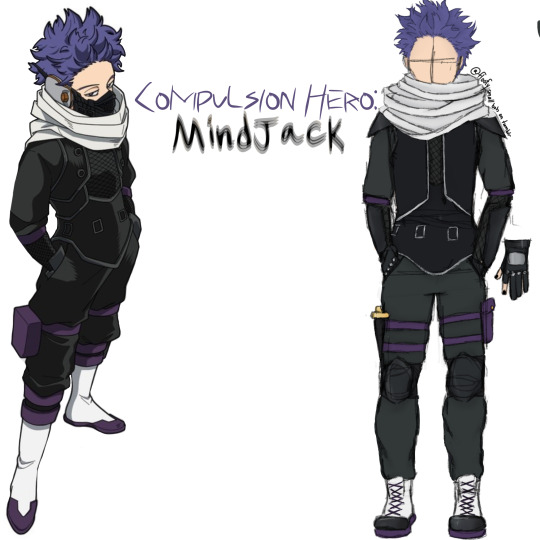
sorry if the text is hard to read or headache inducing
yes the name is a giveaway of his quirk, but I don’t think his hero name would be public knowledge, he’s likely be an underground hero due to the lack of flashiness
honestly his canon costume is the best one out of all of them
it’s practical and it looks great
vest would have been the same but I sure as hell can’t draw that so it’s just a regular looking vest
thin undershirt covered by a fishnet mesh
which is also in turn covered by the vest
and the sleeves in canon look like a separate garment
i told myself when I did the Kirishima design that I wouldn’t give anyone shirtless sleeves.
i have now given two people shirtless sleeves.
i was supposed to give him cargo pants but I forgot to draw the pockets :|
leg strap pouch
dagger, would be useful if the capture weapon got tangled or for close combat fighting. also it looks sick and I really like swords and tbh this costume is something I would want to wear and at this point I’m not even trying to hide the fact that I am Shinsou Hitoshi
i have very prominent purple hair and eyebags too
also there are a fuck ton of layers because I can’t think of a single person this edgy who doesn’t layer like hell
i would rather burn up than not layer and that’s saying a lot considering my incredibly low heat tolerance
but back on topic
combat boots
steel toed
kneepads, shoulder pads, and forearm guards
gloves are the same as canon
so is his mask but I was not going to draw that
it’s legitimately just his canon costume in my art style
COLD WEATHER VERSION:
darker fabrics
slightly longer gloves on the thumb and index fingers
thicker fabric
capture weapon is temperature regulated
can function as an actual scarf
turtleneck(not visible)
undershirt is thicker
WARM WEATHER
yeah he’s still gonna overheat lmao
undershirt has mesh sleeves
gloves are now completely fingerless
also I forgot to mention earlier yes he has black nail polish, just be glad I didn’t give him a full face of alternative style makeup, too
I don’t care if he canonically just wears jean jackets as his casual wear he’s alt now and there’s nothing you can do about it
hell, Jirou is supposedly ‘punk rock’ and the only vaguely alt outfit she had was the time she was wearing an ‘end of villainy’ tshirt with fishnets and boots in one of the openings
no more shirtless sleeves
slightly thinner, looser fabrics
WITHOUT CAPTURE WEAPON:
not really any notes lmao
COLD WEATHER WITHOUT CAPTURE WEAPON:
you can see the turtleneck now
HOT WEATHER VERSION WITHOUT CAPTURE WEAPON:
neckline is slightly lower
as always, tips and advice are appreciated!
#i accidentally saved the redesigns with the color picked palette over the reference photo so I had to go back and fix it#also I don’t think the reference photo is official art but it’s like 90% accurate and the official one is a terrible reference#also hey if you’re reading this why not go over to Arab.org and click a few buttons#shinsou hitoshi#hitoshi shinsou#mha shinsou#shinso hitoshi#hitoshi shinso#bnha shinso hitoshi#mha#mha redesigns#mha redesign#my hero academia#boku no hero academia#bnha#bnha redesign#bnha redesigns
23 notes
·
View notes
Note
For the Actor AU, how did they feel abt the canon heroes' outfits? If they could, how would they have modified them?
Marinette: Basic as fuck! It looks like I’m wearing footie pajamas! If I were in charge of my costume, I’d give myself a full-on punk look because Ladybug’s are some badass motherfuckers. Oh, and boots that have soles equipped with a shock-absorbing cushion, and a heel that contains a reinforced spring to soften the shock whenever I land. And… Maybe a backpack shaped like ladybug wings to hold my Lucky Charms and anything I need to collect for my plan.
Adrien: Less leather! That stuff shrinks, and a full leather bodysuit is not comfortable. Also, because of the cat holders’ powers, it would be cool if heroes had some sort of medical supplies on them just in case, like stored in a utility belt. And I’m with Mari, those boots sound badass. What else?… Oh, definitely add some more color instead of just basic black.
Alya: Well, the Fox doesn’t seem like a combative hero due to the powers. I see Rena Rouge as a distraction, really, so her outfit wouldn’t be one of those “ready for battle” types. Here’s what I’m thinking, one of those noir-film type outfits. The hat covers my face a bit to give me an air of mystery, and the outfit would look almost casual that no villain would suspect me.
Nino: I mean… Carapace’s look is cool. It’s alright. I’m liking the goggles, but… I’d prefer if he had armor. He’s the fucking turtle hero! He should be ready to take any blow that a villain sends his way!
Rose: Where to begin? Look, you all know me; I love pink more than the next guy, but… Sometimes too much is too much. The Pig Miraculous strikes me as… More farmhand than ballerina. Yee, I know, the heroes come with a tambourine, but come on! While I do love the skirt, I’d trade it in for overalls, either shorts or a skirt. Oh, and add some black in there, too. Daizzi has a black circle around his eye, let him be represented!
Juleka: Studded jacket. That is all.
Luka: Oh, honey, either give me a hood so I can look like a cobra or get the fuck away from me with that outfit.
Myléne: The mouse strikes me as more of the elegant type, I’m not sure why. Maybe it’s the pastel pink mixed with the grey, but I see Polymouse wearing skirts over Pigella. But, that’s just my opinion.
Ivan: Honestly, I’m fine with the canon design for Minotaurox. Yeah, he’s got pockets and padding, I-I like it. And if you show me a better design, I’ll happily take a look at it.
Marc: … I think all of the effort went into making Rooster Bold’s costume. He’s got rooster hair, the little tallons on the back of his boots, and a fucking tailcoat! He and Mayura are the only ones to have tailcoats! I’m not complaining, though. I… I actually like it, but it is a nightmare putting on and taking off that wig.
Nathaniel: Well, I can say I sort of know how some of the girls feel, because that suit was tight as hell! You could see my hip dip! Also, I would’ve liked to have a different hairstyle and maybe some color, because I am the only male redhead around for miles. Oh, and climbing boots becuase, I’m a goat, duh.
Alix: … Do I need to say it? Okay, give me some active wear! I’m traveling through a shit ton of different timelines! I need someone sporty and active when I’m on the go. Also, I’ll need a backpack like Marinette.
Kim: Not hearing any complaints from me! I liked Roi Singe, but being Scarlet Beetle is way cooler!
Max: The glasses can easily come off. What I need is a high collar or a bandana that can cover the lower half of my face in case my glasses become askew or someone is able to place my identity because all I have on my face are some stupid glasses! God, I’m so glad I’m doing this new show now.
Chloé: Oh, I just want wings.
Zoé: Same.
Sabrina: Can mine just not look like my clothes, please?! I’ll take whatever, just not that!
Kagami: I would prefer if I had some form of armor and not a spandex bodysuit. It would need to be lightweight but also durable to allow me to travel faster, of course.
#miraculous ladybug#miraculous#nathaniel kurtzberg#marc anciel#marinette dupain cheng#adrien agreste#nino lahiffe#mylène haprèle#Ivan Bruel#alya césaire#chloé bourgeois#sabrina raincomprix#juleka couffaine#rose lavillant#kagami tsuguri#max kanté#lê chiến kim#alix kubdel#luka couffaine
85 notes
·
View notes
Note
If you don't mind me asking, what inspired your designs for the LiB human forms? Why did you give them the looks that you did?
I love this question!! I'll explain a bit of my design process. (Be prepared, it is a long explanation!)
First and foremost, I wanted to retain their color schemes, but sort of "normalize" them in a sense. The lords dress very bright and wacky, and I wanted to keep that but also make them look like someone you could just pass on the street. So, the first thing I did was assign them natural hair colors. A more natural blonde for Tinky, ginger for Wiggly (because I found it funny), etc etc..
I also tried to make their clothes more "believable". You dont really see a lot of people walk around in shiny, brightly saturated, monochromatic outfits in everyday life. Personally, I think we should normalize that, but whatever. So, I broke up and spread the color throughout their outfits. Pokey still has blue, but its only in his pants and tie. Tinky still has orange and a little bit of red, but he doesnt have those neon yellow matching jacket and pants combo like in canon. Basically the first step in designing them was making them look.. kinda normal!
Then the second part! Relating them to my pre existing lords designs!
Disclaimer!! These are old designs from months ago, and Ive been slowly redesigning them so they aren't exactly accurate to how I envision the Lords!
But anyway, then comes the easy part, making them look like my interpretations of the lords! Face shape, nose type, hair texture, body type, etc etc. I did accidentally make Tinky less husky as a nerd, which wasnt intentional, so when I draw him later he will be a bit stockier!
As for exact design choices for each of the Nerds In Black, this is how I designed them!
Pokey
His outfit is meant to resemble Paul's outfit by the end of tgwdlm. Its pure irony and I am a sucker for that! It also feels like something Pokey would wear casually: formal but not too formal. The little heels are purely for show. In the future I'd probably draw him with chunkier heels. The little streak in his hair comes in a later chapter!
Tinky
I really channeled nerd energy into his design. The short sleeved button down over a t-shirt speaks to me. Also gave him a watch because I felt it was the easiest way to allude to who he is. Plus, it matched the shape language of his glasses! (Which alludes to his goggles in canon) When I draw him in the future I am drawing him a bit chubbier and with messier hair. Also, ive never written about it or drawn it, but Tinky still has an overbite!
Wiggly
He is actually pictured in an outfit that will show up in the next few chapters! It's a dressier outfit than what he woke up in. The inspiration comes from a funny place actually: Grace's outfit. White shirt, cardigan vest, a little ascot resembling tentacles, its just a slightly more masculine (and green) version of her outfit. And this serves a purpose! For now, I'll say that Grace and Wiggly have a surprising amount of things in common, and they are sort of like foils to each other. It was also important to make him look non threatening, including his lanky frame and freckles. Basically, i wanted to emphasize his insecurities, the parts of himself that he believes make him weak, so that he can't avoid facing them head on!
Nibbly
I went a little silly for this one. PERSONALLY, and this is my opinion, I dont.. really care for Nibbly's outfit in canon, but I tried to keep the skirt, pigtails, and overall feminine expression. I feel like the dark sweater contrasted well with the skirt and peppermint inspired accents. Honestly, im not sure if this one is one of my favorites and I may rework it a little, but I still think its cute! Plus he has a little gap between his teeth! Also, the corset was a fun idea I had, and I think he will get it in a later chapter. The strings on the corset are supposed to resemble sharp teeth too.
Blinky
Being fr I have no idea what i was thinking with the polka dots on the hoodie. Maybe like.. eyes? Definitely going to rework that. Anyway, I wanted Blinky to be dressed very modestly. Its sort of meant to represent that he prefers to watch and not be watched. The face mask also serves that purpose, plus obscuring his mouth. I also kept his glasses, but made them a necessity. Its an added weakness, and worse, its a weakness that was once his strength.
In conclusion...
Overall, I think Pokey, Wiggly, and Tinky are my strongest designs that have a lot of thought into him! I will be changing a feel small things in the future, but for now I think they are fine.
And that's my design thought process! Thanks for asking about it :3
12 notes
·
View notes
Text
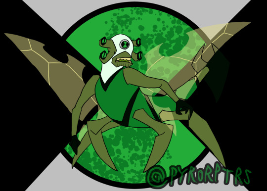
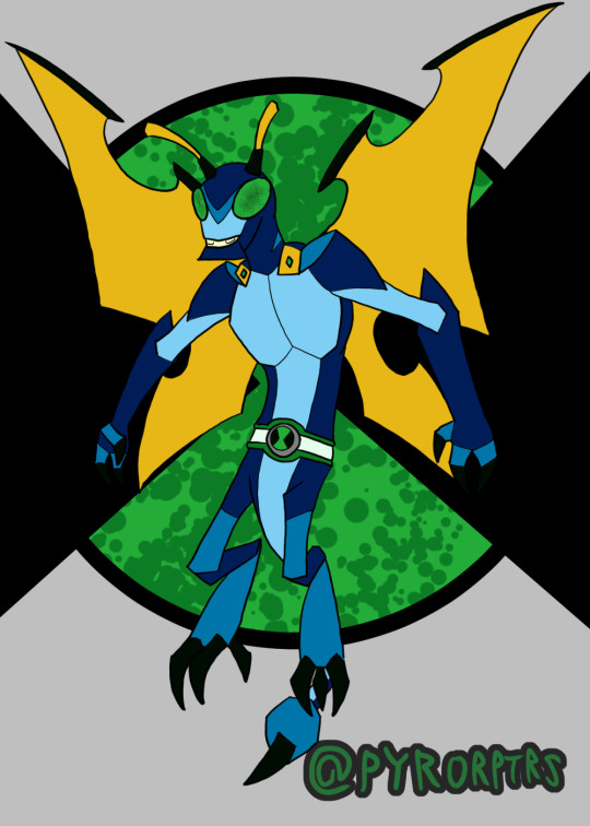
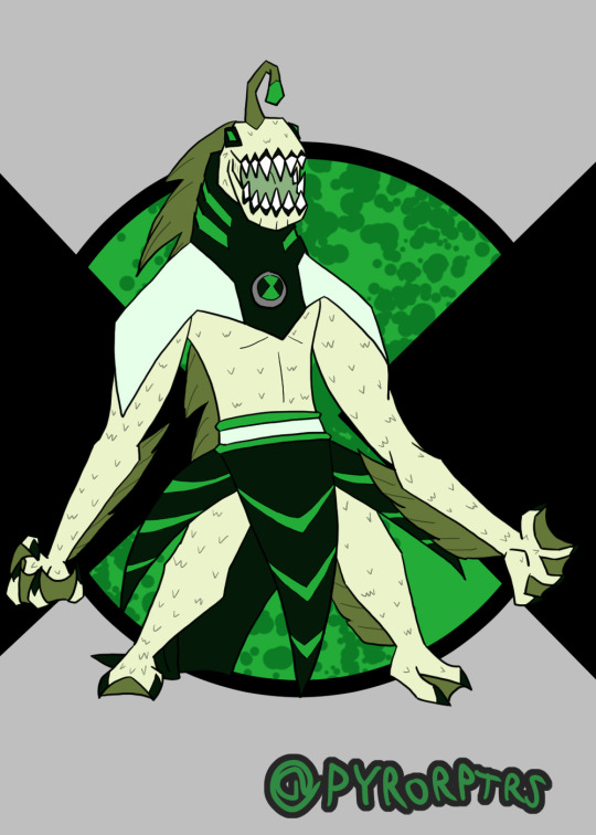
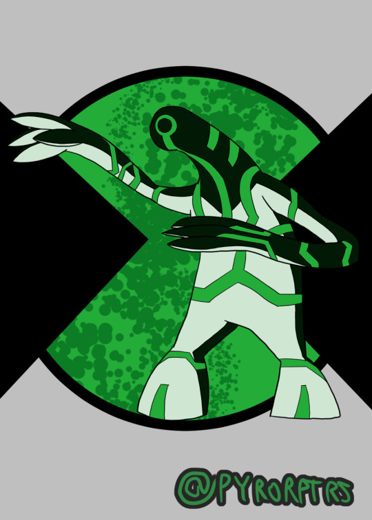
Ben 10 Redesigns Playlist 1
Did redesigns of Ben's first 10 aliens awhile back.
I think Ben 10 designs as a whole work best when you have a specific color scheme to work with, so I tried to incorporate green as the primary with a greenish shade of black and white as the secondary's and highlights. I also made it a rule that unless the alien has some way to properly incorporate the omnitrix into the body, they need some sort of suit or device on them to house the badge
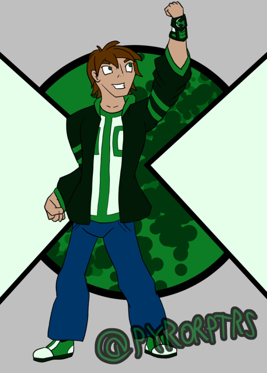
Ben - Honestly doing a design for Ben is kinda hard to do, most of the better takes you can do were done by the original canon and the fandom at large have pretty much filled out the rest. I think the soccer shirt with stripe down the middle is probably the most iconic part of his design, so I tried to incorporate that with his undershirt while messing with the colors. Took some inspiration from both the jackets he wore in the past for his hoodie. Coming up with an Omnitrix design was probably the hardest bit, I'm not a fan of when it looks like a normal watch, but addign too much detailing it can make it a pain to redraw, so I tried finding something simplistic but still kinda techy..
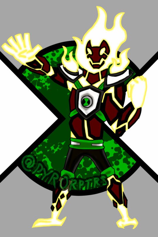
Heatblast - In terms of overall design I tried leaning towards Omniverse, but I also wanted to lean a bit into the 10,000 design from the OG series with the shoulder pauldrons. The reason why I gave him shoulder pads is that I like both the ideas that the aliens grow with ben and that they're the "peak of their species"; which isn't necessarily a good thing. so the shoulder pads act like kind of like "braces" for the shoulder pauldrons since the flames burn more intensely than on other Pyronites.
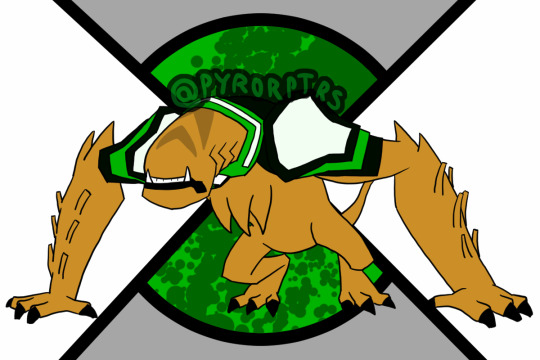
Wildmutt - Went with a mix of his OG and OV looks with a bit of 10,000 influence to make him look older. I feel his shoulder pad is kind of iconic to his design, so I tried to incorporate it and a similar one on his right shoulder into his suit. I also used the collar idea from OV to round out his suit, with the rest extending over his back since Wildmutt tended to be used as a mount a lot. Finally the stripes and tail are nods to his 10,000 design.
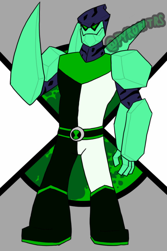
Diamondad - I honestly feel a bit bad for anyone that has to do a design for Diamondhead, because he has such a solid look. Nonetheless I tried to come up with a decent look for him. His OG split outfit look is easy his best suit design, so I wanted to use that as a primary inspiration, but I also liked the the collar that the reboot version had, so I wanted to call back to that. I also liked the earth look he sported in UAF and wanted to take some inspiration from that as well.
XLR8 - Similar deal to Diamondhead, XLR8 just has a solid design, so really was more about adding a couple personal tweaks here and there for personal taste. Did add the back spikes from the reboot version though
Greymatter - I always thought his suits looked like hazmat suits so I wanted to lean into that with his redesign, making it look a bit more techy. I also added some of those falangy thingies other older Galvans tend to have in order to make him look a bit older too.
Fourarms - Another case where the OG design was just so good that it's hard really do another take to it that doesn't amount to personal preference. I obviously used the OG look as a base for the suit and face (mostly because I didn't like the ponytail on UAF or the Goatee on OV), but I also added a belt and bracers on his arms on the arms to spice things up. Finally made his spikes more prominent to make him look a bit older.
Stinkfly - I'll bring up the second design I did in a minute, but for the more classic Stinkfly I leaned toward OV in terms of general proportions and colors, but I also wanted to call back to his OG design with his head being a different color from the rest of his suit.
Slopfly - Obviously this is based primarily off of the design from the reboot, which I have mixed feelings about. Didn't like the almost exclusively humanoid look, so I tried to make him look much more insectoid with more prominent Dragonfly aspects and a bit of Hornet thrown in too. Lore wise, I like to think of his as being from the same planet, but an evolutionary offshoot; think of it like the difference of an ant vs a bee. Overall I tried to make them different, despite basically being the same character. My idea is that classic stinkfly is a bit hardier and can use his claws and stingers more offensively, while "slopfly" as I call him is a bit weaker, but can more effectively use his slime.
Ripjaws - I liked the way OV handled him and wanted to push that more monstrous look a bit further. In terms of his suit, I wanted to add a rebreather so he doesn't immediately start to suffocate, but still kept that weakness.
Upgrade - I lean very hard into Classic as far as my fav designs for him go and wanted to keep that sort of feeling. So I tried to keep his general body shape that same sort of gloppy look he used to sport before OV bulked him up. I also tried to keep the high contrast color he used to sport since I feel it helped his circuitry pattern stand out more.
Ghostfreak -Honestly both easy and hard to come up with a ghostfreak design; their are good aspects in every design, but something also holding them back. I did ultimately lean more toward OV in terms of the overall look, but I also tried to streamline some bits and included the claws from his unskinned form
#ben 10#heatblast#wildmutt#Diamondhead#xlr8#Greymatter#Fourarms#Stinkfly#Slopfly#Ripjaws#Upgrade#Ghostfreak#redesigns
7 notes
·
View notes
Note
Hi! I really like your art style and your designs of the creeps live rent free in my head. Do you still do the 'Ask the Creeps?' thing?
Also, if you want to (you don't have to), can you please do some sfw head canons for Frankie?
It's honestly near impossible finding anything on the guy ☠️
hihi! tysm!! and honestly, i’m kinda weary with the asks specifically because when i draw it’s really weird. it’s hard to consistently keep drawing asks. however, feel free to submit an ask for a character and i’ll try my hardest to get to it. :)
and also, yes i can!! i love this man to pieces like yall need to know this.
also just my regular disclaimer if you dont like my headcanons or dislike them, not my problem and you can cry about it!! 😚😚 anyways lets get into it,
Frankie the Undead Headcanons
died in 1935, and was brought back to life in 1947.
came to the underworld in 1952.
everything about amy remains canon in my headcanons, if you don’t know about amy go to frankie’s creepypasta wiki!!
absolutely loves whiskey. if this man could drink one thing for the rest of his life it would be whiskey.
literally fucking LOADED. he is RICH. but he lives in the slums to keep his identity on the down low.
is a hitman who works under zalgo and beezlebub. he works alone but he is also apart of a small close friends gang with three other men. Tony, Crosseye and Steven (Steve).
has a heavy boston accent and it’s hot as fuck
smokes those thick as fuck cigars
bisexual with heavy fem lean
is apart of the underworld mafia
has been banned from multiple bars
this is kinda nsfw but idc he has a high sex drive lol
has so many nice jackets, suits and button ups but continues to wear the same worn out brown jacket, black jeans and black shirt with his striped tie. that shit is ANCIENT
has a distinct cologne smell. he smells like cologne, smoke and booze.
has a very nice looking apartment. he has very expensive..everything. seriously, his entire apartment alone would cost more than the actual complex (rip hookman)
technically he is literally an elderly man but since he was murdered and then revived, his aging process is very weird. right now hes 39.
owns multiple guns but has his trusty antique revolver he always has on him.
has genuinely good hygiene.
he likes hamburgers and hot dogs.
dad bod dad bod
has medium length hair
heterochromia
hates jack, faint dislike towards william
jazz music atw
really just wants to find someone to spend eternity with. if he ever fell for a human (hehehe) it would ruin him. because they would die off eventually but he’d still be there.
not saying he can’t die, but he doesn’t age as fast as humans so it takes longer.
wants a daughter more than anything
he does have a heart. and he does do this morally. he doesn’t randomly murder, he always has a reason. most of the time it’s child predators/murderers
that’s all for now! if you have any art requests, specially questions about the characters or even my characters please send them! also if you just have any questions for me please let me know!!
#creepypasta#frankie the undead#laughing jack#will grossman#william grossman#creeps comic#headcanons#headcanon
18 notes
·
View notes
Text


I meant to post these yesterday (between the anniversaries of ZTD's Japanese & NA/EU releases), but Eric was giving me trouble still. D-Team honestly has the least offensive designs, so I'll save them for another time. Under the cut is all my commentary on them, including more thought process stuff.
Carlos:
Square-ish design language
The concept art mentioned specifically his broad shoulders, so I tried to make them a little broader than I would on average, though I think I tend towards drawing my characters a little broad-shouldered naturally.
varsity jacket instead of button-down, emphasize "jock" attributes
Canon Carlos kind of looks like a surfer dude. I still wanted to make him look sporty, but in a different way.
kept axe on breast pocket
I think it was a good move for the team to change this one. I like the symbol.
kept burn scarring
I feel as though the burn scarring is less likely to be from his job and more likely to be from when he saved Maria, since he wouldn't have been wearing gear at that time. But I liked the idea, so I kept it.
Junpei:
giving him the emo mullet he deserves
I think with his general self-neglect the fact that his hair is shorter in ZTD than it is in 999 is wild.
I did keep his hair being a purple-black bc I like that :)
put a design on his shirt to make it less plain, so even if you do rob him of his leather jacket he doesn't look boring
Akane:
in the actual game her dress is really close to her skin tone so it blends in. it's still close but not as bad. and it being a turtleneck mitigates those issues mostly
she's wearing platform boots now
I also gave her the River Patented Loose Strand of Hair because I can't draw an Akane without it
both Junpei and Akane:
so I decided to put both of them on the same canvas and work on them in tandem because I like the light/dark contrast they have going on in ZTD as well as the detail that in 999 Akane is purple and Junpei is red & blue
if you look at Junpei the red & blue is still there, just darker and duller
Sean:
honestly I really like the components of his design individually but the desaturation of the colors makes him not interesting to look at past the helmet
the stripes on his shirt were originally blue I think but they're orange here so that the sneakers look less out of place
Eric:
was REALLY hard to work with
like, I have four different versions of this saved, that are all the same base but slightly different
I really liked the note on his concept art where the artist wanted to make his shoulders asymmetric, and wanted to take that asymmetry idea to the next level
I made him blue to contrast with Mira's red
I also wanted to keep the "just some guy" energy, so he is still a Guy In a Shirt, but executed differently and with more color
the orange is because his canon color scheme includes it
"any blond character can be improved by giving them dark roots" -a tumblr post
I don't think that's the exact wording tbh but like that's what I was thinking of
"water motif ;)" because he's really not over it
Mira:
honestly I didn't do much to her.
wanted to make her extra symmetric to contrast Eric's asymmetry but it wasn't working out super well
one of her thigh holsters is for a gun, the other is for a knife
I really despise the zippers on her heels in her concept art they just look bad. There's either a hidden buckle or they're just slip on
made all the metallic accents silver
#zero escape#ztd#zero time dilemma#ztd spoilers#ze spoilers#carlos ztd#junpei tenmyouji#akane kurashiki#sean ztd#eric ztd#mira ztd#r does an art
6 notes
·
View notes
Text
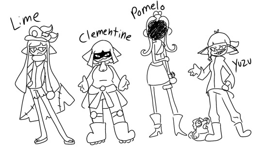
Finally working on my agents?????
Idk what 8 is going to end up like, but I'm going to play octo expansion in the next couple months which should help with that. But for now here's what we have!
I named them all after citrus stuff cuz.. its cute <3 Anyway, if you want a playlist sort of inspired by these 4 and just Splatoon/Splatoon characters in general check this out!
More info under the cut! And of course anything here is subject to change. Feel free to ask me or the agents any questions!
Lime/Captain 3
I mixed the male and female base inkling hairstyles to get the one i use for Lime.
They/Them :)
I changed the cloak they got from cuttlefish to a cape(easier to draw.)
Gave them back their old hero suit/jacket thing and shortened their pants.
This is Lime as of splatoon 3, i dont really know if anything is different about them in one and two that varies from the canon designs other than the hair.
Lime is very much the silent type who tends to worry too much and tries to make sure everything gets handled. This means they can end up taking on a lot more than is healthy for them, but they figure it's better that they do it than anyone else so no one else gets hurt.
has a lot of scars that i didnt include becuz this pic isnt colored.
The exact same height as Yuzu, but Lime wears high heels when in casual clothes so they end up being taller.
Has one older sibling.
Uses roller.
Clementine/Agent 4
Is used to being the smartest there is, and she still is really talented. But when she got into a really fancy school she was suddenly surrounded by other people on her level and she actually had to work. Had never built up good study habits and had just coasted by on natural talent until now, so she dropped out about 3/4 through the school year. A couple weeks later she was scouted by Marie.
She only really went along with Marie due to the low point she was in, and she figured following some random woman into the sewers couldn't be any worse than what she had already done. Saving Callie really helped bring her emotions and confidence back up.
She might still be dealing with feeling like she needs to be perfect and smart for her to have any worth, but she's working to get better and allow herself to make mistakes.
He/Him, She/Her and They/Them!
Their hair is just a shorter version of the "straight" inkling girl hair
The logo on her tank top is supposed to be the cuttlegear logo, but i never drew it lol
Wears her hero jacket around her waist after rescuing Callie.
The wheels help her skate and work well while riding on inkrails. It was her first actual project she let herself work on after dropping out. At first it didnt work, but she eventually tried again and again until it did.
Worlds number one salmon runner.
Was so used to being "the smart kid" until he was surrounded by tons of smart kids. And suddenly, that trait didn't make her stand out any more.
Starts off very self loathing, and Marie doesn't notice because 4 is getting results and all Marie cared about was getting Callie back. But slowly 4 grew to break down and then build herself back up again with Marie's help.
Only child
Uses Dualies mostly, but is also pretty proficient with a charger. Is sort of a jack of all trades and can really play any weapon.
Pomelo/Agent 8
?????
??
She/Her and He/Him???
??????????
??????
?????????????????
E liter user??
??????????????
??????
????
Yuzu/Agent Neo 3
Was originally going to be called Lemon to match with Lime, but i thought Yuzu was cuter
It/It, They/Them, She/Her, and honestly anything else you want to use. Hoards pronouns and names like a dragon.
Lives with Little Buddy and their mom. Their mom(not biological) is a Goldie.
Does actually speak salmonid, and refuses to work for Grizz Co. Will fight their employees on sight. (this causes some slight issues with 4 when they first meet)
Stringer user!
Finds treasure in the splatlands and sells it in splatsville for cash. WILL fight you on sight if you try to take their stuff.
Hair is a mix between the male ponytail and the canon braid style.
Loves to collect shiny bits and bobs, and can sniff out anything like it from a mile away.
Yuzu will do anything for money. It needs money to help support her family!!!
Was sort of conflicted fighting Deep Cut. On one hand, Yuzu respects them a lot for what they do for Splatsville. But on the other hand, Yuzu is not backing down from a challenge OR treasure. So Yuzu chose to at least do Deep Cut the honor of keeping it a clean fight with no tricks.
Speaking of, it WILL play dirty to get what they want.
Very curious and loves to poke around where they don't belong. Will find every little thing hidden in every level.
Absolutely horrible sense of direction, Honey has to help them out a lot.
Is somehow the most naive and most distrusting of the group.
When they celebrate, they go all out! Splatfests, something good happened with the NSS, birthdays, pretty much anything is an excuse to party like tomorrow won't come.
Honey/Little Buddy/Agent Neo 3 Also?
Has a full proper salmonid name, and so does Honey and Yuzu's mom. I just havent decided what they are yet. But Honey was the name Yuzu gave it, and so they wear it with pride!
He/Him, It/Its, They/Them
Has a braid in their hair just like Yuzu!!
Is growing in some of his goldie scales! But not all of them are their yet! Got his first one after the Hugefry transformation. During the transformation he turned into a massive goldie, but returned to normal with no other side effects. But whats this! There was a single golden scale! Honey was so proud!!
Very brave, unafraid to do anything to help Yuzu out! He will help his big sib!!
Likes to cook!
#splatoon#splatoon 2#splatoon 3#agent 3#agent 8#agent 4#new agent 3#neo agent 3#captain 3#little buddy#small fry#splatoon agents#Oc: lime#Oc: pomelo#Oc: clementine#Oc: yuzu#citrus squad
19 notes
·
View notes
Note
2 for any, uhh I cannot remember what it is but..7 for any, cause it’s my lucky number :smiles:
Why does your oc look the way they do? What are your reasons for their appearance?
gonna answer this for most of them bc its fun lol
Raide is actually way different than they originally were designed. she used to be a sona, or, my sona (ravio)'s opposite twin thing. i didnt like that idea anymore so i revamped him completely, and ended up mashing together "skull pattern bc its cool" "keep her hair similar" and "colors i like" and ending up with what we have now. oh, her hair actually originally was designed after a spatoon oc i had, and then i Hated drawing the hair so much that i never drew him, so, with my siblings advice, i made them wear a crown that looks similar to his old hair, and her new hair still has similar vibes but is much easier to draw.
Calen actually hasnt changed too much, to be honest. he used to be just an offbrand version of a character i liked from a fandom im no longer in, and because i had already made him kinda my own, i kept him around and changed him into a twili to match Raide. his colors are blue and gold because thats what his colors originally were, and his skin is tinted green because i didnt want All my twili to just be black and white. thats boring.
Vang was the first of the twins to be made, and was also my first twili oc, so she kinda became the outline for them. Her and her brother, Kalt, are supposed to look like siblings, but also look closer to Midna from canon, because they are part of the royal lineage, and i wanted them to match more with the canon looks we are given for twili.
Kalt is vang but to the left, design wise, honestly. they probably looked Very similar, if not identical before she transitioned, but neither of them minds. he has the same hair as The Hero (link from twilight princess) because he looks up to him and wants to be cool. (aka he started as just a twili Link design but i made him my own.)
(all of the twili are actually undergoing mild design changes currently. undecided if some of the new design choices will be part of an au or not, so i wont be explaining them here, since they arent complete yet anyways.)
Hobic the wizard design choices? uh. slutty gay wizard with his tits out. that was the whole design idea. also green. i dont think too deeply about these things, he's entirely a joke character.
The M Crew, Moss, Marble, and Media are actually mostly three colors. green, purple, and orange. Moss is Purple with green clothes, Marble is Green with orange clothes, and Media is Orange with purple clothes. the intent is to make them look fine on their own, but also like a fun group when put together. Media is supposed to look simplistic but kinda punk. (the end result is them looking like a bouncer at a concert but thats okay lol.) Moss is supposed to have a similar outfit to what i usually wear. letterman jacket, combat boots, ripped jeans. Marble.. marble was a struggle and a half and i dont like her outfit at all. she looks like she got a witch costume from spirit halloween and called it good, so i have to fix that.
Does your oc have any notable skills or good personality traits? Why did you give them those traits? Why do they exist in-universe?
hm. Raide is good at most forms of art. i gave them that skill because im a jack of all trades, and my oc's are almost always an extension of myself. Raide is a good artist in universe because she loves art a lot, and doesnt want to be a royal guard anyway, so why not try Every type of art while he finds out what they want to do? right?
Calen is good at mixing potions, and is pretty charismatic. honestly hes had these since being created so i dont know why he has them. as for in universe explaination: potions are his job, so hes been trained on how to make them(and he Has to know how to make potions.. because they keep him alive..) . charisma is also job related. hes a merchant of many wares (potions are just the ones he makes himself.), so he's gotten pretty good at being charming but honest. it helps people buy his shit.
this got long lmao- and those two are the only ones i could think of answers for quickly(they may or may not be my fav oc's of mine...) so if you wanna ask about other beans feel free!!
#oc tag#ravio rants#calen lunaile#kalt twiliri#raide solaire#twili oc group#vang twiliri#moss the lynx#marble the manta ray#media the raven#hobic the wizard#ravio replies
0 notes
Text
my bud vi @sheylads/@eggmeralda is shadow banned but tried to send some asks anyway 😔💔🤘
Doing this with the Paladins :] 🌈
2.) which oc has never had their first kiss?
I feel like it's such a cop-out to say Amethyst but uh yeah her wivbwigj she's an amnesiac who's memories only started developing again three years prior to the series so she's not that concerned with dating oop
Hypothetically Ruby is the only one who hasn't dated anyone yet but honestly she's such a homie hopper (more in a "kiss the homies goodnight" though) that she probably has kissed one of the other Paladins before lmao
3.) what oc has the best music taste? the worst music taste?
Ruby! Her moms are both somewhere on the punk/grunge/emo/goth spectrum and canonically raised her on My Chem lmao.
Ruby tends to be the one to introduce the other Paladins to bands she think would fit them; Jay and her tend to share music tastes, Blaze would like Fall Out Boy, Rina would enjoy Panic at the Disco (well like the GOOD times), Ruby would be surprised that Turqbalt likes Linkin Park/Green Day, Amethyst would like Evanescence, aaand Ruby would be a little afraid to show her music to Rose oops. I also think she'd be a little shy to show her stuff to Tarum but Tarum surprises her for liking more Danger Days kinds of My Chem
I'd joke that Callaina is into hyperpop like me but I do think canonically Oriole has the worst music taste; he'd really like CORPSE songs, but really only the horny ones in a very unironic "Oriole is incredibly shallow and toxically masculine" kind of way
7.) which oc has the most cohesive color pallet? the craziest color pallet?
I think it's sort of the SUL style to have a veey cohesive color palette; they all tend to be monochromatic with an occasional achromatic color in their designs BECAUSE a good chunk of the series is about how everyone represents a color. The original Paladins are all directly monochromatic because they physically cannot produce any other colors of light
However, craziest one has got to be Sage; I love the vibes of their design, but it definitely feels a little too difficult to redraw over and over again. It doesn't help that their palette uses up a LOT of different shades of gray and green, so their palette is currently the craziest.
8.) which oc prefers flowing clothes? tight clothes?
Oh that's a whole motif in my stories lmao, the "compact" twin and "flowy" twin
Yin and Azureus prefer flowy clothes, because they're the calmer/introverted/gentler twin
Yang and Callaina prefer tighter clothes, because they're the hyperactive/extroverted/harsher twin
Tarum and Prima switch this around with Prima preferring tighter clothes but being the flowy twin, while Tarum prefers flowy clothes while being the compact twin (it probably makes more sense when you see their very atlasified designs from these comics)
Typically I use that motif to design twin siblings, but I use it for lots of other relationships too!
Aster vs Violetta, Aster is the compact one and Violetta is the flowy one
And of course, Ruby and Cobalt! I think the compact/flowy motif I use works pretty well with rivalry designs :D for rivals it tends to reflect their fighting styles.
For those two, Ruby prefers tighter clothes because it's,,, I guess more aerodynamic? You see Olympic runners only in shorts and tanks so Ruby's fighting gear underneath her jacket is only yoga pants and a t shirt, and even then her jacket is pretty short. She runs FAST, so she can't have anything super long for people to yoink/get caught on
Cobalt prefers flowy clothes because his fighting style allows him to stay more static, he's much more based on strategy (called a "fox fighter" in-universe) so he's not making super huge flashy movements to win a fight. Also, he's autistic and also Azureus in another form; he's really attached to long flowy clothing. He likes very soft fabric and lots of it because it's a good pressure stim for him. He hardly wears anything less comfortable than a hoodie and sweatpants, so his fighting gear is made of the same material to ensure his comfort.
0 notes
Text
I don’t know what the main storyline is this season...Honestly, I don’t think the writers know what the main storyline is this season. Bigger than that, I don’t think they’re doing what they think they’re doing.
*
There’s a part of me that believes Maria has been keeping strands of Alex’s hair in a lockbox since middle school after she watched Twitches at a sleepover because she’s in love with him. Let’s call it canon. Also canon, the writers have never known what to do with Maria, so they keep shoving her into storylines...They should have made her the villain. The writers really missed that opportunity during the season she wore ostrich feathers and Abominable Snowman fur. She was like a Cruella in training. And if we’re being honest, in many ways, and to some people, she already is the villain in this story.
*
It’s a duet designed to feed #malex fans, but I question if it’s really enough...It takes more than a ghostly duet to quell justified frustration over a season that has sidelined Alex. And I'm not talking physically, actor availability is a reality many shows have faced. I'm talking about keeping Alex at the center of Michael's heart and arc. Let Michael sit down and have a conversation about missing Alex. Give the audience that onesided voicemail that Michael leaves for Alex; one that's about them and not centered on another character. Have Michael sit down at the end of a long day and let him ramble to Alex's voicemail, a smile on his face and a whispered I miss you, I love you at the end. And above all, let him be the one to realize that Alex is flipping missing. And I dare say, using Maria as the tunnel between Michael and Alex is a big do not want for many of those fans. Again, I’m not saying anything the writers and showrunner don’t know. The fact that they didn't give Michael those emotional beats and spread Maria throughout Michael and Alex's storyline is a choice. A deliberate dickish choice but a choice.
*
Alex is still in the hole. Viewers still haven’t seen him. And unless his cool jacket had secret pockets filled with water, he’ll be dead before next week’s episode because that’s how real science works.
*
Anger is a justified and acceptable feeling. Period. You are allowed to be angry. Don’t ever let someone tell you how you should feel about what happened to you or how they’ve treated you. Is it okay to punch people when you’re angry? The societal answer is typically no. Society says that violence is never the answer. However, if it is the alien Max Evans of Roswell, New Mexico then the answer is yes. Max should be punched in the face far more often than he has been. Feel free to disagree. I say all of this to say that Michael Guerin was justified in his anger. And so what if he let some truth bombs slap people in the face, letting truth bombs fly when you’re angry is one way to process your feelings. Also, Michael lives with and is in a committed loving relationship with Alex, so why would friends keep serious information about Alex from him. Did he scorch the earth the last time Alex went missing? Yes, he did. What were the rest of them doing? They were huddled together at The Pony hoping and wishing while Michael got his hands dirty. We’ll ignore the part where the writers had Michael leave Alex chained up so he could ride the Ferris Wheel with Maria. And why is Michael’s level of scorched earth unacceptable. This group of “friends” couldn’t cobble together a moral compass between them. Violate trust, bodies, and scientific ethics? They got you. Use violence to interrogate a suspect? They’re down. Lie, steal, gaslight? They consider that game night. And the worst part of all — Michael apologizing to the people who wronged him. Talk about a cycle of abuse. In addition to being occasionally stupid, this show is occasionally gross. I would say do better, but they won’t get a chance, so instead I’ll say go take a seat and think about what you’ve done.
*
Here’s my analysis: In the Roswell, New Mexico writers room, there is no bottom when it comes to stupid ideas or desperation over making Maria plot essential. She has been wasted as a character since the first episode and every attempt to correct that fact as been a terrible idea.
#roswell nm#roswell spoilers#anti maria delcua#these reviews are always amazing but this one in particular was a delight
45 notes
·
View notes
Text
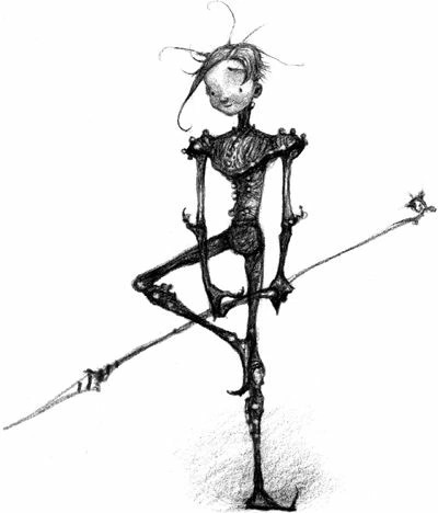
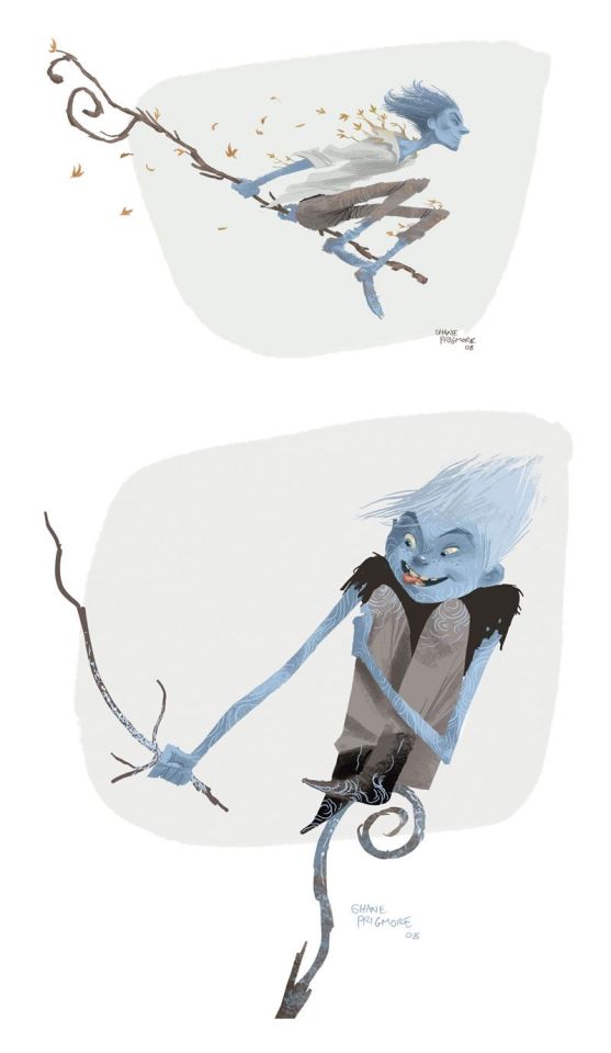
Jack Frost Designs Review
Yes it’s finally his time. This is going to include his book designs including previous incarnations in said books. There are more movie concept designs than book so, let’s dig in shall we?
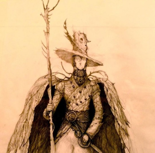
This was in fact the first ever Jack Joyce designed while he came up with The Guardians Of Childhood. He even comes with his own backstory! (Which was cut. Sorry Joyce posts walls of text so it’s a girthy read.)
So instead of a young mischievous trickster, we got a much more depressing story of Jack. (Jack by default is sad obviously) but this one... It kind of hits differently and almost reminds me of the story he crafted for Pitch. A dad who tried to defend his family but through tragic events was ripped from them and changed completely.
Design wise, he’s a lot more tree than snow. There doesn’t exist a colored version of this so we’ll never know if he sported winter and dull dead leaf colors rather than grassy greens.This Jack has a weird presence to him, I can’t put my finger on it.
Rating: 6/10 He’s really neat! Just a little too Autumn feeling rather than a blend of both Autumn and Winter.
Nightlight feels like the baby evolution if Jack was a pokemon and that's what I’m gonna stick with. Below is a more recent version of him colored.
In all honesty that one is easier on the eyes proportion wise because sometimes Joyce has ‘interesting’ anatomy choices but we aint going into that today. It’s interesting how his hair somehow looks shorter and longer than Jack’s at the same time. Could be because the longer strands float seamlessly but star boy hair physics what can ya do. It’s a little hard to tell what is his skin and what is his armor, so that is a casuality in making a character only have one or two colors in their color scheme. I love other artist’s depictions of Nightlight but the canon one feels a little weak color wise.
Rating: 5/10 Sorry, get some better LEDs and then come back.
Here we have a book Jack but I can’t entirely recall if this was used in the books or not. I digress. This design looks like him still wearing very Nightlight-esque armor/clothing and slowly growing into his new persona as Jack Frost. The intricacies are hard to make out but we’ll work with it. This one is very interesting to me because he very much looks like an older teen close to young adult. His hair looks very fluffy too. Not many complaints about this one but not much praise either.
Rating: 6/10 Not great but doesn’t stand out that much.

Remember when I said Joyce had ‘interesting’ anatomy decisions? Jack looks like he has half a head here and it bothers me GREATLY. This is the adult Jack design he went with. Supposedly he likes the opera and he sure looks it. This! Exists!!
Kind of wish it didn’t. The outfit is nice but it just doesn’t fit Jack as a whole. This just screams to me that it’s someone else with a similar-ish hairstyle.
Rating: 3/10 Guess he’d be the...Phantom Of The Opera. (I’ll go home and so should he.)
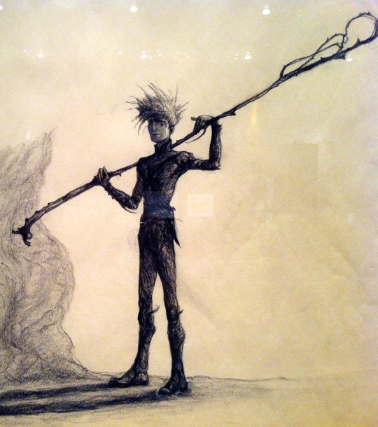
And finally the final Jack. This is the one that almost exactly resembles the Jack we got in the movies(Probably because it was made after the movie but w/e) but just add a cape on him. I can’t really tell if hes got a hoodie and a cape, or just a cloak+hood on top of a sweatshirt. It isn’t too important because my thoughts on this one are obvious.
Rating: 10/10 Edna Mode would have a field day with you boy.
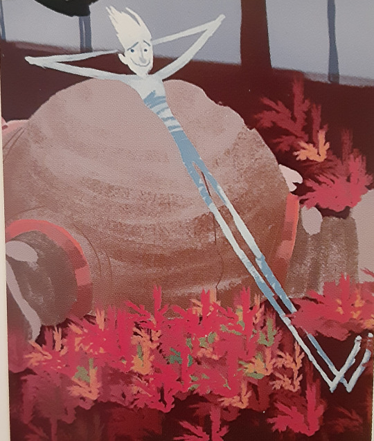
MOVIE DESIGN TIME
Joyce claims this is a design he drafted when Leonardo DiCaprio was considered to voice Jack and I can kind of see that with how his face is drawn here. This Jack looks a lot more like a warrior and less of that trickster look. I can’t say I’m a fan of the weird antenna his hood has but his sword is really cool looking.
Rating: 4/10 Nice bow and sword but it can’t save your fashion choices.
This looks like a lanky 11-13 year old who would put rocks or slugs in my shoes and relish in my disgust. He has the exact look of a snot nose kid and I’m unsure how to feel about it.
His various hairstyles drafted here sort of make him softer looking or just more of a snot nose, no in between. Maybe even an Anime Protagonist.
The top right one almost looks like Hiccup from How To Train Your Dragon if you squint. It’ll be a little hard to rate them all as one individual but why not.
Rating: 5/10 I don’t hate them but they aren’t my cup of tea.
AH- IS THAT A FUCKIN GREMLIN?
Oh wait no it isn’t he looks like a 10 year old. Whatever don’t feed him after midnight. The staff’s design of not being shaped like a G is an interesting tidbit but the whole design looks like he’s really young or like a troll etc. This Jack looks like he thinks girls have cooties uses outdated slang.
Rating: 4/10 This is me being generous.
It honestly looks like he hiked his pants up all the way to his chest. A late teen with horrid fashion choices once again. Not many other thoughts here.
Rating: 2/10 Get a sweater on or something.

This is one is very interesting looking to me. His clothes looked a lot more leather based and very human-like. The tatters, tears and frays all make him look like he was a victim of an accident that never changed his clothes. It makes me wonder if this Jack had the same death as the final movie Jack or something else entirely. Either way, this one looks like hes a mid to late teen which really adds to my intrigue.
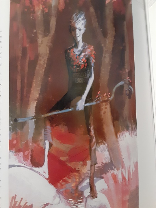
This was another image that greatly resembled the design so I included it here. It almost looks like his skin is blue here which is pretty neat to me at least. He’s also got leaf motifs here, which from the first Jack design Joyce made, we can see a pattern here.
Rating: 8 /10 I was originally weirded out by his head but now its not so bad.
This Jack is definitely dressed more like a nature boy rather than him having human influenced fashion and it’s an appealing touch. The tiny leaf sprouting from his staff is also kind of cute since the designers seemed to want to put leafs somewhere on his designs. His hairstyle is also very cute but it reminds me of Sasuke Uchiha in a sense. (Not a setback for me at least)
Rating: 7/10 13 year old Jack is going thru a phase.
I thought this Jack didn’t show up again in story boards but I was wrong!
They look a little different from each other but just similar enough to pair together, so bare with me. The first one obviously has looser pants, slightly longer sleeves and got his leaf motif going. This second Jack is a VERY green. It gives the impression that this Jack made his clothes out of plants and natural materials. Again I’m not wholly sure if greens fit his color scheme but they sure went for it for a while. I can’t say I’m a fan of it because it heavily reminds me of Peter Pan.
However a very similar looking Jack could be found in this storyboard. It doesn’t look as green as the other storyboards made it out to be and looks more like dead grass. Which is a pretty nice touch.
Rating: 5/10 I don’t hate it but it just doesn’t vibe yknow.
Speaking of a vibe...hoo this certainly has one. This Jack isn’t old but certainly doesn’t look very young, maybe in the 20-30 range, thats just me. He has facial features that remind me of Pitch but resembles the Jack Frost of Santa Clause 3
That being said, I wondered if him looking similar to Pitch was in the storyline of them being brothers.(Which was a scrapped thing, who knew.) He’s a bit more menacing in this design but certainly seems like he relishes in his work.
Rating: 4/10 I’d make it a lower score but I gotta give it props
NOW THIS JACK IS KINDA INTERESTING. This one looks like he’s 16 and going through a grunge phase. He’s gonna play Nirvana loudly and not turn it down even if you tell him too. His staff itself has mini icicles hanging off of it and leafs look stuck to his shirt. Did you glue or staple those on Jack? His hair also looks much longer than his other designs and I kind of dig it( Shut up I’m bias.) I’m not wholly sure why else this design has stuck with me but it just has something about it that I just love. I wish there was a full body drawing of it.
(He also kinda has the same hair as the Jack Frost in Runescape but I wont go on about that hoo hoo)

Rating: 9/10 *Bad Boy by Cascada plays in the distance*
This one definitely feels like middleschooler trying to be in a band. His sticks just resemble drumsticks to me what can I say. I’m a big fan of his shoes and his color scheme screams a hibernating tree in winter. His hair also looks like it’s covered in frost rather than it being wholly white, which is very neat!! He looks like he wants to fight but has slight hesitance. Overall a very balanced Jack.
Rating: 8/10 He’s ready for band practice
Not many thoughts here, I just found these tiny Jack designs cute. His hoodie being a jacket instead just adds to the charm of this one.
No talk to him he angy.
Rating: 6/10 fun sized boi
Now this Jack resembles the one earlier that dressed entirely in leather brown colors, however he clearly is different than that one. I’m gonna say it, he looks like a zombie or undead in this design and its pretty fucking gnarly. I don’t know whats going on with his hair but I’m gonna assume it’s just the wind making it look like that.
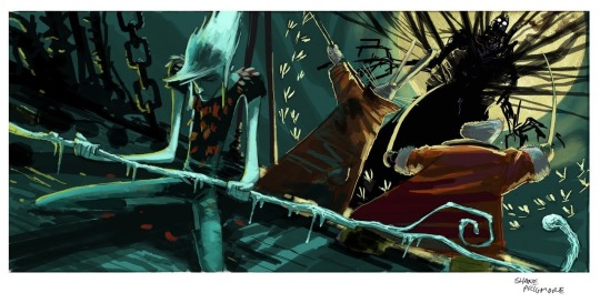
He just has the vibe that he was once human but was turned into something else entirely. It isnt in uncanny territory but borders that. This version of Jack meeting Pitch and the others would have been *very* interesting.
Rating: 7/10 Eat a twinkie Jack you’ll feel better.

The final design! I can’t complain much about this one. The way his staff subtly has a G shape and a hexagon(his signature shape) is a wonderful touch. Additionally, the way the frost is gathered mostly where his hand is such an intricate detail. His signature hoodie is iconic at this point so I can’t bad mouth that either.(I can’t anyway because there's no complaints from me here.) Although, I never understood the leather straps that his pants had or their functions. I couldn’t find any colonial outfits that resembled Jack’s pants so its a total mystery to me at least.
And I can’t go on about this design until I mention the snowflake pattern in his eyes
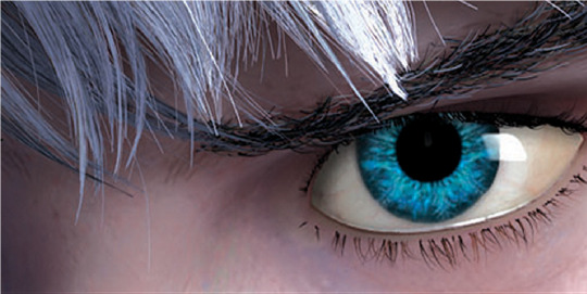
Pure beauty. It’s at a hue of blue that almost looks impossible to have, combined with the electric blue color of the snowflake in his eyes. The amount of detail in this movie amazes me to this day.
Rating: One Great Blizzard <3/10
#rise of the guardians#guardians of childhood#jack frost#jack frost rotg#jack frost goc#jackson overland frost#nightlight#nightlight rotg#toothiana#tooth fairy rotg#e. aster bunnymund#nicholas st north#pitch black#pitch black rotg#concept art#artbook#art book#design review#my bullshit#stay tuned for Aster's review
641 notes
·
View notes
Note
do you have refs for your fua head-canons?
yeah! I use PureRef (tasch recommended and approved ;3) to keep all of my favorite character drawings and refs on hand.
And a reminder that all visual headcanons of the characters are valid!
its been awhile since i talked abt FUA and ive got time so im gonna ramble a bit abt my design thoughts too

Harley's Desi (indian subcontinent diaspora)!
based on my gay community mentor from when i was first figuring out i was trans (was also desi and a trans man, super cool and helped me during one of my lowest times. much love if youre still following! <3)
his hair is sometimes hard to get right bc like, desi hair tends to fall between straight and curly, but with sooo much volume, it’s so gorgeous
i actually looked up radd's design for harley (click here), along with the only other fanart of harley at the time (click here), before coming up with mine, and i liked radd's design, but i didnt wanna fall into the "black man = deep voice" hole, but also didnt wanna make a tumblr white sexyman podcast design lmao (even tho the VA for harley at the time was hella white and even the current VA ajgsfjkhaha)
i actually drew my, eli's, and radds designs all together once for a textpost! (click here)

Love is Korean, as hinted in the show through her name (Nari).
originally love was tall because i wanted a tall asian lady, but alas. also i thought she was older (the shock when you find out she doesnt know the foundation's reputation for death o-o). you can see her design got a little more soft and energetic to reflect the show's hints that she's like, around 20 or something. i love her <3
love's hair is based on like, my personal experience with having long shiny asian hair. HAIRTIES DONT STAY. every day it would just slip down slightly and make that stupid muchroom shape lmao.
also hair is SUPER IMPORTANT in a lot of asian culture, even in modern day, so long hair bc she's close to her family and still figuring out how to be independent and stuff. also it just looks nice on her, i think she can kick ass with long hair
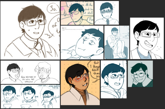
I never actually decided on a specific background for lanc deeper than "Asian", maybe Laos on his dad's side? but I like to think he's pretty americanized (like me lol), so it's not something he thinks about too much.
i honestly don't have much to say on lanc? his design has changed the least, tho i draw him with stubble more often now. also i super project onto him lmao

Klein is white.
her design was based on my boss at the time (and one of my coworkers), who was super charismatic and has a perfect mix of optimism and exhaustion, and who was also fat, and no less wonderful of a person for it. i think a lot of fandoms have a culture of fatphobia (coughmcytcought) and i want to encourage fat characters and designs in our fandom, because hey! we exist!
klein is also the hottest character in FUA
i keep forgetting her scars hfdjkhfd, but yeah she seems reckless enough to have shit blow up in her face (the singing rock that was basically a sound grenade, anyone?) and shes been part of the foundation for awhile
radd doesnt have a lot of drawings of klein posted, but there is the group drawing from awhile back (click here)
Raddagher is also white. But also. This was not my original design for her.
YEAH THATS RIGHT, ALPHA VERSION RADDAGHER WAS JUST A HELMET BECAUSE I THOUGHT SHE WAS HEAVY DUTY SURVEILLANCE HAHAH,, also i thought a big buff faceless security lady was a cool idea. might repurpose the design for an OC in the future
a lot of raddagher’s design is based on radd’s designs, which actually existed before the show iirc, but i wanted some flavor, so goggles and blue hair, and a big comfy security jacket. i have been drawing them with glasses more often tho
the shark teeth doodle is from a joke about radd being part shark
THATS NOT ALL THOUGH. I HAVE ONE MORE THING. THAT’S RIGHT, THE UNVOICED CHARACTERS.
Dr Shao is so wonderful??? Nonbinary Asian and highest ranking member aside from Klein??? the gays keep winning QwQ
Alves and Simmons each cameo in my textpost memes, see if you can find them lol. Their designs are kinda up in the air tbh but I think Simmons is white.
Dr Gravett is based on based on my black coworker that's basically my work mom. her hair is always immaculate, including the style i drew gravett with, which was dutch pigtails. thinking about it maybe she should have more scars considering her personnel file...
The Short Mean One and The Tall One from botany :3 tbh i dont have a lot to say about their designs i just think they’re two pretty besties
also psst check out radd’s designs for upper management too! (click here)
anyways thanks for asking! hopw you enjoyed! imma go pass out now.
#find us alive#fua#raddagher#character design#scp#long post#eyes#eye contact#i adore shao i hope they get more mentions
57 notes
·
View notes
Last Seen Blogs

nba-2k13-cheats-code-os
🏅 nba 2k13 cheats code (mod work) HH1D!
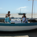
jertaste-blog-blog
JA TASTE - Art I like

onducmili
Без названия

