#i might talk too much...
Explore tagged Tumblr posts
Visit Tumblr Blog
Explore Tumblr blogs with no restrictions, modern design and the best experience.
Last Seen Tumblr Blogs


Fun Fact
The most popular pages on Tumblr are about Minecraft, GIFs, and David J. Peterson.
Text


guess which game(s) I've been playing
#kcd#kcd2#hansry#kingdom come deliverance#henry of skalitz#hans capon#kcd pious#pious pavel#there are also kubyenka and hynek doodles but they are just a small part so no tags for them#and mutt and pebbles are here too :)#I also have no idea what the ship name for henry and pious is and even if I did I feel like that second piece might be too vague to add tha#but that very much influenced the drawing. do with that information what you want#anyway.. i technically don't have time to indulge in drawing whatever I want bc I have an art project to finish (also kcd related)#but I can't help it. I am a hedonistic soul splurging on the joys of decently written games that make me go so insane I just HAVE to draw#been talking to tunes my good friend tunes who is also playing it rn and we've been sharing thoughts that make me go!!!!!!!#literally have so many ideas for what to draw but so little time ugh
2K notes
·
View notes
Text

We're going on an ass kicking adventure.
[First] Prev <–-> Next
#poorly drawn mdzs#mdzs#wei wuxian#lan wangji#Yes indeed this is a reference to the classic 'Kirby's fucking pissed' meme. It felt fitting given the circumstances.#Wei Wuxian is nothing but a villain now. His name is but a booeyman and scapegoat for everything that goes wrong.#It is a cruel and unusual punishment to be Irrepairable to others. That no matter what you do - you are othered and unsalvageable.#While this situation deals with necromancy & war & politics...boy does it ever mirror how modern drama campaigns go.#I wonder if MXTX did that on purpose? Considering how SVSSS talks about the relationships between authors and their fans/work -#Its stands to reason that WWX story is indeed a parallel for how the public prefers black and white & sensationalist views of people.#People are heroes or villains and trying to think about the nuance is too much work.#And it does not matter what the truth or lies are. The rumour exists and so it must hold truth.#It feels like someone dropped a poorly researched callout post on WWX on twitter that went viral.#80% of the people don't even know who he is but are still leaving him death threats.#“Guys I know we all used to really love WWX's content but I heard he unethically sourced his bones for his last art installation...”#Okay actually he might indeed do unethical bone sourcing. I need to think longer on what the hyper-specific hobby drama might be.#And a huge shout out to LWJ who is right in the vicinity watching this happen in horror. *That* is a specially kind of torment too.
2K notes
·
View notes
Text
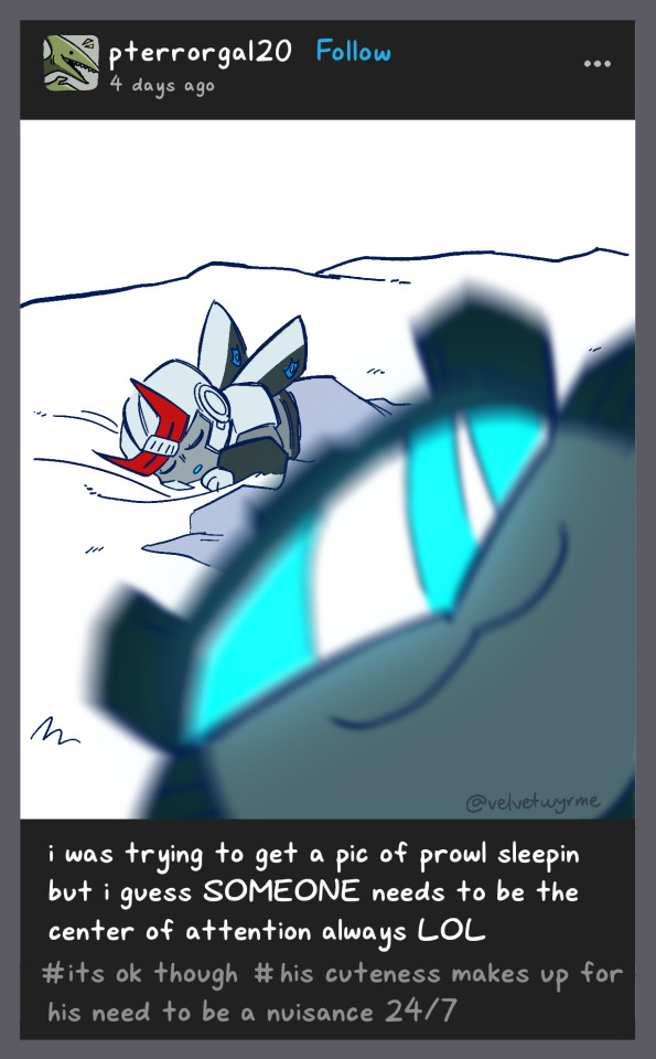


more of the (j/p)eetles..................
prev // next
#macaddam#transformers#velwy.png#my art#jeetle and peetle#bug jazz#bug prowl#prowl transformers#jazz transformers#i spent too long on the bit following this#but i wanted to get some cuteness in first anajjjdhndjdbnd#the bit... might actually come later cos theres some other stuff i wanna do but anyway its all there for when i wanna post it#anyway im talking too much in the tags again u-u#I JUST WANNA GET TO THE FUNNY BIT BUT. MY LOVE OF SETUP IS FIGHTING AND WINNING#cybugs
1K notes
·
View notes
Text
smth i honestly recommend everyone should do is like. keep a private folder of art u like on ur computer lol. and like. download art u like when u see it. ur gonna lose stuff Forever if u just like it, u know? and like, discord archives arent really enough lol. I have been downloading art since like 2016 & I have a LOT of art that was scrubbed from the internet otherwise, especially due to like. the antics of deviantart & twitter. And on things like twitter theres Barely a way to save art to begin with (bookmarks is Not good enough)
u do kinda lose Credit a lot of the time (unless u save it with it named? which i do sometimes but not always) and often like, it won't be the Perfect HQ or itll have a massive watermark on it. but like. since it's not really for Sharing as much as its for my own personal enjoyment, these things don't really bother me at all... Having a collection of art that i love that I can look at offline & like, On My Computer is so nice. And I back up a lot of it on hard drives when i back up my own art! Again, like, a lot of these pieces this is the Only way i can look at them anymore, and Maybe the only archive OF them.... I've had pieces from my friends Before they were my friends, that i just saved as a "fan", that THEY lost years later... I have pieces they hadn't Seen in years. And every year I Probably save at least a few more pieces that will become like, totally scrubbed from technology otherwise. idk. i think it's nice to have an archive of this art that is in my taste but also like, that i'd likely Lose otherwise.
i Hope people save my art. I don't honestly Think anyone does, but I Hope that like, if my shit ever blows up and all my accounts get scrubbed, Someone has at least one drawing I made saved to their computer 2 remember me. u know. Its like a scrapbook. I remember these ppls characters, i remember the communities at the time, i remember how i felt when i first saw the piece. Its really inspiring but also genuinely like, really Important to me and sentimental. I kinda think everyone should have their own collection but I think people are genuinely Scared to right click & save ppls art LOL. Genuinely where is the harm, though.
#idk i really think ppl are afraid of it and like#i think. some artists might at first think “ew no i dont want ppl doing that to my art”#y#like why#like actually.... whats the difference between them looking at ur art on a social media feed vs on their own pc#its beautiful and inspiring and doing a part to archive ur work#cuz like we've been shown time and time again that social media degrades#why wouldnt u want it except like. Just out of kneejerk Fear of people having too much access to ur work#they arent Stealing from u...#thats not what this is LOL#idk maybe this is a hot take but i dont think its a take anyone has any real opinion on cuz i think most ppl dont#like... think about it that hard#but i think ppl should do it#have ur own personal collection 2 refer to#i still have like... my favorite pieces from when i was in middle school#do u know how much that Means to me?#its better at holding my memory than like... anything else... cuz i take it with me#i have art from my Friends back then and my favorite artists#and i can see how clearly my spaces and my tastes have changed over time#i can always draw back the lines of inspiration and hold them close to my heart#idk. im rambling. hi . are u reading the tags. probably not . LOL#im talking to myself#whateva#text post#text
647 notes
·
View notes
Text
₊·͟͟͞͞➳❥ i made an uquiz where i sent you on a blind date with a haikyuu character and if you're reading this you're obliged to take it and share your result!! also rate my matchmaking service 5/5 ✭ and tell your grandma about it please thank you
#there's 16 possible results (guaranteed no blond men. only fake blondes)#our matchmaking service might still be a little wonky tho but i promise you'll have a mediocre date at least#on a side note if i ever talk about making another uquiz again you have permission to take me out with a blunt hit on the head ty#so much work asdfhjsjks but it restored all of my whimsy i hope it works for you too!!#-`♡´- arcade#haikyuu x reader#hq x reader#haikyuu
582 notes
·
View notes
Text

drew some of my fav ody designs! wasnt originally meant to be also replicating the styles but thats sort of just how my brain works. except i didnt copy the lineart styles of anyone here so its DEFINITELY a bit uncanny for a couple of these (LOOKING AT YOU QINNY IM SO SORRY) but whatever
the designs featured here (from left to right) belong to: me, @gigizetz, @neal-illustrator, @irunaki, @bigidiotenergytm, @qinnyanimation, and @foopsie-daisy
#WAUGHHH IM SO NERVOUS TAGGING PEOPLE COOLER THAN ME#HEAD IN HANDS HEAD IN HANDS I NEED TO STOP PANICKING OVER STUFF LIKE THIS#bc like I KNOW THEYRE JUST PEOPLE. I WOULD BE SO HYPE IF SOMEONE DREW MY ODY ID LOVE TO BE TAGGED IN THAT.#BUT WHAT IF I AM SHOT. WITH A GUN. gfrdfvb vfrdedrf#i am a very normal non anxiety having person i swear guys#worst thing i did here was have odys hands very visible for the qinny one. because i didnt realize the way they draw hands is very realisti#BUT THEIR WHOLE STYLE HAS REALLY REALISTIC ANATOMY I SHOULVE KNOWN#irunakis style is SO fun to draw in bc its a lot like some of my older art so its very familiar yk yk i wasnt worrying too much about makin#-things accurate. but i think that accidentally made me too comfortable and so i ended up straying a bit too much#i think a lot of irunaki and qinnys styles specifically is in the lineart. so me using my normal style of lines makes them less recognizabl#anyways. neals odysseus i have shit talked in private (its a good design it just feels uncanny w/ jorges voice to me) but hes really-#-interesting to draw. i wanna do style studies on neal their characters have a very. idk animated feels like the wrong word but like.#something like animated. feeling to them. theyre very distinct in shape i wanna do studies thats it#bigidiotenergy i found this morning while FINALLY looking at cloudysseus art and instantly fell in love w their design#i need to ruffle his hair. hes so silly. absolutely incredible design. but GOD was the style a nightmare#it was too late id already comitted to trying to replicate the styles. but ohhh my god its so far from my own it was so hard#theres so much detail in places i dont normally put any at all#and its like. WAUGH its scary i need to do anatomy studies in general maybe#uhh havent commented on the gigi one. he was really easy to draw though lol. weirdly enough gigis style was close enough to my current one-#-that i didnt have any trouble whatsoever? and i think its the most accurate too but only because of the lineart styles being similar lol#ALSO NOT TO PLAY FAVORITES BUT FOOP ODYSSEUS IS MY FAVORITE#I LOVE HIMMM I LOVE HIS SILLY SHAPES HE LOOKS LIKE A WEIRD CAT KINDA. HE INTRIGUES ME.#my ody feels kinda lame next to all these guys gbfdefgbf#but oh well. hes ingrained into my mind now i cant change him at this point /silly i am actually happy w him but i might make changes#thaats thoughts on all of the odys here. anyways art tags time#doodles#odysseus#epic the musical#OH MY GOD EDIT I FORGOT TO DRAW FOOP ODYS SHOES. HEAD IN HANDS. IM SO SORRY
933 notes
·
View notes
Text
sorry i keep being an Angry Jew on main. unfortunately there is a lot to be angry about as a jew
#sighhhhyg#i don’t like. talking about antisemitism#more than snyone else does#its not fun#makes me feel. really shitty actually.#would be nice if people didnt hate me for being born#but that might be too much to ask for#antisemitism#the jews are tired#jumblr#i say on main as if i have a sideblog for this. i dont
1K notes
·
View notes
Text
i'm in one of those phases where i really wish i believed in manifesting and spellcasting and things like that bc you know when you want something so bad you're literally praying for the universe to let it happen
#ramble#this is not me judging by the way i think it's cool as fuck i just don't do it personally#context: a lot of my 'dream jobs' are now just 'ways to make money that i might not absolutely hate'#but i have one (1) legit dream job and it's literally FINGERTIPS away from me right now#i feel like most people who know me can guess what it is and know how badly i want it#i'm not even letting myself daydream about it or talk about it too much because i'm so afraid of not getting it and being disappointed#and also i don't want to like. jinx it#i've tried so many times before but this is the closest i've ever been and i feel SICK i want to bite something
1K notes
·
View notes
Text
7. Lincolnshire Posy: II. — Composed by Percy Grainger, Performed by the Dallas Wind Symphony
It’s been on my mind lately that I had a lot of these Spotify song requests that I finished and never got around to posting, so I’m gonna try to chip away at posting these over the next few weeks! BUT Hi Ghost :] It’s so funny this was the song you ended up getting the number for; I had actually listened to it on loop during the deepest trenches of ranchers brainrot however many months ago, so I’m really happy I ended up being able to draw something for them!! <3 This is also the part where I expose myself for being an unashamed band kid =w= Grainger’s one of my favorite composers, so I listen to his works a lot and couldn’t help associating the really soft hopeful horns with this kind of healing period for the ranchers ;w;
I probably won’t ever really go into the details of the m-1 server’s overall plot, but I think the general vibe for m-1 ranchers is that these little moments of soft sunlight and healing bones were some of the most needed for them, so that’s why scenes like this always stand out in my mind <3 Context aside though, I think m-1 ranchers are just super sweet so!! figured I’d Full-Send share this soft doodle of them :]
#team rancher#m-1#art escapades#jimmy solidarity#solidaritygaming#solidarity gaming#tangotek#trafficshipping#spotify wrapped doodle challenge#tango#tango tek#how do I tag things normally#ask#babygirlbdubs#mutuals#ranchers#solidaritek#solidango#I don’t remember any of the other rancher tags DFJBDFGN#OH small note but I likely will not be answering any questions about m-1!! might post some old art of the ranchers if I get around to it but#other than that I probably won’t talk about it too much!! :]#m-1 ranchers u have a very special place in my heart <3 kissing you both verrrry gently on the head#and then shooing you both off to bed
1K notes
·
View notes
Text
So...
I'm still having a writer's block on Trial Player AU and I'm stressed out from studying for my upcoming exam on Monday, so I'm thinking of taking a short break by writing something different...
Anyone interested in reading my idea of an Isekaid!Demon(?)!Reader x Saja Boys with a side of Huntrix ?
Where (Name) is: a digruntled manager (read: babysitter) and is basically like a vampire around the Saja Boys; kind of a menace toward Gwi-ma; known by the hunters as "The Anonymous" that helps the Huntrix girls "loosened up a bit" through exchanged letters because apparently their ancestors are, as (Name) quoted it, "Stuck-ups" ; while also dealing with wiping criminals-who-haven't-receive-their-due-karma from the face of the earth on her spare time...
Let me know your thoughts! 🙏🥹💞
P.S. Maybe I'll delete this post later? Idk, let's just see where it goes first...
#Hollow's Talks#trying out something new#kpop demon hunters#kpop demon hunters x reader#reader insert#female reader#reader is not oc#reverse harem#saja boys x reader#huntrix x reader#jinu saja#rumi kpdh#abs saja#mira kpdh#romance saja#mystery saja#zoey kpdh#baby saja#the rest after these are experimental tags#cause I'm still not too sure on what I might include in the story#it's a very recent idea so I advise you to not to expect something as developed as TP AU#I'm still gonna try to keep them as in character as much as I can but I'll apologize beforehand for some inevitable ooc-ness#bear with me#definitely some elements of gore#not sure about including yandere or spice yet#kinda powerful reader? I hope I won't make her too op to the point it will be boring#definitely my own made-up lore#cause the movie left so many questions unanswered T-T#one-shot or series?
244 notes
·
View notes
Text
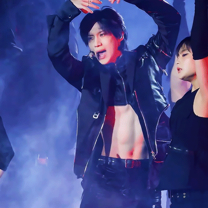


231216 Metamorph Black Rose Fancam
#i think black rose choreo might be my favourite?? it's just sooo beautiful and statuesque#it's also so evocative imagery-wise. just the idea of blooming roses and the controlled movements blow my mind every time i see it#obviously it's taemin's execution of the dance too. i mean look at him he's so poised and gentle (especially the moment in this gifset)#and then the dance goes hard later on too ~chefs kiss~ it's the contrast that's beautiful- like all of taem's work#also this fancam is GORGEOUS the smoke and the layering of the dancer's hands through the mist is so picturesque. yall need to click the#link and watch the full thing. seriously.#ok im done talking too much hah 😅💛#taemin#lee taemin#shinee#shinee taemin#kpop#mygifs#speakofgifs#metamorph#black rose#analook
1K notes
·
View notes
Text
what if i told you guys i actually decided not to drop out of college
#bee talks#not marine biology#‘take a year off’ but I don’t think I would have gone back to be honest#I was doing really bad for a while but I’ve been doing better#and things with my family are. easier to manage now and I don’t feel like I’m walking a tightrope trying to keep all my parents in my life#and I. I talked to my aunt and she helped me make a plan for the next two years.#well what actually happened was I asked her for help and we made a pros and cons list of dropping out#and well. staying at school had some major pros that going home didn’t#so then we made a plan#about my classes and about my job and where I might live. we went through everything#my aunt is good with things like that. I love her a lot#and she is going to help me#i felt really alone for a while like I couldn’t ask anyone for help#but I can#I love my aunt so much#I love my uncle too#and my mom#but my aunt is really really helping me right now#also i taught my aunt what ‘’locked in’ means and she won’t stop saying it#she renamed my group chat with her and my uncle to ‘LOCKED IN 💕🙌’ lmao#anyway sorry for talking so much in the tags I figured probably no one wanted to read a long post but you can skip the tags if you want to
232 notes
·
View notes
Text
Restarting scuba diving as a hobby basically made me go “…oh, shit, the merfolk, the merfolk need to equalise pressure too” so now I’m reading about marine mammal middle ears and lungs
Merfolk probably have more rigid and more easily opened eustachian tubes, for one!
#sinus pressure usually equalises by itself. but that means that a sinus infection can have horrible effects#marine mammals have smaller sinuses or none at all so smaller sinuses might be wiser#but then again merfolk werent made with wisdom in mind#in a way i do like those human anatomy pitfalls because we all have em#if you breathe air less you have less of a chance to contract a virus or a bacterial infection in your sinuses but when you do contract it#you kinda cant do anything for a while. but its a good thing humans are good at taking care of other humans#merfolk houses are more above-water than ive previously talked about too with often several surface rooms#for cooking :)#not to mention sometimes they can be located completely above the water#the swim bladder doesnt do gas exchange so fortunately i dont have to touch upon that too much. but cetacean lungs hmmm……#sirpaverse#merfolk#taur hour
269 notes
·
View notes
Text
I dip out for like three days and they drop a new Riderlad on us?!
#art#ride kamens#ride kamens spoilers#obligatory it's-a me mario#october...#i'd wondered if we were getting a new guy with part 3!!!#i assume guy anyway#i'm getting some ~vibes~ but it's probably just me#on the one hand takahashi DID give us our first nb rider...#on the other hand that would be a hell of a bold choice for this game#on the third hand there's -- well i generally don't like to talk about subtext like this without confirmation because it's a minefield#(tbf there's only like three of us on english-speaking ride kamens tumblr anyway so ᕕ( ᐛ )ᕗ)#but there's been a few lines that make me think koki might legit be intended as some flavor of aroace versus just 'oh he's disinterested'#which would be a bold choice on its own for this game SO WHO KNOWS#i am probably just reading way too much into things anyway#well this is tumblr what is it for if not to baselessly speculate on the gender identity of anime characters#they do call mario ~the white priest~ and i'm still not sure how literal that's meant to be but that might be all it is tbh#the watashi aesthetic#anyway i'm also getting wiseman vibes and i do kinda hope i'm wrong about that because that old man has been haunting me since 2013#you're gonna have to turn this one around for me mario#save me from my sins and also from wizard
247 notes
·
View notes
Text
Actually so tired that people mainly focus on the bdsm when they talk about La Pianiste when we literally have this dynamic right here. Like, that's insane.
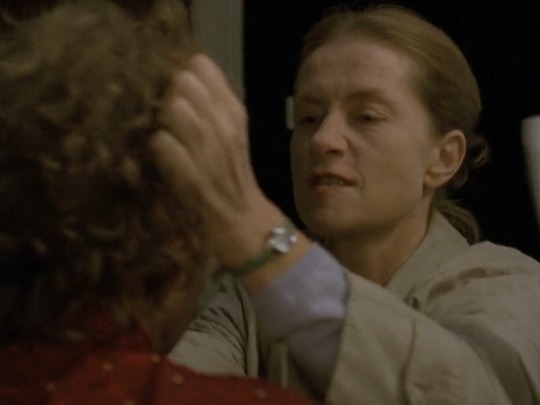
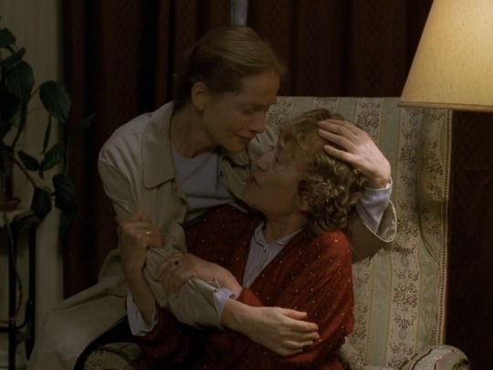
What if you were a little girl in her 40's who couldn't grow up because of your mother-wife who made you sleep in her bed and forced you to repress every sexual desires and thoughts of becoming your own person just to keep you close to her ? What if you fought back and yearned for dangerous things out of her reach ? But also, what if you let her because it's all you've ever known and been taught to want ?
#these two are so entangled with each other and in the roles they play#(mother and daughter. husband and wife. prodigal or ungrateful daughter. adoring or mocking mother)#that they cannot handle it when something else is thrown into the mix#There's no space left because they fill all the roles in each other's lives.#but at the same time they never give the other exactly what she wants#The fights never last. Erika will never live up to her mother's ambitions. And her mother will never give her any form of affection which#might satiate her hunger for love. And so on.#They are deeply imperfect- Love and Despise each other but they could never bear the thought of being separated#When I read the part in the book where Erika talks to Walter for the first time and all she wants is to go back into her mother's womb...#you can't make that shi up#when people talk about toxic yuri that's what they could mean but unfortunately we live in a society#gradually learning to accept the person I'm becoming who would've been burned at the stake by my younger self <3#been having so much thoughts about this film once again. And I know that nothing written here is new but I'm a little sad no one really#talks about this relationship online since it's really the heart of the story for me#Of course everything happening with Walter is important. But none of that would be there without the mother-daughter situation#la pianiste#the piano teacher#haneke#sheep stuffs#isabelle huppert#also I'd kinda get it if it was another film and it made people too uncomfortable to talk about it. but I mean this is literally La Pianist#*
640 notes
·
View notes
Text
watch me end up making a superdad au coz of WTNS
because!!! because i was thinking about how funny it is that Bruce's first two kids (Dick and Danny) would be superman fans, and how funny it would be if that influenced his opinion on Superman when they first met. And then I got to picking that apart, and how Danny's opinion and feelings on Superman would have the bigger impact on Bruce than Dick, since Dick's admiration for Superman (presumably) comes from the standard little kid "he's an alien and he can FLY" (and flying graysons) stuff. Which, while very very cute, is easy to ignore and disallow swaying feelings on.
But DANNY? It's not the same. While part of Danny's admiration comes from the same "holy shit he's an alien and can fly thats so COOL" vein, it also comes from a place of feeling deeply relatable to him. Both he and Superman were/are perceived as incredibly powerful, deeply dangerous creatures that are nigh impossible to stop, they have a handful of powers that are similar to one another, and they are (one of) the only ones of their kind. Superman is (one of) the last Kryptonian, Danny is (one of) the only Liminal in existence, and they might not be the same species but the principle remains the same and they're in the same boat.
As a result, Danny would just, god, he'd find so much relation in that. And yeah they're not the same but Superman would make him feel just a little less alone, a little more seen, and he'd find so much comfort in that.
And Bruce, by the time he meets Superman, would know by then about Danny's powers and his experiences and his time as Phantom and as a Liminal. And it's easy to ignore your kid's admiration for another Superhero when it stems from a place of plain hero worship or simple appreciation. It's harder to ignore it when your kid admires a Superhero because they make them feel seen and relate to them on a level you can't reach them on.
When that's the reason, how could he not think differently about Superman? When, by then, he's seen the scars left on Danny's body from all of his fights; when he's seen him cry and break down over never being able to fly again thanks to the blood blossom poison; when he's heard all about the struggles he faced with his powers, the fear he had about being found out, the fear he had when he was first developing them; and how he was ostracized by his city for his efforts just because he wasn't human, despite how much he was just trying to help.
How could he not look at Superman when they first meet, mask-to-mask, and have a little voice in the back of his mind go: 'my kid is a lot like you'
its making me emotional. if these feeligns persist im going to end up making a superdad au
#dpxdc#danny fenton is not the ghost king#dpxdc crossover#dp x dc#dp x dc crossover#blood blossom au#dpxdc au#like it might not make much of an outward difference to anyone else how batman interacts with superman but WHOO boy is it there#the JLA is founded and eventually everyone starts to note that batman at least seems to *tolerate* Superman more than everyone else#and there are jokes about not even the Bat being immune to Superman's boy scout charms. and then they meet Nightingale and Robin#and both boys want to talk to Superman with stars in their eyes -- Robin being a lot more obvious with it. while his older brother lurks#nearby like a quiet shadow just like his dad. his voice softer and quieter and his questions more scientific and detail-oriented than robin#sometimes Gale's questions are more... wistful. almost. personal. in the sense that they are worded in a way that only someone who has also#flown before could ask. what it was like being on top of the clouds. if he ever got scared of falling. if he ever free fell for fun#if he ever worried that he'd fly too high and get lost coz the earth is always moving but when you're flying untethered to the axis ur#the only one not moving with them. he's very attached to superman's flying. many typically are but gale's is different.#do you ever fly out when its raining or snowing and you don't go anywhere but up just to see the rain and snow go down?#and then there are other standard questions that Superman's never even thought of. like how he doesn't have any calluses on his hands#despite what his size and stature would suggest because he's invulnerable. superman thinks about that one a lot coz it makes him sweat lmao#he remembers Gale turning to Batman and asking him if super strength would negate the need for calluses or exacerbate them since they're a#result of manual labor/working out and not necessarily a product and Batman didnt say anything at the time but Clark had the feeling that i#was going to be a topic of debate the two were going to have later. then Gale turned to Superman and said it was prolly a good thing he wa#invulnerable because that healing factor of his would clash with his ability to grow calluses and might make super strength difficult#idk what my tag count is but i might be getting close to the limit so supes cries when he finds out the full reason nightingale admires him
206 notes
·
View notes