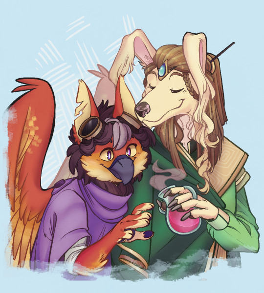
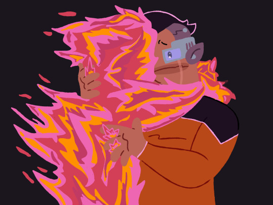
#i've had this idea for a while now lol
Text
New RP blog! Yay!
-> @twins-of-disaster <-
Here we go! Baby's first RP blog!
It'll be Disaster Twins themed, because I love them. Posts will always be tagged with #unreality and #tcest dni. It will mostly consist of silly little posts that I think they would make if they had tumblr, but I will also answer asks! :}
(Keep in mind it is VERY MUCH UNDER CONSTRUCTION! It will take me a bit to get into a routine.)
#pluto is my planet#oof brainrot#i've had this idea for a while now lol#rottmnt#rise of the teenage mutant ninja turtles#rottmnt leonardo#leonardo rottmnt#rottmnt leo#leo rottmnt#rise leonardo#rise leo#rottmnt donatello#donatello rottmnt#rottmnt donnie#donnie rottmnt#rise donatello#rise donnie#disaster twins#rottmnt disaster twins#disaster twins rottmnt#disaster twins my beloved#leo and donnie#donnie and leo
5 notes
·
View notes
Text
The other researchers are also here! (magical edition!)
#neopets#neotag#neoart#eyrie#gelert#THE BOYS ARE HEREEE#vin doods#my beautiful magical boyssss#had some time to kill this weekend so might as well finish rendering some stuff i have lying around lmao#its ironic cause my oc stuff is the stuff that gets less views or reacts overall but is the ones im more interested in for the most part#its been a while since i've actually really loved an bunch of ocs and this 4 (technically 5) are going to be the death of me lol#just to be consistent with the other post#eyrie's name is Ozzi or Oz#and gelert's name i'm still unsure of but for now I'm going with Faeran#i'm so emotionally invested in these characters you have no idea LMFAOO#also I did base Faeran's looks in a lot of “long dogs” like borzois and the ears just came naturally to me lol#I'm still working on a doc with all the info for those interested tho buuut if any are reading by this point feel free to ask about them!!#I'll just never shut up lol#the neopia i did put them in is a tad bit more.... “dark”?? i guess??#its less abstractly magical and i did have to find out how to build a magic system for everything to work lol#and my dnd knowledge did filter a l o t into it so sorry bout that oops:;;#anyway this is too long and hardly anyone really reads this much but hey! finally my babies have faces so i don't feel so bad!!!#it doesnt help that i post this stuff at buttfuck hours LMFAOO
44 notes
·
View notes
Text
having the hc that minato is ace is incredibly funny sometimes when you think about how ryoji is oh so very bi because it's like. "ah. death stole my ability to be attracted to people," in the same way that ryoji stole minato's eye color and energy level. like wow, thanks ryoji, you just keep finding things to steal from minato!
#persona 3 spoilers#minato arisato#hc and au nonsense#lizzy speaks#happy international asexuality day to my fellow aces out there i hope you know that you are loved!!! 🎊🎉🥳#i like viewing minato with the lens of him being gay / ace. esp bc it stems from my own experiences so it's fun to look at-#him from that perspective even if that's not what was intended by atlus y'know?#and im sure others have other hcs from me that are informed by their own life experiences and i think that's great ^_^#something that i found interesting while playing FES was how. stilted? minato's animations felt when hugging the girls#you could definitely go with the perspective that it's a graphical limitation or they didn't have time to polish the animations#and that's def true!! but sometimes i see the hug @ yakushima beach + the other hugs and then i compare it to the sou/yo hug in p4#and there's like... a noticeable difference to me with how intimate and close together the hugs are...#that said i do know that the animations for reload are updated and the hugs are much more natural (good on them tbh!)#the other thing is (pensive sigh). the way you couldn't reject any of the girls when doing their social links in FES#objectively speaking i'm glad that they did away with that and i like how the rejections were handled in reload. it feels naturally written#but also a part of me enjoyed looking at the “hey atlus what the FUCK” moment and thought of how to interpret it differently#specifically with the idea of minato having like.. little to no autonomy and kind of going along with the relationship#it kind of reminded me of myself tbh with like going along with the rship without considering what you want bc#it's what others want or expect out of you... LOL. i dont think atlus intended for someone to interpret it this way but#eh i think that's the fun part of hcs and looking at characters with certain lenses!#regardless of how you perceive minato i do think there's something to be said about him being the kind of guy who molds himself-#into someone that is needed. not wanted. but needed. important distinction here.#the one caveat my brain runs into when im like “minato is ace!” is when i remember thanatos exists and i go#“you know what these ideas can exist simultaneously” GKLHFHDFHD when in doubt schrodinger's headcanons#anyway that's all i've had this thought in my brain in awhile and haven't sat down to share it properly until now 👍#have an excellent weekend everyone !!! lizzy loves you all lets all nurture our inner yippee!!! 🥺💙
49 notes
·
View notes
Text
recent lounging babey images
#he's so floppy recently and I hope it's just the heat. I think wamr weather makes everyone floppy and loungy#a beauntifulle boye...#cats#STILL working on posting some drafts. finishing new poll adventure.. other things... It's just hard with the weather and other things going#on. I've had a few more doctors appointments and other things to do recently that have to be done in a time limit#so I hvae to use my extremely limited energy working on that instead of doing the things I'd really rather do. :T#Main focuses though are keeping up better with doing and posting costumes + sculptures as main creative things. at least finishing the#main poll adventure story. Reworking the game I kind of abandoned for a few years. keeping up with game videos and a few other side things.#Especially the game though. I've been in a really worldbuildy mood recently. I just wish that was easier to manifest into something. I've#now put the worldbuilding slideshow reading video on pause for a while because it's SOOO long to do#and I think I should prioritize making games and stuff instead. but still other things. IT's just kind of like.. I have a whole world and#everything very built and planned out but now.. what do I do with it? what's the best way to share that? factual slideshows just going over#the information like a dictionary? make it into a game? write short stories? do art attached to the world? etc. etc. ?? There are so many#potential avenues I end up kind of flip flopping between them a lot because none really seem more beneficial than the others and they all#seem equally enjoyable and also equally hard so. It's like?? I guess just do what the hell ever and hope I made the right choice in terms o#cost benefit and reward for my time lol. ANYWAY.. Also why I'm in my 'trying to make friends' era still because I think having other creat#ive friends can help you find direction like.. people will meet each other and then go 'hey lol just for fun lets start a project together!#and then like 5 years later it's genuinely become something. etc. having other people to help weed out ideas and start small creative teams#together and etc. I feel is a very beneficial part of networking or whatever but also I have the social capacity of a stale bread roll and#am also inherently unrelatable to seemingly a majority of people due to my hermit wizard swag (detachment from general society and hyper#focus on fantasy worlds in my head gjhghj) so trying to meet people as a grown adult with social issues is Very easy and fun (it is not)#even very basic things like my core communication style is so incompatible with a lot of people it's like.. hhhh... People in this modern#age have GOT to stop being afraid of phone calls and/or text that is longer than 6 paragraphs. Work with me here. I WANT to talk to you. bu#I do not know what your emojis mean and it's physically impossible for me to type less than 85 sentences. please.. hhjgjgb#AAANYWAY!! I am working on things when I can given the circumstances (SUMMER).. hopefully some costume pictures and stuff soon. :'3#I've not forgotten about my art and etc. - as usual I just am bad at social media and also functioning if it's above 65F lol
84 notes
·
View notes
Text
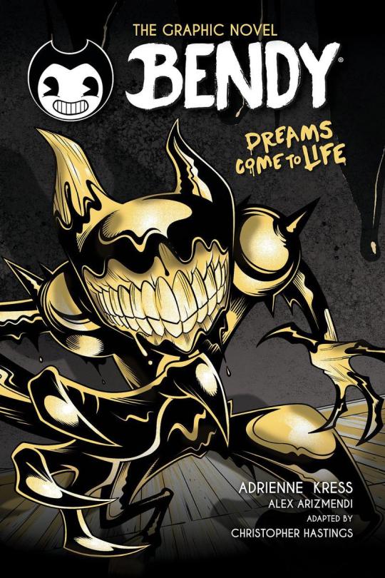
Wow, so umm... This looks bad, not only is it inaccurate due to using the wrong ink demon design [unless this is confirmation BATIM Ink Demon has been outright retconned... Which would make me pissed enough to make a new post just about THAT] but from an art standpoint this is just... Confusing and poorly done.
I wouldn't care if this was fanart, of course you should support young, indie artists... But for a Graphic Novel making sure your cover doesn't look like something Butch Hartman shat out in an afternoon is kind of important. Remember they're going to be asking us to give money to them to read this. The artist likely won't see any of that money and neither do the authors most of the time, not to mention this art screams of the artist being underpaid and overworked.
Like they Had to get something on someone's desk and their boss said 'good enough'. A concept Joey Drew Studios is very familiar with considering the allegations of poor working environments that Kindly Beast. Not to mention Mike Mood admitting in a Reddit AMA that they did in fact rush projects like Showdown Bandit. [Which they sold at full price]

He also says they can in fact say no or yes to designs involving their IP. Either Mike or Meatly had to say yes to this cover, according to his own damn words.
And do you really think this company in particular would care enough about its fanbase to not sell them garbage? They have done exactly that on several occasions. It's not like they care particularly about art either, considering their previous use of AI Art. There was no apology or even posts addressing it... Instead, they just rushed out an archives update to their game to get people to stop talking about it... Even forgetting an entire character in it. Again
This company is [or at least SHOULD BE] on thin ice when it comes to being suspected of misleading their fans or rushing out crappy products to them.
So with all that context in mind, I'm gonna talk about why this cover sucks ass.
The light sources are all over the place? Why does it look like someone put maces or knight armor on his shoulders but it's just flesh?? It looks both gross and weird [not in a good way either]
To explain more I'm going on a rant below but sadly this seems to have been confirmed to not just be a rough pass but the final cover and man... I am not excited about this graphic novel just at all. This felt like it really drained any possibility of it turning out good for me and I already had expectations low.
Okay first point, the light sources?? And there is no consistency here with the shadows or lighting, it looks like there's a hundred light sources all at once but none of them are even consistent!
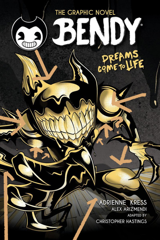
the arrows here represent all the different light sources I can make out and yet the the shadow clearly implies there's only one. I understand wanting to use highlights to give the character a more clear shape but then just give him one or two lights behind him or in front of him? No matter how u follow the light sources, the highlights make no sense and the shadows make even less sense.
Why are the shoulders like that? Like on the legs it's a little understandable, at least those are clearly very heavily affected by perspective, for me I think they are so exaggerated it makes it look like one of the legs is either huge or one is small but that's maybe subjective.
However, the shoulders are unjustifiable, what happened there, what did they do??
I could pick on so much more honestly, how the color choices of piss yellow with no other colors being used, and the harsh pitch black being used for every part of his body is weird. How it looks straight out of Butch Hartman's recent crappy art. But to put bluntly bad start! Also what the HELL is going on with this background??
Seems once again the Bendy team is fine with sending out stuff thinking it's "Good Enough" for Bendy fans and honestly the people trying to tell me to "Be Grateful" for this are just proving that no matter how many times you betray your audience some of em will defend you!
Which is sad tbh. If anything we should be putting MORE pressure on the Bendy team to do better. Cause we deserve better than this, honestly we do. There are amazing artists in the bendy community who could do so much better for a cover. They've employed their fan artists before... Wouldn't it be great to do that for such a lore important book? The book that gives us the identity of one of the main characters in BATIM? The character you spend the entirety of Chapter 4 fighting to save? Not to mention will give several major characters their human designs?
But I guess this is... Good enough...
#ramblez#batim#batdr#bendy and the ink machine#bendy and the dark revival#sorry I've been on a positivity streak with bendy I know but I have to be honest and being honest I think this sucks lol#Im sure plenty of people Disagree and while I would argue this is more objective than subjective people will ignore me if they want to#maybe Im just a hater idk#but I do know one thing I sure do hate this and Im pretty sure Ill hate this novel and its designs#but maybe I wont ya never know#anyways if they do retcon batim ink demon I will make a post abt how much I dislike batdrs ink demon design#and why I think all the people saying its better than the og seriously arent understanding#what made batims ink demon good or character design in general tbh#to put bluntly just bc something is popular opinion DOES NOT make it right or a good idea design wise#not everyone is qualified to be a character designer and thats just good advice in general tbh#anyways yeah thats it sorry im being mean today </3#I simply think corporations shouldnt be able to rush out crappy products to their fans and get paid for it but ig thats a hot take now#but esp with how bad that updated employee handbook was too and it still had stolen renders from fans in it...#yeah I dont think theyve learned a damn thing
24 notes
·
View notes
Text
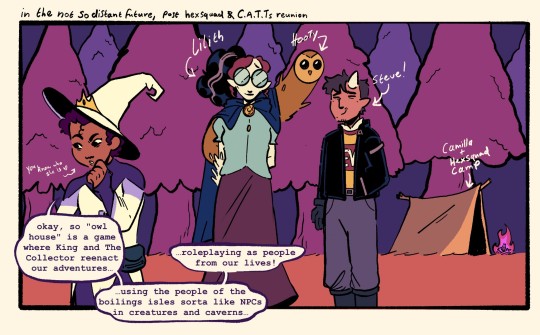


[ID: a digital owl house comic spanning three images. Panel 1: The scene header reads "in the not so distant future, post hexsquad and C.A.T.Ts reunion" and features Luz, Lilith and Steve. They're in a forest and there's a tent in the background labeled "Camilla + hexsquad camp". Luz says "okay, so "owl house" is a game where King and The Collector reenact our adventures...using the people of the boilings isles sorta like NPCs in creatures and caverns...roleplaying as people from our lives!".
Panel 2: a close-up of Luz, resting her face on her hand, looking questioningly as she continues "hmm...but if everyone on the isle's been assigned someone from our lives to play in Owl House...then who's the collector playing?"
Panel 3: a shadow descends on Luz and she tenses up as a mysterious voice asks "isn't it obvious?"
The final "panel" is a full length image of the collector, dressed in Luz's season 1 outfit, floating above her menacingly as shooting stars and crescent moons swirl around him, the ground turning into a crescent effigy. White text sits above the collector, reading "I'm you". End ID]
Okay I had to post my predictions before we get a sneak peek. What better way to convince Luz her life is worth living than to have someone literally try to steal it!!
#the owl house#toh#for the future#luz noceda#lilith clawthorne#steve toh#i know those last two are just cameos but I like to imagine they're hanging out in the apocalypse#I've been holding out for lilith to be the first adult luz and the gang meet up with after TTT#bc i think it'd be cool for her and Luz to talk about everything that happened during elsewhere and elsewhen#i think Lilith's already had to live through the experience of doing the worst thing she'll ever do#and then having to get back on her feet and make amends#and she's not always perfect but she's trying and that's all anyone can do really#there might not be time and I'm content with the writers going other routes (I'm just excited in general!!)#but it's a neat idea ive been tossing around for a while. didn't get to show it here but know it's implied lol#anyway of course the collector would want to be luz if owl house was a roleplaying game! she's the hero! king loves her!#i have to go now but yknow what you get the idea
197 notes
·
View notes
Text
Sometimes It's Better To Grow.
#star trek#star trek lower decks#st:ld#stld#samanthan rutherford#ensign rutherford#stld spoilers#I've had this idea for a while now. lol#I wanted 2 do an amv with little dark age but when i try to thumbnail it i just cant get it right#andy drawz
116 notes
·
View notes
Text
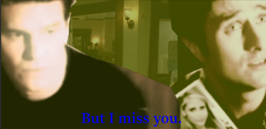

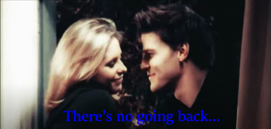

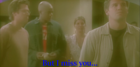
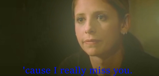


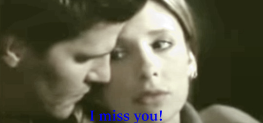
"Miss You" by Sweetbox. Somewhat inspired by how one of the Buffy writers said that she thought one of the reasons Buffy and Angel really resonated with people in season three, was how even though they truly loved each other, that still wasn't enough to make it work for them. And sometimes that is the case with real life relationships too, of course.
#it's also just because i think the song fits them. and weirdly enough. as much as i love bangel. i have a hard time finding songs that i#think work for them#even though this isn't my favorite song in the world and really took me back to some of my cringe-y high school days (that are far too long#ago now). oh well. lol#and of course i think bangel makes it work in the future;)#bangel#buffy the vampire slayer#song edits are fun and i haven't done one in a while and this was nice. especially my first one for bangel#-needs to do more song edits-#it was also nice to do something for bangel again (my first of the year) because i've so been wanting to. i just didn't know what but i've#had this idea for a while and finally decided to make it:)#edit#mine#my work#shanna's various forms of art#song edit#picture edit#manip#buffy summers#angel#buffy and angel#i was also thinking of using some comic scenes for these but i didn't need to and you know what? i think i prefer it that way oc#and i even still used a few scenes here that i don't think people use very often which is cool
18 notes
·
View notes
Text
hmm rn i just wnna be someone's gf. living together. cooking together. just hugging them in the scary cold lonely night :(( holding hands while brushing our teeth. cuddling while watching tv... idk just that comfort. i want it >.<
#i was just watching.... andrew nd chris' cooking video and started thinking abt this lol#whenever im in pain i get these feelings even more bc i feel the loneliness of being... alone even more skskksks 💀#idk i just also like the idea of being able to spend evenings/nights w thme bc we live together so yeah#idk i just want to hug someone nd feel close to them T-T to know im not alone in the world to face these fears nd horrors#wewoeoeowooeoroeowowooeoeoeoeow i haaaaaaate admitting these feelings or talking abt them but yeh#i was just daydreaming abt being a gf and making fucking tea for my partner.. in our kitchen.. at night time#and then when i sit on the counter they'll circle their arms around my waist and hug me tight#while we wait for the kettle to boil da water.... 😳🥴🧍🏻♀️#i havent had a hug in years and i've never had a really close hug#sigh sigh sigh i dont know. idk if i could do this and not die out of embarrassment of being a person but#wth... watching that cooking video started a whole daydream scenario for me like#now me nd my hypothetical partner are playing hide and seek in our home in the middle of the night wtfff..... 🧍🏻♀️#📓��
17 notes
·
View notes
Text
gonna be real bud if your fic relies so heavily on intense triggering themes and shock value that you're averse to putting warnings on it to "maintain surprise" and "avoid spoilers", then you act like you did nothing wrong when people are upset that you didn't make any effort to turn them away and allow them to protect themselves, while also telling them it's their fault that they read something that upset them when they could have never known it contained specific things that will upset them, i think you are a tar pit
#'warnings are a courtesy!!' yes so why are you apparently averse to being courteous#saying omg fanfiction never used to warn people and print books never warn people so it's not a bad thing if i don't warn you!#that's some 'no one protected me so why should i protect you' type shit#sorry i got recommended this dumb ass post and i had to say something so i'm saying it here#why are you telling people to curate their own experiences while actively making it more difficult to curate their experiences LMFAO#if i read a scene with intensely triggering content without knowing it was there before. 'just closing the book' or 'hitting the back butto#is not protecting myself. how do i protect myself from something I've already read???#diary#like dude it's possible to protect people from spoilers while also protecting people from seeing things that will distress them#i also honestly take issue with people who do a content warning but just say “this gets into some shit” or something of the like.#you might as well have just not said anything because now i'm confused and on edge#instead of able to protect myself properly i have to try and gauge my personal sensitivity against the unknowable factor of#what your idea of “some shit” is#also telling someone to 'just close the book lol' is an incredibly dismissive approach to people being affected by something triggering#you know these things do happen to people in real life. right. but of course who would have empathy for someone who doesn't want to be#reminded of trauma
5 notes
·
View notes
Text
THIS IS THE OLD VERSION OF THIS POST AND I ASK YOU NOT TO USE IT ANYMORE!! Please use this remake instead!
Scenario: You enter a mess hall. Despite being one hall it's visibly segregated into two sections that have separate food getting areas and it seems highly discouraged to take food from one side to the other. There are a number of occupied tables on each side and you see that the food very much corresponds to the species of that side's occupants. You, a human, realise you will have to pick one of the sides and stick with it for your lunch break, both consuming their food and experiencing their company. Luckily, you're not important enough for either choice to cause any trouble so it's truly up to your own preference.
Feel free to tag or comment your reasons!
#i myself am regrettably going vulcans because i'm a vegetarian. not that i don't like vulcans but i've got plenty of autism at home lol#i do believe that klingon food prolly tastes far more interesting than anything vulcans can even imagine but most of it seems to contain#meat so unfortunately i don't get to try it or hang out with a kind of person i don't already hang out with anyway. F in the chat 😔#i made this post very late last night btw or tried to anyway but fell asleep before i was done. and a bit ago i remember it was in my draft#the question had existed in my mind for a while already but only last night did i have the idea to turn it into a poll#it was originally just gonna be a two choices poll but i love nuanced poll options so now there's eleven lol#also i finally came up with an original posts tag that i'll be using (when i don't forget) from now on and i think y'all are gonna love it#original posts fresh from quark's pussy
11 notes
·
View notes
Text
man idk, i'm very thankful for guild wars helping me become more comfortable sharing things about my characters, ocs or not. i've always been hesitant to share things i made or thought of and am passionate about out of fear that somebody won't like it or criticize it because i would be CRUSHED. i wouldn't have been able to handle it lmao
i've gotten to the point where it's like, i know not everybody is gonna like everything. if even just one person get a single molecule of enjoyment out of hearing about my dudes then i'm happy 👍 and it makes me happy seeing others talk about and show their characters, because i know how much they mean to me too
#text#for so long faehrnem was just... hollow character-wise despite how much i cared about him#but it was bc i had all these ideas for his character but though yeah no dude that's cringe you are going to LOSE subscriber.#and now people see my cottoncandy randy lookin ass guy and they LIKE him and like seeing him#cause while i've made plenty of art just for me. i also make art in the hopes that it makes someone else happy or at least think oh nice LOL#if that makes any sense. idk why i keep elaborating in my tags but sharing my chars and seeing others sharing theirs#brings me a lot of enjoyment even when i'm quiet about it. i just can't handle interacting too much 👍 but if i see it brother. i am looking
17 notes
·
View notes
Text
i feel like the 'i could make/do that' mindset is so invaluable to have. i don't mean in the sense of like going to a modern art museum and insisting that you, a non-artist, could have made the art just as easily. no, that is condescending assholery. the mindset i'm talking about is one more of confidence, of optimism and.. i guess the willingness to put yourself out there, to ask the right questions, to try something new. and to fail, or rather for your vision not to come to fruition. maybe you don't have the tools yet, maybe you haven't acquired all the skills. but at least you could try. and you have confidence in the level of ability you do have to start. oftentimes actually sitting down and doing something is the best way to learn, and the only thing that could stop you from starting is telling yourself 'i could never make/do that'
#there's a few songs on my playlist that are from the pov of a girl but that have a masculine voice and while that's honestly fine#and i've been living with them on there for over a year. i've also always toyed with the idea of making covers.#like hey i have a feminine voice. it may not be stellar but it would fit better. so what's stopping me??#the answer was a guitar lol#but recently my bil has been teaching my sister to play guitar... and she has a better voice than i do#and so i asked if they would be willing to record covers of these songs with me and put them on spotify just for my playlist#apparently our brother might have some layering software too#and i'm not saying like 'wow i said i could make this and now i am!' bc really it's mostly gonna be my sis and her husband#but i just had to ask#like ig what i'm saying is anything is possible. and keeping your mind and heart open can bring about beautiful things#and actually i'm realizing a better story might have been about the play i just wrapped last week. my first time acting in anything#that one was much more of a learning curve for me but it still had the same spark of 'i could do that' and the same result#something homemade and cobbled together but good.#i just happened to make this post while thinking of my sister putting music on spotify for me <3#the sibs#important
4 notes
·
View notes
Text
also i love my mc for baldur's gate (godwyn) because their design is basic ass pretty androgynous forest elf (with dragon ancestry! so that's unique at least) but they're the absolute epitome of chaotic evil, like this isn't even because i'm shooting to romance astarion, if a game lets me be an asshole i'm gonna be an asshole because it's funny LMAO
#and every time godwyn does something extremely arrogant or just straight up immoral they always look so proud. i love and hate them dearly#riley rambles#also i've been playing this for well over 10 hours now (my eyes burn) but i still have no idea about the gameplay LOL#i'm playing on the easiest difficulty and still struggling miraculously.#i'm a seasoned rpg player but between this and dragon age i'm just not very good at these particular types of rpgs. if that makes sense#but i'm having fun idc if i suck this is the most fun i've had with a game in a long while. i'm here to be chaotic and rude as fuck
5 notes
·
View notes
Photo
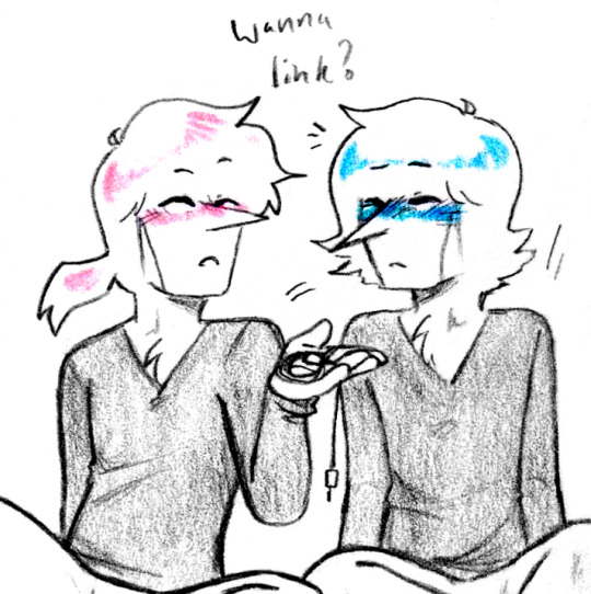
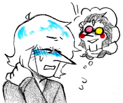

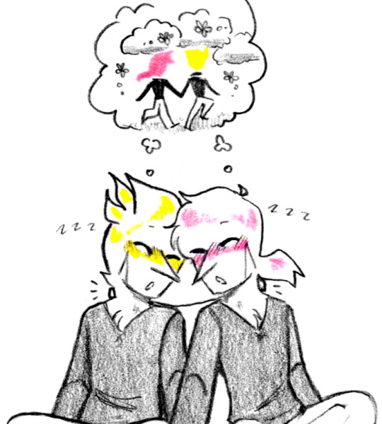
Collective consciousness (Patreon)
#Doodles#Deltarune#Pink Addison#Blue Addison#Yellow Addison#I'm injecting a bunch of old headcanon carryovers from IZ and it feels great and you can't stop me#Lol#It's my old love of consensual and affectionate hiveminds rearing its head again#I'm pretty sure I was only thinking about the little portable battery cord in the back of the neck - inspired again lol -#And from there it spun out into What Ifs and now I'm sticking with it because I like it a lot#All that to say lol - What if Addisons had a way of sharing data/thoughts/dreams/opinions a little more intimately than talking about them#I think the Rouxls mini with Pink and Blue thinking the same thing and both reacting the same way fed into this as well haha#Which actually works well as to why Pink was quicker on his feet! Blue's been avoiding linking up lately for some~ reason haha#I think it wouldn't be like a complete upload/download - more like a stream of consciousness while linked up#So they could intentionally think about something specific to better communicate an idea that they can't quite verbalize for example#But you get distracted for a moment and Oops secret's out hehe ♪ It has quite the drama potential :3c#So Blue's just not taking the risk for the moment - Spamton's kinda forefront on his mind and it'd be sus if he was Not Thinking really hard#What would happen if Spamton tried to link up as he is now? :0#And then last one with the link working as intended haha ♪ They're having a nap together to recharge and catch up :D#It was really fun to doodle a little dream between them haha ♫ I've been having a lot of fun with thought bubbles lately actually :D#As evidenced by 3/4 panels having one here haha it's fun!
30 notes
·
View notes
Note
I miss your fics. I hope you’re doing well tho
I appreciate this, thank you 🥹
For the record, I miss my fics too! This unofficial hiatus has been out of necessity rather than choice, and I can honestly say there hasn't been a day where I don't fantasize about A Grand Return. 💙
#i suppose I've been a bit vaguer than usual about all this#but the short answer is I was still writing consistently up until the end of March#when I had a health incident that was ultimately the fault of the piss poor excuse for care one of my doctors was giving me#& while I'm much better now I've essentially been dealing with the reverberations of that - physically but tbh mostly mentally - since then#so there's that lol#and then also now that it's been so long since I've posted anything I honestly feel super insecure about it#idk for a lot of reasons i question if there's a place for me in the fic world anymore#i hope there is! but i question it#so. just a bit of a look behind the curtain lol#i started tinkering with an old WIP a couple weeks ago and that was nice#and i have pitched like 5 different ideas to Cass over the last week 😂#so clown brain is still there I just need the energy and perhaps some confidence 🤓#i truly appreciate you taking the time to send the message - honestly the discussion/excitement is what i miss most about sharing my fic#sorry this took a minute to answer but i had to decide what to say... and then decide to bury it in the tags obviously 😂💙💙💙#ask#anon#kh4f writing
8 notes
·
View notes
Last Seen Blogs

ti-female
TI FEMALE

jones-art-blog
Art Blog!

kanika77
タンタンブーラブラ

marksweets09
The Journaling of Barrett 460

fatherzoen
Kirit$uga