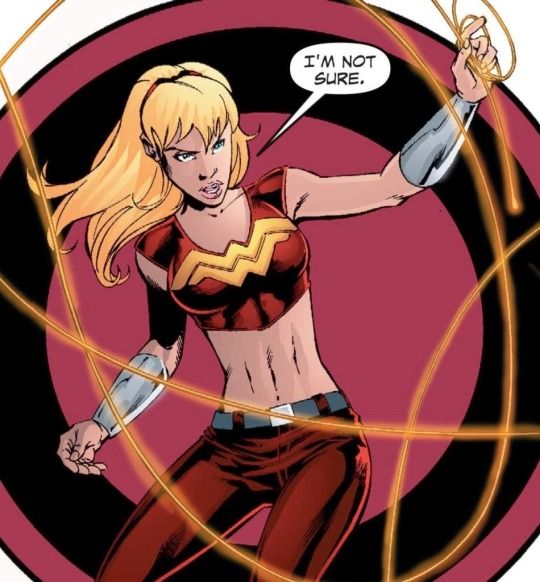
#if it's not the same ... it's still a nod to this design imo
Explore tagged Tumblr posts
Visit Tumblr Blog
Explore Tumblr blogs with no restrictions, modern design and the best experience.
Last Seen Tumblr Blogs


Fun Fact
69% of Tumblr users are millennials.
Text


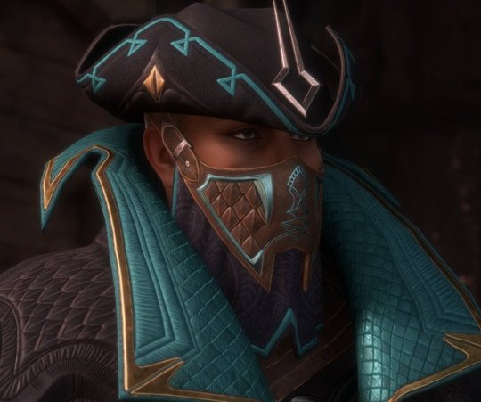
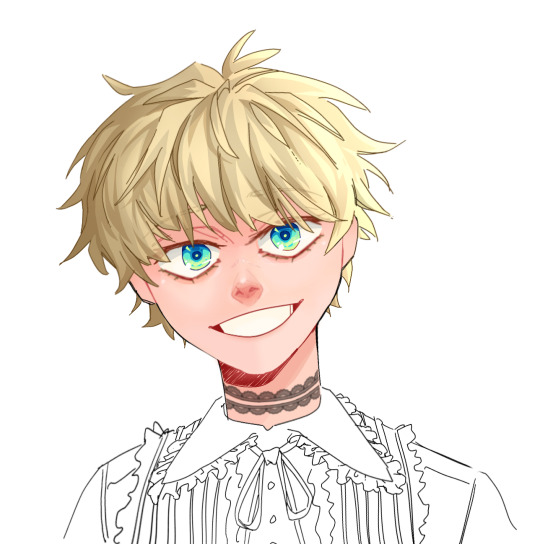
Vel + her jacket
#andoredit#starwarsedit#swedit#andor#andor spoilers#vel sartha#*mine#i can't tell if it's the exact same jacket or a very close replica/a variant of it#the one in s2 is soaked so it would look different in color#but pretty much all of the seams align.#if it's not the same ... it's still a nod to this design imo
186 notes
·
View notes
Text
whoops only just saw this now since i can only see submissions on desktop not on mobile but i'll try my best to summarize most of my thoughts
SHE'S SO GORGEOUS AND PINK I LOVE HER!!!
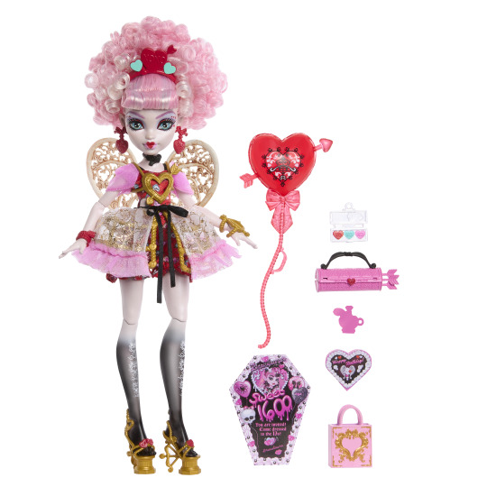
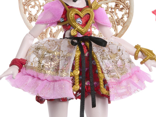
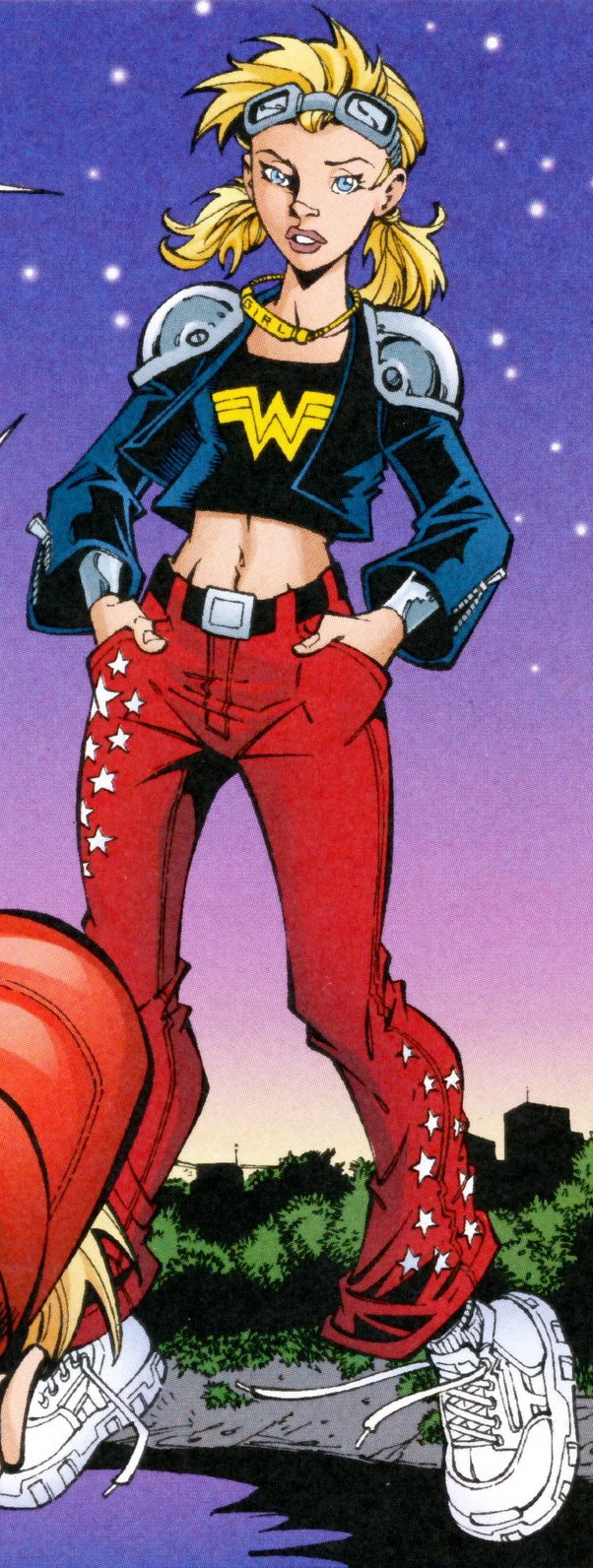
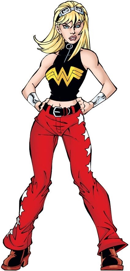
(images of the new doll from DollBoy29 on twitter)
first of all, i think it's a gorgeous doll. not a collector myself, but if i was, i would buy it in a heartbeat. anything was a step up from the budget doll lines from eah that cupid was last in so i'm thankful for that. (also, not an expert on fashion or dolls. so please take my review with a grain of salt)
i like the theming/style that they went with her doll. the style of french rococo is very much romantic and whimsical and i think it pairs well with cupid's character motifs and imagery. though the style isn't 1:1 to rococo fashion, the inspiration is still very much there. the hair and the dress pair very well and i think it's a great design.
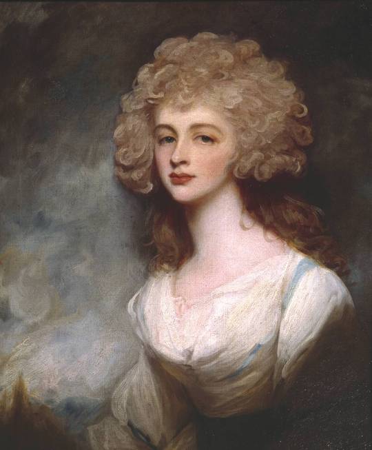
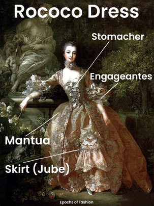
(Top right image is Lady Altamont by George Romney. Bottom left is Rococo Terminology from Epochs of Fashion)
while i like it overall, i'm kind of iffy about some of the little details:

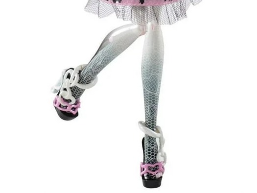
(1) in her previous mh dolls, her hands faded to black. a nod to her heritage as a bone elemental. in this new doll, only her legs fade to black while her arms don't. i don't understand keeping this feature for one set of limbs but not for the other. either keep it for both or remove it for both. or maybe find another way to showcase she's an elemental. but kind of a sloppy design choice imo.
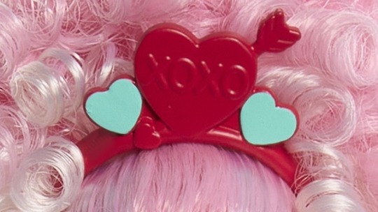
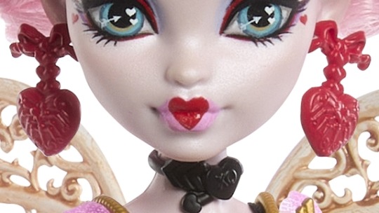
(2) another one i don't like is the hot pink accessories on her!!! not to be a nitpicker, but this shade of hot pink/fuschia is not cupid's palette. her previous dolls (not counting the budget ones) pretty much stuck to her shades of pink (bubblegum, coral, light pink) which i think better suit her. also her accessories have been consistently bronze (or black) which fits her ancient greek background. and she's pretty much the only mh girl in g1 to utilize bronze. she is not a hot pink girl!
(also having her headband be the same color range as her hair makes it blend into the background and doesn't help it pop. the hot pink makes it look a bit cheap and i'd rather the accessories be in the shade of bronze in the other pics.)
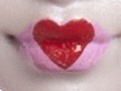

(3) i also don't like her new cupid's bow lips. i prefer the old one and the bright taffy pink doesn't suit the rest of the doll. i think a more rose pink would have been better to suit the red heart. or keep the background of the heart uncolored like the g1 doll.
and so as not to end on a sour note, i saved the new things i liked for the end!
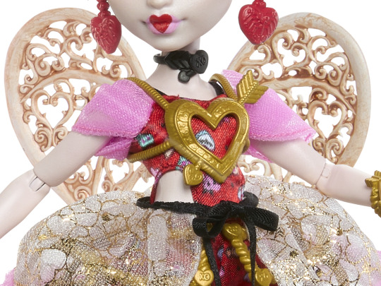
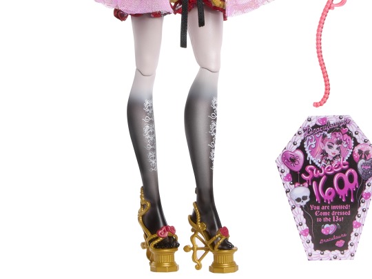
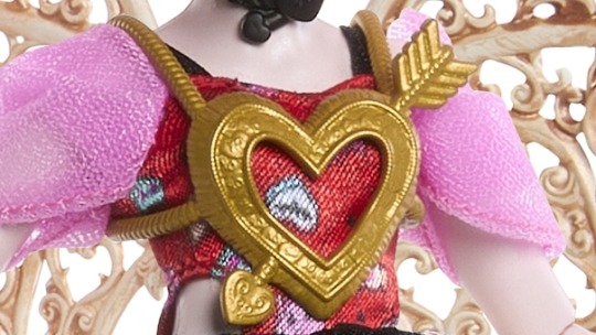
(1) her new wings! oh my ghouls just absolutely beautiful! very much reminds me of rococo pattern. i could see this in the wallpaper or metalwork of the rococo period. the entire shape of the wing is a heart and the curls inside are in the shapes of heart too. the mantua of her dress is also in hearts which is just so pretty.
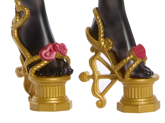
(2) her new shoes! so pretty. the platform of the heel is in the style of ancient greek columns which is an amazing detail. the straps of the shoes look to be made of braided rope which is what greeks used to tie their chitons/tunics with is also another great detail. the heel of her shoes is also a bow and arrow! while i do miss her winged shoes from previous dolls, she can still fly without them and i think this is an equally great shoe. (ashlynn would be proud.)
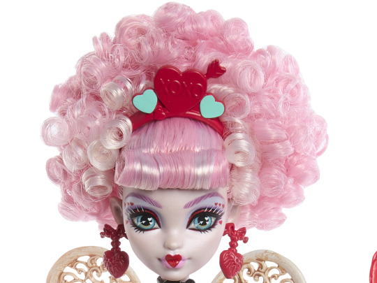
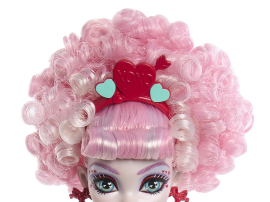
(3) her new hair and her eye makeup!!!! the new hair is gorgeous and beautiful and has so much volume. while best curls and volume of all time (for me), still goes to honey swamp, cupid is very much the runner up. i also adore the different shades of pink in her hair as opposed to her one shade of pink hair from last time. her eye makeup is also so pretty! the blue eyeshadow brings out her eyes and i love the hearts around her pupil and the hearts around the edges of her eyes! sooooo pretty.
tldr: a gorgeous doll, some details i don't like, but very much love the larger changes they made
#monster high#ever after high#cupid#cupid asteria#c.a. cupid#ca cupid#mh cupid#monster high scary sweet birthday#doll#dolls#fashion doll#dollblr#mh#eah#eah cupid
156 notes
·
View notes
Note
imo the glasses on the new guy are a nod to jack’s eye sockets LOL but i def think it would be interesting if his design incorporates elements from characters other than jack because there’s so many cool designs in the movie. also the way i thought he was ace in black and white what with the skeleton costume and that fuckin ass grin haha
[Referencing this post!]


I think that's totally possible too! The glasses could be interpreted both ways, maybe even at the same time. The lenses are definitely big enough to invoke Jack's large eye sockets, but the style just so happens to also invoke Dr. Finkelstein's goggles (albeit the size of them is much smaller). I did see a theory that the new Halloween character isn't twisted!Jack at all, but rather twisted!Dr. Finkelstein, since he could count as a "villain" in the original film. The suit and gloves are very "Jack", but some people have pointed out that the glasses, the headpiece, and the teeth also match up with the doctor's. ashfbaiyldbas THAT WOULD BE FUNNY IF IT WAS TRUE... Turns out everyone was thirsting for the grumpy old man/j The suit and gloves, however, are most definitely more Jack-coded. I think it's still too early to tell right now; we'll have to wait and see how they present him in future content. However, I still do personally think it's more likely to be Jack just because he is much more iconic.
ADLHBAFSOYASIYFA YOU THOUGHT THAT WAS ACE/?????? ? ? ???? ? Ain't no way he got that drip... 😭 (I mean, the new character did drop on Ace's birthday in Japan so I can sort of understand the confusion??) I wonder if the new guy will have a mischievous, kinda cocky personality like Ace?? Aaaah, so excited to learn more about him...
The concept of a white-haired Ace makes me think of an AU where Ace and Deuce aren't knocked out by Styx agents in book 6 and are able to follow Yuu and co. to the Island of Woe. Maybe instead of Riddle getting drained of his energy, it's Ace (and thus he is the one who emerges with white hair, not Riddle).
#twst#twisted wonderland#Ace Trappola#Jack Skellington#Dr. Finkelstein#Doctor Finkelstein#nightmare before christmas#disney twisted wonderland#disney twst#notes from the writing raven#twst jp#twisted wonderland jp#jp spoilers#twst halloween#twisted wonderland halloween#Yuu#book 6 spoilers#Riddle Rosehearts#Deuce Spade#Skully j. Graves#Skelly J. Graves
119 notes
·
View notes
Note
I love love LOVE your art style -- it's so chunky and fun and lowkey reminiscent of woodcuts almost? Plus the amount of thought you put into your Anita costume redesign was just 🙌 so cool to read -- it really makes me wanna ask though: do you have any thoughts on Cassie's design (either current or previous)?
tysm :D <33 my anita costume is genuinely one of my favorites i’ve ever done so i’m glad to hear it :]
as for cassie’s designs, i’m not the biggest fan of her current one. under the cut bc i got kinda rambly
it reads very bland to me i guess, especially compared to the other amazons. the gwen-stacy-esque haircut is not doing it for me (and honestly worked better with her late yj98 & yj19 costumes, even if i still didn’t necessarily enjoy it in those either). i believe i saw someone say that she just looks too childish? which rings true for all of the core four rn to be honest. i’m also sad they scrapped her most recognizable color palette (red, gold, black, and white) that matches her friends :( like the blue added in Could work (and has before) but it falls flat imo.

her yj98 costume works a bit better as far as not being bland, but the skirt is just kinda there. this is more of a personal grievance but i really hate when costumes just have skirts just to have them when the character wouldn’t do that? did the person who designed this even read ww87 #153 smh. same with the color palette but honestly i think the jacket works better here, and i’d like to see this flipped into a aviator jacket rather than the jean as a nice middle ground between this and her leather jacket.
tt03 is it’s own can of worms & where the barbie-fication of her design is made the most egregious. these are pretty ok to me though! i think the way she’s presented is more of the issue + the long hair.
this one is 0/10. so many notes. i swear it gets worse every time i see it. only comparable one is the awful skintight n52 suit but at least that one has potential to be made into something cool.
these are definitely my favorite cassie costumes :) i lean more toward the one on the left but i love the shirt on the right. i tend to pull the most inspiration from these two when i draw her.
lastly, i’m a sucker for baby cassie. look at her stupid wig. look at her shorts and her skater gear. u wanna love her.

my adult cassie design from a while back combines her older yj outfits with some armor from other amazons + artemis specifically if only bc i’m sad that their relationship got deleted out of existence. i pulled in a teal as a nod to her blue jeans + to compliment the deep reds and blacks :^) i just really want her in armor… she’s grown up! she can have more details in her costume!
34 notes
·
View notes
Note
Your addition about Tevinter fashion was so interesting that I can't help but ask (and my apologies if it was something you spoke about before but I missed) — what are your favorite bits of fashion details in Veilguard? Doesn't have to be just Tevinter :)
This is so sweet?? Thank you!! I'm honestly always about 0.5 seconds from rambling about this stuff at any given moment, but I rein it in mostly.
I've talked about Neve a little on here, mostly in the tags on other posts. This post by @icescrabblerjerky talks about Neve's fascinators and how they're inspired by old noir detectives, and I talked a bit in the tags about how her collar in that same outfit mimics the upturned trench-coat collar also associated with old-timey detectives (Sherlock is the most famous example I can think of). The outfit we first meet her in is also very much trench-coat-adjacent imo.
I will try not to go overboard here but !! Some of my fave other little details!
The Viper's hat! It's a tricorn-- always fun! BUT it works really well here, especially, because actual vipers have triangular-shaped heads? (I am not a snake expert and I believe there are exceptions? But generally) Also-- the little diamonds on the sides of the hat look like snake eyes? And the arrow-sort-of shape in the centre seems like it could be a nod to adders- which are a kind of viper. They have an arrow-like shape on the top of their head! Essentially, this man not only gave himself a cool nickname, but he is literally wearing the Thedas equivalent of a Batman outfit. He fully committed to the aesthetic, and I love him for that tbh.

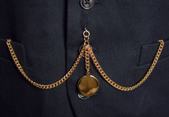
Emmrich's coat is designed to mimic a ribcage! And not just here- this motif pops up in both of his Hero of the Veilguard armour sets, as well! I also noticed in his cosplay guide that this first outfit we see him in has a sort of waist-chain (more on that in a sec!!) with a gold tailbone that sits above where his real one would be?

And of course there are little skulls all over him, too. It's very reminiscent of the memento mori movement- 'remember you must die'. Historically, this was a way of coping with the inevitability of death in a world without a lot of the scientific advancement we have today. Death was a part of everyday life, even more so than it is for most of us today, but it was still scary. So people made art about it! And jewellery! And songs! As a way to cope with it all, and also sometimes as a way to remember lost loved ones. To have Emmrich, who is afraid of death, embrace this idea in his fashion is just... chef's kiss, honestly. Because it was always a way of trying to face death head-on? And acknowledge it, and make it hopefully feel a bit less terrifying.
Although Emmrich's overall style is very Victorian-inspired (the silhouette, the waistcoat, the chains etc.) a lot of his jewellery actually seems reminiscent of older memento mori pieces? There are some examples held by the V&A Museum that date back as far as the 16th Century that I could see him wearing. It's a really nice touch if that is indeed the inspo, because the Mourn Watch pride themselves as keepers of history. So to wear jewellery like this every day, an eclectic mix of time periods, all tied together by this single thread of remember you must die? It's so incredibly fitting for them!!
Also re. the waist-chain. I'm referring to it as that instead of a belt because to me it looks like the kind of thing you'd hang a pocket-watch on? The looping style is very similar. It's of course a lot bigger, but I think it might've influenced it?
This has gotten really long so I'll stop now, but please know there are a hundred little things I haven't even touched on! So much care was clearly put into each and every character's design, and it brings me so much joy!
#thank you so much for this !!! It's not often I get to mash 2 of my loves (video games & fashion history) together like this!!!#(and also Batman is in there too ig?)#I had fun with it :')#emmrich volkarin#the viper#veilguard spoilers#dragon age: the veilguard spoilers#da:tv spoilers
49 notes
·
View notes
Text
Friendly Neighbourhood Spider-Man Review: Episodes 1 and 2
I've just watched the first two episodes of YFNSM and I have one thing to say...
I was fucking right. It's not a bad show.
In fact, its pretty decent especially so far.
Full review under the cut: *SPOILER ALERT*
Characters:
One of the MOST important factors this show needed to get right was the characters and BOY DID THEY.
Let's start with the supporting cast.
Harry Osborn is the character with the least screen time so far (his only appearances being the 'Good Deed' clip in Amazing Fantasy and a shot of him on television in The Parker Luck) so there isn't much to say about him yet.
Next is Pearl Pangan, a character who hasn't shown up much outside of being Peter Parker's older crush who seems like a genuinely nice person. She also seems to be a less academically inclined version of Liz Allen-Toomes from Spider-Man: Homecoming (by which I mean that Liz was the captain of the Academic Decathlon and Pearl hasn't really had any scenes that show she has that level of intelligence). The similarities between the two characters are high so it might lead to people asking, 'Why not just reuse Liz?'.
The answer is, why not? Reusing Liz would have been fun but she doesn't add much to the story (at least yet) and the usage of Pearl has quite a few positives. One, it raises awareness about some lesser known Marvel characters (Pearl is a minor super hero and an Agent of Atlas called Wave) and it allows for different stories to be potentially told in the future. This is the same reason they used Nico Minoru rather than a character like MJ or Gwen, both of which he met in College btw not High School - pretty much all Spider-Man media since the first Ultimate Spider-Man comics have decided his ENTIRE supporting cast should be in high school with him. Personally the easiest way to rectify that imo is to just make an adaptation where he's in college or got a job already (adapt the JMS run marvel I dare you) but one can hope.
The characters in the Oscorp Internship where also a fun nod to characters in comics (looking at you Amadeus Cho aka Totally Awesome Hulk/Iron Spider depending on the adaptation) and Carla Conners was a fun addition (also I better not see anyone hating on her for being a genderswapped and raceswapped version of Curt Conners - there is no part of Dr Conners character that is negatively affected by these changes - its still the same character)
May seems to be very similar by the MCU version (which makes sense) so nothing much to say there yet.
Norman is a character we haven't seen yet in MCU media outside of Willem Dafoe reprising his role from the Raimi movies and I am LOVING it. Colman Domingo is FANTASTIC in the voice role, bringing just the right amount of menace and authority to his voice. All I need now is for him to be able to play crazy and we can get a potentially amazing Green Goblin when the time comes (also his design is just *chefs kiss*)
Next is the character that might actually interest me the most.
Lonnie Lincoln.
Anyone who has seen The Spectacular Spider-Man (or read my screenplay on ao3 - sorry for the promo but I don't get many chances to advertise it) will know who he is. Tombstone, a vicious gangster and mob boss and in this show, he's... an American football player.
And I love it.
Saying that he's been just put into the 'nice jock' category, while accurate, does not think to scratch the potential of this character. There is a scene where he's walking home and it's revealed he lives in a rough neighbourhood. In that same scene, we see that he is helping his family out in quite a few ways (for example the part where he offers to help his little brother with homework) but the part that stuck with me was with his mother when he said that he'd talked to someone about fixing their car and how to get a cheaper price for it.
Money problems.
What I'm thinking they're doing is they aren't showing Tombstone as a mob boss. No. They're showing his descent from upstanding citizen and star American football player to gang violence. We already see that they've planted the seeds and we know they're going for the long haul with this show (It's been greenlit all the way up to season 3 already) so I'm incredibly excited to see Lonnie's arc play out, especially if we're going to get Tombstone by the end of it.
"Cold as Ice. Hard as marble. What else would you call a Tombstone?"
Next, we have the main character himself. Peter Parker. The Amazing Spider-Man.
This might be their best achievement yet in the show. They have Peter's dorky attitude and nerdy demeanour down to a T and it's so fun to watch. He's also a genuinely good person, just how Peter should be. A scene that stands out is the scene where he's caught a shoplifter who's broken down and crying in his eyes and he looks at them and he doesn't see a criminal. No. He sees someone who was down on their luck and asks the shop owner to give them a second chance if they give back the money they stole. It's beautiful and it's so very... Spider-Man. This is the exact kind of thing Spider-Man should be. A friendly guy who's just in the neighbourhood. It's a scene that's very reminiscent of Tom Taylor's Friendly Neighbourhood Spider-Man in all the best ways. (also the shop that was stolen from is called Pizza Time and that's already the best thing ever)
Animation:
Okay so some people have been saying the animation of this show isn't very good which I can say is not an unfounded concern. The effort the show has taken to emulate the original Ditko comics have had a slightly detrimental effect to some of the series.
There aren't as many background extras used in an attempt to mimic the original comics and lots of the shots don't use typically cinematic shading, opting instead to use brighter and slightly less rendered shots to emulate the older style. In some ways, this is actually really cool if you can appreciate the attempt to mimic the 60s style but it can be quite off putting for some people which I can respect.
There are also some issues with the 3d models. The characters mouths don't always move directly in sync and sometimes, for when they do use background extras, they are just 2d images in the back which can be quite unsettling when standing in the same shot as 3d models (there is one scene at a party where Nico is on the phone with Peter and in the background there's a completely unmoving 2d person who's eyes just seem to follow Nico and its quite unsettling).
HOWEVER, there are some incredibly beautiful shots too. Some shots are a direct mimic of older MCU shots from Peter's first introduction in CA:CW like the opening shot and final scene of the first episode which stand out as incredibly well done.
The best part of the animation is easily the web swinging which is so well done and one of my favourite parts of this version of Spider-Man so far. His movement is rough and unrefined as it should be for a Year One: Spider-Man but it is very reminiscent of the Insomniac Games style swinging (which in my personal opinion has the best web swinging in Spider-Man media since The Amazing Spider-Man 2) and it is INCREDIBLY fun to watch when it occurs. They actually focus some time on the web swinging too unlike some other adaptations which see him shoot a web and then THWIP out of the camera frame so we get to really see the extent of this web swinging.
Story:
This is the one where I probably have the least to say, mainly because we're only 1/5 of the way into the season so far and we haven't actually gotten much of the story revealed yet. However, it definitely has a LOT of potential.
Episode 1 establishes that the Spider that bit Peter came from a portal (alongside this universes version of Doctor Strange who is fighting a demon looking creature which is credited as Symbiotic Alien - Klyntar easter egg?????) which might be slightly different to some people but to me this gives me a heavy JMS vibes.
JMS wrote for Spider-Man from 2001 to 2007 and created what became the foundation of the Spider-Verse by introducing the Spider-Totems to the Marvel mythology. He said that the powers that Peter received did not come from the radiation, but the spider itself. The radiation is just what killed the spider. It was never even stated that Peter was the intended recipient of the powers and was hinted that maybe he was just in the right place at the right time when the spider died, which really hammers home the idea that anyone can be behind the mask.
The spider coming from a portal which also brings a symbiotic alien that looks hauntingly similar to Shathra (also a character introduced by JMS that returned to the Spider-Verse in Dan Slott's End of Spider-Verse story line) hints that maybe YFNSM is taking a similar approach to JMS , which is always a good thing. I mean that man wrote Back In Black. (OMD and Sins Past were editorial and should not be credited to JMS despite it being his run people)
Now in terms of the rest of the story, we haven't gotten many hints yet but there is a scene where Spider-Man fights Butane and sees a symbol on his gauntlet that looks hauntingly similar to the number 8. You know what has 8 limbs?
An octopus. Specifically, Doctor Octopus.
We already know Doc Ock is in this show. My theory is that Butane's gauntlets were made by him but my main piece of evidence that tells me that he's the final villain?
The final episode of the season is called 'If This Be My Destiny...'
ITBMD is one of the most famous Spider-Man comics of all time and the panel where Spider-Man lifts the heavy machinery of his body has become legendary. It was used in multiple adaptations of Spider-Man, including Spectacular and Homecoming. Doctor Octopus is also the main villain of that storyline.
Norman Osborn seems to be a character that they're setting up as a main villain for the complete show but not the main season just yet, similar to how the insomniac games treat him. They seem to be putting Doc Ock as the first big villain and then following up with Norman later down the line, maybe around Season 3.
All in all, this show is shaping up to be an incredible adaptation. What are your thoughts?
#marvel#peter parker#spider man#friendly neighborhood spider man#rambling#nico minoru#pearl pagnan#wave#sister grimm#lonnie lincoln#tombstone#amadeus cho#totally awesome hulk#liz allan#harry osborn#aunt may#may parker#doctor strange#venom symbiote#maybe?????#hes confirmed to appear at some point if not in season 1#shathra#mentioned#doctor octopus#doc ock#doctor octavius#otto octavius#butane#norman osborn#green goblin
18 notes
·
View notes
Text
Helluva Rewrite (s1e8)
Okay, so I'm insane and got this sudden urge to rewrite Helluva Boss and redesign the cast. I ended up with a full rewrite of episode eight and the design of a brand new character and thought I might as well post it rather than leave it to rot on a word doc lol. Okay, context before hand. Beelzebub is no longer a hellhound fox sparkledog thing. I’ve split the character into Beelzebub, the ruler of Gluttony, and Cerberus who takes the role as Vortex’s gf without fucking over the worldbuilding. Loona is now an actual teenager, only 17 and was adopted by Blitzo very recently in this retelling so she’s still wary of him a bit. I think that’s it, so here is my reworking!
Loona is terrified. She shows up to the party and is visibly shaken, but immediately brightens up when Vortex calls out to her.
When Vortex introduces Loona, he notices she’s uncomfortable from the attention and apologizes, then offers to get her a drink to help her relax.
The second Loona is alone, she has the confrontation with that poodle bitch. Changes in order:
The Poodle approaches Loona rather than Loona butting into a conversation. She goes “O-M-G. Loona?” and when Loona turns around, she starts getting really mean.
The Poodle and Loona grew up in the same pound but the poodle left first (incorporate somehow into the conversation)
Okay, the Poodle is like “Wow, you must’ve finally gotten too old to stay in the pound, you know, since you were such a lunatic nobody wanted you! Can’t relate lol.”
Loona gets aggro at the lunatic comment, and the Poodle whips out her phone like “woah, careful you’re looking like Lunatic Loona again!”
‘Lunatic Loona’ comes from Loona getting aggressive at an adoption fair and biting people. She was branded as aggressive and hard to work with and it followed her. The Poodle has a picture of Loona looking rabid.
Loona is visibly upset then masks it with anger. (Lots of hounds are gathering to watch b/c they are getting loud) she makes a rebuttal like “I’m surprised someone wanted you considering you’re such a massive bitch!” *in this rewrite, it is established that bitch is a cruel term used against hellhounds
Vortex swoops in the second Poodle squares up (bc she squares up in this after being called a bitch) and calms it down.
Loona is visibly upset and fidgety. She looks in her drink and notices a fly drowning in the liquid. A couple scenes to show hellhounds she tries to interact with are wary of her and are pointing and whispering about her being crazy.
Now, enter Beelzebub. Note: Beelzebub will be a bee demon and no longer Votex’s gf, rather that will fall onto a new character! Beelzebub does her song with her pet, Cerberus acting as her hypeman!
Loona is more in awe during the song than anything else, and starts to seem to be enjoying herself. She dances with Vortex and thinks for a moment he’s flirting with her
When the song ends, Cerberus rushes Vortex, spins him around and squeals about the song and the party. She notices Loona and basically has the same dialogue Bee had in the episode. When Vortex says this is my girlfriend, Loona is visibly stunned. She repeats the word and Cerberus nods and covers Vortex in kisses. *in this rewrite, it wasn’t mentioned during Vortex and Loona’s first meeting that he had a gf. While this takes away from Vortex being a more aware character, this is a change for the sake of better drama imo
Loona is mortified and feels like a moron for flirting with a guy with a gf, and her night has already been shitty and embarrassing enough. She goes outside and texts/calls Blitzo.
While waiting on the curb for Blitzo, a hellhound approaches her. He’ll be the stand in for the guy that’s like ‘oh no, the hottie is leaving?’. He comes up and goes “Loona?” and she’s immediately on edge and snaps at him. Then she recognizes that he is another hound she knew from the pound. They talk
She apologizes for being on edge, she’s just had a shitty night. He knows, he saw, Poodle got adopted by a Greed demon and was spoiled rotten ever since
He compliments her and says she looks nice. He’s never seen her look anything other than miserable or angry. She says he seems adjusted enough. He says he didn’t get adopted, he aged out, so he kind of had to learn how to adjust or die in the fighting pits *expanded on later*
Another pause. He says he’s sorry for how he treated her back then, he was miserable and angry and he took it out on her. Loona shakes her head and replies that she was hardly better, then softly adds that she still isn’t. He points out that they’ve managed to have a conversation for a minute without someone getting bitten, so that’s got to count as an improvement.
Blitzo pulls in, making both of them jump. He asks Loona if she’s alright and if she wants to leave now and to hop in. The hellhound she was talking too is sad at that and says that she should stay because the party just started. Loona stands between them for a moment before suggesting to Blitzo that he come into the party with her. Blitzo says no because he’s had a really shit night and can’t do partying right now. Enter the imp from before. Scene is generally the same, except Blitzo recognizes the other imp and calls them by name so they aren’t some unnamed nobody.
The scene of Blitzo doing a kegstand is the same, but Cerberus and Vortex are watching with Loona as well. Beelzebub (again, a separate character from the dog thing in the show and Cerberus) offers her challenge *Cerberus brings in the booze rather than Tex to indicate servitude
Beelzebub is now a bit less of a nice girl. She doesn’t stop halfway through the contest and stare at Blitzo all concerned. Once he beats her she gets super pumped and takes him off on her shoulders. The next few scenes are Blitzo doing shit (chugging drinks, breaking the disco ball, busting some of the honey tubes in the background, causing general choas and constantly drinking) all the while being egged on by Beelzebub.
Loona finds a small group of friends to talk to along with that other hellhound she first talked to. Then Cerberus asks if she can talk to her in private. In this Cerberus says what Bee originally said in the episode, minus seeing auras. She says that Beelzebub can sense when people are wrecked and can’t help herself. She makes people and demons indulge in their misery and sins until they can’t move, and feeds off of their energy. Blizto is basically a buffet. Loona is a little defensive, but doesn’t insult Cerberus or upset her.
Loona finds Blitzo in the middle of yet another drinking contest, currently chugging before throwing up into his cup and saying he hasn’t lost yet and is about to drink the puke. Loona pulls him away and notes that he’s a fucking mess and that what he’s doing isn’t okay. Beelzebub mentions that she’s being a party pooper, but Loona is too concerned with Blitzo to care
They leave the party. Loona waves at the hellhound boy she talked to, and is shown pocketing a number written on a napkin.
I’m keeping the vomit joke and taking out the moments of Loona calling Blitzo dad, as in this she has only been with him for a short while and doesn’t really know him like that.
Since this episode would be before season two, this is the first indication of Loona’s past, talking about the pound and shit, and also showcases her being more sensitive and capable of having fun and interacting with people other than her dad and her coworkers. I’m no Shakespeare but I tried my best with what Viv and team laid out including the terrible whiplash humor (i'm talking about you dildo scene)
Now, art!
This is my rework of Loona, i wanted her to be more of an edgy emo girl since that's been Viv style for decades

And this is what i came up for Cerberus! I'm struggling with colors, so I might color them and post it later if i feel like it. Cerberus will either be colored like one of Viv's drawings of JayJay or like Queen Bee when she has the superior color pallet with yellows and oranges.
Debating if hellhounds should wear clothes in this rework because i'm doubling down on them being essentially pets and sentient dogs
#vivziepop critical#helluva boss redesign#helluva boss critical#anti helluva boss#anti vivziepop#helluva boss rewrite#i swore i wouldn't be viv focused#then the shitty writing drew me back in lmao#i love rewriting and redesigning things#might post some mlp redesigns tbh
246 notes
·
View notes
Note
Hello! Feel free to ignore this, but I hope you don’t mind me sending an ask because you are one of my two TLOU game mutuals and the only one I feel comfortable putting on the spot.
So, do you know what the deal is with Giant Mushroom Man that Tommy killed (barely) with a flamethrower? I assume that is a game thing and maybe the game gives more info? Why is it so giant? Is there a human under there? Does it bash down doors in the game?
Thank you for indulging my game curiosity!
lol I am happy to yap about the game and/or show! Yeah, that big guy is called a Bloater -- we actually saw one last season bursting out of the ground at the end of the Kansas City episodes, too:

In the game, the bloater is one of the late stages of infection, as in a person who has been infected for a very long time, and they serve essentially as boss fights when you encounter them. They are tougher to kill and they do charge, bust down walls/doors/objects to get at you. Fire is a good way to weaken them, so the show having Tommy attack it with a blowtorch was a nice nod, lol. It's supposed to be something about weakening the hard outer shell iirc.
The show lore has been a bit different for the infected. For eg the tendril things coming out of mouths and the step-on-a-root-wake-the-system mechanic are unique to the show; the game meanwhile has areas filled with spores, which Ellie can breathe fine but other characters need gas masks or they'll get infected. (Incidentally, this leads to a dramatic moment in game 2 and I wonder how they'll adapt it in the show without the spore lore.)
The "smart" infected Ellie encounters in 2x01 is a pretty standard enemy type in the game called a stalker. Stalkers are my least fave to fight they scare tf out of me :P jumpscare mfs
In game lore the infection trajectory is like, you get bit -> a "runner" (mostly still looks like an average zombie, they're fast and least mushroomy) -> a stalker (more mushroomy, they creep up using stealth) -> a clicker (the most iconic variant, full mushroom head, blind but uses the echo location click noises -- this is what Dina and Ellie kill together in 2x01) -> a bloater. As I said, the show is working a little differently, so I'm not sure that same process of evolution applies.
The (imo) goofiness of the bloater IRL is sort of inevitable when you adapt a video game. The bloaters are one of the most "gamey" elements of the story, you can just kinda tell by looking at him he's designed for boss fights lol, but if you don't include a bloater the game fans will be cranky about it. In the game you meet the first bloater in Bill's town, so a certain type of gamer was especially enraged that instead of the boss fight they wanted they got a gay romance ep lmaooo. In season 1 I remember the explanation for no spores on tv was that it would not be believable to a TV audience in the way a game audience will suspend their disbelief.
7 notes
·
View notes
Note
Is it me or are the new outfits simpler? Like old ones had a lot of tiny useless details all around, the new ones look "cleaner" in comparison. It's not bad I kinda like it but it definitely feels weird
Before we start I just wanna say that I kinda critically analysed the costume designs instead of you know. just talking about the details. cool here we go
Yeah aside from VBS they all feel so. Plain, I guess? MMJ’s outfits probably the worst instance, imo they felt more same-y than before and I get they’re an idol unit so they were gonna be uniform but there’s something off. It’s the blue, I get that it’s probably a nod to the blue penlights, but using green or their respective image colors would’ve been better I think. You can barely even see Haruka or Shizuku's image colors on the skirts. Honestly I don’t think the accessories are that bad, they’re pretty cute and fit the group, though the costume being so plain outside of them just makes it look like there should be more. the thing is the outfits aren't the same, they have different skirts and shirts like the original it's just the fact that they all have the same color scheme and similar-enough accessories that it makes the differences less noticable. their image colors should've been the primary or secondary color not the tertiary color.
Leo/need I can get being more uniform, it goes with their whole thing, and I liked how there’s still a lot of details to differentiate them and give them personality. Honestly their original color scheme was pretty basic but making their image colors the secondary colors instead of of the primary colors of their outfit? it just wasn't it. honestly it wouldn't be too bad if the grey wasn't such an ugly color it looks really bad. if they'd gone with black or a much darker grey for the blazers it would've looked so much better and made the accents stand out more. also, the lack of accessories... i get they're more "professional and mature" but their outfits are quite boring, especially next to Miku's. If all of them had a big star armband like Honami or even had a bigger star buckle anywhere (like on a belt) it would look a bit nicer.
WxS was an improvement from Leo/need maybe? The outfits are definitely the most detailed so far, and they had a lot of personality. I like that they kept the original theme of character types (Rui being a villain, Nene being a fairy, etc), and it's not hard to tell what role each of them are meant to be (except emu but it wasn't obvious what hers was in the first place). I think Tsukasa's fits his personality quite well; he plays hero roles so he has a prince sort of outfit, he's the leader so he's got the sash, and he usually dresses very smart. it's very plain though, definitely could've done with brighter colors on the accessories, and maybe keeping the belt charm. also the jacket and trousers being the same color without much to separate them and balance it out doesn't look great. emu and nene's are both better, the color palettes are really nice and their outfits aren't plain holy shit. Emu's fits her personality really well - just by looking you can tell she's a fun and positive person. Rui's is probably the one i'd say is best out of the bunch. I know we can't see the front but the asymmetry and use of black in the color palette makes it stand out a lot and really adds something that the others were lacking. it's a very good villain outfit as well.
N25's were simple, but managed to actually pull it off. they didn't feel really plain compared to some of the other units despite actually being pretty plain. their outfits were always dark, and that hasn't changed, but making the colors more murky adds an extra layer to it. the addition of the flower patterns really adds something to take away the plainess of the original outfits, as well as adding relevant symbolism. Mafuyu's especially stands out being the lightest color and being the most ragged. It tells you she's different, she appears bright and perfect at first, but when you look further down, she's damaged. The image colors could've done with being a bit brighter maybe but other than that these are pretty good.
VBS outfits are actually really good. There I said it. They're able to feel cohesive as a group while still managing to reflect the individuality of each members and not be plain. The outfits fit their personal styles really well, Kohane's more girly, An's more cool and mature, Akito's sporty and active and Toya's more smart but still has the street look. Despite their outfits looking totally different, you can tell they're a unit because of the reddish-pink accents on all their outfits and also using white as a unifying color. i know i complained about the white making the other outfits plain but it's far more balanced out here and isn't as in-your-face. it isn't like MMJ and WxS that have white as their main outfit color. With VBS it's just one white item of clothing: Kohane's sweater, An's cargos, Akito's hoodie and Toya's tshirt. it's incorporated in a very natural way and isn't overly prominent. their image colors and other colors are used just as much in the outfits to balance it out. they have the best balance undoubtedly. even the accessories, they aren't big and there's not a whole lot of them, but the outfits already have a lot going on so they don't need to be complex, they're just there to add something extra.
There’s too much white.
115 notes
·
View notes
Text
More Ouran redesigns!
Below the cut, listen to me ramble about the art choices I made in the redesigns, please. (Honey, Yasuchika, Kasanoda, Renge)
+A little sketch of Haruhi & Tamaki 😊

I redid Honey's because I was so unhappy with the first version, but I like this one a LOT more. He kinds of looks like an idol, but I'm not mad at it lol
The main thing I don't like about the canon design of Honey is that he looks like a literal child (wow new idea alert) and somehow in my first redesign I didn't get rid of that problem?? And I just didn't like the way that one turned out art-wise.
So! This time, I made his face a lot less round and decided to give him shorter hair in a more natural/ash blonde color. Instead of going full l*lita, I was aiming more for "soft boy" & I spent a good minute just coloring his eyes so they look pretty magical (or a bit creepy, I can't tell lol) but I wanted him to have long pretty lashes. Also, I added a little scar on the bridge of his nose to hint at his hidden violent side
(That shirt is entirely improvised lmao)
Anyway, Yasuchika!
I always felt kind of bad for him (for that one episode that he appeared lol), so I wanted to lean into the fact that he's kinda bitter Honey left the Judo club but still admires him a lot.
I had to remember what he looked like first, but I actually really like his design in the manga so its practically the same lol. The hair is slightly different though. And, it's subtle, but his hair is bleached here as a tiny nod that he wants to be more like his brother, though he didn't go full blonde. And since their hair and eyes are different, I now headcanon that they have different moms, because I can and it tugs at my heartstrings for some reason.
Now, Kasadona's and Renge's were done kind of a while ago, so the art is marginally worse imo, but anyway
Onto Kasanoda!

Another character that I always loved and felt sad about! This time he has two episodes, I think.
Since it's important to his character, I had to keep him looking scary, but that doesn't mean I couldn't make him look sad too! I love aiming for subtle expressions lol, I remember this one was really fun.
I can't tell you why I made his hair wavy/curly, I just wanted that, but those little shaved bits at the corners of his hairline were very intentional; it's meant to kind of mimic devil horns just to solidify that he's seen as kind of evil and whatever. And his eyes! I think that blizzard nickname/reputation (i can't remember) is really unique, so it exaggerates his cold glare.
(Trying to avoid saying 'kind of' so much, jeez)
Last up, Renge!

She also kind of looks like an idol, mostly 'cause of the pose and little sparkle, though. And oddly enough, I really didn't like her when I was originally watching the show (thought she was annoying lol) but I kind of adore her now because..
This girl is a nerd, she's silly, she's a cosplayer, a complete madwoman, and girl boss! (Character-wise, I only really take issue with the 'fuj*shi' 'y*oi stan' part, so that's cut for my version) But I really wanted to show that more fun, adventurous part of her, so she has pink dye on the underside, with her hair pulled into this big red bow.
I don't have many thoughts on her past what I already said, she just deserves to be cute and have fun. But I do think she should be in on the secret that Haruhi's a girl, and they should be good friends, the show is just lacking in girl friendships. (Excluding the Zuka club, they're full on lesbians and the show portrayed them so weirdly imo.)
(***I only censored some words cuz I don't want anything to end up in my feed lol)
#ouran redesigns#ouran high school host club#ohshc#mitskuni haninozuka#yasuchika haninozuka#renge houshakuji#ritsu kasanoda#my art#my fanart#33xhausted art
50 notes
·
View notes
Text
Downton Abbey Fashion 64 - evening dresses in 1924
Starting on evening dresses which have gotten so many in season 5 that I might get away with giving a separate post to every single character if it weren’t for irregular guests like Rosamund, Susan, Rachel Sinderby, or Mabel. And for Violet’s frugality.


Violet in lavender silk satin, but what’s new? Let’s look at this yoke. Because this dress is what Violet wears to reunite Prince Kuragin with his wife, the Russian princess from whom she almost stole him a good forty, fifty years back. And if you look at photographs of the Romanovs wearing traditional ceremonial garments, you can often see that those have a big round yoke that is so loaded with embellishments that it looks like a separate piece (which, maybe it is). While the yoke piece of Violet’s dress is in a triangle shape and not quite as extra, it’s still beaded and embroidered in flowers galore, and I’m wondering if this is an intentional nod to the past Violet and the Kuragins have left behind in Russia. Cuffs and the length-wise trims of her upper skirt layer match, then the bishop sleeves and waistband that her other dresses have just the same, and off we go.


Still in her familiar colors, Violet introduces this dusty purple silk satin gown for this season and then season 6. I do love these wide, flaring chiffon sleeves over the longer, fitted sleeves with black insertion lace; Violet brings this style in to keep it, and I think the fluttery part of it is as much of a concession as she will make to 1920s fashion without actually giving up covering her entire arms. The embroidered waistband is pretty nice, and I’m actively envying her that zigzag trim. Lovely hairclip in the first picture, too.


Despite the new sleeve style and the lower collars, Violet never really gives the impression of making an effort to look more modern. Like, this velvet gown that is so dark that I’m not even sure if it’s black, brown, or deep purple? Not only does this look severe, it looks markedly old-fashion. Actually, it reminds me of the dress Violet was wearing to court: opulent decoration, a weighty design, something that is so beaded and embroidered in gold that the jewelry almost looks like Too Much.


Last but not least, an amalgamation of lavender and blue shades with a massive layer of golden lace. I quite like the combination, but mainly, this dress seems to serve as a backdrop for Violet’s jewelry box; she wears another brooch with this every time (my favorite is the little scallop mollusk) and at least two tiaras (the golden lily one is more interesting in design imo).
--------------


Did Isobel commission the same seamstress that Violet did for her velvet dress? Although I’m reasonably sure that this is actually brown, but with the voided pattern and the embroidery down the front, a scalloped strip framing a row of golden stars, it looks rather opulent. It’s less structured than Violet’s dresses because Isobel actually likes 1920s dresses, so this comes down to a fancy sack. Not the worst one could wear.


This one looks more lightweight, and I suspect that’s mainly due to the chiffon sleeves because the rest is so black a blob it might be poorly-lit velvet. Since the fabric is plain, the embroidery gets a little more busy, going in horizontal lines of varying breadth over the skirt, the top of her dress, and as trim along the armscyes and neckline. Couldn’t tell you much about the motives bigger than zigzag and some crosses; feathers or ferns, perhaps? It’s a nice dress; it’s just one of those dresses that probably look better irl than on camera because lighting wants me death.

Blue silk satin, and I almost want to ask Isobel if she made a trip to the 1980s and got a taste for rivets. But no, these are rhinestones, and she liked them so much that she had to have two pairs of sleeves to trim with them. Fair enough. The dress doesn’t exactly give her many points of interest, unless I’m wrong and this actually hides a killer skirt under the table.


More velvet, and Isobel keeps this dress into season 6. It is pretty – sorry, Violet; you got all the pomp, but Isobel knows what a flattering neckline looks like. I guess I wouldn’t mind if the chiffon sleeves had been a lighter shade of green instead, but I don’t hate these. They have something like a little glittering chevron on the lower half. The velvet part keeps its decoration mostly in the upper half with these embroidered roses and the trim of… uhm. Is that a meander or is it just a row of rectangles?


Her dress for the Christmas party and my personal favorite among her evening gowns this season and the next, an apron-style piece of bling over a sleeved light brown under dress with just a little metal trim on the sleeves. Let’s look at the bling! This is very heavily beaded, all glitter and shades of silver and grey. And, for a change, we can actually see how these dresses are worn: They are loosely tied at drop waist height, leaving a gap over the under layer, which we see has some substantial pleating visible on the sides.
--------------

What’s with brown evening dresses this season? Well, in Susan’s case, it’s an ensemble, but I’m barely able to tell the coat from the dress. The golden embroidery on the coat is arranged into thin lines of ornaments while the weave on the dress is spread out more into big, swirly flowers. That’s pretty much it; can’t have Susan wear something flattering.

Is that a sweetheart neckline? I didn’t know those were a thing. Here’s wondering if they put it on the one character who could not be further removed from “sweetheart” for the hell of it. I genuinely wish Susan would have put on white gloves with this; it would allow me to see a little more. This peacock feather embroidery is not half bad!
--------------

Honestly, I’m not impressed with this evening look of Lady Sinderby’s. On the plus side, it doesn’t have a drop waist sash which reduces the sack effect considerably; on the downside, it doesn’t really have anything else. I do like art deco pattern; I just think it could be more to look at if it had opted for being partly in a brighter color than dull greenish gold on black. Or if she had been more adventurous with the jewelry.


There we go! Gimme that sweet golden lace with the scalloped neckline! This is so damn pretty, I want it. Lady Sinderby and lace generally seems to be a winner combination. Also, how nice of her to wear contrasting gloves so that the golden fabric, both the upper layer and the silk satin, can just do its thing.

Last dress for Lady Sinderby leaves the gold behind in favor of a rose copper shade, but sticks with the base layer being a satin that keeps from doing too much in and of itself beside a little trim. The heavy lifting is done by these wonderful coral chiffon sleeves that have masses of silver patterns woven into them… which I unfortunately cannot identify because she did at no point do me the favor of spreading out her arms.
4 notes
·
View notes
Text
( ge.eta-related fun facts! )
// okay, here comes a ge.eta-related infodump-

as someone from spain, i need to say that ge.eta isn't really south asian/indian, but ca.lé (iberian, and especially spanish, ro.mani). i am aware that ro.mani people in general have been suggested to have originated in india though, which explains this widespread belief in the fandom i guess?, and if true would mean it isn't 100% incorrect (i thought it was outright confirmed but apparently it's still debated? apologies if i'm wrong on that front), but there's plenty of proof in her design, team set-up and even her battle theme to demonstrate that she's cal.é/rom.ani
(as a disclaimer, while i am not ca.lé myself, i am from spain and live in an area widely populated by ca.lé people, so i am just giving my two cents, as ca.lé people have influenced and created very representative parts of our culture as a whole, and should be talked about more often!):
her battle theme features instruments and cadences that are common in flamenco (spanish guitar) and pasodoble (trumpets), with flamenco being a spanish music genre which has been agreed upon was created by the andalusian ca.lé, and pasodoble being also a music genre that's prominently featured in bullfighting, whose origins aren't all very clear, but is agreed to have both spanish and french origins (which ties into things that are discussed below). while i'm not super familiar with the french side of things, chunks of her theme are also extremely reminiscent of music featured in the kalos games.
design wise, she follows the very common artistic representation, from her beautifully thick eyebrows to the golden accents in her clothes and bits in her parted pitch black hair and even in her eyes - golden accessories, especially worn around the neck, are a symbol of high status and wealth in ca.lé society, tying nicely into her champion position.
most ca.lé people live in spain, with smaller populations in portugal and southern france, and this is mirrored in her Pokémon team, with Pokémon first introduced in paldea (espathra, glimmora, kingambit, veluza) and kalos (gogoat, avalugg + chesnaught in the DLC). espathra being in her team and being based on an ostrich and on cleopatra could also be a nod to the (very erroneous, mind you) belief that ro.mani people originated from egypt.
her english and spanish names, gee.ta and ságita, both reference the scientific name of the threeleaf arrowhead (Sa(gitta)ria trifolia), as well as sound very similar to the spanish exonym used by payos (non-calé) to refer to the ro.mani, gitan.o. sagitta comes from latin (meaning 'arrow'), which imo lends itself into the zodiac constellation Sagittarius, referencing ties rom.ani/ca.lé people have to fortune-telling, seen as an exclusively female profession in their culture.
there's probably other things that i'm missing or have forgotten, but those were the ones that stood out to me the most- from the moment i saw her in the first trailers, she struck me as super familiar in vibes, and after a bit of both digging and consideration, i feel super happy to see such nice ca.lé representation in a pokémon game based on the iberian peninsula, my homeland!
while doing research for this, i learned that the exonym used to refer to romani people in english and the one in spanish come from the same erroneous belief that they came from egypt. in english, said exonym can be and is often viewed by english-speaking ro.mani people as offensive, but the spanish equivalent isn't really seen that way where i live, which is why i use the spanish one but not the english one! just wanted to clarify-
#( ooc );#( long post );#( just fun observations and clarifications imo! she's my fav champion of all time#and one of the biggest reasons is because of all the cultural inspiration i see in her!! it's super mind-blowing if you look into it!! )#( PERSONALS DON'T REBLOG )
9 notes
·
View notes
Note
What are your top 10 favourite things about your babygirl-princess-clown
akskflflglb um fr i think instead of doing a top 10 thing I'll just gush but in separate topics(?). if it's okay. bc it feels weird to list things when it comes to love. does that make sense
starting with the surface level stuff i gotta gush abt his design bc if it wasn't for it i wouldn't be into bsd now akskdlglg (<- saw gifs of him from the season 4 trailer and went "who's that saucy gendered fella. i gotta know them")
in addition to just liking it visually, i think it has a lot of neat symbolism too. the pinkish-red puff balls for example, i THINK are meant to be a reference to the color of the overcoat which is described to be a muted red color iirc. also possibly adding a red element to go with the subtle card aesthetic he has going on
the black and white can be a nod to his shifting personality changes, the crazy killer persona and the "perfectly sane" side of him. they are (mostly) equal in size, side by side, and overlapping each other. the exceptions are the hat and eye cover - mostly white - and his hair, completely white. i think this comes to imply he's still leaning more towards morality, but. the whole murder thing still taints it, same way his guilt taints him.
um. tldr cool design :) visually pleasing and has some deep meaning behind it :)
ANYWAY NOW ONTO SOME DEEPER THINGS.
i mentioned the two personas thing and well. i wasn't an akechi obsessed blog before switching interests for nothing. fucking love characters that are 2 identities at once despite them directly conflicting each other. i think there's something very real about it - we all change ourselves depending on the environment - but nikolai takes this aspect that exists in every person and takes it to the extreme (no grey area. just black and white yet again 👀). he claims to be one or the other, but imo it's a lie, never believe the words of a clown or you'll go insane etc. he can be both at once. honestly I'd argue he can draw more guilt from *enjoying* killing than from just the killing itself, which makes things spicier.
his thoughts abt free will are so so interesting and i totally get where he's coming from and why he goes to such extremes to prove it exists when it's smth that matters to him this much. i kind of admire it tbh? like having a. let's say value, that you really stick by, and doing whatever you need to follow it, is p amazing! horrible way to live but i gotta respect it when i see it 👍
his whole performanc shtick means so much to me as a fellow dramatic bitch. he is so fun. every time he's around is a delight not just bc i love him but also bc that's just the way he is. he brings in such refreshing energy to every scrne he's kind of impossible not to love imo. also the whole ring leader vibe i think plays into the 2 personas thing, really hammering in the pretense of it all
. i kinda started rambling here idk if any of this is even coherent I'm sorry. there's also so many other aspects i didn't even get into oof
anyway back to shallow again:
murderous men hot
big thighs awooga *cartoon eyes popping out sound effect*
#sorry this is very messy my brain is very Off. but this was nice i like rambling abt him#thank you for the ask 🖤 sorry for the late reply ajskdkg 😭😭😭😭
7 notes
·
View notes
Note
Okay I finally just now got a break from work and holiday business right now to actually comment and reread the newest chapter of pointy objects and honestly, I absolutely love lore drops in this story so I'm still like screaming and crying and throwing up, you have so much skill when it comes to writing its insane omg
Anywho I stopped by to say that and ask a boring question! Just for clarification, when Maki and Kaede were being gay and messy in Fuyuhiko's house, that line "ducking beneath her dad's hesitant touch" for sure means Mondo right?? For a minute I thought it was referring to Fuyuhiko because he's her godfather. The family tree makes a lot more sense now though, but just for clarification's sake I'll ask! I definitely don't want to reach the point of questions where I'm treading into the spoiler zone, because every surprise and reveal in PO has made me scream and shout and let it all out.
hi hello! happy holidays, i'm glad you've got some time for yourself! <3
this did not start out as either a long Or lore heavy answer Whoopsies....there are no actual spoilers (beyond talking about the reveal in the most recent chapter) but i do skate around the concept, just a little
as to your question (which i don't think it's boring at all): kaede is meant to be referring to taka in that instance! the full relevant line is "…still just another traumatized demigod, ducking beneath her dad’s — not her godly parent’s, never him — hesitant touch..." the most recent chapter established mondo as maki's godly parent, the one that she is biologically related to, though both him and taka are equally her 'dad's. there's also a line that describes how taka has visited camp a handful of times, but the same isn't said of mondo, which is intentional.
as for why that is...it is alluded to, but i don't make explicit the reason. doing that now would get into slightly spoiler territory, but in rereading it, i do think someone could make a reasonable inference based on what was said in ch19, and also in things that have been touched on waaay back, as to why mondo isn't present in ways taka has been said to be. i'm keeping my wording vague because to be 100% honest, certain aspects of this lore are so deeply established and it's just been a given for Me in My head for so long that i forget sometimes what has been revealed and what quite hasn't yet, and funnily enough that's mostly in relation to the broader concept i'm referring to now. i don't want to drop something in passing in a reply and then end up with an inbox of "wait what?!?!?!" from unintentionally spoiling something 💀 good news is, on the maki front at least, i expect the why to be answered...relatively soon.
i will say, your mention of the family tree wrt: maki is relieving because in my planning docs. GOD what a mess. not necessarily for her but for All the kids and their parents. i havent tried to physically map it all yet but i will someday and it will probably kill me. the entirety of maki's has been stated or at least implied in-story though, so for clarification's sake:
taka and mondo (godly parent) are maki's fathers. mondo and fuyuhiko are good friends/"business partners" (lmfao). as a gesture of mutual respect/a showcase of their close bond, fuyuhiko was designated maki's godfather (in the traditional sense [but also to me, connorlizabeth bazwrites, as a dumbass nod to their gang/mob/yakuza connections]). and mondo was dubbed tenko's godfather by fuyuhiko (godly parent).
WOW this got long and so very very off topic Oopsie. however in rereading this 800 times it seems a waste not to post it when i've made sure there's no spoilers beyond what can be (imo) sussed out through a close reread (or what will become more relevant as more is revealed in canon). this has Also reminded me to give the most recent chapter a reread, as i plan to get started on 20 around new year, so thank you! hope the predictably massive word dump is worth <3
2 notes
·
View notes
Text
Ultraman Blazar Episode 1 First Thoughts

Ok, I can definitely see why TsuPro, FIELDS and Bandai kept stressing that they're very cautious of this series. The former 2 even outright stated that they'll immediately return to the standard New Gen if it fails.
I myself was thinking that "It can be THAT bad". And boy was I surprised indeed
This was the WEIRDEST first episode I've ever seen
Especially Blazar's primitive nature and horrendous sounding grunts throughout the fight scene
Considering its Taguchi, I actually went it with the belief that the first episode would start off strong, like Decker. But while there were some reasonable nods to ShinU, Taguchi tried too hard to emulate Anno's characteristic cinematography of demonstrating the idiosyncratic aspects of characters, specifically the one about Gento formulating a plan in his head. It dosent feel the same ngl. But then again, Anno is an absolute master at this, especially since its literally one of the iconic techniques of his that he used both in NGE and in the Shin movies
(If yall recall, Taguchi implied in a recent interview that he'd incorporate some aspects of ShinU into Blazar for those that missed it)
It honestly felt like a cheap knockoff cause while it did have the action, the shots lacked the iconic close-up angles Anno used to add to the characters' depth and sense of perspective.
And yeah the fight scenes. Gosh.
I don't even remember when I've ever seen an episode when it all goes downhill when the Ultra appears
As a ultra grunt connoisseur, this is literally an absolute nightmare. I thought I'd only hear the weird sounding grunts in rare instances from the PV, not literally constantly throughout the fight scene. This is literally worst than the X movie when human characters won't shut up during the fight scene. This time is the Ultra himself wut.
But I shall still hold my opinions on Blazar's primitive nature cause I honestly hope it actually adds to the story. However, coupled with the horrible sounding grunts, this is overall, a very bad experience. It was constant cringe throughout the fight scenes.
This is a real sticking point since the fight scenes are always the highlight of any episode for me
Honestly, I feel that Blazar's amazing design is "wasted" on such a grunt and plot settings for now
Really hope Taguchi knows what he's doing and it gets more interesting to watch from here on out (hard to do worse than this imo, it's such a weird experience)
I really hope the grunt is just something I need to get used to. I'm gonna rewatch the fight scenes a few times to try to acclimate myself in the meantime
At the very least, Vol 2 of First Mission drops in a few hours so that'll be a good enough therapy for me to recover from this horrible experience
3 notes
·
View notes
Text
Helmet rankings so far - 17/2/25
(will update when more helmets are out as if I’ve missed any then please lmk)


1. Lando - I think it goes without saying his is easily the most creative helmet on the grid and ngl credit to him bc he’s really built his personal brand over the past year and I think the uniqueness of his helmet has only added to that
2. Alex - I loved the blue and pink last year and I love it this year. Need I say more? Also glad he kept it matte and added a little more pink. Similar to Lando, it’s an evolution of a good helmet and if it’s not broke don’t fix it
3. Ollie - Ngl I love an animal feature and with it being related to his name. I also think that the deep blue and yellow have always looked great on his helmets so I’m glad he kept it. Catches the eye for me
4. Yuki - actually love this years helmet, its minimal but still nods to his Japanese culture which is why he has the leaves there. The orange so perfectly goes with the Red Bull logo and I actually think white base helmets are underrated
5= Oscar - feel like the black gives the helmet a sharper edge almost…less friendly? I can’t lie the base design is a bit bland imo but I think that for most helmets (just wait for my thoughts on the rest)
5= Charles - I actually prefer last years helmet ngl. I get the vision. Also I think his old logo was significantly better, not sure why he changed (maybe trying to compete with Lando for personal brand building?). Always happy to see he’s got his tributes to his dad and Jules on there. That pulls on the heart strings.
6. Carlos - Ik the Spanish flag is his thing and he likes it there but idk…I just don’t know if the blue goes? I liked his testing helmet better ngl. It’s not bad, it’s just not a personal fave
7. Max - I have to appreciate his unwavering loyalty to altering a helmet and yet it always looking the same. The only reason is isn’t lower is bc I absolutely adore the lion on top and his own tributes to his WDCs with the stars
8. George - Only different I see is that his helmet is matte this year (personally I think it looked better glossy). I do really love the blue, but again a very bland helmet design. I want more creativity but tbf I don’t see George as a very artistic man so maybe that’s not fair.
9. Lewis - I expected more. Yellow is a nice nod to Ferrari’s other iconic colour but idk I think had he have done like a remake of his 2020 black and purple helmet and replace the purple with yellow I think that would’ve looked 🔥 and almost been a statement of “the man who won that 7th title is back and ready to win his 8th with Ferrari” but instead he underwhelmed me
10. Kimi - it just feels like it’s giving too much and somehow nothing? Another bland base helmet, but with almost too many colours, like he couldn’t make up his mind? Idk ok helmet design is the last thing he’d be thinking about but I’ve got a critical eye so he’s ranked low
11= Isack - Its kind of just a red bull helmet with yellow on it, again maybe something more exciting will come when he’s out his rookie season
11= Liam - I really thought with his cool logo and his obvious rebrand that is lowkey chasing to become a hybrid of Lando and Jenson, I thought Liam would come in with a killer helmet that made a statement. Instead is a pink version of Isack’s. I appreciate the pink but again expected more.
4 notes
·
View notes