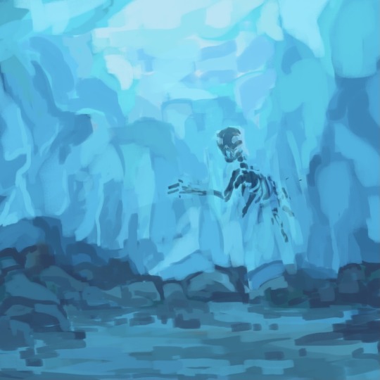
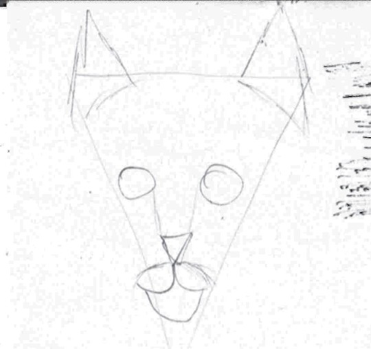
#image is a rough draft but added it just for a visual reference
Note
hi i was feeling keen on talking about fanclans so i thought you’d be a good victim since ive been loving your alaskan clans! I recently changed my clans to live in norway with TarnClan, SkerryClan, HeimsClan, and AsphodelClan in the mountains, coastside, alpine woods, and wetlands. Buncha political stuff happening in these clans. I’d like to say i really like your couriers, i actually have a similar idea called quickpaws, who function essentially the same.
What’s your favorite worldbuilding/story addition you added to your clans? For my own clans, i think i really like my StarClan portal the Moonpine! it’s a albino tree :) hope this doesn’t come off as annoying
Ooh that’s super cool, I don’t think I’ve seen any Norway-based clans before, and I loveee those clan names. Very interested to hear more about them and their politics. And yeah I enjoy the messenger/courier role a lot it’s a fun one to implement
And don’t worry this isn’t annoying! I love hearing about other’s fanclans I like to see people salvaging the bare bones from this mediocre series and actually doing something really cool and creative with it.
As for my favorite part of my clans I haven’t mentioned it yet but their Starclan connection area is an ice cave with a frozen lynx skeleton.
So that and figuring out the clans’ gods and weird cosmic relationships with them is probably my fav aspect so far.
#image is a rough draft but added it just for a visual reference#forfeiting a little realism for imagery that’s Cool As Hell. granted very little about my clans is realistic lol#ask#quiverpaw
86 notes
·
View notes
Text
Writing Notes: White Room Syndrome
White Room Syndrome - a significant lack of description in prose—often a lack of setting description.
A lack of description isn’t a major issue, but sometimes it can hold a story back.
If a reader can’t imagine where characters are, you’re missing out on a ton of opportunities to subtly show how they exist and interact in a setting.
Arguments take on a different tone if the speakers are seated in a church, floating around space, or on the phone at a street race.
Being conscious of the characters involved and showing how they’re interacting with the setting can really elevate what’s happening in the plot.
Here are a few quick things you can do to tackle the issue of white room syndrome:
Create a mood board to help you picture things. Moodboards are a collection of images, quotes, etc. that help evoke an image and feeling for whatever project you’re working on. For writing, they can help you picture what a place or character looks like at a glance. For reference, you may study artworks or photographs.
Remember your five senses: Consider not just what a character is seeing, but also what they hear, feel, smell, or taste. Just, don’t do all of that all the time. Focus on what matters to the scene at hand. For example, if a character just walked into a kitchen, they’re more likely to remark on the smell of food being cooked, not the sound of a dog barking in the yard—unless that matters to the scene.
Reinforce themes or moods with the setting. The Great Gatsby did this magnificently with weather—as tensions rose it became hotter and hotter. Everything comes to a climax on the hottest day of the year.
Embrace worldbuilding. If you don't know what the character looks like, you could exhaustively detail their cultures’ looks and fashion until you have a solid base to build off of. Do that for every character in the narrative and you're golden.
Momentum is also important. Struggling to imagine what a newly introduced character looks like slows anyone down. Consider adding a description edit phase to your writing process. When a new person or place shows up in your rough draft, you may write [Describe] in brackets and move on.
Finally, you may just need to accept it. Not every story needs paragraphs of prose lovingly describing characters that will only be around for three chapters. Excessive descriptions can also turn some readers off, so if you work best with leaner visuals, embrace it.
Source
#writing notes#white room syndrome#writeblr#on writing#writing tips#writing advice#writing inspiration#writing ideas#literature#writers on tumblr#writing prompt#spilled ink#dark academia#writing reference#poets on tumblr#poetry#light academia#creative writing#writing resources
129 notes
·
View notes
Text
Week 4
In todays session I wanted to start creating rough visuals so that we could confirm how we wanted to game to look. I took inspiration from other MMORPG style games, looking at the character creation sections and map designs. We definitely wanted there to be an element of character creation as we thought, even if there were some students that weren't enthusiastic about the gaming side of the project, the freedom of character design and creation could be an element that'd be exciting for all.


These were just a few of the images I used for reference when designing. Our maps weren't going to be as big as those shown above however, and we were instead using pixel art as Lace had said, from research, that this may be easier for them, but the basis of each would be similar. I started to roughly draft our map and the types of locations that we agreed would be appropriate to incorporate.


These were my initial sketches, I used procreate and started off very simple then started to add it extra details, such as the hill background to add some depth to the design as well as some shrubbery. I used sketches of the national Ukrainian sunflower and the English Tudor rose. These felt relevant but also helped to make the surrounding look nicer and add to the idyllic campus setting that we were aiming to create. I added some labels to the final design so that anyone that looked at them on the figma understood the reasoning and for the designs and how the map would function. Ideally clicking on the location and then being transported to the building and exploring what it holds. The playground we thought would contain a game that you'd play with another player. The library containing information on Ukrainian culture/Kyiv and Birmingham/British culture.
We began to discuss the kind of facts that we would include in the library and so added a post to the Figma asking the Ukrainian to send in any facts about Ukraine, and more specifically Kyiv. We also added posts that prompted creative responses. We decided that the characters would be two that you chose from and you can then customise their outfits, and so we prompted the students to respond with any imagery that may be useful in designing these outfits. The characters we decided on would either be a lion, the national animal of the Uk, and a nightingale bird, the national animal of Ukraine. The animal characters felt better as it was a nod to the inspiring countries, but also added to the fantasy elements of the game.
Below are some of the facts sent from one of the students
The Kiev metro is one of the oldest in Europe.
“Shchedryk” or “Carol of the Bells” the famous Ukrainian song that is known all over the world.
The longest pedestrian bridge in Europe is in Kiev, with a length of 429 metres.
One of the favourite dishes of Ukrainians is borscht, which is traditionally eaten with black bread, lard and chesnik (garlic)
Petrikovsky painting is a Ukrainian decorative and ornamental folk painting, which was formed in the Dnepropetrovsk region in the village of Petrikovka, from where the name of this art form comes.
I started to look into the costumes for the characters. The dressing/customization stations and the kinds of outfits that we wanted. This was an important element of the game for us as we had seen that from the results of the questionnaire so far, 100% of the students asked said that they'd 'be more inclined to play a game in which you can design/personalise your own character?'. We asked the Ukranian students about traditional clothing and uniforms that they wore as children. The majority response was that 'primary' colours were part of all our uniforms. The uniform visuals that the students sent through also showed quite a resemblance to the British uniforms. I again began to draft visuals of the 'dressing' element of the game, this was a useful way of ensuring that as a group we were all on the same page about the look of the game.

The image above shows how we communicated with the students in Kyiv via figma. Simply uploading optional tasks that they can chose to interact with. Though this worked and we received some useful visuals from them, we wanted a more immediate form of contact with direct students that we had conversed with via figma. This is when Niamh uploaded the poll to see how the students wanted to communicate. This happened to be via telegram, and so Niamh set up a telegram for us all to join and communicate more efficiently.


These were the kinds of visuals that I created for the avatar dressing station, I used photoshop to create these visuals as i though this would allow a cleaner look, as oppose to ketchup which I'd use for a more rough sketch. I included a small podium on which the character that the gamer selected would stand. And different variations of uniforms, created in the colours that we found were most common in primary uniforms in both the Uk and Kyiv. I tried to pixelate the image, I hadn't previously done this and so I used the adobe website and searched how to create this pixelated effect. I used the mosaic pixelation, and varied the scale of pixelation. Unfortunately the higher on the scale the lower the resolution of the image. I was glad that I had a go and discovered the method to pixelate an image. Even if it wasn't a completely coherent image.
0 notes
Text
No. 5 Progress Update!
Hey, everyone!
I hope you’re all doing well with your projects so far. Time is flying by and we’re almost at the end. For me, things haven’t been exactly what I wanted them to be in terms of timing but I’m still feeling confident I can get this wrapped before our last week deadline. It’s been taking some hours away from my sleep but that’s all worth it lol, and not that big of a deal.
As for any hurdles I’ve faced, I’ve had some personal things take me away from my time on the project. I’m putting the time back into it though, and I’ll get everything back on track in no time. Realistically, I believe we still have so much time left to accomplish things, so if you’re stressing over our time frame, don’t worry about it. It’s better to be patient and finish the race a little bit later than you expected you would, then to give up and not finish at all.
I’m also feeling more confident I can get things done quicker now after my check-in meeting with Sharla today. Lately, I’ve been gathering footage from the films my interviewees mentioned as I was considering adding in the characters they speak about in our conversation, but Sharla recommended that I should avoid doing that, as it takes away from the discussion. Super good advice, and it also helps me just focus on editing my interviewees. I’ve already chopped up the episodes, but the hardest part overall is adding in the different angles to the correct time. It’s a very meticulous task. Also, color-grading them to appear similar has been tricky, as I feel like my eyes have been bugging out on me. Thankfully, I have friends I can use as guinea pigs.
Moving on, another topic that came up during my meeting with Sharla was my YouTube page that I’m going to be doing my posting on. I made one tonight and plan to upload everything there, so I’ll link it on my account for future reference!
Then, for my visual component of this update, it’s a little different than a straightforward attached image. Instead, I’m going to link a project I did last semester in a short film class. I was lucky enough to have the chance to try and do a rough draft of what I wanted my capstone to look like back then. It’s awesome to see how much it’s changed since then. Instead of doing one-on-one interviews it’s now a group project, there’s no outside footage, and the questions aren’t the same either, as my new talk story series allows the interviewees to guide themselves more than anything. I can’t wait to do a full reflection on this experience because the change is pretty significant, but I love my current concept way more, which I didn’t think would happen lol.
Females in Frame - CM 353 cut
Other than that, I’m getting back to work and planning to spend a few more hours tonight editing since I’m off of work tomorrow, so much sleep isn’t required. I hope you all are on track with your projects and seeing the results you want. And again, if anyone needs help feel free to reach out to me for whatever. You can email me through Laulima if need! :)
1 note
·
View note
Text
since last night, i’ve received several additional questions regarding the piece i created in celebration of tony’s birthday; instead of addressing each of these individually, i thought it easier to explain a bit more about my creative process. as stated previously, i have tremendous respect for my fellow creators, and would never intentionally undermine the ethics of the artistic community. i’ve put together an faq of sorts that will hopefully help resolve any potential issues.
no. 1: in regards to reference photos.
i typically reference a variety of images for my works. more often than not, i’m looking at trivial details concerning color or lighting. for more complex pieces, however, i will occasionally reference specific poses or expressions. this post explains a bit about my most recent piece, though i would like to expand upon several points here.
i’ll sometimes utilize what i like to call a “frankenstein technique,” that is, mash up a variety of poses to create a new, more dynamic pose. my bday piece is an example of this technique in action. see below:

here, you can see several of the images previously cited in this post, in addition to another image — which i admittedly forgot to cite, sincerest apologies — have been cropped and laid over one another. while credit for the images themselves goes to marvel and associated photographers/videographers, the mashup is my own doing. the result is... undeniably patchy, but it helps tremendously with my visualization process.

from here, i created a rough sketch, emphasis on “rough.” my goal was to outline the general form as well as the various focal points, ie. the arc reactor and gauntlet.

next, i added detail. this is still fairly loose, but i wanted to make sure the anatomy checked out. i included the layer on which i jotted notes to provide further insight into my thought process as i prepared to make my final sketch and start on color.

this is my final sketch. for anyone wondering whether or not my drawings are “outlined” or “traced,” never. i may use my own first few drafts as references throughout, but under no circumstances will i intentionally plagiarize the work of another.
no. 2: in regards to a “my art” tag.
my blog is not exclusively an art blog. as an anticipated visual communication design major, however, i am incredibly passionate about art; i will occasionally post the projects i’ve been working on and reblog those of others.
all of my original works are tagged with “*art,” note the asterisk, and may be found here. if you follow me, you may know that i recently completed my senior year of high school and have been incredibly busy these past few months; due to this fact, the majority of the works under this tag are older — however, you can still find several recent pieces!
the works i reblog from others are tagged with “art” and may be found here.
not including a “my art” link in my bio was a personal preference, but i would be more than happy to add one if it would make navigating my blog less confusing. until such time, all of my original creations can be found here.
no. 3: in regards to my tagging system.
there seems to be some confusion regarding my decision to tag my artworks as “edits.” as my blog has gained a greater following and my creative outreach has expanded, i’ve adopted a tag system as a way to stay organized.
most of my original creations — whether they be drawings, photosets, gifs, or videos — are tagged as “edits.” while i understand the term itself can be misleading, i've taken it to mean any creation referencing a previously obtained form of media. therefore, the term “edits” could encompass the aforementioned drawings, photosets, gifs, and videos.
simply put, any of my works — regardless of post type — portraying tony stark are tagged with “tonystarkedit,” just as my works portraying peter parker are tagged with “peterparkeredit,” and so on and so forth.
if there are additional questions, or if you would like me to elaborate on any of the above points, feel free to message me! i appreciate everyone who has come to me with their concerns, and am more than happy to help in any way i can.
8 notes
·
View notes
Text
POST - PRODUCTION
Hello guys!! We are all done with production now it’s time to gather all the shots and start the editing process.
I sat with our editor and confirmed every shot which are going to be used and divided the shots according to the trailers.
Our Editor Aadityalekshmi copied all the data in the school’s system and started filtering the shots. On the same time, I along with my Cinematographer Riyaan started looking for background score and sound effects. Though we have a framework in our mind from the beginning but number of things changed during editing process. Aadityalekshmi started editing in stages. First of all, she created a rough draft and assembled all the shots together to see how the overall trailer will look at the end. we even started finding different ways of showing the same shots by just adding or subtracting the shots. Finally we came to a point where we thought this way of execution will look much appropriate.
We did the editing on Adobe premiere pro CC 2018 & 2021 on the school’s pc.

POSTER
At the same time we started creating our poster for the film and for that we used CANVA, which is a graphic design platform, used to create social media graphics, presentations, posters, documents and other visual content.
I researched on the codes and conventions of horror film posters :-
While taking the main image of the person’s face, a low angled camera shot is used to create a scary atmosphere and to create suspense and tension. In the same way I clicked the pictures of the lead character for the poster.


Additionally The low key lighting creates this effect more and identifies it as a horror drama. This tells the audience what to be scared of the film and hints at what the problem is.
There is usually a close of the victims face to show a scared expression which connotes that the poster is for horror film. similarly we took the close-ups of our lead character to show her expressions of both side of her.
The credits are usually at the bottom Of the poster, including the names of the actors And the production company , as well as the title and the tagline of the film. There is also the release date at the bottom of the poster.
The main colours are usually black and white  with just a little hint of other colours  to connate the horror genre such as red. Even Most the horror movie titles are in white or red Font. Following this we used same theme of black and white in our poster.

There after we looked up for many horror film posters just for the reference and to get an idea of how the posters of horror films are presented.


After Looking at the different horror posters we got an idea of the color schemes , Title fonts , background designs , transparency effects and many more visuals. This whole researched helped us to design the poster of the film.
Keeping all these conventions in mind and by creating many drafts, we finalised our film poster. ‼️‼️

0 notes
Text
Film Narrative 2: Fiction Project Critical Reflection
In making ‘Move On’ our main source of Inspiration came from visuals, initially using a Pinterest board with a couple of images to get started. As we added to it the idea it became much clearer how it was going to look. For one of the characters in this project ‘Tom’ I got a lot of inspiration from men’s fashion from the 1940s/50s as this is the time period where he was from. This meant I got to explore costume from this time period and ensure its accuracy.

Our process began with presenting and bouncing our ideas off of each other. We selected Natalia’s idea which we thought was the strongest. We had further discussions to get a greater understanding and depth of how we wanted the story to pan out as and the roles we would undertake. I wrote up an initial logline and synopsis to share with the group. These were received well, and Natalia (writer) went on to write the first draft of the full script. Throughout this creative process we continued to do weekly calls to give updates on where we are at and to ensure we are all on the same page and offer comments and help.
After working with the writing aspect when doing synopsis and logline I focused on my duties as location manager by finding locations which would fit with our story, that were also somewhat realistic in the case that it would be possible to film this in the future. I found around seven potential locations based in Edinburgh that I thought really worked with our concept. From there Olivia (director) shared her two preferred locations from my selection, Checkpoint’ and ‘Nauticus Bar’ as back-up. I made colour palettes of our chosen location ‘Checkpoint’. With the locations decided my next responsibility was to go through the script and consider production design and other materials we would need. This work included making a mark-up script which described location, characters’ features, props, costume, sounds and making simple moodboards showing visual examples of required props. Tom was our post-production editor but we as a group assisted. Using feedback from the ‘Rough cut crit’ (see earlier post), changes were made to the final edit. Tom had sent in an initial draft of the final cut and was happy to include suggestions we had for him in the re-edit.
Helpful feedback was given in early stages in tutorials to improve the script and overall project. Advice included remembering it is a 3-minute script, and doesn’t have to show specifically a beginning, middle, and end. For example, a good moto is to ‘arrive late and leave early’ and it is about seeing how late you can arrive with still having the story make sense and be interesting. Another way of considering and researching this project was to think about ‘bottle episodes’ which are only shot in one location and focus on the dialogue. An example I found of this was a Breaking Bad episode ‘Fly’ in season 3 episode 10; just about the whole episode is shot in the meth lab with Walt, Jesse, and a fly.

From the crit feedback in terms of pre-production paperwork the folders were organised well which was appreciated. The synopsis and logline were also received well due to had it having details of project information at the top such as team member names, genre, title.
Synopsis was said to have been successful in the sense of being intriguing giving a sense of a how the story will go. One of the script mark-ups was seen as slightly confusing in terms of formatting, although good that there were abbreviations for shot framing. The biggest issue was that it started a shot 2 which is confusing for the reader. However, the shotlist and the marked-up script matched up in terms of shot numbers which was good and overall feedback was really positive for the shotlist as it had a good selection of framing which shows we have covered the scene well. In regard to the storyboards, they showed framing and the intentions of the shots well. We also had very detailed artistic storyboards that gave a really good indication of the tone although didn’t include all of the shots. Our Lighting plan showed a clear idea on how we are planning to achieve this and our moodboards showed some really striking, interesting images. Next time we should have notes on why we choose those shots, what do they reference in the script. Overall, our pre-production materials showcased a lot of the development processes throughout all the documents.
In terms of audio edit for ‘Lethe’ the most feedback we received was that the overall dialogue levels need to be higher by making the clip gain higher; there were also come sync and panning problems. I don’t know much about this as I am very new to sound design and it was Natalia who was doing the practical side to this edit but this is something I need to get to grips with and understand better. I also learned that in general no matter where a character moves on screen, the levels are kept the same.
On the visual edit the overall feedback was that it was a nice edit, the pace was good, and Tom (editor) had done some really smooth L cuts and J cuts that allowed some sections of dialogue to be very well. One critique we did get was that there were some shots that were held for too long on dead space. However, I would challenge the statement that we held on the person in the other bed for too long. I personally thought this was a good choice as this is somewhat important to the story, and it is therefore justified to hold it on them.
I think we worked extremely well together; it was collaborative and supportive space. All departments worked together to create the end product we all wanted. I cannot recall a time where we didn’t work well together, the only thing I could possibly say is when we would discuss work via messenger at times it could be slightly unclear what one person is trying to convey, but this was easily fixed with a video call.
I have learned a small bit about sound design, but I still find It a realm that is very complicated, and I am glad I have had my first experience seeing how Pro tools works, learning about beat sheets and how they help when laying out what your film is going to include. I learned about details required to be included in production designers marked-up script. I continue to try and understand editing.
0 notes
Text
“Horror Vacui” or the fear of the blank page [for amateur artists]
[A really long post]
If you fit this description, this post is for you:
I’m a hobby artist/writer/creator with a broad interest and I don’t have enough to time to practice any of my interests beyond the amateur level. Creating is something I commit to about 10 to 15 times a year - when I need help, I don’t want to take an online course, just give it to me quick and dirty and I’ll see to the turnover.
This post contains:
mandatory motivation delineation
step-by-step drawing guide for amateur artists by an amateur artist
all reference pictures for the above
tracing - a technique shunned by my Grade 8 art teacher and the last time I attended art class
cross-hatching and contours
a tiny bit of perspective
a bit of shading
tools
tips for shaky hands
Why this post, when the internet has countless of tips to overcoming writers’/artists’/creators’ block already?
I mean, Google churns out some 20 million search results in under 0.55 seconds! That’s like 10 search results you are might look at tops - 20 if you’re desperate enough to go to page 2 - and realize most of the tips a lot of work, not worth the trouble, things you’ve tried before, or too abstract to be applicable to the thing.
One thing most of these guides get right: getting started is the most crippling step of the creative process.
The most common advice to overcoming your block - so I have read countless times - is establishing a routine until you “instinctively” know how to achieve your goal. Are they wrong? No, definitely not. Is it good advice though? Depends; at least not for me - and if you’ve read this far, then not for you either.
What are my other options?
Planning. And being aware of all the tools at your disposal. I documented the process of this drawing as an example. This process has limited applicability to paintings.
You will need:
an idea
drawing utensils
paper (some scraps to start with)
patience
Step 1: Rough Sketching
Take scrap paper. Unless your documenting this (hi, mom) you’ll throw this away asap. Get down the rough shape. This may a while and will involve you questioning your sanity - barge through the doubt, don’t erase what you’ve made, use the best parts and try again.
Example:
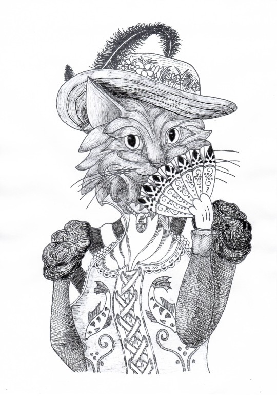
I would like to draw a cat. I take a pencil and...
Lol, no. Cats are not pizza with ears.
Let’s try that again. Maybe a reference picture will help.
Much better. Start with some crude shapes but sketch out the entire body with shapes like they do in some drawing guides - only draw what you need. In this case about two and a half ovals are enough. Now make a better copy beside that initial sketch - I hate doing them on top of the first because that gets messy real quick. Draw some helping lines from the reference image. Don’t bother too much with proportions or posture, or going big; all these sketches are about 6 by 4 cm.
I want to draw a companion for this steampunk cat, about the same shape and posture with a head tilted one way and the torso another. She’ll need a proper headdress too - I went through three options visually and added some notes for other ideas I had in case neither of these worked out.
Step 2: Break it down
Break down the drawing into smaller bits and pieces and look up reference images if you need them.
I broke down my sketch into:
Head/Face
Torso/Clothes
Hat
Fan
The head
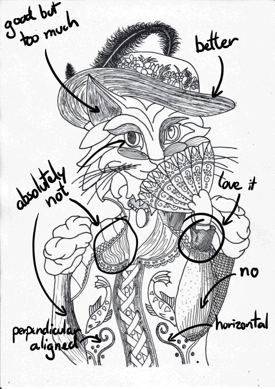
I want my cat to look slightly to the left and this is what I found online:
Not quite
Almost
Perfect
The torso
I found this image, which contained most of the parts I needed. I didn’t like the hat, head, fan, and all the mice scampering about ‘er so I just took the torso - the corset is really neat. Unfortunately, her posture is not quite what I need so that will be the biggest challenge for this body part.
The hat
I considered a few options such as this 1920s flapper’s headpiece and a couple of Victorian hats before settling on this one.
The fan
I own two so no reference image necessary.
You can keep a couple of tabs (or books, if you have some at hand) open in case you change your mind while drafting.
Step 3: Fine Sketching
This is the hardest part but if you’ve made it this far, you might as well go all the way, right? Understand how your brain operates and beat it at its own mind-game: create a sunk-cost-fallacy and drive yourself forward.
There three ways to get your fine sketch onto paper:
Cool, if you can pull it off go for it, usually takes the longest if you lack the practice (like I do)
Generally a good approach, especially when scaling up
Use a ruler to measure and plot key points of your outline
Print it and hold it against a window.
If it’s dark outside unhinge that glass cabinet door, duct tape it between two tables and put a lamp beneath.
Pull it up on your screen and adjust your zoom. Be careful with the pressure of your pen!
Use sticky tape to prevent it from slipping
(Below) Using a reference grid (the dots) on a canvas for another project.
(Below) Tracing the head. Slight rotation of the page to achieve the desired orientation of the head.
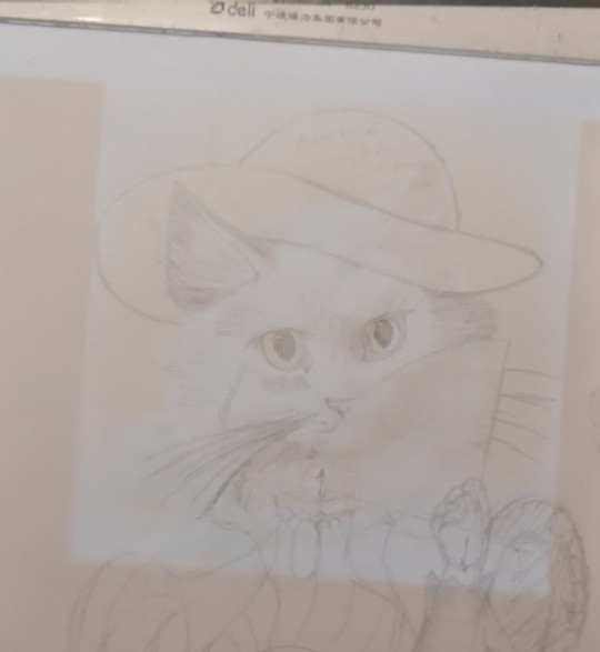
I also traced the torso and the head first. Then I added some rough shapes for the arms and the fan - this was also when I realized I can use the fan to hide parts of the face I don’t want to draw. Everything ended up a little twisted and short so I dashed lines where I want these limbs to go. The fabric of the corset also needs to be pulled up on the right and pushed down on the left, hence the arrow there. The neck is way too long too. Add some more notes of things you want to change - like adding a fuck-ton of flowers to the hat.
To judge whether the proportions make sense take a look at yourself in the mirror or ask random people in the hallway to pose for you - afterwards exchange a friendly, confused smile and move on.
(Below) First fine draft after about 5 hours of intermittent work - just take breaks when you’re bored, but leave it prominently lying in your way so you don’t forget about it. I reconstructed the arms’ outlines and added some bold comments.
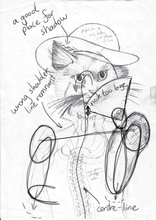
Once you have everything you need, clean up your first draft as much as possible by erasing help lines and drawing strong borders. Next, open something bright on your screen (or whatever your tracing equipment happens to be), tape a blank paper to your first sketch and take down all the details you want to keep. You can move the paper around to shorten or elongate distances.
Add borders if you want to frame the drawing later.
Now change all the things you don’t like. I changed the cat lady’s hat to be less round because I didn’t want her to wear a wide-brimmed bowler and added a fuck-ton of flowers and - for good measure - a feather. If you can’t draw the feather flicking back up like me, hide it behind the brim of the hat.
Think about any fur you want interacting with the fabric (hat or collar). I added one curl to flow down the left side of her collar - didn’t really work out but A for effort.
Add any major decorative elements like the fish on her corset or the patterns on her fan.
Add major textures like the lines on the brim of her straw hat. The dotted texture on her sleeve was way too fine and didn’t carry over to the next tracing. The same goes for the shading from the last draft, which didn’t carry over well and I ended up bundling all the fur together in larger bundles.
Save the puffy shoulders for last (because I had no idea what to do there and eventually opted for “brains”).
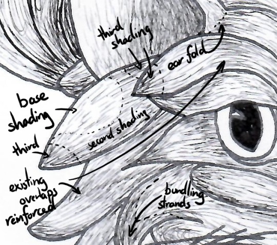
(Below) About 90 minutes on the face to compartmentalize all strands of fur into proper bundles. Note six key bushels that define her expression: on both side of her nose, her “eyebrows” and the trailing of her eyes. Look up cartoon cats for help. 2 hours on her torso and another hour on her shoulders.
Clean it up again and judge your work. If you are still unhappy with the positioning, do another tracing. Don’t forget to embolden all important features
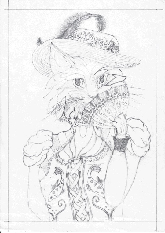
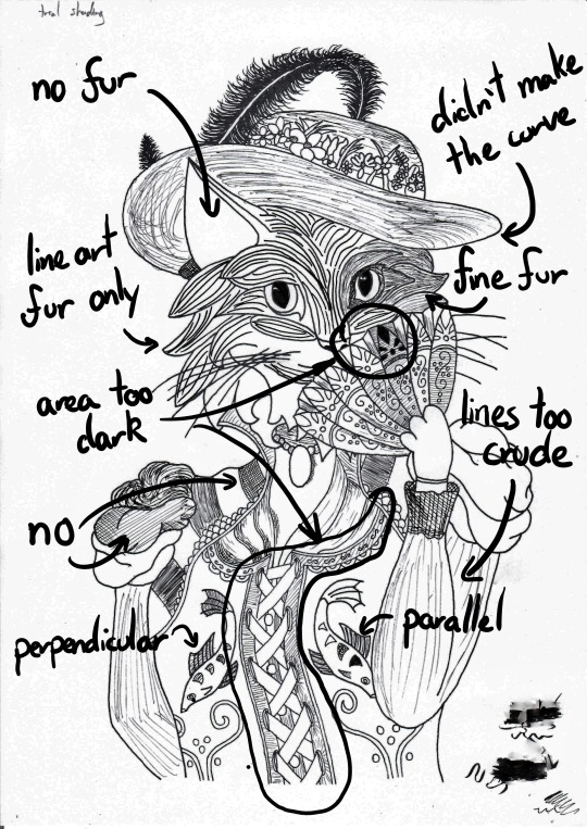
Step 4: Inking the outline!
You’re patience is paying off! Next up is inking! Inking is fun!
Oh shit-
Don’t ink your final draft!
Step 4a: Screw up
I never get my inking right on the first try and it’s hard to hide mistakes you made with ink. I ran my draft through the photocopier once (because I didn’t want to trace it) so my mistake here wasn’t that big a deal - I lost five minutes and this paper went into the my scrap tray. Always start inking the most difficult part so you don’t regret screwing up after being almost done.
At this point I realized I couldn’t erase the pencil lines anymore and went back to tracing paper on paper on screen. Be aware of the ink you use and how thick your paper is or you might end up leaving marks on the draft below.
(Below) The pattern on her brow is off in two places.
Step 4b: Finish inking the outline
As before focus on borders and major textures; about now you’ll notice which parts of your draft are to fine to trace well and which ones need some extra weight. Drop any lines you don’t like.
By now you probably have a couple of pages with sketches and bad inkings lying around - make sure you label them or find some other method to remove them from your line of work (like throwing them in the bin).
(Below) About 45 minutes, 5 of which were spent on the feather, 5 on the flowers, 10 on the fan, 10 on the face, and 15 on the torso including arms.

At this point you could scan and stick it into a colouring book.
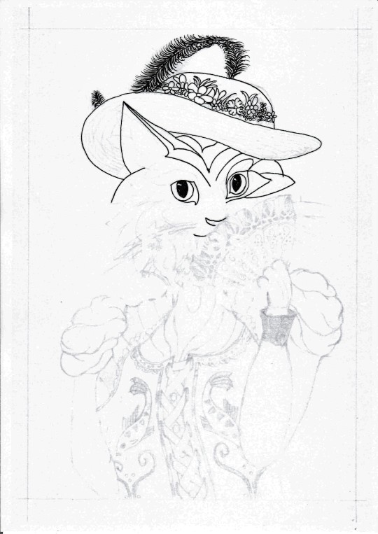
Step 5: Textures!
This is the best part. Texturing a drawing is so satisfying it makes up for all the hardship up to this point.
Make a couple of copies this time to practice your texturing. Afterwards, feel free to continue the page you traced or run it through the photocopier once again.
(Below) Two versions with different types of shading.
It’s very easy to get carried away when shading; always go for a little less than you think you need. You can always add more later, but you can’t take it away.
Fur
Use lines that flow parallel to the outlines you’ve already drawn. Make the strands flow apart at the beginning and back together at the end. Try to keep the numbers of strands that begin and end constant. This will result in a larger spacing and thus a lighter centre of your bushel.
I like shading an entire area, in this case the entire head uniformly but very lightly, then I start thinking about accents and where light could come from. Wherever fur bundles together (usually at the end of a bushel) I add some more of the same texture to make it darker. You can lift some of the shading from your reference pictures and just copy it. But don’t limit yourself to what your references provide.
To be honest, I only roughly take notice of where I place my imaginary source of light and just emphasize parts of a bushel that were darker to begin with. Usually turns out okay.
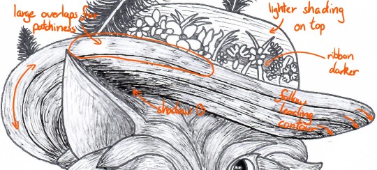
Fabric
Generally, keep your texturing parallel, perpendicular or at a fixed angle to the next leading edge. The lines don’t have to be - and most of the time shouldn’t be - straight. Allow them to trace out wrinkles in your fabric or reinforce the fabric’s rigidity by copying the leading edge at short intervals.
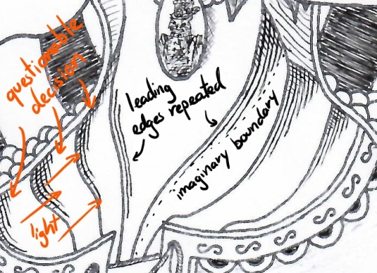
The same formula of repeat the leading edge applies to other parts of the clothing - just vary the line separation and how strictly you follow the leading edges.
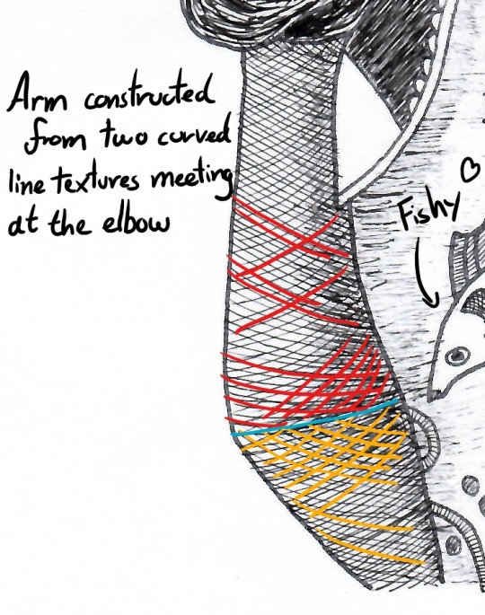
In other places lines placed at constant angles make a good texture.
Know your tools: my pens stop drawing at an angle of about 30-45° and drawing lines at this angle will make them lighter and discontinuous. This is a good approach to lightly shading a large area like most of the corset.
Cross-hatching gives the sleeve a wrinkle and two light-spots. Two layers at roughly 70-90° gives a good hatch, only add a third layer if you need it really dark - careful: this will make any contours established with two layers disappear.
Shadows
Some places just ought to be darker though, like the spot I marked behind the ear or below the chin. This gives your drawing some depth. Just reiterate the same local texture over and over again until it’s dark enough.
Without my annoying comments, the final result will look like this:
Is it perfect? Fuck no. Is it pretty good? Aye, meets my standards.
By the way, this is what we started with:
Tips for shaky hands
Sugar, caffeine, medical condition? Hands come in all degrees of shaky but don’t let that discourage you. Here’s how I approach the most important elements in my art.
Long lines
Long lines are hard to draw, if you don’t have practice sliding your hand across the page. I can do it sometimes but not reliably. Instead I place my wrist firmly on the page and draw the part of the line that is within my mobile range. The more of my wrist rests on the page, the less I shake. Then I lift my pen and move on to the next bit - sounds trivial?
Wrong.
Whenever you start or end a line you go from rest to drawing speed or vice versa. During these moments the constant flow of ink is spread over a shorter distance, resulting in a thicker line. Appending a new segment causes a brief overlap and results in a blotch, especially when you need longer than an instant to correctly put down your pen.
Coming in at an angle prevents the ink from flowing prematurely and gives you more control of your line.
Curved lines
Place your wrist on the inside of the curve (segment) - drawing towards yourself is easier than away. Rotate the page to make it happen or rotate yourself if the page is stationary (like a large canvas). Additionally, I like to keep my fingers stiff and only rotate around my wrist.
Textures
For very fine textures I keep the tip of my pen above the page and start repeating the pattern. About two thirds of the strokes will go into thin air but the shaking will make one third hit the page - a statistical approach to texturing.
Conclusion
My longest post so far - I starting making this almost 8 hours ago. A blank page is a scary thing, so many possibilities, so many ways to screw up. The most important advice to take from this post is plan, save, trace, repeat. You don’t have to be ashamed for tracing art; just don’t parade an exact copy as your own work and always keep your references at hand.
Why does this feel like academic writing 101...
I invite anyone to contribute their own quick and dirty drawing tips for amateurs to this post. DM me, if you have any questions or would like to use this a last-minute-Christmas gift - I’ll send you a free high-res. I don’t judge, not this year nor any other.
Best,
Ocelittle
#tutorial#art tutorial#artists on tumblr#ink#ink drawing#drawing#art#amateur art#christmas gifts#horror vacui
0 notes
Text
DevLog 10.27.17: To-Dos, and To-Dones

Astrophobia is a “neo-Lovecraftian space opera” comic book and audio drama series under development for an intended 2018 release.
Here’s some stuff I did on the project this last week.
Wrote Most Of The Astrophobia #1 Comic Script
I’ve been having trouble putting pen to paper on this one... which is screwy, because I’ve got the story so tightly outlined that I know pretty much everything that happens on every page! But sometimes I have trouble getting started on the first issues of new projects, because I’m nervous about committing the wrong stuff to paper. In this case, it meant that I’d only managed to finish about a page or two a day this week — and on some days, not even that much.
Anyway, yesterday was a lovely day, and I tried working outdoors at a different coffeeshop than I’m used to.

I don’t know how much of it was the (awesome!) change of scenery, and how much of it was just me finally being “ready” to write the script. But suffice to say, I ended up writing ten pages. Only six pages left on the first draft!
Figured Out How To Make The #1 Story More “Lovecraftian”
There’s certain elements people associate with “Lovecraftian” stories: “Madness,” impossible architecture, “things humanity was not meant to know” — and tentacles. But those are just surface elements. Trappings. And though I certainly want to play with all of those, I want to go deeper than that. To pull certain core elements out of HPL’s fiction that’ll make Astrophobia ring truer as something genuinely “Lovecraftian,” without being part of the Cthulhu Mythos, and without being a Lovecraft homage or pastiche.
One element that I can’t believe I hadn’t thought of before: A number of Lovecraft’s most prominent cosmic horror stories begin and end with the narrator reflecting on what’s happened to them, and the ramifications of what it means to be living in a universe where such things are possible. So I whipped up a test version of some text like that for the beginning of the Astrophobia #1 comic script:
Going to the stars was our biggest mistake.
It was bound to happen, someday. I mean... they're right there! Above us, every night! It was inevitable that, sooner or later, that we'd take that one giant leap. If for no other reason than because we could.
That was our sin, in the end. Not hubris, wrath, or any of the classic seven. Our sin was curiosity. It was built into us by... the ones who built us all.
And now all I can do is pray — to the caring gods that don't exist, and the uncaring "gods" that are way too real — that our species survives its own nature.
This is how it started.
(That’s the “test,” rough draft take on it. If I use something like it, it’ll be in a slimmed-down and spruced-up version.)
Figured Out How To Integrate The Comic & Audio Drama Story Elements Better
One of the questions I’ve had as I work on this project is: What stories to tell in the comic, and what stories to tell in the AD? After a lot more thought and some talking to other AD people (see the next entry), I think I’m getting a better sense of what should be in both of them!
(Basically, the AD stories should be more character-focused, more intimate, and should involve aliens/monsters and such that would be hard to represent visually — or that are stronger if they’re just described verbally rather than shown.)
Figured Out More Story Stuff (For The Comic & Audio Drama)
Including several new stories ideas (including a couple vaguely inspired by classic horror movies/scenarios), that may end up being in the comic series at some point. Also, firmed up some story plans for the AD.
Also: I’ve been having trouble figuring out which of my (many, many) story ideas to use, and what order to use them in. This week, I realized the obvious solution to that. For each set of stories (both comic and AD), I need to figure out what the overall plot or character arc that I’m focusing on is... and then select the story ideas that best fit that arc. Seems damn obvious now that I’ve thought of it. But it’s taken me literally months to realize it!
Came Up With Several Ideas For AD Music
Ideas that I pitched to John (our musician) this week:
The music for different story elements could use consistent, different instrumentation for each element. For example: All the parts of the AD episodes that are about the human cast could use “traditional”-sounding instruments — while all the parts where they encounter aliens could also involve “weird” instruments (synths, weird effects, sampled noises, etc.) “The part of the xenomorph will be played by the bassoon.”
Maybe do short loops of music, like in a video game, more than longer “traditional” songs for the score? More modular, more “plug and play” than full-length songs?
There could be marches playing when the actor talks about the ship’s military crew and its mission. And there should be at least one dirge! And a death march!
Got Drinks With Some Audio Drama People
It’s the Austin Film Fest this week, and they have a “Podcast Track.” So there’s some audio drama folks in from out of town. Had a nice, inspiring round of drinks with them at a shmancy, old-timey bar in downtown Austin last night!
(Got lunch with some comics people this week, too.)
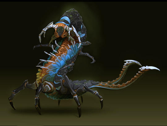
Did Heaps Of Research; Found Heaps Of Visual Reference
Research I did included: Rewatching Prometheus (what a stupid, stupid movie); listening to audiobook versions of Call of Cthulhu and At The Mountains of Madness; figuring out the specifics of the Alcubierre Drive (the actual hypothesized warp drive that scientists at NASA have been studying); and LOTS of Wikipedia-ing and time spent on Atomic Rockets.
Also: I’ve also collected a vastly larger quantity of visual reference and inspiration than I ever have on a project before. The majority of it, we’ll never end up using. But I think it’s going to come in handy. (Plus, Googling up visual reference is something I can still do when I’m braindead at the end of the workday, or even while I’m talking on the phone to people.) (...Yes, Dan Schkade, I may have been looking up concept art of “insectoid exoskeletons” while we were talking about your new story idea and Gross Pointe Blank on the phone yesterday...)
Here’s a few cool pieces of art that I found.


Whew! This is getting really long!
Before I sign off, some stuff I need to do in the coming week. And some stuff that’s not a priority!
To-dos:
Finish the #1 script, and send it out to my “beta readers” for notes.
Firm up the secondary supporting cast/Orpheus crew. (The #1 script focuses on only three of the primary characters, with the other primaries just making cameo appearances, to be fleshed out in future issues. But since the Orpheus is a “closed system” — there’s only so many people on board, and that number’s just going to go down, not up! — it’s useful for me to get a good handle of all the prominent people onboard.)
Decide which stories to tell in the first “arc” of comics.
Decide which stories to tell in the first “arc” of the audio drama.
To-DON’TS (low priority but enticing stuff!)
Search for image ref when I should be doing something else.
Do a bunch of research about things that aren’t germane to my primary “to-dos.”
Come up with more weird aliens to tell stories about (this is a priority, but not a high one at the moment!).
If you actually read this far: Congratulations! Gold stars! :)
#DevLog#Astrophobia#Astrophobia Podcast#Astrophobia Comic Book#Lovecraft#Lovecraftian#podcast#audio drama#comic#comic book#horror#science fiction#space opera
5 notes
·
View notes
Text
MED1444- CW2 Walking Animations
The illusion of movement is essential in animation as form of media; without the movement, the ‘animation’ would just be no different from, say, a singular drawing or a still image of a highly rendered 3d model. Though stills and non-moving models like as mentioned can be considered art forms, animation gains part of its status as an art form through the use of movement. If art is a form of expression of emotions or portraying ideas then most of what makes animation an art form is through the use of movement, for that is one of the main ways that animation provides a sense of expression and emotion. An entire character can have their whole personality revealed to the world through their basic movements, it can show their intents or their emotions or a vast array of other cornerstones to what makes a character. Of all the ways a character can move with their actions, the simplest and most used form of movement by a character is the basic act of locomotion. Even this simple act of moving can give a sense of personality and identity.
Basic walk cycles are greatly important in regards to movement. Though a character may appear without legs or may appear without arms or may differ in any way to a standard human-like body shape, the standard way a human walks is still one of the most commonly drawn upon resources animators use as a point of reference for bipedal characters. From the way a human moves there are several key points of focus that are essential to grasp before adjustments can be made to tailor the movement to a particular character better. The main points of a human walk in simple terms are contact > low > passing > high > contact. ‘Contact’ are the points of the walk where both feet have touched the ground, though the foot that was previously raised above ground is only contacting using the heel. ‘Low’ is the lowest point the whole body is in relation to the space around it, where the foot that newly made contact with the ground is now entirely making contact with the ground, the leg that foot belongs to is bending a bit, and the other foot is starting to raise off the ground. ‘Passing’ is the mid-point for walking where the now raised, bent leg is about equal level with the other leg. ‘High’ is the highest point the entire body is in relation to space, where the lifted leg is at its highest and the foot contacting the ground has the heel raised slightly in preparation for the next ‘contact’. During the leg movements, it is also important to make note of how the arms move, where the way the arms move is inverse to the motion to the legs, so for example if the left leg is the one currently moving forward it would be the left arm that is moving backwards. Despite this the arm movement and pacing isn’t too drastically different from the leg movement and pacing, where the contact movements are in fact the highest points of the arm movements but the passing movement is still around the mid-point where the arms are about level with each other like the legs are.
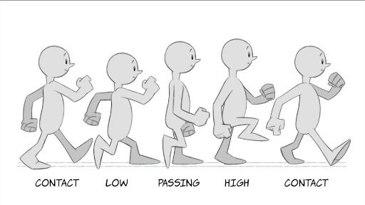
(Pictured above: a visual reference personally used during the production of the 2D walk cycle [Image source])
Though these key points of human movements are essential, once established they can be adjusted as necessary to change the way a character looks as they move. For example, if additional frames for movement are added post-contact but then quickly build up speed until next contact, it may give the character the appearance of being graceful or very careful with their movements. Alternatively, if more frames are added alongside that of the character getting lower to the ground during their ‘low’ point before they build up speed, it may instead cause the viewer to believe that the character is quite heavy and needs time to build speed with their movements.
2D (Harmony) Animation:
The first of the walk cycles created and completed was 2D hand drawn. This was created first as I felt it was a good introduction into how to create a proper walk cycle and to get a feel for the way the human body moves. Creating it was relatively straight forward. To begin with, before the walk cycle was even in a rough draft stage, a character had to be created to animate. The specifications for the character had to be that they had two arms, two legs, feet and a head. As the main focus of the project was the walk cycle itself, the character didn’t have to have too much thought into it, so I created a simple character for the animation that lacked any distinct features to note. Due to this design decision as well as the very non-realistic proportions or drawing style, a massive amount of time was saved when it came to animating it. This design was drawn in Photoshop and then imported to Harmony to use as a reference. The design drawing includes red segments for some areas to highlight the rough size of the joints, where the joints are and how the character should overall be drawn when sketching them.

Firstly for the animation I had to plan the basic features of a walk, so the points of contact, low, passing and high. These were used somewhat as keyframes; they helped with the initial plans and figuring out how to pace the walk correctly but were adjusted or redrawn as necessary as needed in order to ensure the animation retained a flow. Besides that the animation was done frame-by-frame, again with adjustments and frames added here and there to ensure that there was a flow. Moreover, the actual drawing process of the character was done piece-by-piece as opposed to drawing the entire character all at once, so the body, head and legs were drawn first, then the arms and hands, and then finally the feet. By separating the body parts it made editing the body to make the walk feel more natural a much easier process. A minor change took place at this point whereby I didn’t draw a neck as I did in the design plans, making the head float slightly above the body. This change was decided upon to both make the design mildly more interesting and to make the animating process slightly faster.
After the basic animation was complete additional changes were made to it. Notably, extra frames were added to the entire animation overall improve the pacing. This is especially true after the feet make contact with the ground as at that point in the animation the momentum in the leg is lost and has to be built up again so the additional frames creates the illusion of the leg moving slower. Moreover the additional frames were used to add some exaggeration, with squash and stretch and a more pronounced follow-through in parts of the character. As the character design was very unrealistic to begin with, it made squash and stretch all the easier to accomplish and more importantly fit the whole look of the animation a lot better. The final thing added to the animation was shading to the character. In the final uploaded walk cycle compilation there was also another version of the walk added where the character lacked feet, which was added mostly due to how the walk still works even without any distinguishable feet and shows how a walking animation can work well for a character even if they lack that body part.
Generally the 2D walk cycle was quite successful as the finished product had a mostly smooth pacing and, like many animations, any minor errors in the character being drawn that might have been produced aren’t immediately noticeable. The direction intended to go for the walk was one of being mostly basic, almost as basic as the character design itself. Interestingly enough however this may not have been entirely the end result achieved from the walk. The walk could be observed as carrying some sense of purpose in the character and the way that character has a bouncy quality to the walk that makes it appear to be feeling a positive emotion almost. The pacing of the walk also is what gives the character these qualities, and the fully upright gait. Interestingly enough it should still be noted that the character is still quite generic in appearance as is the walk despite all this, so the question could be asked if this is just a neutral walk and is just perceived as having some form of purpose through bias created through the actual animation style, and if so how much bias was created in this manner and how much of the perceived emotion is due to the actual gait the character has. It would be an interesting point to experiment with in future.
3D (Maya) Animation:
The main change between animating a walk cycle in 2D and one in 3D is the introduction of a 3D space as opposed to merely a 2D one. This poses some challenges and as well as some benefits: on one hand one must now display more attention to detail and animate more of the character due to the 3D format now presented, but it can be argued that it is much easier to use real life movement as a direct reference and one must not have to worry about how well one can draw or translate a 3D reference point to a 2D plane. Through the use of 3D one can merely import or create a 3D model and then only have to worry about the movement and posing aspect and not how accurate it looks to the design, because the design was only needed as reference for the model creation itself. Furthermore, like with many animation programs including Harmony, Maya has the option of calculating and auto-filling inbetween frames with movement based on keyframes. This is a process called inbetweening, or ‘tweening’, and through its use it can drastically cut the production time of an animation. While this was not used for the 2D walk cycle, it was heavily used for the 3D one, almost being used exclusively in fact.
The model used in Maya was one imported as opposed to one I personally created from scratch, so the sole focus was on the movement. Because it was not my design however it posed a limitation on what one could expect the personality to be as well as the movement style. In this instance the model was of a zombie so one could expect a sluggish, hunched over stance while moving, or at least that was what myself imagined and tried to capture. While one may think the fact the model was imported to be a massive drawback to what I could animate with it, how it was animated, ect. it might be considered a good form of practice especially if one imagines that much of the time animators are given designs to work with rather than design them themselves.
When it came to animating the model, as stated previously, it was mostly animated using tweening. An extremely important thing to note is that subtlety is key when using tweening and ensuring you calculate where and how much something is tweened. This is mostly due to the fact that because the in betweens are auto-generated you are at the mercy of how the program calculates the in betweens and it usually comes down to numbers and inputs in many cases. It’s important to get the numbers right and what frames you choose to use as keyrames otherwise movement can look stiff, robotic or unrealistic. In the case of Maya the animation itself was simple and easy enough. The keyframes used were mainly the moment a foot begins to leave the ground, the moment a foot touches the ground and the passing movement where the body (in relation to the ground) is at its highest. From there, the main issues faced were mostly figuring out how many frames were needed in-between keyframes to make the movement not feel too rushed, and maintaining an awareness that creating keyframes is based on particular joints selected rather than the positioning of the entire model meaning that several keyframes had to be created at around the same time in the animation for different joints. Besides that, after the animation was mostly complete, minor adjustments were made such as adding extra keyframes around the same points as previous keyframes where i manually moved parts of the body to ensure the pacing was correct enough to give a sense of the body slowing in and out of movements. The extra keyframes had to be created otherwise any changes would be overwritten by tweening. As with the 2D animation, the animation process was mostly segmented by body part again, where the legs and feet were first to be animated and then the rest of the body.
The finished result of the 3D animation came out quite well. Though the robotic look of the tweening was initially a concern in the early process of the animation, after adding the extra keyframes with my own adjustments it made the walk much more natural looking. As with working in a 3D space as opposed to 2D, all aspects of how the body moves from all different camera angles had to be given, which meant that I also had to pay more attention to detail when it came to looking at real life human movements for reference. The reference used wasn’t any source from the internet and instead was just looking at how the other people with me at the time walk and keeping in mind the key points of a walk cycle. One change for example was that I needed to place slight more focus on where weight was distributed on the body as the character walks, as such from a front point of view the body shifts slightly in the direction of whatever leg is remaining on the ground, so less weight is placed on the leg in the air. Although this detail typically may not be needed in a 2D animation it must be added to a 3D as a camera can be placed anywhere around a character model and highlight any details such as that that were missed out. Back to the point, despite tweening the movement appeared relatively organic, and as for the tweening itself it did greatly help with both the speed of producing the animation and being able to make the animation look smooth. However the movement of the arms I felt ended up being slightly stiff, which is due to wanting the arms to remain pointing as much to the floor to possible to add to the “slow and hunched over” look of the character but failing to look at reference to that, nor give any real sense of gravity or weight to the arms or anything of the sort. In this regard it was a bit of a novice mistake but at the same time one, I feel, would take a few hours of investment at least to finally be able to visualise and translate the movement to animation form correctly, but one which might very well stick with me. It might be worth looking at more reference material for how gravity works with dangling and suspended objects and how they move when moving in future.
Final thing to note with the 3D animation is that, after rendering, it was discovered that due to some settings applied to the character model I was not aware of the rendered model, does in fact, lack a torso. While this is unfortunate the legs, arms and head were still maintained which were the key points of movement in the model itself, so the walk cycle wasn’t too gravely affected. This goes back to the point again of importing a model and someone else’s design to animate with as opposed to making one, that by importing one you are also at the mercy of how one rigs a character model or what settings are placed upon it. Despite this using other’s character models is still an important part of being an animator so even with minor errors such as these using a character model that isn’t my own is still a valid option even if I have the option not to.
Stopmotion Animation:
Stop motion is quite similar to 3D in regards to having to animate on a 3D plane and (again) having to animate aspects of the body which might not even ever be seen in a direct way by the camera or brought to focus. However with stopmotion it could be argued that this aspect is even more crucial as at times not placing focus on the way an entire model is animated can either cause errors to arise that are extremely time consuming to fix or even cause the model your working with to be awkward to animate with. These aspects are all just par with the course with creating anything with stopmotion though, or anything with practical effects. In a way stopmotion can almost be considered a paradox with animating- animating itself has almost always had a focus on how it could be used to suspend disbelief (the only notable period that comes to mind where this was an exception was when it was first conceived and used for study purposes) and yet stopmotion itself has the quality of being limited to what can be done in real life terms. Models created for stopmotion, sets and props all have to abide by gravity for example or the laws of physics. Limitation isn’t necessarily a bad thing however: it breeds creativity. Any, or almost any, limitations imposed by stopmotion can be overcome or has been in the past, and nowadays any limitations that can’t be directly overcome practically can be overcome through external means such as video editing software. In some way someone might consider that stopmotion has in fact very few limitations at all, the only limitations are your knowledge on how to create practical effects, your knowledge with animation itself, creativity and patience.
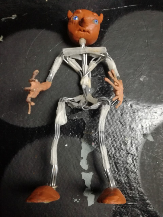
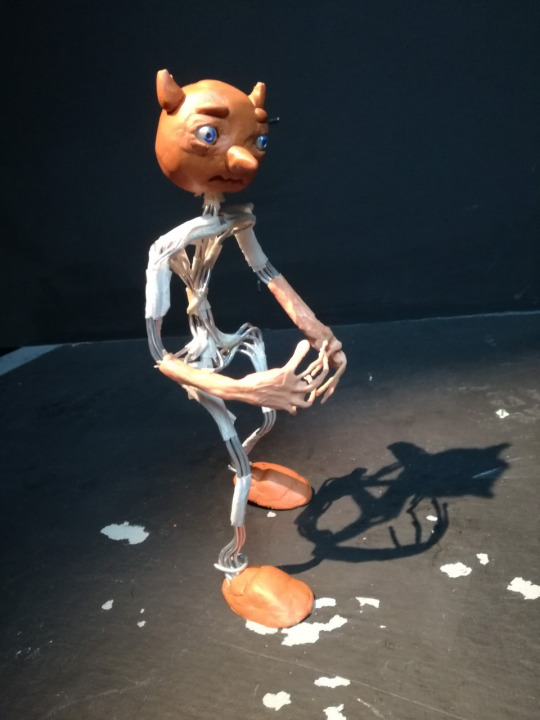
(Pictured: An image of the model used for the walk cycle)
In the case of the walk cycle animation I produced, a model that I created from a previous stop motion project was used. The model already filled the criteria needed for a character to animate walking, being bipedal and having two arms and a head, so it was quite convenient. Moreover, the model was constructed using flexible but sturdy wires and can stand on its own in a variety of positions unassisted making it all the better to animate with. Other traits the model included that made it more efficient to animate with included a fully rotating head, mobile eyes that can be adjusted as necessary and latex hands and forearms which add stability and strength to the hands, fingers and wrists. Though the character is a blank slate and has no personality immediately intended to be associated with them, the approach for the emotion and personality I wanted to give the movement was one of nervousness and fear. In this regard the default pose the model begins with has the arms up, getting closer to the chest as the animation progresses and knees bent a bit to give the impression of being physically small. As the animation progressed I also added the detail of having the head look around a bit, as if alert.
(Pictured: Model posing for first frame of the animation)
Regardless of however well the model may be made it was however still a model, a physical one. Going back to what was mentioned earlier about limitations in stop motion, gravity exists and the threat of the model toppling over mid-frame when attempting to pose it or take a picture was an unfortunate reality. To counteract this double-sided tape is added to the soles of the feet to try and ensure the model stays in place. This is only a temporary fix though as through use the tape becomes less sticky and must be replaced. As the entire model has to be picked up only to be repositioned again after reapplying the tape, the fact that tape has to constantly be reapplied is much less than ideal. It is more ideal than having the model fall over in comparison though as if that happens then there’s the likelihood of parts of the model moving on upon impact. Aside from this the amount of times the model toppled was thankfully not a large amount. As what was previously stated one must focus on many aspects of the way a character moves when it comes to working in a 3D environment, but due to this in regards to stopmotion if you position your character correctly (assuming you’re not attempting an awkward position) then gravity itself can be used as a form of guide in that the model should be able to mostly still stand on its own unassisted due to weight being evenly distributed on the character model. This was extremely helpful for me to acknowledge when repositioning the model from frame to frame and minimised the times that accidents like having the model fall occurred.
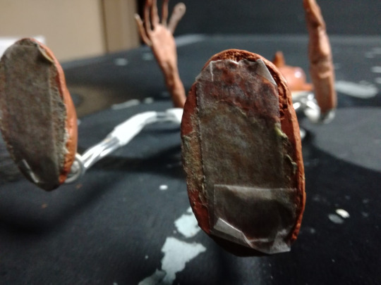
(Pictured: Soles of model with tape applied)
The general animation process was just like how it was with all previous walk cycles, getting a grasp on what a walk looks like on a biped. The addition of making the character look afraid wasn’t troubling to achieve either as if you can envision what someone might look like when afraid then translating that to reality is often only limited by your knowledge on how to animate and pose a model. The only notable faults that occurred both during and after production were that during the animation process, after the camera’s battery was replaced after running out, the exposure increased massively though this was only a minor hiccup that was easily fixed, and that after finally reviewing the walk cycle at the end it was found that character movement was notably but unintentionally jittery in places. The jitter was more than likely caused by mispositioning the model so parts of the model go back over a movement they just moved from, so almost like taking a step forward (metaphorically speaking) and then a step back then forward again. Repeated instances of this caused jittering though it was more notable in parts of the body than others. To fix this issue would be time consuming to say the least as it would require repositioning the model as much as possible to be like in a previous frame, then making the changes necessary and most probably animating the rest of the frames from there even if the other frames were already animated, and that’s assuming that the entire clip was not just scrapped and redone. Aside from the jittering the rest of the animation appears successful, with decent pacing, a clear emotion displayed and the walk appearing mostly natural.
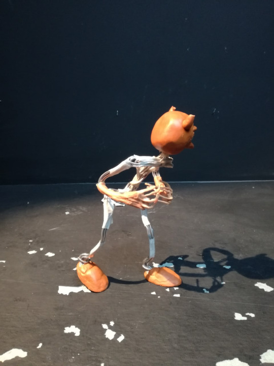
(Pictured: The model, posed in a frame nearing the end of the cycle)
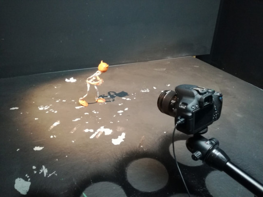
(Pictured: The set-up of the scene)
0 notes
Text
Fantastical Creatures Weekly Summaries
Fantastical Creatures Weekly Summaries
Week 22
Day 1- Character design brief.
Today I had an introduction to the character design brief for this submission. In todays workshop we focused on generating a character for the brief which was an animal and fantastical creature. I decided that I wanted to focus on animals that where found in trees such as monkeys, koalas and sloths as I am intrigued by their anatomy. The task we had to complete was a series of sketches of multiple characters as we would receive visual feedback on the characters. While also giving feedback to other students in the group.
I found that my sloth character was the most liked and I also favoured the design heavily. I felt like the sloth would give me the right proportions when sculpting to give a cute and kind creature who would interact with human. For the I used round large shapes for the face and body , this gave a friendly aesthetic. I am looking forward to creating the character in clay as this would give me a greater understanding on proportions and structure when working in software like Maya.
Day 4 - Character design
Today I had a maquette workshop where I modelled my character for the project using previous sketches to help guide the process. A maquette is a scale model or rough draft of an unfinished sculpture. A maquette is used to visualise and test forms and ideas without the expense and effort of producing a full-scale piece. I found making the maquette to be at first a tricky process as we learned how to create the armature from two lengths of wire using a barley sugar twist to mould them together. This formed the basis of the spine and could be used to help guide the process on further as now the arms and legs of the creature can be seen with the remaining parts of the wire. I then attached the head with a separate piece of wire, this was tricker due to me not understanding where to apply the twist. The twist was then applied onto the spine and this gave the overall skeleton of the character.
Next, I applied tinfoil and masking tape to bulk out the skeleton this allowed me identify key areas of weakness in the initial armature. By doing this i could see the shape and direction I needed to take for my sloth to come to life. I then began to sculpt onto of the tinfoil and fully flesh out the sloth.
I found that sculpting was m favourite aspect of this workshop as the more I added the better the sloth looked as he came to life. I decided against focusing on detail until the very end and just tried to achieve the basic shapes of the animal. This would then give me the basis to progress as I began to add the sockets for the eyes and the overhang of the jaw. I struggled with the eyes as I didn’t know how to sculpt them so i have taken them out of the design so far and will watch a series of videos to help better understand the anatomy of the sloth.
Week 23
Day 1- Character design
Today I was introduced to a Maya sculpting workshop using both Maya and Mudbox. This initial workshop was to get used to using the tools and methods to sculpt and create a character from cubes and rectangles. As I have grown accustomed to Maya sculpting through the radio task I welcomed this new challenge with open arms. The first task was to create three cubes for each part of the body and morph them using the various cutting and extruding tools to create shoulder and legs as well as a neck. This then became the base of the character. I found that using these tools where quite challenging especially with the multi cut tool as this would. Highlight other areas I did not want to cut. In addition , I did not want to create my character I am basing my maquette and drawings on until I fully understand the software. So I was mainly focusing on creating a character which utilised all aspects of the software.
The next task was to smooth the character and change the amount of planes available. The mother the amount of planes the easier it was o sculpt with the sculpting tools on maya. I found this difficult at first as I had made my character too small for the actually brushes. SO I increased the size of the character and began to try and work out how the tools work. I decided to create a visor like head which resembled a hammerhead shark. While also adding a shell on the characters back. I found that I should have extruded these aspects of the character before morphing the planes as this would have gave me better control and precision when creating. As I had just morphed the plane this would detract from the overall animation of the character later in the pipeline.
The next aspect of the workshop was to import the character into mud box . Mud box is a sculpting software that aids character and prop creation . I found this software quite easy to use as I imported a low resolution version of my character into the software and began extruding the same aspects that I had in Maya. I am looking forward to creating my sloth in both these softwares and I will continue to watch tutorials on how to improve my modelling techniques and processes within software like Maya, Mud box and z brush.
Day 1 - Character design maquette
Today I finalised sculpting my sloth Maquette and it is now ready to be baked to set. I found the sculpting process really rewarding as I could see the shape of the character show through with each addition of super sculpt. I found that the refinement process was the best part of the experience due to the level of detail I could achieve. I used a knife to create the fur for the sloth cutting into the clay to give texture . I then decided that I would do this all over the sloth instead of smoothing the clay . I found smoothing the clay difficult as it was too thin and it would reveal some of the tinfoil from the skeleton. I used smaller pieces of clay to add further detail to the face including the eyes and snout for the face. I also added little detail like the bandana and extra pieces of hair onto of the head. Overall I am happy with how the maquette turned out and I cannot wait to paint the finished product.
Week 24
Day 1 - Character design
Today I continued to model my character in Maya. I found this to be quite challenging as at first I didn’t feel that my skills had progressed from the previous workshop. However I did feel quicker at establishing the bulk of the character with its core shapes. I restarted multiple time as I began to get frustrated over the fact my design did not look like maquette in both shape and size. I was extruding too much and this caused the structure of the character to be fundamentally floored so later in the process as the character was placed into mud box I could not smooth down the angles of the character.
Upon restarting, I got feedback off John about the shape of the head as this was causing the most issue. I previously had a square head that would round off when I used the multi cut tool. This caused issue as when extruding around the nose the nose fold would go into each other leaving a floored model. John suggested that I use a round head as this would best accompany the shape of my sloths features. When I rounded the head off I found that the face was easier to split up onto planes and allowed me to create the nose and its bridge much easier. I was also able to extruded the points above the eyes to create a raised eyebrow socket so the eyes could be placed with. I found that these features where also difficult to establish through Maya as I was thinking ahead. By not thinking ahead I miscalculated the steps needed to create the shapes I wanted and got frustrated of my lack of progress. I continued to work through this frustration and established a head and features that I was happy to move into mud box with. When in mud box I found that the same problem had occurred and I couldn’t smooth down the shape. I will have to go back and fix this by either starting again or watching youtube videos to help my understanding of Maya modelling. At current stat I am happy with the progress I am making as I have grown quicker in process of building up a character in Maya. I also have the key shape of my character with the right proportions based on reference from my maquette. However I am also frustrated due to the lack of definition I could achieve with the facial features and fingers.More work is need to establish the characters shoulders and torso and although this is flat there needs to be more bulk and shape added to the skeleton of the character.
Also in the season I was introduced to substance painter which shows me an alternative to photoshop on how I could colour and texture my character. This was a brief introduction as the main focus of the workshop was completing a base shape for the character model.
Easter Break Week 25
Day 1 - Character design
Today I started my character design again as I was not happy with my current iteration. I decided to watch a number of youtube tutorials on how to create a low poly character in Maya. I found that by following these tutorials to some extent I could better grasp an understanding in what was needed in creating the base for my character. I found a series of youtube videos where a cartoon mouse is created step by step and decided to follow the process along but manipulating it to fit my sloth design. I found that with this tutorial I learned how to input reference images which can better help the structure of the model. I imported images of my maquette as I have not drawn my character out in 2d space yet. The tutorial helped show that I did not have to extrude as much as I had in the previous iteration but by simply manipulating the vertices and edges I can create a dynamic shape. Currently in the process I have modelled the body and the head of the sloth as well as placing cuts where the arms and legs should be. I realised that instead of trying to create the head shape from a cube I could bridge a cube and the body together by removing vertices and panels and connecting them after. This greatly helped the structure of the character as I was then able o manipulate the neck with greater precision allowing a place for the chin and the overall slope of the sloths head. I will continue to work on this character design as I feel that I am getting more comfortable with modelling ing Maya. Furthermore I will begin to draw up my character design in photoshop to add more depth to the process as a whole with a character design sheet and turnaround.
Day 2 - Character design
Today I continued to work on my sloth design and focus heavily on the facial feature I continued to watch the next part of the cartoon mouse tutorial as I was intrigued into how the eye socket and the nose was made. As a sloth has a different nose and eyes to a mouse I had to alter the approach to this area. I found that by removing half of the character it made it easier to create the full character after one side was mirrored. At first I focused heavily on the eye sockets of the character altering them so it gave my enough room to create the upper brow of the sloth. I realised that this was fundamental in moving the design forward as by having this as a prominent feature it allowed the rest of the eye to form. I felt like I can create both the eyes correctly once the character is mirrored so left the rest of the eyes for another time as the structure surrounding the eyes is currently more important. I then removed half the side of the character and mirrored it. However I came into difficulty as there was a gap between the two sides of the character. To combat this I went back to having one side and duplicated it without combining the two like the tutorial had suggested. I then combined at a later stage and bridged the gap between the two halves. By doing this it gave me the right amount of room to build the bridge of the nose as before the nose stuck out from the face . This is against the anatomy of a sloth due to the nose being an extension of the face itself. Tomorrow I will focus on completing the face with the inclusion of the eyes as well as creating a suitable jaw for the character.
Day 3- Character design
Today I continued to work on my sloth and added the arms and legs to the design. I found this relatively easy as I am beginning to feel more comfortable in modelling with Maya. I extruded out multiple times and used the multi cut tool to ensure that the joint of the sloth are fully recognised. Furthermore I extruded out from the back of the character to create the tail of the sloth , angling the tail down ensures that the character has balance.To refine details in the face I used the multi cut tool to create added areas of detail and extruded where needs be. This included the ridge above the eyes and made this level with the top of the nose to keep the anatomy of the sloth. I also added a jaw to the character as the bottom of his face was flat so I could extruded in to create the mouth. I then tried to export my character into Mudbox but the software kept failing , I began to get frustrated as I am trying to keep to a specific deadline for each stage of the process. To combat this frustration I added the headband to the character and began to add smaller details like the hair that pass above the headband itself. I did this by extruding the area above the head and offsetting the angle of the extrusion to the right to give the natural flow of hair. Overall I am happy with the progress I am making on the character model and I hope I can get Mudbox to work as this will highlight any floors in the model itself.
Day 4 - Character Design
Today I was able to fix the problem from yesterday and was ready to move my character into Mudbox. This is after I sent my project over to Adam who sent a few tips I should look at before moving to Mudbox These tips where :
- Try to add geometry to support your shapes. This is a common mistake and is super easy to fix.
- Create smooth surfaces yourself rather than trying to rely on smooth preview while modelling. This will help to (as mentioned above) support the shape of the object better when smoothing with smooth preview and also sculpting in mudbox.
- Try to get the topology to flow, this will make it easier to rig, and animate later.
Have a look at other characters people made, like the Max rig you've been using.
In response to this I went over my rig and tried to smooth out the areas without relying on the smooth preview this then allowed better shapes that I could import into Mudbox.
I found that Mudbox has quite a steep learning curve so watched a number of tutorials on how to sculpt properly and how the interface/ tools work. To start with a smoothed my sloth down from its low poly version to add the details of the fur. I used the sculpt tool to add the texture of the fur to the body by drawing directly over each of the strokes. I found that this mimicked how I had used a knife to add texture to the maquette and it gave a similar output.I decided to cover the entire body in this and then focused on the facial features. I left a smooth area for the bridge of the nose and also pushed out the nose as it had been tossed through the smoothing of the whole design. I then focused on the headband keeping that relatively smooth to contrast the fur of the character. When trying to sculpt the hands and toes I found difficulty as I could distinguish what was the finger/ toes to the actual hand or foot. His is problem I am currently trying to rectify and will work on at a later stage to ensure the anatomy of the sloth is maintained. I then moved onto the eyes and used the fill tool to fill the gap I had left in the design up to a suitable point. By doing this is gave me the shape of the sloths eyes which I could manipulate further with the sculpt tool. I found that I was working back and forth between these two tools to adjust the nose and the fur around the eyes. For next time I will focus on the hands and feet as well as establishing a base for the pupils of the sloths eyes. I want to also find a suitable colour palette that can fully represent the sloth. Overall I am happy with the progress I am making and glad that I was able to work through the frustration of yesterday.
Day 5 - Character design
Today I chose to do a series of sketches around the anatomy of the sloth. I found that by drawing the sloths in motion I was able to understand and interpret how they move and their overall form. I realised that the sloth has a very small tail and not a long tail like my character. However as this is fantastical creatures I have chose ti keep the larger tail to set the character apart from normal sloths. Sloths are very slow and so they were quite easy to draw, the best sketches where those of the sloth being in branches as it shows the length of their arms. I also emphasised the length of the arms in my character design by making them a third longer than the legs. Furthermore , I found that the national geographic videos on the sloths very interesting to watch as there was a wide range of shots. These shots contained sloths from different angles and ages which helped my understanding of their overall anatomy.
Easter Break week 26
Day 1 - Character Design
Today I decided to visualise the concept of my sloth by drawing my character up digitally in their environment. This helped me understand the colour pallet I want to use for my character and also gave me a better understanding into the process of developing the character. The character is a product of its environment, after watching the national geographic videos I decided to see how this would impact the design of the character. I realised that the sloth has a similar colour pallet to the branches of the trees around them to camouflage from predators.I found myself emphasising the structure of the sloth however I foreshortened the length of the arms as the character is gripping the branches around him to show how he is interacting with his environment.
Day 2 - Character design
Today I continued to use Mudbox to complete the texture of my character design. I used the sculpt tool to create the pupils of the eyes by raising the surface of the flat plane up wards. I also created texture of the fur in any areas I had missed like under the arms and behind the tail. This helped complete the design of the character. Furthermore, I began to sculpt the hands of the character, for this I emphasised the length of the finger nails on both hands. However I struggled especially with the left hand due to the amount of fur I placed between the fingers. This meant that the fingers began to become lost within the hand. To combat this I flattened between the fingers and pushed the fingers outwards. I also created a lip above to show the knuckles of the character. I ensured this was smooth to show a clear distinction between the fingers and the hand itself. I also experimented with the use of colour in Mudbox and decided to add a base tone to the sloth itself. I then tried to export the file back into Maya so I could add fur to the character however my computer has ran out of storage so I need to sort that out before progressing tomorrow for retopology.
Day 3- Character Design
Today I began to experiment with adding fur to my character. I watched a number of tutorials of how to add fur to a model and found that it was a fairly simple process. I decided that I wanted shorter strands of hair to see the contours of the shapes of the characters head. Sloths also have very thin hair but it is vastly spread across the body. In addition I decided to experiment with retopology and began to watch a series of tutorials on the best ways to create retopology. I found that it is in my best interest to ensure my base of loops are simple and have equal spacing. This will greatly benefit the rest of the process as it ensures the best movement for animation. I learned from the tutorials that I don’t need to individually place the points using the quadrate tool as I can drag a section out from the previous selection and this then snaps to the model. However I have decided to leave the retopology for another day and have chosen to focus on the fur and ensuring that it is the correct size and shape for the character.
Day 5 - Character Design
Today I focused on the retopology of the character and proceeded to complete the base of the torso of the character. I found this process to be quite tricky especially with trying to create evenly spaced polygons around the edges of the character where the polygons would wrap around the appendages. Furthermore, I decided to watch a series of tutorials on youtube to see what was the most effective way of retopologising a character. This allowed me to understand the shortcuts of duplicating an entire Laye of polygons and extruding them outward. This greatly helped the time aspect of developing the character as I did not have to draw each polygon at a time. I decided to leave the head as there are many separate tutorials on how to retopologise the head of the character on youtube. I wanted to grasp the shape of the torso and found that by holding control and clicking this acted similarly to the multi cut tool. This allowed more polygons to be created quickly which intern helped the overall shape of the character take shape. Overall I am happy with the progress being made and can’t wait to continue on this aspect of the character design. I need to improve quickly in the aspect of retopology and will continue to watch more youtube videos to help grasp further knowledge on the subject area. This will then allow me to create the shapes of the arms , legs and ultimately the head and face.
Easter Break week 27
Day 1 - Character Design
Today I decided to continue with the retopology of the character. I focused heavily on the joints of the character around the arms, legs and tail. This proved to be the hardest part of the retopology process. I tried to keep the spacing between polygons consistent. However this was difficult as the polygons would stretch around the areas of the character making it difficult to add more polygons to the surrounding area. I decided that I needed to fix this further before moving ahead with the process.I made sure my polygons remained evenly spaced and smooth so I could add further as I begin to finalise the retopology. I am looking forward to continuing tomorrow and finalising the arms and legs of the character.
Day 2 - Character Design
Today I continued the retopology of the character and focused heavily on the limbs of the character I found that this created large problems in keeping the polygons consitsent. To fix this around the arms I created a loop around the arm of similar shaped polygons and extruded the polygons out. This helped to maintain the shapes of the polygons across the length of the arms on both sides. I found that this became even more difficult for underneath and around the tail of the character due to the tail decreasing in size towards it end. I found it hard to connect underneath the tail to the torso and around the legs. This caused the polygons to change shape and size. To combat this I tried to keep the polygons consistent around the certain aspects of the character. For the legs I created loops similar to the arms and extruded down which fixed the problems for that portion of the character. I tried a similar tactic for the tail and this proved to work as I extruded from the lower back downwards .However bridging the two proved to be the hardest part as I ultimately had to round of the eyes and place more cuts to ensure polygons could be placed to fill the area. I am looking forward to developing the retopology more , however find this a time consuming process with a great learning curve. I need to learn more in order to make the retopology easier for areas like the hands and feet of the character to ensure I don’t have the same problems as today.
Day 3 - Character Design
Today I continued the retopology of the character and finalised the mistakes around the limbs especially the arms. I chose to draw each polygon instead of extruding as this was more precise and gave me greater control. This was a time consuming process but I am happy with the finished result . The polygons are consistently shaped and there are no triangles and n-gons throughout the whole arms. I then decided to focus on the head. I watched a youtube tutorial that explained how I should start large around the features of the head. For this I started around the mouth first and the proceeded to do both the eyes. By doing this it helped enhance the characters structure around the face and was easier to connect the main features of the face together with polygons. I then proceeded to fill the back of the head to help create the arc for the headband on the top of the head. To complete the headband I extruded upward and then closed the gap onto of the head. I found today to be quite challenging especially around the eyes as sometimes the polygons would collapse into each other creating triangles and N-gons. This would detrimentally effect the structure of the retopology so I decided to make the polygons bigger when connecting them and moving them into place to follow the structure around the eye. Overall , I am happy with the progress I am making and am looking forward to finishing the retopology stage of the character design process.
Day 4 - Character Design
Today I focused on the retopology of the hands and feet of the character. I struggled greatly today due to the limitations of zooming. I was unable to place polygons in specific areas of the hands and feet and this caused me to grow increasingly frustrated. I found the best way for completing limbs like this was to work bug to ensure I covered the area in polygons and define certain areas with cuts. However, this was difficult with the feet as I worked up until the toes of the character and then struggled to create a shape that would wrap around the toes completely. So I have removed the work on the feet and completed one of the hands. Tomorrow I will work to complete the retopology of the character as this will ensure I can move smoothly on with the project.
Day 5 - Character Design
Today I finalised the retopology of the character around the feet and hands. This was the most difficult part of the process as I found that it was hard to create polygons where the surface change shape and angled towards the ground. This caused me to become frustrated as I had added to many lines of polygons to the legs and torso of the body which used the problem of completing the feet. To combat this I removed some of the lines of polygons and simplified the shapes in order to complete the feet and hands , after I then added more polygons to the design with the cut tool to restore the torso and legs.The size and consistency of the polygons around the feet vary as I was unable to keep a consistent size across the area .I am looking forward to colouring my character as well as adding more polygons to the retopology to ensure that the mesh is complete. I now need to complete the turntable sequence and cast sheet for the character. As well as adding the character into photoshop to place him in the photographs.
Week 28
Day 1 - Character Design
Today I focused heavily on the Uv’s of the character. I took the retopologised version of the character as the other version was too dense to create Uv’s from. By creating Uvs it allowed me to use the textures I had created within Mudbox and transfer a colour scheme back into Maya. I found the Uv process very challenging due to the construction of the retopologised mesh. I found myself reconstructing areas where there were gaps in the mesh and this caused later issues with the cuts of the uvs. I decided to cut around the arms , legs , head ,feet and face of the character to ensure the mesh would unfold. On inspection with Adam he said that the mesh was was not flat and began to highlight where I should cut the rest of the characters Uv’s. These included around the hands and across the back of the character. By doing this it allowed the textures of the Mudbox character to come through in Maya as before the character remained smooth.
After that I decided to colour the character in Mudbox. I chose a similar colour scheme to the mocked up 2d version of my character. However, I realised the eyes of the sloth where too dark swell as the fur colour was too bland.To change this I changed the hue of the initial base colour and created a warmer tone to show contrast on the fur of the belly of the character where it appears two toned. I found that it was quite difficult to distinguish the tones around the mouth as there was not enough space to fully develop the difference between the grey and white around the mouth. The most difficult part of the colour was the eyes as I didn’t know wether to add a reflective tone to the pupils of the character however after consultation with Adam he said to avoid any shiny surfaces as it would affect the mesh itself. When I reimported the sloth back into Maya there was a problem with the eye where the colour was lost around the left eye. This can be fixed in photoshop when placed in the pictures. However I need to fix the colour in Mudbox for the character turnaround.
I then added joints to the arms of the character so I can properly pose the sloth once placed in the setting. This process was difficult as the shape of the joints where too large and this caused the arm to bend and twist. To fix this I reduced the size of the joints and paired them to a central node in the chest. Overall I am happy with the progress I am making after past frustrations due to the software crashing. I am looking forward to completing this project and to move on to the lip-sync project on Wednesday.
Day 2- Character Design
Today I was able to complete the turnaround and images for the character. I was pleased with the ease in which I could complete a turnaround by parenting my character to the circle on the floor . This was then easy to render out. I found that my character reacted differently to the dome light and so the mouth of the character was not well lit and still showed the darkened paint where I had tried to shade the mouth in. In addition due to previous problems I am unhappy with the look of my character as I feel like some of the form and structure which was once there has been lost through the baking of the character through the uvs. The use of the the retopologised version of the character due to files crashing and the main character being too dense has led to this outcome. To combat this I will be submitting a turnaround of the dense character to show what the initial form and structure of the character should be without the added paint.
Furthermore, I found the process of compositing my character into the still images quite difficult. This was due to when I exported out of Maya the dome light would remain white instead of leaving no background. As I was not in a workshop today I improvised and went directly into photoshop. To do this I saved the image of the sloth and erased the white background therefore leaving me with no background. I then placed the sloth inside the images and began to layer paint on to create shadow and contrast to ensure that the sloth was fully in the scene. This worked well to some extent however it was difficult to know where the light sources of the character was coming from on certain photographs. I also found posing the sloth difficult due to the rigging controls warping the sloths body in unrealistic ways. This was especially difficult in the left arm and so I chose a similar pose to the maquette I made. I hope to get more clarity on this in next weeks. Lecture however these photographs are up to standard for submission as well. Furthermore, I am waiting to complete the character cast sheet. This is due to some of my friends not completing their characters yet. I will complete a 2d and 3d variation of the cast sheet to ensure it meets the submission requirements.
0 notes
Text
Ghost Busters Post Production Editing
#4: Upload the 16:9 Video to YouTube for Auto-Transcription
OpenDrives is the first to admit that expensive all-flash drive technology is not always the best solution for higher resolution, large capacity workflows. There are ways to ensure that a film’s sound is diligently handled, while working within a budget. This often comes from a transparent discussion at the onset of the project about a director’s expectations versus the reality of the budget/schedule.
What is pre and post production?
“That's a wrap!†When a movie director makes the call, cameras stop rolling, and a film is ready to move into its final phase: postproduction. This the final step in taking a story from script to screen, and the stage when a film comes to life.
Just uploading informational blog posts to your website and social media pages regularly is not enough. To boost your content reach and engagement, you must employ a solid video marketing strategy. OR use a project template that has standard bins already set up. These tutorials are most effective when used in conjunction with the editing software. Ideally, you should watch a tutorial then use the editing software to practice the techniques.
Collaborative editing: how should I work with the editor's draft and publish functions?
Editing suites such as Adobe Premiere now offer native features allowing for titles and 2D graphics to be correctly placed onto spherical video content. Stereoscopic content will require that titles or overlay graphics appear twice in the top and bottom (or left and right) channels of your video. In addition to creating a sequence project manager as you would for traditional video editing, with 360 you also have to keep the orientation of each scene in mind. Rough stitches don’t need to be perfect — you can take time to clean up shots later in the project, after you’ve determined which ones will make your final edit. At the time, the $199/month fee was a lot of money to my growing business, but looking back, that decision helped me to grow the business by taking the time to do the marketing that I wouldn’t have otherwise had the time to do.
Operations: Methods of Production (Overview)
Different production companies may have different definitions for what a “rough cut†really is. If it’s too rough around the edges, the viewer will have a hard time reading through the construction and won’t be able to make valuable comments. We’ve also found that if you’re working with clients, the rougher it is, the more they feel the need to add their own creative input. First, most clients and viewers aren’t trained to see through large holes in a film and it makes the quality of your work seem like much less than it is. Adding music as early as possible helps unify the look and feel of the piece as it is edited.
As soon as a draft is ready for review, the timeline is rendered and compressed, the file is uploaded, and the reviewers are notified automatically. Each reviewer (director, client, producer, etc) reviews the work-in-progress directly from a web browser or smartphone and sends timestamped comments back to the reviewer. Those comments can be downloaded into the NLE as markers so that the editor can respond with new changes. More and more productions of all sizes (from blockbuster films and TV shows to wedding videos) are using services like Frame.io to centralize all their creators, collaborators, and audience.
In addition to using a structure map similarly to how you would use a wall of index cards to track your story, you can also use it as a way to track your editorial progress through your first cut using colored labels.
Joined by our primary VFX supervisor Ben Kadie, we developed a plan to address the impact of VFX on 100-plus shots in our film.
Any number of workspaces can be created and can be assigned to individuals or entire teams.
But you will have the ability to leave time-stamped feedback, which makes it much easier for video professionals to interpret and implement requested changes.
As a production manager, you are now able to share a specific episode, scene or item for VFX, sound or subtitling. With a bitrate low enough to play out video over commercial internet product or mobile data, the visual quality of the images is still good enough for the director or the editor to prepare the edit. Solutions that are often limited in capacity or compromise visual quality or security.
Once you get over that 25-weddings-a-year mark, it makes a lot of sense for you to seriously look at outsourcing your jobs to a company that can guarantee you fast turnaround and consistent results. But until you reach that point, you have a good foundation above for getting to where you need to be from a time and efficiency standpoint. There are hundreds of YouTube videos out there reviewing computer parts, but suffice to say, you can build a decent PC for less than $2,000 that will take full advantage of Adobe’s suite of editing products. Partner with us to reach an enthusiastic audience of students, enthusiasts and professional videographers and filmmakers.
Project Manager, Architecture by
What are the 8 elements of film?
Post-Production is the stage after production when the filming is wrapped and the editing of the visual and audio materials begins. Post-Production refers to all of the tasks associated with cutting raw footage, assembling that footage, adding music, dubbing, sound effects, just to name a few.
I understand that I will pay an additional $1.00 per month for bank processing fees included in the dues amounts in this application. I can at any time resign from PPA and stop charges being made to my credit card. If PPA is unable to successfully process my monthly payment, my membership will be considered void, and I am required to pay the balance in full to reinstate my membership.
See what Revu can do for your project team
VEGAS Pro is non-linear, so you don’t have to edit your project in sequence from beginning to end. If you decide to work on scenes or sections separately, nested timelines make it simple to work on individual scenes and then bring your entire project together.
Click here to contact a sales representative and request a media kit. Videomaker is always looking for talented, qualified writers. For video editors, finding the perfect portable workstation is like catching a unicorn. The Videomaker Editors are dedicated to bringing you the information you need to produce and share better video. ✔ Perfect your video editing skills at any experience level.
Purchasers of the book can download Chapter 10:
Time Savers in the Title Tool. See page 2 of the book for details.
Can 7zip open BIN files?
Click the "Tools" button on the menu, and then select the "Convert Image File Format" option. The "convert" dialogue will be pop-up. Press the “Browse†then choose a BIN/CUE file you wish to convert and choose the “ISO files(*. iso)†option.
This allows your media to be consumed and comprehended by viewers who don’t speak the language spoken in your video. Many VOD outlets will request one or multiple translations to broaden your media’s reach.
Regardless of whether your mixing workflow utilizes outboard gear, you need to understand more than just the principles behind compression and equalization. Foley is intended to cover human (and sometimes non human) interactions with objects. It is created by a Foley Artist watching the picture and performing relevant actions with various objects. These elements cover unnatural/otherworldly sounds, musical sound design or audio that must be manipulated and heavily layered to get the desired result. The Post Production Sound Team will take a step back at this stage, allowing the Location Sound Team to take care of the sound recording on set.
0 notes
Text
How To Build Your First App: 7 Secrets From The Founders
Is this a huge mistake? Will it ever work? Will anyone care?
Anyone building an app for the first time is wondering these things. You’re not alone.
��No one knows what they’re doing. You think people who came before you know everything, but there isn’t one right way to do it. If you make a misstep, it’s not a big deal.”
– Whitney Linscott, CEO & Founder, Bracket Dating
You can and should build an app. Don’t believe me?
I just launched my first app, 19 Minute Yoga. I’m not a developer. I have a degree in English Lit.
A technical background is not required. Do you know what is required?
Tenacity and grit.
It took twice as long as I expected. But I still did it. And I want to share everything I learned, so you can build an app too.
The App Store has generated more than $70 billion in revenue for App developers. Apps are transforming and disrupting business.
You or your company should be thinking about building an app for one reason. Eventually, someone is going to come along and build an app that disrupts you.
After I launched 19 Minute Yoga, I knew I wanted to share some honest insights and takeaways. I jumped on the phone with 10 other app founders, technical and non-technical, to discuss everything from developing your idea to developing your code.
Thanks to the founders who participated and shared their experience:
Allison Winston: President & Co-Founder, Kickwheel
Estee Goldschmidt: Co-Founder & CEO, ShopDrop
Julie Campistron: Co-Founder and CEO, Stop, Breathe & Think
Whitney Linscott: CEO & Founder, Bracket Dating
Monika Bhasin: Founder, GLYD
Alexis Monson: Founder, Punkpost
Diane Hamilton: Co-Founder & Managing Partner, Binary Formations
Lori Cheek: Co-Founder, Networkd
Amy Hutchins: Founder & Chief Product Officer, Unearth Technologies, Inc.
Suzanne Hayen: CEO & Co-Founder, Let’s Be Chefs
Building an app can be a rollercoaster and it’s important to know your community and know you’re not alone. Download the apps mentioned here and follow the founders online to learn more about these leading entrepreneurs. Welcome to the community!
#1 Put Your Idea On Paper
Some of the best ideas come from a person creating a solution to her own problem. You don’t have to invent something completely new; you can improve upon an existing idea. Research popular categories and bring a fresh spin to an existing audience. 19 Minute Yoga was born when I realized that I couldn’t find a short, audio-first yoga app–anywhere!
Monika Bhasin, Founder of GLYD, an app that connects travelers with locals, said her initial work was getting her idea validated and that went hand in hand with putting it on paper.
“Write the idea out as an essay. It needs to be simple enough to explain to a 10-year-old.”
– Monika Bhasin, Founder of GLYD
To get started, consider the questions below. Write multiple drafts, as you refine your idea:
What makes your idea different?
Who is your audience?
What are your business goals?
How are you going to market and promote the app?
What is the simplest version you can build first?
How much will it cost to build the first version of your app, the MVP (minimum viable product), to get your first round of user feedback?
In addition to writing about your idea, it’s important to create a visual. Sketch a rough draft of your app. It will help you understand the story you want to tell. Don’t worry about artistic talent (or lack of!).
Suzzane Hayen is CEO & Co-Founder of Let’s Be Chefs, an app that delivers weekly menus and recipes to helps users save time and eat better. When Hayen was developing her idea, she used index cards to illustrate her user experience.
“Start writing things down on index cards. Draw each screen and show your friends. Here’s one screen, here’s the next screen.”
– Suzzane Hayen, CEO & Co-Founder, Let’s Be Chefs
Before you have a formal pitch or brief, simply talking to people will help you develop your idea. Don’t wait until you feel “ready.” My experience is that “ready” rarely happens. Start a dialogue with friends now. Collect initial feedback.
Ask The Pros
If you have the capital, you can hire an agency to help you get started faster. Whitney Linscott, CEO & Founder of Bracket Dating, launched her app to solve the “swipe” problem in dating. When she decided to build an app, she attended a workshop with an app development company.
During the 2-day intensive, Linscott was able to flesh out her concept, along with finer details like user stories. The workshop facilitated her first steps, but Linscott noted, “Just to participate in the workshop was $10K.”
Connect With Your Local Tech Community
Many cities have local developer or app focused meetups. Even if you’re not going to hire a development company, start networking and identify local resources. Search online, talk to people who work in technical fields, and connect with local groups. Maybe there’s a tech Meetup event you can attend.
#2 Tell Everyone
We keep our ideas locked up for too long. Fear of rejection and never feeling “ready” can trick you into keeping quiet. And, sometimes there’s concern that a person might steal an idea. We tell ourselves these stories to let us off the hook–to prevent us from executing. Because executing is hard. Get your notes organized and tell everyone.
This is a collaborative process.
Most importantly —> There should be communication with your key demographic before anyone writes a line of code. Start soft sounding your ideas directly with your prospective users. Stay connected throughout this entire process. Start early. Start now.
Early Feedback Forms
When I first started building 19 Minute Yoga, I recorded a rough version of my first class, posted it on Soundcloud, and collected early feedback through Google forms. I learned what people liked best, what I could do better, and how someone would describe my class to a friend.
See one of my early 19 Minute Yoga “comment cards” here for reference and feel free to steal some of the standard questions. #GeniusSteals
Share your idea with friends, family, and most importantly, the people you want to help–your target market. A survey is a simple way to gather feedback. When Bhasin surveyed her GLYD users, she learned that she was missing some key features, including messaging and following. She realized this would greatly improve the user experience (UX).
Focus & Find Your Niche #DrillDown
Amy Hutchins, Founder & Chief Product Officer at Unearth, a collaboration tool for the construction industry, said “The hardest part was scoping down what we wanted to do.”
Hutchins and her team spent months talking to people in the construction industry. They realized technology could solve many pain points in the construction process, as a vertical it was a huge opportunity.
Know Your Audience
Do your research. Get feedback early and often. Share your idea with people who fit your demographic. Make edits and adjustments as necessary.
When Unearth was conducting early research, they learned a key piece of information about the construction industry–iPads are everywhere on construction sites because the industry wholesale adopted them first.
Ask yourself, is your audience using a certain device or platform?
Featured Event
Click here to reserve your seat at Social Fresh 2017
#3 Don’t Skip The Boring Stuff
Get your ideas organized and start writing your project brief (here’s a project brief outline). Get specific.
Start with these questions:
Why are you building this app? What will the app do?
What content (writing/images/audio/video etc.) will be included in the app? What are the key features that MUST be included the app?
Design and UX is very important. How does your app look and feel? How easy is it to navigate? Do you have wireframes or any creative design specifications? It’s OK if you’re not a designer, grab a pen and paper and hand draw your wireframe. (I sketched the first version of 19 Minute Yoga on a piece of paper and then we made a prototype with InvisionApp).
What type of device (phone/tablet) or platform (iOS/Android) will you build for first? Hint: what does your audience use most?
Will your app be used vertically or horizontally?
Will your app need wifi to work?
If you plan to make money with your app, how will you achieve this (freemium model, ads, e-commerce etc.)?
#4 Find The Right Developer
Building an app with someone is like a marriage. It’s an ongoing commitment and not a one-off project. If you’re a non-technical founder, this is the most important step. Give it the attention it deserves.
You have a few options:
Learn to code – Invest in training and develop the app yourself or in-house. It’s not uncommon for founders to team up with a spouse or former colleague. One person is the developer–or willing to learn to code on the job–and the other person manages operations and marketing.
Bring on a technical partner – Find someone who either knows how to code or has the technical skills (and interest) in learning to code. Search your local network, LinkedIn, and past employment for partners.
Hire an independent developer or agency – You can outsource development to contractors or agencies (anywhere from $5K- $500K+), but there’s no easy button. Expect to be highly involved. It’s a very detailed process and requires many decisions from you. As you’re researching partners, don’t make your choice based on price alone and don’t pay 100% upfront. Take the time to review apps they have launched in the past. How is the functionality? Does it seem comparable to what you’d like to build?
Also, as a non-technical founder, you’ll benefit from a technical advisor or consultant. I know I did.
Search Everywhere For A Developer
When Lori Cheek launched her first app, Cheekd, she had two business-side co-founders, but no one on the technical side. Following her appearance on ABC’s Shark Tank, she pivot Cheekd from a physical dating card business to a Bluetooth dating app. After hiring one of the most expensive agencies in NYC, she had an app that looked beautiful, “but the tech didn’t work.”
Cheek reconnected with a developer she had worked with in the past. She said, “We found our CTO on Craigslist.”
“In the beginning, it was a drawback not having a technical co-founder. Finding a CTO who was invested was the missing link.”
– Lori Cheek, Co-Founder of Networkd
Lori Cheek’s newest app, Networkd, helps users create better connections based on location. “You could be sitting next to someone–someone who could be the co-founder you’re searching for–and not even know it,” said Cheek.
Work With Someone You Know
Hayen said that Y Combinator recommends working with someone you already know. Even if it’s someone you haven’t talked to in a long time, search your network for someone who has a technical background (engineers, IT/tech specialists etc.). See if they are interested in partnering and learning to code on the job.
“Search your LinkedIn and start racking your brain for anyone with technical skills,” said Hayen.
Hire Good Communicators
Allison Winston is President and Co-Founder at Kickwheel, the mobile college fair. Winston, who connected with her co-founder on LinkedIn, emphasized the importance of communication skills.
“Hire an engineer who can explain technical things to you. Someone who can talk about what they are doing. If you’re not mind melding with someone, it’s not a good fit.”
– Allison Winston, President & Co-Founder of Kickwheel Co.
Work With Students
Estee Goldschmidt, Co-Founder and CEO at ShopDrop, a guide to the best sample sales in NYC, recommends reaching out to engineering students and finding technical team members at your local university. For example, in you’re in NYC, NYU Tandon School of Engineering is a good place to start.
It Takes A Village
Building a strong team is critical. It takes time to find partners with the right skills and culture fit.
In addition to development skills, you’ll want to consider graphic design, copywriting, community building, customer service, marketing, PR, and more (start thinking about that marketing plan before your launch). Keep networking and sharing your idea. You’ll start to identify the best partners and resources.
#5 Build Your MVP
The first version of your mobile app is your MVP (minimum viable product) or “alpha.” This includes only the most important features–the stuff users absolutely must have to use your app. Focus on functionality and UX. You want a simple app that tests your assumptions about what users want and need.
“When you want to throw in the towel is usually when something unlocks. You have to hang in there a little longer than most people. Ride the uncertainty. Embrace the process and never lose sight of the experience equity.”
– Julie Campistron, Co-Founder and CEO, Stop, Breathe & Think
This early testing will teach you a lot.
The process of building an MVP taught me some important lessons. I started with a web-based app, but I could have saved time and money if I had built for iOS from the beginning. The web-based MVP was so buggy that I couldn’t even share it externally. We ended up having to build the entire app over.
The first version of your app won’t be perfect, but it should pass internal Quality Assurance (QA) testing. It needs to have a baseline of functionality before you share it with external users.
QA Testing
Just because the app works on your phone doesn’t mean it works for someone else. QA testing is super important but often overlooked until there’s a problem. In her role, Annie Purcell MSc, Project Manager and Quality Assurance (QA) expert, identifies a broken feature and submits a recommendation on how fix it.
“I put myself in the shoes of the most destructive user possible–to try and outthink ways to disrupt the product before anyone outside the development team gets their hands on a download.”
– Annie Purcell MSc, QA expert
Be sure to test your app across a variety of devices.
Get Feedback Early & Often
At Unearth, a regular feedback loop was established during alpha testing.
“We looked at all the features we wanted to build and prioritized. The most important thing we did was get feedback early.”
– Amy Hutchins, Founder & Chief Product Officer, Unearth Technologies, Inc.
They partnered with alpha users who were willing to provide feedback in exchange for free use of the product. Hutchins said, “People were happy to use it and we set up the expectation that they would have weekly meetings with us to provide feedback.”
With my yoga app, we conducted one-on-one phone interviews and included an optional class review within the app. After completing a class, users could apply a star rating and/or a written comment. Users always had the option to “X” out. This helped us collect early and ongoing feedback.
Tight Timelines Create Lean MVPs
Julie Campistron and Jamie Price are founders of the mindfulness and meditation app Stop, Breathe & Think. Campistron and Price pitched the tech mentors on Apple’s show Planet of the Apps and landed a mentorship with Jessica Alba. After hearing the good news, Campistron and Price were on a tight timeline to launch a version of Stop, Breathe & Think for younger kids. Campistron said, “We wanted to have it live for Planet of the Apps and Jessica Alba. We really limited the functionality. We ended up doing horizontal layout only and we didn’t do account creation. We haven’t had any negative user feedback.”
Stop, Breathe & Think regularly collects user feedback with UserTesting.com. Campistron said, “This service finds candidates based on demographics. They set up the link and the task and the whole process is filmed.”
However you plan to receive feedback, insight into how someone is navigating and experiencing your app is priceless.
Release & Update
After building and testing (and building and testing), it’s exciting to officially release your app into the marketplace. I was psyched to see 19 Minute Yoga in the App Store for the first time. It can also be a little anti-climatic. There’s always something to tweak or update!
#6 Connect With Your Community
Invest in PR and community building at least 3-6 months before your launch. Find the social network that fits your goals and connects with your audience. Depending on your industry, you might have a platform specific approach. Goldschmidt’s ShopDrop takes an Instagram-first social strategy, as the photo sharing site has become a powerful tool and “changed the face of fashion” according to Vogue.
Where does your audience spend time? Research and prioritize.
Create Partnerships
Diane Hamilton is Co-Founder and Managing Partner of Binary Formations, a development company with a suite of apps, including App Store Editor’s Choice, Home Inventory. She said, “The market has changed so much. You have to have a marketing plan now, you can’t just put your app in the store. Build partnerships and find people with the the same target market.” At Home Inventory, Hamilton reaches out to professional organizers, as her app helps users “cut down on clutter.”
Alexis Monson, Founder of Punkpost, an app that sends handwritten cards mailed by artists for you, said they focus on PR more than other types of marketing. Punkpost got featured in the App Store which was “huge.” Monson said, “Some of the smaller blogs have more engaged users and communities. It was surprising at first. They might publish a little less, but their readers are hungry.”
Host Events
Meeting users in person builds community and creates the chance for important conversations.
“We have monthly events, every event has a theme, and we also pull people aside to talk to them about the app. I’m building a product for our consumers, so if they tell me something is not a good idea–that’s important feedback.”
– Estee Goldschmidt, Co-Founder & CEO of ShopDrop
Be Helpful In Small Group Discussions
Hayen said, at Let’s Be Chefs, Facebook has worked the best for them, possibly because she’s “most familiar” with the platform. On Facebook, they do some paid ads and Hayen frequently shares recipes, cooking tips, and answers questions in private groups, especially cooking groups and mom groups. Do a keyword search on Facebook to find groups related to your topic.
Reddit is a great place to engage in subject-specific threads. I have an account for 19 Minute Yoga and I search health and wellness related posts to see how I can help. It’s also fun to participate in Reddit’s signature AMA (ask me anything!). On Reddit, always be helpful, non-promotional, and authentic. Here’s one of my first Reddit comments about the benefits of short yoga.
Invest In Your Marketing Team
Notably, Unearth’s third hire was in the marketing department. Hutchins said, “I’ve been blown away by the value that our content strategist, Nick, has brought to the table–the leads and PR we’re getting from his work. We learn what’s resonating with people.”
#7 Listen to Customers, Pivot As Necessary
“Sometimes you need a palate cleanser. Sometimes it’s good to have an idea and try it. Sometimes you decide not to bring it to market. It’s not wasted time. You learn something.”
– Diane Hamilton, Co-Founder & Managing Partner of Binary Formations
Plan for success by staying connected with your community. Have a system for engaging and collecting feedback. You can start with a “help” contact email. As your community grows, you might invest in customer service software. Hamilton uses FogBugz and Punkpost uses a tool from Zoho.
When it comes to software, there are automated options for growing communities, but both founders emphasized the importance of a personal touch. You want your community to know there is a person listening.
As you collect feedback and analyze user data, you’ll make ongoing improvements and updates. You might decide to pivot. After ShopDrop founders identified the most popular topic in their app–sample sales–they re-launched with a new focus to serve their most engaged audience.
In general, don’t be afraid to pivot or roll out smaller apps to test new features. It’s part of the process.
“If you’re passionate about it and you’re willing to spend years working on it, you can do it. I think a lot people get hung up on the tech part because they didn’t go to school for it. It doesn’t matter. You’ll learn.”
– Alexis Monson, Founder of Punkpost
Before Kickwheel, Winston had a 10-year career as a teacher. When she was ready to make a move, she immersed herself in learning about technology and studying the industry. Some of her favorite resources include Chaos Monkeys, a book The New York Times called an “indispensable 360-degree guide to the new technology establishment” and the podcast Masters of Scale with Reid Hoffman, a legendary Silicon Valley entrepreneur and investor.
Winston, now President & Co-Founder of an app with more than 1.2 million installs said, “I was not going to let being a non-technical person stand in my way.”
—-
Stay tuned for our behind-the-scenes podcast for more info on how to build an app.
Featured Event
Click here to reserve your seat at Social Fresh 2017
Source link
0 notes
Text
Month 8 Reflection
This month focused on moving away from working on the style guide exclusively and into the advertising portion of the project. Both social media and print will be utilized by the brand so were created ad comps. Furthermore, the last week of this month was spent drafting an animated logo to be used in promotional videos. Once each project was complete, a page was then placed in the style guide for future reference.
Connecting/Synthesizing/Transforming
Research needed to be conducted to decide how to differentiate social media ad campaigns from those for printed materials. My swipe folder became a huge asset during this process. I looked up how different brands were showcasing their products and services across separate mediums. Moreover, a campaign by Airbnb inspired the print advertisement. It reminded me of an Instagram post, which relates to the target demographic of millennials. According to Business Insider, Snapchat and Instagram are used by over 70% of millennials and are the most popular applications with that demographic (Tran, 2018, para 5). With this information in mind, the campaign will show a scenic view of Kyoto framed like an Instagram photo with the slogan “inspiring – Inviting - Instagramable” located at the bottom. Furthermore, based off of the research stated above, it has been decided that snapchat filters would be a wise investment since the key demographic is highly active on this platform.
In addition, research was conducted on how to create an animated logo. Richard Harrington provided some wonderful insights on how to format the logo before adding it into after effects, as well as, explained some basic features that work with my animated logo idea (Harrington, 2017). Reviewing this video allowed me to create a basic rough draft of what the animation will look like. Research shows that an animated logo holds the attention of the audience, provides better storytelling, and brings life to the logo (Logo Design, 2017, para 4-10). Millennials are used to visual stimulation, which places an even higher importance on creating an eye-catching motion graphic.
Problem Solving
There were multiple design problems. First was to create a memorable and distinctive advertisement campaign for both social media and print mediums. Next was to create snapchat geofilters that will relate to the brand ideals. Last was to create an animated logo that can be used for promotional video use later on in the project. Advertising in one of the most important parts of providing a service to customers. Kyoto is providing an enriching experience for those looking to take a vacation somewhere calming, spiritual, and nature oriented. By creating social media ads, one is increasing the viewership and likelihood of the content being shared which in turn creates more buzz. Furthermore, social media advertising is typically more cost effective than traditional methods. With that in mind, it is still important to make sure an advertisement campaign is seen by all, not just those who are well versed on the internet. Print campaigns that run-in travel magazines can also reach a wide variety of viewers who are already interested in traveling. This investment in both forms of media is a smart choice.
Innovative Thinking
The innovative portion of this project is keeping all mediums in mind while designing, which is typically the industry standard. They are intended to play off one another. The social media ads are meant to be “teasers” which will drive viewers to the website for more information. In addition, the print ads mimic an Instagram post which could lead those with the application on their phone to search the Kyoto Instagram account. The print ads also have the call to action to visit the webpage. We live in a culture that is diverse and multi-dimensional. The advertisements created need to follow suit in order to remain relevant and memorable.
Acquiring Competencies
The biggest struggle this month was learning to work with After Effects. It is a difficult software to use without any formal training. To better understand the process of designing an animated logo, I relied on Lynda.com tutorial videos. It was certainly helpful, but I did have to drastically adjust my expectations once I realized how challenging it would be to use. Thankfully I have a friend who works in video production. He does not use After Effects very often but was able to provide me a few pointers in order to make the animated logo movements look more natural. In addition, with the help from professor K, I was able to understand how to emphasize certain features in In-Design without changing the transparency. Adding a color layer over the image is not something I would have ever thought to do on my own, but it elevated the campaign tremendously. It also allowed me to remove the boarder I placed around the text. I did not like the look of the lettering, but again I did not have the skills to know how to create the effect otherwise until receiving feedback. Overall, I feel as though I learned a great deal.
Resources:
Pinterest. (2018). Swipe Folder: Airbnb Advertisement. Retrieved from https://www.pinterest.com/pin/248331366939768923
Tran, K. (2018). Social Platforms Are Most Popular Among 18 to 29 Year Olds. Retrieved from https://www.businessinsider.com/social-platforms-are-most-popular-among-18-to-29-year-olds-2018-3
Harrington, R. (2017, 22 November). Motion Graphics for Video Editors: Creating Animated Logos[Lynda.com online course]. Retrieved from https://www.lynda.com/After-Effects-tutorials/Welcome
0 notes
Text
Illustration Part Five
Assignment: Seven Days
To start this assignment, I created a series of mind maps so I could figure out the media, methods and concept I was going to work with.

In this mind map, I considered different types of media I have explored throughout the course such as advertisement, book covers and magazine illustrations. I decided I was going to create a poster. I feel like I enjoyed creating a poster the most out of all of the assignments and exercises and it was a medium that I could explore freely and creatively.

Next I created a mind map to help me decide what my poster was going to be about. I was very interested in creating a poster advertising an exhibition or gallery. This covers a wide range of subjects I could choose from, it could be anything from a new history exhibition to an exhibit dedicated to film costumes. I eventually decided I was going to create my poster for an exhibit about a famous person. I then linked this to one of my notes “7 days in the life of someone. A week long exhibition about the life of that chosen person”

I chose two people I thought would be the most interesting to use for this project. I chose Frida Kahlo and Hunter S Thompson. Both of these influential people had wild and interesting lives so I thought they would be fun to portray in my artwork. I created a mind map focusing on both of my chosen people and also researched their lives and sketched images of them and people/things associated with them


After some deliberation, I realised that because Frida Kahlo is a renowned artist, it would be difficult to justify the poster design when her own artwork could just as easily be used to represent herself. I decided to use Hunter S Thompson as my main subject for the exhibition poster. I was excited to see how I would be able to portray him through style, colour and imagery. From here, I wrote my brief.
SEVEN DAYS - BRIEF
You will create a poster for a week long exhibition at a local museum that focuses on the life and work of Hunter S Thompson.The poster must be at an A3 size so it can be shrunk down to A4. You can choose any medium to create the final illustration but it must be in colour and it should express the personality of Hunter S Thompson. The illustration must show 7 different images that represent him, each aspect of the poster should come together so people instantly recognise that the exhibit is about Hunter S Thompson.
After researching some more about Hunter S Thompson, I created a mood board and produced some more sketchbook work so I could start to form ideas for my poster.


To capture the wild side of Hunter S Thompson’s life and the Gonzo movement. I used materials like charcoal, ink pen and pencil to create a rough look, I didn’t want the drawings to look too precise or neat as I felt it didn’t match the tone of the exhibition; However I also kept in mind that the images had to look recognisable.
As well as sketching Hunter S Thompson himself I also sketched objects and actions that I felt represented daily life for Hunter S Thompson such as smoking cigarettes and using his typewriter.
Whiskey - Hunter S Thompson was a heavy drinker and even encouraged interviewers to drink a glass of whiskey before answering any questions.

Gun - Hunter was a firearms and explosive enthusiast, he collected them and was a co-creator of the fourth amendment foundation, which assisted people defending themselves against search and seizure.

Cigarettes - Hunter’s choice of cigarette brand was the Dunhills and he smoked every day up until his death. Smoking is a part of his image, in most of the photos of him I found, he is smoking and even his characters are always smoking in his writing.

Typewriter - Writing novels and articles is what Hunter S Thompson was famous for. Some of his most popular novels were Fear and Loathing in Las Vegas, The Rum diary and Hells Angels. He is the founder of the Gonzo journalism movement, which is a personal style of journalism that includes the reporter being part of the story and it can also contain fictional and satirical elements.

Las Vegas - Hunter S Thompson travelled around whilst he was writing, he is well known for his road trip around Las Vegas which he wrote about in one of his novels, the reader is never really sure what is real and what isn't.

Hat and sunglasses - Hunter was known for wearing bucket hats and aviator sunglasses. These accessories are frequently used in artwork and costumes portraying Hunter. His specific style has even influenced the fashion world:
https://www.vogue.com/article/hunter-s-thompson-style-fashion-sunglasses-coat

Motorcycle - Hunter immersed himself in the lifestyle of the dangerous motorcycle group “The Hell’s Angels” in the 1960′s, he rode with them and wrote about them in graphic detail. He developed a passion for riding his motorcycle and even wrote about it.

Next, I digitally coloured some of my illustrations.I used blue to represent the sad and depressing aspects of Hunter S Thompson’s writing and red to represent the chaotic, destructive aspects.


After this I had to start planning on how I was going to layout my illustrations. I produced some different templates to experiment with.


I felt like both blue on white and red on white wasn’t very interesting, it gave the poster a corporate look and the straight edges and font seemed too simple and boring for my intended design. I needed to find a way to bring more character and expression to my poster. I decided to load the charcoal drawings into one of the templates to experiment with. I adjusted the levels of the image so that the charcoal showed up a lot harsher and bolder. This was already starting to stand out more than my previous poster layouts.

I looked back to my visual reference and mind maps for inspiration. I found I was inspired by the cover illustration by Ralph Steadman for Fear and Loathing in Las Vegas, I decided to use the same colour scheme as he had. All of the colours together closely resemble fire which could represent danger or violence. It is also visually more stimulating than my previous colour palettes and people may associate the colour scheme with the book cover, which would help to express the themes and topic of the exhibition.

I used the paint tool to give my charcoal illustrations a yellow background, and for the poster background, I filled in the colour so that it was dark orange, this helped make the main illustrations stand out. I also added messy, scribbled borders to my 7 images to give it a more chaotic and rugged appearance. I then used the paint tool and with the charcoal brush quickly wrote some details of the exhibition just to get an idea of how the font should look. I also decided after finishing the colours and font that it might be interesting to add some small details. In “Fear and Loathing in Las Vegas” The book starts with the main character ‘Raoul Duke’ hallucinating bats. A lot of people remember and quote this scene so I thought adding in some bats could provide some insight. I also painted some red trees in the background, this which I thought added a stark and strange charm to the piece.

I wanted to hand draw the charcoal borders and writing myself for a more authentic and raw style. I printed the black and white draft onto A3 and reworked the illustration to the desired effect.

After reworking the image using charcoal, I scanned it into Photoshop to add colour. I decided that the pattern I originally intended to create was a bit too busy, so I added some faded red paint strokes in Photoshop for texture and pattern as well as the bats.

Charcoal/ Photoshop (297mm x 420mm)
Overall, I feel that I carried out a successful brief. I think my final piece exaggerates the wild life of Hunter S Thompson and still manages to work as a strong exhibition poster focused on 7 days. It was great to be able to work with charcoal again and create interesting work.
0 notes
Text
Storyboards and Animatics research
When it comes to storyboards, most major films have them is some capacity. Whether it be a few simple drawings to help with a vision, or a hugely detailed series of panels showing basically everything that goes in a scene, storyboard are certainly useful, especially in fully animated films such as ‘Finding Nemo’ (2003).
Storyboard History:
Storyboards as we know them now, being used for film and TV, were initially kick started by Disney in the 1930s by an animator called Webb Smith who had the idea to evolve ‘comic book like story sketches’ into fully fledged panels that could help tell a story. The first storyboards that were drawn to completion and used were for Disney’s short film ‘Three Little Pigs’ in 1933.


(Supposedly original drawings of the storyboards from 1933′s ‘Three Little Pigs’.)
Victor Fleming‘s ‘Gone with the Wind’ (1939) was one of the first live action films to be completely storyboarded. After this, it became more popular to draw storyboards for live action films and eventually became the standard method of pre-visualisation for films.

(Storyboards for ‘Gone with the Wind’.)
All information gathered in the above paragraphs was from http://www.instructionaldesign.org/concepts/storyboarding/ . (accessed on 28/09/18)
Animatics:
Animatics are, simply put, moving storyboards. This is to help show exact movements, camera work, and audio placement. Often this can be a series of images put together with some thought behind timing. In other circumstances, this can involve keyframed motion of objects on detailed backgrounds. I have noticed that 3D animated filmed use the latter more as they need to represent exact movements and timing for the animators, rather than giving them the bare minimum to work with. One example of this that I found was for ‘Finding Nemo’ (2003).
youtube
The video above is a Blu-ray extra clip showing some animatics of Finding Nemo. While they aren’t entirely using moving sprites, there are still areas where that method is used for more exact movement reference. This video also shows how detailed every frame is, and how many were drawn per scene. Another interesting thing about these storyboards is the use of colour everywhere, which, again, I think is to help the animators as they are making these scenes form scratch rather than using real people and objects on camera.
Different kinds of Storyboards:
Traditional Storyboards:
Traditional storyboards are a series of detailed drawings that when put together, help to tell the story. These are commonly used early on to talk through the plot/scenes with the rest of the crew. Director’s often draw their own storyboards in this situation, however if they don’t, they are supervising the artist who does.
Thumbnails:
Thumbnail storyboards are much smaller, rougher drawings done a lot quicker than traditional ones. These can be used to plot of basic scenes, to get something done quickly, or even as a rough draft before drawing out full fledged storyboards. Generally there are many thumbnails on a page at once.
Animatics:
Animatics are basically animated storyboards. Taking the still images, putting them in sequence, and adding rough dialogue and sound effects, animatics create an even better vision of what the final production should look like. This helps with timing primarily, however this is especially useful for animators if it’s a fully animated film.
Animatic examples:
Jurassic Park (1993)
youtube
This animatic from Jurassic Park shows one of the most iconic scenes from Stephen Spielberg’s classic, as the T-rex makes her first major entrance to terrorize the 2 kids. Paired with the tension building up to the entrance, this scene needed to be done right, and from the level of detail in the storyboards, it is clear they tried extremely hard to do so. What I find particularly interesting here is that there are additional shots in the movie that weren’t in the animatic, this includes all of the shots with Alan Grant and Ian Malcolm. This just shows how the main focus was on ensuring the T-rex had the most attention. There are also some extra shots with the kids and the T-rex, but they seem insignificant when it comes to the scene as a whole, since they were added camera angles, or just shots of the other character’s face at the time. The storyboards themselves are so similar to the final film that it’s clear they were faithful to their original plans, and because of that, they made a genuinely tense, thrilling scene.
Baby Driver (2017)
youtube
Edgar Wright, my favorite director, made an entire chase scene timed to music in his latest film, Baby Driver. This animatic snippet from the middle of the chase scene is really interesting to me because it shows a new method of demonstrating camera angles. When it says ‘steadycam follows Baby’, the animatic itself emulates that action by simply transitioning to the next panel, but with a pan, showing exactly how it would happen. This is used again at 0:20 in the video, where there is a whip pan from Baby to a mirror, and the back again. This is a trademark Edgar Wright technique, and it’s interesting how he uses the animatic to demonstrate the whip pan, while still having an arrow that specifically says ‘whip pan’. While it makes sense to storyboard out this scene, it wouldn't surprise me if Wright storyboards the entirety of all his movies since they all have such a big focus on visual comedy, especially Scott Pilgrim vs. the World (2010). Since Wright is my favorite director, and most of his films are perfect in my mind, I will be taking a lot of inspiration from his and his directing style. This includes techniques like whip pans, jump cuts, an frame within a frame.
0 notes
Last Seen Blogs

songimploder
Song Imploder

kannare-blog
kanna
kannare-blog
kanna

muharremadak
Untitled

0ushon-blog
A Text