#interface icon
Explore tagged Tumblr posts
Text
If Severus Snape were an app
interface: unfriendly by design
default mode: unimpressed
responds to nonsense with silent crash
updates? unnecessary. it was perfect from v1.0
compatible with intellect, not ego
#severus snape#he installs disdain silently#default setting: better than you#SnapeOS v1.0 still better than your upgrade#interface intentionally unwelcoming#silent crash loud judgement#emotion module not included#compatible with brains not bravado#SnapeOS#snape fandom#slytherin supremacy#snape meme#harry potter#snape vibes#grumpy icons only#hogwarts professors#professor snape#snape fan content#fanned and flawless
41 notes
·
View notes
Text
nny and edgar in the dance club be like
OKAY LOL this is SUPER DUMB but
it all started when @zarla-s sent this video to a gc i'm in saying " edgar goes with nny to the club to go dancing and he sees nny do this and just stands there paralyzed " " DANCE EDGAR nny shouts at him, edgar sways awkwardly back and forth " i was like haha that's so funny when i do have the time i'm gonna animate that i think guess what i did have the time . right now
#sunny's art#vargas#edgar vargas#vargas zarla#zarla s#shitpost#jthm#johnny c#jthm nny#okay i just banged this whole thing in like FIVE HOURS .#THE WHOLE THING . the guidelines the animation EVERYTHING#this is actually the first csp animation i've made#or like . my first animation EVER#the interface is actually not that hard to understand#it's just that i was forced to watch a tutorial for more than 8 minutes to understand the basics#( i can't finish tutorials to save my life#god i'm still surprised i wanted to finish this before going to sleep and I DID#me : takes a week to make a 9 frame animatic#also me : takes 5 hours to make a 70 FRAME ANIMATION#( well of course this is not colored and stuff#i think this is the most iconic thing i've made for this fandom . proud of myself .
148 notes
·
View notes
Text

cheri.png
#old Mac#old Apple#old internet#old web#00s#y2k#2000s#cyber y2k#moodboard#cybercore#cyber core#tech#techcore#vaporwave#gif#user interface#y2k nostalgia#nostalgia#y2k icons#y2k aesthetic#y2k blog#curators on tumblr
557 notes
·
View notes
Text
neocities layout template
DRAGGABLE WINDOWS WITH TASKBAR


#neocities#website#website layout#html#webpage template#code#2000s web#webcore#pixel art#scenecore#myspace#emo kid#beelzebabelayout#featured#webdesign#websitegraphics#webdev#uidesign#ui#buttons#webbuttons#interface#graphicdesign#icon#icons#pixelicons
138 notes
·
View notes
Text
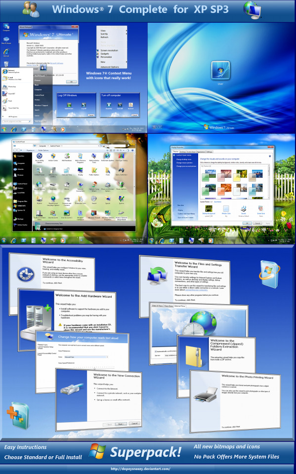
Windows 7 Complete by DopeySneezy on DeviantArt
#art#bitmap#blue#computer#design#desktop#download#dopeysneezy#frutiger aero#graphic design#graphics#icons#illustration#microsoft#microsoft windows#queuetiger#screenshot#technology#user interface#vector#windows 7
269 notes
·
View notes
Text


I've made hundreds of icons for Nightingale, here is a glimpse at some of them! The metal bases for ingots was hand painted, the ores are a mixture of painting, 3D models, and photobash. I referenced Soulslike icon conventions heavily, especially Elden Ring. The alchemical symbol alphabet was developed to help with accessibility (differentiate all the ingots accounting for colour blindness).
8 notes
·
View notes
Text
i've seen people say that the Blood Tree used to have tire swings on it, rather than the square "talismans" that it currently has, which i don't specifically remember seeing... after finding them in older gameplay videos, the truth is stranger.
here's a screenshot of an apparent tire swing in the tundra (from this video, from early 2020):

here's my own screenshot from the same place in emuFer.al, you can see how this was replaced with the more regular rectangular talismans:

however that round thing is certainly not a tire swing, it has six spokes along the side, just like the statues seen in Lakeroot Valley:


this further draws ties between the Tundra and Lakeroot, both of whose endemic species are Kobolds. (For extratextual info, the lore document states that the Tundra used to be a city connected to Lakeroot, but was severed from the land in order to prevent its curse from spreading.)
(here's another screenshot from another video, showing more round structures with spokes:)

EDIT: I forgot but those statues are found in Mugmyre as well.


#fer.al#the expanse#feral game#creature spiritpost#id#i also like seeing the old interface again hehe i almost forgot the harvest point icons used to be leaves#THIS IS SO BANANAS THOUGH WHY DID THEY REMOVE THIS... ::-(
8 notes
·
View notes
Note
Perhaps a request for a blue club? If their aren't enough canon kwami for four blues. I have seen a blue fan Kwami of Seal if that'd help.
Sorry, I don't do requests right now
#ask#i was tempted to do this#actually#like 7 seal swaps#cuz its mermay#and then i lost motivation asoidhgoisdnhfg#but if i did this i would do seal!ondine#andd idk about the rest#def rabbit. maybe peacock? but idk duusu is a pain the ass#hellhound and snow leopard#im going to ramble about zoo empire now#my beloved#i had no idea you could do research until i was a teen#i never looked at the statics cuz i didn't care xd#also theres apparently like a dlc/sequel/updated version?? I had no idea until we found it on steam#and like i would play the newer thingy#marine park empire#cuz it has aquatic animals and more stuff#duh#but god i hate the interface#maybe its just me being used to the old one#but fuuuck its bad#theres a glow on everything and it kind of makes the text harder to read#the icons are more detailed and its just a mess#the old one is so much better but theres no marine animals :(#and i doubt there are mods that add them (or that there are any mods in the first place xd)#ALso the steam versions only have english#which is weird cuz when we played it on cd it had czech#man i really am a yapper huh
4 notes
·
View notes
Text

User interface designs
Various UI/UX screen designs.
#icons#ui icons#graphic design#artists on tumblr#ui/ux design#user interface#design asset#simple glyphs
2 notes
·
View notes
Text
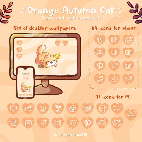
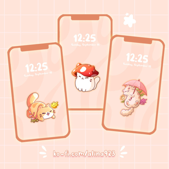
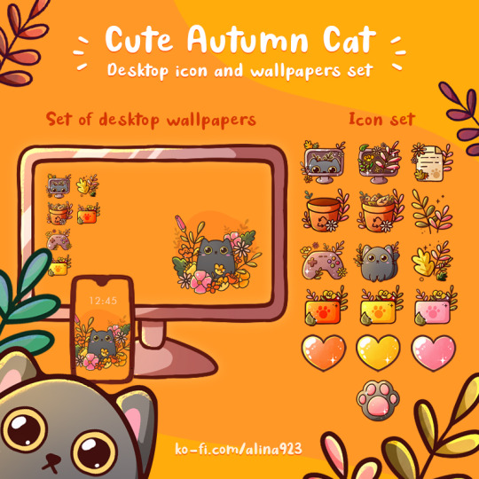
🍂 Autumn update in my shop 🍂
🐾Ko-Fi | 🐾Gumroad
#art by 923#alina-923#drawing#art#digital art#ko fi#ko fi shop#ko fi link#ko fi support#artist on kofi#kofi#shop#gumroad#cute#cat#draw#wallpaper pack#wallpaper#cute wallpaper#icons#icon pack#icon set#interface#pc
5 notes
·
View notes
Text
Explore the World of Food and Drink Icons for Your Projects

->Icons are now an essential component of site design in the digital age, making navigating simpler and more aesthetically pleasing. We at IconAdda provide a large selection of food and drink icons to suit all kinds of projects, including mobile apps, food delivery systems , and restaurant websites. Our selection of premium icons includes everything for every need, whether you're creating a menu, an e-commerce website, or simply want to improve the project's appearance.
Modification at Your Fingertips: What separates our icons is the flexibility to adapt them to your website's branding. Our icon editor allows you to: ->Change the colors to match your palate.
->Rotate or flip the icons to fit your design arrangement.
->Adjust the size for different positions.
->Modify forms or add distinctive components to make them genuinely yours.
Why Do You Choose Our Food and Drink Icons?
->Variety:We provide icons in a variety of styles, from flat design to intricate images.
->Quality: We create all of our icons with precision and clarity, so they appear excellent on any device.
->Ease of Use: Our icons are ready to download and integrate into any project, which saves you time and work.
->Customization: With basic editing tools, you may easily modify the icons to your specific needs.
When choosing food and drink icons for your project, there are various factors to consider to guarantee that you get the best one for your needs. First and foremost, consider the typeface used in each icon; ensure that it is consistent with your overall design aesthetic and seems nice on screen. Consider the color pallet; choose colors that complement each other while still providing enough contrast to prevent them from blending too much. Finally, consider size; often larger is better when utilizing food and drink icons because it allows them to stand out more clearly against other items on screen.
How to Use Our Food and Drink Icons: Including food and drink icons in your project is straightforward. Simply visit IconAdda, choose the icons you want, then utilize our editor to make any necessary changes. Once satisfied, you can download the icons in a variety of formats, including PNG, SVG, and others, making them appropriate for a wide range of digital contexts.

Conclusion: Whether you're creating a new food-related website, releasing a mobile app, or developing a marketing campaign, our food and drink symbols will help enhance your project.
Begin exploring our collection today and elevate your designs to the next level!
here to go ~ IconAdda .
#ui#ui ux design#uidesign#user interface#ux#programming#coding#computing#creative#icons#logo#design#web design#graphic design#photoshop#home design
2 notes
·
View notes
Text

cheri.png
#cannot tell you how much I miss msn#msn#msn messenger#old internet#old web#00s#y2k#2000s#cyber y2k#moodboard#cybercore#cyber core#tech#user interface#y2k icons#y2k moodboard#y2k aesthetic#vaporwave#y2k blog#curators on tumblr
182 notes
·
View notes
Text

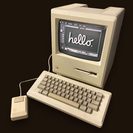
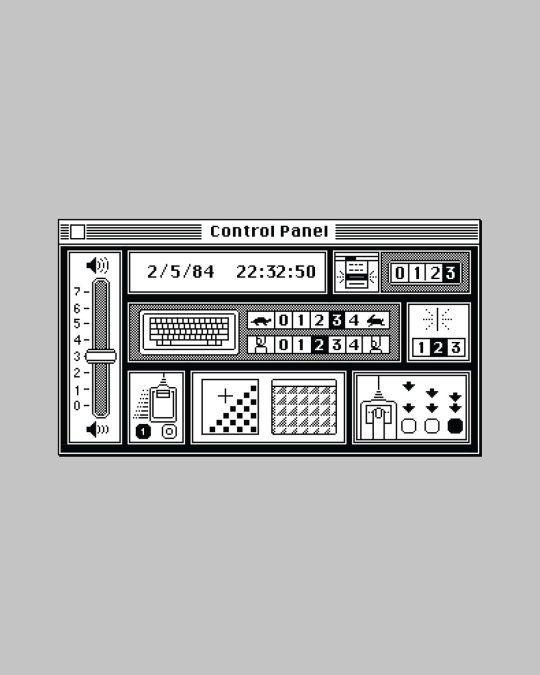
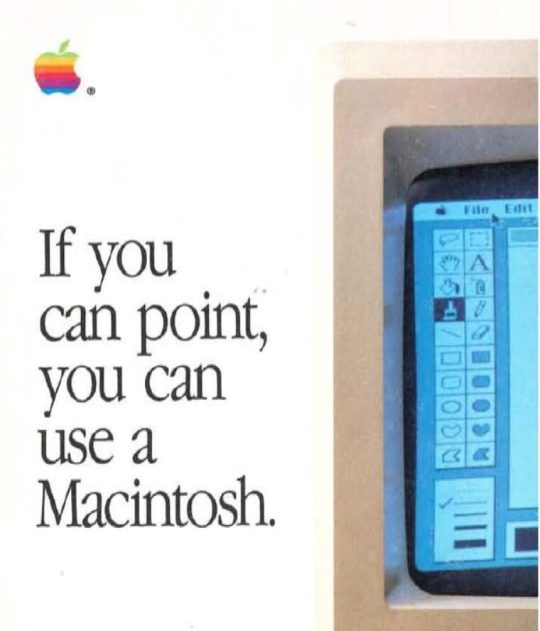
The original Mac "hello" from the first Mac designed by Susan Kare, along with a whole raft of icons that taught us all how to use a home computer, but equally important, also reassured us at the same time. Something it took Microsoft years (and years) to grasp. Great video here of Susan explaining the Mac icons on a TV show from 1984
And good article from Typeroom paying homage to Susan when she won the Cooper Hewitt , National Design Awards, Lifetime Achievement Award in 2019 (better late than never!).
#hello#Mac#Macintosh#Interface#UI#Susan Kare#Steve Jobs#Steve Wozniak#design#typography#graphic design#Woz#icon#iconography#UX
3 notes
·
View notes
Text
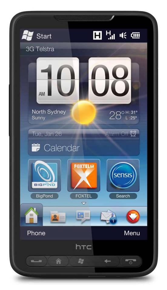

#art#cellphones#design#frutiger aero#graphic design#graphics#htc#icons#mobile#phones#smartphones#tech#technology#touchscreen#user interface#ui
235 notes
·
View notes
Text

50 photography and camera interface micro icons. Check them out!
If you like them, tell a friend ♡ Side Project
#camera#photography#photography icons#user interface#UI#UI icons#icons#icon design#illustration#graphic design#side project
3 notes
·
View notes
Text
Linux users: Linux is a about choice! You can have whatever you want!
Me: I want a functional global menu bar
Linux users:
Linux users: not that
#ok so kde plasma may support it and maybe mate does?#unity did but is either dead or resurrected#this is rapidly becoming too fucking complicated#oh it does everything mac does you can make it look like mac#as long as you want a windows xp start menu for everything#no global menu out the box no finder no spotlight its just open source windows#i dont want it to 'look like mac' with icons and graphics i want it to 'look like mac' when it comes to work flow and interface elements#1980s mac will fucking doo at this point#or Ubuntu when it was unity based
5 notes
·
View notes