#layer mode tutorial
Explore tagged Tumblr posts
Visit Tumblr Blog
Explore Tumblr blogs with no restrictions, modern design and the best experience.
Last Seen Tumblr Blogs


Fun Fact
Forty percent of Tumblr users are between the ages of 18 to 25.
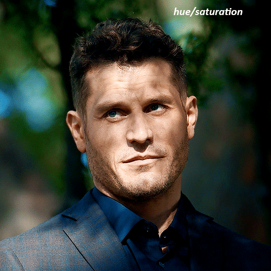
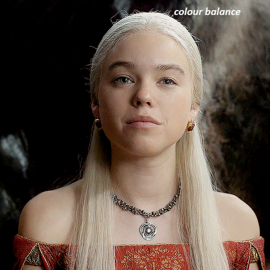
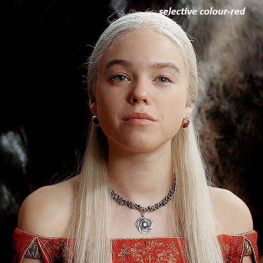
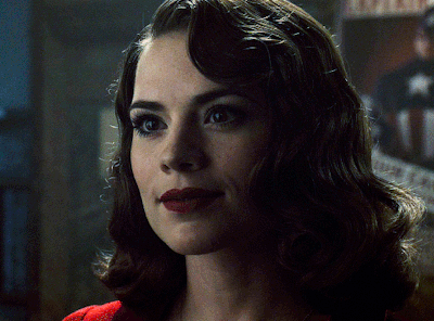
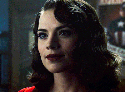
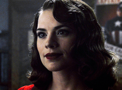
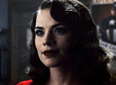
Text
A few other ways to use this mode that I didn't mention in the video so thought I'd throw this up for anyone interested.
LinkTree: https://linktr.ee/jaeharuart
#digital art#layer modes#digital art tutorial#software tutorial#layer mode tutorial#luminosity#brightness#layer mode#jaeharuart#art tutorial#art tutorials#artist#art
20 notes
·
View notes
Text
how did you get so cool kim
when i was playing DE i searched for some hints. you know how google always shows you the section with related questions? almost every time i got one that went somehow like ‘was kim this hot from the very beginning’
i have zero idea on how or why it appeared on absolutely unrelated searches, but the correct answer is YES YEEEES
#bowyo art#it’s not whirling in rags btw. it’s the roof of 41th#i made this after watching tutorial about color theory#my personal pride is that i picked all the colors by hand from the wheel#like there’s no filters or layer modes oher than normal#god i love this man so much he’s so beautiful and fun to draw#disco elysium fanart#de fanart#kim kitsuragi#disco elysium
472 notes
·
View notes
Note
I really would love an idea of your process I'm still learning how to digital art and you're such an inspiration! I know you have a lot of info but I wanna get better and you do such good work! Sorry if this is rude to ask, I've followed you for years and just was able to afford a tablet. ^w^ If you don't want to answer you don't have to I love your art!!
YEAS OFC!! congrats on your first tablet, i know how excited i was w mine (tho i had been using mouse for so long that it took a long time to get used to it haha)
honestly there's a lot i could give tips for it really depends on what program you're using ! I still use Paint Tool SAI personally, but there really isnt any one best program guaranteed to make your art better, never get caught in the trap of thinking your program makes or breaks your art cuz it's really not true..!
but general tips for digital art itself:
experiment with layers, this is the very base of anything digital art (you can still use single layer but i gotta stress how understanding layering and layers is a skill that transfers to a LOT of digital anything, even video editing)
relatedly, here's a tutorial i did on layer folders and clipping! it might be a lot at first and i understand! all of my past tutorials are tagged as #tut ~
get to know your program's tools and shortcuts. shortcuts will make you faster at digital art without even needing to get faster at the art itself (assuming you're using something with a keyboard). majority of my speed these days comes from experience w what im drawing but definitely also from shortcuts.
if you see any tutorials you want to try, try them!! don't sit on them and do nothing with them, art is as much muscle memory as it is knowledge. even if you know all the steps you still gotta "train" yourself for it yanno?? it prolly won't do much just sitting there in a reblog tag..!
don't be afraid to colour pick to learn. lots of artists say dont colour pick, but like, as long as you aren't doing it to recreate their character then tbh you can still do that to learn what's going on. sometimes a colour isn't what you think it is..!
trust the process!! if u really aren't feeling a piece that's ok, but if you ever try digital painting you NEED to trust your process. it will always look like garbo mess at first before it's refined, don't get discouraged each time cuz then you won't finish anything!! likewise not everything needs to be shared, no one has to see the drawings you give up on or didn't like, so try not to feel bad about something not turning out either!
try not to get hung up on comparisons between you and other artists. this kind of thinking can really make art not fun anymore 0(
ultimately art is about fun imo, if you are having fun trying something, or making something, or you just want to draw the same OC over and over then do it! i personally have done a study on figures maybe 3 times in my entire life because that kind of thing bores me, i do art because it's fun and feels good, intrinsic motivation is the best imo!
if you had a specific question about anything tho, either how i've done something or about a program/tool you can always inbox me! i might be slow to reply cuz busy a lot, but i genuinely love to share now (i know in the past i've been protective but i've grown a lot since then i like to think...!)
#honestly the hardest part i remember when i started was learning programs!#they can be very confusing#in that case you can look up beginner tutorials for your program!#i am only experienced with PTS unfortunately so i can only help with that#sorry for the ramble i think about art a lot JKBSDKBFSDB#but i do have a few topics in my tut tag#i've considered a series of topics for beginners in the past .......#either way tho if u had anything specific or wanted to know how i do something specific lmk !!#most of my techniques aren't PTS exclusive afaik#mostly just layers and layer modes!#text#ask#not art#tut#anon#thank you btw UYAAYY
12 notes
·
View notes
Note
how does one make graphics (i need to . improve)

Well, the Princess' methods are very simple! She would be glad to teach you.
A bit long graphic tutorial under cut ^_^ (all art by Iinquint on twitter)

First, we import the frame or mask you will use. You can find these by searching "rentry frame".

Then, we will import our picture and erase any excess outside of the frame.

Then we usually add a chibi, You can do this by finding chibi art and erasing the background.

And now we will add any PNGs to the graphic. We chose circle laces for this.

Now we will duplicate the layer of our chibi.

We then use the Stroke Outer filter to find dots that weren't erased, we will go to the top original later and erase where all the exposed dots are.

After that, we delete the layer & reduplicate it. Then we use stroke outer for a white outline, and then a black one. If the chibi or whatever you are using is white or very light already, feel free to reverse the white & black.

Then we add glow outer (usually around 1-2px)

Continue this process for everything

Save it

And then we will import it into a new canvas through 'import picture' & then use the grayscale.

Now, We do not always use a gradient map. But feel free to try out gradients to see if it looks nice on the graphic. Either of the 2 top sites work.

Find a gradient that looks nice. If none fit your vision, feel free to skip it.


Now, import the new image and then add textures. Play around with blending modes & opacity until it looks right.

Boom! You've made your very own graphic.
Now for animated graphics...
(No visuals) If you'd like one where the small chibi moves, move it to be angle -5, save it, and then angle 5 and save it. (Also adjust angles if the 5 looks weird.)
Import the images into ezgif gif maker and turn on "Don't stack frames" and adjust delay time. (I usually use 80ish)
--
Animated graphics 2

Import your graphic into capcut. Add a green background or whatever color is not present on your graphic at all. Add the gif you want on the graphic. Adjust for all the images to go on for equal times so it works.


Ezgif > Mp4 to gif > Remove Background > Select hex code of background > "Replace hex with transparency" > Adjust Fuzz > Optimize

And voila, your graphic is completed! Feel free to adjust in ezgif effects if needed.

#ᛝ a chat with the lady spawn .ᐟ#rentry decor#rentry inspo#rentry resources#rentry#rentry stuff#rentry graphics#rentry banner#rentry coloring#ibis paint colorings#graphic tutorial#rentry tutorial#editblr#pr3typriincess#pr3ttypriincess forsaken#pretty princess forsaken#forsaken roblox#roblox forsaken#roblox#forsaken rentry
408 notes
·
View notes
Note
hello i hope you are fine ! i have a little question : what brush do you use for your drawing ? i love your work so much !
Would it shock you if I said I use the basic ones?
Soft/hard round brush and soft/hard pressure size round brush (as in the thickness of the line depends on pen pressure) are my go to brushes.
The few texured brushes I use are mainly for details (Available here Psdelux Brush Pack)

You can see if it you zoom in onto my works.
-The lineart is made traditionally but I usually alter its color depending on the area
-Large chunks of drawing are filled with a hard round brush,a large soft round brush is used to add a slight gradient, and a variation of smaller pressure soft/hard brushes for details.
-Textured brush for textured details
The trick? Erasers and clipping masks. You must use your eraser as a brush as well. A lot of the shapes I create are made with painting large chunks and then erasing the details. I use a lot of layers and merge them down when the trick is complete.
The details on the waist shawl, for example: I used a white/yellow hard pressure sized brush to draw the flowery details, I put a textured brush on eraser mode and erased parts of it, I made a clipping mask (the pattern it on its own layer) and painted it with a dark brush over the bits that are in the shadow.
Should I make a tutorial on how I render? Anything specific?
Thank you so much for loving my work!
369 notes
·
View notes
Text
here is the colouring tutorial i promised to go with my beginner's gifmaking tutorial.
to save image space, i've written up a simple explanation of how each adjustment layer works here, so i'm just going to over my colouring for these 4 different gifs.
as always, very image heavy underneath
there are many ways to get the same results and i'll use various methods usually just based on what i'm feeling at the moment. some of it is a little convoluted, but hopefully this will give you a rounded idea of how it all works so you feel more comfortable playing around with your own colouring
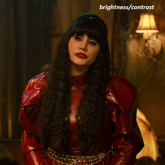
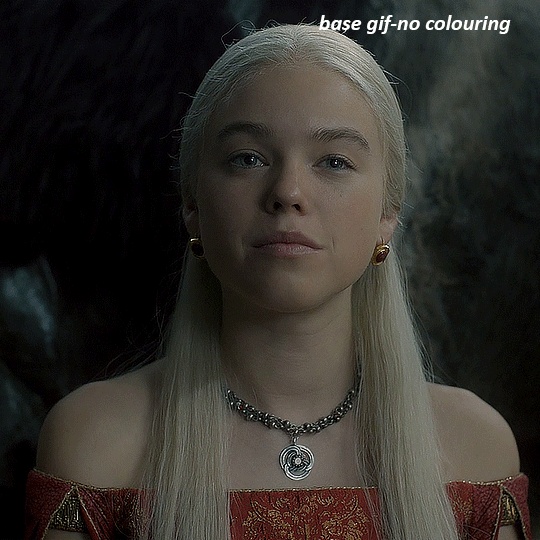
NADJA
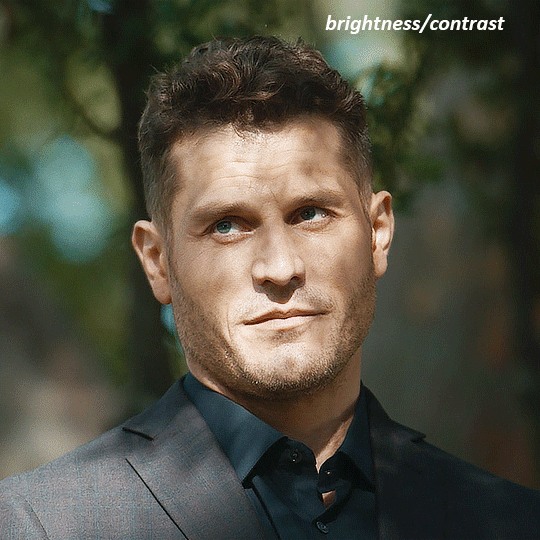
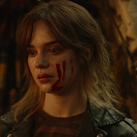
this is the base gif with zero colouring adjustments, just resized and sharpened.
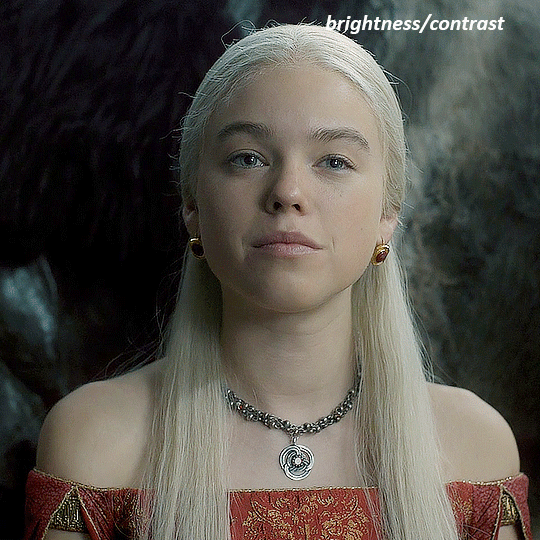
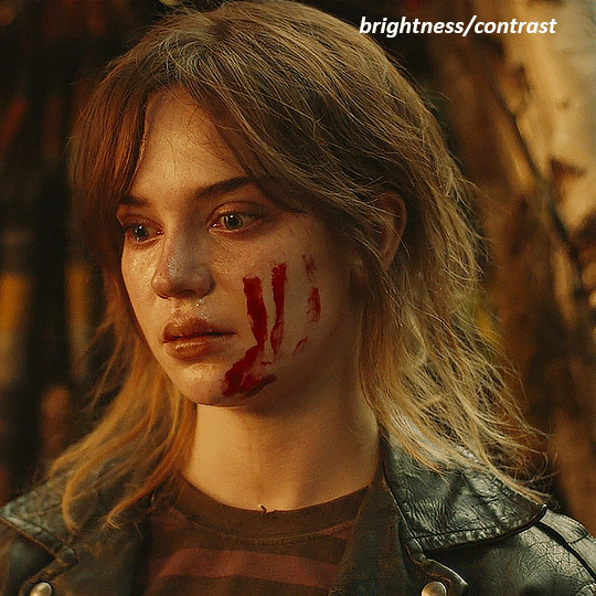
unless the base gif is already very bright, which doesn't often happen because directors nowadays are allergic to light, the first layer i add is always a brightness/contrast layer. i don't adjust any of the sliders, i just change the blending mode to "screen", and then adjust the opacity if needed. this gif was pretty dark, so i left it at 100%,
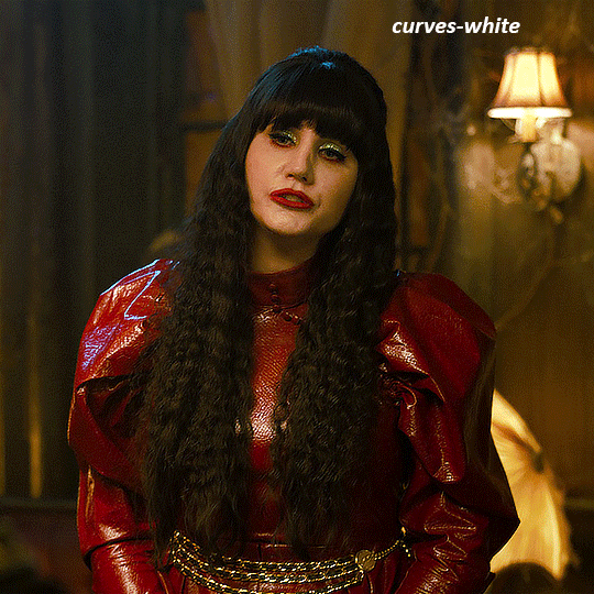
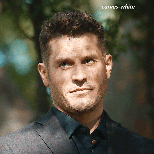
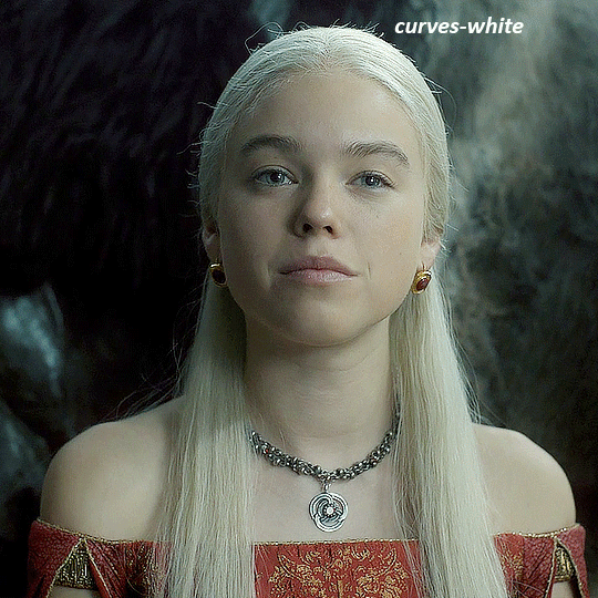
my next layers are always curves to even out the white and blacks. i use two curves layers, one for white and one for black. i used the white drop-picker and selected just below the lightshade on the lamp behind her, and for the black drop-picker i selected her hair near her neck which gives us this
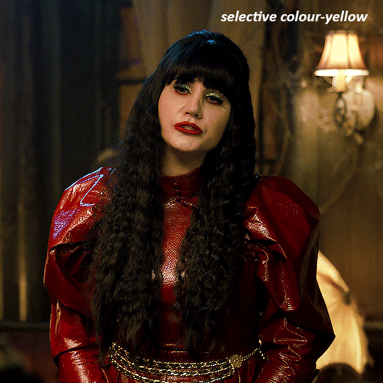
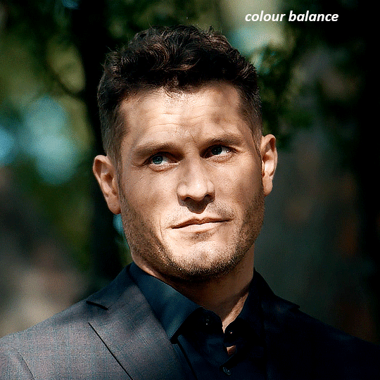
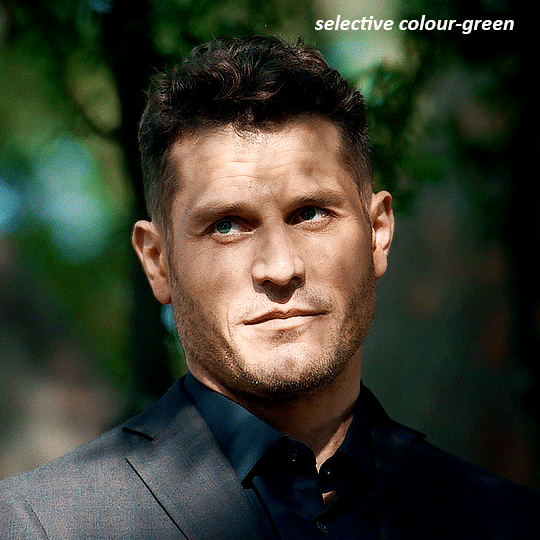
it's already looking much better, it's not as green tinted, but i want to make the red of her dress pop a bit more. in order to do that without making her face too red, i'm gonna remove some of the yellow. so next i'm gonna add a selective colour layer, and under the yellow channel i moved the yellow slider to -5 and the black slider to -52. now
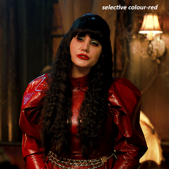
now that the yellow is reduced, i add another selective layer, and under the red i move the cyan slider to -66 and the black slider to +29. now the red of her dress pops and her face is still a realistic tone. when i first made the gif, i added the red selective layer first, then added another selective layer under it and adjusted the yellows to offset it. you can always shift layers around or add a new layer underneath as you go.
voila
TOMMY
here is our base gif

this scene is better lit than the nadja one, but i prefer bright and colourful gifs, so i'm gonna once again add a brightness/contrast level and keep it at 100%
and then the curves layers to even it all out. since there isn't a spot that is immediately noticeable as white, you can hold the alt button with the white dropper selected and it will highlight all the white/very near white pixels. you can also zoom real close in to select specific pixels. i selected a from the white area around his chin/mouth. the same process works for finding a black spot with the black dropper, and for that i selected from a dark spot in his hair
the curves layers evened it out but also made the gif a bit more red and warm toned, and since i've decided i want the end result to be more blue/green, so i'm gonna add a colour balance layer. in the shadows channel i moved the cyan/red slider to -16, and the yellow/blue slider to +11
now the gif already looks great, it's bright, skin tone is accurate, he's not washed out, but like i said i like my gifs colourful, so i'm gonna add two more selective colour layers. in the first i'm gonna adjust the greens, bringing the magenta slider to -87, and the black slider to +81. in the second layer i'm gonna adjust both the blues and cyans, because when you see blue in a gif it's rarely ever straight blue or straight cyan, so always adjust both. (you could adjust the blue and green in the same layer, but i prefer to do them separately in case i need to move the layers around)
now finally i'm gonna add a hue/saturation layer because i think the blue of his suit is too blue when the sky behind him is more cyan. (also, since you only have 256 different colours to work with, you don't want too many different colours otherwise it will distort the colouring.) in the blue channel i move the hue slider to -12 to make the blue a bit more cyan, and i also move the saturation to +38 to make it pop more
and voila
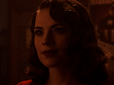
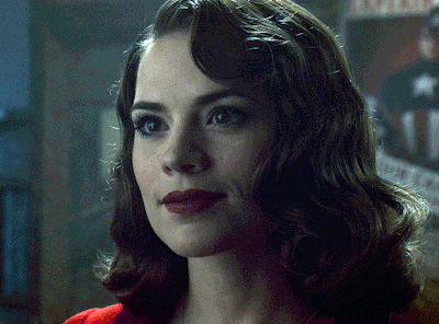
RHAENYRA
here is the base gif (this one is going to get very convoluted and imo best exemplifies what colouring gifs is like most of the time)
as always, a brightening layer set to screen
now the curves layers. for the white i clicked on her hair at the top of her head, and for the black i i clicked in the shadows to the left of her.
but as you can see, while it added contrast, it also made the gif more green tinted than it was. you could click around more, or manually adjust the red, green, and blue lines on the curves until it looks better but i decided to add a channel mixer layer instead. in the green channel i set the greens to -95, and in the blue channel i set the blue to -97
next i wanted to add a little contrast, but i find that using the contrast in brightness/contrast can saturate it too much, so instead i added a levels layer. first i adjusted the bottom bar, moving the right slider to 230 which reduces the overall brightness of the gif, so when i adjust the top bar it doesn't brighten the gif too much. on the top bar, i moved the right slider to 212, and the left slider to 9
now, i'd like it to be not exactly warm toned, but less cool, and while i could use colour balance or a photo filter, i'm instead going to add a gradient map, using the default gradient pink 08, and setting it to blend mode soft light at 50% opacity

next i just want to increase the blacks a little, so i'm gonna add a selective colour layer and under black i'm gonna set the black slider to +10
it's still not as warm as i'd like, so i'm gonna add a colour balance layer, in the midtones setting the cyan/red to +10 and the yellow/blue to -5
we're almost done, but i want to make her dress pop a bit more, so first i'm gonna add another selective colour to bring the yellows down a bit, setting the black slider to -15

and finally one more selective colour layer, in the reds, setting the cyan slider to -50, the yellow slider to +10, and the black slider to +15
voila
NATALIE
here's the base gif
as always the brightness/contrast layer set the screen
now the curves layer. for the white, i zoomed in and selected a pixel on her cheek under her right eye. for the black i the dark spot just above her head
now she's very yellow, so i added a channel mixer layer. in the red channel i set the reds to +88. in the blue channel i set the reds to +10
she's still a little too yellow for my liking, so i'm gonna add a hue/saturation layer, and under the yellows i'm gonna adjust the saturation to -60
finally, i want her to be a it brighter, so i'm gonna add another curves layer, but instead of using the drop, i'm going to manually adjust it. the two points along the line are where i selected it and then i dragged until it looked how i wanted. i start with the upper dot, which made it brighter and moved the line into an arch, and then selected at the lower end of the line and dragged in back closer to centre to add some darkness and contrast
voila
and that's how i do my colouring. it's generally all trial and error, using a layer to fix one thing and then needing another layer to fix something the previous layer did.
play around, have fun, see what works for you and what doesn't. it will take a while for you to develop your own method and style, and even then you'll come across scenes that make you question if you have any sills at all. you do, directors just hate us
have fun and feel free to ask any questions
#tutorial#gif tutorial#colouring tutorial#photoshop tutorial#gifmakerresource#completeresources#*tutorials
260 notes
·
View notes
Note
Coloring anon here, yes, I would definitely like to know more about how you color frame by frame and the other techniques you mentioned! It would be much appreciated, thank you!
Hi anon! I'd be happy to go over my preferred methods for colouring!

First resort (ideal):
Painting over shots with little movement (the first method in this tutorial)
Colour manipulation using selective colours (the second method in this tutorial; alternate tutorial -> i also sometimes add a hue/saturation layer on top to manipulate the cyans/blues as well)
Second resort:
Keyframes for shots with consistent movement where it's easy to hide "imperfections" (tutorial 1, tutorial 2)
Last resort:
Frame by frame colouring -> DISCLAIMER: the way I do this method is the easiest way I've gotten it to work for me but that also means that it's very inflexible when it comes to editing any of the colouring afterwards. Once you start colouring in frame animation mode you're basically locked in so you need your gifs to be exactly the way you want them prior to adding your colour
So in this tutorial I'll go over how I do my frame by frame colouring as well as how I create actions to automate the repetitive parts of this process! (Some resources that explain how to create actions are here: 1 2)
To use the select subject feature you will need Photoshop CC 2018 or later
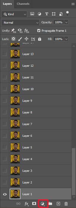
Step 1: Preparing your gif with base colouring
So first you want to do your base colouring for your gif in timeline mode, which I've explained here. I keep my gifs short (ideally 40 frames or less) since this colouring process is tedious!
I make sure that in my hue/saturation layer, I turn the saturation in the yellow, green, cyan, and blue tabs all down to -100 (and for the yellows I usually add around +20 to +60 in lightness)
Here's my gif with the base colouring that I'll be starting with:

Note: turning down the saturation in almost all the colours gives you that nice silver/grey neutral background to paint on top of. It's a lot less noticeable when your painted layers aren't perfect
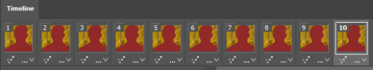
Step 2: Converting to Frame Animation Mode
I use the save action from this action pack to convert my gif from timeline mode to frame animation mode.
You cannot edit your base colouring from this point onwards!
Step 3: Using Select Subject
If you're recording an action this is the step you would *start recording*
This is what your window should look like:

Making sure your first frame and first layer are selected, go to Select at the top of your window and click Subject

You should then see the marching ants outline around the person in your gif

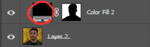
You then want to create a new solid colour fill layer (which can be found when you click that little circle icon at the bottom of your layers panel), and set the layer blending mode to colour.
The layer mask will automatically be created since you had the marching ants outline.

Since my person is in colour and not the background, I want to invert the layer mask by clicking on it and using command + i (or ctrl + i), and now this is what it looks like:

Note: Select subject isn't always perfect!!!, depending on how cluttered the scene is and how much contrast there is between your person and the background, select subject could either do a really good job like it did here, or screw up a little like it did here:

That's okay though because it still gives us a good base to start from! We can fix any issues by painting with black and white brushes on the layer mask.
Step 3.5: Create clipping mask
Thanks to @wolfchans for telling me about this because it gives us back a little bit of flexibility when colouring frame by frame! Instead of merging down, we can make a clipping mask instead. Right click the solid colour fill layer and select create clipping mask.


If you're recording an action, it's at this point where I would *stop recording*
Step 4: Fixing the layer mask if needed
So now I want his jacket and t-shirt to also be purple, and to show his fingers behind the glass. I make sure the layer mask is selected, and paint with a brush at 60-70% hardness (painting with black erases the colour, painting with white shows the colour). User smaller brush sizes to paint smaller details!
This is what my canvas and layer mask look like now.

Step 5: Repeat
Now I click on my second frame and second layer, and repeat steps 3-4. As you can see, using the clipping mask allows you to still see and edit the colouring of the previous frame, just make sure you click on the right frame and it's corresponding layer when you're doing further editing.

This is where an action is super helpful in cutting down all the repetitive steps and clicks you need to do. So at this point I'd just play the action I created and paint on the layer mask as needed.
Repeat for all your frames and then you're done! After this I convert it back to timeline mode again so that I can add my text and do any other effects such as blending or transitions. Hope this helped!!
#answered#Anonymous#*tutorial#userbeanie#userwintersoldado#userishh#userfaiths#usercats#usertj#tuserhol#userahri#usereus#usershreyu#userchibi#userbunneis#usermibbles#uservivaldi#carolook#userbuckleys#usertenacious#tuserheidi#userholtz
248 notes
·
View notes
Text
Edit this screenie with me!


This is an unused screenie of Penny Pizzazz and Marcus Flex. Feel free to save the screenshot (Dropbox link below) and follow along with the instructions, or play around with it and do your own thing! I’m going to keep the instructions as simple as possible; hopefully they make sense.
Note: My process is kinda involved, but it’s a relaxing hobby for me. You do not need to do all of these steps! If the process doesn’t bring you joy, don’t bother!
I’m using procreate, but I’m also a photoshop user. You can use any software that has layers and blend modes :)
Instructions and downloads under the cut!
Dropbox link to the screenshot, and overlays!
1. Let’s start with shadows. The first step is to create a new layer. Put the blend mode to “multiply” (this darkens anything you draw on the layer). Then select a soft brush. We’ll start with Penny’s face. Use the eyedropper tool to choose a shadowy color of her skin (hold your finger on the color you want).

2. Decide where the light will be coming from (we’ll be placing it behind them on the top left). Deepen the shadows already made by the game, and add some shadows opposite to where the light will be. Choose a darker color to match each area you’re drawing on (Penny’s hair, her shirt, Marcus’ skin, his sweater).
When you’re finished drawing the shadows, go into your layer and lower the opacity. Less is more!

3. Choose the eraser (set it to soft brush). With a light hand, soften any shaded areas that are too harsh. Basically you want to blend the shadow with the skin using the eraser. You can also use Gaussian blur!

4. Let’s add some background lighting. This will also be our guide as we add bolder highlights in the next steps. Make a new layer and set the blend mode to “add.” Take your soft brush and a yellowy-orange color, and draw some glowy light coming from the top left.
Lower the opacity and take the eraser and erase much of the light on the right side of Marcus, and erase a bit of the light on their skin/ hair/ etc (like we did with the shadows). You can use Gaussian blur here too!
Note about lighting and highlights: experiment with the color of light, because some will look better depending on the environment and the sims skin tones. Because Penny and Marcus have dark skin, a bolder or darker yellow/orange will look much better than a pale yellow.

5. Let’s start adding more highlights! Make another new layer and change the blend mode to “add.” Choose a yellow-orange and paint some highlights on Penny’s hair, her left shoulder, her chest, cheekbone, and the left side of Marcus’ face. I made the image on the left a different color so you can see where I put the highlights.
Lower the opacity, and use the eraser or Gaussian blur to blend.

6. More highlights! Make a new layer and set the blend mode to “overlay.” Overlay lightens while adding color. I use “light pen” for any outlined highlights (the outer left of Penny’s hair, Penny’s shoulder, the left side of Marcus’ face), and I use a soft brush for the rest. Lower with the opacity, and use the eraser to blend.
This is a great time to play around with other highlight colors! I’m sticking with yellows, so I chose a peach color. Note: the red is to show what I drew.

7. We’re going to import a light leak overlay, and set the layer to “screen.” Then take your eraser, and erase any areas where you don’t want there to be too much light (red areas).

Finally, I’ll merge the layers together and bump up the highlights by going to adjustments > curves. Then I’ll add noise, and a vintage dust overlay. Sometimes I do more than this, sometimes less. I also like to draw hair strands and stuff, but that’s a whole second tutorial.
259 notes
·
View notes
Text
youtube
NEW VIDEO TUTORIAL 🩷
After almost two years it's time for a new and improved version of my "How to make CAS CC" video. This time I will explain how to create a frankenmesh out of a jumpsuit and a dress for adult Sims! It's VERY beginner friendly so if you weren't successful yet with starting to make CC, maybe this one will give you the help you need!
All the topics I cover in this video below the cut:
00:00 Intro
01:00 Software
01:36 Downloading & Installing Sims 4 Studio
01:56 Downloading & Installing Blender 4.2
02:10 Downloading & Installing GIMP
02:20 Introducing Sims 4 Studio
03:03 S4S | Gathering assets to work with
04:09 S4S | Textures
05:12 Project Folder
05:34 S4S | Gathering assets to work with
07:10 Introducing Blender
10:17 Blender | Edit mode (Select, Delete, Wireframe)
12:38 Blender | Append second mesh (Proportional Editing, UV overlapping)
18:23 Blender | Join two meshes (Material, Merge)
20:03 Blender | Cleaning up the mesh (UV editing, Merge, Rip)
22:14 Blender | Cut number
22:43 GIMP | Making a texture (Select, Delete, Healing, Smudge)
24:52 Photoshop | Making a texture (but make it easy)
25:15 GIMP & Blender | Preview of the texture
25:43 GIMP | Making color swatches (Layers, Lighting, Fill tool)
28:33 S4S | Introducing the CAS area
29:15 S4S | Creating a package file
30:25 S4S | Importing all our assets
31:17 GIMP | Creating a shadow texture
32:24 S4S | The specular map
32:39 GIMP & Browser | Creating a normal map
35:58 S4S | Vertices & Polygons, LODs
37:02 Blender | Creating LODs
38:20 S4S | Categories (Tags, Allow for random, Gender restrictions)
39:36 S4S | Tuning tab (not covered)
39:47 Sims 4 | Results & Outro
434 notes
·
View notes
Text
tutorial — changing the background color in a gif
sofia & remy asked for this tutorial so here it is :)
note: i pay for photoshop and currently own the most recently released version of april 2025 - some things might be different if you're working on earlier versions of photoshop
i've made several gifsets (x, x, x, x) where i've isolated the gif subject so i can change the background into a bright, colorful background or into b&w backgrounds - in this tutorial i'll explain how i do that :)
in this tutorial we'll be going from this:
to this:

putting the tutorial under a read more!
step 1 — open your gif
i usually tend to make my gif beforehand, fully colored and sharpened and everything else, and save it before reopening it (as a gif) in photoshop cause i find it's the easiest way!
you'll have to work in frames mode when isolating the background color (because as said, you'll have to do this frame by frame) and it's important to always have the same frame and layer selected, otherwise you might run into some issues

for the purpose of this tutorial my premade gif (eddie<333) has not been colored, only sharpened
step 2 — selecting your subject
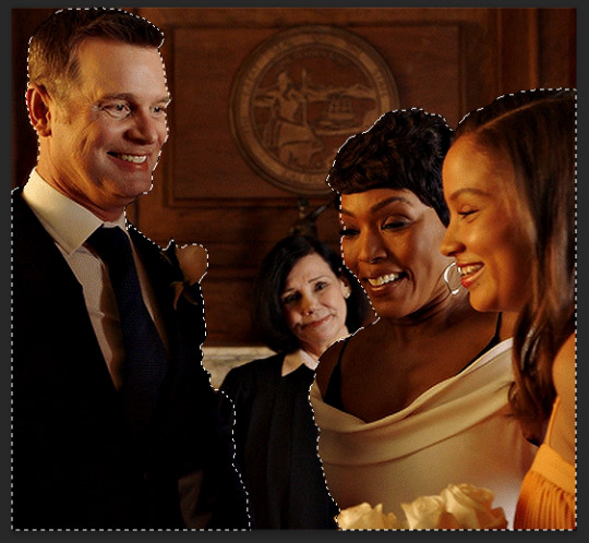
next up we're going to select our subject by going to the select category up top and clicking subject

↓ you'll now have a marching ants line around your subject ↓

sometimes photoshop will be silly and select either too much or too little, and you'll have to manually make sure (for every frame) that your subject is correctly selected - but i'll get back to that later!
step 3 — adding a solid color (/gradient color) layer mask
once you have your subject selected the way you want it, we're going to add a solid color (or gradient color) layer mask by clicking this half filled circle icon in your layers tab - from here on out you can choose whether you want to add a solid color or gradient (for this tutorial - we'll go with a solid color)


photoshop will ask you to pick a color (or gradient) so just go ahead and pick whatever color you wish to make your background! the lighter your color the brighter your background, and the darker your color the duller your background (for b&w backgrounds you can use black or white, it makes no difference) - once you're happy with your color, just press ok :)
step 4 — create a clipping mask
this might seem like nothing, but is actually an important step in the process! you want to make sure that the color fill layer you just created is clipped to the corresponding frame like so:


you can do this by pressing cmd/ctrl + alt + g or clicking right on your color fill layer and selecting create clipping mask

by clipping your color fill layer to the corresponding gif layer, you avoid this happening:
the color fill layer for the last gif layer has been applied on all gif layers before that, which will make it so that your subject will move in and out of the colored background and makes your gif look silly ↓

obviously this is what we want to avoid so clipping your color fill layer to your gif layer is an essential step!
step 5 — invert the layer mask of your color fill layer
next up we're going to select the layer mask and invert it by pressing cmmd/ctrl + i


this way we go from this

to this

step 6 — changing the blend mode of your color fill layer
the final step (!) is changing the blend mode of your color fill layer - i tend to just use the blend mode color on most of these as this mode tends to give the brightest results but you can definitely mess around and see what you prefer :)

(for this set i actually put the blend mode to soft light to create a duller background, for a gradient background just follow the exact same process but in step 3 choose gradient instead of solid color)
and you're done! now you only have to repeat this process for every. single. gif. frame. :)
and that's all there is to it really, so happy creating <3 see more tips/comments below and if you have questions, my askbox is always open!
tips / comments
1.- record this entire process into an action (tutorial on how to create actions) – this way you'll only have to select the correct frame/layer combo before pressing play and letting photoshop do the work for you! i made two general actions;
bw with subject select: use this action when photoshop can select your subject without issues!
bw without subject select: use this action when you need to manually edit the selection of your subject! (see 2.-)
feel free to download and use these actions! they will turn your background b&w - you can change the background color by clicking this square;
sofia @sadgayeddie made an action to select next frame + layer so you don't have to move your cursor around as often and graciously allowed me to share it <3 you can find it here
2.- (circling back to step 2) make sure photoshop correctly selects your subject – when using the select subject feature, photoshop may fuck up the selection of your subject, as such ↓

i don't want the lady in the background included in my subject - you'll have to use the quick selection tool to manually unselect whatever you don't want in your subject and/or manually select what you do want in your subject
from personal experience i know photoshop tends to fuck up with;
hair (especially when it moves around a lot)
blurry subject (eg eddie dancing in 8x06
one or more colors in your subject being too close to the background color(s) (such as bobby's suit in this example)
hands (the smaller the hands, the more photoshop makes a mess)
this is what the subject looks like without the lady in the back selected:
it's a bit more work if you have to edit the subject selection for every frame (and you might make small mistakes), but it's worth it! we want the gif looking like this in the end (sneak peek for my bobby set!!)

#resources#tutorial#itsphotoshop#usergif#i say tutorial but it's just me rambling sjkfhskdf#i hope this makes at least a little sense :') otherwise i'm always ready to answer questions!
228 notes
·
View notes
Note
I’m absolutely obsessed with your art! Your art is such an inspiration, and I like to analyze it to make my own work grow (don’t worry, I am not copying ur style. Perfection is impossible to cheat off of)
I’d like to know- How do you get that dot/noise-ish texture? In the tmnt art you made, one is Raphael’s arm had a bright cyan light from it, but then fades into little dots- I’d like to know how you do that.
Ofc you don’t gotta answer! If you see this in your inbox and don’t want to answer, that’s okay <3
hi! firstly thank u im flattered ;_; secondly its funny to get this ask because i actually made a tutorial for this months ago and i was like.....actually im a little anti-tutorial because i think online art communities pass them around and treat them as a "you've been doing art WRONG this is the RIGHT way" thing and not as like. individual technique sharing. idk. also nobody asked so im not gonna post this. but u asked so... here i am posting it LOL

basically its just the dissolve brush mode in photoshop with the softest default brush + some sneaky masking to get the right fall off/shadows that i want. u can technically use eraser instead of masking but idk i find its a pain to edit afterwards.
this has kind of been my default coloring method for the past... year plus now? basically i just do all the work in my inks/flats stage and all i do for "paint" boils down to like. 2-3 of these lighting layers (normally one key light and one bounce light. sometimes more key lights depending on how much i hate myself) i used to do shadows with this too but then i stopped because it was getting too complicated. sometimes if i want it to be glowy ill throw a frickin.... outer glow layer style on the light layer too.
you can also see me kind of work thru this method in a couple tiktoks (1) (2)
#ask#im gonna make this not rebloggable because i dont want people following me for tutorials LOL#process
277 notes
·
View notes
Text
how I edit my sims ts3/ts4 screenshots (day-time edition)
A helpful? guide for editing screenshots during the day (this is not so easy for me as i prefer taking screens at night but my sims can't always be in the dark so let us all struggle together ok? ok.) this tut is done in procreate on the iPad.

Before taking screenshots:
Help yourself as much as you can in-game, utilise in-game lighting as shadows/lighting is created for you
Understand good/bad composition and add variety by using different angles to make scenes look interesting
I take LOTS of photos just to end up with 1 or 2 good ones

step 1: i would use liquify to smooth out any sharp edges or paint over them

step 2: create new layer, blending mode "multiply" use the colour picker on the area you want to add shadows to, use the selection tool to draw the shadow. you can either colour fill or just shade into the area with the brush. If you colour fill you can then erase lines that are too harsh or use the smudge tool to soften them.


step 3: do this same step but for the clothing. remember shadows are not usually completly black so i use shades of blue to shade her clothes and then shades of green for the tree.


step 4: create new layer, blending mode: overlay. outline the left side of the sim this is to make the light source more prominant. as natural light is not usually just white, i picked a slight orange tint.

step 5: add more lighting to enhance the effect. *create new layer* blending mode: add, and do the same thing as step 4 but with this layer i'll add more lighting to the parts that will be affected most by the light

step 6: i edit the hair. you can look here for my in depth hair tutorial
step 7: add lighting effects *create new layer* blending mode: add. i used the default procreate brushes 'flare' and 'glimmer' [found in luminace] to immitate light rays

step 8: merge all layers, *duplicate layer* add bloom effect and change opacity and erase parts where bloom is too strong.

step 9: merge again, then go into photshop and colour grade using 'camera raw filter' then 'smart sharpen', use 'topaz labs' effect then done!

if you have any questions feel free to direct them to my inbox & u can check out other tutorials here
200 notes
·
View notes
Text
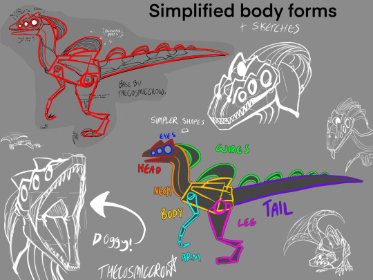
only finally time to post this. also this isn’t a step-by-step tutorial. im assuming you generally know how to draw already, this is just a bunch of references compiled together that could help you draw them easier.
SENTINEL REFS :3
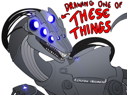
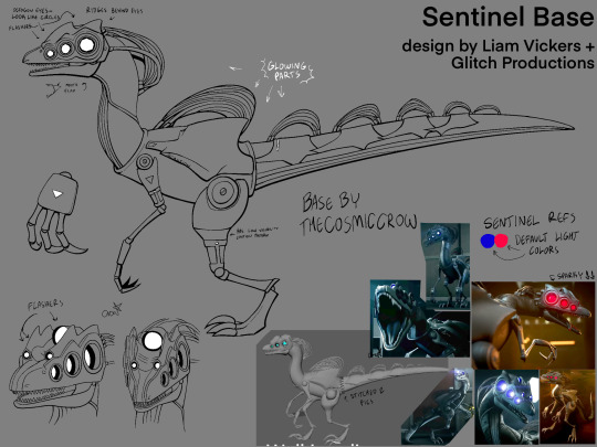
extra notes:
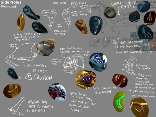
dont worry about a bunch of the smaller details. sentinels are littered with them and itd take ages to draw them if you tried to make them 100% every time. just focus on the bigger shapes and add from there.
their eyes ARE octagons, not circles. that being said it does not matter how you draw them because octagons are absolutely fucking obnoxious to consistently draw. i know, i have a half-sentinel oc, ive given up by now. do not place that burden on yourself. the rest of their face lights ARE circles though.
the smaller two flashers are part of their head ridges. their eyes are on a completely separate layer, and have duller ridges atop them. sentinels just have a lot of ridges in general.
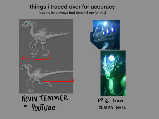
if you want to use real-world dinosaurs as reference, i would use Velociraptor, Utahraptor, Deinonychus, and Dilophosaurus as references, given that theyre all similar in body shape and structure. In the concept art, Sentinels looked extremely like the Dilophosaurus, though it got switched to being more raptor-like in the actual show.
I also MORE THAN LIKELY drew their tail wrong. So if you wanna figure out its design on your own, go for it. I just had to put something down so I tried my best, but it is absolutely NOT perfect.
Same with their colors! they’re almost a completely solid grey so it was difficult for me to tell what colors went where, so I just kinda put em at random in that first image. Doing something completely different is also good, since nobody can tell anyways :)
and on a final note, you technically do not have to follow any of these!! stylize them all you want. these are just references for anyone that may want to draw them more accurately :)
transparent sentinel base png: (MAY NOT BE VISIBLE IF YOURE USING ANY DARK MODE, BUT ITS STILL THERE!)

if it doesnt download as transparent, you can set the layer mode as multiply and it’ll work perfectly as lineart. this is free to use, I just want people to be able to make ocs easier :) i just ask that you leave the watermark in, and credit me if you use it, but you dont have to ask to do it.
(plus the image @1-800-hellyeah made for her sta.sh that i used as reference)
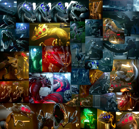
Happy dino drawing!!
(ps. you should totally show me any sentinel ocs you make :3)
#murder drones#murder drones sentinels#sentinels murder drones#sentinel references#murder drones art#thecosmiccrow#my art
382 notes
·
View notes
Text

COLORING + SHARPENING TUTORIAL
someone asked for a coloring tutorial and my sharpening settings, so here it is! there are also a few tips to achieve more HQ gifs. :)
tutorial under the cut!
FOR HIGH-QUALITY GIFS
FILE SIZES
it doesn’t matter what your sharpening settings are if the file you’re using to gif is too low quality, so i tend to look for the best that i can get when downloading stuff.
usually, movies (+2h) look better if they’re 5GB or more, while an episode (40 min/1h) can look good with even 1GB. the minimum definition i try to find is 1080p, but i gif with 2160p (4k) when available. unfortunately, not every computer can handle 4k, but don’t worry, you can gif with 1080p files just fine if they are big enough. contrary to popular belief, size does matter! which means sometimes a bigger 1080p file is better than a smaller 2160p one, for example.
SCREENCAPPING METHOD
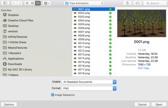
this can too influence the quality of your gifs. as a gifmaker, i’ve tried it all: video frames to layers, directly opening video clips, loading files into stack, and i’ve finally settled down with opening screencaps as an image sequence. with bigger files, it doesn’t matter much what technique you use, but i’ve noticed with smaller files you can do wonders if you screencap (either by loading files into stack or opening as an image sequence) instead of using video clips. for example, this gif’s original video file was only 4GB (so smaller than i’ve usually go for), if you can believe it!
here’s a tutorial for setting up and screencapping with MPV, the media player i use to screencap. again, you can keep using video clips for bigger files, but you’ll find this useful when dealing with dire causes. i don't file loads into stack, though, like the video does. i open as an image sequence (open > screencap folder > select any image > click the image sequence button). just select OK for the speed. this will open your screencaps as a video clip (blue bar) in timeline mode (i'm a timeline gifmaker, i don't know about you). you will need this action pack to convert the clip into frames if you're a frames gifmaker. i suggest you convert them into frames even if you're a timeline gifmaker, just convert them into a timeline again at the end. that way you can delete the screencaps right away, otherwise you will delete the screencaps and get a static image as a "gif".
ATTENTION if you’re a Mac Sonoma user, MPV won’t be an option for you unless you downgrade your system. that is, if you have an Intel chip. if you have M1 Max chip (or even a better one), here’s a fix for MPV you can try while keeping that MacOS, because nowadays MPV is skipping frames in its latest build. or you can use MPlayer instead for less hassle. here are two tutorials for setting and using MPlayer. Windows users are fine, you can use MPV without trouble.
FOR EVEN MORE QUALITY
ADD NOISE
here’s a tutorial for adding noise as a way to achieve more HQ gifs if your original material is too low quality.
REDUCE NOISE WITH CAMERA RAW
instead of adding noise, you can reduce it, especially if your gif is very noisy as it is.
the path is filter > camera raw > detail > nose reduction. i do this before sharpening, but only my video file isn't great to begin with. because it’s a smart filter, you can reduce or increase its opacity by clicking the bars next to its name in the layers panel.
TOPAZ AI
i use Topaz Photo AI to increase the quality of my screencaps when i need to. it’s paid software, but there are… ways to find it for free, usually on t0rrent websites. if someone’s interested, i can make a tutorial solely about it in the future.
SHARPENING SETTINGS
here are my sharpening settings (filter > sharpen > smart sharpen). i sharpen things twice: 500% 0.4px + 10% 10px. here's an action for it, for more convenience. here's a tutorial on how to use Photoshop actions. for animated stuff, i use this action pack.

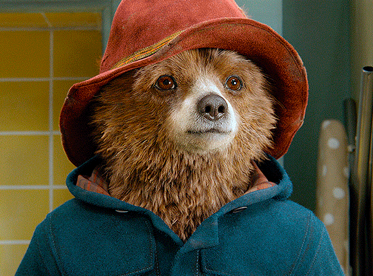
COLORING
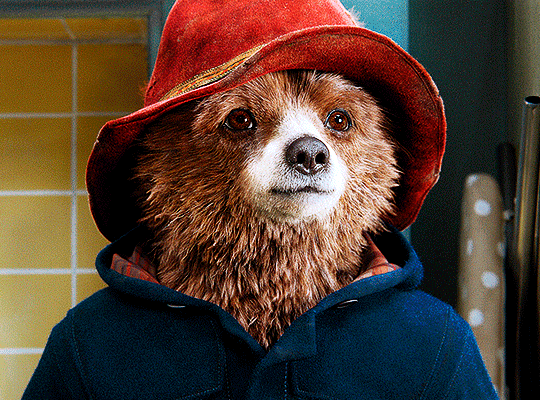
here’s the gif i'm gonna use as a base. it’s already sharpened like the way i always do it.

LIGHTNING THE SHOTS
half of the secret of a good coloring is good lightning. i always useCurves (layers > new adjustment layer > curves) and Brightness & Contrast (layers > new adjustment layer > brightness & contrast). the settings depend on the scene you’re giffing, but i always try make my gifs bright and with high contrast to make the colors pop.
CURVES
besides lighting your scene, the Curves adjustment layer has four automatic options that will color-correct it for you. it’s not always perfect and it doesn’t mean you won’t need to do further coloring, but it’s a great start. it’s a lifesaver for most ridiculously yellow scenes. look at the difference! this gif uses the 3rd automatic option (the screenshot below isn't mine btw so that's why the fourth option is the chosen one), from top to bottom. what automatic option you need to choose depends on the gif.

sometimes i like to tweak my Curves layer. not everybody does that, it’s not that necessary and if you’re not careful, it can screw your gif up. to modify your layer by hand, you will need to click and drag points of that straight line in the position you desire. this is the concept behind it:

basically, the lower part of the line handles the shadows, while the upper part handles the highlights of the image. if you pull a highlight point up, the image’s highlights will be brighter. if you pull it down, it will make them darker. same thing for the shadow points. you should play with it to get a grasp of it, that’s what i did when i first started giffing.
BRIGHTNESS & CONTRAST
then i added a bit of brightness and contrast.

CHANNEL MIXER
the scene looked a bit too yellow, so i used the Channel Mixer (layer > new adjustment layer > channel mixer) adjustment layer. here’s a tutorial of how it works. not every scene needs the Channel Mixer layer though, i mostly use it to remove heavy overall tints. in this particular case, the Curves layer got rid of most of the yellow, but i wanted the gif to be just a bit more blue so the Channel Mixer tweaks are very minimal.

SELECTIVE COLOR
now, this adjustment layer i always use: Selective Color (layer > new adjustment layer > selective color). this is THE adjustment layer to me, alongside the Curves one. this is how it works:

ie, you can separately edit a color this way, giving it tints. for this gif, i wanted to make the colors more vibrant. to achieve that, i edited the selected colors this way:
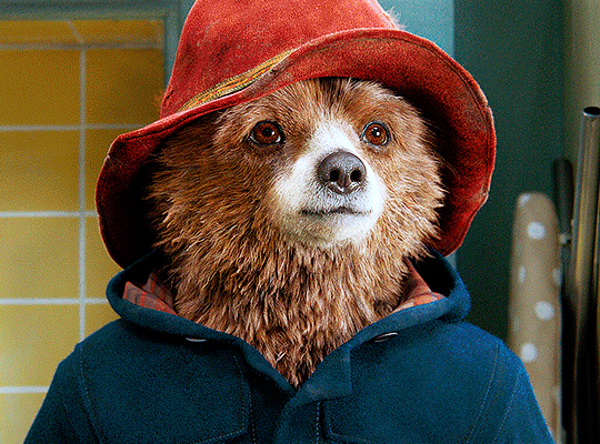
for the reds, i added even more red in them by moving the first slider to the right, making the color more vibrant. for his hat to have a more warm tint, i added yellow to the reds (third slider, moving it to the right). finally, to make the reds stronger, i moved the last slider to the right (more black).
for the yellows, i made them brighter by adding white to them, thus making the tile wall and Paddington more bright as well.
for the cyans and the blues, i just added the maximum (+100) of black that i could.
i wanted for Paddington's nose to be brighter, so i added more white to the whites.
lastly, i added depth to the blacks by increasing their own blackness.
you should always play with the Selective Colors sliders for a bit, before deciding what you want or need. with time, you will automatically know what to change to correct the color grading. it all takes practice!
HUE/SATURATION
i don’t know if you noticed, but there are some green spots on the blue wall behind Paddington. to correct that, i added a Hue/Saturation adjustment layer (layer > new adjustment layer > hue/saturation) and made the saturation of the greens 0%, making that unwanted green disappear from the background.

while the green spots on the wall are specific for this gif, i use hue/saturation a lot to tweak, well, hue and saturation. sometimes someone’s skin is too yellow, i made it redder by tweaking the reds and the yellows, or vice-versa. the hue bar follows the rainbow bar, so the maximum settings (+100 and -100) give the selected color to change its hue to something more red or pink (the rainbow extremities). changing hue can give pretty whacky results, like turning someone’s skin tone to green, so you will need to play with it to get the hang of it. you can also tweak the opacity of your hue/saturation layer to further improve your gif’s coloring. i didn’t do it in this case, the opacity is still 100%. the reds and the blues had their saturation increased to make them pop just a bit more, without affecting the other colors.
COLOR BALANCE
the highlights of the gif still had a green tint to it due to the automatic correction of the Curves layer, so i used Color Balance. this is how it works: instead of giving specific colors some tints, you can give them to the shadows, highlights, and mid-tones. if your shadows are too blue, you counterbalance them with the opposite color, yellow. same thing with the cyan-red and magenta-green pairings. in my case, i added a bit of magenta.


B&W GRADIENT MAP
now, if this gif was a dish, it’s time for the salt and pepper. i always add a Gradient Map (layer > new adjustment layer > gradient map) (black to white gradient) with the Soft Light blending mode, thus giving my shadows more depth without messing with the mid-tones and highlights. it also doesn’t “deep fry” (you know those memes?) the gif too much by adding even more contrast. usually, the opacity of the layer is between 30% to 70%, it all depends on the gif. it always does wonders, though!
COLOR FILTER
finally, i like to add Color Filters (layer > new adjustment layer > color filter) to my gifs. it’s very handy when giving different scenes for the same minimalistic set because it makes them kind of match despite having completely different colors. in this gif’s case, i added a “deep blue” filter, opacity 50% density 25. you can change the density and the opacity of the layer for further editing, again, it all depends on the gif.

VIBRANCE
if i feel like it, i add a vibrance layer (layer > new adjustment layer > vibrance) to make the colors pop. this can ruin your coloring sometimes, especially when regarding skin color, so be careful. i didn't do it in this gif because i felt i didn't need it.
TA-DA! 🥳
AN OTHER EXAMPLE
the color grading of the original scene it’s pretty good as it is, to be honest. let’s see a worse scenario, a VERY yellow one:
no channel mixer this time because the automatic curves option dealt with the yellowness, but you can see it made the gif too green. i needed to correct that with the following adjustment layers:
curves (automatic option) (gif 2) >> same curves layer (tweaks) (gif 3) >> brightness & contrast (gif 4) >> hue/saturation (tweaked cyan+blue+green) >> selective color >> color balance (gif 5) >> b&w gradient map >> (sepia) filter >> vibrance (gif 6)
i added a hue/saturation layer to remove the blues & greens before my selective color layer because i thought that was more urgent than tweaking the tint of all colors. color balance (gif 4) was the real hero here, though, by removing the green tint. the selective color layer was meant to make the red pop more than anything else, because the rest looked pretty good, especially her skin tone (despite the green tint). you can notice that tweaking the curves layer (small gif 3) also helped A LOT with the green problem.
tl;dr 😵💫😵💫😵💫
here's a list of my go-to's while coloring and lightning gifs. it's not a rule, just a guide. there are gifs in which i don't use all these adjustment layers, or use them in a different order. it all depends!
1. curves (automatic option + tweaks) 2. brightness & contrast 3. channel mixer 4. selective color 5. hue/saturation 6. color balance 7. b&w gradient map 8. color filter 9. vibrance
i'll suggest that you study each adjustment layer listed for more info, either with other Tumblr tutorials or YouTube ones. the YouTube ones focus on images, but you can translate what they teach to gif making very easily. you can ask me to further explain any adjustment layer, too! i was brief to keep this short (which i kinda failed lol).
feel free to ask me for clarification or something else about gifmaking wise, i always like to help. ❤️
#*#*tutorials#gifmaker tag#resources#resource: tutorials#ps help#uservivaldi#tuserjen#userrin#userelio#useralien#userzaynab#userchibi#userbuckleys#usertj#userbess#tuserlucie#useraljoscha#userdavid#usershreyu#usernolan#userhallie#userisaiah#tusergio#tusergeo#userjesslynn
794 notes
·
View notes
Text

hello and welcome to my tutorial on how to create gifs like this one! full explanation under the cut, but if you wanted to take a little peek at the gifset attached to this tutorial, here ya go!
for the purposes of this tutorial i am assuming you know
how to make a gif
what vhs footage looks like
STEP ONE: MAKING YOUR GIF
choose your footage and plug it into your desired software of choice! i use photoshop for this so i can only attest to the efficacy of these methods in that context
as for shot selection, you could feasibly choose anything. however, i prefer shots without too much movement in them - makes it look more like a home video.
because of the heavy amount of colors and filters, i'd recommend a gif somewhere around the 40-50 frames! but of course you can play around.
oh i also set the frame delay to 0.08 seconds. this is slower than most gifmakers tend to set theirs, but it makes it run buttery smooth imo.
STEP TWO: MAKING THE COLORING
here's where we get vhs specific. if you're unfamiliar with vhs footage, i recommend clicking through this youtube playlist! if you're not interested in the coloring, skip to step three (smart object fuckery + filters)
now while making a set i tend to choose some primary colors for my gifs. in the gifset i linked above, i chose to work with blue and orange-y yellow. in some of the other gifs i'll be using as examples (from an unfinished set) i chose green and yellow.


to create the above coloring i generally use these steps:
1) curves
i'm a maniac so i use the same curves layer to initially edit the luminosity AND colors of my gifs. the purpose of this layer is to edit brightness/contrast like i normally would and already start the process of changing the colors a little bit. this is my curves layer for the blue house gif:

to make the gif go from the left image to the right image:


as you can see i used the brightening curves to make the footage a whole lot lighter. i also increased the reds to get rid of the cyan tint a lot of blue footage has, slightly increased the blues, and once again decreased the greens to get rid of any cyan. this does make the blue hue a bit more purple, which is a nice bonus!
as for the gif of the boy, that one's a little harder to show a before and after for, but i'lls how the curves for good measure:

the original shot was already quite bright so i only edited the brightness a litttle bit. because i knew i wanted the gif to be green and yellow, i increased the greens, decreased the reds (except in the shadows), and decreased the blues (to get yellow)
2) channel mixer
now the channel mixer layer takes a little getting used to so i recommend experimenting. ALWAYS USE THIS LAYER ON THE COLOR BLENDING MODE for a more even result.
i use channel mixers to sort of... unify the colors a bit more. for the house gif, for example, i increased the blue channel to +110% blue, but decreased the blue in the red (-12%) to retain the yellow in the window.
if you want me to explain this more in depth, send an ask! it'll be kinda longwinded though


before / after of the boy gif with curves/channel mixer.
3) levels
this is where it starts looking more vhs-y! vhs footage has light shadows and dark highlights.
first, set your levels layer to luminosity blending mode to retain your beautiful colors.
then, crunch the hell out of your gif to make it very... mid.


this may feel a little wrong at first but i prommy it'll look okay at the end. a before/after for the boy:


now that's starting to look familiar right?
4) color fill/gradient map
because i want to unify my colors/make sure my gif is saturated, i usually add either a color fill or gradient map layer. in the case of the house, i chose to go with a dark blue color fill:


because the coloring of the boy gif was a little more complex, i decided to go with a brown to green gradient map.

this will make the shadows yellow, and the highlights green.


BOTH THESE LAYERS ARE SET TO OVERLAY. i usually fiddle with the opacity of them until i like it, but it's anywhere from 7% - 17% depending on what i feel like that day
5) curves (again)
this layer is probably useless but i do it anyway to make myself feel better. this is just a regular curse layer to up the brightness a tiiiiny bit and amke sure everything's clear. also it helps counteract the darkness your overlay color will add in.
6) color balance
this is my most subtle layer so i won't be able to show before and after but i fiddle with the color distribution a little until i'm satisfied. set this layer to color blending 'cause that's what you wanna affect!
i decided i wanted the house gif shadows to be a little more purple, for example, so i added in red (+3), magenta (-1) and blue (+1). etc etc. do what feels good!
STEP THREE: SMART OBJECT FUCKERY AND FILTERS
OKAY that was a lot. sorry or you're welcome. but good news: now's the fun part. convert your animation to a timeline, then select both your coloring and gif layers, right click, and select convert to smart object.
now that your gif's a smart object, i usually crop it. i tend make vhs aes gifs a 4:3 ratio (so 540 x 405 px) because that's what vhs footage was usually recorded as! crop your gif, resize, and then we can continue.
1) color bleeding
vhs footage usually bleeds its colors - this manifests as a short of... weird subtle halo around any object. the way to recreate this in photoshop is to duplicate your smart object.
set your copied smart object to color blending. now move it to the side a couple of pixels (i usually do around 5px, but you do you!)


as you can see, the tree and chimney (and everything else but less prominently) have a yellow shadow to them. this is exactly what we want!
2) filters
now's the time to add your filters and make it look like shit (but on purpose!) first, select both smart objects and convert to smart object again. this will ensure the filters apply to all layers evenly.
i use the following filters:
unsharp mask (amt 35%, radius 4px) - this will subtly add some sharpening but only on the edges of objects
add noise (amt 7.5%, distr. uniform, not monochromatic) - this will add the signature vhs grain.
box blur (2px) - i edit this to be 75% opacity with the little arrows to the right, just to make sure you can still make SOMETHING out when you're looking at the gif. MAKE SURE THIS FILTER IS ON TOP OF YOUR NOISE FILTER. tumblr will kill your gif otherwise
4) ONE LAST THING
usually at this point i'm not happy with either the saturation or levels. (usually the levels). so on top of your smart object, add another saturation or levels layer and fuck around!
in the case of the house gif, i thought it was too bright still so i set my output levels to 13 and 216. for the boy, i thought the shadows were too dark, so i set my shadow output to 11.
BEFORE & AFTER:


aaaand that's it! thanks for reading! if you have any questions, feel free to come to my askbox, i'm always happy to explain my process. happy giffing 🥰
#gif tutorial#ps tutorial#photoshop#completeresources#allresources#giffing tutorial#vhs gif tutorial#idfk. what do you even tag for tutorials lmao
319 notes
·
View notes
Note
sorry if this has been asked before but how do you make your gradients look so good?
Hi Anon! First of all thank you so much 🫶
I like to use gradient maps (which I've explained here) or gradient fills + gradient tool. I'll drop a little tutorial under the cut:
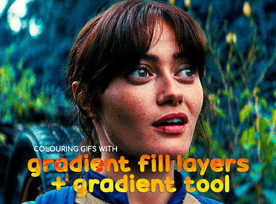
GRADIENT FILL
I'll be using this gif which I've already sharpened and coloured:

First of all let's make the background pop so I'm going to add a gradient fill (Layer -> New fill layer -> Gradient) with these settings (I'm using this colour #0099ff):

Now it's the time to play with the blending settings! Depending on your scene some will look better than others but I usually switch between Soft Light, Overlay, Color or Hue. 90% of the time I use soft light but this scene looked much better using overlay:

As you can see the background looks more blue and vibrant but it's not too much you know.
GRADIENT TOOL
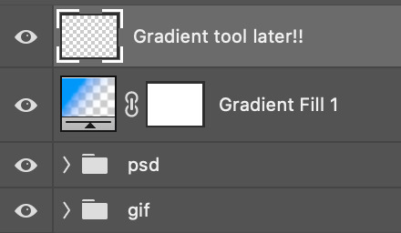
Now it's time to use the gradient tool to give this gif a hazy look. I haven't seen many gifmakers talk about this tool but it's soooo useful and it takes gradients to a whole new level.
Before using this tool we'll need to add a new layer above the gradient fill, like this:
(HELP I just realised I typed “later” instead of “layer” 🤡 but let’s ignore that)
You can choose the gradient tool by pressing 'G' and then clicking here:
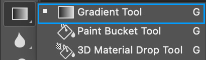
Make sure your gradient goes from any colour to a transparent background.

Okay so next to this gradient settings we have five different styles and each one will create a different shape. Depending on the scene I'll use the first, second or fourth one. Here are how they look:
1. Linear gradient
2. Radial gradient + Reverse (if you don't click this you'll end up with a blue circle above your gif)
3. Reflected gradient + Reverse
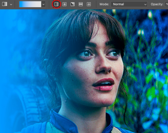
This time I'm going to use the radial gradient so to draw it start by clicking on the centre of the gif and drag the line (the farther you drag it the less intense the gradient looks):
And this is the gradient:
And here comes the fun part again, playing with the blending setting and the opacity! Before doing anything I duplicate my gradient layer because I always use more than one so this is how your layers should look like:

Let's go to the first gradient tool layer and again try different blending modes: soft light, overlay, hue... Most of the time I'll use 'Soft layer' and I'll leave the opacity at 100%.
For the second layer choose 'Screen' and don't worry if your gif looks too bright because we're going to fix this by decreasing the opacity. Anything between 20-60% should look good but it depends if you want a more vibrant or more natural effect. I ended up using 40% and this is the result:

And we're done!!! As you can see the result looks much different from our first gif and it only takes a couple of layers!
Honestly the best advice I can give you is to play with the opacity and blending mode of the different gradient layers because depending on the scene some will look better than others!
#ask#Anonymous#ps tag#tutorial#usernolan#userrin#useraljoscha#uservalentina#userbunneis#userlockescoles#usernik
562 notes
·
View notes