#minimalist notion designs
Explore tagged Tumblr posts
Visit Tumblr Blog
Explore Tumblr blogs with no restrictions, modern design and the best experience.
Last Seen Tumblr Blogs


Fun Fact
Tumblr’s website traffic is steadily declining.
Text
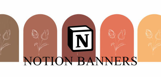
Hi everyone! I have a new Notion pack to share with you all! They are minimalist floral banners for decorating your Notion pages :) I doodled the design myself because I wanted to try & create something from scratch to add to my Notion, & I'm quite pleased with how they turned out.
They come in a few neutral & muted colours, & I also included rectangular versions in the pack for those who'd prefer them over the arched layouts.
Hope you guys like the banners, & I'd love to see how you use them!!
Wilted Banners Pack.
65 notes
·
View notes
Text
Whatever you do on Doctor Who, whatever technology or futurism you're putting on on screen, it's always going to look like it was made now. And it should, you know. Science fiction in the sixties looks like it was made in the sixties - seventies, eighties. The worst and most stupid thing you can do is got into a meeting and say "Let's make it timeless!".
For a start, why? I think these programs are a record of the era in which they were made. And they should be. You should show that off. Plus, you can't fight it. That will creep it in aywhere. There's not such thing as a timeless design, ever.
I think we have to celebrate that.
RTD - DW Confidential - s03e07
#RTD#doctor who#dw#60threwatch#dw meta#speaking of architecture this has always been a bit debate in the area#im not sure i agree with the notion completely#i do think certain designs get really close to 'timelessness' ... while also being a reflection of their times...#but anyway i wanted to post this quote separately cause it reminded me of ppl calling the new tardis 'minimalist' and 'clinical'#i do think this is a classic moment of rtd being hyperbolic to Make A Point lol
31 notes
·
View notes
Text
HMMARBLEDESİGN - DRAGON+ (4)

Transforming your bathroom into a luxurious retreat doesn't have to be daunting, especially with the timeless elegance of black marble. The deep, rich tones of black marble not only exude sophistication but also create a striking contrast that can elevate any space. In this blog post, we will explore the allure of a black marble bathroom, highlighting how this dramatic feature can infuse modern elegance into your home.
Black Marble Bathroom
The black marble bathroom is a stunning choice for those looking to create a sophisticated and luxurious space. This bold design element can transform an ordinary bathroom into an exquisite sanctuary. The rich tones and unique veining of black marble bring an air of elegance and style that is both timeless and contemporary.
When incorporating black marble into your bathroom, consider options such as black marble countertops, vanity tops, and even accent walls. The contrast against lighter colors can create a striking and dramatic effect, making your space feel more expansive and well-defined.
One of the key benefits of a black marble bathroom is its versatility. It pairs beautifully with a variety of materials, such as brushed gold or chrome fixtures, and complements different color palettes, from soft whites to vibrant jewel tones. This adaptability allows homeowners to personalize their space while maintaining a cohesive look.
There are various finishes available for black marble, each offering a unique aesthetic. A polished finish provides a sleek, glossy surface that reflects light beautifully, while a honed finish delivers a more understated, matte look that can soften the overall appearance of the bathroom.
Lighting plays a crucial role in showcasing the beauty of a black marble bathroom. Consider installing ambient lighting to highlight the natural veins and texture of the black marble. Additionally, task lighting around mirrors can enhance visibility and add warmth to the space.
To add depth and interest, incorporate other design elements that create contrast and texture. For example, pairing black marble with wooden accents can create a warm and inviting atmosphere. Textiles such as plush towels and bath mats in lighter shades can also soften the overall look.
With its rich aesthetic and timeless appeal, a black marble bathroom is more than just a design choice; it’s an opportunity to create a luxurious retreat in your home. Whether you’re planning a complete renovation or simply looking to refresh your existing space, integrating black marble can elevate your bathroom to new heights.
Modern Marble Bathroom
When it comes to designing a modern marble bathroom, the emphasis is on clean lines, minimalistic features, and the striking appeal of marble. This luxurious stone, often associated with opulence, can elevate your bathroom space into a sanctuary of relaxation.
One of the defining characteristics of a modern marble bathroom is the color palette. While many opt for classic whites and creams, darker shades like black or gray marble create a bold statement. Black marble, with its rich depth and unique veining, can transform traditional notions of bathroom design, making it a chic and contemporary choice.
A key feature in a modern marble bathroom is the seamless integration of marble into various elements, from countertops to flooring. Large format tiles have become increasingly popular, creating a sense of space and continuity. Pairing these tiles with elegant fixtures and understated accessories enhances the overall aesthetic without detracting from the beauty of the marble.
Vanities in a modern marble bathroom often showcase the stone’s natural patterns, turning functional furniture into a visual centerpiece. Choosing sleek hardware and soft-close drawers can maintain a streamlined look, while integrated lighting adds warmth and sophistication.
For those seeking to add a touch of personality, consider incorporating wood elements or contrasting materials like glass. These choices balance the heaviness of marble with lightness, making the bathroom feel both inviting and serene.
Incorporating plants or greenery can breathe life into the cool, polished surfaces of a modern marble bathroom. Strategic placement of greenery not only adds color but also promotes a calming environment.
Lastly, don’t forget about the practicality of maintaining your modern marble bathroom. While marble is undeniably glamorous, it requires regular sealing and care to keep it in pristine condition. Choosing the right products for cleaning and maintenance will ensure your marble retains its beauty for years to come.
Bathroom Marble Design
When it comes to creating a luxurious and sophisticated space, bathroom marble design stands out as an exceptional choice. Marble is known for its timeless beauty, variety, and ability to elevate the overall aesthetic of any bathroom. In this section, we will explore some key elements and ideas related to bathroom marble design.
Choosing the Right Marble
One of the first steps in bathroom marble design is selecting the right type of marble. From classic white Carrara to striking black marquina, the options are abundant. Each type of marble comes with its unique veining and color variations, allowing you to match the marble to your personal style. Consider how different marbles will interact with your bathroom's lighting and the overall color scheme to create the desired atmosphere.
Incorporating Patterns
Another exciting aspect of bathroom marble design is the ability to incorporate patterns. Marble can be cut and laid out in various patterns like herringbone, checkerboard, or even geometric shapes. These designs can add depth and interest to your bathroom, making it feel more dynamic and stylish.
Combining with Other Materials
To enhance your bathroom marble design, consider combining marble with other materials. Pairing marble with warm woods, sleek metals, or even vibrant tiles can create an intriguing contrast and elevate the space further. This combination can help to soften the look of marble, making it feel more inviting and less formal.
Accent Features
Incorporating marble accent features like vanity tops, shower surrounds, or even marble sinks can transform a standard bathroom into a luxurious retreat. These elements become focal points in the design, drawing attention and admiration. For a truly unique touch, consider custom marble pieces that reflect your style.
Maintenance and Care
While the beauty of marble is undeniable, it's important to consider its maintenance. Proper care, including regular sealing and careful cleaning, will keep your bathroom marble design looking pristine. Avoid harsh chemicals that can damage the stone, and always use coasters or mats to prevent stains and scratches.
In summary, bathroom marble design offers a wealth of possibilities to create a stunning and elegant space. With the right choices and careful planning, you can achieve a bathroom that embodies luxury and style.
543 notes
·
View notes
Text

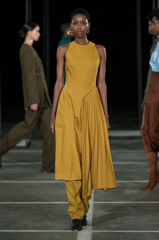

Ensemble
Maxwell Boko and Mmuso Potsane for Mmusomaxwell
Spring/Summer 2021
Mmusomaxwell is a ready-to-wear womenswear fashion brand based in Johannesburg, South Africa, founded in 2016 by Maxwell Boko and Mmuso Potsane. Boko and Potsane met as contestants on the TV show The Intern, run by designer David Tlale, where they competed to present at South Africa Fashion week. Mmusomaxwell are known for their tailored, minimalist designs, aimed at cosmopolitan working women.
This ensemble is from the Imbokodo collection, released for Spring/Summer 2021. Through this collection Boko and Potsane wanted to critique notions of a woman’s place in society, especially in traditional African cultures. The collection featured 27 pieces in a mixture of bold shapes and colours (mainly yellow, blue, red and black). Many of the designs drew on elements of a man’s suit, with the designers exploring power dressing, and the power suit, as a tool for female empowerment.
Victoria & Albert (Accession number: T.118:1,2-2021)
#ensemble#fashion history#fashion#modern fashion#contemporary fashion#mmusomaxwell#runway#spring#summer#2021#south africa#21st century#maxwell boko#mmuso potsane#victoria and albert#v and a#LOVE when you can see the garment on the form AND on a body#popular
696 notes
·
View notes
Text

The Symmetry Collection is a minimalist tabletop collection by the Los Angeles-based multidisciplinary design practice, Studio/ JIALUN XIONG. As the studio’s debut tableware collection, Symmetry is an exploration of exacting form and challenges the widely popularized notion that imperfection is the root of beauty.
17 notes
·
View notes
Text
˖⁺‧₊˚✦ ways to make your laptop aesthetic feat. some extensions, websites & apps for students
i created this cause i found some time to finally upgrade and properly personalise my laptop, it took me almost an entire day watching youtube videos, researching for these and setting them up. so... i'm basically posting this for myself lol, but i also feel like sharing cause these are actually really good hehe
i'm using a windows laptop but i think most of these should work on mac too. most of these are free but there are maybe like less than five that require to be paid.
those that are marked with an asterisk (*) are the ones that i'm currently using while others are recommended or alternatives!
here is what my home screen looks like now:
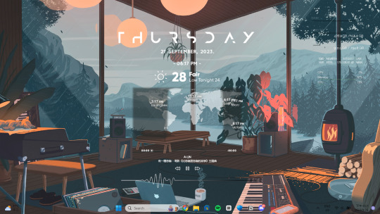
i. screen saver
fliqlo (ios & win) * flipit (win, an inspired & alt ver of ^) flix clock (mac & web, paid ver comes with colours other than black) aura gradient clock (mac & web) retro anime desk clock (mac) flocus (web) * studywithme (web) note: remember to right-click the file and select "install", then ensure that the wait time (e.g: 5 mins) is less than your "turn off your screen" and "put my device to sleep after" (e.g: both 15 mins) in power settings
ii. tab themes
kluk: a clock tab theme * angry study helper: a tab theme that gets angy at u whenever u open a new tab gratitutab: a minimalistic tab theme that works as a to-do list prioritab: a tab theme that shows priorities that u had set for the day, week, and month
iii. extensions
tldr this: summarizes long docs, websites, articles, etc. with just a click * paperpanda: download research papers by clicking on it, it searches on domains like google scholar, semanticscholar, aodoi, and more * coffeelings: mainly a mood tracker that also saves mini journal entries colorzilla: an eyedropper colour picker * whatfont: click on it and hover on any text to show what font it is * mybib: an apa, mla, harvard, and more styles citation generator * read aloud: a tts reader that supports more than 40+ languages * notion web clipper: creates a website into a bookmark into notion * noisli: lets u listen to relaxing playlist while u study/work
iv. websites
lofi.cafe i miss the office i miss my cafe i miss my bar i miss my library a soft murmur patatap tomato timers animedoro lifeat coolors blush designs untools fontjoy zenpen decision maker museum of endangered sounds future me
v. apps
virtual cottage chill corner notion *
vi. rainmeter skins
mond * lano visualizer amatical * small clean weather animated * ageo sonder * cloudy harmattan note: if you're new to rainmeter, it can be a bit overwhelming, u may check out this short and simple tutorial on it, make sure to read the instructions if you're using complicated skins like weather (may require u to edit in txt), i also highly rec watching techrifle's videos
vii. misc.
wallpaper engine * (highly rec getting from chillhop) my live wallpaper (free alt of ^) translucenttb * roundedtb note: u can disable your shortcut icons to be invisible by right-clicking on your home screen, go to "view", and untick "show desktop icons", this is optional and i would always enable it whenever i'm working and gaming for easier access, i also set the icons to small
68 notes
·
View notes
Text
@yetrop has created this SPECTACULAR illustration for Chapter 3
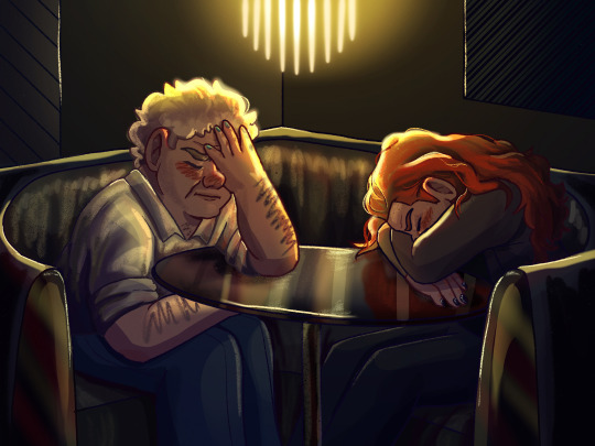
The LIGHTING? The POSES? I can FEEL the embarrassment! This is so gorgeous.
WE ARE STILL LOOKING FOR ARTISTS TO COLLABORATE!!
For more info, you can click here to see the original call out post.

The scene behind @yetrop's delicious artwork is under the cut:
He made it to the restaurant, a classy, hand-painted sign informing him that it was called ‘the Sable Nouveau’. Subscript under the building’s front-facing decal added that the place was ‘an innovative accomplishment of the notorious Dr Raven Sable’ whatever that meant. It was a looming glass structure, a postmodern parapet framing the building in black. The architecture combined brutalist form with glossy contemporary stylings. Beautiful but cold and uncomfortable. Aziraphale didn’t like it at all. It would be the kind of thing he’d point out to Crowley, tutting and shaking his head. Crowley would only grin and excuse the design as minimalist. But secretly, he’d agree; Crowley liked eco-brutalism, not brutalism-brutalism.
That was enough thinking about Crowley! Aziraphale was here to get over that whole predicament. It wouldn’t do to dwell on the one thought that he was trying to escape from.
“Table for Muscas?” he asked the critical woman at the front desk. She appraised him briefly before nodding and leading him to a corner booth. His date was already there, it seemed. Aziraphale took a moment to inspect him from behind; he was slim, in a black suit-type-thing, a waterfall of red hair—oh. Oh no. Oh, no no no. This was the worst outcome; so bad he hadn’t even dignified it as one of the options. Crowley was here. Crowley was his blind date. Crowley was B’s friend. B’s friend who—he realised quite suddenly—was trying to get over someone. Who?! When? Why? And why had he never mentioned anything to Aziraphale? And—even more importantly—who? No, really, who?!
“Uh—” came the dissonant sound from Aziraphale’s throat. Having alerted Crowley to his presence, he sat down opposite him. Bashful, but stiff upper lip and all that.
“Ngk—Beelzebub!” Crowley groaned—and that’s what the B stood for!—putting his head in his hands. Aziraphale pitied him; it wasn’t a fun situation, accidentally being set up on a blind date with your co-author. He would know. He was currently having the exact same experience.
“I’m guessing you’re B’s friend, then,” Aziraphale grimaced sympathetically. This didn’t have to be awkward; they were pals. They could endure a platonic dinner together without making anything weird. It wasn’t that far off from what they usually did.
“And you’re Gabriel’s brother.” The words were disappointed.
Crowley’s eyes had a panicked sheen; he looked almost trapped. In the corner booth of a classy restaurant, he rather made the image of a frightened dog pressing themselves to the back of the cage at the pound. Knowing what he knew, Aziraphale was commiserative. Crowley had come here to get over someone—‘Who, though?’ his mind roared, he ignored it—and instead of a suave first-date ready to beguile him beyond the thought of whoever-it-was, there was only Aziraphale, his frumpish co-author, to greet him. Aziraphale would be disappointed too.
“Well, this is suitably awkward,” he sighed regretfully.
“It was my fault for trusting Beez after a fight. I forget how spiteful they are, sometimes. I’m sorry, Angel. They were being mean. Beez is still under the impression I have the same romantic tastes that I did at seventeen. You—uh—don’t really fall into that category,” Crowley explained apologetically, looking rather defeated. Aziraphale almost flinched at the admission. It was a stinging blow, to have the very notion that he might have—at some point—been Crowley’s type so utterly decimated.
“I wouldn’t assume so, no,” he winced with a self-deprecating wilt. Crowley’s eyes widened as he played back the implications of what he had said, hissing at himself despairingly.
“Not to say that you aren’t—I mean, now it’s… Well, not to say that you are either—” He tied himself into verbal knots, flustered and consoling in equal measure.
“You don’t have to spare my feelings, dear. We’d look an odd couple, if we were together. You in all your leather and me in all my hand-knit sweaters. Odd socks, the two of us.” Aziraphale regarded him with a kind smile, picking up the menu and bemoaning its contents. Never trust Gabriel to pick out a sensible—or even edible—restaurant.
“Odd socks,” repeated Crowley, hoarse.
Aziraphale hummed noncommittally, continuing to search the menu for something palatable; anything that wasn’t a new-age reduction, or an experimental reimagining, or whatever other sacrilegious culinary blasphemy was going on behind the kitchen walls of the Sable Nouveau. Even a humble grilled cheese would have sufficed. But no, the arrogance of fine dining didn’t allow space for something so simple.
“What are you having?” Aziraphale asked, hoping that Crowley had found some hidden gem.
“Dunno, it’s all rather—” Crowley gestured vaguely. Aziraphale agreed.
“It is, isn’t it? Would it be too terribly rude if we—” he gestured vaguely in return, unwilling to voice the sentiment without the full support of his dining partner. Crowley raised his eyebrows, his first grin of the night like the sun at dawn.
“What? Ignored the fancy reservation and instead went to the tapas place across the road from my apartment?” He was snickering, leaning in conspiratorially. Aziraphale’s answering nose scrunch (Aziraphale could communicate a lot with a nose scrunch; for instance, right now his nose scrunch was saying ‘it sounds bad when you put it like that but yes, that’s exactly what I want’) made him snort gracelessly.
“Is it rude?” he pondered to himself, “Undoubtedly.”
“Would it be more enjoyable than eating—” he scoured the menu for something suitably ridiculous, “—‘de jaeger with fermented durian foam’ in a building that looks like it was designed as a prison set for a Dr Who villain?” Pausing just long enough to let the description sink in, Crowley pretended to consider it.
“I think it would be, yeah,” he finished, standing up from his seat and inviting Aziraphale to do the same. Gabriel would understand. They’d never agreed on culinary decisions as kids, either.
Together, they exited the Sable Nouveau, much to the disgruntlement of their server; a sententious little man with a pencil-thin moustache and the permanent expression of someone who had just whiffed a jar of rotten eggs. (Considering the menu, it wasn't out of the question.) He had been trying to find a polite interlude—staff at the Sable Nouveau knew better than to interrupt an awkward moment—in which he could ask for their orders and or offer them a bottle of wine. Six paces from their table—as was his training; close enough to attend, far enough to slink into the background—he watched them scutter away. If he was disappointed, he didn’t show it. Or maybe it just blended seamlessly into his general air of disapproval, unnoticed like salt-water in the ocean.
JOIN US ON DISCORD
AO3
#good omens#ineffable husbands#crowley#aziraphale#art#fanfiction#ao3#fanfic#drawing#fanart#ineffable spouses#ineffable husbands fic rec#ineffable idiots#ineffable partners#gomens#aziracrow#good omens fanart#anthony j crowley#aj crowley#quantum entangled#azicrow#podfic#archive of our own#good omens brainrot#good omens memes#good omens shitpost
34 notes
·
View notes
Text
IWTV / Lady Charles
Recently discovered Lady Charles and because I'm gay and can never be normal about anything my brain has connected a few of their songs to iwtv characters... give them a listen they're fantastic!
Lestat / Manic Pixie Dream Boy
Lady Charles wrote in their write up on the song about working with the romanticisation of mental illness and the manic pixie trope to “avoid succumbing to it” and I feel that defiance relates to Lestat very closely. As he combats his childhood and vampiric traumas he always holds his eccentricities up as his virtues, powering through the dark times as they come. He is shamelessly himself and I love him for it.
“To all those sideways glances Quit harshing me! 'cause I'm a manic pixie dream boy Trying to live authentically”
Armand / Not Your Dolly/A Year Spent Inside
The song has an orchestral feel (lending to influence from Owen Pallett) that I relate to Armand as a character. The obvious connection to me is playful youthful beat with the vaguely ominous but defiant lyrics. Armand's self-awareness of how he is perceived and treated by those around him feels present and honestly I can't decide what relationship I relate this song to specifically. Any of the stanzas could apply to his many companions. Also the sax solo is a nice touch, very 80s which always reminds me of Devil's Minion.
“I look cute, But I am not your dolly You play pretend, Well, I'm not into folly”
Louis / Elation
The whole song itself is very Louis to me but before I get into it I just wanna note that the story of the songs production itself fits into this! It was originally 'cold' and 'minimalist' before Lady Charles started finding pride in their identity and art and being their authentic self, which led to the final song being 'lush and maximalist.' It reminds me very much of the colour and design journey of Louis and the penthouse from the start of season 1 to the finale of season 2.
I read the song as Louis's journey through his relationship with Armand. Him mourning Claudia and revealing his traumas to Armand, and finding temporary solace and elation in their dynamic, his later drugblood abuse, and the interview. He grapples with not having a full recollection of his history, asking how he was supposed to know Armand was miserable when he erased portions of his memory.
The last verse being him realising his true authentic self. He doesn't need that temporary elation once he's done the work on himself and removed certain negative factors from his life.
Sorry this one was a bit long its my favourite Lady Charles song lolol
“I have spent these twenty five years feeling like a burden I don't want to spend another carrying someone else's sins"
Claudia / Child of the Night
I hear this song and I instantly connect it to Claudia's search for belonging and companionship. Specifically in season 2 when there is no going home, she's even insulted by the notion of it. She can't find companionship with Louis or the coven and is lost until she connects with Madeleine. The first verse feels like the two of them leaving Paris after Madeleine is turned, free the wander because they've found each other.
"I'm a child of the night I wander without a plan Just longing for something to long for"
#iwtv#interview with the vampire#tvc#the vampire chronicles#lady charles#lestat de lioncourt#armand#louis de pointe du lac#claudia#iwtv claudia#claudia de lioncourt de pointe du lac#claudia eparvier#madeleine eparvier#claudeleine#spotify#Spotify
12 notes
·
View notes
Text
it’s so weird to me that the mainstream fanart execution follows this formula: lining + coloring + rendering. of course, some people create quite skillful works of this kind but to me this medium always seemed rather boring and, most importantly, tedious for the artist (in my own drawing practice).
i gave some thought to it and now i’m assuming that this style, apparently, comes from perceiving popular animation and comic publications. AND LET ME TELL YOU this is exactly what makes the whole tendency weird: in both of these fields lining + coloring form was/is explicitly instrumental. it is used for pragmatic reasons like 1) cheap production when it comes to comics — the more minimalistic the method, the less expensive it is to print the comic and the less time do the artists spend to prepare new volumes; 2) easier and faster production in animation, as it is an atrocious task — drawing every animated panel with unique details or rendering the finished draft. it is especially superfluous for a mass-media 2D commercial movie or series that doesn’t aim for artistic integrity or innovation.
both of these fields are justified in sticking to lining and coloring with limited rendition because it helps the comic/movie publication happen faster and with minimal costs. it is also replicable, accommodated for teamwork when a group of artists is drawing the same thing with an expectation to have the product look like a solid unit without stylistic deviations.
the question is WHY are fans and other web artists using this pragmatic approach in their free individual artworks (and others are just repeating after them, setting a trend)? actually, now when we imagine fanart as a pursuit, we envision this kind of art style i’m talking about here.
we are able to go crazy with creative, unique ways to make a drawing. instead, the notion of style in online spaces seems to be limited to the way one draws eyes and hair just because everything else is identical by design. wake up, let’s imitate linocut in digital art. or make real linocuts but with anime faces. i don’t get it.
3 notes
·
View notes
Text
Minimal.No🖤
Hello Dreamers! 🤓
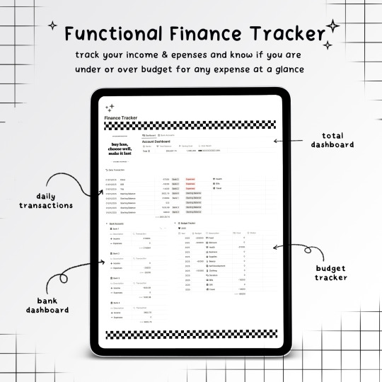
The most popular item among the digital products from Dream By May studio is the Digital Bullet Journal Notion Template || Minimal.No. This minimalist design is a Notion template that will help Dreamers organize and stay productive throughout the year. It's perfect for those who want to try using Notion as a digital bullet journal but don’t know where to start. I've created this template to be ready to use and easy to navigate.
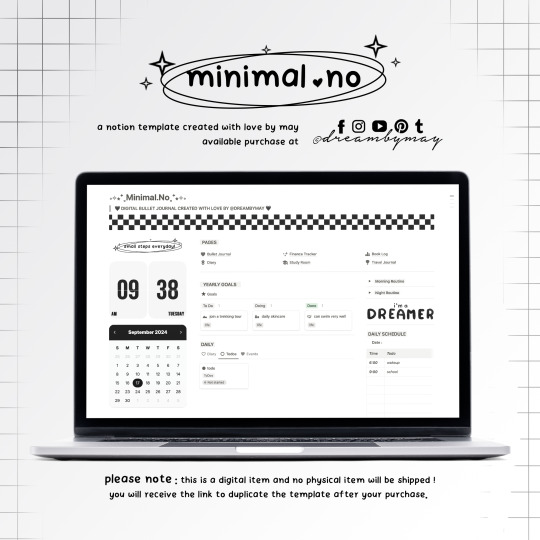
This template includes several spreads you may need for physical bullet journaling or planning. The pages available in this template are:
Ready-to-check-in dashboard
Daily time scheduling
Daily journaling and habit tracking
Routines
Weekly planning
Monthly planning
Monthly habit tracking
Yearly planning
Goals tracking
Reading log
Travel log
Finance tracking
Study room

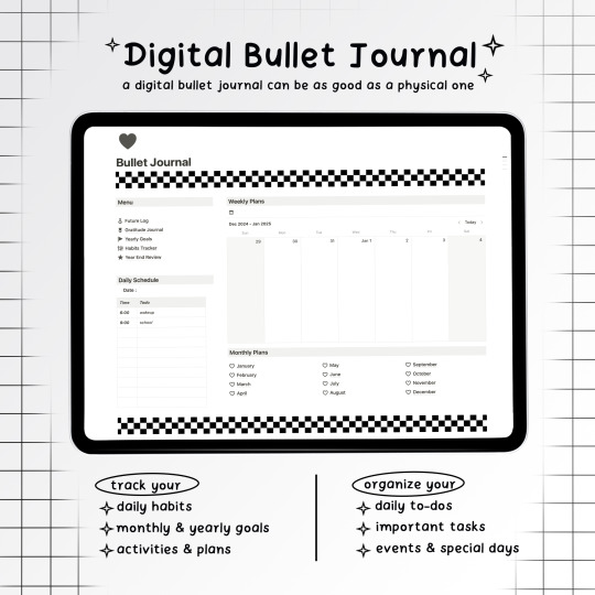
These are just some of the useful pages included. I’ll also be uploading a video on the DreamByMay YouTube channel, so feel free to check that out for more details.

If you'd like to support, the Minimal.No Template is available for 20,000 Ks. 🧡
Notion is a super useful productivity app, whether for personal use, office, or school work. You can learn more about Notion in the posts below that I’ve shared before, or check out YouTube for guides and tips on using Notion. It’s an extremely helpful app, and I highly recommend it!
What is Notion
Digital Bullet Journaling
Since this item is a digital product, once you confirm your order, the link will be sent via chat or email. You can easily duplicate it to your Notion workspace and start using it right away.
Thank you so much Dreamers🙏🏻
xoxo 😘
• M A Y •
#journaling#notiontemplate#notion#digital bullet journaling#digital journal#notion setup#notion aesthetic#notion inspo#notion dashboard#productivity#studying#daily routine#student#notion template#notionbymay
3 notes
·
View notes
Text
if you've talked to me at all since the first big episode we had in carihien then you know how much i disliked the decision to go for a rococo aesthetic given what we know about cairhien in the books lol
by invoking the french revolution you bring in the audiences preconceived notions about what that time period was like. in popular historical imagination its a situation where the rich hoarded all the wealth until the poor rose up and killed them, which is simple but true in broad strokes. while we definitely see a wealth divide similar to this in the books (particularly with the forgate), it also isn't really the best analogy for the state cairhien is in in the mainline of the series in the books.
due to the aiel war and their custom for taking one fifth of the property from their enemies when they defeat them, the land has low-key been strip mined. by the time rand gets there the towers are still covered in scaffolding, we see that the aiel are still passing around treasures from cairhien when we spend more time in the wastes in later books, famine is imminent and the line of succession is tenuous at best. the caste system is also a bit more complex (convoluted?) than the french rev analogy as the average viewer might interpret it implies. the upper class are essentially killing and torturing each other to have power for like a week over dwindling resources that they will be assassinated for starting the cycle of power struggle all over again. if cairhien is anything french rev it's like. IMMEDIATELY post revolution not pre just in terms of a chaotic, painful rearrangement of society
cairhien in the books a nation that used to have way more sway politically on the continent having to come to terms with the fact that it's future means potentially abandoning sovereignty or becoming increasingly dependent on the nations around it for aid. and i think the architectural aesthetic described in the books (granted, as recreated in my mind palace) is way more interesting!! we could have had organic brutalist wood clad skyscrapers!!!
i think the idea of dark wood and geometric design with sharp angles is also more interesting thematically in communicating how the people of cairhien operate as a society. this kind of minimalist presentation belying the fact that they literally might not own as many ostentatious family heirlooms as they used to, but also giving the false impression that the home owner is being transparent and has nothing to hide. the ultimate "im an open book" power move while they are all hiding way more secrets than than their walls might imply lol
by not talking about laman and the lingering impact of the aiel war, season 2 just ended up feeling like the writers had sanded the more dynamic political dimensions and ideas surrounding cairhien in the books for an easy visual catch all
#will obviously be posting more about the Big Laman Fumble of it all later bc i cant help myself but like. insane decision making#i think another thing is they worried cairhien might read too scifi if they went more brutalist or anything close to that design aesthetic#but like#thats literally what makes it interesting lol#cannot believe the only implication of the damage of the aiel war we got was rand being microagressioned by some random old man#and not just some better designed visual world building at the very least#cairhien#wheel of time#wot books spoilers#wot season 2 spoilers
7 notes
·
View notes
Text
Sunwatchers - Music Is Victory Over Time
In the decade or so that hard-working New York quartet Sunwatchers have operated, the group has steadily & subtly refined their sound - a brain-blasting mixture of jazz, psychedelia, krautrock, punk, noise, & Saharan blues - into something that is avant-leaning enough to appeal to the discerning jazz & experimental music fan & weird & wooly enough to get the true heads’ toes tapping. “Music Is Victory Over Time” is the band’s 5th album, and fourth for Chicago-based Trouble In Mind Records, seeing the long-running lineup of Peter Kerlin (bass guitar), Jim McHugh (guitars), Jason Robira (drums), and Jeff Tobias (alto saxophone and keyboards) in prime form. The album’s beguiling title stems from a note scrawled in a book about electronic music donated to PITGOOSE Prisoner Books, the grassroots prison literature program run out of The P.I.T. (aka Property Is Theft - McHugh’s Anarchist community space, venue, and info-shop located in Los Sures, Williamsburg). Scrawled as marginalia modifying a paragraph about durational minimalist composition, the concept illuminates music’s material and spiritual power to subdue the sensation of the passage of time, both as an experiential phenomenon and as a creative, communal, and socio-political force. McHugh says: “The notion resonated with our individual and communal experiences of loss, trauma, stasis, and frustration since 2020, our three-year semi-silence as a band relative to our previous characteristic prolificacy, and our progress, projects, and evolution since.” Group Vocals by Sunwatchers and Brittain Ashford Art/Design by Josh MacPhee Head/Tree logo borrowed from the 1970s East German Green Party SUNWATCHERS STAND IN SOLIDARITY WITH THE DISPOSSESSED, IMPOVERISHED, AND EMBATTLED PEOPLE OF THE WORLD.
6 notes
·
View notes
Text
BMW GINA: A Revolutionary Design Concept
BMW GINA

Table of Contents
Introduction: Unveiling the BMW GINA
The Groundbreaking Design of the BMW GINA
GINA's Adaptive Fabric Exterior: A Game Changer
Innovative Features of the BMW GINA
Performance and Technology: Driving the Future
Frequently Asked Questions (FAQs)
Conclusion
"BMW GINA 2023" is an upcoming model by BMW, featuring a groundbreaking design concept that incorporates a flexible fabric body and innovative technologies.
Introduction: Unveiling the BMW GINA
When it comes to pushing the boundaries of automotive design, BMW has always been at the forefront. One notable example of their visionary approach is the BMW GINA, a concept car that took the industry by storm with its revolutionary design and forward-thinking features. In this article, we delve into the captivating world of the BMW GINA, exploring its groundbreaking design, innovative features, and its impact on the future of automotive engineering.
The Groundbreaking Design of the BMW GINA
The BMW GINA stunned the world with its unconventional and futuristic design philosophy. GINA, which stands for "Geometry and Functions in 'N' Adaptations," was unveiled in 2008 and challenged the traditional notion of a car's body structure. Instead of relying on rigid metal panels, the GINA featured a flexible fabric skin that could adapt and change its shape according to different driving conditions and user preferences.

GINA's Adaptive Fabric Exterior: A Game Changer
At the heart of the BMW GINA's design lies its adaptive fabric exterior, which is made from a specialized high-tech fabric called Spandex. This innovative material, combined with a network of hidden metal wires and components, allows the car's exterior to morph and transform, giving it an unparalleled level of versatility. The fabric skin stretches and contracts, creating a seamless surface that smoothly adapts to various driving situations, enhancing aerodynamics and improving overall performance.
Innovative Features of the BMW GINA
The BMW GINA showcases a range of cutting-edge features that set it apart from conventional vehicles. One of the standout elements is the movable subframe, which can adjust the shape and position of the car's headlights and grille. This dynamic feature not only enhances aerodynamic efficiency but also allows for a personalized and expressive front-end design.
Additionally, the GINA's doors are a marvel of engineering. Instead of traditional hinged doors, the GINA features articulated metal and fabric wings that elegantly open and close, providing both functionality and aesthetic appeal. This unique design element not only facilitates ease of entry and exit but also adds a touch of theatricality to the overall driving experience.

Performance and Technology: Driving the Future
While the BMW GINA's design is undeniably its standout feature, it is complemented by advanced performance and technology. The concept car is equipped with a powerful engine, delivering exhilarating acceleration and impressive speed. Furthermore, the interior of the GINA boasts a minimalist and driver-centric design, incorporating state-of-the-art technology and intuitive controls that enhance the overall driving experience.
Frequently Asked Questions (FAQs)
Q1: How does the adaptive fabric exterior of the BMW GINA work?
The adaptive fabric exterior of the BMW GINA is made from a flexible fabric material called Spandex, combined with a network of metal wires and components. This allows the car's exterior to change shape and adapt to different driving conditions and user preferences.
Q2: Can the BMW GINA's fabric skin withstand harsh weather conditions?
Yes, the fabric skin of the BMW GINA is designed to be weather-resistant and durable. It can withstand a variety of weather conditions while maintaining its flexibility and adaptive properties.
Q3: Is the BMW GINA a production car?
No, the BMW GINA is a concept car that showcases innovative design and technology. It was never intended for mass production but rather served as a platform to explore new ideas and push the boundaries of automotive design.
Q4: Are there any plans to incorporate the GINA's design features in future BMW models?
While the exact design features of the BMW GINA may not be directly integrated into future BMW models, the concept car has undoubtedly influenced the brand's design philosophy. The GINA's spirit of innovation and pushing boundaries can be seen in BMW's ongoing pursuit of revolutionary design and cutting-edge technology.
Q5: How does the BMW GINA contribute to the future of automotive engineering?
The BMW GINA represents a leap forward in automotive engineering by challenging traditional design concepts. Its adaptive fabric exterior and innovative features serve as a catalyst for exploring new possibilities and reimagining the future of transportation.
Conclusion
The BMW GINA stands as a testament to BMW's unwavering commitment to pushing the boundaries of automotive design and engineering. Its groundbreaking concept, featuring an adaptive fabric exterior and innovative features, has captivated automotive enthusiasts and industry experts alike. While the GINA may not have directly influenced mass-produced vehicles, its impact on the future of automotive engineering is undeniable. As BMW continues to embrace innovation and reimagine the possibilities of mobility, the spirit of the BMW GINA will undoubtedly live on in the brand's future endeavors.
#car 2023#2023 bmw#bmw i7 2023#challenge 2023#most expensive car 2023#bmw z4 concept touring 2023#bmw concept touring coupe 2023#bmw concept touring coupe 2023 innenraum#concept cars 2021#2013 srt viper#bmw gina light visionary model revealed 2024#concept car#concept cars#bmw concept car#bmw#new bmw#bmw concept#bmw gina#gina#gina concept#avtr#mercedes avtr#coolest cars in the world#coolest concept cars#supercar blondie#sergi galiano
5 notes
·
View notes
Text
Behind Raf Simons’ “Riot Riot Riot”
Raf Simons is a recognisable name to anybody interested in the fashion space, and an undoubtedly polarising figure in the industry. A visionary Belgian fashion designer who has made a significant impact on the fashion industry, Simons is known for his minimalist designs and avant-garde approach to fashion. Since his debut in the mid 1990s, Simons has pushed boundaries and redefined what it means to be a designer. His unique aesthetic and outstanding ability to seamlessly blend high fashion with streetwear has earned him a dedicated, cult-like following and numerous accolades.
One of Raf Simons' most recognisable collections, “Riot Riot Riot”, was first displayed during Paris Fashion Week for Fall/Winter 2001. Simons drew inspiration from the vigour and rebelliousness of the punk movement for the collection, which was a reaction to the social upheaval and political turbulence of the moment. The collection's harsh, monochrome colour scheme, vivid geometric patterns, and oversized shapes pushed conventional notions of form and proportion. Models stormed down the runway in a flurry of movement and emotion during the runway presentation, which was a spectacle in and of itself. “Riot Riot Riot” is evidence of Simons' aptitude at using clothing as a vehicle for cultural expression and a window into his environment.
The symbolism in Raf Simons' “Riot Riot Riot” collection is multifaceted and deeply rooted in cultural and political contexts. The use of oversized silhouettes and graphic prints represents the rebellious spirit of the punk movement, while the stark black and white colour palette signifies a rejection of traditional fashion norms. The collection's title itself, "Riot Riot Riot," is a nod to the political unrest of the time and an acknowledgement of the power of youth-led movements. The collection's use of graphic prints and bold text further emphasised its message of rebellion, with slogans like "riot," "power," and "control" emblazoned across t-shirts and jackets. In this way, “Riot Riot Riot" served as a visual manifesto, using fashion as a means of communication and a platform for social commentary. By incorporating these powerful symbols into his collection, Raf Simons was able to tap into the zeitgeist of the time and make a statement about the world he was living in.
“Riot Riot Riot” was heavily influenced by Eastern Europe, with many of the collection's motifs and designs drawing inspiration from the region's rich history and cultural traditions. The collection featured a number of garments that were reminiscent of traditional Eastern European dress, along with long coats with oversized lapels, assorted military surplus, and a general oversized look. The looks also had many layers, which could be seen all throughout Eastern Europe, due to the extremely cold climate of the area. The collection's use of bold graphic prints and stark monochromatic colour scheme also reflected the visual language of the region, with its history of propaganda and political upheaval. Simons' use of these Eastern European influences served to emphasise the collection's message of rebellion and political resistance.
The use of patches played an important role in conveying the collection's message of rebellion and social unrest. Patches have long been associated with counterculture and the punk movement, making them the perfect symbol for a collection that sought to challenge traditional ideas of fashion and society. The patches used in "Riot Riot Riot" were intentionally placed in strategic locations, such as on the elbows of jackets and the knees of pants, to suggest that these garments had been worn in the heat of protest and physical confrontation.
Many of the patches featured on the garments were references to artists who put themselves in harm's way, or sacrificed their physical and mental health for the sake of their art. This is often viewed as a reference to Simons’ own life, as he had just taken a hiatus before designing and releasing this collection, largely due to the lack of success and sales from his previous work. His mental health was deteriorating, and the references on these patches were symbolising Simons’ beliefs about sacrifice for one’s art. Releasing an extremely abnormal and never seen before collection of garments in this state of mind could be viewed as a huge mistake on Simons’ part, and temporarily, this seemed to be true. The collection was not hugely popular, and many of the items were struggling to be sold. However as time passed, the public began to view the collection for what it was, an amazing creative feat, with deep rooting meaning and social commentary.
One patch that reoccurs throughout this collection is an infamous image of Richey Edwards, the lead guitarist of the Manic Street Preachers, a Welsh punk band most prominent in the early 90s. Upon receiving criticism about the authenticity of the band, with many journalists stating that they were not truly punk, Edwards would use a razor to carve ‘4REAL’ into his forearm. The patch depicts Edwards bleeding from the arm, with fresh razor wounds, and can be seen on many garments in the collection. The Manic Street Preachers are the topic of many other patches in this collection, and this is the most clear example that Simons’ uses, of an artist putting their art (in this case their authenticity) before their own health.
Another patch that continues this theme of harm for art, is an image of Monte Cazazza, an artist known for pioneering the genre named ‘industrial music’, and even played a large role in coining the term. Other than this however, Cazazza normally participated in performance art, much of which was on the extreme side. During his performances he would pull guns, dump cement onto people, perform stunts involving dead cats, and methods of self-harm were also a prominent part of his performances. The patch in question depicts Cazazza profusely bleeding on his chest, and seemingly ‘grasping’ at the camera.
The connection between these two patches is clear, and this can be seen throughout many others displayed in the collection. The symbolism and connection that Simons’ is drawing through his use of these patches is obvious, which is the relationship between an artist's physical and mental health, and their works. These references show artists who put their art before their health, harming themselves for the sake of the art (and occasionally the harming is the art itself). It could be argued that Simons’ uses these references to show his support, however I believe he is simply making a social commentary and comparing his own experiences as a creative, rather than offering up an opinion.
While it is difficult to know the exact state of Raf Simons' mental health during "Riot Riot Riot," it is clear that the collection was deeply personal and reflective of his own struggles with anxiety and depression. In interviews, Simons has spoken candidly about the toll that the fashion industry can take on one's mental health, and it is likely that the pressures of his work contributed to his emotional state during this time. The collection itself was a risky form of catharsis, allowing Simons to express his own feelings of anger, frustration, and rebellion through his designs. Today, Simons continues to be an advocate for mental health awareness in the fashion industry and beyond, using his platform to raise awareness and break down the stigma surrounding mental health issues.
Why did this collection originally go over terribly, and why was Simons’ largely misunderstood as a designer? As with anything new or unseen, many people can take their time in adjusting, as their preconceived notions of a ‘good’ item of clothing or collection of garments is set in stone. The juxtaposition of “Riot Riot Riot” against the fashion space at the time was clearer than ever, and his adventurous attempt to be himself did not go over well with the public. Even Raf Simons cult following had to adjust to this new look he debuted, as his previous works had been much more slim and tailored, with much less layering. Even though it would be expected that the reception to this collection would damage Simons’ mental health even further, he actually came out of it much better off. As previously mentioned, Simons’ was using this collection as a form of catharsis and rebellion, and the positive effects that this had on him were apparent. Simons’ would continue this oversized, avant-garde look throughout his career, all while incorporating some of his earlier, tailored look.
Raf Simons is a revolutionary fashion designer who has left an indelible mark on the industry. His "Riot Riot Riot" collection, which was heavily influenced by Eastern European culture and the punk movement, is a powerful example of how fashion can be used to convey a message of social commentary and rebellion. Through the use of oversized silhouettes, graphic prints, and strategically selected patches, Simons was able to tap into the zeitgeist of the time and make a statement about the world he was living in. Despite initially receiving a lukewarm reception, the collection has since been recognised as a creative masterpiece, with deep-rooted meaning and significance. Overall, Simons' work is a testament to the transformative power of fashion and its ability to challenge traditional ideas and push the boundaries of art.
2 notes
·
View notes
Text

45 is a minimalist space located in Singapore, designed by Spacebar Design. Set within an urban landscape, this walk-up apartment stands as a testament to simplicity and authenticity, diverging from the conventional notion of a meticulously curated home. Occupied by a young couple, the space is an ode to the inherent beauty of its construction materials. Central to the apartment’s design is a structural column, left bare, its paint and plaster removed
18 notes
·
View notes
Text
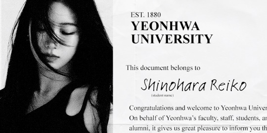
YH STUDENT ID: Shinohara Reiko
AKA The Disaster Prodigy – Has the talent but keeps self-destructing.
Birthdate & age: November 11, 2002 (22)
School year: 3rd year undergraduate
Program: Visual Communication Design, UI/UX (BA)
Minor: Computer Science
Clubs: International Student Organisation (3rd year rep), Coding, Photography
Housing: Nuri Hall
Please refer to our student handbook for any questions!
Introduction
> load: archive/talktalk_feature_0324.int
// excerpt from Campus Connect: The Future of Student-Led Tech // originally published March 2024, Dragon Daily
Interviewee: Shinohara Reiko Title: Co-creator & Lead Designer, 톡톡 (talktalk) Year: 2nd Year, Visual Communication Design
Q: Tell us about 톡톡. What sparked the idea? A: The idea was older than the code. I already knew how to build things. I was that kid who made her own blog templates and fixed the school printers. But when I first moved to Seoul for language school, I didn’t know where to start socially. So I printed out this Canva flyer and taped it to a bus stop, asking for a language buddy.
Only one person ever took a tab, but we’re still friends now. The rest kind of spiralled from there.
It became a pitch at a campus hackathon. I teamed up with some sunbaes who knew what they were doing — I think they just liked my wireframes. We built the first version in a weekend: timed voice calls, meetups, language tags. We won first place.
Q: You could’ve gone anywhere. Why Korea, and why then? A: Honestly? I won’t lie and say it wasn’t because of my scholarship. My grades were great, I was building little games at 12, and someone somewhere decided that this random 18 year old high school graduate was worth investing in. I don’t think I would’ve moved otherwise.
(Author’s Note: In 2021, Shinohara Reiko was hardly "just" a high school graduate. A self-taught developer from the age of ten, she won multiple prefectural coding olympiads and placed in an international student software challenge with a minimalist budgeting app built in Python.)
My parents are both illustrators. They run a small gallery back in Shizuoka, so I grew up around sketchbooks and exhibition flyers. But I wanted to build things that worked.
Seoul just made sense. The tech scene here moves fast, and the design side’s actually respected — like, people care if your app looks good. You open something like 당근마켓 (Danggeun Market) or 브런치 (Brunch) and it just feels... considered. I liked that. (pauses) My folks still don’t really get what I do, but they’re proud. I think.
Q: People expected you to go deep into backend. What pulled you toward the frontend? A: Because first impressions matter.
Humans are shallow beings. That’s not me being mean. I just think we make decisions in seconds, and I’ve always been fascinated by that. You can write the cleanest, most elegant code in the world, but if the button’s in the wrong place? If the spacing is off? If it doesn’t make someone feel something? They’ll leave.
I still love the backend. It’s my comfort zone. But design makes me care. Design makes me look up from the code and ask: "Would my roommate get it? Would my dad?" That’s the fun part. Making it human.
Q: What’s life like on campus now? A: Busy. (laughs)
No, really. I’ve stopped pretending I have work-life balance.
My friends say I hoard Sweet Corn’s tables like a raccoon. I’ll sit there for hours with an iced americano and an entire tray of corn pastry, debugging or pretending to write a paper.
I’m trying to do better, though. I joined a photography club. I check out the exhibitions at EVE when I can. I talk to my roommate instead of sending her Google Calendar invites. Baby steps.
Q: Last one. Rapid fire. No thinking. Ready? A: Absolutely not. Let’s go.
Three tabs always open? Notion, VSCode, and the Yoon Dowoon Sweet Chaos fancam.
Design sin you’re guilty of? Jumped on the Y2K aesthetic trend for a hot second. Exclusively used two fonts and neither of them were accessible, but they were pretty.
Latest rabbit hole you fell into? Personal colour theory. I’ve taken three different quizzes, bought five lip tints from Olive Young, and I’m now thinking about building an app because I refuse to be a Bright Spring.
Last movie you loved? Everything Everywhere All At Once. I watched it on a flight back after winter break. Worst place to emotionally unravel.
What keeps you going? Knowing my younger self would think I’m cool. Oh, and caffeine. Lots of caffeine.
> update: editor_note.txt
Editor’s Note – May 2025: 톡톡 (talktalk) was sunsetted in mid-2025 following persistent moderation and verification issues that raised safety concerns. Originally praised for its student-led initiative to connect local and international communities, the platform came under fire after multiple cases of catfishing and misuse were reported.
At the time of writing, co-creator Shinohara Reiko was still enrolled at Yeonhwa University and responding to press inquiries.
> addendum: SHINOHARA_REIKO.response
We scaled without structure. That’s the cold, harsh truth and I'm not going to deny that. At the time, we didn’t have proper student ID verification, and some users treated the app like… they were looking for something talktalk wasn’t initially intended for. It stopped feeling safe. So we made the call to take it down.
I still believe in the core of it. I still believe in building things that connect people without putting them at risk. Version one wasn’t it. Maybe the next one will be.
0 notes