#pangram typing
Explore tagged Tumblr posts
Visit Tumblr Blog
Explore Tumblr blogs with no restrictions, modern design and the best experience.
Last Seen Tumblr Blogs


Fun Fact
There are dozens of funny blogs to kill time on Tumblr.
Photo
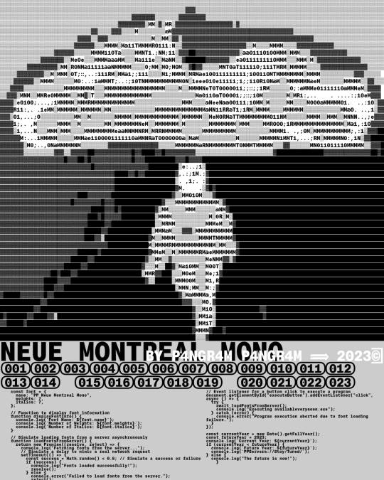
Neue Montreal Mono The workhorse type of Monospace
#typeface#typography#type#font#fonts#neue montreal mono#monospace#Pangram Pangram Foundry#pangram pangram#foundry#u
334 notes
·
View notes
Text
=====Generating a message=====
-Thinking about starting a typing quirk. ‘1’s for ‘i’s and ‘0’s for ‘o’s
-Ex: the qu1ck br0wn f0x jumps 0ver the lazy dog. Sph1nx 0f black quartz judge my v0w. Pack my red b0x w1th f1ve d0zen qual1ty jugs.
-Idk though
-what do you think?
2 notes
·
View notes
Text


Branding design for a smart international collective of change managers, based in Belgium, Italy and Switzerland. My proposal is to show a straightforward and readable image (main contents in black and white) highlighted by bright (post-it inspired) solid colours which are used during the client’s actual consultancy workshops. Logo font: Agrandir Variable Wide Bold, designed by Alex Slobzheninov for the Pangram Foundry.
#emi sakurai studio#company branding#type logo#webdesign#change managers association#meaningful brand design#pangram
0 notes
Text
Writing Notes: Wordplay
Wordplay
Typically defined as “verbal wit” or, putting it another way, using words in a clever or fun way.
For example, a commonly cited example of wordplay is the pun. A pun humorously uses a word with multiple different meanings and/or different words with similar sounds.
An example of a pun could be I don’t play cards with big cats because they are all cheetahs.
Types of Wordplay
There are many different types of wordplay out there. But not all varieties of wordplay even have names. Often, a poet does something entirely new and witty with words that has never been done before. That is the fun of wordplay—you can play around and see what kinds of fun things you make! Here are a few examples of different types of poetic wordplay that have names:
Palindrome: A word or line that reads the same forward and backward.
Pangram: A line or poem that includes every letter of the alphabet.
Alliteration: Using words that start with the same letter or similar sounding beginnings.
Rhyme: Using words that have similar sounds, especially endings.
Assonance: Using similar-sounding vowel sounds to rhyme.
Consonance: Using similar-sounding consonant sounds to rhyme.
Onomatopoeia: Using words that sound like what they mean.
Oxymoron: Creating a phrase using words that don’t seem to go well together.
Neologism: Creating new words.
Portmanteau: Combining two words together.
Chiasmus: Reversing the order of words in parallel lines.
Kenning: Using a metaphorical or poetic phrase to refer to something.
Source ⚜ More: Notes & References ⚜ Writing Resources PDFs
#writing reference#writeblr#dark academia#spilled ink#fiction#creative writing#novel#literature#poets on tumblr#writers on tumblr#writing prompt#poetry#light academia#writing prompts#writing ideas#writing inspiration#writing resources
180 notes
·
View notes
Text


I did it again... I bought another typewriter. This is a Smith-Corona 'Sterling' from 1963, according to the serial number, and the official name for this color is "starmist blue". (They also came in "dawn grey" and "spring green".) It came with a Dixon eraser [seen in the next post] and a case key, both of which were hidden under the machine and didn't make themselves known until I unlatched it from the case.
The workings are very smooth and one can literally touch-type. The ribbon is light grey in Black mode and medium grey (as you see below) in Red mode, so I will be ordering a replacement soon. I am pretty certain that the light spot you see below the spacebar was the paint being affected by stomach acid, as I did have to wipe a little crud that resembled vomitus off that spot and the spacebar. You're welcome. I think the reason why this machine was given to charity was because at some point just a few drops of water went down the middle of the hammer bank and slightly rusted some connections, with the result being the spring on 'i' snapped from the corrosion. In replacing it, I caused the spring next to it on 'm' to break too, but I had a second new spring onhand so all is well.

(Yes, I edited the sample photo; I goofed typing the pangram.)
27 notes
·
View notes
Text
The quick brown fox jumps over the lazy dog - en.wikipedia.org
"The quick brown fox jumps over the lazy dog" is an English-language pangram – a sentence that contains all the letters of the alphabet. The phrase is commonly used for touch-typing practice, testing typewriters and computer keyboards, displaying examples of fonts, and other applications involving text where the use of all letters in the alphabet is desired.
History
The earliest known appearance of the phrase was in The Boston Journal. In an article titled "Current Notes" in the February 9, 1885, edition, the phrase is mentioned as a good practice sentence for writing students: "A favorite copy set by writing teachers for their pupils is the following, because it contains every letter of the alphabet: 'A quick brown fox jumps over the lazy dog.'"[1] Dozens of other newspapers published the phrase over the next few months, all using the version of the sentence starting with "A" rather than "The". The earliest known use of the phrase starting with "The" is from the 1888 book Illustrative Shorthand by Linda Bronson. The modern form (starting with "The") became more common even though it is slightly longer than the original (starting with "A").
See Also
Filler text
Etaoin shrdlu – Common metal-type printing error
Lorem ipsum – Placeholder text used in publishing and graphic design
Thousand Character Classic – Chinese educational poem that uses exactly 1,000 characters, each appearing once
Iroha – Early Middle Japanese pangram poem, composed before 1079 in the Heian period
1 note
·
View note
Note
ur reading homestuck omg bestie same....... karkat pfp go brr. .... wsend me ur trollsona so i can draw ours together


Trollsona ehehe

Typing quirk pangram examples ^_^
4 notes
·
View notes
Text


oh and i found these pangrams for type that i just. i love them. never using "the quick brown fox" ever again
0 notes
Text
Cliff Sands Serif
In this assignment we were asked to create a type face inspired by the city of our city. We were required to either rework an existing type face or one from scratch. This type face could include all lowercase, all uppercase , or a combination of the two. I chose to do the lowercase alphabet. The second part of the assignment includes a type specimen to showcase the created typeface along with a pangram to show how the typeface will look in use.
In the beginning I was unsure of what my inspiration would be until I looked out my window at the cliff faces surrounding the river valley. in those cliff faces, I started to see letters in the crevices that are naturally formed there. From this ideas started to take shape as to what characteristics my new typeface was going to form. I was reminded of an assignment I did in Typography 1, where I wrote out the alphabet with a calligraphy pen and specifically the letter I thought of was the lowercase m.

This letter contained a form that was a little bit compressed with a little bit taller x-height, thick and thin strokes, and curve in the humps that I instantly connected to the river cliff. Using this m as a starting point I started to develop my typeface. I researched information in textbooks to learn point sizes, x-heights, ascender and descender heights and legibility distances and different point sizes

It began with a blank piece of paper and the information I learned. I started with a 1 cm x 1 cm square where I recreated the m from my type 1 assignment. I already decided by this point that I wanted all my letters to be made up of thin, medium and thick strokes mimicking the crevices of the river cliffs. I wanted consistency across all the letter formations and decided to make them the strokes thin on the left of letter, medium in the middle and thick on the right side of the letter. Here on this paper I applied this to the m, o, n and e in the 1cm x 1cm square.
At this time I also started to plan ahead for how I was going to present the finished typeface specimen. It did not take me long to come up with presenting it on sandpaper as the cliffs are made of sandstone right? As per the suggestion of my professor I did research to find out for sure what the cliffs were made of and discovered they are made of siltstone, a finer grained sandstone, so the sandpaper was perfect. I also knew right away that I wanted to recreate the crevices in the sandpaper once the typeface was on added to the surface. This resulted in a sandpaper that was in a 3.5 inch by 25 foot roll, allowing me to create the crevices easily through while allowing the sandpaper to stand on its edge mimicking the cliff faces in the same manner you view them in nature.

Next came size. This time I sized up my letters to see how they would look at a large point size along with the kind of spacing I might need in between the letter. I wanted to do an approximate size of 72 point type which gave ma a measurement of 1 inch x 1 inch with a 0.5 inch of space between the letters. My size had been determined!
But how does on draw letters on sandpaper you might ask...
Well... the answer is using an abundance of supplies. Turns out sandpaper very quickly wares down pencil, fine tip micron pens and sharpies all the same without discrimination. This proved very difficult as the pencil would not stay sharp for more than 3 seconds and the micron pen lasted about 4. Coupling that with the fact that pencil does not stick to sandpaper, the drawn lines were constantly disappearing and had to be redrawn at the smallest breath. I started with a baseline and measured my 1 inch to create the x-height , drawing that line, followed by measuring 1 inch for my width. all the letters fit inside this box.

It was time to bring my typeface to life. First I tried India ink and found that it was to thin. I sat on top of the surface versus soaking in and when the paper was moved it ran and bled everywhere. Next I tried my calligraphy pen. It was ok in the beginning but it was hard to control the flow of ink for consistency. The sound of the metal pen tip on sandpaper?? not good! 10/10 do NOT recommend. I then tested micron pens and sharpies and this gave me more control but they did not last long. I decided sketching the letter on first to get the letterform down before committing in ink was the way to go. I worked letter by letter; first in pencil followed by a large number of micron pens. 16 in all.

As I was going and starting to run out of pens...I realized I had to find another way to fill in the wider parts of the letters. India ink was to thin and gouache was to thick. I added water to the paint but again lacked control in finding the necessary consistency needed and then it hit me... mix the ink with the gouache. it worked perfectly and was able to paint with a small brush the thickness of the letters.
Once the letters were on and the pangram added, all that remained was to add the crevices and the other hierarchal type.

I enjoyed this assignment and learned how to problem solve while experimenting with different materials and mediums .
1 note
·
View note
Text
Did a little research and found that not only is there already a term for a pangram that uses each grapheme only once (a "perfect pangram"), but even in orthodox English you can pretty much only get one by either using abbreviations (which I'm already doing) or loanwords, and even then you end up with something near unintelligible
So I decided to try relaxing my standards a bit and just going for a sentence that works and not sweat a couple of redundancies, though I still tried to keep them to a minimum
To that end, my pangram came out to be:
What j-oy she, the g-ay w-ih-ch, f-ow-n-d b-ai p-ue-t-ing uh-n-y-oo-zh-oo-uh-l h-eh-ks-z on eh-gz-ah-k-t-l-[ih] TH-r-ee s-m-ah-l v-oh-l-z in awe What joy she, the gay witch, found by putting unusual hexes on exactly three small voles in awe.

That gives me 53 characters total with 11 redundant graphemes
I imagine a more skilled linguist could have figured out a way to do it more succinctly, but I rather like what I came up with, and I feel pretty accomplished finally getting it done after several days of struggle
At some point I'll need to look into a font that lets me type in Senior Quikscript rather than Junior so that the letters will join and halve properly, but this is good enough for now
0 notes
Text


//Web Portfolio//
Research- Pangram Pangram
Pangram Pangram is a type foundry whose visual identity and presentation of their portfolio will inspire the section of my website where I add my own typeface. I like how they stylise their website to showcase their typefaces, and really integrate their work into their branding and website. They use colour gradients and textures to showcase the versatility of their fonts. Their Instagram is used to share samples and snippets of their work and they post lots of interactive content such as reels and memes. Their Instagram is a good way to gauge the personality and design style of the company at a glance.
0 notes
Text
Type 2 - (Re)design a typeface
Type 2 Assignment 2
Make a typeface / letter forms, if we want we can use the previously made type specimen tracings or outlines.
A) A full set of upper-case letters
B) A full set of lowercase letters
*Optional*
customize an existing typeface that has been used locally AT LEAST 40 years old (or more)
for examples and reference look at - Old signs, architecture, products
Finding the perfect typeface for your project isn't always straightforward; sometimes, you may not find exactly what you're seeking. Explore the process of creating a typeface by approaching it as a solution to a problem.
Creating a 17 x 23 Poster - using a grid structure, with the name of the typeface, include a pangram (a sentence using every letter of the alphabet) - with the sentence using correct baseline and kerning. I decided to recreate a typeface commonly seen on highway signage
0 notes
Text
Type Changes LO2/3

I decided that I couldn't make the Courier font work and that I was trying too hard to make the text look like code that it was beginning to drift from my narrative.
I decided that I would try a sans typeface, and when browsing PangramPangram for inspiration, I came across Neue Montreal Mono. It was incredibly coincidental that one of the typefaces which caught my eye happened to be a typeface which was used for ASCII art.
I took this as some sort of sign and played around with using it for my body copy and I was much more impressed with it over Courier.


I did also edit the formatting of the paragraph so the nesting was only indented on the first word, so it was more of a subtle touch.


pangrampangram.comAvailable from: https://pangrampangram.com/products/neue-montreal-mono (n.d.). Neue Montreal Mono -The workhorse type of Monospace - Free to Try Font – Pangram Pangram Foundry [online]. [Accessed 3 December 2023].
1 note
·
View note
Text

Do you know pangram is a great tool to practice typing?
To know more visit: https://onlinetyping.org/blog/examples-of-pangram-its-uses-to-learn-typing.php
#typing#bestkeyboard#keyboard#OnlineTyping#touchtyping#typingtutor#learning#education#elearning#onlineeducation
0 notes
Text
Miles stops dead in his tracks, his screen whips around unnaturally to look behind him as he hears the voice that is far too close to be from anyone or anything else but the creature that has been pestering him, the rest of his body soon follows as they are back to staring down at Airin, processing this new information.
Suddenly, all the strange abnormalities about Airin made sense. Talking animal certainly wasn't on Miles' bingo sheet, without necessarily feeling it or knowing how it would-- Miles is absolutely thrilled.
Miles slowly kneels down, and points to his screen. Airin would see Miles opening an application on his screen, typing words and then making them large enough to be read at the distance between the two.

( Can you read this? Please say it out loud. } ( "Pack my box with five dozen liquor jugs." }
For pangrams, They would have gone with the classic "The quick brown fox jumps over the lazy dog." but Miles did not want to insult the creature more than he already had.

𝐇𝐞 𝐡𝐚𝐬 𝐡𝐢𝐦 𝐰𝐡𝐞𝐫𝐞 𝐡𝐞 𝐰𝐚𝐧𝐭𝐬 𝐡𝐢𝐦. Or so his finicky, little mind believes! Airin is standing firm. With his fuzzy brows furrowed, he prepares to make another move if the robot decides to make another attempt to shoo him away.

Only the outcome is so much better than what he was anticipating. The robot scrams, but the prey drive in Airin activates. It pulls him into a galloping hop with his tail high in the air. He has no intention of pouncing on this mechanical contraption though. He might have hidden guns... like in the movies!
" ...I got you now! " Airin yarps at the machine; forgetting all about why he didn't want to talk in the first place. " You can't run from me!! "

#walking laptop; (ic)#do not apologize for airin airin'ing! i am having a good time even if miles wasnt#being mildly inconvenienced is now suddenly worth it!
14 notes
·
View notes
Text


zero fucking clue what the chumhandle's gonna be . pangram typing quirk examples :
-> the QUIxCK brown FOX jumps OVER the LAZY dog !!! <-
-> sphiXnx OF black QUARTZ , judge MY vow !!! <-
-> the JOB requiXres EXTRA pluck -3- ZEAL from EVERY young WAGE earner !!! <-
1 note
·
View note