#passing data to parent component vue
Explore tagged Tumblr posts
Visit Tumblr Blog
Explore Tumblr blogs with no restrictions, modern design and the best experience.
Last Seen Tumblr Blogs


Fun Fact
Users from the US are the majority of Tumblr visitors.
Text
Understanding Slots in Vue

Slots serve as placeholders within a child component's template where parent components can insert their own content. This mechanism promotes component reusability and adaptability. There are different types of slots in Vue:
Default Slots: Allow the parent to pass content without a specific name.
Named Slots: Enable the parent to pass content to designated slots identified by names.
Scoped Slots: Provide a way for child components to pass data back to the parent through the slot, allowing the parent to render content based on that data.
Using Slots in <script setup>
With the introduction of the <script setup> syntax in Vue 3, handling slots has become more streamlined. The <script setup> is a compiler macro that allows you to write less boilerplate code when using the Composition API. To work with slots inside <script setup>, Vue provides the useSlots() and useAttrs() helper functions.
The useSlots() function returns an object containing all the slots passed to the component, which can be utilized within the <script setup> block. This is particularly useful when you need to programmatically interact with the slots.
vue
CopyEdit
<script setup> import { useSlots } from 'vue'; const slots = useSlots(); // You can now use `slots` to access the slots passed to this component </script>
In scenarios where you need to provide type hints for slots, especially when using TypeScript, Vue 3.3 introduced the defineSlots() macro. This macro allows you to define the expected slots and their props, enabling better type checking and editor support.
vue
CopyEdit
<script setup lang="ts"> const slots = defineSlots<{ default: (props: { msg: string }) => any; header: (props: { title: string }) => any; }>(); </script>
By defining slots in this manner, you enhance the maintainability and readability of your components, making it clear what slots are expected and what props they provide.
Practical Example
Let's consider a practical example where we have a BaseLayout component that utilizes named slots to structure a page layout:
vue
CopyEdit
<template> <div class="container"> <header> <slot name="header"></slot> </header> <main> <slot></slot> <!-- default slot --> </main> <footer> <slot name="footer"></slot> </footer> </div> </template>
In the parent component, we can use the BaseLayout and provide content for each slot:
vue
CopyEdit
<template> <BaseLayout> <template #header> <h1>Page Title</h1> </template> <template #default> <p>This is the main content of the page.</p> </template> <template #footer> <p>© 2025 My Website</p> </template> </BaseLayout> </template>
In this example, the BaseLayout component defines three slots: header, default, and footer. The parent component then provides the content for each slot using the v-slot directive (shorthand #). This approach allows for a clean and organized way to compose layouts with reusable components.
Conclusion
Mastering the use of slots in Vue, particularly within the <script setup> syntax, empowers developers to create flexible and maintainable components. By effectively leveraging default, named, and scoped slots, you can build complex user interfaces that are both reusable and easy to manage. Understanding how to use slots in scripts is essential for any Vue developer aiming to write clean and efficient code.
more details : vue how to use slots in script
0 notes
Text
Mastering Scoped Slots in Vue 2: A Complete Guide

Vue.js is a progressive framework that offers developers numerous features to build dynamic and interactive web applications. One of its most powerful features is scoped slots, which enable flexible and reusable component patterns. This article will explain how to access scoped slots in Vue 2, empowering you to create highly customizable components.
What Are Scoped Slots?
Scoped slots in Vue 2 are an advanced slot mechanism that allows a parent component to pass data to a child’s slot content. Unlike regular slots, scoped slots provide a way to dynamically inject content into components based on specific data from the child component.
For instance, imagine a table component where you want to customize the content of each cell dynamically. Scoped slots make this possible.
How to Access Scoped Slots in Vue 2?
To understand how to access scoped slots in Vue 2, follow these steps:
Define the Scoped Slot in the Child ComponentThe first step is to define a scoped slot in your child component. For example:vueCopy code<template>
<div>
<slot :info="dataFromChild"></slot>
</div>
</template>
<script>
export default {
data() {
return {
dataFromChild: "Hello from child component!"
};
}
};
</script>
Here, the slot element passes the dataFromChild property to the parent via the info attribute.
Access the Scoped Slot in the Parent ComponentIn the parent component, use the v-slot directive to bind the slot scope:vueCopy code<template>
<ChildComponent v-slot="{ info }">
<p>{{ info }}</p>
</ChildComponent>
</template>
The { info } syntax extracts the scoped data, which you can then use within the slot’s content.
Dynamic Content RenderingScoped slots are incredibly useful for rendering dynamic content. For example, you can loop through an array of data and use scoped slots to display each item:vueCopy code<template>
<ChildComponent v-slot="{ info }">
<ul>
<li v-for="(item, index) in info" :key="index">{{ item }}</li>
</ul>
</ChildComponent>
</template>
Here, the info object can contain a list of items that the parent renders dynamically.
Practical Use Cases
Understanding how to access scoped slots in Vue 2 unlocks several possibilities:
Customizable TablesBuild dynamic table components where each column’s content can be customized based on the data.
Reusable UI ComponentsCreate components like modals or dropdowns where the content is determined by the parent component.
Flexible LayoutsUse scoped slots to define layouts where the structure is consistent, but the content varies.
Tips for Using Scoped Slots Effectively
Keep It SimpleWhile scoped slots are powerful, overusing them can lead to complex and hard-to-maintain code.
Document Your ComponentsWhen building reusable components, document the data provided through scoped slots so other developers can use them effectively.
Use Descriptive NamesName your scoped slot properties descriptively to avoid confusion.
By understanding how to access scoped slots in Vue 2, you can leverage this feature to create dynamic, reusable, and maintainable components. Scoped slots not only enhance the flexibility of your applications but also improve the overall development experience in Vue.js.
Explore scoped slots in your next Vue 2 project and discover how they can simplify your component structure while making your application more powerful.
0 notes
Text
How to pass value to child component in Vue.js
How to pass value to child component in Vue.js
Hello buddy, in this blog we will see how we can pass value to the child component in vue.js and we will also learn the use of props. Sharing data across components is one of the core functionalities of VueJS. It allows you to design a more modular project, control data scopes, and create a natural flow of data across your app. Think you are using the Vue tab component where you have put 5oo…

View On WordPress
#pass data to component vue#vue dynamic component#vue emit#vue get data from child component#vue pass data between sibling components#vue pass data from one component to another#vue pass data from parent to child#vue pass data to component onclick
0 notes
Photo

Transfer Data Between Components In Vue JS How you can transfer data between components in vue js? I'll explain to you the communication between a parent component and a child component. source
#child component#child component in vue#components#components communication#components communication in vue#data#data between vue components#learn vue step by step#mario laurich#parent component#parent component in vue#passing data between components#passing data between components in vue#passing data between components in vue js#Transfer#transfer data between components#transfer data between components in vue#transfer data between components in vue js#vue#vue js#vue js tutorial#vuejs#webnoob
0 notes
Text
An Introduction to Lightning Web Components | Salesforce Lightning
Lightning web components are custom HTML components fabricated using HTML and standard JavaScript. Lightning web components and Aura components can coexist and interoperate on a page. For both administrators & users, it shows up as components. In this top blog on salesforce, we will talk in detail about the Lighting web components and discuss in detail how it works.
Lightning Web Components is built on top of standard Web Components technologies and provides only what is necessary to perform well in browsers supported by Salesforce. Because it runs natively in browsers, Lightning Web Components is lightweight and delivers exceptional performance. Much of the code you write is standard JavaScript and HTML.
It is open source, that engages you to examine the source code, modify the behavior for your requirements, and gather enterprise-ready web components on any platform, not just Salesforce.
Previously, we required different frameworks to manufacture different sides of an application that encouraged external Salesforce. For example, we used the Aura component to develop the employee-defying side of an application on Salesforce. And also we used React, Angular, or Vue to build the customer-defying side of the application, and passed it on to Heroku or on another platform. Today, we can use Lightning web components to fabricate both sides of the application. The advantages of it are huge and with assistance from Top Salesforce Consultants, you would now be able to learn the framework at ease.
We can simply create lightning web components using HTML, javascript, and CSS.
Benefits of Lightning Web Components
It gives an easy way to develop large-scale modular apps
Also, we got the leverage of the latest web functionalities and constructs
A web developer who is working on modern JS frameworks could easily ramp-up LWC
Interoperable components
Allow better performance
With the right assistance from Salesforce Consulting Companies, you can take the leverage of lightning web components at ease
These are the Fundamentals Pieces of your Component
HTML gives the structure to your component.
JavaScript describes the centre's business logic and handles events.
CSS gives the look, feel, and animation to your component.
Don't forget to check out: How to Convert sforce.apex.execute to Lightning | Salesforce Developer Guide
Let’s take a simple example of the Lightning web component:
HTML:
<template>
<input value={message}></input>
</template>
JavaScript:
import { LightningElement } from 'lwc';
export default class App extends LightningElement {
message = 'Hello World';
}
CSS:
input {
color: red;
}
Decorators in Lightning Web Component
LWC has three decorators that append functionality to property or function. The capability to create decorators is part of ECMAScript and these three decorators are unique to LWC.
@api: It is used to expose public property. And the public property is reactive & if you want to change the reactive property value, the component is re-rendered. So you know that when a component is rerendered, all the expressions used in the template are reconsidered once again. @api passes the public property values from the parent component. If you want to use @api decorators, you have to import it explicitly from lwc. Import { LightningElement, api } from ‘lwc’;
@track: If you want to track private reactive property value & also rerender a component when it changes, decorate it with @track. We can use the private property only in the component where it is defined. If you want to use @api decorators, you have to import it explicitly from lwc. Import { LightningElement, track } from ‘lwc’;
@wire: It is used to read the Salesforce data. LWC uses a reactive wire service. @wire is used to call apex method in lwc js controller. If you want to use @api decorators, you have to import it explicitly from lwc. Import { LightningElement, wire } from ‘lwc’;
Check out another amazing blog by Shweta here: Stages of Salesforce CPQ Implementation
And also you have to import wire Syntax as shown below:
Import apexMethodName from '@salesforce/apex/Namespace.Classname.apexMethodReference';
apexMethodName: It recognizes the apex method.
apexMethodReference: Imported Apex method name.
Classname: Apex class name.
Namespace: You know that the default namespace of the Salesforce org is ‘c’, in this case, don’t specify a namespace. The namespace is used when your apex class is in a managed package.
Important point: For property, we can have only one decorator at a time.
0 notes
Link
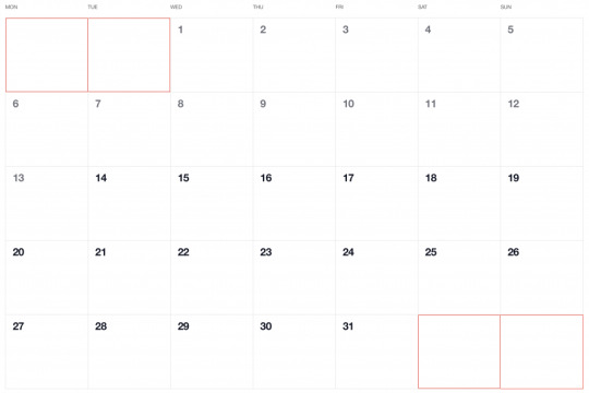
Have you ever seen a calendar on a webpage and thought, how the heck did they did that? For something like that, it might be natural to reach for a plugin, or even an embedded Google Calendar, but it’s actually a lot more straightforward to make one than you might think. Especially when we use the component-driven power of Vue.
I’ve set up a demo over at CodeSandbox so you can see what we’re aiming for, but it’s always a good idea to spell out what we’re trying to do:
Create a month view grid that displays the days of the current month
Display dates from the previous and next months to so the grid is always full
Indicate the current date
Show the name of the currently selected month
Navigate to the previous and next month
Allow the user to navigate back to the current month with a single click
Oh, and we’ll build this as a single page application that fetches calendar dates from Day.js, a super light utility library.
Step 1: Start with the basic markup
We’re going to jump straight into templates. If you’re new to Vue, Sarah’s introduction series is a nice place to start. It’s also worth noting that I’ll be linking to the Vue 2 docs throughout this post. Vue 3 is currently in beta and the docs for it are subject to change.
Let’s start with creating a basic template for our calendar. We can outline our markup as three layers where we have:
A section for the calendar header. This will show components with the currently selected month and the elements responsible for paginating between months.
A section for the calendar grid header. A table header that holds a list containing the days of the week, starting with Monday.
The calendar grid. You know, each day in the current month, represented as a square in the grid.
Let’s write this up in a file called CalendarMonth.vue. This will be our main component.
<!-- CalendarMonth.vue --> <template> <!-- Parent container for the calendar month --> <div class="calendar-month"> <!-- The calendar header --> <div class="calendar-month-header" <!-- Month name --> <CalendarDateIndicator /> <!-- Pagination --> <CalendarDateSelector /> </div> <!-- Calendar grid header --> <CalendarWeekdays /> <!-- Calendar grid --> <ol class="days-grid"> <CalendarMonthDayItem /> </ol> </div> </template>
Now that we have some markup to work with, let’s go one step further and create required components.
Step 2: Header components
In our header we have two components:
CalendarDateIndicator shows the currently selected month.
CalendarDateSelector is responsible for paginating between months.
Let’s start with CalendarDateIndicator. This component will accept a selectedDate property which is a Day.js object that will format the current date properly and show it to the user.
<!-- CalendarDateIndicator.vue --> <template> <div class="calendar-date-indicator"></div> </template> <script> export default { props: { selectedDate: { type: Object, required: true } }, computed: { selectedMonth() { return this.selectedDate.format("MMMM YYYY"); } } }; </script>
That was easy. Let’s go and create the pagination component that lets us navigate between months. It will contain three elements responsible for selecting the previous, current and next month. We’ll add an event listener on those that fires the appropriate method when the element is clicked.
<!-- CalendarDateSelector.vue --> <template> <div class="calendar-date-selector"> <span @click="selectPrevious">﹤</span> <span @click="selectCurrent">Today</span> <span @click="selectNext">﹥</span> </div> </template>
Then, in the script section, we will set up two props that the component will accept:
currentDate allows us to come back to current month when the “Today” button is clicked.
selectedDate tells us what month is currently selected.
We will also define methods responsible for calculating the new selected date based on the currently selected date using the subtract and add methods from Day.js. Each method will also $emit an event to the parent component with the newly selected month. This allows us to keep the value of selected date in one place — which will be our CalendarMonth.vue component — and pass it down to all child components (i.e. header, calendar grid).
// CalendarDateSelector.vue <script> import dayjs from "dayjs"; export default { name: "CalendarDateSelector", props: { currentDate: { type: String, required: true }, selectedDate: { type: Object, required: true } }, methods: { selectPrevious() { let newSelectedDate = dayjs(this.selectedDate).subtract(1, "month"); this.$emit("dateSelected", newSelectedDate); }, selectCurrent() { let newSelectedDate = dayjs(this.currentDate); this.$emit("dateSelected", newSelectedDate); }, selectNext() { let newSelectedDate = dayjs(this.selectedDate).add(1, "month"); this.$emit("dateSelected", newSelectedDate); } } }; </script>
Now, let’s go back to the CalendarMonth.vue component and use our newly created components.
To use them we first need to import and register the components, also we need to create the values that will be passed as props to those components:
today properly formats today’s date and is used as a value for the “Today” pagination button.
selectedDate is the currently selected date (set to today’s date by default).
The last thing we need to do before we can render the components is create a method that’s responsible for changing the value of selectedDate. This method will be fired when the event from the pagination component is received.
// CalendarMonth.vue <script> import dayjs from "dayjs"; import CalendarDateIndicator from "./CalendarDateIndicator"; import CalendarDateSelector from "./CalendarDateSelector"; export default { components: { CalendarDateIndicator, CalendarDateSelector }, data() { return { selectedDate: dayjs(), today: dayjs().format("YYYY-MM-DD") }; }, methods: { selectDate(newSelectedDate) { this.selectedDate = newSelectedDate; } } }; </script>
Now we have everything we need to render our calendar header:
<!-- CalendarMonth.vue --> <template> <div class="calendar-month"> <div class="calendar-month-header"> <CalendarDateIndicator :selected-date="selectedDate" class="calendar-month-header-selected-month" /> <CalendarDateSelector :current-date="today" :selected-date="selectedDate" @dateSelected="selectDate" /> </div> </div> </template>
This is a good spot to stop and see what we have so far. Our calendar header is doing everything we want, so let’s move forward and create components for our calendar grid.
Step 3: Calendar grid components
Here, again, we have two components:
CalendarWeekdays shows the names of the weekdays.
CalendarMonthDayItem represents a single day in the calendar.
The CalendarWeekdays component contains a list that iterates through the weekday labels (using the v-for directive) and renders that label for each weekday. In the script section, we need to define our weekdays and create a computed property to make it available in the template and cache the result to prevent us from having to re-calculate it in the future.
// CalendarWeekdays.vue <template> <ol class="day-of-week"> <li v-for="weekday in weekdays" :key="weekday" > </li> </ol> </template>
<script> const WEEKDAYS = ["Mon", "Tue", "Wed", "Thu", "Fri", "Sat", "Sun"]; export default { name: 'CalendarWeekdays', computed: { weekdays() { return WEEKDAYS } } } </script>
Next is CalendarMonthDayItem. It’s a list item that receives a day property that is an object, and a boolean prop, isToday, that allows us to style the list item to indicate that it’s the current date. We also have one computed property that formats the received day object to our desired date format (D, or the numeric day of the month).
// CalendarMonthDayItem.vue <template> <li class="calendar-day" :class="{ 'calendar-day--not-current': !isCurrentMonth, 'calendar-day--today': isToday }" > <span></span> </li> </template>
<script> import dayjs from "dayjs"; export default { name: "CalendarMonthDayItem", props: { day: { type: Object, required: true }, isCurrentMonth: { type: Boolean, default: false }, isToday: { type: Boolean, default: false } }, computed: { label() { return dayjs(this.day.date).format("D"); } } }; </script>
OK, now that we have these two components, let’s see how we can add them to our CalendarMonth component.
We first need to import and register them. We also need to create a computedproperty that will return an array of objects representing our days. Each day contains a date property and isCurrentMonth property.
// CalendarMonth.vue <script> import dayjs from "dayjs"; import CalendarMonthDayItem from "./CalendarMonthDayItem"; import CalendarWeekdays from "./CalendarWeekdays";
export default { name: "CalendarMonth", components: { // ... CalendarMonthDayItem, CalendarWeekdays }, computed: { days() { return [ { date: "2020-06-29", isCurrentMonth: false }, { date: "2020-06-30", isCurrentMonth: false }, { date: "2020-07-01", isCurrentMonth: true }, { date: "2020-07-02", isCurrentMonth: true }, // ... { date: "2020-07-31", isCurrentMonth: true }, { date: "2020-08-01", isCurrentMonth: false }, { date: "2020-08-02", isCurrentMonth: false } ]; } } }; </script>
Then, in the template, we can render our components. Again, we use the v-fordirective to render the required number of day elements.
<!-- CalendarMonth.vue --> <template> <div class="calendar-month"> <div class="calendar-month-header"> // ... </div> <CalendarWeekdays/> <ol class="days-grid"> <CalendarMonthDayItem v-for="day in days" :key="day.date" :day="day" :is-today="day.date === today" /> </ol> </div> </template>
OK, things are starting to look good now. Have a look at where we are. It looks nice but, as you probably noticed, the template only contains static data at the moment. The month is hardcoded as July and the day numbers are hardcoded as well. We will change that by calculating what date should be shown on a specific month. Let’s dive into the code!
Step 4: Setting up current month calendar
Let’s think how we can calculate the date that should be shown on a specific month. That’s where Day.js really comes into play. It provides all the data we need to properly place dates on the correct days of the week for a given month using real calendar data. It allows us to get and set anything from the start date of a month to all the date formatting options we need to display the data.
We will:
Get the current month
Calculate where the days should be placed (weekdays)
Calculate the days for displaying dates from the previous and next months
Put all of the days together in a single array
We already have Day.js imported in our CalendarMonth component. We’re also going to lean on a couple of Day.js plugins for help. WeekDay helps us set the first day of the week. Some prefer Sunday as the first day of the week. Other prefer Monday. Heck, in some cases, it makes sense to start with Friday. We’re going to start with Monday.
The WeekOfYear plugin returns the numeric value for the current week out of all weeks in the year. There are 52 weeks in a year, so we’d say that the week starting January 1 is the the first week of the year, and so on.
Here’s what we put into CalendarMonth.vue to put all of that to use:
// CalendarMonth.vue <script> import dayjs from "dayjs"; import weekday from "dayjs/plugin/weekday"; import weekOfYear from "dayjs/plugin/weekOfYear"; // ...
dayjs.extend(weekday); dayjs.extend(weekOfYear); // ...
That was pretty straightforward but now the real fun starts as we will now play with the calendar grid. Let’s stop for a second a think what we really need to do to get that right.
First, we want the date numbers to fall in the correct weekday columns. For example, July 1, 2020, is on a Wednesday. That’s where the date numbering should start.
If the first of the month falls on Wednesday, then that means we’ll have empty grid items for Monday and Tuesday in the first week. The last day of the month is July 31, which falls on a Friday. That means Saturday and Sunday will be empty in the last week of the grid. We want to fill those with the trailing and leading dates of the previous and next months, respectively, so that the calendar grid is always full.
Adding dates for the current month
To add the days of the current month to the grid, we need to know how many days exist in the current month. We can get that using the daysInMonth method provided by Day.js. Let’s create a computed property for that.
// CalendarMonth.vue computed: { // ... numberOfDaysInMonth() { return dayjs(this.selectedDate).daysInMonth(); } }
When we know that, we create an empty array with a length that’s equal to number of days in the current month. Then we map() that array and create a day object for each one. The object we create has an arbitrary structure, so you can add other properties if you need them.
In this example, though, we need a date property that will be used to check if a particular date is the current day. We’ll also return a isCurrentMonth value that checks whether the date is in the current month or outside of it. If it is outside the current month, we will style those so folks know they are outside the range of the current month.
// CalendarMonth.vue computed: { // ... currentMonthDays() { return [...Array(this.numberOfDaysInMonth)].map((day, index) => { return { date: dayjs(`${this.year}-${this.month}-${index + 1}`).format("YYYY-MM-DD") isCurrentMonth: true }; }); }, }
Adding dates from the previous month
To get dates from the previous month to display in the current month, we need to check what the weekday of the first day is in selected month. That’s where we can use the WeekDay plugin for Day.js. Let’s create a helper method for that.
// CalendarMonth.vue methods: { // ... getWeekday(date) { return dayjs(date).weekday(); }, }
Then, based on that, we need to check which day was the last Monday in the previous month. We need that value to know how many days from the previous month should be visible in the current month view. We can get that by subtracting the weekday value from the first day of the current month. For example, if first day of the month is Wednesday, we need to subtract three days to get last Monday of the previous month. Having that value allows us to create an array of day objects starting from the last Monday of the previous month through the end of that month.
// CalendarMonth.vue computed: { // ... previousMonthDays() { const firstDayOfTheMonthWeekday = this.getWeekday(this.currentMonthDays[0].date); const previousMonth = dayjs(`${this.year}-${this.month}-01`).subtract(1, "month"); const previousMonthLastMondayDayOfMonth = dayjs(this.currentMonthDays[0].date).subtract(firstDayOfTheMonthWeekday - 1, "day").date(); // Cover first day of the month being sunday (firstDayOfTheMonthWeekday === 0) const visibleNumberOfDaysFromPreviousMonth = firstDayOfTheMonthWeekday ? firstDayOfTheMonthWeekday - 1 : 6; return [...Array(visibleNumberOfDaysFromPreviousMonth)].map((day, index) = { return { date: dayjs(`${previousMonth.year()}-${previousMonth.month() + 1}-${previousMonthLastMondayDayOfMonth + index}`).format("YYYY-MM-DD"), isCurrentMonth: false }; }); } }
Adding dates from the next month
Now, let’s do the reverse and calculate which days we need from the next month to fill in the grid for the current month. Fortunately, we can use the same helper we just created for the previous month calculation. The difference is that we will calculate how many days from the next month should be visible by subtracting that weekday numeric value from seven.
So, for example, if the last day of the month is Saturday, we need to subtract one day from seven to construct an array of dates needed from next month (Sunday).
// CalendarMonth.vue computed: { // ... nextMonthDays() { const lastDayOfTheMonthWeekday = this.getWeekday(`${this.year}-${this.month}-${this.currentMonthDays.length}`); const nextMonth = dayjs(`${this.year}-${this.month}-01`).add(1, "month"); const visibleNumberOfDaysFromNextMonth = lastDayOfTheMonthWeekday ? 7 - lastDayOfTheMonthWeekday : lastDayOfTheMonthWeekday; return [...Array(visibleNumberOfDaysFromNextMonth)].map((day, index) => { return { date: dayjs(`${nextMonth.year()}-${nextMonth.month() + 1}-${index + 1}`).format("YYYY-MM-DD"), isCurrentMonth: false }; }); } }
OK, we know how to create all days we need, so let’s use them and merge all days into a single array of all the days we want to show in the current month, including filler dates from the previous and next months.
// CalendarMonth.vue computed: { // ... days() { return [ ...this.previousMonthDays, ...this.currentMonthDays, ...this.nextMonthDays ]; }, }
0 notes
Text
Watch Directv
AT&T‘s Internet-streaming live TV service will soon be specific to the Chrome browser, assuming you favour to circulation for your computer or computing device. Users are reporting seeing a message when trying to move on PC that advises them to download and install Google Chrome, pronouncing its miles vital with the intention to get the ‘best streaming revel in.’ You have till the give up of this month to make the transition.
If you subscribe to DirecTV NOW and also you log into your account on a PC's browser, you’ll be greeted with a message that asserts, in component, ‘DirecTV NOW will stay solely on Google Chrome while accessed through your laptop.’ The word goes on to give an explanation for that the provider will drop its support for Internet Explorer and Safari ‘after June.’
This trade simplest impacts folks that try and watch the carrier from a computing device browser; the service is viewable thru a devoted app while watching from a cellphone or pill. Presumably, as soon as the aid is dropped, folks that try and get admission to the provider the usage of Explorer or Safari could be directed to download Chrome before getting access to the video content material.
The organization has no longer revealed why it's far making this modification — except to say that Chrome will in a few ways offer the excellent viewing enjoy — and it hasn’t but updated any of its assist pages to indicate the upcoming change, which is a chunk ordinary. Regardless, you've got approximately 3 weeks left to make the transition…either to Chrome or to an extraordinary OTT video carrier. Competing products consist of PlayStation Vue, Sling TV, and Hulu Live TV.
WHAT IS DIRECTV APP FOR PC
Directv is a premium subscription-based satellite tv carrier issuer which becomes began in 1994. The company has been successfully completed its 23 years. At Directv, you could subscribe tv and audio offerings. It makes use of satellite transmission to offer their offerings to their customers. Its audio and tv services are confined to the United States, Latin America, and the Caribbean. It doesn’t provide their offerings international.
OTHER PRODUCTS OFFERED BY DIRECTV
Direct broadcast satellite tv for pc
Pay Television
Pay-in line with-view
Internet Television
Owner AT&T
Read Kinemaster for PC
SUBSCRIPTION OFFERED BY THE DIRECTV
Local tv stations
broadcast television networks
Subscription-based total tv offerings
Satellite radio services
private video services
HOW TO WATCH DIRECTV ON PC
If you're one that loves looking movies and TV suggests so that you must strive the Directv which help you get right of entry to movies and indicates anytime & anywhere if you have a working internet connection.
Below we're sharing how you may start taking part in the content of Directv on a Home windows PC (Computer)
Visit here DIRECTV entertainment website
Log in along with your subscription keys
Now faucet “watch online”
It will carry you the listing of films, simply select one
Enjoy
Features of Directv APK
Watch Favorite shows and films
It gives its customers the element to watch their boundless fav serials and films which customers can see Live or On-Demand. Another extra element is to get the Data Free TV which allows viewing DIRECTV on the gadgets, without utilising the patron’s net facts. Besides, customers should purchase into the top-notch channels which permit viewing the maximum latest content.
Recording
Directv gives a highlight of recording the fav serials and movies from anyplace in order that viewers don’t pass over out on their favourite content material and can view it every time as consistent with their requirements.
Read MainStage 3 for PC Download Free
Total Control
This component permits its customers to use their devices to pause, play, and rewind the serials and films which can be streaming on their TV. At the point when somebody wishes to search for a show, the subscriber can actually communicate out and voice seek highlight can help discover exactly what clients are trying to find. At that point, they can even arrange it to reveal consequences on the TeleVision. Most importantly, Users can set parental controls and respect large serenity over what their children are viewing.
Easy Interface
It is having an exceedingly easy to make use of interface which makes your work excessively truthful. The on-hand channels incorporate every one of the channels immediately from the child’s quarter to adults.
More info Clicks Helpsforpc.com
0 notes
Text
Vue-Emit data from child to parent in vue js
Vue-Emit data from child to parent in vue js
In this article, we will learn about how to emit data from child to parent in VueJS with the example, I will show you an example that how we can pass child data to our parent component, We will use emit method to pass the data from the child component to the parent component in vuejs. Let’s suppose my child component name as Child.vue and have the below code into it. <template> <div> <b-tabs…

View On WordPress
1 note
·
View note
Text
Vue.js Tutorial From Scratch - e08 - Custom Events Passing Data from Child to Parent Component - VueJs
Vue.js Tutorial From Scratch – e08 – Custom Events Passing Data from Child to Parent Component – VueJs
Vue.js Tutorial From Scratch – e08 – Custom Events Passing Data from Child to Parent Component – VueJs
[ad_1]
Now that we have a nice modern npm and webpack build, let’s tackle getting our components to communicate. In Vue, this is done using custom events. We can emit an event on our child component and then listen for that event on our parent event. Follow along as we code a simple example from…
View On WordPress
#laravel computed property#laravel mix#laravel vue tutorial#Learn Vue#Learn Vuejs#passing data to parent component vue#vue#Vue 2019#vue course#vue emit to parent component#vue for beginners#vue framework#vue js frontend laravel backend#vue methods#vue npm#vue passing data between components#vue tutorial#vue webpack#Vue.js#vue.js tutorial 2019#Vuejs#vuejs course#vuejs tutorial#web development#web development framework#webpack crash course
0 notes
Photo

A Beginner’s Guide to Working With Components in Vue
One of the great things about working with Vue is its component-based approach to building user interfaces. This allows you to break your application into smaller, reusable pieces (components) which you can then use to build out a more complicated structure.
In this guide, I’ll offer you a high-level introduction to working with components in Vue. I’ll look at how to create components, how to pass data between components (via both props and an event bus) and how to use Vue’s <slot> element to render additional content within a component.
Each example will be accompanied by a runnable CodePen demo.
How to Create Components in Vue
Components are essentially reusable Vue instances with a name. There are various ways to create components within a Vue application. For example, in a small- to medium-sized project you can use the Vue.component method to register a global component, like so:
Vue.component('my-counter', { data() { return { count: 0 } }, template: `<div></div>` }) new Vue({ el: '#app' })
The name of the component is my-counter. It can be used like so:
<div id="app"> <my-counter></my-counter> </div>
When naming your component, you can choose kebab case (my-custom-component) or Pascal case (MyCustomComponent). You can use either variation when referencing your component from within a template, but when referencing it directly in the DOM (as in the example above), only the kebab case tag name is valid.
You might also notice that, in the example above, data is a function which returns an object literal (as opposed to being an object literal itself). This is so that each instance of the component receives its own data object and doesn’t have to share one global instance with all other instances.
There are several ways to define a component template. Above we are using a template literal, but we could also use a <script tag> marked with text/x-template or an in-DOM template. You can read more about the different ways of defining templates here.
Single-file Components
In more complex projects, global components can quickly become unwieldy. In such cases, it makes sense to craft your application to use single-file components. As the name suggests, these are single files with a .vue extension, which contain a <template>, <script> and <style> section.
For our example above, an App component might look like this:
<template> <div id="app"> <my-counter></my-counter> </div> </template> <script> import myCounter from './components/myCounter.vue' export default { name: 'app', components: { myCounter } } </script> <style></style>
And a MyCounter component might look like this:
<template> <div></div> </template> <script> export default { name: 'my-counter', data() { return { count: 0 } } } </script> <style></style>
As you can see, when using single-file components, it’s possible to import and use these directly within the components where they’re needed.
In this guide, I’ll present all of the examples using the Vue.component() method of registering a component.
Using single-file components generally involves a build step (for example, with Vue CLI). If this is something you’d like to find out more about, please check out “A Beginner’s Guide to Vue CLI” in this Vue series.
Passing Data to Components Via Props
Props enable us to pass data from a parent component to child component. This makes it possible for our components to be in smaller chunks to handle specific functionalities. For example, if we have a blog component we might want to display information such as the author’s details, post details (title, body and images) and comments.
We can break these into child components, so that each component handles specific data, making the component tree look like this:
<BlogPost> <AuthorDetails></AuthorDetails> <PostDetails></PostDetails> <Comments></Comments> </BlogPost>
If you’re still not convinced about the benefits of using components, take a moment to realize how useful this kind of composition can be. If you were to revisit this code in the future, it would be immediately obvious how the page is structured and where (that is, in which component) you should look for which functionality. This declarative way of composing an interface also makes it much easier for someone who isn’t familiar with a codebase to dive in and become productive quickly.
Since all the data will be passed from the parent component, it can look like this:
new Vue({ el: '#app', data() { return { author: { name: 'John Doe', email: '[email protected]' } } } })
In the above component, we have the author details and post information defined. Next, we have to create the child component. Let’s call the child component author-detail. So our HTML template will look like this:
<div id="app"> <author-detail :owner="author"></author-detail> </div>
We’re passing the child component the author object as props with the name owner. It’s important to note the difference here. In the child component, owner is the name of the prop with which we receive the data from the parent component. The data we want to receive is called author, which we’ve defined in our parent component.
To have access to this data, we need to declare the props in the author-detail component:
Vue.component('author-detail', { template: ` <div> <h2></h2> <p></p> </div> ´, props: ['owner'] })
We can also enable validation when passing props, to make sure the right data is being passed. This is similar to PropTypes in React. To enable validation in the above example, change our component to look like this:
Vue.component('author-detail', { template: ` <div> <h2></h2> <p></p> </div> `, props: { owner: { type: Object, required: true } } })
If we pass the wrong prop type, you’ll see an error in your console that looks like what I have below:
"[Vue warn]: Invalid prop: type check failed for prop 'text'. Expected Boolean, got String. (found in component <>)"
There’s an official guide in the Vue docs that you can use to learn about prop validation.
See the Pen Vue Componets - Props by SitePoint (@SitePoint) on CodePen.
The post A Beginner’s Guide to Working With Components in Vue appeared first on SitePoint.
by Kingsley Silas via SitePoint https://ift.tt/2XrymCO
0 notes
Photo

Metaphors for life while learning to code
It has been a few days since I updated this tumblr, mostly because the prototype was in a state of progress that I couldn’t deploy a stable version. The past few days have been both enriching and frustrating, like any learning journey or any process of making anything.
I spent a few days just trying to get cards to display within stacks – which is easy if the cards are in the same parent stack object, but firebase recommends denormalization, and anyway I want the card instance to be available out of a stack, since cards can belong to multiple stacks.
So because my javascript is still terrible, I have to figure out how to display two linked objects by their keys. Till now I am still not sure I am doing it the right way, and I think it is made more complicated because the Vue code is all broken down into components, so I can’t use the same Firebase.ref everywhere, so there is a lot of trying to pass data from component to component, while using one js file for functions belonging to a stack and a card each. I feel like I am repeating the same functions everywhere but maybe that is how components work? And I have to call Firebase listeners a lot.
There are some metaphors for life while trying to do this, such as:
how we know we've leveled up in learning how to code: the moment when we realize we have to refactor most of the existing code
— Winnie Lim (@wynlim)
March 15, 2017
...which I had to do a lot the past few days, because I would do something, learn something new and then realize the previous way I have been doing it is inefficient. I look forward to the day I can refactor whatever I have now, because there must be a better way of doing this.
Life is the same, isn't it?
And then there is this
the thing where we spend the whole day debugging something only to solve it in ten minutes after a break
— Winnie Lim (@wynlim)
March 14, 2017
...which makes me wonder why do I keep repeating the same mistake? The thing with coding and life is that sometimes we fixate on something, only to discover that we've been fixating on the wrong thing; if only we could step back and look at the problem with a wider perspective.
There have been countless times I had spent like 6 hours straight trying to make something work, only to go for a swim or a meal, and the solution magically appears in my head. Sigh.
I'm quite glad to get most of what I want done for the very first micro version:
create card and stack
display cards within stack
delete card and stack
edit card
auto-populating of image using embedly when you paste a url
add/remove card to/from stack
loading indicators
editing stack
add card while in stack page
navigation
card data structure and display
bind stack and card to creator but provision for future curator mode: i.e. you can add someone else’s card into your stack but add your own note
better auto-snippets and fallbacks
UI messages hahaha
Everything is shitty and poorly done, there are no loading indicators and sometimes there’s weird behaviour because there are no fallbacks or loading provisioning. (And yes, I am ignoring the aesthetics.)
But it works!
I can’t imagine the work that needs to be done to bind the content to a user...
3 notes
·
View notes
Text
Let’s Make a Vue-Powered Monthly Calendar
Have you ever seen a calendar on a webpage and thought, how the heck did they did that? For something like that, it might be natural to reach for a plugin, or even an embedded Google Calendar, but it’s actually a lot more straightforward to make one than you might think. Especially when we use the component-driven power of Vue.
I’ve set up a demo over at CodeSandbox so you can see what we’re aiming for, but it’s always a good idea to spell out what we’re trying to do:
Create a month view grid that displays the days of the current month
Display dates from the previous and next months to so the grid is always full
Indicate the current date
Show the name of the currently selected month
Navigate to the previous and next month
Allow the user to navigate back to the current month with a single click
Oh, and we’ll build this as a single page application that fetches calendar dates from Day.js, a super light utility library.
Step 1: Start with the basic markup
We’re going to jump straight into templates. If you’re new to Vue, Sarah’s introduction series is a nice place to start. It’s also worth noting that I’ll be linking to the Vue 2 docs throughout this post. Vue 3 is currently in beta and the docs for it are subject to change.
Let’s start with creating a basic template for our calendar. We can outline our markup as three layers where we have:
A section for the calendar header. This will show components with the currently selected month and the elements responsible for paginating between months.
A section for the calendar grid header. A table header that holds a list containing the days of the week, starting with Monday.
The calendar grid. You know, each day in the current month, represented as a square in the grid.
Let’s write this up in a file called CalendarMonth.vue. This will be our main component.
<!-- CalendarMonth.vue --> <template> <!-- Parent container for the calendar month --> <div class="calendar-month"> <!-- The calendar header --> <div class="calendar-month-header" <!-- Month name --> <CalendarDateIndicator /> <!-- Pagination --> <CalendarDateSelector /> </div> <!-- Calendar grid header --> <CalendarWeekdays /> <!-- Calendar grid --> <ol class="days-grid"> <CalendarMonthDayItem /> </ol> </div> </template>
Now that we have some markup to work with, let’s go one step further and create required components.
Step 2: Header components
In our header we have two components:
CalendarDateIndicator shows the currently selected month.
CalendarDateSelector is responsible for paginating between months.
Let’s start with CalendarDateIndicator. This component will accept a selectedDate property which is a Day.js object that will format the current date properly and show it to the user.
<!-- CalendarDateIndicator.vue --> <template> <div class="calendar-date-indicator"></div> </template> <script> export default { props: { selectedDate: { type: Object, required: true } }, computed: { selectedMonth() { return this.selectedDate.format("MMMM YYYY"); } } }; </script>
That was easy. Let’s go and create the pagination component that lets us navigate between months. It will contain three elements responsible for selecting the previous, current and next month. We’ll add an event listener on those that fires the appropriate method when the element is clicked.
<!-- CalendarDateSelector.vue --> <template> <div class="calendar-date-selector"> <span @click="selectPrevious">﹤</span> <span @click="selectCurrent">Today</span> <span @click="selectNext">﹥</span> </div> </template>
Then, in the script section, we will set up two props that the component will accept:
currentDate allows us to come back to current month when the “Today” button is clicked.
selectedDate tells us what month is currently selected.
We will also define methods responsible for calculating the new selected date based on the currently selected date using the subtract and add methods from Day.js. Each method will also $emit an event to the parent component with the newly selected month. This allows us to keep the value of selected date in one place — which will be our CalendarMonth.vue component — and pass it down to all child components (i.e. header, calendar grid).
// CalendarDateSelector.vue <script> import dayjs from "dayjs"; export default { name: "CalendarDateSelector", props: { currentDate: { type: String, required: true }, selectedDate: { type: Object, required: true } }, methods: { selectPrevious() { let newSelectedDate = dayjs(this.selectedDate).subtract(1, "month"); this.$emit("dateSelected", newSelectedDate); }, selectCurrent() { let newSelectedDate = dayjs(this.currentDate); this.$emit("dateSelected", newSelectedDate); }, selectNext() { let newSelectedDate = dayjs(this.selectedDate).add(1, "month"); this.$emit("dateSelected", newSelectedDate); } } }; </script>
Now, let’s go back to the CalendarMonth.vue component and use our newly created components.
To use them we first need to import and register the components, also we need to create the values that will be passed as props to those components:
today properly formats today’s date and is used as a value for the “Today” pagination button.
selectedDate is the currently selected date (set to today’s date by default).
The last thing we need to do before we can render the components is create a method that’s responsible for changing the value of selectedDate. This method will be fired when the event from the pagination component is received.
// CalendarMonth.vue <script> import dayjs from "dayjs"; import CalendarDateIndicator from "./CalendarDateIndicator"; import CalendarDateSelector from "./CalendarDateSelector"; export default { components: { CalendarDateIndicator, CalendarDateSelector }, data() { return { selectedDate: dayjs(), today: dayjs().format("YYYY-MM-DD") }; }, methods: { selectDate(newSelectedDate) { this.selectedDate = newSelectedDate; } } }; </script>
Now we have everything we need to render our calendar header:
<!-- CalendarMonth.vue --> <template> <div class="calendar-month"> <div class="calendar-month-header"> <CalendarDateIndicator :selected-date="selectedDate" class="calendar-month-header-selected-month" /> <CalendarDateSelector :current-date="today" :selected-date="selectedDate" @dateSelected="selectDate" /> </div> </div> </template>
This is a good spot to stop and see what we have so far. Our calendar header is doing everything we want, so let’s move forward and create components for our calendar grid.
Step 3: Calendar grid components
Here, again, we have two components:
CalendarWeekdays shows the names of the weekdays.
CalendarMonthDayItem represents a single day in the calendar.
The CalendarWeekdays component contains a list that iterates through the weekday labels (using the v-for directive) and renders that label for each weekday. In the script section, we need to define our weekdays and create a computed property to make it available in the template and cache the result to prevent us from having to re-calculate it in the future.
// CalendarWeekdays.vue <template> <ol class="day-of-week"> <li v-for="weekday in weekdays" :key="weekday" > </li> </ol> </template>
<script> const WEEKDAYS = ["Mon", "Tue", "Wed", "Thu", "Fri", "Sat", "Sun"]; export default { name: 'CalendarWeekdays', computed: { weekdays() { return WEEKDAYS } } } </script>
Next is CalendarMonthDayItem. It’s a list item that receives a day property that is an object, and a boolean prop, isToday, that allows us to style the list item to indicate that it’s the current date. We also have one computed property that formats the received day object to our desired date format (D, or the numeric day of the month).
// CalendarMonthDayItem.vue <template> <li class="calendar-day" :class="{ 'calendar-day--not-current': !isCurrentMonth, 'calendar-day--today': isToday }" > <span></span> </li> </template>
<script> import dayjs from "dayjs"; export default { name: "CalendarMonthDayItem", props: { day: { type: Object, required: true }, isCurrentMonth: { type: Boolean, default: false }, isToday: { type: Boolean, default: false } }, computed: { label() { return dayjs(this.day.date).format("D"); } } }; </script>
OK, now that we have these two components, let’s see how we can add them to our CalendarMonth component.
We first need to import and register them. We also need to create a computed property that will return an array of objects representing our days. Each day contains a date property and isCurrentMonth property.
// CalendarMonth.vue <script> import dayjs from "dayjs"; import CalendarMonthDayItem from "./CalendarMonthDayItem"; import CalendarWeekdays from "./CalendarWeekdays";
export default { name: "CalendarMonth", components: { // ... CalendarMonthDayItem, CalendarWeekdays }, computed: { days() { return [ { date: "2020-06-29", isCurrentMonth: false }, { date: "2020-06-30", isCurrentMonth: false }, { date: "2020-07-01", isCurrentMonth: true }, { date: "2020-07-02", isCurrentMonth: true }, // ... { date: "2020-07-31", isCurrentMonth: true }, { date: "2020-08-01", isCurrentMonth: false }, { date: "2020-08-02", isCurrentMonth: false } ]; } } }; </script>
Then, in the template, we can render our components. Again, we use the v-for directive to render the required number of day elements.
<!-- CalendarMonth.vue --> <template> <div class="calendar-month"> <div class="calendar-month-header"> // ... </div> <CalendarWeekdays/> <ol class="days-grid"> <CalendarMonthDayItem v-for="day in days" :key="day.date" :day="day" :is-today="day.date === today" /> </ol> </div> </template>
OK, things are starting to look good now. Have a look at where we are. It looks nice but, as you probably noticed, the template only contains static data at the moment. The month is hardcoded as July and the day numbers are hardcoded as well. We will change that by calculating what date should be shown on a specific month. Let’s dive into the code!
Step 4: Setting up current month calendar
Let’s think how we can calculate the date that should be shown on a specific month. That’s where Day.js really comes into play. It provides all the data we need to properly place dates on the correct days of the week for a given month using real calendar data. It allows us to get and set anything from the start date of a month to all the date formatting options we need to display the data.
We will:
Get the current month
Calculate where the days should be placed (weekdays)
Calculate the days for displaying dates from the previous and next months
Put all of the days together in a single array
We already have Day.js imported in our CalendarMonth component. We’re also going to lean on a couple of Day.js plugins for help. WeekDay helps us set the first day of the week. Some prefer Sunday as the first day of the week. Other prefer Monday. Heck, in some cases, it makes sense to start with Friday. We’re going to start with Monday.
The WeekOfYear plugin returns the numeric value for the current week out of all weeks in the year. There are 52 weeks in a year, so we’d say that the week starting January 1 is the the first week of the year, and so on.
Here’s what we put into CalendarMonth.vue to put all of that to use:
// CalendarMonth.vue <script> import dayjs from "dayjs"; import weekday from "dayjs/plugin/weekday"; import weekOfYear from "dayjs/plugin/weekOfYear"; // ...
dayjs.extend(weekday); dayjs.extend(weekOfYear); // ...
That was pretty straightforward but now the real fun starts as we will now play with the calendar grid. Let’s stop for a second a think what we really need to do to get that right.
First, we want the date numbers to fall in the correct weekday columns. For example, July 1, 2020, is on a Wednesday. That’s where the date numbering should start.
If the first of the month falls on Wednesday, then that means we’ll have empty grid items for Monday and Tuesday in the first week. The last day of the month is July 31, which falls on a Friday. That means Saturday and Sunday will be empty in the last week of the grid. We want to fill those with the trailing and leading dates of the previous and next months, respectively, so that the calendar grid is always full.

Adding dates for the current month
To add the days of the current month to the grid, we need to know how many days exist in the current month. We can get that using the daysInMonth method provided by Day.js. Let’s create a computed property for that.
// CalendarMonth.vue computed: { // ... numberOfDaysInMonth() { return dayjs(this.selectedDate).daysInMonth(); } }
When we know that, we create an empty array with a length that’s equal to number of days in the current month. Then we map() that array and create a day object for each one. The object we create has an arbitrary structure, so you can add other properties if you need them.
In this example, though, we need a date property that will be used to check if a particular date is the current day. We’ll also return a isCurrentMonth value that checks whether the date is in the current month or outside of it. If it is outside the current month, we will style those so folks know they are outside the range of the current month.
// CalendarMonth.vue computed: { // ... currentMonthDays() { return [...Array(this.numberOfDaysInMonth)].map((day, index) => { return { date: dayjs(`${this.year}-${this.month}-${index + 1}`).format("YYYY-MM-DD") isCurrentMonth: true }; }); }, }
Adding dates from the previous month
To get dates from the previous month to display in the current month, we need to check what the weekday of the first day is in selected month. That’s where we can use the WeekDay plugin for Day.js. Let’s create a helper method for that.
// CalendarMonth.vue methods: { // ... getWeekday(date) { return dayjs(date).weekday(); }, }
Then, based on that, we need to check which day was the last Monday in the previous month. We need that value to know how many days from the previous month should be visible in the current month view. We can get that by subtracting the weekday value from the first day of the current month. For example, if first day of the month is Wednesday, we need to subtract three days to get last Monday of the previous month. Having that value allows us to create an array of day objects starting from the last Monday of the previous month through the end of that month.
// CalendarMonth.vue computed: { // ... previousMonthDays() { const firstDayOfTheMonthWeekday = this.getWeekday(this.currentMonthDays[0].date); const previousMonth = dayjs(`${this.year}-${this.month}-01`).subtract(1, "month"); const previousMonthLastMondayDayOfMonth = dayjs(this.currentMonthDays[0].date).subtract(firstDayOfTheMonthWeekday - 1, "day").date(); // Cover first day of the month being sunday (firstDayOfTheMonthWeekday === 0) const visibleNumberOfDaysFromPreviousMonth = firstDayOfTheMonthWeekday ? firstDayOfTheMonthWeekday - 1 : 6; return [...Array(visibleNumberOfDaysFromPreviousMonth)].map((day, index) = { return { date: dayjs(`${previousMonth.year()}-${previousMonth.month() + 1}-${previousMonthLastMondayDayOfMonth + index}`).format("YYYY-MM-DD"), isCurrentMonth: false }; }); } }
Adding dates from the next month
Now, let’s do the reverse and calculate which days we need from the next month to fill in the grid for the current month. Fortunately, we can use the same helper we just created for the previous month calculation. The difference is that we will calculate how many days from the next month should be visible by subtracting that weekday numeric value from seven.
So, for example, if the last day of the month is Saturday, we need to subtract one day from seven to construct an array of dates needed from next month (Sunday).
// CalendarMonth.vue computed: { // ... nextMonthDays() { const lastDayOfTheMonthWeekday = this.getWeekday(`${this.year}-${this.month}-${this.currentMonthDays.length}`); const nextMonth = dayjs(`${this.year}-${this.month}-01`).add(1, "month"); const visibleNumberOfDaysFromNextMonth = lastDayOfTheMonthWeekday ? 7 - lastDayOfTheMonthWeekday : lastDayOfTheMonthWeekday; return [...Array(visibleNumberOfDaysFromNextMonth)].map((day, index) => { return { date: dayjs(`${nextMonth.year()}-${nextMonth.month() + 1}-${index + 1}`).format("YYYY-MM-DD"), isCurrentMonth: false }; }); } }
OK, we know how to create all days we need, so let’s use them and merge all days into a single array of all the days we want to show in the current month, including filler dates from the previous and next months.
// CalendarMonth.vue computed: { // ... days() { return [ ...this.previousMonthDays, ...this.currentMonthDays, ...this.nextMonthDays ]; }, }
Voilà, there we have it! Check out the final demo to see everything put together.
The post Let’s Make a Vue-Powered Monthly Calendar appeared first on CSS-Tricks.
You can support CSS-Tricks by being an MVP Supporter.
Let’s Make a Vue-Powered Monthly Calendar published first on https://deskbysnafu.tumblr.com/
0 notes
Link
vue pass data between components,vue emit,vue emit example,custom events in vuejs,vue emit multiple parameters,vue event bus,vue emit event to parent,vue event bus vs vuex,vue pass data between sibling components,vue event bus in component,vue pass data to component,
0 notes
Link
In this article, we'll take a look at the biggest and best JavaScript frameworks around, and explore how to get the best out of them for your next projects. We'll look at Vue.js, React, AngularJS, Polymer and Aurelia – you can use the drop-down menu above to jump to the framework you want to explore first.
Most of these frameworks are open source projects, too, so you can dig in and see how they work – or even contribute yourself.
Vue.js

Best for:
Beginners
Lightweight applications with a small footprint
Vue.js is a progressive JavaScript framework for building user interfaces. An open source project (see the GitHub repo here), its ideal for beginners. The main library is focused on the view layer and all templates are valid HTML, making it easy to pick up. In the following two mini-tutorials, we'll walk through how to use Vue to manage multiple data stores, and speed up the first load to improve your site's performance.
01. Manage state with Vue
As with any component-based library, managing state in Vue can be tricky. While the application is small, it’s possible to keep things in sync by emitting events when values change. However, this can become brittle and prone to errors as the application grows, so it may be better to start out with a more centralised solution.
If you’re familiar with Flux and Redux, Vuex works in much the same way. State is held in one centralised location and is linked to the main Vue application. Everything that happens within the application is reflected somewhere within that state. Components can select what information is relevant to them and be notified if it changes, much like if it was part of its internal state.
A Vuex store is made up of four things: the state, getters, mutations and actions. The state is a single object that holds all the necessary data for the entire application. The way this object gets structured depends on the project, but would typically hold at least one value for each view.
Getters work like computed properties do inside components. Their value is derived from the state and any parameters passed into it. They can be used to filter lists without having to duplicate that logic inside every component that uses that list.
The state cannot be edited directly. Any updates must be performed through mutation methods supplied inside the store. These are usually simple actions that perform one change at a time. Each mutation method receives the state as an argument, which is then updated with the values needed to change.
Mutations need to be synchronous in order for Vuex to understand what has changed. For asynchronous logic – like a server call – actions can be used instead. Actions can return Promises, which lets Vuex know that the result will change in the future as well as enabling developers to chain actions together.
To perform a mutation, they have to be committed to the store by calling commit()and passing the name of the mutation method required. Actions need to be dispatched in a similar way with dispatch().
It’s good practice to have actions commit mutations rather than commit them manually. That way, all updating logic is held together in the same place. Components can then dispatch the actions directly, so long as they are mapped using the mapActions() method supplied by Vuex.
To avoid overcomplicating things, the store can also be broken up into individual modules that look after their own slice of the state. Each module can register its own state, getters, mutations and actions. State is combined between each module and grouped by their module name, in much the same way as combineReducers() works within Redux.pport.
02. Explore lazy load routes
By default, the entire contents of the application end up inside one JavaScript file, which can result in a slow page load. A lot of that content is never used on the first screen the user visits. Instead it can be split off from the main bundle and loaded in as and when needed.
Vue makes this process incredibly simple to set up, as vue-router has built-in support for lazy loading.
Vue supports using dynamic imports to define components. These return Promises, which resolve to the component itself. The router can then use that component to render the page like normal. These work alongside code splitting built in to Webpack, which makes it possible to use features like magic comments to define how components should be split.
React

Best for:
Sites and applications with complex view logic
Quick prototypes with a low barrier to entry
Launched in 2013, React is maintained by Facebook and Instagram, alongside a community of developers. It's component-based and declarative, and you can also use it to power mobile apps via React Native.
Here, we'll explain how to keep your code clean by separating your concerns, move contents outside of the root component, and ensure errors don't destabilise your application.
Use container and presentational components
As with any project, it's important to keep a separation of concerns. All React applications start off simple. As they grow, it can be tempting to keep adding logic to the same few components. In theory, this simplifies things by reducing the number of moving parts. When problems arise, however, these large components become prone to errors that are difficult to debug.
React and JSX encourage the creation on multiple small components to keep things as simple as possible. While breaking the interface down into smaller chunks can help with organisation, having a further separation between how a component works and what it looks like provides greater flexibility.
Container and presentational components are special names given to this separation. The container's job is to manage state and deal with interfacing with other parts of the application such as Redux, while the presentational component deals solely with providing the interface.
A container component will often be in charge of a small section of the UI, like a tweet. It will hold all the workings of that component – from storing state, like the number of likes, to the methods required for interaction, such as a mechanism for liking that tweet.
If the application makes use of external libraries, include at this point. For example, Redux's connect method would provide the container with a way of dispatching actions to the store without worrying the presentational component.
Containers will never render their
own UI and will instead render
another component – the presentational component.
This component will be passed props that detail all the information needed to render the view. If it needs to provide interactivity, the container will then pass down methods for this as well, which can be called like any other method.
Having this separation encourages developers to keep things as simple
as possible. If a container is starting
to grow too large, it makes it easy
to break off into a smaller set
of components.
If the inner workings of a component, such as its state, needs to change, this technique allows the presentational component to remain unaffected. This also means this component can be used somewhere else in the application without needing to adjust how it functions. As long as it keeps getting served the same data it will continue to work.
Render with portals
React 16 introduced the ability to return lots of different types of data from a component. While previously it had to be either a single component or 'null', the latest version allows strings, numbers, arrays and a new concept called 'portals'.
The return value of a render() method decides what React displays, which is shown at that point in the component hierarchy. Portals allow React to render any of these return types outside of the component they were called from.
These can be other parts of the page completely separate from the main application. They still form part of React and work just the same as any component, but are able to reach outside of the normal confines of
the root container.
A typical use case of this technique would be to trigger modal windows. To get correct positioning, overlay
and accessibility requirements out
of a modal it ideally needs to sit as a direct descendant of the <body>. The problem is, the root of a single page application will likely take up that position. Components managing modals will either need to trigger something in the root component, or render it out of place.
Here the Modal component returns a portal. The create function for it takes two arguments – what needs to be rendered and where it should render it. The second parameter is a regular DOM node reference, rather than anything specific to React.
In this example, it references a <div> at the top of the DOM tree that is a sibling of the main app container. It is possible to target any node, visible or not, as with any JavaScript. To use it, another component can summon Modal just like any other component. It will
then display its contents in the targeted node.
Because React events are synthetic, they are capable of bubbling up from the portal contents to the containing component, rather than the DOM node they are rendered in. In the modal example, this means that
the summoning component can
also handle its state, such as its visibility or contents.
Establish error boundaries
Unhandled errors can cause havoc in a JavaScript application. Without catching them as they happen, methods can stop executing half way. This can cause unpredictable behaviour if the user continues and is a bad experience all around.
Previous versions of React did not cope with these situations well. If an error occurred in a nested component, it would leave its parents in limbo. The component state object would be stuck in the middle of performing an operation that could end up locking up the interface.
As of version 16, the way React handles errors has changed. Now an error inside any component would unmount the entire application. While that would stop issues arising with an unstable state, it doesn't lend itself well to a good user experience.
To avoid this, we can create a special component called an error boundary to ring-fence parts of the application from the rest. Any errors that happen inside children of the boundary will not cause issues to those outside of it.
Error boundaries work a lot like typical catch blocks in JavaScript. When an error occurs somewhere inside the component tree, it will be caught by the componentDidCatch() method, which receives the error thrown along with a stack trace. When that gets called it is an opportunity to replace the tree with a fresh interface – typically an error message.
Since it only renders its children, this component
can wrap others
to catch any errors that happen within it. The components chosen for this will vary by application, but error boundaries can be placed wherever they are needed, including inside other boundaries.
Error boundary components shouldn't be too complicated. If an error occurs inside of a boundary, it will bubble up to the next boundary up. Failing that, it will unmount the whole application as usual.
AngularJS

Best for:
Large projects in need of structure
Applications with lots of changing data
AngularJS is an open source frontend web application framework developed by Google. It offers declarative templates with data-binding, MVW, MVVM, MVC, and dependency injection, all implemented using pure client-side JavaScript.
Here, we'll show you how to use AngularJS to create reusable code blocks known as custom decorators, serve content to your users quicker, and create performant and easy to control animations with ease.
Create custom decorators
TypeScript is a superset that sits on top of JavaScript. It supplies features such as static typing, classes and interfaces that are lacking in the native language. This means that when creating large applications developers can get feedback on how best to work with external code and avoid unnecessary bugs.
Angular is built exclusively on top of TypeScript, so it is important to understand how to utilise it correctly. Combining the strengths of both provides a solid foundation for the application as it grows. There are not many better techniques to demonstrate this than with decorators.
Decorators are special functions designed to supply behaviour to whatever it is applied to. Angular makes extensive use of them to provide hints to the compiler, like with @Component on classes or @Input on properties.
The aim is to make these functions as reusable as possible and are often used to provide utility functions, such as logging. In the example above, @ClassLogger is supplied to a component to log to the console when certain lifecycle hooks are fired. This could be applied to any component to track its behaviour.
The ClassLogger example above returns a function, which enables us
to customise the behaviour of the decorator as it is created. This is known as the decorator factory pattern, which is used by Angular
to create its own decorators.
To apply a decorator, it needs to be positioned just before what it is decorating. Because of the way they are designed, decorators can be stacked on top of each other, including Angular's own. TypeScript will chain these decorators together and combine their behaviours.
Decorators are not just limited to classes. They can be applied to properties, methods and parameters inside of them as well. All of these follow similar patterns, but are slightly different in their implementations.
This is an example of a plain method decorator. These take three arguments – the object targeted, the name of the method, and the descriptor that provides details on its implementation. By hooking into the value of that descriptor we can replace the behaviour of the method based on
the needs of the decorator.
Build platform-level animations
Animations are a great way to introduce a friendly side to an interface. But trying to control animations in JavaScript can be problematic. Adjusting dimensions like height is bad for performance, while toggling classes
can quickly get confusing. The Web Animations API is a good approach, but working with it inside Angular can be tricky.
Angular provides a module that enables components to be animated by integrating with the properties already within the class. It uses a syntax similar to CSS-based animations, which gets passed in as component metadata.
Each animation is defined by a 'trigger' – a grouping of states and transition effects. Each state is a string value that, when matched, applies the associated styles to the element. The transition values define different ways the element should move between those states. In this example, once the value bound to hidden evaluates to true, the element will shrink out of view.
Two other special states are also defined: void and *. The void state relates to a component that was not in the view at the time and can be used to animate it in or out. The wildcard * will match with any state and could be used to provide a dimming effect while any transition occurs.
Inside the template, the trigger is bound to a value within the component that represents the state. As that value changes, as does the state of the animation.
That bound value can be supplied either as a plain property or as the output of a method, but the result needs to evaluate into a string that can be matched against an animation state.
These animations also provide callbacks such as when they start
or stop. This can be useful for removing components that are
no longer visible.
Serve content quicker with server rendering
HTML parsers struggle with JavaScript frameworks. Web crawlers are often not sophisticated enough to understand how Angular works, so they only see a single, blank element and not the whole application.
By rendering the application on the server, it sends down an initial view for the users to look at while Angular and the rest of the functionality downloads in the background. Once the application arrives, it silently picks up from where the server left off.
The tools needed to achieve this in Angular are now a native part of the platform as of version 4. With a bit of set up, any application can be server rendered with just a few tweaks.
Both server and browser builds need their own modules, but share a lot of common logic. Both need a special version of BrowserModule, which allows Angular to replace the contents on-screen when it loads in. The server also needs ServerModule to generate the appropriate HTML.
Servers also need their own entry points where they can bootstrap their unique behaviours as necessary. That behaviour depends on the app, but will also likely mirror much of the main browser entry point.
If using the CLI, that also needs to be aware of how to build the project for the server by pointing to the new entry point. This can be triggered by using the "--app" flag when building
for the server.
The application is now ready to be server rendered. Implementations will vary based on the server technology used, but the base principles remain the same. For example, Angular provide an Express engine for Node, which can be used to populate the index page based on the request sent. All the server needs to do is serve that file. Server rendering is a complex subject with many edge cases (look here for more information).
Polymer

Best for:
Combining with other platforms and frameworks
Working with JavaScript standards
Polymer is a lightweight library designed to help you take full advantage of Web Components. Read on to find out how to use it to create pain-free forms, bundle your components to keep requests low and sizes small, and finally how to upgrade to the latest Polymer release: 3.0.
Work with forms
Custom elements are part of the browser. Once they are set up they work like any native element would do on the page. Most of the time, Polymer is just bridging the gap between now and what custom elements will be capable of in the future, along with bringing features like data binding.
One place where custom elements shine is their use as form inputs. Native input types in browsers are limited at best, but provide a reliable way of sending data. In cases where a suitable input isn't available – such as in an autocomplete field, for example – then custom elements can provide a suitable drop-in solution.
As their work is performed within the shadow DOM, however, custom input values will not get submitted alongside regular form elements like usual. Browsers will just skip over them without looking at their contents.
One way around this is to use an <iron-form> component, which is provided by the Polymer team. This component wraps around an existing form and will find any values either as a native input or custom element. Provided a component exposes a form value somewhere within the element, it will be detected and sent like usual.
In cases where a custom element does not expose an input, it's still possible to use that element within a form, provided it exposes a property that can be bound to.
If <my-input> exposes a property like "value" to hook into we can pull that value out as part of a two-way binding. The value can then be read out into a separate hidden input as part of the main form. It can be transformed at this point into a string to make it suitable for form transmission. Forms not managed by Polymer that would need to make use of these bindings, the Polymer team also provide a <dom-bind>component to automatically bind these values.
Bundle components
One of Polymer's biggest advantages is that components can be imported and used without any need for a build process. As optimised as these imports may be, each component requires a fresh request, which slows things down. While HTTP/2 would speed things up in newer browsers, those who do not support it will have a severely degraded experience. For those users, files should be bundled together.
If a project is set up using the Polymer CLI, bundling is already built in to the project. By running polymer build, the tool will collect all components throughout the project and inline any subcomponents they use.
This cuts down on requests, removes unnecessary comments and minifies to reduce the file size. It also has the added benefit of creating separate bundles for both ES5 and ES2015 to support all browsers.
Outside of Polymer CLI, applications can still be bundled using the separate Polymer Bundler library. This works much like the CLI, but is more of a manual process. By supplying a component, it will sift through the imports of the file,
inline their contents, and output a bundled file.
Polymer Bundler has a few separate options to customise the output. For example, developers can choose to keep comments or only inline specific components.
Upgrade to Polymer 3.0
The philosophy behind Polymer is to 'use the platform': instead of fighting against browser features, work with them to make the experience better for everyone. HTML imports are a key part of Polymer 2, but are being removed from the web components specification moving forward.
Polymer 3.0 changes the way that components are written to work with more established standards. While no breaking changes are made with the framework itself, it's important
to know how the syntax changes
in this new version.
First thing to note is that Polymer is migrating away from Bower as a package manager. To keep up with the way developers work, npm will become the home of Polymer, as well as any related components in the future.
To avoid using HTML imports, components are imported as JavaScript modules using the existing standardised syntax.
The major difference inside a component is that the class is now exported directly. This enables the module import <script> tag to
work correctly. Any other components can be included by using ES2015 import statements within this file.
Finally, templates have been moved into the class and work
with template literals. A project by the Polymer team called lit-html is working to provide the same flexibility as <template> tags
along with the efficiency of
selective DOM manipulation.
Aurelia

Best for:
Simple applications with
little setup
Developing alongside
web standards
Aurelia is a JavaScript client framework for web, mobile and desktop. It's written with next-gen ECMAScript, integrates with Web Components and has no external dependencies.
Read on for two mini-tutorials, showing you how to change how properties display value and function, and how to use Aurelia to check values in forms.
01. Use value converters
Sometimes, when developing components, the values being stored do not lend themselves well to being displayed in a view. A Date object, for example, has an unhelpful value when converted to a string, which requires developers to make special conversion methods just to show values correctly.
To get around this problem, Aurelia provides a mechanism to use classes to change values, known as value converters. These can take any kind of value, apply some kind of processing to it, and output that changed value in place of the original.
They work similar to pipes in Angular or filters in template languages like Twig.
Most will be one way – from the model to the view. But they can also work the other way. The same logic applies, but by using fromView instead of toView, values can be adjusted before they are returned back to the model.
A good use-case for this would be to format user input directly from the bind on the element. In this example, it will capitalise every word that is entered, which may be useful for a naming field.
They can also be chained together, which encourages the creation of composable converters that can have different uses across the application. One converter could filter an array of values, which then passes to another that sorts them.
Converters can also be given simple arguments that can alter the way they behave. Instead of creating different converters to perform similar filtering, create one that takes the type of filter to be performed as an argument. While only one argument is allowed, they can be chained together to achieve the same effect.
02. Try framework-level form validation
Validation is an important part of any application. Users need to be putting the correct information into forms for everything to work correctly. If they do not, they should be warned of the fact as early as possible.
While validation can often be a tricky process, Aurelia has support for validating properties built right into the framework. As long as form values are bound to class properties, Aurelia can check that they are correct whenever it makes sense to the application.
Aurelia provides a ValidationController, which takes instructions from the class, looks over the associated properties and supplies the template with any checks that have failed.
Each controller requires a single ValidationRules class that defines what's to be checked. These are all chained together, which enables the controller to logically flow through the checks dependant on the options that are passed.
Each ruleset begins with a call to ensure(), which takes the name of
the property being checked. Any commands that follow will apply
to that property.
Next are the rules. There are plenty of built-in options like required() or email() that cover common scenarios. Anything else can use satisfies(), which takes a function that returns either a Boolean or a Promise that passes or fails the check.
After the rules come any customisations of that check, for example the error message to display. Rules provide default messages, but these can be overridden if necessary.
Finally, calling on() applies the ruleset to the class specified. If it is being defined from within the constructor of the class, it can be called with this instead.
By default, validation will be fired whenever a bound property's input element is blurred. This can be changed to happen either when the property changes, or it can be triggered manually.
0 notes
Photo

New Post has been published on http://programmingbiters.com/login-with-linkedin-in-codeigniter/
Login with LinkedIn in CodeIgniter
youtube
Login with LinkedIn feature makes web login system completed. It provides an easy and quick way to sign in to the web application without creating an account on that web application. Using LinkedIn login, the users can log into your website with their LinkedIn account without register in your website. Our earlier tutorial showed you the integration of LinkedIn login in PHP. In this tutorial, we will show you how to integrate LinkedIn login system in CodeIgniter.
Before you get started to implement LinkedIn login in CodeIgniter 3 using OAuth Client Library, create a LinkedIn app in LinkedIn Developer Network panel and get the API Key (Client ID) and API Secret (Client Secret). You should need to set Authorized Redirect URLs that would be the same of user authentication controller URL (http://localhost/codeigniter/user_authentication/). Also, need to specify the Redirect URL, API Key, and API Secret in your script at the time of connecting with LinkedIn API.
Once your LinkedIn app creation is completed, copy the Client ID and Client Secret and put them into the respective variable in the script.
Take a look at the files structure of Login with LinkedIn in CodeIgniter using PHP client library.
Database Table Creation
To store the LinkedIn profile information, you need to create a table into the database. The following SQL creates a users table with some required fields in MySQL database.
CREATE TABLE `users` ( `id` int(11) NOT NULL AUTO_INCREMENT, `oauth_provider` varchar(255) COLLATE utf8_unicode_ci NOT NULL, `oauth_uid` varchar(255) COLLATE utf8_unicode_ci NOT NULL, `first_name` varchar(255) COLLATE utf8_unicode_ci NOT NULL, `last_name` varchar(255) COLLATE utf8_unicode_ci NOT NULL, `email` varchar(255) COLLATE utf8_unicode_ci NOT NULL, `gender` varchar(10) COLLATE utf8_unicode_ci NOT NULL, `locale` varchar(10) COLLATE utf8_unicode_ci NOT NULL, `picture_url` varchar(255) COLLATE utf8_unicode_ci NOT NULL, `profile_url` varchar(255) COLLATE utf8_unicode_ci NOT NULL, `created` datetime NOT NULL, `modified` datetime NOT NULL, PRIMARY KEY (`id`) ) ENGINE=InnoDB DEFAULT CHARSET=utf8 COLLATE=utf8_unicode_ci;
Config
autoload.php: The database and session libraries are needed throughout the login process. It will be a good idea to specify these libraries in the autoload.php file.
$autoload['libraries'] = array('session','database');
linkedin.php: LinkedIn API Configuration variables are defined in this file. You need to specify the Client Id (linkedin_api_key), Client Secret (linkedin_api_secret) and redirect URL (linkedin_redirect_url) according to your LinkedIn App credentials.
<?php defined('BASEPATH') OR exit('No direct script access allowed'); /* | ------------------------------------------------------------------- | LinkedIn API Configuration | ------------------------------------------------------------------- | | To get an facebook app details you have to create a Facebook app | at Facebook developers panel (https://developers.facebook.com) | | linkedin_api_key string Your LinkedIn App Client ID. | linkedin_api_secret string Your LinkedIn App Client Secret. | linkedin_redirect_url string URL to redirect back to after login. (do not include base URL) | linkedin_scope array Your required permissions. */ $config['linkedin_api_key'] = 'InsertAppClientId'; $config['linkedin_api_secret'] = 'InsertAppClientSecret'; $config['linkedin_redirect_url'] = 'user_authentication/'; $config['linkedin_scope'] = 'r_basicprofile r_emailaddress';
Controllers (User_authentication.php)
User_Authentication controller contains three functions, __construct(), index(), and logout().
__construct() – The LinkedIn API config file and User model are loaded in this method.
index() – The following functionalities are implemented in this method.
Connect with LinkedIn API using the LinkedIn client library, pass the user profile information to the User model for insert into the database.
Pass the user data to the view and load the profile details view for authenticated user.
Load the login view for the non-authenticated user.
logout() – This method removes the OAuth status and user data from session and logs out the user from their LinkedIn account.
<?php defined('BASEPATH') OR exit('No direct script access allowed'); class User_Authentication extends CI_Controller function __construct() parent::__construct(); // Load linkedin config $this->load->config('linkedin'); //Load user model $this->load->model('user'); public function index() $userData = array(); //Include the linkedin api php libraries include_once APPPATH."libraries/linkedin-oauth-client/http.php"; include_once APPPATH."libraries/linkedin-oauth-client/oauth_client.php"; //Get status and user info from session $oauthStatus = $this->session->userdata('oauth_status'); $sessUserData = $this->session->userdata('userData'); if(isset($oauthStatus) && $oauthStatus == 'verified') //User info from session $userData = $sessUserData; elseif((isset($_REQUEST["oauth_init"]) && $_REQUEST["oauth_init"] == 1) "http://www.codexworld.com/" (isset($_REQUEST['oauth_token']) && isset($_REQUEST['oauth_verifier']))) $client = new oauth_client_class; $client->client_id = $this->config->item('linkedin_api_key'); $client->client_secret = $this->config->item('linkedin_api_secret'); $client->redirect_uri = base_url().$this->config->item('linkedin_redirect_url'); $client->scope = $this->config->item('linkedin_scope'); $client->debug = false; $client->debug_http = true; $application_line = __LINE__; //If authentication returns success if($success = $client->Initialize()) if(($success = $client->Process())) if(strlen($client->authorization_error)) $client->error = $client->authorization_error; $success = false; elseif(strlen($client->access_token)) $success = $client->CallAPI('http://api.linkedin.com/v1/people/~:(id,email-address,first-name,last-name,location,picture-url,public-profile-url,formatted-name)', 'GET', array('format'=>'json'), array('FailOnAccessError'=>true), $userInfo); $success = $client->Finalize($success); if($client->exit) exit; if($success) //Preparing data for database insertion $first_name = !empty($userInfo->firstName)?$userInfo->firstName:"http://www.codexworld.com/"; $last_name = !empty($userInfo->lastName)?$userInfo->lastName:"http://www.codexworld.com/"; $userData = array( 'oauth_provider'=> 'linkedin', 'oauth_uid' => $userInfo->id, 'first_name' => $first_name, 'last_name' => $last_name, 'email' => $userInfo->emailAddress, 'locale' => $userInfo->location->name, 'profile_url' => $userInfo->publicProfileUrl, 'picture_url' => $userInfo->pictureUrl ); //Insert or update user data $userID = $this->user->checkUser($userData); //Store status and user profile info into session $this->session->set_userdata('oauth_status','verified'); $this->session->set_userdata('userData',$userData); //Redirect the user back to the same page redirect('/user_authentication');
else
$data['error_msg'] = 'Some problem occurred, please try again later!'; elseif(isset($_REQUEST["oauth_problem"]) && $_REQUEST["oauth_problem"] <> "http://www.codexworld.com/") $data['error_msg'] = $_GET["oauth_problem"]; else $data['oauthURL'] = base_url().$this->config->item('linkedin_redirect_url').'?oauth_init=1'; $data['userData'] = $userData; // Load login & profile view $this->load->view('user_authentication/index',$data);
public function
logout() //Unset token and user data from session $this->session->unset_userdata('oauth_status'); $this->session->unset_userdata('userData'); //Destroy entire session $this->session->sess_destroy(); // Redirect to login page redirect('/user_authentication');
Libraries
LinkedIn OAuth client library is used to connect with the LinkedIn API and integrate login system with LinkedIn. The linkedin-oauth-client/ directory contains the required PHP client libraries for authentication.
Models (User.php)
The checkUser() method of User model used to insert or update the user profile information into the database.
<?php if ( ! defined('BASEPATH')) exit('No direct script access allowed'); class User extends CI_Model function __construct() $this->tableName = 'users'; $this->primaryKey = 'id'; public function checkUser($data = array()) $this->db->select($this->primaryKey); $this->db->from($this->tableName); $this->db->where(array('oauth_provider'=>$data['oauth_provider'],'oauth_uid'=>$data['oauth_uid'])); $prevQuery = $this->db->get(); $prevCheck = $prevQuery->num_rows(); if($prevCheck > 0) $prevResult = $prevQuery->row_array(); $data['modified'] = date("Y-m-d H:i:s"); $update = $this->db->update($this->tableName,$data,array('id'=>$prevResult['id'])); $userID = $prevResult['id']; else $data['created'] = date("Y-m-d H:i:s"); $data['modified'] = date("Y-m-d H:i:s"); $insert = $this->db->insert($this->tableName,$data); $userID = $this->db->insert_id();
return
$userID?$userID:FALSE;
Views (user_authentication/index.php)
If the user already logged in with their LinkedIn account, the profile details will be shown, otherwise, Sign in with LinkedIn button will be displayed.
<?php if(!empty($error_msg)) echo '<p class="error">'.$error_msg.'</p>';
if(!empty(
$userData)) ?> <div class="login-form"> <div class="head"> <img src="<?php echo $userData['picture_url']; ?>" alt="http://www.codexworld.com/"/> </div> <div class="content"> <li> <p><?php echo $userData['first_name'].' '.$userData['last_name']; ?></p> </li> <li> <p><?php echo $userData['email']; ?></p> </li> <li> <p><?php echo $userData['locale']; ?></p> </li> <div class="foot"> <a href="<?php echo base_url().'user_authentication/logout'; ?>">Logout</a> <a href="<?php echo $userData['profile_url']; ?>" target="_blank">View Profile</a> <div class="clear"> </div> </div> </div> </div> <?php else echo '<div class="linkedin_btn"><a href="http://www.codexworld.com/".$oauthURL."http://www.codexworld.com/"><img src="http://www.codexworld.com/".base_url().'assets/images/sign-in-with-linkedin.png" /></a></div>'; ?>
Conclusion
That’s enough! Now run the application authentication URL (http://localhost/codeigniter/user_authentication/) on the browser and check the login with LinkedIn in CodeIgniter. All files including LinkedIn OAuth Client Library are included into the Source Code package, download it and place the files into the CodeIgniter application.
Are you want to get implementation help, or modify or extend the functionality of this script? Submit paid service request
0 notes
Text
Vue.js Tutorial From Scratch - e09 - Making HTTP Requests with Axios, API Example - VueJs
Vue.js Tutorial From Scratch – e09 – Making HTTP Requests with Axios, API Example – VueJs
Vue.js Tutorial From Scratch – e09 – Making HTTP Requests with Axios, API Example – VueJs
[ad_1]
Let’s start off by pulling in axios, a simple JS library that allows us to make http request. Then let’s implement a simple api request using JSONPlaceHolder, a nice testing api service. Then use the results to display them on the page.
For the best experience, follow along in our interactive school at
View On WordPress
#axios js#axios vue#laravel computed property#laravel mix#laravel vue tutorial#Learn Vue#Learn Vuejs#passing data to parent component vue#progressive web app#vue#Vue 2019#vue api#vue axios#vue course#vue for beginners#vue framework#vue js frontend laravel backend#vue methods#vue npm#vue tutorial#vue webpack#Vue.js#vue.js tutorial 2019#Vuejs#vuejs course#vuejs tutorial#web development#web development framework#webpack crash course
0 notes