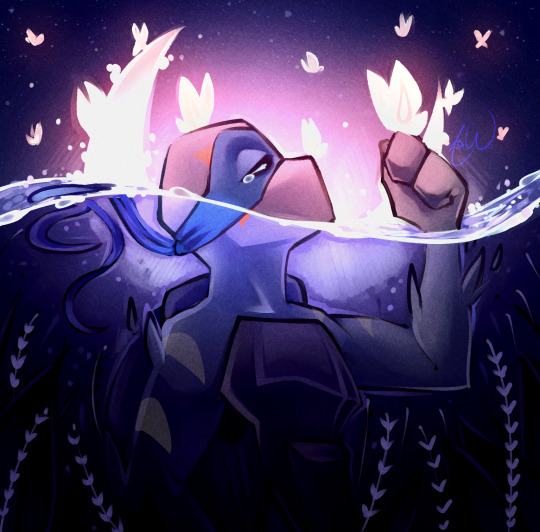
#personally I like csp a lot!
Note
i just found your blog and i am in love!!! the way you draw them pokebeans look so cute and endearing! also! i don't know if you've answered this already, or if i haven't scrolled through your blog far enough, but may i ask what program you're using for your art? keep up the amazing work! your art gives me (and others!!!!!!) so much joy! 🧡✨
AHHHHH HELLO anon thank you sm for the kind words!! It always makes me happy to know ppl find joy through my art ;w; (it's the best kind of compliment really <3)
I use Clip Studio Paint for my art! (and here's more info abt the brush I use :D)
#asks#anon#tysm again for the kind words anon!! ;w;#love drawing them pokebeans uwu#personally I like csp a lot!#it's a lovely program so you should give it a try when you have the chance 👍
8 notes
·
View notes
Text

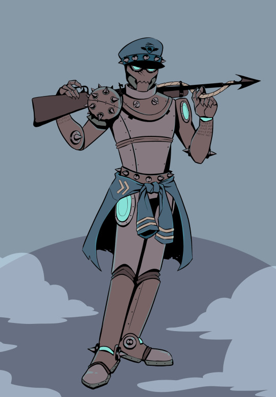
playin around in strike + csp feat himeno
#chainsaw man#csm#himeno#himeno csm#nettillust#genuinely Do Not Like Her as a person but. she is here regardless. hi girl what's good#aside from Her though strike is SUCH a fun program to mess around with!!!!! feels very quick but playing with 1bit has been super gr8#process i've been using for it has been:#sketch + rough tones in strike > edit tones and tweak details in csp > adjustment layer fucking around til something sticks out 2 me#and then it's done!! tbh as someone who usually spends a lot of time on detailed color rendering and being as precise as possible it's like#ultra refreshing to just have somethin done in an hour or two. compared to my usual bullshit lol#anyways! u can find strike on itch.io and it runs for free in browser! go try it!#oh forgot 2 add Put In Image/Noise Textures to that process list lol but i do that with every painting i do so. ya#later gators! more coming soon!
53 notes
·
View notes
Text
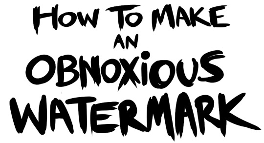
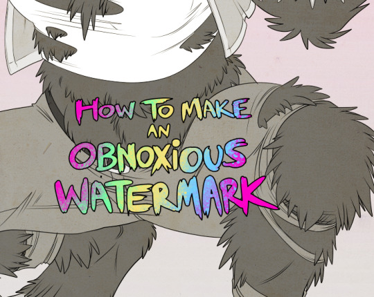
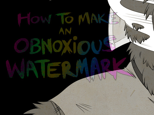
...that your audience won't hate.
This is a method I started using when NFTs were on the rise - thieves would have to put actual work into getting rid of the mark - and one that I am now grateful for with the arrival of AI. Why? Because anyone who tries to train an AI on my work will end up with random, disruptive color blobs.
I can't say for sure it'll stop theft entirely, but it WILL make your images annoying for databases to incorporate, and add an extra layer of inconvenience for thieves. So as far as I'm concerned, that's a win/win.
I'll be showing the steps in CSP, but it should all be pretty easy to replicate in Photoshop.
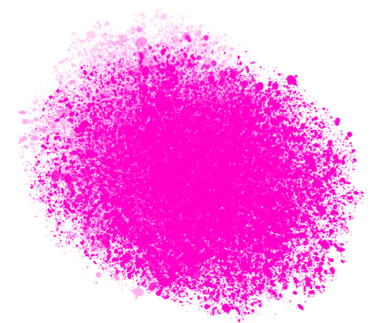
Now: let's use the above image as our new signature file. I set mine to be 2500 x 1000 pixels when I'm just starting out.
Note that your text should not have a lot of anti-aliasing, so using a paint brush to start isn't going to work well with this method. Just use the standard G-Pen if you're doing this by hand, or, just use the text tool and whichever font you prefer.
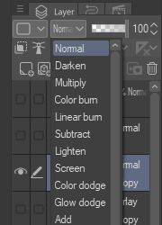
Once that's done, take your magic wand tool, and select all the black. Here are the magic wand settings I'm using to make the selections:

All selected?
Good.
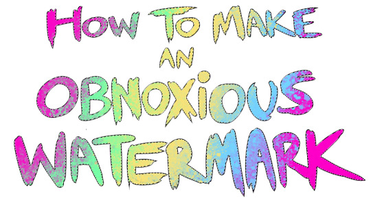
Now, find a brush with a scattering/tone scraping effect. I use one like this.
You can theoretically use any colors you want for this next part, but I'd recommend pastels as they tend to blend better.
Either way, let's add some color to the text.
Once that's finished,
You're going to want to go to Layer Property, and Border Effect

You'll be given an option of choosing color and thickness. Choose black, and go for at least a 5 in thickness. Adjust per your own preferences.
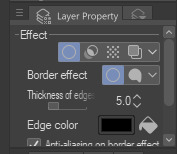
Now create a layer beneath your sig layer, and merge the sig down onto the blank layer.
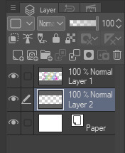
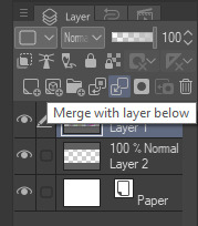
This effectively 'locks in' the border effect, which is exactly what we want.
Hooray, you've finished your watermark!
Now let's place that bad boy into your finished piece.
You'll get the best mileage out of a mark if you can place it over a spot that isn't black of white, since you'll get better blending options that way. My preference is for Overlay.

From here, I'll adjust the opacity to around 20-25, depending on the image.
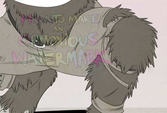
If you don't have a spot to use overlay, however, there's a couple other options. For white, there's Linear Burn, which imho doesn't look as good, but it still works in a pinch.
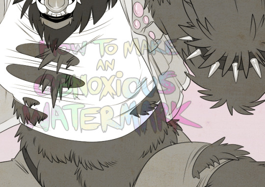
And for lots of black, you have Linear Light
Either way, you're in business!
EDIT since this has escaped my usual circles, and folks aren't as familiar with my personal usage:
An example of one of my own finished pieces, with watermark, so you can see what I mean about 'relatively unobtrusive'-- I try to at least use them as framing devices, or let them work with the image somehow (or, at the very least, not actively against it).
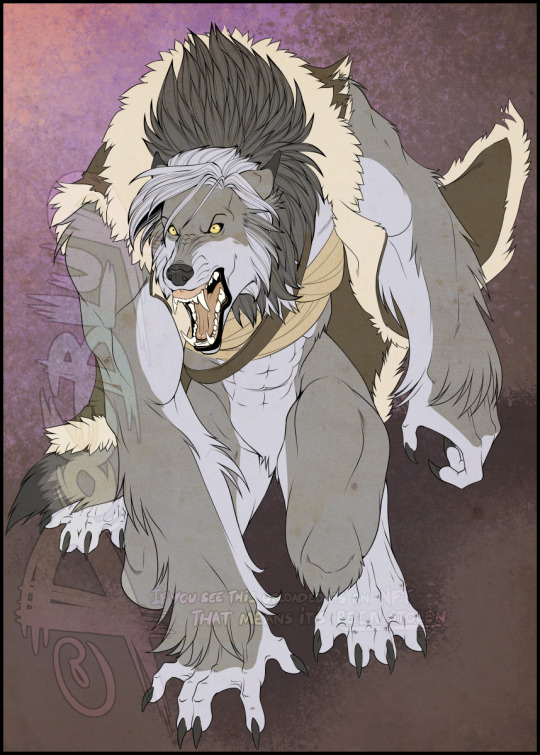
I know it's a bummer for some people to "ruin" their work with watermarks, which is part of the reason I developed this mark in particular. Its disruption is about as minimal as I can make it while still letting it serve its intended purpose.
There's other methods, too, of course! But this is the one I use, and the one I can speak on. Hope it helps some of you!
52K notes
·
View notes
Text
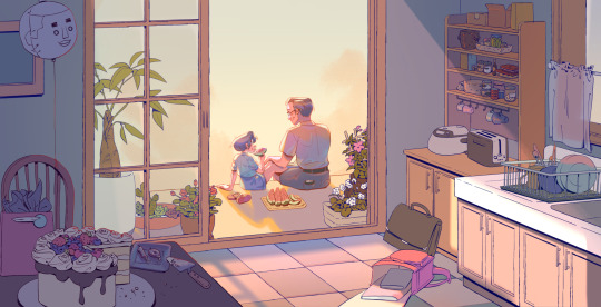

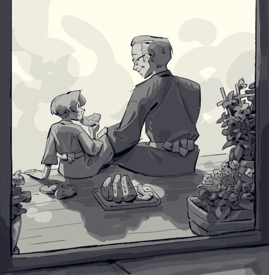
edgeworth family & summer 🍉
i needed to go through an old file in my 2021 folder, and i stumbled upon this drawing. 2021 was an incredibly arduous year & resulted in a lot of art block, so i have a lot of unfinished drawings from then. the fact that i finished/drew anything at all is a feat honestly (and you guys should be proud too if you drew anything at all during the early months of the pandemic...!)
i quite like the look of jeluto's csp brush here to achieve a blocky effect...


i dont know what is UP with the bleed border here, did i plan to print this in a book? especially with how close greg's face is to the gutter??? *avgn voice* what was i thinking
the one time i ACTUALLY tried a bg and it backfired on me bc i never finished. im sorry to my 1st year layout teacher who gave me a 1 on 1 personal pep talk *dexter voice* i have failed you 😭😭 i think this drawing had a lot of potential, i just wouldn't go back to it bc it's 3 years old now. backgrounds are tough because i never really know how to approach them. do i line it? do i keep it a sketch and just paint over/under the sketch layer? do i lineless it?
i guess it depends. much to think about... i definitely want to challenge myself whenever i can, but not overwhelm myself with the need to "improve". gotta remember that art should be fun ♥.
#ace attorney#miles edgeworth#gregory edgeworth#my art#do people on twitter still like seeing wips/throwaway drawings/lower quality art? i feel like it's ..crickets over there..........#aa
558 notes
·
View notes
Text
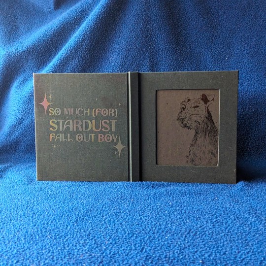
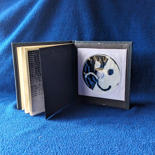
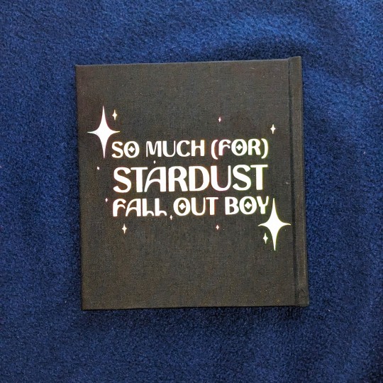
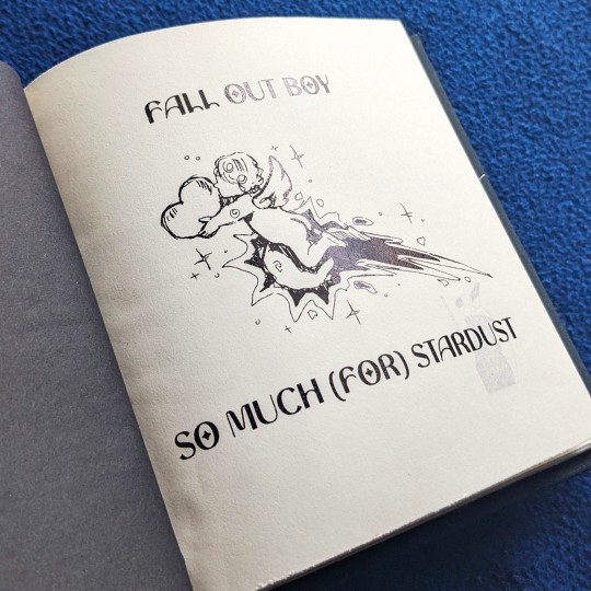

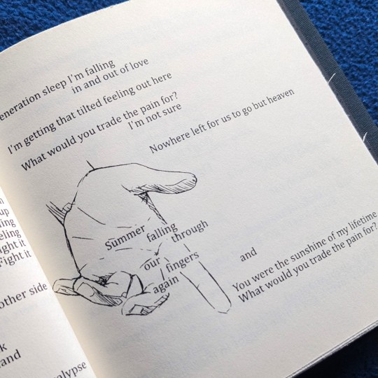
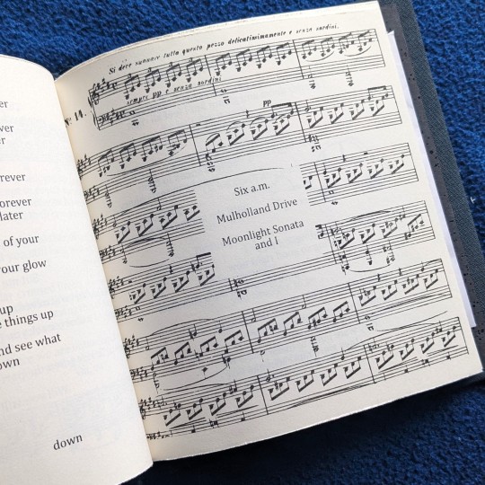
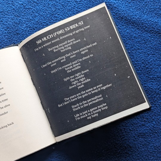

So Much (For) Stardust by Fall Out Boy
Bind made for a Fall Out Boy trade with beardeddogbindery
Christy and I chatted about FOB and doing an album exchange while I was attending a FOB concert - I know there are a lot of Swifties out there, so it's nice to also bump into another FOB and be able to do a small trade together ((if there are more Fall Out Boy fans out there, don't be shy let us know))
Christy told me that she hasn't really listened to much of the newer Fall Out Boy stuff - I knew that lot of the older fans didn't like any of FOB's post-hiatus works. SMFS was described by FOB as "[the album] sounds closer to a continuation of their 2008 record Folie à Deux", which I thought might be a good "re-introduction" into FOB's newer music. I also really really really really like this album myself lmfao.
✦ illustrations are done on Procreate, everything was typesetted on Clip Studio Paint 0/10 I do not recommend typesetting on CSP lmfao
✦ Printed on A4 folio and then cut down to 148x148 mm because I wanted the lyrics book to be square and resemble an album
✦ original album cover features a painted dog. Christy has two VERY ADORABLE puppers. The only logical approach here is to draw one of her dogs and slap it onto the cover
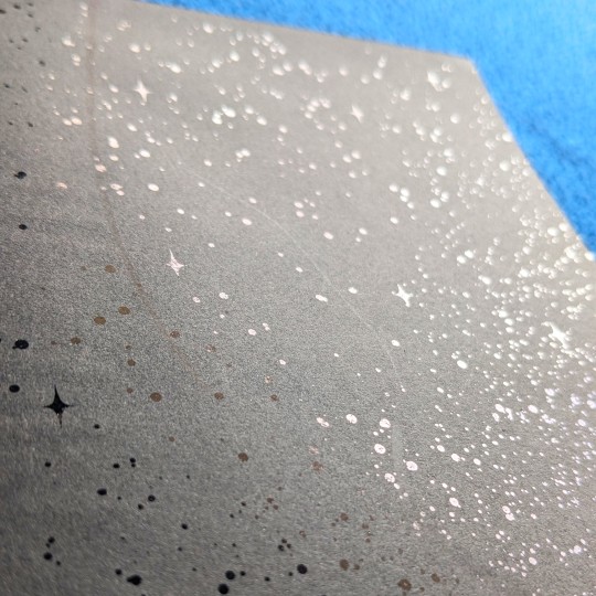
✦ Dog illustration + endpapers + title page + some other pages are foiled using black foil! It was my first time working with black foil. It's very subtle
✦ Backside text is done on holographic reflective HTV, to add a bit of surprise effect and make it glow like a star
Please go check out @beardedogbindery's page for her two adorable quarto binds (I got two binds. two!!!)
So Much (For) Stardust typeset will be available at request for personal binding too!
.
#book binding#bookbinding#fall out boy#so much for stardust#so much (for) stardust#fob#smfs#eggfriedpenguin
283 notes
·
View notes
Note
What brushes do you use in csp?? Ive been trying to find a good lineart brush thats gives me similar results to yours and im just having no luck
Imma be real with you boss I don't even know how to answer that question anymore LMAO
There's a post on my patreon (which, my bad, I thought was public but is locked for $1 apologies) called "brushes masterpost" where I list a bunch of brushes I tend to circle back to BUT that post is already outdated. I switch lineart brushes so often that ANY information about what brush I'm using becomes obsolete real quick so I hate answering this question 🫠
I can say that even if I linked the brushes I'm using, the chances of them looking the same to you are slim since my brush effects depend not just on the original brush, but on a bunch of edits to its settings, system pressure settings (the same brushes look different to me on a laptop and an iPad for instance) and resolution (a lot of the brushes I use look crispy because I work on low resolutions, but would look completely different if instead of using them at 3px size I used them at 10px like a normal person).
I can also maybe just advise that if you're struggling with finding a brush you like, don't be afraid to download a bunch of different ones (assuming you've got something like the CSP asset store) and spend some time redrawing the same things to see which one tickles your brain! And also don't be afraid to mess around with the settings to see what they do - while of course saving duplicates if you don't want to lose the original one. I find that really understanding what the main settings do is a lot better in the long run to customise your ideal brush than just trying out stuff other artists use directly.
My current lineart brush is a customised version of the brush "sketchy pen" from this pack
275 notes
·
View notes
Note
These have been pent up for a while, so there's a whole list lol. Some are Aurora, some are not.
1) Can lacrimas carry out multiple purposes at once? Or will they blend them? I'm assuming that this is possible, considering that the automaton in the ruins was using a lacrima as a brain
2) Has anyone tried to make tools or weapons out of lacrimas? I'm talking like chisel that needs no hammer. Or maybe a Fire lacrima on a bow that sets your arrows on fire
3) Can you engrave runes on lacrimas to make them affect themselves?
4) Where can I read more about the Twins? If I'm not wrong they're the creator gods, aided by the Light dragon and the Void dragon to create life, but I might be getting a wrong read on that
5) Since we see Erin successfully become the first Void mage, does that now mean there's potential for him to make a Void lacrima? The dragon probably won't allow it, but still
6) What exactly does elemental corruption of each element do? Fire literally burns you up, as we saw in Arc 1. I can infer that Life likely makes you a chimera. Void corruption makes you a cave crawler. But what do the other one do? Does Earth make you a statue? Does Wind disintegrate you, Thanos style?
7) Now onto the non-Aurora questions, is your art vector or raster? I believe it's vector, but it's always better to confirm
8) What are your opinions on reading into the environment and the character design to infer things about the character themselves? In any type of media
9) Have you played Baldur's Gate 3?
10) Do you have any music that you'd recommend? I've listened to every song I liked so many times that I hate them now.
11) I'm new to Tumblr, anything that I should know? You don't have to answer this one if you don't wanna. I think I know some of the basics already. Reblog what you like, and avoid the terfs, right?
You might be able to tell that I like the idea of the lacrimas a little bit. Just a teensy bit. The artificer in me definitely isn't obsessed. I appreciate any answers you can give :3
Cheers!
Ooh, lots of stuff!
Yes, it's possible. A lacrima can be engraved with multiple spells, set in a casing engraved with commands, or some combination of the two. Typically, all spells engraved directly on a lacrima will activate at once when the lacrima is "switched on", but a spell can be quite complex, and conditional activations are possible - "if-then-else" statements, basically.
Yes, magic items exist.
Generally no. If the lacrima is disrupted or broken, the spell generally stops functioning, so a self-affecting lacrima will run only as long as it takes for the lacrima to distort or break.
There's an extra lore page about them!
He probably could if he wanted to (and the Dragon allowed it) but Void energy is very dangerous, so he likely doesn't want to.
Each form of elemental corruption agitates the presence of the element in the mage's body. Earth corruption can damage or alter bones, encourage unhealthy petrification of soft tissues, etc. Wind corruption can have physical effects but it often most obviously produces breakdowns in the person's ability to speak or understand language. Lightning damages, numbs or intensifies a person's physical senses.
Raster, I draw with CSP's digital pens. I've only very briefly experimented with vector art - I don't like how it simplifies the lines.
I think it's a fun school of analysis but, like all literary analysis, it runs into trouble if it tries to lock down exactly what the writer was thinking or intending (which is an objective fact that one can be incorrect about) rather than trying to analyze the story on its own and what meaning might, intentionally or unintentionally, be factoring into it.
Nope
don't trust my taste in music it's 90% nu metal and sonic OSTs
Like what you like, reblog what you want, generally it's considered dubious form to add a comment to a reblog unless you have something profound to contribute (commenting in the tags is fine), steer clear of discourse and callout posts and generally the sectors of the site that are constantly on fire, blocking someone for any reason is 100% fine
156 notes
·
View notes
Note
hi! not exactly a request but i do wanna ask, whats your process when you're rendering more paint like art? (if that makes sense, English isnt my first language so apologies hdskhsjdbd) i really love how you use the colors and im curious how you do it :0
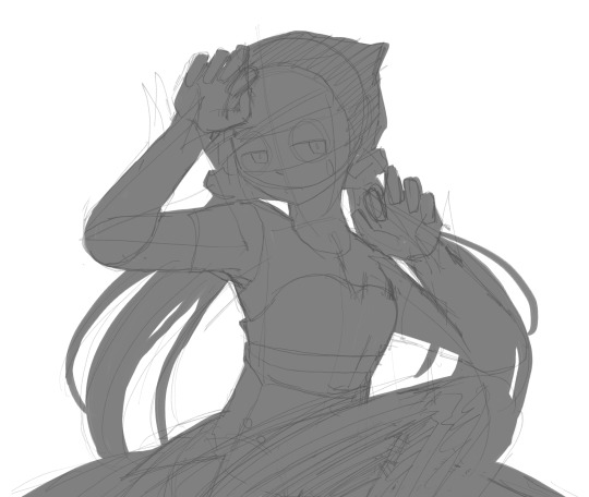
i’ve been meaning to answer this one for a while so here’s how i painted miku in today’s post (put under the read more because yeah prepare for a long post
i’d also like to preface this by saying that i never follow a set way of doing things, so in terms of what my personal process is like, these are only broad strokes of what i do! sometimes i’ll combine or skip parts entirely, depending on how i feel. also, this is not a tutorial, just how i do things, so please don’t treat it like one :’D this will read like the ‘how to draw an owl’ picture if you do
first, like every artist, i sketch. more specifically, i’m getting an idea of what i want to paint later on. this could be how a scene is set up or in this case, how a character is posed. here i’m not concerned about details or getting everything perfectly, i’m only planning how the thing will be composed. maybe a lot of canvas size changing, or adjusting what miku’s doing (note how busted miku’s right hand looks from all the transforming!) however, i still have to be concerned with how clear the sketch will be to future me, because the sketch won’t be any good if i can’t read what miku’s doing

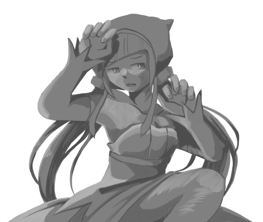
after that, i lay down a flat gray under the sketch, mainly focusing on giving miku a clear silhouette. this is also a good time to make adjustments to the composition on the fly if i suddenly feel like something can be improved upon, like shortening miku’s left arm from the sketch!
after painting a flat silhouette, i start shading in grayscale, focusing only on lighting. i usually do it in two passes, one for the lightest and darkest tones i’ll use (not black and white) and then a second for midtones to blend them better with the base gray but i forgot to screenshot the result of the first pass 🗿 nevertheless, here is where i can start adding some amount of details. i’m not including any extra accessories yet, just focusing on the base design of the outfit and the character herself (for anyone wanting to draw characters from That Gacha Game, this is how i personally make the process more bearable for myself.) i still use the dark gray to separate where certain details (like the facial features and fingers) begin and end, mainly to make colouring more bearable later.
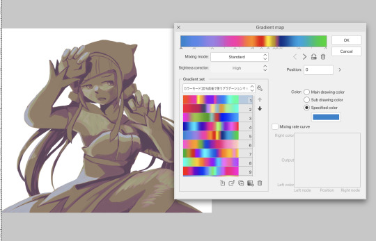
now here’s where i get the Good Colours. it’s a cheat lol. i put a gradient map layer over the grayscale painting so that there’s a little bit of color to start. some gradient maps can be applied as is, some need the layer settings adjusted to make it look good. this one, for example, is a (free) gradient map set from the csp assets store that needs you to set the layer opacity to 20% and to set the blending mode to color to achieve this result. in general, i tend to pick which gradient map i want to use based on vibes, or basically whether i want the work to be warmer or cooler, colour-wise. but this does do quite a bit of lifting for the colors in my stuff.
and then, finally, i add the colours. i add flat base colours in an overlay layer. at this stage, i’ve made the character silhouette clear enough that i don’t need to refer to the sketch anymore for what miku looks like. also, the gradient map layer does its magic by making the shading a bit more vibrant than it would’ve been without it. after that i paint over with a new layer to add details like the lace.
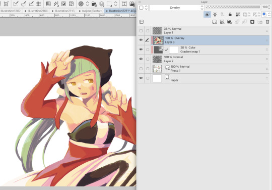
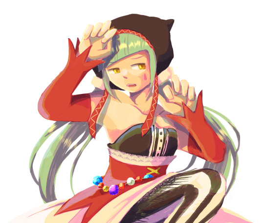
and then i put some extra shading on top. basically this is where the ‘better lighting’ happens. again, this isn’t a tutorial, so i’m not here to say what each part of the lighting is, but i’ve labeled which layers do which job. in other works where the lighting within a scene is more defined (from a window, from a small crack in the walls, etc) the glow dodge layer may be more opaque and sharper, but since this isn’t a work with that, the lighting was applied using an airbrush. the linear burn layer is also there to make the whole thing darker so the glow dodge doesn’t end up oversaturating miku. i also usually match the lights to the vibe i want, and use a complementary color for the shadows. so here you can see i have warm colors on the glow dodge layer, but light purple on both the linear burn and multiply layer.
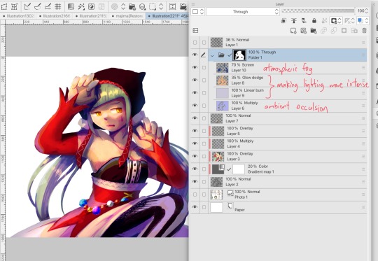
and that’s it for the character—here’s a gif showing how each layer adds to miku! (sorry it’s so toasty)

as for the background, depending on the complexity, it may go through a similar process, or if i can settle with flat image backgrounds, i just go for that. it’s ok to use external image materials. i didn’t have a background in mind for this miku in specific, so i got some default csp materials and threw together something
and that’s about a rough overview of what my process for more finished works looks like! again, art is a fluid process so i never specifically stick to certain steps all the time, and you shouldn’t either. i can probably answer why i’d pick this colour over another in one particular work, but it’s something that kinda has to be learned on a grander scale. i think everyone can already feel what colors work with what atmosphere or what setting, even if they can’t immediately explain why. colors and composition do take some level of experimentation to find what works best!
125 notes
·
View notes
Note
Thanks for answering! Could you go into how you paint? It's always the trickiest part for me
Hehe sure thing! I even recorded some of it, bc for me personally, i learn a lot easier when it's visualized like that, aha.
So first off, we'll start off with our base!

Personally, I like a lot of gradients and color variations to start off with, but these can be solid base colors of you prefer :3. From this, ALL layers are gonna be merged down into one, no separate layers here yet :D
Going forward, I have a video done here kinda showing what I do :DD. I'll explain below the video in more detail what I do
First the base shadiws and highlights — for the shadows I'll usually pick from the color wheel (a darker, more saturated tone, plus I'll also shift the hue some) and draw right on the canvas. For the base highlights, i'll almost always use a bright orange on whatever adjustment layer makes your color nice and bright and glowy (for PTS it's Luminosity, and for CSP and Procreate I usually use an Add layer).
THEN I DO SOME MESSY BLENDING OUT, nothing pretty yet, just getting some of the colors blended out hehe
Afterwards, the drawing usually looks like this :0 very messy lol
NEXT !!! PAINTING TIME !!! As show in the video, it's allllll about color picking and going over what you've already done. For a lot of it I use a softer brush, letting the colors blend together more softly, and then for other portions I'll use a harder pen for where I want more of the color that I picked to show through. Sometimes I'll draw over the line art all together if I don't think it's needed, or i"ll draw the line art back in after painting over it if I want those lines still :0
And there's just a looooot of drawing over and painting over. The 20 seconds you saw of painting and blending usually goes on for like 3-6 hours, depending on the drawing XD.
After ALLLL of that, I get smth like this

AND this was pretty much just working on leo. Now to work on the background elements >:3c same progress, just for the atmosphere and not the character!

YAY NOW THAT'S DONE !! Now all the paintings done soooooo
Color correction and final touches >:3c no more painting, now there's just a bunch of fun glowy layers we add on top of this heheheeh
AND WE DONE >:DDD
I hope that helped some djejwjww. Tbh, the way I learn the most is if an artist im trying to learn from straight up just streams what they’re doing, but I don't rlly know anywhere i could stream or who would be interested ;w; but I hope this helps enough anyway!
If there are any other questions, I'll be happy to answer! Ive said before I rlly like playing art teacher heheheheh <33
218 notes
·
View notes
Text
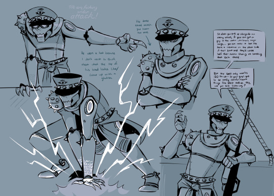
Seafaring warforged for your consideration
Originally my D&D guy was gonna take more than just a level in fighter, and eventually get echo knight. My plan was that he’d always unintentionally summon the same fucking guy — a version of himself from a timeline where the ceasefire was never called and he’d been built to completion and dispatched as the naval demolitions guy he was intended to be. The two of them would have very different life experiences and senses of self… basically, their personalities would clash A LOT.
But… I ended up scrapping him — he was interesting but a bad fit for the game (with a smaller group and a more rollplay-apt DM, this guy woulda kicked ass)
Anyway I never gave that much thought as to what he looked like until he came up in in conversation about a month back, and he’s been kinda floating around my brain since. Had to trap his ass in a CSP file.
#based on like. the canon warforged loose naming conventions I’ve been mentally calling him#The Weatherman#which I think is funny so I’m sticking with it#didn’t wanna draw a second guy so it looks like he’s talking to thr harpoon gun#again that’s funny I’m not changing it#d&d#warforged#eberron#my art#oc
90 notes
·
View notes
Text
What was the police générale (Police Bureau) ?
Long post! I missed doing these analysis posts! More under the cut. Please feel free to let me know if I need to correct/add any info!
There is a lot of confusion amongst frev hobbyists and historians alike regarding the Police Bureau set up by the Committees in April 1794. Hopefully this analysis will better present it to the frev community here. The Bureau is often wrongly presented as a "Robespierrest power-grab" when in hindsight and more careful analysis has taken place, it appears to be more of an unfortunate coincidence that Robespierre, Saint-Just, and Couthon were signing a majority of the decrees and statements put out from the Bureau. The rest of the CSP, and including Saint-Just- who gave the speech presenting it to the Convention on behalf of both of the leading committees were all largely preoccupied with military matters and missions to the provinces. In fact, Saint-Just, Robespierre, and Couthon did attempt and succeed in passing Bureau document reviews off to other CSP members like Carnot, in some instances. Robespierre's reviews of many documents were vague and often called for further examination- not immediate trial, or let alone condemnation. Robespierre (and likely Couthon's) ill-health left them confined to Paris- someone still had to be there to oversee matters in a committee stretched to its very limits.
The idea that Robespierre, Couthon, and Saint-Just- who was gone away to mission only days after the Bureau came into existence were "terrorizing" the public with this measure is entirely anachronistic reactionary propaganda. Also, it is important to acknowledge the ever-growing rift between the CSP and the CSG- although this bureau in theory was probably intended to be reconciliatory (as many of SJ's proposals were) and alleviate the strain the vast amount of these sorts of cases had on the CGS, it really only divided them further in many ways. Regardless of SJ's and the entire CSP's intent with creating this bureau, in reality it sowed more seeds of envy and distrust amongst the two leading Convention committees.
The two leading Convention committees issued these 18 decrees in alignment with the speech Saint-Just gave on the CSP and CSG's behalf on the creation of the police générale on 26 germinal an II ( 15 April 1794). This is approximately 10 days after the Indulgents/Dantonists' trial and executions, for a timeline reference. However, Saint-Just was never one to willingly make a speech without carefully preparing it. Couthon originally presented amendments 1-7, which passed unanimously. Saint-Just modified Article 7 and introduced Articles 8-15 during his speech. This post is quite long but I recommend checking out Saint-Just's personal script for the articles he introduced (These can be found in the 2004 folio-histoire edition of his Oeuvres complètes, and probably other editions too.)
Articles:
Art. 1- Les prévenus de conspiration seront traduits de tous les points de la République au tribunal révolutionnaire à Paris.
Art. 2- Les Comités de salut public et de sûreté générale rechercheront promptement les complices des conjurés, et les feront traduire au tribunal révolutionnaire.
Art. 3- Les commissions populaires seront établies pour le 15 floréal.
Art. 4- Il est enjoint à toutes les administrations et à tous les tribinaux civils de terminer dans trois mois, à compter de promulgation du présent décret, les affaires pendantes, à piene de destitution ; et, à l'avenir, tous les affaires privées devront être terminéés dans le même délai, sous la même piene.
Art. 5- Le Comité de salut public est expressément chargé de faire inspecter les autorités et les agents publics chargés de coopérer à l'administration.
Art. 6- Aucun ex-noble, aucun étranger des pays avec lesquels la République est en guerre, ne peut habiter Paris, ni les places fortes, ni les villes maritimes, pendant la guerre. Tout noble ou étranger dans le cas ci-dessus, qui y serait trouvé dans dix jours, est mis hors la loi.
Art. 7- Les ouvriers employés à la fabrication des armes, à Paris, les étrangères qui ont épousé des patriotes français ne sont point compris dans l'article précédent.
Art. 8- Le séjour de Paris, des places fortes, des villes maritimes, est interdit aux généreux qui n'y sont point en activité de service.
Art. 9- Le respect envers le magistrats sera religieusement observé; mais tout citoyens pirranse plaindre de leur injustice, et le Comité de salut public les fera punir selon la rigueur des lois.
Art. 10 - La Convention nationale ordonne à toutes les authorités de se refermer rigourousement dans les limites de leurs institutions, sans les étendre ni les restreindre.
Art. 11- Elle ordonne au Comité de salut public d'exiger un compte sévère de tous les agents, de poursuivre ceux qui serviront les complots et auront tourné contre la liberté le pouvoir qui leur aura été confié.
Art. 12- Tous les citoyens sont tenus d'informer les autorités de leur ressort et le Comité de salut public, des vols, des discourses inciviques et des acts d'oppression dont ils auraient été victimes ou témoins.
Art. 13- Les représentants du peuple se serviront des autorités constitutées et ne pourront déléguer de pouvoirs.
Art. 14- Les réquisitions sont interdites à tous autres que la commission des subsistances et les représentants du peuple près les armeés, sous l'autorisation expresse du Comité de salut public.
Art. 15- Si celui qui sera convaincu désormais de s'être plaint de la Révolution vivait sans rien faire et n'était ni sexagénaire, ni infirme, il sera déporté à la Guyane. Ces sortes d'affaires seront jugées par les commissions populaires.
Art. 16 - Le CSP encouragera, par des indemnités et des récompenses, les fabriques, l'exploitation des mines, les manufactures, le dessèchement des marais; il protégera l'industrie, la confiance entre ceux qui commercent; il dera des avances aux négociants patriotes qui offriront des approvisionnements au maximum; il donnera des ordres de garantie à ceux qui amèneront des merchandises à Paris, pour les transports ne soient pas inquiétés; il protégera la circulation des rouliers dans l'intérieur, et ne souffrira pas qu'il soit porté atteinte à la bonne foi publique.
Art. 17- La Convention nationale nommera dans son sein deux commissions, chacune de trois membres: l'une chargée de rédiger en un code succinct et complet les lois qui ont été rendues jusqu'à ce jour, en supprimant celles qui sont devenues confuses; l'autre commission sera chargée de rédiger un corps d'institutions civiles propres à conserver les moeurs et l'espirit de la liberté. Ces commissions feront leur rapport dans un mois.
Art. 18- Le présent décret sera proclamé dès demain à Paris, et son insertion au Bulletin tiendra lieu de publication dans les départements.
English translation:
Art. 1- Those accused of conspiracy will be brought before the Revolutionary Tribunal in Paris from all parts of the Republic.
Art. 2- The CSP and CSG will promptly seek out the conspirators' accomplices, and have them brought before the revolutionary tribunal.
Art. 3- The People's Commissions will be established by 15 Floréal.
Art. 4- All administrations and civil tribunals are enjoined to complete all pending cases within three months of the promulgation of the present decree, under penalty of dismissal; and, in the future, all private cases must be completed within the same time-frame, under the same penalty.
Art. 5- The Committee of Public Security/Police Bureau is expressly charged with inspecting the authorities and public officials charged with cooperating with the administration.
Art. 6- No ex-noble or foreigner from countries with which the Republic is at war may live in Paris, or in fortified towns or maritime cities, during the war. Any nobleman or foreigner in the above situation, who is found there within ten days, is outlawed.
Art. 7- Workers employed in the manufacture of weapons in Paris and foreign women who have married French patriots are not included in the preceding article.
Art. 8- Generous citizens who are not on active service are forbidden to stay in Paris, fortified towns and maritime cities.
Art. 9- Respect for magistrates will be religiously observed; but all citizens will complain of their injustice, and the CPS will punish them according to the rigor of the laws.
Art. 10 - The National Convention orders all authorities to remain rigorously within the limits of their institutions, without extending or restricting them.
Art. 11- It orders the Committee of Public Security to demand a strict account from all agents, and to prosecute those who serve plots and turn the power entrusted to them against liberty.
Art. 12- All citizens are required to inform their local authorities and the CSP of thefts, uncivil discourse and acts of oppression of which they have been victims or witnesses.
Art. 13- The people's representatives will use the constituted authorities and will not be able to delegate powers.
Art. 14- Requisitions are forbidden to anyone other than the subsistence commission and the people's representatives to the armed forces, subject to the express authorization of the CSP.
Art. 15- If the person convicted of having complained about the Revolution lives without doing anything, and is not in his sixties or infirm, he will be deported to French Guiana. These kinds of cases will be judged by popular commissions.
Art. 16 - The CSP will encourage, through indemnities and rewards, factories, the exploitation of mines, the draining of marshes; it will protect industry, the confidence between those who trade; it will give advances to patriotic merchants who offer supplies to the maximum; it will give guarantee orders to those who bring merchandise to Paris, so that transporters will not be troubled; it will protect the movement of supply ships in the interior, and will not allow public good faith to be undermined.
Art. 17- The National Convention will appoint two commissions from among its members, each with three members: one will be charged with drafting a succinct and complete code of the laws that have been passed to date, deleting those that have become confused; the other commission will be charged with drafting a body of civil institutions suitable for preserving morals and the spirit of liberty. These commissions will report within one month.
Art. 18- The present decree will be proclaimed tomorrow in Paris, and its insertion in the Bulletin will take the place of publication in the departments.
69 notes
·
View notes
Note
I have been following your soc comic adaptation and it just so good!!! I love how you draw them!
I have just one question: Why did you not include Inej's opening musings about Kaz on the first page? (Kaz Brekker didn't need a reason etc) I actually really like how there is not text on the first two pages, it's really atmospheric and moody so this really is not a criticism, I don't want to insult you. I guess I was just wondering what the thought process behind that was?
Oh, I've been wanting to talk about this for a while! Buckle up, this is gonna be one of my long comic rants. (Also, no offense taken at all! Anyone's welcome to question my artistic choices and I'm always happy to take critique, even though that isn't your intention.)
So, the thing is I actually planned on including that first paragraph into the comic! Here's when I first shared the thumbnails on here. Just for the sake of this post, I'll insert them here too.
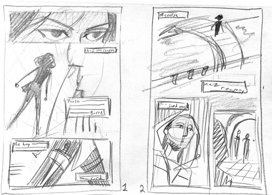
The boxes are meant to be where excerpts of that introduction would go. When I was creating the thumbnails, I was thinking about how iconic these lines were and how well they introduce the world and characters. I even finished the pages with the intention to include those lines. This is from my original csp file.
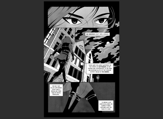
When I lettered it all out, I felt like something wasn't right...? Hard to explain. I wanted silence for the opening and the narration took that away. I then thought about the reader who'd go into this without reading the novel first, wondering if they'd be thinking, Who's this Kaz Brekker guy? Is it this character on the page? It's clearer in the book, but I didn't think it paired well with what I drew. I didn't want any confusion. It's also Inej's chapter, and while Kaz's parts take up most of it, I still wanted it to feel like her POV and her story. We can hold off officially meeting Kaz until page four.
But the main reason I took it out comes down to my philosophy when it comes to comic adaptations. I believe that an adaptation should use the original story in the best way for the secondary medium. A comic adaptation should play to the strength of comics, not the original source material.
Time and time again, I see a lot of comic adaptations of books try to use a book's strength instead of a comic's. When that happens, you get pages upon pages of narration boxes and exposition that could've easily been told in a single panel's image. If you want to read excerpts from the original novel, go do that! They're beautiful and well-crafted and you should be reading the original anyway! If you're making a comic adaptation, make a comic, not an illustrated version of the novel (that's a whole field of its own).
This whole thing really ties well into what I'm doing for Chapter 3. Kaz is such an internal character, his chapters have a lot more exposition that isn't setting description or character actions. I've had to do a lot more of my own writing for this chapter than the last just to turn that exposition into his own voice as an internal monologue. Sometimes, it's just a change from "he" to "I," but there are other times I've had to write new dialogue and find ways to naturally flow between thoughts. If I didn't do the work to adapt the expository text and instead just put in narration boxes of text from the book, there would be a greater disconnect between the reader and Kaz. Third-person limited works great in books and doesn't separate the readers from the story, but in comics, first-person internal dialogue keeps the readers inside the scene better.
If I were to redo Chapter 2, I think I would try to find a way to incorporate the information from the chapter intro better. I think by losing the intro I initially planned to include, I didn't establish certain ideas very well. Ketterdam and Kerch are established later on pages 4 and 5, but I don't think I ever go back and mention The Barrel. Also, the idea that Kaz is deliberate, even if his reputation says otherwise, is important too. I've made sure to fix this kind of issue in Chapter 3 and keep record of what kind of information I'm losing as I adapt it.
#comic rant over!#thanks for the ask I really love talking about this stuff#soc comic adaptation#asks#comics talk
111 notes
·
View notes
Text
We Don't Gatekeep Art Resources | A Comprehensive List
Here's a list of some of the tools/sites I currently use or have used previously for works/studies. I'll separate it into Software/Utility, Reference, and 'Other' which will be just general things that could help you map out things for your experience with art.
**[Free highlighted in pink, paid highlighted in green. Blue is variable/both. Prices Listed in USD]**
Software/Utility:
2D
Krita Painting app (PC) (my main digital art software on PC for 5+ yrs)
Clip Studio Paint [PC] [CSP 2.0+ allows for 3d modelling within the painting app and a lot of other cool features] [apparently allows up to 6 months free trial]
Procreate (12.99) [iPad/iPad Pro] (the GOAT)
Artstudio Pro [iPad/iPad Pro] (An alternative to Procreate if you enjoy the more traditional art app layout) -- I find this app handy when Procreate is lacking a feature I need, or vice versa. (you can easily transfer files between the two, but keep in mind Procreate's layer limit)
2D "Collaborative Painting/Drawing apps"
Magma Studio
Drawpile
Discord Whiteboard
Gartic Phone (Pretty decent for 2d animation practice, but has a hard limit on frames)
3D
Blender [3D Modelling, Sculpting + Layout] (PC)
Sculptris [PC] (it's an old unsupported version of Zbrush, but can help to get ideas out, and functions better than browser sculpting apps
Nomad Sculpt [iPad/iPad Pro] ($20) Works pretty well if you prefer a mobile setup, but it is a bit intense on the battery life and takes some getting used to
References + Study
Magic Poser [ PC and Mobile ] Has both free and paid versions, I've made do with just the lite version before
Artpose ($9.99) [Iphone + Steam]
Head Model Studio [IPhone] A 3D head, with both a basic blockout version for angles, and a paid version with more detail
Cubebrush [simply search "[keyword] pose reference pack"], they usually have good results + they frequently have sales!
Line of Action [Good for Gesture practice + daily sketching], also has other resources built in.
Quickposes Similar to Line of action, more geared toward anatomy
Drawabox | Perspective Fundamentals Improvement modules (Suggested by @taffingspy )
Sketchfab, this skull in particular is useful, but there is other models that can help you study anatomy as well.
Pinterest can be good, you just have to be careful, usually you're better off just finding reference pack if you have the money, sometimes certain creators have freebies as well
Artstation Marketplace can be decent [make sure to turn on the Aye-Eye filter so it doesn't feed you trash], a colleague of mine recommended this head model for practicing facial blocking, there is also this free version without lighting.
Local Art Museums [Unironically good for studying old "master work" if you're into that, or even just getting some inspiration]
Brushes + Other Useful software:
I personally have used both of these brush packs before making my own
(I actually don't know how to share my daily brush set because I frequently switch between Krita, Procreate, and ASP, but once I figure that out I'll be sure to do that lol)
Marc Brunet's Starter brush pack [Technically free but supporting him for this if you like it is ideal, there's some good brushes]
Dave Greco Brush Pack [$3]
Gumroad in general is a good place to find brushes and art resources. *Note; for Krita specifically, brush packs are a bit weird, so it may require you to find different packs, or import them in a particular way
PureRef [PC] - Reference Compiler/Moodboarding
VizRef ($3.99) [iPad] - Moodboarding/Reference Compiler
Artist Youtubers/Creators that helped me improve/guide me along as a self-taught artist from when I first started digital art to where I am today:
Proko
Marco Bucci
Sinix Design
Sycra
Hardy Fowler
Lighting Mentor
Winged Canvas
Moderndayjames
Swatches
Chommang_drawing
Marc Brunet (YTartschool)
+ Observing a lot of speedpaint art by people whose work I enjoy on social media/youtube, trying to dissect their processes
If you've gotten this far, first of all, congrats, you can read a lot, and second of all, thank you for reading and I hope this helps! I'll continue to come back and update this if I find any new resources in the future, or if my processes change :)
Much Love,
-Remedy (aka "grommy_art")
#art#artwork#digital painting#painting#artists on tumblr#drawing#anime art#sketch#digital illustration#transfem#art tools#art resources#useful websites#small artist#illustration#digital art#artist on tumblr#procreate#my process#my art#krita#art tag#sharing is caring#learning#knowledge#useful stuff#links#reference
30 notes
·
View notes
Text
Clip Studio Paint is Incorporating Stable Diffusion
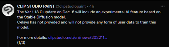
***THE BUILD GOES LIVE DECEMBER 6TH***
Here's the bullet points you need to know about Clip Studio Paint joining deviantArt as today's 'villain for no good reason' de jour.
They are adding Stable Diffusion as a function of the program.
It is using the same stolen dataset we're all very familiar with.
This, in lieu of the millions of other features artists have actually been asking for.
This should be enough to make anyone angry. Really. The SD dataset is still a tirefire of stolen material. Nothing has changed that, and Celsys has made no steps to create their own AI database. Which is ironic, because they could've managed to bring in a lot of good will by seeking volunteers and buying up stock, but they did not.
As with dA, this is a case of 'do the thing, then apologize later, and hope people just kind of go along with it.'
What the new changes do not currently do:
Celsys is allegedly not scraping content from their users.
Celsys is allegedly not going to scrape content from their users without the users' express permission.
Celsys has not explained how they aim to do this, or what formal steps users must take to opt in or out.
I personally don't trust that it will stay like this. So:
What I'd recommend is freezing auto-updates on iPad (you have to do it through Settings -> App Store -> App Updates toggle) and just not updating CSP at all on any other platforms until this gets sorted out.
3K notes
·
View notes
Text
2D Digital Artists of Tumblr!
I'm curious! I personally really like CSP, but don't love that it is moving to a subscription-based model (and already is a monthly fee for mobile devices). I used PS a lot as a student, and have noticed it's basically the industry standard. If you do use PS, is it because you are in the field, or just have a preference for it overall? I did find certain aspects of it better/easier to use than CSP (masks, patterns, transformations, and filters for example), but I like the brush settings and asset management in CSP better. I've also seen a lot of folks moving to Procreate!
Reblogs are encouraged!
317 notes
·
View notes
Photo

Decided to post the whole thing on Tumblr, since Tumblr is just perfect for longreads.
Here is a small background tutorial I did a few days ago! Hope you guys enjoy it!
I decided to make this tutorial free, but if you wish to leave a small tip you can do it at my BMC page. But basically all I wish for is to share this thing with others, so I would really appreciate some reblogs here!
This tutorial is not for the beginners, it requires some basic knowledge on perspective drawing (but don’t worry, I got you covered: here’s my easy guide to perspective drawing). 3D-modelling skills aren’t necessary though, there are plenty of free models out there that can be used in personal or even commercial projects.
All the architecture and interior element designs/3D models are my own (I use SketchUp for modeling), the pillows and cloth are some random 3D-models used as a base with a bit of overpainting. The background is photobashing (I always use the assets published under Creative Commons license or similar licenses, especially now when I can't buy stock images and packs for photobashing) with some paintover. The nice brushes I used to draw leaves are from LoranDeSore pack (you can find it on her DeviantArt page) and the watercolor texture I used on top of the image are made by Hibbary (check out their DA for texture packs).
There are plenty of nice free assets out there, both for Photoshop and CSP, and I think it is important to share this stuff with others, especially knowing that not everyone can afford paying for brushes, textures and stocks. And if you can't afford PS or CSP either there are a lot of software developers who offer their stuff for free, everyone can download Krita and Gimp or other amazing stuff online.
I find it funny when Ai-bros say that artists are gatekeeping (all while fighting with each other over prompts). Like, it literally have never been easier to find tutorials, assets and instruments for your creations.
295 notes
·
View notes
Last Seen Blogs

i-kennot-stand-bean131206
i-kennot-stand-bean131206
bockyblock
Platformy's Pond
poore-choice-of-words
Quirks and Characters
keykomori
Happy Madness

shopandshop-blog1
Untitled