#smartmaps
Explore tagged Tumblr posts
Visit Tumblr Blog
Explore Tumblr blogs with no restrictions, modern design and the best experience.
Last Seen Tumblr Blogs


Fun Fact
Tumblr has a low social media market share in South America.
Text
Where maps meet technological advancements—explore how GIS and IoT weave a living tapestry of smart cities, sensing change, guiding growth, and echoing the rhythm of a smarter tomorrow.
#digitaltwins#environmentalmonitoring#geospatialinnovation#geospatialtechnology#gis#gisiotintegration#internetofthings#locationintelligence#realtimegis#smartmaps#spatialanalytics
0 notes
Text
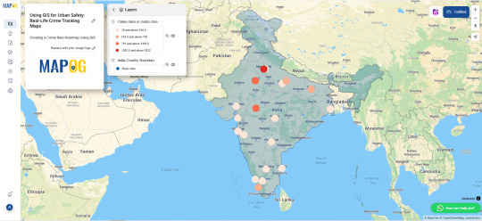
GIS for Urban Safety with Interactive Crime Mapping

Interactive, GIS-powered crime maps deliver essential spatial insights for bolstering urban safety. By displaying crime data in real life, these platforms enable law enforcement and city planners to pinpoint high-risk areas, anticipate emerging trends, and allocate resources more effectively—melding public records with advanced geospatial analysis.
Why Use GIS for Crime Prevention?
GIS streamlines crime analysis by overlaying incident reports with environmental, demographic, and infrastructure layers. Moreover, these scalable solutions support predictive policing, informed patrol deployment, and robust community outreach through location-based crime intelligence.
Uses of GIS in Urban Safety
Hotspot Detection – Reveal clusters of criminal activity, guiding officers to the areas that need attention most.
Predictive Policing – Identify patterns in past incidents to forecast where future offenses may occur.
Public Safety Planning – Inform neighborhood design by integrating crime data into urban development decisions.
Key Applications
Community Awareness: Offer citizens up-to-date crime information via interactive dashboards.
Patrol Optimization: Reconfigure patrol routes according to crime density and urgency metrics.
Traffic Incident Mapping: Enhance road safety by mapping collisions and traffic-related offenses.
Procedure for Crime Mapping with GIS
First, compile crime statistics and geo coordinates from authoritative sources by adding a boundary layer. Next, add CSV/Excel file containing city names and their latitude–longitude pairs. Then, create a “Crime Rate” attribute in the layer’s schema and input the corresponding values for each location. Afterward, switch to the style settings and enable the “Bubble Map” visualization. Adjust classification breaks for clarity and assign a bubble radius of 20 for optimal display. Using tools like MAPOG, merge administrative boundaries and fine-tune symbology for clear overlays. Finally, review the map, publish it to your GIS portal, and share the interactive link with stakeholders.
Use Case: School Zone Safety and Youth Protection
GIS crime mapping is increasingly used to safeguard areas around schools by analyzing incidents involving theft, bullying, or drug-related activity near educational institutions. By combining spatial crime data with student commute routes, pedestrian crossings, and traffic flow, city officials can implement targeted interventions such as increased surveillance, better lighting, and adjusted traffic patterns. This application not only helps create safer school zones but also strengthens policies aimed at protecting young populations in vulnerable urban pockets.
Open-Source GIS Tools in Crime Analysis
Open-source platforms such as MAPOG enable municipalities to develop transparent, shareable crime maps. These tools enhance civic participation, facilitate data sharing, and improve real-life public safety coordination.
Conclusion
By harnessing interactive GIS mapping, cities can revolutionize crime prevention and response. With spatial data and dynamic visualizations, decision-makers gain the insight needed to deploy resources swiftly, engage communities effectively, and ultimately create safer, more resilient urban environments.
#UrbanSafety#CrimeMapping#GISforSafety#SmartPolicing#SafeCities#GeospatialTech#PredictivePolicing#CommunitySafety#SmartMapping#DataDrivenSecurity
1 note
·
View note
Text
Exploring the Depths of Bathymetric Survey and Trusting Dolphin Engineers for Expert Solutions
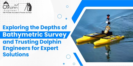
Bathymetric surveys are essential in understanding and mapping the underwater topography of oceans, seas, rivers, and lakes. The process involves measuring the depths and shapes of underwater features, which can provide invaluable data for various industries, including marine construction, navigation, environmental studies, and resource exploration.
Understanding Bathymetric Surveys
Bathymetric surveys utilize advanced technologies such as sonar systems, echo sounders, and GPS equipment to develop highly accurate maps of underwater surfaces. Such maps enable the determination of depth variations, sediment buildup, and any underwater structures. Such data is vital for the planning of maritime construction projects such as ports, bridges, or pipelines. It further helps in ensuring safe navigation for vessels, understanding marine ecosystems, and detecting potential hazards beneath the water surface. These surveys also significantly add to scientific research when they provide insights into underwater geological formations and aquatic habitats. For example, knowing the dispersion of sediment in a river gives one a chance to discover erosion patterns and aid in the proper design of flood control systems.
Why Choose Dolphin Engineers for Bathymetric Surveys
Dolphin Engineers is the most trusted name in the industry when it comes to bathymetric surveys. Here's why they are the best fit for your project:
Accuracy and Reliability Dolphin Engineers uses high-tech equipment and tested methodologies to ensure highly accurate results. The team ensures that every data point is carefully recorded and analysed to provide reliable information for decision-making.
Experienced Professionals The company has a team of experienced professionals who have extensive experience in conducting complex bathymetric surveys. Their experience allows them to handle various challenges, whether it is surveying shallow rivers or deep ocean floors.
Customized Solutions Dolphin Engineers understands that each project has different requirements. It works closely with clients to come up with the survey plans aligned with specific goals and challenges that result in meeting expectations.
Commitment to Safety is a top priority for Dolphin Engineers. Their operations comply with all industry standards and regulations, ensuring that both personnel and the environment are protected throughout the survey process.
Dolphin Engineers delivers comprehensive services other than data gathering, including the processing, analyzing, and generating reports. This is done so that the deliverable will be friendlier to its users, ensuring that the end clients can work with the finding properly.
Cost-Effective Options Despite providing premium-quality services, Dolphin Engineers offers competitive pricing. They strive to deliver value for money by optimizing resources and streamlining processes.
Applications of Bathymetric Surveys
Bathymetric surveys have numerous applications in various fields:
•Marine Construction: It provides foundational data for the construction of harbors, oil rigs, and underwater tunnels.
•Environmental Monitoring: Assessing aquatic ecosystems and tracking changes over time.
•Resource Exploration: Identifying underwater mineral deposits or potential fishing zones.
•Navigation Safety: Updating nautical charts to prevent accidents.
•Flood Management: Studying riverbeds to predict and mitigate flooding risks. Conclusion
Choosing a reliable bathymetric survey partner is indispensable to achieving very accurate and useful results. This is because the company, with Dolphin Engineers advanced technologies, experienced professionals, and service commitment to ensuring that every single project is handled to the high standards of success, will give a client the needed confidence in what they receive-quality and accurate underwater data.
#BathymetricSurveys#DolphinEngineers#MarineSafety#SonarTechnology#UnderwaterMapping#PrecisionMapping#NavigationSolutions#EchoSounding#MarineSurveying#SurveyingExperts#FloodManagement#AdvancedSurveyTech#Oceanography#AccurateDataSolutions#ResourceExploration#GeospatialAnalysis#HydrographicSurveying#TrustedSurveyPartner#EnvironmentalConservation#SmartMapping#EnvironmentalMonitoring#SedimentAnalysis#MarineConstruction#CoastalEngineering#InfrastructurePlanning#WaterResourceManagement
0 notes
Text
Happy New Year from Team CyberSWIFT!
As we step into another exciting year, we extend our heartfelt wishes to you and your family for a year filled with joy, success, and new opportunities. May 2025 bring you endless happiness, good health, and prosperity. Let’s continue to innovate, grow, and create incredible moments together!
#HappyNewYear#TeamCyberSWIFT#Welcome2025#NewYearWishes#2025#CyberSWIFT#GISSolutions#GeospatialTechnology#MappingTheFuture#GISInnovation#SmartMapping#SpatialAnalysis#GISForGood#GeoSolutions#GeospatialInsights
0 notes
Text
Digital Map Market Landscape: Opportunities and Competitive Insights 2032
The Digital Map Market was valued at USD 21.3 billion in 2023 and is expected to reach USD 67.8 billion by 2032, growing at a CAGR of 13.8% over the forecast period 2024-2032
The digital map market is experiencing rapid expansion, driven by advancements in GPS technology, increasing demand for real-time navigation, and the growing adoption of location-based services. Businesses, governments, and consumers rely on digital maps for various applications, including navigation, logistics, urban planning, and disaster management. As industries continue to integrate geospatial technology, the market is set for continuous growth.
The digital map market continues to evolve with the rise of smart cities, autonomous vehicles, and AI-powered mapping solutions. Companies are leveraging satellite imagery, big data analytics, and cloud-based platforms to enhance accuracy and efficiency. The increasing reliance on geospatial intelligence across industries such as transportation, retail, and telecommunications is further fueling market expansion.
Get Sample Copy of This Report: https://www.snsinsider.com/sample-request/3556
Market Keyplayers:
Google LLC (Google Maps, Street View)
HERE Technologies (HERE WeGo, HERE HD Live Map)
TomTom International BV (TomTom GO, TomTom AmiGO)
Esri (ArcGIS Online, ArcGIS Pro)
Mapbox (Mapbox Studio, Mapbox Navigation SDK)
Maxar Technologies (Vivid Standard, Precision3D)
Digital Map Products, Inc. (LandVision, GovClarity)
OpenStreetMap Foundation (OSM Editor Tools, OSM Data Platform)
Lepton Software (SmartMaps, Mapytics)
ThinkGeo LLC (Map Suite, ThinkGeo Cloud)
Market Trends Driving Growth
1. AI and Machine Learning in Mapping
AI-driven mapping solutions are enhancing accuracy, enabling predictive navigation, and automating real-time updates. Machine learning algorithms analyze traffic patterns, optimize routes, and improve geospatial data accuracy.
2. Integration of Augmented Reality (AR) in Mapping
AR-powered navigation is transforming the user experience, offering real-world overlays for enhanced situational awareness. This technology is particularly useful in tourism, real estate, and smart city applications.
3. Growth of 3D and HD Mapping
With the rise of autonomous vehicles and drone technology, high-definition (HD) and 3D mapping are becoming essential. These maps provide intricate details for self-driving cars, advanced urban planning, and immersive location-based experiences.
4. Expansion of Indoor Mapping
Retail stores, airports, hospitals, and large commercial complexes are adopting indoor mapping for better navigation and customer engagement. AI-powered indoor positioning systems enhance accuracy, improving operational efficiency.
5. Increased Demand for Real-Time Location Intelligence
Industries like logistics, fleet management, and emergency response services require real-time geospatial data to optimize routes, track assets, and improve decision-making.
Enquiry of This Report: https://www.snsinsider.com/enquiry/3556
Market Segmentation:
By Type
Geographic Information System (GIS)
LiDAR
Digital Orthophotography
Aerial Photography
Global Positioning System (GPS)
By Mapping Type
Indoor
Outdoor
Metaverse
By Service
Consulting
Development & Integration
Support & maintenance
By Application
Asset Tracking
Geo-positioning and Geocoding
Routing and Navigation
Others
By End-use
Automotive
Military & Defense
Mobile Devices
Enterprise Solutions
Logistics, Travel, and Transportation
Infrastructure Development and Construction
Market Analysis and Current Landscape
Rising adoption of GPS-enabled devices: Smartphones, wearables, and IoT devices rely on digital maps for seamless navigation and location-based services.
Expansion of connected and autonomous vehicles: The automotive industry heavily depends on HD and real-time maps for navigation, safety, and advanced driver-assistance systems (ADAS).
Increasing investments in smart cities: Governments worldwide are integrating digital maps into urban planning, traffic management, and public safety initiatives.
Growing use of geospatial analytics: Businesses are leveraging mapping data for market research, asset tracking, and operational efficiency.
Despite these advancements, challenges such as data privacy concerns, high development costs, and cybersecurity risks persist. However, continuous innovations in AI, blockchain, and cloud computing are addressing these concerns.
Regional Analysis
North America
The largest market for digital maps, North America benefits from strong investments in autonomous vehicles, smart infrastructure, and AI-driven mapping solutions. The U.S. leads in technological advancements, with key players such as Google, Apple, and TomTom dominating the market.
Europe
Europe’s market is fueled by stringent environmental policies, smart city initiatives, and advancements in transportation. Countries like Germany and the UK are investing heavily in 3D mapping and high-precision geospatial solutions.
Asia-Pacific
The fastest-growing region, Asia-Pacific is witnessing increased adoption of digital maps due to rapid urbanization, expanding e-commerce, and government-backed infrastructure projects. Countries like China, India, and Japan are at the forefront of digital mapping innovation.
Latin America & Middle East
These regions are gradually embracing digital mapping technologies, particularly in transportation, logistics, and disaster management. Investments in connectivity and satellite-based mapping solutions are driving growth.
Key Factors Influencing the Market
Technological Advancements: AI, machine learning, and big data analytics are revolutionizing digital mapping capabilities.
Growing Demand for Autonomous Navigation: Self-driving cars, drones, and robotics rely on highly accurate, real-time mapping solutions.
Government and Private Sector Investments: Infrastructure projects, smart city initiatives, and transportation improvements are increasing the demand for geospatial intelligence.
Security and Privacy Concerns: Protecting sensitive location data and preventing cyber threats remain a priority for digital mapping providers.
Future Prospects: What Lies Ahead?
1. Expansion of AI-Driven Mapping Solutions
AI will play a crucial role in improving accuracy, automation, and predictive analytics in mapping applications. AI-powered traffic predictions and dynamic route optimization will enhance navigation efficiency.
2. Development of Blockchain-Based Mapping
Blockchain technology is being explored to secure geospatial data and prevent tampering, ensuring data integrity and privacy.
3. Enhanced Personalization in Mapping Services
Future digital maps will offer personalized recommendations based on user behavior, preferences, and real-time conditions, improving navigation and local discovery.
4. Satellite-Based Mapping Innovations
Advancements in satellite imaging and remote sensing will provide more detailed and real-time mapping solutions, benefiting industries such as agriculture, disaster management, and climate monitoring.
5. Integration with IoT and Smart Devices
Smart home assistants, connected cars, and IoT devices will further integrate with digital mapping platforms, enabling seamless automation and navigation experiences.
Access Complete Report: https://www.snsinsider.com/reports/digital-map-market-3556
Conclusion
The digital map market is on a strong growth trajectory, fueled by rapid technological advancements, increasing demand for real-time location intelligence, and expanding applications across industries. As AI, AR, blockchain, and satellite imaging continue to evolve, digital mapping will become even more accurate, personalized, and indispensable in our daily lives. With ongoing investments and innovations, the future of digital maps promises to revolutionize how businesses, governments, and consumers navigate the world.
About Us:
SNS Insider is one of the leading market research and consulting agencies that dominates the market research industry globally. Our company's aim is to give clients the knowledge they require in order to function in changing circumstances. In order to give you current, accurate market data, consumer insights, and opinions so that you can make decisions with confidence, we employ a variety of techniques, including surveys, video talks, and focus groups around the world.
Contact Us:
Jagney Dave - Vice President of Client Engagement
Phone: +1-315 636 4242 (US) | +44- 20 3290 5010 (UK)
#digital map market#digital map market scope#digital map market growth#digital map market trends#digital map market analysis
0 notes
Photo
#smartmaps des iRobot i7+ Saugroboter funktionieren zuverlässig. Büro ist von der geplanten Reinigung ausgeschlossen und wird auch nicht abgefahren 👍 https://www.instagram.com/p/BudzFYRn6uG/?utm_source=ig_tumblr_share&igshid=1w8sxdqndw95j
0 notes
Text
How can you choose a purpose for your map if you don’t understand the data yet?
At work, as a project is considered (or after we’ve been volun-told for a project) we often discuss the relationship between a map’s purpose, and the map maker’s understanding of the data. Our most successful maps are those which we’ve been allowed to seek and choose a purpose for each map.
Every great map serves a purpose. A map that doesn’t serve a purpose is just data slapped onto a map backdrop. What confuses people is that they think once they slap data onto a map backdrop, and set some symbols and colors, they’re done.
That’s kind of like slapping a bunch of facts about yourself, your eduction, job history, interests and skills down on paper and calling that jumbled result “a resume.”
Putting data onto a map is only a beginning. At that moment, your map map has no purpose, only data. A map gains purpose as the map maker begins to understand the data, explores it, asks questions of it, and modifies the map based on answers to those questions.
Initial map of VIIRS fire hotspots. Getting the data onto a map is only a starting point.
In planning for an upcoming tutorial about making maps better, the question above in the title of this blog entry came up:
“How can you choose a purpose for your map if you don’t understand the data yet?”
It’s a great question. It reminds me of the “chicken and the egg” question.
So many demos and presentations about map making seem to infer that a map’s outcome is never in doubt. It makes sense -- we tend to listen to experts, and experts want to show you their latest/greatest examples. In the enthusiasm to share a map’s best qualities, the presenter can inadvertently make it seem like the map’s fate was never in doubt. You, too, may one day have enough cartographic skill to make such maps, is the inference.
I’m guilty of giving such presentations too in the past. At work, I’ve been accused of “just knowing” what kinds of maps to make. I’ve been identified as someone who “a wizard” with the data and maps, making the connections between what the data has to offer and what the mapping technology can reveal. There’s nothing mysterious, at all, about how I create maps. I seek a purpose for each map.
I think my early background in journalism wired my brain to constantly seek ways to connect story with facts derived from data. GIS just makes it more fun, in that finding a spatial aspect to the story is endlessly interesting, to me.
It was my boss, Sean Breyer, who identified that I was practicing what he and others already know: every great map starts with a purpose. Oh, some may blunder into a great map from time to time, but for the most part, the person who starts out with purpose is far more likely to succeed in making great maps, useful maps, maps that make a difference.
So, why wouldn’t I reveal what others have shared with me over the years, with regard to finding a map’s purpose?
Start with Questions
For most of us, every map’s fate is in doubt, at the start anyway. I’m here to tell you that this is not only OK, it’s actually to your advantage. Why?
Anyone can drop some data onto a map and share it out. The Interwebs are full of maps like that. Don’t be that person. Ask more of the data. Ask more of yourself.
It’s to your advantage to start out as if you know nothing about the data. Even if you do know a lot about the data, treat it as something new that needs to earn your trust.
That should encourage you to ask lots of questions. What is it? How is it collected? When was it collected? How often is it updated? Who trusts it? Why? What are known limitations with this data. And, the single most important question about data:
How is this data used, by whom, to make decisions?
Answers to these questions will help start to shape a map’s purpose. But, if you don’t have those answers yet, or you prefer to start with the data, that’s fine. Read on to understand why the map maker’s time is best served by starting with purpose, even if everyone else prefers to “just” start mapping the data.
Step 1: Start looking for a purpose.
If you ask me to work on a map, and it’s clear you don’t have a stated purpose for that map yet, that’s OK. We can start by getting data onto the map. If nothing else, we both agree that needs to happen at some point, so why not? It just means that I’m going to turn to the data to see what it has to say, and I consider myself free to seek out any purpose I can find among the data.
Oh, and if I am given a stated purpose, I still give myself permission to seek and define any purpose I can find. Good map makers look at everything (but always deliver the map you were asked to deliver; plus any additional maps you also find useful/interesting).
Why? Well, if you went to the doctor to talk about your sore elbow, you’d want them to bring up the oddly shaped and dark mole on your biceps if there were one there, right? You’d expect a doctor to keep their eyes out for any kind of issue, not just what you asked them to evaluate.
I don’t expect people to ask me to make a map and give me a stated purpose for that map. When people ask me to make a map, in their mind, of course the map would have a purpose. That’s why they’re asking “the expert” to make the map -- they count on us as map makers to find a purpose for each map we deliver.
Step 2: Open the data.
Drop it onto a map. Use any symbols or colors you like. If mapping a numeric attribute value, use a rainbow color palette to really spread out the data values in terms of color. All is fair in data exploration. You’re looking to find your level of trust in this data.
Until you look at the data, you have no trust in it. You don’t know how many records it has. You don’t know what attribute fields it has. You don’t know any statistics about those attributes’ values, like min/max or average. You don’t know how many records have actual data for the fields you are interested in mapping.
Exploring the data to answer all those questions is how you begin to build a level of trust in it. With a minimal level of trust comes curiosity and willingness to try to map the data.
What if you find flaws in the data? Limits? Errors? Well, think about it in terms of any relationship: do you completely toss people from your life if you discover flaws in them? Or, do you note the flaws and adjust your behavior accordingly?
It’s the same with data. When you find a level of trust in the data, for what it is, your map making can take that into account. (And, yes, sometimes the best move is to break off the relationship if you simply cannot find anything worthwhile in the data).
Step 3: Determine what part of the data is interesting
When people hand you data to work with, there is no guarantee that the data is interesting. When varying a symbol’s size or color based on a numeric attribute, you need a standard of comparison if your map is to reveal anything interesting.
Every useful measure needs a standard of comparison. For human body temperature, Fahrenheit is one scale used, and 98.6 degrees F is an important standard of comparison. That’s the average body temperature for humans. If you have a 99 degree F temperature, your parent may have allowed you to stay home from school. Maybe. Another standard of comparison is 103 degrees F, which is the point at which a serious fever requiring significant and immediate intervention.
Imagine mapping a room full of people at a wedding sitting at tables. Wouldn’t you want your map to make it very clear which people had normal body temperatures, which were above normal, and which were at 103 degrees? The map maker would be smart to ensure their choice of symbol and colors made the story of this data very clear. That’s how useful maps are born - from the stories learned from / shared by subject matter experts and the map maker’s application of that knowledge to the map’s symbols and patterns.
So, step 3 for me is always to ask lots of questions and do research about the standard of comparison for the measure I’m mapping. If that doesn’t produce some significant values I can build a map’s purpose around, I’ll next turn to the statistics of the data itself, to find what the average value is, min/max values, look at how the data varies over time if possible... anything to find a “hook” on which I can build a map’s purpose.
An example
I recently was working on wildfire maps, and the data includes something called VIIRS points, which are point locations with various attributes. One of the attributes is called Fire Radiative Power (FRP).
In order to map something, you need to understand its data’s definitions and meanings. FRP has a definition - it measures the heat output of a a fire at the point of measurement taken. Most point locations vary from 1 - 1200 or so megawatts of measured energy. Think of each VIIRS point as a snapshot of how much energy was being given off at that particular moment in time, in that single location. A minute later, it was probably a similar value at that point. An hour later, it probably was similar, unless it was a very high value (e.g. a large oak tree burning as the edge of the fire burned through an area). The tree continues to burn long afterwards, but perhaps at a lower level.
Interestingly, I could not find any discussion of what a significant value or standard of comparison was for FRP. I learned that it ranges in values from 1 megawatt to 1200 megawatts or higher, and that larger values tend to be present for brief periods of time, and as the edge of the fire moves on, the value for a given location falls back to a background value. Eventually it falls to 0, long after the edge of the fire has moved on.
So, I know what the definition of FRP is, but I don’t yet have a standard of comparison or knowledge of any significant values.
I could not find any information on whether 10 megawatts is a meaningful value, or 100 megawatts, or 1000 megawatts... "At what point do I care?” is the question I often ask of a subject matter expert when they are only explaining the range of values and not the meaning or use of significant values.
So far, I cannot find a subject matter expert who has assigned an inherent meaning (e.g. “900 megawatts kills all life above and below ground in that area”) or use of the data (e.g. “when we see 750 megawatts, we usually pull back any hand crews near that area.”)
Why insist on mapping the meaning of these numbers? When you know what’s important in the data, that guides your choices for symbology, color, and other visual variables, so that you can emphasize what’s important and de-emphasize what’s less important. That’s how maps fulfill a purpose - the editorial choices made, based on knowledge gained and applied to the map’s message.
If I were to be told that FRP values above 750 megawatts indicate an area where firefighter safety is of heightened concern, now I know how to give purpose to a map. I need to call out anything near 750 megawatts or higher.
Would I classify the data, using the 750 figure as a class break? What about the values at 740 megawatts? They are 98.7% of 750, and likely well within the margin of error of the measurements. Classification might give them a symbol size that is much smaller, simply because they “missed” the threshold by 1.3%. That seems like an unfortunate and unnecessary consequence of classification.
I’ve seen a lot of good maps become great maps simply by adding more classes or using unclassed symbology. Both approaches let the data “breathe,” as it were, and force the map maker to ask better questions of the data.
For VIIRS, I would classify the data using Jenks at first, then modify those classes based on analysis of the data and discussions with subject matter experts. I’d also try a version with an unclassed symbology. If 750 megawatts were identified as a significant value, I would ensure data points at or near 750 megawatts are clearly called out on the map, using size and color, diminishing both as FRP values fall away from 750. Unclassed lets this happen automatically, while classifications forces the mapmaker to justify each break in their classification.
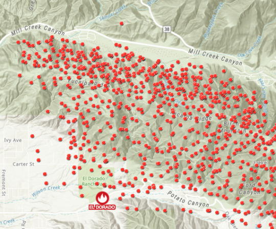
In the VIIRS example, I’m still stalking the data and talking to people to find significant values. The map below is by Emily Meriam, a colleague who has a successful history of mapping fires in California. It uses 5 classes and uses size to de-emphasize lower values and emphasize larger FRP values.
I’m excited about the possibilities of this map, because it’s already a really good and useful map, and once significant values are identified, that will open the door to additional maps, each with their own purpose (firefighter safety, smoke prediction, fire intensity, etc).
Every map maker should understand that turning data into a purposeful map is a journey, not an event. Making one good map ought to lead to better questions, which lead to other good maps. It’s a virtuous cycle, once you tune in to how to participate in it.
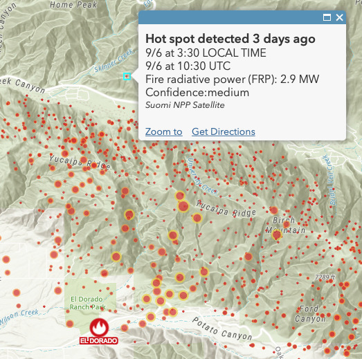
VIIRS data, using several classes, where the largest symbols are 750 megawatts or higher. Why 750? Well, until we can find other values to “hook” our map’s purpose on, that’s a value near what a Jenks classification suggests.
“How did you know to do that?”
That’s a fair question to anyone presenting their map. Every map maker has their own talents and abilities, but everyone learns cartography the same way: by trying things out and sharing the results with others. Every setting in their map is fair game for this question.
As much as I enjoy seeing a great demo or presentation on how to make maps, I know I’d benefit from seeing many more presentations where map makers show some failures, admit where they got stuck, acknowledge what they feared, credit the SMEs or others who opened their eyes, and share how they overcame issues with data, methodology, color, medium, people and process.
On my team, and on projects we’re asked to contribute to, we welcome the challenges present when we don’t know the data and we are unsure what the map’s purpose might be, just yet.
Every great map serves a purpose. A map that doesn’t serve a purpose is just data slapped onto a map backdrop. A map gains purpose as the map maker begins to understand the data, explores it, asks questions of it, and modifies the map based on answers to those questions. I hope you begin to see that it doesn’t really matter if you start with purpose, or start with the data. Your role is to seek and validate what the data appears to be saying, after establishing a level of confidence that embraces imperfection.
2 notes
·
View notes
Photo

Tata Kelola Ekonomi Keuangan Daerah Penulis : WINDHU PUTRA Penerbit : Rajawali Pers ISBN : 978-602-425-256-4 Halaman : 340 hlm Ukuran : 15.5 x 23 cm Tahun : Cetakan ke 1 2018 Original Harga Rp111.000 diskon 15% Rp94.350 Sinopsis Buku ini dirancang untuk para praktisi dan para mahasiswa semester lanjut karena secara khusus membahas Anggaran Pendapatan dan Belanja Daerah (APBD) Kabupaten/Kota. Para praktisi bidang penganggaran dan pengawasan akan sangat dibantu dalam membuat perencanaan, pengelolaan dan evaluasi. Sedangkan bagi para mahasiswa akan sangat dibantu untuk memahami proses terbentuknya APBD pada sebuah kabupaten/kota. Batang tubuh dari buku ini dapat menjadi tiga bagian: 1) Bagian Pengantar; 2) Pengelolaan APBD; dan 3) Analisis Kinerja APBD Bagian Pengantar, secara khusus membahas APBD dimulai dari Bab 1, yaitu mulai dari pengertian, tujuan, fungsi, unsur-unsur, kedudukan, kebijakan serta alur proses terbentuknya lembaran APBD. Kemudian dilanjutkan pada Bab 2 membahas tentang cara-cara menilai Kinerja Keuangan Daerah melalui beberapa pendekatan rasio. Bagian Pengelolaan APBD, lebih banyak membahas tentang Pengelolaan APBD dibahas mulai Bab 3 sampai dengan Bab 7. Bagian Analisis Kinerja APBD dijelaskan dalam Bab 8, membahas tentang Analisis Standar Belanja (ASB) yang merupakan salah satu alat untuk menilai kelayakan dan mengevaluasi anggaran suatu program kegiatan APBD. #keuangandaerah #pajakdaerah #keuangan #anugerahputra #sismiop #sismiopterbaik #sismioponline #pajak #smartphone #terpadu #apple #web #cepat #smartmap #map #petapintar #peta #perijinan #simpatdu #daerah #aplikasi #pad #android #ios #bphtb #tanah #ktp #bimtek #linkeupemda #aplikasisismiop https://www.instagram.com/p/CBe_XrAhxDY/?igshid=bjoit5yk2iqx
#keuangandaerah#pajakdaerah#keuangan#anugerahputra#sismiop#sismiopterbaik#sismioponline#pajak#smartphone#terpadu#apple#web#cepat#smartmap#map#petapintar#peta#perijinan#simpatdu#daerah#aplikasi#pad#android#ios#bphtb#tanah#ktp#bimtek#linkeupemda#aplikasisismiop
0 notes
Text
Thoughts on The Legend of the Three Caballeros episode three under cut
Likes - Everyone talking about what the heckie that creature is - "Find something to help him!" They only bring out pointed objects (I am reminded of how in the movie when Jose and Donald were trying to murder Panchito for holding a note too long) - LEOPOLD - "Maybe I was wrong about you." *Not Goostave shrills like a girl* "Spoke too soon!" - "All will be revealed!" "Which means?" "Shut up and get inside." - CARLA - These villains are amazingly hilarious - Donkey-Bat
- Over exaggerated "WHAAAAAAAAAT" - "The moon" (Me- "Donald, find Della!) - Super fast explaination - Astro Mummies - "I'm gonna stop saying things" - "Story of my life" (Same, Don) - Xabdra is a bamf and I'm gay - Anger management - LUCY - Less over exaggerated "whaaaaaaaat"
Dislikes - Excuse, but they are NOT cowards (well, Donald kinda is...but not the others!) - Oh my god they're all cowards - Egypt trope -"Cabs" - Yet again, they make Panchito stupid - Panchito is a famous wrestler - "What is this? Italian?" - Jose being bad at translating again - My boys running from a fight
Meh - The theme song - SmartMap - Of COURSE Dona wakes it up - Power button - Werewolves are a thing
Overall? My previously said frustrations with this show still continues and increases, but it’s still early in the show so I will remain optimistic that maybe some of the issues will be fixed. I love that my boys are back in the spotlight regardless.
#The Three Caballeros#the legend of the three caballeros#donald duck#panchito pistoles#josé carioca#jay's thoughts
26 notes
·
View notes
Text
GIS for Smarter Energy Infrastructure

GIS technology plays a critical role in designing, monitoring, and optimizing power grid infrastructure. Through geospatial analysis, utilities can map assets, forecast demand, and enhance system reliability—supporting grid modernization and energy access in growing regions.
Why GIS is Crucial for Power Grid Planning Traditional power infrastructure planning lacks spatial insight. GIS enables utilities to visualize substations, transmission lines, and load centers, ensuring informed decision-making, better outage response, and smarter resource allocation across regions.
GIS Enhances Power Grid Management Through:
Asset Mapping: Recording and tracking the location and condition of grid infrastructure.
Load Forecasting: Using spatial demand data to plan future capacity and prevent overloads.
Risk Assessment: Identifying areas vulnerable to weather disruptions or equipment failures.
Integration of Renewables: Mapping solar, wind, and hydro resources for clean energy planning.
Power Grid Planning with GIS Involves:
Creating transmission and distribution layer maps.
Overlaying weather, terrain, and hazard zones.
Buffering critical facilities (e.g., hospitals) for prioritized energy restoration.
Styling infrastructure by voltage class for visual clarity.
Procedure for Power Grid Mapping and Infrastructure Planning Using GIS
Selecting the relevant power grid data. Import administrative boundary layers for the desired district and fine-tune their styling to improve visual clarity. Add high-voltage transmission lines from the infrastructure dataset. Apply a 100-meter buffer around the selected lines, then use the Merge Polygon tool to combine overlapping areas. Configure attribute merging with 'count' for numerical fields and 'concat' for text. Review and share the map to aid in power grid analysis and planning.
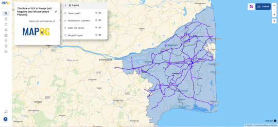
Use Case: Renewable Integration and Grid Expansion GIS helps identify optimal locations for renewable energy projects by analyzing sunlight exposure, wind patterns, and land use, while aligning them with existing grid capacity—enabling smarter, greener energy systems.
Open-source GIS Tools for Grid Mapping Platforms like MAPOG support utility companies with interactive mapping, spatial load balancing, and collaborative planning features. With open access and cloud deployment, these platforms are redefining how power grids are designed and maintained.
Conclusion GIS-based grid mapping ensures smarter, safer energy networks. Buffer tools and spatial planning empower energy providers to design infrastructure that is both resilient and responsive to modern energy demands.
#PowerGridMapping#SmartEnergy#UtilityPlanning#GISPower#GridResilience#SustainableEnergy#GeospatialSolutions#SmartMapping#InfrastructureInnovation#FutureOfEnergy
1 note
·
View note
Text
Alabama Gardening: SmartMap Online – A New Adventure for Land and Forest Managers
SmartMap Online – A New Adventure for Land and Forest Managers #AlabamaGardening yardstead.com/news/alabama-gardening/…
https://yardstead.com/news/alabama-gardening/31742-smartmap-online-a-new-adventure-for-land-and-forest-managers
0 notes
Photo
Pembayaran Pajak On Line Kabupaten Pasuruan Mulai 1 Juli 2019 Dengan Aplikasi Anugerah Putra
Koordinasi Anugerah Putra dengan semua pemangku kepentingan beberapa waktu yang lalu membuahkan hasil sesuai yang ditargetkan yaitu pembayaran pajak on line di Kabupaten Pasuruan dapat dilakukan secara on line bersama Bank Jatim.
Dengan Industri 4.0 kecepatan dan akurasi serta presisi memang segalanya karena semua dapat dikontrol secara real time melalui internet. Jangan lupa dengan kemudahan. Masyarakat yang sudah sadar pajak seharusnya diberikan layanan terbaik berupa kemudahan untuk membayar pajak.
Aplikasi Anugerah Putra menghadirkan kecepatan dan kemudahan ini. Saat yang menyenangkan untuk membayar pajak demi pembangunan daerah kita.
Anugerah Putra karena kami selalu berusaha menjadi yang terbaik dalam sistem dan terbaik dalam pelayanan SISMIOP dan Aplikasi perkantoran di Indonesia.
Telpn/WA 08155033295
#anugerahputra #sismiop #keuangandaerah #keuangan #pajak#pajakdaerah #smartphone #aplikasi #terpadu #pad #android #apple #ios#web #bphtb #daerah #cepat #sismiopterbaik #sismioponline #smartmap#map #petapintar #peta #tanah #perijinan #simpatdu #ktp #capil #kk
0 notes
Text
Kalmar to Supply Terminal Process Automation for Termont Montreal Inc.
Kalmar, part of Cargotec, has concluded an agreement to supply container terminal operator Termont Montréal Inc. (Termont) with a suite of Kalmar SmartPort process automation solutions for its cargo-handling equipment fleet. The order, which also includes service deployment, configuration and ongoing support, was booked in Cargotec's 2020 Q1 order intake, with delivery scheduled to begin in Q2 of 2020.
Termont is based at the Port of Montréal. Their Maisonneuve terminal has been running for over 25 years and handles over 500,000 TEU of containerised cargo per year. The company’s new Viau terminal, also in Montreal, provides additional space to accommodate customer growth. Termont’s fleet of cargo-handling equipment includes rubber-tyred gantry cranes, Front End Loaders and terminal tractors.
The order comprises a range of Kalmar SmartPort process automation solutions including SmartStack, SmartLift, SmartScreen and SmartMap which will be implemented across the entire cargo-handling equipment fleet.
SmartStack and SmartLift are process automation solutions which together help improve lift equipment operator productivity, reduce human error and improve terminal safety. Kalmar SmartScreen optimises work instructions for operators in order to reduce non-productive moves. SmartMap enables real-time and historical visualisation of equipment location and container routing in the yard.
Julien Dubreuil, General Manager, Termont: “Particularly during situations like the current pandemic, the ability to remotely access real-time and historical equipment data is invaluable. SmartMap, for example, will give us clear visibility over what our machines are doing between jobs and therefore help us identify where we can make improvements in operator training. Furthermore, we have been using the Navis N4 terminal operating system for some time, and now have the opportunity to automate a number of data collection functions to improve operator productivity, safety, and data accuracy.”
John Scott, Vice President, Automation Sales, Americas, Kalmar: “Kalmar SmartPort solutions help terminal operators be more efficient, to see the big picture, think on their feet, reduce complexity and make smarter decisions that boost efficiency. During the evaluation process Termont had the opportunity to visit Kalmar’s existing customers to learn about their experiences and to benchmark existing processes.” Delivery of the SmartPort hardware will begin in Q2. Kalmar will provide a comprehensive package to Termont which includes setup, configuration, go-live planning and ongoing support.
from Storage Containers https://maritime-executive.com/article/kalmar-to-supply-terminal-process-automation-for-termont-montreal-inc via http://www.rssmix.com/
0 notes
Text
@alexandrasanurb @EducaAnd #propuestasTIC #competenciasdigitales #innovacióneducativa Cada vez más colegios se unen a utilizar las TIC e innovar y a los alumnos ¡les encanta! En este caso el IES Fernando III, a través del proyecto SMartMaps, un proyecto educativo muy interesante
0 notes
Text
And we’re back.
Just got back from the Esri User Conference in San Diego. I think it’s my 21st year of attending as an employee. Great to reconnect with friends and customers who are making a difference in the world using GIS.
It’s always humbling to see the breadth and depth of what our customers and partners are doing with GIS. Then, on top of that, this conference allows all our product teams to show their latest enhancements, which will open up even more uses of GIS around the world and in your area.
Very proud watching two of my colleagues, Lisa and Jennifer, showcase some ArcGIS capabilities during the Plenary session. It’s not easy to stand up in front of 18,000 people and tell a story while demo’ing software. They did a great job. I learned something new about vector tiles working in any projection, and it was the best smart mapping demo I’ve seen to date. Thanks Bern for including them and guiding them along the way.
I had ten presentations this year, mostly about how to think while making maps. I’ll post the link to the Powerpoints/videos when available (how about this Dropbox link for now). We managed to incorporate Seinfeld references and maps into the “Rethinking...” tech workshop, a bonus.
People really react positively to encouragement, go figure, and my goal in these presentations is to break down the perceived barriers to making great maps, while tapping into their enthusiasms for data, mapping, communication--whatever gets them to TRY IT OUT.
And here’s why: never before in history has it been so easy for so many to be in touch with so much data, with access to tools designed specifically to find the signal amongst the noise and make a useful, clear map about a subject. They need examples, and they need encouragement. So that’s what I’ll keep trying to provide. The technology is here, the data is available, the problems need solving. Who will step up?
Oh, and I lost 5 pounds at User Conference, despite certain indulgences in Little Italy and the Gaslamp district.
0 notes
Text
Introducing smartvote Australia: take the test ahead of the federal election
The May 18 election between Prime Minister Scott Morrison and Opposition Leader Bill Shorten presents voters with a stark choice on fundamental questions like how much tax governments should raise and how that money should be spent. Minor parties are also expected to play a significant role, with one in four voters forecast to give their first preference to a candidate who does not represent a major party. Patrick Dumont, a professor of political science at the College of Arts and Social Sciences who is leading the university's involvement in the project, said that at a time of falling trust in political elites and the major parties, systems such as smartvote had been shown to boost policy knowledge. Increasingly, theres a lot of negative campaigning and from time to time political misinformation," he said. "smartvote Australia means we have a more issue-based discourse about elections and campaigns, focussing on policy positions rather than personal attacks. We think this is highly valuable for any kind of system. Loading He said it served as an entry point for getting more interested in politics because after completing the questionnaire and seeing the results, voters tended to seek out even more information. smarvote has become institutionalised in Switzerland, where it has been used for many elections, Professor Dumont said. As well as matching voters to candidates and parties, smartvote Australia creates a smartspider that visually displays whether candidates are socially traditional, economically liberal, supportive of strong law and order, inclusive and other political descriptions. It also produces a two-dimensional "smartmap". The map's horizontal axis represents the classic economic leftright dimension, which focuses on the role of government intervention in the economy. The vertical axis represents social liberal-conservative dimension, which focuses on the role of government in holding up traditional values and institutions. The Sydney Morning Herald and The Age national editor Tory Maguire said the tool was an innovative way for the mastheads to deliver policy analysis and track the issues driving voters choices on polling day. Its very exciting for us to partner with the ANU to bring smartvote to our readers, she said. Our audience is a highly politically engaged lot who have a big decision to make in this election. Most Viewed in Politics Loading https://www.smh.com.au/federal-election-2019/introducing-smartvote-australia-take-the-test-ahead-of-the-federal-election-20190429-p51ibu.html?ref=rss&utm_medium=rss&utm_source=rss_feed
0 notes