#some lines go hard
Text
My friend and I are having a BioShock infinite conversation and she whipped out "Bioshock infinite is good! When it's not trying to be a 'better' (in Ken's eyes) version of Bioshock 2" and she's right.
#I love the art#song bird? beautiful#some lines go hard#but i cant#the rebellious female religious idol has already been done#bioshock
63 notes
·
View notes
Text

Summer vacation, 4am.
Tons of easter eggs in this one! Click the image to find them (and for better quality ofc)
Close ups and process shots under the cut, description in alt text


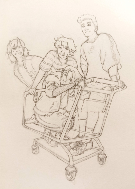


#it's all post canon of course#btw you can't see but the paper on the floor has an episode description written on it#it's ep 53.5 which I made up. what's the plot you ask? pure fluff and highschool shenanigans. these kids deserve it#check out Taylor's Matryoshka shirt and Linc's Garfield pullover :3#also the building on the right may or may not be a Sonic's distribution center#I love being not-usamerican and just going on google streetview to research the San Dimas area.. looking at parking lots going ''ah! I see'#also#this one took me literal months... the cart's perspective was so hard to get right#so I just sat and stared at it for a couple minutes - added a couple of lines and erased some others - and then closed off my sketchbook lo#dndads#dungeons and daddies#dndaddies#dndads s2#scary marlowe#lincon li wilson#link li wilson#normal oak#normally oak swallows garcia#normal oak garcia#taylor swift dungeons and daddies#taylor swift dndads#taylor swift not that one#my art#yuviur
1K notes
·
View notes
Text
Prompt 74
When a new black-haired blue-eyed person appeared in the manor, one could easily be forgiven for thinking that Bruce’s adoption problem had struck again. So color many a batkid surprised that no, this kid isn’t a new sibling, no he didn’t get grabbed from the street, and actually he’s here for Alfred.
Apparently Alfred never found it important to mentioned that he has a husband- that the kid kind of implies isn’t human what with the casual way he says he himself is half human- and that this kid is apparently their child. For once it’s Bruce’s turn to come home to a surprise sibling.
Danny on the other hand just learned that his Clockpa has a semi-mortal partner who has offered to take him in, (in another dimension even! And there’s aliens!!) while the ancient takes care of some stuff at home.
And yeah it’s in a rich-manor but Sam has proved that not all rich people are evil, and based off of Mr Pennyworth’s stories the Waynes weren’t bad either. Though based off of the others’ reactions perhaps he should wait to mention that there wasn’t one new family member but three…
#dcxdp#dpxdc#prompts#clockworth#Clockwork is taking care of the GIW#they crossed the line when they took his kids#fuck the observants telling him not interfere- he's going to channel some Kronos and eat some people#hey if they want a mindless and dangerous ghost they can deal with the one behind tales of a world serpent#Alfred is honestly pleased to hear from his partner and to meet their children#Reminds him of when he first met Clockwork and they took down a government branch#lovely times#would do the date again#Danny is in awe about food that doesn't fight back and tastes good#Alfred is also great! He teaches him proper gun safety and makes sure he gets a proper amount of sleep and its great#honestly he can't wait for Ellie to get to this world but she really wanted to finish exploring the mariana trench first#And Jordan is apparently helping Clockpa with something for the last bit of his probation#Jazz is just happy for him but sad she couldn't come#but she has college that she worked really hard for so he gets it#the batfam are so confused and concerned
2K notes
·
View notes
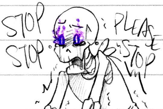
Text
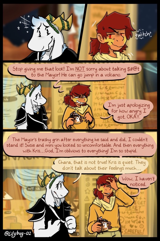
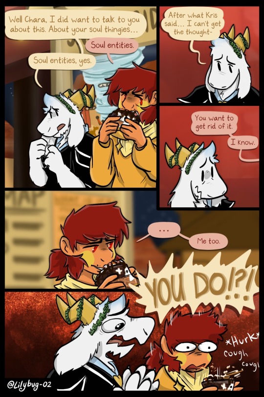
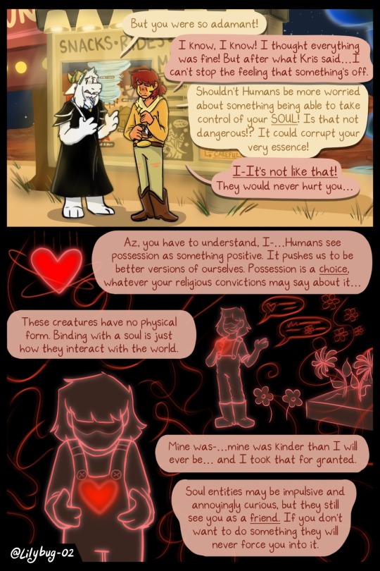
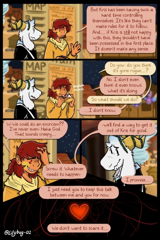
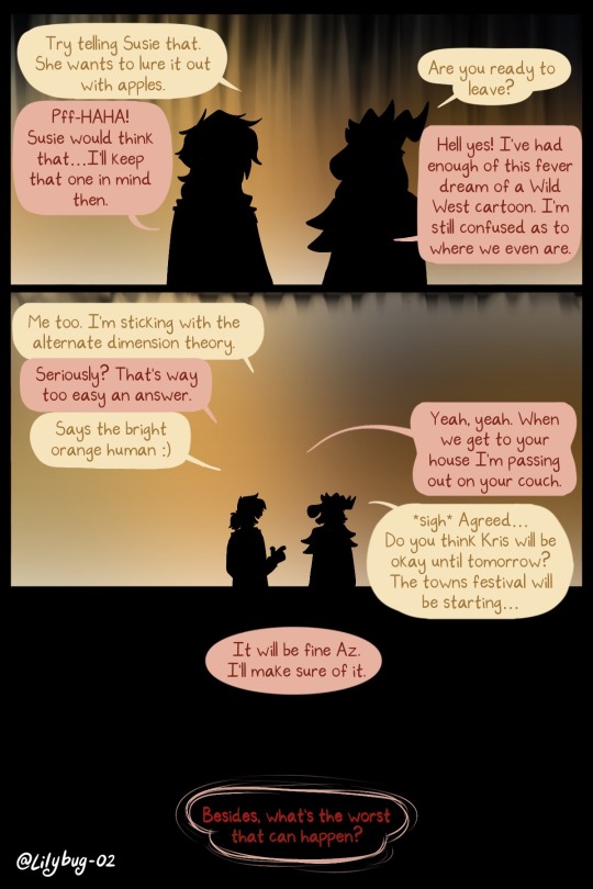
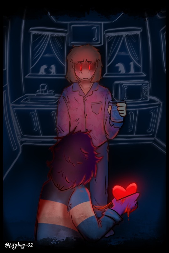
Wow. That could not have turned out worse.
Part 23 || First || Previous || Next
--Full Series--
This comic will be on Holiday Hiatus this December and January! While on a cliffhanger? What a scam! >:/
#Chara finally realizes something is wrong....very wrong#And you get to see little Chara for all of 2 drawings. wow. You guys are so spoiled uwu#Asriel and Chara bbfs#finally out of that darn tootin' Darkworld! WE'VE BEEN THERE FOR 2 YEARS!!!#LORE TIME LORE TIME. I know Chara is very vague about it but player-human relationships are very personal.#it can be hard to talk about them if you've been possessed yourself. especially with some stigmas around it#chara just wanted a glass of water. why you gotta do this to em#I am so so so happy to get here#the full excitement has faded since I first thought up this scene but It's still one hell of an accomplishment#YOU GUYS HAVE NO IDEA how many times I reworked this and how many rough drafts I've thrown out the window because of it.#tbh. I may post the 10+ rough pages that will never see the light of day#Im glad I didnt go through with that scrapped plot bc It was too many unneeded pages. I've learned to start condensing in a better way#I am also planning on showing off my Patreon soon :) so I'll be posting complete scrapped story lines over there#deltarune chara timeline#deltarune#utdr#deltarune chara timeline comic#art#my art#bread#chara#asriel#saloon darkworld#darkworld#deltarune au#college chara#college asriel
2K notes
·
View notes
Text
actually I'm kind of curious about this because it was a huge debate among my peers in my community
Clarifications under the cut:
The poster is in a public space where it is typical for everyday people to post things. It is not someone's private property or possession. Think piece of paper taped to a telephone pole, not sign in a storefront or in someone's yard.
The poster is not protected by law; you are very unlikely to face legal consequences for vandalizing it. Caveat: some peers have argued that it risks being socially consequential because an organization or demographic that you are a part of may be judged as intolerant/oppressive/disruptive/otherwise unpleasant if people witness your actions, and thus advocated against vandalism for fear of damaging your public image.
The poster is not an expensive or personal piece of artwork; it is a mass produced print on letter paper.
You are vehemently opposed to the message displayed on the poster, but it is an opinion that people are free to have in your country.
The 4th option refers to things like intentionally putting your own poster over top of the bad poster or otherwise making the bad poster harder to view; some people argued that targeting the poster for removal is out of line, but posting your own messages is an innocent action that you are well within your right to do (in this context, posters regularly eclipse each other as new ones are posted over top of outdated ones due to limited space)
The poster is part of a campaign; it's not unique. There are many postings of it across the community.
This is all assuming that the offending poster is not old and would typically not be considered fair game for pruning for quite some time, and that it is being specifically targeted for removal because of its message (rather than petty vandalism or because it's obstructive or damaged). E.g., if a poster is advertising an event happening on April 20th, it's typical to prune it after that date but not before.
Of course the situation that prompted the real life debate did involve a specific offending message, but I'm not going to specify what it was for now because I think it'll skew the results as people will just end up voting based on whether they like or dislike that message, which isn't the point of this. For this poll we are assuming that it IS a message that you are very opposed to; you can substitute in your own opinion that you have strong feelings about.
Please reblog for sample size!
#my og opinion was that it wasn't that deep. it's just a paper poster. and if it's promoting evil then it should go#i did trash 2 posters before i even found out that the issue was being hotly debated. didnt really think too hard about it#on one end there were people congratulating me and on the other were people saying that it's out of line + sets a really bad precedent#like in a “you are silencing the opposition and that's playing dirty. i dont agree either but they are legally free to express this” way#meanwhile still others argue that actually you have a moral duty to get rid of things that explicitly promote evil ideas#and some said that since we are a minority group we should avoid scandal and not provoke people into hating us. which i never thought about#anyway i am curious what other people think since i can see the merit in all the viewpoints#my posts
422 notes
·
View notes
Text
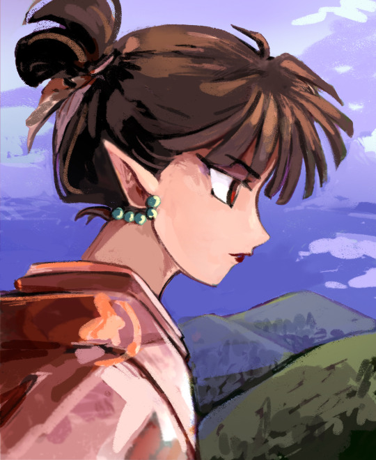
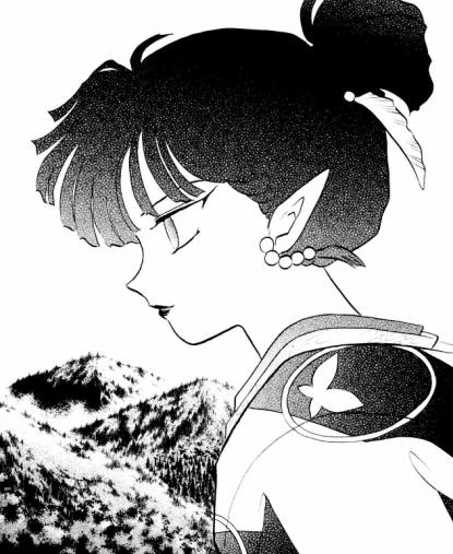
My Kagura style study. (on the left) And manga chapter cover for 374 on the right. It's a study rendering a stylized design in a realistic way.
I got lost in some of the colors but it was a fun challenge.
#I got a little lost in her neck and in her hair..#it was hard for me to imagine there what shape it was supposed to be#inuyasha#kagura of the wind#some of painting becomes 3d but some of it remains 2d. she is still flat at parts#old retro anime would render hair as if it was a kinda plasticy shiny material.. maybe that would help me here#i wanted her hair to be matte for impact but i also wanted to show definition#the cheek bone line is probably also way too defined.. maybe rumiko was going for a 'soft curve' there and not a joint
423 notes
·
View notes
Text
Brennan: *narrating* ...and third he gave him a sword named Wavebreaker.
Aabria: *gasp* SHUT UP! sorrysorrysorry
🤣🤣🤣 I love when the cast has the exact same reaction I do. What an exciting moment!

#worlds beyond number#the wizard the witch and the wild one#this podcast fucking SLAPS#it slaps SO HARD#and as i am grappling with tv shows that refuse to have narrative follow through#it's SO delicious and addicting to listen to (and watch in the case of d20) artists who are allowed to make their art how they want#without some crusty old white dude banging on about target demographics and making line go up for shareholders#ANYWAY#give it a listen it's phenomenal
459 notes
·
View notes
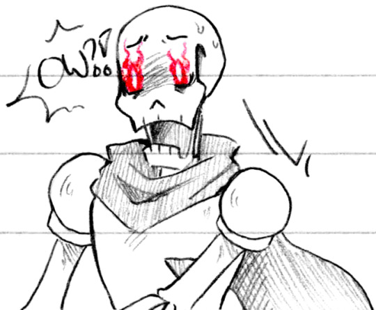
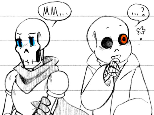
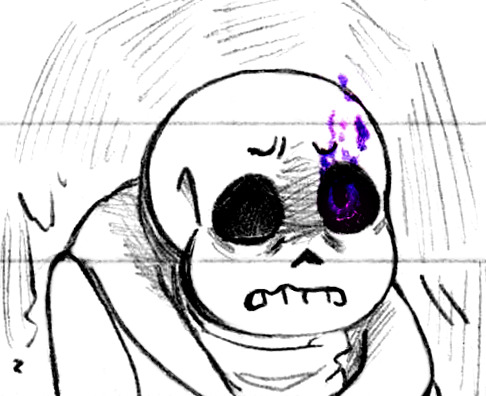
Photo


Rainbows (Patreon)
#Doodles#UT#Handplates#Papyrus#Sans#This rainbow is all out of order - and so many negative glows ah :0#I didn't mean for them to trend negative! They were just easier to imagine the expressions - maybe I'll take a second pass on the positives#Or in green's case the negative :')#Again in order of when I drew them so kinda all over the place haha#I wanted to go in order! And then I got distracted pft - thus started with red ow :(#Honestly I was thinking of it just being a surprise-pain more than anything lol - like a splinter haha that wouldn't even pierce him!#D'you think that eyeglows could also act like automatic word-responses? Like how we say ''Ow'' when we're surprised but not hurt sometimes#Silly haha#The second is a lot less silly-intended tho more actual pain#It's also sad to think that Sans' red would pretty much have to be sympathy/emotional pain :(#The kind of survivors guilt of not being able to shoulder more but he's so fragile! It's not his fault!#I am quite happy with both of their expressions there tho especially their mouth shapes - and how the colours interact with their eyes#Lineless colours are some of my favourites :) You can tell it's my pencils and not my pen there 'cause it's feathery hehe#For example Edgar's scars are usually with my pen and they have an almost hard-line quality while my pencils are soft :) S'pretty#Switched colours! I unfortunately misremembered what their meanings were oops lol#Well I got them kinda half-right - I like blue as skeptical quite a lot :D I think it suits them both!#Sans as wary and logical and wanting to keep distance to assure his safety and what he can devote energy to - I like it!#And Papyrus using his brother's colour to be grown up in the way that Sans is hehe <3 It's sweet#I misremembered orange lol I assigned blue's alt meaning of ''curiousity'' - orange is meant to be bravery! Oops lol#I think I was thinking of Papyrus' childlike excitement and wanting to know and be involved! Haha#Greeeeens <3 Happy boys happy with each other! I love when they're happy ♥ Interlocked holding hands hehe#Pinks! Along a similar line! I like pink as platonic affection :D And as embarrassment lol but hgg the sweetness! The care and love!#Is my bias showing lol - especially with the bros sleeping on each other haha ♪ They're both happy to know the other is safe!#Couple'a stresses - I like Sans' more I'm not even gonna sugarcoat lol his expression turned out so good haha#And the inverse for the purples! I do like Sans' face but his body :P Papyrus tho - he turned out sad and perfect :')
506 notes
·
View notes
Text

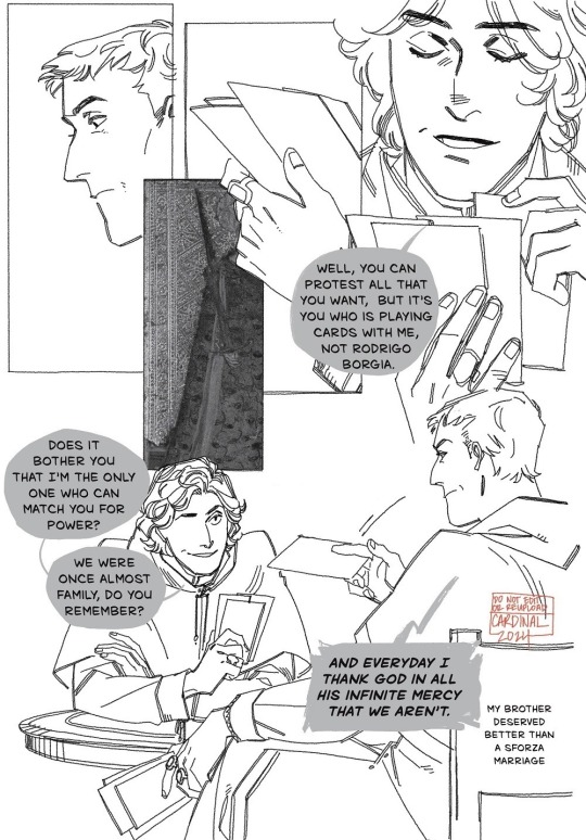
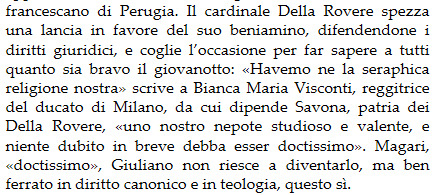
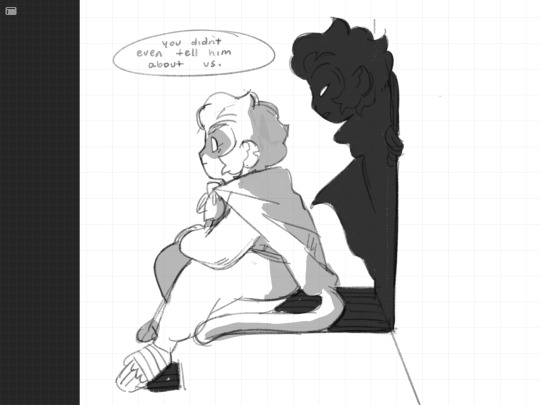
listen. listen, there's a kind of intimacy in having a dedicated rivalry, okay. who else is going to know you like this!!! also it's funny
Ascanio Maria Sforza: la parabola politica di un cardinale-principe del Rinascimento, Marco Pellegrini
Julius II: The Warrior Pope, Christine Shaw
and on della rovere’s soldier comment:
Popes, Cardinals and War: The Military Church in Renaissance and Early Modern Europe, D.S. Chambers
and finally! regarding the delightful Mess of political-family relationships, including the marriage comment (altho the montefeltro family that giovanni married into did have sforza family ties, since giovanna's mother was battista sforza, but this is about the more immediate alliance based relationship and della rovere's hand in the rejection of a milanese match for his brother. and. this is not even remotely a serious comic, but now I am once again thinking about insular all these families are. the fucking medicis are here too, if you go half a step to the left on della rovere's family tree)
Julius II: The Warrior Pope, Christine Shaw
Giulio II, Il papa del Rinascimento, Giulio Busi (Bianca Maria Visconti is Ascanio's mom. btw)
panel inserts of the cards they're playing with are all from the Visconti-Sforza tarot deck! (I used public domain scans/photos for the comic itself)
ko-fi!⭐ bsky ⭐ pixiv ⭐ pillowfort ⭐ cohost ⭐ cara.app
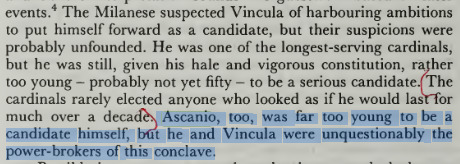
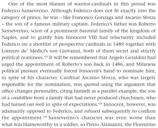
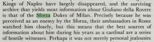
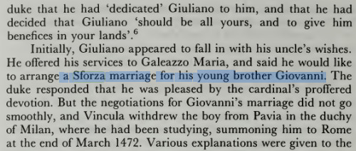
#weeping. ascanio's dialogue covers up della rovere's sleeve collar. i spent all that time drawing details on it and FOR WHAT#(it was fun)#there was another deleted bit where ascanio has some petty line like 'i bet arguing makes you hard' but then i realized#that's something that lucullus would probably say to crassus and also i need to set that line up for ascanio#we gotta. we gotta character build (lays down face in the ground) we have to provide the character set up for it#it's really more of a line for cesare to drop at some point over how much rodrigo and ascanio argued#shout out to the time rodrigo threatened to throw ascanio into the tiber river or that time ascanio like. decided to physically get into#a fight with juan borgia#and they were still gambling partners after that????? damn okay. sometimes the vice chancellor can be (checks note) im not finishing#that statement#komiks tag#italian renaissance tag#ascanio sforza#giuliano della rovere#i WILL get a relationship dynamic tag for them once i can figure out something punchy and fun. anyway!#ehgh. I NEED. to go to milan. and go thru the archives. let me in. LET ME INNNNNNNNN
282 notes
·
View notes
Note
I just skimmed through the art part of your blog and holy bajeebus your LMK art is so beautiful and the headcanon ideas you come up with are so good I wanna steal em-
Kinda wanna see like a part 2 of the little angst you did between MK and Macaque a while ago. It's so interesting and I wanna see Macaque's reaction in your art style. (You don't have to of course, it's just a suggestion [idk if i spelled that right])
Thanks for reading and hope you have a good day/night!
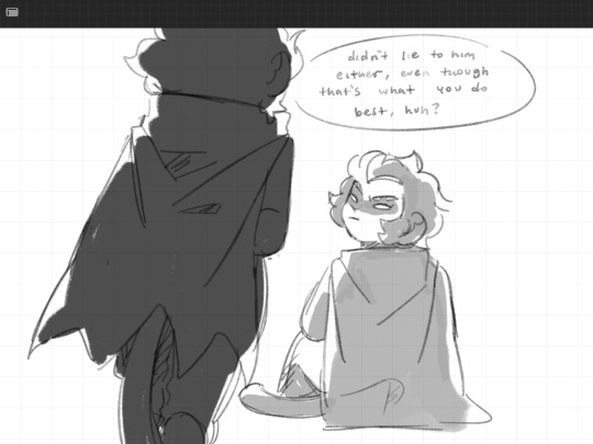

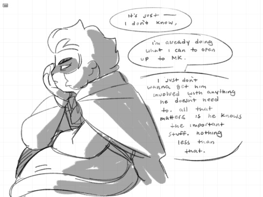

Hope this is to your liking ^^
Part one here
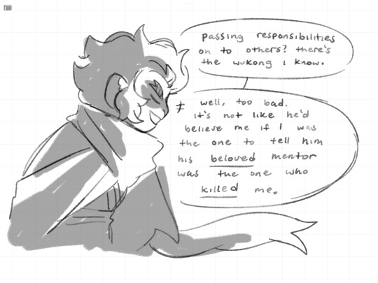
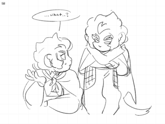
#I’m sure there are some character nuances im forgetting but well 🤷🏽#I want their misunderstanding or whatever they have going on between then come to a head. literally just going ‘wait what’#for me I think it’s entirely possible that there was an actual fight and maybe tension leading up to that point#cause I feel like macaque is not just bitter about thinking he died to wukong but maybe some stuff that built up to that#maybe the fight was just the breaking point. maybe they’re idiots who don’t talk about it because they think they’re on the same page idk#chipper-smol wrote a cool theory abt them using macaques ‘you’re nothing’ line in s4ep1. from what I understand it could be a direct parall#parallel to when he said that to MK right before MK regained his nerve and hit macaque in the eye.. since flying bark foreshadowed monkey mk#waaaay back in season 1 (where his shadow is his monkey form in the opening) i think that could be deliberate#and they could have gotten billy to voice an entirely different line for that scene. but they reused his line from s3#in a very specific scene with wukongs narrative foil. hm#that aside I would have liked to hear billy voice the ‘you abandoned me’ line that would have killed me. but that’s just me lol#also looking at this I should have shaded the last frame to make it look more dramatic and serious but I ran out of time :(#if anything I want to see MK try and help them get back together. poor kid tries so hard to understand people so I think it would be cool to#see that happen. that’s what I like about him.. he asked macaque why he was working for LBD instead of accusing him of dooming everyone bc#he wants to and he tried to comfort spider queen by admitting he was scared of LBD too 😭😭#my art#myart#Lego Monkie kid#lmk#Monkie kid#lmk spoilers#Lego Monkie kid spoilers#lmk macaque#six eared macaque#lmk sun wukong#lmk swk#lmk MK#lmk xiaotian#lmk season 4#Lego Monkie kid s4
2K notes
·
View notes
Note
I was wanting to try doing an art piece in the style of the signature spell poster art pieces you create. But I’m not really the best at coming up with a composition for such a thing.
Do you have a process for how you come up with the compositions for them?
oh, awesome! it is an INCREDIBLY enjoyable style to work in; I hope you have fun with it! :D
I'm not great at putting my thought/art process into words, so my apologies if this doesn't make a lot of sense, but I'll try! my first step is always to do a LOT of thumbnails to figure out both the idea and how I want to show it; not trying to do a real sketch or anything, just little doodles to figure out what exactly I'm trying to portray. (I also call these "garbage passes" because they're not meant to be any good, they're just there to throw things out. aha. ha. ...anyway.) I think it's important during that first stage to really focus on the idea and the layout and not to get too bogged down in the actual drawing yet!
I tend to save my final thumbnails, so I'll use 'em as examples (I posted the ones up through episode 5 here if you're interested!) (and, uhhh, spoilers through episode 5 also in this post, hopefully that won't be an issue!)
the main thing I try to think about in composition is balance -- not necessarily in terms of symmetry, but in where each element is placed and how much space it's taking up. remember, empty space is still space! it's also really important to think about the parts that don't have anything in them, as much as the parts that do!
personally, I like to divide things up roughly by both halves and by thirds -- there's a lot more in-depth info out there on why the "rule of thirds" in particular works well visually, but in short, our brains tend to focus on things that are placed closer to imaginary division lines, instead of in the exact center of an image. so even when I'm doing something that is very centered and symmetrical, I try to keep that in mind and generally aim around those for landmarks like faces/eyes (or...where they would be, anyway) and other focal points.
it's not a formula of "the character's face should be in this division of this grid" or anything, more like "our minds like to focus on these areas, let's think about how to use that", if that makes sense! and of course rules are made to be broken, art is lawless anarchy, and so on. but it can be a good starting place for deciding where you want to put things!
(blue - thirds, red - half)
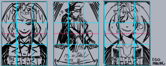
and against the finished versions, because they do usually end up changing a lot (including the empty space of the border):
(...these actually lined up a lot better than I thought they would. :') it makes me look like I do things way more intentionally than I do.)
other stuff I just try to keep in mind is that our eyes like following arcs and paths, which can be a good way to guide the eye:
and frame and control the focus:

honestly, composition is one of those things I feel like I struggle with a lot, so I'm not sure how much of this is helpful or actually makes sense outside of my head. but hopefully it helps a little! it's all just stuff to think about while drawing and not anything hard-and-fast, so don't, like, stress out about making sure things are lining up exactly on the thirds or anything. again, it's more "our brains think these are the dopest parts of the rectangle" than anything else! take advantage of the cool parts of the rectangle!
NOW GO HAVE FUN DRAWING seriously though, it is always super cool that other people like this idea and style enough to want to do it themselves and for other/their own characters! thank you! ❤️❤️❤️
#art#sketch#twisted wonderland#...technically i guess? it's not about twst but there is twst art present anyway#i did have a few more examples but then i wasn't sure if you were cool with episode 7 spoilers. whoops. 🫠#many other people have explained the rule of thirds and directional flow way better than me and i apologize#it is so hard to put things into words i am so sorry#me: the...you know...the lines...they sort of converge? like a triangle?#the internet: mm-hmm. yes. go on.#me: (sweating) the...the triangle points here...because it...it has a point.#the internet: it's doing better than you are then#genuinely shocked at how well some of these line up though#uh. i mean. actually it was all totally intentional and i put actual thought into it! NOT an accident at all!#my eyes darting back and forth shiftily are just ✨following the paths✨
428 notes
·
View notes
Text
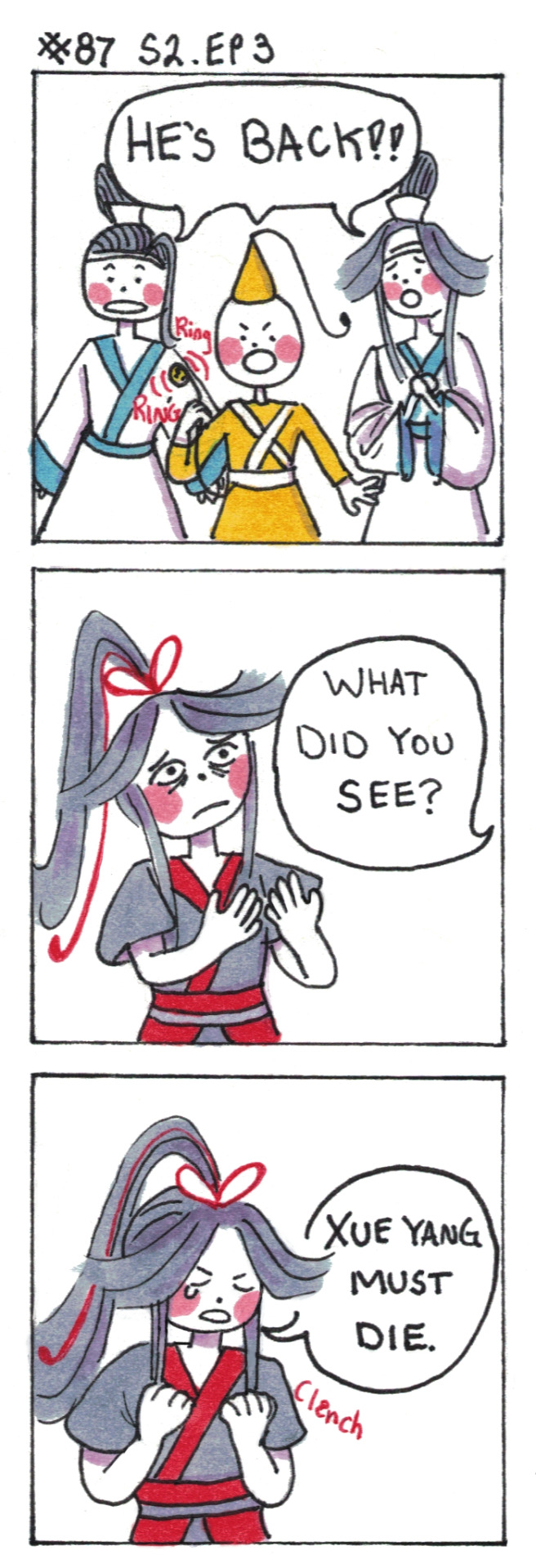
End of Empathy (time for violence)
[First] Prev <–-> Next
#poorly drawn mdzs#mdzs#wei wuxian#lan jingyi#jin ling#lan sizhui#We are back to the present! Honestly I think I'm going to try and truncate the rest of this arc.#I LOVE yi-city and I really appreciate all of the support the yi-city lovers have given me. And the patience of those who aren't.#But it's been two months. And I need to move this along </3#Anyways; I love the start of ep 3 so much. The worried concern of the juniors is so cute#but the crown jewel by far is wwx responding like a parent that's very hungover but trying so hard to be nice about it#like 'shhh shhhh guys hi I'm up now. Can you keep the volume down. Can you get me some water and my sunglasses from the glovebox.'#and of course the incredible wham line of 'Xue Yang Must Die.'#'Is YX irredeemable? I'm pro 'everyone is capable of change and deserves a chance.' So Im of the camp of 'if he had the opportunity...maybe#The issue is that this setting has no structure to provide those opportunities. You are perceived as a threat therefor you must die#XY is a very interesting parallel to the YLLZ because they both meet the same fate: outsiders determining that they need to be killed#plus both did war crimes. I know it's easy to forget the YLLZ actually did do some of the things he was accused of (most wrong)#but wwx also has blood on his hands. He also sought revenge in pretty twisted ways. Both were given opportunities to step away and refused#The difference is that we empathize with and like XXC & SL and A-Qing. The Narrative says they were wronged and that is an injustice.'
826 notes
·
View notes
Text

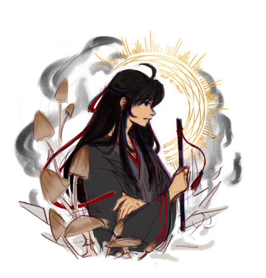
Day 13: past; mushrooms
#mdzs#wei wuxian#yllz#drawtober#mxtxtober23#general portrait style borrowed from the artist who did the art my friend just got tattooed#colorful lines thing borrowed from Koko#felt a little like I was trying too hard so have both versions#I actually really like this but if I go truly finish rendering I want to add some spider lilies and maybe actual bones instead of just blob#teleport warning draws
302 notes
·
View notes
Text

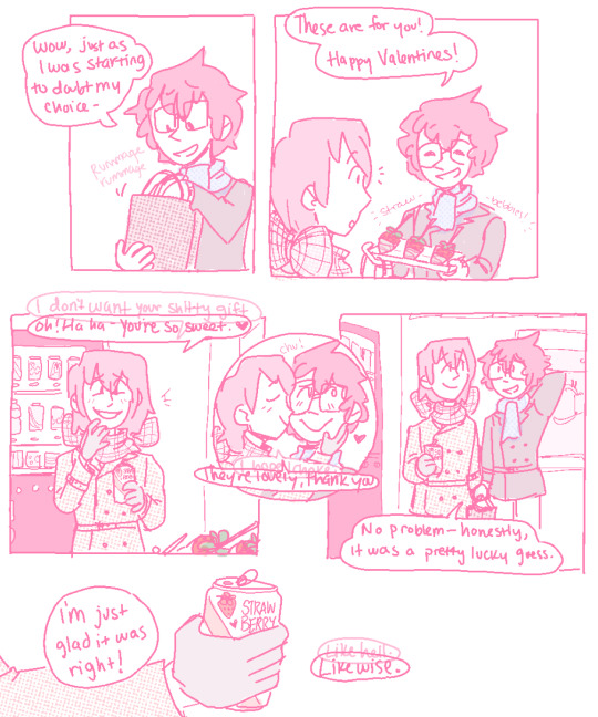

Happy Valentines, Akira.
Happy Valentines, Asshole.
If you can’t read what Akechi’s secondary inner-dialogue says cause I obscured it too much behind his regular dialogue, here’s a transcription in panel order:
Hello, you fucking-
Ah- Hello, Akira!
Fuck off, why should I tell you-
Just a soda- there’s a new flavor.
I don’t want your shitty gift.
Oh- haha! You’re so sweet.
I hope I choke.
They’re lovely, thank you.
Like hell.
Likewise.
There’s no way it’s just a coincidence.
Still though, it’s a funny coincidence.
#p5#akeshu#akechi goro#kurusu akira#wow- me?? posting a valentines comic... actually on?? valentines????? wack. absolutely wack#it's a short one! I purposefully tried to keep it short. it was a challenge and it still ended up being 3 pages. but i blame my canvas size#also in case u can't see what akira is holding out to akechi: theyre chocolate covered strawberries on sticks!#i saw them irl and was like oh god i want those. i am going to project that feeling on my favorite characters so help me god#and now! here we are! but my shitty-ass coloring & line quality make it hard to discern them so. sorry about that lmaooooo#ANYWAY i don't do enough post-maruki stuff so. i made this one a little bittersweet. :)#why did i put akechi's scarf in a bow? honestly i dont know! i think i saw some art a while ago that did that too and i thought it was cute#well. plus i guess there's the symbolism of 'akechi being alive and reciprocating your feelings (however involuntarily) IS a gift' part#hence that hes wrapped up in a bow. like a present. :)#also god. the first panel is supposed to be akechi's reflection in a vending machine window. I could NOT get it to look right#so for reference!!! just so you guys understand!!!!!! thats what that panel is supposed to be!!! he is NOT in fact a ghost. (sigh)#hope you enjoyed and had a lovely valentines!! for my part i have eaten nothing but sweets today and hoo boy will that have been a mistake#ALSO in terms of the audience-participation comic...hopefully coming soon. if i can ever gain the will to draw it.#but at least tumblr has polls now so i can do the audience-choose-y bit without needing to use a separate website! so thats good i guess#anyway anyway anway thanks for listening to me ramble if you made it this far! have a lovely rest of your day and hopefully see u again soon
725 notes
·
View notes
Text


"It is ill luck to look upon the face of death."
RHAENYS TARGARYEN, 1x8 & 2x3
#geeta you mad woman for giving us this#something something about being on the brink#of having tried so hard to STOP something but now it's all starting i.e vaemond was dead and battle lines are drawn#vs cole has been spotted and they are on the cusp of all-out dragon war#we have rhaenys in episode 08 before it all goes to s*** in episode 09#and then rhaenys is episode 03 beforer it all goes to s*** in episode 04#i think both suggest some communion with death as well - she's very aware of death#in the first one it's very literal as she's in front of a dead body#but she also talks about the stranger and for her corlys is hanging by a thread#and in the second whilst it's not as stark she has been aware of it throughout the episode#at arryk and erryk's graveside AND when speaking to corlys#idk where i'm going with this but does anyone else have thoughts??#let me know i'd love that#what do these images make you think?#rhaenys targaryen#house of the dragon#eve best
36 notes
·
View notes
Text
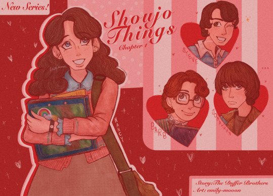
Nancy Wheeler the shoujo manga protagonist you are what with your love triangle and everything about you my pookie <3
#the fake shoujo manga chapter divider in a shoujo magazine is complete!#this took me like three days to finish and needless to say I’m proud of it 😌#ok maybe apart from Steve I’m not too happy with how he came out#everytime I draw his s1 hair apart of me wants to explode cause of how confusing and hard it is to draw#I imagine that this (fake) manga starts off as a regular shoujo romance but slowly escalates into a sci-fi horror#I’d like to thank Betsumas online archive for giving me references of shoujo from the 80s and 90s#ngl this would have flopped without it#I took some inspo from the many different art styles I saw in my betsuma refs and added aspects to my already pretty anime style#I also stylized Jonathan’s hair differently to how I usually do it to go more in line with how I think it would be stylized#in an actual shoujo#same with Nancy too#I also did more softer shading and tried to make it look watercoloury as alot of the shoujo mangaka I like use it for more fancy art#in relation to their work#i don’t think it comes across that way but hey it was worth a try!#I’m either proud of the title of this fake ST manga or ashamed of it idk I can’t decide#anyways I might do a part two to this? idk it was originally my intention#hope y’all enjoy!#stranger things#nancy wheeler#jonathan byers#steve harrington#barbra holland#jancy#I’ll add the jancy tag cause this piece has the pairing in subtext (lmk if i should remove it at all cause this isn’t an obvious jancy thing#)#cw eyestrain#tw eyestrain#<-adding these tags cause I think this could cause some eyestrain
51 notes
·
View notes
Last Seen Blogs

chebepowder
22-halo

k4r-suyu
16tmmz sarhoş_hayatlar

diewelthoertmich
breakable- unbreakable
sessju
Dinos & History

uccizgi-kpop
üççizgi