#some of these are made with illustrator and some are made with a different software (sketchbook autodesk)
Explore tagged Tumblr posts
Visit Tumblr Blog
Explore Tumblr blogs with no restrictions, modern design and the best experience.
Last Seen Tumblr Blogs


Fun Fact
70% of Tumblr users say the Dashboard is their favorite place to spend time online.
Note
“potentially do something of your choosing” - could you show some examples of those prospective wallpapers?


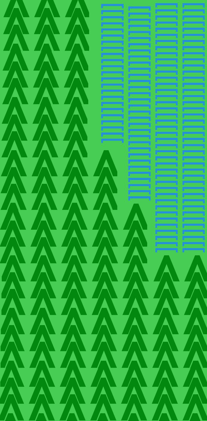
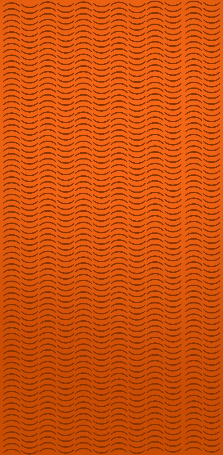

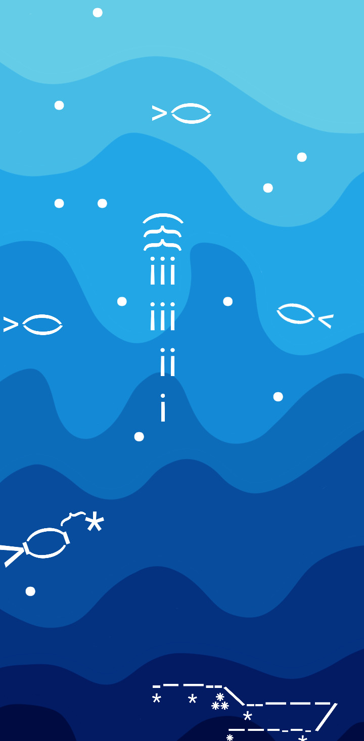
these are some of the phone proportioned wallpapers, and while i can't find where it's saved, my blog header is also a thing that i designed! these are a tad old—i mean they're from september and i have gotten better at graphic design and i think that my minor amount of pixel art experience somewhat helped me—but i think they should give an idea of what i can do!
#ask tag#some of these are made with illustrator and some are made with a different software (sketchbook autodesk)#the illustrator ones are better i think. if i make you guys things on request it's probably going to be on illustrator if i can manage it#(the only problem is i only have access to it during my graphic design class and i also have actual work to do)#(but pish posh. anyways yeah)#i know that i said i would be answering asks at 50% but this seems like it could influence votes#not counting#because i was just about to go to bed lol. anyways
24 notes
·
View notes
Text
OOOOOO I LOVE THE ANIMATION!!!
“Oh, its not tonight. Where you hold me tight”🪶

Can anyone recommend any free animation software? I can only do so much in Procreate :,)

#as for free animation software#i would say krita or opentoonz if u have a laptop/pc#or flipaclip if u just have a tablet#those are atleast the ones ive used#kinda of a better description of the different softwares aswell:#krita is in its base for illustration so i feel like the animation feature isnt the best and can lag a lil(dunno how to explain it)#opentoonz is made for animation (it was developed by studio ghibli and is what they use)#im not too experienced with it yet BUT there are a lot of functions u can use for animation#some downsides with it is that it can crash every now and again and it is pretty difficult to learn where stuff is in the beginning#but it seems rly good if u learn that!!#and lastly flipaclip is just a regular animation app#the big downside with it is that unless u pay some money (i dont think its that much) u have EXTREMELY limited tools#just three layers u can use is the most annoying thing#plus that there are ads#i think that was all i had to rant abt softwares#hope it helps!!
617 notes
·
View notes
Text
While I really hate the narrative of "tech bros" because of how it conflates shitty CEOs with non-shitty base-level programmers, and how it conflates Dunning-Kruger-y early adopters with people who Know Their Shit about computers...
...On the AI art issue, I will say, there is probably a legit a culture clash between people who primarily specialize in programming and people who primarily specialize in art.
Because, like, while in the experience of modern working illustrators a free commons has ended up representing a Hobbseyan experience of "a war of all against all" that's a constant threat to making a living, in software from what I can tell it's kinda been the reverse.
IE, freedom of access to shared code/information has kinda been seen as A Vital Thing wrt people's abilities to do their job at a core level. So, naturally, there's going to be some very different reactions to the morality of scraped data online.
And, it's probably the same reason that a lot of the creative commons movement came from the free software movement.
And while I agree a lot with the core principles of these movements, it's also probably unfortunately why they so often come off as tone-deaf and haven't really made that proper breakthrough wrt fighting against copyright bloat.
It also really doesn't help that, in terms of treatment by capital, for most of our lives programmers have been Mother's Special Little Boy whereas artists (especially online independent artists post '08 crash) have been treated as The Ratboy We Keep In The Basement And Throw Scraps To.
So, it make sense the latter would have resentment wrt the former...
2K notes
·
View notes
Text
Creator Spotlight: @camberdraws
Hello! My name is Camber (any pronouns), and I’m a mixed media illustrator located in the southwestern United States. I love drawing everything, but I have a special interest in depicting strange creatures and environments, often accompanied by abstract imagery and mark-making. Professionally, I’ve worked creating concept art and 2D assets for museum exhibits, but currently, I am engaged full-time as a software developer and make standalone illustrations in my free time. I’ve been posting art on Tumblr since I was a teenager, and the site has been very welcoming towards my work to this very day!
Check out Camber’s interview below!
Did you originally have a background in art? If not, how did you start?
I’ve had an interest in drawing since I was barely sentient, but at thirteen years old I decided to become “serious” about art. I was all about reading tutorials and doing a ton of studies. I would tote my heavy instructional art books to school every single day (my poor back!) Despite all this, I decided to forgo art school in favor of a bachelor’s degree in Computer Science at my local college. Alongside my major, I received a minor in Art Studio with a specialization in fine art, which totally changed my views on creating artwork and drastically changed my style.
How has your style developed over the years?
As mentioned previously, my style did a 180 after I studied under some very skilled fine art professors! As a kid, my drawings were very realism-heavy and inspired by video game concept art. I mostly worked digitally, too. During college, I was thrown for a loop when we were instructed to do strange things like, for example, make a bunch of marks on paper using pastel, WITHOUT looking, and then turn said marks into a finished piece of art! I quickly and deeply fell in love with abstract work, and especially appreciated images that are not easily parsed by the viewer. Since then, I’ve made it my goal to combine abstract mark-making with more representational subject matter.
What is one habit you find yourself doing a lot as an artist?
Hmmm, one habit I really enjoy as an artist is strictly tracking the amount of time I spend drawing! I currently work a full-time job wholly unrelated to art, so I have to be careful with my time if I want to spend enough hours drawing each week. I created a spreadsheet that allows you to enter the amount of minutes you’ve drawn each day and calculate how much drawing time you still need to reach your weekly goal (I aim for 20 hours a week.) Having such a clear, numbers-based objective keeps me motivated to work like nothing else!
Over the years as an artist, what were your biggest inspirations behind your creativity?
I know this is a common inspiration, but Hayao Miyazaki’s work has been rewiring my neurons since I was a child. Seemingly all of my artistic interests can be summed up by the movie Princess Mononoke: it has strange/abstract creature designs, a strong focus on nature and environmental storytelling, and a mix of dark and hopeful themes. Additionally, I’ve been deeply inspired by video game series such as Zelda, Okami, Pikmin, and Dark Souls. But arguably, none of these have influenced me more than Pokemon! I’ve been drawing Pokemon since I could barely hold a pencil, and I haven’t stopped since! I believe my love of designing creatures originated with my endless deluge of Pokemon fanart during my childhood.
What is a medium that you have always been intrigued by but would never use yourself?
I’ve always been fascinated by 3D mediums and am so tempted to try them out! Whether that’s 3D models created digitally or sculptures made from clay, I profoundly admire artists who have this skill. Oftentimes, it feels like I don’t have time to delve into a totally different artistic paradigm. However, I feel very strongly that learning new skills can enrich your current work. I should take that advice and someday give 3D mediums a shot!
What is a recent creative project that you are proud of?
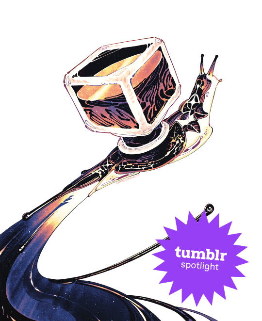
I am in the process of creating an art book (a dream of mine!) and have been executing smaller drawings of concepts I find interesting from both a visual and storytelling standpoint. A recent drawing for said book is that of a snail made of ink with an ink bottle as a shell, and it went absolutely viral! I’ve never had an experience like this as an artist before and it has been spectacular! I was able to open a shop using my newly acquired art printer and sell many prints of my snail. Creating something original, directly stemming from my interests, and having that resonate with so many people has been unreal. I couldn’t ask for more as an artist!
What advice would you give to younger you about making art that’s personal or truthful to your own experiences?
I would tell my younger self to chill out and experiment more! I was so caught up in the idea that I needed to have a realistic style to be considered “good.” I also believed that technical skill was the only measure of how worthy my art was. That’s not to say technical skill doesn’t matter, but I now firmly believe the creativity and voice of your ideas far outweigh the skill of execution in terms of importance. Technical skills should elevate ideas, not the other way around. Once I began to revel in strange ideas and stories for my work, depicted oftentimes in odd styles or mediums, I truly found my voice as an artist.
Who on Tumblr inspires you and why?
My peers here on Tumblr inspire me more than anything! Sharing my work with contemporaries and giving each other support brings me joy like no other, and keeps me motivated to continue creating. I wouldn’t be where I am today without them! @beetlestench, @theogm-art, @trustyalt, @ratwednesday, @phantom-nisnow, @svltart, @mintsdraws, @mothhh-hh, @jupiterweathers, @thesewispsofsmoke, @picoffee, @fetchiko, @kaisei-ink, and @pine-niidles just to name only a few!
Thanks for stopping by, Camber! If you haven’t seen their Meet the Artist piece, check it out here. For more of Camber’s work, follow their Tumblr, @camberdraws!
1K notes
·
View notes
Text
So apparently there's an official Gallifreyan translator now.
On the one hand, I'm really excited that Sherman's Circular is becoming more and more canon. On the other hand, it feels weird that such major part of the fandom is now being kinda... corporatized. But this blog isn't for my opinions and I don't want to influence yours. All I will say with conviction is that I really hope they credit the original creator.
However, for those who want some more info, I did a comparison between the new "official" translator, the old translator that most people just getting into Gallifreyan probably used, and my own style.


The first image in black is the old translator, the second in yellow on blue is the new one, and the third in blue is my style from two years ago, and all of them say "Never Give Up, Never Give In". (Though only mine includes punctuation). The first and biggest difference between the computer-translated ones and mine is that mine has the various words interlocked. This is something that anyone can do when they write the Gallifreyan on their own, little practice required, but it cannot be done by the computer translators. They only ever put the words in fixed, equidistant positions. Another major difference is the curve of the connecting lines -- this is another thing that neither translator will do for you. The old translator does allow you to curve the lines yourself, but is very finicky about it. The dots are worth noting as well -- in both translators, they are quite small, while I make them big and pretty separated, for ease of reading. In other words, in terms of style and readability, these computer translators will never replace those created manually.
However, there are clear benefits to the translators. They are extremely helpful for those who are just getting into Gallifreyan and want to double-check their work. So long as you remember that what really matters for readability -- the shapes and positions of the circles and the number of lines and dots -- the rest is just stylistic flourishes. And both allow you to download the Gallifreyan as a .svg so that you can edit it in Inkscape or Illustrator or whatever vector editing software you prefer. As for the comparison between the two translators, the new one has more color customization, and will probably better match how Gallifreyan appears on-screen (though I find it interesting that the Gallifreyan on the new Sonic has the starting point of each word be at the furthest point from the center of the circle, while this translator has them at the usual bottom), but the old one allows for more in-engine editing, and as the lines actually connect to somewhere and the dots are slightly larger, it is easier to read.
TL,DR: Manually-made Gallifreyan still allows for far more stylization and is generally the most easily readable, but both translating websites can be useful, especially as both can be downloaded as editable .svg files. The old one is more readable and has in-engine editing capabilities, but the new one allows for color customization and may be more accurate to what is seen on-screen. And Sherman needs to be credited for its creation.
79 notes
·
View notes
Note
Several things: -LOVE your art, it’s amazing! Especially the one with Crowley and Aziraphale under the umbrella - which software do you use? Your art always look SO gorgeous (cheeky quote from GO right there lol) - how did you get so good at drawing?And thank you for encouraging other people to keep drawing and being so kind as I sometimes can’t help but compare my sketches to others and feel silly, but I guess it’s just a learning curve… Thank you so much for bringing your art to the world!😊
Thank you so much!!
I use Clip Studio Paint for drawing and Photoshop for small adjustments!
2. Haha thanks! Honestly...it's the hyperfixations. I managed to improve a lot in just a year because I've been drawing SO much cos there's so many shows and movies I became obsessed with that I wanted to create art for. So by drawing a lot I just naturally improved. For example these two Illustrations are just a year apart:
I actually didn't actively try to improve, it's been a while since I did proper studies (I just don't really have the time for it between freelancing and art school), it just happened.
But I can absoluetly recommend going on YouTube and look for some art tutorials if you actively want to start improving! There's some channels that helped me so much back then:
moderndayjames
Incredible shape language and super insightful tutorials on all kinds of topics! I learned so much from him.
Ahmed Aldoori
So many awesome tutorials on so many different areas of art. Love it.
Marco Bucci
Incredible tutorials on color theory and understanding how color works in general! Learned SO much from him!
Sinix Design
The OG tutorials I began learning from. I watched his videos religiously as a teen. I adore his painterly style and adopted it in some way, haha.
Ethan Becker
This dude sometimes drops these tiny art tips that just completely blow my mind and that I adopt immedietly. He's super entertaining but also such a great teacher.
And I can also recommend checking out this book by James Gurney if you want to get better at colors!
And for anatomy I highly recommend the Morpho books!
But improvement doesn't only come from drawing a lot. A lot of the time I don't draw for a while and just study the world and artists around me and suddenly I improved when I get back to drawing. Don't ever overwork yourself to the point that you don't enjoy what you do anymore. Take breaks and listen to your body!
I learned to try and not compare myself to other artists, which helped a lot. Through conventions and social media I made so many lovely artist friends and realized how we're all struggling in a very similar way. A lot of us don't even really know what we're doing most of the time, haha. But we help each other out, it's such a wonderful community. I think when you're not actively part of the community it tends to feel like other, more successful artists are some kind of art gods that have perfected the craft and never struggle. But believe me, all the artists you admire go through rough times all. the. time. Sometimes what they do feels easy and natural, other times (more often than not) it feels like you have to try and learn how to walk all over again and you start to doubt your abilities. I personally go through that so many times.
So what I'm trying to say is that instead of comparing yourself to the artists you admire, learn from them instead. Ask questions, befriend fellow artists, study the artists you enjoy and just have fun with it!
And finally I thought it would be fun to share some of my horrendous Johnlock fanart from a decade ago for some motivation:

I hope my answer didn't overwhelm you, but I thoight it would be nice to give a more detailed answer!
Have a wonderful day and keep drawing! :)
479 notes
·
View notes
Text
FanFiction.net’s current state is especially disheartening when you’re a software engineer. 😟
It’s painful to watch it decay so severely due to issues that are algorithmically so simple to solve. The site remains virtually unchanged since it was launched in the early 2000s. But now, as we’re entering a new era of scammers (fake "illustrators" flooding the works and authors to try and sell AI generated content) one would expect that at least some small improvements towards protecting the users would be made.
While I recognize that building a system to detect and mitigate such kind of abuse isn’t trivial nor cheap, there are some very easy, very low-effort functionalities that could be added to at least let the users fight back. From computer programming perspective, it's ridiculously easy to allow authors to delete or moderate signed-in reviews, or implement a button to allow users to be blocked directly from their profile page.
This website has given me so many fond memories, entertainment and friends. It was one of the internet’s first homes for fan creators. It’s hard to see it fall so far behind when a few thoughtful updates could make such a difference.
7 notes
·
View notes
Text
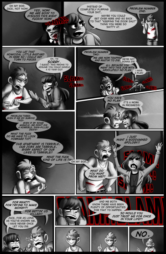
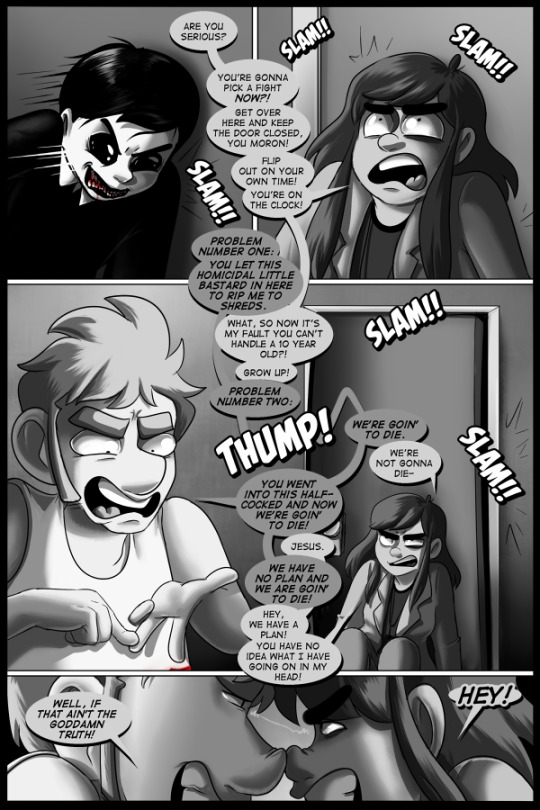
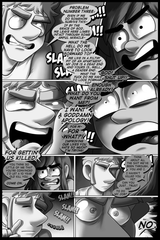
"A GHOST STORY" IS A WEBCOMIC I MAKE THAT I WILL BE RE-POSTING, GRADUALLY.
the top row is from 2013, the bottom row is from the 2018 re-draw. the second row was made in 2019. this was another page where the original had too much information on it and it had to be split into two pages.
we finally hit a page i can look at and go "yeah i was cooking when i re-did this". it is vastly improved over the original in all ways. the art is still rudimentary and does not do anything exciting or unexpected, but the writing is far better and way more "human" than it was previously. the re-draw/re-write successfully conveys a conversation between these two characters as i know them today. maxine is stubborn and self-assured even when she's going to die. jack is passive to the point of being unhelpful and cowardly, even when he's going to die. they are both so stupid.
i miss writing them in the same room together. it's been so long. but it's for plot reasons. they will re-united and be dumber than ever. anyway, this is the stuff i feel more confident about presenting to people as "my work". it's still deeply imperfect and awkward but in ways that feel unique to me as a result of trying really hard to make something good. it sucks, but sucks in a way that i have been cultivating and fine-tuning over the course of several years. it demonstrates improvement, and goddamn if that isn't all i want more than anything else.
in the original page, jack and maxine have a panel where they're doing different poses that pants does in the webcomic "jerkcity" (now called some other shit i don't remember or care to look up. rands you're a bitch dude), which is made in the software "microsoft comic chat", which uses illustrations provided by comic artist jim woodring.

---
♥ read the comic: A Ghost Story ♥ support the comic for as little as $1 a month on Patreon ♥ donate on kofi ♥ pay what you want for the re-draw of the first chapter on itch.io
you can block the tag "#AGS repost" to keep this off your dash
17 notes
·
View notes
Text
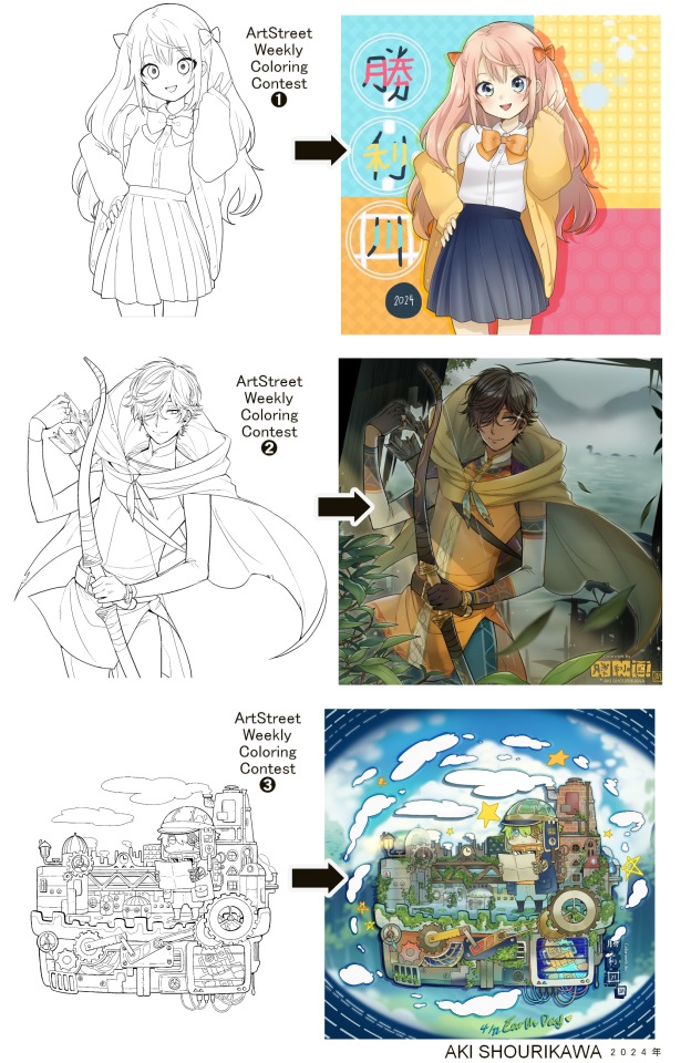
Blog No.003🍊 24年5月10日
「Let's Talk About Coloring+Rendering!!」
~ The Chaos of Akehhh-style Layering w/ Colors & Values ~
ArtStreet recently released some weekly coloring contests and as someone who likes joining 'em + colorwork being the absolute joyous part in drawing for me, I got really into it!! One of them somehow won and I still have the raw .mdp file of it with most of the layers unmerged... so, I thought there might be some value in sharing my chaotic coloring progress with it. There may never be an opportunity like this again...
CONTENTS:
Preface・・・・・・・・・
The Linework・・・・・・
Composition + Planning・
The Render・・・・・・・
Additional FX Tips・・・・
The Layers of Dread・・・
1. Preface
I use the free software MediBang Paint, which is made by the same folks who made the aforementioned art-sharing website, Artstreet. Although its file type extension is .mdp, it can also save as and open .psd files all the same.
If interested, you can download it on their website here! I believe it's available in both PC, Apple, iOs, and Android (also on the PlayStore). ☞And here is my google drive link of my fully rendered entry's raw .mdp file. I also included a .psd version that should be accessible with most other softwares like Photoshop, Clipstudio, etc.
NOTE: Not sure how some layer effects will be displayed apart from MediBang though (either in name or function) . But I think "multiply" and "overlay" is fair game on most drawing/photo-editing softwares with layer systems.
Either way, ↑this is just a bonus thing if you wish to see for yourself how much my MediBang cries everytime I work on something, since visuals of the rough step-by-step will be provided here as well!
At the end of this post, all of the layers' purposes will be explained...y-you'll see...
■And just as a disclaimer: I'm an instinctively self-taught illustrator who is a heavy visual learner, so there are certain methods I do that I cannot readily explain with back-up studies on color theories or formally taught techniques in art schools and the like/certain made-up terminologies that may or may not exist as something else. I mostly operate on instinct, observation, subjective preferences, and vibes, so this would just be me trying to verbalize my process (with visual aid) as a means of share-rambling, rather than actually directly "teaching" anything, I think haha You can take it as a cautionary tale too, honestly-
※I will also be going through this with the assumption that the reader has some background knowledge on digital illustration and general drawing basics + lingo. If you have any questions or needed clarifications, please feel free to let me know!
Although art can be fundamentally "wrong" when it comes to achieving certain specific styles, structures (especially when involving realism as the standard), or general executions of intentions/themes, I am of belief that there is generally no wrong or right 'way' for drawing anything; or for doing ANY type of artistic endeavor for that matter. This might be perceived as a "bad anatomy defender" / "no need to improve, then" stance on my part, but it is absolutely not the case! An artwork is never finished, there's always room for improvementsーa galaxy's size of a room especially for myselfーbut I just think anything at all that brings you an expressive or creative outlet, joy, or peace of mind is worth pursuing, regardless of your own skill or tact and there's no shame in that. I do not wish anyone, especially people starting out with drawing to be discouraged for having their own different approaches in comparison to other people's works by misconception of, "oh, am I doing it wrong?". Sometimes having different or an uncommon worldview is not always a 'bad' thing, I think. Heaven forbid artists actually start getting creative and unique―
What I will be presenting here is simply my one way out of thousands of thousands of different possibilities. So, let's start★
2. The Linework
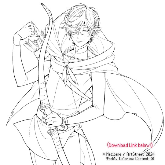
Equally lengthy talk of lineart is probably for a later discussion, but here is the template provided by ArtStreet for the contest + what will be colored in for today.
☞The contest has since ended, but you can still download the lineart template here if you'd like!
3. Composition + Planning
The contest rules said it's "OK to draw backgrounds", so let's go!!
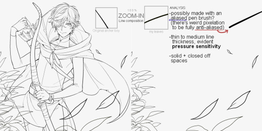
I had already decided on how I want to color it early on: It will be more scenic in nature, rather than stylistic. So, there will be more focus on looking 'real' than 'aesthetically stylish'! Just so it doesn't look disconnected or too out of place, I tried to draw my additions similarly to how Mr. archerman's linework looked as much as possible.
This how I visually define "scenic" VS "stylistic" illustrations (in my head)
I like experimenting and mixing different rendering techniques with varying linework styles and tend to think about my approach with the rendering long before the coloring process, even waaay before I line my final sketch, usually. But for this, I'm simply working with what was given to me.
At first, I just wanted a "cool breeze w/ leaves flying away ahhhh refreshing~~" mood, but the space at the side of his head looked rather empty as is, even with Nessie. So I thought about putting him inside a vague...darkly-lit abandoned ruins-setting to eat up some of that space.
And with that, it's time for colors.
4. The Render
My coloring process is the lengthiest and often makes people who see me color in real-time scream in horror, but I think it's actually fairly simple and can be summarized into three nutshelled stages:
①Fill in the colors with a finalized palette of your choice,
②cry Continuously render until your arms fall off you're satisfied.
③ cry even HARDER (optional) Adjust accordingly to fit in better with other elements of the illustration, such as with the focus/subject to background. *will be explained later.
oh and btw, the usage of the words 'render(ing)' tends to be confusing with its association with other mediums like 3D models, but when it comes to drawing I like to think of it this way:
🎨Coloring is the planned/intentional selection of your color range, tints, tones, and palette to use in a drawing, ☀Rendering is the act (or product) of the set of techniques (including effects, filters, etc.) you use with the colors/values to create the illusions of depth, shadows and light, movement, warmth/cold atmospheres, etc in a 2D illustration.
But that's just how I define it with my own step-by-steps. Otherwise, I think either term is pretty much interchangeable.
Anyhoo, what do you think should this man's hair, skin, eye, and clothing's colors be?
here are some of the variations on the color picks of his outfit that rotted my brain for about 3 hours straight, like it's a 2000s dress-and-match flash game
The many submissions for the contest had many fun color combinations and interesting interpretations I personally think should've won. I saw a lot of blonde archer-princes wearing greens, browns, and blues, as a lot also went for the "forest hunter boi" vibe. But I was saddened by the lack of my favorite colors being used as the primary colorーorange and yellow. So, let's use those!!
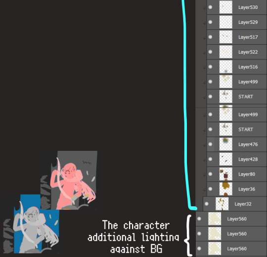
The start of my coloring/rendering journey is never at Layer '1'.........
―Starting with what I've always referred to as "environment prep":
The purpose here is to 'set' the base colors so they match with the environment or general atmosphere. Get ready to see this over and over
This could mean adjusting the saturation, or spraying gradients of the BG's most prominent color on parts that...gives me anxiety the most-
As someone who tends to work with very, very bright color schemes with character designs, trying to blend in when the illustration is meant to be scenic or 'serious' in tone without it being a distracting eyesore can be a challenge. So, this is what I do to counter it.
Shading is usually an early step for me as well, even though I think it's a lot of other artists' near-to-final step. I tend to lean towards an abomination mix of soft shade and cel shadeーthe strokes are sharp enough to trace where the shadows start and end, but softened around the edges for effect.
I also tend to apply an additional spray of subtly darker shade on top of the first one? It's usually on spots where I think the light source won't be hitting as much. I wouldn't do this for simple styles (stylized illustrations like with a chibi style), but for scenic illustrations I find it's necessary to achieve that depth against a fully-rendered environment.
※Just a side note: You may see multiple things changing around, but in real time I'm most definitely working on one part at a time lol. These visual aids were ripped off the raw .mdp by hiding some of the layers, so that's why different areas seem to progress together all at once, even if that's a bit idealistic in actuality.
Apart from the previous adding of shades with a multiply-mode layer for the preliminary shadows, I add one more layer of shadow on there for objects or other characters that can cast distinct shadows on the subject. In here, it's the bow and the hovering strap across his chest.
Lighting is also starting to be added as well.
One direct alteration I did with the lineart template was change the line's colors. I find it really softens them to mix better with their filled-in colors + as well as not stand out too harshly against a light-colored scenic background.
I think you now have a good idea over my hyperfixation on making sure colors are 'vibing' well against the BG lol A lot of these steps are basically just doing the same thing over and over with new layers for the sake of this purpose, really.
And after that, just repeating all the stuff we did with the character onto everything else (background, foreground, objects, etc.) until you're satisfied with it!
A lot of these changes are very subtle on their own, but makes all the difference in the bigger picture, I think!
Just maybe some additional finishing touches for some boom shakalaka and...that's pretty much it! You will notice that throughout the entire process, there's a lot of random little things that suddenly appear or change with seemingly not much purpose or meaning on its own. I unfortunately have always drawn in this sort of vague, quickly impulsive, directionless way since I was a child and I don't think even I will ever understand it, logically. It's mostly a... continuous string of instinctive feelings of "HEY let's do it this way, if not there's like 10 other things we can try next", is the closest I can get to an explanation of how it feels.
I don't know if it's common for other artists to think or function this way, but I do know for a fact that many people seem to be surprised and confused when they see me drawing in real time this way. Everytime I get asked 'how' I draw certain things, I say things like 'I turn my brain off and vibe with many, many layers with a broken back.' and people think it's just a dismissive joke. I-it's really not, it's literally what happens, I don't have any secret shortcuts for you-
Hopefully this very lengthy post + visual aids can help demystify some misconceptions on what "really" goes on when I'm drawing! It's also a bit of an update of my tutorials made for friendos starting out with digital drawing back in 2015!
Anyway, the rendering stage is where the simplified steps ② and optional step ③ branch out like a fork in the road for me; I don't think one is any "better" than the other, I think doing either is simply a matter of personal preference and artistic choice;
➋being leaving all that 100++ layers rendering that we just did alone and calling it a day,
➌being a little bit more extra w/ additional shadows/lighting that corresponds with the environment the character is in.
I removed the walls to see the whole figure better in a side-by-side comparison. I like the unadjusted (L) without the wall, but with the walls in the final illustration, I think adjusted (R) felt 'right'. What do you think?
There are some things, although realistic, don't look that good as a visual aesthetic and are just downright excessive/unnecessary to add to certain types of illustrations.
Then there's things that aren't possible in real life, but artistically? Looks really dang cool. Being biased for either ends of the hyperrealism and hyperstylized spectrums of styles is fine; only as long as no discrimination is involved towards people who don't share your opinions, in my opinion-
and to conclude this section, I say,
『 You go render however you wantーhellーno colors even necessary if you wish!
Simple ≠ laziness, just as much as complexity ≠ skill。』
I will never stop yapping about how a lot of minimalist styles require so much more amounts of planning and effort to make sure everything is nice and clean, especially compared to mindless rendering loops like these. Mine's a maximalist hell and I wouldn't have it any other way, but I greatly envy minimalist artists that can render with just something like my step ① with so much grace and tact; not a single stray or wasted stroke!! Anyone who dismisses these types as "lazy" I will violently stuff inside a couchーwithout any potato snacks to snack on!!!
5. Additional FX Tips
Just a shorter section for some optional finishing touches tips'n'tricks used in this I frequently (ab)use☆
◆ From the very beginning, even before I understood how to draw, it's always been a tradition to doodle around sparkles all around the place. I usually do it with MediBang's sparkle brush if I want it to look polished, or simply draw it manually using either the pen or airbrush tool for a cruder charm.
◆ Motion blur is great, and MediBang in particular also has different types of blur effects like Gaussian and regular blurs. If your software doesn't have these effects / if you're working traditionally but still want to achieve the illusion of motion in a still drawing, you can still achieve the same effect through your linework! Try looking into incorporating action lines (commonly seen in manga and comics) into it. Otherwise, purposefully drawing something blurily to begin with oughta work as well.
◆ Apart from changing the lineart's colors, there's also this little effect that is achieved by duplicating the lineart and blurring it. It gives something like a...'dreamy' quality to it? The higher the blurred copy's opacity is, the more emphasized it makes everything look.
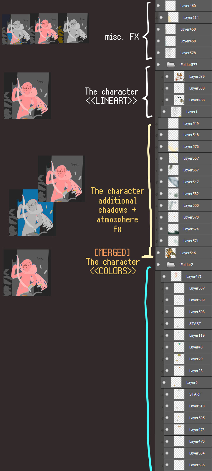
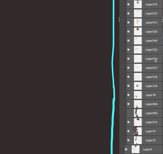
6. The Layers of Dread
At long last we've arrived... at my MediBang's repeating demise for all of eternity...
Here's a preview of what the .mdp/.psd file of this colored entry's unhingedmerged layers looks like + how I try to validate their existence. When I work on full-sized illustrations, I tend to merge layers as I go, so this is probably one of the rare times I can show something like this without either mine or your PC dying. If you'd like to see, play around with, and toggle them for yourself in all of its............glory, feel free to download it here.
Yes
we're starting at Layer 611. Enjoy.
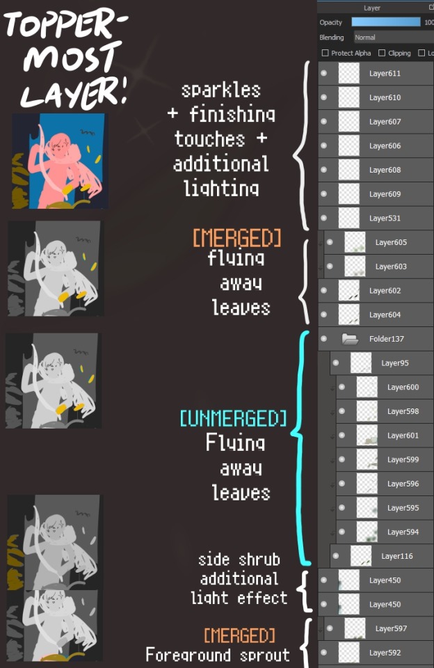
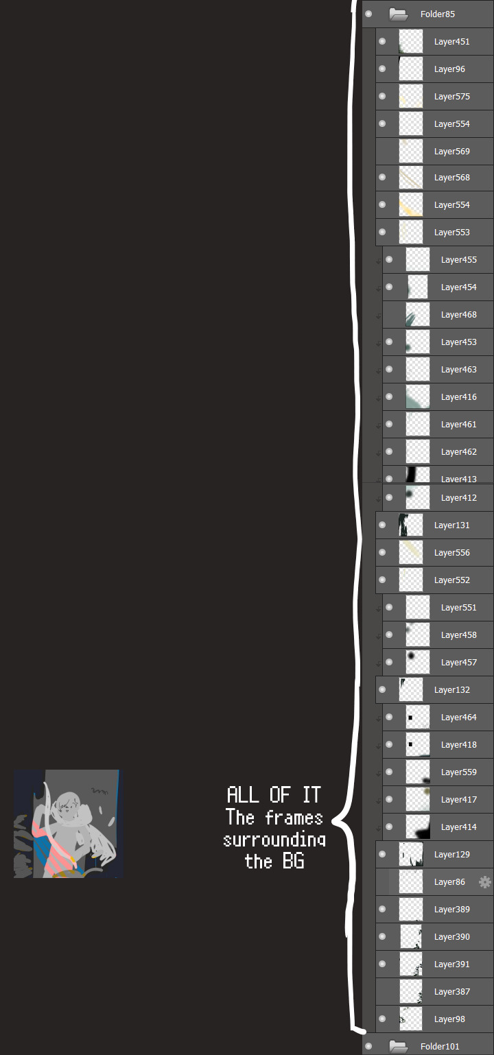
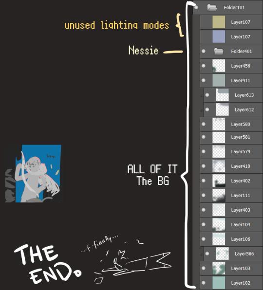
I will now delete my PC's copy because jfc that's one too many MBs ...and it's still eons lighter than what I usually work with on my own full illustrations from sketch to finish......。 (;´༎ຶٹ༎ຶ`) thank you for reading this far and making it out alive, goodbye for now...
・・・ホームページALL LINKS・・・
・Art Gallery・Commission Info・Ko-fi shop・
#art blog#long post#coloring#coloring tutorial#art tips#art tutorial#digital art#digital illustration#digital drawing#digital art tips#digital art tutorials#medibang#drawing journal#drawing process#illustration#coloring practice#nessie#the loch ness monster
32 notes
·
View notes
Text
AB Newsletter April 2025
Unmasking the Mercs – A Sneak Peek into Our Next AvA Episode
Sneak Peek
Our next video is another shorter one, but this one takes place in the Animator vs Animation series! We’ll be focusing a bit more on the mercs. Who’s your favorite?

Behind The Scenes - Creating The Mercenaries
One of the most requested things you guys have wanted to see in these newsletters is more information about the mercenaries, so this one is dedicated to you! Alan wanted to bring in a few new characters for the new season of Animator vs Animation in 2022. Of those we were introduced to 4 mercenaries! We have production names for them, but you can join as a YouTube member to find out what those are. The first concept of the 4 mercs is very different from how we see them now.

The team grew concerned that because they’re all similar shades of grey and black, it might become confusing to tell apart who is who. We gave them a bit of an overhaul so they all look much more unique.
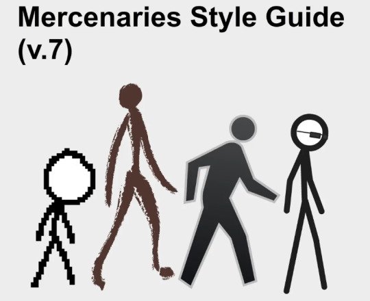
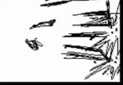
The mercs were all inspired by different things. The pixelated one was based on an animation (allegedly made by @/REN_multilockon) where a stick figure tries to open a door.
Watch the full original animation here
The brown one was inspired by lascaux illustrations (caveman paintings).

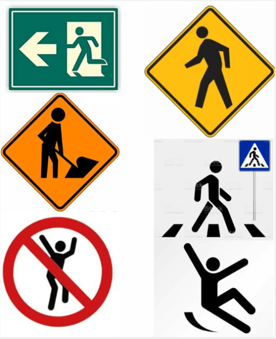
The grey one was inspired by all kinds of signs from street signs, warning signs, and various other signals used in real life to symbolize actions and warnings.
Last is the lengthy stick; he was generally inspired by line-based stick figure animations. We can’t attribute his inspiration to one in particular, but we knew they had to use the tools from animation software in their arsenal.

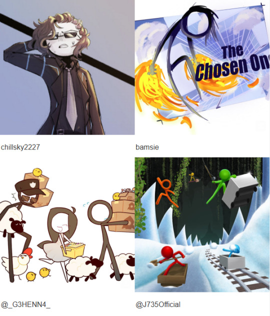
🎨 Fan Art Spotlight
Once again, you’ve blown us away with your creativity. Here are some of the standout pieces from this month:
Remember to post your fan art on any social platform with the hashtag #AlanBecker (or post in the #fan-creations channel on our Discord Server).
We pick a few artists to feature every month!
That’s it for this month, we hope you liked the updates! Can’t wait to share more next time. Keep creating and stay awesome!
Alan Becker & Team
6 notes
·
View notes
Note
Love your art dude! Was wondering what program you used? (and also how you get that painted look in your art? Some of your digital pieces look like paintings to me sometimes and it’s so cool, but I totally get if explaining it would take too long or if it’s complicated to explain 😅)
THANK YOU !!!!
i use procreate for the ipad for my drawings (it's an apple exclusive and it costs money though 👎) i will always reccomend ibis as an alternative
short answer for the painting question; it's mostly just a mix of brushes and never soft shading
long answer; Procreate's brush software is different than most art programs. instead of blending their colors together, the colors layer on top, unless you want to use the smudge tool. base program brushes from procreate, medibang, and ibis for example

[ID: A showcase of blending brushes from the art programs Procreate, Medibang, and Ibis paint. Under Procreate it's showing off acrylic, wet acrylic, hard blend, and larapuna. Under Medibang it's showing off watercolor, watercolor wet, and acrylic. There's a bullet point under acrylic that says "important to note, acrylic isn't set as a blending brush. it's a texture brush. Under Ibis it's showing off watercolor (wet), fade watercolor (wet), and oil pen (soft.) Procreate is shown again with smudge tool added to their brushes. End ID.]
the thing is, i hate procreate's smudge tool and for some reason their actual blending brushes blend with the background, even if it's on a separate layer (you can see that in hard blend). it's ugly and i hate it. so, i never use their blending brushes or smudge tool
I only use 2 brushes when shading. flat brush and tinderbox. if you look closely at some of my pieces you can see that most of my shading edges are hard and kinda messy. that's those 2 brushes


[ID: Four close-ups of digital illustrations. One a face. The other a chest. The third of hair. and the final of a hand. End ID.]
this technique is common in both traditional and digital paintings. it makes things be less muddy for me and i mostly was inspired by artists that use acrylic. sometimes instead of battling time and blending with paints that are actively drying, they'll wait and just block in colors instead, leaving hard edges. (thats what i did before a switched to gouache LMAOO) i really like that look so i used it for my digital paintings. along with some hatching, it creates the illusion of softness when you look from afar.
it's all mostly just experimentation. but i'll bring out ol reliable for how my process usually goes

[ID: A step by step guide on my shading process using a pink circle. The text says "Step one 1: Get your base. Step 2: Find your light source and block in colors (I use flat brush.) Step 3: Darken edges and add some desaturation in the dark (mimics color reflection.) Step 4: Refine and add texture and fun bits (I use tinderbox.) Step 5: Color balance and TADAA you have a 3D object. kinda." End ID.]
although this is the technique i do, i recommend using references and better drawing tutorials that explain things in much more detail than this one photo. (and references don't just have to be lighting references, you can look at other painters and try to mimic that digitally.) there's so much nuance with lighting that this one picture is barely scratching the surface. i've been doing this for a decade and i'm still learning and deciding what i want to "do." maybe next year i'll only be into cell shading with purple multiply. play around with brushes and layer modes to see what sticks. that's the fun part of experimentation.
if you made it this far, thank you for listening to my ramblings and mini procreate brush software rant. happy drawing !!!!
#this is the first time i've been asked my art process so i'm sorry if it's overexplained#i just get excited when i get to talk about procreate and how shitty it is and the workarounds#tutorial (????)#more of an explanation really#had to bang out the proper grammar for this one#long post#art#ask#wrote a novel that brought me to how i shade now#i just think all of it is equally as important#this is redundant asf but whatever
5 notes
·
View notes
Note
As we're in the topic of AI, I remember my mom once insisting I learn how to use it as she believed all jobs are going to be replaced by machines in the future. When I tried giving my valid arguments to how AI should be implemented without totally replacing people, harming the environment, spreading misinfo (I'm lookin' at you, Google AI!) and stealing information, she just shut me down with "Oh, but you risk being left behind! Remember Kodak? They shut down when everyone started going digital!"
There was this wise man who said "I'd prefer to have AI help me do my chores and reduce the workload but not take over the job I love." As an artist, you know that anything that's made by a human becomes a novelty and more sought after. I remember passing by our local mall and all of the ads had these hollow, generic AI-lookin' CGI graphics. There is just something in them that makes me gag!
Heck, I'd rather look at those corporate Memphis illustrations more than those slop. Again, I wonder if she's even listening when I suggested how AI could be susceptible to privacy breaches. I hate how even Google and DuckDuckGo have AI features now whenever I search for something. Even one of the prestigious art schools such as Gobelins landed under fire for using AI!
For now, AI doesn't seem to be a very promising tool. It's not like digital art or cameras because at least it doesn't feed off data and just makes creating art or taking photographs much easier. At least you get to curate the results by toggling with settings and textures instead of just typing random prompts leading to some sickening random image.
In regards to AI, I know a lot of people have anxiety around the topic. But it's a great time to actually talk about what AI is and isn't.
And what we call AI is not actually artificial intelligence. What we are calling AI is still a highly regulated script of pseudo-reasoning that is impressive on first blush, but quickly shows its debilitating limitations.
For one, large language models are impressive as long as you don't think about it. The hive mind these companies have sought to create fails at the basics due to the fact that this is still just a software program we are talking about. It is utterly useless as a data collection and research tool as it has no idea what is and isn't true. The large language models look impressive. It looks like it's thinking as it goes step by step to “prove it's work” so to speak. But it is just sifting through data, it's not actually thinking. Thinking would be reasoning. It would be categorizing sources based on accuracy, while also taking into account implicit bias of such sources.
Asking GhatGPT to make a pasta recipe, but asking for substitutions to certain ingredients will not yield a surefire result as the computer is not going to understand the difference between a tomato and a lemon as both are acidic fruits. It does not understand the concept of texture or where it comes from. It doesn't grasp the experience of eating food because it is running on an assumption that the ability to taste yields a singular result. That everyone will find a lemon sour and a grapefruit bitter and a cherry tart. But what if you don't taste soap when you eat cilantro? What if lemons are sugary sweet while grapefruits are tart? The machine is never going to be able to account for the experience of sensing.
As such, AI will never be able to portray meaningful art either. The fact that AI has taken up so much of the artistic community's discourse goes to show the issues with art today. People are so afraid of a machine creating something that looks pretty because that's all we make any more. We have commodified and commercialized art to the point of it being soulless. Its only purpose is to appear aesthetically pleasing for an audience who will spend less than a minute on a piece of art we've spent hours to days to weeks working on. But the reason is because our art lacks meaning. Whenever someone praised art on Twitter and claimed an emotional reaction, they attribute their feelings to the context of the source material or the appearance to the art.
When I went to an art museum, the paintings were all very well done, but not all aesthetically pleasing. And the one that stuck with me the most was a painting of four elderly women staring back at me. The only aspect of the painting that is in sharp focus are these women’s blue-grey eyes. And that was intentional. Because I kept finding myself going back to that painting because I kept feeling a strange sense of guilt. These eyes were on me and I couldn’t tell if it was with tenderness or scorn, so I had to keep going back. I felt guilty, if it was with tenderness I was ashamed I couldn’t remember anything else about them. Their faces left my mind the second I looked away. If it was with scorn, I felt the need to figure out what I missed. What quality was in the painting that was leaving me confused about the way these women looked at me.
That’s when I noticed their faces were literally painted in such a way that gave them an almost dream-like effect. The artist played on my brain’s inherent desire to identify a face, and with the eyes painted in such fine detail, the hazy idea of a face was held together in my brain. But I couldn’t say anything else about them without looking directly at them.
And it made me feel, but feel in a way that was slow and contemplative. It made me consider what the artist was trying to say without just googling it. A guess based on our wordless conversation through his medium. Because the real beauty and power that makes art ART is the way you get to interact with it as an individual. It’s vaguely spiritual. You can have these conversations with people long passed, and come to know them through their works.
That isn’t how it is anymore.
When you’re chasing numbers, be it in the form of money or perceived admiration, you inherently lose sight of what got you started: a feeling, a thought, an idea. Computers will never be able to question an idea. Never be able to extrapolate meaning from information or technique. Computers only understand numbers.
The fear of AI is the fear of replacing capitalism and consumerism. All we are thinking about is numbers. Numbers in the price of rent and food. Numbers in the hours worked and days off. Numbers in how we justify our own existence through social media clout and how much we consume with literal numbers. We function like computers, so of course people are scared of being replaced by computers. That they need these computers to stay on the latest operating system.
Only machines are scared of machines.
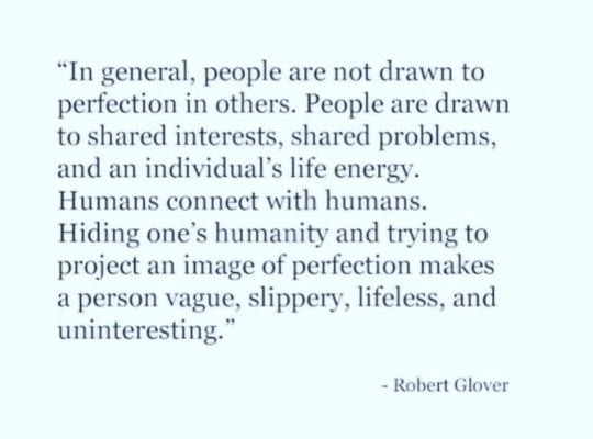
#anon ask#ai art#chatgpt#artificial intelligence#technology#consumer culture#consumerism#capitalism#robert glover#social media#neoliberalism#libertarianism#socioeconomic
4 notes
·
View notes
Text
Graduate School Admission Result – A New Chapter Begins
After months of education, application time limits, recommendation requests, private statement rewrites, and disturbing ready, I am pleased to in the end share the outcome of my graduate faculty software process. It feels surreal to jot down this sentence, understanding how long this dream has been inside the making, and what number of hurdles and moments of doubt came earlier than it.
College Graudate Admission Result

This adventure has been both academically disturbing and emotionally extreme. I started out considering graduate college severely at some point of my final undergraduate 12 months. At the time, I was immersed in my coursework and a few unbiased studies initiatives, and it have become clean to me that I wanted to delve deeper into my field. The idea of spending the next few years immersed in inquiry, surrounded by means of specialists and peers who percentage my intellectual passions, became incredibly motivating. But understanding what you need and accomplishing it are different things.
The utility method itself was grueling. Graduate school packages are not pretty much submitting transcripts and check scores; they're approximately conveying your tale, your academic identity, and your ability. Crafting a non-public declaration that captured my highbrow motivations, research stories, and destiny goals took weeks. I must have revised it a dozen instances before it felt like a real illustration of myself. I sought remarks from mentors, pals, and college advisors — every round of revisions bringing me towards readability and confidence.
One of the maximum challenging factors become choosing where to apply. I spent hours learning programs, college contributors, and branch cultures. I didn't need to choose applications based completely on rankings. I became seeking out a very good intellectual match — departments that aligned with my studies pursuits and supplied a supportive, collaborative environment. I implemented to seven packages in general, every one selected carefully primarily based on how nicely their studies ethos resonated with mine.
And then got here the waiting. After filing all my substances in December, the following months have been a combination of remedy and anticipation. There’s something uniquely hard about this section — you’ve achieved all you can, and now the selection lies in someone else’s fingers. I kept myself busy with paintings and side projects, but the query became usually within the again of my thoughts: Did I do enough? Will I be prevalent?
Then, on a reputedly regular Tuesday afternoon, the email arrived. I noticed the concern line — “Congratulations on Your Admission” — and iced up. I must have study it 5 instances to trust it. My heart changed into pounding. I clicked on the link, logged into the portal, and noticed the words in bold: You had been admitted to the [Program Name] at [University Name].
I felt an awesome blend of exhilaration, gratitude, or even a chunk of disbelief. I known as my parents immediately. Their pleasure and pleasure were palpable, and that moment will forever be etched in my reminiscence. It changed into no longer simply my achievement — it became the culmination of their guide, sacrifices, and encouragement through the years. I also reached out to my mentors, professors, and pals who had written advice letters or furnished precious recommendation in the course of the software procedure. Their responses had been warm and full of congratulations, which made me understand just how many human beings had invested in my growth and success.
What makes this admission even extra special is the program itself. [University Name] has lengthy been a dream group for me, no longer due to its prestige by myself, but because of its college, research opportunities, and dedication to interdisciplinary scholarship. I am specially excited to work with [Professor’s Name], whose paintings on [Research Topic] has deeply encouraged my academic pastimes. The notion of contributing to ongoing research projects, attending meetings, and being part of this vibrant highbrow community excites me past words.
At the same time, I am completely privy to the demanding situations beforehand. Graduate college isn't simply an academic pursuit — it's far a rigorous, disturbing, and frequently setting apart revel in. I understand there could be moments of imposter syndrome, difficult coursework, and intense closing dates. But I sense more organized now than ever earlier than. The previous few years have taught me resilience, time control, and the importance of in search of help whilst wanted. I’m prepared to embrace each the highs and the lows of graduate existence.
Looking returned, I am proud no longer handiest of the outcome but of the method itself. This journey forced me to reflect deeply on my motivations and dreams. It taught me how to talk my ideas really, recommend for myself, and push thru moments of doubt. Whether I were widespread or now not, I trust the process by myself made me a more potent, more self-conscious man or woman.
To those currently applying to graduate college or making plans to accomplish that soon, I offer this advice: be honest to your programs. Don’t try to mildew yourself into what you observed admissions committees want to look. Instead, be true about your pastimes, your questions, and your aims. Reach out to cutting-edge college students, ask for comments, and supply yourself time to revise and mirror. And most importantly, bear in mind that rejection doesn’t imply you’re not properly enough — it frequently manner this system wasn’t the proper suit.
I was now not usual to every software I applied to, and that’s k. In hindsight, I recognize that the program I’ve been admitted to is where I definitely belong. Fit matters — some distance more than people frequently recognize. I’m thankful to be heading to an area that recognizes my capacity and is eager to aid my educational adventure.
As I prepare for this next chapter, I feel a deep feel of obligation. I recognize how aggressive and selective graduate admissions may be, and I don’t take this opportunity as a right. I plan to make the maximum of it — to examine voraciously, make a contribution meaningfully, and develop each intellectually and in my view.
The Graduate Result Examination Check
2 notes
·
View notes
Text
If anyone wants to see a different take on AI use in art by a professional artist who's personally using it for their work, I recommend this Reddit thread:
Text copied under read more:
"I've been a professional artist and illustrator for decades. Like most artists, I was concerned when AI image generators hit the scene. But since they sucked at first, I wasn't all that worried... but then they started to get much better, really fast. I figured I should look a bit closer to see if I should be worried.
What I found was that they really are a powerful tool if used creatively, but they are *nowhere near* a replacement for human artists. They don't understand context, they spit out a lot of garbage that needs a ton of work to refine into something useful, and you still need an artist's eye to know how to direct them to make anything that's actually good. This is why you see so many people complaining about all the bad AI art. Because there really is a lot of bad AI art out there. The good AI art? People don't even know it's AI in many cases.
But as an artist who has been around since before the days of computer art, I have had to adapt to many changes. I adapted to using a computer to make my illustrations to keep up with the times. I learned to use Photoshop. I learned to use Blender (although admittedly not very well). I see this as necessary in a world where technology is constantly evolving; you need to evolve and adapt with the tech, or you will get left behind. So naturally I looked into ways to use AI generators to help in my work flow.
I started out by using it to create textures. One thing I have always done is use a blend of photo textures in my digital paintings to create visual noise and interest. It's a great technique that's been around for years. Being able to generate my own textures with AI means that I can get exactly the texture I want, much quicker than looking through stock images or going out with a camera trying to find new textures.
As AI image generators improved, and as my prompt skills improved, I started using them to generate thumbnail images to work off of, and to generate models to use as reference, etc.
I have always been very open with my clients about my work flow, and I've never had a problem with that. If I have a client who is opposed to my use of AI, then I don't use it when working for that client. No big deal. I have some clients who actually prefer that I use AI in my work flow, as it helps smooth the process along, gives me more flexibility, and they believe that the end product can be better. Again, I'm happy to accommodate.
Well I had one such client hire me to do a book cover. They suggested I use AI to help because the cover included multiple human figures, and without AI I would have to get some very specific photo references which would cost a lot of time and money. The whole image was completely created by myself, a product of my own mind, but there were some AI elements remaining in the final image.
The client was very happy with the end result. The author of the book was especially excited. They shared it with their audience and they got a ton of positive feedback. No negative feedback at all. Just another job well done then, right?
Well, no. Apparently another artist who also does book covers decided to run it through AIorNot and it came back saying it was likely AI generated. Well, of course it did. If you so much as look at AI while creating an image, AIorNot will say that the whole thing was made by AI.
And often even if you don't.
It will say that my old abstract acrylic paintings are AI generated more often than not. That software is seriously flawed. But no matter, as in this case, I actually did use AI elements in the illustration, and my client was well aware of this. No big deal.
Well, no, it turns out that it *was* a big deal. This artist contacted the book's author who, apparently, had not been made aware that I would be using AI in my work flow on this piece. It turns out that this author is extremely anti-AI, not just for images, but in general. For him it is a moral issue, and anyone who uses AI is not fit to be employed.
My client, the publisher, explained to him that I made the image, but only used AI elements as part of the process, but the author wasn't having it. They refused not only to use the cover, but refused to allow me to paint a new cover without the AI elements in it. In fact they strongly pressured the publisher to cut off all ties with me. The publisher obviously wasn't going to do this, as they are very happy with the work I do. In fact they still paid me for the cover art, even though they can't use it now, because they loved the cover and I did the work they asked of me.
But still, the publisher had no choice but to pull the cover art.
The author put out a social media post about it, essentially accusing me of being dishonest. People are jumping on the bandwagon, calling me an art thief, telling him how morally superior he is, etc. It's a truly nauseating display. This is not a matter of creative differences to these people; it's about good vs. evil. And because I dared to try and stay relevant in a changing world, I apparently picked the side of evil. And there is no arguing with them about it being art theft. They have no idea how these generators work, and they don't actually want to know, or they wouldn't keep pushing that obvious falsehood.
I have reached the frightening conclusion that if AI generators don't put artists out of work, then they may very likely do it to themselves when the community implodes. The way I see it, you can either try to stay competitive, or you can choose to be a Luddite and fall behind, because AI image generators aren't going away. They simply aren't. And in a few years, only the zealots will remain, beating their drums in a small echo chamber where only other zealots will hear them, because everybody else will be over it and bored sick of the drama. In the meanwhile, they are only making it more difficult for artists to stay employed in this new world with AI generators, by punishing those who try to adapt!
Any artist who runs art through an AI image detector, which actually uses AI to operate, is committing extreme hypocrisy.
The irony is completely lost on them, that due to their panic about AI potentially putting artists out of work, they themselves are using AI to track down and punish artists by threatening their livelihood.
AI will put artists out of work, because artists are making it happen.
So now, my client is in a bit of a panic and adding a disclaimer that relevant covers are made with AI on all the Amazon links because, even though Amazon claims that no such disclaimer is needed in cases where AI is merely used as an assist, he is worried that people will complain about them, and they could lose their Amazon affiliate shop, which would be death to their company. So even the images that merely had a texture overlay somewhere on it now have to be labeled as being ENTIRELY GENERATED BY AI. Even though according to Amazon's own terms they were in full compliance already. And the issue there is that if an Amazon affiliate has too many products which are listed as made by AI, apparently (I'm not sure exactly) they get put in a different category or something. So even though Amazon claims that AI assistance and editing is fine in their rules, in actual practice it is not. You can't take that chance because of the witch hunt that is happening right now.
And I'm still perfectly happy to work with or without AI. I have done without it for many years. But my clients still want me to use it, because they also don't want to fall behind. So that puts me in a difficult position of feeling like I need to choose a side on an issue that I don't even think should be an issue in the first place.
TL/DR: AI image detectors, which use AI to function, are being used by artists to track down other artists and endanger their jobs. And I really hate this stupid war."
20 notes
·
View notes
Text

Hello all! Thanks for tuning into this month’s update! We’ve got a few things on the docket.
Asset Update - Snowfoots!
We’ve continued updating the cat assets to sport cleaner lines, better flipability, and match more in-line with our more recent illustrations.
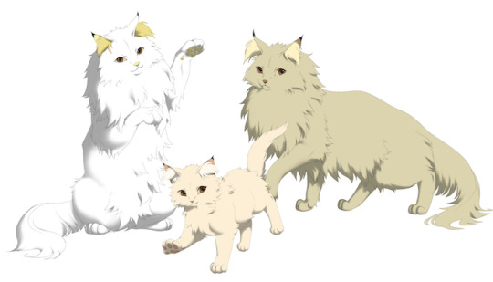

It’s night and day with these guys! We’re thrilled to be giving them a fresh coat of paint.
The Guild - Preview Page
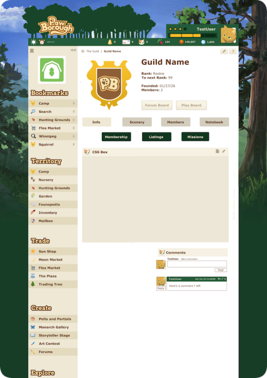
Leaders of a Guild will be able to import a custom emblem and edit the CSS boxes available! We’re so excited for this feature to help foster community storytelling and roleplay!
Want to play?
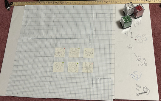
After trying it out for ourselves, we’re here to tell you all the battle mechanics as simply as possible, and give you the tools to try the combat system yourself with your friends!
If this is confusing and/or it’s your first time seeing or trying a game like this, we completely understand. By doing this, we are putting a lot of responsibility on you, the player, that would otherwise be on the software. We will try our best to supply pre-made components and a simple step-by-step instruction guide below.
If you want to try playing but still can’t understand everything, we recommend reaching out to a more experienced friend, or someone in our Discord, to help you out or play with you!
You need at least two people to play, and some dice! If you don’t have physical dice at home, try rolladie, or the Google dice roll function! Up to eight people can play with opposing teams of up to four!
Remember, if you’re playing with someone long distance, games are more fun if you’re faithful to the dice roll - no cheating!
Rules are below the cut!
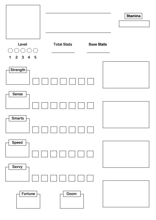
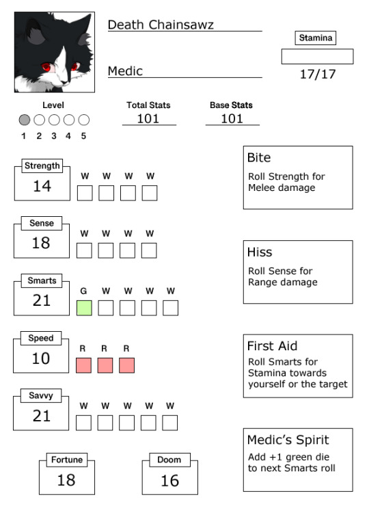
If you’d like to build a character yourself, see the following steps:
Step 1: Roll for Statistics
You can do this by using dice to simulate how the software will choose your cat’s statistics. The software will have weighted outcomes for balance, and we simulate this with specific dice.
For this step, you will be rolling 2 12 sided dice (d12) and 1 6 sided die (d6). These outcomes will be your stat points. A statistic can have between 0-30 points.
You must roll these 3 dice 6 times, and record what number the dice equal to each time you roll.
If you get a 3 during one of your 6 rolls, you then must roll a four sided die (d4). This is to ensure it is possible to get 0-2. Count the following number for these rolls:
1 = 1 point
2 = 2 points
3 = 4 points
4 = 0 points
Your six roll numbers will fill in the following categories:
Roll 1 = Strength
Roll 2 = Sense
Roll 3 = Smarts
Roll 4 = Speed
Roll 5 = Savvy
Roll 6 = Stamina
Lastly, roll a 20 sided die (d20) and record the outcome 2 times. These rolls equal:
Roll 1 = Fortune
Roll 2 = Doom
Fill these numbers in the corresponding categories.
Now, count how many blocks you have for each category (excluding Stamina). These blocks are also known as dice or chances. Their official name is pending, but they equal the amount of times your cat has to succeed or fail for a single roll!
0 - 4 points = 1 die
5 - 9 points = 2 dice
10 - 14 points = 3 dice
15 - 19 points = 4 dice
20 - 24 points = 5 dice
25 - 29 points = 6 dice
30 points = 7 dice
Erase the dice you do not have from the sheet!
If you are playing at level 1, you are done.
However, if you wish to level up your cat to try the different battle mechanics, choose your class, then see the following:
Choose your class first.
After each level, you are given 10 stat points to distribute however you please among the 6 different statistical categories. This does not include Fortune and Doom.
For example, if you are going from level 1 to level 5, add 40 stat points to your character.
Add your stat points, then add the corresponding dice to the number your statistical category is at. Remember that the 6 categories all cannot go above 30.
Step 2: Choose a Class
Generally, your character’s class should depend on your statistics. The 5 classes are Warrior, Ranger, Medic, Thief, and Bard. Each class favors one of the statistical categories.
If your highest statistic is Strength, pick Warrior.
If your highest statistic is Sense, pick Ranger.
If your highest statistic is Smarts, pick Medic.
If your highest statistic is Speed, pick Thief.
If your highest statistic is Savvy, pick Bard.
If you have statistics that match in number, then pick whatever you like most of the two! If you’re playing with other people, it’s best that you do not have 2 of the same class on one team (a team equals 4 characters.) You may want to talk to the people you’re playing with to coordinate the classes of your teams.
However, this is just a guide. You can choose whatever class you please!
Step 3: Distribute Red and Green Dice
Depending on your class, certain statistical categories are poor or favored. Favored categories will have green dice, while poor categories will have red dice. Red and green dice are dice which give you guaranteed successes or critical successes, and red dice are dice which give your guaranteed failures or critical failures.
If this is confusing to you, that’s okay! It may make more sense when reading the combat outline. Simply follow the instructions:
If you are a Warrior, change 3 of your Sense dice to red, and 1 of your Strength dice to green.
If you are a Ranger, change 3 of your Strength dice to red, and 1 of your Sense dice to green.
If you are a Medic, change 3 of your Speed dice to red, and 1 of your Smarts dice to green.
If you are a Thief, change 3 of your Savvy dice to red, and 1 of your Speed dice to green.
If you are a Bard, change 3 of your Smarts dice to red, and 1 of your Savvy dice to green.
Note that if you do not have 3 dice to make red simply replace the amount of dice you have. For example, if you are a Thief with only 1 die in Savvy, then make that 1 die red!
If you are playing at level 1, you are done.
Otherwise, the amount of red and green dice you have in these categories will grow and shrink depending on level. See the following:
At level 1: Cats have 3 red dice in the poor statistic, and 1 green die in the favored statistic.
At level 3: Cats have 2 red die in the poor statistic, and 2 green die in the favored statistic.
At level 5: Cats have 1 red die in the poor statistic, and 3 green die in the favored statistic.
Class will also change to subclass once you are level 2 or above! See the next section for further details.
Step 4: Add Your Moves
If you are level 1, all 4 of your moves will already be planned for you. The moves you have are dependent on your class.
There are 5 basic move types:
Melee damage: Roll Strength for the number depleting the target’s stamina. Each success equals 1 point. Must be one tile apart, and the target must roll Speed for a chance to miss. Cannot hit diagonally.
Range damage: Roll Sense for the number depleting the target’s Stamina. Each success equals 1 point. Can hit up to six tiles apart between the two parties, cannot hit only 1 tile apart, and the target must roll Speed for a chance to miss. Can hit diagonally.
Dodge: Increases the amount or type of dice in the next Speed roll the user does.
Heal: Roll Smarts for the number added to the target’s stamina. Each success equals 1 point. Can hit diagonally.
Status: Affects the amount or type of dice for any and all rolls. Placement limitations depend on the move. Stackable over multiple turns.
Level 1 Warrior
Strike - Roll for Melee damage
Shield - Change 1 die to green during next Speed roll
Bandage - Roll for Stamina restoration of oneself
Warrior’s Spirit - Add +1 green die to next Strength roll
Level 1 Ranger
Longbow - Roll for Range damage
Dodge - Change 1 die to green during the next Speed roll
Bandage - Roll for Stamina restoration of oneself Ranger’s Spirit - Add +1 green die to next Sense roll
Level 1 Medic
Bite - Roll for Melee damage
Hiss - Roll for Range damage
First Aid - Roll for Stamina restoration of either oneself or a target. Must be 1 tile apart from the target.
Medic’s Spirit - Add +1 green die to next Smarts roll
Level 1 Thief
Slash - Roll for Melee damage
Dagger - Roll for Range damage
Hide - Change 1 die to green during the next Speed roll
Bandage - Roll for Stamina restoration of oneself
Level 1 Bard
Taunt - Roll for Melee damage
Shout - Roll for Range damage
Protection - Change 1 die to green during the next Speed roll
Bard’s Spirit - Add +1 white die to all rolls for one round to the target. Can be used on any target regardless of distance. Cannot be used on oneself
If you are playing at level 1, you are done!
If your character is level 2 or above, your character will need to choose a subclass.
Subclasses solely affect a single, special move called a submove. Each subclass has a single submove, so each cat will only ever have 1 submove. This move replaces one of the four you already have, and will grow in power for each level. Each class has 3 subclasses with 1 submove each.
Warrior Subclasses:
A. Warrior of the Fang
B. Warrior of the Claw
C. Warrior of the Body
Warrior Submoves:
A. Fangs - Melee damage +1 white die to the Strength roll at level 2 At level 3, +2 white dice At level 4, +3 white dice At level 5, +4 white dice Replaces the move Strike
B. Claws - Melee damage Damage affects all enemies within a 12 space radius at level 2 At level 3, radius is 24 At level 4, radius is 36 At level 5, radius is 48 Replaces the move Strike
C. Bodyguard - +1 white die to next Speed roll used to dodge an attack provided said attack is Melee At level 3, +2 white dice At level 4, +3 white dice At level 5, +4 white dice Replaces the move Shield
Ranger Subclasses:
A. Ranger of the Rain
B. Ranger of the Wind
C. Ranger of the Clouds
Ranger Submoves:
A. Multi-arrow - Range damage +1 white die to Sense roll at level 2 At level 3 +2 At level 4 +3 At level 5 +4 Replaces the move Longbow
B. Dash - Gives the user 9 spaces of movement for 3 rounds at level 2
2 spaces at level 3
16 spaces at level 4
20 spaces at level 5
Replaces the move Ranger’s Spirit
C. Safeguard - +1 white die to next Speed roll used to dodge an attack provided said attack is Range At level 3, +2 white dice At level 4, +3 white dice At level 5, +4 white dice Replaces the move Dodge
Medic Subclasses:
A. Medic of the Heart
B. Medic of the Mind
C. Medic of the Soul
Medic Submoves:
A. Healing Kiss - Roll for Stamina restoration of oneself or the target. Must be 1 tile apart +1 white die to smarts roll at level 2 +2 at level 3
+3 at level 4
+4 at level 5
Replaces the move First Aid
B. Hospital - Roll for Stamina restoration of oneself or all allies within a 12 space radius at level 2
At level 3, radius is 24
At level 4, radius is 36
At level 5, radius is 48
Replaces the move First Aid
C. Necromedic - Heal by bringing a fallen (Stamina fully depleted) ally back with 1/3rd Stamina, siphoning said Stamina from an enemy
At level 3, 1/2 total Stamina
At level 4, 2/3rd total Stamina
At level 5, 100% total Stamina
Cannot be used if an ally has not fallen during the combat instance. At each use, user takes damage equal to half of the damage siphoned and healed. Limited use of 4 times per mission. Has no range limit for target for target. Replaces the move First Aid
Thief subclasses:
A. Thief of Shadow
B. Thief of Time
C. Thief of Space
Thief Submoves:
A. Shadowsneak - Add (not replace) +1 green die to the next speed roll at level 2
+2 at level 3
+3 at level 4
+4 at level 5
Replaces the move Hide
B. Go-getter - Puts the user first in initiative order for the next 2 turns at level 2
3 turns at level 3
4 turns at level 4
5 turns at level 5
Replaces the move Hide
C. Two-step - Allows the user to choose whether to attack or move first, as opposed to move, then attack
Lasts for 2 turns at level 2
3 turns at level 3
4 turns at level 4
5 turns at level 5
Requires a speed success roll to activate. Replaces the move Hide
Bard Subclasses:
A. Bard of the Night
B. Bard of the Day
C. Bard of the Dawn
Bard Submoves:
A. Screech - At level 2, all enemies within a 12 space radius have 1 red die replaced in their next roll
At level 3, radius is 24 and 2 dice are replaced
At level 4, radius is 36 and 3 dice are replaced
At level 5, radius is 48 and 4 dice are replaced
Replaces the move Bard’s Spirit
B. Sing - At level 2, all allies within a 12 space radius have 1 green die replaced in their next roll
At level 3, radius is 24 and 2 dice are replaced
At level 4, radius is 36 and 3 dice are replaced
At level 5, radius is 48 and 4 dice are replaced
Replaces the move Bard’s Spirit
C. Deafen - At level 2, all red dice are changed to white during the next roll of all allies within a 12 space range, and all green dice are changed to white during the next roll of all enemies within a 12 space range
At level 3, radius is 24
At level 4, radius is 36
At level 5, radius is 48
Replaces the move Bard’s Spirit
The spirit status moves also grow with level if they are not replaced:
At level 1: Class’s Spirit does +1 color die to the designated roll
At level 3: Class’s Spirit does +2 color die to the designated roll
At level 5: Class’s Spirit does +3 color die to the designated roll
Once you have determined your character’s statistics. class, level, potential subclass, and moves, it’s now time to get your teams together and battle!

A single cat square takes up 4 spaces. It is recommended that you place your cats randomly on the board, and that you have as many allies as there are enemies. Meaning, if you have two cats on the A team, put two cats on the B team!
Turn order is decided by the cat with the highest Speed statistic among the group. If two cats are tied for Speed, then automatic green or red dice in the Speed stat are calculated (cats with a green die in the Speed stat will trump a cat without a green die, and cats with a red die will fall below a cat without a red die.) If the Speed stat is still a tie, roll a D6 to determine who is above the other within the tie. Remember, odd numbers are outcome A and even numbers are outcome B.
A turn in combat takes 2 parts:
1. Move
2. Attack
A turn must take place in this order, move then attack, unless a move has been used to designate otherwise.
Movement depends on level:
Level 1 cats may only move 6 spaces
Level 2 cats may only move 7 spaces
Level 3 cats may only move 8 spaces
Level 4 cats may only move 9 spaces
Level 5 cats may only move 10 spaces
You do not have to move the full amount of spaces, and you do not have to move at all if you do not want to!
For diagonal movement, count the spaces horizontally and vertically! You may not move nor attack 6 full spaces diagonally, but you may move 3 spaces to the side and 3 spaces up (this is not the case for Range attacks, which can hit diagonally without the use of slope!)
Attack consists of any of the moves at your cat’s disposal.
Every time a cat is hit with a Range or Melee attack, they must roll to avoid the attack. Cats must roll a number above or equal to the number of damage that they are being attacked for. If this number is not met, all the damage hits!
Remember to always roll for Fortune and Doom before rolling for the outcome!
This is done by using a 20 sided die, and counting the roll as a success if the number is under or equal to the Fortune or Doom statistic. For example, if your Fortune is 15, you need a 15 or below to succeed. If your Doom is 20, you will always succeed at a Doom roll.
If you succeed on Fortune, replace a white die in your roll with a green die! If you have only red and green dice, replace a red die! If you have only green dice, do nothing.
If you succeed on Doom, replace a white die in your roll with a red die! If you have only red and green dice, replace a green die! If you have only red dice, do nothing.
For every roll for outcome, use the amount of six-sided dice that the statistic calls for, with the necessary red and green dice accounted for. A die landing on an even number equals a success, and a die landing on an odd number equals a failure.
For calculating red, green, and white dice, keep the following in mind:
White fail: 0
White success: +1
Green fail: +1
Green success: +2
Red fail: 0
Red success: -2
If you end up with a negative number during your roll, your cat takes damage equal to the negative number. If a cat rolls to attack and ends with a -1 roll, said cat will take -1 damage instead.
Or, if a cat rolls to dodge an attack but ends with a -1 roll, that -1 will be added to the damage taken from the attack.
You must always use an attack to end your turn.
To finish off this briefing on how to play, here are some valuable notes on experience from one of the team members that we tested with!
“If you decide to play with other people, you may choose to have one person work as a GM* and do all the dice rolling and math in-game. Having several people do it themselves can get confusing. If you find yourself in this role, here are some tips.
*GM is a tabletop RPG term that usually stands for game master. (If you've heard of a dungeon master from dungeons and dragons, it's the same thing.) Usually the game master is in charge of controlling non-player characters and the overarching story. However, for this, it's a little different.
1. Colored Dice
If you are using physical dice, I cannot recommend enough to make sure that your d6s (6 sided dice) are red, green, and white (or at the very least 3 distinct colors.) Remembering which one is which when they're all the same is a headache and a half. If you're using an online roller, using 3 separate tabs all with the same dice to keep them separate should do the trick.
2. Enemy Cats
The way we played was 2 teams of 3 cats, each of us controlling a cat on either team. Personally I think this is the best way to play, as one finds themself less caught up in actually winning and more focused on having fun playing a silly game with friends. However, you are welcome to control your cats any number of ways. You could have the GM control all enemy cats and players control their own cat, you could have two people play two teams of opposing cats; whatever you have the most fun doing!
#3 Fortune and Doom
This is easy to forget in the beginning. Whenever ANY cat rolls dice for ANY reason you HAVE to roll for Fortune and Doom first. Have 2d20 (two twenty sided dice) that are green and red (or at least different colors) on hand at all times. It will become second nature to you by the end of the game. Attacking? F&D first. Dodging? F&D first. Healing? F&D first.
#4 Character Sheets
If your character sheets are on physical pieces of paper, it's most useful to have them displayed where you and their player can see. You will both need to check these sheets frequently, and needing to ask: "What's your fortune? How many strength dice do you have? What's your class again?" Becomes annoying for both parties.
#5 Roleplaying
This is totally optional, however I highly recommend it. Talking about how your cat is stricken with grief because their teammate died when they missed their last attack roll is half the fun. Give them backstories! Give them relationships! The world is your oyster.
Final notes:
I personally did not test tile functions and cats above level 1. I plan to in the future, but if you decide to play this, let us know how it goes! Please, please, PLEASE tell us everything that happened if you do this yourself. We want to know both the drama and what technical issues you ran into. Show no mercy in ripping different mechanics apart! This is how we learn! Thanks for reading! Have fun!”
Now, knock eachother out!
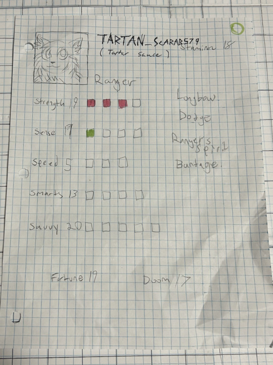
To Summarize: We shared the improved renders of the Snowfoot breed, a preview page of what Guilds will look like, and a breakdown of what we are testing so you can play for yourself!
What to expect next month: Continuation of asset and development production.
28 notes
·
View notes
Note
do you have any raw .drw files? how does its file size compare to a vector image / raster image of the same size / similar content? like ik vector files can be very small compared to a jpeg... storing timing info sounds simple to implement, but i wonder if it bloats up .drw file sizes?
Oooh, good question, and my answer uhh... got a little out of hand..
Here's the files in the folder for one of my drawings on the windows beta:

So we have the .drw file, the .sim file, a .csv file (this stores text data for my added title and description), and a .png and .sim for the thumbnail.
The .sim file is new to me, but looking at other files I believe the .sim files holds the individual layer data. Maybe the .sim stores the actual image data for display during drawing?
For example, heres the files for my haunter painting:

And here are the layers for the drawing in game (software?):

The sizes match up pretty well with the actual data on each layer!
(I should mention here that looking at file types and figuring out how they work is completely new to me so I could be getting some things wrong. I'm debating if I should reach out to the dev directly to check my work before starting this essay proper... but it's also been fun for me and my brain to try and figure this stuff out on my own)
Actually.. the sim files made me curious... if the main data is in the .drw file, what would happen if I delete the .sim files? Would the file still work?

First off, the thumbnail does not load, but the file still opens fine and the replay function still works.

And we still got all the layers no problem.

Hmm, if I save changes to the images, will it create .sim files?


It did! Huh!
Then uhh.. I don't really know what the .sim files do. If has something to do with display in game which is why the thumbnail didn't display. But I don't know where the layer files would be displaying if it's all based on the .drw. Maybe it's for file conversion? For uploading to the gallery? I don't know...
Anyways... back to the topic at hand, files sizes! The windows beta lets you export files as layered .psd files, .png files, and partial replay in uncompressed and compressed .avi!
So a quick reminder, here are the file sizes of the original image set up for Colors Live:

The .drw is pretty small!!
And here are my exports!:

The .drw is MINUSCULE compared to the .psd. And the .sim size falls between the two sizes of .png. Hmm, still don't know what's going on with that. Also for fun we can look at the size of an uncompressed two minute long .avi looks like. 4 million kilobytes, yay ^_^
Vector wise.. I'm actually not super familiar with vector programs (should probably brush up on them for this essay, huh?) so I'm not sure what exactly is comparable... I've had to use Illustrator this semester but I feel like Colors and Illustrator are approaching vector graphics in a very different way. Illustrator is saving data for vector objects, but Colors is saving data for brush strokes!
Well.. anyway we can open up one of my projects:

And we can stretch that layers panel all the way out so you can see all my layers and paths and objects:

And let's check the file size...

Yep! Pretty small!
For fun we can also convert that .psd I made into a .ai..

Yep! It's smaller!
Regarding file bloat... I think the devs did a fantastic job creating such a small file size and it's perfect for drawing on game consoles that usually have very limited space! However, my experience with Colors! 3D as a kid did have issues with file sizes.. Colors! was the biggest app on my 3DS and I constantly had to juggle uninstalling games and uploading and deleting paintings so I would have more room for new paintings. I did have quite a number of painting files... in various states of progress (as is typical) but storage space was a real issue for me. Now, were my SD cards only 2 or 4 gb big? Yes. Did I understand at the time that those were quite small for SD cards, even at the time? No. Does my experience mean anything then? I don't know.
Colors! 3D also had an issue were particularly lengthy paintings (were talking hitting the ~4 hour mark) would stop saving replay data. The replay would only play up until a certain point. I'm not sure why that is, based on what we know about .drw files I don't think it can be a limitation with the file type? That's kinda all it does? Maybe it's a limitation with the size of the 3DS memory that couldn't play the replays that long? Hitting that ~4 hour mark would also limit the amount of undos you were able to do so it could easily have to do with memory.
(Bit off tangent but undos take soooo long in Colors. And the more undos you do the longer they take! Colors didn't official start limiting the players undos until that ~4 hour mark but they were already limited by your patience)
Anyways, I will leave you with this, a link to the documentation of the .drw file format. It's only two and half pages long which I think is pretty short? Maybe you can find more info in there that what I can parse...
2 notes
·
View notes