#sort of tutorial
Explore tagged Tumblr posts
Visit Tumblr Blog
Explore Tumblr blogs with no restrictions, modern design and the best experience.
Last Seen Tumblr Blogs


Fun Fact
Tumblr.com is the 103rd most visited website in the world.
Note
Hi hi Lifa! I'm trying out Eulalia's darker defaults in my game, and I was wonder if there are any custom versions of your defaults so I can regeneticize them into that system? I don't know how to undefault skins myself, unfortunately.
I think what you're actually looking for has already been done: https://eulaliasims.tumblr.com/post/734614595199811584/default-skin-sets
Otherwise, if you want fully custom genetic skins of my skintones, you can just: 1. Install my defaults (& toss your current defaults someplace you can easily find them again, like the desktop.) 2. Make a recolor of each of the 4 default skins in Bodyshop. Just export/import, don't change anything with the texture. They will then be custom with the little rainbow custom icon. (Unless you wanna get fancy & give them an icon, you can do that.) 3. Delete my defaults & toss your preferred defaults back into the game (they're probably on the desktop, like I said earlier.) 4. Re-gene your 4 "recolors" using SimPE, there's a lot of good info out there on how to geneticize skins but really? Like really really? it's just changing a couple numbers. It's so easy, it's one of the easiest things that can be done in the game, don't be scared of making something new!
9 notes
·
View notes
Note
that peeled Jamis (lol thank you for showing us this) work-in-progress you posted... do you do the inking traditionally? that's so cool! :D


yeah!! i sketch with non-photo blue pencils that don't show up on scanner, and then i ink on top of that with kuretake black ink.
it looks fancy but this is THE cheapest way of doing comics, since i draw on paper i use a looot of ink and this stuff lasts a long time! i used to ink with markers but it got really expensive in the end. also with dip pen nibs you get wonderful variation on the line, unlike with markers so i heartily recommend it to everyone! i started drawing tigers with wooden pencils, then i switched to markers and finally to ink and i cannot emphasize how good the ink is compared to every other medium.
975 notes
·
View notes
Text
#tf2 heavy#tf2 medic#tf2#tf2 fanart#text is just flavour to make it look more screenshotty idk#there's so much wrong with this image but im moving onto other stuff fkjgjkfds#i'll draw other characters soon i promise#ty for the sweet tags on this!!#i'll do a tutorial at some point as this sort of lighting is NOT complicated at ALL im telling you. it's literally just a multiply layer#and a bloom
4K notes
·
View notes
Text
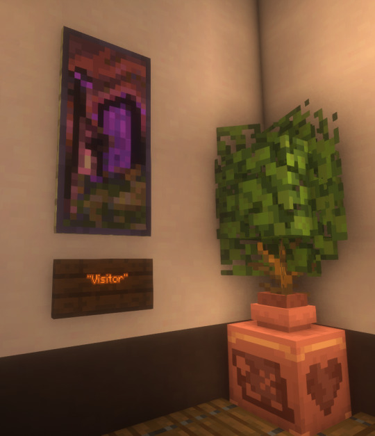
I finally finished a NEW CUSTOM MAP ART!!! "Visitor," a portrait of an enderman, is extra exciting because it's my first full-palette map painting, meaning I used block height to access all the highlight and shadow colours available!! More on the full process under the cut, but the short version of what this means is:
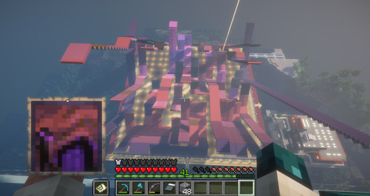
ITS A VERY COMPLICATED CONSTRUCTION. I created the art, then planned and built this manually, without any mods or schematics for construction. Huge props again to everyone else in the server for helping me gather all the materials to make this absurd thing possible!!!
This was the original art I made for it! I'm a huge fan of the "compressed" look of the vanilla paintings, so I've been starting with a large image and shrinking it down, though there were a lot of pixel tweaks to get it to read well. After shrinking it to 16x32 (for an art made of two maps), I convert it to a limited palette that I've set up to match the colours minecraft actually has available:

The map palette is actually tremendously limited, so figuring out a painting that will still look good with that constraint is a challenge in and of itself!
Anyway, the way minecraft maps work, a block that is Taller than the block to the north of it shows up with a slightly lighter colour, and a block that is Lower than the block north of it shows up on the map with a slightly darker colour. So when making a key for this one, I marked all the squares with a little arrow if it's the lighter or darker version:
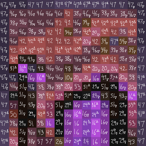
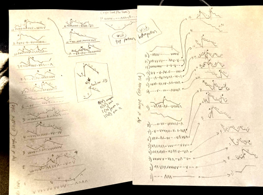
Each "pixel" here is a full stack of blocks on the mapped area: 64 blocks, 8 rows of 8. In order to achieve the affect of every block in a given pixel being taller or shorter than the block to the north of it, dark and light shades need to staircase either up or down. Because staircasing downwards in survival sounds even worse than this madness, I did some planning to make sure each of the "downwards" staircases would touch the ground, so I could simply staircase up from south to north instead. This involved figuring out how many up and down movements were in each individual column and planning out 32 little layouts:
It's worth noting that if you look up minecraft map art on Youtube, most of what you'll find is either, the simple realisation that placing blocks allows you to make custom map art, or an explanation of how to use a generator that will let you plug in any picture and then produce a schematic for you. It's very cool that these exist, but I wanted to do full palette art myself, without an auto-generated schematic, and at the time THERE JUST WEREN'T ANY TUTORIALS FOR HOW TO DO ALL THIS?? Now, having the experience of finagling all this, i think perhaps the reason is that this is a mad undertaking.
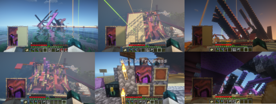
ANYWAY: PROGRESS SHOTS!!
I actually love how the staircases look..... its like some kind of modern sculpture
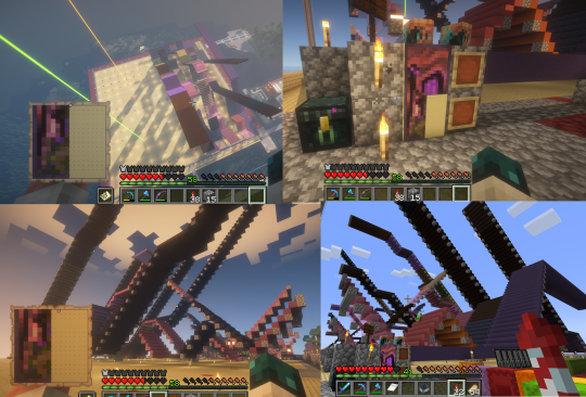
Fewer shots of the second half since I did it on call with friends; the last screenshot is one Thren took of me activating the new locked map to use for the gallery.
Once these paintings are done, I lock the finished maps, make copies, and stock them in the art gallery so other friends on our server can also put these paintings in their homes! It's a lot of work, but really rewarding to see my art decorating various buildings around the server. ;u;
I have one more custom full-palette painting I've done the art for and gathered all materials for; I still need to do the full key and plan staircasing for it before I can start, but HOPEFULLY if my resolve doesn't waver there'll be at least one more of these!!
#minecraft build#minecraft screenshots#minecraft#block game liveblogging#minecraft map art#GENUINELY SO PROUD OF THIS ONE#bsl shaders#im so tempted to make some sort of tutorial on doing this by hand sometime. you shouldnt do it by hand. but a tutorial should exist!!
481 notes
·
View notes
Text
Correct me if I'm wrong but I think? you're running into the reason why all the unmodded UC birthday cake recolors (which are clearly the same mesh) are each their own item in the catalog. Unfortunately I personally would recommend separating them into their own objects per color, especially since it's possible that someone might want to add different needs/mood buffs to different drink types later on.
If you're really set on getting the recolors to stick, there have been modders who have been able to get cake recolors to stick to slices & you can try reverse-engineering what @gayars did here: https://gdayars.home.blog/2021/08/14/peacock-wedding-cake/ to apply to your drink bottles. Difficulty level unknown lol, I'm not as smart about these type of things as she is.
Help a Fellow Simmer
Howdy, folks!
I was working on an updated version of this mod for my game, but with fizzy drinks from TS4 Eco Living.
I ran into an issue where the recolors are not "linked" wherein if they pull from the green recolored 6 pack, they'll always get the main file's blue texture.
Is there a tutorial or a knowledgeable modder that can help me out? I'll pay you in gratitude :D
45 notes
·
View notes
Text
Let's make a Sim!
Heyyo~ I want to make something but I don't know what, so I'm just gonna start and see where I end up, and I'll document the process so you can follow along with me if you want.
Warning: long post under the cut!
Follow meee~! ☆ミ(o*・ω・)ノ
Let's start with a blank Sim. A clean slate. I keep some blank Sims saved in my library for just such an occasion.

Hi buddy. 👋
Since I'm not starting off with any particular idea in mind, let's just randomize and see what pops up:

Yeah, okay. That's a decent enough base to start with.

I don't know what I want to do with him yet, but I think he should be cute. Just a cute lil' guy, you know?
But first he needs a chin.

Jesus Christ.
Now that he has a lower jaw, let's set the eye color back to default black. We'll figure out what to do with them later; for now I want to work on his facial structure.

Okay, getting somewhere.
Now he needs big, beautiful eyes. I'm deciding that now. Our nameless Sim is going to be a cute lil' guy and he's going to have big beautiful doe eyes.
We'll use this eye preset and scale it down a little.

Baby boy. Baby.
While we're here, let's give him a new lip preset and new eyebrows. We'll keep his nose for now, but let's make it a little bigger.

Okay, now we're getting somewhere.
Now onto skin details. ✧w✧
Let's start with a skinblend. We'll use @adelarsims's Romeo Face Overlay, and maybe we'll layer @sims3melancholic's Frederick Skin over it at about ~15% opacity, just for that liiittle touch of texture and color. (Thank you Color Slider mod.)

Oh he's CUTE cute.
You know what? Make him purple. We'll use one of @noodlescc's Sorbet Remix skin tones.

So he's cute, and purple. But who are you, nameless Sim?
Oh hey. Let's add @gloomiegalaxie's Chitin Antenna. I've been wanting to use those.
We'll call him Chitin Boy.

Greetings Chitin Boy.
So he's cute, purple, and bug-y. Party. Let's finish adding skin details, and give him some shiny new bug eyes. Big, beautiful bug eyes.
We'll also give him some pointy ears. Bitches love pointy ears.

It's me; I'm bitches.
Additional skin details:
Undereye Shadow
Eyelids N13
Eyebags Plus
Mouth Corners
Definition Overlay
Chin Overlay
Misc. Face Details
Now let's hit the gym, Chitin Boy. ( ◡̀_◡́)ᕤ

Chitin makes up insect exoskeletons and is pretty tough stuff--maybe Chitin Boy's species is also tough, and that's why they need chitin armor. So our boy is cute, but tough...let's make him slim but muscular. We'll use this body preset, because I like the muscle definition.
We're also going to give him an itty bitty slut waist, just because.
Now onto tattoos and body skin details... ( ◡‿◡ *)
Let's mix in a couple different blushes to give him a bit more color/depth, maybe a little highlight here and there to give him some shine, plus some bug-ish looking overlays.

Tattoos:
Torrada Body Blush
Lovefreak Body Blush
Blush N74 (Love You Like Crazy)
Eye Highlight N01 (Spark)
Demon Days Pallor (to make his skin just a little more purple)
Intergalactic Overlays (yes we're going to use that one overused nose ridge overlay, hush; it makes sense in the context of a chitinous bug-man.)
Skin Details:
Basic Body Blush
Asteroid Overlay
Tiefling Skin Detail
There we go. Lookin' extra insect-y.

Bitches don't know 'bout my bug armor.
Y'know what? Let's embrace the bug angle. Give that boy some mandibles. We'll give him new eyebrows too while we're at it. Let's use @plantainboat's Spikey Leaf Eyebrows.

Oof I love that bit of blue. Let's incorporate it into the rest of him.
Now it's makeup time. 👁👄👁
How about... Eyelashes / Eyeliner / Eyeshadow / Lipstick / Highlight / Glitter. We want him colorful and shiny, like a beetle.

Oh work.
Since we're embracing the bug/alien angle, let's give him a more fitting nose. We'll use this orc nose preset.

Lookin' cute, Chitin Boy. (Note: he has no idea that he's considered adorable by Earth standards. On his planet he's considered quite menacing. :'c )
Now let's give him some hair. ("Chitin and keratin?" you say. To which I say, "Yes. He has both. He is rich in both polysaccharides and proteins, and this makes him unstoppable.")
Now, what kind of hair... I think he should have long hair. It just feels right. Chitin Boy's species is tough but beautiful, and they grow their hair long. It flows behind them in battle.
Ooh, let's use @yin-shimo's Qing Jiu hair.

Perfect, but it's not quite the color I want, so we'll use @tricoufamily's Willoughby Hair Overlays to tweak the color, plus these ombre & root overlays. Bugs are colorful, so Chitin Boy's species should be, too.
Also we'll give him new eyeshadow. Oh, and cooler ears.

Chitin Boy you are positively radiant.
Okay, we've got a good color palette going here. Let's go back into tattoos & skin details and change that pop of color from purple to blue, so we can pull some of that color down onto the rest of his body.
We're also giving him a braid. It feels important. Chitin Boy has a braid and he's very proud of it. Maybe it has some kind of significance in Chitin Boy culture.

Okay, love that.
Now let's dress him up. ( ͡o ω ͡o )
I'm thinking we want some bright, bold colors, but I also want to utilize a lot of black. He's pretty but he's also fierce and serious, I've decided. We want colors that will complement his color palette but won't distract from it--Chitin Boy is bold and beautiful, but he isn't gaudy.
His clothes should be functional and comfortable, and shouldn't restrict movement--he needs to be able to move quickly if he's from a tough warrior-bug-alien species, and if he already has chitinous skin he won't need much actual armor. But they should have a unique silhouette, too; not just "shirt and pants," you know?
I also want to show off his body details/coloring, because look at him--it'd be criminal to cover all that up.
Let's go with: Bottoms / Top / Shoes.

These recolored Journey to Batuu bottoms give him a great silhouette, and pairing the asymmetrical skirt with an asymmetrical top balances it out. And of course a fierce bug-boy warrior needs a sturdy pair of boots--that's just a given.
Maybe Chitin Boy is a warrior on his planet, but on Earth he's just a guy. I bet he'd be into the punk/metal scene. His culture doesn't have music but they do have screaming, so naturally he's drawn to Earth's Loud Scream-Singing.
Let's add on some punk-y accessories to complete the look: Gloves / Belts / Bracelets / Nails
We'll tweak the body a little bit, aaand...

Chitin Boy, you beautiful bastard, you've done it again.
There he is. Our Chitin Boy. From inception to finish. :') Now we'll give him some traits--how about Self-Assured, Chased by Death, Music Lover, and Loner. Confident and self-sufficient, keenly aware of his own mortality, and just a big fan of a good song.
He likes arguments & singing and dislikes silly behavior & video games. He likes argumentative Sims, but does not like ambitionless Sims. His favorite color is blue.
And we'll give him the Soulmate Aspiration. Because Chitin Boy needs love. 💖
How it started vs. How it ended:

Glow-up. 💅
And that's a wrap! Thanks for accompanying me on this journey. I don't know if this is actually going to help anyone, but it's been a hell of a ride. :^) May you go forth and make some weird random Sims of your own.

155 notes
·
View notes
Note
how are you so good at drawing people's skin!? my feed is like a soap commercial right now from all of your perfect flesh. (also thank you, your work is really nice to look at c: )
FIRST OF ALL THANKS😭💖
And hmm about flesh and skin overally, I think what helped me the BEST to make it look realistic was paying more attention to and managing the cold and warm undertones! I think it started when I saw this thing here for the first time👇

(I have NO IDEA who's the author I'm so sorry,, I have it saved for so long on my phone it got lost💀)
From there I started paying attention to other artists' arts, pictures (better if unfiltered/if people have no makeup on) and started "mapping" where regions should I put each color not only on the face but also the body and here we are😂🙏
I think these illustrate well how I apply (and often exaggerate them, specially the greens) akdjjs and this cold/warm tones apply to all skin colors too btw


The last one is how I distribute it in bodies more or less aoskapskap
The other think yo consider is obviously the skin folds– and for these I also use a lot of refs ORRR take pics of myself if it's something more specific akdnsjs
This may or may not ended up with me having tons of very shameful and ugly pics on myself on my phone😍
BUT THATS IT KANDJS
#ask#maybe (totally) overexplained this one sorry#take it as a lowkey cheap ass tutorial of some sort idk LMAO#art tips
183 notes
·
View notes
Note
I really love the texture in your paintings!! I also use gouache but getting a nice texture with clean lines is something I've struggled with, do you have tips or specific techniques you use?
Thank you!!
Thank you so much!! I'd love to help - I'm self taught wrt painting so I have no idea if my approach will make sense to anyone else. I'll tell you what I do and why and you pick and choose whatever (if any) of my thoughts might be helpful ^^ I find that zooming in close on my subject makes textures much easier to capture, because more detail can be included without the picture looking noisy. It also saves me from having to make so many decisions (what to include, what to leave out, how to simplify and just suggest texture), but tackling every challenge at once is not a good way to learn anything. Maybe stick to close ups, or extreme close ups, to practice your textures, and then practice making judgement calls on what to include and what to leave out! Both parts are important, but they are somewhat separate concerns (IMO) I go over most areas of a painting many, many times. I build up many layers of paint, re-wet the area to blend them together, paint over it if I change my mind about something... Any "clean" line I make is often made up of 10+ strokes. I kind of creep up on detail, instead of trying to get it perfect once - I just find that the nature of the paints respond better to that. (And my hands often tremble, so that has to be accounted for) For example, the white highlights at the edges of these leaves I repainted I don't know how many times - I only made the decision to stop once I realized I was getting caught up in the joy of those movements of the wrist....

Because you can cover up areas well (at least if you cover with many layers), AND you can re-wet the paint to blend it or shape it differently, I find gouache very forgiving and I rarely start over a piece. A lot of times this messing around will bring up something fun I didn't expect, too! So I don't approach gouache like water colours, or expect a smooth surface on the paper, or paint in a style that requires anything to look good on the first stroke of the brush.
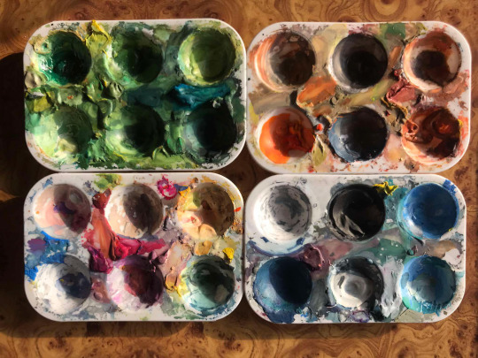
^^^ those are my palettes. I don't clean them... ever... I just wet my brush to loosen the pigment and add paint as I need it. I started working like this because I didn't feel I had the money to spend on paint, and then I built my techniques around that as I learned. So I rarely premix my paints, I usually pick whatever is closest and then mix colours on the paper. That means my focus isn't on getting the colour right, but on getting the values right. When gouache dries, it looks dull, so you have to over-shoot the mark wrt to values - make your darks darker and brights brighter. Go bold! I'll give some examples

^^^ with this painting, I think I succeeded wrt textures and values (and largely because of that, colours). I found this log in a big bush, so the light was very dappled under all those leaves. I added lots of small, very bright strokes on the bark where the sunlight landed the strongest, and kept most of the rest dark and flat-ish.
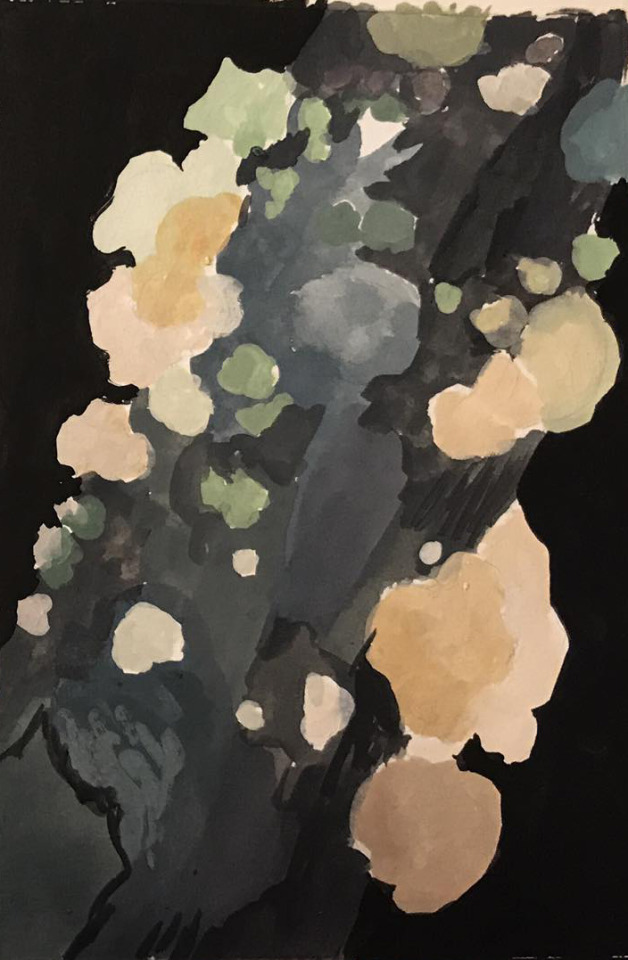
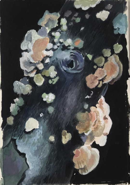
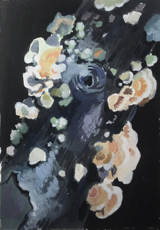
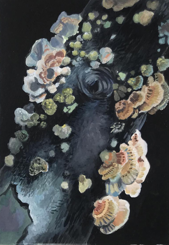
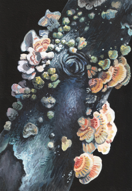
I initially added a lot of detail to the bark even in those dark areas, but then painted over them to lead the eye to the brighter areas. But since gouache doesn't give GREAT coverage, you can still see small brush strokes in there that add some texture. So it's rarely important to get things right on the first try! I think these ^^^ progress pictures do a pretty good job of showing how I tend to go back and forth on how much detail/contrast to add in any one area...

^^^ I'm not so satisfied with this painting in hindsight. My usual approach of mixing on my "canvas", lots of layering and trial and error looks muddy here and detracts from, rather than adds to, the result. The white flowers should be more uniform, bright and clean in colour, with shade added sparingly and with precision. The reds, oranges and yellows needed to be mixed fresh on a clean palette, because those were supposed to be the stars here and yellow is the most finicky colour, it can't take a beating like blue can... but I digress. The textures suffer for the same reason. Each individual flower has too much detail, too much texture, and they cancel each other out. My last piece of insight/advice is: approach textures like play. Like finding bunnies in clouds, textures suggest things, and that game of association or single-player-telephone is where you'll find YOUR approach to stylizing what you see, and how you'll share YOUR interpretation/imagination of the world with us.

^^^ the original mushrooms didn't literally have those colours, or those swoops and dots... but I saw them there, and I brought them out and exaggerated them, because I used my brush to "play mushrooms". It wasn't exactly conscious decisions, either - I didn't decide to make this shape and not that shape, I didn't look at anyone else's style or mannerisms. If it's difficult to access that confidence to play on a subconscious level, make up some exercises to bring it out consciously. DON'T go looking at other people's choices and try to incorporate them into your own "style". "Style" is only interesting when it's an expression of someone's vision, and everyone has to explore their own vision. Inspiration from other artists is most useful when it reminds you of just how much is permitted, how far you can push the boat out. I think the same goes for learning techniques from other artists. My number one piece of advice for art generally is to divide your time into just learning (practicing techniques, following guides, making studies) and just making (sitting down to create and play, with or without a plan, entering flow as quickly as possible and shutting up your inner critic wrt execution). And that goes for the details, too - if you find someone who's art you like, who can explain how they work with textures in a step-by-step way (and I might make a guide like that, but that'll have to be another day ^^), by all means try out their methods. But when you're CREATING, try not to stop and think, try not to aspire, and try not to lean too hard on other people's methods. So! That was maybe not super straight-forward or strictly on topic, but it's the best advice I can give off the cuff! If there's interest, I'd be happy to sit down and analyze my own decision making when I paint and then I'll be better able to make a how-to guide of "first this, then that". But for now, I hope these thoughts are useful, and thanks for getting me thinking on such an interesting subject!!!
#dogboynecromancer#tutorial#tutorials#art tutorial#my painting#my art#gouache#gouache tutorial#well sort of...#questions#i realised half way into writing this that I have a migraine so idk if it's even coherent.#but if I let illness stop me i'd never say or do anything so...
59 notes
·
View notes
Note
Hey I was wondering if you would do a post about how you make your feralnette au? I really like how you color it and was curious about your process.
Yes this is absolutely for plagiarism purposes /j
(I want to incorporate something similar on a smaller scale within my artwork, I don’t plan on posting anything but I can run the art past you if your worried about me actually stealing your style)
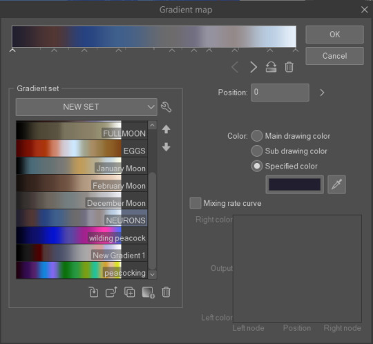
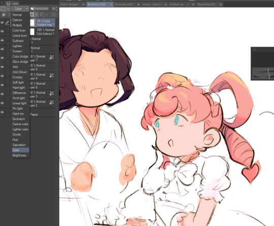
sure! as a note I'm not a pro or anything, this is just how I render my comic for ease of access
as a general note I draw everything in black and white first

I use a LOT of texture heavy brushes for effects, and specifically because I render with gradient maps a lot. people ask me why I do AU's in different styles - usually anything outside of feralnette is done in color - but that's because the rendering process is different.
for instance in the dad villain au, I do basic linework and chunky colors. if I was to do Feralnette in the same style, the gradient maps wouldn't nearly have the same effect, as you can see up there ^
when a gradient map is applied I can fiddle with the color values to set a Tone for the update I'm going for, while also making it really pretty, bc textures can really bloom the subtle colors in a gradient map. I get a lot from the CSP page itself, but I also MAKE a lot too. this specific map I made by color picking off of a neuron map from a brain scan I thought was pretty~
I don't do the feralnette AU in full color because generally, anything IN full color will have significance - either to show that a scene is important character development,
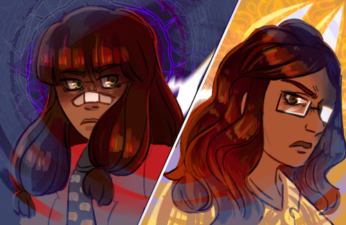
is a flash back,

or to put emphasis on something supernatural happening.
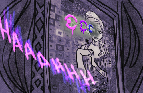
with Feralnette, when something is colored purposefully, its to emphasize it, whether that be to highlight character moments, or to stress that something eldritched and unnatural could be occurring, as its colors that do not exist in the pre-existing gradient map. Color out of space, yknow?
((SOMETIMES I put gradient maps on my colored chunky stuff, but once again, for the purpose of creating a tonal shift, like when papa Tom shows up in the dad villain AU!))
anyway I hope that helped!
#replies#tutorial#sort of#im answering a lot of questions bc im bedridden w/ ms rona herself#my kitty retail sis caught it too (she's a champ so she's beating it like a fuckin pro)) and nudibranch sister remains unscathed!!!!!#we stay winning even if im dying!!
807 notes
·
View notes
Note
Hi, Lifa! I hope you're doing great. I've just seen your answer to an anon regarding Monique's Hacked Computer - you see, I've been trying to sort of clone Maxis' computers and give them "Monique abilities". Unfortunately, I fail at it every single time. Would it be too much to ask for some kind of tutorial? I'd be forever in your debt <3
Honestly if you're trying to replace the Maxis computer with the Monique computer? Clone the Monique computer, replace the mesh of the cloned Monique computer with the Maxis computer mesh, & change the GUID of the (cloned & mesh-replaced) Monique computer to the Maxis computer's GUID. I promise it's easier to work backwards with these by starting from the Monique computer with working options, than it is to try & add ALL the options to a package that doesn't have them. ;)
8 notes
·
View notes
Text
skip the youth, it's ageing me too fast
#young royals#youngroyalsedit#wilmon#mygifs#do i have an explanation for this? not really!#i just love this song and i had this idea like a month ago#sorry i guess????#(also i just realised that the wille one is him lashing out at his mum vs. the simon one getting comforted by his mum and i'm not okay????)#also i had to watch a tutorial bc i forgot how to do any sort of blending
204 notes
·
View notes
Text
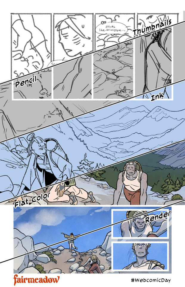
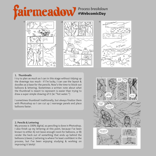
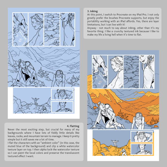
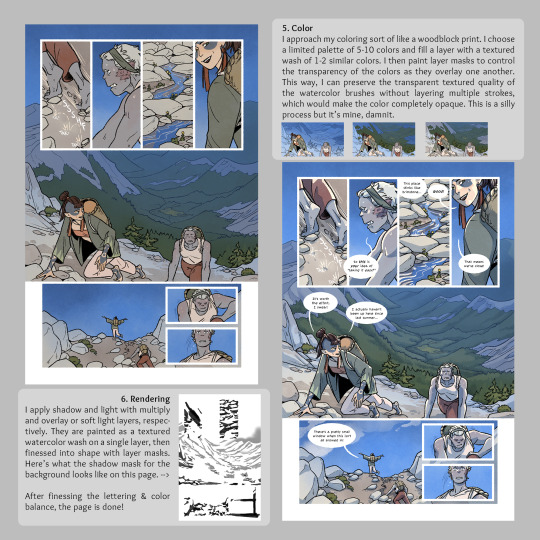
How the veggie sausage is made for #WebcomicDay. I have a weird process built entirely around trying to preserve my watercolor textures with severe layer limitations. (This was one of my few files that still had background flats in it!) Enjoy??
Read Fairmeadow!
& Happy Webcomic Day!
#process work#behind the scenes#comics#webcomics#webcomic day#fairmeadow#tutorial#sort of#procreate#hiveworks
261 notes
·
View notes
Text
Don't quite understand the obsession with bringing back characters' old interests/hobbies. Like yeah it could be fun but also, people pick up and abandon hobbies all the time? People do them a little every once in a while and then forget about them for like 3 years? It's not some horrible character-assassinating thing to not mention someone's interest in poetry or whatever they quite literally might have just stopped doing it.
#and dare I say this can even go for Jay's inventing#like. the guy was never “the inventor” he was just the dreamer. he liked MAKING things sure but of his own admittance he liked making#ALL SORTS of things#nya was always the mechanic#jay could get into baking or sculpting or needlework or woodcarving or programming or fuckin makeup tutorials and it would feel in-character#okay fine so maybe the post is just about jay#ninjago#ninjago jay
53 notes
·
View notes
Text
The Load Order Myth
There's a persistent myth in this community that mod conflicts can be solved by making the mods load in the right order.
However: This is only true if the mod creator has made them compatible. It might be true if two mods just happen to do the same thing, but that's very rare.
How mod conflicts work:
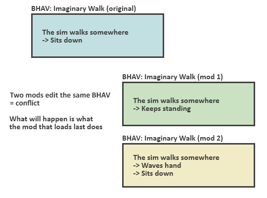
No matter in which order these mods load, the sim will always do either thing, not the combination of both.
So the mod that loads first will stop working.
Making these compatible is only possible by making a new mod:
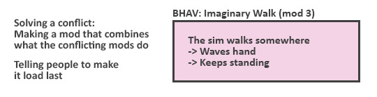
Depending on how complicated mods we're talking about, making compatible versions can be just as worksome than making a completely new mod.
So if the creator doesn't want to use both of the mods themselves, chances are they aren't interested in making yet another mod.
TL;DR: whenever creators say "these will work together if my mod loads after", they've intentionally made it that way (and will likely tell about it in the post).
193 notes
·
View notes
Text
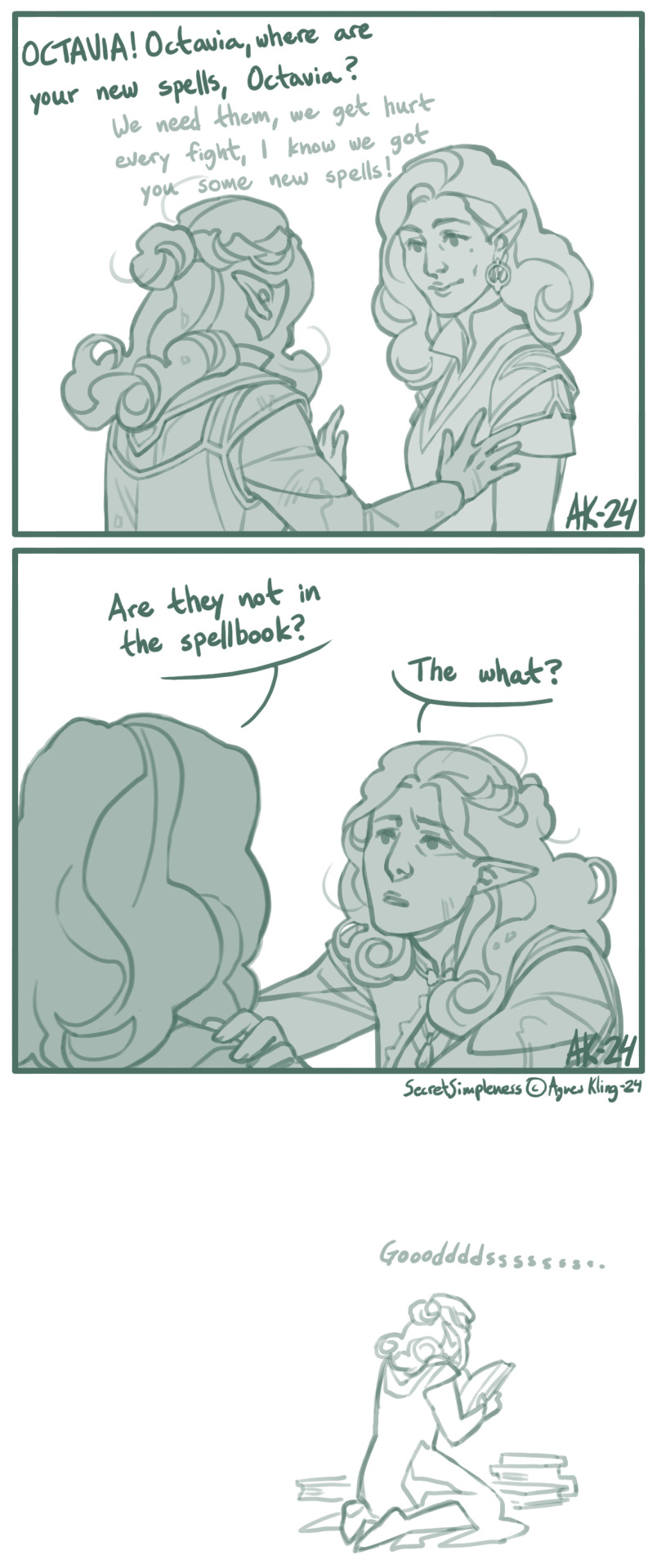
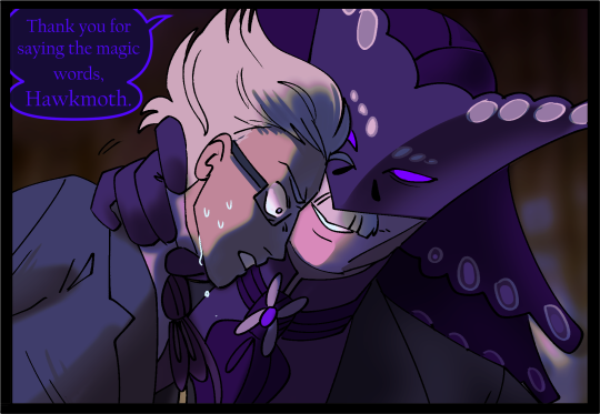
I figured this out somewhere along the second-to-last act. Octavia, the Baroness / Pathfinder Kingmaker (c) Owlcat Games
#pfkm#pfkm baroness#octavia#comic#pathfinder kingmaker fanart#pathfinder kingmaker#owlcat games#oc ailcha#spellbook#game mechanics#I tend to re-read tutorial messages for all sorts of things but this one apparently passed me right by. whoosh. gone.#“this class needs to prepare their spells” what like at camp or? and then I just forgot and was a tad annoyed after each level up.#almost all of the companions only had their level 1 and basic stuff. for most of the game. great. it was a great experience.
240 notes
·
View notes
Text
hi everyone!! my wrist is too sore to draw today, so instead i thought i'd share some of my favorite csp assets + how i like to use them! i also linked some procreate brushes at the end of the post!!
lineart brushes:
SU-Cream Pencil: i swear by this brush and i use it very often!! if you lower the pen density and use a gradient map over it when coloring your drawing, it has a nice effect. that's what i did in this drawing here! i also use this brush like i would draw on paper, so as a sketching tool. recently i've been enjoying blending it for shading. the pics below are drawn on one layer; left is more manga style while the one on the right is from a WIP of my singer sargent study, so it can be used for more realistic styles pretty well!


Found Pencil: another pencil brush that feels really nice to use, created by @/pigpenandpaper.
PS style brushes: a recreation of photoshop's (i believe) default brush. very versatile and also blends well!
analog wind variant pen: a nice pen that i like to use for lineart that is intended to have a bit of a sketch look.
zakutoro real g-pen: i used it for the lineart of this piece. although, it was drawn before i started using 600dpi in my works, so the lower resolution might make it look a bit unclear.
sets of rough pens: great for manga lineart with a rougher vibe; some of them have varying line weight.
coloring brushes:
zaku brushes: very nice and painterly mixing! i definitely recommend it for those who like to leave their colors a bit unblended.
softie marker: as the name implies, it's very soft! i like to use it for blush in chibi illustrations.
analog watercolor brushes: realistic-looking watercolor brushes. i recommend using it with csp's default paper textures, or those i linked below!
993 coloring pen: it's very soft and watery, though it can be made more solid by adjusting the paint density. i actually think it works very nicely for lineart too.
rock dog pen: another soft marker brush i like, that i once again also use for lineart and doodles.
thick coating brush set: recommended for paintings that show brush strokes.
cartoon cloud: don't let the name narrow your vision!! this has to be one of the BEST brushes for painting in my opinion, and of course it's great for clouds and explosions but so so much more!! and it's FREE try it try it!!
decoration/miscellaneous brushes:
neon pen
paper textures
symmetry move brush
close and fill without gaps
rope brush
sphere fisheye guide
flash balloon
speech bubble set: a lifesaving collection for comic artists!! dimensions and line weight can be adjusted by using the operation tool.
gradient map to use in color mode at 15% and another gradient map to use at 20%: the percentage refers to the opacity of the gradient map layer, but they are just the creator's recommendation and i tend to actually increase it. to use gradient map efficiently, i recommend putting all your colors (and lineart if you want) in a folder. then, right-click the folder, select "new correction layer" and then "gradient map". this allows you to modify the gradient map without worrying about affecting the original colors in case you decide not to use it in the end. to import a gradient map from your downloaded csp assets, click the wrench icon next to the name of the gradient set that's currently in use, then select "add gradient set".


you'll also notice that the creator recommends to use their gradients in "color mode". of course, this is also only a recommendation and i suggest trying as many layer modes as you like! to change a layer's mode, simply highlight the layer and click on "normal" (the default mode) and csp will display the available modes.

fruit ninja gradient map: fun to use if you want really drastic/vibrant colors! the names of the gradients are cute too, as you can see in the above screenshot!
BONUS: jeremy fenske's free photoshop brush pack: these aren't csp brushes per se, but they can be imported into the program! excellent for environments, i recommend watching fenske's video on how he uses the brushes to get a clearer picture since there are so many in this pack!!
BONUS 2: my good friend clem has a few brush packs for procreate that are ideal for painting,decorating drawings, and y2k-inspired illustrations, i definitely recommending checking out her shop!
in conclusion i hope this post can be helpful to you!! i tried to explain how to use the brushes as best as i could, but feel free to let me know if anything is unclear!! i hope you will enjoy using them! :D
#clip studio paint#clip studio paint brushes#csp#csp brushes#procreate#procreate brushes#brushes#tutorial#art tutorial#sort of hehe
174 notes
·
View notes