#sphere shading tutorial
Explore tagged Tumblr posts
Visit Tumblr Blog
Explore Tumblr blogs with no restrictions, modern design and the best experience.
Last Seen Tumblr Blogs


Fun Fact
Forty percent of Tumblr users are between the ages of 18 to 25.
Text

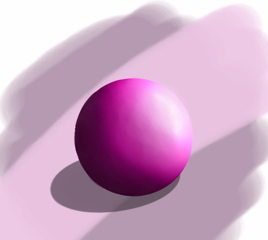
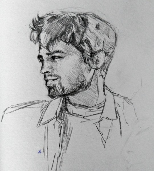
first attempt at a mini tutorial? i included my mistake as well in pink because i think it's a good learning opportunity. transcription of my handwriting below: [top right corner: Object; Light source] [top left corner: Round shit reflects a bit of light @ the edge; Shadow follows the curve; Shadow to indicate ground-- dark!; Airbrush shading] [bottom right corner: New shadow; Edge stays shadowed; I fucked the light source; New light according to highlighting] [bottom left corner: Light towards edge to indicate backlit] end transcript
5 notes
·
View notes
Text
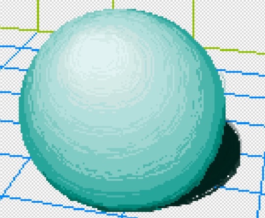
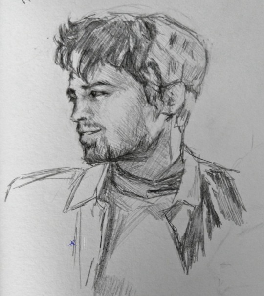
Did a couple more edits and fixed the shadow a bit still figuring out where to position the shadow.
Time: 30min roughly
#art#digital art#digital aritst#digital drawing#digital painting#digital sketch#how to draw#drawing tutorial#drawing#ibispaint art#ibispaintapp#made in ibis paint#ibispaintdrawing#ibispaintx#sphere#shading#realist art#artists on tumblr#my art#artwork#digital arwork#satisfying#girlblogging#this is a girlblog#rendered art#art tutorial#art tumblr#painting#ibis paint x
9 notes
·
View notes
Text


Dumb doodles/ shading and highlighting with no tut lol
Actually it’s one tut, but it’s literally just that Hypixel video someone made to prove they weren’t hacking to win Pixel Painters that I watched years ago and still have muscle memory of.
Then I devolved and just did some weird style derived from that videos methods and.. yah that’s what came out. Also couldn’t for the life of me figure out how the pyramids shadow would look. I should prob watch a shading tutorial LMAO
Also the grid box thing is a preset on @pixilart t, I didn’t make it
#pixel#pixilart#pixel art#pixels#pixel illustration#shading practice#pyramid#cube#prism#sphere#highlighting practice#i’m insane#I literally am happier not learning from an actual tutorial but remember ones from years ago and wing it#no one can stop me#>:3
2 notes
·
View notes
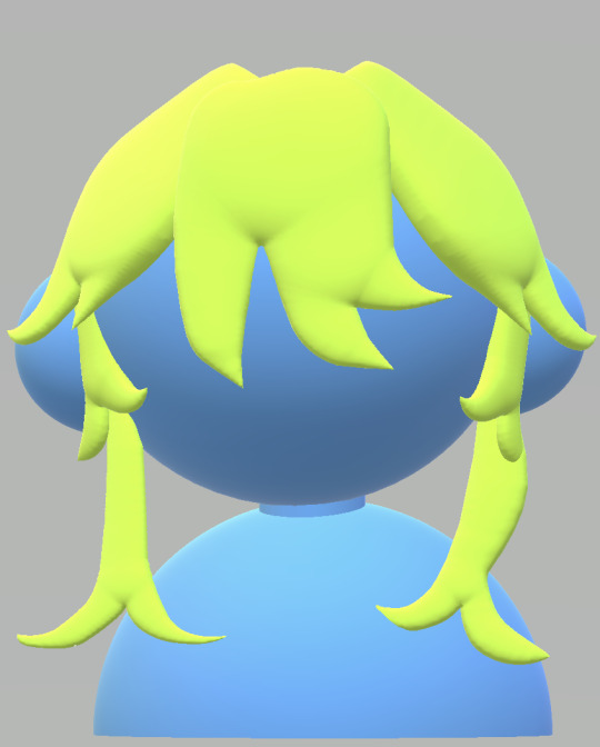
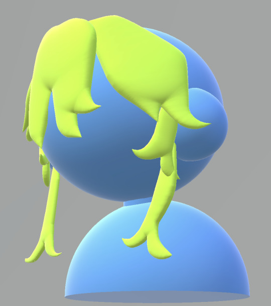
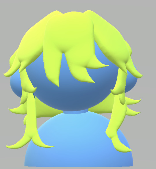
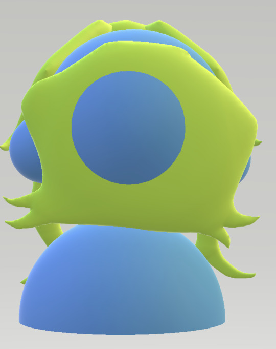
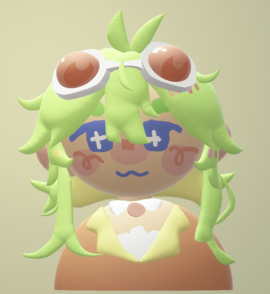
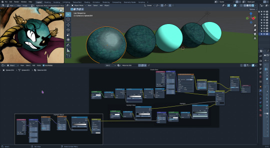
Text
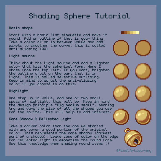
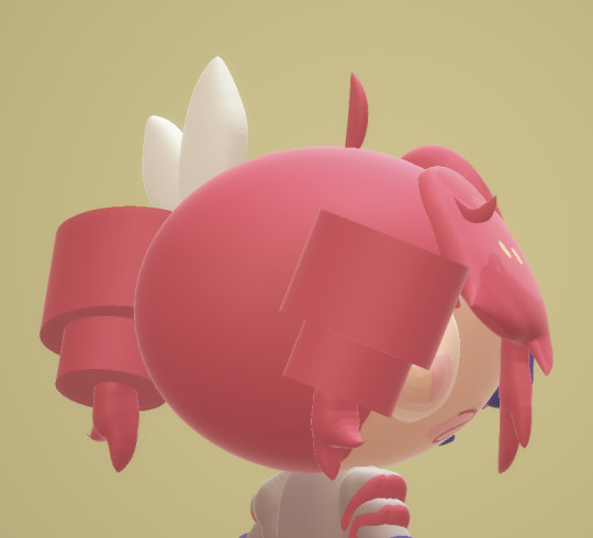
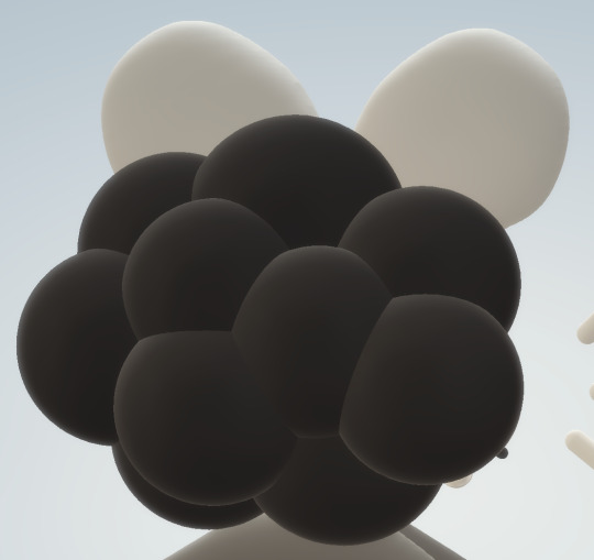
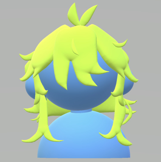
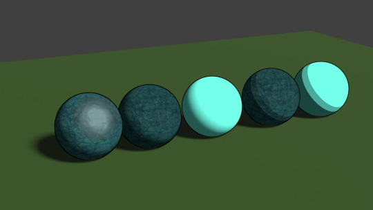
Sphere Shading Tutorial
310 notes
·
View notes
Text
How to fix Transparency w/ Lashes and Alpha Hair in Blender! Cycles & Eevee!
(This tutorial also helps with adding transparency to Sims 4 Object cc. If needed, I can make a post on that as well.)
This is NOT a Tutorial on how to fix broken/ glitched lashes in the SIMS game!!!
It was brought to my attention that others do not know how to fix this issue in blender, so I've made this post to help out. This tutorial works for BOTH Eevee and Cycles! (This only matters at the end when in the materials tab.)
None of the CC is Mine! Ty to ALL creators!
This is work for all methods of DAE exports.
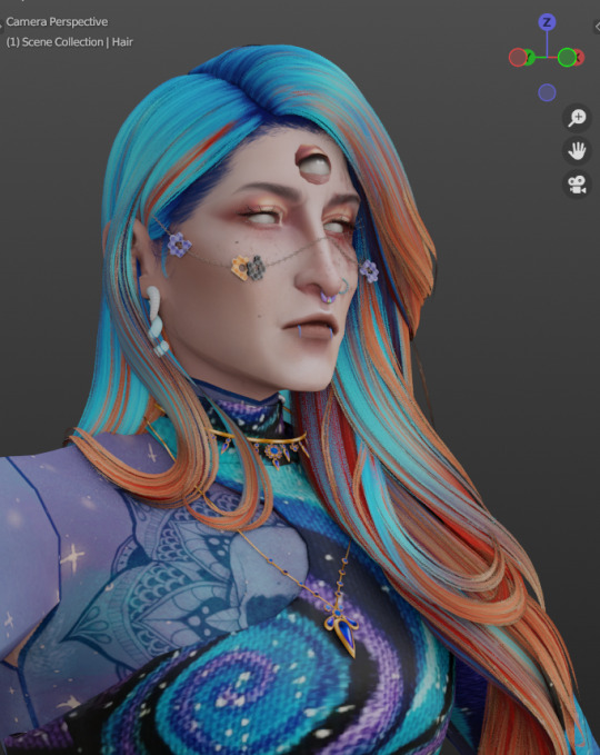
This is Erecen. They will be our tutorial model today.
As you can see, the Alpha CC hair and lashes are not... working like how we saw them in game. So! We will need to fix this up within our Shading Node Wranglers to correct this.
(If you use a GLASS mesh, make sure you are shade wrangling on the GLASS!)
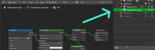
(This picture is only showing which is the Glass mesh!) Plz ignore this if you are not using Glass mesh export on Ripper.
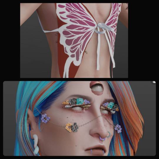
Lashes/Hair Transparency
First import your sim and wire the texture nodes how you normally would. Stay in Shade Editor/Shading tab.
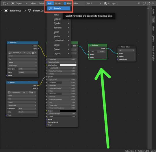
You will now want to Add a 'Mix Shader' node. Search for it by typing in "Mix Shader". Select and now drop it between your Principle BSDF node and Material Output node.
After this, you will want to Add a Transparent BSDF. I added mine the same way as the Mix Shader and have place it under my Mix Shader node.
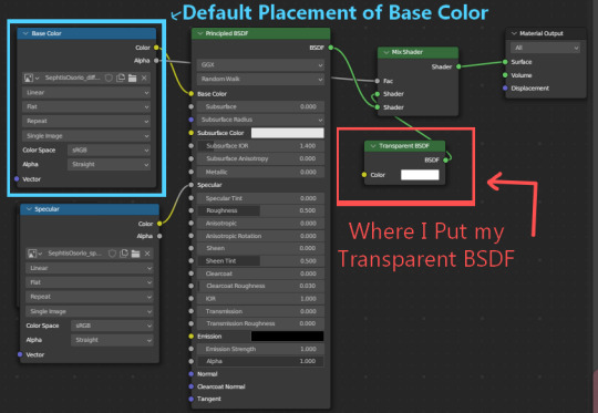
With this Transparent BSDF node, you'll want to wire it to the TOP Green Circle of your Mix Shader node. (1 in pic below) This will disconnect your current wiring from Principle BSDF. This is fine since you now want to wire the Principle BSDF node to the BOTTOM Green Circle of your Mix Shader node. (2 in pic below)
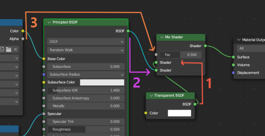
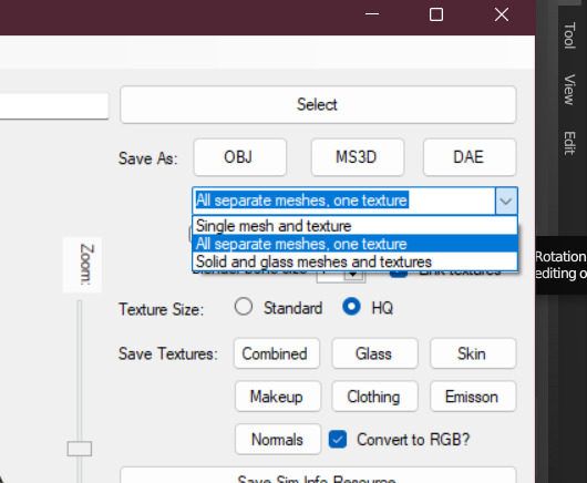
Afterwards, you will now need to go to your Base Color node; (Where your sims diffuse lies!) It should be the top left node, unless you have moved it. (3 in pic above) Now take the Alpha dot and drag it all the way to FAC on the same Mix Shader node. From here, we need to go to 'Editor Type'.
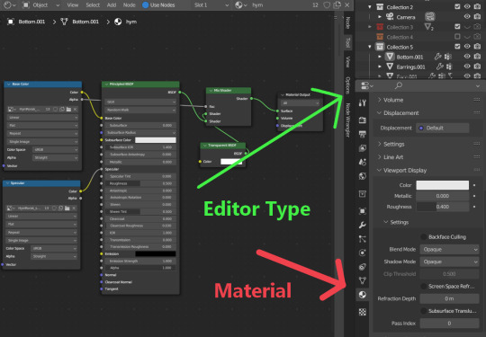
After locating Editor Type, you now want to locate the sphere listed as Material.
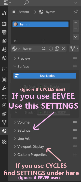
You now want to find the correct SETTINGS tab. Please note how you render your renderings. If you render in EEVEE, take note of the picture above. Same for CYCLES as taking note in the picture above. This is very important since the SETTINGS options switch between these two areas depending on the Engine.
In Eevee, this should be in the first SETTINGS tab in the materials properties tab.
In Cycles, the SETTINGS you will need is located under the tab listed as Viewport Display. From there, a new drop down will be available called Settings. (This is the correct SETTINGS you want)
Either engine will now have a few modes now visible.
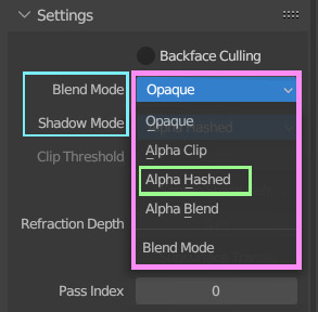
For both Blend Mode and Shadow Mode, change them from Opaque to Alpha Hashed. (It is only required to change Blend Mode to Alpha Hashed for the transparent textures to work. Hashing shadows makes a nice balance of translucency and ambient occlusion.)
And that should be it! Your lashes/Alpha CC hair should be working correctly now!
I hope this helps! If not, please feel free to msg me of any other further know issues. Thank you to @spookyxdoom for bringing this topic up!
I even had my bf try it out without knowing a single thing about Blender and they figured it out just fine with this tutorial.
I already plan on doing other tutorials on how I fix overlapping textures as shown below.
35 notes
·
View notes
Text
Does anyone have helpful tutorials on shading drawings that’s like,,, not just a sphere or other simple geometry? I never got to any art class that wasn’t like “yeah you can shade this cube right? good. end of lesson” and just acting like somehow shading a cube meant I was a master at shading things like humans and plants and cars and anything else oddly shaped. Anyways I always have trouble figuring out how to determine what parts of a thing should be shaded or not and i just end up scrapping shadows for the most part,,
9 notes
·
View notes
Note
Hello do you have any guides/tips for writing image descriptions, I’m always at a loss of how much/little to include
Here's a post I made a bit ago going over the basics for what and what not to do.
Here's a tutorial showing different levels of detail.
I usually will include first, what is the medium? A photo? Digital painting? A traditional painting? (in which case I'll usually just say 'painting')
Here's another little tutorial for this post, showing images of increasing detail, and descriptions to match, which will hopefully help.
The main thing is to make sure you describe everything that's important in the image.
A good way to learn is to follow a lot of blogs that do image descriptions, so you can see how different people describe different things.
A new tutorial for April 2024:
simplest:
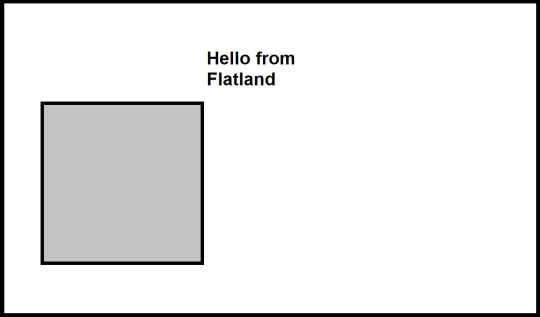
[ID: An MS Paint drawing of a grey square on a blank white background, saying, "Hello from Flatland". There is a simple black border around the image. End ID.]
a bit more detail:
Note that there's nothing inherent in the image to tell you this character's gender, but because I, the describer know it, I can simply use the correct pronouns and convey it that way.
If you're describing people whose genders you don't know, it's best not to assume.
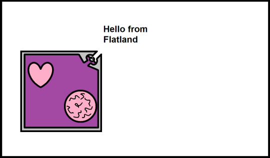
[ID: An MS Paint drawing of a grey square on a blank white background, saying, "Hello from Flatland". He has a simple eye drawn on the upper right corner where his dialogue is, and has a pink heart and a brain represented by a circle with squiggle lines inside his body. There is a simple black border around the image. End ID.]
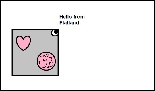
Some more detail:
[ID: An MS Paint drawing of a square on a blank white background, saying, "Hello from Flatland". He has a grey outer layer, with his insides purple, with a small eye just inside an opening on the corner where his dialogue is, with the corners appearing almost like a beak. He has a pink heart and a brain represented by a circle with squiggle lines inside his body. There is a simple black border around the image. End ID.]
Yet more detail:
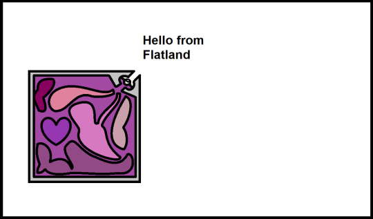
[ID: An MS Paint drawing of a square against a blank white background, saying, "Hello from Flatland". He has a grey outer layer, with purple insides, and various blob-shaped internal organs in different shades of pink and purple to reddish-purple, with all of them general blob shapes except the purple heart, which is in a simple heart shape. There is a simple black border around the image. End ID.]
Ooh look at this:
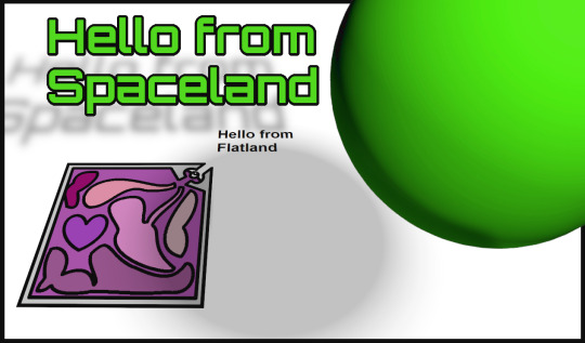
[ID: A digital drawing A green sphere, which says in matching green text, "Hello from Spaceland". The sphere and its dialogue both cast shadows on the white ground below, where a square, tilted at an angle as though lying flat on the ground while we view him from an angle, says "Hello from Flatland". The square has a grey outer layer, with purple insides, and various blob-shaped internal organs in different shades of pink and purple to reddish-purple, with all of them general blob shapes except the purple heart, which is in a simple heart shape. End ID.]
I'm too lazy at the moment to twist my brain to draw a tesseract so you'll all have to use your imagination for the image that would come next lol...
Hopefully this helped demonstrate a bit!
25 notes
·
View notes
Note
Maybe you have some drawing tips for beginners?
Your style is incredibly beautiful and it just inspires this thing inside me to grab my iPad and start drawing but unfortunately I have no idea where to even begin
Or maybe you have some recs where to look to learn how to draw stuff?
But I understand completely that it’s your thing and artists should never feel pressured to share all their techniques and secrets, you worked hard on it!
I just really really love your art to the point where I just look at it for 30 minutes straight with this big feeling in my chest
<3
ah it was never about being secretive, i'm pretty open about my drawing process since gatekeeping knowledge is a big pet peeve of mine. It was more like,, laziness because writing a cohesive and helpful drawing tutorial is pretty difficult and i wouldn't even know where to start; i'm afraid i'll get maybe too technical and what have you.
As for tips for beginners, i've shared plenty on my couriouscat so you can scroll through the answers there, i also have some drawing timelapses on my twitter account as well (albeit you'll have to scroll a little)
I'm very flattered you feel that way about my art, it really means a lot to me and i'm glad to have inspired you to draw as well that's awesome and i wish you best of luck!
I actually don't know how different drawing on an iPad is compared to a graphic tablet+desktop, so I am actually pretty clueless in that regard. I think Procreate is the most used digital art app for iPad so you can start by getting it and familiarizing yourself with the UI. I think this step is often overlooked. The brushes and the chosen program can make or break the drawing experience. If you simply find yourself not enjoying Procreate, experiment with other apps or maybe try switching to a graphic tablet, maybe that feels better and is more suited to your tastes.
To be completely honest, one "bad" piece of advice that i should probably keep to myself is to draw something you actually enjoy: fanart, Pretty Girl Portrait(tm), your cat, landscapes etc even if it's above your skill level (becoming obsessed/ fixated on some character from a piece of media also works wonders i'm just gonna throw that out there). The main point is to actually care about your chosen subject in order to get inspired and to have that inner desire of "doing them justice" aka drawing them well. The traditional art learning route probably involves studying the fundamentals, shading spheres and cones and simple 3D forms blablbablah which. Yeah ! sure that's probably better advice but i'm telling you what will make you want to keep going and not get discouraged after a few failed attempts.
As for the drawing subject, I highly recommend having photo references to guide you.. you always need refs it's a recurring thing. My fastest artworks are the ones where I have the right references. the less references the more difficult it is to draw something
As a beginner it is also a good practice to draw OVER your photo reference to get the proportions right ( i'm not talking about literally tracing the contour of a face or limb ( just an example ), but moreso identifying the Main shape which makes up that body part and observe how long is it in respect to the other components, how does it connect to the other parts etc - big difference. Tracing won't help you in the long run).
Another thing you can do is to study your favourite artists and see how They tackle whatever it is that you like in their work. how do they simplify facial features? what about anatomy? color/ light etc and kinda reverse engineer your way through their process. ( but i highly recommend to just keep these practice sketches to yourself, and to not share them on social media- unless you get the artist's permission)
This is how i got into drawing and what i did back then, again, for more technical hands-on information i did answer similar CCs before so with a little bit of stalking you'll find them in no time
I wanna finish this with some resources that helped me:
>youtube guys - sinix, ahmed aldoori, marco bucci, and also just speedpaints in general i highly recommend watching those
>for simplified anatomy i found @/ taco1704 's ref sheets to be very helpful but ........... I'm pretty dry here i just look up refs on Pinterest tbvh
speaking of, here's my pinterest i have a bunch of art related boards board cool stuff overall maybe they can help guide you towards some direction or inspire you in some way idk
ok i kinda suck in the resource department listeN. im starving too just.................. watch youtube speedpaints ok
SORRY IT'S SO LONGGGBGGG i hope it was at least a bit helpful? this was all over the place... I'll try to come up with a tutorial as well but i really gotta be careful with how i go about it. I'll leave you with this for the time being. Again, thank you a lot for the kind words, I really am very grateful and touched esp by that last part about staring with the big feeling stuff eeeeeeeeeeeeee really wow T T that's so lovely and a big compliment thanks ty ly
#long post#this is so messy...... sorry anon#i don't have a very. linear thought process as the kids would call it#you should see my lit essays back in the day lmfao#anyways#if there are typos i'll fix them later#ASK IZTEA#they call me the tutor the way rial my way through the .....#ok nevermind
35 notes
·
View notes
Text
This post is for: buddycakeartistworld and their ask for criticism. Though this post is also for anyone else that finds it helpful
Click more for the in depth tutorial \/
You want a lot of transition shades between dark and light. So colors closer to the original color of the sphere. So change your color slider in micro amounts to the desired dark/lightness. Make sure the change in shade is still visible though.
Brushes: I understand that the blur brush may be a style choice but if you're looking for something similar to the result of mine you'd want to switch to a brush that blends but isn't too harsh, I don't really use anything outside of ibis paint so I can't really give any recommendations. So for the sphere I used a mid sized blending brush, you don't want the blending brush to be to big or it will obscure a lot of the transition shades.
For the Shadow I went in with a little bit of the blending brush then I finally used the blur tool. You can use the blur tool but your result may come out more muddy and colors less blended
Also I made the shading layer a clipping layer onto the sphere if that helps
3 notes
·
View notes
Note
Hello! I’m the anon that was curious about your p3d process from before 🙌
First of all, tysm for such a quick reply and oml pluto soda mentioned!! Their tutorial was one of the first few resources I came across when I was first starting out. Their models are absolutely adorable! The cottencandy robot is my fav (the one with a pink and blue color scheme) However, as much as I love their tutorial, I did find that due to the character they choose having a hood on (i’m assuming) and the tutorial jumping forward sometimes, it makes it a little difficult to design the back of the model (the hair especially.) The back of all my models looks like such a big mess cause of the hair haha. That’s why I was wondering about your workflow and how you go about making your models! Your shading style is super cute and i’d love to know more about how you pick your colours!
I really love this one model of yours in particular cause of the design of the face. (linked below, the one with purple hair) One thing I really like about your style is how you use shading to create depth and add more details to the design instead of adding a ton of different shapes (which given this is p3d we're talking about . . . oof the software would crash a dozen times)
-> For example: Teto’s hair + highlights in this model, and the design of her skirt is such a unique approach! 1) https://www.tumblr.com/meowonaise/757822097302110208/revenge-for-tomatolamp?source=share
2) https://www.tumblr.com/meowonaise/766338194550685696/paint3d-teto-for-teto-tuesday?source=share
If you feel comfy, pls do share your secrets! Or atleast a few hints as to how I should go about to achieve a similar result. Ty in advance
hi anon ^_^!! you mostly mentioned hair + faces so i mostly went with that!! hopefully thats what you meant!! also the most of it is under a read more because it got kind of long >_<
id say my process in making hair in paint 3d art is very similar to how i go about drawing 2d art if that makes sense. i block in my colors so after i draw the head ill start drawing the front bang, side hair pieces, and then back hair pieces. im not quite sure whats the best way to explain so heres tetos hair all broken up
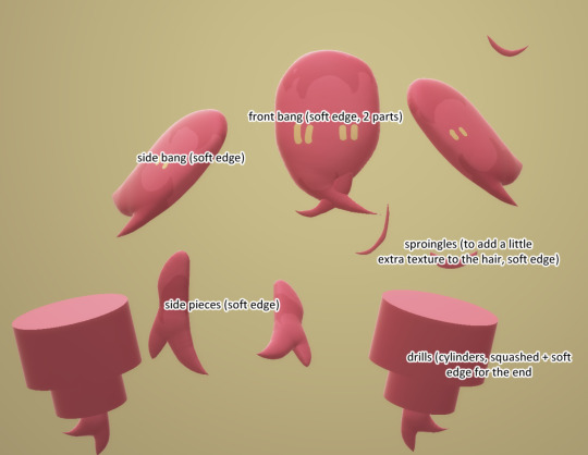
it varies a lot from what character you want to draw but teto only has her front hair and pigtails so theres not too much going on with the back hair (i just colored in the back of her head, which is a sphere, with the marker tool)
for the maya fey plushie + a plushie of @/machamess's oc kapri sun the back hair is just one really big shape drawn out w the soft edge as well. which doesnt really look as detailed or have a lot of form to if you drew out and fiddled with a bunch of pieces, but it works perfectly for my purposes !!
^^ignore how crunchy these images are i moved computers and didnt transfer over my paint3d models so i had to screenshot gifs of them. but hopefully theyre clear enough!
and you can see there that on mayas hair the highlights are painted in!! which is also drawn in the same way that i add highlights to hair in 2d art. i think it makes up for the fact that their hair is completely flat and gives it a little depth!
but again it varies from the hair your trying to make!! like for example heres a model of mirabelle of in stars and time fame. unlike the other characters who all had straighter hair she has a kinkier hair texture, so her hair is comprised of spheres with her hairline being drawn in with a marker instead. it probably isnt very realistic but i think it works for a cartoony style with no textures ^_^
as for skirts i dont really have much advice unfortunately :( i made a teto model because i was thinking and i was like wait..... i could make tetos synthv skirt in paint 3d and then i did it. but its the semi circle shape with squares drawn with the soft edge! tetos design is a bit unique in that she only has 4 flaps in her skirt which could definitely apply to some characters but not all? but on the mira model her skirt is made up of long, almost triangle shaped slabs to get the pleated effect. theyre less squashed to get a more fluffy shape that i like to draw mira with ^_^

anyways i dont think theres a better way to go over this so:
the step by step tutorial part (for the face + hair)

heres the base for the headshot which is just a sphere for the face, semicircles for the body and ears and a capsule for the neck. theres not much to see for a full body model since its basically the same as plutosodas. were going to make this a gumi megpoid because i think her hair is fun to draw :) also i forgot to sketch it out first so i urge you to not be like me and sketch things out first.
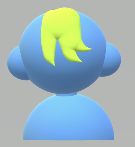
front bang, done in light green for clarity
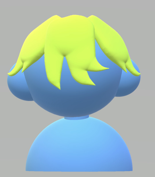
side bangs. here i start thinking abt the general shape, here i want gumi to have an exaggerated indent on her head so the side bangs are shaped as such. i also elongated her front bang to frame the face a little better.
side hair thingies! the closer ones around her ears are a bit sideways to wrap around her head a bit more. i also made her side bangs a bit bigger to frame the face better. theres a lot of shifting things around i realize!
back hair time! its just a really big soft edge shape. you maybe see the the hair clips into the back a little. well paint it over during the painting process! also i made her head smaller here.
extra stray bit of hair! ill move onto the painting now, but ill probably add and change more later.
ok so there is not really any logic i follow when picking colors. i just usually pick my favorite ones. for the dono model (purple haired character you linked) i color picked their colors from their reference (made by @/tomatolamp on here who also does really cool art!!!!! including 3d stuff!!!!!!) but ill try to explain my coloring style a bit ^^
as said before my painting process in paint 3d is nearly identical to my 2d art so heres a gumi really quickly done in clip studio. for blush, i always like to move the color wheel closer to the red/pink area, maybe make it darker for really pale skin, and use a darker/more saturated red to draw in the blush + imply a nose bridge. for highlights i always go for something that stands out against the hair color, which yellow is always a safe choice for but anything that contrasts nicely will work for me!
heres her skin tone all colored in. i also changed the lighting to the sand filter to be more pleasing and not so washed out and gray
blush + lines!
face!! i like to draw on the eyes and mouth with blue cuz i like to use blue lineart when i do it.
hair colors time!! i changed the hair to a more pleasing green and changed the inside hair to yellow and added highlights. i got the gradient effect by simply moving the color slider from yellow to pink with stopping in between to get the middle colors.
i decided to redo the back so that it doesnt have a top part so it goes into the head a bit nicer. i traced over the original back part to keep the same shape :)
clothes time ^_^ her goggles are 3 hard edge shapes (2 for the eye parts, one for the bridge) and 2 semi circles and her collars are soft edges. also i added sparkles in her eyes and redid for front bang bc it was spaced out in a way that bothered me (this could have been avoided if i did a sketch. dont be like me) (and also i realize now i forgot to re add the highlight. oops)
also added some more stray hairs to the back to add more texture!! here i also tried to make things a bit more symmetrical and make sure that nothing looks too off from the other angles. its mostly just shifting things around!
and there you have a full paint3d model!! shes still a bit messy on some parts so i would probably fiddle around a bit more if she was a full model but thats the gist of it. if i skipped over anything or you still got further questions dont be afraid to ask :)!! happy paint3ding!!
#ive never wrote up a tutorial before so hopefully this makes sense :') ?? im also not great with words so sorry if its hard to follow >_<#meowart#mailbox#paint 3d#<- maintagging bc this might be useful for others !!#also it seems like this post has trouble having images side by side? does that happen if you add a read more link? huh
2 notes
·
View notes
Text


National Accessory Day
National Accessory Day, celebrated on November 3, is the perfect day to honor our love for accessories. Some attires are incomplete without the touch of accessories, while other attires are worn to highlight the statement piece — Bella Hadid’s golden lung necklace at the Met Gala comes to mind. Any adornment worn with clothes, including shoes, bags, belts, bracelets, watches, rings, necklaces, and earrings, falls into the category of accessories (the first two often find themselves in their own separate category). Now that we are clear about the sphere of fashion we are celebrating, let’s learn more about its history.
History of National Accessory Day
Accessories add the essential details and refine the finer points of a look. In the fashion world, accessories are known to be the “vitamin to fashion” and “exclamation point of an outfit.” But how did it come into existence?
Some accessories naturally evolved to fulfill necessities, while others were introduced to represent social status and wealth. Early accessories — when humans were dancing around a fire dressed in leaves and animal skin — were made of bones, seeds, feathers, shells, and stones. Crowns, amulets, or badges often depicted the status of the individual in the tribe or town.
Necessity carved the other sets of accessories, such as bags and footwear. Glasses, shades, and watches (often replaced with Fitbit these days) were introduced to the list with newer inventions.
In the last few centuries, it has been observed that wars and economic depressions have impacted fashion more than any major brand or designer. For instance, in the Victorian era, gloves, fans, and extravagant hats were integral to women’s wear, while after the Great Depression, the style became subtle and minimalist with long socks and simple hats.
Accessories are capable of changing the mood of a get-up. Social media is filled with tutorials to style the same dress for different occasions by just changing the accompanying accessories — just changing how a scarf is worn or adding a belt can change the whole vibe of the look.
National Accessory Day timeline
150,000 Years Ago The Most Vintage Necklace
Archeologists find a 150,000-year-old necklace made of perforated beads and seashells at an excavation site in Morocco.
20th CenturyThe Term “Fashion Accessory” Originates
The term ‘‘fashion accessory’ comes into use, attributed to the adornments worn to compliment the main attire.
1837 Hermès is Established
Hermès, the oldest French luxury house that continues to be operational today, is founded.
1995 The Advent of Internet
With the advances in the internet and online transactions, clothes and accessories are sold online, with eBay being one of the first online stores in 1995.
National Accessory Day FAQs
What do accessories do to an outfit?
If you’re tired of your wardrobe, you can switch it up by not emptying your pockets. Some classic additions can breathe new life into your wardrobe.
Which designer bag is the most expensive?
The Guinness World Book of Records notes the most expensive bag to be the 1001 Nights Diamond Purse from the House of Mouawad. It took 8,800 person-hours and 10 artisans to make.
What is the most popular item of jewelry?
Earrings are considered the most popular jewelry among women.
National Accessory Day Activities
Spice it up
Make your own accessories
Spread the love on social media
Rather than picking an attire and styling it with accessories, spice it up a little today and pick some accessories and choose an outfit to match it. You can look up styling tutorials online and experiment with different looks.
Do you remember buying colorful beads and weaving them into a necklace? Well, you can do the same or find something more exquisite to make jewelry with, such as feathers, pearls, silver beads, or flowers.
Tell fellow aficionados about National Accessory Day. Share your love on social media by sharing a picture of yourself in your favorite accessory.
5 Interesting Facts About Accessories
16 love charms
30% of e-commerce
Accessories as a symbol of strength
Symbolism of status
The founder of National Accessory Day
In Hindu culture, married women wear 16 adornments called ‘solah shringarm,’ as a symbol of prosperity.
In the U.S., the apparel and accessories industries account for 30% of the e-commerce business.
Villages in the older period thrived on the prowess of hunters; hence, they wore the teeth and bones of the fearsome animals that they had killed.
Accessories such as amulets, rings, and necklaces often symbolized the social status of individuals in ancient societies.
National Accessory Day was founded by Luxury Next Season in 2019.
Why We Love National Accessory Day
It gives a whole new vibe
This day celebrates fashion
It celebrates art and luxury
Accessories give a new vibe to ordinary outfits and totally transform the look. The hoop earrings are for the days when one doesn’t want to put in an effort. The bold ring with a suit gives the vibe of a classy bad boy.
National Accessory Day gives us an occasion to celebrate the indomitable element of fashion. Fashion is a form of expression worthy of celebration, and this is the perfect day to show our appreciation.
Diamond-studded bags and gold watches are some of the most expensive accessories in the world. Owing to their rich history, vintage accessories are also very expensive owing to their rich history. As accessories are symbols of many things, this day celebrates art, luxury, and history.
Source
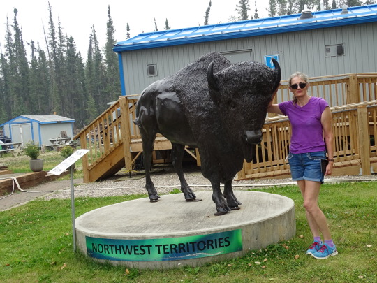
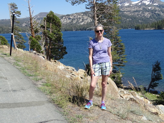
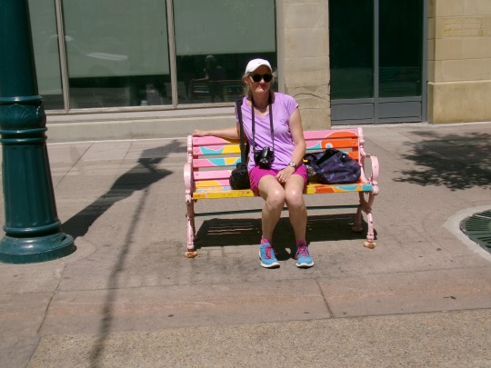
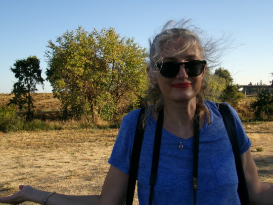
#summer 2024#travel#vacation#USA#tourist attraction#landmark#National Accessory Day#3 November#NationalAccessoryDay#Canada#original photography#Yellowstone National Park#Glacier National Park#Banff National Park#Domaine Carneros#Idaho Falls#Nevada#Yellowknife#Northwest Territories#Alberta#British Columbia#California#Montana#Wyoming
2 notes
·
View notes
Note
Can you make a step-by-step shading tutorial? It would be REALLY helpful.
Of course!! This will be a longer post, with a blend of text and images, so buckle in.
Shading can be difficult, so I mentally break it down from step to step. There are a few things to remember, which I'll state below.
There is also the medium that you're using to keep in mind of. Dry mediums (graphite, charcoal, pens, etc) work best with some shading techniques while wet mediums (watercolor, oil, markers, pastels, etc) are best with others. Digital is unique and honestly depends on the person and their preferences. <- keep in mind this overall point is dependent on the artist and some people like to use wet medium shading techniques for dry mediums (or vice versa).
All the works I have posted now have been with graphite or digital. At the moment I'm struggling with my digital style, so we will focus on graphite instead.
Before I even begin to explain my steps, there are some stylistic shading preferences to go over.
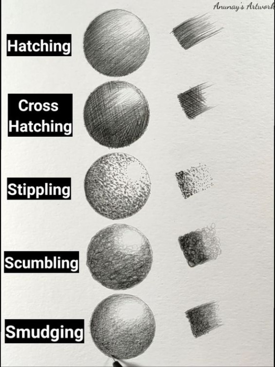
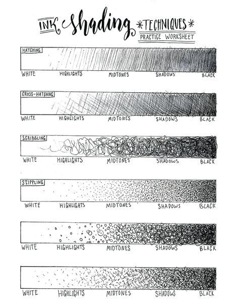
I'm a huge fan of hatching and cross-hatching, but they're not the only ways to shade in dry mediums or with ink. Above are two different images showing different ways to shade, one on a sphere and one as a gradient value scale.
I know many people might get annoyed by it, but I find making 5-value scales extremely helpful. It shows you which values you struggle with and could potentially practice with more. I always struggle with going dark enough (or hitting the 5th value) and it can be seen in my value scales before I practiced going darker.
////
Step-by-Step
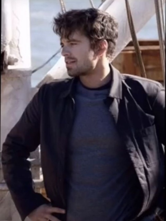
Reference: Sebastian Stan behind the scenes in 'The Falcon and the Winter Soldier'
---
Step 1: Sketch. Establish forms & features. Lines are loose and angular, with minimal curved lines.
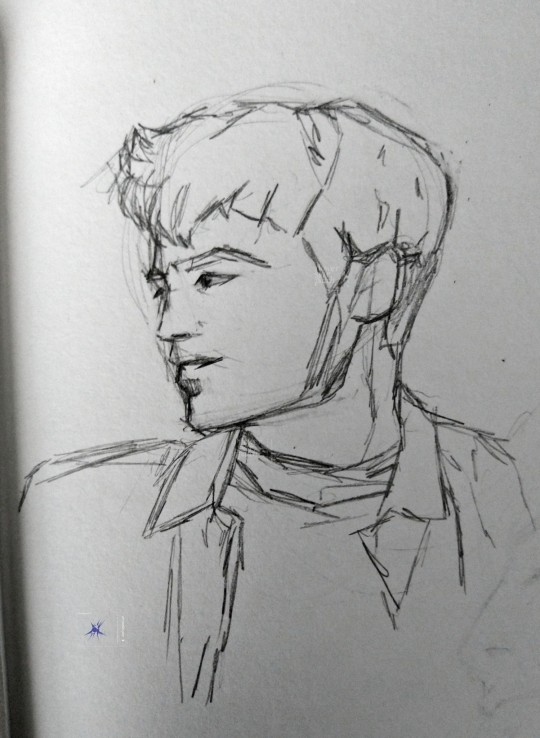
Step 2: Hatch in mid-tones lightly & loosely. (Sorry for blurry photo)

Step 3: Hatch in more detail in denser parts of the face & light areas' shading.
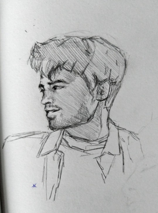
Step 4: Hatch in gradual curves to the face & block in clothing's shadows and darkest points. (Both photos)
Step 5: Finish hatching overall, add/adjust shading and lines around small or delicate features, remove hatching where unneeded
^ isn't the final product, i probably will take a kneaded eraser to it and adjust further. it also doesn't 100% match the reference due to stylistic choices & lack of some skill.
////
Well, that's as much as I can think to include that is my process or is necessary for shading in my eyes. Let me know if you'd like me to explain a step in more detail, or if something didn't make sense. Hope this helped!
drawn 11/4/2023 - instagram • patreon • carrd
#inbox#my art#tutorial#art#answered#art practice#sketch#bucky barnes#sebastian stan#in progress#drawing#graphite#wip#in progress photo#asks#art progress#work in progress#art tutorial#art tips#pencil drawing#drawing tips#art help#art advice#how to shade#shading tips#the falcon and the winter soldier#james buchanan barnes#seb stan#james bucky barnes#james bucky buchanan barnes
14 notes
·
View notes
Text
Decided to run some shading tests in Blender for Eightenate's future character model. I started with Comfee Mug tutorials for anime shaders and stylized metallic objects. After following the tutorials, I added a rough recreation of Eightenate's texture.
Details below
Then, I wanted to know if I could edit the toon shading to be soft like my usual shading style. so instead of using Constant for the ColorRamp like in the usual Toonshader, I changed it to Linear.
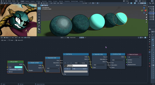
Original toon shader highlighted from the Comfee Mug anime shader. Edited soft toon shader highlighted third from the right.
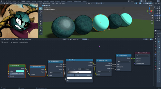
Then I watched Ibrahim's video on adding textures to toon shaders.
Soft Toon Shader with Texture added (second from left). The nodes for this setup are the same as the hard-toon shader.
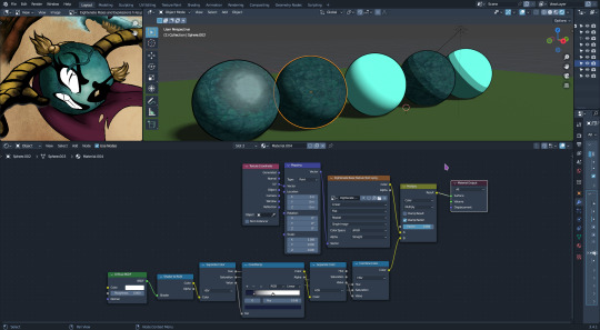
Finally, I tried to shade a sphere as close as possible to Eightenate's concept. Unfortunately, I had to lighten the test texture with an HSV node to match Eightenate's base texture. I forgot to watch how I created the texture since I tend to over-blend while painting.
The sphere closest to view. Updated soft shading with highlight, highlight masking, and highlight texture.
Interesting experiment, and with lines generated from LBS, it completed the style I was going for. I still need to figure out how to get the highlight to work for me (I had trouble getting a good texture with noise lol).
#my posts#worldofrelics research and inspo#WorldofRelics#TheMundaneRealm#character design#sketches#art#drawings#objectocs#objectoc#fantasy#objectxenofiction#worldbuilding#blender#toonshader#toon shading#3d#3dblender
2 notes
·
View notes
Text
Miniature Polymer Clay Cheesecake Tutorial:
youtube
This is a Youtube video tutorial on how you can make a Cheesecake only using Polymer Clay. First you need to cut out 3 sphere shapes from the clay, one a light brown colour and then 2 cream shade before stacking them up together and smoothening them out, next you need to carve out a crumbly type of texture that Cheesecakes usually have. For the creme layer you need to make lines on the sides and the top with the same tool but also pat it with a toothbrush to make it look less smooth before getting a small brush and making the top of it a yellowish colour and then your half way done.
Next you can take out a slice to put beside the Cheesecake and make some more indents with a carving tool and with a toothbrush around it. For the top you need to make a lot of red spheres to fill the top area using red polymer clay (Preferably small sized) and then put some red resin on top of the spheres and on the cream part on top using the same brush from earlier.
0 notes
Text
boost your Images with knowledgeable Editor

In The present digital entire world, exactly where visuals choose priority, successful layout relies not only on creativeness but also on how well it truly is performed. no matter how amazing your first strategy is, the distinction concerning "fantastic" and "Fantastic" regularly lies during the specifics. Here is the level at which a skilled editor gets crucial. a qualified visual editor can boost your creations, no matter whether you are developing branding belongings, developing product mockups, producing content for social networking, or engaged on editorial photography. This skills can rework your function from common to Fantastic, ensuring that your visuals go away a strong impact.
the necessity of Visual enhancing
Visible editing involves Considerably more than only refining visuals or modifying shade configurations. It requires greedy how features like composition, tone, color, texture, and typography collaborate to produce a unified narrative. within a time when customers make speedy decisions to either interact or move ahead, possessing large-high quality visuals is crucial.
A lot more, brand names, influencers, and designers are trying to find the assistance of experienced editors to help make their material much more distinct. An expert editor is ready to:
• Adjust and boost colour grading to evoke emotions.
• Guantee that branded visuals stay regular.
• remove distractions or imperfections from photos.
• Refine designs to achieve the most effective balance and readability.
• Convert an imaginative notion into top-good quality benefits.
adequately executed enhancing can improve reliability, foster rely on, and enhance conversions, all by accomplishing Visible excellence.
What Qualifies an Editor as an "qualified"?
The phrase "expert editor" goes past basically acquiring yrs in the sphere; it encompasses talent, Perception, and proficiency with various resources. A skilled editor acknowledges that in some cases simplicity is best, grasps the basics of effective layout, and may modify their methods according to the condition.
traits of a talented editor encompass:
• Skillful usage of application for instance Adobe Photoshop, Lightroom, Illustrator, following outcomes, or Capture just one.
• An attentive target particulars, equilibrium, proportionality, and coloration coordination.
• Comprehending brand id and the way visuals improve conversation.
• Quickness and usefulness though protecting criteria
• capabilities in communication that allow crystal clear Artistic direction and collaborative revisions
• These characteristics support in ensuring that that each modification corresponds With all the supposed creativeness and enhances the initial strategy.
The affect of an Editor's do the job
photo this: you've just concluded a photo session for just a new product. The angles you utilised are robust, the lighting is favorable, and the overall composition appears to be promising. nonetheless, minor flawsa shade that lacks vibrancy, a track record characteristic that diverts focus, or a structure that feels unevencould hinder your picture from genuinely standing out.
Now picture offering that exact challenge to a talented editor. They modify the tones to tutorial the viewer's focus to the best spots, enrich the item to its most polished point out, reduce any distracting aspects, and incorporate final details that induce the graphic to stick out on both of those screens As well as in print. The modify is usually not noticeable, however the end result clearly seems much more polished.
This polish distinguishes premium top quality from newbie get the job done. It is the aspect that causes viewers to stop, interact, and retain of their memory.
Revising for Online Media
many platforms need many sorts of edits. what on earth is helpful in print may well not do the job in social media marketing. a talented editor is conscious of those refined differences:
• Social media calls for eye-catching, dazzling visuals that seize attention. Editors prioritize changing brightness, contrast, and cropping to produce a mobile-to start with Show.
• Web design calls for visuals which can be superior-good quality still load quickly with no compromise. Editors thoroughly lower file measurements whilst making certain that the branding remains dependable in the course of banners, icons, and backgrounds.
• online video: Includes refinement body-by-body, movement graphics, and shade grading. Editors sustain a consistent tone and psychological move.
• Print: Needs large-resolution images, CMYK shade adjustments, and layouts which can be Risk-free for bleed. Files are geared up by editors to guarantee clarity and precision.
• In every one of these conditions, the experience of an editor who understands precisely what is helpful and The explanations behind it really is useful.
Do it yourself versus using a expert
contemplating the abundance of modifying apps and presets obtainable these days, It can be tempting to surprise, “Why not tackle it myself? ” This tactic could suffice for straightforward jobs. having said that, if the strain is intensesuch as throughout manufacturer launches, advertising and marketing campaigns, portfolio initiatives, and consumer presentationsit's sensible to spend on pro enhancing.
using a expert not merely conserves time. It ensures that your visuals are polished properly, in line with your model, and ready to prosper in competitive on line options. Investment returns tend to be noticed instantly: enhanced engagement, better have confidence in, and Improved effectiveness.
getting the appropriate Editor
When looking for to work Image Editing with a specialist editor, Consider:
• evaluate the energy of one's portfolio by taking into consideration its flexibility and the care taken with facts.
• design and style compatibility: Your brand name’s vision really should match their aesthetic.
• testimonials and recommendations: feed-back from customers can Express lots.
• Communication: An excellent editor might be approachable, willing to take suggestions, and supportive in teamwork.
• methods and procedures: validate that they utilize software package that meets market requirements and adhere to streamlined, very well-structured workflows.
• various studios and designers, such as These highlighted on AttestDesign. com, supply a blend of modifying and creative expert services, simplifying the journey from thought to last product.
Concluding Remarks
The visuals you utilize generate the First effect of your respective model. steps resonate greater than expressions and remain in our minds for an extended time. getting a talented editor by your aspect would make particular that your audience ordeals only top-good quality information. it does not matter if you are someone creator, a brand new company, or simply a perfectly-known manufacturer, Placing sources into professional enhancing performs An important job in developing a unified and fascinating Visible id.
inside of a Modern society exactly where numerous vie for awareness, enable your visuals to accomplish a lot more than mere Exhibit; allow them to converse, inspire, and produce motion.
#professional image editing#Image Editing#video production services#clipping path#Multi-Clipping Path#background removal#ghost mannequin#Image Ghost Mannequin#image masking#photo retouching#color correction#Image Resizing#Photo Optimization#photography post-processing#e-commerce product image editing#e-commerce video production
0 notes
Text
Blender donut
I've picked up a lot of useful tasks from this tutorial I watched. Here's a breakdown of what I've learned so far:
Navigating the Interface: I got comfortable with Blender’s interface, figuring out how to move around in the 3D viewport, select and manipulate objects, and use the toolbar. It took a little time, but I feel pretty confident now.
Creating Basic Shapes: I learned how to add primitive shapes like cubes, spheres, and cones to my scene. From there, I practiced scaling, rotating, and moving these objects to position them just right.
Mesh Editing: One big thing I picked up was using tools like extrude and loop cuts to add detail to my models. I also started using the Subdivision Surface modifier to smooth things out and make them look cleaner.
Modifiers and Sculpting: I played around with modifiers like Mirror, Subdivision Surface, and Boolean to make the process more efficient. I even dove into sculpting a bit, learning how to use different brushes and dynamic topology for more detailed work.
Texturing and Shading: I practiced UV mapping to unwrap my models and apply textures. Also, I got into the Shader Editor to make materials and shaders. The node system took a little time to get used to, but it’s a really powerful tool for creating cool effects.
Lighting and Rendering: I learned how to set up different lights in the scene to make it look more realistic. I also played with the rendering settings, switching between Eevee and Cycles, and tweaking them for the best results.
Animation Basics: I started animating by setting keyframes for objects. I even explored the Graph Editor to get the timing and movements just right.
Finalizing the Scene: I figured out how to set up the camera to get the perfect shot of my scene. Finally, I learned how to export my models in formats like .FBX, .OBJ, and .STL.

To add icing to my donut model in Blender, I started by selecting the top face of the donut where I wanted the icing to go. I switched to edit mode and used face select to pick the top face of the donut. Then, I pressed E to extrude and started pulling the icing up from the donut's surface. As I extruded, I moved the new geometry slightly upwards and outwards, making sure the icing flowed over the edges. I used S to scale the icing and give it a nice, smooth, flowing look around the donut. After extruding, I smoothed out the icing shape by tweaking the vertices and adding some small adjustments, making it look like the icing was naturally draped over the donut. Finally, I exited edit mode to see the whole result, and it looked just like a donut with a perfect layer of icing on top
I also learnt how to make object smooth. As you can see the icing of tis donut was very pointy and not realistic. Therefore, I learnt from this to do that I have to be on edit mode to click on each dots then play around to see what looks best.


I managed to make the icing and I am proud of how well I did this for first time.
However after making the icing drip I realized the top bit got messed up. probably because the dots were pulled down too much.
0 notes