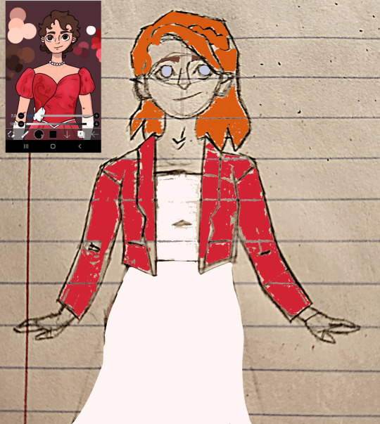
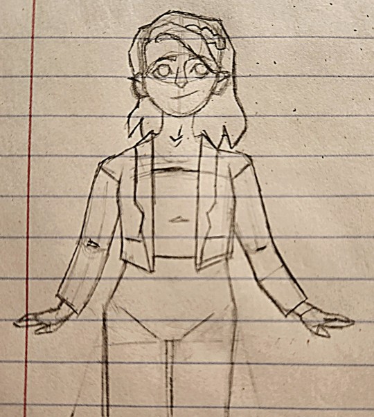
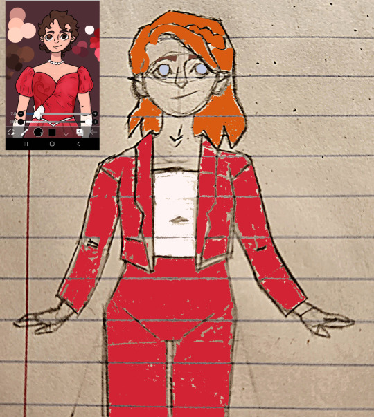
#still new to adding image ids to my art.
Photo
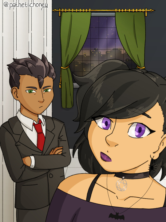
[Image ID: A drawing of a selfie taken by Sam Manson with Damian Wayne. They are both dressed up in formal attire, Damian in a black/dark grey suit with a red tie, and Sam in a purple topped off the shoulder dress with black straps. She is wearing a variety of jewelry, a necklace with a bat pendant, a black choker with a star of david in a circle pendant and cartoonish spider shaped earrings. Her hair is reminiscent in her half-up hairstyle, but with two ponytails rather than one. The background is a dark wall, a white collumn and white tile flooring. There is a window in the back, with green curtains, and outside the window is a cityscape of Gotham at night. There is a watermark of the artist’s username in the top left corner @pathetichoney. End ID.]
i am back on my bullshit this time with a v special new way that i’m drawing bc i got a new phone that i am paying out the wazoo for, however i can draw on it so my art has gotten significantly better. though of course i had to test myself and do both 1. a full background 2. a character who wears lipstick which i always struggle with unless their mouth is in a particular position and 3. a character that i have never ever tried to draw.
so like. rip me lol.
anyways i am back on my bullshit bc this is fanart of fanfic!!!! i always feel exactly in my element when i do this, it’s just always so good??? and fun?? and when i first read this fic, i mean oh god i just fell for it so hard. i ended up rereading it again like barely 48 hours after i’d finished reading it the first time lol
the fic in question is a damian and danny are twins au! it’s called Leap Before You Think by TourettesDog and i just-- the characterisations are just so well done it all feels incredibly natural especially with the merging of the two different universes into one cohesively and seamlessly it’s wonderful. there are a few faults with this pic i think, however i am still incredibly proud of it. as a bonus, here’s a better view of the window scene because i’m still really proud of that one:

#my art#danny phantom#batman#batfam#dp x dc#dp/dc#sam manson#damian al ghul wayne#fanfic fanart#also i am not jewish and i could not find a solid answer for this: but my intention w sam's choker necklace pendant was to be#the jewish star of david however when i looked online to find if i was right when i was doing the image id it was called a wiccan symbol?#as in the star of david in a circle and i couldn't find an answer to the question if they were two separate symbols or they're the same?#if this is NOT a jewish symbol then i can v easily change this and will make an edit for it even if it looks rather gothic for sam#i added the circle because the star that i'd drawn felt unfinished but i can v easily go back and add more detail to the star to remove it#as for damian i wish i could have accurately portrayed his murder scowl but due to my unfamiliarity with him i literally had to redraw him#like 10 times and i was v much relying on my friend to tell me exactly what i needed to adjust rip#in the end i gave up because this was the closest i could get to him and sigh oh well#i'll get it better next time i draw dp/dc stuff bc i probably will be doing it again soon lol#ALSO i am still v new to writing image ids so if there's any issues with this one please let me know!
396 notes
·
View notes
Text
Snippets. 🐺💜
Nathan: "This team has done some amazing work 😍" [source]
devs Mack Carruthers and Greg Towner worked on Morrigan's transformation in the new trailer [source]
Violet: "🥰 can't wait to share more with you guys 👀" [source]
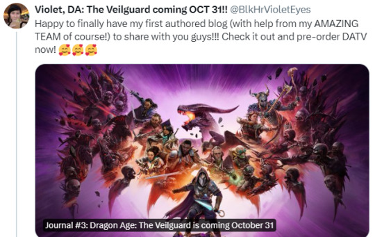
Violet: "Happy to finally have my first authored blog (with help from my AMAZING TEAM of course!) to share with you guys!!! Check it out and pre-order DATV now! 🥰🥰🥰" [source] [bloglink]
In this thread, Derek highlights a compilation of shots from the trailer that he made, worked on in-tandem with others, or polished

Derek: "And that’s all the stuff from me in the trailer! I feel so incredibly lucky that so much of my work made it into this AMAZING trailer. Can’t wait for you guys to see more. 🧡 I wanna add: it takes an army to make these scenes. While I did character layout, camera animations, animation polish, bug fixing and technical stuff, there’s still a plethora of folks who touched these scenes. Matter of fact, our work still isn’t done. So I gotta thank: writing, level art, VFX, lighting, sound, character art, performance capture, actors, production, and my fellow Cine folks who I worked on these scenes in tandem with. It all came together into one incredible package. 🧡 For anyone who’s curious, here’s a breakdown of what I do:
- mocap assembly
- scene layout (characters, props, cameras, mocap)
- camera work (animations, framing, polish, etc.)
- scene polish (character and camera animation polish, bug fixes) - integration
- bug fixing"
[source, two, three, four]
Derek added: "PS: I count these as Cine folks, but to clarify - also huge thank you our incredible Creature and Character animators. They did some really insanely mind blowing shit. Dunno how they do it." [source]
User: "Okay, but is it on purpose that the drink/flask thingie is positioned almost like the stomach in Manfred It's like kinda in the correct area too if I'm not mistaken [image of Manfred]" / Derek: "Yeah, I’m pretty sure that’s what character art was going for here 😂" [source]
Dev Tony: "Been hard at work bringing these scenes to life with an amazing team of cinematic artists and designers. Enjoy a small teaser of our work." [source]
Derek: "I worked on a few of [Lucanis'] best scenes. HE OWES ME." [source] / User: "Very much looking forward to seeing where his story goes. I have a feeling it'll be spicy." / Derek: "Oh it’s a doozy." [source]
Derek: "The hair in our game is ASTOUNDING." [source]
Derek: "Our lighting team are absolute MASTERS at this, every bit of work they did was incredible!!" [source]
Derek: "I can absolutely tell you that there are a PLETHORA of dialogue options, major choices, and a huge amount of variability. Trust me - it’s been challenging to work with all the variability LOL" [source]
Carly: "game dev is so collaborative, a lot of stuff in the trailer i've helped out on! most of the work id say i "own" isn't gonna be in flashy trailers, but hope we get to see some of it over the next two months ! :)" [source]
Crystal: "Some really beautiful cinematics shown off in this one. So proud of our team!" [source]
Carly: "ive worked on at least one romance scene for each follower and i still squeak when they flirt with me im With y'all" [source]
Dev Matthew: "👀 This is so hype! Might be a tad of my work in there as well. 😉" [source]
Siggi: "It's so exciting to see the some of the shots I worked on and worked along-side come to life! I was afraid that my work would never see the life of day. I can't wait for October!" [source]
Siggi: "My biggest contribution was the assan work I think. I got to do a lot of look and movement development on him. I even animated his whole intro scene." [source]
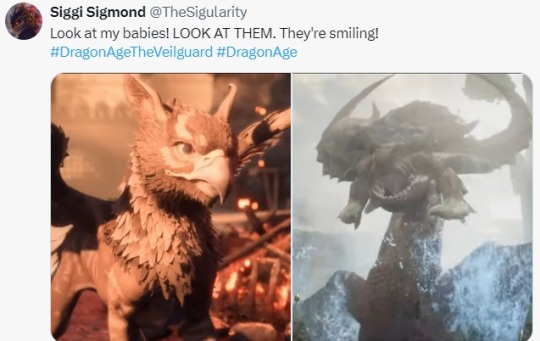
Siggi: "Look at my babies! LOOK AT THEM! They're smiling!" [context: Assan and the dragon that rises from the water, and having worked on them] [source]
Carly: "forever grateful to siggi for helping me onboard but okkkk their animation work is sooooo killer, set an amazing standard for the cines !!!!! 🙏🙏🙏 so excited for y'all to see" [source]
Dev Zara: "October 31st!! So excited for folks to enjoy it. And to finally be able to publicly share my animation work." [source]
Camille: "Time for you to meet some of them dragons ! And I don’t think you’ll be able to slay them so easily hehe" [source]
Varric's Bianca: "That’s us!! That’s our game!! 😭❤️ never in my wildest dreams would I have predicted that I’d end up where I am, working on my dream project. I’m so immensely grateful to this amazing team!" [source]
ikhandle: "Congratulations team! This has been an honour to work on! Amazing job all around." [source]
Michael: "the team really, really cares about PC." [source] / User: "The trailer was awesome! How soon do you think we'll hear about PC specific features? 👀" / Michael: "pretty soon! i know its in the works." [source]
For a while there was an error on the Steam listing of the game's PC specs. it said the recommended PC spec is the same as the minspec. the recommended PC spec is PC spec is i9-9900K. it looks like this has now been fixed [source]
ikhandle: "One of my dragon shots just made the trailer! 🐉🐉 Huge shoutout to the Cinematic team for absolutely crushing it—these are some of the best cinematics I've seen in years. Truly an honor to have the privilege to work on Dragon Age. Congrats to the whole team on their outstanding work!" [source] (context: dragon shot at the end of the trailer when the red one pulls a pike out its body)
ikhandle: "Had a lot of fun animating this big boi. Y’all not ready for him 🦴☠️🪓" [source] (context: the giant skeleton) / User: "Does he have a name? 👀" / ikhandle: "I’ll ask 😂. I’ve named him SeñorBones for now." [source]
The cinematics in the trailer are running REAL time in engine [source]
ikhandle: "Everyone has done such an amazing job… a lot of hard work to get these out. Shout out to the whole team!!’" [source]
Jess: "😎 I'm uncontrollably hype and I work on this….." [source]
Dev Yanni: "Dragons go roar! *internal screaming in excitement*" [source]
Nick: "Nuts to see how far this has come. Way to go to the BioWare team." [source]
#dragon age: the veilguard#dragon age the veilguard spoilers#dragon age: dreadwolf#dragon age 4#the dread wolf rises#da4#dragon age#bioware#video games#long post#longpost#morrigan#queen of my heart#hype hypeeeee
108 notes
·
View notes
Text
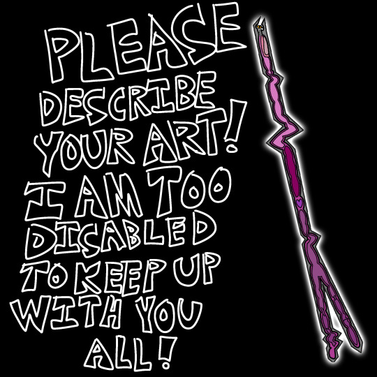
[ID: White bubble text on a black background that reads, "Please describe your art! I am too disabled to keep up with you all!". Next to this is an original Flatland character, Hauntlight, an Irregular line who has many bends, and whose back end branches out into a narrow fork. It has a white glow on its outside, and its insides are filled with simple blobs of different shades of purple and pink to show its internal organs. End ID.]
The goal for this blog was feasable when it was only a few people posting, but now with the sudden surge of new fans posting undescribed art every single day, I literally have no hope of keeping up unless other people start describing their own art, or at least adding descriptions to other people's.
If someone adds an image description to your art, copy and paste it into the original post. It should be in the same format as the one on this post: Plain regular text with no italics, color, or bold. Describe what is in the image. Pretend your friend's internet isn't working and the image won't load for them.
A plain text image description is more accessible than ALT text alone, because tumblr is glichy as all crap, and even if the ALT text is working fine today, it might not be tomorrow, or a few months from now. For several months they literally had the ALT text be white text on a neon purple background. Do not trust tumblr's staff to keep their accessability features actually accessible. They break this site all the time. Plain text in the body of the post itself, like all of this whole post is, is less likely to be broken by glitches and changes to the site.
Image descriptions are for blind and low vision people the way subtitles are for the deaf and hard of hearing, as well as people with brain damage who can see fine, but still struggle to process images.
Learning to describe your art will make you a better writer and artist. It will allow disabled people to appreciate your art. It will make this fandom, and any other fandoms you make art for, more welcoming for disabled people, and will make the internet overall more accessible.
Please start adding plain text image descriptions to your art. There are hundreds of tutorials on tumblr alone you can find, and many blogs dedicated solely to creating image descriptions that you can follow to see more examples.
Image descriptions should go directly below the image they are describing, above any other commentary. Do not put them at the very bottom of the post if the image is the first thing in the post.
Also, do not put anything you wouldn't be okay with losing forever under a read-more. If you ever delete the original post, change your username, or have your blog terminated, everything under a read-more will be deleted forever, because the link breaks.
This is why image descriptions should not go under read-mores unless the images they're describing are also under it.
Please add image descriptions to your art before you post it. I could slowly work my way through the fandom's posts when it was only a few people, but this is just becoming unmanageable and I don't want to have to give up from being completley overwhelmed.
Make image descriptions for your own art. Make them for other's art. At the very very least, when someone makes one for your art, add it to the original post. Please. Irregulars are in this fandom too.
34 notes
·
View notes
Text
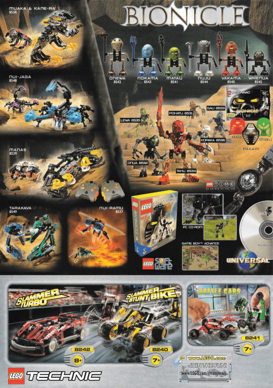
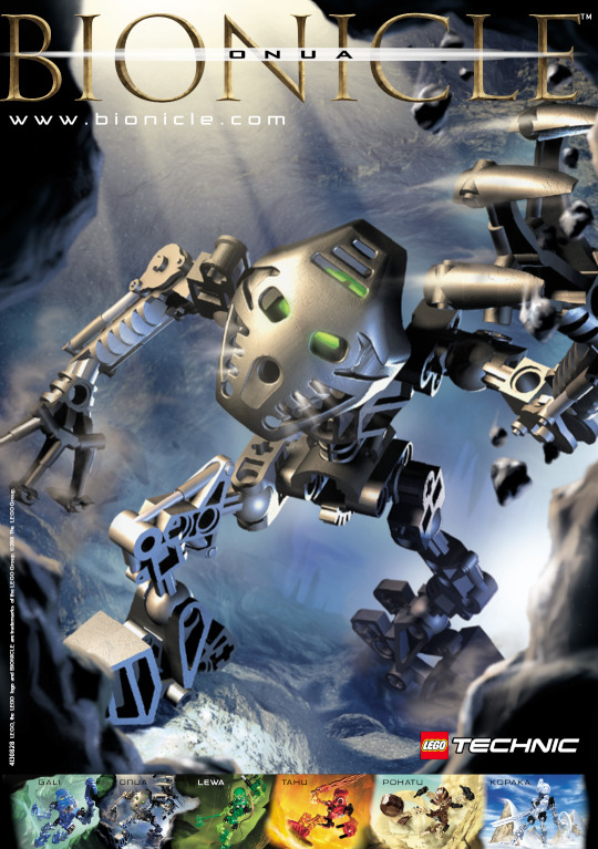
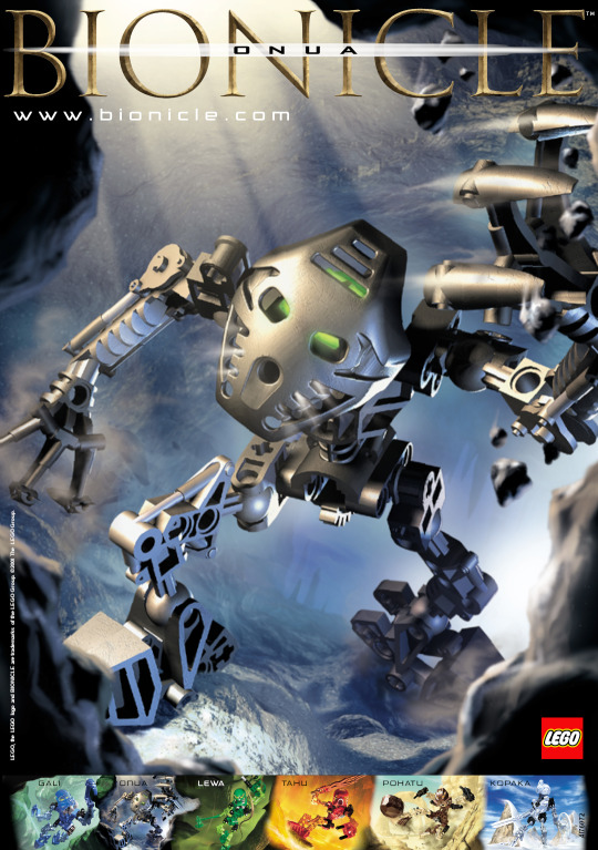
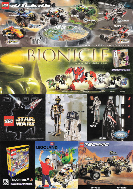
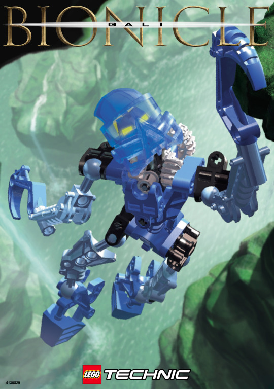
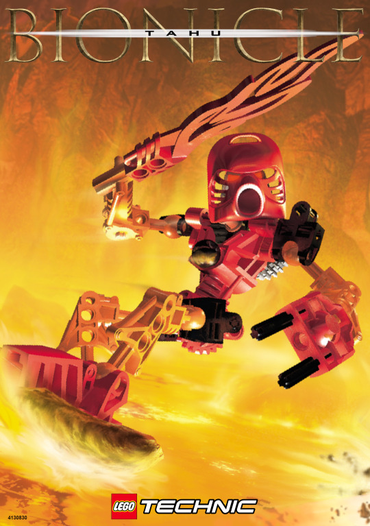
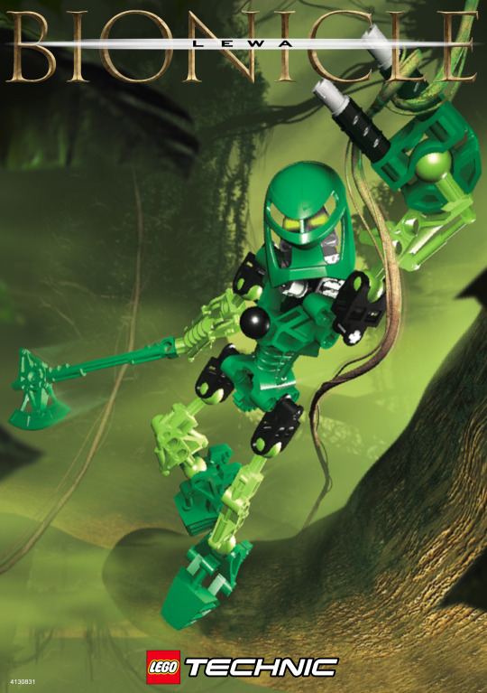
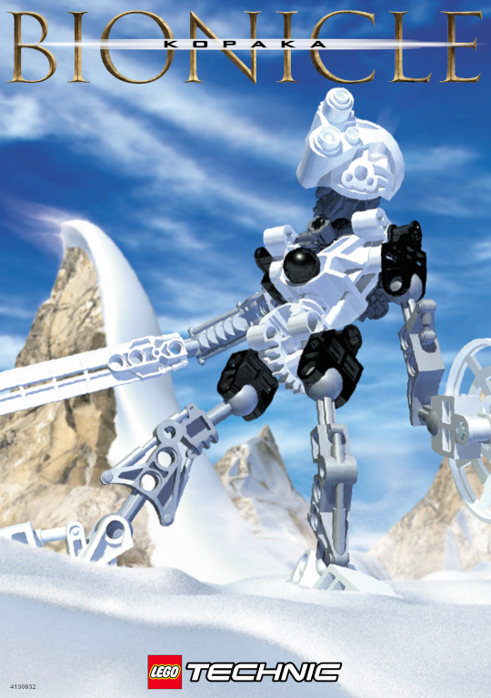
Bionicle Toa Posters
Did you know that there are multiple variations of the poster that came with the Toa in 2001?
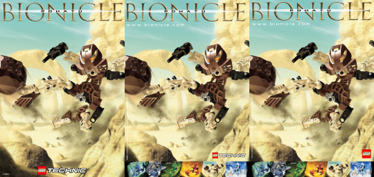
Version 1
I would consider this to be the first version, and in some ways, the best. It features the fullest view of the Toa art and has the least clutter, just the Bionicle logo, Technic logo, and the ID number. The numbers have a consecutive range of 4130827 to 4130832.
The backside of this poster to my knowledge can have two variants. The first is a general Technic advertisement sheet only focusing on Bionicle in one corner, I assume this is the first version based on the 2000 copyright. The second is a much more Bionicle focused image that can also be found on the backs of many Rahi instruction books.
So version 1 has two variants, I would consider the second variant the "Optimal" Bionicle poster, as it has the clearest view of the Toa and the most interesting Bionicle themed back.
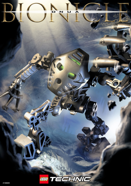
Version 2
The 2001 copyright date makes me think this is a later revision. Many things were added in this version, there is now a trademark symbol beside the Bionicle logo, full copyright text has been added along side the ID number, which is now vertical along the left side of the page, the Technic logo has been shrunk and moved to the right, and at the bottom a strip has been added featuring all the Toa similar to what can be found on the canister, although they're named here.
This version seems to exclusively feature the second back layout, which would fit which it being a later addition.
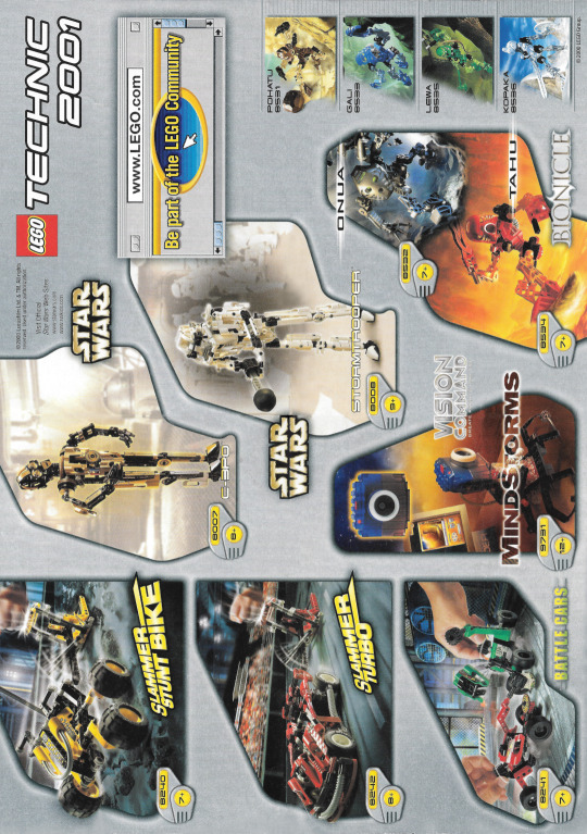
Version 3
At first glance this poster would seem to be the same as the previous version, but there are several key differences. The easiest one to spot is the dropping of the Technic brand, as this is from closer to 2002 (though it still retains the 2001 copyright), when Bionicle became its own line, rather than a subtheme of Technic. The ID number has also been shifted from the left to the right, being placed over the Kopaka tile in the Toa strip. This is the only variation to actually be given a new ID number, though oddly the numbers are not consecutive: 41760[67 | 72 | 74 | 81 | 83 | 85].
In fitting with the 2002 theme the back of this poster prominently features the Bohrok and several newer Technic sets.
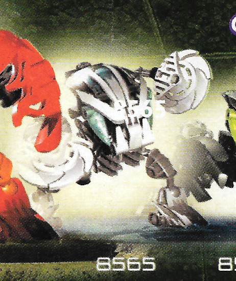
There is also a slight error where Kohrak was misprinted, still featuring the identifier they must have used when assembling the image:
And that's all the information I've managed to gather on the posters. My sample size isn't huge, roughly 13 but it seems to be consistent with what I've seen online.
I've made recreations of all 3 types of posters for each of the 6 Toa and have uploaded them HERE.
And the raw scans can be found HERE.
119 notes
·
View notes
Note
I have to ask, how did you edit your plus sized MCs? (I imagine my ID MC Mary to have a similar body type to that but slightly smaller)
I love it because I have been waiting a plus size protagonist in Choices and I'm been starving!
Ooh so the software I used to make these plus-sized edits is called Krita, which is open source and free to download for PC!
You also don't need to use Krita if you just want to try your hand at basic edits like changing a sprites clothes - you can stack up layers of Choices assets in something like Canva online.
There are plenty of amazing people who make Choices assets available -- @farizrz and @cassiopeiacorvus are my usual go-tos (thank you again for your hard work!)
You just download the images you need, and assemble your layers like so:
Hair - Front
Face
Accessories
Clothing
Body
Hair - Back
I'll ramble more under the cut about some of the specifics 💖 (Sprites in their underwear below!)
Spoilers: I made an edit of Mary for you ssdfklj
Let me preface this with: idk what I'm doing. I'm self taught, still learning, and I don't have an art background, so others can probably do a much better job than me, but here's my attempt at this stuff!
So, to start, we want to grab the bits that we'll need - the base "Student" body type, your MC face from Immortal Desires, and the new sprite we want to edit - in this case, its Dee/Maia's body from Getaway Girls

Then, you can begin by looking at the colour palettes of both sprites to see what you are working with - I used the eyedropper tool a few times to get an idea of the various colours used in the highlights, base colours, shadows, undertones, etc of these sprites. You can see the ID sprite seems a little lighter, cooler, and less saturated overall.

From here its a case of making a new group and adding various layers to it to achieve the effect you want through a combination of "Colour", "Screen" and "Multiply" layers, as well as using the "HSV Adjustment" and "Colour Adjustment Curves" tools.
Each skin tone is going to be a case by case thing -- some will want more reds in the shadows, or some will need parts of a multiply layer erased bc it's losing emphasis on highlighted areas, etc.
I recommend clicking this little symbol (I think its a clipping symbol? Again, I'm just learning this all by trial and error) to essentially keep you from drawing outside the lines.

And then its just lots of minute adjustments! Here is a comparison of the edited body with the original "Student" counterpart. The physical manipulations were done with the "Liquify", "Warp", and "Perspective" tools. (Unfortunately, the more you (well... I lol) edit things, the more detail gets lost and blurry, so you can see things like her hands are beginning to lose detail.)

And then once you've made all your adjustments, you get something like this!! Here is a comparison between the original "Student" body type, one of my own MCs, and Mary, whose new body type is somewhere in between the two (hopefully) like you wanted!

Throw on a sleeveless version of one of the outfits from ID2, and some hair, and you're done! (Here are some transparents of our beloved Mary for you ft. some of the ID hair options, plus one that made me think of the photo you used in her "Meet My MC" profile ✨💛

Hope they turned out okay! Thank you for the ask lovely, I hope you are having a great day!
21 notes
·
View notes
Text
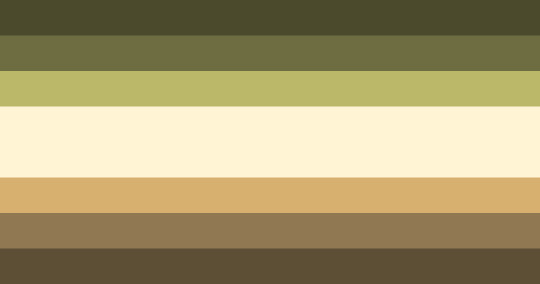
My Newly Proposed Pro-ship Flag!
PS: Sorry if the image ID is bad. I don't write them much... /lh
This flag is called the "deviate flag," or "deviant [proship] flag."
A new emoji code I have made to fit this flag is 🌤️🦋.
More below the cut ^^ (Warning: long post!)
I made these flags because, to be honest, I don't connect with any other proship flags. I do like quite a lot of the flags, but I could never find one with a message I connected to the point I'd use the flag.
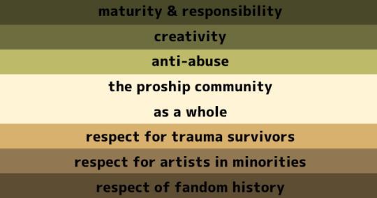
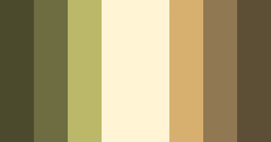
The meanings of the colours on the flag are as follows:
Dark green = Maturity & responsibility
Green = Creativity
Light green = Anti-abuse
Cream = The proship community as whole
Light brown = Respect for trauma survivors and those who use dark tropes in fiction to cope
Brown = Respect for artists in minorites
Dark brown = Respect for fandom history
I also chose natural colours because I thought it was a nice change of pace from all the cutesy-coloured flags! (Nothing wrong with cute, bright, colorful flags, though! I just don't personally prefer them.)
The emoji code (🌤️🦋) itself doesn't have a real meaning, I just thought it was cute.
However, over time, I've started to interpret it as this:
The sun and cloud (🌤️) represents how something so important could be hidden by something, but still exist. This is relevant because it's become apparent that modern fandom has been forgetting about early fandom culture and rules, even though these things haven't died in any way.
The butterfly (🦋) represents how one could start off as something sometimes seen as "weird" (referencing the caterpillar) only to turn into something seen as beautiful. This is relevant because I personally like to see it as how, in a lot of stories I've heard, many proshippers felt much happier and safer when they joined proship spaces (and left antiship spaces, if applicable).
The reason I chose to call it the "deviant (proship) flag" is because when I think of someone who is proship, I think of someone who is "deviant" (positive connotations) in what content they consume and create. I also think of someone who is responsible in the actions they take to share their art and interests, and has a maturity that is earned through being this sort of "deviant."
However, this flag recognizes not every proship person consumes "taboo" or "dark" content.
I have no real rules regarding this flag, just use it like you would a normal flag. Edits of this flag are allowed, and credit is appreciated but not necessary.
Feedback from fellow "proshippers" is encouraged ^^
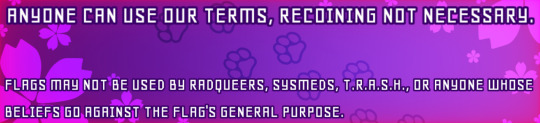
[Image ID: A rectangular box with vibrant pink and purple colours with flower and paw print patterns in the background. White text at the top reads: "Anyone can use our terms, recoining is not necessary." White text at the bottom reads: "Flags may not be used by radqueers, sysmeds, T.R.A.S.H., or anyone whose beliefs go against the flag's general purpose." End ID]
(Edit Oct 29, 2023: Added the box thingie bc I forgot it!! Lol)
#proship#proship please interact#antis dni#proshipper safe#proship flag#flag making#proship safe#proship friendly#radqueer dni#i am a proshipper#I am a comshipper#comship#anti anti#comship safe#comship please interact#pro fiction#profic#deviant proship flag
48 notes
·
View notes
Text
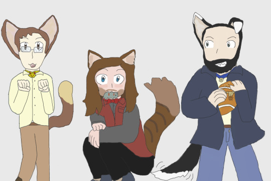
Was seized by the supernatural urge to redraw some of my old nkotr art (mostly based on my own fics/aus because that's uhh pretty much the only time I drew them in an interesting way heheh)
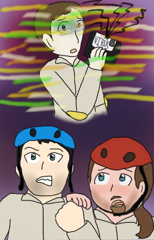
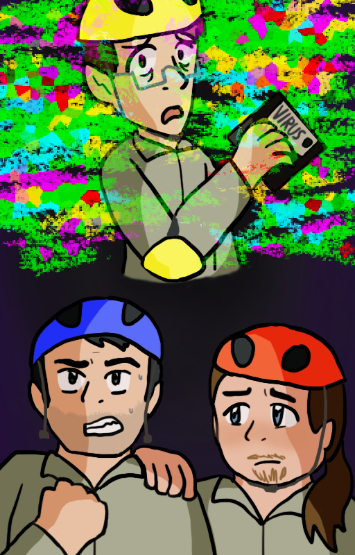
[ID: two versions of an alternate cover image for Your Computer has a Virus, and it's Killing Your Online Friends. The new kids are in their jumpsuits from Computer Fighters. Neil is holding a floppy disk labeled "virus" and looking over his shoulder with a scared expression as multicoloured glitch effects surround and overtake him. Below this, Kevin grits his teeth and makes a fist while Ryan sadly puts a hand on his shoulder.
The colours in the new piece are more saturated and the glitch effects are done differently, and there's shading. Neil has his helmet, which was missing from the original, Kevin is visibly sweating and his fist is on the other side, and Ryan looks more resigned whereas in the original he has his mouth open. End ID]
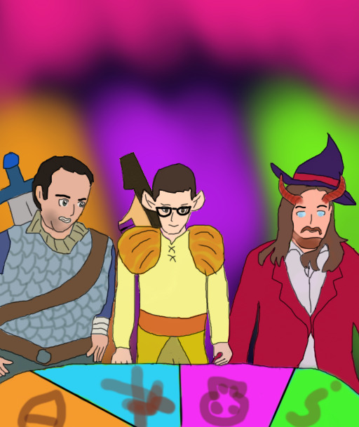
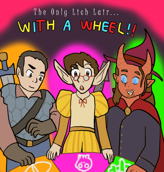
[ID: two versions of a piece featuring fantasy versions of the new kids standing in front of a colourful roulette wheel marked with ominous symbols. Kevin is a human fighter, Neil is an elf bard, and Ryan is a tiefling warlock. The dark purple background is lit up with hot pink at the top and bright orange, purple, and green behind each of the guys to contrast their respective colour coding.
The old piece was done in an attempt at a realistic style, while the new version is in the artist's usual more cartoony style. The new kids' poses, expressions, and outfits are all changed to varying degrees; most notably, Neil's elf ears are bigger and Ryan's skin is red rather than a human skin tone. Ryan also has a cape instead of a jacket this time. In the original, they all look rather apprehensive, while in the new version they look more excited. Text has been added above them reading "The Only Lich Lair... With A Wheel!!" End ID]
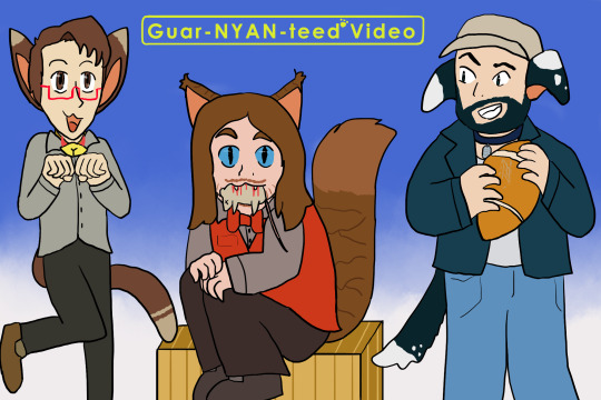
[ID: two versions of a piece where Neil and Ryan are catboys and Kevin is a dogboy. Neil is in a cutesy pose with his hands raised like paws, Ryan is sitting or crouching with a dead mouse in his mouth, and Kevin is holding a football with scuff marks on it. In addition to the regular clothes they're wearing, Neil and Kevin have collars; Neil's has a bell in the shape of the lemon demon logo.
The colours in the original are washed out and there's a little dog logo on Kevin's football which is missing in the newer version. The colours of Neil's outfit are different and his leg is bent more, Ryan now has a box to sit on and has cat pupils while the others still have human eyes, and Kevin is now wearing a baseball cap. A gradiented blue background has been added along with yellow text at the top reading "Guar-NYAN-teed Video", with a paw print in place of the G*V logo's asterisk. End ID]
+ a couple bonuses:

[ID: a follow-up to the "Only Lich Lair" piece. The new kids are now injured and look miserable. Kevin has grown a beard and lost his hair, and is wearing a blindfold over where his eyes would be. He's also lost his armour. Neil's hair is frazzled and he's covered in singe marks, and he's lost a hand and got a chunk taken out of one ear. His instrument is also missing. Ryan has an eyepatch, has the tip of one horn taken off, and is frozen. He's also lost his wizard hat and the clasp for his cape. The bright lights in the background are gone save for the pink at the top, which drips down like blood; the text is also removed. End ID]
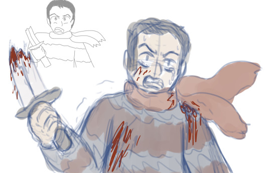
[ID: a sketch of Kevin wearing a sweater and scarf, holding half a broken sword shouting angrily, based on a scene from I'm Gonna be the Anti-Hero. An old version of this doodle is shrunken down in the upper left corner. Colour has been added to the new version, as well as blood spatter on Kevin and tears in his eyes. End ID]
#all these redraws are from over the course of the past week and change. scary.#idk what forces have got ahold of me but once i started it's like i couldn't stop#i don't think most people will recognize all of the originals especially since i didn't even post all of them in the first place?#the catboys is the only one where you can find the original in my art tag#i think the likenesses might be better in some of the originals but to me at this specific moment in time that's not what's most important#nkotr#new kids on the rock#my art
16 notes
·
View notes
Text
Crash Course: Submission Guidelines
It’s been brought to my attention that Tumblr no longer allows for anonymous or sideblog submissions! 🙃 This, for obvious reasons, is less than ideal. Fortunately, we can work around the limitations and still allow folks who wish to maintain their anonymity the option to do so while also ensuring your works are appropriately credited and tagged.
Step One
Select whether you’re submitting text or an image, and include the title of your art piece or work of fiction if you have one.
Step Two
Insert your gift and who it’s for!
Be sure to double check that your submission contains all the bits ‘n’ bobbins that you typically like to include when you post content. This can include summaries/captions, artists or authors note, word count, image ID’s, etc. Once you submit your piece, there will unfortunately be no way to directly edit it, so make sure you like how it’s formatted in the HTML box and that it’s free of error.
Step Three
Insert a page break indicator (a line of - - - or ~~~ would work just fine). Below this line is where you will have the opportunity to include tags for your piece that I can add prior to posting. Please list (separated by comma):
• Your preferred/tickle blog username or registered anon handle
• All relevant fandom and pairing information
• If there are any trigger or content warnings you feel are necessary to include
I will add whether it is [#tickle art] or [#tickle fic], as well as [#squealing santa 2k23], [#ss2k23], and [#submission] on your behalf. This way we can find and archive your wonderful creation!
Step Four
Should your preferred username/anon handle differ from the submission username, I will take your creation and make a one-to-one copy as a brand new post to preserve your privacy. The only thing I’ll adjust is adding artist/author credit below the title and moving your tags to the, well, tags. Once posted, I’ll forward you the link to your post via DMs, similar to what I intend to do when anon gifts are posted.
If your preferred username matches the submission username, I’ll simply move the tags. I’ll only follow the above steps if Tumblr acts a fool and won’t let me adjust accordingly. So it’s like a 50/50 chance 😅

As always, please make sure to check the 2k23 Bulletin Board for all event specific updates/news in case your question has already been answered elsewhere on the blog 😊
17 notes
·
View notes
Note
The tags you added to your answer are so interesting!! The arch and the vines do frame them very nicely, and its always wonderful to learn how much thought gets put behind a piece like that. Do you always use references when you draw/paint? If you dont mind sharing, id love to hear more abt your process :))
I don't mind sharing at all!
the truth is there is no process. stuff tends to just Happen most of the time. I tend to soak up everything I look at like a sponge and like to watch videoessays about art of any kind that break down certain aspects so I can use the pieces and put them into something new. I love art, be it live action movies or animation, stop motion or a music video, stained glass or architecture of fiber crafts, oil paintings or comic books and so on. when I go places I try to take it all in, I take notes, pictures if necessary, and then vomit it up on paper when the time comes.
it's like 'oh, I like This area in This game because of the ambience' (which resulted in the image in my header), or 'oh the colours in this movie Fuck' and I apply them when they come in handy. it's a bit of a backup library, especially if I know I will be working with that stuff soon (cough cough I may or may not have a lot of images of medieval manuscripts at hand for Reasons)
if I have a more specific idea for a vibe I wanna go for, though, I like looking through reference. I'll be posting a piece (Soon) of my OC and the composition and the overall clutter of it was inspired by the work of Satoshi Kon. my pride art was inspired by local 19th/20th century illustrations of folk motifs. when I worked on my pin-up zine piece, I looked through a lot of antique pinup photography, but I also wanted to tilt the overall vibe to the work of the artist Sakizou so I went through her artbooks. when I still worked on Monarchy Restoration I liked to visit places that fit it time-wise (aka late medieval castles or romantic castles that reimagine the medieval) along with watching old Czech fairytale movies, which were the key inspiration behind the aesthetic of the AU.
honestly I'm a little paranoid at times that if I look up reference of particular styles or techniques, it will show too much in my work and people will call me a fraud lmao. I don't really know why, since a lot of people very openly reference the works of famous artists and it isn't a problem (nor do I mind it when they do it), but a small part of me gets kinda mad when, idk, the houses in the background look too much like those in Cabinet of Doctor Caligari, or something. obviously that doesn't really apply to needing precise anatomy/clothing reference but I tend to put away any reference images the moment I start working on the final product so I'm not replicating someone else's work.
#asks#rebelwithoutabroom#I didn't even mention just the long term influences that just kinda stick with my style at all times#it's kinda hard to give a response to this because every picture is different#recently worked on a fan exchange project and I used no reference save for character and object references#but I can tell that since I've been looking at more ink art (and reading a lot of manga) my inking was influenced by it#or the fairytales collab. I can tell that given that I was looking at artists who had this kinda light application of watercolour#my art has been influenced and Im trying to copy that. because I like how light and airy watercolours feel when used that way#there's also just a lot of Little Tricks that I picked up with time because I saw someone use them and thought it was neat#twisted perspective my beloved
3 notes
·
View notes
Text
Neopronoun flags for each category and explanations for what they mean!
[Plain text: Neopronoun flags for each category and explanations for what they mean!]
All flags here except the neopronoun flag were created by me today, November 28th, 2022!
They are all public domain, meaning you can use them for literally anything you want, no credit necessary, though I will ask that you provide image descriptions whenever possible, and direct people to an basic (not an emoji or art or anything) version of the flag whenever possible!
If you want to change the brightness or contrast, you are welcome to! I did my best to make them accessible, but I'm only nonhuman, so they won't be perfect for everyone!
You can find the Super HD (8000x6410 pixels because these are the templates I use for Redbubble designs) Versions of these images here on the web archive to download and save:
"https://archive.org/details/Neopronouns-categories-flags-and-explanations"
Neopronouns
[Plain text: Neopronouns]

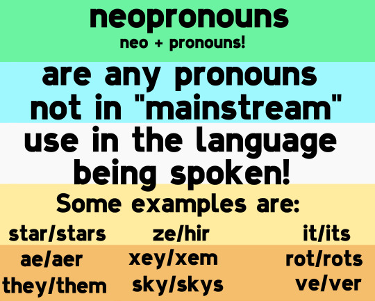
[ID: The neopronouns flag, with stripes of pastel green, cyan, white, pale yellow, and orange.
This is followed by another version of the neopronouns flag, now with black text added over top that reads:
"Neopronouns (neo + pronouns!) are any pronouns not in 'mainstream' use in the language being spoken!
Some examples are:
star/stars, ze/hir, it/its,
ae/aer, xey/xem, rot/rots,
they/them, sky/skys, and ve/ver.
End ID.]
Neopronouns is the umbrella term under which all of the following terms reside as more specific categories!
All the following flags keep the five stripe layout as above, with the white stripe remaining in the center to represent community, solidarity, and commonality!
===
Nounself pronouns
[Plain text: Nounself pronouns]


[ID: The nounself pronouns flag, with stripes of: orange, red, white, sky blue, and purple.
This is followed by the same flag, now with black text that reads:
"Nounself pronouns (noun + self + pronouns!) are pronouns like sun/suns/sunself, or wa/wave/waves/waveself.
If the pronoun set is based heavily on existing words, they're nounself pronouns!"
End ID.]
The colors were chosen to be colorful and fun!
Nameself pronouns
[Plain text: Nameself pronouns]


[ID: The nameself pronouns flag, with stripes of grey, sky blue, white, black, and berry red.
The first version is blank, and the second reads:
"Nameself pronouns (Name + self + pronouns!) are when someone's name replaces all pronouns! Like: 'That's John! John uses nameself pronouns, so instead of he, she, or they, you'll just call John 'John'. That's John, John's over there, John's trying to get back to John's home planet.' If the pronouns are the person's name, they're nameself pronouns!"
End ID.]
Colors were chosen because I associate them with Farscape, and I decided John Crichton uses nameself pronouns...before I even knew those were a thing! Lol.
===
Ectopronouns
[Plain text: Ectopronouns]

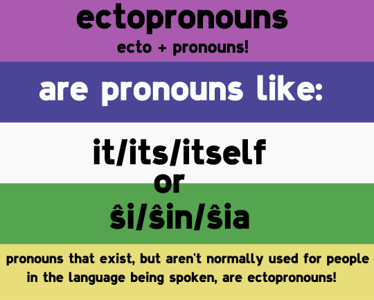
[ID: The ectopronouns flag, with stripes of: purple, dark blue, white, green, and yellow.
This is followed by the same flag, now with text over it that reads:
"Ectopronouns (ecto + pronouns) are pronouns like: it/its/itself, or ŝi/ŝin/ŝia. Pronouns that exist, but aren't normally used for people in the language being spoken, are ectopronouns!".
End ID.]
The colors were chosen because if you invert the flag, it'll be upside down with a black stripe in the center, which I thought fit the theme pretty well! They/them pronouns also fall into this category of neopronouns, since it's still relatively new for them to be used for singular people rather than groups!
The pronouns ŝi/ŝin/ŝia are from Esperanto!
===
Novapronouns
[Plain text: Novapronouns]
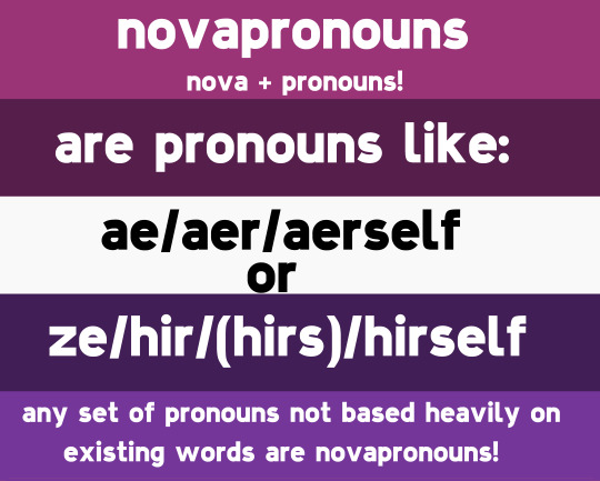
[ID: The novapronouns flag, with stripes of berry purple, dark magenta, white, very dark violet, and purple.
This is followed by the same flag, now with text over top of it that reads:
"Novapronouns (nova + pronouns!) are pronouns like ae/aer/aerself or ze/hir/(hirs)/hirself! Any set of pronouns not based heavily on existing words are novapronouns!"
End ID.]
The colors were chosen because I love purple, and associate it with space!
===
Supernova pronouns
[Plain text: Supernova pronouns]


[ID: The supernova pronouns flag, with stripes of: gold, copper, white, silver, and dark grey.
This is followed by the same flag, now with text over it that reads:
"Supernova pronouns (supernova + pronouns!) are pronouns like:
xiy/rik/ix/sirav ('sirav' replaces the usual _-self ending),
or
aix/(aed)/arix/aiv/aixelf ('aed' replaces contractions: instead of 'aix's going too', you say, 'aed going too').
If the pronouns use a different gramatical structure than usual, in whole or in part, they're Supernova pronouns!
The colors were chosen based on metals, which can only form inside a supernova! Gold, copper, silver, and iron!
Supernova pronouns can also be used as one long word, "supernovapronouns"! I just figured I'd put a space in there to make it easier to read and write!
I will be making pronoun pins and icons with these flags as backgrounds once I'm done my current project, so if you want to see those (or the other pronoun pins and icons I make) check out @custom-pronoun-pins!
#long post#described images#neopronouns#neopronoun history#nounself pronouns#nounself#novapronouns#novaself#novapronouns history#ectopronouns#ectopronoun#ectopronouns history#supernova pronouns#supernova pronoun#supernova pronoun history#supernovapronouns#supernovapronoun#supernovapronoun history#pride flags#supernovapronouns history#supernova pronouns history#supernova pronouns coining#ectopronouns coining#novapronouns coining#Rjalker makes pride flags#pronouns#trans#transgender#nonbinary#xenogender
46 notes
·
View notes
Text
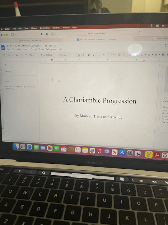
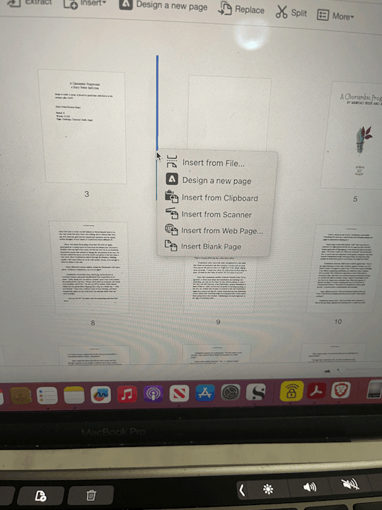
Fanbinding Process 1: Typesetting
Someone asked me to chronicle a fanbinding project a while back and now that I'm in the starting stages I figured "oh yeah I should do that!"
Disclaimer: still new at this. Please don't judge me. And also this is just what I do and really when it comes to some of the smaller details, that's personal choice and stuff you'll decide once you get going and know what you wanna do with it!
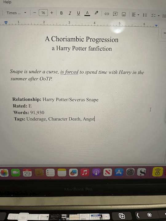
Anyway current project: A Choriambic Progression (one of my faves!) (I'm also doing In Between Days at the same time but I'm further along in that one so it's not a good one to really show.)
Step 1: Gotta save the fic! I'll say ahead of time how I do this with AO3 fic, even though A Choriambic Progression isn't on AO3. With that, I go to Download > HTML. I've found that way will copy over all the formatting whereas the other ones didn't for me. Then I open the HTML file and copy paste into Google Docs.
Instead with A Choriambic Progression I just went to the Wayback Machine link and copy/pasted all of that.
Step 2: I do my page setup before fixing the body of the work, so I inserted a few pages above the work. I consulted a few books on hand to decide the layout. Page 1 is a simple title page:
I know when I print, odd numbered pages will show up on the right and even numbers will be on the left. So when I first open the book, the simple title page will be face up.
Step 3.) Which means for Page 2 I do the copyright page:
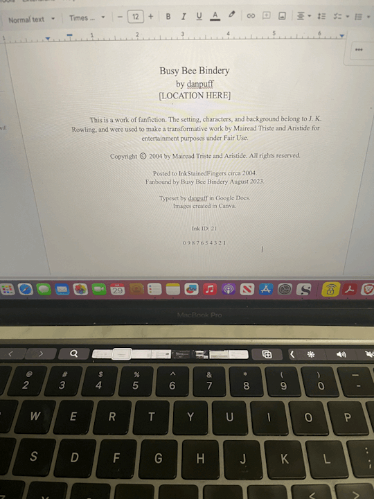
I temporarily removed my actual location for this, but: I made a name for my bindery. Most I've seen have the location of the publishing company, so I have my location in that section. Most copyright pages vary in the setup and even some information, so I borrowed what I liked! A lot have like "First Printing: Date, Second Printing: Date" so I list where all I've found the work, plus when I'm binding it. Even though it's July right now, I figure most of my work on this will be in August so I put August 2023 for that.
For ISBN I usually will put AO3 ID: and the work ID #. Since this was originally posted to Ink Stained Fingers I used Ink ID instead and it's ID # (which is 21???? Very cool.) Also since this fic is old and not really anywhere else, I had to do my best guessing on the date, which as best as I can figure was sometime 2004? And the print line for funsies! Though I don't think I'll do more than this one printing of it, but who knows!
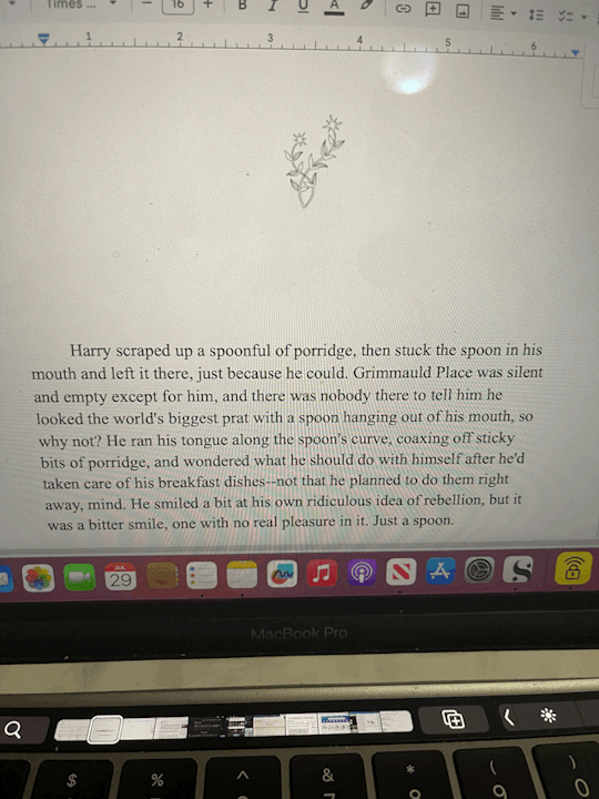
Step 4.) Images in Canva. Which is just....me creating whatever icons and images I want to use in Canva, which is at least a title image. In Canva I opened an Instagram Post sized template. I threw in the title + artist. I had no idea what sort of art I wanted, so I just typed in "magic" and found this crystal & plant art I liked. I fixed up the font how I liked and then went to Share > Download > check Transparent Background > Select Pages: 19 (to just save page 19) > Download.

I also went into another Canva project for smaller images that i call "icons" to make my bindery icon and also a simple image I want to have at the top of the first page and downloaded both of those.
Step 5.) Back in Google Docs aaaand....I knew I'd need some pages before my title image so on Page 3 I added the "archive information" (which is where I'll normally pull the info from AO3, but I did the same basic idea here.)
Then Step 6.) I inserted another blank page (CTRL + Enter) and on Page 6 I went to Insert > Image > Upload from Computer and added my title image. Below it I added my bindery icon and spent over fiddling with it to get it properly centered. (It never wants to center correctly.) Iirc I went into Format > Align & Indent and played with "center" and "increase/decrease indent" until it behaved itself.
Step 7.) CTRL + Enter for another blank page. Then I make sure the start of the fic is on an odd page (though I can always fix this later in Acrobat.) I inserted my cute lil story icon above the start of the story:
Step 8.) I realized I had a problem in that I did all this setup BEFORE setting my font. So I had to CTRL + A to select it all and set it to Times New Roman 16, which I know will print in a way I like.
Next I'll say, I like to keep the space between paragraphs in an ode to fanfic-y ways. But I also like indented paragraphs. So this is a personal choice, but with everything still selected I went to:
Format > Align & Indent > Indention Options > set Left & Right to 0. Then select Special Indent > First Line > set to .5.
THEN I had to go back and fix my title, copyright, and archive pages, but it's less annoying to do that than it would be to try to highlight over 300 pages to do this for JUST the fic. I later added some extras (such as the poem at the end, the author's note, and some review/recommendations for the fic that I wanted to format differently.)
....Basically just figure out how you want to format it.
Step 9.) CTRL + F. This fic was a NIGHTMARE to fix up, ngl. I did all of this last night but basically...I had to find all the scene breaks by going CTRL + F and searching "***" so I could replace those with a horizontal line (Insert > Horizontal Line.) But a few places had tildes instead so I had to do an extra CTRL + F: "~~~~" That wasn't so bad.
The bad part was realizing how much had to be italicized. Regular italic words had a "*" on either side, while correspondence began and ended with an underscore. So I had to CTRL + F: "_" and then highlight and italicize all the letters. Then CTRL + F: "*" to find all the italicized words of which there were like 200. Very tedious.
Step 10.) File > Download > PDF Document
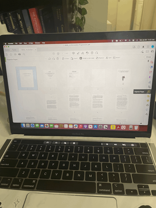
Step 11.) I opened the PDF in Adobe Acrobat for my final stages. Mostly here I make sure all of the pages are in an order I like and make sure all of my pages that need to end up on the right are odd numbers. And if not, I can go to the sidebar on the right and go to "Organize Pages"...there I can reorganize or add blank pages where needed.
Step 12.) Page Numbers & Headers! Again this is personal preference but I can show you how I did it and you can make your own decisions about how you want to do it.
Close out of Organize Pages. Then from the sidebar I chose "Edit PDF." Then at the top toolbar I click on "Headers & Footers" and select "Add."
For me, I wanted the title as a header, and I wanted to insert page numbers. So in "Header Center" I wrote the title and in "Footer Center" I clicked on "Insert Page Numbers."
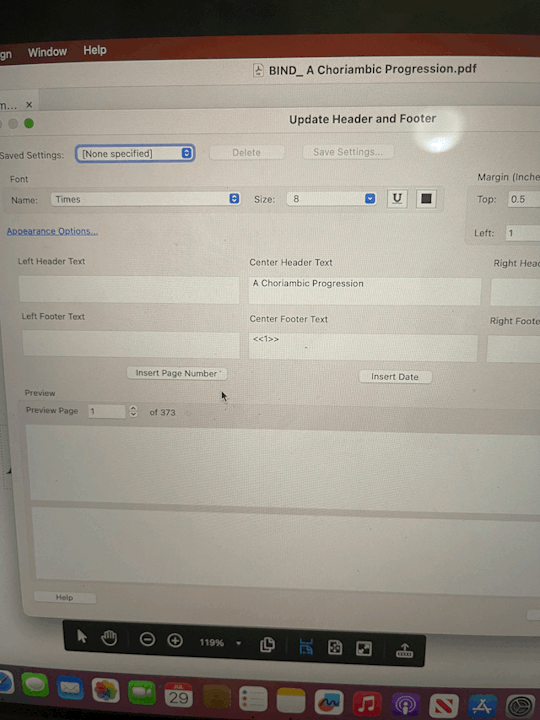
Then because I want my page numbering to start on Page 3 (I like to start numbering at the Archive Information page) I click on "Page Range Options" and in "Pages From:" I changed "1" to "3."

Note, if you fiddle with the pages later on and reorganize or add new blank pages, Adobe won't adjust the page numbers for you, which is why I make sure my pages are all in order first.
Step 13.) My least favorite part is REMOVING headers & footers from pages I don't want them on. So on all blank pages I took off the title & page number. I took the title off of the Archive information and the Title Image page. I took the title off of the "Recommendations" pages later on, too. It's not only tedious but Acrobat likes to be difficult about letting me select the page numbers so it takes a few tries of me getting the page just so before I can select and delete the page number.
Anyway at that point it's ready to go so I make sure to save it to my Fanbinding folder and next up I can print! So...we can do printing & page folding and maybe page cutting in Part 2.
You know...if I remember. 😬
#danpuff binds#progress pics#step by step#wow this is a lot#whoever asked for this i hope you're happy 😂
19 notes
·
View notes
Text


[Image ID: Screenshots of various posts in my blog with recently added image descriptions. /End ID.]
Hi everyone!
Something I've been wanting to do for a long time but had left in the back burner was giving my art image descriptions for those who are blind/low vision/visually impaired or might benefit from them in any way. Well, not anymore! After looking at various posts and resources regarding the topic, I've began updating some of my older posts with the things I've learned so far.
However! I'd like to ask for your feedback. I'm still very new to this, and I have a bad tendency to over-explain or meander at times. So any suggestions or critique are welcome, as I want them to be understadable and comfortable for those of you who need them. :)
Posts I've updated so far:
Sona drawing
Transmasc drawing (wip)
Drawing of bff's OCs
Christmas Angel Dust drawing
Sad Angel Dust drawing
Ink drawings
I'll update others in the next couple of days and my future posts will have image IDs. I'll be reblogging the updated versions as well
Thank you for reading :)
2 notes
·
View notes
Note
https://ibb.co/wNj5R6Z
When did this become a thing? There's no rule in the server about it. Nor has there been an announcement about this new rule.
Dont get me wrong, i get it. Its a server with minors in it. Its smart of em. But, there is no rule about it that id seen?? Besides that point... How you going to control someones profile like that??
Its not like its going to stop the minors from seeing it regardless. Cause if the two dm cause commission or whatever, they are still going to see it anyway?! And you reallllly cant tell someone they have to change their pfp OUTSIDE the server. Its their profile afterall.
This is 100% why i believe minors shouldnt be involved in CS spaces too. Because regardless of any rule put in place about nsfw content.. They will still see and be subjected to this content if theres a customer/client chat going on due to commissions. You can control a persons server profile, but outside of that... You cant.
And if the adults all start putting in their ads "Please no minors, as it makes me uncomfortable," or whatever other thing they could write... Will probably get bad backlash in a server full of well...children. Including some of the actual adults too. I can just see this being a huge thing from both sides.
The minors being upset they cant offer their art/comms. The childish adults who just cant handle too... Then a big ol whine fest about it all.
Even though the adults are just trying to keep the minors and themselves safe.
But ye.. Either way... This rule should probably be announced and added in bold somewhere. Cause i didnt, nor have seen, this one in this server. Still a worry, but... Still glad its there too.
I just am seeing both sides of what could happen here though.
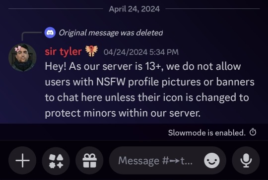
i mean im gonna be fr, i do not see the issue with this. i think its pretty implied that no NSFW whatsoever is allowed seeing as terras has always advertised itself as being minor friendly, so it would just be looped in with the no NSFW images rule.
there is a trade discussion chat, if the person wanted to keep their actual profile NSFW but have talks about comms they can do it in the other chat, it doesnt HAVE to go to dms
also ive really never seen an issue with people saying they only want adults to commission them, and even if someone complained i dont think itd be received well by other members or by staff
i understand your angle of playing devils advocate but i honestly dont think this is an issue, at best its an attempt to minimize any foul play and exposure of NSFW to minors, and at worst its a measure that, while effective in some areas, has some oversights in others
i know terras has been pretty dead but yall gotta have better topics if ur gonna put it in my inbox lol (kidding)
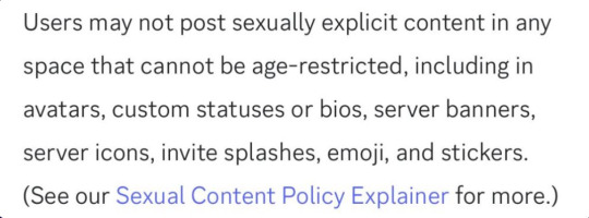
Editing to add: NSFW pfps/profile banners are also against Discord TOS as a whole. checkmate liberal
2 notes
·
View notes
Text
✨intro✨
[PT: Intro /end PT]
I am new to creating image IDs/Image Descriptions, but I will do my best to add them to as many of my posts (on @egg04) as possible. Specifically for images I haven't added alt text to (yet) first, and then I'll go to posts I have added alt text to. I also sometimes add alt text posts I like from others.
The plan is, once I'm all caught up, I will have to use this blog less by already having proper image descriptions in my main blog's posts.
Please DM or send an ask to:
tell me about any of my image posts I haven't described that you want described
give me any ways I can improve my text descriptions.
submit your own image IDs if you want to and I'll give you full credit
Tag System:
ID From Alt Text? For Image descriptions from drawings that have alt text
Fanart and Original Art are self explanatory
Photos and egg04 irl (I.R.L.) are also self explanatory
Character Details? Tag used when the ID primarily focuses on describing physical attributes (hair, clothes, etc.) of the character in the drawing. This tag in particular is so that not every single drawing featuring the character has that description unless something new is added.
For Tuko to Edit? Is for descriptions where I'm not quite satisfied with the current outcome and will edit in the future.
Not My Art and Not My Posts? Self-explanatory.
Video ID? Description of video
Plain Text Transcription? Transcribing plain text to posts with bolded, italic, small, colored, etc. text (New, and still figuring out the system to doing this)
8 notes
·
View notes
Note
Hi! Genuinely curious. I know a lot of artists don’t like qrts on Twitter because they remove engagement from the original post, but on tumblr, the engagement stays with the original poster, so I’m curious why you don’t want comments on reblogs. Is the engagement thing why you don’t like comments on your art, or is there a different reason?
hi! so im going to write this post with the assumption some people who read it may be unfamiliar with tumblr so pls excuse me if im explaining things you personally already know/is considered common sense/etc... i am also unsure which parts i should consider common knowledge/how far to explain so please forgive me if i overexplain a bit!
so on tumblr, comments on art do not affect engagement, but it is still commonly held etiquette not to add comments directly onto reblogs of art.
the reason for this is that when you add a comment directly onto a reblog (ie, not in tags nor the reply function) is that the comment becomes permanently affixed to that version of the post. it becomes a secondary caption, basically; it is not the same as a reply on twitter or a comment on insta. if the reblog with the comment is reblogged by someone else, that comment will remain and can continue to be shared, even if the commenter were to later delete the post. you now then, effectively, have a new version of the post that has additions to it.
this has become somewhat more of an issue lately, as tumblr recently updated to remove the ability to go to where somebody reblogged a post from. which is to say, if somebody encountered a post that has a lot of additive comments on it, but wanted to reblog the original/a version with less or different comments, they can no longer do so unless they scavenged someones blog for the post manually.
generally speaking, many artists prefer no direct additions be made to their posts (although sometimes people add image descriptor IDs, which i dont mind people doing) so that only the original iteration exists and can be reblogged, without anything extra added onto it that isn't meant to be there. the reply function (looks like a chat bubble at the bottom of a post) is a newer addition, but most people still prefer to add thoughts/commentary in tags -- since reblog tags only serve an organizational purpose within someones own blog/exist to help filter content warnings, it is very commonly used to add comments, since that will stay within someone's specific reblog and will not affect or change a post. original posters are still notified of every reblog and their tags (and i really like to go through and read/reread tags), so any commentary can still be appreciated and seen even without having to attach it to a post directly
tl;dr: id just prefer my art posts to be able to stand alone and be able to be shared that way w/out extra comments/a comment chain on them
i hope this helps answer the question...!
#umbrvx.ask#ofc different ppl are different too... idk if there r ppl who dont care abt additive reblogs but#in my experience using tumblr since like 2012 ik this has been the generally held etiquette...! afaik at least#anyways im sorry if i am overexplaining#ik quite a few new ppl are joining so i didnt know how much to consider common sense or not#also i hope it doesnt seem like i am making a big thing of it i dislike telling ppl what to do...#but ive been seeing it happen a bit more lately n thought itd just be worth at least trying to say something rather than hope ppl just know
11 notes
·
View notes
Text
El prom dress post
So the El prom dress comes from this post by dis-a-pointment which also has a photo of the inspiration dress so take a look at that and also look at dis-a-pointment 's blog bc it's really cool 😎
Basically red and white are both colored that represent El in different ways unlike blue which represents Mike, so if there's gonna be a Snow Ball parallel, she might wear those colors instead. In the post above she's also gong to prom with Max which is for fun(but would be cool in canon too).I made three versions of the background. One is transparent, one is colorpicked from the photo, and one is a screenshot from the show+ a black gradient.


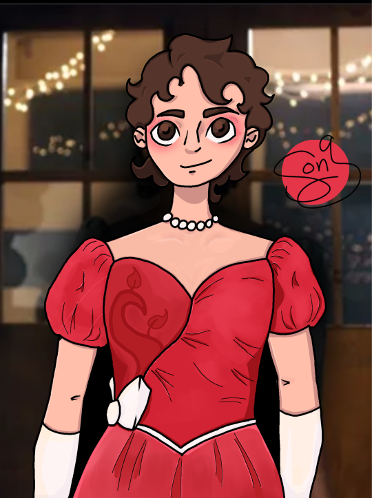
[ID: three images of a digital drawing of El Hopper from Stranger Things from the waist up at a head-on angle. She is wearing a red dress with a sweetheart neckline and puffy sleeves. A panel on the left of the bodice is a lightly deeper red and a had a vine outlined on it in a curling, almost heart- shaped form. The right/ majority of the bodice is brighter red and gathered slightly at the seam much like the skirt. The triangle waistline has a thin white ribbon and the left side of it has a white bow. She is wearing white silk elbow length gloves and a white pearl choker necklace. Her hair is in short curious reminiscent of season two and she has blotchy red eyeshadow much like in season two, but this time matching her new dress. The leftmost image is set against a transparent backdrop. The second image has a flat maroon backdrop. The rightmost image has a photo background of the gym doors from the Snow Ball scene. : end ID]
Some part of the art I wanted to talk about:

All white elements are filled in with a very light gray. The gloves and pearls have a yellow highlight and blue shadow.
All of the red colors are from the photo
I specifically chose to copy that original snow ball photo but with two key changes besides her outfit and makeup
Her hair in my drawing is kind of styled in bangs/fringe to mimic her Season four hairstyle since she seemed to really like it AND because the original photo had her hair swirled in the front- like Superman. The only person who compares El to Superman is Mike, specifically in the context of their relationship, and unlike the Snow Ball, prom is about El (/elmax for the sake of hc). I also changed her expression from a sort of shocked look to a smile since I think he original reaction was partially due to being around so many people and not having to hide.
The reference photo of the red dress has a bodice panel with embossed or embroidered shiny vines and floral patterns, so the way I added that to the dress and changed it to not look out of place in a cartoony style was to have a larger vine which was colored to blend in with the fabric. I mightn't have bothered, but the vines reminded me of the Upside-Down, which I just thought was cool.
I also have the sketch on paper
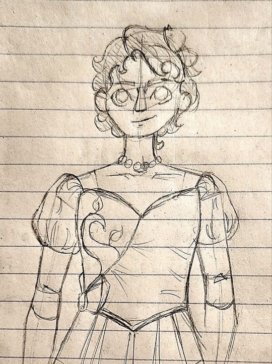
Where she originally had a bow in her hair, which I only didn't add by accident💀. Besides that, O didn't change anything, but I like the sleeves outline better in pencil. The erased lines were the original sleeve placement until I realized the sleeves only have one point of attachment.
I made some thumbnail sketches of elmax at prom as well
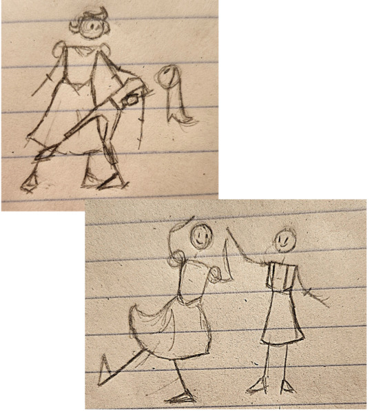
Max has trousers in one and a skirt in the other bc I couldn't decide.. here's her sketch plus a version with a some quick color on it (colorpicked from El), the colored version has a skirt one and a trousers one. I thought she'd wear a suit bc it can be more simple than an elaborate prom dress and still come off as formal, plus she wrote a sweater to Show Ball. I added a little braid in her hair too for fun :)
21 notes
·
View notes
Last Seen Blogs

teloowj
Untitled

my-journey-through-mental-health
My Journey

ryccino
ryccino

nni-sommerfest-17
Vernissage und Sommerfest

waraderahul530-blog
Untitled