#that I regret
Text
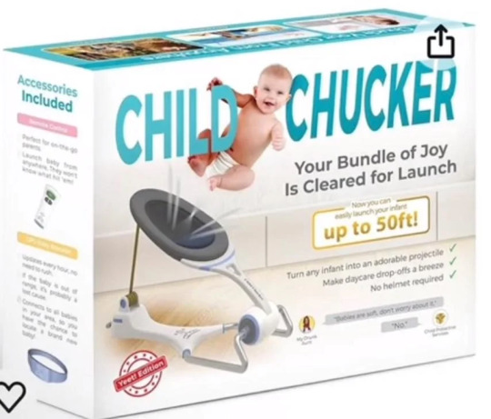
Review/Rant: Official Merch Store
General Short Version
Remember how he said he would hire professional artists for the official merch store? Yeah, Landy lied bc of course he did. Pretty sure he designed this stuff himself. I mean, a too big amount of items are his doodles.
I didn't expect much, didn't even hope for merch for my favs, but I expected at least some new SP art instead of recycled art (some art is so old it's still from when the first trilogy was released) and well, text.
And no, Landy's shitty 5-second doodles of Skul and himself don't count as "art". Neither does the skull silhouette on some items. Couldn't even be arsed to add eye socks and nose smh :/
3 pages full of garbage merch. He really went for quantity over quality here.
And to add further insult to injury, the prices of the items he sells are heavily overpriced.

So yeah, this entire store is a sign of disrespect and balant insult to the fandom. I hope no one buys this.
Long Version
The Notebooks/-pads

Too much empty space. WAY too much empty space. You couldn't possibly have done this in a lazier way.
The sarcasm one is hardly even SP-related. Plus, he didn't even attempt to pretty the text up a little with typography. He didn't use the 'bold' font for "Caution" which would have been the bare minimum. This doesn't even count as trying.
I TRIED to make the two with characters on it a little better by reducing the empty space, but it's really hard to polish a turd. Especially if ya don't wanna put more than 5 min in lol
Totem Bags
This store has totem bags, but they are worse than the Kickstarter one. At least the Kickstarter one had text big enough that you could read it from afar. For the text on the new ones, you'll need a magnifying glass.
Clothing
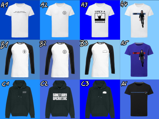
Some of the text has the same problem as the totem bags: too small to read. The only time text should be that small is if it isn't meant to be read or when it's "if you can read this you're too close" T-Shirt.
This applies especially to A6.
If you have B2 you don't need B1. What happened here? Did he have an item amount quota to reach?
A3, B3 and C3 are Landy's shitty 5 second doodles again. Unless they are used to signed the cloths they don't belong on the clothes. Pay for a custom design, you cheap ass scammer!
A4 and A5, the stripe with Skul should be thicker. If it's on a shirt you shouldn't need a magnifying glass to see it. Also, the blue stripe needs more contrast, the blue is eating the black outlines of Skul. The red stripe on the blue shirt... I just really don't like that blue tone and I hate that he doubled down on it. For the website too.
C1 should have had the sold letters bc you can't read it from further away with that effect on top.
C2 at last you can read this one. Not getting any creativity points from me tho. Once again it's just text and probably took him 5 seconds to design.
Now listen, here is what I want instead. I have this zip-up hoodie from Killstar. I love and essentially I want this but in SP.
Faceless One version:
The symbol on the front is the Faceless Church symbol.
The back is a picture with Mev in the middle and his generals around him and it's done in the style of those stained glass windows you see in Christian churches but black and white.
I don't know what I want on the sleeves. Maybe bursts of flames, symbolizing Mev's fire attacks. Or perhaps just parts of the 'Gospel of the Faceless' scribbled along on the arms in English, Latin or even Irish??? Or one arm a snake to symbolize Nef and the other a lion to symbolize Baron as his right and left hand men?
China Sorrows Version:
The symbol in the front should be a crest with a scorpion on it.
The back image is a drawing of China in the Art nouveau style.
The arms should be a roll of paper curling down each arm with various symbols drawn on them, artfully intervening with each other.
Hats
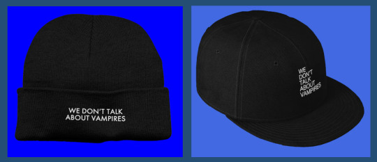
I wouldn't say that "We don't talk about vampires" is one of the more iconic quotes of the series, but besides that not even an attempt was made at typography. Or like, a little vampire head silhouette with an open mouth and exposed fangs. or even just fangs around the text or anything at all even.
It doesn't assault my eyes, but it's also incredibly boring.
To the people saying they wanted to buy Skul's head: just go to a hat store and buy a fedora. It's gonna be better quality than whatever Landy would smack on the store for a criminal price.
Everything with his face on it

No.
How full of yourself do you have to be to try and sell merch with your face on it. The quotes are awful too
The quotes on the postcards are so awfully 2012 Tumblr "quirky" I'm-not-like-other-people ^w^ edgy bullshit vibes. Wasn't cute when it came from the emo kids back then and it coming from a +50 year old man trying to be relatable to the kids these days is just sad and cringe.
Also, I'm pretty sure by sending people that greeting card is how you end relationships including familiar relationships.
Baby's first InDesign Skull

It's what it says in the title. Should have just used the iconic Skul logo instead to make it look like SP and less like random shit you can find on Etsy after reaching page 100.
Really should have just used the old school icon. Thee is a reason it's so iconic: it's easy to recognize as Skul and not random skull/skeleton number 5643489. Plus, using the old one is about the same amount of effort as making the new one.
Honestly, it should have been custom art, but the iconic SP icon would be the lesser evil by a far.
On top of hat, black text is hard to read on a red background js.
Also, what kind of chaotic evil alinged bastard uses a metal pencil case???
Prints

Ngl I always thought the "Mortail Coil" cover was one of the best of the entire series. I also really love the OG "Dark Days" cover. OG book covers as prints? Easy win! Still fucking overpriced tho.
Plus the OG covers also would have looked good on clothing, way better than the shit he ended up slapping on there.
As for the collage with all of the characters in it: I always thought it looked awful. The characters were just thrown in there without much thought or care. Also hate that he used the ugly ass SoW Nef instead of the way better-looking Book 1 cover Nef.
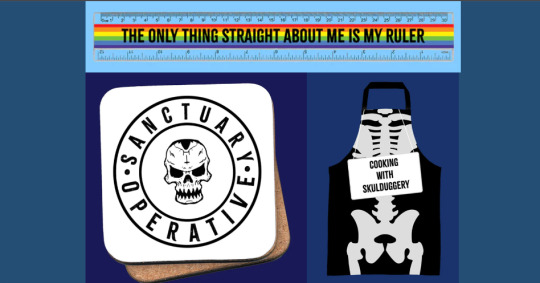
Rainbow Ruler
This isn't even Skulduggery-themed.
I feel like HarperCollins told Landy he had to put something in the store for the gays but instead of making something like a cute lil Valkyrie/Militsa pin he just smacked this into the store.
The Skulduggery Apron
The only thing that makes it SP-themed is that they smacked a sign saying "Cooking with Skulduggery" on it. Otherwise, it looks like every other skeleton apron you can get around Halloween.
Coaster
So empty and boring again. It looked way better with the moth eventho it was a "Silent of the Lambs" movie poster rip-off. Still don't know why a skull is the official Sanctuary logo. Seems kinda weird for the good guys. On a meta level: I guess literally EVERYTHING in universe has to revolve around Skulduggery.
Make the Sanctuary seal more interesting and then invert the values so the background if black and the lines are white and this could actually look decent.
Skulduggery Clock
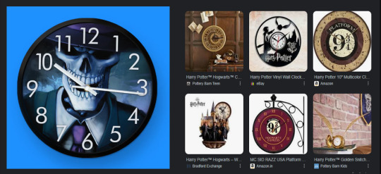
This looks like a your-photo-here clock that you can order at every random print shop. Here are some examples from HP to show HOW a custom clock for the fans is meant to look like next to it. (Also look at this Thresh watch, it's so good I almost regret not wearing watches.)
Lunchbox and Waterbottle
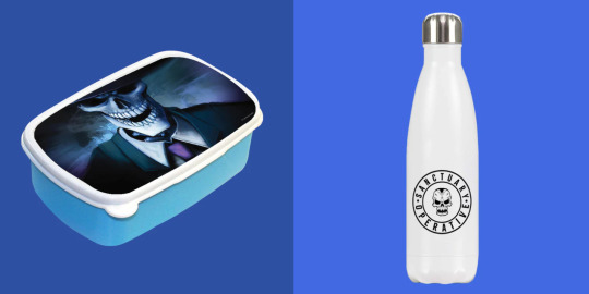
Same thing as with the clock. Tho the water bottle also has too much white space.
Mouse-/Gamerpads

Recycled art again. The mousepads look weird with Val placed smack dead in the middle. Plz apply the rule of thirds and move her a little to the right.
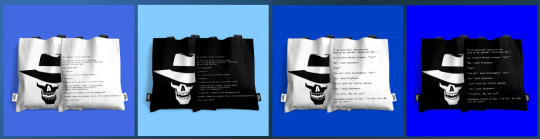
Pillows and Bag
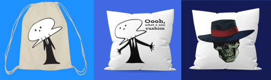
AGAIN WITH THOSE SHITTY DOODLES
Someone tell Landy that if it takes about 5 seconds to draw it does NOT belong on merchendise!
Also, that floating "Bad Magic" Skul really doesn't work on it's own, Just... just use the damn Skul icon if you gotta be lazy.
Final Words
Overpriced lazy garbage that Landy definetely designed himself. No person with self-respect would even consider participating in this cash grab.
It's an insult to every fan, really.
How to fix this? Delete everything from the website, hire a professional artist, go for quality over quantity. A few items that sell really well are a million times better than a bunch of items that don't sell. If the shop goes well you can always expand.
Almost all of the store should have been custom art apart from a few exceptions where old promo art and book covers are used for tops and posters.
#skulduggery pleasant#sp merch#long post#well this was a waste of time#that I regret#I did not expect it to take this long#but there is just so much merch#and none of it good#rant#art rant
10 notes
·
View notes
Text
I remember this song lmao
#it was#a time#and a lot of piercings were made#that I regret#mr merlin tends to talk#joan jet and the blackhearts
2 notes
·
View notes
Text
Back in 2017 I signed up for one of the Cards Against Humanity sillies and did their Cards Against Humanity Saves America. Basically they were like fuck Tr*mp and his border wall and used the funds from the campaign to buy land and to make all 150,000 contributors part owners of said land across the US/Mexico border.
It was fun and silly and I got a little certificate.
Today I got an email that Elon Musk illegally annexed that land for SpaceX and that CAH are suing him over it. So possibly I’ll get like $100 if they manage to win a lawsuit and stick it to Musk. It’s like even more bang for my original buck.
#ramblies#cards against humanity#CAH#I have never ever regretted being on their mailing list like truly it’s always great#every Black Friday I love joining their antics#elongated muskrat
39K notes
·
View notes
Text
ah yes my favourite divorced half-foot dad
#dungeon meshi#delicious in dungeon#chilchuck#chucklefuck#chilchuk dungeon meshi#zaragovica#sorry for being inactive i dont regret it
53K notes
·
View notes
Text
@ anybody who's started getting interested in slay the princess after watching Markiplier play it: trust me. trust me on this. stop watching his playthrough. don't even think about his playthrough. ideally wait for the pristine cut to be released (completely free expansion to the game.) but if you're impatient it's complete as-is. go play it yourself. as blind as possible. trust me. TRUST ME. the game is SO MUCH BETTER when you're the one behind the wheel, making all the choices, and you don't know what will happen when you make them.
it's a very, very, very good game, if you can't afford it the devs are perfectly fine with piracy, there are two of them, they have plenty of the money they need to support their future projects, you can always buy the game later or official slay the princess merch to support them financially, i'm telling you this for your own good, trust me, you want to play it yourself and you want to avoid Markiplier's playthroughs until you do.

#i watched like. one/two routes before playing it myself and i regret it lol#shlong talks#slay the princess#stp
22K notes
·
View notes
Text


"I could be really brash and really loud and really dressed however I wanted to and almost made [Chappell] on purpose a drag version of myself so I can be whatever I want. It allows me to feel really safe exploring those aspects of myself. I’d never be able to do that if I took myself super seriously with pop. I think that the project has allowed me to be a part of the queer community in a deeper way because I'm not observing from the outside anymore. I feel like I'm in it. I am the queer community–it's allowed me to just feel queer, feel like a queer person and feel freedom in that."
#*gifs#1k#chappell roan#chappellroanedit#chappellsource#tusermiles#userbru#tuserdee#wlwgif#dailywomen#femaledaily#flawlessbeautyqueens#dailymusicians#dailymusicqueens#ladiesblr#userbbelcher#chewieblog#my brain is stuck listening to her on repeat and honestly i have no regrets
23K notes
·
View notes
Text
yoooo guys these wings my dad made look INSANE i can’t wait to try them tomorrow
#helenaposting#icarus#icarusposting#guys there is more to this post PLEASE check the notes i cannot handle one more chicken wing comment#<- person who did the chicken wing thing on purpose and now is regretting it
67K notes
·
View notes
Text
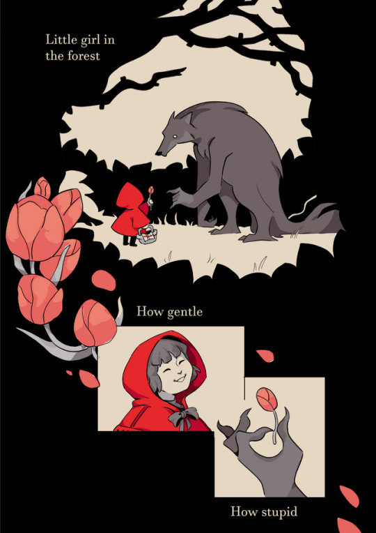


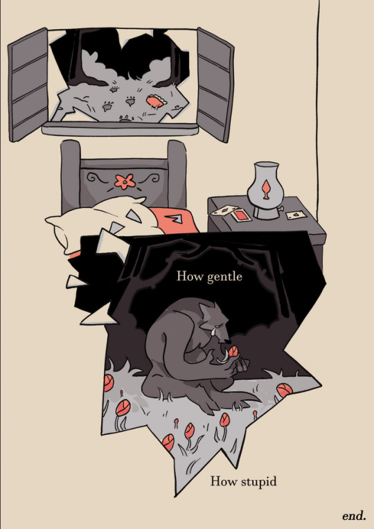
Red riding hood comic collab with the wonderful @yeehawpim (go check out their blog for loads of great comics!) 🌷
See the layouts he did here!
#james art times#artists on tumblr#comics#comics!! very excited to do this and especially with pim who is just fantastic at what they do#fairy tales#little red riding hood#pim did the layouts and I rendered these and my goodness was it a good time#he also did the image descriptions so huge shout out for that as well#go check out her comics! you will not regret it
51K notes
·
View notes
Text
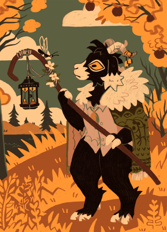
autumnal chill....featuring the girl
#my art#oc#svanhildr#furry#anthro#goat#almost typed ''featuring the girk''#my favourite girk of all time baby#this took an INORDINATE amount of time but also i was experimenting with style so maybe it's somewhat ordinate#i did the brush/texturing too small but it looks nice when you zoom in on some parts#and i finally have a decent twitter banner so small mercies#anyway summer kind of sucked this year - not much warm weather. better than last year but still pretty bad#hopefully september comes in clutch with some last minute sun. so i can appreciate the autumnal chill more when it comes#also scrumping season is coming to a close and i regret not eating more greengages when i had the chance...they rotted off so fast#apple season save me. save me apple season#illustration
10K notes
·
View notes
Text
Alright you filthy farm animals, come and eat your slop!
31K notes
·
View notes
Text
#i have done nothing all day#and i have no regrets#boop#april fools#april fool's day#tumblr#tumblr memes#memes#background agent 3
17K notes
·
View notes
Text

it's READY! :')
#biocomics#autobio comic#diary comic#dungeon meshi#i ate like ten#full of potato and regret#theres more we have 24 hours send help
9K notes
·
View notes
Text
#tim drake#conner kent#bart allen#cassie sandsmark#robin#red robin#superboy#impulse#dc impulse#kon el kent#wonder girl#core 4#young justice#teen titans#i regret nothing#core4
10K notes
·
View notes
Text
grr having one of those days where my leg hurts so much that I might use a cane if I go out 💀
#I had friends over this weekend and pushed myself too hard doing activities with them#it was very fun and I don't regret it but now I have The Limp
5K notes
·
View notes
Text
Okay so in my Computer Applications class we learned about conditional formatting in Excel, where you can change the color of a cell by inputting certain values.
We're supposed to use it to model heat gradients in metals, but I found a better application:
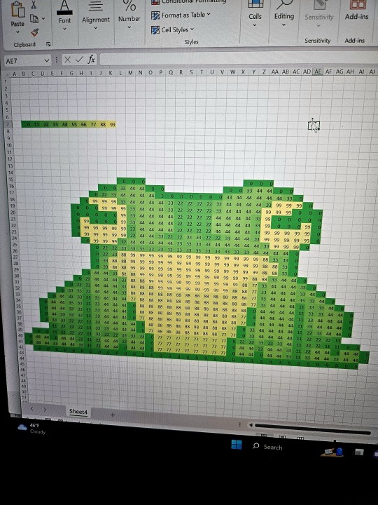
FROG ART
#frogs#Excel#i spent like an hour doing this#should I have been doing my homework instead?#absolutely#do I regret it?#absolutely not#frog art#pixel art
10K notes
·
View notes
Text
not that we didn't already Know belos was full of shit, but it's even funnier knowing the titan was still alive the whole time and probably judging him
#toh#the owl house#emperor belos#papa titan#the titan#art#doodles#comic#fanart#watching and dreaming#captioned#brief visit to ye olde days of memeing on belos... those still get spread around#i hope the titan saw him get his shit stomped in before they passed on#like yes luz was right there but did the titan actually get to see it. i hope so#shoulda been broadcast on penstagram too#there's a piece of fanart i wanted to draw after. i think o titan where art thou. but i never got around to it#because it had animation in it. and im regretting it now#maybe i will finally do it. and something else too#the whole titan reveal brings with it a lot of tropes and ideas that absolutely destroy me personally#and i need to Draw about it#edit - thank you anistarrose for the caption!#''he wasn't Really alive'' you're right they were a secret third thing. the heart still beats. they were still Somewhere#but it's easier to just say Alive. it's not Technically wrong#i try to keep my captions short ok
58K notes
·
View notes
Last Seen Blogs
coolradiourl
THIS IS A MUSIC BLOG

kyri45
The Jades are here
alexandramaa
All these things

frrrankie3
チェリー

phukla-blog
Sin título