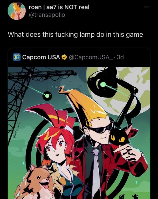
#and none of it good
Explore tagged Tumblr posts
Visit Tumblr Blog
Explore Tumblr blogs with no restrictions, modern design and the best experience.
Last Seen Tumblr Blogs


Fun Fact
There are dozens of funny blogs to kill time on Tumblr.
Text
Review/Rant: Official Merch Store
General Short Version
Remember how he said he would hire professional artists for the official merch store? Yeah, Landy lied bc of course he did. Pretty sure he designed this stuff himself. I mean, a too big amount of items are his doodles.
I didn't expect much, didn't even hope for merch for my favs, but I expected at least some new SP art instead of recycled art (some art is so old it's still from when the first trilogy was released) and well, text.
And no, Landy's shitty 5-second doodles of Skul and himself don't count as "art". Neither does the skull silhouette on some items. Couldn't even be arsed to add eye socks and nose smh :/
3 pages full of garbage merch. He really went for quantity over quality here.
And to add further insult to injury, the prices of the items he sells are heavily overpriced.

So yeah, this entire store is a sign of disrespect and balant insult to the fandom. I hope no one buys this.
Long Version
The Notebooks/-pads

Too much empty space. WAY too much empty space. You couldn't possibly have done this in a lazier way.
The sarcasm one is hardly even SP-related. Plus, he didn't even attempt to pretty the text up a little with typography. He didn't use the 'bold' font for "Caution" which would have been the bare minimum. This doesn't even count as trying.
I TRIED to make the two with characters on it a little better by reducing the empty space, but it's really hard to polish a turd. Especially if ya don't wanna put more than 5 min in lol
Totem Bags
This store has totem bags, but they are worse than the Kickstarter one. At least the Kickstarter one had text big enough that you could read it from afar. For the text on the new ones, you'll need a magnifying glass.
Clothing
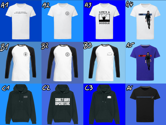
Some of the text has the same problem as the totem bags: too small to read. The only time text should be that small is if it isn't meant to be read or when it's "if you can read this you're too close" T-Shirt. This applies especially to A6.
If you have B2 you don't need B1. What happened here? Did he have an item amount quota to reach?
A3, B3 and C3 are Landy's shitty 5 second doodles again. Unless they are used to signed the cloths they don't belong on the clothes. Pay for a custom design, you cheap ass scammer!
A4 and A5, the stripe with Skul should be thicker. If it's on a shirt you shouldn't need a magnifying glass to see it. Also, the blue stripe needs more contrast, the blue is eating the black outlines of Skul. The red stripe on the blue shirt... I just really don't like that blue tone and I hate that he doubled down on it. For the website too.
C1 should have had the sold letters bc you can't read it from further away with that effect on top.
C2 at last you can read this one. Not getting any creativity points from me tho. Once again it's just text and probably took him 5 seconds to design.
Now listen, here is what I want instead. I have this zip-up hoodie from Killstar. I love and essentially I want this but in SP.
Faceless One version: The symbol on the front is the Faceless Church symbol. The back is a picture with Mev in the middle and his generals around him and it's done in the style of those stained glass windows you see in Christian churches but black and white. I don't know what I want on the sleeves. Maybe bursts of flames, symbolizing Mev's fire attacks. Or perhaps just parts of the 'Gospel of the Faceless' scribbled along on the arms in English, Latin or even Irish??? Or one arm a snake to symbolize Nef and the other a lion to symbolize Baron as his right and left hand men?
China Sorrows Version: The symbol in the front should be a crest with a scorpion on it. The back image is a drawing of China in the Art nouveau style. The arms should be a roll of paper curling down each arm with various symbols drawn on them, artfully intervening with each other.
Hats
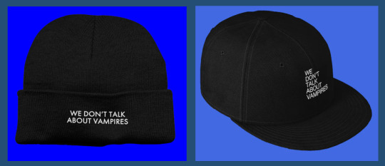
I wouldn't say that "We don't talk about vampires" is one of the more iconic quotes of the series, but besides that not even an attempt was made at typography. Or like, a little vampire head silhouette with an open mouth and exposed fangs. or even just fangs around the text or anything at all even.
It doesn't assault my eyes, but it's also incredibly boring.
To the people saying they wanted to buy Skul's head: just go to a hat store and buy a fedora. It's gonna be better quality than whatever Landy would smack on the store for a criminal price.
Everything with his face on it

No. How full of yourself do you have to be to try and sell merch with your face on it. The quotes are awful too
The quotes on the postcards are so awfully 2012 Tumblr "quirky" I'm-not-like-other-people ^w^ edgy bullshit vibes. Wasn't cute when it came from the emo kids back then and it coming from a +50 year old man trying to be relatable to the kids these days is just sad and cringe.
Also, I'm pretty sure by sending people that greeting card is how you end relationships including familiar relationships.
Baby's first InDesign Skull

It's what it says in the title. Should have just used the iconic Skul logo instead to make it look like SP and less like random shit you can find on Etsy after reaching page 100.
Really should have just used the old school icon. Thee is a reason it's so iconic: it's easy to recognize as Skul and not random skull/skeleton number 5643489. Plus, using the old one is about the same amount of effort as making the new one.
Honestly, it should have been custom art, but the iconic SP icon would be the lesser evil by a far.
On top of hat, black text is hard to read on a red background js.
Also, what kind of chaotic evil alinged bastard uses a metal pencil case???
Prints

Ngl I always thought the "Mortail Coil" cover was one of the best of the entire series. I also really love the OG "Dark Days" cover. OG book covers as prints? Easy win! Still fucking overpriced tho. Plus the OG covers also would have looked good on clothing, way better than the shit he ended up slapping on there.
As for the collage with all of the characters in it: I always thought it looked awful. The characters were just thrown in there without much thought or care. Also hate that he used the ugly ass SoW Nef instead of the way better-looking Book 1 cover Nef.
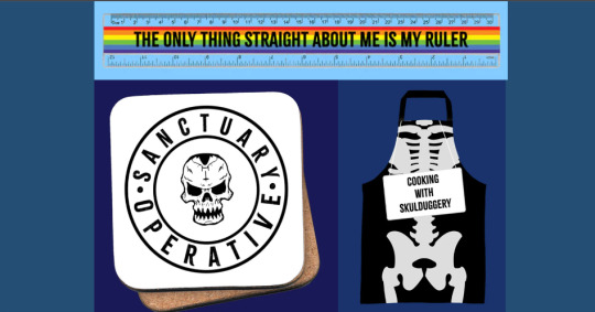
Rainbow Ruler
This isn't even Skulduggery-themed. I feel like HarperCollins told Landy he had to put something in the store for the gays but instead of making something like a cute lil Valkyrie/Militsa pin he just smacked this into the store.
The Skulduggery Apron
The only thing that makes it SP-themed is that they smacked a sign saying "Cooking with Skulduggery" on it. Otherwise, it looks like every other skeleton apron you can get around Halloween.
Coaster
So empty and boring again. It looked way better with the moth eventho it was a "Silent of the Lambs" movie poster rip-off. Still don't know why a skull is the official Sanctuary logo. Seems kinda weird for the good guys. On a meta level: I guess literally EVERYTHING in universe has to revolve around Skulduggery.
Make the Sanctuary seal more interesting and then invert the values so the background if black and the lines are white and this could actually look decent.
Skulduggery Clock
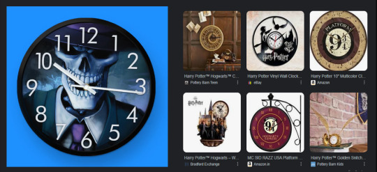
This looks like a your-photo-here clock that you can order at every random print shop. Here are some examples from HP to show HOW a custom clock for the fans is meant to look like next to it. (Also look at this Thresh watch, it's so good I almost regret not wearing watches.)
Lunchbox and Waterbottle
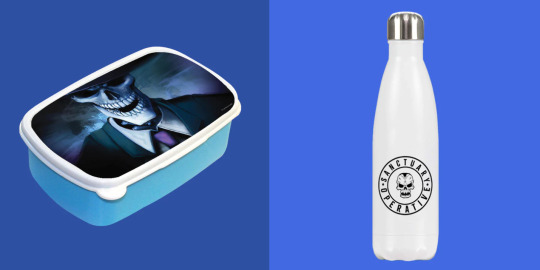
Same thing as with the clock. Tho the water bottle also has too much white space.
Mouse-/Gamerpads
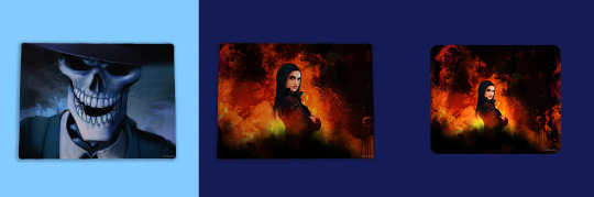
Recycled art again. The mousepads look weird with Val placed smack dead in the middle. Plz apply the rule of thirds and move her a little to the right.
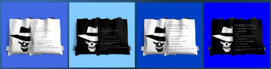
Pillows and Bag
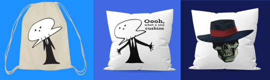
AGAIN WITH THOSE SHITTY DOODLES Someone tell Landy that if it takes about 5 seconds to draw it does NOT belong on merchendise!
Also, that floating "Bad Magic" Skul really doesn't work on it's own, Just... just use the damn Skul icon if you gotta be lazy.
Final Words
Overpriced lazy garbage that Landy definetely designed himself. No person with self-respect would even consider participating in this cash grab.
It's an insult to every fan, really.
How to fix this? Delete everything from the website, hire a professional artist, go for quality over quantity. A few items that sell really well are a million times better than a bunch of items that don't sell. If the shop goes well you can always expand.
Almost all of the store should have been custom art apart from a few exceptions where old promo art and book covers are used for tops and posters.
#skulduggery pleasant#sp merch#long post#well this was a waste of time#that I regret#I did not expect it to take this long#but there is just so much merch#and none of it good#rant#art rant
10 notes
·
View notes
Text
Apparently there’s a website called Public Square where conservatives register their businesses to identify themselves as “anti-woke” so other conservatives can find them. I just thought I would share in case anyone wanted to put their zip code in and learn which local businesses to avoid.
#because that’s what I’m doing#there were several in my hometown but none I’ve ever been to#but it’s good to know#one was a doctor!#like what??
30K notes
·
View notes
Text
Batfam bodyswap but all of them have insane chronic pain in different places.
Jason, in Tim’s body: Yeah, your hands and waist should not feel like this.
Tim, in Dick’s body: Shut up, it's normal. But Dick all of your joints are fucked. What is wrong with you?
Dick, in Damian's body: Nothing. Jesus, Dami, I want to peel my ribs out of my chest.
Damian, in Jason’s body: Todd, I don't think the pit healed you at all...
Duke, in Bruce’s body: ow
Bruce, in Cass' body: I, for one, feel amazing.
Cass, in Duke’s body: I'm going to go OD on Advil. That probably won't be enough for how much my head hurts.
#jason todd#tim drake#bruce wayne#dick grayson#damian wayne#duke thomas#cassandra cain#chronic illness#chronic pain#batfam#batman#none of them good
10K notes
·
View notes
Text
Katniss is such an unreliable narrator. She says "Then something unexpected happens. At least, I don't expect it because I don't think of District 12 as a place that cares about me" girl you deliver strawberries to the Mayor, you hunt and trade for the district, when you fell at Prim being chosen someone caught you, when you went to Prim people parted for you, when you volunteered EVERYONE stopped. Idk how to tell you but I think you're a pillar of the community.
#katniss everdeen#the hunger games trilogy#the hunger games#primrose everdeen#hunger games#batcavescolony reads the hunger games#suzanne collins#'now it seems i have become someone precious' NOW? GIRL BFFR you're their hunter girl#and this isn't negative just bffr girl#your WHOLE DISTRICT did the three finger salute that you yourself says means admiration thanks and goodbye to someone you love and on top is#old a rarely used. your WHOLE DISTRICT decided in that moment that they needed to bring back this sign of respect for YOU#...................................................................#idk why some people are thinking i mean this as negative i don't she is unreliable but its not intentional. like when Peeta heart stoped in#CF she doesn't know what Finnick is doing at first cus she doesn't know off the top of her head what cpr is. she also thinks Peeta after the#reaping is acting for the cameras. he isnt we dind out later his mom basically told him Katniss was gonna win and he would die. obviously#shes not doing it on purpose shes just for lack of better words uneducated? as in she doesn't know everything shes not omnipotent#so when Plutarch (? second games guy) shows her his mokingjay hiden watch shes like *wtf that's weird?* then the people traveling to#district 13 show her the mockingjay cookie and explains it and she then goes on the difference between his watch and their cookie#and why does eveyone act as if district 12 is as bad as the capital? they CANT help Katniss and Prim in the way you want. they cant give#them food. none of them have any! and im not putting iton Katniss but they hid they needed food so they could stay together. it sounds like#some of you are in this our world mentally of what people do after a loved one dies (brings food constantly checks on them etc) district 12#cant do that. they dont have food and they're all suffering. you cant give someone food when you have none to give. then theirs the fact#that peeta DID help. Peeta buring the bread and tossing some to her then taking a beating from his mom is a HUGE thing in the books.#he used his resources to help her like you all said someone should.#district 12 DID (rip) care about Katniss before the hunger games. why do you think she was allowed to hunt? or how her trades were good#these are the little ways 12 can shows Katniss they love her. but again Katniss doesn't see this and YES its because she had ptsd before the#hunger games as well. i swear some of you make it seem like d12 was all living a life of luxury and glaring down at Katniss.#other things that show Katniss is in hight standing with at least her people of d12 is her dad was known enough through d12 for peeta dad to#comment on his singing along with his commenting on her mom. also her mom is a healer in the community. yeah her parents arnt the top but#of d12 but they are/were definitely high staning in the Seam.
48K notes
·
View notes
Text
I love the idea that Bill’s manipulation tactics are horribly obvious but Ford is so socially inept that it works on him perfectly
“He was a masterful manipulator.”
No bestie he was just nice to you and you folded like a house of cards
#stanford pines#bill cipher#gravity falls stanford#billford#bill x ford#the book of bill#gravity falls#manipulation#toxi old man yaoi#See if Stan and Ford were still on good terms none of this shit would happen
19K notes
·
View notes
Text
"must a story have conflict?" yes. hope this helps <3
#this is about many things but also none of them in particular lmfao#truly what not understanding how conflict operates does to a mf#me vs my executive dysfunction trying to focus enough to finish reading my book this weekend is a conflict.#like good lord
20K notes
·
View notes
Text

bill and ford comic! ft. bill being his usual attention seeking self.
#i tried to make more geometry jokes but i couldn’t find a good angle on the situation#none of the jokes had the right degree of humor#they didn’t measure up#billford#the book of bill#gravity falls#ford pines#stanford pines#bill cipher#grunkle ford#gravity falls fanart#book of bill comic#artists on tumblr#schneid art
8K notes
·
View notes
Text

📷.
#transformers#mtmte#rodimus#drift#ratchet#I could tag this as dratchrod to troll but in the end thats not my beliefs. Good luck#Something worse& more stupid going on probably it's kind of none of my business#Dratchet. And the other one#<-Some qualifying statements: I'm not a dratchet guy I don't gaf sorry. I'm not a dratchrod truther but this post IS about gay sex
3K notes
·
View notes
Text

It'd be so embarrassing to join a group after trying to kill their members and losing
#hardcore fighting hoyo outfit design to get this out there before it becomes outdated 🤭#but i do like hearing ppl argue about which faction sunday should join#i personally think he should join none of them haha#his callous manipulation would make him good in any group. which makes him perfect for no group#but what do i know#honkai star rail#hsr sunday#hsr firefly#hsr stelle#hsr welt#hsr march 7th#hsr dan heng#hsr himeko#hsr aventurine#hsr#neapart
7K notes
·
View notes
Text
Young Hero Sent On A Quest meets other young heroes also sent on various quests—only to discover they're all being used as free child labor by the same flaky wizard as a scam to collect magical artifacts.
the Young Heroes' collective new "Quest" is now to Unionize.....
#actually this is funnier if there are multiple wizards involved but the 12-year-olds combine their knowledge#and realize the wizards are operating as a unified corporate entity#so then of course they have to go on a Quest To Meet The Monarch#to ask the Crown to rule on this previously undeclared power bloc#which in a feudal fantasy world causes all sorts of political intrigue! none of it good#so we've got corporate executive wizards facing off against royal anti-monopoly legal teams#meanwhile the aforementioned 12-year-olds are standing by pissed off and chewing popcorn#(and hoarding undeclared magical artifacts they may or may not collectively vote to use as ammunition to fuel a revolutionary uprising)#the!! possibilities!!!!!!!!!!!!
3K notes
·
View notes
Text
If this post gets 10k notes by March, I will start taking better care of my health (something I have no motivation to do)
11K notes
·
View notes
Text


Haven't posted in a while have some duos
#uhh first of all#puremilk#shadowvanilla#← lovers#eternalmilk#shadowsugar#← exes#goldenspice#← worse. nothing good#i don't get them romantically but i wish my brain was big enough to make it work#i live in beast redemption au delusion always. canon makes me too sad#excl BY9 best chapter yet i'm in love with es#i need to draw more pvsm theyre still my favorites ive jus been drawing too much smilk selfcest#none of which can be shared with the class sorry.#crk#cookie run kingdom#pure vanilla cookie#shadow milk cookie#eternal sugar cookie#golden cheese cookie#burning spice cookie#im hungry im gonna eat one of those 5#two actually#(romantic)#i got ES first day btw btw btw btw btw i was so excited and it paid off#no promotions yet i'm sadly broke so stuck in f2p hell
2K notes
·
View notes
Text
The way Sakura laughed and the WHOLE CLASS stopped talking and stared at him in amazement???
And then how they started fucking around twice as much to make him laugh even more???????
That shit is straight out of a fanfiction and I’m SO here for it.
#wind breaker#sakura haruka#windbreaker#wind breaker s2#They are THE found family ever#none of them have an ounce of toxic masculinity#and when they do#they just talk about it and then it’s all good again#I love them SO MUCH#my post
1K notes
·
View notes
Text


#ghost trick#this has made my week ngl#this isnt even half of it it's so great#NONE of the 210 replies are spoilers#everyone is so good I love this fandom so much#ghost trick: phantom detective
28K notes
·
View notes
Text


911 Text Posts 6/?
#none of them are having a good time 😆#911#911 abc#911 show#evan buckley#eddie diaz#henrietta wilson#athena grant#ravi panikkar#text post#911 text posts
1K notes
·
View notes
Text


Throwing around a Peter the Panda design
#I have been trying to get down a design I’m happy with for ages I think I’ve finally done it#knew I wanted to give him facial hair and I found the stupid soul patch the funniest#I tried soo many hairstyles for him and none of them looked good so I made him bald out of annoyance. sorry#he keeps his hat on.#I like him. I like his blank stare#pnf#perry the platypus#peter the panda#human perry#my art
2K notes
·
View notes