#the evolution of celebrity and image
Text
From Person to Publicist: The Evolution of Celebrity and Image
The layperson’s first brush with everyday perfection came in the ’90s when the daughters of New York City’s richest power players decided to make their life consumable to the average person. Rather than hiding inside of mansions like the millionaires of yore, these women—such as Paris Hilton, Casey Johnson, and Olivia Palermo—were seen both at red carpet events and blackout drunk at nightclubs.…

View On WordPress
#alice larkin#beyonce#by Jocelyn#casey johnson#elizabeth harrison#lara shriftman#lizzie grubman#new york city#olivia palermo#paris hilton#peggy siegal#person to publicist#publicists#queenmaker#socialite#taylor swift#the evolution of celebrity and image#tinsley mortimer#tree pain#yvette noel-schure#zillennial discourse
0 notes
Text
Pick-A-Girl Group: What Purpose Do the Women In Your Life Serve?
Continuing on with my Women’s History Month series, I am going to do a reading on how the women in your life feel about you and the effect of these feelings. I am going to be using the True Heart Tarot Deck and the Archetype Oracle Deck. These readings are supposed to uplift, relate to and inspire women so I hope they serve their purpose. I Without further ado, please pick your pile. 🫶
***Disclaimer: Regardless of your gender identity, the women that are in your life deserve to be celebrated as long as they have pure intentions. Much love. 🩷
Left-to-Right (1-4):


Pile One: If you resonate with the image of FLO, then you deserve the whole fucking world. Pile One, the women in your life absolutely adore you. You probably resonate with the song’s theme: recognizing beauty in yourself when everyone is against you, specifically as a black woman. You have come such a long way. The women that are currently in your life have seen you make mistakes and allowed you to do so. They recognize your evolution. A lot of you have a best friend who you’ve been friends with for a long time and she is so proud of you. She is proud of the person that you have become. This pile has some cheerleaders around them. I feel like the women in your life are meant to take inspiration from what you are going through right now. I think that you may be going through your redemption arc.You’re forgiving yourself for a lot of things that you’ve done in the past. The women in your life see that and are following suit. After all, living life does mean not being a robot. These women who are around you are all ears, very receptive to what it is that you are doing with your life. You’re like their Oprah, lol. If you have a story to tell, share it with her. She may need to hear it. I channeled the show: Beyond Scared Straight; specifically the parts where the prisoners talk to the kids about their life stories and the reasoning for why they should not end up in jail. I feel like you could be someone’s mentor, whether they’re younger or the same age as you, perhaps even older. You are someone’s Reesa Teesa too, lol. I get the feeling that you need to be talking about yourself, Pile One. There is an audience full of women who are willing to hear you out and listen. When I pulled from the oracle deck, I got the following cards:
God: Benevolence and compassion. Recognizing the eternal force within yourself and others/Despotism and cruelty. Using power to control people
Mother: Nurturance, patience, unconditional love. Joy in giving birth to life/Smothering or abandoning children. Instilling guilt in children for becoming independent.
Poet: Expresses soul insights in symbolic language/Turns a lyric gift to negative or destructive effect.
Cards Used: 2 of Swords, 4 of Discs, 9 of Cups, Prince of Wands (RX), King of Discs, Four of Cups, Temperance.
Pile Two: If you resonate with the photo of Destiny’s Child, you got some ride or dies around you for real. I think that you’ve been through hell and back with the women in your life and they do not play about you. I think the women in your life want you to know that you are so worth it. I’m not going to lie Pile Two, it sounds like you’re in a toxic love situation and your girls want you out of it. Your friends, cousin or little sister could have told you that you need to exit stage left multiple times. They absolutely believe you deserve better. Hypothetically speaking, If y’all fell out today and an emergency happened tomorrow, they would be on the way to the hospital. I feel like family is so important to you. They feel like you’ve forgot about them but I don’t think that you have. Circumstances make it difficult for you all to see eye-to-eye. The women in your life want you to know that you are not alone. They will forever be there for you no matter what, even if you have lost your damn mind. These challenging times will make the bond between you and these women stronger. When I pulled from the oracle deck, I got the following cards:
Artist: Expressing a dimension of life that is beyond the five senses. Inspiring others to see life symbolically / Using talent as an excuse to mistreat others. Posing as the Starving Artist to elicit pity.
God: Benevolence and compassion. Recognizing the eternal force within yourself and others / Despotism and cruelty. Using power to control people
Goddess: The feminine expressed through wisdom. Nature, life force, and sensuality / Exploitation of the female nature and form
Cards Used: Ace of Discs, 9 of Swords, Princess of Cups (RX), Prince of Discs, The Hierophant, Princess of Discs, 4 of Cups (RX), The Devil (RX), 10 of Cups.
Pile Three: If you resonate with the photo of TWICE, you got the grandmother spirit around you. Did you grow up in the church? Or at least with a god-fearing grandmother? I feel like the women in your life hate to see you unhappy and this is what you’re feeling right now. I think that you may be uninspired/unfulfilled with what life is giving you right now. It’s not an uncommon feeling. But smiling can make all the difference. The women in your life want to see you smile, make you smile and laugh. They want to be there for you like how your grandmother was. No one will ever replace Granny but her presence is always there. You may be questioning God/your higher powers because of something that deeply affected you. But the women around you want you to not feel ashamed or want you to feel like they are judging you. They have been in the same predicament. They only want to see you get better. They hate to see you like this. It may be hard to do this but look at the glass half full, rather than half empty. They want you to get back to yourself, the version of you that isn’t defeated. When I pulled from the oracle deck, I got the following cards:
Child: Nature: Friendships with animals. Communication with nature spirits / Tendency to abuse animals, people and the environment.
Destroyer: Releasing what is potentially destructive. Preparing for new life / Intoxication with destructive power. Destroying others’ dreams or potential.
Child: Magical: Seeing the potential for sacred beauty in all things. The belief that everything is possible / Pessimism, depression and disbelief in miracles. Believing that energy and action are not required for growth.
Cards Used: The Devil, Princess of Cups, The Star, Judgment, The Moon, Temperance, Seven of Swords.
Pile Four: And lastly, if you resonated with the photo of the Spice Girls, you seem very sensual. Are you a SWer? Do you attend pole dancing classes for fun? Do you know someone who does either of these things? I feel like the women in your life appreciate how physical you are. You’re probably an artist and you're sensitive about your shit too. The women in your life feel as though you have a lot of talents. You’re very multifaceted and they love to brag about it, especially the older women. You could been the cousin who had to show off the latest dance move. So as a result, you became the leader of the pack. You can be naturally nurturing but it can drain you. The women around you feel like you need to put up some boundaries so that you can still worry about you. They respect your quality of being a giver, but do you even respect yours-[GUNSHOT]. There is a woman that you are close to that admires a quality that you hate. She compliments it any chance she can get because she wants to uplift you. I feel like people always try to touch you, whether it’s your hair, your arms, or even your butt. The women around you could immediately shut it down or call them out or defend it. They want to protect your innocence. Even though you are grown, you have that ingenue within you. They know how you can get (especially while under the influence) so they refuse to let you get that way. When I pulled from my oracle deck, I got the following cards:
Servant: Delight in serving others with a free and loving heart / Using the lack of money as an excuse not to move forward with life
Bully: Highlights your tendency to intimidate others. Helps you confront the inner fears that bully you / Conceals deep fears behind verbal or physical abuse.
Hedonist: Inspires creative energy to embrace the good things in life. Celebrates the beauty in yourself / Pursues pleasure to the detriment of health. Indulges at the expense of others.
Cards Used: The Star, The Lovers, Judgment, The Emperor, 7 of Cups, 10 of Swords, Ace of Cups, The Moon, 8 of Cups (RX).
#law of assumption#manifesting#neville goddard#hoodoo#tarot#tarotreading#astro notes#pick a card#pick a pile#divination#pac reading#tarot pac#tarot pull#tarotcommunity#daily tarot#free tarot#tarot deck#tarot reading#womens history month#spirituality#intuitive readings#pick a reading#tarot pick a card
188 notes
·
View notes
Text
PART 1
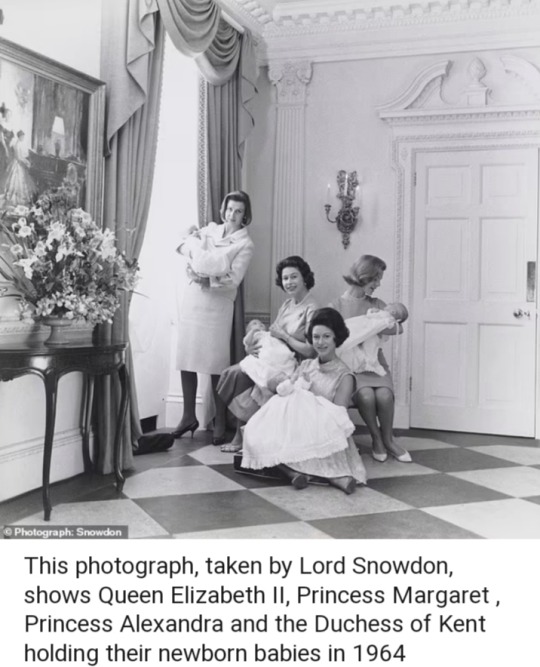
Never-before-seen photo of four royal mothers, including Queen Elizabeth and Princess Margaret with their newborn babies, as a personal token to doctor who delivered them to go on display at Buckingham Palace
By Rebecca English, Royal Editor and Mark Duell
16 May 2024
—
It is a remarkable and never seen before snapshot of royal motherhood.
The image, taken by Lord Snowdon, shows Queen Elizabeth II, Princess Margaret, Princess Alexandra, and the Duchess of Kent holding their newborn babies in 1964.
It was captured by Princess Margaret's celebrated photographer husband as a personal token of thanks for Sir John Peel, the royal obstetrician who delivered all four babies within two months — Prince Edward, Lady Sarah Chatto, James Ogilvy, and Lady Helen Windsor.
And it will be one of the highlights of a new exhibition Royal Portraits: A Century of Photography, opening tomorrow at The King's Gallery, Buckingham Palace.
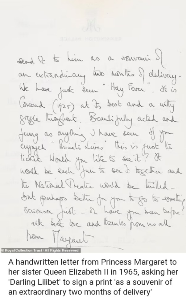
The charming picture will be displayed along with a handwritten letter from Princess Margaret to her sister, asking her 'Darling Lilibet' to sign a print 'as a souvenir of an extraordinary two months of delivery.'
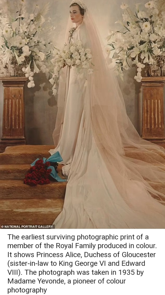
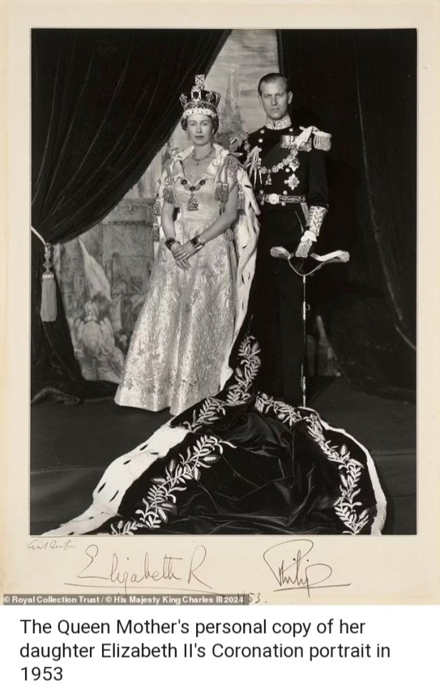
The new exhibition — the first to be held at the The King's Gallery since it was renamed following the death of Queen Elizabeth — will also include The Queen Mother's personal copy of her daughter's Coronation portrait and the earliest surviving colour photographic print of a member of the Royal Family.
It charts the evolution of royal portrait photography from the 1920s to the present day through more than 150 items from the Royal Collection and Royal Archives.
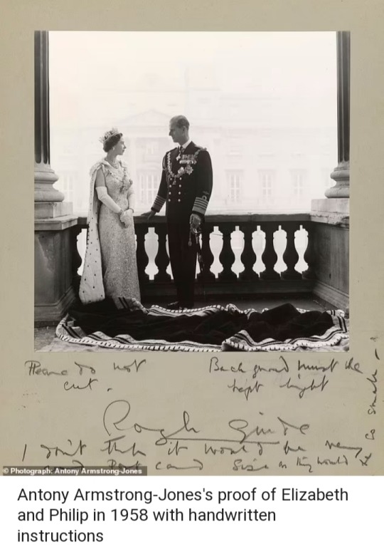
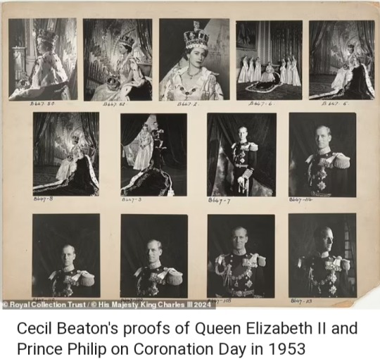
The photographs presented in the exhibition are vintage prints – the original works produced by the photographer – most of which are on display for the first time.
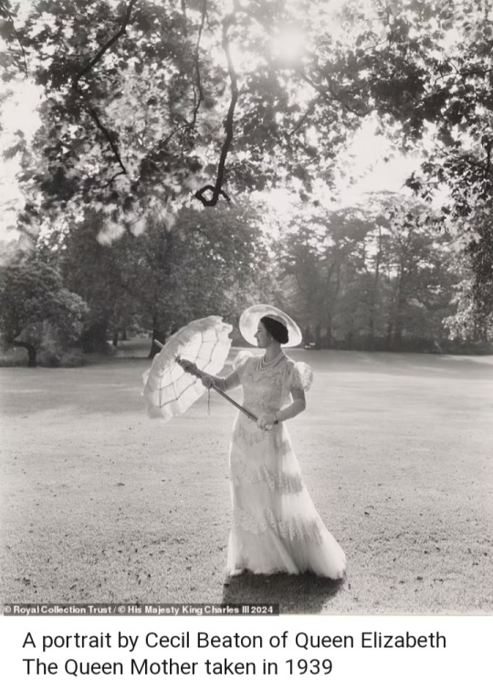
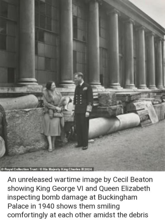
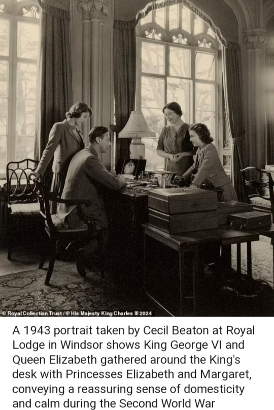
Alessandro Nasini, curator of Royal Portraits: A Century of Photography, said: 'The Royal Collection holds some of the most enduring photographs ever taken of the Royal Family, captured by the most celebrated portrait photographers of the past hundred years – from Dorothy Wilding and Cecil Beaton to Annie Leibovitz, David Bailey, and Rankin.
Alongside these beautiful vintage prints, which cannot be on permanent display for conservation reasons, we are excited to share archival correspondence and never-before-seen proofs that will give visitors a behind-the-scenes insight into the process of creating such unforgettable royal portraits.'
'Royal Portraits: A Century of Photography' is at The King's Gallery, Buckingham Palace, from tomorrow (May 17) until October 6, 2024.
#Queen Elizabeth II#Prince Philip#Princess Margaret#King George VI#Queen Elizabeth The Queen Mother#Princess Alexandra#Duchess of Kent#Princess Alice#Duchess of Gloucester#Cecil Beaton#Lord Snowdon#Madame Yevonde#Royal Portraits: A Century of Photography#Alessandro Nasini#Annie Leibovitz#David Bailey#Rankin#royal portraits#royal motherhood#royal babies#British Royal Family#The King's Gallery#Buckingham Palace#vintage photos#royal photos
65 notes
·
View notes
Note
What are your favorite tropes or plot points in Jason fics and why do you like them???
That’s really hard for me to narrow down. I will read just about anything gen that’s Jason-centric. Usually what makes or breaks a fic for me is the quality of the writing and characterization, rather than specific plot points or tropes. That said, some things do stand out…
Competent Jason, my beloved, how I adore you. He’s makes killer (ba-dum-tss 🥁) plans, he can adapt on the fly, and he’s got the range and depth to go up against anyone.
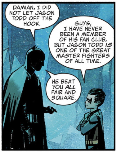
That’s my boy, any story that celebrates this is golden in my book. (Images from Event Leviathan #3)
I like Bruce and Jason origin stories, or stories that deal with them being father/son and Batman/Robin, because these boys love each other so much and, honestly, I just want them to be happy together.
I like fix-its or what-ifs that center around the Lost Days/UtRH timelines, because Jason’s story is a goddamn tragedy and I like thinking about all the ways it could have gone better/differently.
I like stories that feature late UtRH or Outlaws era Jason where he goes through real growth and development, because dc refuses to give us any meaningful character evolution without ripping it away or undermining it, and I have to feed my soul somehow. Bonus points if Jason gets to be badass with his guns or sword (or both 🤤).
I’m always up for a story that deals with batarang incident, although preferably not Dick-finds-out-and-runs-off-to-yell-at-Bruce, been there read that. Also, time travel or alt universes where Red Hood is there for Jaybin, because of all the lovely angst and hurt/comfort (and when it comes down to it, time and time again, Jason can really only depend on himself—thanks dc 🖕).
Finally, I’m weirdly lowkey obsessed with Selkie!Jason. There’s just something about baby Jay as a baby seal that melts my heart. Plus I think the vulnerability of the Selkie coat mythology is a really good fit for Jason’s character, which is so often held hostage to the narrative or other characters.
I could go on, but that’s probably enough for now. Thanks for the ask, anon! 💙
66 notes
·
View notes
Text
I am howling at the sky for the look tonight that Harvey Guillén staked to death, spat on, and made it beg on the red carpet. Instead of just ranting to my queer fashion/fandom retail friends again, I took our collective slobber and tears to outline my plea to the fashion gods.
Why doesn’t this man have a ‘mens’wear line in every American mall? There is a gap in the market for adventurous, queer friendly suiting available through a retailer like Macys/J C Penney. Yes, retail is dying and wedding industry more so, but that’s particular to what’s available for consumers as well. Suiting is turned from off the rack into iconic by proper tailoring, but let me tell you from working all sides of the bridal salon, even up-scale clothing lines are getting rude as hell about quality and assembly to prevent tailoring and longevity.
This kid’s Disney charm would be perfect for introducing a plus size, inclusive line of fashion-forward pieces which include, say a QR code video about taking your own measurements, how adjustments work, with pieces designed to be sleek, with enough allowance for tailoring, and minding the lines in the garment to make the adjustments for plus size bodies easier. It’s no more adjustments than are made on straight size bodies, it’s just straight size bodies have more options to find a line which works with their natural shape.
But in my experience, it’s gender non-conforming folks and plus sized folks who get pushed out of finding pieces they can actually use for celebrations or work, much less pieces with actual personality that spark joy. This man has been killing it for years, really getting some clutch looks for events and invites in the fashion world. He’s showing proof of concept every time he steps in front of a camera.
Watching Harvey’s fashion evolution, I trust his fashion team and judgement to create a mid/high line for workwear to events suiting embracing a gender nonconforming audience. I can’t think of anyone better situated to become the ambassador of a brand with *the* formal wear for queer events and special occasions. I was tickled to see he sells his own merch and hope this experience convinces him of the joy working with artists and connecting their visions to a wanting public, dipping toes into the new ethical, sustainable trends in fashion. His looks alone shows he’s done his homework over the years about timelessness and early adopting trends.
For the years I worked selling/tailoring wedding dresses, there was the prophetic ‘someday… along will come the man who revives men’s fashion for events again’ to save the David’s bridal/men’s wear house lines who keep dropping plus sizes like mine and dying off. As the pet butch in the bridal salon I pleaded to the sky for better suiting options. Add that to my butch lezzy ways and trans masc circle of friends I legit spent this past Friday night drunk in a bar with a seam ripper adjusting jackets and darting pants in an unplanned sewing circle for a bachelorette until it was my round of karaoke. This isn’t the first time I’ve spontaneously started tailoring for the queers, I can’t keep up with the demand! Y’all we are in our twenties to mid thirties there should be better options than this that don’t require a vacation to LA/NY!!
I have ethical, sustainable fashion preferences about slipping in a retailer versus an online brand. But for the vision of accessible clothing to the masses pushing the envelope of the kind of quality only vintage pieces are affording the general public, this is the only celebrity really posed with the image, high energy, and bona fides to be the face of it. His connections in the fashion game are only growing as WWDITS wraps up.
If this man opened a pop-up suiting/fashion shop I’d take my limited time and resources to really dig in to the designers he promoted. I’d be howling in the streets for my celebrants to go get a Gullién. There’s no shortage online pattern makers, but there is a shortage of queer friendly shops to really get pieces that pop and it feels safe to enjoy in a retail environment. For average people wanting to engage with fashion that affirms their identity on their special day, there’s too much fucking compromise. Honestly it’s nice that I have a side hustle sewing to pattern, but I’d give it up in a fucking heartbeat for there to be actually sustainable and approachable options. I wish there was an in between of being ‘affordable’ gnc suiting in an American mall but add plus size availability and it gets sad for your most thrifty, creative friends. Someone needs the step in the gap, and why not someone at the top of the game?
Even if it was just a pop up line every few years, I’d fucking salivate over every image in that catalogue two thousand miles away for what it can teach home sewists just by virtue of curating those artisans with the express goal of queer, fat friendly designs playing together. Just the existence of vintage shops like Proud Mary creates a boom across the inter-webs of new sewists per post. Could anyone really imagine if there were actually accessible stores in key cities/supported by an online catalog with a personable, rising star as the brand face?

Please feed us more fashion, Harvey. Keep those stylists and designer friends close. Please. I cannot stress how many mascs/nb-bebes keep dropping your name every fitting consultation across this nation and it’s for good reason.
69 notes
·
View notes
Text


"…to wear a wedding dress means at least a kind of success. The unification and combination of men and women. That is what is called happiness…", Alexander McQueen
In 2002 Nick Knight followed a series of fashion designers, models, stylists, celebrities and performers for SHOWstudio.
The guests were followed with three viewpoints. With two films drawn from Webcam footage, watch the models arrive, the stylists work and the celebrities socialize as the sixteen fashion stories unfold. The footage was edited to show exactly what went on in front of Nick Knight's camera. The third viewpoint were the Polaroid images that showed the evolution of each evolving story.
The tradition of a couture show, is to end with a wedding dress. The final of Transformers, September 19, was the time for Alexander McQueen to do his work. He made a bride out of a groom in a gender bending fashion performance.
follow on Instagram for more
360 notes
·
View notes
Text
You're Losing Me
Relationship: Sebastian Sallow x f!MC
Summary: After seven years of relationship, MC feels neglected by Sebastian when he's been spending too much time at work.
Word Count: ~3k
Author's Note: So Taylor Swift finally released You're Losing Me a few days ago, and in honour of my favourite song of hers, I wanted to write a short story based on it.
Also, this is the very first one shot I've ever written, so if anyone ever reads this, I hope it's not too bad and that you'll enjoy it.
Warnings: Angst with no happy ending
If you've listened to the song, you know what I'm talking about.

MC was sitting alone in the dimly lit living room of her and Sebastian’s flat in London. She had been waiting in the same place for almost two hours, dressed in a long, elegant lace dress. Sebastian had promised to pick her up on his way home from work to take her to the restaurant to ‘celebrate a special occasion’. But he was almost two hours late.
Just like every day.
Weary of waiting without doing anything, MC stood up and found herself drawn to an old framed photograph resting on top of the mantelpiece.
The faded image depicted Sebastian and her in the early days of their relationship. They had been together for just over a year, recently graduated from Hogwarts, and had just finished moving in together. In the picture, MC was grinning and waving at Anne who was taking the photo, while Sebastian only had eyes for his girlfriend and placed a tender kiss on her cheek, clinging to her waist. Their smiles were genuine, and their eyes sparkled with the innocence of young love. It was a time when laughter flowed effortlessly, and every shared glance held the promise of a bright future.
This picture had been taken in front of the same fireplace, where MC was now standing alone. The slightest noise she made echoed through the empty flat.
As she traced her fingers over the photograph, a wave of nostalgia washed over her, bringing both warmth and sorrow. MC could not help but notice the drastic contrast between the joy reflected in that frozen moment, and the current state of their relationship. Whereas at the very beginning, Sebastian had always been by her side and found it hard to part with her, he now had little time for her, preferring to devote his entire days and weeks to his job as a researcher for the Ministry. The smiles that once came so easily had become strained, and the sparkle in his eyes had dimmed.
The passage of time had woven complexities into the fabric of their connection, and the former carefree happiness seemed like a distant memory. A heavy sigh escaped her lips as she pondered the journey they had taken, acknowledging the inevitable changes that had altered the landscape of their once-unblemished love story. The photograph became a poignant reminder of the bittersweet nature of time and the inevitable evolution of their relationship.
Nothing had gone according to plan.
Their original plan was to get married soon after leaving school, and then start a family together.
But Sebastian had wanted to put off the idea of marriage until they had found a home together. When they did find somewhere to live, he wanted to wait until he had more money to support them both, even though MC had a job of her own. Then, once he had enough money, he wanted to wait for his career to develop, and for him to climb higher up the social ladder.
Long story short, Sebastian always wanted more, and therefore still had not proposed to MC in the seven years of their relationship.
Lately, MC had been coming home to an empty flat, sleeping in a cold bed, and spending her weekends alone, with Sebastian becoming increasingly more obsessed with his work. MC, in her attempt to be the bravest soldier, had not made any remark to Sebastian about it. She had sacrificed pieces of herself, bleeding emotionally in secret to keep their relationship intact. Instead, she spent many evenings sitting in the dark, wondering if it was time, if their relationship had finally come to a dead end.
At this point, the only cure for their couple would be for Sebastian to propose.
MC remembered Poppy's words. When the Hufflepuff had come to visit her earlier in the day, she had told her that this impromptu dinner at the restaurant was suspicious, that he was bound to propose. He had asked her to wear her best dress, after all. Besides, it would explain why he had been even more absent than usual in recent weeks; he had certainly been busy planning the perfect proposal.
Once her friend had sown the seeds of doubt in her mind, MC could not resist the urge to rummage through Sebastian’s belongings. In the drawer of his bedside table, she eventually found a jewellery order form, with a red stamp reading ‘paid and delivered’ across it.
All of MC’s doubts had vanished. He was going to propose to her this evening, and she had put her glad rags on for the occasion.
“MC! I’m home!” She heard Sebastian call from the doorway. “Are you ready to go?”
**********
After a delicious dinner at a fancy restaurant of Diagon Alley, the couple indulged in their dessert. MC’s eyes sparkled with excitement, her mind racing with thoughts of a romantic proposal. She anticipated the moment when he would make a magnificent declaration of everlasting love to her, get down on one knee and take out the beautiful engagement ring he had chosen specifically for her.
As Sebastian poured them both champagne, he cleared his throat, “So, as you know, I've brought you here to celebrate a special occasion.”
“Yes?” She grinned at him, more ready than ever for what was going to happen next.
“Well brace yourself, because I have been promoted! You're looking at the new head of the Ministry’s research department.” He announced with a smile of professional triumph.
An amalgam of surprise and disappointment replaced MC’s initial beaming smile.
“That's wonderful news, honey…” MC managed to reply, trying to mask her unmet expectations with a supportive tone.
She had imagined this evening to be the oh-so-awaited milestone in their relationship, a step towards a shared future. Instead, Sebastian was excitedly explaining to her that he will be dedicating even more time to his career, and be even less present for her.
“It was Alcamene, the department secretary, who helped me get this promotion. Her uncle is in a powerful position at the Ministry, and she spoke to him about me. It was really nice of her, so I bought her a necklace to thank her.”
The champagne lost its sparkle as the weight of his words sank in. MC had not been given the declaration she had so longed to hear. Instead, she had received a proclamation of increasing separation. Added to this heartbreak, was the gut-wrenching betrayal that Sebastian had given a piece of jewellery to another woman, when he had not bought her one for years.
If hell was a place on earth, MC was right in the middle of it.
“Couldn't you have asked Ominis?” She asked bitterly, and Sebastian only shrugged nonchalantly.
“I didn't want to bother him. I'm already asking too much from this bloke.” He chuckled.
“Right.” She took a sip of champagne, but the taste lingered on her tongue with a hint of unfulfilled expectations, and the realisation that the gulf between them was about to widen even further. “So, in practical terms, now that you've been promoted, what more are you gonna do?”
“I'm going to be in charge of planning all the research. For my first project, I wanted to do things on a grand scale, so we're going to go in search of a stone that's rumoured to be able to cure any illness or curse. Me and the team are going on a five-month expedition to Estonia.”
MC nearly spat out her champagne, “I’m sorry, what? You’re going to be away for five months? And in Estonia?”
“I know it seems like a long time, but don't worry, time will fly by in the blink of an eye. I'll be back before you know it.” He flashed her a comforting smile that did nothing to reassure the girl.
“Is this expedition really necessary?” She asked, begging him between the lines not to leave, not to abandon her.
“You know it's a subject that matters a lot to me. This stone could help so many people, especially Anne.”
“But Anne's condition has stabilised thanks to my ancient magic.”
Sebastian let out a heavy sigh, “Maybe, but I’m sick and tired of you having to visit her every week to put her out of her misery. The curse is still present in her body, and your ancient magic is clearly not a long-term solution.”
MC found herself unable to form the response he was waiting for. She was too busy imagining her near future, where she would wake up alone every morning, make coffee for just one person, have no one to kiss or hug, and come home to an empty flat at night to lie in a cold bed. In the end, she realised, it would not be much different from now. There would just be a thousand miles separating them, and it would last longer than usual.
Her glazed over eyes reflected her quiet resignation. Deep down, she understood that convincing him to prioritise their relationship over his career ambitions – and especially a remedy for his twin sister – would be futile. After all the means he had used to try to save Anne – from a Shrivelfig to losing himself to the Dark Arts – it was obvious that he would never stop, not until she was entirely out of danger.
“You could be a bit more enthusiastic for me, MC. I'm finally going to do something that counts, that could make history, and here you are sulking.” Sebastian threw his napkin on the table in annoyance.
“Let’s go home. I’m tired.”
**********
The night air was crisp as MC and Sebastian returned from the restaurant, in complete silence, the remnants of their dinner conversation lingering uncomfortably in the space between them. As they stepped through the front door of their flat, the air became thick with loss and indecision.
As they stood in the living room, near the fireplace, MC took a deep breath and turned to face Sebastian, her eyes searching his familiar chestnut ones for a connection that had eluded them for far too long.
“Sebastian…” She started, her voice steady but tinged with vulnerability. “Did you have another question for me this evening?”
Sebastian frowned in incomprehension, “No… Why?”
“Nothing, forget it.” She glared at Sebastian with storms in her eyes.
But he unfortunately remained oblivious to the dying embers of their love, “No, tell me, because you’ve been acting strange tonight. I don't understand.”
She scoffed bitterly, “I know you don’t.”
“Love… Talk to me, please.” He approached her slowly, as if trying to tame a frightened little animal, and then reached out to cup her face in his hands, gently caressing her cheeks with his thumbs.
For a moment, MC leant into his touch, feeling as if she were in the presence of the old Sebastian, the one who cherished and cared for her, a presence she missed agonisingly now. She lifted her gaze to look at him, believing that the man she absolutely adored had returned, but when she saw that the flame in his eyes was still extinguished, she was quickly brought back to reality, and reluctantly pushed him away.
MC, her heart heavy with the weight of unspoken words, was overcome by a surge of courage, “When are you going to marry me, Sebastian?”
“Soon, baby. I promise.”
“You’ve been saying that for years…” She shook her head in disbelief, as if she were trying to push away the terrifying thoughts that perhaps she simply was not enough for him. “You know… I’d understand if you didn’t want to marry. I wouldn’t either. I’m just some boring people pleaser…”
Sebastian was quick to take her hand in his and reassure her (or at least try), “Hey, you know it’s nothing like that, darling. I told you I wanted my situation to get better before committing myself.”
“But your situation couldn’t be better!” She withdrew her hand from his abruptly, her tone becoming louder and louder as she grew increasingly frustrated. “You’re an honoured researcher, who’s able to afford anything he wants with his salary, but you’re never satisfied! What could you possibly want more?”
“I want to be the best. For you. Because you deserve it.”
MC laughed humourlessly in his face, “And yet, here you are, not even able to give me the worst, because you’re not giving me anything anymore, Sebastian! I barely see you anymore! It… It’s like we’re not a couple anymore! I can’t bear the distance between us any longer.”
“MC, calm down.” Sebastian said in a firmer tone, as if warning her not to take this argument any further. It was palpable that his irritation was growing too. “It’s only a matter of time. You just have to be a bit more patient. It’s not that bad–”
“Not that bad? I’ve waited seven years, Sebastian! I’ve been more than patient! I gave you all my best me's, and my endless empathy, but all you’ve done these past months is ignore me! Anyone else would’ve left you long ago!” At this point, MC was fully screaming at him, no longer having the strength or desire to contain her torrent of emotions any longer.
The intensity of her outburst left Sebastian taken aback, her words cutting him like a sharp dagger straight to the heart. A stunned expression etched itself across his face. He stood there, momentarily at a loss for words.
MC was biting her nails to the quick as she stared at him. She was waiting for him to find the miracle solution to all their problems, like he always did, and for their relationship to be saved. However, he did nothing more than stare right back at her, lips parted as he struggled to find a response that could bridge the growing chasm between them.
The icy silence reminded them that their relationship was nothing more than a ship that was slowly sinking. Its demise was inevitable. This realisation was unbearable for MC, who could not stop herself from snapping at Sebastian.
“Do something, Sebastian. Say something. You’re losing me!”
The echoes of her plea filled the space, and for a moment, the silence spoke volumes. Sebastian, caught off guard by the rawness of her honesty, met her gaze, recognising the urgency in her eyes. It was a pivotal moment, the point of no return where they needed to confront the cracks in their relationship and decide whether to mend or let go.
“I love you, MC.” Sebastian finally said. These were the only words his mind could muster.
MC huffed at how basic and devoid of authenticity his declaration was, “How can you say that you love someone you can’t tell is dying?”
Sebastian stammered, his usual poised demeanour shattered by the force of her cold indifference, “I… I… I don’t know. I don’t know what to say…”
“Then I’ll make it easier for you. It’s either me or your research. You have to choose now.”
“I can’t believe it!” He exclaimed, putting his hands on his hips in exasperation. “You can’t ask that of me, MC. I need to do this research, but you have to understand that it doesn’t mean that I don’t love you. You’ve got to believe me.”
She crossed her arms in front of her chest, “I’ve got nothing to believe unless you’re choosing me.”
Sebastian, confronted with the reality of losing the woman he had taken for granted, faced a choice that could either breathe life back into their love or push it beyond the point of no return. Nevertheless, he did not need to rack his brains for very long, for his choice was already made.
“I’m going on this trip, whether you like it or not. It’s too important.”
MC’s eyes widened at his answer.
“More important than me?” She asked, her facade of indifference cracking in the same way as her voice.
Sebastian looked away without responding, but there was no need to. His silence spoke louder than any words ever could.
And just like that, he had dealt the final blow, carrying away with it the last vestiges of MC’s feelings for him.
Her heart, once resilient like a phoenix, now struggled to find a pulse. Her heart would not start anymore for him. She was tired of always having to mend the gashes he had been inflicting on her heart every day for months. She was done.
“Leave this house.” MC ordered in a weak, strained voice, indicating that her tears were about to flow.
“MC…” Sebastian called her name like a prayer to reconsider her decision.
“LEAVE!” She shouted again, this time firmly to force Sebastian to comply. “I don’t want to ever see you again, Sebastian.”
Sebastian nodded in resigned agreement, and retreated to what is – or rather once was – their shared bedroom. He mechanically began to pack his belongings, the act itself a silent testament of their love being beyond repair. The sound of clothes shuffling and drawers closing punctuated the oppressive silence that did nothing to help forget about the gravity of the situation.
With one last lingering gaze at the space that held memories both beautiful and painful, Sebastian shouldered the weight of his bags and walked towards the door, leaving behind his home, his lover, his best friend, and his life.
The thud of the door closing behind him sounded the death knell of seven years spent together, brutally gone up in smoke.
Her tears began to flow down her cheeks, as abundant as torrential rain. MC was suddenly overwhelmed by a profound sense of loss that instantly made her collapse to the floor of a room that had once been a sanctuary of light and love. She looked around the gloomy room that was adorned with remnants of their shared history, and had now become a silent witness to their break-up. Photos, souvenirs, and gifts of them were everywhere. MC had no idea if she was supposed to throw out everything or keep it.
They had chosen this flat together. They had bought it for its living room, which they both loved because of the light. That same room was now shrouded in the darkness, with MC alone and crumpled to the ground, crying her eyes out.
She could not believe what had just happened. She could not comprehend how everything had gone downhill so rapidly.
Sebastian had lost her.
#hogwarts legacy#sebastian sallow#sebastian sallow x mc#sebastian sallow fanfiction#hogwarts legacy fanfic#sebastian sallow angst
71 notes
·
View notes
Note
Hi! I love your art, especially when I see your Vonder worldbuilding on my feed! I just wanted to ask: what made you start wanting to worldbuild (and/or make Vonder specifically)? And what got you interested in speculative/fantasy biology?
I've been worldbuilding since I could talk! There was never really a start to it. I would make stories with my siblings and populate it with new rules for how magic worked. I have 2187493275893 different variations of "dragons" and what they mean, how they work, how they breed, etc etc. I grew up watching national geographic at every opportunity.
As a kid I was raised homeschool fundamentalist evangelical young-earth creationist and told that evolution was invented by the devil, while celebrating what the world had as wonders created to bring glory to god. Scientists were either misunderstanding creation or evil. I was very spiritual so I felt when I was inventing worlds and creatures in them, that I was communing with God. We were both creators, and I was made in his image.
Then got to college, took my first science class and got blown out of the primordial water by evolution. I thought "there's no way deer became whales lol. thats impossible and there would be in between stages all over the place.
Then I looked up "whale evolution" and guess what? there's in between stages. There's thousands of in between stages. There's a fossil record of the nose hole slowly inching up to the forhead to breathe air when surfacing. there's tessellations of the hips slowly disappearing from one ancestor to the next. So then I had to decide if every photo, specimen, paleontological dig, and diagram was a purposeful lie crafted by evil humans who knew more about god than I did and dedicated their lives to sculpting rocks just to spite him and lead christian astray.
I'm not a conspiracy theorist so I was like damn. Evolution real. What do you know.
Then I exploded
My creative potential was unlocked. Everything became possible. I could create imperfect animals that had quirks and holdovers from previous generations. I could mutate and reform and call back and stretch and bend the possibilities. I could appreciate the true beauty of how every animal is an imperfect attempt at fitting in, just as I am also an imperfect work in progress. I learned that what makes you different can be an advantage in the right environment. I learned about mimicry, about complex symbiotic relationships that evolved alongside each other in a beautiful adaptive dance. I learned about the first ancestors of bilateral animals. I learned to love the forces that turned creatures from one thing to another. I looked at all of the world and I saw it not as a flawless portrait of god, but as an active, breathing, and changing masterpiece created by the paint itself.
I loved it. I love all of it.
I started working immediately. My dragons split and split again. My unicorns developed parasites that evolved to feed on their magic. My mermaids started out as fish and turned their swim bladders into resonate cavities with which to sing their siren songs. Hunters hunted and the prey learned to run.
Life cannot be stopped from changing
I cannot be stopped from loving it
I see religion now as something humans created to be a touchstone of community and ritual. It's beneficial to have something to point to for ethics and routine, and an explanation for things we don't yet understand. One day I may find a place that fits and fulfills me.
for now I am free.
131 notes
·
View notes
Text
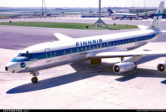
No. 55 - Finnair [+ Centenary Livery]
So I know I'm in the process of writing a bunch of longer posts and thus haven't posted in absolutely forever, but I had to let something cut the line very quickly because in this case it was somewhat time-sensitive. I've missed the actual date by two months, but if I get in a post while it's still 2023 (...in my timezone, at least, so sorry to actual Finns busy enjoying 2024) I think that counts, and this entire blog is about what I think, so that means it counts.

On 1 November 2023 Finnair became the sixth airline to turn 100 years old, consistent with its status as the sixth oldest airline in continuous operation. I wish I'd started this blog earlier in the year, or prioritized differently, because Aeroflot and Czech Airlines also turned 100 in 2023, but...well, I didn't. You'll probably see them both in 2024 instead. Finnair, however, was requested by @kuivamustekala - particularly their centenary liveries. Requested a long time ago, even. So I'm going to hope that late is better than never and throw Finnair one last birthday party to wrap up 2023 by looking at where they started, where they are now, and what they've been doing to celebrate.
1923: PROTO-FINNAIR
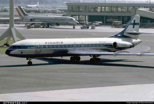
Finnair, obviously the flag carrier of Finland, was founded in 1923, but its first service was in early 2024, using a Junkers J.13 (fitted with obligatory floats, as there were no suitable airstrips in Finland at the time).

image: Joseph Eaton via US Navy National Museum of Naval Aviation
This is actually the US license-built version, the Junkers-Larsen JL-6, but I couldn't find any pictures of actual J.13s on floats.
Unfortunately, Finnair was founded under the name 'Aero', which is probably the actual single worst name for an airline I have ever heard. We can jest and joke about things like Jet2 and Fly Air, but I sincerely do not think I have ever seen anything with worse SEO than an airline named 'Aero'. Even for 1923 this was fairly dire - back then, as for much of history, airlines were generally named for the area they served. Aero may have been a private company, rather than state-owned, but that didn't mean they couldn't name themselves for the area they served - private airlines have always done this and still do. Incredibly enough, there was a second 'Aero' founded in Poland in 1925, but that was quickly merged into what would become LOT Polish Airlines, shedding the name like a chrysalis.
Bafflingly, even when the Finnish government bought the airline in 1946 (they still own a majority share of it today) they didn't bother to change the name. They did begin writing 'Finnish Airlines[1]' on the fuselages, but as far as I can tell this appears to have been more of a stylistic flourish of sorts than an actual rebrand, or maybe even a clarifying subtitle on the very nonspecific name. In 1953 they began marketing under the much catchier 'Finnair', but the company remained legally named 'Aero' until literally 1968 and the fuselages still read 'Finnish Airlines'.

image: Finnair
An Aero/Finnish Airlines Convair 340, photographed in 1953 in a livery which included both the large 'Finnish Airlines' wordmark and 'Aero' on the tail.
Early Finnair, like most early airlines, didn't have a particularly standardized livery for its fleet, and even where it did it's not very well documented. Finnair unfortunately has some of the poorest documentation for livery evolution of any large airline I've discussed so far, which really surprised me. That said, it's when the name became Finnair that things begin to be easier to find, and so that's where I'll begin.
1968: CLASSIC FINNAIR

This original logo[2], introduced in 1968, was designed by Kyösti Varis - at least, that's what every logo database I looked in said. I actually couldn't find either Finnair or Varis confirming this[3], but I still think it's probably true. Unlike designers like Vic Warren and Lindon Leader, who wrote and gave interviews about their designs for major airlines, Varis appears to have other preoccupations. He is enormously successful and prolific, to the point where his website doesn't even mention Finnair. According to the timeline he provides he would have either been creating this logo freelance or in his very last days at Advertising Agency SEK (probably the latter, since they did the two subsequent iterations), and based on his history as a typographer I think it's safe to say the letterforms are his creation as well. Also according to his timeline, he is younger than Finnair! And we almost have the same birthday.
I like the original Finnair branding. It's not ostentatious, but it's nice and sleek, with that forward slant I love in airline branding and a long unbroken line (both in the 'F' logo and in the even heights of the letters in the wordmark). It looks aerodynamic and the rounded, blocky letters have a hint of that 60s futurism while not being gimmicky. It's kind of incredible looking at it next to the '91-'94 FedEx wordmark, which occupies the opposite end of the sliding quality scale of TRON-looking text. The design as a whole is simple enough to easily reproduce but distinct enough to easily recognize. The shade of blue chosen is a fair bit lighter than the blue of the Finnish flag, but visually pleasing enough. They basically keep iterating on this general concept for the rest of their history, which I think is fantastic - no need to get rid of something that's working for you. It's nice to see an airline not feel pressured to reinvent its logo and livery every 20 years. That's about it for the logo[4] - what about the livery?
As mentioned prior, Finnair's liveries, before quite recently, were very poorly documented. Variants definitely existed between different types and different periods in the company's history, but the broad strokes of the branding seem to have remained almost startlingly intact for around thirty years.

image: Letterform Archive
The cover of a style guide from 1985. If it's changed from the 1968 original, I can't tell how.
But I'm really here to talk about one thing: the liveries.

The above image was from Finnair's own archive and was taken in 1968[5], making it contemporary with the introduction of the Kyösti Varis branding, as well as lining it up with the 1969 addition of DC-8s, like the pictured airframe.
For the majority of Finnair's history, their livery is always going to look something a little bit like this. Primarily white, with a thick blue cheatline (in what I call the domino-mask style, where it's vertically centered around the cockpit windows) that lightly flips up at the very end and a blue cross on the tail to represent the Finnish flag.

Finnair says this image is from 1960. If so, the livery was already well on its way to existing prior to 1968, with my guess being that it was introduced in 1960, along with the first jets in Finnair's fleet - the pictured Sud Aviation Caravelle, which pioneered the swept-wing, aft-engine format later seen on immensely popular jets like the DC-9 and Tu-134 - the latter of which was commissioned specifically because Nikita Khrushchev was so impressed with the Caravelle's aft engines and the quiet cabin experience they provided. It's a plane with a lot of unique visual features, featuring a nose that looks almost slanted downwards (a copy of the de Havilland Comet nose), a cruciform tail (instead of the more efficient T-tail used for future rear-engined designs), and triangular passenger windows. Most crucially, though, it was more or less the first short-range jet on the market. This made it perfect for an airline like Finnair, which at this point didn't really go that far from actual Finland.
This 1960 photograph provides a very strong blueprint for what was to come. It's the first iteration of the livery to say 'Finnair' instead of 'Finnish Airlines', and it's introduced a modern-for-1960 single-rule cheatline, although this early version was flipped horizontally, curling up at the front to frame the cockpit windows instead. (I think the white paint also cuts off behind it, leaving the space in-between the cheatline and painted nose blank metal, but in black-and-white it's somewhat hard to tell.) I do think I prefer the modern version. The use of the white downward curve with no blue hemming it in creates a really nice effect where it blends with the unpainted metal underside, due to the metal being right where you would expect to see a shadow anyway. (This effect is why I'm not quite sure where the paint ends on the Caravelle, and am just guessing based on which parts are noticeably reflective.) I definitely prefer the change made to the tail, where the single line of trim at the end of the rudder was replaced with a white canvas for the Finnish flag.

While I do tend to have a slightly pessimistic outlook on primarily-white liveries, I will say that if you're going to have a primarily white plane, and you are the flag carrier of Finland, this is a fairly understated and stylish way of incorporating it. While I probably would have done it on the main body, over where the first set of doors is, instead of on the tail, I think this is far from the end of the world. What they have is a nice, elegant taper where the tip seems to point directly at the tailplane, and it looks neat and intentional. A lot of airlines tend to just awkwardly slap a logo on their tail, which often looks really sloppy due to poor alignment or even just out-of-place entirely, and Finnair avoids that while keeping the tail from being completely blank. Having an element on the tail that's more horizontal than vertical, like the old 'AERO' rectangle or the tail rectangle on the one decent livery Lufthansa ever had.
If you look in the background, you can see that wow has the Olympic Air livery looked like that for a long time! But that's a story for soon.
Additionally, some details were added on the nose. You can see on this DC-8, photographed in 1969, that the nose features an e-girl cheek stamp of the Kyösti Varis logo. Next to it is the name of the aircraft - in this case, Jean Sibelius - in really difficult-to-read thin text. (Finnair unfortunately appears to have stopped naming their planes by the late 1970s, but at one point they would frequently be named for Finnish people and places.) The 'domino mask' goes quite a bit beyond the cockpit windows to create a wider line from the side. I wish that the logo could have been integrated some other way, because the extra little blue thing just looks cluttered, but I can't imagine how they would do it without just replacing the cheatline. I mean, that would have been an option - indeed, it's what I would have done[6] - but assuming that they keep this general look I think the logo just can't fit in on the livery. The engine nacelles, maybe? Though that would still present issues on the Caravelle, where the engines are directly over the cheatlines. I also wish they would have made it a bit easier read the name, because I like to know what the plane's name is - thankfully, some later paint jobs actually do this before, tragically, Finnair stops writing names on their planes at all.
I believe this to be the strongest iteration of the classic Finnair livery, and it was pretty obviously optimized for the DC-8. Modern airlines tend to not bother adjusting their liveries between types, creating some absolute travesties of proportion, but Finnair boldly went in the opposite direction by modifying it for each airframe and yet still having it look worse.

The sharpest deviation arises in the CV-440 version of the livery. This image is from 1971, just two years after the DC-8 liveries would have carried their first passengers, and it's wildly different. The cheatline is lowered sharply, sitting below the cockpit windows and wrapping around to contour the body of the airplane. There's a certain je ne sais quois to the domino mask that I find myself missing here. This design also has an unnecessary second 'Finnair' added to the tail, which kind of looks awkward stacked on top of the existing cheatline besides being redundant, and the Finnish flag on the tail is somewhat awkwardly made free-floating. It feels a lot less sleek and a lot more arbitrary.
On the other side of the plane the cheatline goes down quite a bit farther than on the jet models, probably because they thought it would be a better way of negotiating the Convair's rather bulbous nose, and I actually think I prefer the wide, upturned variant. This version, if anything, is too close for my taste to the livery VARIG operated in a similar timeframe. There are a lot of differences, yes, but in the 70s having one big solid cheatline on a white body and metal underbelly was the equivalent of the Lufthansa Line, so if you toed said line, be it cheat or Lufthansa, you risked becoming easily mistakeable for any airline with too similar of a color scheme. And blue-on-white was maybe the most common color-scheme at the time.

I doubt Finnair shared many tarmacs with VARIG, but here they are with Pan Am, and they could also expect to run into airlines like Sabena, Icelandair, and probably a half-dozen I've never heard of, all competing to be the one the others get mistaken for. It's a tricky position to be in.

I do quite like the livery on the left, maybe even more than the DC-8 one, but I can't seem to find any other airframes painted like this. I'm not sure why this one is.
These images are from 1971 and 1969. They are both the same model of airplane - the Super Caravelle or Caravelle 10B. Their liveries are completely different. And that's just how it was back then - not even standard within the same airline, somehow still trying to stay distinct from dozens of other non-standardized blue-on-white cheatlines.
When evaluating classic Finnair, I have to keep myself tempered in both directions. When I think it's clean and well-proportioned I have to remind myself that it's just a complete nothingburger. When I think it's a lazy and cowardly non-design I have to remind myself that, no, at its best classic Finnair does look like it was designed with some thought, and it does have some traits that feel at the very least interesting enough to merit not being totally dismissed.
But...look, I have to give classic Finnair a D+. Because they tried, and they did something, sure, but it's ultimately not something especially memorable and the implementation is just spotty.
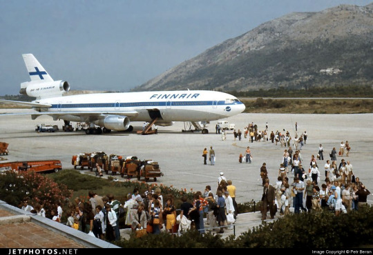
Even given a canvas like the DC-10, they fumbled. The DC-10, in my opinion, was a big test for them. And I do mean big. In the DC-10 is a plane with all the space in the world to add visual elements, and a space where just a couple lines can go from a detail to a fin that towers over anything that isn't a 747, showing off the Finnish flag as if someone had flown it from a building mast. The third engine, which I feel like a lot of airlines really struggle with on the DC-10, gets a nice horizontal line of writing that's not intrusive but helps prevent it from feeling like a giant gap. The wordmark gets larger, is moved forward, gets to really own the space it takes up instead of being squeezed in. And...they made the cheatline just....a really thin flat line that looks bad and stiff and boring. There's nothing setting them apart from Icelandair, and Icelandair's livery from this point in time was so boring that my only comment on it was that it looked like they forgot to paint the rest of the plane. You can do white planes well, but Finnair just really doesn't get there.

...hey, Finnair? You can't just decide to do belly stripes but worse, Finnair, you're literally next door to like two thirds of SAS and that livery was designed from the ground up. They have a couple of near-misses with SAS's toes but this is the one that makes me actually go 'is this allowed?'. It seems to have been exclusive to their late-80s MD-80 fleet, but it's just incredible to me that it ever happened. (That said, those three shades of blue are so nice together and I wish they had ever brought them back. I understand the appeal of sticking to the stark contrasted blue-on-white of the flag, but there's so much potential out there!)
1997: NEW TYPE, NEW LIVERY

I really like the 757. It deserves a better livery than this.
Removing the cheatlines was a very trendy choice to make. This is the sad beast I call the Deltalite - a Deltalike but without the painted nacelles and belly that are usually slight redeeming factors. There's such a beautiful design on the tail that could have been put on the whole fuselage, honestly, and that's sad, but even on the most granular of levels...why keep the little cheek stamp if you have the logo visible on the tail now? Weird choice. Being so desperate to do the Deltalite thing everyone else is doing that you get rid of your country's flag on the tail is just a bad choice of priority, I think. There's not much to say about this. Honestly, I'd drop it to a D-. There's enough happening that it would lose something by being painted into Star Alliance colors, but it wouldn't lose terribly much.
2000: NEW FINNAIR

Oh, Finnair. Why? Did no airline resist the siren song of getting way too into airbrushing in the early 2000s?
Maybe I just have whatever the opposite of nostalgia is for the early 2000s, but this just makes me sad. They've made the wordmark look worse, overcomplicated the simplicity of the logo, and gone ham with the gaussian blur.

Look, it's not all that bad. The shades used on the actual plane are noticeably darker, and the colors at least don't look half bad now. And they've even bothered to paint the engines this time around! But...come on. You've changed 30 years of something that was working just fine for...this? Something which maybe climbs up to a flat D?
The 2000 brand overhaul, including the logo, was done by Finnish agency SEK & Grey. They're nearly as old as Finnair and have worked for brands as prominent as Coca-Cola and Kellogg's, but their about page puts Finnair front and center. They have an entire page describing their Finnair work.
Despite claiming to have included humanity and warmth and movement, I see none of this. I'll admit upfront I generally dislike what's dubbed 'Nordic' design. It's not the minimalism which I dislike but the banality.

What does any of this have to do with Finnair? What here represents the history of one of the world's oldest airlines? What here really speaks to the Finnish people? Why is just designing something generic and making sure it's all crisp (when you're photographing it fresh out of the plastic, before it's been tripped over and stepped on and yanked down staircases and accidentally sat on and stained with tea) considered a substitute for designing something that people will see years down the line and get nostalgic for? I'm nostalgic as hell for Alitalia, an airline that doesn't exist anymore. I still use the bag from an amenity kit I got on Alitalia nearly ten years ago to store small essential things like toothbrushes and medication while traveling, but I wouldn't know it was Alitalia by looking at it, because it's lovely and convenient and ergonomic but it's literally just grey. It evokes nothing, and it doesn't even say 'Alitalia' on it anywhere. Nothing here could ever be considered ephemera or memorabilia. I could steal Finnair's look at the Gap.
2010: SORRY, HERE'S NEW FINNAIR FOR REAL THIS TIME

SEK & Grey gave it another shot. This one's a lot better.
I like the change in the logo, first off. And this, the word 'Finnair', is the logo, but I'm comparing it to the earlier wordmark. 2000's attempt felt like it was taking the original and just trying to sand off the corners to make it more modern, but the 2010 take on it actually shapes each glyph into a neat little space-age thing that creates this curved shape by way of a lot of straight lines, in a way that feels visually pleasing and interesting. I enjoy the square holes in the A and R, the return of the crossbar on the N, and the extreme range of widths which gives the letters a real weight to them. This isn't a typeface - these glyphs exist in the context of the word FINNAIR in this exact configuration and one of four colorways. Finnair does have a proprietary typeface, Finnair Sans, and it looks nothing like this because this is not a font, it's a logo.
I think it is a shame that this is the logo now. I really liked the F. And they haven't gotten rid of it, but it's now been relegated to an official subordinate position, according to their branding guide:
The official Finnair logo is the text version of the logo, and it is primarily used. The F emblem is used as an additional symbol.
Look, I'll always think it's a shame when your main logo is just the name of your company. Some airlines do it, and it feels like an empty space to me. It can be satisfactory but not outstanding. When you start out with a nice little symbol and then take it away, though, I do feel somewhat robbed.

It stings extra because I really like the way the new F looks. It has that long brushstrokey look and it almost makes me think of Hebrew characters. The way it tapers now really adds to the feeling of movement I get from it, and it's a great base for a livery. Now that it's darker, even though this does bring Finnair into competition with airlines like SAS, LOT, TAROM, Lufthansa, and even Ryanair when it comes to dark-blue-on-white, it also contrasts better with the main body, and it's still light enough that you can recognize it as blue. Anyway, it doesn't take a genius to know how to integrate this into a livery. Long line for the fuselage, go up to match the tail...

Finnair. Are you serious, Finnair?
Look! I get it! Billboards are in now, it's fine, I get it. it's probably the nicest billboard I've seen in a while, font-wise. It feels comfortable on the fuselage and it feels like it earns the space it occupies. The F is nicely centered on the tail, cuts off at a pleasant point. But...why?
I really can't be too mean about this. I want to be meaner than I actually can justify, because I think if any other airline made their plane this featureless I would hate it but Finnair's billboard livery is actually nice enough and everything is placed well enough that it's not at all unpleasant to look at. It's an acceptable livery. If maybe 25% less planes were basically all white it would shoot up in my esteem. I don't really like the fact that they put the little Fs on the inside of the wingtips of their A350s, but that's really my only nitpick. It's just sort of...bringing a really fantastic loaf of bread to a potluck when you were asked to bring baked desserts. You've done a very good job, but you didn't quite get the assignment.
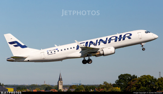
It's a bit hard to critique the modern Finnair livery in detail because I think it's executed fine. There's nothing really wrong with it except that it has a logo that could lend itself to all sorts of interesting shapes, it has 30 years of variants of a very specific design to draw on, and it's chosen to go tabula rasa just to be all clean and minimal instead of doing any of the interesting things it could have with this new start.
I want to dislike this take on the Finnair livery, but at the end of the day I just don't. I think it's completely satisfactory. A lot of airlines try to get this look and somehow end up seeming cluttered for it. Finnair is one of the only instances I can think of where a white fuselage with just a wordmark has looked okay. It isn't ugly. It hasn't failed at the thing it's trying to do, but I think that it should have tried to do something else.
At the same time, though, this is the most Finnair that Finnair has ever been. The blue cheatline and the Deltalites were stumbling over well-trod ground. The modern livery, at least, isn't sloppily tail-heavy and seemingly thoughtless.
I give modern Finnair a C. This took an excessive amount of deliberation, but it really is...good enough. It's satisfactory. It's fine! I would have taken a completely different direction, but they have done a good job with their sort of lackluster idea. It's alright. We'll check on them again in another hundred years and see where they're at.
2023: CENTENAIRY

A century is a very long time. Finnair is older than my oldest grandparent. Finnair is older than over a dozen sovereign countries. Finnair is older than aerodromes in Finland. It's older than every currently operating airline except KLM, Avianca, Qantas, Aeroflot, and Czech Airlines. As of the first of November, Finnair is in triple digits.
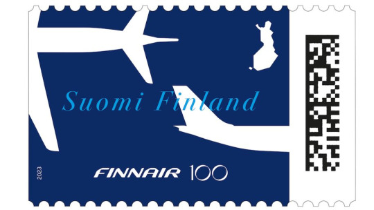
I adore this centenary stamp Finnair has put out, celebrating the long relationship between aviation and the mail. It's not complex, but it's not barren, either. It combines the dark blue of the modern livery with the light blue of the classic one, all with the white silhouettes of airplanes elegantly soaring over an outline of Finland. The outstretched white wings on the deep blue have the grace of a giant fish swimming beneath a glass-bottomed boat.
But of course it isn't just stamps. Finnair is an airline. Airlines do special liveries. Qantas and KLM both slapped a big 100 sticker on an airplane for their big anniversaries. Finnair has of course done something similar.
Three airframes - the pictured A350-900, OH-LWR, and two A320s - OH-LXK and OH-LXM - have had a 'bringing us together since 1923' sticker applied. Matching the rest of Finnair's branding, it's certainly quite minimal, but it's a nice gesture. It's not what people have been talking about. That's OH-LWO and OH-LWP, both A350-900s, who have been given something more substantial to wear.
youtube
I'm going to assume that after its renaissance on tumblr a few years back most people reading this are familiar with the Moomin franchise. I definitely am, because when I was in my larval stage my mother first taught me to read Russian using an omnibus book of Moomin stories. Creator Tove Jansson apparently designed both the shape of the eponymous white critters and the sound of the name Mumintrollen itself are designed to evoke a feeling of softness, and it's clear why these characters are so beloved.
It isn't the first time Finnair, which frequently collaborates with Finnish brands and highlights its Finnish roots, has featured Moomins.


image on left: Antti Havukainen
In the 1990s, the airline first flew a Moomin jet. They had another in the 2000s. Both were withdrawn from service before 2010. It's been a while now since Finnair flew their last MD-11, but when celebrating their 100th birthday, a milestone that the vast majority of airlines will never see, they chose to do it by way of a soft Moomin embrace.
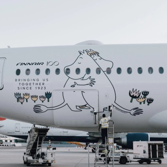
image: Changi Airport
And, I'll be honest, I think it's very sweet. It got an actual, sincere little smile out of me.
100 years is a really long time. In 1923 aviation was unrecognizable. What we would now consider an airliner didn't really exist yet - space for ten passengers, closed cockpits, and metal fuselages were the exceptions rather than the rule, and the Ford Trimotor was two years from its first flight. Cabin crew were barely even a concept. Airplanes, for all intents and purposes, were considered a type of boat. A nonstop flight across the Atlantic was a ridiculous concept. In a report published by the US National Bureau of Standards, it was said: 'there does not appear to be, at present, any prospect whatever that jet propulsion of the sort here considered will ever be of practical value, even for military purposes'. There were no aerodromes in Finland, so a small company called Aero attached floats to a plane just large enough for four passengers and took them from Helsinki to Tallinn.

Look how far we've come.
Footnotes:
[1]: The Finnair website's history page, which I used as a source for much of the background and several images in this post, renders it as 'Finnish Air Lines', but on the airplanes themselves it clearly has no space, so I've corrected that seeming error for them. I don't know why this discrepancy exists, because as far as I know during this period they were marketing themselves as Aero so this text would only have existed on the livery itself.
[2]: Actually, I very occasionally see this version where the F logo isn't fully surrounded by the circle and the F in the wordmark doesn't have the rounded top, and I don't know which came first or if the less round version is just somehow...not real? I did try to figure this out, I swear, but at some point I realized I am literally not a professional logo historian, and nobody is going to be let down if I don't brute-force an answer despite not even speaking Finnish, and I should finish writing the post before it's 2024.
[3] The closest thing to an official source I can find is the descriptions of two listings for the centenary stamp including a quote from designer Ilkka Kärkkäinen attributing it to him. I don't at all doubt that he did design it, but I always like to find concrete attribution for things if I can and would hate to spread misinformation and the sparseness of confirmation here is something I find very strange. My best guess is that there's plenty of good sources on it in Finnish but nobody has bothered to make it as clear in English.
[4] Admittedly this is a stretch, and I certainly don't think it was intentional, but it does remind me of the longship prow used in early SAS liveries. This motif was introduced in 1946 and continued to see use after the Finnair logo was introduced. The overlap is fairly limited in that SAS never used the longship in their logo (...I kind of want to talk about their logos one of these days) and the Finnair livery you'll see shortly doesn't look like SAS's at all, plus SAS has the extra pink on their liveries, but I couldn't get it out of my head that they do look sort of alike.
[5] The absolute hero who uploaded it to jetphotos mentioned that Finnair had given him the photograph while planning to dispose of it, and this makes me wonder if the lack of documentation is just because Finnair doesn't hold onto their old materials, which makes me very sad. A lot of companies, more broadly, didn't bother to keep records until somewhat recently, but in Finnair's case it seems to be particularly egregious. As someone literally studying to be an archivist it makes me exceptionally sad to see history lost just because nobody cared enough to preserve it.
[6] Maybe they didn't want to look like backwards SAS. Who can say?
#tarmac fashion week#finnair#grade: c#grade: d+#region: finland#grade: d#grade: d-#region: northern europe#era: 1960s#era: 1970s#era: 1980s#era: 1990s#era: 2000s#era: 2010s#era: 2020s#special liveries#commemorative liveries#requests
50 notes
·
View notes
Photo

Mikleo’s 6☆ Evolution image from the “ Celebration!! As-yon’s First Anniversary!“ event (January 21, 2019 to February 7, 2019)
129 notes
·
View notes
Text
The myth of Apollo (3)
A continuation of these posts.

III/ Towards the perfection of the divine
With Plato, the perception of the god changes completely. The philosopher doesn’t see in Apollo just one Olympian among others: he makes him THE god by excellence. The evolution that Pindar started now reaches its peak. Closely associated with Helios (so closely in fact that we can almost talk of an assimilation), Plato’s Apollo becomes the supreme god, the unique god, the “divine essence” of which the other deities are mere aspects of. Through the character of Apollo it is the Platonic doctrine that is expressed, in a symbolical ay. It is why, despite their ludic function, the various etymologies of the “Cratylus” must be considered very carefully (see the article “Apollo, the mythical sun”). As Apolouon, the god who washes, he represents purification of both the body and the mind, and reminds us of “Phaedo”. As Aploun, he highlights the link between unity and truth, and reminds us of “Parmenides” and “Philebus”. As Aei ballôn, he who always hits/reaches, he is infallibility and perfection. As Homopolôn, the simultaneous movement, he is harmony – as musical as celestial, the harmony of the spheres and the celestial bodies ; and we think of the “Timaeus”, or of the myth of Er at the end of the “Republic”. The respect carried here for the religion of Delphi is not a passive submission to the tradition: piety becomes the foundation of metaphysics. In this context, we can understand why Plato violently rejects the image of a lying, grudge-bearing, bloodthirsty Apollo as he appears within Thetis’ speech in the fragment of Aeschylus’ “Judgement of the Weapons” (quoted before) – a fragment which was preserved only because Plato denounced it within his “Republic”.
Prepared by Pindar, ensured by Plato, the greatness of the god, now the incarnation of the divine unity, will now definitively impose itself. The killer of Achilles, Koronis or Cassandra is now far away: with might now comes moral perfection, and unity replaced multiplicity. It is what Plutarch means when, during his list and comment about the various explanation of the mysterious “E” inscribed in the temple of Delphi, he finally concludes that it means: “You are”.

IV/ The Roman Apollo: politics and religion
We know the famous sentence of Horace: “The conquered Greece conquered its fierce vanquisher” (Epistles). The history of the Greek Apollo within Rome illustrates this line. It is true that we have to account for other influences that nuanced and “filtered” the Delphic presence and adapted it to the mentality of the Roman people: the Falisci beliefs and rites, the Etruscan legends and cults, the fact that the Cumae Sibyl originally belonged to an ancient chthonian goddess… But we can still easily follow a clear progression of the god. Beginning of the 5th century BCE: Tarquin the Superb (Tarquinius) sends two of his sons to the Pythian oracle. 433: a temple is dedicated to Apollo on the Field of Mars. 212: The first “ludi Apollinares” are celebrated. The 2nd of September of 31 BCE: Octave crushes in the waters of Actium the ships of Antony and Cleopatra under the sight of Apollo, who is honored on the promontory that dominates the entrance of the Ambracian gulf.
From this moment on truly begins the entrance of Apollo within Latin literature. (Ennius, Naevius and Lucilius all evoked him, but in a shy and discreet way). Octavius, who will soon be called Augst, cleverly organizes the propaganda. He has a rumor spread according to which Atia, the mother of the new sovereign, conceived him with Apollo. The victory of Actium becomes the “miracle of Actium”. In the year 28, a temple is dedicated to Actian Apollo on the Palatine Hill, right next to the palace the prince had built for himself. On the cuirass of August’s statue (the one found at Prima Porta), Apollo is depicted riding a griffin with a lyre in his hand, while facing his sister Diana, riding a stag and holding a quiver. Apollo, after being the one who caused the victory, becomes associated with the work of peace, the “Pax Augusta” – for he is the god of harmony.
The authors participate to the Augustinian work. Already, well before Actium, in the year 40, in his fourth “Bucolic”, Virgil was announcing the rule of Apollo. Within the “Aeneid”, Apollo plays a major role: it is him that gives to Aeneas and his companions the order to regain the land of their ancestors. He is also Aeneas’ protector, and just as beautiful as the Greek poets painted him: “ the god walks on the yokes of Cynthia, his flowing hair softly pressed with foliage and crowned with a gold diadem ; ad his arrows rustle on his shoulder”. He finds back all of his old functions: he is a prophet, a musician, an archer and a healer. He is “the greatest among the gods”. As for Horace, he opens his “Carmen Saeculare” by an invocation to the two children of Leto – the “Carmen Saeculare” being sung on the 3rd of July of the year 17 BCE for the celebration of the secular games organized by Augustus: “Phebus, and you, Diana, queen of the forests, luminous jewel of the sun, you, always adorable and always adored”.
During the episode of Daphne, in the first book of his “Metamorphoses”, Ovid does treat the god with some disrespect. Apollo is vanquished by the child-Cupid that he disdained. Overtaken with desire for Daphne, he hopes to be able to unite himself with her, “fooled by his own oracles”. He gives her a very eloquent speech, that the nymph refuses to listen to as she flees away from him. And right as Apollo is about to reach for her, Daphne, turned into a laurel tree, escapes him forever. However, if we look at the way Ovid treats the gods in the entirety of his “Metamorphoses”, we do note that Phoibos-Apollo has a more important role than the others. The others gods are not presented with any kind of dignity and do not seem to fit their ranks: they are only seen embroiled in romances or taking part in petty quarrels. On the contrary, Ovid’s Apollo, just like the one of Virgil, has all of his Antique functions – he is an oracle, he is a medicine spirit, he is a musician, and to all of this is added the art of the metamorphoses, an art pushed to a level of science. He is the god of harmony and of light. His identification with the sun which, throughout the previous century was sometimes clear sometimes underlying, is here expressed with no hesitation in the speech Ovid gives to Pythagoras. With the Augustan Apollinism, the depiction of the god shifts to a solar theology, that the successors of Augustus will all make use of. The god of Lycia, the god of the wolves, is forgotten. Apollo is now the figure of light, the harmonious and perfect spirit, and it is as such that he is now forever imprinted in our cultural subconscious.
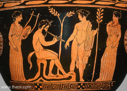
#greek mythology#roman gods#apollo#roman mythology#apollon#greek gods#plato#ovid#virgil#helios#the myth of apollo
13 notes
·
View notes
Text


[Translated from Spanish]
Louis Tomlinson chose Argentina once again to enjoy the time before his show on May 18, nothing more and nothing less than at the Vélez Sarsfield Stadium in front of 40,000 people. His last visit to the country took place under the framework of his concert at the Movistar Arena, in mid-2022 with the presentation of his debut solo album Walls, so the fans wanted to be able to see it again and share some time with him.
To the good luck of those present last weekend at the Four Seasons hotel in Buenos Aires, Louis took some time to greet each and every one of them on the street, where minutes before he had spoken with various media about how he prepares for this great show, which in his own words "is a great leap in his career."
In this show, he will present his latest studio album, Faith In The Future, which has hits such as "Bigger Than Me", "Out Of My System" or "The Greatest" and which he presented in an exclusive listening at The Roxy Bar & Grill at the end of 2022.
You have already stepped on the field of Vélez, you even had the opportunity to score a couple of goals, how did you feel?
Very good to be honest, but I'm not going to lie to you, I think I injured my quadriceps, I'm not very fit these days (laughs). As a soccer fan it's beautiful to be able to play on a field in good condition, I was able to kick some penalties, score a couple of goals... It was a great day.
Especially in Argentina, a country so passionate about football, did you have the opportunity to know anything about our football culture?
Totally, I saw the videos of the celebration of the World Cup, five million people... It was crazy. I love that, football is my other love after music. Having so many people who love the same thing as me makes me feel at home, it's very nice.
When you stepped on the grass, could you imagine how crowded it will be in your show?
It's something very difficult to imagine. You have the idea because you look at the place and you could have the image of what it will be like, but I really don't think you have the true feeling until you go on stage. It's a reaction that is always shocking to me, because although it's real, and you can have an image in your head of what it will look like, you can't imagine how it will feel to get there and go on stage with so many people. I'm excited to be able to feel it.
Did you prepare something special for our audience?
I think I'll probably be bringing... The setlist will be a little different... Maybe bring some of the old songs, make new covers... I would like the show to feel a little different from the last ones we did, so there will be some new additions.
You recently commented that Anitta was your favorite Brazilian singer. We are a little jealous.
It's fair, I get it, I get it. Give me a minute... Where is it? (Take a paper out of your pocket) I have a couple of names... Here I have it, look at this: WOS, Airbag, Cerati, do you see it? Are they okay? I have three here.
From the Movistar Arena two years ago, to this show in Vélez, what differences can you notice?
The truth is that I can't tell you... It seems that I made a very good record, and the jump is huge. It's something I don't know what to expect, because since I didn't know what my first show would be like, I wasn't very aware of what the evolution would be like from there. I feel very grateful to be able to be in these beautiful places, the stadiums, the arenas... I feel very lucky to be able to have the opportunity to do it again.
Throughout your career you have been present multiple times in both the Hot 100 and the Hot 100 Argentina, is it something that worries you when it comes to creating songs?
It's something I try not to be too worried about. I think that sometimes, when you try to create something for playlists, for radio or something similar, the panorama of the imagination changes because it becomes a more linear path. I was particularly enjoying writing a lot, regardless of the success that the track will have. A lot of what I do when I write is oriented to the live show, and later it is molded for the radio.
Are you working on something special for this year?
I wrote about four or five songs for the new album. By the end of this year, I think I'm going to start writing a lot more, with the intention of presenting a new album next year.
15 notes
·
View notes
Text


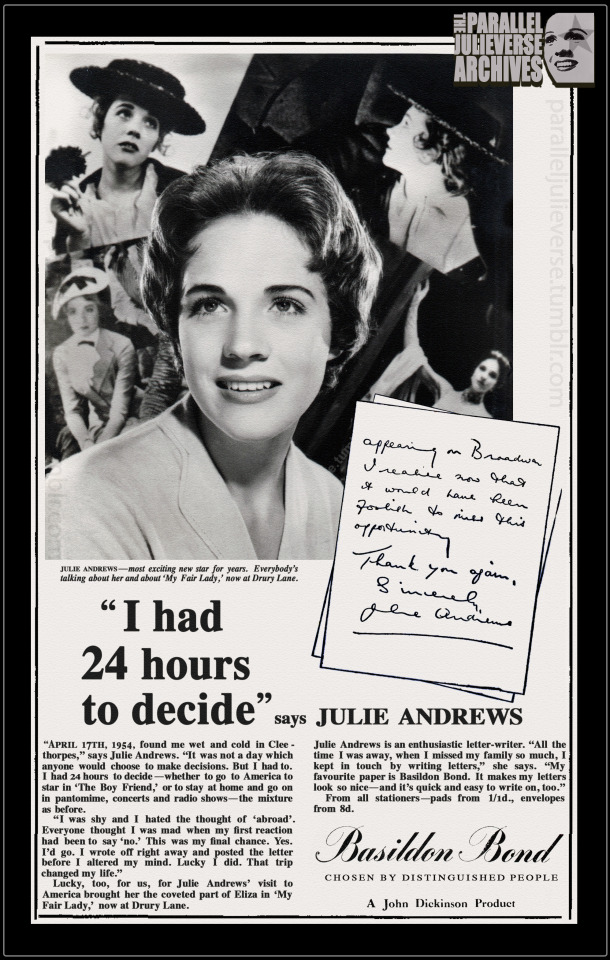
Come taste the wine... : 70th anniversary of Julie Andrews's 'cabaret debut' at the Café Dansant, Cleethorpes,
3 performances
Easter, 14-17 April, 1954
This week, seventy years ago, Julie Andrews made her official 'cabaret debut' at the Café Dansant in Cleethorpes. While not a major milestone in the traditional sense -- and one that seldom features in standard Andrews biographies -- the Cleethorpes appearance was nevertheless a significant event in the star's early career.
For a start, it was Julie's first appearance in cabaret -- the theatrical genre that is, not the Broadway musical which is a whole other Julieverse story. Characterised by sophisticated nightclub settings with adult audiences watching intimate performances, cabaret emerged in fin-de-siècle Paris before expanding to other European cities such as Berlin and Amsterdam (Appignanesi, 2004). Imported to Britain in the interwar years, cabaret offered a more urbane, adult alternative to the domestic traditions of English music hall and variety with their family audiences and jolly communal spirit (Nott, 2002, p. 120ff).
Julie's debut in cabaret was, thus, a significant step in her professional evolution towards a more mature image and repertoire. By 1954, Julie was 18, and well beyond the child star tag of her earlier years. Under the guidance of manager, Charles Tucker, there was a calculated strategy to reshape her stardom towards adulthood.
The maturation of Julie's image had begun in earnest the previous summer with Cap and Belles (1953), a touring revue that Tucker produced as a showcase for Julie, comedian Max Wall, and several other acts under his management. Cap and Belles afforded Julie the opportunity to shine with two big solos and a number of dance sequences. Much was made in show publicity of Julie's new "grown up" look, including the fact that she was wearing "her first off-the-shoulder evening dress" ('Her First Grown-Up Dress', 1953, p. 4).
The Cleethorpes cabaret was a further step in this process of transformative 'adulting'. Indeed, it was something of a Cap and Belles redux. Not only was Max Wall back as headline co-star, Julie even wore the same 'grown up' strapless evening gown. In keeping with a cabaret format, though, Julie was provided a longer solo set where she sang a mix of classical and contemporary pop songs including "My Heart is Singing", "Belle of the Ball", "Always", and "Long Ago and Far Away" ('Cabaret opens', 1954, p. 4).
That Julie should have chosen Cleethorpes for her cabaret debut might seem odd to contemporary readers. Today, this small town on the north Lincolnshire coast is largely regarded as a somewhat faded, out-of-the-way seaside resort. In its heyday of the mid-twentieth century, however, Cleethorpes was a vibrant tourist hub that attracted tens of thousands of holidaymakers each year (Dowling, 2005). With several large theatres and entertainment venues, Cleethorpes was also an important stop in the summertime variety circuit, drawing many of the era’s big stars and entertainment acts (Morton, 1986).
The Café Dansant was one of Cleethorpes' most iconic nighttime venues, celebrated for its elegant suppertime cabarets and salon orchestras. Opening in the 1930s, the Café was a particularly popular haunt during the war and post-war era when servicemen from nearby bases danced the night away with locals and visiting holidaymakers to the sound of touring jazz bands and crooners (Dowling, 2005, p. 129; Ruston, 2019).
By 1954, the Café was starting to show its age, and incoming new management decided to shutter the venue for several months to undertake a luxury refurbishment (‘Café Dansant closed', 1954, p. 3). A gala re-opening was set for the Easter weekend of April 1954, just in time for the start of the high season (‘Café Dansant opens', 1954, p. 8).
Opening festivities for the Café kicked off with a lavish five hour dinner cabaret on the evening of Wednesday, 14 April. Julie was “one of the world famous cabaret stars" booked for the gala event, and she received considerable promotional build-up in both local and national press (‘Café Dansant opens', 1954, p. 8). There was even a widely circulating PR photo of Julie boarding the train to Cleethorpes at London's Kings Cross station.
In the end, Max Wall was unable to appear due to illness, and Alfred Marks -- another Tucker artist and former variety co-star of Julie's (Look In, 1952) -- stepped in at short notice. Rounding out the bill were several other minor acts, including American dance duo, Bobby Dwyer and Trixie; novelty entertainers, Ruby and Charles Wlaat; and magician Ericson who doubled as cabaret emcee.
Commentators judged the evening a resounding success. The "Cafe Dansant has got away to a flying start, after probably the biggest opening night ever seen in Cleethorpes," effused one newspaper report (Sandbox, 1954, p.4). Special mention was made of Julie who “received a great reception when she sang a selection of old and new songs, accompanied at the piano by her mother” (‘'Café Dansant reopening’, 1954, p. 6).
Following her performance, Julie joined the Mayor of Cleethorpes, Mr Albert Winters, in a cake-cutting ceremony and mayoral dance. Decades later, Winters recalled how he still “savour[ed] the memory of snatching a dance with the young girl destined to be a star… [S]he seemed very slim and frail,” he reminisced, “but she was a great dancer and I thoroughly enjoyed myself” (Morton, 1986, p. 15).
Julie stayed on in Cleethorpes for two more performances on Thursday 15 and Saturday 17 April respectively, before returning to London with her mother on Easter Sunday, 18 April. The very next day she commenced formal rehearsals for Mountain Fire, Julie's first dramatic 'straight' play and another step in her professional pivot to more adult content (--also, time permitting, the subject of a possible future blogpost).
A final noteworthy aspect about the Cleethorpes appearance is that it was during this weekend that Julie made the momentous decision to go to America to star in The Boy Friend. In what has become part of theatrical lore, Julie had been offered the plum role of Polly Browne in the show's Broadway production sometime in February or March of 1954 while she was appearing in Cinderella at the London Palladium. To the American producers’ astonishment --- and manager Tucker’s horror -- Julie was initially reluctant to accept, fearful of leaving her home and family. She prevaricated for weeks. Finally, while she was in Cleethorpes, Julie was given an ultimatum and told she had to make her decision.
In her 1958 serialised memoir for Woman magazine, Julie recounts:
“Mummie and I went to Cleethorpes to do a concert. It was a miserable wet day. From our hotel I watched the dark sea pounding the shore with great grey waves. I was called to the downstairs telephone.
“Julie,” said Uncle Charles [Tucker]‘s voice from London, “they can’t wait any longer. You’ll have to make your mind up NOW.”
I burst into tears.
“I’ll go Uncle,” I sobbed, “if you’ll make it only one year’s contract instead of two. Only one year, please.” …
Against everyone’s judgment and wishes I got my way…None of us knew that if I’d signed for two [years], then I should never have been free to do Eliza in My Fair Lady. And never known all the happiness and success it has brought me” (Andrews, 1958, p. 46).
The Cleethorpes ultimatum even found its way into an advertising campaign that Julie did for Basildon Bond stationery in 1958/59, albeit with the telephone call converted into a letter for enhanced marketing purposes. Framed as a choice between going to America and the “trip [that] changed my life” or staying at home in England “and go[ing] on in pantomime, concerts, and radio shows—the mixture as before,” the advert highlighted the “sliding door” gravity of that fateful Cleethorpes weekend (Basildon Bond, 1958). What would the course of Julie's life been like had she said no to Broadway and opted to remain in the UK?
It is a speculative refrain that Julie and others have made frequently over the years. “If I’d stayed in England I would probably have got no further than pantomime leads,” she mused in a 1970 interview (Franks, 1970, p. 32). Or, more dramatically: “Had I remained in London and not appeared in the Broadway production of The Boy Friend…who knows, I might be starving in some chorus line today” (Hirschorn, 1968).
In all seriousness, it's doubtful that a British-based Julie would have faded into professional oblivion. As biographer John Cottrell quips: "that golden voice would always have kept her out of the chorus” (Cottrell, 1968, p. 71). Nevertheless, Julie's professional options in Britain during that era would have been greatly diminished. And she certainly wouldn't have achieved the level of international superstardom enabled by Broadway and Hollywood. Who knows, in a parallel 'sliding door' universe, our Julie might have gone on playing cabarets and end-of-pier shows in Cleethorpes...
Sources
Andrews, J. (1958). 'So much to sing about, part 3.' Woman. 17 May, 15-18, 45-48.
Appignanesi, L. (2004). The cabaret. Revised edn. Yale University Press.
Basildon Bond. (1958). 'I had 24 hours to decide, says Julie Andrews'. [Advertisement]. Daily Mirror. 6 October, p. 4.
'Cabaret opens Café Dansant." (1954). Grimsby Daily Telegraph. 15 April, p. 4.
‘Café Dansant closed.' (1954). Grimsby Evening Telegraph. 28 January, p. 3.
‘Café Dansant opens tonight – with world-famous cabaret’. (1954). Grimsby Evening Telegraph. 14 April, p. 8.
‘Café Dansant reopening a gay affair.’ (1954). Grimsby Evening Telegraph. 15 April, p. 6.
Cottrell, J. (1968). Julie Andrews: The story of a star. Arthur Barker Ltd.
Dowling, A. (2005). Cleethorpes: The creation of a seaside resort. Phillimore.
'Echoes of the past, the old Café Dansant'. (2009). Cleethorpes Chronicle. December 3, p. 13.
Frank, E. (1954). Daily News. 15 April, p.6.
Franks, G. (1970). ‘Whatever’s happened to Mary Poppins?’ Leicester Mercury. 4 December, p. 32.
'Her first grown-up dress.' (1953). Sussex Daily News. 28 July, p. 4.
Hirschorn, C. (1968). 'America made me, says Julie Andrews.' Sunday Express. 8 September, p. 23.
Morton, J. (1986). ‘Where the stars began to shine’. Grimsby Evening Telegraph. 22 September, p. 15.
Nott, J.J. (2002). Music for the people: Popular music and dance in interwar Britain. Oxford University Press.
Ruston, A. (2019). 'Taking a step back in time to the Cleethorpes gem Cafe Dansant where The Kinks once played'. Grimsby Live. 12 October.
Sandboy. (1954). 'Cleethorpes notebook: Flying start.' Grimsby Evening Telegraph. 19 April, p. 4.
12 notes
·
View notes
Text
[ALT TEXT: Two Archaeopteryx . On the left, a drawing by a palaeontologist- black and white, feathered. On the right, an image of a 3D Archaeopteryx in the game Paleo Pines- both wings outstretched, eyes closed, looking up. This Archaeopteryx is bright pinks and lilacs.]
Our resident Paleontologist, Natalia Jagielska is back to give us a rating on how accurate our little Archaeopteryx is and throw some dino truths our way.
The Bare Bone Basics:
The fossil celebrity! Found in Germanic limestones in 1860s (almost 200 years ago!), it paved our way in understanding dinosaur evolution and the onset of avian flight. This feathered animal lived around warm, shallow lagoons in Jurassic Germany. Its fossils were preserved alongside hundreds of crustaceans, fishes, pterosaurs and occasional dinosaurs.
An Interesting Story:
Only a handful of variably preserved Archaeopteryx fossils have been studied (one for a time was mistakenly identified as a pterosaur!), but there are also individual feathers preserved. In fact, the first fossil of Archaeopteryx to be preserved as a single, lonely feather! The feathers, more recently, were studied for geochemical markers (using lasers, synchrotron x-rays) and special microscopy to see traces of structural pigment, melanin. Pointing to the animal having white feathers with black tips.
The Known Unknowns:
We don't know much about the evolution of flight in other flying vertebrates, pterosaurs and bats, as their flightless ancestors rarely preserve well. Birds, however, from Late Jurassic onwards, left numerous "transitional" fossils showing modular evolution that eventually led to the formation of specialised feathers and wings we know today. While Archaeopteryx was one of the first, many similar "transitional" fossils have been discovered since. Looking at claw, feather and wing morphology allows us to postulate whenever Archaeopteryx was an active flier or mere glider, could it climb or perch on trees like a bird or was more inclined to live on land.
And now for the reveal on how our little guy did in game?
Archaeopteryx: 3/5
Natalia says: "No evidence, sadly, for bright blue feathers (rare as natural pigment), the jaws in real animal are much more elongate, the model is also missing the hallux bone. I love him anyway."
Wishlist Paleo Pines to rate them yourself!
57 notes
·
View notes
Note
LEAVING ASIDE the nonsense that was the marketing for these films, how do you feel about the songs Taylor released on the THG soundtrack?
oh i love them!! i actually think eyes open is the superior hunger games song of the two and i think it's a brilliant interpolation of taylor's own relationship with fame projected onto katniss in a way that i think highlights just how incisive the commentary of THG is -- like "everybody's waiting for you to break down/everybody's watching to see the fall out" could easily be on a track like the lucky one and it clearly reflects a lot of taylor's own anxieties about fame and celebrity -- but the fact that it maps so perfectly onto katniss is just like MWAH! perfection. and it's just proof that suzanne collins tapped into a VERY real set of feelings and ideas about fame and living under intense scrutiny. and the hunger games-y lyrics are SO GOOD bc they feel natural but also are so specific and cool: i love "keep your aim locked the night grows dark" like YES LOVE IT.
to expand on that honestly... i think that line eyes open in particular is proof to me that a lot of great songwriting comes out of using stories that are not your own. i think another great example of this is olivia rodrigo. like don't get me wrong: i LOVE deja vu. i think it's a pretty perfect pop song honestly. but "can't catch me now" is SUCH A GOOD SONG. it has imo a some of her best songwriting on it, because i feel like it gave her new metaphors to explore and made the lyrics and the music feel fresh -- like "there's snow falling over the city, you thought that it would wash away the bitter taste of my fury and all of the messes you made" is a BRILLIANT line! like to me, it's leagues above "i used to think i was smart but you made me look so naive" (i could write an essay on my feelings on vampire honestly but that's just one example) (like i really genuinely enjoyed guts a LOT -- but it did start to get repeptitive, only being about heartbreak and insecurity. yeah those feelings are rich and layered! but i also like the song about falling in love with a future fascist dictator and then disappearing into the woods a la wordsworth and exiting in a perpetual state of unreality for the rest of time. like that one was really good too! (another side note is that she has that one unreleased song on her instagram inspired by twilight -- and it's also like, wonderfully written. like yes olivia, free yourself from the need to be a diaristic songwriter and just write insane fandom songs. PLEASE.)) (i felt the same way about "what was i made for?" -- like that song is PERFECTION in the way it maps so perfectly onto the metaphors and images of the barbie movie and yet it stands alone as a great song as well. low key i wished wwimf and ccmn had been released in two dif years because i wanted them both to get the best original song oscar. just incredible work by our gen z pop girlies.)
and to go on and on MORE... all of this is why i think the taylor swift effect in pop music has been like... honestly a net negative for a lot of artists honestly. like music doesn't NEED to be about gossipy personal details to be good! don't get me wrong, i love the way we get to dive into "taylor's diary" and i think it's the reason i still love so many of her personal songs -- bc they feel like various entries into the experience of growing up as a lonely little girl and trying to understand your place in the world. and exploring the evolution of her personal relationships over the years is really cool and makes for a fascinating body of work to dive into and analyze. but also... sometimes songs are still good even when they're NOT intrinsically tied to the personal life of the singer! like nobody cares if "toxic" is about justin timberlake or kevin federline or whatever -- it's just a great fucking song and it doesn't matter that it's britney singing it, except in that her vocal delivery and performance style lends itself to that banger of a track! (AND THIS IS TRUE FOR TAYLOR TOO! i've said often she does her best work when she's fantasizing -- "you belong with me" is inspired by a phone call. "august" is a completely pretend story. "death by a thousand cuts" is about a movie. like those are some of her best songs!! and it's at least in part because they feel expansive and fresh because they're NOT ABOUT HER!)
anyway my point is not to say that diaristic songwriting is bad or that i don't like it -- because i really DO, i love looking at the connections between taylor songs across albums and eras and analyzing how she ties certain images or phrases to certain muses and tracking the evolution of her relationship to life and love over the years. but i also just think she's a good songwriter -- so when she writes songs about other stuff... it's interesting and cool. i wish she'd do more of it haha
#answered#anonymous#taylor swift#probably not what you expected me to say on this topic#buuuuut of course i over explained. what else do we do on petruchio.tumblr.com if not expand far beyond what the original ask was saying
12 notes
·
View notes
Text
Yemi Bamiro To Direct Kwame Brathwaite Doc ‘Black Is Beautiful’ For Wayfarer, Misfits Entertainment
EXCLUSIVE: Yemi Bamiro (Fight the Power) has been set to direct Black Is Beautiful: The Kwame Brathwaite Story, a documentary spotlighting the life and work of activist, cultural icon, and renowned photojournalist Kwame Brathwaite, which Wayfarer Studios (Ezra, It Ends With Us) is developing in partnership with Misfits Entertainment (McQueen, Rising Phoenix), The Creative Coalition, and The Kwame Brathwaite Archive.
A celebration of Black history, art, and culture, the film will chart Brathwaite’s rise to a position of huge influence against the backdrop of the second Harlem Renaissance, the Civil Rights Movement, and the evolution of modern art. A trailblazer and founding father of the “Black is Beautiful” movement, Brathwaite is perhaps best known for co-creating Grandassa Models, a group of Black female models that promoted African-inspired fashion and beauty ideals, aiming to foster a shift away from from the more traditional Eurocentric standard by highlighting a more cosmopolitan look and feel. The movement was documented through Brathwaite’s photographs of gatherings which included music, poetry readings, plays, and art in its various forms. With Grandassa Models, he was able to create an authentic and unfiltered environment where people could be themselves and embrace their natural beauty, and to this day, the group meets weekly.
Related Stories
Brathwaite’s work appeared in publications including Vogue, The New Yorker, The New York Times, Essence, Blues and Soul, New York Post, New York Magazine, and National Geographic. Over the course of his career spanning more than six decades, he snapped shots of everyone from Mohammed Ali and The Jackson 5 to Nelson Mandela and Grace Jones, while giving equal focus to ordinary individuals.
In utilizing his photographic medium to spotlight the convergence of fashion, activism, music, and art on a global scale, Brathwaite captured spectacular moments in history, both big and small. His quintessential contribution to the Black aesthetic continues to inspire the next generation of photographers, celebrities and artists across all mediums, messaging, and brands.
Helping the Black Is Beautiful filmmakers in their mission of celebrating the unique life and talents of Brathwaite is the massive archive of never-before-seen materials that they were able to access through the creative’s estate. Wayfarer Studios co-founder Steve Sarowitz will exec produce the doc alongside Misfits Entertainment’s co-founder and co-owner, Andee Ryder. Producers on the pic include Wayfarer’s Justin Baldoni and Andrew Calof, Misfits Entertainment’s Ian Bonhôte and Lizzie Gillett, Robin Bronk for The Creative Coalition, and Kwame S Brathwaite on behalf of The Kwame Brathwaite Archive.
Brathwaite’s son, Kwame S. Brathwaite, shared that the process of archiving his father’s “writing, ephemera and iconic photography” has been taking place over the last few years. “We are truly excited,” he said, “about this opportunity to provide an in-depth look at the breadth and historical significance of his work.”
Bamiro stated that he came to the project as “a huge fan” of Brathwaite’s work. “To have the opportunity to shine a light on the life, work, activism and influence of such a legendary figure is a privilege,” he said.
Offered Wayfarer Studios’ President of Production and Development, Calof, “The world hasn’t heard enough about this incredibly crucial man who has influenced the Black aesthetic since the 1960’s. Images which showcased the persecution of Black people deeply impacted Kwame and as a photographer, he was compelled to change the focus and provide positive narrative to this time.”
Calof went on to emphasize that Brathwaite was “devoted to spotlighting the love, hope and beauty present within the underground movement of Black culture and he was driven to bring this into the mainstream. This greatness has resulted in tremendous impact on generations since.”
Bamiro most recently directed Fight the Power: How Hip Hop Changed the World, a PBS docuseries chronicling the birth and evolution of hip-hop, which features talents like Chuck D, Ice-T, and Run DMC. He also directed the doc One Man and His Shoes on the “social, cultural and racial significance” of Air Jordan sneakers, as well as Reggae Fever: David Rodigan, a feature doc spotlighting the career of the same-name British DJ. Other past projects include Viceland’s Hate Thy Neighbor and Prime Video’s Fever Pitch: The Rise of the Premier League. The filmmaker is repped by Jenny Parker at Mint & Co.
#Kwame Brathwaite#Yemi Bamiro To Direct Kwame Brathwaite Doc ‘Black Is Beautiful’#Black Photographers#Black History Matters#Black Photog#Black Lives Matter
12 notes
·
View notes
Last Seen Blogs

sherrylephotography
sherrylephotography

sirithfin
So bad you won't believe it.

blooming-grove
Blooming Grove

thewomenstudies
TWS

nitor-infotech
Nitor Infotech