#they always create such interesting compositions !!
Text
back to your usual programming i think the past/present suite is one of the greatest examples of an absolutely gut-wrenching energy build on a single beat with repeated, slow motifs in contemporary music. britell talks about creating a "wall of sound" in this piece and absolutely fucking nails it. what i would give to play this in a full orchestra.
#no hate to john williams but like. honestly this is 1000x more interesting than the classic star wars soundtracj#still working with your traditional concepts of composition and all but. nicholas britell has made something so incredibly cohesive.#john williams relies on his style being the same to build a symphony#britell has branched out and created unique sounds for unique settings and people and institutions#and yet it's still movements in a symphony bc they're all tied together#No track in this exists separate from the others. there is always something to connect#fr though i am so biased bc jws music is just so like obviously his you know. it all sounds like that.#its so much fucking fun to have something so different and i can't imagine this show with anything other than this score.#andor#every day i find new things to think about!
3 notes
·
View notes
Text
Some positivity in these turbulent AI times
*This does not minimize the crisis at hand, but is aimed at easing any anxieties.
With every social media selling our data to AI companies now, there is very little way to avoid being scraped. The sad thing is many of us still NEED social media to advertise ourselves and get seen by clients. I can't help but feeling that we as artists are not at risk of losing our livelihoods, here is why:
Just because your data is available does not mean that AI companies will/want to use it. Your work may never end up being scraped at all.
The possibility of someone who uses AI art prompts can replace you (if your work is scraped) is very unlikely. Art Directors and clients HAVE to work with people, the person using AI art cannot back up what a machine made.
Their final product for a client will never be substantial since AI prompts cannot be consistent with use and edits requested will be impossible.
AI creators will NEVER be able to make a move unless us artists make a move first. They will always be behind in the industry.
AI creators lack the fundamental skills of art and therefore cannot detect when something looks off in a composition. Many professional artists like me get hired repeatedly for a reason! WE as artists know what we're doing.
The art community is close-knit and can fund itself. Look at furry commissions, Patreon, art conventions, Hollywood. Real art will always be able to make money and find an audience because it's how we communicate as a species.
AI creators lack the passion and ambition to make a career out of AI prompts. Not that they couldn't start drawing at any time, but these tend to be the people who don't enjoy creating art to begin with.
There is no story or personal experience that can be shared about AI prompts so paying customers will lose interest quickly.
Art is needed to help advance society along, history says so. To do that, companies will need to hire artists (music, architecture, photography, design, etc).
The best way for us artists to keep fighting for our voice to be heard right now is staying visible. Do not hide or give in! That is what they want. Continue posting online and/or in person and sharing your art with the world. It takes a community and we need you!
#text#ai#artists on tumblr#art#im usually right#whenever I feel mostly calm in a crisis it's a good sign
5K notes
·
View notes
Text
sequoia.
pairing : iso x gn!reader
notes : mutual pining ? i’ll let the audience decide , might be ooc since i wrote this based on all of his available voicelines so far ( . — . )

The echoing clang of bullets hitting metal targets reverberated through the shooting range as you took aim alongside Iso, the new recruit to the Valorant Protocol. You’d been itching to get to know him better, and what better way to break the ice then some target practice?
“Clean shot! I should let Chamber know he has a rival now.”
Iso shrugged and chuckled, as an acknowledgement to your compliment.
“So, Iso… I heard you isolate your enemy into that domain of yours? Interesting…” you remarked, keeping your eyes trained on the target as you shot a bullet straight to the head.
Iso nodded shyly, his fingers still gripping the handle of his pistol.
“Y-yeah… Just my way to secure a 1v1 duel…”
Oh, what the hell am I saying, Iso thought, mentally facepalming at his awkward response. He felt silly for acting awkward in front of you. To be honest, he finds you really, really beautiful. Maybe that’s the reason.
But to his surprise, you merely gave him a soft smile.
“That is sooo freaking cool ~! Can you bring me there someday?” you asked, your tone playful and light.
Iso was surprised, his eyebrows knitting together.
“Why would I bring you there? I don’t think having a gun duel with an ally there is a good idea–”
You giggled, which interrupted his words. “Not in a gun duel, silly. I just wanna know what it looks like in the dimension.”
Warmth crept onto Iso’s face, his cheeks tinged with embarrassment at having misunderstood your context. “O-oh… Yeah, sure. I hang out a lot there even though there’s nothing much… Mostly when I need alone time to read my books or… listen to music.”
“And, having company once in a while would be nice.” He smiled, his eyes glanced at you.
“Mhmm, then I’ll be waiting ~” you replied, your curiosity piqued. You adjusted your stance, firing a few more rounds with precise accuracy.
“Oh ! Talking about music,” you continued, gesturing to the earbuds that Iso always had whenever you saw him. “I always see you got your earbuds on all the time. I assume you’re a music enthusiast, yes?”
Iso nodded, his fingers fumbling with the gun’s magazine as he exchanged it. “It helps me to stay relaxed and focused. Music has this way of grounding me, you know?”
You smiled, appreciating his honesty. “That makes sense. What kind of music do you listen to then?”
As Iso put his pistol down, he began to list off his favourite genres and artists. You noticed the way his purple-coloured eyes lightened up. You were surprised by the variety of his tastes, from classical compositions to high-energy EDM tracks. Your conversation flowed seamlessly, as Iso continued geeking over his profound hyperfixation.
“So, do you have a favourite song?” you asked, genuinely interested.
Iso took a moment to think before answering. He has so many favourites, heck, he could create millions of playlist when he thought of it. Then, a song came to his mind, “There’s this one song that I find myself going back to quite often. It’s called ‘Helena’ by My Chemical Romance.
The name caught your attention, “Wait ! I know that song ! What’s the worst that I can say ~”
Iso chuckled, he continued singing along, “Things are better if I stay ~”
“So long and goodnight, so long and goodnight.”
Both of you started giggling, which lightened up the mood surrounding the both of you.
Iso started to fiddle with his gloved fingers, his expression softening. “To me, that song carries a powerful and cathartic expression of one’s emotions surrounding the loss of a loved one, so it has become one of my favourites.”
You were touched by his description and decided to make a mental note to listen to the song again later. As you both finished up with the training at the shooting range, you couldn’t help but feel a connection forming between you and Iso. He’s slowly getting along with you, no longer the quiet and reserved recruit.
Someone you could genuinely relate to.

As the both of you left the shooting range, the two of you talked and laughed, not just about combat training but about music, books and everything in between. His giggles caught your attention, the way he would bring up his hand to stifle his laughs.
Goddamn, he’s cute.
You didn’t expect the training you had with him could be the perfect time to bring you both closer. You couldn’t wait to explore Iso’s unique dimension with him, discovering not just his hidden talents but the beauty of the world he had specifically created for himself.
“So, about that dimension visit,” you teased, “When can we make that happen?”
Iso grinned, the embarrassment from earlier dissipating. “Whenever you’re ready. I’d be happy to show you around the place.”
“Can we make that a promise?”
“Yeah, promise.”

(A/N): my love for iso is growing… he’s so cutie patootie… do u get me…
masterlist.
#f6bron#ITS SO ISOVERRRRR#valorant iso#valorant iso x reader#iso x reader#valorant imagines#li zhao yu#iso x y/n#iso x you#valorant fanfiction#iso headcanons#valorant x reader
500 notes
·
View notes
Note
I was wanting to try doing an art piece in the style of the signature spell poster art pieces you create. But I’m not really the best at coming up with a composition for such a thing.
Do you have a process for how you come up with the compositions for them?
oh, awesome! it is an INCREDIBLY enjoyable style to work in; I hope you have fun with it! :D
I'm not great at putting my thought/art process into words, so my apologies if this doesn't make a lot of sense, but I'll try! my first step is always to do a LOT of thumbnails to figure out both the idea and how I want to show it; not trying to do a real sketch or anything, just little doodles to figure out what exactly I'm trying to portray. (I also call these "garbage passes" because they're not meant to be any good, they're just there to throw things out. aha. ha. ...anyway.) I think it's important during that first stage to really focus on the idea and the layout and not to get too bogged down in the actual drawing yet!
I tend to save my final thumbnails, so I'll use 'em as examples (I posted the ones up through episode 5 here if you're interested!) (and, uhhh, spoilers through episode 5 also in this post, hopefully that won't be an issue!)
the main thing I try to think about in composition is balance -- not necessarily in terms of symmetry, but in where each element is placed and how much space it's taking up. remember, empty space is still space! it's also really important to think about the parts that don't have anything in them, as much as the parts that do!
personally, I like to divide things up roughly by both halves and by thirds -- there's a lot more in-depth info out there on why the "rule of thirds" in particular works well visually, but in short, our brains tend to focus on things that are placed closer to imaginary division lines, instead of in the exact center of an image. so even when I'm doing something that is very centered and symmetrical, I try to keep that in mind and generally aim around those for landmarks like faces/eyes (or...where they would be, anyway) and other focal points.
it's not a formula of "the character's face should be in this division of this grid" or anything, more like "our minds like to focus on these areas, let's think about how to use that", if that makes sense! and of course rules are made to be broken, art is lawless anarchy, and so on. but it can be a good starting place for deciding where you want to put things!
(blue - thirds, red - half)
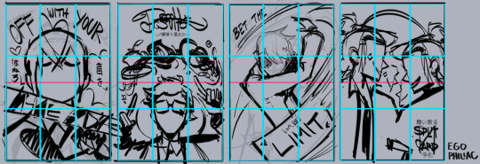
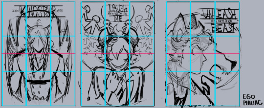
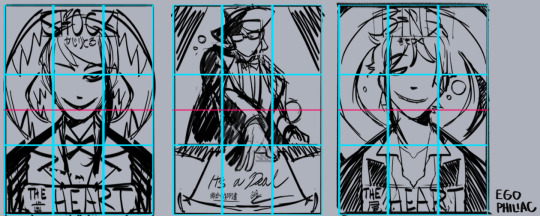
and against the finished versions, because they do usually end up changing a lot (including the empty space of the border):
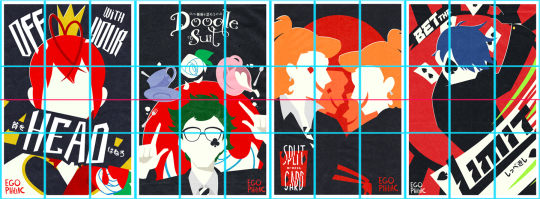
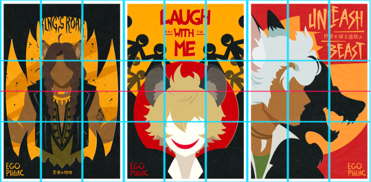
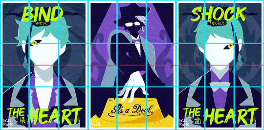
(...these actually lined up a lot better than I thought they would. :') it makes me look like I do things way more intentionally than I do.)
other stuff I just try to keep in mind is that our eyes like following arcs and paths, which can be a good way to guide the eye:
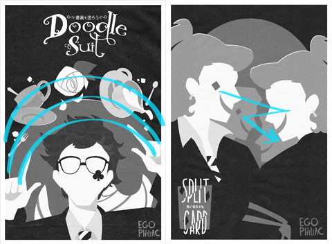
and frame and control the focus:

honestly, composition is one of those things I feel like I struggle with a lot, so I'm not sure how much of this is helpful or actually makes sense outside of my head. but hopefully it helps a little! it's all just stuff to think about while drawing and not anything hard-and-fast, so don't, like, stress out about making sure things are lining up exactly on the thirds or anything. again, it's more "our brains think these are the dopest parts of the rectangle" than anything else! take advantage of the cool parts of the rectangle!
NOW GO HAVE FUN DRAWING seriously though, it is always super cool that other people like this idea and style enough to want to do it themselves and for other/their own characters! thank you! ❤️❤️❤️
#art#sketch#twisted wonderland#...technically i guess? it's not about twst but there is twst art present anyway#i did have a few more examples but then i wasn't sure if you were cool with episode 7 spoilers. whoops. 🫠#many other people have explained the rule of thirds and directional flow way better than me and i apologize#it is so hard to put things into words i am so sorry#me: the...you know...the lines...they sort of converge? like a triangle?#the internet: mm-hmm. yes. go on.#me: (sweating) the...the triangle points here...because it...it has a point.#the internet: it's doing better than you are then#genuinely shocked at how well some of these line up though#uh. i mean. actually it was all totally intentional and i put actual thought into it! NOT an accident at all!#my eyes darting back and forth shiftily are just ✨following the paths✨
412 notes
·
View notes
Note
Do you have any tips on for people starting a comic and wanting to post to tumblr? Like pacing ect. Or well any experience you’ve had with your comics? Love your content as well ❤️
If it’s simply for fun, and you’re just trying to gain experience, my biggest advice would be to just START. Don’t worry about it looking perfect. Don’t worry about comparing it to other’s comics. Just try something, and if you find it’s not working, you can always change things up. I have gone through several styles and page layouts since starting. Do I wish those first pages of EW looked just like what I’m doing now? Yes, but if I’d waited around for perfection I would have never started. And I wouldn’t have had nearly as much fun creating it! If people like it, that’s great, but your art is for you. If you’re growing and learning and having fun, then you’ve accomplished something!
Now for some less preachy advice 😂…
—If your comic is gonna be hosted on Tumblr specifically, I would say, make sure you keep the 10 image limit in the back of your mind when you’re pacing things. That can definitely cause some headaches down the line. If you don’t plan ahead, and end up hitting it, you’ll have a sudden cut in your flow. This last update I knew it was gonna be long, so while I did plan, but I could’ve planned better.
—Variety is key!!!!!
Composition changes keep your viewers from getting bored. Sometimes I’ll find myself falling back into the bad habit of just doing the simple back and forth with two characters talking straight on, but changing the camera angle, making establishing shots when you change locations, and over the shoulder shots, etc etc…All these will make for a more interesting viewing. You may think a character needs to be in every single panel to make it interesting, but if you have a lot of dialogue, a simple plain shot—either in top of a solid background, or just over something boring, like a glance at the set, etc—this will let people focus on the words rather than splitting their focus.
Variety applies to shading as well—whether you’re using color or black/white. Variety in values are SO important for comics. You’re shoving a ton of information in a limited space, so try to keep your values different for items that are close together….it can make things very confusing and turn your line work into indistinguishable blobs if you shade without this in mind.
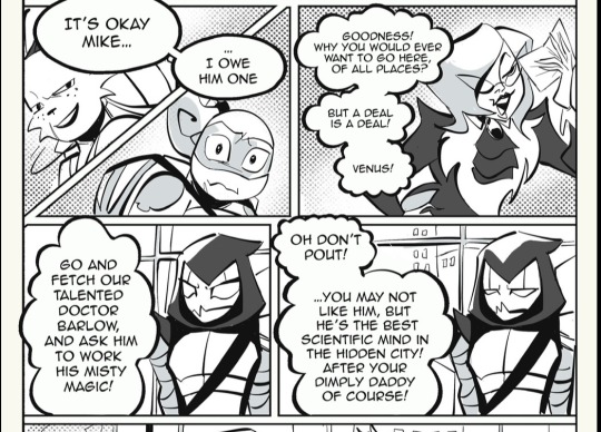
(Using this panel as an example….)
The top two panels have a variety of darker values and a halftone background—so the next two with Venus, I kept rather simple. I could’ve colored the buildings behind her, but then, she might’ve gotten lost amidst all the grey. There’s not really any trick or solid rule to this, but once you develop your creative eye, you’ll make these choices without even thinking about it.
A few links to helpful tools (they’re all procreate centered I’m afraid 😅)
Outline brush — a free tutorial for Procreate users. This brush kinda mimics the CPS feature that lets you create panels with a nice black outline. I used this brush very often, and it really gives your panels a professional look. Fair warning, it can be glitchy, but it’s free…
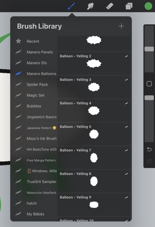
Manero Comic Bubbles and sfx — These brushes are not free, so I would recommend maybe getting in your groove before you try them out. They’re by no means necessary, but I’ve just started using them, and they save me so much time. There’s a HUGE selection of shapes, and they go on with a solid white background, so you don’t have to worry about coloring around your dialogue balloons.

#rottmnt#ask slushie#slushie rambles#I could probably think of more stuff but my brain is fried I’m just really putting the rambling in that slushie rambles tag
237 notes
·
View notes
Text
About scale, process, palette and canvas: a few considerations on pixel art as a medium
User moredogproblems answered an interesting and legitimate question by another, DiscountEarly125, regarding my work and canvas size. He also perfectly isolated two central concepts of pixel art, which are scale and process. Canvas size, which was the theme of DiscountEarly125's specific request, is more of a dependent variable to those two aforementioned concepts, rather than a starting point. I hope the following considerations I shared may help or prompt some other ideas, but this is what I could come up with 15-ish years of experience with pixel art (and a few more years of art and media studies). I was quite in the mood of writing down these few thoughts that have been floating for a while. I apologize as this may also result in a confusing wall of text, but it is all part of a my work and research, and I would love to polish all the material, hopefully with some thoughts, insights from other colleagues, as well as pictures and materials!
A. Scale and canvas size
It is true that the bigger the canvas, the more distance one may visually create from pixel art, but I personally think this is to be possibly considered a matter of perceiving pixels, rather than a fundative problem of the medium. In fact I concur with the idea of "process makes the medium" rather than identifying pixel art as how (evidently) pixeled the result feels. The general picture, or the sum of pixels, though, is a really important matter to the medium nonetheless! Pixels themselves work in relation one with another, so it's their overall result that gives context and makes the subject recognizable. This relationship between pixels links back to all the art fundamentals that each artist is taught, from color theory to shape and composition - and so on.
So, the canvas size debate usually boils down to a matter of scale or necessity of your subjects.
As long as the dimension (canvas) of your subject (as in: a drawing of an apple, a character sprite, a mockup environment) allows you to operate, control and keep an eye on the quantity (number/area of pixels together) and quality (color, shaping of multiple pixels, texturing obtained through color and shapes) of isolated single pixels or pixeled areas, you're in the pixel art universe.
The other way around to define the matter of scaling: in order to be operating pixel art fundamentals and techniques, your subject has to be on a scale that allows you to apply principles of pixel art within the space of your canvas and your personal style.
These very same principles, or basics, can be applied with different results and extent to bigger and smaller canvases alike, each with their own specific difficulties and variables. It is important to adapt your scale when learning, and trying classic canvases per subject like "16x16px" (standard tile or character sprite unit, tied to older consoles and screen ratios, it's a bit complicated there) is always a nice idea - they also tend to be industry benchmarks and necessities so in case you'd like to consider a professional output, that's very useful.
Scale also applies to the array of colors, and there lies the concept of palette: a number of single hexadecimal hues we are using for each single pixel. Any single pixel can have one hexadecimal color only.
Consequentially it is absolutely true that either a huge canvas or a palette too broad may prevent a viewer from perceiving immediately the "nature" of your medium, namely seeing square pixels, recognizing a certain amount of color - or more thoroughly recognizing that you made some choices for each subject on a pixel level. What could possibly happen on a huge canvas (without zooming in) is that you can't really grasp the pixels, but just the "overall picture" - and that may not differ too much from digital, raster art, which is of course also based on pixels. Therein appearently lies a sort of threshold that is really hard to pin down for us pixel artists, as it depends on screen size, visualization methods, distance, filters and lots of other inherently subjective parts.
This kinda is my case sometimes: I make big environments (possibly too big, and too detailed in each part I tell myself) that are a sum of many lesser parts: both tilesets and sprites that relate (but not strictly adhere) to a basic space unit that is 16x16pixels. You can indeed consider scale in a broader sense as a subdivision or magnification issue, much alike squinting your eyes to focus on a picture's overall contrast or, conversely, analyzing its fundamental parts with a magnifying glass, and then a microscope - an analogy as follows:
a. the picture as a whole is like a colorful rock that you can analyze by magnifying its grain.
b. the characters, geographical elements and textures, works like the different substances that compose the rock and give its visible characteristics grain and complexity,
c. single pixels constitute the very atoms of those previously recognized substances.
I mean "atom" in the traditional, classical meaning of indivisible, fundative object. That's a "quantized" part of information, which for pixel art is ultimately color (or a binary value, like yes/no black/white).
If you were, for example, to crop some parts of my work - let's say 160x144 pixels (a gameboy screen resolution in pixels) you would see the substances that are characters and elements of nature, and when you zoom in again, every atom becomes visible as a single entity of color. There are 29 different type of "atoms" in Ruin Valley as in different, singularly hexadecimal colors that work together in different combinations and shapes to create different substances and characters. 18 of them are used for the different qualities of the environment, and 11 more for extra hues for characters and other elements to pop out a bit.
It's really interesting to see how many pixel artists push this "threshold" of pixel art canvases to the extremely small or the extremely big, whereas, notably, palettes are less open to growth: it is indeed my opinion that pixel art tends to quantize color (quality) over than dimension (quantity). Palettes, notably, do not grow exponentially, but tend to a lower, fixed, controlled amount of individual values instead. This usually gives the artist the true possibility and toolkit through which is possible to think about/with pixels. In other words: color (or its absence) is the founding unit and identity of pixel art as a digital medium.
B. Pixels as process or pixels as objective?
Pixels themselves (as strange as that may sound!) are not to be considered an objective of pixel art, I think, but the founding matter of its research as a medium instead. I think that making pixel art is not just devoting oneself to show those jagged, squarey areas or blunt edges that we all know and love: this is just one of the possible aesthetics that pixel art conveys or adopts - especially on small canvases. Pixel art is not about denouncing itself as pixels, but, rather, embracing the square, atomic unit to build an ensemble that conveys a content or a style. That's the important part of the discourse that emancipated pixel art into being a medium, and not just an aesthetic choice or style of representation. Again: process makes this medium. Speaking of that, I consider pixel art as part of a broader family of "quantized art", namely media that operate on/with "indivisible, founding bricks and unities" that can assume a certain quality (color, mainly) within a certain quantity (palette, canvas size) and in relation to its surroundings to describe something.
This puts pixel art, with its specifics and with a certain degree of semplification, among other mediums such as cross-stitch, bead art, construction sets, textile art (on a warp and weft basis), (micro-)mosaics and others.
A classic threshold example of process vs objective: oekaki art. Oekaki art - which I love and also happen to make from time to time - doesn't really work or "think" specifically on a pixel base: it doesn't place pixels per se, but uses pixel-based areas and textures on bigger canvases with a certain degree of freedom, like one would normally do with brushes on raster digital art programs (adobe ps, gimp, clip studio and so on) in order to convey an aesthetic with fewer colors and a certain line style and texturing. That way, oekaki uses and knows pixels in a deep way, but doesn't see them primarily in a quantized way. As a result the "overall picture" shows pixels to a certain extent, and it's possible to recognize distinct pixels for each part, but the objective is not an analysis and use of pixel and quantized information, but the use of an aesthetic based upon accessibility of resources, their control and a certain rendering style.
A huge part of pixel art is its absolute accessibility: everyone with a fairly outdated computer or screen and a basic drawing program can study the medium.
To be fair, it's indeed considering accessiblity that I highly support an inclusive approach to the term "pixel art" and I think traditional oekaki is a close, beautiful relative that builds upon the rules and techniques of pixel art and pixel rendering, yet keeping its identity as its very own medium - somehow like a dress may be built around/upon textile design. Anyway, boundaries are meant to be crossed and I think there definitely are lots of oekaki and pixel-based art that meet traditional pixel art mid-way - or further.
I also think the "is it pixel art?" discourse possibly ensuing - and generally speaking any media belonging purist ontology - is a treacherous, slippery terrain leading to excesses, and this is not my focus today, neither am I able to tackle that subject extensively at the moment.
C. Conclusions and a few good exercises
Everything above may be farfetched or too complicated as a starting point. I tried to write all down as orderly as possible. The point of this (possibly discouraging) analysis and the reasoning between scale and process is that (pixel) art is about trying different canvases, and reasoning on one's subject and objective, rather than limiting oneself to presets sizes or styles. It's important to choose something that resonates with us and, in doing so, thinking about other, more interesting limitations: that's the discourse about quantity of space and quality in color. Limiting is the best possible exercise and one I wholeheartedly encourage: by doing so we are progressively delving deeper on the basics, as we learn the fundamental relationships between shapes and colors that we can achieve through pixels.
A few good exercises that I too implemented in my own workflow come to mind:
1. Trying different canvases (or sizes) for the same subject (sprite, character art, illustration or so on). This helps a lot finding a comfortable size to apply pixel techniques, as well as getting a hold over fundamentals such as aliasing, linework, conventional representation and so on.
2. Trying different palettes for the same subject, both by varying colors themselves (therefore learning about values and contrast and readability, as well as atmosphere and mood!) or singular hues and their components, in order to discover possible relationship between them. Have fun!
3. Reducing the width of the palette progressively for the same subject: reducing the number of singular colors forces a reasoning on shapes, rapresentation. You may go from 1-bit art (just black/white) to 3 colors, 4, 8 and so on. We'll not talk about transparency as a singular color there, but if you happen to be interested in retro art, transparency counts to the palette size. This exercise is very useful in rendering, and possibly tricky. And definitely fun. :')
4. Choosing an objective and usage of our work: for example trying to learn about old pixel art limitations for games, in order to reason within specifics. Get inspired by traditional games (spriters-resource is your best friend here, in case you have a specific retrogame you're thinking of)! I will probably talk about limitations and style on another post.
5. Four eyes (and other multiples) are better than two: try to talk with people and friends and other artists you trust and feel comfortable with to get their point of view. This can be scary, I know, especially at the beginning. You're not forced to, of course, but if you do (in a safespace) there's lots you can learn about concepts such as readability, subject recognition, rendering and composition. Our eyes and brains get accustomed to something, and pixel art being a rather analytic medium made of synergies, subtle changes, limitations and conventions is especially tricky on the artist's eyes on the long term.
Either way, the important thing about pixel art is understanding that this medium is about recognizing and enjoying the process rather than the eventual aesthetic and in order to do so the best choice is to start simple, small, with few colors and techniques at a time!
Have fun and hit me up with your progress and considerations. :')
336 notes
·
View notes
Text
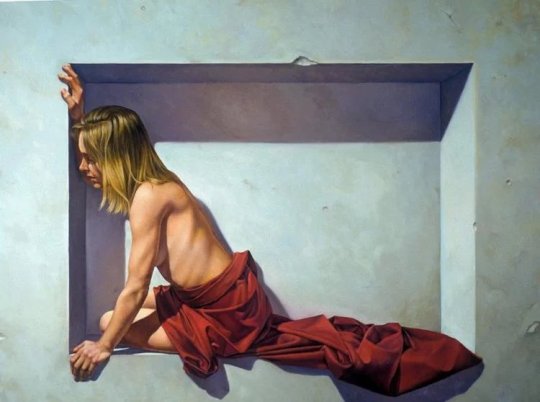
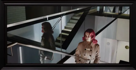
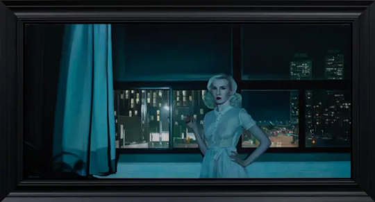
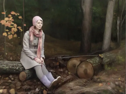
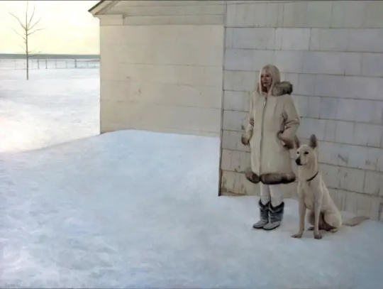
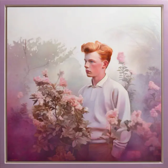
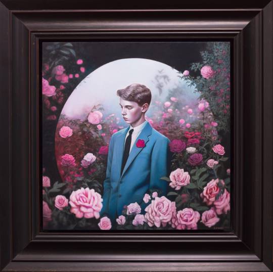


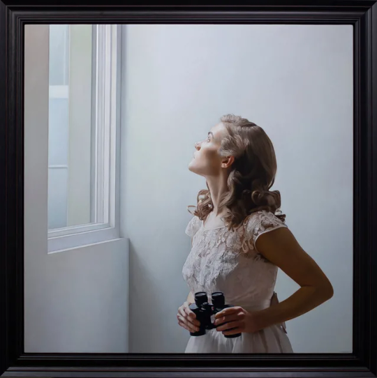
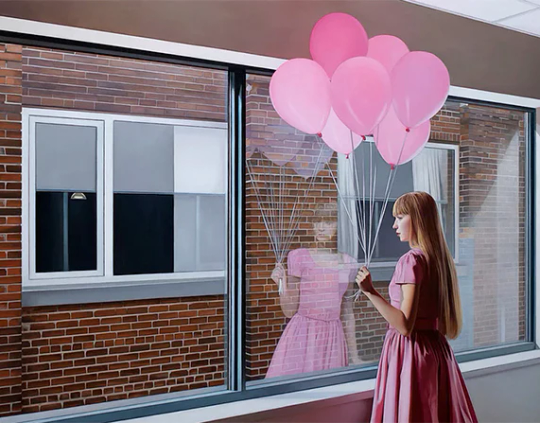
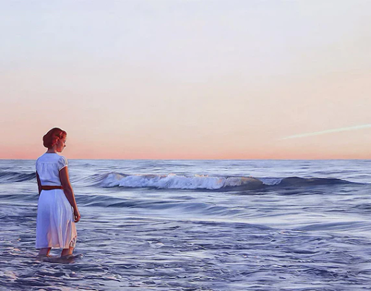
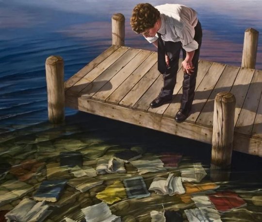
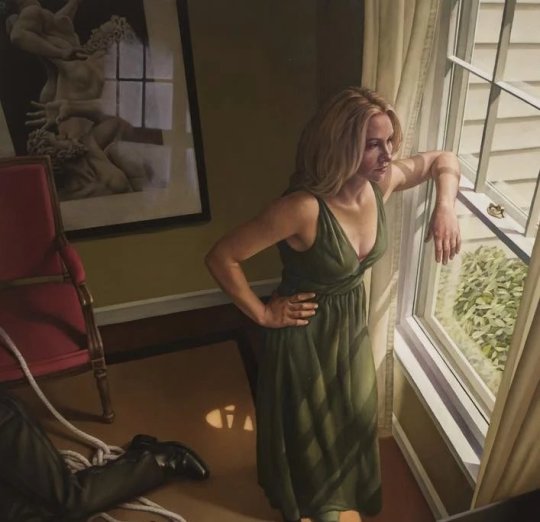

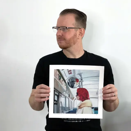
Красивые современные портреты в работах канадского художника Шона Дауни.
Портреты Шона Дауни основаны на таких разнообразных влияниях, как известные голландские мастера и современные комиксы, прочно закрепляя многовековую традицию фигурной живописи в настоящем. Используя реалистический стиль, Дауни создает эмоционально насыщенные портреты, в основном женщин, в полностью реализованных декорациях, где лицо и настроение человека в зависят от окружающей среды. Очевидный интерес Дауни к таким мастерам, как Вермеер и Норман Рокуэлл, проявляется в его внимании к людям, занимающимся своими повседневными привычками, таким как женщина, укладывающая волосы или моющая руки, всегда в современной обстановке и одежде. Точно так же, в традициях вышеупомянутых художников, Дауни рисует не только лица, часто изображая свои фигуры спиной к зрителю. Однако его гиперреалистический стиль и манипуляции с масляными красками делают эти композиции такими же запоминающимися, как и его выразительные фигуры, обращенные лицом вперед.
Beautiful modern portraits in the works of Canadian artist Sean Downey.
Sean Downey's portraits are based on such diverse influences as famous Dutch masters and modern comics, firmly anchoring the centuries-old tradition of figurative painting in the present. Using a realistic style, Downey creates emotionally intense portraits, mostly of women, in fully realized sets, where a person's face and mood depend on the environment. Downey's obvious interest in masters such as Vermeer and Norman Rockwell is evident in his attention to people engaged in their daily habits, such as a woman styling her hair or washing her hands, always in a modern setting and clothes. Similarly, in the tradition of the aforementioned artists, Downey paints not only faces, often depicting his figures with his back to the viewer. However, his hyperrealistic style and manipulations with oil paints make these compositions as memorable as his expressive figures facing forward.
Источник://www.houseofroulx.com/products/shaun-downey-first-stop-lemon-hand-embellished-one-off-variant-12-x-12, /www.risunoc.com/2021/05/mimoletnaya-krasota-sovremennoj-zhizn.html,/arcadiacontemporary.com/artists/37-shaun-downey/works/,http://www.oilpaintings-supplier.com/products/ 124521.html.
#живопись#картины#искусство#художник#Шон Дауни#Гиперреализм#масло и холст#современное искусство#портрет#art#painting#artist#Sean Downey#Hyperrealism#oil and canvas#portrait art#modern art
114 notes
·
View notes
Text
Astrology Observations part 2
* Synastry Edition *
‼️These pictures are not mine,
do not steal or plagiarise my work,
*this post may include triggers*‼️
Happy reading!
🌌 Moon in the 8th house in synastry is truly as intense as everyone makes it out to be, it can be obsessive and bring out emotions you haven’t felt before. You can go crazy for the other person. Usually, both can love the other person so much that you start hating them. (if you’re not used to intense emotions ofc) It can create this push and pull dynamic, one or both may even run away from this connection if emotions get too intense.. if developed and both people want to make this connection work, this is a unconditional love overlay. Edward and Bella from twilight vibes! 🌙
☁️ 12th house overlays are KARMIC most of the time. These people stay in your life for a long time, but a lot of the times these relationships aren’t meant to last. This house overlay does teach you a lot of lessons and uncovers the parts of yourself that you weren’t even aware of.
*This overlay also makes you dream of the other person, while sleeping, more often!😴😴😴
☀️ Someone’s sun falling in the other persons 6th house can create a CEO-Assistant or Batman-Robin type of dynamic. These people are usually very involved in each others’ lives. The 6th house person is very interested in the sun’s daily life - the friend that texts you what you ate in a day and how your day was 🥺 The sun on the other hand makes the house persons life more ✨bright✨ - makes them laugh daily or helps them with daily tasks etc.
💘Having venus and chiron in the same sign and vice versa will be very healing for the both of you, unless other aspects say so. The venus person may “soothe” and love the chiron person in a way no one else can. On the other hand- The chiron person may teach the venus person how to love themselves. A lot of married couples have this!👰♂️
🫂Having someone’s planets falling into your 2nd house, can make them VERY possessive over you.They also like physically touching you or just being in your presence. It’s a very sensual overlay. Both will also indulge in food and the pleasures of life. Sometimes though the planet person can feel like they “own” the house person. On a good note - it can also signify someone who is very protective over you. Depending on aspects/planet falling in to the house and how developed the person is.. this overlay can signify jealousy if other people are involved in the relationship.
🚫Mars square Neptune in a synastry or composite chart is a cheating aspect(of course, not always). It does signify a lot of deception, miscommunication and lies though. If other hard aspects are involved.. RUN FOR THE HILLS!!
💕Venus conjunct Sun in synastry is a soulmate aspect from what i’ve noticed. Both platonic and romantic, so cute! 😍
That’s all for now! I would love some feedback or questions if you have any. Till next time! ✨ Don’t forget to reblog and follow me for more posts like this!
#astro community#astro placements#astrology#astro#astro notes#astrology observations#moon in 8th house#synastry#love#friendship#love astrology#friendship astrology#synastry observations#sun in 6th house#12th house#8th house#mars square neptune#sun conjunct venus#chiron venus#chiron#venus#soulmate aspects#soulmate#karmic#karmic astrology#soulmate astrology
2K notes
·
View notes
Text
What are Hieroglyphs? - A Q&A from a Poll
I ran a poll last week to see what people most wanted to know about how Hieroglyphs and languages such as Old/Middle/Late Egyptian work. While certain responses had more of an interest, the most common tag/comment I was getting was 'umm all of them?'. So, I'm going to do just that, but under a cut, because no one needs a post that's going to be as long as this one is without choosing the colour of the sky. Trust me, this is colour of the sky long.
So, without further ado, these were the results of the poll (yeah it's not finished yet, really, but the percentages haven't moved in 4 days and the poll ends in about 12 hours so here we are):

I'll start with 'least interest' and move onto the bigger things, as some of these I can get out of the way pretty quickly. I'll apologise to screen readers in advance, because you might imagine how difficult it is going to be describe hieroglyphs in a way that makes any meaningful sense, especially if they're using different cultural concepts. So, here we go!
How long does it take to translate?
Honestly, it depends on the text, and to some extent the language I'm translating it from. For me, Late Egyptian is the easiest, so a text in Late Egyptian (with all that entails) is a breeze. Others will find Late Egyptian really difficult because that form of the language (used from the Amarna period onwards when the written language changed to reflect the spoken language...except on monuments and tombs which kept using Middle Egyptian) uses a lot of semitic loanwords and has differences in orthography (the way signs are laid out and spelt), as well as changes in grammar (moves to frontal exposition so all the markers come at the start of a sentence).
Once you're past the 'oh it's in a form of the language I like/hate' you're into 'what kind of bullshit is this text going to pull on me?' and that can be easy or nasty grammar, lots of spelling mistakes/no spelling mistakes, what kind of text it is like biographical (formulaic, tend to be easy) or literary (not formulaic, full of metaphors and strange sentence composition), or religious (formulaic, but *Chalmers pointing* Dear Lord what is happening in there?). You can get a formulaic biography that's nasty to deal with (Tjetji) or a 'I'm so full of metaphors that I can fight god' literary text that's actually pretty nice to deal with.
In any case, if we're talking about something longer than 5 lines of text we're talking hours to translate. It's not like the films where they just read it on the fly (though you can reach some level of that), you are going to need a notepad, a dictionary, and several hours. This obviously lessens the more experience you have.
Why are the signs so specific?
We're dealing with a language whose script communicates in what are essentially pictures with sounds. It's also an art form as well as a written script. This means that it can, through necessity, create a new sign to express something. More often than not, these signs are very specific, which means you don't see them all that often (hello religious texts again) or they've combined two signs together (overlapped them essentially) for space reasons and it's ended up as it's own sign eventually. I mean, if you had the ability between trying to use what you've already got, and drawing an entirely new sign that is literally a picture of what you want...you're gonna draw a picture. This is why you get the penis glyph. There was always going to be one because at least half the population has one. There are also tit hieroglyphs. Equal opportunities and all that. The tit ones have less applications though, sadly.
How do you remember all the values for all the signs?
I'm gonna be annoying and say: Practice
But it's true. Just like children learning to speak, it has to be repetition repetition repetition. The more you see it, the more you're exposed to it, the more likely you are to remember sign values. There are still some signs I have to look up because they never stick in my head, but mostly I'm able to transliterate very very easily. Once you've got sign values down, you're more likely to begin to recognise them in word groups, which means you're more likely to just know the words by sight. It is very much like learning to read. First you learn the letters T, H, & E, and then you learn that T, H, & E together spell the word 'the' and then you simply recognise the letter group as the word from then on. Same principle for hieroglyphs! Some people will be able to remember them effortlessly. Some people will never be able to remember them. It's all about how your brain works, so don't beat yourself up about it.
How do you work out the grammar?
*laughs nervously* erm....so y'know how I'm bad at remembering grammar? This is going to be a wild ride. In the simplest terms, there are markers within the Egyptian, just like we use certain endings (like '-ed' for the past tense or -ing for present action) or markers (! ? . , etc), so do the Egyptians. I'm not going to cover them all here because goddamn no one needs to know those unless they're actually learning the language and it would get LONG. But I'll show you at least the past tense, pronouns, some special markers called Particles, and prepositions.
Pronouns
Simple, yet important. These little guys come at the end of verbs (at least in Middle Egyptian). They have every pronoun we do except the singular 'they'. Now there are several different types of pronouns depending on whether they're the subject/object attached to a verb, or subject/object that are independent of the verb. This is where you get the 'suffix' (attached to the verb as the subject), dependent (not attached to the verb but related to it), and independent (come at the start of the sentence, not attached to the verb but still the subject. Usually Participial Statements have these). I'm only going to deal with the Suffix pronouns here because sweet jesus this is a whole chapter to itself in a normal grammar book and I'm not doing that. They look like this:
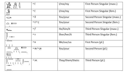
For other hieroglyph readers sake: I am of the school of hieroglyphs that uses =i instead of =j, and I don't use z for one of the s signs. That's why you're seeing that difference.
For the rest of you: Sometimes there are variants of types of signs for a pronoun, so I've listed them all. The most common one you'd see when translating is at the start of each entry.
As you can see, the pronouns are fairly distinctive in construction, especially when they come at the end of a verb in a sentence. The only ones that would give you any real issue would be the =n (we/our) and =t (she/her) pronouns. This is because they look like the 'past tense .n' and 'marker of the feminine verb .t' endings (sometimes they omit the plural strokes the =n 'our' pronoun and that's just not cool). When you're starting out, you essentially have to look at the context the word is in, and partially continue with the rest of the translation to see if a pronoun is there or it's a tense/feminine marker. Correctly identifying which one it is, is again down to experience. Thankfully this one is something you pick up pretty quickly, because your sentences won't make much sense otherwise.
An example of a pronoun in action is the following sentence:

You can see that the pronoun =k (you) comes after the verb 'sDm' to hear, and before the object of the sentence miw (cat). Any of the pronouns above can be inserted where =k is, and the sentence will read as necessary.
Prepositions
Prepositions often tell us where one noun is in relation to another (e.g., The coffee is on the table beside you). But they can also indicate more abstract ideas, such as purpose or contrast (e.g., We went for a walk despite the rain). Prepositions also indicate direction, time, location, and spatial relationships, as well as other abstract types of relationships. Just like we say 'the cat is on the mat' or 'the fox at the house', Middle Egyptian can do the same thing. Here's a list of prepositions:
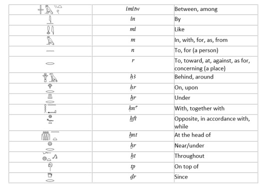
These, of course, occur anywhere within a sentence in Middle Egyptian just like they would for English. They can also take pronouns like xr=f 'under him' in order to give a subject or object for the sentence. If you were translating and you saw one of these, you'd know that you were about to change direction/time/place or get more information on a relationship in that sentence.
I've constructed an example here:

MEg readers: There's probably supposed to be some sort of nominal -pw construction in the first sentence to get the 'is' sense, but it's late and I am le tired, so please ignore this potential glaring error. The gist of the sentence is at least right.
Everyone else: You can see I've used the prepositions xr 'under' and mi 'like' to construct this sentence. If I was translating this from the Egyptian, they would be the grammar markers that tell me something in the sentence has got or changed a location, or that it was a comparison. Basically, if you're looking at a word and it's not a verb/pronoun/adjective/noun, you're probably looking at a preposition.
Particles
These are tiny words, which don't always translate as anything, but give more meaning or information about a sentence. Basically, they have a grammatical function, but don't actually translate. In English the word 'to' performs this function, as it appears with many verbs 'to fly' 'to go' etc, but doesn't actually translate (yes, I'm aware 'to' can also be a preposition). I'll only deal with a couple of the more common particles here because there are a lot of them, and you don't need to know all of them.
iw is probably the most common particle. As far as we're aware it doesn't have a translation (there's debate), but it always comes at the beginning of a clause. We don't even know why they use it, because it's one of the particles that you get taught 'always comes at the beginning of a sentence/clause' but then once you learn more MEg (Middle Egyptian) you realise that it barely shows up at all. Anyway, the little guy looks like this:

In a sentence it looks like this:

This is a few lines from the Shipwrecked Sailor, a literary text from the Middle Kingdom. You can see the 'iw' particle used twice in this sentence and both times it does not impart any direct meaning to the translation, but it does tell us of a new clause.
ir is another particle that turns up semi regularly and has the meaning 'as for/if' depending on the context. The original context for it, is that it stemmed from the preposition 'r' 'to/from' (see table above) and evolved into its own usage. It looks like this:

So if you see it in a sentence before a noun like so:

ir will only translate as 'as for' when before a noun. That's how they mark that sort of grammar.
However, if 'ir' is before a verb, this happens:

The sense becomes 'if' when before a past or present tense, meaning the particle has express a conditional sense. If it was before something other than the past or present tense, the sentence would read entirely differently, and thus wouldn't have ir there in the first place. That's how we know to translate it that way. mutters something about the ir conditionals
Past Tense
I'm not sure I need to explain the past tense to most of you, but rest assured that Middle Egyptian also has the past tense. This can usually be identified by the .n ending after a verb, but before the pronoun. You might be sitting there saying 'wait, lottie. isn't the pronoun for 'we' also an 'n'?' and yeah you'd be right! It's all to do with context.
Let's take a very basic sentence:
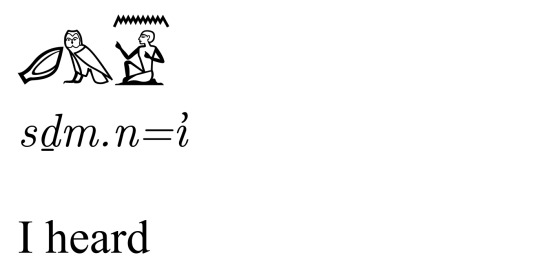
You see the 'n' sign above the pronoun =i ? That's the .n of the past! It tells us that the verb preceding it, in this case sDm 'to hear', is being read as the past tense and thus we have to translate it with the -ed past tense ending in English. Yes, it does look very similar to the 'n' pronoun for 'we' (=n) and the preposition for 'to/for (a person)' (n). It's because they are all the same sign, they're just being read in different ways.
What do all the .'s, ='s, and brackets mean in transliteration?
So as I just showed you, the marker of the past tense is denoted with the water sign 'n' which is attached to a verb in transliteration using .n at the end. You've also seen me use the equals sign with the pronouns like =i. In Egyptology, at least, we use these symbols as a way to differentiate between different markers of grammar and basically make it easier to spot when we're just reading someone else's work. Say you've got sDm.n=n mdw r=k 'we heard the words concerning you'. Here are the glyphs:

You can see that sDm is easy to see (the ear reading sDm, and the owl reading m as a phonetic complement, forming the word) and then you've got two water symbols for n, and three vertical strokes. Now, as I've already shown you, the n of the past tense, and the n that's the pronoun for 'we' look pretty much the same, but you know they're different. However, when they're together in one sentence it makes them difficult to distinguish. In order to make them distinct when transliterating we use .'s for marking the endings of verbs be they tense markers or say the feminine .t ending. For pronouns we use ='s so that it's clear they're separate from both the verbs and grammar markers. Otherwise you'd end up with sDmnn mdw rk and it would really tell you absolutely nothing if you were reading it without the glyphs.
I should note at this point that some schools of Hieroglyph teaching use the . for both the verb ending marker and for the pronoun. So it'd look like sDm.n.n and that would be completely fine. I didn't learn this way, so I won't be using it. I'm just mentioning it here for the sake of completeness.
For brackets, I'll do a quick run through: … denotes a lacuna (a hole in the text) with no restoration, [ ] denotes a lacuna with restoration, < > denotes an omission made by the original scribe, whether intentional or accidental, and ( ) denotes a modern addition, usually in the translation to give proper English sense or to provide clarification. In cases where an Egyptian word is legible but the meaning is unclear, ___ denotes an unknown transliteration and a (?) denotes an uncertain translation.
How do you know where a word stops and another one begins?
Ahh the classic! This is a two parter: the first part is 'usually there's a sign that tells you' and the second part is 'more experience with hieroglyphs.' With experience you tend to learn how the most common words are formed, so you know what those look like and how they're spelt. This means that you tend to be able to pick those out of a sentence, and whatever is left must be a word/s you don't know. Over time you'll begin to realise what signs do and do not form words, so if you're trying to read a word and it doesn't make any sense you probably need to separate the signs you're looking at. It really is just practice and becoming more familiar with the language.
The other way, is learning how to spot what are called 'determinatives'. A determinative is a sign that helps to categorise a word without having any consonantal value. It’s just there at the end of a written word, like a man with hand to mouth at the end of the word ‘vomit’ in Egyptian tells the reader (most of whom were illiterate) that the word had something to do with something that comes from the mouth). Not every determinative has the same value as the word it’s written for, and some can even be metaphorical in nature. If I bring back the first sentence I used in this post 'You hear a cat' I can show you what a determinative looks like:
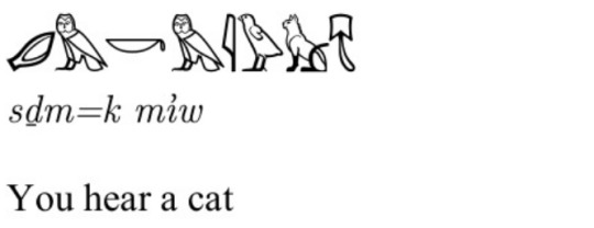
Since you know that sDm is the verb 'to hear' and =k is the pronoun for 'you', then miw must be the word for 'cat'. But there are 5 signs and only 3 consonant values in miw, which ones are we reading? The answer is the first three signs: the m 'owl' the i 'reed leaf' and the w 'quail chick'. So what about the last two signs: the seated cat and the pelt? Well those are the determinatives I told you about. They're part of the word, but they don't have any sound values. They're just there to tell us that the word is about a cat (seated cat!) and an animal (pelt!). Now I could have written the word miw 'cat' with just the seated cat sign, as that by itself has the 3-consonantal value of miw, but here, along with the pelt, it's just being used as a way to reinforce to the reader that this word is animal based and that animal is a feline.
It also helps that words in Egyptian tend to have no more than 2 or 3 consonants in them (some have 4, but they're not as common). So if you're transliterating and you've got a word you don't know that appears to have more consonants in it...you might want to take a look at it because you've probably added two words together, or joined the past tense marker or pronouns into the word you're looking at. In fact, knowing the grammar markers, and the pronouns, and what a determinative looks like is what helps you pick out the words more easily. It's sort of a process of elimination of words/grammar you do know, to see what's left and that's where you get the dictionary out and start looking things up.
I'm going to try my best here to show this in diagram form. Ideally, this would be done in person where I could write it on a board and go through it in real time, but since I can't do that I'll have to go with this:

This is an excerpt from the 'Dialogue Between a Man and His Ba' and you're looking at it going 'oh dear god'. So let's start by marking out where our words separate in blue:
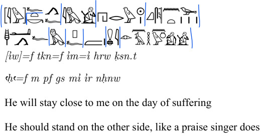
So, these are all the words within this sentence, and I hope it at least shows you where the transliteration is following. However, how do I know this? You can see the pronouns in the transliteration marked with the ='s sign. I'll mark those in pink:
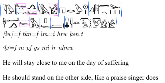
So you can see for four words in these two sentences they end with either the =f 'he' (second person masc.) or =i 'I' (first person masc.) pronouns. Those suffix pronouns only come at the end of words, so those must be the ends of those words, and what comes before is the word. Cool. So, what about determinatives in these sentences? Can seeing them help us see the end of any other words? I've marked them in green:

So, now you can see where the determinatives are. The walking legs determinatives noting a verb of 'motion' appear twice before pronouns, and that's fine, they're marking the end of the word where the pronoun goes anyway! Some of them don't though! The first set that don't are the Ra 'sun' symbol and the single stroke, which are determinatives for the word hrw 'day'. These determinatives are a) showing that the word hrw has something to do with the sun (passing of time), and there's only one of them (hence the single stroke). Thus we know this means 'day'. The next is the bird and plural strokes at the end of qsn.t 'suffering'. Plural strokes don't usually come in the middle of a word, so that helps us to identify the end of a word quite easily. The bird is what's known as the 'bin' or 'bad bird', which turns up as the determinative for words that have bad connotations (not always being used in a bad way though). In this case we have the word 'suffering', so the bad bird is here to tell us that. With those two together, it tells us this is the end of the word qsn.t. After the word 'gs' (meaning 'side') you can see I've highlighted the single stroke determinative. This is because that sign can also be read as 'm' like the owl sign in the sentence before it, and what they're using this sign to denote is that 'hey we're not dealing with a preposition here this is a noun!'. The last set are from the word nHnw 'praise singer'. You have the man with his hand to his mouth indicating that the word is something that comes from the mouth (in this case singing), and then the seated man is not a pronoun (this is one of those cases where you'll have to watch out in your translations!) but another determinative telling us that this is a 'person' word i.e. someone who does the action. Thus we translate it as 'praise singer' rather than 'praise singing'.
There are no tense markers, like the past, in these sentences so I'll skip that. There is another grammar marker of the .t ending in qsn.t, but that would require explaining an entirely different verb form and no one is here for that. I'm just noting it's there for people who can read this and are like 'girl there's one right there!' I know and I'm choosing not to perceive.
Anyway, the last things to look at are prepositions and particles. Do we have any of those in these sentences that could help us identify where words begin/end? I've marked prepositions in red and particles in yellow:
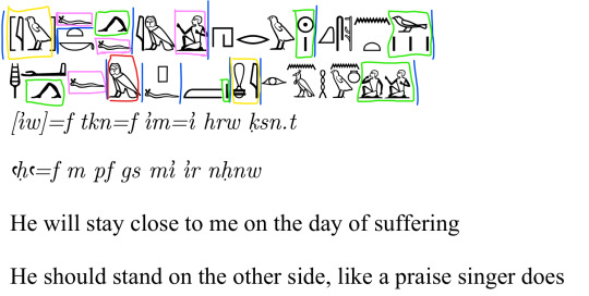
So we have one preposition and it's the preposition 'm' in/from. So we know, thanks to the pronoun before it that it doesn't belong to that word, and since 'm' as a preposition is a single sign, it can't belong to the next signs. Then we have the two particles. One is right at the start and is the 'iw' particle that has no written meaning. It's at the beginning, so we know that this is the opening to a clause and therefore the signs that precede it in the text (which aren't shown here) don't belong to it. The pronoun attached it is the 'he' at the beginning of the clause. The other =f pronoun attached to tkn is what's known as a resumptive pronoun, meaning it's there for emphasis but isn't read in translation.
The other particle is 'mi' 'like', which comes after a determinative stroke for 'gs' (side), and before a lot of signs that end in the two men (hand to mouth and seated). So we know that if 'mi' is a particle by itself, it doesn't belong to the signs that come after it, and therefore is its own word. If you tried to read it with the other words, you'd get miirnHnw and since we know that Egyptian words tend to be 2-3 consonants long, with a max of 4, this is too long to be an actual word. Therefore mi has to be separate from ir and nHnw.
There's another little bit of grammar I didn't cover, because 'too advanced for this post', but for completionist's sake: there's another type of pronoun in here called a demonstrative pronoun. In English it's what the words 'this/that' are referred to. Here the word 'pf' (the sign group with the rectangular box and the horned viper) is performing that function meaning 'over there'. So in the sentence we have: aHa=f 'he should stand' (subjunctive + second person masc.), m 'on' (preposition), pf 'the other' (demonstrative pronoun), gs 'side' (noun), mi 'like' (particle), ir 'does' (infinitive verb), nHnw 'praise singer' (noun). If that makes sense? It probably doesn't, but that's how we know pf isn't connected to either m or gs. Somewhere my lecturers are feeling a weight lifted from them and it's because I'm finally able to express this without confusion. Sadly they'll never see it lmao.
So what do we have left unmarked? Those are all your verbs, nouns, and adjectives! tkn (stay close), hrw (day), qsn.t (suffering), aHa (stand), ir (does), nHnw (praise singer). Once you remove all your grammar markers what you're left with can only be those three. The only one that isn't clearly marked is 'ir', and that's because it tends to just show up as the eye sign, or the eye sign with an r 'mouth' sign beneath it. Here it's just the eye sign, and an inexperienced reader will likely either read it with the particle 'mi' making miir, or with nHnw making irnHnw. Either way they're going to run into some issues, and unfortunately the only way they'll stop making that mistake is experience with translating MEg.
I hope that this post has at least somewhat cleared up the confusion about how Hieroglyphs and Middle Egyptian work. If I'm honest, I think it's more likely to have confused some of you even more. I apologise for that. Trying to explain a dead language, for which most of you have no reference point, on a medium like tumblr is pretty difficult. If what I've said here is too complicated, I would suggest getting yourself a copy of Mark Collier's 'How to Read Egyptian Hieroglyphs'. That book is about £10, and it's really easy to get hold of. The British Museum shop has copies you can buy (it got a reprint thanks to the Hieros exhibit) and I know it's on Amazon too. Go forth and get the book written by the man who taught me how to read them! sorry Mark
Congrats on reaching the bottom of 'Do you know how to read hieroglyphs? Which one?'
𓋹𓍑𓋴 ꜥnḫ wḏꜢ snb
#scheduled#this took me the best part of a week (over several evenings) to write and create all the hieroglyphs for
651 notes
·
View notes
Note
how did you get so good at a anatomy? like what practices helped you improve the most if you remember?
-from a new artist desperately in need of help
This is the first I’ve heard a comment on my anatomy, especially as someone who hasn’t quite grasped the whole thing haha. But I’m happy I’ve reached a point where it’s considered good. Bodies are hard and they suck but here’s some stuff I do/used to do to help.
1) Don’t avoid it. You can’t, it’s impossible. After years of only drawing 2/3 facing busts as soon as I forced myself to start drawing full bodies, I was able to create more interesting compositions and expressions. Even if it looks awful, you have to keep working at it. I myself can’t figure out a lot of poses and have to work around what I dislike.

2) Study in parts. When I did anatomy studies I always focused on one or two parts at a time. For example, I spent a lot of time studying legs and made a bunch of art that either required or focused on legs. Same went for faces, hips, and even clothes. Eventually it becomes habit and I could switch to a new part.
3) Reference. Reference. Reference. Unless you have the most vivid imagination and can put mind to canvas, please use a reference. I still use references for poses I think I can draw just in case there is a more sensible or more interesting way of depicting it. This also precedes the idea of tracing. It’s a bit controversial, but I promise you tracing is more common in the art industry than you think. It’s about muscle memory and visualization more than just “copying” a piece of work. I started art traditionally so could never use tracing to practice, but if you use digital I highly recommend tracing as way to practice anatomy. However it’s only really useful if you do it with intent, studying how all parts connect to the trunk (torso).
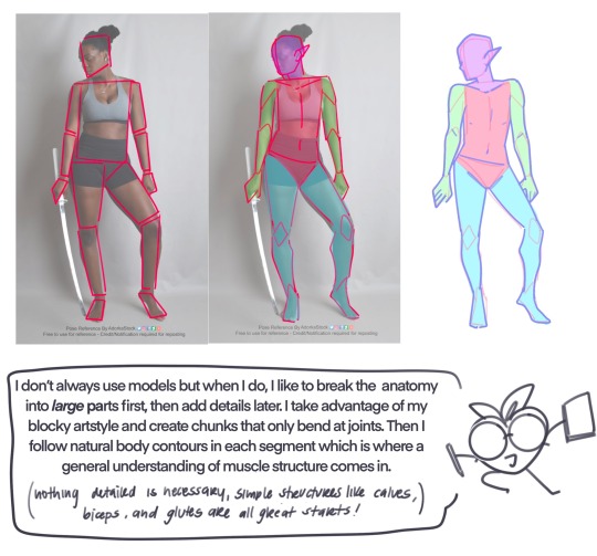
4) Lastly, it’s ok to start with a simple artstyle at first! It’s totally cool to build upon the basics instead of running straight toward hyperrealism. Plus it’s cute!
That’s all I have for now since I’m still trying to figure it out myself, but I hope this kinda helps!
346 notes
·
View notes
Text
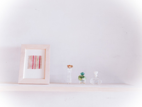
I want to talk about the stripes I make.
According to a book, there are 270 names for striped patterns in Japanese. Thousand stripes (sen-suji), ten-thousand stripes (man-suji), with kids stripes (komochi-jiima), twin stripes (futago-suji), fall stripes (taki-jima), bonito stripes (katsuo-jima), benkei stripes (benkei-jima), wickerwork stripes (ajiro-jima), etc., etc., etc.
Among these, I basically make random stripes, called “yatara-jima”.
Yatara-jima have no regularity in the arrangement of the stripes, and were originally woven to finish off the threads left over from weaving, and originated mainly for women's kimono.
Yes, weaving always produces surplus threads, but that does not mean that a regular number of threads can be taken.
If that were the case, it would be more fashionable to arrange them randomly... nowadays, but I think it's amazing that the people who first made them ( I suspect that they were everywhere in private kimonos) and put them on the market are so amazing.
I think there were people who thought it was interesting and stylish... but I wonder through what channels it spread. I wonder if it was a marketing strategy at the time to have ukiyo-e paintings of beautiful women drawn, or if the models happened to be wearing them. It’s similar to influencer marketing or buzzing on SNSs!? I can imagine all sorts of things.
Taking these cloths as an example, I used 19 different threads in total: three red, three yellow, five green, three grey, three purple, one off-white and one non-dyed white.
In my case, I of course use leftover thread, but basically, as in normal weaving, I have a design first and then prepare the thread. To be more precise, I have the design, dye the necessary colours, take some yarns out of the chest, lay them out, look at the colours and readjust the design. I use two or three threads of the same colour to create shading or variation in the slightly thicker stripes.
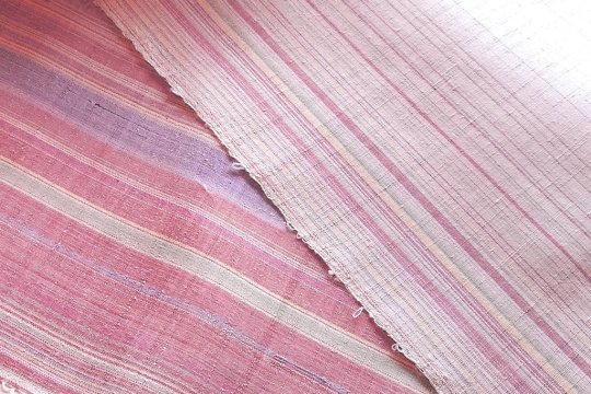
But sometimes I feel that I have made a mistake, because when I add the weft yarn, there is not much difference, and in some cases it is a newly dyed yarn, and I feel like, "Wow, give me back my time!" Sometimes I feel like, “Wow, I want my time back!” I'm not experienced enough …
It is actually very difficult to distinguish between the two types of red cloth.

It's not so much about making stripes, but more about the colour composition of the kimono or the shape of the cloth, so it may be a slightly different way of making it.
The right two madders look different, but...
-------
I used the same warp (silk) as this cloth and hand-spun ramie yarn as the weft, and of the 19 colours... 15 are included.
Red: Indian Madder (strong&pale), Sappanwood
Yellow: Amur Corktree (strong&pale), Gardenia
Green: Ōbaku x odour wood (two light varieties), Green leaf extract powder, Japanese Pagoda Tree x Indigo (strong&pale)
Grey: Cochineal (strong&pale), Sawtooth Oak
Purple: Cochineal, Lithospermum Erythrorhizon (strong&pale)
Off-white: Walnut
265 notes
·
View notes
Note
if you could inform your past self of exactly one (1) photoshop tip and/or trick what would it be?
That's a hard question! To choose one thing, I think I should have taught myself to make actions for my commonly used workflows a looong time ago! It would have saved me so much time. I have made plenty of small actions I use for everything, things like:
F7 creates a clipped layer on Soft Light mode. Same with F8 on Color mode.
F11 pastes the whole composition into a new layer, then turns it into a smart object so I can apply filters to the whole image at the end of my workflow.
F4 turns a layer into an overlaid texture (makes it grayscale, High Pass filter, then applies it in Hard Light mode)
F3 simplifies a layer (rasterizes, cuts it down to the size of the canvas), which lets you easily trim down large layers that lag photoshop.
(These aren't standard shortcuts, actions are something you gotta set up yourself!)
These and a few others have saved me ungodly amounts of time! Actions are a tool really worth learning if you spend a decent amount of time in photoshop (especially if you tend to use things over and over in your workflow!)
These are my commonly used actions:
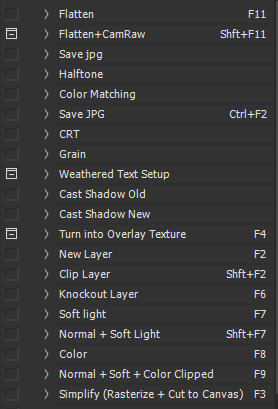
(If anybody is interested in learning this in more detail let me know! I don't have any specific resources since I taught myself how to make these, but I can always do a little tutorial or explain in on stream if there's enough interest!)
70 notes
·
View notes
Text
Updated: How I edit my sims 4 screenshots (night-time edition)
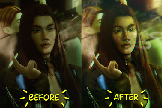
A more detailed editing tut so you can understand my process as it may help you, i edited this relatively quickly and usually spend about 1-2hrs editing something...so let's goo.....
Before taking screenshots:
Help yourself as much as you can in-game, I always make sure there is some sort of light source in my pictures or something interesting that I can add to enhance something already there
Understand good/bad composition and add variety by using different angles
I take LOTS of photos just to end up with 1 or 2 good ones

I'll just be using photoshop for this, but i also like to use the procreate app as i'm more confident w it.
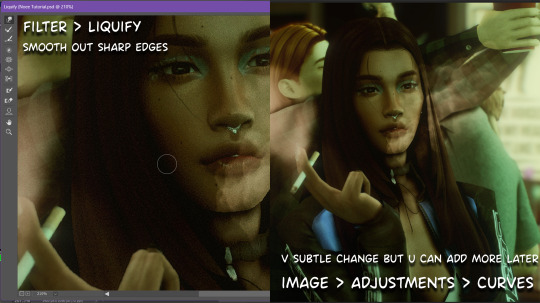
step1: I check if there are any major glitches or hard areas e.g, fingers elbows etc.. that have sharp points and pull them in liquify so they are smooth. Then use curves to change the contrast.
step2: *duplicates image* using the dodge and burn tools (keyboard shortcut: o ) i'll add emphasis to highlights and shadows (be careful with these as the dodge tool can ruin the image if used in excess) *merges image* (i duplicate and merge as i go, utilise using lots of layers so you can go back if you mess up/ want to change the opacity of an effect.)
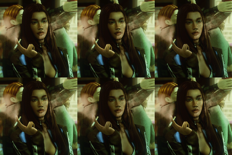
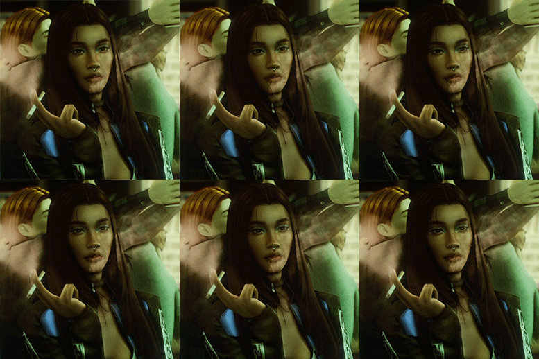
step3: making light sources POP. *new layer* change blending mode to overlay or soft light and choose a colour you like.

step4: *new layer* draw hair strands. i just use a basic round brush in photoshop and change the hardness or i'll use a sharp caligraphy type brush depending on my sims hair type. (i try not to overdo it as i like maxis hair and don't want it to look too realistic)
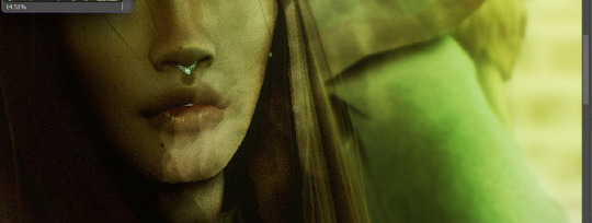
step5: i would then add a new layer and set the blending mode to multiply to add more shadows, but i don't feel like i need to at this point.
step6: *duplicates image* go to filter > camera raw filter, i change the "light" and "curve" panels, i like green tints in my screenshots especially the night ones. (this is where all the magic happens really so just adjust all the channels to your liking, lightroom is also really good to use)

step7: *create new layer* blending mode: screen or linear dodge (add) / makeup and finishing touches! - for this look i'll get stars and glitter pngs off google or unsplash same for the smoke, though if i'm using procreate they have free brushes for that :')

step8: add light leaks as they add some fun dynamic lighting and textures to your screenshots. (i also flip my image horizantally [image > image rotation > flip canvas horizontally] whilst editing as it's like a "fresh pair of eyes" when you've been editing for a while so you can see what looks off)
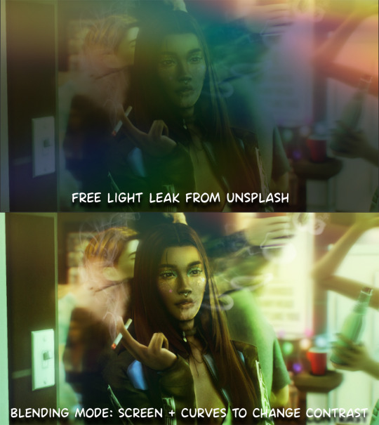
final step: merge all the layers (though i do merge along the way once i'm happy with something) go to filter > sharpen > smart sharpen. I leave it as the default setting.
extra step if u want: for party pics i might add chromic abberation here is a 60 second tutorial on youtube it makes the pic look cool and trippy.
And you're done!! congrats on surviving. if you have any questions please send them in my ask box so others can see and get help too.
127 notes
·
View notes
Text

Curiouser and Curiouser
(Eris Vanserra x Archeron!Reader)
Maybe it was the drastic change of scenery from the Night Court, but the Dawn Court Palace was one of the most beautiful places you had ever been to. The Night Court was beautiful in its own right, but the Dawn Court, you didn’t even have the words in your vocabulary to describe such exquisiteness.
Walking beside your sister, Nesta, and Cassian and Azriel, your eyes glanced from corner to corner, taking in every sight you could see, every place the light touched. You were in awe, separating you from the cool demeanors upon everyone else’s face. Your other sister, Feyre, and her mate Rhysand, High Lord and Lady of the Night Court, schooled their faces in complete darkened calm. The others replicating their expressions in their own. You were the only one who’s curiosity had prevailed over your intended composition. You couldn’t help it. The palace was just so angelic.
“Y/N, gather yourself,” Nesta hissed. Your older sister snapped you out of your daze and awe as the Inner Circle arrived in the meeting room. She hadn’t meant to be rude, you knew that, she was just looking out for you. A pit of vipers, she had said, that’s what she told you you’d be entering when you begged the Inner Circle to let you come.
Rhysand and most of the Inner Circle hadn’t had a problem with it, but it was Feyre and Nesta who seemed to be the most reluctant. Being the youngest, you weren’t trained like Nesta was by your mother the art of diplomacy and calculation, you didn’t have a silver tongue, and you weren’t necessarily clever. Your skills aligned more with Feyre’s. When you had lived in the cottage, despite being warned not to, you would sneak out, and observe Feyre when she hunted. Eventually, she had caught you. You convinced her to teach you to hunt, and soon after you were just as good with the bow as she was. Feyre was always protective of you, more so than Nesta even. But you had a reputation of learning fast, and you also had a reputation for not exactly being the best listener. Even if they told you to stay in the Night Court, you would’ve stubbornly, foolishly, found your way out.
“So,” you spoke to Azriel, your silent friend that resided to your right, “Is it likely that the other courts will align with us? What will we do if they don’t?”
The shadowsinger didn’t look at you as he softly said, “It will be difficult to gain every court’s loyalty, but I have no reason to think that it won’t happen.”
You looked at the dark haired male, observing his features, “You’re lying.”
Azriel cut a glance to the young female, but didn’t say anything further, as the High Lords present began to speak to each other before the true meeting started. The meeting. Without a formal agreement since the wall had come down, tensions were high. It was in the High Lords best interest, at least Feyre and Rhys had thought so, to create a Peace Treaty within Prythian. One united force of seven is better than seven warring courts, that’s what they had said as well.
Conversations rose in volume. More people of more courts arrived. You were familiar with Helion of Day Court, for he had visited Velaris many times before, and you were familiar with Tarquin of Summer Court, he, you knew, was a closer ally. The other High Lords you had placed yourself, the male who had first greeted them had to have been the High Lord of Dawn Court, and the male who looked carved out of snow and ice himself was likely the High Lord of Winter Court.
And then-
Him.
You had seen him before, speaking with Feyre and Rhysand. He looked like an older Lucien. Well, you knew he was an older Lucien. The heir to the Autumn Court. Eris Vanserra.
And the most ethereal male you had ever laid eyes on.
You didn’t mean to look at him longer than the others, it was just that he was simply intriguing to you.
“Let’s sit,” Azriel held out his arm for you to take, so he could lead you to your seat. You quietly followed, observing the rest of the room. Spring was here too, Tamlin. Your eyes narrowed at the blonde, subtly enough no one would notice, but pointed enough that when he caught your eye, he shifted in his seat, looking away.
Most everyone was in their seats now. Your seat was between Nesta and Azriel, and you didn’t mind. You felt safe with Nesta, and Azriel, over the past few months, had become your friend.
But across from you, was Eris.
In his seat, he boredly surveyed the room, his fiery eyes catching on you. As he stared, his head cocked to one side ever so slightly before he straightened out again and allowed a minuscule smirk to paint his features. His eyes raked over you, and it was your turn to shift in your seat, feeling the heat of his gaze. Turning away from the red haired male, Rhys, your saving grace cleared his throat.
“Thank you all for coming, and on short notice too. We have much to discuss.”
“Skip the pleasantries, get to the point, Rhysand,” The older male next to Eris interjected, indifference edging his words. You assumed it was Beron, High Lord of Autumn Court, due to the cruelty that shadowed his eyes, the coldness that surrounded him.
Despite the venom dripping from his words, Rhys simply said, “We are on the brink of another war, and Prythian, is especially vulnerable. We’re divided, which makes us small, an easy target. But if we stand together, we might stand a chance. A Peace Treaty uniting us, it could be our only option, our only way of surviving.”
“And what evidence do you have, of war being imminent?” Beron countered. The other High Lords, from what you observed, seemed to be well receiving to Rhys’s proposal. You looked towards Eris, across from you. His eyes were on his father, an unreadable expression donning his face. The fire that had earlier danced in his eyes, dulled. His entire aura had dampened. He seemed less…vibrant.
Curiouser, and curiouser…
You looked closer at him, taking in his features. He resembled a fox, like Lucien, but where Lucien seemed more playful, Eris seemed more mischievous. Calculating, scheming…plotting. What was The Fox thinking?
“Y/N,” Nesta pulled you from your thoughts, you hadn’t realized you zoned out. “Pay attention.”
Everyone else was getting up, leaving the meeting room. You had been distracted.
“Oh, yes, I’m sorry,” You scrambled to stand, “Lost in thought, I guess.”
You followed Nesta and the others to the rooms you would be staying in. It was late, and apparently, the courts hadn’t reached an agreement. Because of this you all would be staying the night. You didn’t mind, it was a new place to explore, if you could get away without being caught.
When you reached the quarters with the others, you noticed you had your own room, like everyone else, which was good for an explorer's sake. Everyone gathered in the common area, however, to eat and drink.
“Feyre,” You called to your older sister, “I’m quite tired, so I think I’m going to head to bed.”
Feyre smiled, “Of course, just call if you need anything.”
You returned her smile, and turned to go towards the direction of your room, only looking over your shoulder when you might have escaped the eyes of the Inner Circle. When you wouldn’t be noticed anymore, you slipped from the quarters and closed the door with a quiet click.
It was darker than it was earlier, shadows longer and drawn out. Orange, yellows, and purples painted the clouds so magnificently, it brought a flutter in your chest. You had never seen such a sight before. Walking around the corner, still staring in-
“Oomf,” you exclaimed as you ran into a wall, shaking your head gathering your bearings. Looking up, your hand pushing the hair out of your face, you realized you didn’t walk into a wall, so much as you had run into a male.
More specifically, Eris.
You started your apologies, “Oh! Lord Vanserra, I’m so incred-”
“Well, seems a little Doe wandered too far from the Night Court’s grasp,” Eris smirked down at you, disregarding anything you might’ve said, or had been trying to say. “And what brings the Doe out here?”
“I,” You didn’t know what to say, but you had to salvage the situation. You were Rhys and Feyre’s unintentional emissary now. “Lord Vanserra, I’m incredibly sorry for running into you.” You tried apologizing again, looking up into his scathing eyes. He was tall, taller than you by a long shot even with your longer, fae legs.
He chuckled, “That doesn’t answer my question, Doe. What are you doing outside of the circle of brutes?”
His question placed a frown on your face due to his word choice, but quickly, you unfurrowed your brows and said simply, “I was hoping to explore.”
Eris’s intense gaze, caused you to wring your hands, sweat beginning to form in your palms. Even getting scolded by your parents when you were much younger hadn’t felt this intense, and your mother could be fearsome.
“Explore, eh? And what do you hope to find, Doe? Secrets? Whispered words from others?” Eris continued to interrogate you.
“I, uh, no. Not anything like that.” You shrunk under his piercing eyes, his charming, handsome fiery eyes. Those eyes that were like the sun through the lense of red and yellow and brown leaves. His eyes, you realized at such a close distance, were multitudes of warm colors, of light and fire. They beheld power, but they also were…comforting.
You straightened. If he could poke and prod your mind, you could too. Hopefully, find information of use for the others.
“And what are you doing outside of your quarters, Lord Vanserra? Why were you close to the Night Court’s quarters?”
He didn’t falter as he said, “Why, to catch you, little Doe.”
Certainly, not what you were hoping for, but you couldn’t let his unexpected words catch you off your guard.
“Curiouser, and curiouser,” You muttered, smiling softly. Eris cocked his head, similarly to how he had done earlier in the meeting. “Lord Vanserra. King of Foxes, it seems. And why do you want to catch me?”
“You seem to be the curious one, little Doe, with all those questions of yours,” He leaned in closer to you, observing you, analyzing you. When you didn’t retort back, he simply said, “Well, I just wanted to get to know you. You intrigue me, Doe. Obviously, you are an Archeron, sister to the High Lady of Night Court, however, unlike your sisters, you were not present at any meetings before the war with Hybern. Nor have I ever seen you during my visits to the Night Court. Why are you hidden? Why have I not seen you before?”
You hesitated. You didn’t know what the right answer was. Was it the truth? Or do you lie? You had heard stories of Eris, of his cruelty, of how wretched he could be. He was duplicitous, sly. You could risk the truth, or what you know, and offer him more than he needs to know, or you could deceive him and risk his wrath.
“Maybe the universe didn’t want me in the same place as you till now,” was all you could say.
“Don’t be coy, Doe, it doesn’t fit you,” He leaned back away from you. You didn’t realize how close you had gravitated towards each other till he moved. He was magnetic, pulling you closer. You wanted to know more, learn more, give more, but that wasn’t smart. “Keep your secrets then.” He turned to move back to where he came from, leaving you in the corridor by yourself. “Till tomorrow, Doe,” And with that he had left.
The corridor felt empty when he did.
You murmured to yourself, “What do you want, Eris?”
#eris vanserra#eris acotar#eris x reader#eris x you#acotar#acotar fanfiction#maasverse#eris x y/n#acotar x reader#acotar x you#eris fanfic#archeron sisters#autumn#autumn court#night#night court#eris vanserra fic
95 notes
·
View notes
Text
Setting aside the fact that you should never critique someone's work without permission and expect them to listen, or feel like you're entitled to criticize someone's work regardless of context or even if a person knows you or not. Setting aside the fact that certain people seem to think they're the divine's gift to mankind and that everything they don't like about someone's creative labor is an affront to them, personally, and the rest of the world too. Setting aside the weirdly combative and confrontational attitude some people get if you decline their criticism, politely or otherwise, and say you do not trust or know them enough to believe they have your best interests at heart or that they understand the pathos of your work. Setting aside all of that...
Too many people don't seem to understand the first thing about what constructive criticism—or even just criticism, period—is and what it has the authority to talk about, and it irks me to no end. Saying you're giving someone critique or are criticizing something isn't just a "I can do whatever I want" permit to say whatever the heck that crosses your mind and tickles your id. You're thinking of an opinion piece, not an actual critique.
The core of critiquing a piece of creative labor, any creative labor, is always, always, to criticize it only on what it is, never on what it isn't. One cannot criticize a story or artwork for something it didn't do and call themselves a good, or even competent critic. It is categorically off-limits to talk about what the results of a creative labor doesn't do and isn't, and likely never intended to do or be if someone's intending to call their writing or talk a critique instead of an opinion piece. It's disrespectful to the artist, it's disrespectful to their own intelligence, it shows a childishly immature understanding, or rather, lack thereof, in what they think criticism is and what role it plays in the ecosystem of creative labor, and it shows a complete ignorance to the distinction between what critics have an authority to talk about and what are the matters of someone's own personal taste.
Criticism, at its core, is an evaluation and commentary on what a piece of creative labor is and attempted to do with the techniques the artist applied or attempted to apply. It looks at whether or not the artist had a thorough understanding of their craft and the history of it when they created their artwork, story, song, or other creative labor, and it looks at—if an artist did have such an understanding, but decided to push the boundaries of the limits of their medium or capabilities—their experiment succeeded or fell short, and if it fell short in any way, what the likely pitfalls were. It does not look at whether or not the results were popular, whether or not they were to the critic's personal taste, and whether or not it did or didn't include what the critic thought it should have.
You can criticize a slow-paced story for poorly utilizing its slower pace and being jarringly incomprehensive when the pace picks up, and you can criticize the author for either failing to understand what makes a slower-paced story work or for neglecting to investigate and experiment with the techniques that create a slow pace. You cannot criticize it for not being a fast-paced story. That is your personal taste, not a failure of the story or an author's technique.
You can criticize a painting for poorly utilizing color theory and composition to the point that its difficult for an audience to understand what's being depicted, and you can criticize a painter for failing to demonstrate why those two skills are important for a painter to develop and use. You cannot criticize a painting for being modern art. That's your personal taste, not a failure of the painting or an artist's technique.
You can criticize a work for dismissing the consequences systemic bigotry have on the oppressed and perpetuating harmful stereotypes and ideas, and you can criticize an artist for not handling such subjects with the necessary care or denying their existence outright. You can criticize art for contributing to the alienation of minorities and furthering their oppression. You cannot criticize art for including those elements in the first place, and for portraying depictions of oppression that you, personally, don't resonate with. Not only is that an incredibly immature stance to take, it demonstrates a fundamental failure of understanding how people experience the world as individuals.
Critique and criticism are intended to examine a work of creative labor for what it is and does, evaluate if it succeeds as such, provide the artist with an outside opinion to asses as objectively as possible the strengths and weaknesses of the results of their creative labor, and furnish an audience with the information necessary to make an informed decision on a work and improve their own techniques if they so choose.
Critique and criticism aren't a cudgel to beat artists into producing works that fit your personal tastes and to shame them if they don't comply with such demands. Shame on you if you've ever used it as such.
Works of creative labor don't need to be popular to be good, and they don't need to be good to be popular. Popularity is a matter of taste, and taste, fundamentally, is immaterial to the critiquing of a creative work.
Critics, good, competent critics, don't concern themselves with taste outside of acknowledging it exists in every person and only an individual is the absolute authority on if a creative work fits within it or not. They critique a work for what it is and does do, not what it isn't and doesn't do. If a work doesn't include a specific element or theme you think it should have, and you say as such in your criticism, you are no longer giving critique on that work, you are stating an opinion. And the artist is fully within their rights to ignore you or call you out on it.
Critiques are the tool by which artists analyze and advance what they do create, not by which they are shamed or pressured into including what they don't.
Whether or not it's popular. Whether or not it fits personal taste. Whether or not it resonates or is alien to the person experiencing it.
Because in the end none of that matters in assessing if a work of creative labor is good at what it is and does. And that, always, is what critics evaluate.
Artists don't serve to please critics. Critics serve to further artists. If your critiques don't do that, or only pretend to do that, you've failed as a critic. And you probably should look into writing an opinion column instead of trying to pass yourself off as a legitimate critic.
225 notes
·
View notes
Note
hi sorry if im being a bother but like. how do you be creative? or just have creative ideas in general? your art is always so unique and interesting and so different but I always feel like im never creative or have no ideas. idk if it has to do with me just not being able to focus easily but if you have any rescources or tips or anything really that helps with being creative, if it isnt too much of a bother, could u share them? ty sm
so this has been sitting in my inbox for months, i’ve been wanting to answer this when i had time!
here’s some stuff that helps me:
- an inspiration board by your workspace of other’s work and things you find out and about that interest you and doodles of your own
- writing down simple poetry or prose that you can later attach ideas to
- planning out concepts and compositions more akin to how one would assemble a collage ie. layering very visually different subjects and text
- exploring other mediums! sometimes ideas come better in 3d than 2d for me, this also applies to the work of others you view, i adore some good textiles or photography or films, and leading off that, follow lots of artists!
- let your interests motivate you! wildlife and paleobiology and queer love and my fav video games always make me want to create
- lastly be kind to yourself!
social media especially dictates creatives should always be pumping out perfect, innovative work but sometimes you just need a quiet week. sometimes you gotta make “meh” work and not post it or have a messy, illegible sketchbook. thats how art truly goes.
i can struggle with focus too, i can catch myself pacing for an hour straight or sitting down for two hours and getting 20 minutes of work done and other adhd brain shenanigans but i try my best to be kind to myself and try to create an environment to accommodate that.
treat yourself with respect too, art is a process and journey and we deserve to enjoy that act of creation and vulnerability and expression 💛
322 notes
·
View notes