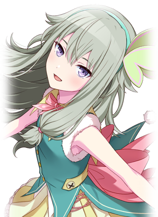
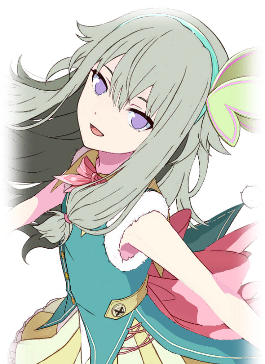
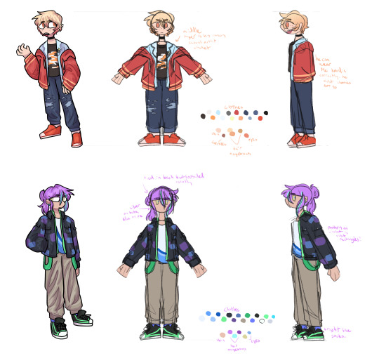
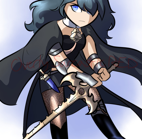
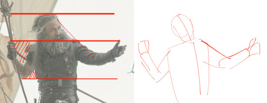
#this drawing is a bit more loose than my usual style
Text
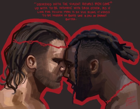
#aew#wrestling fanart#hangman adam page#swerve strickland#my art#haven’t posted in a while#school has been kicking my ass#been improving my digital art#this drawing is a bit more loose than my usual style
361 notes
·
View notes
Note
I recently started learning to use rpg maker (vx ace!) and as a result have become increasingly interested in pixel art. I hadn't really done pixel work since my teens - I do more digital painting and vector art - so while I'm a little familiar and can do passable editing, there's a lot I don't know.
One thing that's kind of perplexing for me is understanding the differences in style between two creators of pixel art. I studied art history and I'm used to the differences being things like brush stroke length or degree of realism... I feel like I'm lacking in lexicon in this new frontier lol
What nuances of an artist do you think are most important to style in pixel art?
This kind of stuff is not really officially studied (yet) so it's all a bit of opinion from me.
Usually in pixel art the biggest differences in styles are which limitations the artists choose to impose on themselves; colour count, resolution, palette... Or more stylistic choices like hue shifting, anti-aliasing style or no, dithering or no, etc.
I personally think there are a huge variety of styles in pixel art, as it's literally just a medium, and I hope you'll agree by the end 8)
Also (imo) there is some seperation between the styles of art for art's sake, and art for videogames, where things have to be clear and readable to be actually playable.
🎮 Old school games:
Sometimes referred to as something like '8-bit' or '16-bit' (relating to the NES era / SNES era consoles), these artstyles usually follow the rules and limitations of the hardware at the time.
This all falls under retro art, most popular styles include: NES, SNES, GB, GBC, C64
Notable artists: Nickwoz, Sandy Gordon, Franken, Cisco
📚 Old school art:
There were also events called Demoscene (still are), where developers would go to a big convention and share their demos. A lot of pixel art competitions were held here, where artists would draw live.
Generally they used to favour a high realism/semirealism style, with lots of texture/dithering, fairly high resolution (if the hardware allowed for it), and adjacent pixels mostly being different from one another.
There are even older styles than this but they are fairly niche and I'm not that well educated. If interested look into some of the old PCs/consoles.
⭐ Modern pixel art:
Usually using more colours and higher resolution, larger clusters of pixels instead of individual ones. Strong use of art fundamentals.
Artists to look at: Adam Ferguson (yes it is pixel art), Snake, Slym, 6VCR, Yes I do Pixels, Gijotto, SovanJedi, JoeCreates, Franek, @8pxl
the rest below are "modern" pixel artists too but I think they have other things in their style that are a bit different!
🎨 Painterly:
Some artists choose to emulate the natural brushstrokes digitally, and keep their clusters large and loose. Usually don't focus on the minute details as much.
@makrustic, @hexh-pixel, Umbohr, Gawrone
🟦 Dithering
These artists all use dithering / texture in ways that make their styles totally unique.
Deceiver, Night, Reo,
💥 Experimental
These artists are always trying new things and honing in on their unique style.
AJ, hby, @ilta222, Alphons
I could really go on for ever, there are so many different styles, cute pixel art, horror pixel art, 1bit (2 colours only), and then adding animation takes it even further, but I think you get the idea
If you want to learn more, the Masters of Pixel Art books have works /interviews from pixel artists of different eras, including demoscene and contemporary.
😊👍
231 notes
·
View notes
Text
Rough Day
A/N: Hardly proofread this because I just wanted to be DONE with it. I'm a bit annoyed that i've kind of adopted a 'same face syndrome' style for my writing.
Synopsis: Your strong, silent husband comes home late after a tough day at work ready to use you as a stress reliever.
TW: implied noncon/dubcon, arranged/forced marriage, Implied deaths + stalking, general fear, yandere-ish themes
Word Count: 2100

You were once preoccupied by a magazine loosely held between your finger tips, lazily glancing at its contents as you laid on your stomach. But the slam of your front door twisted your attention away from its pages-- the sudden boom making you jump. Your grip tightened, eyes watching the doorway. Sharp, familiar footsteps filled the hall accompanied by the rustling of clothes as your husband stormed in. He flung his suit coat to the bed, Oxfords still clicking against the wooden floor of your shared bedroom. His steps were heavier than ususal; something happened.
“How was your day?” You ask, jerking back to stare at the magazine as if it kept you safe from his wrath.
“Fine,” He responded. “It was work.”
You avoided his gaze when he began to take off his tie with unusual aggression. flipping a page in the flimsy book in your hands, an advertisement showed floral perfumes while a blog section detailed lists of expensive items celebrities were using now-a-days. You stared blankly at the page, trying to look as natural as possible on the bed.
Your husband huffed and sighed; you would’ve offered to help him with the tie he seemed so desperate but unable to get off, but your mind told you otherwise. His general aura made you want to curl in a ball under the sheets to avoid it. You always felt he was intimidating --ever since you met him after hearing you were to be married from your parents-- but moments like this were when you were truly nervous.
“Everything go okay with the meeting?”
“Yes. The investors were perfectly--” Your husband tore off his stubborn tie, dramatically throwing it across the floor. “Fine.”
The way his teeth clenched and his body tensed, you knew this wasn’t just his regular cruddy day at work. You guessed it was something to deal with the business meeting he had been planning for weeks.
Not much could get him worked up, but you knew this meeting was something that drastically affected his behavior depending on how it turned out.
You didn’t respond as he finished getting undressed, flipping the magazine page once more, and again pretending to read. You knew it was only a matter of time before he looked to you, but you were trying to hold off on that for as long as possible. You realized even if you tried your usual approaches of wiggling out of his affection, he was too wound up to not pounce on you like a raging animal in heat.
So you bid your time, silently pretending to read and hoping he’d get in the shower before trying to tackle you so you could play the ‘fallen asleep’ card. Goodness knows you don’t have enough energy to take him.
But as you heard his buttons come undone one by one, and his hands began to draw nearer, you knew your time was up. You didn’t say a word as he grabbed you by the hips to pull you close, snatching the magazine from your hands to toss it on the floor.
You would’ve protested, if this was your first time dealing with him. But you knew that never played in your favor. All you could hope for was that he’d be gentler this time; less rough, perhaps with a little bit of thought and rationality in the way he manhandled you.
“How was your day,” He asked, though you could tell he wasn’t really interested.
“Well… uneventful I guess.” You yelped once he laid you across his body, resting up against the pillows as your head laid against his chest. “I tried to clean…a little…” You found it hard to speak once his mouth was against your ear. The gruff sighs and clearings of his throat never failed to cause shivers to run down your spine. It even tickled your neck, the air from his nostrils hitting the back of your ear.
He hummed in response to your answer, sounding disinterested but as if he was listening.
You regretted having changed into your pajamas already. He slid your clothes around with ease, the loose fabric letting him do as he craved to your body.
The male was already latching onto you, a hand across your chest holding your shoulder, while the other was securely gripping your thigh, groping the flesh as his heartbeat slowed.
You could hear his breath gently hitch as you let out an anxious squeak.
“So uh… what did the investors think?”
You tried to make conversation, to not stumble over your words as your husband softly ran his lips down your neck, nuzzling into your shoulder with a hardness you knew was from how pent up he was.
‘They were reasonably upset,” he unfastened the top two buttons of your shirt with a swift motion. “But right now it doesn’t matter what they think.”
He effectively ended the conversation with that line, making you purse your lips together as you tried to ignore the ticklish circles he rubbed into your flesh. From behind, he had full access to you, unable to let go of your warmth. Or rather, unwilling.
The sound of his lips pressing against your skin filled the quiet bedroom, the gentle hum of the refrigerator in the kitchen faintly in the background. Your husband wanted to squish and feel you, to squeeze the soft parts of your body and squeeze them like a stress ball. There was also an, admittedly, large part of him that wanted to violently make love to let out all of his aggression instead.
It was hard for him to hold back when you made such cute little sounds, reacting to even the smallest things. It boosted his pride more than it reasonably should’ve, especially since he knew how unwilling you were in this marriage.
He snaked an arm up your loose night shirt, grabbing at your stomach and preparing to palm your chest with fervor.
“Shouldn’t you eat dinner first?” You asked wearily, already dreading the bruises and love bites you knew you’d find on yourself in the morning.
“I’m not hungry for food right now.” He whispered.
Biting at your ear, he massaged bruises into your thigh with his thumb.
You knew he probably meant that he didn’t have an appetite, but his phrasing couldn’t help but make you grow hot and squirmy.
“Don’t say it like that,” You groaned as his hand lifted under your shirt, running his ticklish fingernails up the dip of your chest. “And don’t touch me there!”
“I’m your husband, I can touch you where I want.” He mumbled into your neck, using an arm to hold your jaw. He pulled your face towards his with an uncharacteristic amount of desire.
Your husband's lips touched yours with a pressure that convinced you would crush your mouth.
He yearned for the touch of you, to want to squeeze so hard that you’d have a constant physical and mental reminder even when he left for work. It didn’t help that he was so closed off, focusing much more of his time on work these days to where he’d be touch starved by the time he got home. He’d still be as stoic and stern as ever, but with the added flavor of barking orders at you to sit on his lap and feed him.
“You’re allowed to touch me, too, you know.”
“Yeah.” You say, if only to have him stop talking about it out of your embarrassment. He was never one for extreme methods of affection until it came to these stress phases, which is why you couldn’t wrap your head around how physical he had become despite his distant personality.
But tonight he was warm and intense, enveloping you with his body to prevent your always perfectly timed escape. You couldn’t help but notice how his hips rocked to slide against you, the male lazily grinding upwards as you laid spread like a star fish for him. He forced your thighs open to become available for fondling and led your hands to a comfortable position. He guided you every step of the way, hardly giving you free will as he touched without hesitation. You didn’t dare move away, slightly enjoying the attention, but also feeling a strange sense of nausea as he got rougher with each grind against your backside and every tug at your hips.
He was getting impatient with just this. He wanted more.
Your husband removed the stronghold on your leg to play with the elastic hem of your PJ shorts, tugging at it so that it let out a small ‘slap’ against your skin once released from his fingers.
You would've caressed him back, would've kissed him with genuine desire and held him If he was truly befitting of the title "husband." But you knew the monster this man was. Married couples were supposed to cuddle and embrace, and lie with one another. But that was for spouses who were together willingly. That was if they felt some semblance of love and care. But your marriage was full of lies and threats, with death and forced servitude. You were civil with your husband, you looked the other way when you heard of a distant acquaintance who got too close dying, or finding a shiny black car following you down the street.
You could ignore his damage to your loved ones and his constant need of possession over you, but you couldn't seem to love him the way a spouse should. You could endure it, much like other things. But when it came to moments like this, you could only dread his powerful hands and the more than bruised body he'd leave you with in the morning.
“A-are you sure you want to do this now? You have work in the morning, and it’s already ten-”
“I’m sure.”
Your husband exhaled against your ear with relaxation, not acknowledging your hesitation. He was so close to you, your body nearly melting into his as his body heat mixed with your clean scent; the day's sweat still clung to him from when he rushed from meetings into cabs. He could smell the shampoo in your hair, the lotion you applied to your hands before lying down. The businessman couldn't help but lean into your neck and take a deep whiff, the smell helping him find comfort despite how much he desired to release his pent frustration.
“Just stay still for me…” He mumbled, pulling your shirt to the side to make room for his mouth. He bit down on your skin, refusing ro hold back as he dug his teeth deep into your flesh. You knew if he could, hed bite your flesh hard enough to tear; hed be able to consume a piece of you, and mark you deep enough for it to last forever. But though your husband was ruthless, he wasn't entirely a savage. So he settled for using your body to rub up against and squish, his teeth dragging along your soft skin with a longing desire in his eyes.
You could see behind the tired look and superiority complex, his lust sat waiting. It lurked in shadows during the day for when he could finally lay his paws on you-- his perfect spouse. And now, at night and alone with you, he wasn't planning on being gentle with his hunger.
Your husband's striking hands were brought to your flesh greedily once more, over his sudden sentimental mood and interested in one thing: relieving himself without a forethought.
One for being used to this fate, you didn't show reaction when he twisted you around, forcing you beneath him in a flurry of loose unbuttoned clothes and kisses. It didn't phase you when his pants fell partly down from his earlier undressing. As he planted rough kisses up your legs you didn't dare to speak or flinch-- didn't move as his white button up nearly slipped off, the bottom button having not yet been released.
You could tell with the way your spouses hands dragged you, gripping and pinching as they pulled you beneath him. He seemed so… needy. You'd never say that outloud, but it was true.
He pressed his lips down hard onto your skin and trailed up your abdomen. They were kisses that pinched your skin between his lips as restless fingers tugged at your nightwear.
Even if you wanted to fight back, your husband moved so fast it wouldn’t have mattered. You were practically a ragdoll in his hands, a stress ball that could hardly comprehend his lust.
And so, you let him ravage you. He released his heavy desires upon your body, forgetting the mess he’d make of you ‘til the morning.
#one shot#x reader#reader insert#self insert#yandere male#yandere#yandere x reader#y/n#yancore#yandere aesthetic#yandere imagines#yandere scenarios#yandere writing#yandere fluff#dark content#dark fiction#dark romance#yandere husband#yandere!husband#writing#male yandere#husband x reader#yandere husband x reader#yandere fiction#yanderecore#tw yandere#yandere x you#yandere boy#yandere x y/n#yandere oc x reader
5K notes
·
View notes
Text

we've got a date!
date night + morning with ellie! (+ a couple headcanons)
warnings: fluff! fem!reader (reader wears a dress & heels), modern au???? kinda, not really, but STILL! IDK!!! ALSO, mentions of pot/weed/reefer/mary jane/ganja... u know ;)
a/n: this has been sitting in my drafts for WEEKS! like seriously.. i forgot about it… also ty for 100+ followers?? i’ve only had this acc for a few weeks? sooooo ty!!! (´ヮ`)ノ*: ・゚
getting ready for date night with ellie takes longer than the date itself!
she always wants you to do her hair (she picks the same style almost every time) and her makeup (usually a little bit of concealer, dark eyeshadow, some mascara, and more often than not, a dark-reddish lip tint/lipstick)
but of course, it’s all an act to get you to be close to her and so she can get a good look at you :)
by the time you’re finished getting the both of yourselves ready, it’ll be too late to go to the fancy restaurant that you‘d had a reservation for.
“it’s fine, babe. we’ll stay in.” she says, her head tilting as she studies the way your dress hugs your waist and your hips, a grin forming on her face. “yea… we’ll definitely stay in.”
the one time you guys end up being ready on time, she wears a loose-fitting suit (becuz she’s classy like that), she prefers the darker shades to match with the makeup you did for her.
her accessories include TONS of rings, including the matching promise ring that she’d gotten for the two of you. i feel like she has 2 silver necklaces, one being a sorta chunky silver chain and a heart locket with a picture of you in it :(
and guys…. wouldn’t it be so fun and so silly and goofy if ellie wore matching underwear set with the reader? like….. HELLO?
during dinner (whether it’s at home or at the actual restaurant), she’s always staring at you, into your eyes, at your hair, at your body. 'god, she’s gorgeous.' she thinks to herself, watching as you eat your food. 'fuck.. i'm so lucky to have her.'
omg ellie has PAGES and PAGES dedicated to you in her notebook. if she could fill up her entire notebook with drawings, poems, and little details about you, she would.
but obviously she can’t because she needs it for her missions, and it’s best to travel lightly on them.
periodically, you’ll look up to see her sketching in her notebook. but when you try to take a peak, she covers up her pages with her hands. “babe!!” you whine, “let me see!!!” she groans and places her notebook in your hands.
as soon as your eyes hit the pages, you see detailed and pretty accurate drawings.. of you. “are these all me, ellie?” you gasp, and look up at her. she’s already looking away, a flustered and palming the back of her neck.
she mumbles something under her breath, but you can’t quite make out what. “what? i can’t hear you..” you reply to her mumbling. “i said… yes.” she responds, turning to face you, her freckled cheeks still flushed.
as soon as the two of you leave and get home, you shower her with kisses, placing your lips all over her face, neck, and face (basically wherever you can!)
i feel like ellie would be the type of person to order chicken tenders/a burger at whatever restaurant she’s at.
she doesn’t like changing up her orders too often, but she’ll definitely end up eating half of your meal as well :’)
it’s usually super late when the two of you get home. as you set down your stuff, you can feel ellie’s guitar-calloused fingers feel up and down your arms, her lips peppering soft and light kisses against the back of your neck and your shoulders.
“let’s go to bed, angel..” you hear her grumble behind you. she guides you upstairs, her hands placed on your hips, lightly pushing you up the stairs.
ellie LOVES to take care of you. taking your heels off, helping you out of your dress, taking your hair down/putting it up. the whole SHEBANG!!
but she’s also a big softie and loves when you return the favor :(
she absolutely loves your touch and feeling your soft hands and your delicate fingers gliding up and down her skin.
cuddling with ellie is usually short, but sweet. she likes to be little spoon most of the time, but since she falls asleep so quickly, she almost always ends up wiggling her way out of your grasp.
on the contrary, when you’re little spoon, her grip on you is so tight that you guys wake up the next morning in the same position. and thats how you know the sleep was good.
“so… how would you rate our date?” she asks, her eyes closed, already drifting off to sleep.
+++
you find yourself waking up the next morning to ellie’s side of the bed empty. “..ellie?” you call out. no response. as soon as you get up and walk halfway down the stairs, your nostrils are hit with a mixing aroma of both pot and…. bacon?
when you spot ellie, she has a spatula in one hand and the other is gripping the handle of the pan. 6 thick slices of bacon dance on the face of the pan as ellie exhales smoke through her nose.
when she finally realizes you were standing at the edge of the counter, she makes her way over to you, slightly blowing smoke into your mouth as she leans in to kiss you “good morning!" she says, taking the joint out of her mouth, and placing a deep kiss on your lips. "mmm my sweet girl.” she hums.
"hey, help me set the table!"
constructive criticism is appreciated !!!
#ellie williams x reader#ellie williams x you#ellie williams fanfiction#ellie tlou2#ellie williams#ellie williams fluff#ellie x fem reader#ellie x you#wlw#ellie x reader#ellie the last of us#the last of us#tlou 2#ellie tlou#ellie fluff#tlou fluff#fluff#𝐛𝐞𝐚𝐫𝐢𝐞𝐢𝐨 ୧ *.˚₊
543 notes
·
View notes
Text
Ok we all know guild me, build me exists due to my artistic abilities being very lacking in the visual arts, so rather than drawing the crows in the komedie brute, I had to write kaz in. however I had ideas for the others that I couldn't get into a fic, so I've put em down here
Kaz: (description ripped from guild me, build me):
a heavy black cape, sewn with stolen chains and jewels so that it jingled upon every movement (...) It was marked up and slit here and there, on the edges and at the collar, to give the impression of crow’s feathers, and it was made of some kind of shiny, velvety fabric that had the oily shine of crow’s plumage. The gloves were the same material, thinner and more embroidered than Kaz would have ever entertained, and the cane was a plain, inaccurate copy– (...) the mask; a silver crow’s head (...) crooked over the eyes and nose, almost like a Kaelish plague mask. But it left the mouth unblocked; of course it did. Dirtyhands needed to talk.
Inej:
Light and flimsy dark (doesn't have to be black; could be blue or grey) fabric for the veil and cloak. Has an element of spiderwebby fraying to it which is a nod to her being... Well, a spider lmao. But also meant to look ghostly and insubstantial, can sometimes see a metal shiny suggestion of knives underneath it. The veil can be parted just down the side of her face, so you can occasionally see a bit of her face, but never the whole thing. Would not be a practical costume to climb or spy in; too long and bothersome, the same way Kaz's Dirtyhands cloak would not be practical to pickpocket in. Sometimes productions get her a few cheap sheath knives.
Jesper:
Rabbit head mask, short cloak in some batshit colour like green or pink, lined w rabbit's fur and threaded with gambling chips, 'lucky' rabbits feet, coins, and stray bullets. Adornments tied on loosely so they swing everywhere when he moves. This way there's also a real risk of the Kaz and Jesper actors getting tangled together if they interact, which is not symbolic, just funny. This is our get-along Komedie Brute costume :) (we are stuck)
Wylan:
A once-fine red cloak with a high ruffly collar-- now tattered and singed and gone to seed. Little bits of wiring or string or pouches of powders etc sewn into it; sneakily embroidered with the Van Eck laurel around the edges. Mask, while elaborate and matching with the cloak, only covers the top half of his face, as if he's not quite as all-in as the others. For similar reasons, the cloak is half-length.
Matthias:
Wolf's head mask ofc, white fur cape a lot longer and more substantial than Jesper's, with heavy furring around the neck (made to bulk out the actor if they're not the right stature, which most will not be). Likely they also weight his boots to make his tread sound more imposing. Possibly a wig if they can afford one, since Druskelle are known for the long hair.
Nina:
Porcelain-doll Venetian style mask (you know the ones!) with a single black tear-- referential both to that bit in CK when they identified themselves that way in the crowd of Mister Crimsons, and the Queen of Mourning thing. Mask is covered with a very light veil, and she wears a long heavy silk cloak with a bit of a hint of a kefta, but not enough to get the Komedie Brute in shit from Ravkan Grisha lmao. Entrance usually heralded with a blue corpselight.
I imagine dependent on the production and the costumier they could look great and beautifully elaborate, or they could look cheap and shit lmao.
Bonus: I got bored and made a mock-up of a page of a Komedie play. I edited over the first folio for this, yes. Sorry to the Big W.S.
#right I think this is all right now. finally#fuckass blue site so glitchy it posts my shit early.#six of crows#soc duology#my fics#my post#grishaverse
179 notes
·
View notes
Note
Hello! I'm trying to shorten my sketch to good drawing time and I think your lae'zels are good (great) drawings. What does your initial process look like? (If you don't mind sharing your process) Do you have a sketch step or are you going straight in with the outline somehow? I'm trying to find a process that's more comfortable than I what I do now, which is sketchy and messy. And then I hate the inks I do because the sketch always looks better.
Thanks :)
Lucky for both of us I actually still have the sketch layer for my last Lae’zel drawing so I don’t have to make anything new to show the process!
I have no idea how to organize this so I'm just gonna go with my own weird thing and do levels and hope that it makes sense!

Level 1: This level is entirely for working out poses and forms. The sketch is really ugly and has no detail, just the basic building blocks for the pose and anatomy. Most of the time it looks even messier than this example, but I had to mock one up for this because if the pose is simple and I'm familiar with the character I'll just skip right into level 2
Level 2: This is when I start adding in details, not anything clean, still very messy and basic. I try to keep it loose and mostly from memory so I don’t overwork the sketch more than it needs. I usually start with a simple anatomy sketch, add hair and clothing overtop on another layer, erase the underlying anatomy, and then merge it all into one layer
Level 2.5: Sometimes on more complicated areas like the hair, hands, face, and clothes I’ll do another cleaner sketch with reference just in those areas to make the jump to level 3 easier. If I intend to leave it as a sketch ill usually do this with the whole piece and leave it as a "cleaned sketch" something a bit cleaner and more detailed than the level 2 example but not quite at level 3
Level 3: Here is where I really start busting out the references and getting down into the details. Since I don’t do inks and prefer a sketchier style this is basically my line art. I work through it in parts so things like the face, hair, clothing, hands, and skin details are all usually split up into different layers so it’s easier to manipulate and erase bits. Then at the end I merge it all together into one layer and either start on colors or call it done.
In really simplified terms, my drawing process is - draw a sketch, lower the opacity, make a new layer, draw a cleaner sketch, and then keep repeating that process till I get the results I'm looking for. Its definitely probably not the best way to do things but it works for me!
Hope all this makes sense and that the insight on how I do things helps you out!
92 notes
·
View notes
Text
lesson O1: cel shading and how to achieve it.
Project SEKAI uses a unique shading method, which is a cross between rendering techniques and what is commonly referred to as "Cel Shading." Cel Shading was a term coined by animators before computer animation, who worked in "cels" or hand-drawn scenes. Because of the limitations of the time, the animators had to find a cheap and simple way to shade, resulting in the shading we see usually in modern animation.
Project SEKAI uses this style in combination with rendering tactics to create their iconic art style.
In this lesson, I'll be going over how Project SEKAI achieves that look by breaking down their Live2d models and card cutouts.
Cel Shading is the basis upon which everything in Project SEKAI is shaded. Commonly, this is seen in: Live2d models and card trims. Here are some examples.
In both examples, you can notice the more "simplistic" style of shading. Now, the real question is: "How is this done?"
To explain this, I'll be using the card trim on the right as an example.
Firstly, artists need to put base colors under their lineart. Base colors are the bare-bones, not shaded colors. This is to provide a guideline as to what areas need what colors. Below, you can see the same Nene card trim, but reduced to its base colors.
It is a bit sloppy, considering I made it myself, but the point is; there is still **some** shading blocked out where it's needed. For comparison, see below.
So, now the question is: "how do I even do Cel Shading from here? I've gotten my base colors down, now what?"
And, luckily, I can share that too! First, let's start by doing the most important thing, deciding where our light source will be.
In this card, it looks to be at the top right, coming down to shine on her.
The yellow is where I estimate the light would hit her. Now, we need to decide where our darkest areas are.
In this card, the darkest colors would be away from the light, meaning they would be to the left.
The red is where I estimate the darkest areas would be. The areas behind her arm would also be darker than the rest of the card, since they aren't being hit directly by the light.
This understanding of lighting will help me to place my shadows and highlights later!
After this, I'd suggest putting in a new layer on top of your base colors, and clip it.

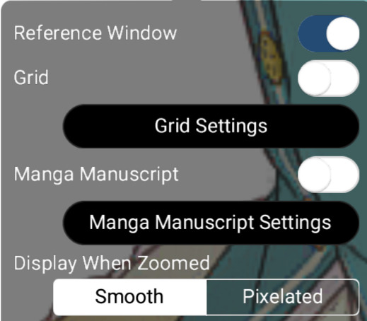
Now, I would be sure to grab a reference. For this drawing, I will be referencing the original trim, as well as the full card. I will be using a reference window, but use whatever works for you!
Now, we can get started! First, I'm going to block out where the **lightest** areas would be. I will be loosely following the card trim as a reference. Using the places we previously determined would be hit by the light, I blocked them out with loose colors.
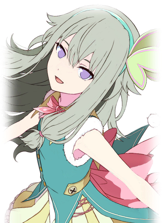
We know that these areas would be directly exposed to the light if it continued at the angle we previously determined. Now, as for the headband, I decided to block out a very light yellow color. This is because of something called ambient lighting. Ambient lighting is just when highlights have a similar color to their light source. This is seen a lot in photography, and sometimes, even in cards!
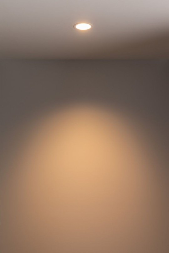
As you can see here, the light itself has a yellow tint, so the wall behind it will also appear yellow as a result.
We can also see it in Rui's newest card!
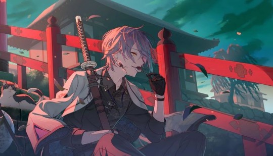
The light behind him is a reddish-pink, so that light bounces onto him, and makes the highlights appear that color. You can also see it on the railing and the building behind him!
Back to Nene, I then blocked out some of the darkest parts of her, based on our previous assumptions about the source of the light.
I shaded the areas of her dress according to how the bow was shaded. Since they were in almost the same place, we can use it as a guideline. We know that the dress isn't exposed to the light, since it is in front of the bow. As for the arms, we know the arm closest to her face would be fairly far from the light source, so I blocked out a shadow there as well.

Here, I adjusted some of the shadows, and I added some shadows to the dress. I blocked them all out in shapes, which I will go back and refine later.
I also added some shadows to the white fur on her dress. I paid specific attention to the edges of it in an attempt to make it seem "fluffier."
Here, I blocked out more shadows of her dress based on how the light would hit her. Now, we'll move on to the hair!
While it is messy, I wanted to ensure that the areas I placed shadows in would line up with my assumption of the light source. So, I toggled back and forth between the reference for the light source and the card itself to see where it fell. Now, with that, we are done blocking our our shading! I would suggest duplicating this layer to touch up everything to ensure you're satisfied with it.
The eyes will be a lesson by themselves, seeing as I didn't want to rush out two lessons in one and overwhelm people with so much information. This was a longer post than I anticipated anyhow.
If you have any questions, please feel free to shoot me a dm or an ask in the ask box! I hoped this helped at least a few people, and I will try to do weekly/bi-weekly lessons if I can!
If you found this helpful, please consider reblogging this post for more reach! I want to help as many people as I can!
#art tutorial#art study#project sekai art#pjsekai#pjsekai art style tutorial#proseka art academy#art lessons#nene kusanagi#kusanagi nene#shading test#cel shaded#prsk
29 notes
·
View notes
Text
Kind of couldn’t let humanity forget about this.

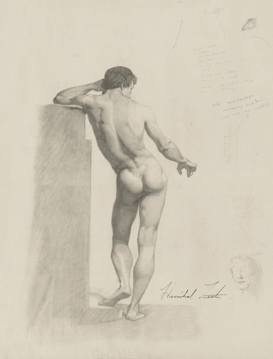
About Hannibal’s drawing pencils…(Decided to make a whole separate post about Hannibal Lecter’s drawing supplies to keep all the things I figured out after really attentive, extensive and obsessive research & viewing. Thanks to @existingcharactersdiehorribly for signal boosting my original questions! Sharing the fruit of my labours for the good of all Fannibals.)
1. Free range psychiatrist drawing habits
Hannibal DOES, in fact, draw with Tombow MONO graphite drawing pencils! (Originally, I just tossed the idea out there because these beautiful Japanese pencils seemed to fit his style, and it was an accurate guess.) These are professional drawing pencils, high-density graphite, strong point, smooth line. Hannibal has several at hand when he is drawing (which makes sense since his drawings have different values): in one scene, he’s shown with four different pencils while working on one sketch.
In case you want to sketch like Baltimore socialite Hannibal, this is a Tombow MONO.
He sharpens them with a scalpel (again, makes sense, a blade is preferable to a pencil sharpener for a better point).
Hannibal doesn’t seem to use a kneaded eraser, which is strange, nor have I spotted a blending stump (tortillon), but he has an ergonomically shaped triangular eraser. It looks like one of Faber-Castell grip erasers, the one Hannibal uses is the triangular shape but in a dark colour, possibly dark green (?). He also has a brush (to brush off the bits of eraser from the drawing).
2. Cooped up BSHCI resident drawing habits
Apparently Dr Alana Bloom provides Hannibal with quality drawing supplies. Unlike his usual set of hexagonal graphite pencils, Hannibal is seen with a single black round one. The lead is very black, suggesting a mix of charcoal and wax or charcoal and lead. It would have a soft matte finish. After squinting about 1001 times watching it roll over Hannibal’s table for half a second, I am certain it is Sanford Prismacolor Premier Colored Pencil, 935 Black, which is actually much more expensive than a single MONO drawing pencil (rough estimate: approx. $6.50 for 935 Black vs. approx. $1.50 for a Mono?). Alana is really pampering Hannibal.
In case you want to sketch like Hannibal in BSHCI, this is a Sanford Prismacolor Premier 935 Black.
(NB: Hannibal also uses a different pencil while in BSHCI, specifically, during the coversation with Alana about his insanity plea. The non-drawing tip is similar to the Tombow MONO, but I can give no definitive opinion yet.)
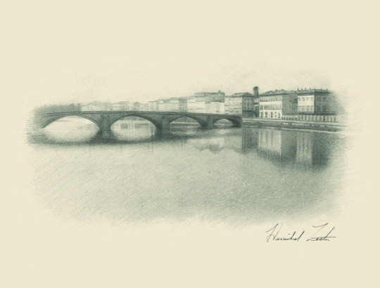
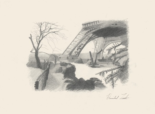
So far I haven’t been able to identify Hannibal’s drawing paper (loose sheets). He seems to use at least two types, one which appears heavier and with a warm tint (example), the other less heavy, smooth and prone to minor creasing (example), probably for looser preliminary sketches? But there’s also an unfinished study of a woman on a warm-tinted (or perhaps yellowed with age?), thinner, slightly creased paper (this one). Examples from NBC Hannibal site.
If you have any ideas about the grain, weight, tint, and brand of Hannibal’s drawing paper, or any observations of his use of erasers and blending stumps, please let me know! Or just chime in if you, too, care about Hannibal’s drawing supplies.
cc: trobador (banned I think?)
54 notes
·
View notes
Text


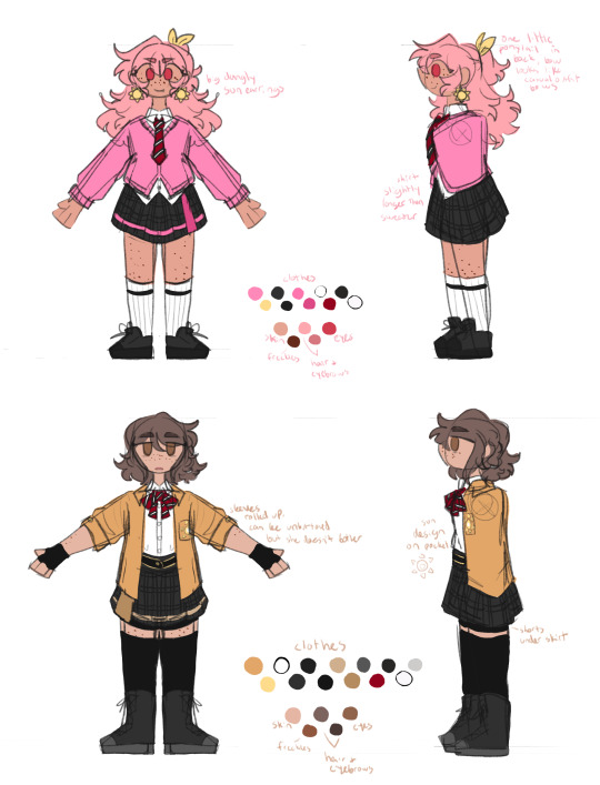
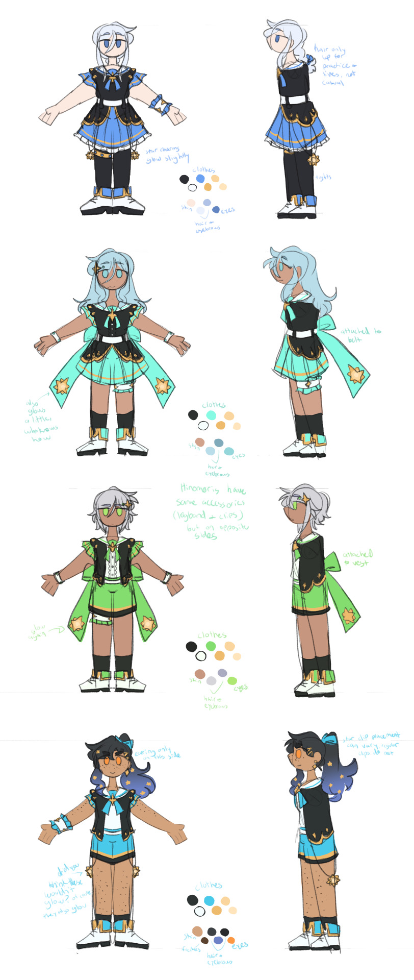
so i like the april fools shuffle units a normal amount. i have done redesigns for almost all of them and i draw them A Lot.
rambling additional notes on all of the redesigns below
a couple notes if you ever want to draw any of these redesigns for yourself at any point: i'd appreciate being credited for these redesigns (obviously anyone not redesigned i don't need credit for lol) and you don't need to follow my specific skin tone + hair/eye color schemes i have laid out. those are how i personally like to draw the characters and i've included them for anyone who might want to stay completely accurate to my redesigns, but you're welcome to use your own preferred color schemes for the cast when drawing them with these outfits!
now onto the fun(?) stuff
aoharu is pretty straightforward with redesigns, its basically just leoni but with a sun theme instead of stars. adding the image for the color palettes for the unchanged designs just because it has the notes for ichisaki too (their changes were too minor to completely redraw them, in my opinion).
ichika remains entirely unchanged design-wise other than adding a sun pin to her suspenders. saki stays mostly the same too, other than changing the design on her armband and switching her pigtails for a ponytail (in an attempt to seem a little more mature/imitate airi's hairstyle/move on from her childhood self since she's started to believe that honami and shiho want nothing to do with her and ichika anymore).
not too much to say about airi and ena's outfits either, i wanted to go a little more cute with airi and cool with ena, but there's minor changes with both of their hairstyles, with airi switching her pigtails for a ponytail as well (moving on from her idol days but still maintaining her usual sort of style) and ena's hair being a bit longer/messier.

yyj is definitely the most drastic, they're the only unit where i changed every single character... i have a lot of trouble drawing the mmj outfits, but also the lighter color scheme and clover theme just didn't really make sense for yyj to me? so instead i went with a mainly black and character color combo for their color schemes, alongside gold and white to accent it and a more spacey/dreamlike theme. everyone's black and white are slightly tinted with their character colors too!
they're split into pairs for matching accessories, but it doesn't mean much otherwise. kanade and an both have the dangling star charms and a single larger wristband (with those being on opposite sides from each other) as well as no buttons on the front of their outfits, while both hinomoris have the large bows on the backs of their outfits, smaller wristbands on both arms, a legband, and star shaped clips (like the other pair, the clips and legbands are on opposite sides from each other) and they do have buttons. they're split differently for the same style outfits though, with kanade/shizuku and shiho/an being the matching pairs this way.
kanade has the most obvious design changes. i swapped her character color to a medium-light blue rather than red, because tbh she kind of stood out too much if she was still red. she's not meant to be the leader of the unit, she doesn't want to stand out. her hair is a lot shorter than canon and she usually keeps it braided for practice and performances (and leaves it loose otherwise) (both the haircut and style were initially suggestions from shizuku). shes the only member of the unit to wear tights and to lack any star shaped hair accessories.
shizuku i don't have that much to say about, i had designed kanade first and then shizuku to match. its pretty straight forward i think? she's got the tallest socks not counting kanade's tights though.
for both an and shiho i wanted to go a slightly cooler/less feminine direction, while still sticking to the general theme i had going. which lead to the shorts and vest combo! otherwise the only notable change with either of them is that an's changed her clips to two regular gold ones and she's got a ponytail now when they practice/perform, much like kanade's braid.
fts was both very fun and an absolute pain to redesign because on one hand, i can do whatever i want, on the other hand, it's like vbs there's really no consistent theme to carry through everything. except a lot of layers i guess. so my goal was to kind of merge their casual aesthetics with something more vbs-like.
tsukasa wearing his jacket incorrectly was inspired by my own tendency to do so whenever i get too warm. i think he just does it because he thinks it looks cool though (its a little silly and a pain to keep it on but he's committed to the look). also leaving his middle layer as his fish jacket from his casual sprite was a funny little thing i thought worked for him.
with rui my goal was just pockets. lots of pockets. they're probably hiding little robots and tools in those pockets. i should have put more pockets on their pants too but oh well. combine that with wanting some obnoxious bright greens and blues and at least one item that kind of clashed color-wise with the rest (their pants in this case) and this is the result. the sketch doesn't convey it well but their black jacket and pants are both kind of loose, while the green hoodie and tshirt underneath fit okay. also their hair is kind of long if they ever untied it, but no one ever sees that.
hapisen for the most part sticks to their canon sprites, just simplified slightly for my sanity. mafuyu's costume still drives me insane to draw though, that's so many layers to think about.
other than questioning my sanity every time i draw mafuyu, there's only one change from her sprite, which is making her hairtie one decorated with pompoms much like a lot of other parts of her costume. i just thought it tied things together a little more.
the upper half of haruka's outfit is more or less completely unchanged (other than making it fit in a way that looks slightly more masculine), but then i replaced his skirt with pants and gave him boots (wxs meiko, who is the sprite haruka's outfit is originally just a recolor of, wears heels). i figured if i was going for a more princely sort of design for haruka then changing those felt fitting. beyond that he's obviously got shorter hair (a choice he makes after seeing kohane decide to change herself, wanting to embrace the genuine person he wants to be beyond the idol people knew him as) and that's about it. hits this guy with the transgender beam.
kohane's outfit is really just a bit simplified from the original with sizing/proportions of elements adjusted to (in my opinion) suit her better. the ribbons in her hair felt like a cute addition (and i like to give kohane ribbons in general), while her hair length is an in between of her two standard canon ones, longer than the usual one we see but shorter than pre-canon/early mainstory. her glasses are optional, she changes between them and contacts with how she's feeling for the day and what kind of shows hapisen is planning. the more intense the show, the less likely she is to wear her glasses.
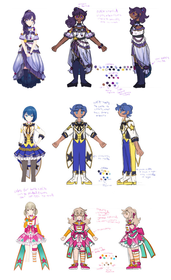
kyushumi was kind of intended as niigo but without one member in a mostly white outfit since they don't have someone like kanade who is intentionally trying to save people. although they're also a little happier off anyway, so they don't need someone like that. they're my most drawn shuffle unit, so also probably my most thought-through redesigns.
each design takes slight inspiration from a member of niigo (nene/kanade, minori/ena, honami/mafuyu), but that was just kind of as a personal guide for what kind of vibes to go with for the outfits. they've all got personal touches to them.
nene's hoodie is very loose on her body and arms, but a normal fit in the length, and her shorts are actually long enough to be seen. she just wants to be comfy, she's tired a lot, very low energy girl. glasses because i think nene should wear glasses anyway, so as opposed to canon nene who i like to believe just favors contacts, this nene does not.
minori is pretty obviously similar to ena's outfit, but there's a few nods to mmj in here. she's got clover shaped earrings, the pattern along the bottom of her dress is meant to resemble the tips of the clover leaves from mmj's symbol, and her shoes are just the mmj unit outfit shoes in different colors.
the goal with honami's outfit was simply "how little skin can she have exposed" because i imagine her being more worried about that than usual here. so long sleeves, long skirt, high collar, etc. her hair is longer (for no particular reason tbh, i simply liked how it looks) but still styled the same, and she's got a solid red scrunchie now. the four buttons on her outfit are all meant to look like the moon, two full moons and two opposite facing crescents. also i will never stop joking about the fact that she's naturally the second tallest girl in the cast (not counting vs, then she's third tallest) and i gave her tall heels on top of that. she is towering over all of her unitmates here.

while you're welcome to use these designs for any (non-incest) ships you'd like, i do have a personal list of ships that are canon to my own au with the shuffle units, which is what i originally designed these for. the "canon" ships are
ichika/saki
ena/airi
honami/kanade
akito/touya
mafuyu/rui (qpr)
haruka/kohane
mizuki/nene
however you are not by any means required to follow these specific ships! i have no desire to enforce the ships that go with these, so draw whatever ships you might prefer with these designs. i'm happy to see anything!
anyway if you made it this far congrats on surviving i know this is a lot of text o7 i hope you've enjoy my silly little character design insanities ^^;
#you guys have no idea how much these live rent free in my head#the chibis were a fun little project#and then it turned into the full sketch references for everyone once i realized i needed a better way to share my designs#project sekai#prsk art#project sekai fanart#prsk fa#w1f1 draws#saki tenma#ichika hoshino#airi momoi#ena shinonome#kanade yoisaki#shizuku hinomori#shiho hinomori#an shiraishi#akito shinonome#touya aoyagi#tsukasa tenma#rui kamishiro#emu ootori#mafuyu asahina#haruka kiritani#kohane azusawa#mizuki akiyama#nene kusanagi#minori hanasato#honami mochizuki#april fools shuffle units
168 notes
·
View notes
Note
hi i just discovered your blog and i LOVE your art. can you do a tutorial on how you do your pop rocks colors? im OBSESSED with it.
(totally cool if not, no pressure! :] )
this is generally what i do , and it's rough since i rushed it , but this is generally how it goes
this is a normal sketch
messy lineart done with a deep blue hue
colors !!! with basic shadows included . shadows aren't done with multiply or any of that , i just make the color a lil more saturated and move the hue
on an (unclipped) layer on top of the lineart layer , i just color my lineart . very loosely . this whole style is loose most of the time . i also add highlights by lightening the base color and moving the hue in the direction that feels lighter . additionally , i outline my shadows with a slightly darker hue bc it looks cool
(on the same layer as step 4) this is where i go Nuts . the lightest colors of the highlights are always pure yellow and teal , as they're naturally lighter than the other colors , and the secondary highlights are usually a bit more saturated and are blue green and yellow green . for other colors that aren't highlights , i tend to mostly go over the shadows (and the shadow outlines we added in step 4) by picking a color i'm gonna be going over and shifting the hue until it's a similar value/until it doesn't seem lighter or darker to the color i picked . i usually stick to purples , pinks , and blues for this
other things to note:
i tend to stay away from pure red and pure green
i use firealpaca's marker brush , which is like your standard pen brush but it's shaped like a rectangle
i don't think too hard about where i'm placing colors . if i pick a new color in step 5 i'll just put it wherever looks good . don't think about it too hard
unless i'm trying to be cleaner with this , my stabilizer is usually pretty low . i have it set to 10 on firealpaca- for reference , my sketching stabilizer is around 5 (side note: i should also mention that comparing to a lot of my artist friends , i just have my stabilizer really low all the time . my lineart setting is usually like 15 and firealpaca can go up to 40)
^^ i should also mention that stabilizer levels are different between programs just go with what feels right for you
my colors here are always very saturated . they're always either tints or shades , but never tones . mostly tints
^^ i do make exceptions to this if i'm going for a less saturated look (like my gumigoo drawing)
#please ask me any questions you may have KJHDFKGJSFHDK i know i can be confusing at times#long post#bright colors cw#tutorial#kinda#anonymous#asked box#lightly salted art
27 notes
·
View notes
Note
This is probably a weird question, but what are some tips you could give on character design? I've been trying to feel confident with my own designs, but they feel kind of bland... what kinds of things would you suggest to help make designs stand out more?
Hoo boy. Hm. I feel like I am not the right person to ask about this because objectively I do almost nothing you're "supposed" to, but if it's working I guess that means I might be onto something?
A lot of my design considerations are practical. I don't want to give anybody a design that's going to be a nightmare to draw over and over again. I've done enough commissions in my time to know when somebody is overdesigned and therefore hugely annoying to draw, and that's a no-no. So I tend to stick with simple patterns at most, not too many layers, no need for five million belts, no need for incredibly intricate hairstyles, etc. This is a practical consideration for the medium of comic art, but other mediums have different considerations - 3D-modeled art, for instance, can overdesign the characters as much as they want because they only need to model them once, and a lot of visual novel characters are limited to a very small handful of poses and some interchangeable expressions, meaning it isn't prohibitively complicated to make them a little Extra. The most time-consuming and frustrating commissions I've ever done were for characters who were frankly never designed to be drawn more than once. A quick sampling of highlights for the design features I swore to myself I would never deal with again-


So on a basic level, if you're designing a character to draw over and over again, it needs to be something you're willing and able to draw over again. Intricate patterns, a lot of interlocking plates, anything with lace - those are all things I try to avoid.
I've often seen the advice that character silhouettes should be super visually distinct, that characters should be very strongly shaped like different things. I think that's great if your style is that flexible, but if you kind of want everybody to be shaped like a human being with a skeleton, this advice is not very useful.

I think a diversity of body shapes is great, but the style I favor requires the anatomy to at least sort of makes sense, which means while there can still be a lot of variation in the distribution of muscle and fat, everyone's bones are gonna be in roughly the same place. I can't just draw a square and fill it with a dude. So instead I try and distinguish my character silhouettes in other ways.
Everyone's hair is different, and because most characters have big hair, this plays a large part in their silhouette. Falst and Erin both have short hair, but Falst's is a bristling mane while Erin's is usually more swept and soft-looking. Dainix and Kendal both have long hair, but even when Dainix's hair is loose it doesn't hang or flow the same way Kendal's does - it gets in the way, drapes in front of his face and overall doesn't move the same. Alinua's hair is bouncy curls. On top of that, everyone's outfits are fairly simple, but no two of them are exactly the same - Erin has a monopoly on poofy sleeves, Kendal has cuffed boots and the back-slung sword, Dainix has the poncho and the poofier pants, Alinua has the v-neck top with slightly pauldron-y shoulders and the slippers, Falst's clothing is ragged at the edges, etc. Even without getting into their distinct color palettes, everyone's at least a little bit distinct.
And this is another place where I purposefully try to avoid overdesigning. If everyone has too much going on it can circle around to being hard to tell the characters apart, because too much is happening. Who can pay attention to the fact that one character is sleeveless and one has asymmetrical boots and one has a mullet when everybody is wearing eight layers of embroidered fabric with four belts and half a breastplate on top?
Avoiding same-face is hard, and I'm not very good at it. But I do try to make sure everyone's face shape, nose and eyes are at least slightly different from everyone else's. It might not show from a distance and it might not be as extreme as a pixar design sheet, but it's something.
Ultimately the main consideration I keep in mind when designing characters is - perhaps a bit redundantly - their character. Who they are as people, and how that will impact the way they look. Everybody stands differently, and shifts their weight differently when a situation is changing.
Despite both being short, lightweight guys with short hair, Falst and Erin are wildly different people and are not going to dress the same, make the same facial expressions or hold themselves the same way. Despite both being tall, long-haired, generally friendly warrior badasses, Kendal and Dainix carry themselves very differently and react to things in very distinct ways. Tess and Erin have the exact same haircut and nobody noticed for ages because of everything else.


The designs aren't complicated, and compared to some, they aren't even that distinct. But I try to make sure that their personality is visible in every aspect of their design. Every "why?" in their design has an in-character answer, and since they're all quite different on the inside, keeping things simple means that starts showing through on the outside.
This is also how I can visually distinguish between Vash and Kendal, who have the exact same body and clothes.


we can never underestimate the importance of ✨body language✨
391 notes
·
View notes
Note
Do you have any advice for drawing stuff? I made art for the longest time, and now I’m trynna get back into it. My art looks terrible, so do you have any pointers I should start doing?
(God I loose motivation so fast, you don’t even know)
There's certain things I do when I want to get better at drawing something
1. Watch speedpaints or art live streams, especially if it relates to what you want to draw. Art streams are more helpful, but speedpaints are easier to access if there are no streams of what you want currently live. Watch it and absorb what they're doing. How they make certain shapes, where they start with what, and what you can do to mirror these things in your own art. If something seems too far out of your skillset to replicate, then discard it. Focus on what looks doable. Focus on what's 1 step ahead rather than 50. You can still play with these kinds of ambitions from time to time though, just understand that the goal probably isn't to perfect it but to rather learn a tiny bit. One of my favourite Moon drawings was made after watching Bamsara draw him for a few hours, actually
2. If an artist has an art style you really like, figure out why you like it. Don't post it, but trace over an artwork of theirs to get a feel for what makes their art so satisfactory. Then without tracing, try to redraw those details next to the drawing. It can look wonky. It usually looks very wonky. But it can help you figure out how a person might draw hair, features, anatomy, etc. Your goal isn't to completely recreate another person's style, but to learn shapes you could never understand at just a glance.
3. I pay no mind to the quality of the first few doodles of something I'm not used to drawing. Those doodles are for unconsciously memorizing the motion of the shapes, they're allowed to be wonky. My first Moon drawing was the goofiest thing to ever exist
52 notes
·
View notes
Text
Happy (belated) Pride Month everyone!!
Decided to revamp my adult Charlotte and Vendetta designs for the occasion (once again lol, + alt color variant)


I kinda tried to make it where their outfits are swapped to represent their relationship. Charlotte has a jacket Vendetta gave her, and Vendetta has a baking/cooking apron that Charlotte gave her (both being comforting for each other)
Also, I tried to make their clothing choices representative of how they'll be portrayed with the Retold AU.
Charlotte, who's more relaxed and usually wears more laidback clothing, becomes scared and secluded after finding out Vendetta tried to destroy her, which makes Charlotte quiet and afraid. And Vendetta, who's usually stern and reserved/quiet wearing more covered attire, becomes more laidback and friendly, allowing her to be freely happy and relaxed, now wearing loose clothing. Both of them become accustomed to each other's clothing and lifestyle styles, while also healing from their traumas and opening up to each other together
A perfect parallel for their relationship and the hardships they've endured together, and of course, a happy ending :33
UPDATED:
Updated the drawings because I think it would be better if Vendetta were lesbian rather than bi. I feel like it would do better in the long run, with Vendetta being closeted and thinking she's bi throughout part of the AU, only for her to realize that she's lesbian and I think that small bit of character growth would work, as it would also explore Vendetta's thought process and how she feels about herself, expanding her character even more
#making fiends#makingfiends#making fiends au#making fiends vendetta#making fiends retold au#charletta#venchar#making fiends charlotte#vendetta making fiends#zombro draws art#pride art#lgbt pride#sapphic#wlw#lesbian#Zombro Draws Art
14 notes
·
View notes
Text

Thanks for the ask, @strrwbrrryjam ! i'm flattered that you think I do a good job of that, because I'm still learning! (and I also struggle heavily with proportions. I have to resize my heads and arms so, so much...)
I'm afraid I don't have any secrets. I think the answer is to just practice, over and over again. But specifically, this is what I try to focus on as I'm learning:
references
quick practices - 30 second to 5 minute studies that help with getting a full scope of the shape and energy of the body, not meant to be perfect
studies - deep dives into certain anatomical structures (videos linked below)
Below the cut is how I use references go from this to this:

References:
Use a bunch of references! Pictures you take, stock images, from shows--practice real people. Even if your style is heavily stylized, it all starts from an understanding of anatomy.
How I Use a Reference When I Struggle With Proportions:
The first step I take while looking at a reference is to just draw a very loose sketch with a line of action that goes then entire length of the piece, and I try to section it out. I find if I don't think about the body as a whole, and just start drawing a head, the head will be way bigger than the rest of the image. So my first step is just really boxy and basic, just to get all appendages on paper. My first pass could look like this:
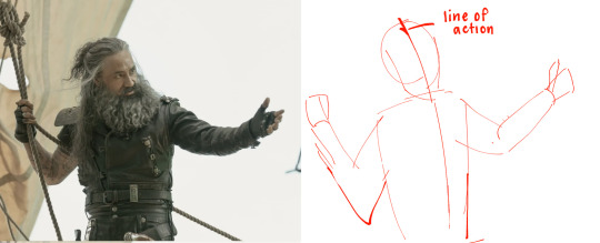
Okay, not bad. But the right arm is going way too far down--the forearm is really long. The head is too big for the style I want, and the left arm is at a 90 degree angle, unlike the picture. But, I have the general scope of everything on the page, so it's easier to adjust and look at the full picture!
Then, I try to focus on landmarks. I look at where certain body parts fall in the reference. For instance, Blackbeard's right elbow doesn't reach his belt, so his elbow shouldn't be near his waist. I can tell that his left arm is closer to being straight than at a right angle, and I can see that his head isn't as big on his shoulders as I have. I can also look at the negative space and see that the gaps between his right arm need to be smaller. So my next pass might look like this:
(I don't usually draw on the reference image, and I just "draw" the lines in my mind, but the for sake of things...)
Now it's looking a bit closer!
The next is the harder part. It's making things shapes, and is closer to the lineart stage. I try to follow curves, separate the chest from the torso, get the angle of the shoulders and head, etc. I have some video links at the end that explain this step much more in def.
You may notice that the head angle is a bit different than the image, and the shoulders are a bit lower. Sometimes, following a reference image completely either doesn't fit your style or, in some cases, the more accurate drawing following a reference can actually look "wrong" (anatomically) when drawn. Figure out what works best for you, and for the message you're trying to get across in the piece!
[sliiiight flashing in timelapse]
And here is the final timelapse, with a little refining and polishing of the anatomy. Not everything is completely accurate to the reference image, but I've created a believable image in the likeness.
I hope this helped! This was a quick and dirty post of something I'm still learning. Here are some youtube tutorial artists, resources, and books that I use to learn!
Youtube:
-ModerndayJames has lots of videos on creating shapes and understanding anatomy, and placing people in perspective. He has a lot of free videos, and then some cheap ones on gumroad that go more into it.
-Proko has lots of videos on anatomy!
Practice Resources:
-Pose Maniacs - figures in different poses. You can move the camera around to see different angles.
-QuickPoses has images for figure drawing and quick gesture drawing! You can even have different timers.
Books:
Morpho Series. There used to be the one on "Fat and Skin Folds" that was a free PDF download that was on tumblr for a while, but I don't believe the books are that expensive.
Taco's Books, published by Lezhin. This is heavily anime styled, but talks a lot about anatomy, and is a great resource!
#art tutorial#asks#mytutoirals#myart#proportions#turns out you can't add videos to asks and if you try it makes the post uneditable#so i couldn't answer your ask directly. hope you see it sorry!#anatomy tutorials
59 notes
·
View notes
Text
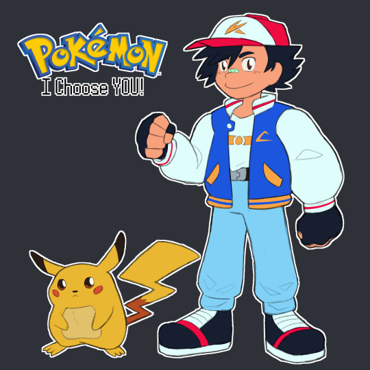
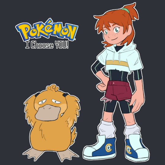


the gang's all here!!
now we're just missing team rocket 👀
inspired by kianamai's redesigns!!
design notes and lil musings under the cut!
Ash takes a lot from Pokespe in terms of his proportions (at least how the early chapters look in my head) and some cues from the newer movie designs bc i LOVE those, especially the one from Power of Us. So ya I also wanted to give him a big poofy jacket bc of i remember seeing an interpretation of Red's original sprite as a big jacket as well and i think it suits Ash a lot. The style was kinda early One Piece inspired at first, so there's just a big of Luffy in Ash's design, but I think it ended up more Digimon Adventure in the end lmaoo. The nose bandaid's to just elevate that rookie protagonist feel a lil bit + I spent way too long figuring out a new hat symbol lmaoo. He's also 11 in this world to match Red's age in RBY.
Pikachu I just wanted to draw him like Red's Pikachu in Special and give him the lighter coloured tummy from early artwork.
Misty's the biggest departure obvs but I knew I wanted to give her a crop hoodie and take inspo from Kiana Khansmith's Misty and give her the wetsuit as an undersuit. Then the chunky shoes were carried over from Ash with big scrumpled socks bc I thought it made her look a lil more unkempt. The whole goal was the make her more scrappy looking and focus in on the whole "Tomyboyish Mermaid" thing from the games. Also combined her RBY hair with her GSC do by making it a half-up ponytail that I think is very cute. OH and her shoes are Cerulean Gym branded, bc I imagine in this world there's merch for each Gym that the leader wear, so the wet suit and hoodie would be branded too. The hoodie's just cropped above the logo and the wet suit's logo's covered by clothes. She's about 12, so a lil older than Ash and does not let him forget it.
For Psyduck, I wanted to make him a lil fluffier and ugly-duckling + incorporate the three lil sprout hairs he's got a lil more to suit the style. He also has a neck now, you just can't see it super well here. He's just a fluffy lil duck who hurt a lot. Poor lil guy :((
Brock was pretty straight forward, I kinda wanted to reference his Sygna Suit from Masters with pants and a tank top, but made the pants into cargo pants that can be unzipped into shorts (he's thinks its the coolest thing in the world. He wears hiking boots to go over rougher terrain as a Rock-type Leader and hunt for fossils bc I like that aspect of his game characterization so I carried it over here, and he wears an armband with Pewter Gym branding. His tiny lil facial hairs are all he can grow at the moment bc he's still like 15 as usual, but he thinks it makes him look ~Older, Maturer & More Sophisticated~ so refuses to shave it.
I wanted to incorporate a lil more Geode Dude into Geodude so I changed his colours a bit and added parts where the outer layers of the rock have kinda chipped away in battles to reveal the crystal underneath + added the eyebrows from Alolan Geodude. I imagine it's like, the more outer layer gets chipped away from a Geodude, the closer they get to evolution. I do not at all know what this world's Graveller or Golem would look like but I think I'd canonise the theory of Machoke and Graveller taking aspects of the other when traded and make them kinda like Karrablast and Shelmet in a way.
Broad plot strokes are just these guys would exist in a version of the indigo league w an expanded kanto dex to include all related mons + variants, so stuff like Electivire and Annihilape and Alolan Exeggcutor would exist in there without much fanfare of ~Woahhhh Newly Discovered Pokemon~. Regional variants would be found on the Sevii Islands. Maybe there'd be small type changes too idk. Like pure Rock Geodude that gain Ground on evolution bc Gravel-ler. idk who knows I'm just spitballin. Essentially just a lil more closely following the Game's story, I guess. Less wacky loose adaptation stuff from Indigo League. Not bc I don't like that stuff, just bc it's not what I'd do.
I figure like, there'd be an interlude short arc that takes place in the Sevii Islands just after the Vermillion Gym where Ash would catch a Galarian Farfetch'd and all forms of Paldean Tauros instead of like, 100 Kantonian Tauros, and be introduced to Legendary Pokemon through a quest to track down the Galarian Legendary birds (then find out others can be found back in Kanto). Naturally he'd use the PC system (maybe adapted as some kind of daycare or something, or maybe just a teleporter to Oak's lab like the main anime) and have a couple more than 6 team members to rotate out as needed. Also. Mega Evolution would be a factor bc I think it'd be cool, so Ash gets to Mega Evolve Charizard into Mega Charizard Y.
OH also just for funsies, I'd split the starters across the trio, so Ash gets Charmander, Misty gets Squirtle and Brock gets Bulbasaur.
Basically Ash would end up with more or less the same team from the original series, but with added Annihilape, Sirfetch'd, Paldean Tauros and Mega Charizard Y. I also think I'd add Dragonite from Journeys and make his Gengar the Haunter he befriended that would follow him in secret after helping him beat Sabrina and evolve in the Cinnabar Mansion + officially join his team there.
Squirtle would evolve into Wartortle with Misty and Bulbasaur would stay in the same stage with Brock like Ash's.
I'll come up with and probably draw everyone's main teams at some point later but. ya. that's my piece!
#pokemon#pokeani#ash ketchum#pokemon anime#misty#brock#pikachu#psyduck#geodude#i say we're just missing tr but i'll probably also do gary and prof oak and delia and stuff hehe#my art
57 notes
·
View notes
Text
ok so i know i've literally never posted abt sanders sides before on this blog (i haven't been keeping up for a few years) but i've been tumbling down a waterslide lined with my old hyperfixations for the last few hours and ended up creating D&D au character designs for the core four sides using heroforge. images and descriptions under the cut if you're interested ❤ bonus points if you can guess what classes they are (this is EXTREMELY self-indulgent so pls forgive the ranting abt them, they're very important to me ok)


First up we have Roman! my beloved. one of my first questions when starting his design was how can i make him look as cunty as possible? the answer: heeled boots and winged eyeliner (It's a little tricky to see but he's got gold metallic eyeliner). I ADORE Roman's colour pallet so i kept it as close to accurate as i could, making white the base colour and accentuating it with the gold armor and the dramatic red shoulder cape as my stand-in for his sash. he's wielding a katana OF COURSE how could he not be. he's slaying ⚔ 🐉 and slaying 💅💋
moving on:


Patton. my baby, my honey, my ragtime gal. i decided to make his hair a little longer than roman's bc i thought it made him look softer and more approachable. it was UNBELIEVABLY hard to find something that sort of replaced his cardigan without looking too chunky but i did like this kind of loose tattered mantle, so i went with that. kept the sky blue shirt and gray cardigan/shawl, but gave him more greyish blue pants so they didn't blend into the shirt too much. glasses are round instead of square bc again i thought they made him look friendlier than the square ones. freckles bc i personally think freckles are very cute and patton is very cute so he got freckles. no shoes he's travelling the realms like the gods intended. the dad vibes are strong i want him to give me a hug 🥺
next up:


logan is quite possibly my favourite side so i really wanted to get his design right. the MOST important thing was giving him his iconic necktie, which ended up being pretty much the same color as his canon design. i couldn't give the tie specifically a pattern, so i made his vest stripy like his tie is in the show and i think it looks really good. his glasses are the more classic nerd ones which is perfect for him and i gave him black eyeliner bc i thought it made him look more serious. i added the coat for more of a d&d look (it doesn't make sense to traverse planes wearing a vest and tie) i think it gives him an extra bit of style that i love.
and last but not least:


the Anxious BoiTM himself (i've only had him for five minutes seven years but if anything happened to him etc etc). virgil's was one of the easiest designs aesthetically and hardest mechanically (you'll never guess what class he is guys i took some BIG swings). I knew i wanted him in black and purple (obviously) and i knew i wanted to give him the iconic purple hair dye and eyeshadow. i almost said screw the genre and put him in a zippered hoodie but i do think that a cloak and cowl would suit him very well (good for hiding in) and i found a combo that looked equally cosy and spooky. a bow is good for attacking long range and keeping out of danger (appropriate for anxiety, i thought) and the mask looks intimidating but actually helps him with sensory overload (with the cowl and mask on he's basically in a mini sensory deprivation bubble). an eyebrow ring bc he's edgy idk why honestly i thought it looked cool.
So that's basically it! As i said before if you can guess their respective classes i'll give you a cookie (🍪). since i can't draw, heroforge is usually my go-to for character creation and i have to recommend it (i think i talk abt this site a lot but 🤷♀️) it's so helpful for non-artist types like myself.
I hope you enjoyed! please leave comments if you liked they feed me (if you didn't like it, please just move on and don't let me know, i'm doing this for fun and i don't want any negativity please ❤) @thatsthat24 hope you like 🥰
#sanders sides#long post#roman sanders#patton sanders#logan sanders#virgil sanders#thomas sanders#you're too loud al#this is so different than what i usually post#sorry to all my d20 and starkid moots/followers i'm revisiting my old blorbos#i might be stuck here for a while who knows#pls be patient i love you all#do NOT @ me abt typos i wrote this at 12 am#no beta we die like logan in dealing with intrusive thoughts
12 notes
·
View notes
Last Seen Blogs

anoklahomagirl-blog
An Oklahoma Girl
the-brave-and-the-dumb
comic books, art and oh fuck I can't rhyme

necrovos
Back and happy!

furykang
제목 없음

eddsworld-universe-guardian-blog
COMEN BACK!!!!!!