#uppercase script letters
Explore tagged Tumblr posts
Visit Tumblr Blog
Explore Tumblr blogs with no restrictions, modern design and the best experience.
Last Seen Tumblr Blogs


Fun Fact
28.6 is the average number of monthly visits per US mobile user.
Note
hii can u do just the full alphabet of cursive capital and lowercase letters? thank u love 🎀
⠀⠀⠀⠀⠀⠀⠀⠀ 𝓐 𝓑 𝓒 𝓓 𝓔 𝓕 𝓖 𝓗
⠀⠀⠀⠀⠀⠀⠀ ⠀𝓘 𝓙 𝓚 𝓛 𝓜 𝓝 𝓞 𝓟 𝓠
⠀⠀⠀⠀⠀⠀⠀⠀𝓡 𝓢 𝓣 𝓤 𝓥 𝓦 𝓧 𝓨 𝓧
⠀⠀𝓪 𝓫 𝓬 𝓭 𝓮 𝓯 𝓰 𝓱 𝓲 𝓳 𝓴 𝓵 𝓶 𝓷 𝓸 𝓹 𝓺 𝓻 𝓼 𝓽 𝓾 𝓿 𝔀 𝔁 𝔂 𝔃

divider ctto !
#lilac♡#cursive#fonts#symbols#letters#cursive letters#letters copy paste#font copy paste#font pack#font design#uppercase#lowercase#math script font#coquette#coquette symbols#coquette fonts#requests
558 notes
·
View notes
Text
Some Letterform Vocabulary

CATEGORIES
Typeface—an artistic rendering or design of a set of glyphs. Used to be only one style, now usually refers to a type family.
Font—The medium containing an iteration of a typeface. For metal type, this would be the set of glyphs for a single size typeface (as designs varied by size to create optical harmony from one size to another). Whereas for digital type it refers to the actual font file. So if the file contains a whole family, then “typeface” and “font” become interchangeable. But if there’s only one style per file, then each one is a font but the collection of font files comprises the typeface.
Family—a collection of related typefaces with the same core traits and name. (Usually consists of regular, bold, italic.)
Regular—also called roman in text types, the base style (most significantly in terms of weight and width) of a type family.
Bold—a heavier (thicker) weight than regular, used to emphasize text in contrast to regular type.
Light—a lighter (thinner) weight than regular.
Weight—a gauge of the thickness of the strokes in a typeface.
Italic—a style of type based on chancery hand calligraphy developed in Italy. Initially used on its own (beginning around 1500), it was not used for emphasis in contrast to roman type on the same page until much later.
Oblique—type slanted to the right (different and distinct from italic).
Backslant—type slanted to the left.
Condensed—type that takes up less horizontal space than its regular counterpart. Condensed type is designed to keep stroke widths in proportion, whereas artificially compressing the type causes the vertical strokes to become thinner, losing much of the character and grace of the original design.
Extended—type that takes up more horizontal space than its regular counterpart. Extended type is designed to keep stroke widths in proportion, whereas artificially stretching the type causes the vertical strokes to become thicker, losing much of the character and grace of the original design.
Display—type meant for large sizes, typically with finer details.
Caption—type designed for very small sizes, meant to harmonize visually with text type and address specific design problems arising at such sizes.
Superfamily—also called a Type System, a collection of type families, often across different type classifications (like gothic and script) or consisting of an extensive range of type styles along multiple design axes.
FIGURES (Numbers)
Lining Figures—numbers that sit on the baseline and are about cap-height, meant to be set on their own or with uppercase letters. Also called Titling Figures.
Text Figures—numbers with different heights meant to harmonize with lowercase letters. Also called Oldstyle Figures.
Proportional Figures—numbers spaced to fit according to their shapes, the way letters are spaced. Lining and Text Figures can both be proportionally spaced.
Tabular Figures—also called Monospaced or Fixed Width Figures, numbers spaced equally in order to work in tables. Lining and Text Figures can both be tabular.
CLASSIFICATIONS
Classical—also known as Oldstyle, these types are characterized by triangular serifs, low stroke contrast, and an oblique (non-vertical) axis.
Humanist—also called Venetian, these types include the earliest type designs, which emulate 15th century manuscripts written in a formal hand. Based largely on Carolingian minuscule, they have low stroke contrast, a slanted axis, short and thick bracketed serifs, triangular serifs on the ascenders, and typically a tilted crossbar on the lowercase e. The work of Nicolas Jenson in 15th century Venice (hence the name Venetian) is the prime example of this classification.
Garalde—a portmanteau of the names of Claud Garamond and Aldus Manutius (whose work epitomizes this classification), garaldes have a horizontal crossbar on the e, finer proportions and stronger contrast than humanist types.
Transitional—also called Realist, this classification expresses the spirit of the Enlightenment. Transitional types have higher contrast than humanist or garalde, and a near vertical axis. Baskerville typifies this classification.
Modern—types categorized by simple or functional structures.
Didone—a portmanteau of Didot and Bodoni (whose work exemplifies this classification), these types have a vertical axis, very high contrast, and unbracketed serifs.
Mechanistic—also called Slab Serif, the types in this classification embody the spirit of the Industrial Revolution, which is when they first occurred. They have very low contrast and thick, rectangular serifs. The serifs can be unbracketed, like Rockwell, or bracketed, like Clarendon.
Lineal—another term for sans serif type.
Lineal:
Grotesque—also called Gothic, originating in the 19th century, these types have some degree of stroke contrast and tend to be somewhat idiosyncratic; typically the curved strokes have horizontal terminals, and the G has a spur. (Franklin Gothic, Akzidenz-Grotesk)
Neo-Grotesque—derived from grotesque typefaces, these types have less stroke contrast, a more regular design, and a high degree of subtlety; the curved stroke terminals tend to be slanted, and the G might not have a spur. (Univers, Helvetica)
Geometric—sans serif types derived from geometric shapes such as circles and rectangles, the glyphs in these types have a high degree of repetition and regularity. (Futura)
Humanist—derived from hand painted monumental capitals and Carolignian miniscules, the proportions of these types come closer to being written rather than constructed. They are similar in derivation to, but not derived from, Humanist serif types. (Gill Sans, Optima)
Calligraphic—type meant to show clear evidence of being chiseled, written, drawn, or otherwise created directly by hand.
Glyphic—also referred to as Incise, the types reference forms cut or incised into a hard surface such as stone, wood or metal. (Trajan, Copperplate Gothic)
Script—types based on calligraphy, cursive, or other hand writing.
Graphic—also called Manual, these types are based on slowly hand drawn originals.
Blackletter—types modeled after late medieval broad nib formal hands.
Gaelic—types derived from the insular manuscript hand.
Source ⚜ More: Writing Notes & References ⚜ Writing Resources PDFs
#typography#terminology#letters#writing reference#writeblr#dark academia#spilled ink#literature#writers on tumblr#creative writing#writing prompt#worldbuilding#light academia#writing inspiration#writing ideas#writing resources
74 notes
·
View notes
Text
Handwriting ask game
Describe your handwriting
Fanciest you can whip up
Chicken scratches
Uppercase VS lowercase comparison
Numbers
Your favorite letter (graphically)
Your favorite letter (phonetically)
Your favorite sound (as spelled, phonetic alphabet, description, whatever)
A letter you mangle all the time
A letter you used to write differently (before and after)
Another script
Your favorite word(s)
A quote you like
A good title
A name you like
Your favorite idiom
A tongue-twister
Your favorite kind of pen/apparatus to write with (use to answer if possible, describe if not)
Do you write by hand often?
Make a pretty signature out of your url/nickname
The first rule of the handwriting ask game is to have fun and be yourself.
📍You can default to english/latin script or to any other language as you wish 📚You can interpret the prompts however you want 📜You can write as you'd usually do even if it's difficult to read 📝You can misspell things
I have dysgraphia and this is a no-judgement zone, 'kay?
#i'll send asks to people who reblog! no fun if there's no participation#hehehe i'm glad to get this out i've been thinking abt it for a couple weeks#broadcasting my misery#ask game#dysgraphia#i get to tag this bcuz i have dysgraphia and having fun w my handwriting that was mocked and cost me marks is refreshing#so maybe it'll be nice for other ppl who have it
59 notes
·
View notes
Text
if you will (and can), imagine a letter. any letter. close your eyes and picture it.
feel free to tell me what letter you picked, its font, whatever. but I'm a lot more interested in:
17 notes
·
View notes
Text
Sooooo I got some more headcanons. This time about the @valrayne-faeu by @antlered-knight and @owl-bones and how their characters write. I used the first two names I found for each of them. (Please ignore that I misspelled Nightmare at the top)

In case you can't read my scrabblings, a transcript and some FunFacts are under the cut.
Nightmare - Juliet: He's a king, I think he writes a lot.
Cross - Mistral: As far as I'm aware, he's a soldier/guard, and I'm confident he had to learn how to write in the military.
Horror - Demian: Same as Cross =) I think he's older then the others (Aside the kings & Ink/Error) so he's probably written more than them and developed a "neater" handwriting.
Killer - Calson 540 Italic: He taught himself how to write so he could hang up flyers before his 'business' got popular, so he always had a very fine & neat handwriting.
Dust - Nevison Casual: I think he learned how to write in the military too. Him being an archer didnt grant him a neat handwriting, because I think he kept his fingers really stiff when hunting/fighting.
Soul - My own handwriting: She learned how to write on a farm to keep track of the crops/finances, and her writing became neater when she began studying dragons.
Dream - Cancellaresca Script: Same as Nightmare <3.
Blue - Park Avenue: No explanation. I just think it fits him.
Ink - Murray Hill Bold: He probably writes like he draws; long, thin strokes with a brush and not a pen.
Error - Van Dijk: He lives in the faewilds, he probably doesn't write much. I headcanon he struggles with it, especially the uppercase letters.
Funfacts: I HATE the font for Dream with a burning passion of a 1000 suns. Why. Why did I choose the font with the most INTRICATE LETTERS for the one with the (objectively) WEIRDEST NAME.
I checked and Horror is INDEED, like, 100 years older than the others.
I headcanon Killer started out as a very lowlife criminal, who hung up flyers for his assassination business. Once he was tasked to kill a person in Nightmares castle, and he almost did. Then he was recruited by Nightmare. (Also I think it fits his reputation as a Casanova in the fandom)
#utmv#faeu nightmare#faeu cross#faeu horror#faeu killer#faeu dust#my sona#faeu dream#faeu blue#faeu ink#faeu error#WOW these are a lot of boys#(these are all the boys im an idiot)#welp#ANYWAYS#yeah.#i did that during some free time today#just because i can#hehe
18 notes
·
View notes
Text
thinking so many thoughts about ender at the moment . disco i blame you entirely /lh /pos
thinking about how ender as a language system would be written as cursive, because it is not a very easy language to write by hand since a lot of the letters require you to take your hand off the page, which people do not enjoy doing very much - as evident by cursive existing in latin scripts and even in others like russian. but in ender it is extremely difficult to intuitively connect the letters to each other, especially the letters with underscores beneath them: ⊑ ⍜ ⎐ ⍙ and other letters with gaps in them like ⏚ they don't fit into the quick, keeping the pen on paper that is typically prefered with cursive
so i set out to try and make it cursive, to do that you would need to change some of the letters, in the same way they're changed in english to fit how we write cursive, but then i got extremely sidetracked about how the language of ender would have developed in fable smp and also the reasoning behind it not having capital letters
i dont fully remember the order of mortal creation in fable smp, but in my mind of minds it makes the most sense to be fable > enderian > netherum, with alerion obviously never creating his own mortals, instead having space for the deceased souls from all other realms. and to me it makes the most sense for humans to develop more agriculturally, as in the barren landscapes they had to find their ways to survive and develop farming etc. whereas i think in the end, with the abundance of food in the form of chorus fruit, which i imagine they also get their hydration from (of course if they even need hydration), they don't have much else to work with, so i would imagine enderian's people would start devoloping intellectually much faster rather than agriculturally- all this meaning i think they created a writing system first, as you can see in many places in ender some of them are so similar to english script, namely ⏃ ⎎ �� ⋔ ⋏ ⍜ (A F I M N O) you can really see how these could over a couple hundred years evolve into the common script.
this led me onto the thought of "how did common then get capital letters when ender doesn't have them" which led me to go down a bunch of rabit holes about when english started using capital letters - and i found that latin started out with the captital letters and then developed the lowercase script for cursive writing, which is incredibly similar to what i was doing which was taking the letters of ender and making them easier to write without taking your pen off the paper- what i was essentially doing is creating a lowercase alphabet, because ender is all uppercase, it makes the most logical sense.
this all being said, i have taken it upon myself to change up a couple of the ender letters to make them easier to write fluidly
my first attempts at cursive, before all this deep diving and thinking, perhaps reads as a more stylistic cursive

both say "ember"
the cursive - aka lowercase - ender alphabet

my first attempt after creating this

says "Ember"
And my attempt at a sentence, cursive, normal ender, and my english cursive handwriting

translation is already there but to keep consistent all three sentences say "The quick brown fox jumps over the lazy dog." which is a sentence that has all the letters of the alphabet.
14 notes
·
View notes
Text
irken alphabet hcs ★
i like to think that originally, irkens used to write using their claws since that would have been the most practical option back then, which is where their writing system got its characteristic angular aspect from. i think though present day irken empire has long since discarded handwriting in favor of typewriting as it developed and grew reliant on technology, the look stayed anyway...
even though the classic irken characters we're all familliar with still seem to be widely in use in-universe, the fact is they seem somewhat... tedious to handwrite. even more so for the conquered species who would have to assimilate to irken culture and their language, if we're running with the idea that the look of the irken alphabet is tied directly to their specific physical attributes.
i tried to imagine what a simplified/standardized irken alphabet might look like, based on the traditional characters. i'm not sure how common writing by hand is in the irken empire, since everything inside it seems so digitalized. in any case, this script is a lot less time consuming, so i can see it being used in the event where one would need to write something down quickly
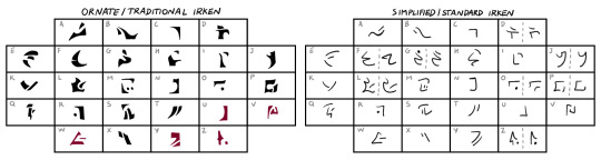
something of note here is that the letters in red (that is U, V, W, Y, Z) didn't exist until standard irken was developed.
i also gathered the "rejected" characters from the dvd subtitles for an earlier, proto-irken alphabet, and tried to arrange them so that the evolution between the two scripts would be more apparent. as previously stated, some of the letters are missing (because there wasn't enough of them for me to use lollll)

lastly - despite having been created to facilitate the act of writing, standard irken will sometimes incorporate traditional irken for the sake of stylistic contrast. since the concept of uppercase and lowercase letters is foreign to this alphabet, it's frequent (sometimes even expected!) to resort to traditional irken if you wish to put extra emphasis on a word (such as a noteworthy place, event, people) and especially if the subject invoked demands reverence.
(for the sake of example, both of these sentences are written in english)
#i'm aware soo many people have done this kind of thing already but i'm just having fun in my little corner thinking about language and so on#invader zim#blingee.txt
11 notes
·
View notes
Text
an almost whisper
prompt "whisper" by @onesmallfamily
highly inspired by this gif by @phoenix27884:
a/n: hey! i wanted to at least do ONE prompt of the 30 day sherlock september challenge. here is my ficlet of yesterday, because seriously- i fell asleep while writing it 😅
ps: so sorry bout the no uppercase letters, as said i was very tired for half of this (and lazy for the second)
○◡◠◡◠◡◠◡◠◡◠◡◠◡◠◡◠◡◠◡◠◡◠◡◠◡◠◡◠◡◠◡◠◡◠◡◠○
sherlock was sitting across from him. from john watson. what a gorgeous man he was. gray silky hair - combed back, a dark blue jumper that looked ridiculously endearing on him... his doctor hadn't had time to shave this morning and sherlock was currently trying to gauge how many colour shades you could see in john's beard. one, two, three...
the beard moved. well not the beard itself but the lips that sat between the beard.
what would it feel like to-
"sherlock, did you hear me?"
the asked man raised his eyebrows. had he heard him? "still caught up on the case, i fear."
"you solved it. what's there to think about?"
his john. asking just the right questions. unfortunately they were rather uncomfortable right this moment, considering sherlock had been thinking about and staring at john's facial hair...
topic change. "how was dinner?"
"delicious. pity you didn't have any."
"eating..."
"... slows you down, i know, i know.", john said, but there was an amused grin on his lips. for some reason sherlock had to look away to catch himself. john smiling at him like that, it did something to him. something that hits way further inside than just into his heart.
he sensed john leaning back and stretching his face up to the sun. sherlock simply had to turn his gaze back onto him. the sun highlighted the few blond strands left and the red undertone in john's beard... it accentuated the wrinkles, that sherlock loved, because they reflect just how real john is. the detective then realized he was staring again and looked away. pretending to focus on the people around him, maybe deducing them. in reality every sense was directed at john. he heard him move, sensed his body being closer to his, smelt a hint of the coffee john had drunk, saw him putting his chin into his hand out of the corner of his eye.
he felt john staring now. sherlock decided it was safe to glare back at him. and was swept off his feet, well he was sitting, but he was still overwhelmed by john's expression. there was so much adoration, fascination and out of a lack of better words - love in his eyes.
sherlock had to smile back at him. he felt his face getting hotter. john - without saying a word - made him feel special.
john's gaze never left his and then exclaimed, barely above a whisper, "i'd like to kiss you." it was out of the blue, but it felt like the perfect timing.
what happened next felt natural, like they were actors who were acting according to a script: sherlock stood up leaned over the small table and placed his lips on john's.
the kiss was over soon, but they both knew it was just the first of uncountables.
a smile, a hand sneaking into his, looks speaking more than words.
on that day just like that, with that tiny almost-whisper and their promising first kiss they stopped being augend and addend and began being a sum.
○◡◠◡◠◡◠◡◠◡◠◡◠◡◠◡◠◡◠◡◠◡◠◡◠◡◠◡◠◡◠◡◠◡◠◡◠○
tag list! (tell me if you wanna be added or removed please 💚) @justanobsessedpan @helloliriels @catlock-holmes @fluffbyday-smutbynight @inevitably-johnlocked @hisfavouritejumper @rhasima @forfucksakejohn @ohlooktheresabee @turbulenttrouble @so-youre-unattached-like-me @totallysilvergirl @peanitbear @train-mossman @loki-lock @smulderscobie @timberva @grace-in-the-wilderness @chinike @jawnn-watson @whatnext2020 @escapingthereality @missdeliadili @kettykika78 @musingsofmyown @7-percent @speedymoviesbyscience @astudyin221b @francj15 @we-r-loonies @mxster-jocale @sherlockcorner @noahspector @our-stars-graveside @jobooksncoffee @baker-street-blog @macgyvershe @myladylyssa @battledress @a-victorian-girl @dreamerofthemeadow @oetkb12 @ohnoesnotagain @mutedsilence @jawnscoffee @raenchaosandcozyadashofmurder @lisbeth-kk @quickslvxrr
#turtely writes#johnlock#johnlock ficlet#inspired by gif#30 day sherlock september challenge#bbc sherlock#sherlock#john watson#sherlock holmes#martin freeman
104 notes
·
View notes
Text
hmmm okay so in follow-up to my last post, there's another thing I've been up to this Lent: I made another silly phonetic writing script for English! (very long explanation below the cut)
so they way it works is: I sat down one say and was like, "Okay it's really easy to make something that works atrociously, but what about something at least somewhat helpful?", which led me to write out the alphabet and try to simplify it!
what I came up with is a couple definitive changes, that are thus:
1. Voicedness!
I decided that all voiced consonants were to be removed and replaced with their unvoiced relatives but with a little apostrophe mark above them to indicate their said voicedness :>
2. Vowels!
I realised that if English is to be made simple, that's essentially to say it's been made intuitive, so I wandered very rapidly into the problem of consonants being extremely straightforward, and vowels being equally as extremely not
my solution? was first to simply look up all vowel sounds and plot them accordingly, which resulted in the main 5 (diacriticless) corresponding to more or less their original short vowel sounds, with the inclusion of omega (Ω,ω) in representation of what the IPA denotes as an upside-down omega (hm i wonder why i chose omega XD), and the schwa!!!! oh how we love the schwa, it's the same both lowercase and uppercase
and so now that all the short vowels were mapped out, I moved onto the long sounds, to which I originally corresponded with doubled-up versions of the og vowels, to then be shorthanded into the original vowel with the upside-down triangle diacritic on top of them; The vowels themselves are a weeeee bit unintuitive to native English speakers, so they would take some getting used to *nod nod*
and then, those out of the way, I finished with diphthongs! these were relatively simple when I realised that in the IPA all diphthongs but one are a predetermined vowel sound paired with either and "i" or an "Ω", so I just used diacritics over the paired vowel to indicate as such! for the omega-paired vowels, a squiggle equivalent to the one in "ñ", and for the i-paired ones, a dot like a lowercase "i" is over them :D the one diacritic that didn't follow this pattern was, conveniently, an e paired with a schwa, so I just combined 'em into an o with a horizontal like through it lol
all in all, you have 7-ish short vowels that don't contain diacritics, 5 long vowel sounds that are marked with an angy-brow, and like 9 or so diphthongs that are almost unanimously marked with either a squiggle or a dot!
3. Little changes
I also took it upon myself to use an "m" marked as voiced to represent the letter "n", since they're both nasal consonants and I liked the compaction XD
and to represent "L" with the rhotic-consonant-voiced, since it can't be unvoiced and L is literally just some of the r-sounds pushed further into your alveolar
so! that's about it! this was delightful to think up one night, and I do use it sometimes when I'm making short notes on my whiteboard, so I can confirm there's somewhat of an air of intuitiveness surrounding it! I hope you all have enjoyed, and now enjoy the rest of your day :DD
#the talkies tag#linguistics#language#writing scripts#this was so fun lol ^-^#i'm sure there'll be ironing at the creases as they come up *nods*
5 notes
·
View notes
Text
The idea of a Braavosi alphabet has been churning around in the back of my head for a while, and I’ve finally settled on a version I feel is interesting and “right” for the setting!
Sorry a couple of the letters are out of order and also for the image rendering, my handwriting is not all that great lol

Love love love Braavos it is so medieval Florence Venice core and I wanted to reflect the visual style of the manuscripts of that era with the script. I also felt like the Braavosi script would be in a rounded style especially during this time where it’s written by quill and inkbrush. The script kinda tended towards “standard fantasy alphabet” decisions like making it an alphabet and having both uppercase and lowercase versions of the letters, but I felt like it worked well for the aesthetics.
The script has been in use for more than 400 years, being developed at least in part by the Moonsingers who first came to Braavos by escaped slave ship, so I imagined that it was first used to write a form of Low Valyrian before evolving over time as the language turned into the modern Braavosi thats spoken during the time of the main series.
Most of the letters have existed since the beginning of the script except for “f” which developed later in Braavos’s history. There are two “y” letters: the one that’s just y is treated as a vowel (like in Daenerys) and the one that’s j/y is a consonant (like in the name Yorko). “gh” (as in “Valar morghulis”) exists as a letter but its pretty archaic today as the sound doesnt exist in the language of the city today. “x” only exists for transcribing the back-of-the-throat guttural sound but only like the Iron Bank uses it if you ask pearl merchant #17 about that letter they probably couldnt answer you
More information about the technical details and thought process behind this script can be found at this post
#i loved seeing the fandoms contributions to grrms worldbuilding in fashion and hairstyles and so much art#i wanted to contribute in my own way#plus i feel strongly that braavos should have its own unique visual style as we get some hints of it in the books but more is left unfilled#asoiaf#neography#braavos#game of thrones#greenbloods.txt
55 notes
·
View notes
Text
Note: Case folding is not the same as lowercasing, and a case-folded string is not necessarily lowercase. In particular, as of Unicode 8.0, Cherokee has become a bicameral script with the introduction of lowercase Cherokee letters, but Cherokee text case folds to the existing uppercase letters. This case folding behavior for Cherokee text is precisely to guarantee continued case folding stability.
I learn about Unicode by collecting Bulbapedia-tier trivia
2 notes
·
View notes
Text
Inventors of the Latin script and inventors of maths working together to create the ultimate diabolical plot: uppercase and lowercase letters that look the same when written on a classroom board but mean entirely different things in lots of different maths subdisciplines
#taking statistics and p and P look exactly the same on a chalkboard but they CANNOT be mixed up#english language#language#latin script#maths#mathematics#statistics
6 notes
·
View notes
Photo

Handwritten script font with uppercase and lowercase letters, numbers, and punctuations. Includes OTF, ETF, Eps10, AI, JPG, and PNG files for easy installation on Mac or PC.
Link: https://l.dailyfont.com/fUYSM
#aff#Font#Design#Typography#Graphics#DigitalArt#CreativeTools#Inspiration#GraphicsDesign#DesignCommunity#FontsForDays#DesignLove#ArtisticLicense#DigitalCreative#TypeFace#ScriptFont#Lettering#HandwrittenFont#FontFrenzy
3 notes
·
View notes
Text

yes.yes i am fucking gay for you and i dont regret it, bastard


/silly

Sigma (/ˈsɪɡmə/ SIG-mə;[1] uppercase Σ, lowercase σ, lowercase in word-final position ς; Ancient Greek: σίγμα) is the eighteenth letter of the Greek alphabet. In the system of Greek numerals, it has a value of 200. In general mathematics, uppercase Σ is used as an operator for summation. When used at the end of a letter-case word (one that does not use all caps), the final form (ς) is used. In Ὀδυσσεύς (Odysseus), for example, the two lowercase sigmas (σ) in the center of the name are distinct from the word-final sigma (ς) at the end. The Latin letter S derives from sigma while the Cyrillic letter Es derives from a lunate form of this letter. The shape (Σς) and alphabetic position of sigma is derived from the Phoenician letter 𐤔 (shin).
Sigma's original name may have been san, but due to the complicated early history of the Greek epichoric alphabets, san came to be identified as a separate letter in the Greek alphabet, represented as Ϻ.[2] Herodotus reports that "san" was the name given by the Dorians to the same letter called "sigma" by the Ionians.[i][3]
According to one hypothesis,[4] the name "sigma" may continue that of Phoenician samekh (𐤎), the letter continued through Greek xi, represented as Ξ. Alternatively, the name may have been a Greek innovation that simply meant 'hissing', from the root of σίζω (sízō, from Proto-Greek *sig-jō 'I hiss').[2] In handwritten Greek during the Hellenistic period (4th–3rd century BC), the epigraphic form of Σ was simplified into a C-like shape,[5] which has also been found on coins from the 4th century BC onward.[6] This became the universal standard form of sigma during late antiquity and the Middle Ages.
Today, it is known as lunate sigma (uppercase Ϲ, lowercase ϲ), because of its crescent-like shape, and is still widely used in decorative typefaces in Greece, especially in religious and church contexts, as well as in some modern print editions of classical Greek texts.
A dotted lunate sigma (sigma periestigmenon, Ͼ) was used by Aristarchus of Samothrace (220–143 BC) as an editorial sign indicating that the line marked as such is at an incorrect position. Similarly, a reversed sigma (antisigma, Ͻ), may mark a line that is out of place. A dotted antisigma (antisigma periestigmenon, Ͽ) may indicate a line after which rearrangements should be made, or to variant readings of uncertain priority.
In Greek inscriptions from the late first century BC onwards, Ͻ was an abbreviation indicating that a man's father's name is the same as his own name, thus Dionysodoros son of Dionysodoros would be written Διονυσόδωρος Ͻ (Dionysodoros Dionysodorou).[7][8]
In Unicode, the above variations of lunate sigma are encoded as U+03F9 Ϲ greek capital lunate sigma symbol; U+03FD Ͻ greek capital reversed lunate sigma symbol, U+03FE Ͼ greek capital dotted lunate sigma symbol, and U+03FF Ͽ greek capital reversed dotted lunate sigma symbol.
Derived alphabets
Sigma was adopted in the Old Italic alphabets beginning in the 8th century BC. At that time a simplified three-stroke version, omitting the lowermost stroke, was already found in Western Greek alphabets, and was incorporated into classical Etruscan and Oscan, as well as in the earliest Latin epigraphy (early Latin S), such as the Duenos inscription. The alternation between three and four (and occasionally more than four) strokes was also adopted into the early runic alphabet (early form of the s-rune). Both the Anglo-Saxon runes and the Younger Futhark consistently use the simplified three-stroke version.
The letter С of Cyrillic script originates in the lunate form of Sigma.
4 notes
·
View notes
Text
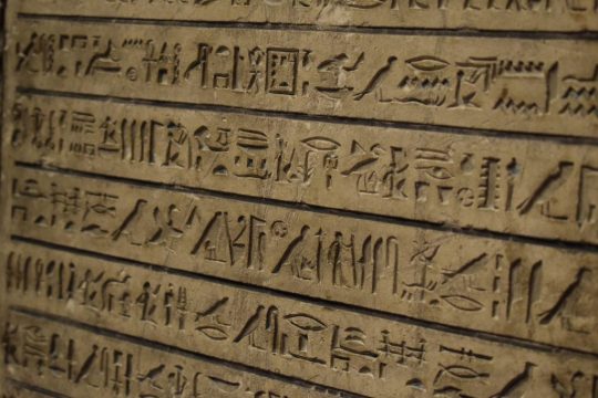
The Evolution of the Alphabet: A Story of Human Ingenuity and Innovation 🤯
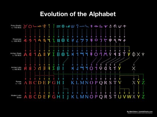
How the Alphabet Changed the World: A 3,800-Year Journey
The evolution of the alphabet over 3,800 years is a long and complex story. It begins with the ancient Egyptian hieroglyphs, which were a complex system of pictograms and ideograms that could be used to represent words, sounds, or concepts. Over time, the hieroglyphs were simplified and adapted to represent only sounds, resulting in the first true alphabets.
The first alphabets were developed in the Middle East, and the Phoenician alphabet is considered to be the direct ancestor of the Latin alphabet. The Phoenician alphabet had 22 letters, each of which represented a single consonant sound. This was a major breakthrough, as it made it much easier to write and read.
The Phoenician alphabet was adopted by the Greeks, who added vowels to the system. The Greek alphabet was then adopted by the Romans, who made some further changes to the letters. The Latin alphabet, as we know it today, is essentially the same as the Roman alphabet, with a few minor modifications.
The English alphabet is derived from the Latin alphabet, but it has undergone some further changes over the centuries. For example, the letters "J" and "U" were added to the English alphabet in the Middle Ages, and the letter "W" was added in the 16th century.
The evolution of the alphabet has had a profound impact on human history. It has made it possible to record and transmit knowledge, ideas, and stories from one generation to the next. It has also helped to facilitate communication and trade between different cultures.
The alphabets are a fascinating invention that have revolutionized the way humans communicate and record information. The history of the alphabets spans over 3,800 years, tracing its origins from the ancient Egyptian hieroglyphs to the modern English letters.
Here is a brief overview of how the alphabets have evolved over time:
Egyptian hieroglyphs (c. 3200 BC): The earliest form of writing was the pictographic system, which used symbols to represent objects or concepts. The ancient Egyptians developed a complex system of hieroglyphs, which combined pictograms, ideograms, and phonograms to write their language. Hieroglyphs were mainly used for religious and monumental purposes, and were carved on stone, wood, or metal.
Proto-Sinaitic script (c. 1750 BC): Around 2000 BCE, a group of Semitic workers in Egypt adapted some of the hieroglyphs to create a simpler and more flexible writing system that could represent the sounds of their language. This was the first consonantal alphabet, or abjad, which used symbols to write only consonants, leaving the vowels to be inferred by the reader. This alphabet is also known as the Proto-Sinaitic script, because it was discovered in the Sinai Peninsula.
Phoenician alphabet (c. 1000 BC): A consonantal alphabet with 22 letters, each of which represented a single consonant sound. The Proto-Sinaitic script spread to other regions through trade and migration, and gave rise to several variants, such as the Phoenician, Aramaic, Hebrew, and South Arabian alphabets. These alphabets were used by various Semitic peoples to write their languages, and were also adopted and modified by other cultures, such as the Greeks, Etruscans, and Romans.
Greek alphabet (c. 750 BC): The Greek alphabet was the first to introduce symbols for vowels, making it a true alphabet that could represent any sound in the language. The Greek alphabet was derived from the Phoenician alphabet around the 8th century BCE, and added new letters for vowel sounds that were not present in Phoenician. The Greek alphabet also introduced different forms of writing, such as uppercase and lowercase letters, and various styles, such as cursive and uncial.
Latin alphabet (c. 500 BC): The Latin alphabet was derived from the Etruscan alphabet, which was itself derived from the Greek alphabet.
Roman alphabet (c. 1 CE): The Roman alphabet is essentially the same as the Latin alphabet, as we know it today. The Latin alphabet was used by the Romans to write their language, Latin, and became the dominant writing system in Europe after the fall of the Roman Empire. The Latin alphabet was also adapted to write many other languages, such as Germanic, Celtic, Slavic, and Romance languages.
English alphabet (c. 500 AD): The English alphabet is derived from the Latin alphabet, but it has undergone some further changes over the centuries. For example, the letters "J" and "U" were added to the English alphabet in the Middle Ages, and the letter "W" was added in the 16th century. The English alphabet consists of 26 letters, but can represent more than 40 sounds with various combinations and diacritics. The English alphabet has also undergone many changes in spelling, pronunciation, and usage throughout its history.
The evolution of the alphabet is a remarkable example of human creativity and innovation that have enabled us to express ourselves in diverse and powerful ways. It is also a testament to our cultural diversity and interconnectedness, as it reflects the influences and interactions of different peoples and languages across time and space.
Thank you for reading! I hope you enjoyed the post about the evolution of the alphabet. If you did, please share it with your friends and family. 😊🙏
#evolution of the alphabet#history of writing#alphabet#hieroglyphs#proto-sinaitic script#phoenician alphabet#greek alphabet#roman alphabet#english alphabet#language#linguistics#consonantal alphabet#syllabic alphabet#ancient egyptian#greek mythology
20 notes
·
View notes
Text
Did no one fucking checked in with the greek alphabet because what the fuck is this shit Camp Half Blood?

Stables/STAβLΣS is going to be read in old Greek as Stablss but modern Greek as Stavlss (the β giving more of a v sound in modern words but holding to b in ancient phonetics) also the capital Beta is just B not β.
Archery spelled like ΑRCHΣRΨ in Ancient Greek reads Arcisrps and maybe ok sure that’s an H instead of an uppercase ita (η/Η) so it’s archsrps.
Like I know they have “dyslexia” in that their brains are hardwired for Greek, but what the fuck???? I have dyslexia, and just write the fuckin signs in English. Your Greek-hardwired Brain isn’t going to read that easier.
STABLES or ΣΤΑΒΛΕΣ
ARCHERY or ΑΡΧΕΡΥ
And that’s using English words.
In Greek it would better be στάβλος for stables and τοξοβολία (or τοξευτική depending on intent because “archery” is vague in translation) for archery - Which if you can read Greek then says “Stablos” and “Toxobolia/Toxeutike” (again the B can sound like a V if this is modern Greek sounding more like Toxovolia).
Trying to be aesthetically pleasing with your script makes words completely incomprehensible and gibberish instead.
Then again… I could also definitely see this as a prank too.


Like for the love of everything spare a look at the alphabet before you use letters of the script is different than you are used to or you end up with that T-shirt.
ZEUS / ĒERA / RŌSEIDŌē / DEo̱ETER / ARES / ATĒEPA / ARŌLLŌ / ARTEMIS / ĒERĒAESTUS / ARĒRŌDITE / ĒERo̱ES
And arguably the worst; DIŌē[Taurus?]SUS.
These gods have actually names that you can use. A simple google will solve it, I’d love to suggest Theoi.com just for seeing how the dodekatheon is spelt.
9 notes
·
View notes