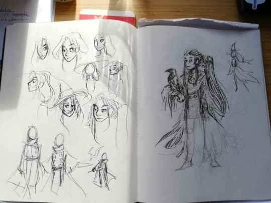
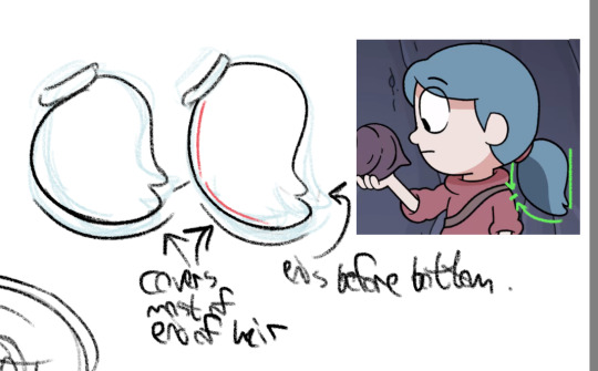
#usually i mostly use the line tool to make lineart in this program
Explore tagged Tumblr posts
Visit Tumblr Blog
Explore Tumblr blogs with no restrictions, modern design and the best experience.
Last Seen Tumblr Blogs


Fun Fact
25% of US internet users with an annual income of $80-100K use Tumblr.
Text
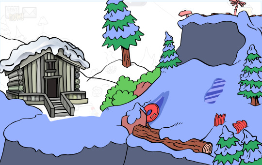
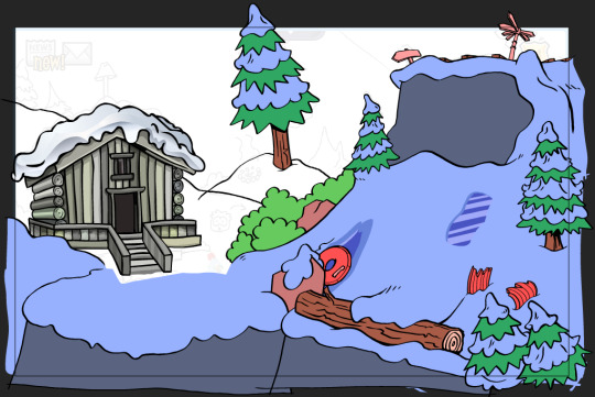
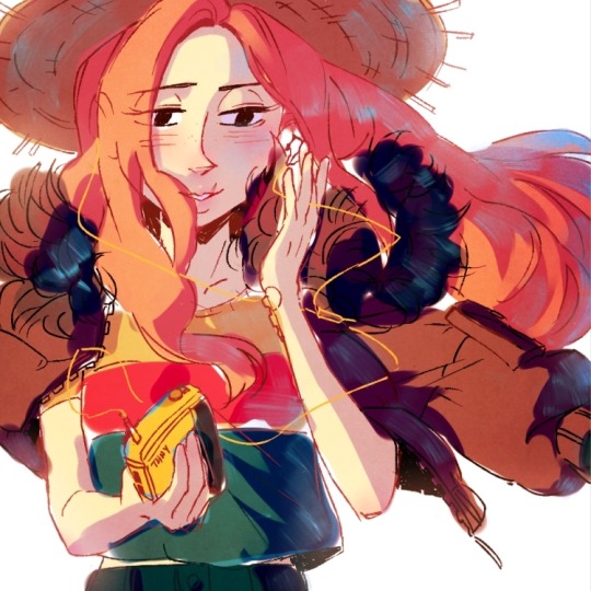
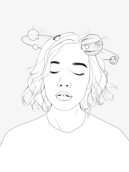
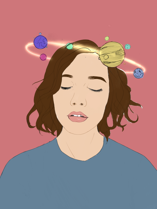
last thing i worked on. the sketch and lodge was done by 3 other designers total, i only did the lineart and placeholder colors for the background. this was a project so secret only a handful of people knew about it, with it being kept from even most of staff. there's this mystery lodge seen from ski hill in the og game never elaborated on. this was intended to be a secret area akin to the dojo or iceberg in really early clubp. youd access it by hitting the "ridge run" sign on ski hill with a snowball and doing a perfect game of sled racing on that track (all ice patches hit, no obstacles hit). there was no interior planned for the lodge, but you'd get a golden sled by walking up to the door
#club penguin#club penguin journey#stoppy.png#usually i mostly use the line tool to make lineart in this program#but for this room its actually handrawn entirely#we wanted this rougher earlier era look so i went full in with studying and learning to draw the older style trees and snow#no reused assets
25 notes
·
View notes
Note
I got inspired by your doodle of me, and wanted to ask- how do you do your art? I really wanna get better, but i don't know how. I use FireAlpaca, and i could really use a more "focused" pencil rather than the "smudgy" one in my profile picture art. I mostly wanna draw to make my friends and partner happy, so you don't have to go into the most complex stuff i you don't want to x3
hi! sorry for taking so long to answer!
so i use almost exclusively ibispaint x for my digital drawings, and use a tablet or my phone to draw, so I can't help you with the technical aspects of the program you use but I can tell you a bit about my drawing process! apologies if this doesn't make a lot of sense, english is not my native language so my words may sound a bit weird.
so for drawing first you should make a sketch, which for many is the best part as it's the most fun part of the process. for this I usually do it on paper as pencils are more natural for me, but sometimes I do it digitally too. my suggestion is to go wild with the sketch! draw many lines one on top of the other, use the eraser freely, move things around however you like. once you're happy with your sketch you lower the opacity and create another layer for the lineart.
here is the part where you choose the brush you want to use for the drawing. depending on how finished you want it to look, you can use a more sketchy shape or a more geometric one. in ibispaint, I use a brush called marker that has a round shape. for clean lineart, you should use a brush that has an opacity of 100% and a geometrical shape like a circle. if you want a more sketchy look, you can use a brush that has an irregular shape and different opacity, like for example a pencil brush.
for flat colouring I get lazy so I just use the bucket tool in a different layer, and then I create another layer that I set to Multiply to do shading. but shading is pretty complex so I won't get into more detail.
as for getting better at art, my recommendation is to use lots of references and practice a lot. personally I got better by tracing comic panels with a paper on my mum's computer screen. also I drew lots of dragons because I had a special interest in them, so I drew them over and over and over. eventually I got good enough that I could branch to more complicated things like humans. last week i read a story of someone learning to draw using naruto characters as reference. everyone's learning process is different, so you should draw what you like! if the drawing process is fun, you will do it more, which means getting better.
so this is it! I really hope this makes sense and it's useful to you :}
5 notes
·
View notes
Note
Hey :) I've been looking at your blog and first off, wow. Second, you're really good at digital drawing and I'm trying to get better at digital drawing but I can never seem to get the lines straight or the colours even and in the lines. So if it's not too much trouble, could you maybe tell me what app you use or what brushes you prefer? I'm currently using ibisPaint X and I'm drawing with a sketchpad :) it would really help if you gave me some tips too! Thank you!! Also, you're really talented hehe
Hi there, I'm glad you like my art thank you so much! ; u ; <3 And sorry for the late reply, I wanted to write up a full response with some examples!
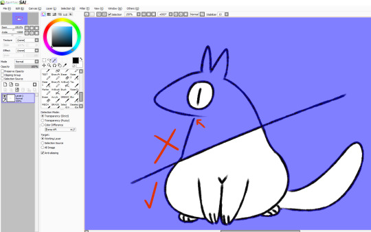
So for my artwork, I use almost exclusively Paint Tool SAI. I specifically use the original SAI atm, though I want to try using SAI 2 more (the brushes just feel... different. I've been using SAI for a decade now, so it's where I'm most comfortable.) SAI does cost money, but there are also free alternatives online as always. I'm not familiar with IbisPaint X, but I know that FireAlpaca and Krita are two good free options. I don't use a smart tablet or apps to draw, though, so I'm not sure what are the best options outside of PC.
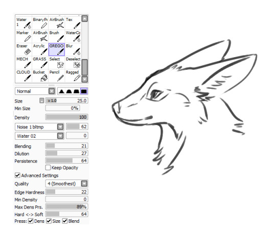
As for brushes, I use three brushes for my lineart-- though 2 of them much more than the third. The first brush I use is my Marker brush. I've been using this brush to line my work for a very long time. It's thin and somewhat transparent (sometimes I copy-paste my lineart a couple of times to bulk out the transparency).

The second brush I named TEST when I made it and I just never changed it, so it's my very permanent TEST brush. It's sort of similar to my marker brush (it even uses the SAI marker brush base), but it's thicker and a little more ragged. I tend to change up my style when I use this brush.

The third brush I use for lines is not one of my "lining" brushes. It's a painting brush named GREGORY and I Mostly use it to paint backgrounds and details in fur. I change up the "blending" setting on it as needed. I usually only use this brush to line if I'm having artblock or am sketching around.
As for keeping lines straight, I honestly just gotta say-- there's tricks to cheat the system! The first, easiest thing is you can find the "stabilizer" setting on your art program, slide that bad boy up, and have some assistance with keeping your strokes smoother.
The second thing you can do is... not really "line" your artwork. I tend to fight with lineart a lot. Sometimes it's not so bad (especially with my TEST brush), but a lot of the time I just line something and hate the end result, if I can even push myself to finish it. So, instead of "lining" over my sketch layer, I just... make the sketch my lines.
My sketches are usually pretty detailed so I think that helps, but I basically just erase and go over the lines meticulously in small increments until I'm left with linework. And if I'm having trouble with a spot, I'll just make a new layer, "properly" line that spot, erase the section of the sketch under it, and then merge the layers and move onto the next section. (I also keep my fingers over my undo and redo hotkeys, since a lot of lining can be just undoing a mistake and redoing it until you like it.)
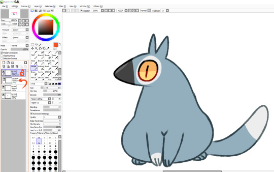
For example, here's this dragon I've been working on, in its original sketch:

And here it is halfway through the cleanup process, where you can see an amalgamation of clean lines amid the remaining sketch:

And here's how it looks now:
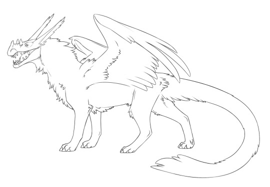
Lines won't cooperate? Make friends with the sketch! I often feel like it's easier to keep the personality of the original sketch when I do this also, though that's just personal preference.
Now as for keeping colour inside your lines, Layers and layer settings are your friends-- that and the magic wand tool (which is a selection tool).
When I use the magic wand tool, I tend to select the area Outside of my drawing first
If there's a hole in my lines and I'm having trouble finding it, I cut a line across the drawing and use the magic wand tool again so I can see which section of the drawing the linebreak is in and fix it.
Once the lines are sealed, I invert my selection so it's inside the lines rather than outside! I prefer to start outside since I find it easier than individually selecting the inner parts of the drawing. It's worth mentioning that the magic wand tool is not perfect (especially if you have sketchy, ragged lines like I often do), so you might have to clean up the edges.

You can make layers under your linework that you can freely draw on without disturbing your lines, and they will conform to your magic wand selection as well. What more, though, you can also make clipping layers/groups which are layers that affect only the pixels below them.
So like in this example here there are four layers. There's the lineart layer, the layer for the base fur colour, a layer for the details (beak, eyes, white spots), and then there's a clipping layer that is on top of the details layer.
Anything I draw on that clipping layer can only appear on pixels directly below it. This is useful for a lot of things like detailing and shading. It also means you can safely exit out of your magic wand selection and still remain in your perimeters.
You can also lock layers which is like using a clipping layer, only you're affecting that actual layer instead of going over it. Whichever one you want to use is pretty much just personal preference or situational. You can also use these layer settings to colour in your lines, if that's something you want to do!
I hope some of this helps! I also hope that you're having fun with doing digital art! :D <3
#also I love your username#so-once-i-was-a-chicken#digital art#replies#art tips#art programs#art brushes#brushes#paint tool sai#maybe I should put some of this under a readmore but naw#long post#not art
223 notes
·
View notes
Note
How do you do your comic pages? Do you use a special drawing software that give you the option of editing the dimensions of the panels? Or is it all free handed? I'm asking because I'm trying to draw a fan comic myself, and I use FireAlpaca, which gives me the option of exiting the borders and panels of comic pages, but I dont like some of its features. How do you make your pages?
my "special drawing software" is a super old version of photoshop elements XD it's from 2009, and somehow i still haven't found another program that i like better for text editing or setting up panels--mostly because it's super straightforward. there's plenty of other things it's not good at--for example, i don't think it can do outlined shapes, and it's really not the best for digital painting. So, I use other programs for that.
Anyway, when it comes to making comic pages the way i do, you can probably use the same basic technique in other programs because it's ultimately very simple. All i do to make my panels is use the shape tool to make boxes in the sizes and shapes i want; in photoshop, these shapes can automatically 'snap' into alignment with one another, which makes keeping them to a standardized size easy. so that might be something your program doesn't have--you could probably just use the rectangular selection tool and delete edges that don't line up.
once i make all the panels i need, i merge them all onto one layer, and then do all my drawing and shading in clipped layers above the comic panels. Clipped layers are super useful and let me draw without worrying about going over the edges of the panels below, and i usually only ever need a few--one for lineart, one for "color", and one for shading the backgrounds. text, speech bubbles, and other effects go over those.
so, there's no real trick to it; i know some programs let you draw comic panels and then 'cut' them to create new borders (called gutters, i think), but i haven't figured those out so i just use this cheap method.
hope that helped ^^
#i guess my drawing program is special because it's old and idek if there's slightly-not-legal versions out there >>#the important thing though is finding a method that works for you ^^#mine doesn't really lend itself to really creative panel layouts for one#the most important thing though is making sure your panels are easy to follow no matter how they're made#i've seen very simple panels that would have been fine if not for the fact i had no idea what order i was supposed to read things in :'D#so be mindful of that sort of thing =u=;;#art tips with undertalethingems#undertalethingem chats
99 notes
·
View notes
Note
Art question: your colors and lighting are always so gorgeous - what’s your process look like for colors in terms of layering/combining colors?

Ok, time for the end boss, this is probably gonna be a long one so I hope this is still gonna be understandable and not too much as a text post.
First up I’m just gonna put a quick and very basic break down of how I often approach coloring before I go more into detail.
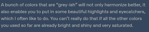
I’d definitely recommend to not leave your canvas white while painting, I either rough in my background first or give the canvas a grey-ish blue color if it doesn’t have one. The bright white of the canvas will make it harder for you to judge colors, having a nice midtone will help you make better color decisions and get more accurate colors!

Here’s a little snippet from a previous post about how I pick color! (check out full post for some useful links)
Here is one of the brushes I really like using in paint tool sai2! Other than that I might use the standard marker tool with a square shape. In clipstudio i try to use similar textured brushes.
To blend or to create soft edges, which really helps you to sculpt your drawiing/painting, I often just start painting on a new layer above the one with the base color and then use a soft eraser! I might also use paint tool sai’s water tool, which I find really useful and pretty unique, I sadly haven’t really been able to replicate it in programs like clip studio.
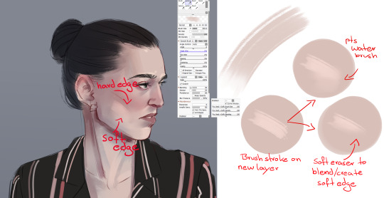
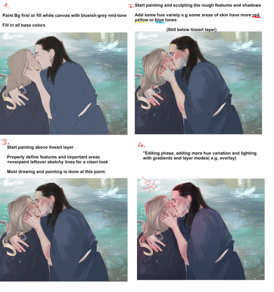
In the two pictures above I already did a lot of defining and painting before I moved to a layer ontop of the lines because the lines were fairly clean already. Sometimes my “underpainting” looks way rougher though and I just put in some blobs of color for hue variation, especially the more red-ish areas and then do most of the painting above the lineart layer! Not sure if there’s much to say to the overpainting stage, as mentioned before this is just where I clean up the whole drawing and define the features more, especially the eyes, eyebrows and lips.

NOW, the real fun begins....
After I’m mostly done with painting, I start to properly establish the lighting, some people find it easier to do it the other way around, and sometimes I do so too. But often I push for the strong lighting at the end so I can focus more on painting. This is where I play around a lot with layer modes, usually I use a combination of overlay and shine to put in some bright warm light from one direction!

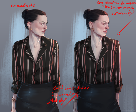
The way I do it is I usually put all the layers of the person/object into a folder so it’s separated from the background, then I make a new layer on top of that folder and use clipping group. It works similar to a layer mask, whatever i do in those clipped layers will only affect the layers that are in the folder! Since only my character is in that folder, my background will be left alone.

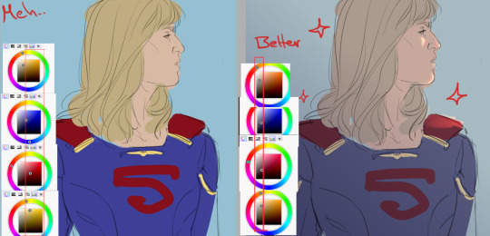
As mentioned before, I now use gradients to give the entire picture more hue variation and to properly give it strong lighting. Make sure the gradient tool is set to “color to transparency”. I use a warm orange/red color for the top right side where I want the light to hit and put it in overlay mode. And then use a colder purple/blue color on multiply mode and pull it up from the bottom to the middle.
At the end I often adjust the colors a bit, I like to use cool colors in the background to make the warm colors of the skin etc pop! So often I push those reds of the characters a little more! In paint tool sai I just adjust the hue and saturation a bit. In more complex programs like CSP I do it in the color balance option.

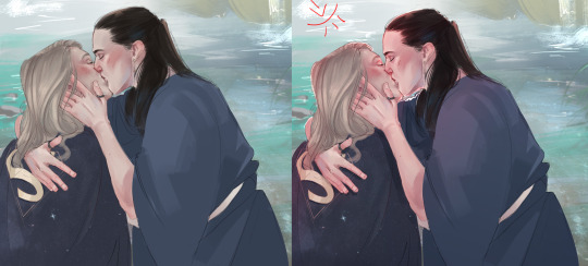
You can see how I pushed it a bit more towards red here, to make it stand out more against the blue-ish background. I also pushed the blue’s in the hair color. Giving dark hair blue-ish undertones can make for a really good contrast compared to the warm colors in the skin! I think this last part is really the most important to me,lighting can REALLY change your entire picture, and I think gradients are a super easy and fast way to do it! If I pull up the picture from the beginning again, you can see just HOW MUCH the picture changed again after I was pretty much done painting by adding strong lighting! It’s a good way to pull the attention to a certain spot, in this case the faces/the kiss, where all the strong saturated colors are!
I also think that a good contrast between warm and cool colors is really important! As you can see I often use that to make my characters stand out from the background. If you put everything in cool colors or everything in warm colors it’s easy to make your object get lost in the background. I recently found this guys YT channel, he talks alot about warm vs cold colors, which I think is so helpful! I’ve hardly seen any other artists talk about it that much. If any parts were unclear or I left something out/ someone wants to know more about a certain topic just let me know! Thanks to everyone who’s sent me asks
950 notes
·
View notes
Note
Hey! I'm the one who asked the poorly worded art process question. I'm here to give it another try by being more specific. The problem is . . . that's hard. Because that was about a specific as I can get, since I kind of want to know everything about how your art works.
Big things, like how you come up with ideas, or how you design characters. But small things, too, like what tools you use for drawing, how you balance between traditional and digital art, and how you decide what color to use for your unique and beautiful line art.
I want to be more specific so you can answer, but the question in my head is too vague and broad for me to be specific about it. So . . . here are some subquestions of my question, I guess! Maybe that helps?
Sorry this is so weird, and thank you, your art is amazing
first of all, thank you so much <3
and yes, this is far more answerable! i hope i can satiate some of your hunger for insight without writing a whole book.
HOW DO I COME UP WITH IDEAS?
this is obviously going to be very different for everyone. i very rarely have to dig for ideas or sit down and brainstorm, unless of course i am trying to achieve something very specific, like fulfill art contest criteria or working on a commission. my brain is very visually wired, so a lot of my ideas literally just pop up in my head (i know of several artists with aphantasia - some people don't have any visuals in their head at all and I HAVE NO IDEA WHAT THAT'S LIKE AND I AM IN AWE OF THESE ARTISTS), sometimes i see a character or character design and im like HNNNG i need to draw them, or i just... have a concept i really want to Exist and i'm going to figure out how.
my biggest problem is that often, when i get an idea i want to DRAW IT, NOW NOW NOWNOWNOW, and that's just Not Feasible. sometimes because i'm Literally In Bed, sometimes because i have too many things i need to do or draw first... but i need to clear up space in my head, because my Urge To Draw will be like, beeping and whirring until i satisfy it... so i write it down on my TO DRAW-list! it's a real list that exists on my phone and i have to use it frequently. if i keep scrolling down i start finding weird notes that i have NO idea are supposed to mean anymore, but that's fine. i can't satisfy every Art Urge. sometimes i need to let them pass.

HOW DO I DESIGN CHARACTERS?
this one might vary a bit, but it can often be boiled down to "i sketch around until i figure something that Works." many of my characters, especially my older characters, became characters by accident when i kept drawing them over and over and i was like Ah I Like Drawing You... You Exist Now. that's how sparrow spellcaster happened, at the very least. this could happen because i had school and i would focus in school by doodling/sketching while listening to class. since i no longer go to school, pretty much all of my new characters are far more intentional. Timian and Vinta specifically exist as a result of a "favourite character fusion" challenge, and a lot of iphimery characters started with a Purpose rather than just harnessing the vibe of something i drew multiple times without thinking.
it helps to write down elements or tropes i want to include, like "sturdy-looking" or "VILLAIN OF EVIL SCARY MAGICS but it's a little girl and the dark magic is bright lightning and not shadows" or something. it can vary from a tiny visual detail to their role in the story. whatever i want to Achieve. my Intent. because my brain works so visually, i just really need to sketch somethign repeatedly until i nail it and can be like Yes That's It.
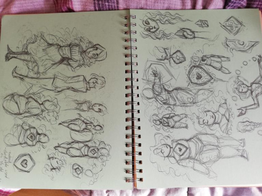
sketchbooks look a little messy but that’s what they’re for.
WHAT TOOLS DO I USE
for digital art, i’m currently using an ipad pro and procreate. i use a lot of the brushes that came installed, like Mercury is my primary lineart brush, and Moorilla is my primary sketching brush, but i also buy a lot of custom brushes on the hunt for More Delicious Textures (DAUB has a lot of good ones, especially if you want some that imitate traditional art). i have also used Huion and XP-pen tablets and generally recommend them, as well as clip studio paint as an art program (i love it very much and if it wasn’t subscription-based on ipad i would still be using it).
for traditional art, mostly just whatever sketchbook i have + my trusty mechanical pencil. i mean i have two: one with softer lead (it comes out darker) and 0,7 mm thickness, and one that’s 0,5 and harder lead for more light sketching, or if i’m going to line it with ink.
i also have a trusty pentel brush pen that i love DEARLY and feel bad for not having used in a while for reasons i will get to.
when i work on calendar pieces traditionally, i like to draw lines with ink - i use a dip pen with exchangeable nibs - and then color with watercolors. i have several sets because they’re all slightly different and i want the Range.
i sometimes travel with a little sketchbook in my bag and an assortment of pens, so that i can sketch Anytime, Anywhere. i think doodling with a pen can be very useful because you gotta become comfortable with the mistakes and imperfections and keep going anyway. if i doodle at work that’s the tools i have - regular ball pens and a bunch of paper lying around.
HOW DO I BALANCE BETWEEN DIGITAL AND TRADITIONAL ART?
currently, i... don’t, really. it was easier when i had school, and i would just doodle freely and then maybe use some of my sketches as thumbnails or concept ideas. it’s harder now that i need to intentionally sit down with my sketchbook, and tbh... the ipad works very well for sketching. it’s so CONVENIENT and i have WORK all the time and my time to create art has become much more limited than it was. i miss going to my weirdo art high school where we would try out a whole bunch of different tools and methods. sure, yes, i had to paint with Acrylics My Beloathed, but getting to play around in different mediums is VERY valuable.
i genuinely want to be able to make more time and space for non-digital art again, but i just don’t have the ability to right now. it’s also different now that i’ve moved away from my parent’s place - i used to have an enormous desk and my mother has a large collection of art tools and there was a lot more storage space for whatever i created. digital art is very convenient and very accessible. ah well!
HOW DO I DECIDE ON THE COLOR FOR MY LINEART?
i usually line in black or a very dark color, and when i’m done coloring + shading i might play around with the colors and see what works. if you lock the layer you can just throw all the spaghetti at the wall you want. i decide on whatever fits the piece. i tend to be pretty fast and loose about it too, sometimes you can probably spot parts of my lineart that have slightly mismatchy color, but it’s like... done is better than perfect! i don’t have the energy to overlook every single pixel of my piece or else i would drive myself utterly mad.
HOPE THIS ANSWERS ANYTHING AT ALL!! THANKS FOR ASKING!!!
#art advice#(tag for archival purposes not to imply my methods are gospel)#everyone has their own ways!!!
40 notes
·
View notes
Note
When I’m drawing the ponytail I try to do the bump sort of thing, then the spikes and then finishing it, but the shape never looks right to me even if I’ve used a ref


These are the only examples I have on me but I’ve drawn her a lot in my sketchbook as well
Okay this is a quick sketch so it’s not my best but I’ll try and walk through my process

Normally when I get to the ponytail I will have already done the body and face and all. Same goes for her long hair - it usually isn’t until I’ve gotten at least the position of her body.
My assumption is (based off your drawings) that you usally for the bump do like a circle?
So sorta like this (I did like semi circles and then the spikes)
Thats not inherently bad and I don’t think it looks as bad as you think it does. I think it looks alright tbh. But again, not a bad thing to do, and it works.
For me with ponytails or hair bits that spike up at the end I usually do the first line (in blue) in one fell swoop
Its a super quick hand motion that I've sorta gotten used to doing for different things. It's like an unconscious motion I guess haha, like say certain reactions when playing video games on a controller. There's motions you don't think about or realise your doing with your hands, your not thinking about that, your just thinking about doing the action in the game. But doing it quick is essential or you’ll think too much/wobbly hand will come into play and it’ll look deliberate, won’t look as wavey etc. (Or at least it does for me jhasdhjsda) The spikes are one line too since its like second nature to me to do those sorts of bits with hair but thats like unconscious thing jhasdhjasd

And that's not to say it's easy to get it right when doing it quick, it took me a few times to get it to look right even for this. Ctrl z is your friend haha. Redoing a line multiple times to get it right is fine and it happens and goodness it's basically every line I do xD.

An easier way to do this kinda motion would be to use whatever equvilant you have of the Dynamic tool in krita (the program I use). Cuz of the adjustable mass it means you can go slower without getting as wobbly lines or you can make them smoother and more deliberate without making it look unnatural/non curvy. I usually use it for help with lineart jahsdhsd
And thats not to say my method is the most accurate either!
I mostly do mine from memory (since I keep only drawing ponytail Hilda when I can’t get a reference) but her ponytail is sorta more of a curve (which I dodn’t even illustrate the best but yknow). The bottom spikey covers most of the bottom of the ponytail, the top spikey extends as far out as the as the bump. And theres like a centre point too on the left side. So you could do that in two lines or two swoops to get more of an extruding bit but still have it seem circular and like one line. A lot comes from examining how the show does it and like figuring out ‘how could I do this consistently?’ which sometimes includes quite literally going over the lines and figuring out what works best for you to imitate that.
And it doesn’t always have to be show accurate! You could be mostly show accurate with a bit of your own flair (like what I’m tryna do) or you could straight up do it how YOU want the ponytail to look or how you like to draw ponytails! Anything works honestly. And my personal advice is to experiment and figure out what method works best for you/is easiest for you to do or replicate
So ye this is mostly how I do the ponytail (i think. Turns out having to think about what your drawing and how you draw it makes it harder to know how you draw normally. Like when you consciously think about say holding a knife and fork. Suddenly you don’t remember how to anymore...)
I hope this helps at least a little and is understandable, sorry I rambled a lot, but yeee ^^’‘
#ramble post#randy rambles#ask#nacho0#gosh no one let me do tutorails im so bad at them AJHSDSJAD#hilda (hilda)#hilda netflix#hilda the series#my art#randy's art#sorry this took a bit i had dinner in between JASHDAJHSD#gosh i hope this is at least semi helpful
38 notes
·
View notes
Note
damn your art style is so pleasing to the eye :0
do you use any particular art software, brushes or technique? I'm a beginner at digital art, so I'll take all the advice I can. thank you for your time!
Hi anon!! Thank you so much, it really means the world to me <3
There’s so many tangents I can go on to give different advice for you, I think because we often think there’s a concrete formula to improve. I hope the advice I give here will help down the road, and that I don’t sound too all over the place here! (lol)
As for programs and such, I use Clip Studio Paint EX. I used to be a PRO user for quite some time but upgraded for the extra features (mostly for webtoon creators/animators), it isn’t a necessary switch at all if you only want to focus on illustration.
Paint tool SAI is also a good lightweight alternative! Before I got a better laptop, my old HP couldn’t really handle CSP; it lagged a whole bunch.
---
I tend to jump around a LOT between brushes to toy around with effects and stuff, so it’s hard to give a specific set, however I use these the most:
https://assets.clip-studio.com/en-us/detail?id=1697201
https://graphixly.com/products/theonewithbear-sumi-brush-pack-for-clip-studio-paint
Along with the darker pencil (default brush in CSP)
and a few brushes from the DAUB brush pack.
I don’t use every single brush in every set all the time either though! Usually when it comes to picking brushes for yourself, it 100% relies on how comfortable you are with using them. You'll definitely know what feels good for you, and what doesn't when you try them out!
Some people (like me) enjoy more textured brushes, and others are comfy with clean brushes for lineart, and others like soft watercolor brushes or oil brushes.
Don’t be afraid to tweak brushes either! It takes some time to learn how to do this, but there are lots of tutorials out there.
---
I think the most important thing is to first find something that you enjoy drawing/painting a lot, and experimenting a bunch on that. Don’t be afraid to try new things!! You don’t always have to follow the basic workflow of sketch > lineart > color > shading. Mix it up a bit! Include colors in your sketches, paint over your sketches if you don’t like doing lineart! If you do like making super clean lineart, work on different types of lines to make it more fun! Art is like a form of play and messing around, it shouldn’t feel stressful. Be willing to make lots of bad art (even though that can be hard sometimes), so that in the future there’ll be less bad art and tons of good art! Don’t worry too much on developing a style, since this will come naturally the more you draw.
---
(also, a word to those who post art on social media!) -
Don’t ever forget to draw what YOU enjoy, rather than focusing on what you think others would like to see!
For a long time before this year I felt like I was constantly hitting a brick wall, and I didn’t know why I didn’t like drawing as much as I used to, and why my character art felt so boring to me. When the covid pandemic hit, I was forced to take a loooong look at my art, and decide ‘I still have a long way to go..’
Something clicked when I sat down to work on some acrylic paintings on canvas for my uni portfolio: I wasn’t allowed to include fanart, since the university didn’t accept that. I also didn’t want to only include digital art either, so that I could add some variety! So, I painted.
I was forced to think more about colors (something I was neglecting, since it’s much easier to color digitally and hit the undo button 10000000 times when I wasn’t happy with something)
During that time, I found that I really REALLY liked painting landscapes and working with bright colors, so I also started to incorporate that into my digital art. Turns out other people enjoyed that as much as I loved creating it, so from there on out, I’ve just been toying around and experimenting on new things ever since!
---
Anyway I hope this doesn’t sound too abstract. This is my first time giving formal advice so my brain is going into overdrive mode.
#asks#I decided to include the last bit for new and veteran artists :) I hope it helps those feeling stumped and art blocked#We're all learning after all!
9 notes
·
View notes
Note
Do you have any art tips or a step by step on how you color??
Please its ok if you wont
sure, i can give a tiny bit of insight on how i colour. Under the readmore:
At this point of my personal understanding, i would say colouring is just two things: 1) making sure your colours look good together, and 2) lighting (if u decide to even do lighting/shadows, that is)
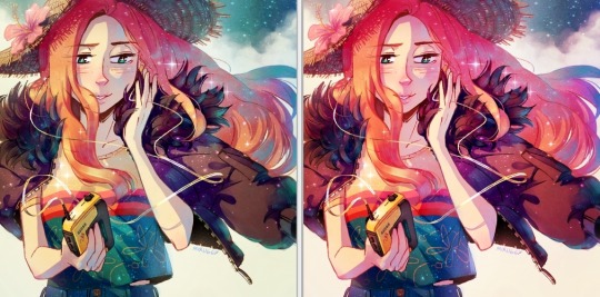
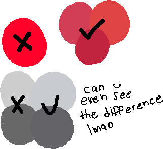
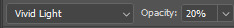
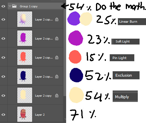
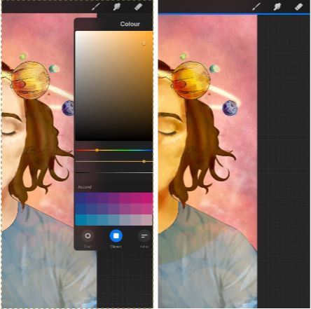
The 1st one you can achieve by doing palette studies based on photographs or other ppls art, or by doing trial and error, or apparently by learning colour theory (im too dumb to understand it) and also applying digital tricks like overlay layers and also fiddling with hue/sat/brightness/contrast until it looks good to you. Below is my latest Audrey drawing without the overlay layer (left) and then with the overlay layer (right).
It’s magic, right!? I’m so used to having an overlay layer in every drawing now that these days i just slap one on before i even start colouring lmao. usually 20-50% opacity, usually a saturated orange or pink and then i’ll adjust as i go. mostly i just do trial and error like fitting wooden toy shapes into the right holes - my brain will go “ding!” when the arrow on the hue gauge hits a colour that looks good to my eyes.
The 2nd one, lighting, is more complex. I always say “lighting is everything” because to me it IS...it can control the entire mood of the picture. Where is the light? Is it hard or soft? is there a secondary light? What emotion are u trying to convey? and then how can you execute it? how would light look on THIS object compared to THAT object? A big part of lighting is being able to visualize your drawing in 3D. Once you can do that, you can lay down the light and shadows quite naturally depending on where your light source is. this ties into the way you DRAW things tho (like, u have to already be thinking about 3D while in the drawing stage) so i dont wanna get into it since this post is about colouring.
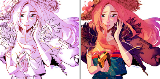
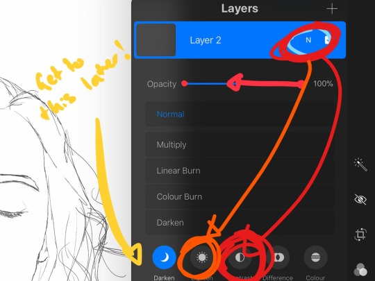
Lately I’ve been p lazy and doing all my major shadows on a single layer, set to “Shade” on sai (it might be something diff on other programs idk), 42% opacity (for this particular piece), and clipped to my folder of colour layers. So that means almost all my actual colour layers are just flat colours! Here’s my main shadow layer all by itself without any base colours (left), and then shadows + base colours (right):
sometimes i’m already thinking about lighting while im still sketching the picture. sometimes i’m already thinking about lighting before i even start to draw. For this particular pic I ended up with 5 different layers for lighting: 1) all shadows (42% opacity Shade layer); 2) some extra shadow under her hat (72% opacity Shade layer), which then allowed me to create the cool hat texture by simply erasing bits of this layer 3) a soft angelic backglow coming from behind her. this layer goes somewhere above the lineart layer to give the illusion of light spilling in front of her and fading out her edges; 4) secondary blue reflective light coming from the....sky im presuming, but mostly because i just felt like the drawing needed some blue lol; 5) a 55% opacity overlay layer containing a trace amount of vignette in 3 of the corners + an extra glob of light just to the right of her cuz i was experimenting with different instagram filters near the end and found one i rly liked and tried replicating it on sai 😂 Here’s the picture with only my main shadow layer (left) vs the picture with all 5 lighting layers (right):
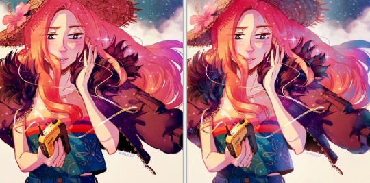
The pic on the right makes her look more like she is Somewhere. I think I could’ve pushed the depth even more but i wasn’t confident enough. And sai doesn’t have blur tool :(
I also always have at least one layer that i name “extra”. The Extra layer goes on top of the colours/shadows/lineart layers, but under the overlay/glow layers. This is for extra details (including extra LIGHTING details) that I wanna add like extra sparkles, extra straw hat strands, hair strands, hair shine, zipper shine, etc all for that “extra” touch of realness. I don’t do all this stuff at the end, though. I have my Extra layer created pretty early on and i go back to it and add to it when I need to. Here’s what it would look like without the Extra layer (left), and with it (right). Try to find all the extra bits i listed:

One last note is i don’t colour one thing at a time. Before I start, I slap on all the base colours and all the shadows super roughly, just to check if my lighting and colour choices look good TOGETHER and make the entire composition look good. no point in spending hours rendering all the lighting and shadows on the character’s hair if in the end u decide there was actually a better lighting design u could’ve gone with. So here’s the rough colouring plan I made for myself before i started rendering for real:
im not sure if this was useful at all but i hope it was interesting at least! if you want to see my actual chronological process for colouring you can watch the gif of wips i compiled here: [link]. You’ll notice that i edit my lines as i colour. I think it’s good to be adaptable, and to be ready to go back and change ur lines to benefit your lighting, colouring, and overall look of the piece.
Also here’s the finished version of the pic: [link]
#Anonymous#miruask#miru art#tutorial#there's a lot more i didnt mention#i didnt mention my texture layers#cuz i felt too ashamed lol im just a sham artist using textures and overlays and texture overlays#textures can absolutely make ur colouring look interesting tho so try some out!#i didnt use a texture for the hat tho i did that all on my own and im proud#i also didnt mention locking ur lineart layer and colouring the lines themselves#but thats such an age old technique that im sure everyone already knows it
32 notes
·
View notes
Note
i just know you just for a few days (because I was offline for months), and now you're one of my favourites blogs!! so, direct to the point,, i really like your style- could you show your tactics, what brushes do you use, what art program and how do you choose good colours? i'm sorry if that's too much, i am just very curious :))
aww thank you so much! i never showed anyone how i draw, so this might be sloppy, but bear with me
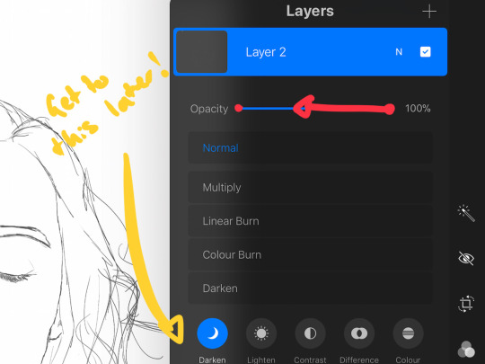
(I use Photoshop to draw. and I use a wacom tablet)
sketch
ok so the first thing is sketching, obviously. for a lot of the drawings on this blog I don’t sketch because the objects are usually easy to draw and I don’t need a sketch.
line art
then there is the lineart. so I pretty much always use the pencil tool instead of the brush tool because it makes all the other steps (coloring, shading, etc.) MUCH easier. yes, it has some cons but that’s just what I like to use. usually for the little doodles for requests I make I use a size 4. if I’m drawing humans I’ll make the size bigger (6-10). I also mostly don’t use pen pressure but lately I started kinda using it. but the problem with the pencil tool’s pen pressure is that it looks like garbage. SO I invented a way to use pen pressure with it looking kinda descent. there are probably other ways to do it but I’m dumb.
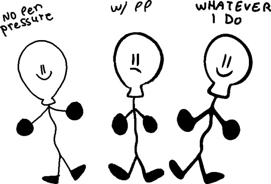
(I would suggest doing this tactic on simple drawings, like the objects)

first of all draw using the softest brush, the size doesn't rly matter (dont use 600 lol) use the pen pressure of course

merge the layer with the drawing (the drawing must be black) with a completely white layer

double tap the layer and slide the (first) little white triangle to the left until the drawing looks the way you want (the more it goes left, the thinner the lines will be)
next merge the layer with a completely blank layer (this is important)

press this little button and make ur brush big and draw black on the whole drawing.
and you’re done :D you might need to a bit of fixing tho. (also I suggest to not use black for line art but I’ll talk about it more later)

coloring
basically it’s don’t use gray... put a bit of blue in it. and don’t use eye strain-y colors (also I’m just saying this rn, there is no right or wrong way of coloring or drawing, this is just how i do it) also I use very dark purple/blue instead of black

also photoshop has this little warning when the color is really bright, so you can click on it to fix it but sometimes it’s not enough for me.
using a color palette on a character is also useful and reusing colors but sometimes I’m too lazy for that.
the filters i put on the drawing at the end also are really important to the drawing so you can skip to that if you want.
shading
pretty much put the shading the opposite of where the light source is coming.

this is what i use for shading:

the colors aren’t consistent.
more shading/highlights/coloring/whatever
after im done shading i make another layer between the color and shading layers. use the magic wand tool to pick one color from the drawing and go to the new layer, color pick the shading on the color you picked
(ps idfk how to spell its almost midnight shut up) and use the soft brush to ad a gradient under the shading with the color of the shadow

and set the opacity to 40%

color of line art
first of all don’t make the line art black, i use a dark blue/purple. it also depends on what colors I used for the drawing

then on another layer I ad color to the line art if it has the same colors on both sides of the line. (use the color of the shading of the color thats on both sides but darker and ya know play w/ it a little)
highlights
just...

small details
filtersssssss
well at this point ur pretty much done but lets make the colors looks better!
put all the layers in group. copy that group. marge all the content of the newer group (the second group should be on top of the first one). click the merged layer and press ctrl + b

play with this how you would like.
press ok and then ctrl + u
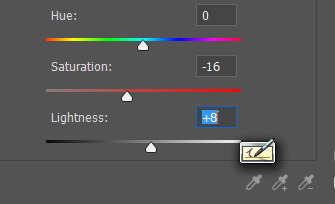
I usually make the saturation lower and the lightness higher. and lower the opacity of the layer
more filters!
it’s not consistent. you just kinda play w/ it

AND THAT’S IT
conclusion
this post is way too long and idk how to explain shit and i prob could have drawn like 5 drawings by the time finished reading. if anyone read even.
26 notes
·
View notes
Note
Hi sorry to bother you but could I ask a question about how you do digital art, like how you line,colour what brush's to use ect since I'm trying to learn how to do art digitally
Oh man this is a lot of material to cover xd I use mostly photoshop/paint tool sai, and depending on what program you're going to use the brushes will be different and will work differently. I usually use a no texture thin brush. Sometimes I will give it some paper texture if I feel fancy. I know a lot of people use stabilizers but I hate these things and I do never use it unless it's absolutely necessary, it feels much more organic to me. I'm also not a very gib fan of the technique that I see everywhere, where you draw a sketch, lower down the opacity, draw over it and do that a few times until you have a clean lineart. I do it sometimes only when I draw something more complex or I have a problem with anatomy or sth but mostly I just draw the sketch and then draw on it, erasing the lines I don't want to have there until I get a clean lineart, I think it feels better for me to draw like this and I often lose emotion or other things I wanted to convey in the drawing so this way I keep everything just like I want it to be.
I don't usually make the lineart very clear so I don't color using the bucket, I just go through the drawing with a brush and I color the whole drawing like this. Filters help a lot when I have a problem with the colors :v
Idk dude, good luck! I would recommend you trying everything a little bit and figuring out what feels the best for you.
12 notes
·
View notes
Note
how do you draw your GF characters? i’m trying to get into making fan art but i’m not creative when it comes to drawing stuff and i want to learn how to do it
I usually have three layers: the ref, sketch, and lineart. So when I draw Stan and Ford, I always start by drawing a basic shape of their head. I tend to use a rectangle shape and round it on the top like so:

And depending on where I want them to look, I then draw two lines indicating where the features of their nose and eyes are gonna be at. Drawing digitally gives you an advantage cuz you can basically copy the layer and paste it. I copy the outline of the head and then paste and flip it with the handy flip tool. And from there I do a basic outline of the pose.

The poses don’t have to look pretty but enough to know how you want things to look. And now onto the sketching process. I set the ref layer’s opacity usually between 20-30% and go onto my sketch layer. But if you’re drawing on paper, make sure not to make the reference or guideline of the pose too dark. I always start with the nose and then the eyes. Where the two lines intersect is where I start with the nose and the eyes follow. Like so:

The glasses get included afterwards. Since I get lazy at times, I’ll just copy the features of the face and flip it and drag it over to where Ford is at since you know, twins. And from there is when I draw the face and ears and then do the hair afterwards. I tend to give Stan a little extra floof for his hair.

And from there is when I go ahead and add the clothes. I always say: references are your friend. Looking at screenshots of the show or looking up examples of how the characters look will help lots.

It’s important to note that the reference pose is to help you give a basic idea of what the pose looks like. As you can tell, mostly the shoulders are wider and a few things aren’t exact in the sketch. And if you’re drawing digitally, a big friend that helps wonders is the flip tool (which is what it’s called in my program). But if you’re doing it on paper, looking at your piece in a mirror can help show what certain things look off. And then I either hide the ref layer or delete it since I already got my sketch and set the opacity down to 20-30% again and then it’s off to lining it with the pen tool and add colors. I’m a cheater and use the color picker tool for the colors (since the resolution on my computer is awful).
And that’s how I draw the boys. If you want, I can also show you how I draw the kids as well. I apologize the explanations sound vague, I’m awful at explaining things. If I ever learn how, maybe I’ll record or live stream me drawing.
#ask#gravityfallsmd#i've thought about making a discord as well#maybe screen share and kinda live stream that way#but ehhhhh idk
95 notes
·
View notes
Text
A BASIC GUIDE TO DIGITAL ART ON PROCREATE
okay so i joined the digital art scene about a year or so ago and it has been a total whirl! there’s so much stuff that’s so confusing and hard to understand at first. And that’s okay! A stupid amount of what constitutes as “good” or “complex” art is to do with layers, patience and experience.
and because literally every tutorial on here is for Paint Tool Sai i thought it might be useful for those of us using Procreate! because i don’t have sai and i have a relatively shit laptop by comparison to my Ipad.
so without further ado - here is how to make a KICKASS piece of art on procreate
1. REFERENCE + SKETCH
the first thing you're gonna wanna do is collect any references you need for thing youre tryna make. you can collect references by finding stock images, using other artists work (i use these mostly for colour refs cause i SUCK at finding good colours). however when i make art nowdays i usually just snap a selfie and use that. for this work i did the last option (see below)
after grabbing my reference i decide on the style i wanna use. for beginer artists what i suggest doing is just pasting the image onto your canvas, opening layers and adjust the opacity to around 20% by clicking on the little N on your layer with the photo. then once thats done add a new layer by clicking the + and work over that
for more experienced artists experimenting with style just stick that bad bitch reference in the corner, then open a new layer and sketch in your own style.
when it comes to sketching i usually do little flicky lines. i do this with a mid grey (like 50% white 50% black) i recommend the “Narinder pencil” which you can find by clicking the little brush at the top, selecting sketching and then selecting that bad boy. you can adjust size and opacity using the sliders to the side of the screen.
when sketching you just wanna get a rough idea of where you’re gonna do your eventual lines - don’t worry about it being smooth or anything just get down where everything goes
once you’re done you might have something like this:
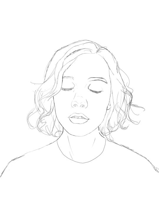
this brings us too...
2. LINE ART
for beginners - lineart is just a sexy word that means a clean drawing with hard lines so you can colour it easier and it looks prettier. you want to do this on a new layer so you can delete the sketch one later.
your goal with lineart is to make it three things: 1) its gotta be seamless so you can select the insides, don’t leave little gaps between lines 2) its gotta be smooth! jagged lineart isn’t NEARLY as sexy as smooth curvy lines 3) this one is more of a tip - but lineart generally looks better if you do thinner lines inside your shape with a slightly thicker border line. again this isn’t essential but i find it looks cuter
the way i get my lineart all cute is by using the monoline brush (found in calligraphy). sometimes i use my own modified version of the Technical Pen (found in Inking) but mostly monoline is pretty neat. You can use whatever brush you want but mostly you just wanna ensure that its nice and smoooooth. you can do this by selecting the brush and then clicking it again. this will bring up a popup menu like this:
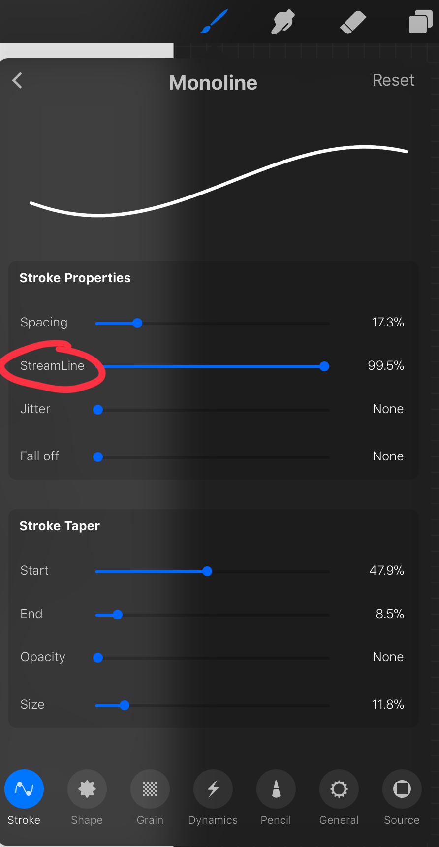
most of these brush settings are complicated and stupid and i’ll do a big post about it later. the only one that really matters here is streamline. if you wanna use a different brush for lineart just wack that slider up between 80-100% and you’re set.
once your lineart is finished on a seperate layer go to your layer menu and unselect the little tick on your sketch layer. you should be left with something like this.

3. ADDITIONAL DETAIL LINEART + MONOCHROME BASES.
once your focus lineart is done you can add detailed lineart by repeating the same process with sketching and lineart i described above. i like to do details separate because if i dont like it i can just delete the whole layer without destroying my focus.
what i find important in these now is using my favourite fuckin tool in this whole program. you can find it here:
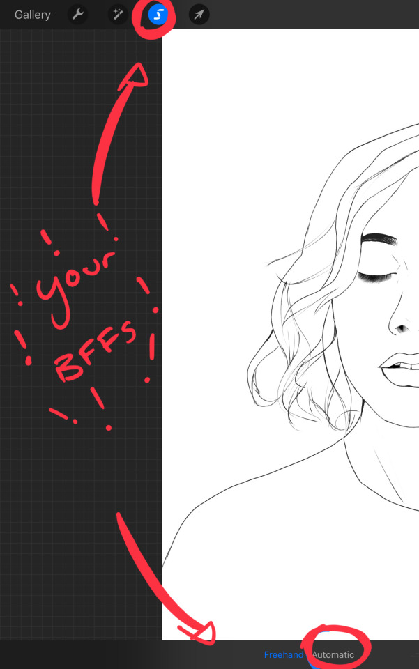
Only start using this once youre 100% done with your lineart. once thats done - make sure youre on the lineart layer and click that weird little s at the top of the screen. go to the bottom and click automatic. then select somewhere INSIDE your lineart. it should do something like this:
don’t freak out! what that blue stuff means is that you've just selected the inside bit of your lineart. continue selecting until your subject is 100% coloured in.
MAKE SURE THE BACKGROUND/STUFF OUTSIDE YOUR LINEART ISN’T SELECTED. ALSO MAKE SURE YOU’VE SELECTED THE LINES THEMSELVES. THEY WILL TURN WHITE ONCE THEYRE SELECTED. if u fuck up and select something by accident that’s all g, theres a little undo button on the bottom. if you click on the paint brush or another tool and you cant add stuff to your selection you can reload the mask by holding down on the weird s and the selection will reload. If there are certain bits of your work that you’re struggling to select with automatic selection that’s also not an issue. just click the “freehand” setting next to the automatic setting on the bottom and you can now use your stylus to draw around what you want to select.
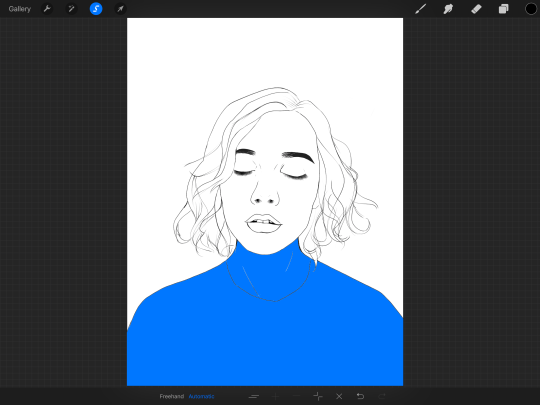
once you’ve selected your foreground in its entirety - THEN click the layer button. insert a new layer underneath your lineart layer. Using literally any brush (works best if you get one from the painting section) colour EVERYTHING white. just get round brush and colour all of it. you wanna keep your line art layer separate over the top.
once all of it is coloured hold down on the weird s tool until it reloads the selection. then look along the bottom of the screen and click the little button that looks like 2 arrows pointing at each other. THIS INVERTS YOUR SELECTION. Open a new layer and make this entire thing a grey. THIS IS WHOLE STEP IS OPTIONAL BUT ITS SUPER USEFUL AND THE SELECTION TOOL IS SUPER HELPFUL FOR GOOD ART. DOING THIS WILL BE SUPER USEFUL WHEN YOU COLOUR STUFF LATER.
once you’re done it should look something like this:
4. BASE COLOURS
okay so this is where shit starts to get real. The goal of putting down base colours is to make is easier to add eventual shading to your piece and decide your colour scheme. This is where the white layer you just used is gonna become your BITCH.
you wanna start by duplicating your white layer you just made. You do that by opening your layer menu and swiping that thot to the left. this is what should happen:
click duplicate. Select the top duplicate you just made and select our favourite weird s tool. click inside your shape and the whole white shape should go blue (become selected). next, open a new layer on top of the white layer. colour in your base colours and now none of it can go outside the lines. you didn’t even have to do a billion selections. you just select inside the white blob on the layer we made the step before, opened a new layer and started colouring. fucking superb. so much time saved. DO YOU KNOW HOW MUCH I USED TO SUFFER BEFORE I THOUGHT OF THIS. HOW LONG I SPENT SELECTING AND RESELECTING I CANNOT
A TIP FOR PEEPS NEW TO THIS PROGRAM - if you use your finger and hold down on a colour you’ve just used it acts like an eyedropper tool so you can pick up any colour you want. like this:

once you got your base colours done you can either: 1) go to your grey layer you made in the last step and select the tick next to it. once you’ve done that scroll to the bottom of your layers and select background. it will open a colour wheel. pick your background colour. 2) you can use my second favourite tool from this program! go to your grey layer you made in the previous step. click on it, then click on it again. (not the little n just click the whole layer) this menu should pop up:

oh MAN okay so. “alpha lock” pretty much means that it locks whatever is on the layer. when you get another brush and go over a layer with alpha lock turned on you can only paint over what you have previously put on the layer before turning on alpha lock. Its like automatically selecting everything on the layer. its fucking brilliant. anyway. scribble over your grey layer (once alpha lock is on) and boom you have a base for your background.
NOW YOU KNOW ABOUT ALPHA LOCK YOU GO BACK TO YOUR LINEART LAYER. SELECT ALPHA LOCK. COLOUR IN YOUR LINES ROUGHLY 2 OR SO ISH SHADES DEEPER THEN YOUR BASE COLOURS
(minus eyes i like to keep the lines around them black.) this will make your art like 100000000 times nicer (majority of the time)
once you’re done you should get something like this:
this brings up to...
5. SHADING!!!!!!! this is my favourite step tbh.
what you wanna do is chuck on a new layer over the top of your base colours. and go into your brushes. pick up your basic bitch “round brush.” this is (in my opinion) the best painting brush in the program. Its the thing you can do the most with. so what you wanna do it get a slightly deeper colour from your colour wheel by yeeting your colour selection slightly more saturated and slightly more dark. dont just make it blacker move your colour selector on a diagonal to get a nicer colour. (i’ll eventually do a colour theory ref but today is NOT that day.)
i like to do colouring in short, light strokes. DON’T PRESS TOO HARD. you wanna get that cute little gradient.
A THING FOR BABY ARTISTS: on every art program i have ever used, the blending tool SUCKS. it makes paintings UGLY AF. (wow another tutorial i have to do at some point. i HATE the blending tool. SO HERE IS HOW I COLOUR MY ART TO MAKE IT LOOK, YKNOW, GOOD:
Unless you’re drawing something SUPER freaking smooth like a bubble or some shit. when you wanna blend colours what you gotta do is: 1) put in your darker colour. 2) use your finger to bring up the eyedropper tool to select a mid colour of the colours your blending together - a mix between your lighter and darker colour. (remember that tool? it looks like this)

3) Paint the colour you just made in the middle of your lighter and darker shades. REPEAT THIS PROCESS ON EITHER SIDE OF THE COLOUR YOU JUST PUT DOWN TILL IT LOOKS GOOD. The result is an WAY sexier piece of art.
once you’ve put in all your shadows repeat the same process with highlights.
FUN TIP: if you decide you dislike a colour or want to change the colour you already did all the shading for you can change the colour without any major drama. You can do this by select ing the colour on your colour wheel you would like to change your already shaded work too. (make sure you’re on the right layer.) then hold down on the colour dot on the top bar (next to your layer settings) and drag it to whatever you want recoloured. let go of the dot and it should recolour your work (including all the shading you’ve done granted that its on the same layer) like this:
once you’ve got all your shading done it should look something like this:

6. background and pretty bits
so! youve got this kickass work but nothing surrounding it. lets fix that.
In procreate there is SO MUCH you can use to spice up a work. a SCARY amount even. this is when layer settings are gonna start to come in handy.
ill do a masterpost on procreate brushes for backgrounds later, but for this piece what im gonna do it head over to the Luminescence section and pick up a “nebula brush”. this makes a complex galaxy kinda design in a randomised stamping pattern that is frankly SEXY AS ALL HELL. Select a layer below your base colours but above your background colour. IMPORTANT NOTE: this brush’s blend mode is autimatically set to “add” (ILL DO ANOTHER POST ON THAT LATER)which means if you go over the same spot heaps of times it will eventually go a bright white. This can be nice, but its not really what i want cause its kinda intense. to make this thing go glowy but not ~too~ glowy im gonna lower the brush opacity (the bottom slider) to around half way. i set my colour to a light yellow and a darkish pink and put in some nebulas!!!! once that was done I wantd to add some more colour variation so i popped open a new layer - selected the lightleak tool and lowered the brush opacity using the slider to around 20% just to spice some shit up
you can kinda do whatever you want for your background. sometimes its nicer just to go into artistic, select a random brush and draw a square underneath what you were doing. backgrounds can be super detailed or super easy it doesn’t really matter to be 100% honest.
THE PART 2 OF THIS STEP WILL ADD HEAPS OF DIMENSION TO YOUR WORK AND MAKE IT SUPER PRETTY: adding light effects over the TOP of your main subject often creates a more realistic sense of depth. In simple terms it just makes the thing look more 3D and nice. to do this, get a random brush with a nice (preferably light) colour. i picked up a “bokeh brush” from the Luminescence section. make this pretty big. sprinkle your brush across the page on a NEW LAYER above all of your work so far, including line art! Then open your layer menu and click that little n in the corner again. Remember this one:
click the little n. then go down to the bottom and select a layer setting from either of the 2 groups circled (i normally like overlay for this type of thing) you can mess around with layer settings and opacity till you find something that looks super nice. My piece now looks like this:

pretty cool right. now we’re gonna make it EVEN COOLER.
7. LIGHT FILTERS
this is something i picked up from artists like softmushie and cryptidw00rm. (not gonna @ them here cause they probs dont wanna get tagged in my shitty tutorial thing but yeah i owe so much to those two especially)
for those unsure of what im talking about: light filters are layers you add over work to make the lighting on it seem more natural and pretty. you do this by colouring over your natural highlights and shadows with different colours and then messing with the layer settings to make it seem like its being hit by sunlight. these layers go BELOW your foreground stuff (the bokeh lights from step 6) but ABOVE your lineart.
start by opening a new layer. select a colour similar to where the green outlines are here:
now on this layer paint over anywhere where the sun or other light source would be normally hitting (like cheekbones hair etc.) this can be kind of like shading. dont worry if it looks shit at first we’re gonna change it.
open a new layer beneath the one you just made. Using a colour similar to one circled in purple above colour over all the shadows in a piece. it should now look like this:
now open your layer settings on the purple/darker layer by selecting the N like we did with the foreground layer before. you can play around from here by setting the layer mode to anything from the “darken” or “contrast” menu. For this work i chose overlay. I then lowered the opacity until it looked nice.
Repeat the step above with the lighter highlight layer. when adjusting this one make sure you set the layer mode to anything from the “lighten” or “contrast” menu. For this work i did hard light.
your peice should now look kind of like this:

AND YOU’RE DONE!!!!!!!!
look at that sexy thing you just did. Congrats on creating an awesome peice of art!!!!!!
if you guys are interested in more tutorials like these or have any reqs for similar stuff send me a question or a dm to my blog @plasticbattleaxe
if you create anything by following tutorial that you want me to see don’t hesitate to tag me or submit it to my blog!!! i love seeing y’all make art
also - i know it’s annoying - but reblogs > likes. thanks for your support
i hope someone finds this useful!!!!!
#reference sheet#art reference#reference#art ref#procreate#procreate ref#zoeyeets#plasticbattleaxe#plasticbattleart#layer ref#art tutorial#art studyblr#art tips#ref artist#tutorial
1K notes
·
View notes
Note
Hello! Your art is absolutely wonderful! What really gets me sometimes is your linework, and it compliments your coloring very well! What would you say is important to consider when doing the line art work and makin' it looks so pretty?
Hi :D wow I’m very not used to answering technical questions, but maybe if I just show you my process it’ll help you out?
here, I’ll share a WIP from my most recent piece of @vildexiv!!
This is how the lineart looked before I coloured it :>
I don’t think there’s anything particularly special about the way I do my lines though?? I try to keep em fairly thin mostly, but I do like to thicken the line weights near some of the joins, on important features, and along the outside edges.
ooh also, after colouring ^^^ I hid the colour layers here, and you can see I’ve lightened some of the lines where the colours are paler. Makes those areas look a bit softer! (changing a line’s colour can be done by locking your lineart layer’s transparent pixels and just painting over it)
I guess another thing might be that you can see some areas, like the hair, are pretty simply lined whereas others, like the outfit and fancy accessories, I’ve worked lots more detail in. Makes for a nice contrast I think?
Then it comes to colouring—which I’ll speed over cause you asked about the lineart! Since my lines are usually pretty clean I like to just spam the fill tool so it’s nice and quick to get the flats done, then lock the layers and do some gradients and brush strokes to give them some form afterwards.
Here’s Cae for @keeperofthelilacs! Sometimes if I feel like my lines really need a push, I’ll give the whole thing a thick outline which helps lighter pieces pop out real nicely. This can be done quickly with the stroke layer option in photoshop, or in most other programs just using the selection tool, expanding the selection by a few pixels, and grabbing the fill bucket!
Lineart is fun and I love doing it. Not sure what else to say 8′)
I could make actual in-depth tutorials or something for my patreon page if there are enough people wanting them ♪
81 notes
·
View notes
Note
How do you do your coloring process?
I will put this under the cut because it is unnecessarily long

I do the lineart like every loser that doesn't know how to paint does.

I color in the lineart like an absolute barbarian using my pen freehand and no other of the useful tools but I make sure to put each color that’s touching a different color in a separate layer so I won’t have two colors nearby or touching in the same layer.

Then I create new layers on top of the color layers and select the option to create a Clipping Mask or sometimes I just lock the color layer and shade over it (I don’t recommend this because if you don’t like the shadow color later you can’t change it)

When I am doing flats and generally characters in Neutral light I usually shade as if it was sunset or sunrise, using red undertones to shade skin, using orange to shade yellow, pink to shade red, and for the cold colors I use blue to shade them, getting turquoise for green, deeper blues for blue and purple for pink. Sometimes purple for blue too. I don’t know color theory so I am mostly doing this by eye and what I feel looks good to me at the moment.

Then using the Air Brush tool, or the Soft Brush depending on what program you are working in, I make the shadows more dynamic and interesting, making them darker or colder in some places where i deep necessary and warmer and lighter in others. To do this I Lock the Opacity on my Clipping Mask layers.

Sometimes when I am doing more serious and detailed drawings I Unlock the Clipping Mask Layers and with the Soft Brush/Air Brush I slowly blend in the rough shadows with the base color.

Then if I feel like it, I add some highlights, a second strong light source from the opposite direction or something that will make the drawing more pleasant for the eye.

I Lock the Opacity on the lineart layer and color in the lineart. Usually the lines inside and the detail lines I color in tones slightly darker than the shadows of the base and the outline of the whole object I color with a very dark shade of the base color or just leave it black if its thin enough. For dark surfaces sometimes I color the lineart lighter to stand out if its necessary, if not I leave it black.

Add bad background and some other details if necessary, and tada! Cheap bullshit art that sometimes looks good, sometimes doesn’t. I have never studied art in my life I have no idea what I’m doing.
Hope this helped in any capacity and happy drawing!
32 notes
·
View notes
Note
how do u use ms paint bc that's wyat I'm using currently?? bc my laptop is fucked but I'm not rlly syre how to,, use it??
well for the most part, i use the pencil tool. this is bc the default brush paint opens with leaves trace elements on the canvas, and its kinda Ugly, esp if youre going to use the paintbucket tool. the white ring typically left is there because when the brush tool makes a mark, it renders the surrounding area to “smooth” out the line. the colors may look white, but they are very light greys and make color replacing and filling shapes a complete nightmare. if you use the brush tool over a color like purple, the surrounding pixels will adjust to the purple instead of white, and youll get purple remnants around the line.

i usually sketch out the drawing in one of the default colors like pink, and then switch to black to line the drawing. then, to get rid of the sketch lines, you need to change the foreground color to the sketch layer color, with white as the background color. then selecting the eraser tool, i right click and hold and scrub it over the image, “erasing” the colored lines which leaves the lineart.

some people like to use the curve tool and line tool. the curve tool lets you draw a line, then you have two chances to adjust the line to its proper curve before paint accepts the line and youre unable to adjust it. it takes some practice but it lets you create some really smooth lines. protip, if you only want to curve something once, just click on another tool and paint will accept the line as it is. protip #2, adjust the first curve closer to where you started the line, and use the second adjustment at the tail end of the line. this will let you create a smooth arc.
there are two selecting tools, a square marquee and a line marquee that lets you draw the selection box yourself. for selecting theres a transparent button you have to check, since as a default, paint with grab the white background for an opaque selection. to scale a selection, there is a tab in images that is two boxes. this will let you scale by percentage or pixel. or skew too, but ive never had a use for skew.

its a pretty basic program but there are a few fun Tricks to it, like the color replace function of the eraser. i can try to explain more if your interested in doing something else with paint, but this is mostly what i do for my paint doodles
84 notes
·
View notes