#web portfolio
Explore tagged Tumblr posts
Visit Tumblr Blog
Explore Tumblr blogs with no restrictions, modern design and the best experience.
Last Seen Tumblr Blogs


Fun Fact
Mobile Tumblr US users spend an average of 4.04 minutes per session on the app.
Text
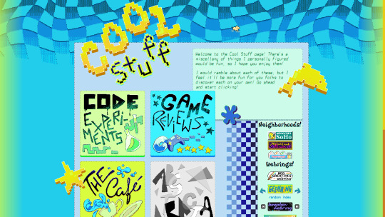
I've been meaning to make this post, but couldn't find time :']
I finally managed to begin moving to my new domain! Not just that, but I've been revamping the site as I went, and can proudly announce that the 2.0 version is coming along super nicely <3
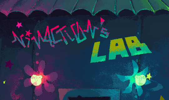
This is a sneak peek of the enter page! I worked very hard on it ^^ And here's the link-
https://ninacti0n.art
For now, only the Blog and Guestbook are accessible. Sticky notes are still under development, but work. Hope you folks enjoy the index and the homepage!
#webbed papercuts#artists on tumblr#web design#neocities#digital art#aesthetic#retro#laboratory#stylized#pixelated#portfolio#personal website#website#indie web#artist website
41 notes
·
View notes
Text

WiNKYFACE ;)
#WiNKYFACE ;)#graphic#design#studio#Amsterdam#portfolio#colors#typography#type#typeface#font#mabry#2024#Week 41#website#web design#inspire#inspiration#happywebdesign
48 notes
·
View notes
Text
Folly animation was originally supposed to come out in January, but it will now be delayed to february. Or if not February, march!
Otherwise, it has been going pretty good so far!
But after I finish the Folly Animation, I will work on less fan-made stuff & instead focus on more of my own work (which I’ve already teased at a character animation gif, and am currently still working on Chapter 3 for my webcomic, if interested on reading it I will leave a link linking to the webtoon :>!)
Anyways I’ll go riiight on back to animating :)!
#artists on tumblr#animators on tumblr#2d animation#fan animation#indie animation#animation portfolio#animation#frame by frame animation#procreate art#folly fanart#fanart#regretevator fanart#regretevator#roblox#regretevator fananimation#regretevator folly fanart#regretevator folly#dreamer folly#folly#procreate#procreate animation#regretevator animation#tapas webcomic#tapas webnovel#web comic#webtoon#webcomic#my comic
21 notes
·
View notes
Text
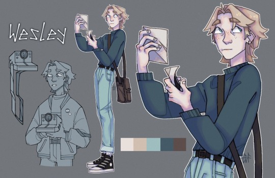
full character sheet for my photographer character, wesley! he’s the main character of a comic i’ve been working on.
#art#artists on tumblr#concept art#artist#character art#character illustration#concept artist#digital art#oc#original character#original character art#illustration#visual storytelling#comic art#original comic#web comic#webcomic#comics#comic characters#digital artist#digital illustration#portfolio
25 notes
·
View notes
Text
hey font nerds
[ does anybody know any good fonts for a lil my "pc as a website" project? ]
pwetty pwease? >:3 # this is a threat
REQUIREMENTS: - Kinda like Android Material UI but more suited for a "modern" PC desktop [ I like Inter ExtraLight for example :3 ]
or: - something good for icons. tray, notifications, you get the gist [ - i know nerdfonts and i can guide myself through their patcher so combining them with a "sleek" main font should be no problem. Wanna get more into python stuff anyways. ]
[ but wait, there's more: - i'm getting cozy with a mono font on my current setup, so if there's any that give of a more like "coffee house vibes and today is cocoa day" vibe, they're also very much appreciated OwO # ^> again, a threat.]
[ oh and also: - access to adobe-fonts is not a problem, i have a adobe license from work # ^ sharing is caring 💚 ]
⬇️ ⬇️ ⬇️ OBLIGATORY CONTRACT INFO DOWN BELOW ⬇️ ⬇️ ⬇️
SERIOUS ENQUIRIES ONLY! (middle click)
[ oh and plz many thanks :3 # < this time i really mean it :3
💜
]
#linux#196#kthxbai#fonts#free#adobe#design#graphic design#web graphics#ui#ux#ui ux design#portfolio#uidesign
26 notes
·
View notes
Text
question: how did i take 4 years of coding classes in multiple languages and not retain A THING!!!!!!!!!!!!! ?
#context: trying to make a neocities page and realizing how effed i am#using a template rn......... i just want a cool portfolio site with different pages for different mediums.. maybe a journal page#i feel like im 12 and trying to make deviantart custom boxes again what the h.#for real how was i making games with c++ and making robots navigate mazes with python in high school AND I CAN'T FATHOM. SIMPLE WEBBED SITE
7 notes
·
View notes
Text


HTML Portfolio Template!
Here's a little project I made, it's a pretty simple HTML, CSS, and (minimal) JavaScript portfolio! It's very beginner friendly and has a 'Quick Start' guide so you can get it up and showing your art!
With the way social medias change constantly, it's a good idea for any creator to have an independent portfolio. This is a good template for anyone who has pictures (you could show off photos of a fiber craft rather than art).
You can download it for free on itch.io and/or check out the live demo!
11 notes
·
View notes
Text
My domain name got sold to a different provider, tried to transfer it to Wordpress so I could spruce up my website, and the domain name poofed into the aether. I have been fighting with AI customer service bots to figure out who now provides it, so I can hopefully get the authorization code.
#i am ready to scream#i just want my website back#I have had a web portfolio since college#this is so frustrating i could cry
13 notes
·
View notes
Text


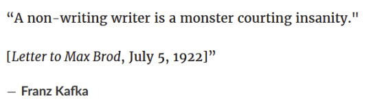
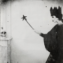
this post / Defunctland / Franz Kafka
yeah
95 notes
·
View notes
Text
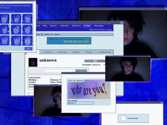
Completely Automated Public Turing Test to Tell Computers and Humans Apart digital collage
#my art#digital collage#collage#art#technology#old web#tech art#captcha#self portrait#remy’s portfolio
7 notes
·
View notes
Text
Hello folks! I bring another site update!! I had to get this one out ASAP, because I didn't wanna leave holes in the webrings :'] I'm still waiting for the owner of the Funky Webring to update my url in it, so I can add the link back... but until then, this page shall do! Hope you folks enjoy it! I will be updating the pages with new buttons and links to things soon ^^ This shall do until I add more stuff.
#artists on tumblr#webbed papercuts#web design#indie web#neocities#retro#aesthetic#my brain juice#colorful#vibrant colors#neon colors#frutiger aero#checkered pattern#pixelated#stylized#personal website#artist website#art portfolio#I don't know what else to tag lol
31 notes
·
View notes
Text

Studio Kleiner
#Studio Kleiner#photography#imagery#design#studio#Stockholm#Sweden#portfolio#green#typography#type#typeface#font#Theinhardt#2024#Week 24#website#web deisgn#inspire#inspiration#happywebdesign
65 notes
·
View notes
Text
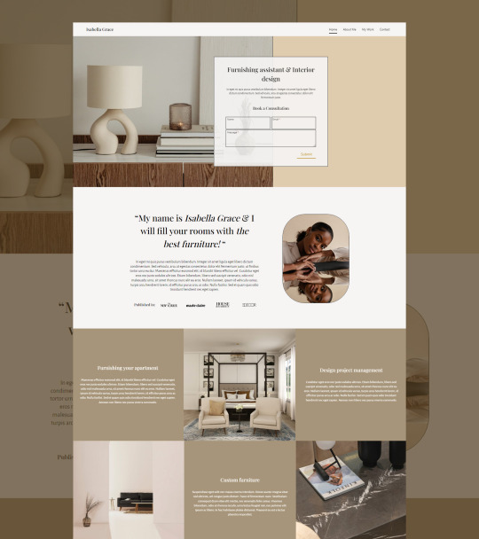


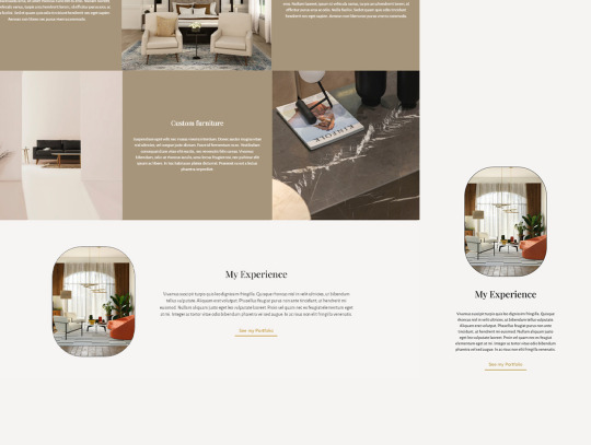
Web Design by Alice | Interior Designer portfolio
#web design#webdesign#aesthetic web design#web design by alice#interior designer#portfolio building#mobile optimization#websitedesign
73 notes
·
View notes
Text

character sheet for lady, another important character in the comic i’ve been working on.
#creature art#creature oc#monster oc#original character#original character art#concept art#art#artists on tumblr#artist#character art#character illustration#concept artist#digital art#fantasy oc#oc art#monster art#web comic#comic art#original comic#digital artist#digital illustration#portfolio
7 notes
·
View notes
Text


Agrokiz - Modern Font
Download Here: https://www.behance.net/gallery/185781885/Agrokiz
Agrokiz is a typeface designed for display and design needs that require large text such as magazine headlines, banners, etc. With its modern form, this typeface is quite applicable for various media and design styles. Agrokiz is equipped with uppercase, lowercase, symbols, numbers and multilingual.
#modern font#sans serif font#font#graphic design#Design#Graphic Design#Illustration#Art#Typography#Creative#Digital Art#Designer#Artwork#Inspiration#Modern Design#Visual Art#Creative Process#Design Inspiration#Design Trends#Design Community#Art Direction#Minimal Design#Design Portfolio#Design Ideas#Design Studio#Digital Design#Print Design#Web Design#Brand Identity#Logo Design
16 notes
·
View notes
Text
Get a Fun, New Website: Simple & Affordable!!

Hi~ I want to share my website design services with you, because you may be seeking a creative answer to your portfolio or business website that stands out from others in your field. For under <$200*, I will design a multi-page, detailed and customized website for your personal or professional use.
I have designed websites for several types of businesses, from financial to creative, and I always add a classic, personal flare to each one. You deserve more than just Web 3.0, after all!
These websites can see hundreds of visitors a day, not just because of mindful SEO, but because every web page provides exactly what your audience is looking for with beautiful and personal presentation.
Key Benefits:
+ Display and promote your highlights + Collect ethically organized interest data + Speak directly to your audience on your own platform + Receive maintenance and updates* + Publish and market your website in less than a week!
You can view my previous work on my dedicated webpage: Darya Talia Web Services. I encourage you to do so!
If you're ready for a free consultation, complete this Google Form describing the goals and aesthetics of your website and I'll book you to review your design options. Websites are primarily designed using Wix Web Builder, and the *cost of my services plus domain registration and hosting will be discussed during your consult!
Thank You for supporting an independent designer and developer!

#Web Design#Web Development#Share this Post#Thank you for Reading#Yes I am also a Video Game Designer! Ask me how I can assist your game portfolio!#Accepting asks that are interested in more information about my process and services!
5 notes
·
View notes