#what do you mean I have to resize it and work out how to do it on my own? >:(
Explore tagged Tumblr posts
Visit Tumblr Blog
Explore Tumblr blogs with no restrictions, modern design and the best experience.
Last Seen Tumblr Blogs


Fun Fact
The Tumblr app for Google Glass was released on May 16, 2013.
Text
I enjoy it when I find out about academics who have very specific areas of interest.
If I see a quote where someone is talking shit about the Spartans, I don't even need to check, I know it's almost certainly Bret Devereaux because I read his essay series This. Isn't. Sparta. and then noticed that I saw quotes various places on Tumblr and elsewhere and it was invariably Bret talking about how the Spartans sucked and how they're overhyped. (His essays on Game of Thrones are very good, also.)
I've been getting into embroidery lately, mostly for historical doll clothing reasons, but also because it's an aspect of crafting I can do in bed when I'm not feeling well enough to sit up and sew or iron or whatever. In the process of doing this, I bought a book called Jane Austen Embroidery (it's late 18th/early 19th century embroidery but if you call something "Jane Austen" more people buy it) published five years ago, co-authored by someone named Jennie Batchelor, who is super jazzed about this one ladies' magazine from the period (and has written other academic books about it, but I'm in this specifically to embroider tiny doll dresses so that's less relevant to me).
So I go online to look for more period embroidery patterns to get a feel for the sort of stuff I might want to make because maybe Felicity needs a fancy embroidered dress. And I find this website where someone has conveniently archived a bunch of the patterns. https://ladysmagazine.omeka.net/
And after browsing for several days, I happen to scroll down a bit and see the name "Jennie Batchelor".
Then today I'm looking at an issue of Piecework magazine from a couple months ago that I commandeered from my roommate because it's all about Regency needlework, and I'm reading the first article which has some very pretty pictures of and it's by . . . Jennie Batchelor.
#it's A Very Specific Set of Skills#if I were less tired I bet I could filk 867-5309 except it's about asking Jennie to post more embroidery patterns from 200 years ago#also I've just got to say - having tried to avoid embroidery for 30 years - I'm really annoyed there aren't more patterns for AG doll stuff#what do you mean I have to resize it and work out how to do it on my own? >:(#No plan only stitch
36 notes
·
View notes
Text
How to take screenshots and edit (when it's just not your thing)

Alright-y!
So, I have over the years learned how to use reshade and to edit my pictures. I am really not a natural on these things, so this is very much to help others who are as aesthetically challenged as I am. I have to have certain "rules" to follow, because I can rarely just see if a picture will turn out well or not.
We all need to realize where I started. We're talking using FRAPS to take screenshots and then running holy colours batman! to get some sort of effect.
Now, I'm not one to buy fancy stuff and to pirate certain programs isn't really my thing either. So we mend and make do!
Also, I am by far very good at taking screenshots and edit, but I have learned things and hope that it might be useful for someone!
A word on light
One thing I've learned is to work with is light. Where the light is is where the focus will go. This doesn't mean that a person has to be in the spotlight, but if they aren't - try to make that a more conscious choice. I am no pro at this, but I have to say that some of my favorite screenshots are where the light is just good. It focuses the eye or it just give a vibe.


(and yes, for some reason all of my faves are of Agnes, which is a bit annoying since Amanda is my fav-character, lol)
This is also where reLight comes in handy. Yes, it's behind a paywall but there are ways that you will have to figure out yourself.
Great tutorial here on reLight by @pictureamoebae! (if you want to really understand reshade, do check out their tumblr. So many helpful tips and tricks!)


Posing
Posing is fun! I don't fully story-tell with my sims, most of it is gameplay. But I do like to pose for family pictures or to enhance something that is going on.
What you need is Andrew's Pose Player and Teleport Any Sim or Wicked Whims.
Now, I haven't figured out how to use WW for children and younger to pose, so I use both. And I like @ts4-poses to find poses. Eventually, you'll find your favorite creators and can follow them directly.


Angles and vibes
Here's a trick. Work with angles. I am a master of pictures with zero vibe, just a face. Those can be ok, and sometimes that's what you have - but try to angle your shot a little.
Or add clutter, focus on that and let something out of focus happen in the background.
Or just go higher, take the screenshot from above.
Or don't focus on your sim at all, focus on something else that adds to the story/post.


Take the screenshot
The light is good, the angle great, the poses are in place and now, we need to take the actual screenshots.
I am a huge fan of reshade, I use version 4.9.1 because that works for me and the presets I use. No need to update reshade unless it becomes too old.
It can be really difficult to to find a preset that you like. I mostly use birdie by @monasims, tawhay by @windslar and paperbacks by @literalite. But I have tried many.
I like this youtube-tutorial on how to make your own preset, which also helps if you wish to modify one that you've downloaded. I do always recommend learning how to use ADOF and CinematicDOF to help focus the image on what you want to capture. I also strongly recommend @pictureamoebae's Foundation.
To take pictures, use the tab-key to leave the UI behind and use Q and E to go down/up in your game and then the mouse to angle. I use print-screen to take my screenshot, but that's something you set up when installing reshade so that's different for everyone.
And now you have your screenshot and it's time to open an editing program. Cheap as I am, I open GIMP.
Let's edit!
I don't use many steps. Since I can't use fancy photoshop actions I have to make all the steps by myself and well - I am human and therefor lazy.
Resize and start to think of a post
First things first. I cut my pictures to work for the tumblr ratio. I actually don't resize them smaller anymore - because when I change layout on my tumblr I just feel as if it messes it up. Now, I don't have a huge screen and my screenshots aren't massive, so it's not necessary either.
My images will be 1017x1017, 1525 x 1017 or 678 x 1017.
Once this is done, I also try to look at how they will go together. If I want a post of just squares I need to have an even number of images. Sometimes I want a landscape image as a sort of heading, or one in the middle with squares around it. It depends on what I want to convey.
This is by no means something that comes natural to me - I am aesthetically challenged after all. Sometimes, I just have 5 images and have to make do.

Resized
Topaz Clean
Yup, it's awesome. No, it doesn't come with GIMP. Yes, there are ways to work around this. You will have to find those ways on your own.
But I have to say, it does makes wonder for the images. I have completely stolen @sojutrait 's settings because I really like her style and therefor - I copy. I have added a bit more sharpening, but otherwise it's completely hers.

Topaz Clean:ed
Curves
Curves my beloved! I use curves for two things! Take out the yellow (aka increase the blue) and to brighten/darken the image!
I do sometimes matte the image too and here's a good tutorial for GIMP users on how to use curves in GIMP (for a matte look)

Less yellow/more blue

Brighten the brights (but I did not brighten the darker parts)
Layers, curves and increase the light where needed
Now, remember that we need light? Sometimes, a screenshot just doesn't have the right light. So I duplicate the layer, use the free marking tool around what I wish was brighter and put that on a new layer.
Then I use curves to lighten the layer with what I want to brighten and to make darker the layer with what I want to put less focus on (here's an ok youtube video on the subject).
Below, you can see the effect on my images.


Sharpen
Pretty basic. I subtly sharpen the image again. Even if I use the sharpening in topaz clean I do like to add an extra touch before it's time to save and move on.

So sharp!
PSD and UI
I do like to use psd's now and then. I mainly use @windslar's psd-collections and @deathbypufferfish's Build-a-Sim Icon Pack.
It's mostly to help give some info about the post or when my sims age up and I want to show their traits.
I do use the UI-info sometimes. If I do, I go into Game Options in the game > Accessibility > UI-scale and just drag that up a bit. Then I copy/paste that part onto the image I'm using.


Done!
That's pretty much it. Thing is, to post good edits you have to actually take good screenshots. As annoying as it is, it's like cooking: it all comes down to the ingredients. I hate cooking Yes, editing does help but I think my main journey has been to learn to take better screenshots from the start.
The picture below is from resized to done.
Hope this might help someone! I will probably learn more and more as I continue to post, but this is where I am so far in my journey!
154 notes
·
View notes
Note
Morning. For the Friends Au it appears that Winter is trying to reach out to Jaune... and maybe he sees it and it's confusing him as to why.
Does her each out to Saphron and Terra, and seek their advice?
On a side note, great series. Looking to further posts as you have time.
Specialist J.A.
Winter: Specialist Jaune Arc. It has a nice ring to it. Don't you agree?
Jaune: It has a bit of ring to it... But, it's not as special as you're making it sound.
Winter: You should be proud, Jaune: You're the youngest person to ever be accepted as a, Specialist, and the first person of none, Atlasian descent to become one. So, take pride in your accomplishments, Jaune.
Jaune: Okay, being the first none, Atlasian to join the, Specialist doesn't sound like that much of an achievement. But, am I really the youngest member?
Winter: Oh yes, I was twenty when I joined, most others, Specialist were around twenty one as well when they joined. You are nineteen years old; You are the youngest member to ever join the, Specialist!
Jaune: Wait really...? Wait, twenty? Does that mean you're around twenty three then?
Winter: Careful, Arc... You should know better than to ask a lady her age...
Jaune: I-I-I'm sorry! I've just been curious how old are!
Winter: And, why do wish to know that?
Jaune: I was just curious!
Winter: Curious...?
Jaune: Yeah. You have this ageless beauty about you, Winter. So, I've always been curious.
Winter: Ageless beauty...?
Winter: Ahem! So... So what do you think of your new uniform?
Winter changed the topic as she looked away from, Jaune hiding a faint blush threatening to spread across her face. Meanwhile, Jaune looked at his reflection taking in his new, Specialist uniform.
It wasn't what, Jaune had expected, but he loved it nonetheless. It was similar to the uniforms to the rest of the, Specialist work as in style.
Jaune's uniform was more of a long sleeve sweater than a dress shirt. A zipper ran up the middle of it to the high collar. A sleave that ran over zipper to connect to a series of buckle buttons on the side. The front was a vibrant white with red stripes running along the side. The rest was the vibrant deep blue that was commonly found on, Atlasian uniforms.
His blue denim jeans had been replace with black combat cargo pants, giving him extra pockets to store necessary supplies. His boots had also been chaged for more modern combat boots, rather than the surplus boots, Ruby tends to wear. He found the boots quite nice, there was space in the boots he could fit something like a knife in it, perhaps her should do something like that.
Jaune: I didn't expect the blue would fit me so well. I know the red, and white suit me. But, I was never sure of the blue.
Winter: The blue is quite fetching on you; it matches your eyes quite well.
Jaune: Really? T-Thanks...
Winter: Your welcome. So, how does your armour feel?
Jaune: Mmmm... It feels a little tight; I think I need to ask one of the armourers to readjust it for me.
Winter: I see... Well, you can ask the armourers to resize it for you, that shouldn't be a problem for them. In fact, they could forge you new armour if you want.
Jaune: New armour? I know my armour is pretty good as it is, but would I be able to get some of that, Paladin Armour plating if I asked?
Winter: Hmmm...?
Winter: That’s a possibility… You'll have to ask about it.
Jaune: Okay, I'll ask them to remake, Crocea Mors then... It's probably best if I ask for, General Ironwood’s permission first. I suspected considering the metal this is used for your, Paladins its restricted from personal use.
Winter: While I'm not sure about that myself. But, I'm sure he'll agree to it, at least he may eventually let you do that. Once you prove your worth to, Atlas.
Jaune: That's fair. He's already upgraded my gear as is. It feels a little greedy of me to ask for another upgrade.
Winter: So, everything alright with your new uniform, Jaune?
Jaune: My armour is a little snug, but everything else is just fine. But, what's with this sash?
Jaune pulled out a deep rich crimson sash with a white snowflake pattern on the edge of it. Jaune looked at the beautiful needle work before staring at, Winter. She looked away as a small blush crossed her face.
Jaune: Winter?
Winter: I uhh... I got you a gift...
Jaune: A gift?
Winter: Yes, a gift to celebrate you're joining the, Specialist core. I would have gotten you something else, but I wasn't sure what... what you would like...
Jaune ran his thumb across the sash marveling on the smooth fabric, and the intricate detail woven into the snowflake.
His mind wondered at the red sash, he wore, Pyrrha's stash as a memento of her, the gold of his armour was also from her. He worse it keep her close to him. But, maybe...?
Winter: Do you... Do you like it, Jaune?
Jaune's mind was running until he saw a flash of red, and gold in his eyes, his eyes moved up to see the ghost of, Pyrrha looking at him. A smile spread across her face as she nodded her head, and gestured to the sash. Jaune's eyes darted to the crimson sash in his hands before looking back at, Pyrrha, and realizing she was gone.
Jaune smiled as his hands reached down, and grab the sash before wrapping it around his waist. Jaune looked down at the sash, then at it in his reflection. He nodded his head before turning to look at, Winter with a smile on his face.
Jaune: Thank you, Winter, it's beautiful.
Jaune hand pulled on the sash to move it so it ran parrel with his hip, while he was fiddling with it, Winter stepped forward, and readjusted it so it would look better.
Winter: Oh thank goodness... I was worried you wouldn't like it. I rarely get presents for my siblings, I've never gotten one for someone else so I was really... worried...
Winter's rambling was cut short as she finished adjusting, Jaune's sash before standing back up staring directly into, Jaune's cerulean blue eyes, their faces mere centimeters apart.
Jaune: I uhhh...
Winter: Y-Yes...?
Red slowly creeped across their faces before the game of chicken was called to the end as the both turned away,. Brushing away their blushes in the process.
Winter: S-So... did... Did you tell your teammates about you're appointment to the, Specialist's?
Jaune: Uhh... no.
Winter: Do you plan to?
Jaune: They'll find out eventually. Just like when I learned that they forgot to invite me to, Ruby's birthday party the other day.
Winter: What? They did, when?
Jaune: They texted me my invitation when I was about to talk to, General Ironwood about me becoming a, Specialist.
Winter: The message you said was from, 'no one important.'
Jaune: Yep, that one.
Winter: You don't see them as anyone important in your lives now do you?
Jaune: Just returning the favour...
Winter: I see. Well then... Specialist Arc!
Jaune: Sir!
Winter: Are you ready for your first mission as a, Specailst?
Jaune: Yes, Sir!
Winter: Good! You will follow me to the cafeteria where we, Specialist will be holding your initiation!
Jaune: Yes, Sir. May I ask what this incitation process will be, Sir?
Winter: Yes, to survive, Marrows cooking!
Jaune: ...
Jaune: Eh?
Winter: The incitation is just a simple welcome party with food, drink, and cake that we, Specialist have. We're expected to each bring in our own food, hand crafted, or store bought. Marrow insists on bringing his family's chili recipe.
Winter: It taste terrible...
Jaune: Chili? Well... now I'm worried about the surviving bit... Should I bring something?
Winter: If you want to, but you're the guest of honour you don't have to.
Jaune: Why don't I cook something edible then. Something we can all enjoy.
Winter: You can cook?
Jaune: Seven sisters, and not a chef among the lot of them.
Winter: Well then, I'm looking forward to whatever it is you plan to make.
Jaune: When is the party?
Winter: This evening around six.
Jaune: That give me... five hours. I can whip up something nice by then. I best get to it. But, I'm going to change first. Don't want flour on my new uniform now.
Winter: I'll see you later then.
Jaune: till later then.
Winter soon made her way to the exit as, Jaune started unbuckling his armour. As the door opened, Winter stopped to say one last thing to, Jaune.
Winter: Oh, and Jaune...?
Jaune: Yes?
Winter: You... You don't need to call me, Sir, or Specialist Schnee... Just call me, Winter, okay?
Jaune: Okay... Winter...
Winter: Thank you~!
Winter smiled a sweet smile as she left, leaving, Jaune behind dumbfounded as he nervously swallowed.
Jaune: Shit...
Jaune: She does like me...
236 notes
·
View notes
Text
How to convert Sims 4 3D CAS Rooms to Sims 3

Disclaimer: If you’re not familiar with Blender/TSRW/UVs then this tutorial may not be for you. If you don’t have Sims 4 Studio which needs the Sims 4 base game (or don’t know how to extract the meshes without it) this tutorial may not be for you. Honestly it’s pretty straight forward, but there’s a lot of trial and error and going in game and out of game checking placement, etc. I use Blender 4.1 for this, but you should still be able to do the same things in the older versions. I'm trying to make this as easy as possible. I’m here to answer any questions though 💕 Tutorial below
Things you’ll need:
Blender (whatever version you prefer)
Sims 4 Studio
TSRW ( I use version 2.0.86)
My Christmas CAS Room here
My TSRW work file here
Tutorial:
Find a Sims 4 CAS room that you like and open it up in Sims4Studio. This is the one I'll be using for the tutorial.

In the Texture tab, export the textures. The only textures that matter are the first 3 diffuse. Go to the Meshes tab and export the mesh, it will save as a .blend file. After that you can close out of Sims4Studio.


Open my Christmas CAS Room in TSRW. You'll get this message. Hit ignore and don't send. We only need this file as a reference to resize the SIms 4 CAS room. Export the mesh as an obj, name it whatever you like. You can close TSRW for now.

Open Blender and open the .blend file you exported from Sims4Studio. Make sure to delete studio_mesh_0 as it's just the shadow map and we don't need that. This is what mine looks like after fixing the textures.

Then import the wavefront obj you just exported from TSRW. Again we're just using this as a size reference.
This is what it looks like after I added the obj. I scaled, moved, and rotated the room to match up as close as I could with my reference mesh. When you have it lined up to your liking you can delete the reference mesh. I usually import the sims 3 body to see where my sim would be in CAS as well so feel free to do that too.

Now we have to separate the objects that use transparency in the scene to their own group. The transparent objects will always be located on studio_mesh_1. I usually do this in UV mode. Make sure UV Sync Selection is on. Where the red arrow is, that's the UV Selection button. It's blue so that means its on.

Tip: If you're using the same Blender version I am (I'm not sure if the older versions below Blender 3.0 do this) you can disconnect the alpha in shader editor and then you can easily see what uses transparency because it has a black background like the plants. Don't worry about the one outside the window as that's on the backdrop image and doesn't show in CAS.
Important: Also, make sure you delete the back of the mirror frame or it will show through the mirror in game. I usually select it in the UV editor as well and delete it.

After selecting all the objects that use transparency, I go to the 3D viewport window and press P, then selection. Now they're on their own layer as you can see. That's a very important step so please don't miss it.

Sims 4 CAS Rooms don't have a closed room like ts3 and if you don't add walls/ceiling with planes you'll be able to see that it in CAS. You can do this in any way you're comfortable with. If you don't understand how to do it feel free to ask me. For this tutorial I will not be doing this perfectly lol I've done enough rooms and I'm just trying to teach here 😩

Okay now last is renaming groups to import into TSRW. Make sure it's in this exact order and uses the exact group numbers.
Group 0 - Mirror
Group 1 - Windows/Curtains
Group 2 - View outside the window
Group 3 - Walls
Group 4 - Objects with transparency
Depending on the CAS Room you convert, yours may not have a mirror you know. You can delete groups in TSRW, experiment, feel free to ask me questions as well.
After renaming the groups, select only the groups you renamed and export as an obj. Make sure that object groups is checked so that they can stay in groups.

Open TSRW and open the testroom_cas.wrk file.
After opening the file you'll see this exact room in this tutorial lol because I had to test some things first 😅

Import the CAS room you converted from ts4. You'll get these two messages. Click yes on the first and no on the second.
Disclaimer: Make sure you reduce polygon sizes or it won't import and give you an error


Import your textures (yours may be different than mine depends on the converter) but most have been the same that I've seen. Group 0 is the mirror it doesn't require a texture. Group 1 and Group 4 usually have the same texture.
Disclaimer: TSRW an be finnicky with textures sizes, I havent gotten any issues since using the 4GB patch, but just in case. Texture sizes from ts4 can run pretty big 4096x2048 even 8196x4096. I would resize to no bigger than 2048x1024 in my opinion, but whatever works for you.
After export to sims3pack or export as package file. Make sure you compress your files and you should be good to test your CAS room in game.

This is the finished product. Should look something like this or better lol considering this was quick 😅
If you would like to make your own from the original ts3 cas room, I would suggest watching this Youtube video (it's for TS4 but it still applies and is helpful) and the link to the original ts3 cas room is here. Since we can convert ts4 to ours you could probably just build your own and go from there as well.
Thanks to @mookymilksims for testing things for me and converting her own. If you would like to try this tutorial out and experiment with room placements using @boringbones Ultra wide CAS mod which changes the field of view in cas so that you can see the whole cas room, it is here. I didn't use it for mine, but that's only because I found out about it after from Mooky lol and I'm tired of converting them 😅 but feel free to ask me any questions if you need help 😊
#ts3#tutorial#sims3#I hope this helped#been procrastinating finishing this 🙃#cas room tutorial#sorry if it's long#tried to be thorough and make sure everything was correct#my tutorials
173 notes
·
View notes
Text

A quick method to deal with blurry action shots that have Hannibal's quintessential dim lighting + green color grading combo.
Here's the example I'll be using:

Don't get me wrong, I love the look of Hannibal, but the average person doesn't scroll tumblr with their screen brightness on max. Plus, night light filters and blue light glasses add even more yellow to an already heavily filtered show. If you want people to see your gif clearly, you have to edit it at least a little. Especially for extreme shots like this lol.
What I use: macOS 15.1.1 Elmedia Player 8.18 dupeGuru 4.3.1 Topaz Photo AI 3.2.0 Photoshop 25.11.0 LuLu 2.6.3 (optional, but it's nice to block outgoing connections from pirated programs)
Step One: Take Screenshots
Open your video file (1080p preferred) in Elmedia Player and navigate to the first frame of your gif. Hit "Playback > Record a Series of Screenshots" and let it run until you have all the frames you want. Unfortunately for mac users, we have a problem where a lot of duplicate screenshots are taken (like every third screenshot is a duplicate... it's so annoying). To save time later, I use dupeGuru to clean out as many duplicates as I can.
Open dupeGuru and add whatever folder you saved your screenshots to.

Scan the folder, then hit "Mark > Mark All" (you can see here that the program only caught one duplicate, which means more work later. it's not a perfect program -_-)

Hit "Actions > Send Marked to Recycle Bin..." to remove the duplicates from the folder

Step Two: Denoise
At this stage the screenshots are so dark that the noise isn't obvious, but it'll be more noticeable after brightening and sharpening. Here's the difference this step makes later:

Upload all your screenshots to Topaz Photo AI and add a Denoise layer. I normally go with the automatic settings.

Hit "Select All," "Apply > Current Settings," then export all your images. This can take a while depending on how many images you have.

Step Three: Create Frame Animation in Photoshop
If you've read any other gif-making tutorials this part should be familiar, so I'm gonna skim over it.
"File > Scripts > Load Files into Stack"
"Browse..." and select your Topaz output files
"Sort by Name" so they load in the correct order
"Ok"
Once all the layers have loaded, hit "Create Frame Animation" in the Timeline window
Under the Timeline window options menu, hit "Make Frames from Layers," then "Reverse Frames"
This is probably when you want to go through frame-by-frame and delete any remaining duplicates. It's very annoying to have to redo this step if you want to go back and edit your crop size later. (Not that I would know... 🤡)
Step Four: Crop + Resize
Crop, then "Image > Image Size" to adjust the width of your gif. You'll most likely want to use one of the common tumblr image dimensions:
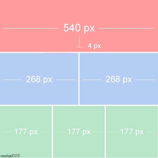
Keep in mind that tumblr's gif size limit is 10 MB. But it's honestly best to keep it under 9.5 MB if you want the gif to load smoothly. A 540x540 px gif can have 40-60 frames while a smaller gif can be longer.
Make sure to add +2 px to whichever width you choose (so 542 px, 270 px, etc), since we'll be adjusting the canvas size later to get rid of transparent border anomalies.
Step Five: Color
The more common order of operations is to sharpen before coloring, but for dark scenes like this, it's kinda silly to sharpen when you can barely see what you're doing, so I like to color first.
Select all your frame layers and make a new group, just to keep them separate from your adjustment layers.
I always start by testing out the Auto Color Correction Options in a Curves adjustment layer. To access them, opt + click on the Auto button. This opens a window with four options.
I like to use a combination of "Enhance Per Channel Contrast" and "Find Dark & Light Colors," though either option can be used to adjust color balance. The important part is selecting "Snap Neutral Midtones" and picking a midtone that brings your gif as close as possible to the desired color balance.

If changing the midtone doesn't affect the color balance, brighten the gif first and try again.
For this gif, "Enhance Per Channel Contrast" removed the bulk of the green filter:

It's still pretty dark, so I brightened up the gif with some more Curves layers:

There's still a lot of purple/blue in Dolarhyde's black leather jacket, so I added another Curves layer and used "Find Dark & Light Colors" to improve the blackpoint:

Now we can up the contrast a little:

Nice! Good enough to move onto sharpening!
SIDE NOTE: The reason I use these Color Correction Options is because simply brightening leaves you with purple/blue shadows and sickly green over-exposed highlights that take ages to color correct. You can see the difference here:

(If you've ever wondered why so many Hannibal gifs have blue shadows, this is why.)
Step Six: Sharpen
This is where you'll want to start implementing actions, which are pre-recorded series of adjustments that you can perform with the click of a button. I mainly use three actions (download here, open the Actions window in PS, open the Action options menu, and click "Load Actions...").
The "frame animation to smart object" action converts the gif to a video timeline so we can apply smart filters.
The "legacy sharpening + high pass" action applies my standard sharpening filters. Not every gif will need the high pass filter, so feel free to change its opacity or delete it altogether. You can also tweak the smart sharpen filters by right clicking them and selecting "Edit Smart Filter..."

3. Once you're happy with the sharpness, the "convert to frame timeline" action turns the gif back into a frame animation. I use a 0.05 s frame delay for most gifs (equivalent to 20 fps; 24 fps is standard for tv/movies). I normally use 0.07-0.08 seconds for action shots, so the gif doesn't whip around so fast. Over 0.1 seconds, it starts to look like stop motion, so I try to avoid that.
Step Seven: Final Adjustments
This is where I fine-tune the colors, mostly using Hue/Saturation layers.
If I use a Color Balance layer, I only make very small adjustments and try to counterbalance them in the other tonal ranges (e.i. adjustments to the Highlights spill over to the Midtones, so I make the opposite adjustments to the Midtones to fix it). But most of the time, I'd rather play around with Curves or Hue/Saturation to fix stuff like that.
Hue/Saturation gives you more control by allowing you to select the exact color range you want to affect. For this gif, I used Hue/Saturation to get rid of the purple introduced around the highlights in Will's hair by the high pass filter.
The eyedropper tool allows you to select the exact color you want to include in the range. Then you can move the bars around until all the colors you don't want to affect are excluded.

Once you have your range selected, you can bring the saturation all the way down and set it to whatever lightness you prefer:

I also reduced cyan's saturation so that Will's shirt wouldn't look quite so blue.

[You could do a lot more to make the colors prettier... but there are other tutorials online for that. 😅]
Step Eight: Export
Once you're happy with your final product, go to "File > Export > Save for Web (Legacy)..."
These are my settings:

You can use Diffusion instead of Pattern if you want. Diffusion is probably better for mobile gif compression, but I like the way Pattern looks on desktop, especially for gifs with smooth gradients. It's a personal preference thing.
Hit "Save..." and you're all done!

This isn't gonna win any gif-making awards, but at least you can see what's happening and the colors don't look wonky. And for Hannibal, I call that a win! 🥲👍
61 notes
·
View notes
Note
Psst. What's your process for Comics? I would like to Know (Because your ISAT comics make me a little bit feral and I would like to learn)
Okay so the cop out answer is: i basically wing it every time since im very very new to making comics and my method is still evolving. but that's not helpful and i like to yap so ill talk through My Method anyway
So first of all: Ideas.
All my ISAT shit is like. extremely dialogue heavy & mostly focused on the same like. 3 topics and philosophical concepts over and over lbr. So mostly when it comes to drafting that I'll just let my brain bash the dolls together until i notice either 1. a fucking banger line (this usually becomes a punchline i then work backwards from when writing it out) or 2. that i keep coming back to the same like 'scene' in my mind.
(I'd love to know. how to make this work for like. OCs??? But I haven't quite cracked that one yet sorry)
For the former though what usually happens there is I write things out on my phone (this happened with the bonnie-centric ones a lot?) or i'll leave a voice note for myself. Or, if i'm at my computer it goes straight into notepad, which is where everything goes before i draw it.


so these are just like. Disgustingly strewn about on my desktop. But this is how i type up the comic scripts, which I do before i put the dialogue in csp because csp's text tool sucks ass, but you can see how these end up having Some Semblance of the final formatting? Some more than others. But they don't have much consistency in how i'm tagging the dialogue LOL. (bonus: one of these i never ended up making. because i come back to the same wells SO FREQUENTLY that it gets embarrasing to retread sometimes) Then I just... screenshot the notepad file and paste it into a csp window LOL.

So I've pulled up three comics just because theyre like, recent ones? (Links to all 3 -> x, x, x) And oh yeah immediately they're rather inconsistent. But this is the level of detail i do in my thumbnails. (Hello Golf Ball Loop) MOST of my long ass comics look like the first one though, and all of them follow the same thought process.
I will take the dialogue, and then just draw a panel that i think works with it. Then move onto the next line, and the next. Basically thinking mostly in speech bubble placement rather than anything? But I'll just keep... going downwards until it is done. You can see the speech bubbles tend to include either nothing or the vaguest indicator of what's inside them.
(The third one here is an outlier because iirc I actually had this very visual idea while drawing something else and went to go quickly draw it out so the text actually went right into CSP bc there was so little of it. But it was still panelled really sequentially for what action I know I wanted in each panel.)
Overall this is probably because of my habits from learning animation? I thumbnail as if im storyboarding, if that makes any sense. Or is any different to how people usually do it, anyway.
My friends who actually read comic books have told me off already for my vile leaning-tower-of-pisa bullshit formatting. I understand their criticisms because genuinely what the fuck am I doing half of the time? I like it though lol. It's a reflection of how stream-of-conciousness my workflow tends to be, but fuck if it means the aspect ratios aren't the wooooorst LOLL

Then i resize the thumbnails to be roughly 1920px wide, aspect ratio be damned. And at this point I usually also have to draw a big grid so that i can align the comic and make it not on a weird tilt. The most thought that goes in here is that I try to avoid making panels too samey in layout from line to line, and try to keep vaguely to making panels the same-ish height but a width of the page either in halves or thirds. Making it so they aren't completely inconsistent sizes does a lot for making things not look too sloppy.
My first sketch over the thumbnail usually is neat enough to be The Final Lines because I'm impatient. EXCEPT when i realise its going to get Fucking Complicated at which point i pull out the CSP models and my beloved cubes. Then i take a billion years to pose a consistent scene (and often realise where I need to cheat angles. Like for loop reaching down to sif's face. That doesn't make sense in 3d space so I had to cheat). This is basically par for the course whenever I want to do a scene where there's Any consistency in character positioning and they aren't just Talking Heads.

THEN. After the sketch (which was done with speech bubble placements in mind back at the thumbnail stage) I will finally put in the speech bubbles. This usually means re-sketching them, then putting the text down and doing all the typesetting (VCR mono looks very ugly in CSP a lot of the time so I fuck with the spacing of individual letters a lot) and THEN redrawing the speech bubbles around them properly.
Sometimes I'll fuck myself over here and have to move stuff but ideally, if I weren't working like some kind of fucking barbarian, I'd do the speech bubbles before finalising the lineart. But I don't on account of going straight from thumbnail to final lines. You'd do this during the sketch stage if you were normal.

then it's finally panel border time. And then when I get to this stage I just make like. another few new layers above everything but the text where i just clean up. Everything that I had neglected while drawing. So any extra white lines or places where i just think things look bad and i want to redraw them entirely. I will also sometimes literally make a flattened copy of an entire panel to just move it around slightly. It's a deeply evil part of the workflow and i apologise for it. But also it's the major benefit to drawing in straight black-and-white with no tones. It means i can just overdraw anything that is unclear in the end.
(and reposting again Links to all 3 -> x, x, x for easy comparison if u want it)
ANYWAY for further reading. I know I've already stated these before somewhere on my blog but for ease of access... The major inspirations for how my comics Look are as follows:
1. tumblr user Floralmarsupial's homestuck comics found [HERE]. She did a LOT of straight up black and white comics that are ingrained deep in my brain at this point. These are always in the back of my head.
2. Leo Fox [LINK] regularly gets really strange and esoteric with overlapping panels and unorthodox layout. I stared at these a lot when i was starting to make the first couple ISAT comics even if i'm not going nearly as abstract as him
3. tumblr user the-hydroxian-artblog's comic Hangin' Out [LINK] has GORGEOUS typesetting and their art in general uses a lot of speech bubbles that convey some really funny shit by just resizing the text in funny ways. Gold standard for emotive typesetting and also their lin weight and b/w illustrations are gorgeous.
4. sonic the hedgehog idw keeps me humble and reminds me to make the speech bubbles fucking SMALLER. if im left to my own devices i make speech bubbles and fonts WAY too big so reading a cleanly formatted professional comic book for children reminds me what i should be aiming for in legibility.
anyway hope this helps? the answer really is "fuck it we ball" tho
#LONGWINDED MODE ACTIVATE GO#anyway yeah here u go hope it means anything. if you wanted more elaboration on the idea generation sorry tho its just like#put blorbos in rock tumbler of brain see what dialogue comes out see if i get fixated on anything#lucabytetalks#isat spoilers#ONCE AGAIN i love to use source material for these thats spoilerrific. since its all i draw#i am genuinely struggling to put these into effect in my oc shit which is maddening. but ill get there... it's all about the writing#in that case... so i just need to practice :/ lmaoo#doodlebyte#for ease of access i think as a tag#long post
34 notes
·
View notes
Text
Dev Log! 1.04 BETA Release Date Confirmed & Info Dump!

I was going to post up a video update, but editing videos is time consuming!! So, written devlog it is! This devlog is a long time coming. There's been some trials and tribulations leading up to this point. There was a situation of lost coding, lack of time, and even some health issues that kept it from coming out sooner! I was hoping to have it out in March around my birthday. That didn't work out. So it's late! However, no lie, this feels like the biggest update I've ever done for Camp Gash! So, sit tight and get a snack. This may take a minute to read! I feel guilty for not saying much until now.
However, I'm here to rectify that! Release date for this update will be placed at the very end of this devlog! So, here's what is all coming to the:
1.04 BETA Consequences and Scenarios Update

First off: An Inventory System!
That's right! A working, real, inventory! WOOO! I thought it was just going to be a list for now, but I figured out a system! There will be 4 categories of items:
Consumable Items
Dialog Items
Mission Items
& Special Items
Consumable Items can be clicked on and used in the inventory. Instantly. Consumable items can help with raising and lowering your horny meter, some can be shared to NPCs, and even help your HP. <More on that detail later!
cigarettes
bottled water
beer
first aid kit
bandages
no-baby pill
Dialog Items can only be used during interactions with NPC's or during certain situations. A dialog option will either appear or the MC with automatically use them. Each one has a limit to how much you can carry and use. Some dialog interactions won't be present without them!
lube
condoms
Mission and Special Items are items you pick up during missions as an objective.
Special items are found in secret, given, or found in select areas. These are considered non interactable.
You start WITH ONE STARTER ITEM that you can pick while in the car ride with Moxie. You can now find items in a stick pile during the tour. It's random chance.
New Artwork!

Another part of this major update is a few new changes to the games artwork! The bridge to the player's cabin is updated! It is no longer a sketch! The player is getting a new design for their cabin. ...Isn't it delightful?(it's trash I know!) A few new NPC sketch buttons for Carrie, Lyle, Mars, Lucian, and Lucy! I hope to have some new buttons that are finished like Moxie's soon. But, it takes a while to do! I've also resized Moxie's tour buttons so she's not a giantess. She's closer to what she needs to look like compared to the other buttons! The original buttons I created by drawing with a mouse. That's why they looked so wonky! They now have a revamp!
There's a few new MC customization options for their face!
New hair! Long flowy and Mullet(because it's the ✨80s~!✨), tired eyes, and a new nose!

Added or Expanded Locations!

The nurses station, although mostly still basically a sketch, has a back room that you can go into. A side garden at the green house and a secret 'relief' spot for the green house! Now you can jack it in peace during your groundskeeper tour!
Let's get down to the nitty gritty!!

Game Play Additions and Changes!

There are new things to customize your character and change up player experience! Many of them aren't fully implemented, but will be added in with each bug fix update and future updates. These all include:
The requested virginity option. You can now start off, by choice, as a vcard holder. This means that you can lose that vcard to other NPC's, both counselors and monsters alike. This may change up scenes for sexy time. If you tell your RO that you are a vcard holder or not! Only a few Counselors have been added to this, the monsters for the most part have this implemented! Lyle, Barb, Mars, and Kyle have reactions to this(only certain scenes!). Moxie just knows you are since the two of you are besties. The twins and Carrie, are unfinished for now.
The ability to choose if you have pubic hair, facial hair, and body hair. Will be implemented for scenes overtime. (facial hair not a selection for visual MC appearance yet! Still working on it!)
*Some requested that it should be an option for vagina havers (both intersex and lone vagina warriors included) to have an option to have their period during the camp week. (OPTIONAL) Not mentioned or implemented currently, but may open up more options for bloodplay. If this is selected, the game play may increase in difficulty. Monsters, not just the monstrous ROs, smell BLOOD. Attacks may increase and if hiding, yes that will be added later!, it'll be harder to stay hidden. Survival is about to become more of a thing!
PREGNANCY. Yes, I said it. Pregnancy. Depending on the equipment your MC has - vagina, penis, or both. You are now able to become or make other NPCs pregnant. Will you know? Probably not. Only one NPC can tell you if you are. And it will only be said in passing! Practice safe sex~! Or don't. This doesn't change gameplay much, but will affect your ending. Make your game as MESSY as you want! There are items to prevent - or terminate - the pregnant variable. Condoms and the No baby pill(For MC only). If an NPC knocks you up or you knock another one up, you will gain a variable that will keep track of which one you got pregnant /got pregnant. Once the player is pregnant, unless terminated, you can not become pregnant by another. **Birth preventative items can be purchased in next update when the SHOP is implemented!
The ability to change what type of undies you wear! Briefs, Panties, and Boxers.
You can now be injured during the tour! It's random chance!
Consequences on day 2 for fucking Barb on night one and NOT having a truce with her.
Lucian has a more complete Sleepover scene if you invite him over! This one has a story attached... I lost all of it for some reason. The coding just disappeared for some reason and I had to rewrite ALL of it. EVERY. SINGLE. THING. And I'm STILL writing it!! 😡 FUUUUUCK! You can be kinky with him or just do it vanilla! (interesting scene if you tell him of your virginity during sex~!🩸)
Lyle shower sex on night one (if invited to shower with him after shed sex)
You can die during rough sex now! Yep. Keep an eye on your HP! If your health is low during rough scenes you might die! There's consequences to your hoeing now! XD And you don't heal completely when you go to bed. You heal one notch when you sleep now. No more. DON'T WORRY! I've placed a few first aid kits on the map on day two, if injured when you talk to Lucy on day two you she may heal you once, and one of your starter items can be a first aid kit! Be safe! LUBE is recommended for rough sex and helps prevent injury. This can be useful for if you have a vagina and are going to have your first time roughly! Just a tip! ;)
There are new dialog options, scenarios, and sexy scenes! You can now KISS the monster at your cabin on night one! Nothing like rewarding your stalker with kiss. 💋
PROTECTIVE MONSTER is now a thing. On night one when you need saving at your cabin -if you know you know- only if your LOVE IS HIGH with the slasher or the swamp monster. (Eldritch horror has it's own idea of protection) They will come to your rescue! This unlocks a different wake up scene for day 2! ...With consequences.
NEW NPC(s)! Jackeline! She's a friend and bandmate of Lyle. This goth gal shall show up on day two after she is mentioned in Lyle and Carrie's day two conversation. She doesn't have much dialog for now but she will have MUCH MORE in the future. She will be... Helpful. Also, a serotonin boosting NPC you can find at the greenhouse on day two! Have fun with the little guy!

WOW THAT WAS A LOT! Phew! Do you all see why it took me so long? It has been a TRIAL! Let me tell you! Didn't mean to turn this into a safe sex class but here it is!
I hope to have the newest version of the game posted up here on
MONDAY April 7th
Of which, if you like what I do so far feel free to become a patron or do a one-time purchase of the game! Every little bit helps. Thank you all for playing and I do hope you're having fun with what I've created so far! Stay tuned, because there is more to come!
Until Next Time, Doves! Take initiative and game on!
- Pillow Princess Games
Play the current/non updated version HERE! 18+ ONLY!
#campgash#indiedev#camp gash#game development#gamedev#horror games#horror/romance#indie game#monster fucker#monster romance#devlog#game dev blog#game dev log#update#yandere#18 plus#nsfwgame#adultgames
25 notes
·
View notes
Text
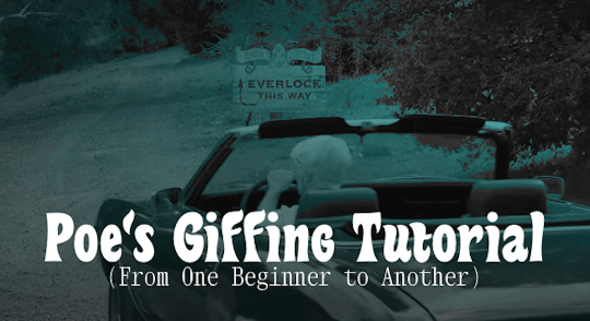
Poe's Giffing Tutorial (From One Beginner to Another)
Hey, everyone! So, I've been thinking about this for a while, and decided to finally make it happen. This post aims to be a giffing tutorial that isn't a bunch of technical jargon that nobody except experienced giffers understands. This is for the person that I was when I first started out: someone who wants to make gifs, for free, without having to learn the entirety of a new program. As such, if you're already familiar with the basics, this probably won't be super helpful to you.
In this, I'll cover the basics of actually capturing a gif, the how-to of color correction (though without getting into the nitty-gritty detail of it), some basic text effects, and some more decorative effects like overlays and ~fancy coloring. I'll also show you the program I use to resize gifs.
I don't have a fun quip to lead us into the next part, so, uh, let's just dive in.
Tools*:
A PC capable of handling heavy processor loads (I use a mid-range gaming laptop; it's a little slow sometimes, but it works)
Whatever you're giffing (obviously...)
ScreenToGif (a free, basic screencapture program)
Photopea (a free, in-browser Photoshop dupe)
RedKetchup (a free file resizer/converter)
*Note: These are not the end-all, be-all of gifmaking. They may not even be the best tools for the job! But they're free, they work well, and they're relatively intuitive.
Step 1: Capture your gif.
I'm going to use ScreenToGif for this. The first thing I do is open the program and click Recorder, which opens the recording interface.

I click and drag (or manually input dimensions in the boxes next to the recording button in the lower right corner) to set my dimensions, and then I press record. The red "Record" button will change to a blue square that says "Stop," and a timer will appear in the upper right corner, showing how many seconds your gif is.
Generally, I'll pause the video 5-10 seconds before my desired start time, to give myself a buffer (you'll be able to delete those frames later), start the recording, and then start the video. You'll probably find a system that works for you once you do it a few times.
Once the scene that I want to capture is done, I'll click the blue "Stop" button, and the overlay will close itself. A few seconds later, depending on how long/complex/large your gif is, the program will pop up with a new window where you can edit. Here's what it looks like:
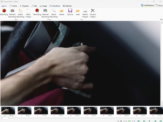
You can do a lot with ScreenToGif, but we'll be using the dead simple stuff today. Click the "Edit" tab, fourth from the left, and this will show up.
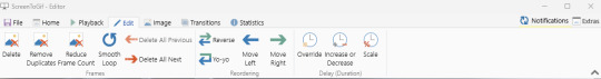
"Delete All Previous" and "Delete All Next" are our friends here. Go to the FIRST frame that you want in your gif, using either your arrow keys or just dragging the slider, and select it. Then hit "Delete All Previous." This will make that frame the first frame of your gif. Then, go to the LAST frame of your gif, and hit "Delete All Next." This makes the last frame of the scene that you want the last frame of the gif. You can also use the "Delete" option to delete frames by selecting them with your cursor if you want a more manual option.
Now you have your raw gif! Go to the "File" tab, the first one on the left, and select "Save As" from the menu. You want to make sure that it's saving as a .gif file, not an .mp4 or .apng --- you can check this up at the top. Don't worry, though, as .gif is the default, so unless you change it, you should be golden. Select whatever folder you want to put it in, name it, and save it.
You could absolutely stop here. It is by no means required to color your gifs or slow them down or any other number of things associated with giffing. But if you want to, here's how I do it.
Step 2: Edit your gif.
Head on over to Photopea. You'll see this:
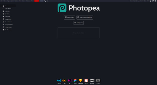
What we want is the "Open From Computer" option. Click it, and your File Explorer will show up. Navigate to whatever folder you saved your gif in and select it by double clicking or clicking once and hitting "Open."
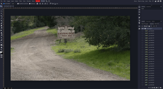
It'll open in a new workspace that looks like this.
You may be saying, "Gee, Poe, that sure looks a lot like Photoshop!" Yes, it absolutely does. If you're familiar with Photoshop, you will most likely be able to find your way around Photopea just fine, and can probably go from here. But if you're not familiar with Photoshop, here's the basics.
First thing's first: gifs are frequently pretty fuzzy/blurry. Luckily, sharpening them is easy.
Select all your frames (the list on the right with all the numbered layers) by clicking one end, scrolling up/down, holding Shift, and clicking the other end. Then go up to the tabs and do Filter > Sharpen > Smart Sharpen. This will automatically sharpen each frame using a percentage; the default is, I believe, 150%, and this is usually what I use because I am fundamentally lazy.
If you don't select all your frames, only the one that you're currently on (the one highlighted in a lighter color) will get the effect applied to it. This goes for basically anything you do, so it's good to get in the habit of selecting all.
Now that it's sharpened, we can color it. Go up to the tabs again, and go to Layer > New Adjustment Layer > [whatever you want to adjust]. Most commonly in Escape the Night, you'll have to adjust brightness, because there's a lot of dark, moody scenes; Season 3 is also especially yellow/orange tinted, so you'll probably want to color correct it, too, using the Color Balance adjustment layer. This is a total guessing game based on the exact scene you're doing and my method is just selecting random things and adjusting sliders until it looks good (remember: fundamentally lazy). Honestly, I'm not an expert in coloring gifs, so I won't pretend to be — especially since people can and do write entire posts just dedicated to it. For this gif, I'm just lightening it a little.
And if this is all you want to do — no text, no effects — you're done! Go to File > Export As > GIF. It will take a few moments to load, so don't panic when your page freezes. A new window will pop up that allows you to do things like set looping, time, etc. but you can also just "Save" and you're done!
But let's say you want something fun. Maybe you'd like to overlay a quote or make it a cool color. If that's the case, continue on...
Step 3: Make your gif shine.
Three parts in this: text, fun colors, and overlays. You can combine these three to do some awesome things, and they're all very simple to do, once you know what you're doing. Think of them less like steps and more like a mix-and-match deal. You can use one, two, or all three!
So, here we go.
Option 3a: Add some text.
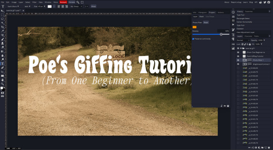
The easiest option of the three, this one works exactly like you think it does. The uppercase T symbol on the sidebar will create a new text layer where you can type something and set a font, size, and color.

I'll spare you the lecture on typography that I could give you — you can find better ones than I could make. Generally, though, you have a decorative/display font for headings and emphasis, and then a different, more generalized font for subheadings and other things. In this, the display font is Heavy Heap, which was used on the Season 3 tarot cards, and the general font is a relatively generic serif font.
(Sidenote: you can load fonts into Photopea! Just go to a font website like Dafont, download the font you want, and then open it as you would any other file by going to File > Open and selecting it from your files. You should get a message that says "Font [Your Font Name Here] Loaded," and then you'll be able to use it in your design. That's how I got Heavy Heap in there.)
You can change size and color with these, which will show up at the top when you select the text tool. Keep in mind that if you're making changes after you type something out, you will need to select (highlight) the text you want to change — it won't do it automatically.

I will admit that Photopea's text editor is not the cleanest, simplest, or nicest to use, especially at first. I came from Canva where it was much faster and easier. The downside, of course, is that Canva is highly limited with what you can do.
There are also ways to warp the text, change the blending, and do outlines, but I'll leave that for another time as to avoid making this any longer than it already is.
Option 3b: Make it a cool color.
You have a couple different ways to do this. Probably the most intuitive is to go to Layer > New Adjustment Layer > Photo Filter. Select the color box, pick the color you want using the picker or a hex code, select your desired density, and click OK. Boom, color over your gif.
It defaults to this vintage-y orange, but you can pick whatever color your heart desires.
However, I usually use a different method using Gradient Maps. This is also pretty easy; Layer > New Adjustment Layer > Gradient Map. If you leave it black and white, by the way, you get a B&W gif (you can also just select the Black and White option in the Adjustment Layer menu). Click on the gradient, select the white square on the right side of the gradient line, and then select the square down at the bottom of the window and change it to whatever color you want.

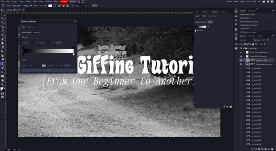
For this gif, I'm leaving it B&W.
(You can have a lot of fun with gradient maps. Play around with them!)
Option 3c: Overlay another gif on top.
Ooookay, so, this is the most advanced and tedious of effects to do (at least of the ones documented in this post), but it's worth it, I promise. For this, you'll need at least one other gif. I usually use a base gif that's relatively neutrally colored, oftentimes B&W but sometimes just faded or pastel, plus one (or more than one) colored, brighter gif. These are, of course, just guidelines — combine whatever gifs you want. The only real requirement, per se, is that they have the same amount of frames. If they don't, it'll look weird. (But if you do end up with two gifs that have different amounts of frames, you can delete the difference right in Photopea, so I don't stress about it too much.)
You also generally want to add text after this step, so if you're planning on doing this, save the text for last.
First things first: color your gifs the way you want and then save both of them. Then re-open them both in Photopea. Yes, this is annoying. I did say it was tedious.

So now I have both of them in my navbar, labeled as "tutorial base" and "tutorial overlay."
Go to your overlay gif and right-click on the gif folder. This is the top layer with a little arrow and folder icon next to the name of the gif.
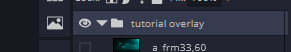
Select "Duplicate Into" and then pick your base gif in the popup. In my case, it's named "tutorial base."

Now you'll click over to your base gif, and you'll see that your accent has been put on top of your base. Now you get to have fun with blending!
Right click on the overlay gif's folder again. Then, select Blending Options, which is the first menu item. It'll bring up a popup with all sorts of options for styling your layer.

The default setting is Pass Through, which is what we see here. If you want, you could just change the opacity to get your desired effect.
You could also play around with blending options such as Overlay, Color Burn, Lighten, and Screen. Every gif is different, and every gif will look different with different options, so experiment and see what looks best! You may have to go back and recolor it a few times, so I recommend just keeping the project open in your navbar for easy access.
For this gif, I think I'll go with Darker Color at 67%.
One last step, and then you're done with blending!
Go to Layer > Animation > Merge. This will merge each frame of your animation (the gifs) with each other, meaning that they'll play at the same time. If you forget this step, as I do frequently, you'll go to save your gif and find that it plays as a sequence.
Once you've merged your gifs, you can add texts, more effects, PNG overlays, whatever you want! Congrats! You did it!
Step 4: Resize your gif (if necessary).
Maybe you've made a gif, and it's beautiful, and it's amazing, and you wanna show everyone...but it's five million megabytes and you can't send or post it anywhere. Tumblr's max file size is 10 MB, while Discord's (standard) max file size is..7 MB, I think? Either way, if you try to upload something bigger than that, you'll get an error message and the familiar taste of disappointment.
Never fear, Redketchup is here!

This is Redketchup, and it's super simple.
Go to "GIF Resizer" under Animation Tools. Upload your gif, then scroll until you see the Resize GIF section. Input the percentage you'd like to reduce it by (presets are 25%, 50%, and 75% smaller, but you can set it manually, as well).
This is also the step where you can slow it down if you desire if you didn't do it in Photopea — it's in the next section down. Set the speed, if you'd like, and then go down to the bottom and hit Download.
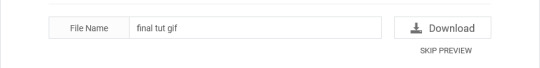
It'll take you to a preview tab where you can check if your gif is small enough. If it is, hit Download again up in the top left, and that's that! Go share your gif with the world!
Conclusion:
Thank you for reading! I am by no means an expert gifmaker, but I want to spread the love and give other people the option to do it. I wouldn't know any of this stuff without the people who taught me, and I'll put a list of tutorials down at the bottom that I referenced when I was first learning to make gifs.
At any rate, if you use this post to make a gif, feel free tag me or send it to me so I can see! And for those of you who are on the fence about learning or starting to gif...
Do it. I double-dog dare you.
:)
References:
Blending Gifs by @the-mother-of-lions
Photopea Coloring Tutorial by @heroeddiemunson
Merging in Photopea by @bellamyblakru
And, though not a specific reference, I frequently browse @usergif for inspiration (they have tutorials there, as well, but I haven't checked them out yet).
#gifset#giffing#gif tutorial#how to gif#how to make a gif#photopea#escape the night#etn#I wrote this instead of socializing at my family's thanksgiving dinner#because that's just who I am
150 notes
·
View notes
Text
one of the tags I see/asks I get the most related to GIF making is “how do you GIF that fast?”
I’m by no means the fastest creator out there & it’s not a speed test anyway, even if it feels like it sometimes. that being said, I’m obsessed with efficiency & my neurospicy brain doesn’t like monotony. if there’s a way to automate what I don’t like so I can skip to the good part, I’ll find it.
there are a bunch of things I do that have streamlined my process over the years, but if I had to choose only one? creating actions.
the moment you find settings you like (sharpening, sizing, etc.), make. an. action. I don’t even want to think about all the hours I wasted before I figured out how to make them.
I created actions for the two GIF sizes I use the most: full size (540x390) & half size, or two GIFs side by side (268x400).
with one click in Photoshop- let me repeat, ONE- the following is immediately applied:
play speed is slowed (makes GIFs look better)
my video is converted to a Smart Object
my video is cropped
my video is resized
my sharpening is added (3 in total)
my noise layer is added
my watermark is added
my subtitle text is added (I still have to add the text, but the text box with the font I use is ready to go)
the adjustment layers I use the most are added, including Curves, Levels, Color Balance, Selective Color, Brightness/Contrast & Vibrance (after my action has run, I’ll manually add coloring presets I’ve already created from previous episodes, shows, etc. & tweak them as needed. no reason to reinvent the wheel)
with all the repetitive work done for me, I can focus on the thing I love most: COLORING 🌈
it’ll take a minute to learn how to create your own actions, but I swear it’ll change your life!
#gif making w/ mor#mor answers#photoshop#gif making#photoshop actions#if anyone’s interested in tutorials etc let me know!
202 notes
·
View notes
Note
How do you do your Final Fantasy edits?
The hard way, my friend. No AI is used here, I do it all by hand. 🥰 I assume you mean the screenshot manipulations I create? I'll try and give a simple summary... First, I boot up Remake on PC and use a "free camera" mod(you can find the links to the mods I use on my archive pages for manipulations, which is on my pinned post) to take a couple screenshots that I think will work well together. Sometimes I change my mind and choose a different one. It can be hard to match the camera angles and lighting, so sometimes I have to mess with that later, as well. But it's easier if they fit together from the beginning. We'll take my current WIP as an example. I started with these two screenshots:


I open them in the free program GIMP (GNU Image Manipulation Program), which anyone can download at gimp.org. Then the first thing I do is choose the base image. In this case, they're both facing the same way, so I choose to flip Sephiroth(you can't really do that with Cloud easily because of his earring, and his hair is less symmetrical). Since the camera was closer up on Cloud, and he's the smaller one, I usually choose Sephiroth's to be the base image. With that decided, I roughly cut Cloud from his background and paste him onto Sephiroth's image as a new layer. Then I position him, resize him, rotate him, whatever I need to do until he seems to be in the desired place, which ends up looking like this: (I ended up adding snow for this preview, so it would look more complete than it is when I showed it to my server, haha)

If you look at Cloud, you can still see a thick outline of his old background around his head. Once he's positioned properly, it's time to remove the rest of his background(I use a size 10 eraser with 100% hardness and zoom in about 5 times). Then I need to think about where they're connected, and how to make them look like they're touching, as well as layering to make them seem intertwined, as if they're truly occupying the same space together.

I cut away some of Cloud's shirt, and the rest of that effect will come with shading later. If I wanted Cloud even closer, I would make a duplicate of Sephiroth and erase his background, so that his lock of hair would appear to go over Cloud's face. I could also make it semi-transparent, so you could see the outline of Cloud's face through his hair. You can see I have some small game defects to fix, such as Cloud's hair clipping through his ear. I leave those tiny details for later, typically. Sometimes, because of their height differences, I have to "rebuild" missing parts of them from scratch, such as I did for this other manipulation:


It's a delicate process that's mostly the clone tool(to keep the textures) and some freehand drawing, but I don't have an art tablet, so I use my mouse for everything, which can be quite challenging. I've had a lot of practice from translating doujinshi, where I'd erase the words, rebuild the missing part of the image, and then place the translated words over that spot.
In any case, I decided I wanted more out of this manipulation than just leaning against each other. I wanted Cloud to be reaching up towards Sephiroth, and perhaps for Sephiroth to be pulling him closer. To do that, I needed pictures of their hands/arms like so:


I've taken hundreds of shots, so I looked through what I had first, but it wasn't the right angle, or was the wrong outfit for Cloud, so...then you open up those images and cut out the parts you want. After that, you work on positioning and things like that again. I haven't finished with that part yet, so it looks a little awkward. (And when you're doing these kinds of things, color matching is very important, but that's a bit advanced.)

I'm not fully satisfied yet, so I'll probably remove the rest of the background from the arms and then mess with the placement. As for Sephiroth's hand, I intend to thread it in Cloud's hair, so Cloud will need to be duplicated in order to create that layering effect, as mentioned previously. Which should end up looking similar to this one:

(I had to draw in most of Cloud's hand because I didn't have the camera mod back then, and the Sephiroth shot was provided to me by Coeurlwhiskers.) After that, it's a matter of shadows and highlights, remaining details, and finishing up the colors, etc. It's a long and difficult process, and can take many hours to complete, depending on how ambitious I get with it. Most of that stuff would be a much longer tutorial, and I did used to do some actual artwork a long time ago, so I...kind of know what I'm doing?? I probably do a lot of stuff the hard way(like not using layer masks) because I just don't have the time to teach myself more than the basics. 😅I know it may seem daunting, but it's really fun! I hope I managed to answer your question properly. Feel free to ask follow ups~
20 notes
·
View notes
Note
hello, love this gifset for schitt's creek!!
https://www.tumblr.com/alexisrosemullens/780180482548711424/schitts-creek-week-day-7-best-wishes-warmest?source=share
please give a tutorial on how you did the colour manipulation in the first gifset and adding one gif in three places in the layout.
Sorry this took a little long to do. Thank you so much! This amazing template is by Sole (@the-borgias). You can find the psd in her post!
The psd is in frames but I work in timeline so I converted it to timeline first. The template is labeled really well for the gif placements. Here's what Sole's psd is labeled as. I followed this placement for each of the gifs.

I need five gifs in total. For sets like this, I like to pick my scenes, resize, and go ahead and put them all in one psd to color there. I place each gif in their respected group. It's just easier for me to get the placements right and decide how each would be colored. For the background, I knew I wanted black and white. Then for the other four, I knew I wanted two gradient maps and then two just the background colored. I base which one is which on movements.

Without the coloring, you can see Alexis and David move the most so I add some curves, brightness and contrast, then a gradient map.

Now, here comes the fun part. Let's start with Moira because she's moving less than Johnny. For Moira, I add the same gradient map as David and Alexis but this time, I take a black brush and paint over the parts I don't want colored.


There's yellow on her hand but it didn't bother me so I just left it. Now, Johnny we are going to do in a similar way but he's moving a lot more than Moira so here's when I walk through the gif and clip it if necessary. Let me show you.
Here's what it looks like before. As you can see, it starts to cover Johnny's face and I don't want that.

So we are going to go down to timeline here and click on the group. Johnny is in 3rd gif group. Click that little arrow and expand it.

When it expands, you'll see each layer. Mine is already cut but we will get to that.

So now the fun really begins and we are going to use these handy buttons and walk through the gif and when the color starts moving on Johnny's face, we are going to cut the gradient map using the scissors. This is a really tedious process. You can also use key frames but sometimes there is still too much movement.

Let me show you want I mean. Like I said, I already have mine cut so I know where I want to cut it but you really have to rely on your eyes.

You are going to repeat this until the end of the gif. It is really tedious and takes a ton of practice. I wish I could've done a longer gif of the process but my photoshop hates me today.
And that's how I did most of the gifs in this set. If you have any more questions, feel free to reach out. Hope this makes sense!
12 notes
·
View notes
Text
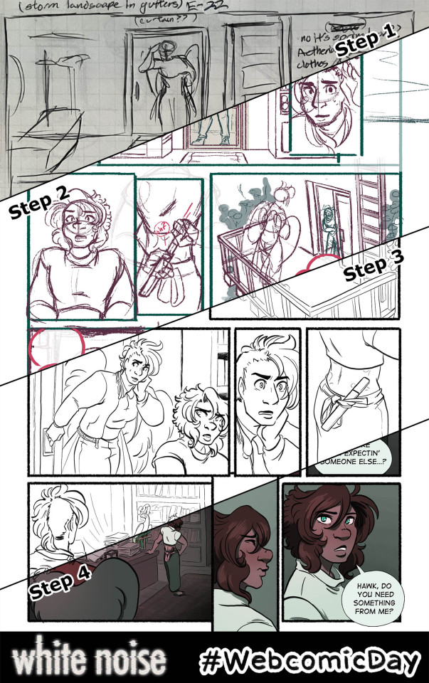
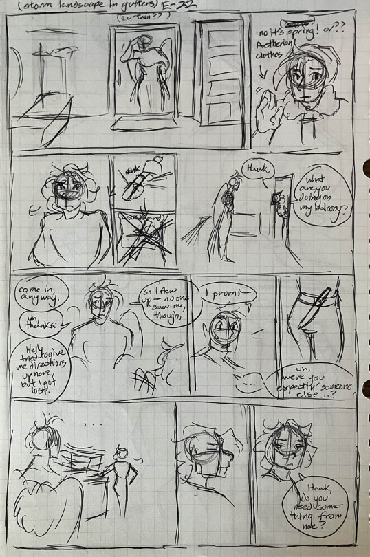
youtube
Happy Webcomic Day! My webcomic White Noise is a labor of love--according to Procreate, this page took me 15.5 hours to complete.* Here's a look into that process!
Some other notes:
The thumbnails are done on graph paper and I script while I do them--there is no separate written script for White Noise. I usually spent a couple hours on weekends as needed thumbnailing, sometimes at a coffee shop or at home listening to records.
I then set up the file in Photoshop, so I can lay in the text and use the template I have with bleeds already set up. The text is rasterized and I shuttle the file over to my iPad via Airdrop.
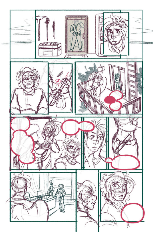
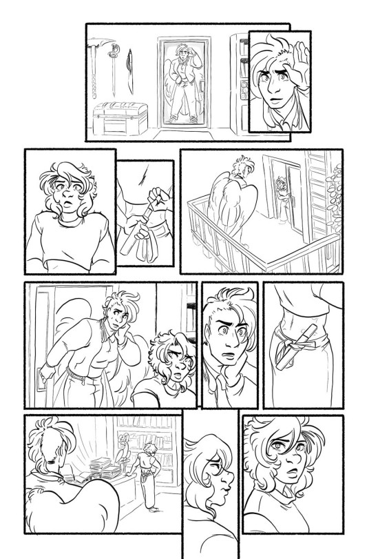
The bulk of the actual work is done in Procreate, which records timelapses that I sometimes share to my Patreon. I usually spend a couple hours most nights after my day job or on the bus commuting doing this.
Once everything art-wise is done, I shuttle the file back over to my desktop to re-set in the text, add a stroke around the speech bubbles (Procreate doesn't have that took fsr) and do the resizing/exporting for web.
On Sunday mornings I get up, queue the page and write the page descriptions. I don't spend any time on the page descriptions outside of that.
Also, this process goes for the whole first arc of White Noise. I'm done with that arc (which means you can binge the whole thing I'm js!!) and am experimenting with some different methods these days, but my workflow is still generally the same.
*Some more talk about the labor (and burnout) involved below the cut:
This particular page (and most of the pages I did in 2023) took a lot longer than normal because I was heading into a burnout period that I'm still lowkey in/recovering from. It's obvious to me now in retrospect watching the timelapse here and seeing how much noodling I'm doing and how much I'm struggling with the process, but at the time I was just very frustrated generally. When I'm not burned tf out pages take maybe 10 hours max.
2023 was a pretty stressful year--lots of big life changes, uncertainty, pet death, health issues--so it's no wonder it propelled me into burnout, but it just goes to show that even the slowest and steadiest pace is not sustainable forever. I've been doing one page a week following this general process for over a decade! And I stuck to that pace because I knew it was one I could maintain. But even so, by the end of this arc I found myself working more and more slowly, not really looking forward to the work, feeling anxious about being behind, unhappy with the finished work, and extremely annoyed with myself for not being able to give it my all right there at the finish line.
I did stop for a while after the epilogue and took a more or less complete break from drawing for about a month--the longest I have EVER gone without drawing, much less working on White Noise--which did help, but these days my ability to work is...inconsistent. I should probably take another total break, but I'm reluctant. What if my passion never comes back? What if people forget about WN? It's already pretty obscure, and with the general social media collapse, it's harder than ever to get people to read my work. Now that I've left Hiveworks, WN doesn't even get the benefit of being linked to other comics (although objectively very, very few readers actually got referred to my comic that way.) And frankly, I'm also just too proud to go too long without comic updates. I've always told myself, I might not be the best artist or the fastest worker or make a popular comic, but I'm consistent. Difficult to let that go.
This is all to say that webcomics are hard. We do them because we love them, we have stories to tell, we are seized with the human compulsion to create. We spend hours of our time, almost always on top of the paying work that allows us to eat, to make something that we then give away for free. It has consequences on us that the reader doesn't often see, no matter how careful we are about it. If you ask me, webcomics deserve to be valued more.
Happy Webcomic Day! Read webcomics!
#webcomics#comics#webcomicday#webcomic day#web comix#indie comics#wn comic#white noise#behind the scenes#art process#comic making#sorry about the vertical video Tumblr would not just let me upload the video file into the post#Youtube
59 notes
·
View notes
Note
question - new to this rentry graphic/edit stuff (lmao i dont even use rentry i'm planning to use it for other stuff - ) but how do ya'll get the graphics to have animation in them? like they're gifs obviously but - idk might be a stupid question just see it a lot and my brain buffers tryna figure it out - k thanks

almost all questions aren’t stupid !!! it is a bit of a process lawlz — don’t know if you mean the little moving ones or that like fading so i’ll explain both !!


changing the photos in a graphic is way simpler so i’ll talk about that first ^__^ all you have to do is take your graphic with each different image , put it into ezgif , and use the ‘crossfade images’ setting !! you can mess with it however , but i usually do a fader delay of 4 and make each frame around 2 seconds ( or 200 miliseconds , which is what the site measures stuff in ) !

now , for adding each moving part means going into photopea . hopefully yours is more competent than mine and doesn’t crash seven times during the process … if you’re worried about that though i like to save the project as a psd every now and then , so the layers save in my files !!
i’ll take my recent atsushi graphic’s file as an example for visuals :3 so , you have your project in photopea ! yay !! open your gif(s) as new projects — if you use ‘open and place’ , it’ll just place as a still image and not a gif .
make sure you have the second icon on the left sidebar selected , and you’ll see a dropdown that likely currently says ‘layer’ ; click on that , and change it to folder ! this way , you can select the folder of frames , and be able to move the whole gif instead of just one part of it . ( buttons highlighted below !! )

okay good job you’re doing great . nowwww . go to the files where your gifs are ( in the photo above , it’s the IMG_1890 / 1797 ) , and make sure you have the folder selected in your layers tab ! then , click the layer button — the one above the dropdown this time — and then ‘duplicate into…’ , then select your main project ! if it worked , it’ll be in the corner of that project , and you can move / resize it to your liking ^__^
if you have multiple gifs , you’ll then click the same layer button , and scroll down ‘til you see animation >> then merge . that way , they all play at the same time !!! yay !!!! applause !!!!!! you did it !
yeah y as always sorry i’m really bad at explaining errer if you need anything else let me know !!!

11 notes
·
View notes
Text

HAPPY JUNE !
Even though the official start to summer isn't until much later in the month, this is the first month of summer! And quite frankly, I love it. This month, we have our pride weekend celebration, plus the summer bash and carnival, and a few little fun mini events thrown in! Hop under the tag to read about some important changes and a refresh (and refresher) for everyone! xx
ON THE CALENDAR !
June 4 -- last day of school -- school's out for summer! and the school district is hosting a carnival for all students, staff, family and friends to enjoy.
June 6-8 -- PRIDE WEEKEND -- more info here!
June 15 -- father's day -- head down to the Creamery to make an ice cream float with dad!
June 20 -- first day of summer!
June 21 -- selfie day -- post a photo of your character taking a selfie, and make sure to tag it to #merrocksocial.
July 4-12 -- SUMMER BASH & CARNIVAL -- begins OOC on June 28th; more info here!
IMPORTANT STUFF !
as usual, just take a few moments to read over the rules!
for this summer only: acceptances will be on a rolling basis.
we have a new task, based on the physical appearance of your character(s)! and for the rest of the summer, you can go back & do any task you might have missed.
the summer gala announcement is up, too! i wanted to give you lots of time to plan your look, since they take thought.
this also means summer, on my end, is planned. if you would like to host some sort of party or event, have at it!
oh! yeah, new graphics or whatever. ;) they're actually older graphics that i happened to really, really like, resized and reapplied to our new theme!
CHARACTER / MUSE COUNT !
After much deliberation and listening to people in and out of the group, we have decided to implement a character cap and stricter rules for picking up characters:
CHARACTER CAP: 12 total.
1-4: two week waiting period, so you have a chance to balance diversity (at this point, half must be diverse).
5-6: 1 month waiting period.
7-9: 3 month waiting period & must fill a wanted connection.
10-12: 6 month waiting period & must fill a wanted connection.
Doing the math, you can still end up with six characters in less than three months, which is a pretty reasonable amount of responsibility as is! Past that, we just really want to make sure that everyone is taking the time to create and develop their characters and once they are here, that you are really working on interactions and connection building. I waited almost two years for my 9th and almost a year for my 10th, I know this is a fair amount of time.
REFRESHING ACTIVITY FOR SUMMER !
Two things in regards to activity! One, I have cleared the activity chart, and smushed all warnings, strikes and hiatuses into a single column that hopefully, I never have to look at again! Fresh, clean slate for everyone this morning. This is being done primarily to help you guys get on track and feel a little pressure removed to maybe just jump into summertime with a fresh, new go at keeping all of your characters active and involved. You are now responsible for your activity, period.
Two, I have updated our check schedule page to include a detailed, transparent talk about how checks are done, what does and does not count, and any information you might need to know about what's expected of everyone. Strikes and warnings, moving forward, will have more consequences. We have heard the concerns. We want to keep things laidback, but we also do want an active crop of characters, so I get the concern! Hopefully, this encourages a little more responsibility with activity.
A WORD FROM THE MOD !
Good groups are made great by the writers who join. As an admin, it is my job to have created a safe, comfortable space, to maintain and moderate it, provide you with fun things to do (tasks, events, plot drops, etc.), and promote the heck out of it. My job pretty much ends there. The activity, making it a welcoming space, keeping dash fun and flowing, developing connections, watching characters grow? That's up to you guys (and me, as a writer). Food for thought! Roleplay is a collaborative effort. Let's always strive to make this place a step above good, straight into great. xx
HAVE A GREAT JUNE !
10 notes
·
View notes
Note
So what did you think of that stream?
//And now its a day afterwards and I have my kitten pic up its time to talk about Tetro Pink Chapter 5 Daily Life Part 1.
//As always thoughts are below the cut due to spoilers and because it gets tense.
//So unlike previous streams for a good chunk I was more listening to it while working as I was neck deep in sprite resizing at the time. The good news, if you are wondering is I'm almost done since I'm on the very last character now and once she's done, I can then move onto my own characters. But rest assered that despite this I was paying attention and listening on what was going on.
//Like after every Class Trial, the mood is ill, but there's also some optisism in the air since its the very last round and once it concludes they all allegedly go home. I say allegedly because and this could be my permissim taking hold but I have huge doubts the survivors would be let go. I want to be wrong there but bad thoughts are bad.
//Chapter 5s are often marked being the final showdown between the class and the main antagonistic force within their group which for Tetro Pink is Hirokai as nobody liked how he behaved in the previous class trial. Yes they know not voting Hama means death but he didn't need to say it out loud and the way he's been acting, a serious target has been painted on Hirokai's back which is why under Ojima's insistence, he decides to apologise to the group. Some are suspecious but overall the group does seem to take it to heart and hope that Hirokai would be a better person moving forward.
//Mai and Yanagi also have a heart-to-heart well the closest to one when even though Yanagi knows that Mai is the kind of person who likes doing shit on her own, its in his nature to look out for members of the fairer sex and he really was torn up over when Mai got taken in Chapter 3 to be tortured by Biology Head. And Mai confesses for the first time she's actually proper scared and Yanagi tells her that its okay to be scared, nobody can act tough all the time, and yes being vulnerable is scary but sometimes required to get anywhere.
//Tamba is also someone grappling with some of her situation as she and Yanagi talk about Mai and how concerned they both are for her and agree to do what they can to help, even if she doesn't like it. Plus a lesson that the group is kinda relying on Mai a little bit too much and they need to stand on their two feet. After all this is the pitfall Tsuno fell into where she had to do everything and got hit hard with compassion fatigue, and while her death was unrelated to those factors I do believe she might have been sharper on her feet had she not been so stressed out all the time.
//The reason I say Tamba is grappling with some of it is because we have her interview and while some was hilarious like Tambaland and how much of a sugarbowl it would be, but also very upsetting since its very clear to anyone that Tamba has been abused by her parents but she's normalised it and thus doesn't see it as abuse which makes it even worse. Its the worst ones since with most abuse the abused wants to get out but here the conditioning is so strong that they cannot think of it as anything but normal which is deeply worrying indeed.
//Not everyone is coping well though and the ones who hit rock bottom are Wada and Ken. For Wada the fact all his friends keep dying and the fact he's literally starving is really getting to him. Yanagi did promise to make sure he was on a diet to eat well, but since he hit his head last chapter he got a concession which contray to what V3 tells you, can lead to lasting damage and Yanagi very likely forgot about it due to his head trauma. It makes me wonder if Kokichi's post Chapter 3 actions were spurn on by the concession he got during it.
//We also have the final room as best as anyone can make it up due to all the fire damage and its just one large hallway and a greenhouse...though to call it a greenhouse is a twisted joke since everything is in a state of decay with only Yuri being the sole living thing and even she is on her last leg. This is so much symbolism for this Killing Game that it shows how helpless the students really are even more so then most Fangans as while Chapter 5s is when the students normally start to gain some Ws against the Mastermind, I really don't see that being the case here.
//As for Ken, while he is trying to keep it together, its clear Kamimura's death has left some severe scars onto him and he even confesses something everyone in the Tetro Pink fanbase saw as far way as the scientists are to being good people; that Ken had romantic feelings for Kamimura. He did confirm he was gay in a previous chapter after all, but yikes and given that we know Yanagi is in love with Mai and Hiroaki and Ojima have something going on, I doubt Ken is gonna be the only heartbroken lover when this fangan ends.
//But hold on, Hirokai, the most antagonistic person in this cast has apologised for his behaviour and vows to become a better person, and normally Chapter 5 marks when the antagonism ranks up to eleven so does this mean we have a chill Chapter 5? Hahahahaaha NO as shortly afterwards Tamba finds a note addressed to her that in four days upon reading the note; someone is gonna kill her.
//This naturally calls for a meeting which devolves into hysteria since Tamba assumes that Hirokai was faking his confession earlier and wrote the note which just goes as well as you think. Tamba is many things but her biggest vice is that not only is she dumb as a brick, but she suffers from the Dunning-Kruger effect, where she thinks she can come up with good ideas and theories which nine times out of ten, are untrue. Do I need to remind everyone that in EVERY. SINGLE. CLASS. TRIAL. Tamba has ALWAYS assumed the culprit was poisoned.
//So Hirokai is 100% not the person who wrote the note, plus the fact it was typed or seems to be typed means seeing who wrote it is impossible, but what do I think it is. Well...I think its a toss up between Wada, Yanagi or Ojima sorta. For Yanagi he knows Tamba's schedule very well and would be thinking to take extreme actions so that the Killing Game ends and everyone gets out, even if it means he dies in the process. Wada is another option since he's not taking the Killing Game and might have finally snapped but the final one seems strange since Ojima seems to be the furthest from culprit material but here's the thing. You know when Ojima zones out? We all dismissed it as a ha ha funny thing he does or as a coping mechisim from when his uncle was....yeahhh....but in this chapter we see signs that Ojima can do more then just stand there when zoned out, like when he accidently hurt Ken, which makes me wonder if its not so much zoning out as it is sleepwalking. And bear in mind sleepwalkers could get very dangerous so this is why when I say its Ojima sorta since its not techincally him doing it but rather someone else.
//That's already drama enough but then we have even more worrying signs since Hirokai's drugs have resurfaced after Okazami took them and now they are in Hirokai's room as he tries to prevent himself from relapsing which yeahhh Hirokai on drugs is not a good sign and then Mai gets gasoline dunked on her which is also not fun since good thing she wasn't near fire or bye bye Mai. Clearly SOMEONE in the group has snapped big time and is now trying to be as antagonistic as possible but who is it since everyone seems calm.
//Monomoko is also acting strange again since she helped to get Yuri to safety and disabled her bug transmitter in the process, now we know the last time Monomeko developed a conucnious this was "corrected" by Biology Head and when talking to the sellout scientist they mention that Tetro Blue, the follow up Fangan to Tetro Pink, would take place in the same lab they were observing the students right now which of course raises the question how they are gonna observe to which I give no shits about since that's a problem for the Head Scientist not me? Would it be too much for Monomoko to revolt and help the students escape. Sure it won't end well for her but at the very least it would help to redeem her massively in the eyes of the fandom?
//So with Tamba getting a death note, her getting on Hirokai's case, Hirokai possibly doing drugs again, Ken and Wada being the big sads, Yanagi having concussion based issues, Mai getting gasoline dunked on her and Ojima's zoning out seem to be glitching, surely things can't get worse, right? ...right?
//Oh how foolish and naive for you to assume otherwise.
//For the quite literal first time, we have a motive for Chapter 5. This doesn't happen normally since Chapter 5 is normally when the rival character goes completely insane and does their own plan which takes over the plot, but with no obvious rival character a motive was needed to bring that tension in. Now the motives in Tetro Pink have been extremely cruel and sadistic and to recap we have had;
//Chapter 1: Nobody is allowed to sleep and every morning cruel and harmful games were played.
//Chapter 2: Adrealine Gas was pumped into the school building.
//Chapter 3: Heating was turned off and the temperature was dropped every day.
//Chapter 4: No light sources available.
//So what horrible horrible motive has been done this time? Well at first glance it doesn't seem bad as its that all power to medbay was disabled until a murder occurs. Okay that's not ideal but surely nothing bad could happen...
//And then you realise the cold lockers which is where all the bodies of the dead students were kept are in the medbay.
//Which means if the power is turned off, they are gonna start to rot.
//The hygiene would be a concern since aside from the bodies stinking like shit, there's also fears that rotting bodies could spread diseases and make everyone sick. No miasma but there are diseases associated with dead bodies.
//But of course the worst bit is the implication. Its assumed after every Killing Game, all the bodies were retrieved and given a proper burial by the survivors but here the Tetro Pink survivors might not be able to do that as if their friends literally rot away...it shows how little the scientists care that they see these students as not human at all but mere lab rats to throw away once they are done with the experiments.
//And you guys wonder why I have no empathy for them.
//While there was a bit after the motive, we had to stop here since TA went into a MASSIVE panic attack since descrecated and rotting corpses is a major phobia of hers, and the fact the Masterminds were willing to go THIS far just set off a fear response that nobody in any sane mind would want to go on. If you have a panic attack, you don't carry on, you stop. End of.
//I just know this is only gonna get worse as time goes on. And when the victim does occur, whenever that be Tamba or someone else, it won't be a pretty sight and I...I am very fearful what Chapter 5 has in store.
//Chapter 5 in a Danganronpa game usually gets extremely intense and for Tetro Pink, an already intense game...
//My blood is now frozen like the corpses once was for what is to come.
#review anon talks#tetro danganronpa pink#tetro danganronpa spoilers#tdp#this was a mixed stream at first#a lot of glum moods#but also some hope#plus tambaland#but then we get signs someone is being naughty#and being very bad indeed#and the motive#oxygen deprivation would be better#to put it mildly#and i fear for what tetro blue and white have in store#big time#this is gonna be a heavy intense chapter#and i'm not ready for it
7 notes
·
View notes
Text
Nightshade
Guys, this is really easy. I just ran my first render on Nightshade, and it's very simple to use.
What is Nightshade?
It's software to "poison" the AI image-"generating" models which scrape your art without permission. It works by telling the AI software that this car is really a cow, or something similarly improbable, so that someone using that scraped art to "generate" a car will get a cow instead. This makes stealing art dangerous and costly and ineffective.
Thieving tech-bro: "That's so mean! They're poisoning our data!"
Hey, you know the absolutely guaranteed way to make sure you don't eat brownies full of laxatives? Don't steal brownies out of someone else's lunch in the break room fridge. This will only poison data that's stolen. Be ethical, be unaffected.
Download Nightshade here.
How To Use Nightshade
First, you can choose how intense to make the poison. :D It does increase render time, but that's okay, we know wars aren't won in a moment.
You can specify a tag for your primary image content ("fire," "rabbit," "forest," etc.) to establish content for the scrapers, and it reminds you to use this tag in the alt text and description, and in the post, for maximum impact.
Nightshade takes a while to download and then again to update libraries on first open, but that's a one-time thing. And then it takes a while to render, but again, we are here to preserve art and save the internet, so I can wait a bit to post.
And the output quality is good! Allegedly there are some image effects, but I'm not good enough to spot the difference when I have the before and after together.
Tips:
The guide says to run Nightshade last, after resizing, watermarking, etc. This will be most effective.
Do Nightshade before Glaze, if you choose to do both.
Render in PNG for best results but it's okay to convert to JPG after.
Remember to use your content tag in alt test, description, and your post! This is exactly where you'd be putting accessibility text anyway, so it's good practice with or without Nightshade.
Please share, please protect!
Note: I'm not an artist, I'm a writer, but I'm using Nightshade on promo images I'm putting together for a future project, because those software companies didn't buy that stock art either and I won't make it available to them for free on the license I purchased.
Please share, please protect!
(Now, speaking as a writer, I wish we had something similar for text!)
49 notes
·
View notes