#what is css in web design
Explore tagged Tumblr posts
Visit Tumblr Blog
Explore Tumblr blogs with no restrictions, modern design and the best experience.
Last Seen Tumblr Blogs


Fun Fact
In 2020, 27% of US Tumblr users had an annual household income of over $100,000.
Text

hyperfixated on this game so hard i tried to recreate ac syndicate's animus database using html css and js👍
i will make this responsive though, i've only started doing the frontend but i'll also start doing the backend as soon as i finish this
basically this is gonna be a website that will allow you to create a database of your assassin's creed OCs (btw this was inspired by @gwen-the-assassin's idea <33) and help you with worldbuilding and making AUs (i know the ac fanon wiki already exists for that but i wanted to make the experience of keeping a database more immersive u know....)
this might take a while to be completed, but I'll try to post updates on it as much as possible! if there are any programmers/web developers in the ac fandom that want to contribute to this project plsplspls DM me!!
actual pic of the database for comparison:

ik it's not entirely accurate but this is the simplest database in the game that i could recreate lmao
also code snippets just cuz (+ me crashing out)


#u know what#i might just pass this for my database systems class#assassin's creed#assassin's creed syndicate#ac syndicate#animus#video games#gaming#programming#coding#codeblr#web development#ui ux design#html css#javascript
161 notes
·
View notes
Text

i'm not a DNI person but actually do not fw me if you're like this
#what a pretentious POS#fuck gatekeeping!!! if you wanna use the sadgrl layout do it!!#if you wanna collect blinkies and buttons from gifcities DO IT!!#gatekeeping fucking OLD WEB DESIGN is LOSER BEHAVIOR and will NOT be tolerated at melis industries#newsflash - my neocities is based on the sadgrl layout#heavily modified and customized#BUT is has helped me learn CSS and HTML!!! it is a GODSEND!#sadgrl and yesterweb in general is a GODSEND!!#i've looked at how people create navigation buttons and other components#and applied these tactics to my own site!#old web is about taking inspiration from each other!!!#FUCK this commenter!
21 notes
·
View notes
Text
Progress. Slow, eventual progress.
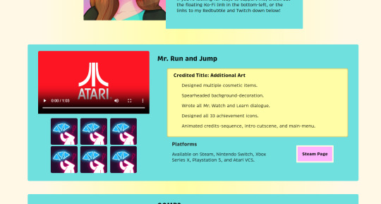
Getting a bit tired of staring at this, but at least it's no longer color-vomit.
#web design#front end development#portfolio#mr. run and jump#i do not remember if that's actually what i was credited under rip#edited the colors of the entire site hows about that#it's cleaner and better but definitely needs more improvement#htmlcoding#html5#css#html css
0 notes
Text
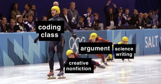
how i think things will fall when it comes to my favorite class by the end of the semester
#creative nonfiction had been doing so well recently too after such a rough start#what happened [professor]#coding is just html and css so it's not so much and the professor's really sweet. it's just not really my thing#web design didn't make it bc not enough guys and i have no beef with that prof (who is my favorite tbf)#i just find it INCREDIBLY boring and confusing and i look forward to never doing it again even though i don't hate the class#science writing has been the biggest travesty though
0 notes
Text
I have gotten a lot of messages saying that they really love the presentation of CURSE/KISS/CUTE. Often the commenter in question can’t say what exactly it is about the formatting that they appreciate, but that it just reads well and looks good. Well!!! Allow me to bare my wealth of secret knowledge for you once and for all:
I sorta just did some research into book typography...?
Here’s something you should know about web development, alright: typography on the web is really, really bad. The tools we have at our disposal—HTML and CSS—are incredibly powerful, but they are set up to fight you every step of the way towards Good Typography. When you know what you’re looking for, you can fix all the common issues quickly and easily. But it’s not easy to know what to look for, because
problematic typography is overwhelmingly the norm on the web, and
good typography is invisible.
Here’s a screenshot from CURSE/KISS/CUTE episode 0:

Now, I don’t want this post to come across as prescriptive. It is not my intention to tell you, “This is what good typography looks like, so follow my lead exactly.” I made a lot of choices with the typography of my web novel: many of those choices would not make sense in other contexts. What I want to convey to you is what those choices are, so that you will know they’re available to be made.
I mentioned that the web “fights you” when it comes to good typography. What do I mean by that? Well, check this out:

This is how that passage of text renders “by default.” In other words, this is how a web browser would render that text without any input from me about what styles to apply. It kind of sucks ass! But it also looks pretty familiar, right? This is not that far off from how a lot of websites—even websites full of prose (looking at you, AO3)—render text.
I think the most illustrative thing to do here would be to walk you through my thought process and show you, step by step, what decisions I made to turn this unstyled text into the styled version you see in the novel.
So, first things first:
1. We have got to shrink that text column.
Computer monitors... are wide. They are wider than they are tall. They are so wide, and they have so many pixels. This means you can fit a lot of characters on them. If you wanted, you could just have a wall of characters from the left side of the screen all the way to the right side. Talk about efficient!!
You should never, ever, ever do this.
This is one choice that I actually will make a prescriptive statement about, because it’s supported by quite a lot of research: fairly narrow text columns are more legible. Specifically, research seems to support the idea that a width in the range of 50 to 70 characters per line is the most comfortable for people to read*. Every font is different, so it takes a little doing to turn that “characters” figure into a pixel measurement; I went with 512 CSS pixels for the maximum width of my text column:

Isn’t that just so much nicer to read already?
*A commenter reminds me that I’d be remiss not to point out that the research on column width legibility isn’t completely conclusive. You do want to limit the width of your text columns, but going over the 70 character-per-line recommendation isn’t necessarily the end of the world, and you might have good reasons to do so. I did not: as mentioned, one of my goals was to mimic book-style typography, and books by nature have fairly restrained column widths, on account of they’re books.
2. Picking a font.
I’m not going to give you the blow-by-blow on how I decided what font to use. The short story is that I asked some designers, and one of the recommendations I got was the free font Crimson Pro, which I took a liking to immediately:

It’s just an all-around attractive serif font, but one thing I really like about it for use in a novel is its highly-visible quotation marks. They’re just kinda jumbo! They’re real big! Easy to see! In a novel, those things aren’t just ornamentation. It makes a great deal of practical sense for them to stand out just a bit. It also has a fairly large x-height, unlike a lot of the more traditional options, which is good for legibility on a computer screen.
3. Adjusting the line-height
Web browsers default to a line-height of about 1.2em, which, as you can probably tell, is quite cramped. If you go and Google “optimal line height for legibility”, you’ll get a number of results right off the bat suggesting 1.5em. Sounds good! Let’s do that:

Well... hmm. That’s definitely an improvement, but between you and me, it actually looks a bit too spacey to my eyes. I wonder why?
I’ll cut to the chase: the 1.5em recommendation makes some assumptions about the font you’re using. In Arial, the letter “A” is about 0.6em tall; in Crimson Pro, it’s about 0.5em. That means that there’s no one-size-fits-all solution to spacing your lines, because different fonts have different amounts of empty space baked in. How annoying!
Let me tell you something about the kind of nerd I am. When I had this realization, I grabbed some books off my shelf and pulled out a literal micrometer. I started measuring the line-heights against various font features to see if there were any patterns I could spot in professional typesetting. Here’s what I found:

Almost every book on my shelf spaces lines such that the distance between one baseline and the next is about three times the x-height. How cool is that? I clapped my hands like a seal when I put this together.
Adjusting the line-height to match what I observed in the wild gives us this:

It’s a subtle difference, but to my eyes it feels just right. It’s almost like magic!
4. Paragraph spacing...
Let’s address the elephant in the room. Probably the most controversial choice I made with CURSE/KISS/CUTE’s typography was to opt for book-style paragraph indentation rather than web-style paragraph spacing—like so:

I did this for a few reasons:
It’s what I’m used to. I’ve read a lot of books, and this is just the way that books are formatted. I think for something aspiring to the title of “novel”, there’s value in making it look the way a reader probably expects a novel to look.
A novel has a lot of paragraph breaks in it. A paragraph in, say, an encyclopedia entry might go on for half a page or more; whereas it is unusual for a paragraph in a modern work of narrative prose to run for more than a handful of sentences, especially in any scene with dialogue. Because paragraph breaks are so common, spacing between paragraphs in a novel results in a lot of wasted space. Also, subjectively speaking, the additional space seems to me to lend an undue amount of weight to paragraph breaks. I’m just starting a new thought; there’s no need for a 21-gun salute, you know?
Having said that, here are some good reasons you might decide not to do paragraph indentation anyway:
Doing it right requires a bit of extra legwork. Notice how the very first paragraph in the image above has no indentation. That’s because it’s the start of a new section, and the first paragraph in a section traditionally goes unindented. This is an easy detail to miss, and it can be difficult to wrangle CSS into doing it for you automatically.
Web users don’t expect it. For the first decade of the web’s existence, there was no good way to do paragraph indentation; by the time CSS rolled around and made it easy, paragraph spacing had already become the norm. And while CURSE/KISS/CUTE may be a novel, it is also, specifically, a web novel!
But it’s my house and I get to make the rules, so I went with indentation. Incidentally, there seems to be a dire lack of research into the question of whether indentation or spacing is more legible for readers—but the data that does exist appears inconclusive at best. So, the choice really does come down to vibes.
5. The tragedy of justification.
You’ll note that one way in which I did not make my web novel look like a paper novel is the text alignment. It’s un-justified: the right margin is ripsaw-ragged.
This is because it is not possible to justify text on the web.
Oh, you can try. Look right here: there’s a CSS property for it and everything. Just turn on “text-align: justify” and...

Nightmare! The interword spacing on that first line is almost as wide as the indentation!
Reader, I’m afraid that your web browser is simply too dumb. That’s not the browser’s fault: robust algorithms for justifying text without creating these distractingly huge gaps between words have existed for many decades, and modern computers are powerful enough to run them in real time with little performance impact. It’s just, uh—nobody has ever bothered to implement them into web browsers. It is the damnedest thing.
I tried, I really did. You can mitigate this problem a bit if you enable automatic hyphenation, but browsers are unfortunately also kind of dumb at hyphenating. Firefox, for example, will refuse to hyphenate any word containing a capital letter, so any sentence with a lot of proper nouns in it is a lost cause. I tried manually inserting soft hyphens with a text preprocessor I wrote myself, but still these overjustified lines plagued me: when the text column narrows, for example on a phone, even hyphens can’t save you. The line-breaking algorithm is simply too naïve to optimize for well-justified text, and that’s not something you can fix as a web developer.
As a result, my heavy-hearted recommendation is to never use text justification. It’s just too distracting.
6. And then some extra stuff just for me
I added drop-caps because it looks neat and I made the ellipses spacier because I think it looks good when it, uh, when they are spacier. I think that looks pretty good that’s just my opinion though.
That’s all! Hope you learned something bye!!!
527 notes
·
View notes
Note
Hi!! I wanted to say that I loved reading about your journey of creating a personal website. I'm still unsure between Vercel and Netlify. I have a small question to ask. See, one of the reasons I want to make a website is to archive drawings and journal/sketchbook. Would you have any tips for creating an area on my website just for the diary/journal, which has tags, files for each entry, etc.?
Bello!

Really happy to hear about your interest in websites! I want everyone to make their own site so I don't have to log into social media and get instant tummyaches ♥
Vercel vs Netlify: I think I settled on Vercel for absolutely no reason whatsoever. I just made a site on Netlify, then tested on Vercel, and now I have like 5 websites on Vercel so I just kept using it LOL. I'm sure a more tech-savvy person would know the difference - I think they have certain integrations with specific programs.
Creating a diary or journal with tags:
There's a couple of different ways you can do that, with different levels of work needed.
you got me yapping again:
This sadgrl tutorial might be outdated and may or may not work, but explains the process better than I can.
Easiest: make a journal on Dreamwidth, or another blogging site (wordpress??) that allows easy tags and RSS feed, and embed that RSS feed onto your site.
This requires almost no HTML set-up, and the easiest to organize tags, but you don't truly have the data on your own site since it's just embedded.
When I snuck into a web design class at college, this was one of the methods that the professor used for a blog within a portfolio site LOL.
Shit like wordpress is what a LOT of ~professional~ sites do for their blog section. They code it separately from the main site haha. It's the most popular thing, but not necessarily the best. And wait til you read on what the CEO of wordpress has been having meltdowns about... he owns tumblr too!
It's made with a tutorial for Neocities if that's what you use.
Medium: Set up zonelets.
It will require some HTML and JS editing, but will help automate making headers/footers for each page of a blog.
I've never used it myself, but I see other people speak highly of it.
HARD FOR ME CUZ I'M A GORILLA: I believe a lot of professional web devs will slap your face with their coding cock until you use a static site generator (SSG) to make your site.
You will need some coding knowledge to set up the tagging system since it doesn't come with it enabled by default. But it's made explicitly to be an alternative to big Static Site Generators which are...
It requires some more intimidating knowledge, because it's a lot of scripts that turn files that are not HTML/CSS/JS into plain HTML.
Also you have to use the command line, and that doesn't come with buttons that tell you what you can do. You have to copy/paste all that shit or memorize the code to 'dev build astro' and it all looks silly.
I've used Eleventy, and now am using Astro. Other people use Hugo or Jekyll or some other stuff with crazy names like Glup Shitto. I hate all these sites cuz none of the words mean anything to me. This is a common theme for me and tech. I don't know what NODES or CONTENT or ISLANDS are!!!
I had the most success attempting to learn how to use a SSG by downloading a template and altering it with github + VScodium. Here's the template page for Astro. You click on a theme you like, and it takes you to its github page. (If you don't want to use evil Microsoft stuff sorry. Skip this entire section.) Follow the instructions on the page for "forking" the glup shitto. When it tells you to run commands, I run those commands through the terminal window in VScodium. These tutorials never tell you what these commands do cuz they assume you already know. Usually those commands automatically install the files you need onto your computer, and create the final files.
You can see my wip here for a "tag system" that SHOULD show members of a web listing haha but I don't know what I'm doing and I have a reading disorder AND don't know cumputer good.
THEORETICALLY this will be the simplest and easiest way to maintain tags and files, because after you set it up you just have to write the "content" of the blog page. And you don't have to set up the header/footer ever again. I see the vision, and potential, but I am not there yet when it takes me 5 hours a day to figure out what any of the words in the documentation mean and I don't want to ask an actual tech person cuz they will be like 'obviously just press the Blip on the Repository and then Suck My Ass in the command line".
(side note I haven't updated fujofans in like a year cuz I'm struggling with this part to make updating easier).
Con: the final HTML/CSS code is really ugly if it's "minified", and a lot of themes use """"""professional"""""" CSS libraries like Bootstrap and Tailwind that I honestly think are ugly cuz that's what every fuckin' tech website uses to style their pages and make them look Professional and Minimalist with stupid code like style="500-w dark-gray-balls D-cup-bra" on every single element. Even Toyhouse uses Bootstrap. Eugh!
But maybe you're smarter than me and can wrangle these things better!
That was really long. Woops. I hope you can slug through this wall of text and find something helpful. Feel free to email me if you have any more specific questions. I may or may not be helpful.
If someone else sees this and has better suggestions for making BLOGS, please chime in. I'm begging you.
64 notes
·
View notes
Text
Ad | Absolute banger of a Web Design & UX bundle here. Honestly amazed at what's on offer here. HTML, CSS, Figma prototyping - Loads of solid basics to give you a solid foundation.
102 notes
·
View notes
Text
Web designer in Jodhpur
Creative Web Design
We are a web designing company that has a team of skilled and experienced web designers and developers who can create stunning and functional websites for any type of business or domain. We offer a variety of web designing services, such as custom web design, web development, web hosting, SEO, and maintenance. We also provide you with a free web design consultation, where we can discuss your goals, needs, and preferences, and provide you with a web design proposal that suits your requirements and expectations.
What we do in Web Design
Our web designing services are the services that provide web designing solutions for clients who want to create or improve their online presence. It involves the use of various elements such as colours, fonts, images, graphics, animations, and interactions to convey the message and purpose of the website to visitors. Web designing services can help clients with various aspects of web designing, such as Consultation: Our web designing services can help clients understand their goals, needs, and preferences, and provide them with expert advice and guidance on how to achieve them . Strategy: Our services can help clients develop a clear and effective web design strategy that aligns with their brand identity, target audience, and business objectives.Design: We help clients create a unique and attractive web design that reflects their vision and personality, and that engages and impresses their visitors.Launch: Our services can help clients launch their website to the public, and provide them with web hosting, domain registration, and security services.
Our Design Technology
At Web Farm House, we understand that web design is not just about making a website look good. It is also about making it work well, communicate effectively, and provide value to the users. That is why we use the latest web design technology to create websites that are:
Visually appealing: We use web graphic design to create stunning and consistent visual elements for your website, such as colours, fonts, images, icons, and animations.
Easy to use: We use user interface design to create intuitive and interactive elements for your website, such as buttons, menus, forms, and navigation.
Functional and reliable: We use web development to code and program your website, using languages such as HTML, CSS, JavaScript, PHP, and others. We follow the principles of web standards, web accessibility, web performance, and web security, to ensure the quality and reliability of your website.
Our Work Process
At Web Farm House, we follow a systematic and collaborative work process to create your website. Our work process consists of four main phases: Discovery, Design, Development, and Delivery:
Discovery: This is the phase where we get to know you and your project. We will ask you some questions about your goals, needs, preferences, budget, and timeline. We will also conduct some research on your industry, competitors, and target audience. Based on the information we gather, we will create a project proposal and a contract for you to review and approve.
Design: This is the phase where we create the visual and interactive elements of your website. We will start by creating a sitemap and a wireframe, which are the blueprints of your website’s structure and layout. We will then create a mockup, which is a prototype of your website’s appearance and functionality. We will present the mockup to you and ask for your feedback and approval. We will make any revisions as needed until you are satisfied with the design.
Development: This is the phase where we code and program your website. We will use the latest web development technology to create a website that is functional, reliable, and compatible with different devices and browsers. We will also test and debug your website to ensure its quality and performance. We will show you the progress of the development and ask for your feedback and approval.
Delivery: This is the final phase where we launch and maintain your website. We will upload your website to your chosen hosting service and domain name. We will also provide you with a user manual and a training session on how to use and update your website. We will also offer you ongoing support and maintenance services to keep your website running smoothly and securely.
We will also listen to your feedback and suggestions and make any changes as needed. We will work with you as a partner and a friend, not just as a client and a vendor. we value your input and satisfaction throughout the work process. We will communicate with you regularly and keep you updated on the status of your project.
Our Web Designing Services
Our is provides web design services for clients who want to create or improve their online presence. We help clients with various aspects of web designing, such as consultation, strategy, design, development, testing, launch, and maintenance:
Static web design
Liquid web design.
Adaptive web design.
Dynamic web design.
Responsive web design.
Single-page web design.
Why Choose Us?
We are a One-Stop Solution for delivering the best web design and development services. We render customized and affordable web design facilities to suit your requirements. Choose the best plans for building a responsive web design according to your needs:
Excellent technical support
Core PHP &Codeigniter + MySQL.
Secure and Reliable coding.
Satisfactory Customer Support.
SEO-friendly web development.
33 notes
·
View notes
Text

🧡 Tuesday Tips #3 🧡
Your website is more than just a collection of pages—it’s your digital home. It should reflect you, your interests, and your personality. But with so many sites out there, how do you make yours stand out?
Here are 25 ways to make your website feel more personal, unique, and personalized to you!
........................................................................................................
🎨 Design & Aesthetics
1. Custom Color Palette – Pick colors that resonate with your personality and aesthetic.
2. Unique Typography Choices – Use a mix of fonts that match your vibe.
3. Handwritten or Doodle Elements – Add personal sketches or notes.
4. Custom Cursor – Let visitors use a fun, themed cursor on your site.
5. Personalized Favicon – A tiny but powerful detail that makes your site feel complete.
6. Themed Layouts for Different Pages – Make each page visually distinct but cohesive.
7. Custom Backgrounds – Textures, gradients, or even a personal photograph.
8. Retro or Experimental CSS Styles – Go wild with unique styles that make your site stand out.
9. Create a Custom Hand-Drawn Logo – Instead of a standard logo, try sketching one yourself for a unique touch.
10. Add Subtle Animations – Small hover effects, background animations, or cursor trails can bring your site to life.
11. Play With Layering Elements – Overlap images, text, and shapes for a more dynamic look.
12. Design a Personalized Loading Screen – A custom loading animation or message adds a fun detail visitors will remember.
13. Add Your Own Handwriting as a Font – Convert your handwriting into a web font for a truly personal touch.
14. Design a Seasonal Theme Switcher – Let visitors toggle between different seasonal or mood-based color palettes.
........................................................................................................
📜 Content & Personality
15. Create a Behind-the-Scenes Page – Show how your website was built, share your thought process, or include fun bloopers.
16. Add a "The Making Of" Section – Share drafts, sketches, or early concepts behind your creative works.
17. Include a Personal Dictionary of Words You Love – A list of favorite words, phrases, or slang you frequently use.
18. Design a "Things That Make Me Happy" Page – A simple, uplifting page filled with personal joys.
19. Show Your Progress on a Learning Goal – Track and share your journey in learning a new skill, language, or hobby.
........................................................................................................
💾 Interactivity & Engagement
20. Add a Clickable Mood Indicator – Let visitors see your current mood with an emoji or phrase that changes over time.
21. Create a Dynamic Banner That Updates Automatically – Display different messages depending on the time of day or special occasions.
22. Add a "What I'm Listening To" Widget – A live-updating display of your current favorite song or playlist.
23. Embed a Poll or Voting Feature – Let visitors vote on fun topics or help you make creative decisions.
24. Introduce a Mini Personality Quiz – Something quirky like “Which of my favorite books/movies are you?”
25. Make an "Ask Me Anything" Page – An interactive page where visitors can submit questions for you to answer.
Closing: Make It Yours!
Your website should be you in digital form—fun, unique, and engaging. Whether you add just one or all 25 ideas, the most important thing is to have fun and make it your own.
If you try any of these ideas, let me know—I’d love to see what you create!
-----------------------------------------------------------------
Want to help the Small Web movement grow?
Join us on other platforms. ♥
FB Page & Group:
facebook.com/thesmallweb
facebook.com/groups/thesmallweb
Twitter/X:
x.com/smallweblove
Tumblr Community:
tumblr.com/communities/thesmallweb
Mastodon:
indieweb.social/@thesmallweb
#small web#indie web#web revival#old web#blog#neocities#2000s web#decentralized social media#decentralizedfuture#old internet#decentralization
17 notes
·
View notes
Text
differences ive noticed between tumblr and cohost so far:
tumblr has numbers, like most social media sites, for almost every aspect of it. notifications, likes, reblogs, comments, followers, following, etc. cohost only had numbers for notifications (opt-in) and number of comments. the rest had nothing indicating a number, not even for the original poster.
tumblr has notifications for many actions, including "<person> liked a post you shared" and others. it seems you can turn them off but the fact tumblr has them in the first place is concerning. cohost, by design, had very limited notification scope. when someone rechosted your chost with added text, you only got one notification: that someone rechosted it. you won't know the likes and rechosts of it. you also didn't get mention notifications.
tumblr also offers push notifications on their mobile app, while cohost never offered notifications (and was purely a web app that could masquerade as a mobile app).
tumblr's ask system (which cohost's was based off of) is a LOT more robust. private ask answers, the option to allow media in your received asks, etc. the only leg-up cohost seemed to have was the option to allow for asks from logged-out accounts. cohost also allowed for media in asks until the feature was abused and it was globally turned off.
cohost's post format had an unstyled title that could be up to 240* characters long, and a post body that could be styled however you want. tumblr does not seem to have this title system, other than the "biggest" text style option.
cohost never had an algorithm for showing you chosts. it was reverse chronological only. the only system they had for a global feed is the #The Cohost Global Feed tag, and it was still only reverse chronological. tumblr has a For You page, with recommended posts that your mutuals liked or have many notes, but it seems to have a Following feed that's reverse chronological as well?
cohost had mostly unrestricted html and css (as long as it was inline)* as well as some basic markdown support. tumblr seems to just have a few fonts, some colors, and pretty much the same range of basic text styling.
cohost was very sex positive and allowed pretty much all porn with exceptions for csam and other illegal material. (18+ content needed to be tagged as such). tumblr, as of 2017ish (iirc?) does not allow for pornorgraphic content of any kind.
cohost's four staff members were queer as fuck and the atmosphere of cohost was EXTREMELY queer. tumblr has seemingly had multiple instances of bans of trans users for seemingly no reason other than "they were trans".
cohost had a cool mascot while tumblr seemingly doesn't have any. eggbug win
as someone who used cohost a ton before it shut down, moved to bluesky, and is now dipping their toes into tumblr, i think cohost did it better than tumblr on a lot of fronts, even if its features weren't as fleshed out. i'll do a full retrospective piece about cohost another time though
anyways shoutout to tumblr sending one of my bullet points to the void when i was changing the formatting. very cool
and if you used cohost as well, let me know what i missed!! i'll edit this post if so :3
14 notes
·
View notes
Text

Advice; Where to Make Rules and About Pages
If you've read my advice post about the difference between about and rules pages and why they're both important, you may not be wondering the best way to make them. The good news is, there are plenty of options!
Tumblr
The simplest choice. In the past, people would make custom pages on their theme. However, since dash view has become popular (and you can't view custom pages via it, nor can you view them on mobile), most people simply post their about/rules page as a normal text post, and link to it in their pinned post. If you have a custom theme, make sure to link the pages in the navigation bar too!
Using a plain Tumblr post increases your page's readability, but reduces the amount of formatting you can do. If you make your pages elsewhere, you will be able to customise them a lot more.
Carrd
A free website maker. You can make a small site with a free account, and the prices are pretty reasonable if you need to make a bigger site. Carrd has a minimalist aesthetic, and it will also adjust what you make to fit a mobile browser (though this may break your formatting if you have designed something complicated).
Carrd is easy to use, but it is best used for simple designs. If you want to do something more complicated than a basic Carrd layout, you're going to spend a lot of time trying to make the formatting work. If you want multiple pages for your site, you're also going to spend a lot of time formatting as you can't clone pages, therefore have to recreate each one every time instead.
It uses markdown for formatting text. If you're familiar with it, this can speed up writing, but it may slow you down if you've never used it before.
One of the benefits of Carrd is that there are lots of free templates available within the rpc! Here are resources I found with a quick Google search, but there are plenty more out there if you look for them: [x] [x] [x]
Weebly
Another free website maker. You can make more for free here than you can on Carrd. Weebly sites should adapt to work on a mobile browser.
I've never seen anybody use Weebly for about/rules pages, but I do recommend it! It's very easy to use, and, unlike Carrd, you can copy and paste entire pages. This makes it ideal if you have lots of muses that you want to make individual about pages for.
It uses a more typical text editor than Carrd. Instead of markdown, it's more like Microsoft Word - where you highlight text and click buttons to add formatting. You also have HTML/CSS options.
Weebly does offer some free templates, but you're likely to want to edit them to suit your needs more. This is okay! It isn't difficult to do!
Google Docs
A popular, completely free option. As with Carrd, there are plenty of templates and resources within the rpc (here are three examples: [x] [x] [x]). These pages will be viewable on a mobile browser, but the theme may not translate well. Keep readability in mind if you use this option.
If you use this option, also make sure the link you share is viewer only and doesn't have editor permissions!
Other Options (WordPress, Self-Hosting, etc)
Don't feel you have to follow the crowd. If you like to use WordPress, use WordPress. You could also use Neocities, or any other website builder!
Personally, I already own a web domain because I have websites for other online activities, so I use about pages that I've coded from scratch and host them myself. For my rules page, I just use a Tumblr text post that's linked in my pinned post. In the past, I've used Carrd and Tumblr pages for about pages.
If you want to write your site using HTML, some free website hosters will allow you to do this (Neocities, for example). If you're interested in coding, I do recommend this! It allows you to have full customisability, and coding can be a really useful skill. However, one downside of this is it can make your pages hard to read on a mobile browser. It's up to you to decide how important this is.
If you're interested in learning HTML (as well as CSS, JavaScript, and other coding languages), this site is a great resource!
41 notes
·
View notes
Note
Dream's a software developer (I could see either as an architect for that large-scale view mentality or as the Senior level dev that keeps getting asked to move into management type positions and just straight up refuses because he's been doing code happily for the past fifteen years and doesn't plan on changing that now).
He enjoys his job enough. He likes computers and code. It functions exactly as told (for better or worse) and appreciates the straightforwardness of it all. He's a bit insufferable to work with, but if you have an issue, he'll readily help (just be prepares for critiques on your code in the process).
Hob works at the same company as Dream, but as a front-end dev. The work he does for his day job is kinda boring. All standard corporate style web design. No fancy scripts or fun colors. But in his spare time, he weaves Javascript and CSS like a wizard and creates magical, animated scenes across the page. Would it be easier to just make a video and play it on the page instead? Sure, but where's the fun in that?
Dream and Hob get paired together on a small side project for work. Hob does the front-end work, Dream does the back-end. They get on each other's nerves at first, until Dream spots Hob tinkering with his personal code on their lunch break and is honestly a bit in awe. He's found code beautiful in its own right (the way one appreciates a well-oiled machine) but he's never seen it wielded in such a fashion before. This is the moment he falls just a little bit (read: a lotta bit) in love with Hob. He was already starting to fall for that endless charm and wit of his anyways.
The company hits the first quarter of the New Year and with it come layoffs. Hob gets fired along with some other devs from Dream's same team (a younger pair of devs: Matthew and Jessamy). A fellow named Will comes along to help Dream finish the project in Hob's stead and Dream hates every moment of it. He misses Hob, more than he ever thought he would.
So, in an impulsive rush of anger and longing, he quits the company because how dare it toss someone as good as Hob Gadling out the door without a thought? He's halfway to the café he and Hob had started frequenting together when he realizes that he's just thrown away a career fifteen years in the making. But when he finally gets to the café and sees Hob tapping away on his laptop, he knows he's made the right choice.
Dream slides into the seat across from him and proposes that they build something wonderful together. So they create a small business of their own. They become a freelance web dev team (and steal Jessamy and Matthew as well) and with their skills combined, they take off. It's not huge, but for their size, they're incredibly popular. And Dream's certain he's never enjoyed his work more than when he's working beside Hob.
Later on, Hob proposes to Dream via a custom website with the most beautiful web animations he's ever seen before. And of course, he says yes.
(If you're curious about what inspired this, here's the website: http://www.species-in-pieces.com)
This is such a good concept for a story!!! I really really love aus where Dream and Hob are coworkers. Dream being the grumpy, awkward guy who hides behind his coffee mug while Hob is the popular, chatty one who tries to get Dream involved in fun office activities or socialising after work - it makes so much sense to me.
And Dream quitting his long-term dream job because he's mad that genuinely talented people have been laid off? I love it. Dream just has this inate appreciation for hard work and good art, and that's exactly what Hob (and Jessamy and Matthew) do. How dare the stupid company not understand that they're firing people who deserve to thrive and grow in an environment which actually appreciates them? Everyone is shocked that Dream has quit (not only that, he sends around an email to everyone in the company from the ceo all the way down to the work experience guy, outlining exactly why he quit) because he seemed to be the type to play by the rules and never leave his comfort zone. Apparently, Hob has really helped him bloom into a much more confident person, able to express his principles and strive for better.
And Hob isn't surprised, because he always knew that Dream had the courage, talent and ambition to strike out on his own. Maybe he just needed a bit of love and understanding. Which Hob is only too happy to provide.
Their work together sometimes involves long hours and stress, but Dream wouldn't ever want to go back to the slightly soulless corporation where he used to be. Even if he's tired and a little frustrated by Hob’s disorganised workspace, Dream is perfectly content. There's nothing better than curling up in Hob’s lap while he taps away on a line of code. Plus, he has a great time building their wedding website. Hob got to propose, so Dream gets to celebrate their upcoming marriage with his own expression of love through code. The theme colours are, of course, black and red <3
69 notes
·
View notes
Text
web "design" is a profession manned by the most foul of evil wizards ive ever met and html is a stalwart horse who refuses to drink the water what ive brought her. and css is a gnarled demon of horrific portions who likes to blow up portions of my webpage like some kind of horrid poltergeist
88 notes
·
View notes
Text

Uuh… Fic stuff
(Also, that web design class paid off, and now I know what the fuck HTML and CSS is)
#Carrie#Carrie white#carrie 1976#carrie 2002#carrie 2013#Wybie Lovat#Coraline#coraline wybie#ao3fic#my art#sketch#soon to be in color#Coraline art#Coraline au#fanart
21 notes
·
View notes
Text
3 Game/Coding Resources!
I wanted to put together a few resources I found for people who might be planning to make games, or might be looking to learn coding!
The first resource is for anyone looking to learn how to code, build a portfolio, and get Certifications:
This is something I've recently been using myself and I can attest that it is an excellent resource!! They have many different paths you can learn, and right now I’m on the Responsive Web Design Certification. You can learn HTML and CSS, in order to create responsive pages. It teaches you through projects, where it breaks down different parts of the coding language and shows you how to use it. Some projects are optional, and some you have to complete in order to earn your certification. Certification projects don’t have instructions, only a rubric of what the project needs to be able to do, but you can learn all those skills in the optional projects! They also have Javascript, Frontend Development, Information Security… the list goes on! The website is run by a really cool non profit. I definitely recommend giving it a try!!
2. The second is for game developers who are looking for background music:
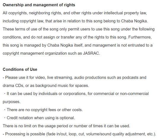
@/茶葉のぎか (Nogika Chaba on twitter) makes some really awesome 8bit-sounding BGM! And a lot of it is free for commercial/non commercial use!!
Make sure to check the description (you can translate to your language) for their policies. Many of their videos are tagged #freeBGM, which if you check their Pixiv Fanbox terms of service (in the desc of each video, please do check it before you use it) states that you are able to use the music in commercial/non commercial works:
2. The third resource is for students:
Whether you're a university student, college, high school, or elementary, Github gives you free Github pro, as well as a curation of free offers! You do need a piece of student ID (proof that you indeed belong to an institution, eg. report card, student card, etc), but it has a host of offers. Microsoft offers free cloud training through this, there are multiple offers for learning a new coding language for free (eg. Codedex free 6-month subscription, which will also give you certificates once completed), you can get free domain names, the list goes on! If you are a student, I highly recommend that you give it a try, since it's 100% free!
#coding resource#game resource#coding#free#background music#if you have any other resources#let me know!!
18 notes
·
View notes
Note
What did you use to create your website? It's honestly very impressive and I'm curious.
Thank you so much!!!
My website is hosted on Neocities, which is a free webhosting platform with a paid upgraded version. I have had some web design classes, so that's where I got some of the baseline, but a lot of my learning came from elsewhere and a lot of trial by fire.
There is of course the god-tier resources of sadgrl.online and w3schools, but you can find some more resources around as well. What got me started and motivated was thegardenofmadeline's resource list
A couple of tips from me to you on web design:
keep your css in a separate document (just makes this cleaner)
if you come across code you want, copy-paste it. don't try to rewrite it from memory
if something isn't working, you're probably missing a ) " or >
don't worry about your code being perfect. it just has to function
If you need any help starting out or with specific issues please don't hesitate to reach out!!! I love troubleshooting stuff, and I've even written starting code and done snippets and stuff, I find it to be a lot of fun!!!!
Go forth! Write code! Have fun!!!!!! Yay websites!!!!!!!!!!!!!!!!
#my posts#ask#anonymous#neocities#wren's website#if u do make a website pls send it i would love to see it!!!
47 notes
·
View notes