#with the different textures and details and layers of fabric
Explore tagged Tumblr posts
Text
—💋💋Rising Signs as Style Personas💋💋—

-Aries Rising – The Bold Trailblazer-
• Sporty-chic, lots of red from vibrant crimson to deep merlot. gold jewelry, sneakers & moto jackets
• Loves a statement piece and fearless combos. bold hairstyles, including big hair, wild curls, and hats
Sharp, modern, and slightly androgynous silhouettes, like tailored suits or sporty outfits, can showcase their assertive nature
• Vibe: Off-duty model meets rebel cool
What to avoid:
Frilly or overly feminine styles Unless there are other feminine placements in their birth chart
• Don’t overdo pastels or ultra-delicate looks
Avoid looking “overly safe” or forgettable
Taurus Rising – The Sensual Minimalist
• a style that is both classic and sensual, Loves comfy, high-quality fabrics (cashmere, silk, velvet, leather)
• Neutral tones evoking a sense of comfort and groundedness, earthy luxury, elevated basics, Coquette Core
Taurus risings might go for richer, deeper jewel tones like emerald, sapphire, or amber
• Vibe: Soft luxury. Expensive but not loud
What to avoid:
Avoid cheap-looking or overly synthetic fabrics. Scratchy textures and fast-fashion fads can dull your luxe aura.
• Stay away from chaotic prints—simplicity is your superpower. Don’t chase trends that don’t feel good on your skin.
Gemini Rising – The Playful Trend Hopper
• Constantly changing style: graphic tees, Y2K, funky prints. can experiment with layering different textures and styles
Yellow, orange, green, and white are great choices, as these colors align with their playful and vibrant energy. Blue, especially cobalt or sky blue
• Loves mixing colors, accessories, and eras
• Vibe: It Girl with 6 personalities
What to avoid:
Avoid boring basics or monotone outfits. Minimalist styles with no flair = style boredom for you
Super heavy, restrictive fabrics can kill your “light on your feet” energy. Avoid overly mature or serious looks
Cancer Rising – The Vintage Romantic
• Soft silhouettes, retro-inspired, dainty details
• Classic and Timeless Styles think flowy skirts, lace, and pearl accessories or Bold Colors and Vintage/Retro styles
• Vibe: Cottagecore princess with a nostalgic twist
What to avoid:
Avoid anything too edgy or cold-looking. Harsh lines, aggressive cuts, or cold metals can clash with your softness
• Avoid overly futuristic fashion—you glow in classic, romantic styles. Skip overly stiff or corporate looks that harden your energy
Leo Rising – The Glamorous Showstopper
• Bold colors like gold, orange, and red, as well as patterns, such as leopard print or bold stripes, gold jewelry, high-glam energy. statement pieces, and luxurious fabrics
• Designer logos, animal print, dramatic outerwear, large earrings, bold necklaces
• Vibe: Main character with a paparazzi fantasy
What to avoid:
Avoid blending into the background, neutrals and overly minimal outfits can rob your main character glow
• Avoid anything “meh” or dull—your presence is meant to shine. Don’t be afraid of drama—just avoid looking try-hard

-Virgo Rising – The Clean Girl Chic-
• Structured pieces, monochrome looks, subtle elegance
Clean Lines: crisp and simple silhouette is favored, often avoiding overly flashy or intricate designs
• Loves sets, blazers, and refined neutrals a focus on essential pieces and a cohesive style
• Vibe: The polished Pinterest muse
What to avoid:
Avoid messy, chaotic, or over-layered outfits. Over-accessorizing or clashing patterns can make you feel uncomfortable
• Avoid overly trendy, low-effort looks—your strength is in intentional styling. Sloppy = your style kryptonite
Libra Rising – The Trendy Tastemaker
• Always on trend, perfectly balanced outfits
• Pastels, silk, chiffon, and other lightweight materials, curated jewelry, polished glam, pale pink, and light blue
Shades like lavender, pale pink, and light blue, which complement their gentle and graceful nature
• Vibe: Fashion influencer energy—effortlessly pretty
What to avoid:
Avoid anything unbalanced or clunky. Harsh colors or mismatched silhouettes throw off your harmony
• Avoid hyper-casual outfits that lack polish. Don’t skip details like accessories—your beauty is in the finish
Scorpio Rising – The Mysterious Seductress
• Dark tones, silk, leather, corsets, bold lips. Black, deep reds (maroon, burgundy), and purples
• Loves contrast: sexy + covered, classy + edgy. Subtle Sensuality: Clothing can hint at sensuality without being overtly revealing
Intriguing Accessories: Statement jewelry, striking watches, and dark gemstone accents can add depth and intrigue
• Vibe: Femme fatale who owns the night
What to avoid:
Avoid overly bright, bubbly fashion. Neon colors and cartoonish prints can feel out of alignment
• Avoid exposing too much randomly—it should feel mysterious, not just sexy. Light-hearted styles may undercut your magnetism
Sagittarius Rising – The Worldly Free Spirit
• Boho layers, fringe, bold patterns, comfort meets cool. A flair for the dramatic and enjoy statement pieces
• Think earthy travelwear, vintage denim, cultural inspo. They are not afraid to experiment with different styles, colors, and patterns
Flowy fabrics, maxi dresses, caftans, ethnic prints, and accessories from different cultures resonate with their adventurous nature
• Vibe: Jet-set fashion nomad
What to avoid:
Avoid overly tight, restrictive clothing. Structured suits, bodycons, or stiff materials = outfit jail for you
• Avoid dull, uninspired outfits—you thrive in expressive, worldly fashion. Comfort and freedom are key: don’t fake a look that isn’t you
Capricorn Rising – The Luxe Executive
• Power dressing, clean lines, high-end accessories. quiet luxury.
• Tailored fits, structured bags, black & neutrals like gray, and navy. structured clothing like tailored blazers, column dresses, and shoes with sculptural heels; business-casual
Invest in high-quality materials and design, building a wardrobe of well-respected designer pieces.
• Vibe: Corporate baddie who closes deals & slays
What to avoid:
Avoid anything sloppy or trend-obsessed. Hyper-youthful or chaotic outfits can feel off for your natural poise
• Avoid super busy prints or too many layers. Cheap-looking details? Hard no. You’re all about refined presence
Aquarius Rising – The Style Rebel
• Experimental, futuristic, gender-fluid vibes. Mixing patterns, wearing vintage pieces.
• Think metallics, platform shoes, bold shapes. unconventional choices, unexpected pairings, and a touch of the avant-garde.
Versatile Wardrobe: As their interests are varied, their wardrobe likely reflects that with a mix of styles.
• Vibe: Runway from the year 3030
What to avoid:
Avoid blending in or playing it safe. Basic mall-core or anything too “normal” dims your edge
• Skip ultra-traditional or conservative styles. You were born to break rules—not follow them
Pisces Rising – The Dreamy Drifter
• Flowy fabrics like maxi dresses, tiered skirts, water tones, artistic layering. Pastels, lavender, seafoam green, whites, and light blues.
• Loves soft textures think chiffon, silk, tulle, satin, and lace. sheer details, whimsical looks.
Bohemian and vintage styles: Items with a retro or free-spirited vibe.
• Vibe: Fairycore meets ethereal fashion muse
What to avoid:
Avoid sharp, overly structured silhouettes. Harsh fabrics or heavy, dark styles can drown your ethereal energy
• Avoid looking too “grounded”—you’re meant to float. Stay away from ultra-serious fashion—your magic lies in softness

#astro notes#astrology#birth chart#astro observations#astro community#astrology observations#astrology community#astrology degrees#astro#astroblr#astrology content#astrology insights#fashion
222 notes
·
View notes
Note
Your art is jaw-droppingly stunning. Can I ask, how do you render things so beautifully? Can you give any tips? Especially with colored lineart.
Aww thank you so much, that's so sweet of you to say. <:3
I don't think I can give much advice on rendering; I've always been highly dependent on line-art to portray form and any attempt at lighting more complex than "shade with one layer of a desaturated color on multiply" frightens me.
BUT I can share what I do with line coloring!

This is a drawing I've done both with and without the coloring on the lines, to show the difference it makes.
In general, the color of the lines is just a darker shade of the color surrounding it. The more defined I want a feature, the darker the hue.
The interior lines, everything that goes on inside the outermost line-art, is where I put most of my attention. I separate the lines into tiers of importance and color accordingly, with the most important things getting darker (and often thicker) line-art.

Here's a cropped image of Ambroys holding a very expensive future murder weapon to try and show what I mean. The big circles are the base color of his dumb face and ludicrous glove, and the smaller circles are the color of the line-art for each of his features.
The hierarchy tends to go like this:
Important Features: eyes, mouths, hands, forearms, anything that I want to be emphasized or needs to be very clear, etc. gets dark line-art. This separates these features from the rest of the image and makes them pop.
Secondary Forms: joints, noses, the edge of bangs over the face, the lines between fingers, big wrinkles on evil old bastards, cravats etc. get medium line-art. These forms are meant to be distinct from what surrounds them (fingers shouldn't look melted together, the hair is not part of the forehead) but giving them dark line-art would draw attention from the important parts (for example, Ambroys' punchable grin), so they get slightly darker line-art to make the forms clear but not distracting.
Fiddly Little Details: fabric folds, flesh creases, strands of hair, seams in clothing, etc. These add texture, but I don't want them to be making everything look like a mess of scribbles. So these have light line-art, relative to the base color, to allow them to blend more than the important features.
Sometimes I'll make the line color more saturated or a slightly different hue (cooler or warmer), but it depends on the image and how much skill I randomly roll in color usage that day. It just looks more interesting than just going over the lines with a low-opacity brush of the base color.
When it comes to the exterior lines, I have two approaches. If I want a form to be bolder or stand out I tend to leave the outside lines around the form black or a very dark color. If I want something to look softer or blend into the surrounding image, or want the form to appear to glow, I color the outside lines closer to what colors surround the form or a brighter, paler color.

For example, all the characters here have nearly black exterior line-art. The background objects all have pale line-art, so they don't overwhelm the characters. Even objects in the mid-ground have slightly lighter line-art than the figures so that the eye is (hopefully) drawn to the characters instead of my labored attempt at drawing a cash register.

Or here, the parts of Ambroys that are en flambé have orange-red exterior line-art, while everything else has dark exterior line-art.
Like most things with my art, it's not hard to do, it just takes a long time. :P
And of course, this isn't the "right" way to color line-art! My art style is pretty cartoony, heavy on line-art and low on shading and very focused on silly characters making silly faces. A softer, more realistic, more rendered style, or one that is more graphic and focuses more on silhouette, would likely require a different approach. But regardless, I hope this ramble is helpful!
#asks#i never feel quite qualified to give art advice... but this is less advice and more just my personal approach#it could use tweaking and refining i'm sure!#but anyway super flattered by this ask thank you anon!#chocodile did the heavy lift with the lineart color on that ambroys on fire pic but i liked that pic better than others i had with glow#thanks chocodile for being better at color than me!
136 notes
·
View notes
Text
Dankovsky definitely puts effort into his appearance. I like that he doesn't settle for the chic style most men go for, instead he isn't afraid of patterned coats and bold red vests, and the brooch is the cherry on top! (he knows silver favours him) He tends to wear black, white, and one statement colour.
The interesting thing I find about his outfit is how he chose both to do a statement colour and a statement piece without merging them in the same clothing article. He chose the vest for the striking red, and the coat for the bold design with the asymmetrical collar and snake leather.
His hair is combed to the side, his shoes actually match his gloves and bag! A muted shade of black that contrasts the textured grey of the snake skin. The silk cravat (we're three different fabrics in so far) in a warmer shade of red, the silver buttons on his coat with embedded red centers (fabric or stones?)
It's these things that add up and make him stand out amongst a dozen other stylish sleek-suit-and-nothing-else men oh so beautifully!
Another interesting thing: his clothes are an antiparallel of General Block's.

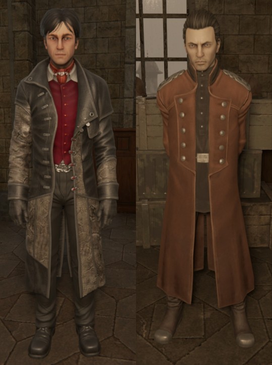
Dankovsky: Black on the outside, red on the inside, hair combed to the sides and framing his face, p2 asymmetrical coat, buttons undone.
Block: Red on the outside, black on the inside, hair combed back and showcasing his face, symmetrical coat, P1 buttons done.
In common: Black+red+silver combo, multiple layers, dark shoes and gloves, silver jewellery (Belt, buttons, brooch and epaulettes)
In p2 they added white to his pallet in the shape of a collar peaking from underneath the vest, implying a white shirt underneath. While showcasing the black uniform underneath Block's coat, previously barely visible in the collar of his p1 design.
Then the detail of P1 Dankovsky's parents wanting him to be an army general instead of a doctor. It's almost like the two of them are opposite sides of the same coin, sprung from the same seed, only that they took alternative pathes in life, both ending up renowned in their respective fields.
71 notes
·
View notes
Text
a look into the historical fashion of sfth characters
[—> angelina roland edition | see below the cut !!
first: what’s the time period and setting that the character is in?
the off season takes place in the late 1800s (more specifically 1895!) in england. we also know that angelina also lived in america for a decent amount of time. (or i assume it was a good chunk of time at least, long enough for her style to be influenced by it for the purpose of this analysis.)
general overview of the fashion for the period:
in both british and american fashion around 1895, the bustle was falling out of style, giving way to skirts with a more bell-shaped silhouette that skimmed the hips and flared toward the hem. at the same time, sleeves were growing more dramatically puffed, leading to the distinctive "leg-of-mutton" sleeve trend.
late 1800s british fashion:
british women’s fashion in 1895 was all about dramatic silhouettes and romantic details. bustles were officially out, and skirts started skimming the hips and flaring out at the hem in a smooth, bell-like shape. the waist was still tightly corseted, keeping that hourglass figure in style, but the overall structure was softening compared to earlier decades.
the real star of the year? sleeves. specifically, the iconic leg-of-mutton sleeve. they were huge—puffed up at the shoulder and narrowing at the wrist—creating a bold contrast that made waists look even smaller. bodices were fitted and often high-necked, though evening looks sometimes dipped lower.
fabrics were rich and textured: think velvet, silk, wool, and taffeta, often layered or trimmed with lace, embroidery, or ribbon. outerwear like capes and short jackets were popular, especially with fur or braid details.
hats grew wider to balance the sleeves, usually decorated with flowers, feathers, or bows. hair was worn up, softly waved or puffed to match the romantic, oversized look of the time. gloves were a daily essential, and parasols still made an appearance when the sun did.
late 1800s american fashion:
american women’s fashion in 1895 followed a lot of the same trends as britain, but with a bit more practicality woven in. the bustle was officially done, and skirts took on that smooth, bell-shaped silhouette—fitted at the waist and hips, flaring gently at the bottom. corsets were still a must, keeping the waist cinched and structured, but the overall shape was starting to ease up.
leg-of-mutton sleeves were everywhere. they hit their peak size around this time—huge at the shoulder, narrow at the wrist—and were a staple in both day and evening wear. they gave that bold, almost theatrical touch while still fitting into the modesty of the era.
day dresses were typically high-necked and long-sleeved, often with layered bodices or decorative panels. fabrics leaned heavy and durable—wool, cotton blends, and silk—especially for middle- and working-class women who needed practicality as well as style. wealthier women wore more delicate materials like velvet and taffeta, often trimmed with lace or ribbon.
outerwear included tailored jackets, capes, and mantles, many with bold collars or cuffs to match those big sleeves. hats were getting larger too—picture hats, bonnets, and toques all decorated with feathers, artificial flowers, and sometimes even birds (victorians were intense about hat decor).
hair was worn up and often softly waved or curled at the front, with pins and combs for decoration. gloves were a daily accessory, and parasols stuck around, though they were a bit more common in southern states where sun exposure was more intense.
so in 1895 america, fashion meant flared skirts, sky-high sleeves, cinched waists, and a mix of function and flair. victorian drama, but with a touch of that american practicality.
differences between american and british fashion:
british fashion was all about elegance and polish. upper-class women leaned hard into the drama—fabrics like velvet and silk, bodices with detailed embroidery or lace, and silhouettes that followed parisian trends to a tee. everything was a little more formal, a little more elaborate. even outerwear felt fancy, with lots of tailored capes and fur trims.
american fashion? still dramatic (those leg-of-mutton sleeves were everywhere), but way more practical. daywear often used sturdier fabrics like cotton-wool blends or plain wool, especially for middle- and working-class women. yes, rich american women wore silk too, but the average person needed clothes they could actually move in. plus, regional differences mattered—fashion in new york wasn’t the same as in texas or montana.
so while both had the same silhouettes—cinched waists, flared skirts, big sleeves—british fashion was more about looking luxurious, and american fashion was more about making it work.
now, on to what i think we’re all here for, what i think angelina would wear:
angelina’s clothing would most likely reflect how both places influenced her personal style. while her father’s status means she’s expected to dress in the traditional, formal upper-class style of late 1800s england, angelina’s more rebellious nature means she doesn’t fully conform.
she wears the classic 1895 silhouette—bell-shaped skirts, corseted waist, and leg-of-mutton sleeves—but her outfits are more practical and less ornate than typical upper-class fashion. sleeves are often rolled up for comfort and movement, and she incorporates pockets, a detail more common in american clothing.
her hair is most likely worn up but in a simpler, looser style than the tightly curled, polished look favored by british aristocracy. hats and outerwear are more modest and functional rather than heavily decorated.
overall, i think that she would blend these cultures together to express her individuality—combining british elegance with american practicality in a way that allows her to have the freedom she needs to do things. (like i don’t know, taking her injured lover to france or something? who knows?)
#helena speaks#this was so fun to do!!#i did start rambling at one point#so i was like#well might as well keep going 🤷♂️#but yeah these are the reasons why i think she would dress like that#angelina roland#sfth angelina roland#historical fashion#shoot from the hip#sfth#luke manning#tom mayo#sam russell#alexander jeremy#sfthposting#character analysis#if you have questions#please ask me#unless you want a short answer#then you’d probably just be better off looking it up-#the off season#sfth the off season
75 notes
·
View notes
Note
hhiii....... could i ask for joefoes x gn reader that dresses in lolita fashion... ((((;゚Д゚))))
hiii, yep, i hope you enjoy and thank you for requesting! :333

Dio
You walk in wearing your frilly clothes, ribbons, and elegant tights and Dio literally freezes mid-monologue. “You look… divine.” He says it low, like he’s seeing something holy.
He becomes possessive of the aesthetic. You’re like his living doll, and only he gets to admire you up close.
Buys you obscenely expensive Lolita dresses, shirts, and shorts from all over the world. “I had this custom-embroidered in Italy. Try it on. Now.”
If anyone so much as breathes near you disrespectfully? They’re dead. No hesitation. Your elegance deserves reverence.
He LOVES brushing out your hair before you get dressed, surprisingly gentle as he hums something classical under his breath.
Kars
Intrigued. Deeply intrigued. The way you layer textures and fabrics reminds him of art- something thoughtful and symbolic.
“Such... unnecessary detail. And yet...” He brushes a hand down the lace sleeve of your blouse and stares.
He doesn’t understand the practicality, but he respects your dedication. Honestly? He kind of likes how it sets you apart from the rest of humanity.
Offers to craft you accessories from rare stones and feathers. “If you insist on adorning yourself, you may as well look like a god.”
Yoshikage Kira
Obsessed. You’re immaculate, pristine, composed- everything he’s drawn to.
He treats your clothes with borderline religious reverence. Gently steams your coats. Never lets you wear the same piece two days in a row- for your dignity, of course.
You once wore a wrist cuff with a delicate ribbon and he almost lost it. “May I… keep this?” he asks, breathless, not even realizing how creepy he sounds.
Sometimes he watches you apply makeup or do your hair like it’s a ritual. It calms his murderous urges.
Secretly loves going on quiet walks with you in full dress. “You make this mundane world tolerable,” he murmurs, holding your gloved hand.
Diavolo & Doppio
Doppio is awestruck. “You almost look like royalty..” he beams, eyes sparkling. He wants to take 500 photos of you in your outfits. “Can I send one to the Boss? Please?”
He asks you about every bow, every button. If you say it took an hour to get ready, he’s like “WORTH IT.”
Diavolo is… harder to read. He’s quiet about it at first, analyzing. Then one day he just deadpans: “You look divine. Unreachable.”
He likes how untouchable you look. Untouchable = protected. That matters deeply to him.
Diavolo gifts you dark, gothic Lolita pieces: crimson velvet, black lace, gold cross motifs. You suspect it’s his way of marking you.
Enrico Pucci
Initially doesn’t understand the appeal, but he sees how peaceful you are while dressing yourself, and it moves him.
“Your appearance reflects a careful soul,” he says, watching you pin lace into your collar.
Gets you blessed lace from Italy. Seriously. He brings you fabrics soaked in holy water.
Secretly thinks your fashion is a form of spiritual expression. He once compared your dress to the Virgin Mary’s robes and you had to blink at him like “...”.
If anyone makes fun of you, he defends you with scripture. Yes, really.
Funny Valentine
He adores the patriotism of Classic Lolita. You in red, white, and blue? He literally tears up.
Will commission rare fabrics if he thinks it’ll enhance your look.
Sees your fashion as both regal and subversive. You’re different- he loves different. “A person of elegance…,” he hums, brushing your cheek.
Obsessed with making you look like an old photograph. Hair curled, cameo brooch, boots laced to the knee- he’ll style you himself if you let him.
You’re the only one he’d trust to attend formal events at his side. No one else looks as polished.
Diego Brando
“What the hell are you wearing?” he asks- at first. Then? He circles you.
He quickly realizes you’re more intimidating than him in some ways. People stare at you longer. He both resents and loves it.
“If you’re going to wear that in public, you’re walking with me,” he growls, throwing his arm around your waist.
Brings you roses that match your outfits. Low-key brags that his partner is the best-dressed person in all of England (or America if this is during SBR).
His favorite thing? Watching you struggle to climb onto his horse in full dress. He lives to tease you about it.
Tooru
“Wowww,” he coos, eyes gliding down the ruffles and bows. “You dressed up just for me, huh?” He knows you didn’t- but he loves pretending.
Immediately pulls out his phone. “Turn your head a little- yes, yes, perfect. Gonna make this my lock screen.”
He teases you constantly. “You look so delicate. Like one push and you’d tip over~”
Compliments you in weirdly poetic ways: “You’re like a sugar-dusted ghost,” or “You look like a haunted painting. It’s hot.”
Absolutely uses your fashion to mess with others. “Look at my darling- don’t you feel underdressed? Yeah, I thought so.”
#jojo's bizarre adventure#dio#dio brando#kira yoshikage#funny valentine#kars#diavolo#enrico pucci#kira#doppio#vinegar doppio x reader#funny valentine x reader#pucci x reader#diego brando x reader#diego brando#jjba tooru#tooru x reader#dio x reader#dio brando x reader#kars x reader#yoshikage kira x reader#diavolo x reader
75 notes
·
View notes
Note
Would you be able to do a costume breakdown of Bway rusty/Bochum rusty costume
Broadway/Bochum Rusty! OK!
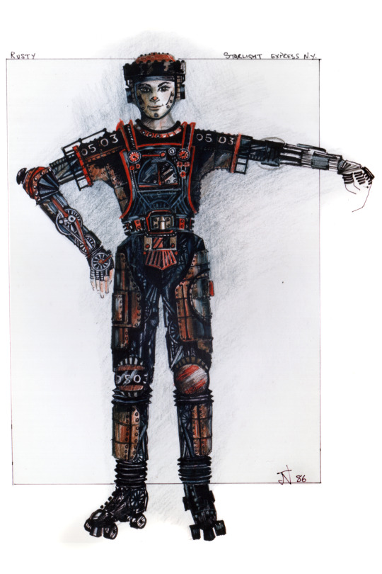

Honestly Rusty is one of the most impressively realised costumes from the design... all the details are there, and it all works!

I'm afraid I can NOT find any pictures of a half-dressed Rusty! Sorry! Seriously it would be useful, as we can see here that his costume is mostly one piece, but his arms are an under-layer.
I know. I KNOW there's pictures of Jamie Golding with that under-layer.... somewhere... but I'm going in circles trying to find them. ANYWAY.
So, Rusty's mysterious base layer is the sleeves, attached to a basic body. The sleeves are painted spandex. (I wonder if it's a backstage video rather than still photos?)
Here you can kind of see inside Jamie's neckline that the red neck panels are - unsurprisingly - attached by snaps. They will line up with the snaps on the main body. Curious that while all the sleeves and thigh panels etc stay on the main suit, the neck panel doesn't? I wonder why.


Just a side note, looking at the mannequin followed by the costumes on the rail, it's interesting how the decoration on his stomach changes. The mannequin costume looks like it's had a few inches cut out to shorten the costume! I always think of that stomach pattern as looking like the Bridge. Whether that's intentional or not, I love it!

Then we have almost all the costume in one piece! The shirt and overalls are attached - in London the shirt was a separate layer but this version it's all one piece that fastens up the back. It's intricately painted, look at all those steampunky details! And judging by the way it catches the light onstage, I think there's a lot of quilting around the wheels etc. I'm not sure how fixed the design is - the one in the background here seems to have different details to the one in the foreground.
But looking at the costume behind there, you can see that the chest plate is held on by velcro all around, and snaps are visible at the top corner. Also you can see the thigh patch is not properly attached - it too has an outline of black velcro, with silver snaps all around the corners. And the ankles on the costume behind are missing their panels, so good clear example of how it goes together!
The sleeves are going to be similar, but a bit more complex. For a while there was one sleeve on display in the foyer, alongside his old hat, and we can just about see (sorry about the reflections!) that the black grill that trims his sleeve is part of the hardware. I suspect it connects to the fabric sleeve just the same as the other panels - lots of snaps and velcro.


Rusty has so much texture going on it can be hard to make out the details! But it looks like his kneepads are held in place using fabric tabs through D rings, that snap back on themselves, and just blend away into the texture. The UK Tour costumes used this technique a lot - a LOT - and in far less subtle ways. Which does have the silver lining of making it very easy to see how it works!

Just focusing on the kneepads here. Joule had D rings on her leggings, and loops that snap back on her kneepads - while Caboose had the tabs with snaps on his leggings, and the rings they pass through on the kneepads. With Rusty it can be a deliberate part of his costume design to have "rivets" for the snaps.

Rusty has plenty of the foam trim that gives most of the characters bold 3D details. This is a lot of hand sewing! I'm pretty sure the rusty orange fabric is spandex, helpful to have the stretch to get smoothly around the curves. The silver trim is sewn on with a herringbone stitch - it's a design feature! Definitely! I suspect the silver is actually a kind of car trim - chrome edging of some kind - rather than something intended for clothing! As is the foam that pads out those details.
Making the solid panels like his chest, thighs, sleeves etc, isn't my area so much - as long as they're sturdy and a bit flexible, you're good. They just need a backing panel with the snaps and half the world's velcro supply installed!

The gloves are half standard leather gloves, with a "gauntlet" of painted, quilted fabric under the moulded wheels. There's a strap - maybe a buckle? at the wrist to adjust.
The belt has more of the raised layers of detail - spandex over foam strips - I would assume there's a solid leather base underneath. Interestingly he doesn't seem to have anything holding the belt in place to the main costume - but the belt and codpiece float and sometimes seem to sit quite low on the performer's hips. I guess you don't want the opposite and getting a wedgie!
The codpiece is another panel like the thighs, this time attached to the front of the belt with snaps, and a strap to attach to the back of the belt.
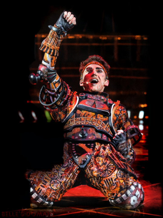
Elbows! We haven't mentioned elbows! They really are more decorative than protective with the big buffer going to knock your elbow sideways rather than take an impact. But they're a solid foam base, the moulded buffer, looks more like leather than spandex to me.
Construction of the kneepads is going to be basically the same as Pearl, which I went into before - but the curved foam base is covered with the decorative fabrics and painted layer, then vacuum-formed clear plastic shell that's held on with big stitches going right through the pad. A cosplayer on skates NEEDS to be confident to use those kneepads, the costume is less valuable than your body!


Last thing, the backpack. I don't see anything to suggest there's more fastenings than just more heavy duty snaps and velcro. Which does make sense when it's across the main fastenings for the costume, gotta keep it simple if you need to get your actor out of costume in a hurry. I wonder if - although the "shirt" and "overalls" are incorporated as one garment, if the back of the "overalls" isn't a separate layer to allow fastening those snaps more easily. IDK if that makes sense, but snaps are much easier if you can press from the inside as well!
OK. Now I want to go through and find as many pictures of the different paintings on Rusty's stomach as I can find. There's so much gorgeous detail in there that's so easily overlooked!
57 notes
·
View notes
Text
Renegade Exchange '24: Her Kingdom As Great
I participated in @renegadeguild's typesetting and bound fic exchange, in which we trade typsetting/bound fic wishlists with other participants and then typseset/bind at least one fic from their list and send it to them.
This post is about the first fic I bound for @celestial-sphere-press: Her Kingdom As Great by MarbleGlove.
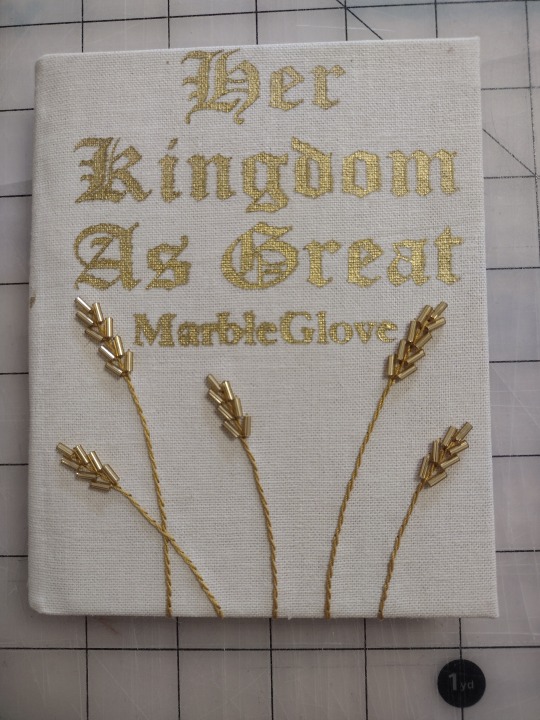
I was excited to see this fic on my requester's wishlist, because I've read this series in the past and really enjoyed it. I liked the imagery of the golden wheat berries from the Nearly Endless Plains being used in embroidery on clothing, so I wanted the cover to feature embroidered wheat sheaves.
My first step was to work on the book cloth. I knew I wanted something tan that looked kind of hand-woven, so I went to the fabric store and got some linen-look fabric that I liked. I also experimented with three different ways of making it into bookcloth: backed with tissue paper filled with Heat'n'Bond (right), filled with a 50/50 mix of starch paste and matte acrylic medium (bottom), and filled with the paste/medium mix with a piece of tissue paper on the back (top).
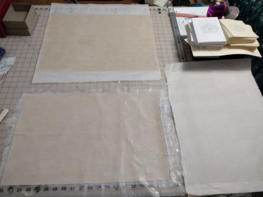
I ended up liking the last option the best, though it meant the fabric lost the slubby linen-like texture I had selected it for. I wanted to go all-in on the tan wheat-tone theme, so I also printed the text on cream paper instead of white (the right typeset in the picture above).
I also added a tan bookmark, embroidered on gold headbands, and added an oxford hollow (although this book is a bit too thin to really need it).
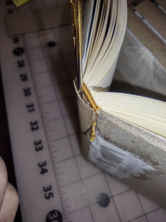
When I went to cover the book, I had every intention of using gold HTV foil. However, I didn't take into account how the beads would inhibit me moving the iron around like I usually do with HTV (to avoid issues with the steam holes). It didn't end well. In fact, it ended very horribly.
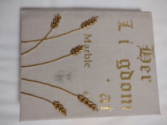
The foil only partially stuck, and when trying to use the tip of the iron to apply heat only on the bits that hadn't stuck, the iron left a big black stain on my bookcloth. Luckily, it came out pretty well with a bit of baking soda on a nearly-dry toothbrush. I ended up asking a neighbor for some gold paint and using some regular vinyl as a stencil, which worked out OK. I found out later that it works better if you put down a layer of acrylic medium or the like first to avoid bleeding around the edges, but you live and learn.
Technical details:
Quarto size (quarter-letter, about A6)
Sewn on tapes
Sewn-on made endpapers
Chisel-trimmed
Rounded but not backed
Sewn-on endbands
Sewn-on bookmark
Oxford hollow
The tapes are frayed and glued to the exterior of the boards
The mull is also glued to the exterior of the boards
Full bookcloth cover
Things I especially liked about this bind:
The embroidery. It turned out pretty much exactly how I had envisioned it
The filled bookcloth. I don't think I'll do it by default, but I liked how it turned out and I like having it as an option in my back pocket
Things I'd like to improve for next time:
The title. I don't mind the paint rather than HTV foil, but I didn't love that it bled under the edges of the stencil. Next time I'll try using acrylic medium to seal the edges first, and see how that turns out.
The endpapers. I've been applying my endpapers with the covers open because I was concerned that they'd pull weird and possibly rip at the hinge. Unfortunately, this causes a big wrinkle in the endpapers that does not look nice. I figured out while doing the back endpaper that it actually is just fine to apply the endpapers as I close the covers on them because of the way I taper my boards and glue the mull on the outside of the cover.
Overall I'm moderately pleased. It's the highest-effort book I've made so far, and it turned out nearly how I had envisioned it with only minor issues.
134 notes
·
View notes
Note
Hey Girl, I need help right now, how can I build my wardrobe because right now all I wear to school is a hoodie and flare jeans/sweatpants, I like the pants but I don’t wanna seem basic and just wear a hoodie with sweatpants or jeans. Cause I’m low-key in the middle of masc and fem so it’s just strange and I don’t know how to dress. 😭💗
how to build your wardrobe | starting with the "downtown girl" aesthetic


hey girl!! tysm for reaching out and trusting me with your style journey 🤍 i totally get that feeling of being stuck in a hoodie + flare jeans loop, especially when you know you deserve a wardrobe that shows off both your masc + fem sides. i remember when my closet felt like a jumble of basic pieces until i started curating it with intention, and now my outfits reflect a confident coquette, downtown girl aesthetic with just the right amount of edge + softness. so, let’s dive into building

little note before we start
i was in the same situation as you, trying to find a way to embrace my masc + fem fashion, i naturally gravitated towards to "downtown girl aesthetic" since it was closest to my comfort zone, now i've branched out to a lot of coquette pieces, my fashion style is amazing now, and really reflects me perfectly. however, i still would define my fashion as downtown girl aesthetic, that's why in this post i'll be giving you a guide since i think it'll fit perfectly for you especially with you being in the middle of masc + fem fashion. hopefully this helps you, feel free to research more about the aesthetic + fashion style, i think it's a great fashion sense that isn't too uncomfortable for first trying out to build your fashion sense. - love from mindy <3

~ discovering your style identity ~
first of all, take a little time to reflect on what you truly love about your style. do you gravitate towards minimalist silhouettes, or do you adore a bit of playful edge? for a downtown girl vibe, think urban chic combined with touches of romance and practicality. jot down a few adjectives that vibe with you. words like “modern,” “gritty,” “romantic,” or even “vintage downtown” can help create your style compass. i like to create digital mood boards on tumblr or pinterest, collecting images of outfits that spark joy. it’s literally a fun, visual way to consolidate your style ideas before letting them influence your wardrobe choices.

~ detailed downtown girl aesthetic tips ~
a downtown girl aesthetic is all about blending practical urban style with a hint of romance and vintage charm. here are some tips to nail this vibe:
color palette:
stick with neutral tones like black, white, navy, + grey as your base.
add pops of color through accessories or a statement piece like a bold red bag or mustard yellow scarf.
muted pastels can also work wonderfully to soften the look while keeping it edgy.
layering techniques:
downtown style is often about layering. try combining a fitted turtleneck with a slip dress, then topping it with a blazer or leather jacket.
experiment with different lengths. for instance, wear a cropped sweater over a longer button-down for a dynamic, urban silhouette.
footwear:
invest in a couple of key pairs of shoes. sleek ankle boots or minimalist sneakers are perfect for walking through the city.
consider converses, boots, and any type of sneakers are literally your best friend
also a pair of combat boots can add a cool, grunge element to your wardrobe.
accessories:
accessories can really pull your look together. a cute necklace or a standout ring adds subtle elegance.
don’t shy away from statement bags. i love structured crossbodies or chic totes.
a stylish hat, like a beret or a fedora, can transform a basic outfit into something that screams downtown chic. omg and headphones literally could be considered as a hat in this aesthetic <3
prints + textures:
mix structured fabrics like denim, leather, or cotton with softer textures like silk or cashmere.
subtle prints such as pinstripes or small polka dots can add visual interest without overwhelming the overall look.

~ mixing masc + fem in a downtown setting ~
if you find yourself balancing between masc and fem, remember that fashion is all about contrast. here’s how to blend the two effortlessly:
combine structured, masculine pieces with more delicate, feminine items. for example, pair a sharply tailored blazer with a soft, lace-trimmed blouse or a flowy midi skirt.
try androgynous cuts like oversized shirts or well-fitted trousers, then add a touch of femininity with accessories. maybe a charming belt or minimalist jewelry.
experiment with layering a unisex tee under a feminine dress, then finishing the look with a sleek jacket or ankle boots that have a modern edge.
balance textures: mix a masculine fabric like denim with a more fragile, silky scarf to bring out both aspects of your style.

~ practical pro tips for wardrobe evolution ~
building a wardrobe that feels authentically you takes time + experimentation. here are some extra pro tips i swear by:
start with what you already love:
take a look at your current wardrobe and identify pieces that feel true to you.
use these as a baseline to decide what new items can mix well with them. this way, you’re expanding rather than completely overhauling your style.
2. shop mindfully:
whenever you’re shopping, think about versatility. ask yourself, “can i see this piece paired with at least three other items i own?”
if possible, try to shop at stores or online shops that offer timeless, well-made pieces rather than fast-fashion for a sustainable approach.
3. don’t be afraid to experiment:
style is a journey, and it’s totally okay to try something new even if it feels a bit out of your comfort zone.
consider having a “fashion day” where you experiment with mixing different textures, layers, and accessories. take photos of your outfits so you can look back and see what works best.
3. remember the power of personal touches:
add items that tell your story. a vintage scarf, a piece of jewelry with sentimental value, or even a custom-painted jacket.
these pieces not only elevate your look but also make your outfit uniquely yours.

~ my personal journey & final thoughts ~
i remember when i first started experimenting with my wardrobe. i was always tethered to the same basic pieces until i decided one day to step out of my comfort zone. i went to a little vintage store downtown and found a structured coat that changed everything. pairing it with a crisp button-down and sleek trousers created a look that was so different from my usual style but felt incredibly empowering. the process was filled with trial + error, but each piece i added felt like a tiny victory. an expression of my evolving self.
i currently have a mix of downtown girl aesthetic, coquette, and just a lotttt of pink clothing lol <3. however, when i first started experimenting with a style i personally love and own now, i started with the downtown girl aesthetic, and it helped me so much. this is why i recommend starting with this aesthetic first if you're trying to discover your personal style and especially if you want to express your masc and fem side.
building a wardrobe is literally a form of self-expression, and it should be fun rather than stressful. let each outfit be a mini celebration of who you are. remember, there’s no “right” way to dress. your style should grow with you. even if you’re headed to school or exploring the city streets, your wardrobe should be a canvas that reflects your creative spirit.
I have a pinterest board here specifically with downtown girl outfit ideas: https://pin.it/1d0IdGrNL
sending you the biggest virtual hug + all the good vibes! i hope these detailed tips help you start with building your wardrobe. remember to take it one step at a time, enjoy the process, and always embrace what makes you uniquely you.
p.s. if you ever need more advice or a pep talk to boost your style confidence, feel free to send more asks!! keep shining, and always take care of yourself.
xoxo, mindy 🤍

#downtown girl#girl blogger#girl blog aesthetic#lana del rey#girl blogging#tumblr girlies#lana del rey moodboard#girlblogger#lana del ray aka lizzy grant#lana del ray aesthetic#lana del ray moodboard#gossip girl#cinnamon girl#coquette girl#gaslight gatekeep girlboss#clean girl#gilmore girls#girlblogging#becoming that girl#girlhood#girly tumblr#hell is a teenage girl#im just a girl#it girl energy#just girly thoughts#just girly things#that girl#this is a girlblog#this is what makes us girls#vanilla girl
47 notes
·
View notes
Text
What They Wore: A Thousand Years of English Fashion (And How to Write It Right)
Whether you’re writing historical fiction, fantasy inspired by real eras, or just trying to clothe your characters convincingly, knowing what people actually wore matters — and it’s about more than corsets and cloaks. From the scratchy wool tunics of the medieval peasantry to the bell-bottoms of the 1970s, English clothing tells a story of class, comfort, constraint, and change. This post walks you through the major fashion eras in England between the 1000s and the 1970s — what people wore, why it mattered, and how to write it in a way that feels immersive and true to life. Let’s dress your characters like they belong to their world.
Disclaimer: This is a broad overview, condensed for accessibility — after all, we’re covering nearly a thousand years of fashion history. Naturally, styles varied by class, region, and even personal taste, and there’s much more to explore within each period. If you’d like a deep dive into a specific era, class, garment, or perhaps another culture, feel free to send a request — I’m always happy to expand.
Medieval England (1000s–1400s)
In early medieval England, both peasants and nobles dressed in practical layers of wool and linen. Commoners wore plain, ankle-length tunics (often belted) over long-sleeved shirts, paired with simple hose or leg wraps for warmth. Wool was the staple fabric for everyone, while wealth could afford vibrant dyes (bright reds, blues, greens, purples). By contrast, nobles added furs, embroidery or jewelry to the same basic garments – royalty might even wear sumptuary-lavish cloaks or mantles trimmed in gold, as 12th-century illustrations show. Men’s tunics remained shorter at the knee for ease of riding or labor; women’s gowns were floor-length. Both sexes often draped heavy cloaks or mantles when travelling or in cold weather.
True medieval underwear was simple. Men wore linen braies (loose breeches) under their tunics and leg wrappings, tied at the waist. Women wore a long linen chemise or smock as a shift. This garment added warmth and protected outer clothes from sweat (no tight corsets or “bras” yet). Class differences showed in cut and trim – a peasant’s gown might be undecorated wool, while a lord’s wife wore fitted bodices (achieved by tight lacing over a chemise), padded shoulders and long flowing sleeves. The Church and guilds also influenced style: monks and nuns added cowls and coifs, and sumptuary laws legally restricted who could wear dyed silk, gold thread, or certain colours.
Writing Tip: Use clothing to signal class and duty. For instance, a blacksmith’s leather apron and coarse tunic (everyday workwear) contrasts with a merchant’s doublet of fine wool. Show characters adjusting layers: “He tightened the leather belt around his tunic as he stepped out of the thatched cottage into the mist.”
Writing Tip: Invoke texture and sound – wool that “scratches at the neck,” or a “swish” of a long gown. Let a character fix a loose seam or breathe easier when loosening a tight chemise to ground readers in the era.
Writing Tip: Detail symbolic colors or accessories sparingly. A commoner in drab browns hints at toil, whereas a ribbon or brooch (if he can afford it) indicates rising status or an important occasion.
Tudor & Elizabethan (1500–1600)
The Renaissance brought elaborate silhouettes. Nobles cherished opulence: wealthy men in the Tudor court wore stiff doublets padded to exaggerate chests, short padded breeches (or trunk hose), and codpieces (a decorative flap) over hose. Over these they donned richly brocaded jerkin or cloak, often with fur trim, velvet hats or felt caps, and elaborate ruffs or standing collars. Women of status layered a white linen shift (changed daily) beneath stays (boned bodices) and voluminous skirts supported on farthingales (hoops). Catherine of Aragon famously introduced the Spanish farthingale; Elizabeth I’s later drum farthingale forced skirts into a wide hoop. Gowns were jeweled or embroidered, and hair covered by French or gable hoods, crespine nets or coifs. By Elizabeth’s reign the magnificent ruff (starch-starched linen around neck/wrists) and sewn-on large sleeves were courtly norms.
A cascade of Tudor sumptuary laws tied color and fabric to rank. Only royalty could wear purple or cloth of gold; courtiers donned silk, satins or damask, while rising gentry used silk linings and polished buttons to signal wealth. Ordinary people still wore plain woolen gowns or jerkin-jacket and hose, with felt hats or hoods. Both sexes often carried outer cloaks lined with wool. For servants and peasants, attire became more “modern”: buttons were common and fashions (like shorter tunics for men) trickled downward. Rich or poor, everyone still wore the linen under-shift. However, women’s garments were now purposely shaped: laced stays cinched the waist, and sometimes early chemise-corsets appeared. Men’s base layer was a linen shirt with sleeves (embroidered for the well-to-do) and linen breeches; long knitted woolen stockings attached by ties at the waist.
Writing Tip: Describe movement and inconvenience. A character might “force a hand between stays to loosen its rigid boning,” or “hike her petticoats as she climbs stairs.” Such details show the weight and constraint of historic dress.
Writing Tip: Use era-appropriate lingo lightly: “wimple”, “coif”, “silken livery”. But balance it—don’t overload readers. Instead, embed meaning: a heroine adjusting her hood hides a secret, a lord smoothing his doublet polishes his pride.
Writing Tip: When including hierarchical detail, focus on what it means to characters. A footman cannot afford scarlet satin; a merchant proudly pins his new starched ruff before a marriage. These actions reflect societal rules and personal aspiration.
Stuart and Georgian (1600–1800)
The 17th and 18th centuries saw fashion swing between opulence and moderation. The Restoration court revived splendor: men donned lush silk coats, lace-trimmed shirts and curly periwig wigs, with cuffs frilled at the wrists. Waistcoats (vests) appeared over tight-breeched outfits. By the 1700s the classic three-piece suit emerged (knee-breeches, vest, coat) in finer weave, often powdered in pale colors. Women’s court gowns remained elaborate: low necklines, tight corseted bodies and full panniered skirts held out to the sides. After 1760, French styles influenced England: panniers gave way to the high-waisted Robe à l’Anglaise or à la Polonaise, and hair piled or powdered in complex coifs. By Regency times (c.1790–1820), women’s gowns adopted an Empire silhouette – high, Greek-inspired waists – and men dressed in tailcoats and trousers with cravats, marking a turn toward gentility.
Across these decades, common folk dressed more simply. Farmers and tradesmen usually wore knee-length woolen coats or frocks over rough linen shirts and plain stockings. Women wore bodices and petticoats, often with aprons and linen caps. During industrialization, everyday garments became machine-made, so even middling classes could buy off-the-peg items. However, distinctions remained: a gentleman’s frock coat or silk waistcoat revealed class, while a laborer’s homespun jacket and sturdy boots spoke of work. Undergarments sharpened into necessity: men wore linen shirts and drawers; women almost universally laced stays or corsets under their dress and multiple petticoats (often starched) for the desired shape.
Writing Tip: Convey texture and sound: the swish of a hoopskirt or the creak of a leather saddle as a knight shifts in his stirrups. A gentlewoman smoothing velvet or a butler brushing lint off a suit can reveal character and class naturally.
Writing Tip: Demonstrate labor versus leisure by clothing. A laborer’s patched serge coat might smell of smoke from the forge; a lady’s embroidered fan sits untouched as she oversees chores. Use clothing to underscore who is active and who is idle in a scene.
Writing Tip: Remember weather and function: mention a wool cloak over a Georgian riding habit in damp London, or breeches mud-splattered from carriage travel. These practical notes ground the narrative without feeling like exposition.
Victorian & Edwardian (1837–1910)
By Queen Victoria’s reign, fashion signals became highly codified. Early Victorians embraced enormous skirts: ladies cinched tight-waisted corsets to support bell-shaped crinolines or later hoops and bustles. Bodices were stiff and high-necked by day; evening dresses revealed shoulders with off-the-shoulder necklines. Dark colors (blue, crimson, black) were popular (especially in mourning culture). Fabrics ranged from humble wool and cotton for daily wear to fine silk and lace for the wealthy. Working-class women wore simpler, flatter skirts with sturdy cotton bodices and aprons; servants often in plain black-and-white uniforms with modest bonnets. Men’s attire grew uniform: morning coats and waistcoats for day, tailcoats for evening; trousers were straight and gray or brown. The bowler hat and homburg became typical, replacing earlier top hats for all but the most formal outings.
Industrial changes accelerated these trends. Sewing machines and railways made fashionable cuts available across Britain. Middle-class families (say, merchants or civil servants) dressed almost as richly as gentry on Sundays, though domestic work still required plain frocks, shawls and bonnets. By the Edwardian era (1901–1910), the “S-bend” corset created a distinctive posture, and women’s jackets and skirts (often in tailored separates) borrowed from hunting outfits. Undergarments remained essential: corsets with “modesty panels,” bustles or pads in the 1870s–1880s, and layers of petticoats. Men routinely wore knitted union suits or drawered undergarments beneath their trousers and shirts, and cravats became simpler ties.
Writing Tip: Use clothing to show routine or ceremony. The ritual of a Victorian ball: “She laced each hook of her corset with trembling fingers; downstairs, servants stood ready with her sash and tiara.” By contrast, “He rolled up his shabby sleeves to churn butter, uncaring of the morning coat tossed on the chair.”
Writing Tip: For a character’s comfort (or lack of it), note fitting details: an heiress lamenting how “the bustle dug into the small of her back,” or a soldier tucking an insulated wool shirt as he sleeps in a cold barracks. Realistic sensations immerse readers.
Writing Tip: When describing class difference, contrast quality. A factory girl’s frayed cotton dress vs. a lady’s crisp linen shift; or mud on work-boot and silk on ballroom shoe. These differences show society without heavy telling.
World Wars & Interwar (1910s–1930s)
The two World Wars drastically reshaped British dress. In WWI, women’s roles expanded: they wore simpler, shorter skirts and looser jackets to work in factories or farms. Uniforms became more common (nurses, Women’s Land Army in rough dungarees). After the war, the 1920s flapper fashions broke from corsets: young women donned drop-waist dresses, knee-length hemlines and sleeveless cuts, with cloche hats and bobbed hair. This androgynous silhouette (flat bust, loose skirt) symbolised modernity and new freedoms. Men’s suits slimmed down too, with low-waisted trousers and narrow lapels.
The 1930s muted this vivacity. Hemlines rose and fell, and skirts lengthened to mid-calf. Women often adopted padded-shoulder jackets inspired by military cuts, and everyday fabrics included rayon and jersey for ease. Men’s fashion grew comfortable: tweed suits for country, wool lounge suits in town, and fedora hats.
WWII imposed austerity. Rationing (1941–1949) meant government-issued coupons for clothing and the Utility scheme enforced plain, functional dress. Yet style survived: women in Utility dresses (knee-length shirtwaist designs in wool or rayon) still appeared smart with accessories like headscarves or twinsets. The iconic “Land Girl” uniform – khaki slacks and green shirt – showed women in typically male attire. Men wore military uniforms or civilian suits with restricted fabrics. The era’s fashion reflected patriotism (navy-blue, army-green) and necessity, but young people still experimented with unofficial looks (hand-me-down fur-collared coats, tailored leather jackets).
Writing Tip: In wartime scenes, let the struggle over clothing come through. A mother mending her children’s patchwork stockings, or a soldier’s mailed boots clicking on cobblestones. These small details add authenticity.
Writing Tip: Post-war, convey the joy of fabric and color’s return: describe a woman’s new Dior-style dress with yard upon yard of printed cotton after years of gray wool uniforms. Contrast with the drabness she recalls.
Writing Tip: In fantasy or fiction, you can borrow silhouettes: perhaps a medieval knight’s surcoat becomes a mage’s tunic, or a Victorian bustle inspires a steampunk character’s coat. But ground it: under the fantasy trim, is it stiff boned corsetry or soft layers? Readers love to recognize true details.
Postwar to 1970s
After 1945, fashion swung from austerity to optimism. The 1950s saw the return of the hourglass (Dior’s “New Look”): full circle skirts, cinched waists, pointed busts (often with bullet bras), and smooth silk scarves. Teenager culture arose: poodle skirts, saddle shoes for girls; Levi’s jeans, t-shirts and leather jackets for “greasers” in cafes. Men typically wore fitted suits for work and nylon bomber jackets after hours.
The 1960s exploded with diversity. Early on, the mod look – mini-skirts, bold geometric prints, go-go boots and short haircuts – epitomized youth rebellion. Late 60s brought the hippie wave: men grew hair long and donned flared bell-bottoms, peasant blouses, and psychedelic patterns; women wore flowing maxis, tie-dye prints and ethnic-inspired prints. Clothing began to mix historically inspired pieces (a 60s “boho” dress might hint at Empire-waist or peasant smocks of earlier eras). Underwear also changed: bras became soft and full coverage, and girdles/y-shaped underpants replaced stiff corsets.
By the 1970s, fashion was eclectic. Men wore wide collars, leisure suits, or continued long hair into tailcoats for gigs. Women shifted from bohemian maxi dresses to shorter disco styles (mini-dresses again, jumpsuits, platform shoes). Overall, clothing became lighter and less structured: synthetic fibers dominated, and undergarments focused on comfort. Gender norms loosened: women in pants (slacks, jeans) became common, and men in more playful cuts. Still, fit would often imply role – a nurse’s crisp dress and cap, or a bank manager’s striped suit and tie.
Writing Tip: For period fiction, small touches anchor the era. A character might smooth out a synthetics-rich polyester shirt or pull down a low-rise 70s hip-hugger. Mention music (a Beatles T-shirt, perhaps) or social movements subtly through style choices.
Writing Tip: Show the landscape of class or culture: a London punk with a safety-pin vest vs. a country farmer in corduroy jacket and flat cap. Each piece of clothing is a social clue or a story waiting to be told.
Writing Tip: In fantasy inspired by these eras, fuse the fantastical with the practical: e.g. a 1920s flapper hero might wear a deerstalker hat instead of a cloche, or a space-opera Victorian might have a corset of alien metal. Keep the proportions and constraints believable to maintain immersion.
Across a millennium, English dress evolved in step with technology, class, war and whimsy. The practical — wool cloaks for cold, sturdy leather boots for farmers — remained a constant, while social cues — a lady’s lace ruffle or a soldier’s epaulette — spoke volumes. Whether sketching a knight’s tabard, a Tudor gown or a 1960s mod mini, the key is integration: let clothing reflect your character’s world. Focus on how they wear it, care for it or chafe in it, and your narrative will feel as rich and authentic as the tapestry of history itself.
#historical fashion#writing tips#historical writing#period drama#writing advice#historical accuracy#world building#fashion history#costume design#writing community#writeblr#writers of tumblr#creative writing#medieval fashion#regency style#victorian fashion#edwardian era#vintage fashion#research for writing#writing help#character design#historical aesthetic#vivsinkpot
37 notes
·
View notes
Text
Sewing Collaboration! Takashi Mitsuya (Tokyo Revengers)
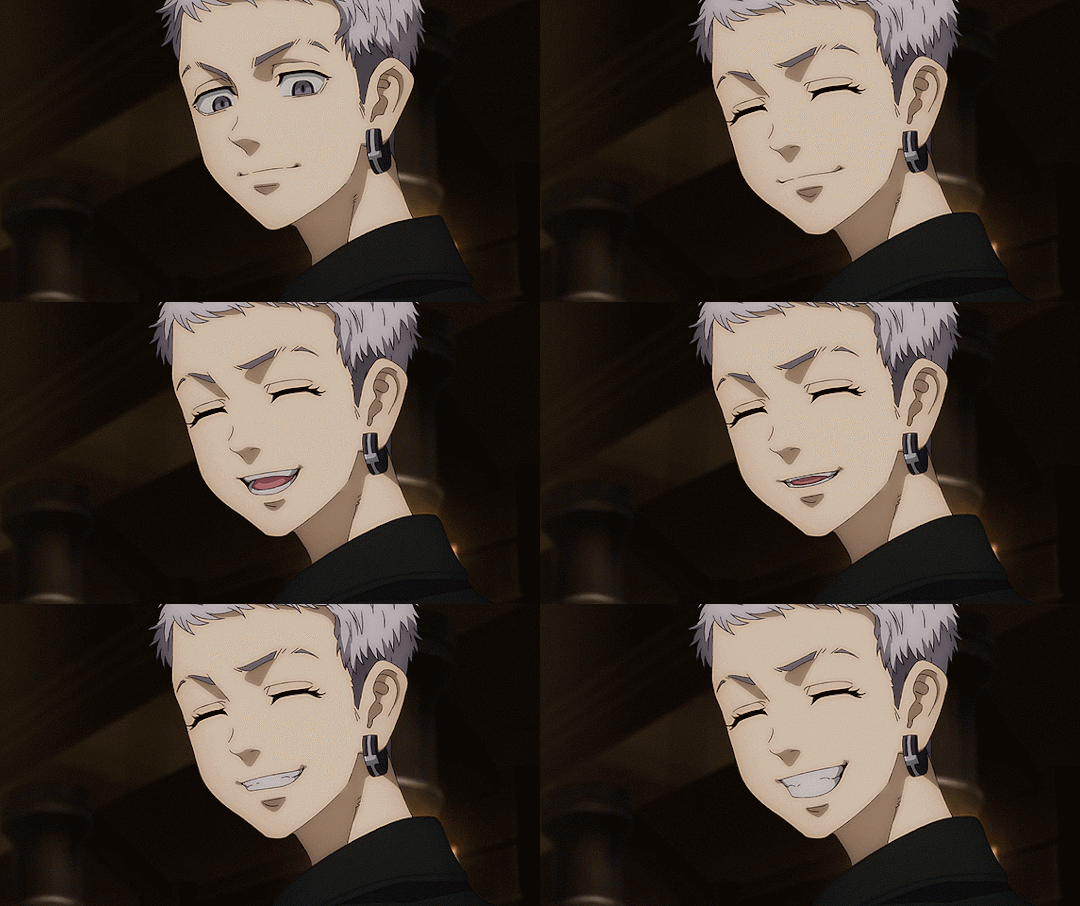
You recently joined the school sewing club, but you keep to yourself. Until one day you catch the eye of Mitsuya, who notices your talent while you shy away from any sort of attention. Friendship and jealousy arise, but you gain a friend and future sewing collaborator.
The quiet hum of sewing machines filled the fabric-scented air of the sewing clubroom. Mitsuya glanced up from his project, eyes finding you, who were sitting at the far table, new, quiet, always sitting with your shoulders slightly hunched, your hands moving delicately over the fabric like it might break if you press too hard.
He stood and made his way over, curiosity piqued, 'Hey,' he said with a warm smile, 'You’re new, right? Mind if I take a look?'
You startle slightly, glancing up at him with wide eyes before hesitantly turning the sketchbook toward him.
Mitsuya blinked in surprise. The designs were intricate—soft lines, layered textures, tiny notes scribbled in the margins about fabric choices, 'Wow…These are amazing,' he said sincerely, 'You’ve got a real eye for detail.'
You duck your head, ears turning pink, 'I-I… um, thank you…'
Mitsuya chuckled, 'Seriously. You should show these to the others. I bet they’d be impressed.'
You shake your head quickly, 'N-No way…You’re much better. Your work is like…actual fashion.'
'And yours is like something I’d see on a runway,' he said gently, nudging your sketchbook back toward you, 'Don't sell yourself short.'
Your fingers fidget with the edge of the page, 'I-I just do this for fun… I didn’t think anyone would notice…'
Mitsuya leaned on the table, his voice softer now, 'Well, I did. And I think we could learn from each other. Want to work next to me next time?'
You glance up, eyes wide again—but this time, you nod, a small smile tugging at your lips.
Mitsuya grinned, 'Great. It’s a deal.'
ONE WEEK LATER
The clubroom buzzed with its usual after-school chatter, but today had a different kind of energy. The sewing tables were pushed together for a group project, and Mitsuya sat beside you, now less hunched and a little more comfortable around him. You two had been working on a joint piece for the past week: a soft, flowing dress with delicate embroidery along the hem, a blend of your dreamy style and his crisp lines.
'You really brought this to life,' Mitsuya said, adjusting a pin, 'I just followed your lead.'
You shake your head, smiling shyly, 'I-I couldn’t have done it without you…'
But when the two of you returned from a short break, something felt off.
The fabric you'd been working on lay in a crumpled mess, threads yanked loose, embroidery torn halfway through. Your sketch, once neatly tucked under your notebook, was missing. A few girls across the room whispered behind cupped hands, one of them glancing over with a smirk.
You freeze. Your hands trembled as you picked up the fabric, staring in silence.
Mitsuya’s brow furrowed, 'Hey…What the hell?' He crouched beside you, gently taking the ruined piece from your hands, 'This didn’t happen on its own.'
You shake your head quickly, blinking fast, 'I-It’s okay, I-I probably just—'
'No,' he said firmly, not unkindly, 'You didn’t. Someone messed with it.'
Your lip trembles, and you turn your face slightly away.
He stood, casting a cool glance around the room. The girls who had been whispering quieted immediately under his gaze.
Mitsuya turned back to you and crouched down again, speaking low so only you could hear, 'This wasn’t your fault. And I won’t let it slide.'
You sniffle, eyes shining, 'B-But we worked so hard…'
'I know,' he said gently, 'And we’ll fix it. Together.'
He helped you gather the scraps, carefully and calmly, treating each torn piece as if it were still something beautiful. When you look at him, really look at him, something new appears in your eyes. A flicker of trust.
'Next time,' he said, giving you a soft smile, 'we’ll lock the pattern drawer. And maybe start sewing at my place. My sisters are better company anyway.'
That got a tiny laugh out of you. And just like that, you nodded. Anywhere was better than this club room.
A FEW DAYS LATER
The dress took a few afternoons to mend. You work side by side at Mitsuya’s house, surrounded by the chatter of his younger sisters and the soft scent of fabric softener lingering in the air. His sisters had immediately taken to you, offering you snacks, asking about your favourite colours, even braiding little pieces of your hair as you stitched.
By the end of the fourth evening, the dress was whole again. Maybe even better than before.
'It’s ready,' Mitsuya said, brushing his hands off. 'You should try it on.'
You hesitate, glancing down at the flowing pale fabric, 'I-I don’t know if it’ll look good on me…'
'It’ll look perfect,' he said without missing a beat.
Ten minutes later, you step out of the bathroom, smoothing the hem nervously. The soft fabric clung just right, the embroidered accents catching the light as you move. You keep your eyes low, bracing yourself for some kind of critique.
But Mitsuya was silent. You glance up and blink.
He was staring at you, lips parted slightly, a faint pink creeping up the tips of his ears and into his cheeks. He looked…stunned.
'Is something wrong?' you ask softly.
Mitsuya blinked like he’d just snapped out of a daze, 'No! No, not at all. It’s just…You look stunning.'
Your breath catches, 'O-Oh…'
You look down quickly, your own face flushing deep red as your fingers twist in the hem of the dress, 'T-Thank you…I—I mean, it was your design too, so…'
He chuckled softly, scratching the back of his neck, 'Still. You bring it to life in a way no mannequin ever could.'
Your heart does a little flip. You look at him shyly, a hopeful glint in your eyes, 'Do you…wanna collaborate more? I-I mean—only if you want to.'
Mitsuya smiled, the kind of warm, sincere smile that melted all the nerves in the room. 'Yeah,' he said gently, 'I’d really like that.'
#tokyo revengers#tokyo revengers mitsuya#mitsuya takashi#mitsuya x reader#tokyo rev mitsuya#tokyo revengers fluff#tokyo revengers imagines#tokyo revengers headcanons#tokyo revengers fanfiction#mitsuya imagines#mitsuya fanfiction#tokyo revn fanfiction#tokyo rev imagines#imagines blog#anime imagines#anime imagines blog#anime blog#anime fanfiction blog#anime fanfiction#fanfiction blog#fanfiction
31 notes
·
View notes
Text
Costume analysis!
And I wanna analyze Mercutio’s French 2010 costume today. This purple one:

Under the cut because it’s gonna be long
The coat
Let’s start with the coat, the outer layer. It stands in stark contrast with Tybalt’s red coat in length and in cut as it’s more similar to what Romeo and Benvolio wear. This of course is to show that they are his friends and he shows his allegiance to them and the house Montague by wearing this coat. Even though he’s supposed to be a neutral party in this feud.

Let me go into the details of the coat a bit. In length it’s shorter than Romeo and Benvolio’s coats, but a bit longer than Tybalt’s, so a good in between. It’s decorated with the same rhinestones that grace the Montague coats. They are however only present on one lapel and on the right side on the bottom, more sparsely used. The lapels are unique in their shape, one more round, the other more spiky and no one else has such lapels. There’s slits at the end of the sleeves, again copying the style of Romeo and Benvolio’s coats.
Under the arm is also a slit which I believe is in reference to a 15th century fashion, called slashing. It’s something they would do so that the garment underneath would be visible and since at the time they all wore linen shirts and camicias it would be white. This underarm slashing also featured in the other coats, as seen here:


Now the fabric. It’s obviously shiny which fits him well, but I want to focus on the texture of it here. Romeo and Benvolio’s coat’s fabric is smooth, not textured safe for the rhinestones. Tybalt’s coat’s fabric is textured however. Now the fabric of Mercutio’s coat is also textured, but less so than Tybalt’s. It’s visible in close up pictures, but it’s also clear that the fabric isn’t smooth from further away. Once again, it’s a perfect mix of both sides.

The belt(s)
For some reason, Mercutio wears two belts copying the Montagues who also wear two belts. But where Romeo and Benvolio’s belts are black and not decorated, his are. It’s not easy to spot and it’s even more difficult to make out what the pattern is. But! I did find some decent pictures and could make out the patterns that Mercutio has on his belts. It’s upside down jolly rogers.


Of course I do dive into the symbolism now. The first association is pirates of course (which I don't really see how it relates to Mercutio. Do tell me if you think other tho). But! According to wikipedia Roger was a slang word for Penis. So a really sneaky dick pun, which fits Mercutio very well. The jolly Roger is upside down however. If the jolly Roger flag is flown upside down, it signifies 'give no quarter'; a declaration of lethal intent. Which he literally does declare in le duel. It of course has also been used as a symbol of anarchy and rebellion more recently. This ties in nicely with how Mercutio appears to be silly and unserious to everyone, but he actually is more than those things and he observes and knows more than you might think. (And if you know more about the symbolism of the jolly Roger, do tell me more.)
The shirt
The reference to historical fashion is more obvious here. The sleeves on Mercutio’s shirt are split in half, yet still connected at the top and bottom. This is meant to remind you of the overcoats, gowns and houppelandes with one long slash in the sleeves, revealing the garment underneath.


Now the garment Mercutio is wearing underneath is sheer mesh, modernising this 15th century fashion a lot. The collar of his shirt is the same in shape as Benvolio's and Tybalt's shirt. Romeo's collar is very different from theirs, but we're not here to talk about that. This collar and the strips where the buttons are, are in a darker shade than the rest of the shirt. Once again there are rhinestones on his shirt, looking like singular flames. Those flames are scattered all over the shirt — save for his left sleeve — unlike Romeo and Benvolio's rhinestone formations, which drip down the shoulders.

The cuffs on Mercutio's shirt are interesting. From what I can tell, they're completely covered in rhinestones. Only Romeo's cuffs are decorated with rhinestones too, which makes me think that Mercutio copied him. It's probably also supposed to show how he's in love with Romeo. But if you've seen the show you know that already without me ascribing this meaning to his cuffs. The second part that intrigues me is how there's jagged bits of fabric at the very end of his cuffs. The only other character whose fabric is cut jagged and uneven is death. This leads me to believe that this is supposed to show how he's marked for death since the beginning. It's a clever little detail.

The pants
His pants are fairly standard, not decorated or anything. From what I can see, they're most likely made out of jeans material or a similarly slighty thick fabric. In length, they go to about mid-calf, once again highlighting his in between-ness with his clothes. They're darker than the shirt and closer in colour to the coat, maybe even the same colour, but it's difficult to tell exactly. I think they're a bit lighter than the coat.
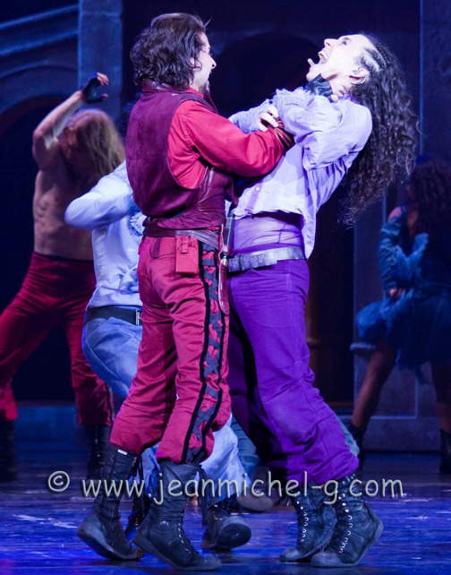
The shoes
They're black boots, similar to those the rest of the cast are wearing. But where the Capulets wear boots that go up just until the muscly part of the calf and the Montagues wear boots that go just above the ankles, Mercutio has boots that reach about the middle of the calf. Again showing how in between and not part of the feud he is, as with the coat.
So, all in all I think his costume in the 2010 version is showing, despite how he's not supposed to be a part of the feud, he is dressed more like his friends rather than completely different from anyone else, like his uncle is. The costume shows his obvious bias, while also showing his personality and role in the show. The purple he wears is not worn by anyone else, making him stand out among the crowd. It's all fascinating when you pull it apart like this and look at the different parts of it one at a time.
If you have more thoughts or ideas, I'd love to hear them.
28 notes
·
View notes
Text
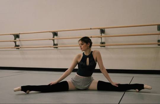
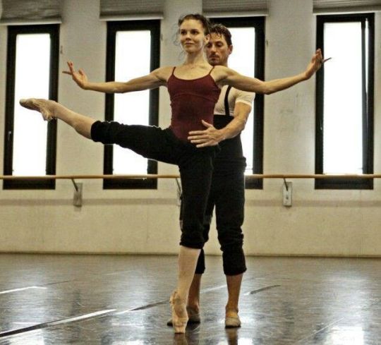
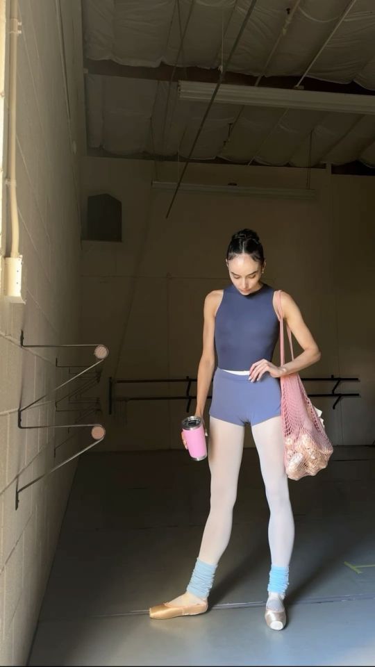
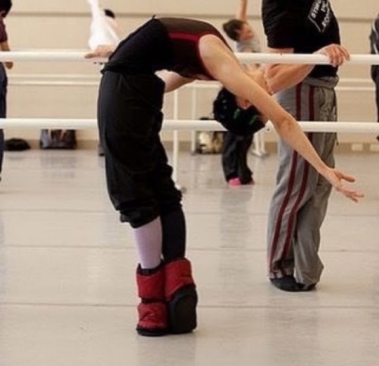
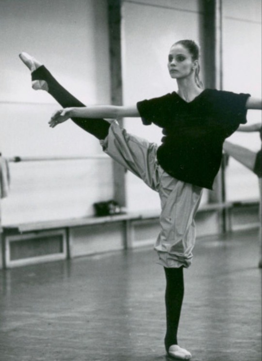
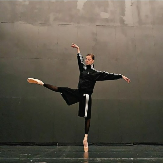
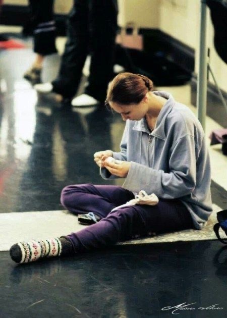
alright i need everyone to walk with me for the fem c!tntduo ballet outfit headcanons. i feel like neither of them would be big on the pink, preppy vibe (think coquette ‘balletcore’ or the black swan movie) so they would both gravitate towards darker colours, either earth or jewel tones and also greys.
for cwilbur i think her style would definitely be messy with lots of layers, patterns and textures. not sporty/clean/elastic materials either, but a lot of drapey or velvety fabrics (even occasionally a lace shawl around the waist, or skirt) and mismatched accessories (only 1 ankle gaiter, a sweater around the waist, etc). the aforementioned loose button up that she leaves open and rolled up at the elbows is a key element (i couldnt find an image that suited my vision). its also Big Lesbian Points. she also DEFINITELY wears those sleeves things (see photos) that just look like emo gloves to me like its SO her vibe. in terms of necklines i think she’d go for more romantic/classic shapes like v-necks with short sleeves. mostly earthy or grey/powder colours, with maybe a few jewel tones for her nice velvet leotards she wears on special occasions. she’s an adept of the trash bag shorts, and occasionally wears some accessories in some random colours like those mustard yellow ankle gaiters . she also prefers long skirts in general

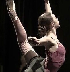

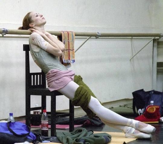
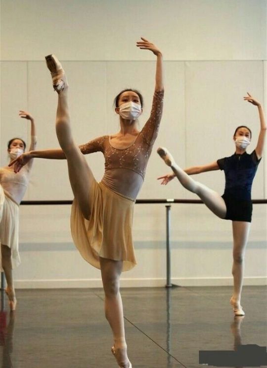

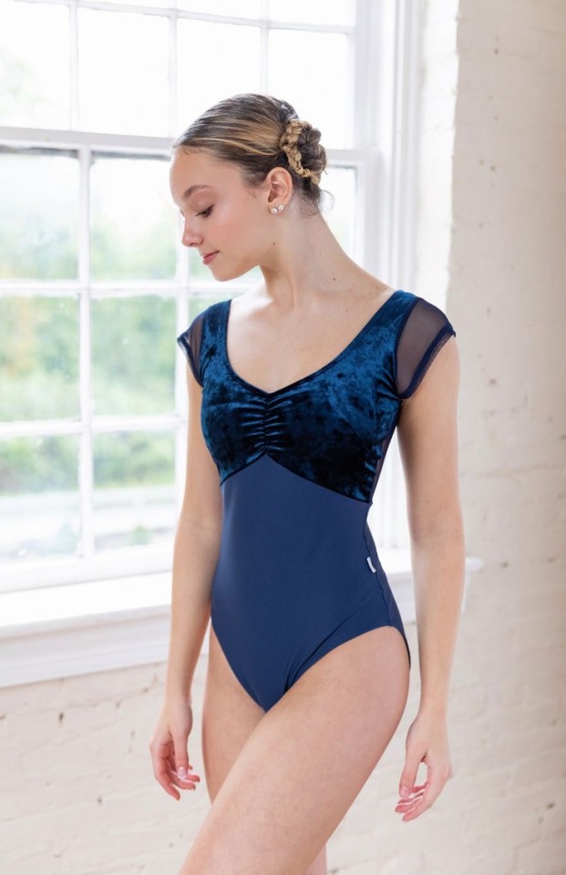
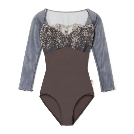
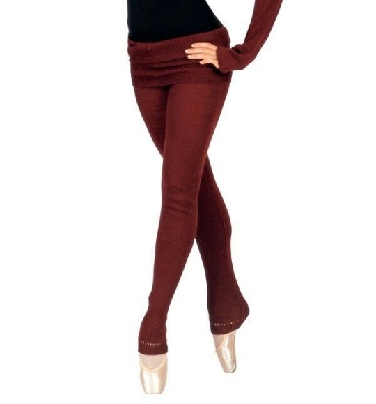

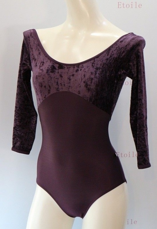


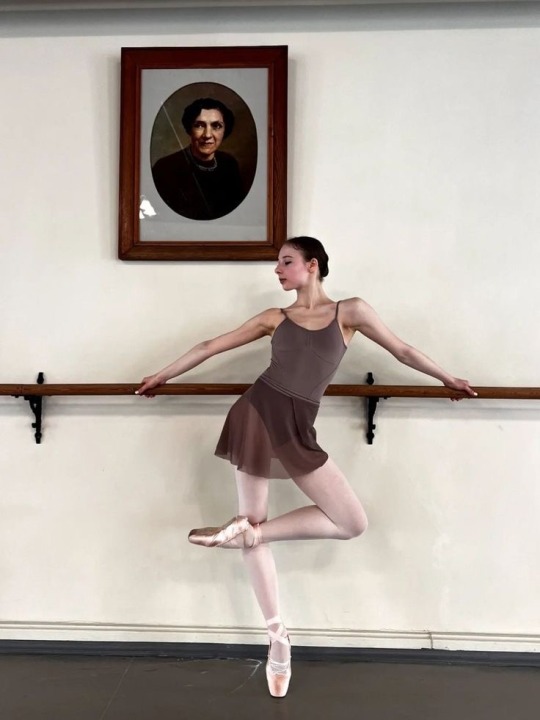
for cquackity i think her style would be a lot more modern and sporty, with cleaner lines (even though shes also an adept of accessories). for necklines she would wear a lot of boat necks. big fan of just one huge sweater to throw on. for colours i think she’d lean more towards black and blues, with the occasional jewel tone or even a bright colour, like those more modern colour block leotards . she would wear less patterns and textures than wil, and more finer details like different coloured lining. however she does also like black wrapovers in flimsy fabric (see pictures) and its like the main element of texturing she does. she’s more into shorts or short sporty skirts than the romantic flowery skirts that wil has (also because of their differing heights, she’s aiming to make her legs look as long as possible whereas wil already looks like a string bean lol). also BONUS for that last image because that leotard reminds so much of cquackity's blue tracksuit lmaooo




23 notes
·
View notes
Text
The ball-jointed doll sat motionless, its painted features faded and chipped, the remnants of its previous life clinging to its smooth plastic skin. It couldn't speak, but it could feel - a strange, numb sensation as the chemical solution began to erase the old layers of paint. The scent of the solvent was sharp and foreign, mingling with the smell of the room, the faint traces of its owner's hands. Every stroke of the rag felt cold and purposeful, wiping away the past, preparing it for something new.
There was no rush. The doll couldn't rush. It could only exist in the moment, unable to comprehend the transformation, only able to feel it. The chemicals stung as they spread across its surface, and yet it felt a quiet relief - each swipe, each clean surface, marked a new beginning, an unknown journey ahead. The doll didn't need to understand it. It just knew that the old was leaving, making way for something different.
The artist’s hand hovered over the doll's blank face, and soon, bristles of a fine paintbrush began to trace delicate lines over its once-plain features. It felt the brush's soft, smooth strokes against its skin, the bristles gently teasing it to life. The brush flowed like water, shaping curves and contours that the doll could only sense, not see. Slowly, carefully, the paint began to form its eyes, one stroke at a time, the color flowing across the plastic surface, but its vision remained a fuzzy blur.
The brush moved in precise motions, painting lips, shaping a delicate nose, blending shadows and highlights to bring personality and warmth. Though the doll could not see, it could feel the change in the air - the texture of its skin becoming more alive, more expressive with each touch. Its face was becoming something new, but it wasn’t complete. Not yet.
As the doll's new eyes began to take shape, the feeling was strange - alien, almost. There was a sense of waiting, of anticipation as the brush moved delicately, filling the void. The vision was still unclear, like waking up from a dream, the shapes and colors blurring together. But slowly, ever so slowly, clarity began to form. The eyes - first vague, then bright with detail - grew into their final shape.
At last, they were finished.
The doll blinked - or at least felt like it did. It didn’t know how to blink, but in that moment, the world around it seemed different. The blurry fog that had once obscured everything now began to clear. Colors, shapes - things it had never seen before - began to come into focus. The eyes were finished. The doll could finally see.
But there was more.
Next, it felt its owner’s hands delicately pull fabric over its limbs, threading it's bending joints through soft materials, fastening them with small buttons and ribbons. Layers of intricate clothes were draped over its body - silk, lace, and velvet, each texture unique and unfamiliar. Its fingers warmed, a sign of life it hadn’t had before. The clothing was soft against its skin, a far cry from the cold, unfeeling plastic it had known. The doll could sense its new form, the transformation into something more than just an object. It was becoming something... alive. Something with a story.
It couldn’t speak, it couldn’t move on its own, but in that quiet space, with each stroke of the brush and each fold of fabric, it began to understand. It was no longer just a doll. It was a creation - shaped, crafted, and brought to life in its own way, ready to embark on the story its owner had prepared for it.
It loves the artist, it believes the artist loves it too. What else could its new form mean?
The doll's new, soft smile is filled with adoration. It had become beautiful under the artist's careful hands.
turn the page
#dollkin#dollposting#doll#empty spaces#microfiction#writing#everyday doll#not a person#ball jointed doll#🪳doll space🪳
43 notes
·
View notes
Note
Hey!
I can't find any good inspo for heliotrope clothes I was hoping you could help me with that!
Sure! Something that might be important to keep in mind about the clothing is that (as mentioned here) the intentional community thrifts clothes which they then bulk dye heliotrope.

Because they bulk dye the clothes there’s variation in the heliotrope color between the different batches so it’s not all the same shade.


Something else I notice a lot with the clothing is the mixing of different textured fabrics in the outfits to create more visual intrigue.

From other observations, I’ve noticed they tend to dye items that already have a purple color/detailing on them so the pieces have more variety as well as it evening out the color with the heliotrope dye.

In season 1 the community members who nab Natalie all have white shoes but this changes in season 2 as more members wear purple shoes in the camp. The white shoes are still prevalent though.


In several interviews Costume Designer Amy Parris has talked about how the clothing in the community is supposed to be gender neutral (where everyone wears a mix of men’s and woman’s clothes) and overall it is supposed to have a vintage 70s look to it.

Additionally, the clothes are often layered with other pieces. For example, Walter wears a short sleeve shirt over a long sleeve but vests and cardigans also seem like very popular pieces in the community.

Hopefully the photos and observations are helpful but if you have any other questions please feel free to reach out!
16 notes
·
View notes
Note
Thoughts on character and costume?
I really love how the respective characters have different colour palettes, silhouettes but in particular material/textures to their costuming. Fang Duobing is a little princess so he gets pale pastels, fancy ornamentation and transparent gauzy fabrics which I find so cute, he’s not just rich he’s *expensive* and *pretty* it’s pretty funny that he matches the actual princess in the red leaves mountain case
DFS gets your wide shoulder bad guy rich deep colours with thick layers and lots of metal detailing but it veers towards grand instead of pretty. Hot topic young DFS is leather and studs lmao. Brocade and fur & shit.
LLH is a linen boi and he almost never has any metal on him, we all know his natural material hair ornament meta etc. Interestingly, he does share some colour palette and fabric overlap with FDB, we se him with his tits out transparent outer layer sometimes. No structure all flowy silhouette
someone on here made a post abt their differing sleeve styles but I can’t find it!
I wanted to gush but also do u have any extra costume thoughts + how they relate to one another? You have a great knack for finding good photos of the show too 😅
Thanks for the ask, @lei-llustrations , and I love your analysis of the outfits! I'm so sorry it took me forever to respond! I had grand plans for a full essay analyzing DFS's costumes, and then I ran out of spoons for doing that. (The short version of the point I was going to prove is that his a-Fei outfits have elements of what seem to be his favorite details from his fancier alliance leader outfits, so it seemed like evidence of LLH trying to make up for making him be in disguise and without his power. I'm thinking of the maroon-red one with studs in the sleeves in particular, but there are echoes of his preferences in the other ones, too.)
Since I'll never actually respond if I wait to put that meta together, here's a shorter one, with my thoughts on DFS's official Alliance Leader robes (screenshot taken from ep 40, when delivering the wangchuan flower).
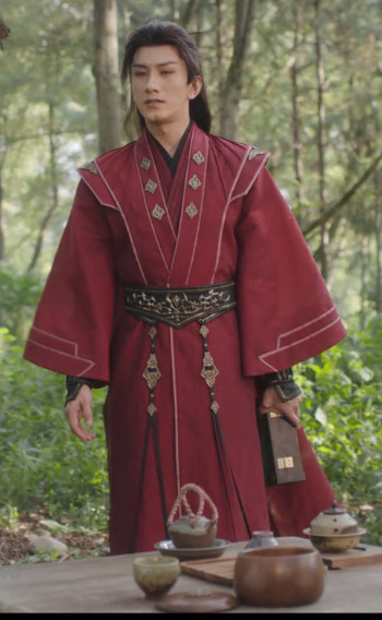
LLH and FDB both call him Di mengzhu in the wangchuan flower scene, because he's clearly dressed in a way that makes this an Official Visit. I find it fascinating that he wears his alliance leader outfit instead of his grey, maroon, and gold outfit that he wears for non-alliance matters (aka. the wedding room outfit, which he also wears for such Xiangyi-related purposes as the reunion duel that doesn't happen and grieving for him in the middle of the night). After all, he's giving LLH a gift to save his life and issuing him a friendly anniversary honeymoon challenge, so you'd think that would call for his dating outfit, not his official garb.
BUT! What if he's using his official Alliance Leader regalia as a way of saying that not only a-Fei/Lao Di, but also Di Mengzhu and the Jinyuan Alliance want him to live? It's more than just essentially creating Peace Treaty version 2.0, and trying to get life back to what could have been if SGD and JLQ hadn't ruined everything: their people at peace, and the two of them meeting for friendly duels rather than death matches. Yes, only LLH and FDB are there to witness it, but by showing up in his Official Capacity, he's also correcting all the narratives about the enmity between himself and Li Xiangyi, and in giving him the flower, he's officially declaring that Di Mengzhu wants Li Lianhua to heal and have his strength and power back more than he wants to gain martial arts power himself.
This is a HUGE deal. DFS formed the Jinyuan Alliance as a way of climbing the ranks of the jianghu, because his goal was to gain strength so he'd never be helpless or forced to do someone's bidding again. And yet, he wears the outfit that symbolizes that striving and his place at the top of it to GIVE AWAY THE FLOWER THAT WOULD CEMENT HIS PLACE AT THE TOP OF THE JIANGHU. He wants Li Lianhua to not just live but also to regain the strength SGD and JLQ stole from him, which would mean that Li Xiangyi would quite possibly defeat him, and he would welcome that, because it's not about self-protection anymore: now, what he wants more than anything else, is for Li Xiangyi/Lianhua to live.
If that's not enough of an emotional gut punch, try this: Di Feisheng told Li Xiangyi at the start of the show that swordsmen shouldn't have weaknesses. Di Feisheng has only really had two "weaknesses" (vulnerabilities might be more accurate): his desiring the wangchuan flower (which led to SGD and JLQ incapacitating him) and Li Lianhua. It feels like a monumental shift to me that, at the end of the show, Di Feisheng hands one weakness to the man who is the other: essentially, he is announcing to the world that nothing is more important to him than Li Lianhua's recovery, and he doesn't care who knows it.
It also feels very pertinent that his official outfit is wedding red, and he's essentially showing up in his fanciest remaining outfit to offer Li Lianhua his heart on a platter priceless magical flower in a box the way someone might show up at the house of their beloved with boxes and boxes of betrothal gifts. Not that DFS explained that or LLH picked up on it, because that would involve better communication skills than either of them had.
#mysterious lotus casebook#mlc meta#lianhua lou#lhl#asks answered#Di Feisheng#Li Lianhua#Fang Duobing#costumes#feihua#dihua
148 notes
·
View notes
Text
General Kratos (no-ashes OOAK, part 2)
What's going on here?
Part 1 - Head
Poor me, it's been a while. Lasted autumn was a hard time for me, but I tried to find time and strength to continue making this OOAK anyway.
Here could be a scream like" NEVER AGAIN!!", but it won't be here, because it is a lie, yeah? Yeah.
Of course I knew that making Kratos's Dominus armor is going to be difficult even with the experience I had with Ares (❤). And it was! Kratos's outfit turned out more layered, had more elements, more different textures. I am just afraid that photos can have a so-so quality, i am sorry..
Well, come on under the cut.
When I made Ares, I've already said that I wanted to be as close to the gow1 design as it possible. Not a simple task, there is only one cutscene in gow1, where you can see this armor's details closely, and also I found a couple of early concepts.

Dominus armor was also made as a custom skin for the gow3 and I used a couple of screenshots from there for the shin panels, but somehow gow3 variation of this outfit has a little different... mood.. I don't know. More bitchy vibe maybe?
Well, anyway everything starts with the cuirass.
--------------
Cuirass
I decided to make a cuirass differently this time, taking into account that Kratos's torso should not be scratched anyhow while taking the armor on and off, because of his body art.
In some way his outfit is more realistic, I mean, at this screenshot you can see that he wears chiton under the armor. Bad news for the future-me, I thought then, but it solved a problem with scratches.
As we can see, his cuirass is a classic Lorica musculata, and I was going to made it the same way I made Ares's armor, using linen fabric and CVA glue. I wanted his cuirass be a single piece, wearing over the head, with fasteners on the sides, so I changed a pattern since the last time and started to glue.
After separating a base from the body, I started to sculpt a relief of the pectoral, abdominal and back muscles. I've had a couple of tries actually, because i needed to be sure that the relief won't crack during bending armor in shoulderstraps. After curing I sended a sculpt, put layer of a patch, and the base is ready.


Well it was an easy part. Here was a huge timeskip in real life, because I sat there and brainstormed how to make these "birds" over the chest. At screenshot you can see that their claws also forms a line of a diaphragm. An obvious option was just to sculpt these birds, but I was afraid of material cracking near the collar and armholes. So there was no other option, but to make these bas-reliefs also of the thick fabric.
Nothing scary, right? Just draw a bird, move the pattern, cut it and glue it over the cuirass.


After that I've just needed to seal all the edges with silky cord and paint everything with acrillic paints.


Oh, and sew hooks-fasteners.
---------------
Skirt and belts
After the cuirass I went south. Because I was afraid of a rectangular piece of fabric, which could end my whole career. (I mean chiton... I wasn't ready for it. And then I still didn't have a right fabric for it.)
Okay, as a General Kratos doesn't wear pteruges, he wears skirt with two long plate belts with relief and some chain-mail piece. Same as Ares has, or I'd say, same as Freya has, yeah. Looks more like her chain-mail, also made from tiny round plates.
Skirt was an easy thing to do. I used a simple dark-brown leather with the silky golden cord over the edge.


Chain-mail is more interesting. Of course I could make my life difficult and make it by myself, but for such miniature when you can find an already perfect piece of material, it is much better. Small, weaved, metallic round plates.. with smooth surface.. I used earrings for this. Just torn them with plyers in a right way and painted with acryllics, and sewed to the skirt.
Long belts also needed to be made of metallic plates, but I sculpted them, glued to the knitted base for the realistic movability and painted also with the acryllics.


--------------
Chiton and wraps (and bracers)
Okay, maybe one more little rant won't hurt anyone. Do you know what's the most wrecking thing you deal with while working with a rectangular pieces of fabric? You should find not only the right color, but a right feeling.
Maybe it is just me, but I think, when you make an ancient warrior doll, you can't use fabric which feels too.. modern, when you look at it or touch it. Even if Kratos was hm quite wealthy as a general, Spartans themselves were very ascetic people, they used simple fabrics with rough textures. But at the same time it should not be too rough to the body and it shouldn't be too thick, because it is underwear.
Long story short, muslin is my friend now. But sewing process is not my friend. How I am glad that all greek clothes is a differently sized rectangulars. I know I am not making chiton right, it should be wearing around the body and pierced over the shoulders. But you can't be absolutely realistic everytime. Besides, it is still an underwear, it's main goal is preventing scratches of the body.
Bracers were easy. Just a glued fabric again with the cotton cords at the edges and a schematic golden depictions of goddess Nika standing on the globe. (I discovered this today lol..).


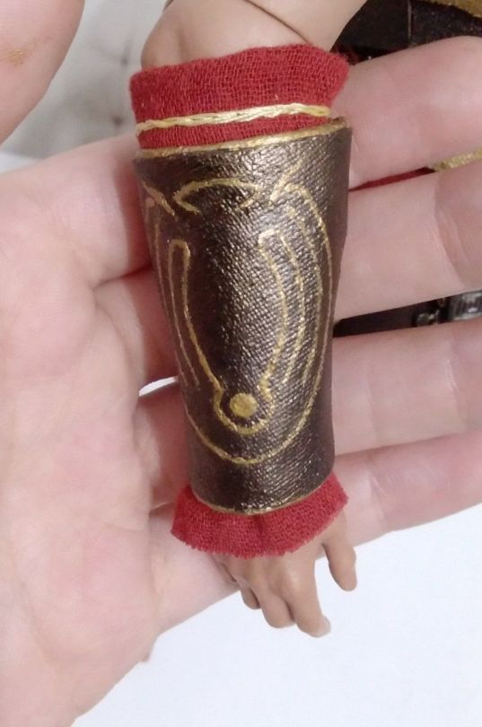
---------------
Sandals and shin panels
Muslin is still my friend here and sewing is not, because I needed to start with preparing wraps again, which covers legs from the toes to the knees. Hm, smart..

Design of the sandals and shin panels I took from the gow3 variant of this armor. I pretend that they are a single pieces too...
I've already had a good pair of the leather soles so I glued wraps to them and started to make a base for the shin panels. Same way I did them for Ares. Fasteners of the panels and sandals stripes are also from the cotton cords.


------------
And... Prepare your spirits, General is here.
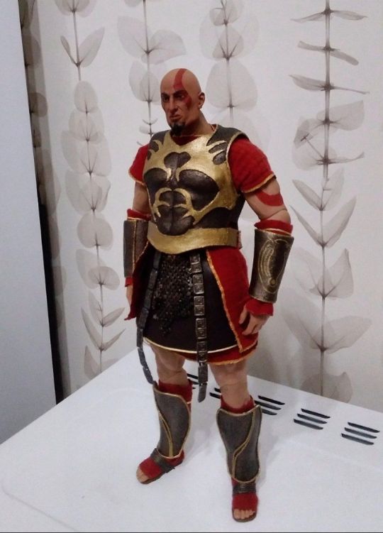
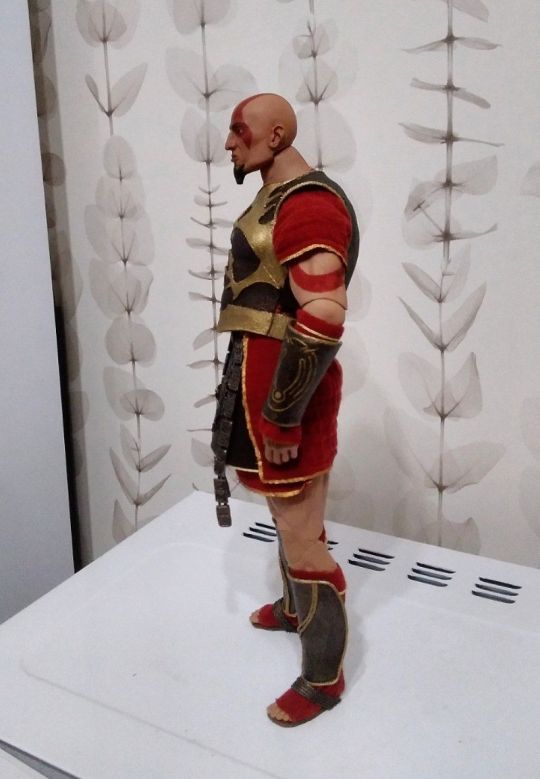
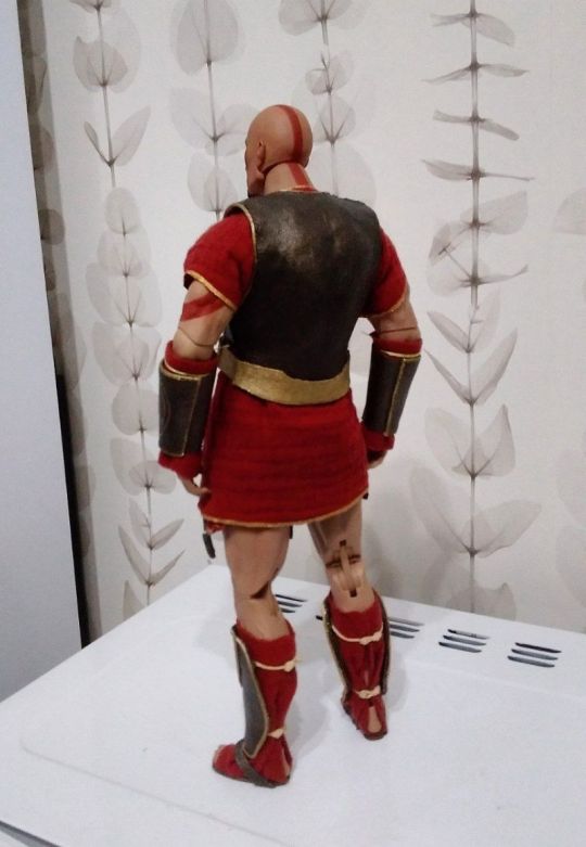
Fuf. And this is it. Dominus armor is complete. But is this the end???????
No.
Because Kratos is not a whole person without the most important thing in his life. Yeah yeah, the reason this entire project took almost a year is because I was made Lysandra and Calliope at the same time with Kratos. And they are finished too at this moment. I'll try to write posts for both of them soon, but now, at the Christmas Eve I wish you have a good time with your families.
Merry Christmas, my dears, and Happy upcoming New Year!

See ya very very soon and thank you for watching.
#kratos#gow kratos#God of war#upn the sky handycraft#action figures#god of war fanart#ooak doll#ooak#god of war kratos
27 notes
·
View notes