#;PSD Tutorial
Explore tagged Tumblr posts
Visit Tumblr Blog
Explore Tumblr blogs with no restrictions, modern design and the best experience.
Last Seen Tumblr Blogs


Fun Fact
In 2020, 27% of US Tumblr users had an annual household income of over $100,000.
Text
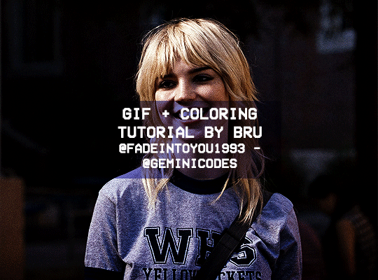
Hello! I've decided to make an updated tutorial on how I gif, since some of my giffing methods have changed since I made my first one (and this one is still valid, by the way! I've just changed a few things and I thought the update would be good.)
In this tutorial you'll find:
A download link for Photoshop CC 2020;
Step-by-step instructions on how to make gifs and color them;
A sharpening action for your gifs;
A base psd for gifs.
Get the tutorial here (just type 0 to get it for free, and if you'd like to support me, any amount is extremely appreciated).
I accept commissions for tutorials + support me on ko-fi?
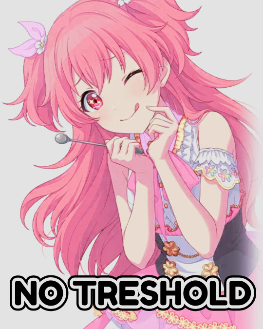
#tuserdee#dailyresources#completeresources#userbecca#gif tutorial#gif resources#mine#resources#*#my tutorials#tutorials#my resources#gif#my psds#my actions#psds#actions#reposting it on main bc fucking sideblog is shadowbanned LOL!!!!!!!!!!!
413 notes
·
View notes
Text
My GIF Making process: Screen capturing using MPV player, Organizing files, 3 Sharpening settings, Basic Coloring PSD + Actions set

This is a very long post so heads up.
I’ll try to be as thorough and true as much as possible to the way I make my gifs (I already use Photoshop Actions which I’ve long since set up but now for this tutorial I’m reviewing them to show you the exact steps I’ve learned to create my gifs 😃) and present them to you in a semi-coherent way. Also, please bear with me since English is my second language.
First things first. Below are the things and tools we need to do this:
Downloaded 4K or 1080p quality videos (let’s all assume we know where to get these—especially for high definition movies and tv series—so this post doesn’t get removed, okay? 😛)
Adobe Photoshop CC or the CS versions can work as well, but full disclosure I haven’t created gifs using the CS versions since 2020. I’m currently using Adobe Photoshop 2024.
mpv player. Use mpv player to get those frames/screenshots or any other video player that has a screen grabber feature. I’ve used adapter for the longest time but I’ve switched to mpv because the press to screenshot feature while the video is playing has been a game changer not to mention ultimate time saver for me. For adapter you need to play it in another video player (like VLC player), to get the start and end timestamps of the scene you want to gif which takes me ages before I can even open Photoshop.
Anyway! Please stop reading this post for a moment and head over to this amazing tutorial by kylos. She perfectly tells you how to install and use mpv player, both for Mac and Windows users.
One thing I have to share though, I had a tough time when I updated my MacOS to Sonoma since MPV is suddenly either duplicating frames or when I delete the duplicates the player seems to be skipping frames :/ I searched and found a solution here, though it didn’t work for me lol. My workaround for this in the meantime is decreasing the speed down to 0.70 then start screenshotting—it’s not the same pre Sonoma update but it works so I’ll have to accept it rather than have jumpy looking gifs.
Now, after this part of kylos’ tutorial:

you can continue reading the following sections of my gif tutorial below.
I want to share this little tip (sorry, this will only cater to Mac users) that I hope will be helpful for organizing the screenshots that MPV saved to the folder you have selected. Because believe me you don’t want to go through 1k+ of screenshots to select just 42-50 frames for your gif.
The Control + Command + N shortcut
This shortcut allows you to create a new folder from files you have pre-selected. As you can see below I have already created a couple of folders, and inside each folder I have selected screenshots that I want to include in one single gif. It's up to you how you want to divide yours, assuming you intend to create and post a Tumblr gifset rather than just one gif.

Another tip is making use of tags. Most of, if not all the time, I make supercorp gifs so I tag blue for Kara and red (or green) for Lena—just being ridiculously on brand and all that.
Before we finally open Photoshop, there's one more thing I want to say—I know, please bear with me for the third? fourth? time 😅
It's helpful to organize everything into their respective folders so you know the total number of items/frames you have. This way, you can add or delete excess or unnecessary shots before uploading them in Photoshop.
For example below there are 80 screenshots of Kara inside this folder and for a 1:1 (540 x 540 px) Tumblr gif, Photoshop can just work around with 42-50 max number of frames with color adjustments applied before it exceeds the 10 MB file size limit of Tumblr.

Sometimes I skip this step because it can be exhausting (haha) and include everything so I can decide visually which frames to keep later on. You'll understand what I mean later on. But it's important to keep the Tumblr 10 MB file size limit in mind. Fewer frames, or just the right amount of frames, is better.
So, with the screenshot organization out of the way, let's finally head over to Photoshop.
Giffing in Photoshop, yay!
Let’s begin by navigating to File > Scripts > Load Files into Stack…

The Load Layers window will appear. Click the Browse button next.
Find your chosen screenshots folder, press Command + A to select all files from that folder then click Open. Then click OK.
After importing and stacking your files, Photoshop should display the following view:

By the way, I'll be providing the clip I've used in this tutorial so if want to use them to follow along be my guest :)
If you haven't already opened your Timeline panel, navigate to Windows > Timeline.
Now, let's focus on the Timeline panel for the next couple of steps.
Click Create Video Timeline, then you’ll have this:

Now click the menu icon on the top right corner then go to Convert Frames > Make Frames from Clips

Still working on the Timeline panel, click the bottom left icon this time—the icon with the three tiny boxes—to Convert to Frame Animation
Select Make Frames From Layers from the top right corner menu button.
So now you have this:

Go and click the top right menu icon again to Select All Frames
Then click the small dropdown icon to set another value for Frame Delay. Select Other…

The best for me and for most is 0.05 but you can always play around and see what you think works for you.
Click the top right menu icon again to Reverse Frames.
I think Photoshop has long since fixed this issue but usually the first animation frame is empty so I just delete it but now going through all these steps there seems to be none of that but anyways, the delete icon is the last one among the line of feature buttons at the bottom part of the Timeline panel.
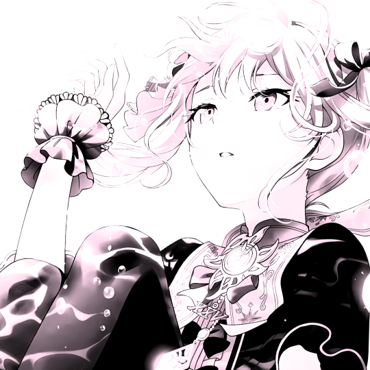
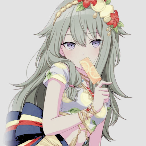
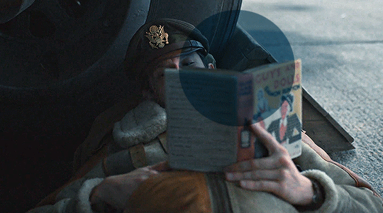
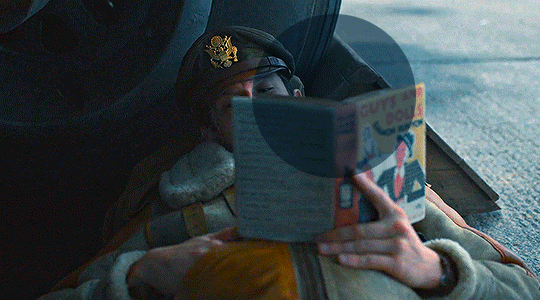
Yay, now we can have our first proper GIF preview of a thirsty Lena 😜

Press spacebar to watch your gif play for the very first time! After an hour and half of selecting and cutting off screenshots! 😛 Play it some more. No really, I’m serious. I do this so even as early (lol) as this part in the gif making process, I can see which frames I can/should delete to be within the 10 MB file size limit. You can also do it at the end of course 🙂
Now, let’s go to the next important steps of this tutorial post which I’ve numbered below.
Crop and resize to meet Tumblr's required dimensions. The width value should be either 540px, 268px, or 177px.
Convert the gif to a Smart Object for sharpening.
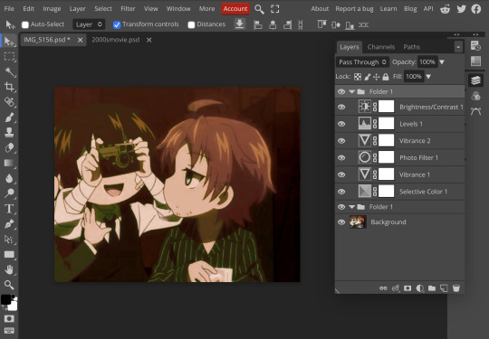
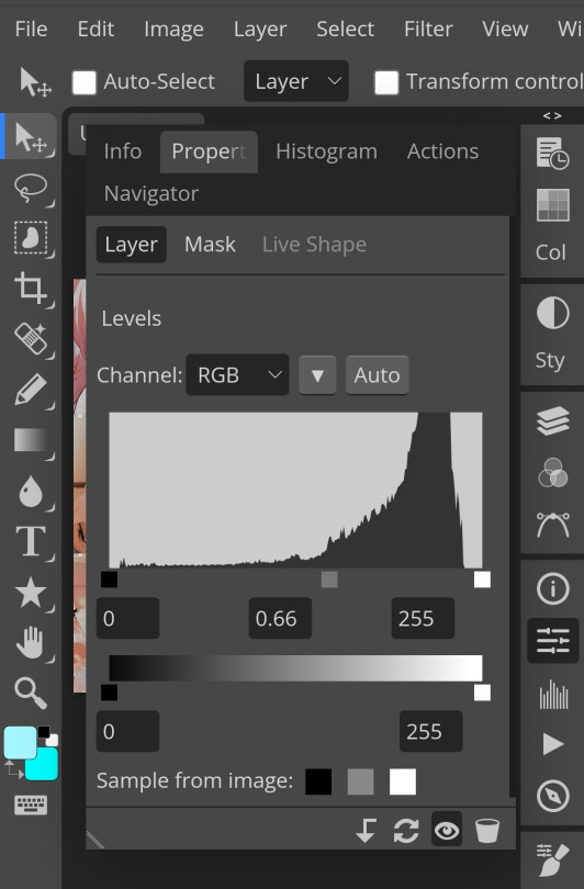
Apply lighting and basic color adjustments before the heavy coloring. I will be sharing the base adjustments layers I use for my gifs 😃.
1. Crop and Resize
Click on the Crop tool (shortcut: the C key)

I like my GIFs big so I always set this to 1:1 ratio if the scene allows it. Press the Enter key after selecting the area of the frame that you want to keep.
Side note: If you find that after cropping, you want to adjust the image to the left or another direction, simply unselect the Delete Cropped Pixels option. This way, you will still have the whole frame area available to crop again as needed and as you prefer.
Now we need to resize our gif and the shortcut for that is Command + Opt + I. Type in 540 as the width measurement, then the height will automatically change to follow the ratio you’ve set while cropping.
540 x 540 px for 1:1
540 x 405 px for 4:3
540 x 304 px for 16:9
For the Resample value I prefer Bilinear—but you can always select the other options to see what you like best.
Click OK. Then Command + 0 and Command + - to properly view the those 540 pixels.

Now we get to the exciting part :) the sharpen settings!
2. Sharpen
First we need to have all these layers “compressed” intro a single smart object from which we can apply filters to.
Select this little button on the the bottom left corner of the Timeline panel.


Select > All Layers
Then go to Filter > Convert for Smart Filters
Just click OK when a pop-up shows up.
Now you should have this view on the Layers panel:

Now I have 3 sharpen settings to share but I’ll have download links to the Action packs at the end of this long ass tutorial so if you want to skip ahead, feel free to do so.
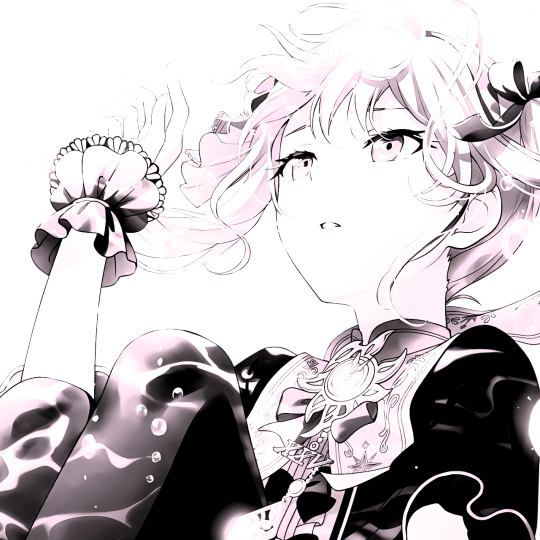
Sharpen v1
Go to Filter > Sharpen > Smart Sharpen…
Below are my settings. I don’t adjust anything under Shadows/Highlights.
Amount: 500
Radius: 0.4
Click OK then do another Smart Sharpen but this time with the below adjustments.
Amount: 12
Radius: 10.0

As you can see Lena’s beautiful eyes are “popping out” now with these filters applied. Click OK.
Now we need to Convert to Frame Animation. Follow the steps below.
Click on the menu icon at the top right corner of the Timeline panel, then click Convert Frames > Flatten Frames into Clips
Then Convert Frames > Convert to Frame Animation
One more click to Make Frames From Layers
Delete the first frame then Select All then Set Frame Delay to 0.05

and there you have it! Play your GIF and make sure it’s just around 42-50 frames. This is the time to select and delete.
To preview and save your GIF go to File > Export > Save for Web (Legacy)…
Below are my Export settings. Make sure to have the file size around 9.2 MB to 9.4 MB max and not exactly 10 MB.

This time I got away with 55 frames but this is because I haven’t applied lighting and color adjustments yet and not to mention the smart sharpen settings aren't to heavy so let’s take that into consideration.
Sharpen v1 preview:

Sharpen v2
Go back to this part of the tutorial and apply the v2 settings.
Smart Sharpen 1:
Amount: 500
Radius: 0.3
Smart Sharpen 2:
Amount: 20
Radius: 0.5
We’re adding a new type of Filter which is Reduce Noise (Filter > Noise > Reduce Noise...) with the below settings.

Then one last Smart Sharpen:
Amount: 500
Radius: 0.3
Your Layers panel should look like this:

Then do the Convert to Frames Animation section again and see below preview.
Sharpen v2 preview:

Sharpen v3:
Smart Sharpen 1:
Amount: 500
Radius: 0.4
Smart Sharpen 2:
Amount: 12
Radius: 10.0
Reduce Noise:
Strength: 5
Preserve Details: 50%
Reduce Color Noise: 0%
Sharpen Details: 50%
Sharpen v3 preview:

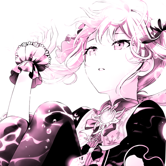
And here they are next to each other with coloring applied:
v1

v2

v3

Congratulations, you've made it to the end of the post 😂
As promised, here is the download link to all the files I used in this tutorial which include:
supercorp 2.05 Crossfire clip
3 PSD files with sharpen settings and basic coloring PSD
Actions set
As always, if you're feeling generous here's my Ko-fi link :) Thank you guys and I hope this tutorial will help you and make you love gif making.
P.S. In the next post I'll be sharing more references I found helpful especially with coloring. I just have to search and gather them all.
-Jill
#tutorial#gif tutorial#photoshop tutorial#gif making#sharpening#sharpening tutorial#photoshop#photoshop resources#psd#psd coloring#gif coloring#supercorp#supercorpedit#lena luthor#supergirl#my tutorial#this has been a long time coming#guys. i'm BEGGING you. use the actions set - it was a pain doing all this manually again ngl LMAO#i've been so used to just playing the actions#so this has been a wild refresher course for me too 😆
769 notes
·
View notes
Text


Hello guys! Today ill make a tutorial on how to use psds! Dont be scared, its really easy and very fun too!

First, open photopea with the image you wanna use. click “File” and press open, after that, you open your files and select your psd!
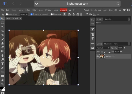


Great! Now we have the psd! But what do we do with it…?
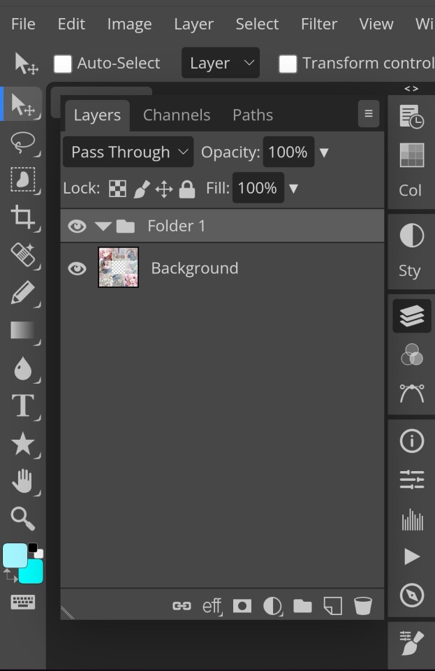
well, first you need to check that youre on the right layer: Make sure youre selecting your psd folder before doing anything here!

great! Now click “layer” and after that, “duplicate into”

Now make sure you change it to the name of the project you wanna apply the psd to!


Enjoy your edits!
Feel free to send in an ask if you have any questions or something wasnt clear enough! Im always happy to help. See ya!

#⌗ 🍦 ⊹⁺ Marking what is mine#rentry decor#photopea psd#psd#psd tutorial#editing resources#edit tutorial#rentry inspo#editblr#rentry resources
537 notes
·
View notes
Text
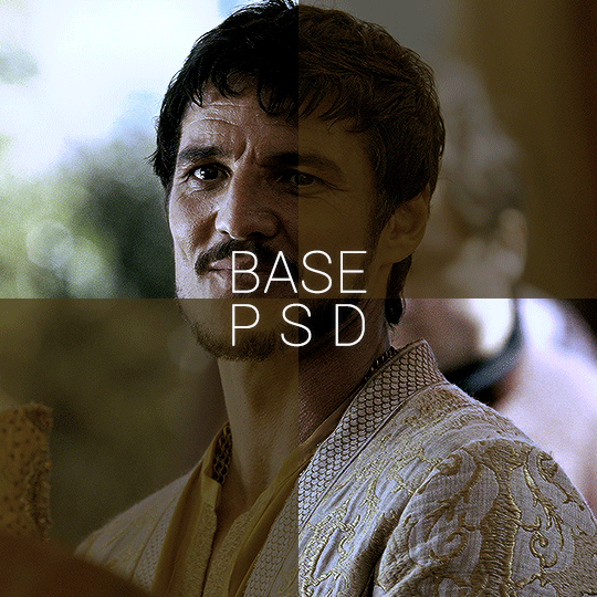


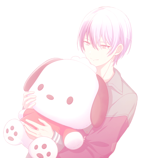
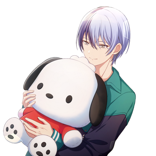
BASE PSD FOR HDR CAPS by @manny-jacinto
- as per requested by @lady-alicent, this psd is specifically made for HDR muddy caps. this probably won't work for SDR caps - like / reblog if you use - don’t repost or claim as your own *note: this was made on a mac with a retina display so the coloring may be off according to what computer you use
download link | basic coloring tutorial
#userzil#usergif#psd#psds#gif psd#base psd#photoshop tutorial#photoshop tip#hdr#photoshop#resources#*#fair warning this will also probably do not work on every HDR caps. every scene is lightened differently
456 notes
·
View notes
Text

Hello everyone! With the poll on my main blog, many ppl have voted for a psd tutorial so here it is! Here are some things to note:
✦ ・ There is NO fixed way on making psds and this is simply my way of going through it.
✦ ・ this will be a in depth tutorial so it'll show u my whole process! Skip to step 3 for actual process.
✦ ・ there are other tutorials on tumblr that i def recommend! Such as @/canarysage and @/imbermagnvs
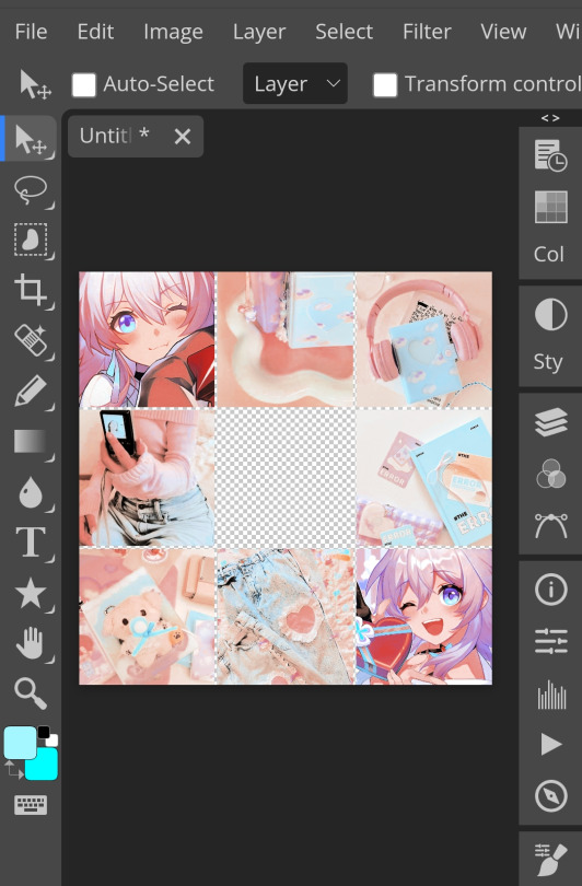
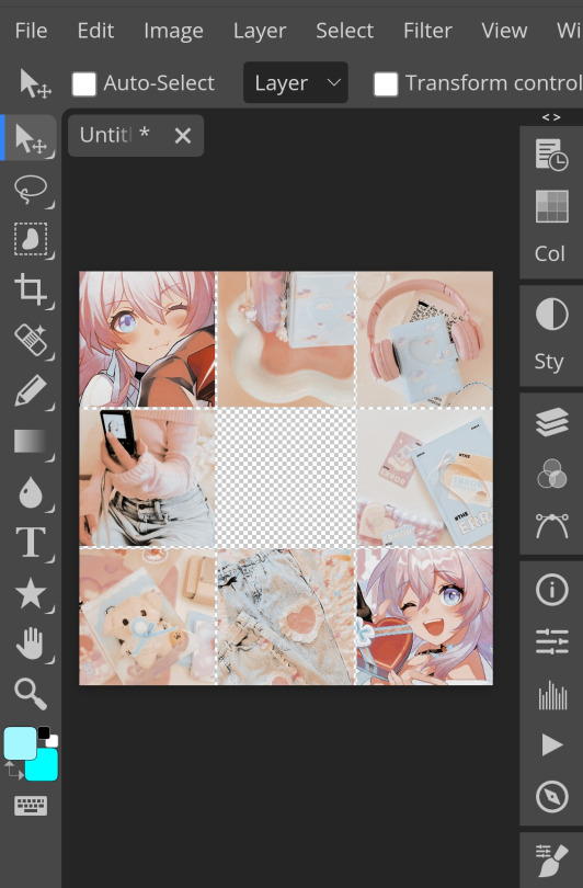
1. Lets get straight to the point! Choose the image(s) you want, i often make a moodboard first but thats optional and you can just choose ur image. (not sure if anyone needs this but to import or place images, press file -> open)
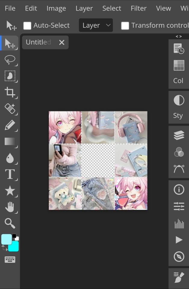
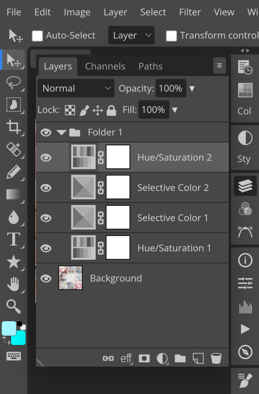
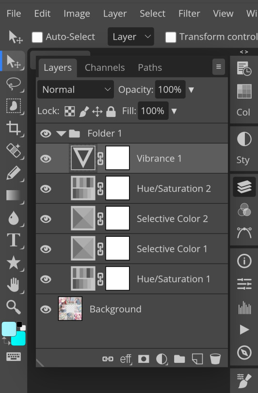
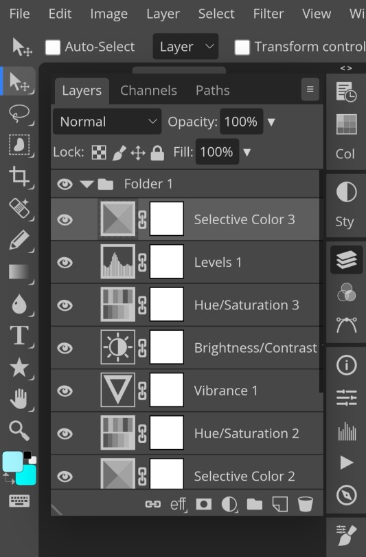
2. Next, make a folder by pressing the layer button (the 5th button the right based on my image)
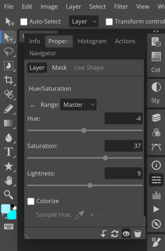
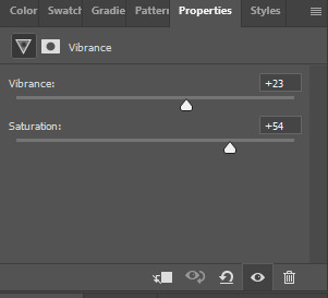
3. Firstly, i use hue/saturation to make her a lil more vibrant so my colours can be more uhhh vibrant or vivid.
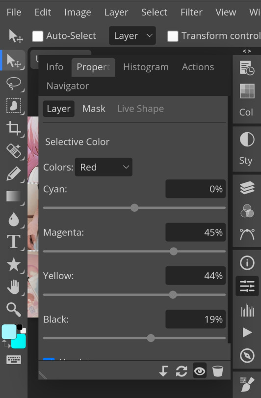
4. Now, every editors fav! Selective colour 💓 I'm not really good at explaining so pls visit canarysage to see what it is! It's good to tweak some colours without affecting the other colours.
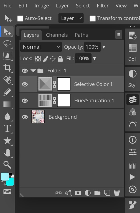
5. I recommend adding more selective colours as i added few more but cuz of the limit i can't show u help but i recommend adding 2-3 anyways! This is the psd so far which seems okay but to me it doesn't pop out so I'll be adding on
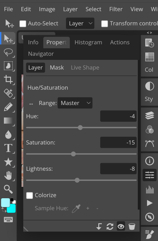
7. So i decided to add hue/saturation w the same reason as point 3.
8. Next, i use vibrance to not oversaturate the image.
9. Now i use brightness and contrast, It’s often used for quick n straightforward edits to enhance visibility.
10. Let's add another hue/saturation layer cuz why not! Please remember to experiment w what u do since this is how you can have your own "style" of making ur edits.

10. Next, let's add levels! I recommend checking out canarysage since they explained it better than i ever could.

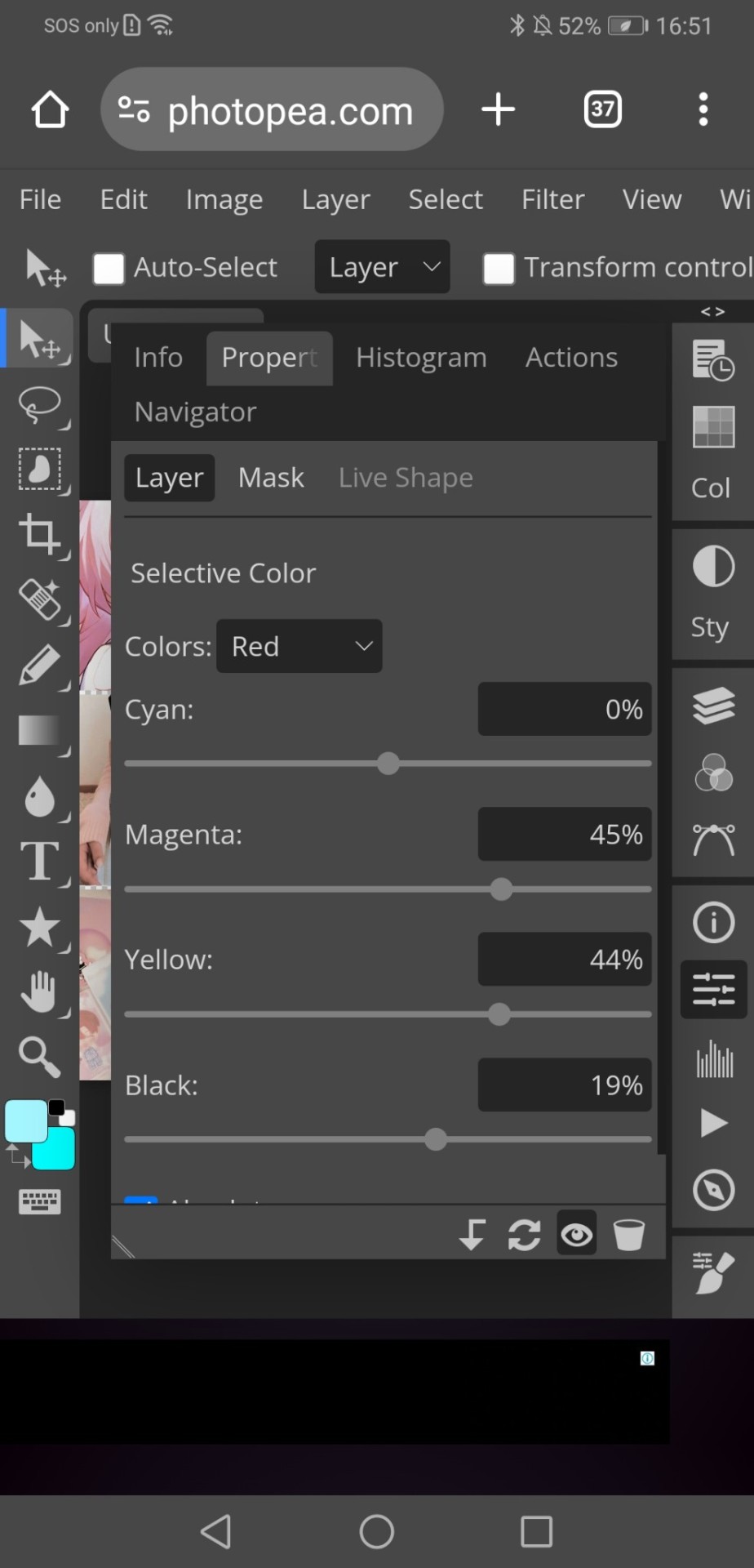
11. Now, another layer of selective colour
and tada! This is my psd so far but i love those psds that r bright so I'll add on but this is optional!
12. Now let's add a channel mixer to create some custom effects <3
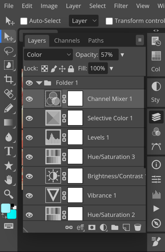

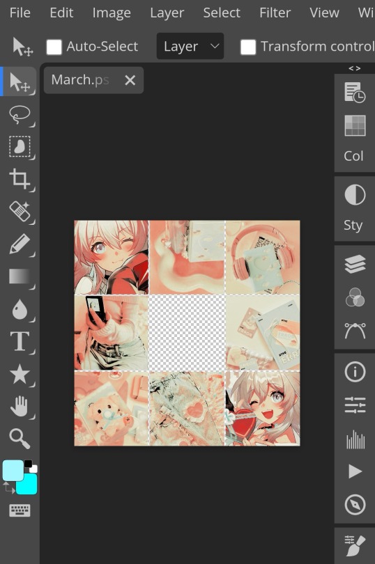
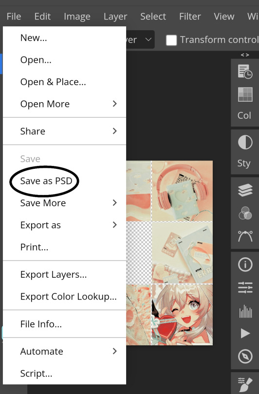
And here's the psd outcome! You'd wanna save it as save as psd (i HIGHLY recommend you put ur psd on a 100x100 canvas w a pic so it doesn't take much space)
ANOTHER NOTE!! i always test my psd on dark skin characters afterwards and made adjustments when needed i realised my selective colours made em abit red so feel free to adjust if ur using this tutorial! If u made it this far drop a follow 😈
191 notes
·
View notes
Note
hii can I please ask what psd you use? liek the pink/grey/black one? its supar pretty... thank u if u respond... :3 ♥︎
henloo!! thank chu 04 liking mi cwoloring !! (*´ω`*) bwut 04 this ,,, ki did nwot use a psd !! instead ki used a gradient mwap ! so hwere it is ^_^ :
(pt: hello!! thank you for liking my coloring !! (*´ω`*) but for this, i did not use a psd!! instead i used a gradient map! so here it is! ^_^ /end pt.)

if kyu want a tutorial on how ki mwade thy cwoloring without ibis premium ,, then hwere is the free version below under thy cwut!
(pt: if you want a tutorial on how i made the coloring without ibis premium, then here is the free version below under the cut! /end pt.)
i will not be using typing quirks for this since it may occur for some users not being able to read! ^_^♡
so step 1: you can go to ibis paint then click the brush button at the bottom, then you might find a button called filter! which looks like this

then, click adjust color after u got into filter, u may see it since there's a corner with the effects in order

after that, scroll on the right side a bit then you might appear to see a button called grayscale.

my settings: copy if needed!

then your image will appear in the colors black and white! for me it looks like this:
then you can add a new layer and put on clipping mode, then choose a light shade of pink! then go to blending mode then choose "overlay" in the lighten section (*´ω`*)
here are some examples with the shades i used below, i will be including the hex codes so that you may use it too!
#FFD8EE
#FFE0F2 (brighter)
#FFA5D9
sorry if this sounds complexed or messy! send asks or questions here and I will be happy to answer all of them! 🫶🏻
+ here are some free gradient map websites ^_^
#𓈒𓊆ྀ۪۪𓈒 𓈒 ۪ ݁ ིུ🫐 ۪ ۪ ۪ SELYSiE ུཾ ۪ ׂ. ̼͜ ͝͏ ྀི͜#₊𓎟 ˚ ᧔𓉸᧓𓂃 ˛ kuni's inbwox . .#┄ ଘ( ཫ . ᵔ ) ꔫ ⁺ pwuppet’s rsrcs#kuni's tuts tags#psd#coloring#tutorial#psd coloring#ibis paint
201 notes
·
View notes
Text
PHOTOPEA TUTORIAL / PHOTO FILTER FOR SKIN TONES:
a tutorial on HOW TO BRING OUT SKIN TONES if an image is 'too gray' (faded) or has too much of one (likely over saturated) color! this technique can easily be applied to icons that already have a border ! just put your focus on the base image / icon ! this works on relatively anything, including poc and non-poc. WHAT YOU WILL NEED: photopea...and your desired your base image(for example, i'll be showcasing inconsistent or otherwise dark/faded scene lighting, like twilight and saw). DISCLAIMER: not all lighting/images are the same, nor are psd colorings. while some colorings may be designed to bring out reds/yellows(which is the filters we'll be using in this specific example), others may mute them and you may have to improvise with whatever color the psd you're using is designed to focus on. this is just a general idea, you will have to explore as you see fit. it's all going to depend on your personal taste !
by the end of this, you should be able to manage results like this !

cool, huh?....anyway, on with the mechanics !
EXAMPLES:

[ BEFORE PSD ] [ SYNOPSIS ]
#01 / LEFT IMAGE ABOVE: too much green, becomes muted with psd and doesn't show variety. #02 / RIGHT IMAGE ABOVE: the colors are very faded in this scene, and the pink focused psd in question made the image seem gray. we will start with EXAMPLE #01. i will be using the same PSD on both, a custom psd i made and focuses on reds/pinks.

as you'll see above the PSD has now been applied...but now it's kinda boring :// (there's nothing wrong if you don't mind how it is above, everyone's got their aesthetic choice—HOWEVER, we're aiming to add skin tone...)
once you have your image open, you'll want to go to image>adjustments>photo filter; i went ahead highlighted it in yellow for easy finding !

since this psd DOESN'T mute reds/yellows, (and those are usually the base of most/general skin tone combinations) i applied both a yellow and red filter. now, these colors i'll be using in this example, because they're in my default colors on the photo filter option—you can totally choose lighter or darker variants of these colors, or like i said, a different color altogether based on how the PSD you're using works. the toggle setting doesn't have to be exact to this example either—this is just what worked best on this image combined with the chosen PSD ! // RIGHT IMAGE IS THE FINAL RESULT AFTER APPLYING THE RED FILTER AFTER THE YELLOW.


repetition on a different example . . .


this scene in particular is very faded, and the red feels a little blotchy/over saturated here...so i'll show you an EXTRA STEP you can use ! in saying this, you don't have to do exactly this; you can even choose to go ahead with selective color to fix your image, without doing the filters, if you find that suitable. but i'll be showing you the magic of selective color to balance out the red toned overlay.

same concept as before, just a different selection: image>adjustments>selective color. think of selective colors as "balancing" the colors. it does have a toggle selection for each color, which is super helpful, including diminishing or adding white highlights. given the PSD colors, naturally, i'll be focusing on yellow and red.


it's now got a general skin tone and red is not as blotchy !
[ FINAL RESULTS / CONSISTENCY WITH PSD APPLIED ]

this is a great hack i use quite a bit, it's great for maintaining consistency in your icons when the lighting is working against you...hope this was comprehensible and helpful, happy editing !
#* RE - RELEASE#* MY TUTORIALS.#sorry i didnt realize i forgot to reupload this one!#long post /#FREE TO REBLOG !#rp community#icon tutorial#rp icon tutorial#psd tutorial#roleplay coloring#roleplay help#roleplay resources#roleplay community#roleplay graphics#coloring psd#psds#icon psd#psd#roleplay psd#rp graphics#rp psd#rp resources#tutorial#editing tutorial#rpc tutorial#editing resources#psd coloring
254 notes
·
View notes
Text
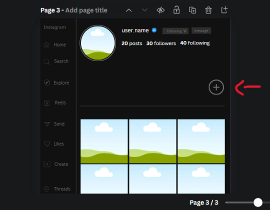
𓈒༷♪˚.✧ How to make a mockup like this for smaus, ocs, etc. (step-by-step tutorial ☆ no Photoshop, easy, free) (requested by @lovebittenbyevans) ✿
guys this took me two hours to make and you could probably get this done in like, 30 minutes :) I hope this is coherent <3 Please look back this image for comparisons, if my explanation is not well explained, etc.
first of all, if you dont already have one, make a free canva acount. once you're signed in, hit the purple "create design" button on the sidebar. A pop-up will appear with different design template options. For this design, we want the dimentions to be 1080 x 1080, so you can either make a custom size or choose the instagram post (square) template by either searching or scrolling through the list.

2. Now you have a blank page. Zoom in with the slider at the bottom of the page if you need to (Mine is currently zoomed in 41%). Click on the page and change the color to an off black (hex code #111111).
3. Now that the color is changed, click the "elements" tab and search "line". Click the shape and it will add it to the page automatically. These line are particularly hard to navigate and hard to get it at the right angle and length so this part might take a little longer than the rest.
4. stretch it from top to button and turn in a 90 angle so its straight on the left side of the page. Change the color of this as well to a grey tone (hex code #2F2F2F).
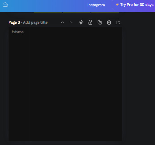
5. Now we'll add the Instagram logo. Click the "text" tab then click the purple "add text box" button. Write "Instagram" in the box and change the font to "apricots". This is the closest font I could find that resembled the logo font but if you find a better one, feel free to use that instead. Make the font size 19.3 (you can do this manually or do it in the text options). Change the color to grey color (hex code #707070). Add it to the upper left corner of the page like this:
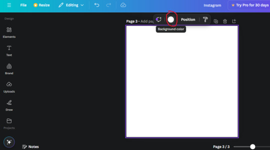
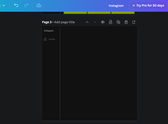
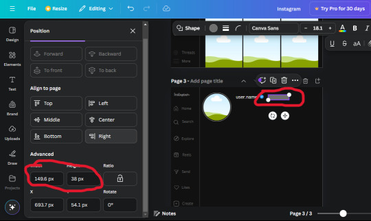
6. now we're adding icons and a menu inside the border we just made. Click the "elements" tab again and search for "instagram home icon" and add the element by sketchify to the page. Click the home icon, an options icon with pop-up above the page. Look for the "Position" button and click it. Scroll to find the advanced options and you can manually type in the width and height at 26.6 and 28.7.
Move it inside the border, under the logo (photo below). Change the color again (the hex code is #707070).
7. Open the text tab and add a text box. Change the font to Canva Sans and write "Home" in the box. Change the font size to 18.1 and align with with the house icon. It will look something like this,
8. Go into the elements tab again and search "instagram search icon". Scroll until you find the one by sketchify and add it to the page.
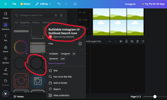
9. Shrink it so the W and H is at 36.6 and 31.3. Move it below the home icon until a purple "67" pop ups and aligns under it. Change it to the same color as the Home text and icon (#707070). Go ahead and Duplicate the the "Home" text box and clicking it and a pop-up will show up then edit the text so it says "Search" and align with the searcch icon we just added.
10. You know the drill. We are continuing to search up more icons in the "elements" tab. Search "instagram compass icon" and choose the one by sketchify (are u seeing the pattern?). Add it to the page and change the width and heigth to 33.1. align it under the search icon just like how we did before and change it to the say colors as the other icons.
11. Do the same as before and write "Explore" in a text box and align it with the icon. We're doing the same thing for all of these.
We'll be using the same search prompt for all of these icons so just change the type of icon you're looking for like we've done before hand. Next look for the Instagram reel icon and add the outlined one by sketchify and change the W and H to 31.2 x 30.9. Change the color to the ones we've used before, align it underneath the icons above and add your text ("Reels").
12. The next icon is an outlined, "sent" one. W and H is 31.1 x 27. The text will say "Send". Then an heart outline by sketchify; W and H is 34.2 x 29.1 and the text is "Likes". Next is the "create" outline icon by sketchify, W and H is 36.8.
(p.s if you are struggling to align the icons and text correctly, shoot me a message and I'll send you the X and Y positions ;D)
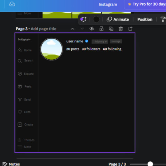
If you followed it through, it should look like this,
13. Now onto step 13, we'll be adding the Threads logo. You don't have to add this but to make it look more like the actual website, I will be adding it. Open the "text" tab and add a text box. Write an "@" symbol in the box and change the font to Nanum Sqaure and the size to 24.9. Add in the bottom corner below all the icons we just added to our page. We need another text box now (Color is still #707070), write "Threads" and align it to the "@" symbol.
14. We're adding another icon now. Search "Instagram menu icon" and find a wireframe menu icon by sketchify. the W and H are 42.5 x 24.6. Add a text box that says "More". It will look like this:
We are a quarter way done now :D
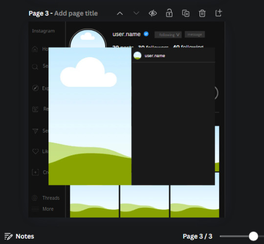
15. Search in the elements tab "circle frame" and look for the one with a little border around it.
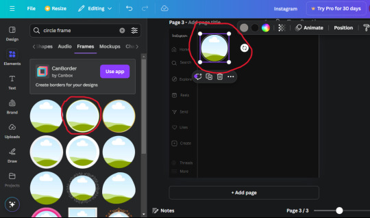
At first, the circle will be green and inside the circle will be white. Change the white to color of the background of the page (hex code #111111) then change the green to a grey color (#8D8986).
16. Add a new text box, change the font to Canva Sans and the size to 22.8 and the color is white. I just wrote "user.name" in the box. the W and H will be 153.3 x 35.7.
Enter the "elements" tab and search for a blue checkmark and find the icon by Victor Aguiar. The W and H is 28.1 by 28.
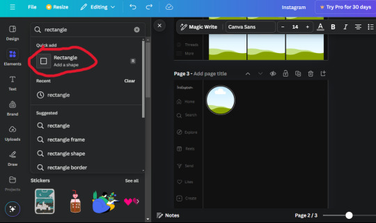
17. Search in the search box for a rectangular shape and add it to the page. Place it next to your username and checkmark icon and make the W and H to 149.6 x 38. Add another and place it next to the other rectangle shape. the W x H is 111.4 x 36.7.
Change the color of both boxes to #2F2F2F. Add a text box and write "following" then change the W and H to 82.6 x 21.8 and fit it inside the first box. Add a second text box and write "message" in it then change the W and H to 77.8 x 21.8. Change both text colors to #7A7A7A

18. Add another text box. Write "<" and turn it upside down and place it beside the "following" text inside the rectangle. Adjust the size as you need to. I also like the round the corners to around 8 so its not so pointy and square.
19. Add 3 new text boxes. Write the amount of posts, the amount of accounts you're following and the amount of followers your have. Write "20 posts", "30 following" "40 followers". Bold the numbers and change the text W and H to 116.4 x 32.7. These are just place holders that I use.
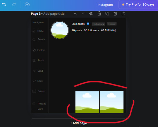
20. Open the "elements" tab again and search "frame". Choose the first one.
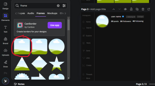
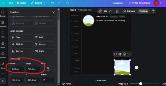
We want the height and width to be 268 x 252.4. Place it at the bottom of the page but we want some space between the frame and the page.
Now we'll duplicate the frame we just placed (the icon between the comment and trash can on the pop up above the frame). Place it next to the previous frame but we want to leave a bit of space between them like this:
If its a little wonky, don't worry. You can always adjust it so it looks right.
Duplicate the frame again and place it next the second frame you just placed, same distance between. Make sure they're even. Now we have a row.
Select all three frames and duplicate them. Move them above our original frames but leave a little space between them.
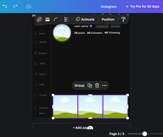
Again, if they're uneven, adjust them as you need to.
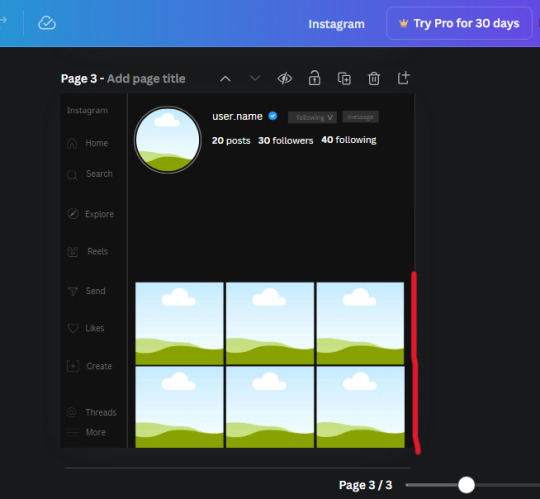
21. Select the line again from the elements tab. Stretch starting from the top frame to the last frame and make the color grey (#2F2F2F).
Because the line is stupid hard to navigate, use something like a text box to mark where you want it to end like this:


Delete the text box and the line with be where we want it.
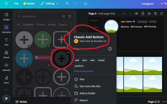
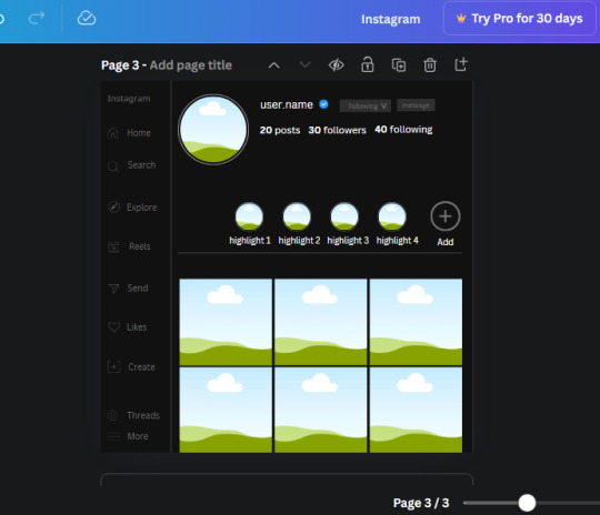
22. On to the highlight reels. Seach for "add button" and find the one by Barudak Lier.
Change the heigh and width to 81.1 and move it above the border.
Search for circle frames now and add this one to the page (The same one we used for the pfp), change the width and height to 85.4 and move it next to the add button. Since this is a generic, blank template, I add about 4 of these highlight frames but you can do however many you want. You can change the border color to a gradient or leave it grey.
Add a text box now. The font will be Canva Sans, the size will be 18.1 and the color will be white. Change the text to "Add" and place it under our add button. Make more of these text boxes to place under the circle frames. Depending on which frame its under, write "Highlight 1", "Highlight 2", etc. etc. or you can give them different names and such.
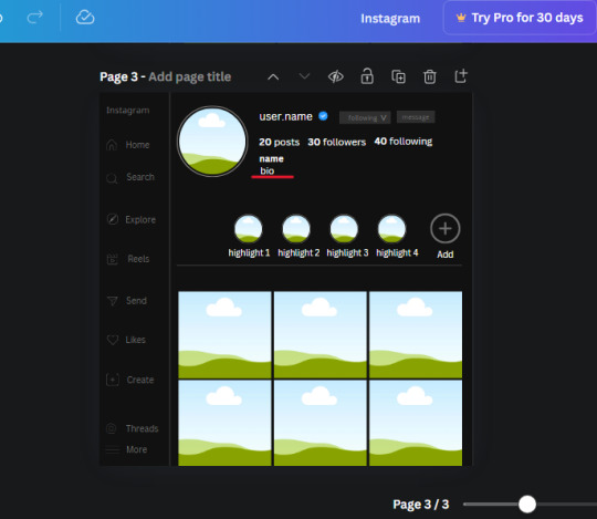
23. Add another text box, write "name" and bold it, change the size to 19.1 and the W and H to 69.2 x 28.8. The font will be Canva Sans and the color will be white. It will go under the amount of posts, followings and followers.
Add another box. The font is Canva Sans, font size to 20.1, the W and H is 40.8 x 31.3 and the color is white as well. This is our "bio". Place it under "name".
Yay!🎉🎉🎉 You're halfway done!
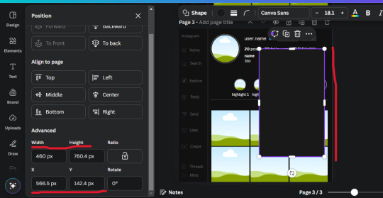
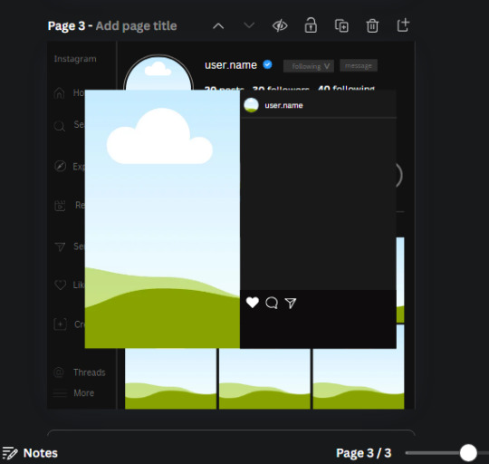
24. Search for a shape in the elements. Look for the rectangle again and add it. Change the width and height to 460 x 760.4 and the color to an off black/grey color (#191919), placing it like this:
Get the same kind of square frame we used before to make the profile grid and make it the same size as the rectangle we just added. Place right up against the rectangle like it's its other half. Add another line like before and span across the upper half of the black rectangle as a border then add a circle frame inside the border.
Add a text box, "user.name" and align it with the frame. The text is white and the W and H is 111.5 x 25.9
25. Add more circle frame along the inside of the rectangle to resemble the comment section. Make sure the W and H of the frames are 46.1.
Add more text boxes that align with the frames you just made and write "username" again and bold them. Add even more text boxes that align with the usernames and write "comment". These are place holders for when you decide to use this template.
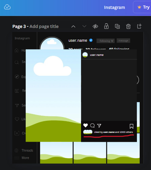
Add another rectangle on the lower part of the rectangle and make the color black. and search for "instagram heart icon", "instagram comment icon" and "instagram send icon". Make sure the lines are thick. Find the heart icon by sketchify, and the the comment and send icon are by Mirazz Creations. Make the lines white and make sure the W and H are the following:
Heart icon: 38.7 x 32.9
Comment icon: 35.2 x 35. 8
Send icon: 35 x 32
Next, look for "instagram bookmark icon" and find the one by Adricreative. Change the color to white and the W and H to 29.7 x 40.2. Move it to the other end of the rectangle.
26. Now add three circles frames and change the W and H to 37.2. Move them below the heart icon and have them overlap each other some. Then, add a text box and write "liked by username and 1000 others". Change the font size to 13.6 and change the font to Canva sans. the color will be white. Align this with the three overlapped frames.
27. Look in the elements tab for an emoji icon and choose the one by Soni Soukell from Noun Project. The W and H will be 32.8 and the color is white.
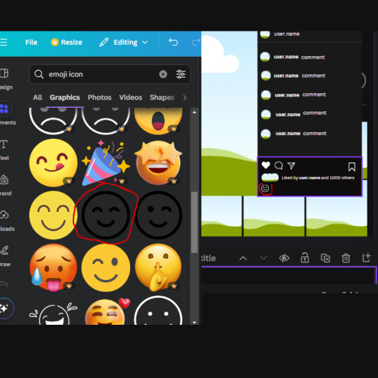
Now add a another text box and write "Write a comment". The color will be white, the font size will be 14.2 and align with the emoji icon you just placed.
Search for "next arrow button" by Pixeden and make the W and H 42.8 then add it to both sides of the post.
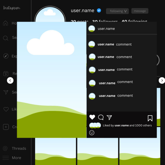
And you're all done with your template! All that is left to do is fill it but before doing that, duplicate the page so you always have an extra blank mockup if you want to use it again.
To fill the frames, upload an image (or use a Canva stock photo), drag and hover it over the frame and it will fill the frame.
Hope this was helpful and you you successfully made one :D <3
#requests#text#smau#template#mockup#moodboard#instagram#instagram moodboard#instagram mockup#graphic design#canva#psd#free tutorial#tutorial#instagram au#social media au#free psd#photoshop#resources#fanfiction resources#graphic design resources#graphic design tutorial#psd tutorial#photoshop tutorial#au#au ideas#mockups#digital design#digital design tutorial
169 notes
·
View notes
Text
*✶ please please please
a template by cozysip.
by clicking in the source link you’ll find 02 different dash icon templates made by me from scratch. credit is not needed , but do not claim as your own ! if you enjoy this or you use it, please reblog or like this post . thank you !
#01. PSD TEMPLATES : mine.#template#free template#rp template#psd template#free psd#dash icon#dash icons#dash icons template#icon template#icon psd#psd#rpc#rph#graphic tutorial#free graphics
279 notes
·
View notes
Text

❥⠀⠀random colorings
f2u⠀𓈒⠀no creds needed⠀|⠀no id tags for toya
color palettes and tutorial below cut
transparent credits ; 01 02


#˚ ୨୧ ⋆ 。 ˚ ⋆⠀𓂃⠀𝓐⠀𝓑lessed⠀𝓖ift⠀⠀︵ ︵ ིྀ#rentry decor#rentry graphics#rentry inspo#rentry resources#rentry stuff#sntry decor#sntry frames#sntry graphics#sntry inspo#sntry resources#coloring#ibis paint x#ibis paint coloring#psd#rentry help#rentry#rentryblr#editblr#editing#colors#coloring tutorial#free coloring psd
93 notes
·
View notes
Note
haii i usually use ibis paint to edit and if its not too much trouble i was wondering if you had any tips or like a tutorial on how to make better psds on photopea??(/nf) i tried playing around with the adjustment layers for a bit but it didn’t really turn out the way i wanted it to… 💔 thank you for your time and sorry this was so long 😭
PSD coloring tutorial / Recommendations by a self-taught loser
hello! i don't really know how to make a tutorial on PSDs, but i do have a few recommendations!
a useful setting would be Selective Color ( i apologize if the name is wrong, i have my photopea in spanish and have to translate everything myself 😓😓)

for example, the PSDs i used here barely have any layers, but i used a ton of selective color layers!
basically, from my own experience, i'll say Selective color is to make a specific color kinda .....pop (?. idk how to explain it.
moving on, i also recommend threshold! idk how to explain this one, so i'll just leave an example!
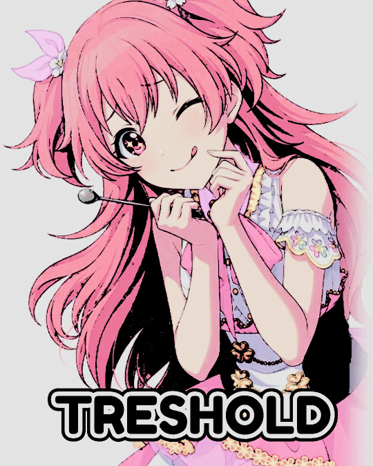
I exagerated it a little to show the effect properly lol, you can adjust it to as little or as much as you want! just remember to set the layer to multiply! (or any blending mode that works for you! many of them work, i just use multiply for... no reason at all actually)
next up, we have Replace Color!
it literally just... replaces colors. most people use it on black! just add the effect, set the color to the one you wish to replace, and start playing with the settings!
-- also, note that when using it on black, you have to turn up the luminosity for it to work!
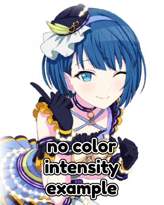
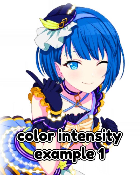
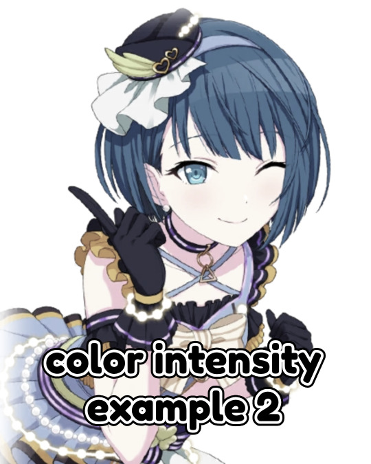
last but not least, Color Intensity!
its just... color intensity. but yeah! its pretty useful! i'll leave 2 examples here.
If anyone has any other tips, feel free to reblog! i kind of learned everything by myself, so im not the best, sorry.
i'll confess i haven't seen it myself, but @/canarysage has a psd tutorial here! so... just saying, you should check that out!
(user canarysage feel free to throw tomatoes at me and boo me off the stage (in other words, feel free to send an ask to be removed!))
...and if i left something out, let me know!
#questions / tutorials。#rentry help#rentry tutorial#photopea tutorial#photopea help#psd help#psd tutorial#rentry#psd#rentry graphics#rentry dividers#carrd material#photopea psd tutorial#coloring help#psd coloring help#photopea coloring tutorial#coloring tutorial#coloring psd
275 notes
·
View notes
Text

PRAYSIA. An editing resource sideblog. See under cut for further information and helpful links. We do all our editing in Photopea.
OUR TO-DO. RENDERS DRIVE.
Inbox is always open for questions. Want to Request?
Helpful Links: Upscale Images, Image Splitter, PhotoMosh, Text Symbols, UniCodes, Word Combiner, Remove Gif Background, Download Videos from MOST Sources, Gradient Maps, Tons of Laces.
Tutorials: How To Mask Renders via Critical Galaxy, Photopea for Dummies.
Misc Help: Site that has TONS of PNGs.
This will be updated as needed, so be sure to check back before asking for something please!
If you know us, it is likely from our past edit blogs @necromii, doveish and v-rtue, none of which we use anymore.
#𐐪 asks.#𐐪 tutorials and help.#𐐪 important.#𐐪 from praysia.#𐐪 by praysia.#𐐪 from [user].#𐐪 by [user].#𐐪 chatting.#𐐪 praysia's renders.#𐐪 promo.#⠀⠀⠀⠀⠀⠀⠀⠀⠀#transparents#dividers#frames#masks#psds#gifs#buttons#stamps#pixels#pngs#overlays
270 notes
·
View notes
Note
hallo! may i ask for a tutorial on how to use psds? thank you!

here’s your certified lilay tutorial! (this time with captions!)

251 notes
·
View notes
Note
Hello, this is not a request it's question because I really want to learn how to make graphics with gifs and idk how to do it 😭😭😭
Like your agar agar cookie layouts, I really like your work and would like to learn how you make it
Thank you for reading this, if you don't want reply it's okay, have a very nice day

Haiii!! It's no problem!! Unfortunately, I'm VERY bad at explaining stuff LOL, so here's the best I can do!! (Also, have a sneak-peak to another post :3)
How to make a gif edit.
How I decorate my edits.
How I make my PSDs.
VERY LONG POST BELOW. MASU LOVES TO HEAR HIMSELF TALK.
Okay so step one is to use photopea. I used to be an avid ibispaintx user until I realized that photopea can make gif edits and suddenly I'm photopea's #1 fan (and hater). Photopea is a website, BTW, here's the link!
First, open up a project. Good job! We're 1/4 of the way there! You can import a PSD if you want (Here's a different tutorial for that), but let's just say you DON'T have a PSD, for the simplicity of this tutorial.

Next, find the animation you want! For this example, we'll be using the Wind Archer sprite below (I took this from the CRK wiki). It can be anything - but preferably nothing too big, because Tumblr for SOME REASON HATES high quality gifs. Siiiigh...

From here, you want to go to FILE > OPEN & PLACE. It'll show a window of all your downloaded items. Click on the animation we just downloaded.


Wam-bam! We're almost there!! Okay, if your image is a WEBP file, it will not animate if you export as a GIF. But! That's okay! Because with trial and error, I found out how to fix this!
On the downloaded layer, double click on the layer. After this, go to SMART OBJECT > CONVERT TO LAYERS...

Now, if your photopea tries to explode and pretend it don't know nobody, that's okay! Just let it load a bit. The file is very. very big. It should turn into a folder! You have nothing else to do from this.

After this, you can do, well, whatever ya need!! Slap a stroke on, put a gradient map on this bad boy, anything else! Once you're finished, go to FILE > EXPORT AS... > GIF. Your photopea might try to explode again, for like, a few minutes. Just give it some time. It's a lot of trial and error!! Don't feel bad if you didn't get it the first time!!
Now, before I talk about my edits, I want to make it clear that you should FIND YOUR OWN STYLE! Don't try to copy off of someone else, or try to replicate another style. Every editor is different!! While I overuse overlays and gradient maps like I won't see tomorrow, you may like a more simple style, or something less over and out there ~ ! That's alright! Don't be afraid to branch out.
Now, as we said - we love to use overlays + gradient maps. I am an artist, so a LOT of what I do correlates to that as well (having an interesting silhouette, making a focal point, color theory, color contrast, composition). It'll be WAY, WAY too much to explain in one single post, so I'd just say to go with the flow! If something looks off, try something else! There's no shame in scrapping an entire project - especially if you're unsatisfied with the result. Do what you need to do!! It's your edits.
For making PSDs, our process is actually pretty simple. We just use a gradient map and adjusts it till it works LOL. We add a few others things too - but that's mostly what I do. If you want to learn how to make your own, my word of advice is to dissect from others. Take inspiration!! If you don't feel like doing that, there's no harm in just using a F2U PSD floating out there. Feel free to look at our Squid Ink post and use that as an example of our PSDs! (If you don't feel like going to go get it, yeah I understand, here it is right here.)
All in all, my biggest tip (besides to have fun), is to edit until you like it. Don't try to compare yourself to big editors - they've had TONS, AND TONS, of experience and editing. Experiment with your style, put yourself out there, edit some new media you've never edited before, find resources to help you out, find tutorials, ETC. It takes time to learn, so make sure to take that time!! You got this, don't feel discouraged by other people's work!!!
That's all from us folks!! Peace out!! ^_^


#໒꒰ྀི ․ ․⸝⸝⸝ ꒱აㅤ﹑﹫ㅤtalks.#໒꒰ྀི 𖦹 ˕ × ꒱ྀིაㅤ﹑﹫ㅤasks.#editblr#edit tutorial#editing#edit blog#psds#photopea tutorial#tutorial
36 notes
·
View notes
Note
As a fellow gifmaker (only not quite as skilled as you are) I've been struggling and your gifs always look so amazing and nice and colourful so I was wondering if you could share some tips on how do you colour tinted scenes like in MoTA? thank you Jess you are amazing 🤗
heey there!!!! First of all sorry for taking so long to reply to this, I was so happy with your nice comments that I wanted to give you a proper insight on how I do it, but unfortunately I'm quite HORRIBLE at explaining things?
I'll put it under the cut because it's gonna be a long post! but if you have any doubts my askbox is always open!!!!

So first of all I already gave some tips on how does my process with coloring gifs work so you can check it on my resources and tips tag
As you said you are also a fellow gifmaker so I'll take it from there as I assume you already know gif 101, but if you are new to this you can again check my tag for some beginners tips
Also want to point out this lovely tutorial by @ajusnice that might be even more helpful, since I learned a lot from it
Disclaimer: i'm colorblind, I can see all the hues, just not all the shades and I tend to struggle with greens, oranges and yellows so apologies for any mistakes or if this turns out looking weird!

HOW TO COLOR TINTED SCENES????
So at this point I hope you already have you gif all cut down to the size that you want and used your fav action/sharpening presets ( I use this or this actions to sharpen my gifs
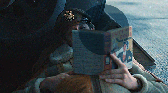
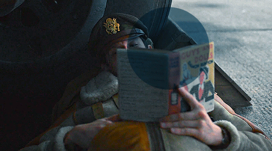
Now I'll use the footage down bellow as it is really blue tinted and I worked with it for this gifset (MoTA SPOILERS AHEAD!!!!!!!!!) so it looks like this
3. So the first thing I do is work with curse as it gives me a better grasp of what I have and how do I want to go with it. I have been using this method where you go to Curves >> Click on the top right menu >> Auto Options
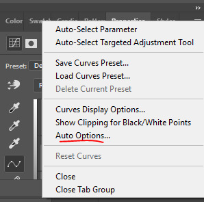
4. Now a new window thing will open up and then I click on the option Find Dark and Light Colors, as you can see my gif already looks a lot brighter and now so tinted
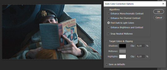
5. this is how my gif looks like I selected that option
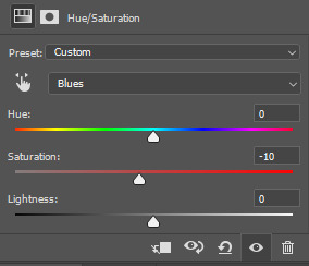
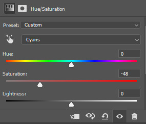
6. still does look a little blue-ish doesn't it? Okay so now I'll go to some adjustment layers, the first thing I do is work with hue/saturation. I'll go to the cyans and blues first and I want to remove some of the blue tint of my scene. I prefer to decrease the saturation of those colors so it looks a bit like this
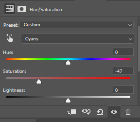
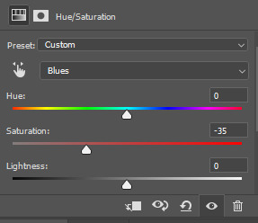
and my gif looks like this
7. So here is our first problem, while I took away the blues my gif now looks a little dull as the scene was delivered to us in such a different color scheme, It wasn't supposed to look like this so now we need to color correct!! For this I work my way around vibrance/saturation so my menu looks like this
And my gif looks like this
8. Problem #2 because now it looks too blue tinted AGAIN! so I just repeat step 6 again so my menus look like this
and my gif looks like this
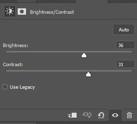
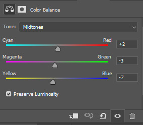
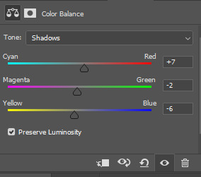
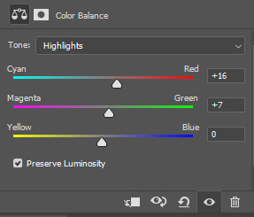
9. from now on it's only about some details such as correct the brightness/contrast of the scene and I personally like to use the color balance adjustment layer, I'll leave it all here
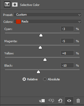
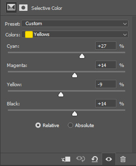
10. finally one of my fav adjustment layers -> SELECTIVE COLOR i just mess around until it looks nice to me, I'll leave the configs I used down bellow
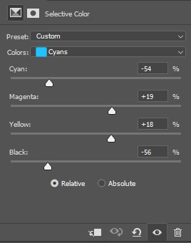
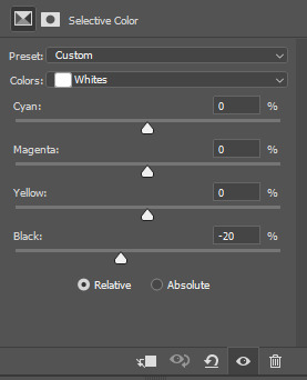
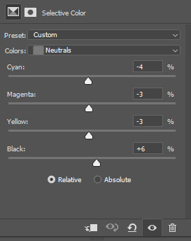
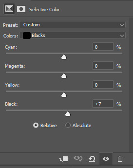
Finally after all those steps my gif looks like this
#asks#anon#s: resources#requests#coloring tutorial#usergif#allresources#chaoticresources#gif tutorials#gif tutorial#psd tutorial#completeresources
220 notes
·
View notes
Note
hello! do you have any tips for creating your own psds? right now I'm just sort of throwing things at the wall and hoping it sticks!

Hi hi nonnie! I am NOT the best person for you to ask this (not in a miiile) BUT I tried making this in the most concise way I could and prayed to god it didn't get too confusing since a lot of the times I too just throw things at a wall and call it a day. I'll teach my usual psd making style and a more general one just in case that's what you were looking for! They're under the cut since it probably will get a tiny bit long but I hope it's helpful to you! <3 as always reminder that there is no correct way to make a psd this is just how i do etc etc
This has a lot of text and images so beware of the big scary maica


First of all: While you certainly *can* make a psd based solely out of one image or a compilation of your own edits (as i have done on the past), I'd say in general it's more useful and easier to make something when you have more than a singular image to check and a color spread to use. I made this little template in 5 minutes (which is a lie because my photopea crashed at first and so I had to re-do it) and I'll link it here alongside the psd itself so you can poke around and check how I do things! If you want to do your own template or anything, though, here's the color spread I use! :]

It has a spectrum, a bar line and some skin tones so it should be helpful! You can also use Travi3sapsd swatches if you'd like, since I know some people would prefer having a view of the colors before and after the psd to check!
Talking about skin tones, Amemcth also has a nice collage with characters of varying skin tones so you can check how your psd look on different skin tones. I don't think it's obligatory for all psds to look fine with every skin tone, however, I think if you're not doing it for a singular character and are indeed posting that psd for public use, making it work with darker skin tones is something good and that I encourage. If it doesn't work, remember to always indicate it by adding a "Works fine on most skin tones" or "Doesn't work on poc characters". Those warnings can also be useful for other things, like not indicating the usage of the psd on irl pictures, cartoon pictures etc.
So, final thing before we get into psd making itself (if you are using a image mask template to check colors) is adding the images! I always recommend adding characters from different sources and irl images to be sure, and with either varying colors across the spectrum so you can be certain the psd is working nicely OR images that feel similar enough in vibes so you can be certain the vibes of the psd are going towards where you'd like them to. However, it's also important to consider which colors you will be working with to make the psd, since I think it's easier to make a psd for a character when you have something in mind. For my own psds, I usually limit myself to a maximum of three colors + black and white (which I'll mess with to change their tones), so for this tutorial I'll be using yellow, purple and pink! This is the where we start. (I won't be trying to keep skintones working for this since it's all pale characters, but please have the common sense to make psds that work if you're editing a black character. don't make them white and for the love of god don't make them grayish)
Also reminder before anything that if you're editing a card and that card works weirdly with the psd you can always add adjustment layers to the card itself and mess up with the hues on it hashtag editing some characters just are a pain in the ass to edit because of colors being too similar etc so don't be afraid to fight them

First: Make A Folder for your psd to be built on. It makes things a lot easier to drag around once you have it done and arranged. Name it after the psd name, name it psd folder, whatever, just put your layers under that folder. Onto the layers.
My autistic ass mostly does psds only following one single pattern, but in case you want to mess around and play, feel free to have fun and mess around. A lot of psd making really is just messing around. In my case, these are the main adjustment layers i use: Threshold, Selective Color, Hue/Saturation, Photo Filter, Color Balance, Vibrance and, on occasion, Gradient Map and Curves. You can use others but I am >not< the best person to tell you what they do and how to work with them.
So, you now have your pretty little image layout down and the colors you want to work with in mind (pink purple yellow + bw), so what now? Well, I usually like to think on which direction I want to take this psd towards. People will always have different methods and directions on psd making. Some of them like to make some of the most eyestraining things I've ever seen which somehow work, some of them like to make a pastel so bright I can feel my eyes burning, some of them prefer to make desaturated tones, some of them like to lower the vibrancy of the image so much I almost can't see shit. Everyone has their own preferences and I work w pretty much anything, but for this I'll try to keep a standard bright view, if a little pastel and desaturated, for this.
So now, we have our colors, our images, our color swatches and a direction in mind.
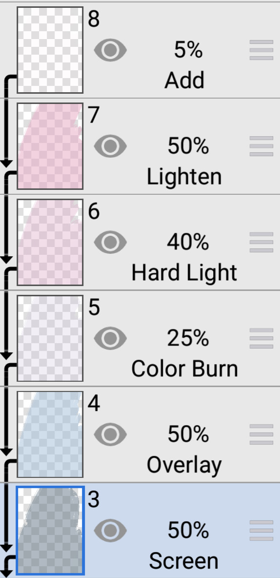
First thing I like to do whenever I'm making psds is to add a threshold layer. However, not in the way I usually see around editblr. When you add a threshold layer, it should look like this

Don't just do that. Go there on that little normal bar and click it. I know people who use others, but I usually settle with either Multiply or Soft Light for it, then lower the opacity down until it's somewhere I'm satisfied with.


So this is where we end up at. I don't let my threshold opacity go any higher than a 30%. threshold basically serves to bring out the shadows on your images and bring out the shapes on them. it helps make the focus on the image clearer yadda yadda yadda. Be careful when using it on darker images, but for brighter ones it sure helps w making everything easier to see.
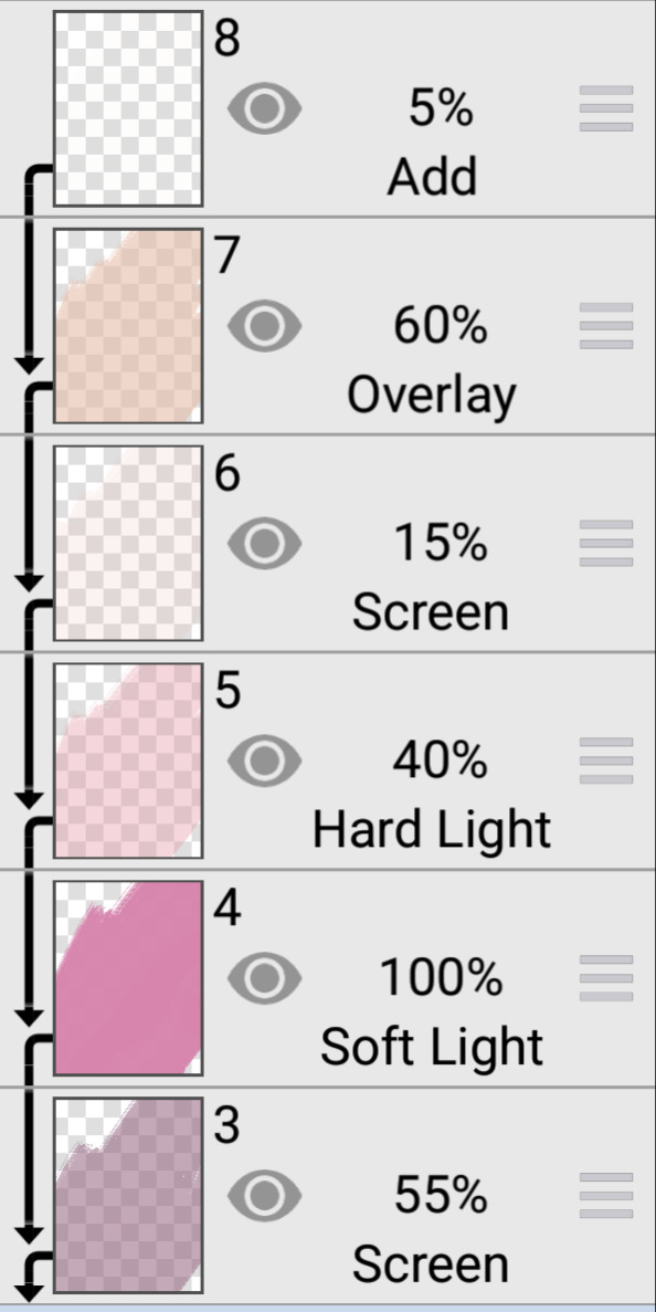
After adding a threshold, I add my Selective Color layer. With this you'll basically be playing around with the sliders until your colors look the way you want them to. This messes *slightly* with the hue without fully changing them (we'll get there soon), so it gives you some chance to balance out the initial shades of the psd. For the current method i'm teaching (focused colors), i usually recommend you to make the colors you >dont< want on your psd brighter or in a shade that still feels coherent with the colors you dont want in it. we'll be dealing with them soon.

So we get there. HOWEVER! don't think we're done once you mess with the main colors. the 1st selective color white is, what i'd say, one of the most important parts of psd making. you know how most anime characters in gacha games these days look pale white? Yeah. this can change it. What i usually do is bring the black slider on the white layer to the right and then increase a bit of the magenta and yellow. Boom.

It's quite tricky to use on images with heavier shadows, but for the standard pale white anime gacha character? it helps give some life to them. its quite subtle, but can help a lot to make the image get more lively. A counter thing to this is that yeahhh this can mess a lot if you want to make, you know, a >white< psd since it will also mess with the white tones themselves, so there's no 100% settled need to mess with it, just keep it in mind in case you wanna make the character a bit more tan or, you know, have a normal skintone. It also helps a lot with defining shadows, so keep it in mind :]
I usually don't mess with the neutral since it can fuck around a lot w skintones and, if i do, i always make sure to keep them on less than 20% for all levels. be careful when playing w it.
Black is a tricky one. I know a lot of you pastel girlies across editblr and psd making communities like turning it all the way down so theres no black but honestly, contrast is important. I usually make sure to bring the black scale to the right and then mess around w the other three so the black is still visible and bringing contrast to the image, but w the help of the other three, make it so the black looks softer and matches the psd itself. So, here we are!

After the selective color in my psd process, that's where we erase any unwanted color and shift the hues to where we'd like them to be. Make a hue/saturation layer and go to the colors you dont want (in our case, green and cyan) and move that hue slider to a color you want babyyy. I encourage to mess around with the color scale on the specific color so you have more power over what colors change or don't, in case it's messing with colors close to it on the scale (cyan messing with greens, greens messing with yellows etc). Be aware that doing this will fuck uppp certain images with those colors, cry about it for a bit, and go back to making your psd

If you're a picky mf just like me, you WILL add 1 or 2 more hue/saturation layers to fully clean that bar of any color you do not want. If you're normal, you'll be chill with how this looks and call it a day, so onto the next step.

After arranging your colors and possibly finding out how green is an absolute shit color to try and erase traces of, we get to color balance which is, well, where you balance the colors. go around and mess w the scale until your colors lean more towards what you want them to look like. I personally don't mess much here and the difference will be suuubtle subtle, this is more if you're just picky with colors like me and want them to look perfect in the idealized version of the psd you hold in your head.

Photo filter will basically bring the whole thing together. It serves as a filter to bring eeevery tone you have going on into a cohesive line. Always remember to lower down the density of it so the other colors are still noticeable. a lot of the time i will add more than one photo filter and play with it until I'm satisfied with how it looks <3

Then this is the time where I'll usually add ANOTHER selective color layer just to mess more with the tones and finally get them down to where I usually stop playing around.

A few more touches and you should be done! I really don't know how to even explain curves and gradient maps so play around with them for a bit and you should at least understand how they work. One thing I do a lot with my psds is make toggles to make colors darker/bring more focuses etc etc, so if you're someone who struggles to make decisions, toggles might be a good thing to add to your psds!
Now... If you don't want to limit yourself to a set number of colors? Quite simple! Simply skip the hue/saturation layer steps or delete them altogether once you're done with your psd and there, a psd that plays with the tones of the image to make them more harmonious while keeping everything cohesive! You can mess around a bit more on the two selective color layers you have if you do this by deleting the huesat layers, but it should generally look pretty nice still!

This should be it! So, to summarize everything Ive been yapping about so far...
Before diving head in, decide if you want to limit your colors or not. Also decide on a set type of psd (bright, pastel, desaturated, dark...) you want to go towards
Use multiple images to make your psd, either with similar vibes so you can ensure it's becoming something you wanted or with varying colors so you can cover your ground
Use a threshold layer with lowered opacity before anything else so the shadows on your images have more contrast
You can use a selective color layer on the white part to darken pale characters skintone and bring some more life to them, but be careful when doing this because of cards with heavier shadows, if you want to keep white as a color on the psd etc
Don't lighten the black part on the selective layer as that messes with contrast and might make your psd harder to comprehend when looking from afar
Try to still make your colors distinct enough so you're able to tell apart shapes if from afar, it can be a difficult thing to do but it helps a lot with readability
Don't be afraid to go back and forth between layers! If you're on a photo filter layer, you can always go back to make a specific color more prominent if you miss it overall
Use hue/sat as a way to change colors you don't want instead of replace color. It's tricky, but it covers more ground
Use photo filter to bring all colors more cohesion and make it so they look more harmonious
Have a headache trying to work around cards with harsher shadows
DO NOT make poc characters gray or straight up orange/red for the love of god
Feel free to make different toggles for your psds if you can't decide on which path to go towards, you can always duplicate layers and make different paths depending on what you want!
If a specific image you're using has difficult shadows or different tones to work around with the overall set, you can always just mess with that image alone and make adjustments to make it work out with the rest of the set
Remember that psds work differently on photopea and photoshop, so make sure to check that out if making them/using them/posting them anywhere and make it clear for which app they were made for!
Good luck with psd making and have fun overall! <3
Here's my psd test yet again if you'd like to mess around with it! Just don't repost and it should be fine ^^
47 notes
·
View notes