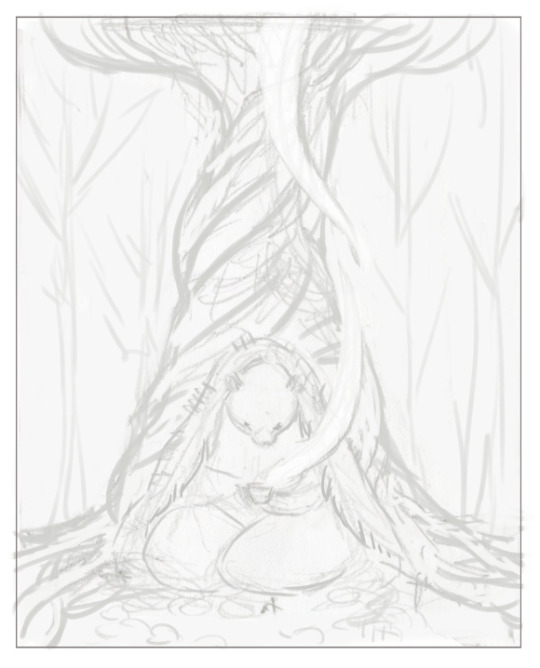
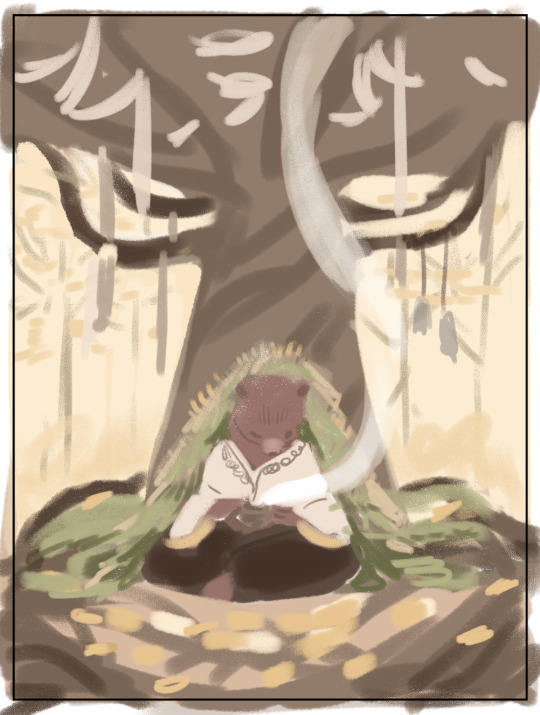
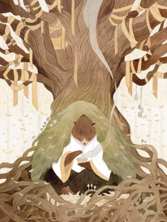
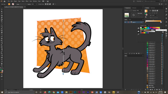
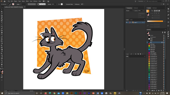
#(this is the illustration from my tutorial but with a few small changes)
Explore tagged Tumblr posts
Visit Tumblr Blog
Explore Tumblr blogs with no restrictions, modern design and the best experience.
Last Seen Tumblr Blogs


Fun Fact
China blocked Tumblr because of pornography and censorship problems in 2013.
Text

small riso postcard design for one of my classes!!
#(this is the illustration from my tutorial but with a few small changes)#irl oomfs are saying i should turn this into a riso postcard series with different fruits... what do we think#my art#illustration#riso#risograph#print#strawberry#fairy#whimsical#fairytale
4K notes
·
View notes
Note
I love your art so much!!! I've also been starting to paint with gouache, and I'd love to know a little more about your process! What kind of paints do you use, do you sketch first or start with paint, do you paint in layers over several day or all at once?
Hi and thank you! I hope you don't mind me answering this publicly and apologies for length, but:
MY ART PROCESS!
Supplies: I use winsor and newton gouache and arches cold press paper blocks, usually 140 lbs (the lime green ones) and sometimes 300 lbs (the teal green ones). Even though this paper comes pre-stretched in blocks, I actually take the sheets off and stretch them myself because I've found arches' glue isn't as strong as it used to be. This is how you get watercolor paper to lay flat! I recommend youtubing some videos on how to do it -- there's a lot of great tutorials out there. Also, I use princeton brushes, and kraft paper tape and these boards to stretch my paper. (these aren't affiliate links, I just shop at blick)
A word about art supplies: these are the exact tools I use but everyone uses supplies differently and two people with the exact same supplies might get different results! A lot of it is about what works for you and what you like, so I always suggest that gouache/watercolor beginners just buy a few tubes from a couple of different paint companies and some small pieces of paper from different manufacturers to see what you like. Just changing one ingredient in the above has created massively different results for me, but maybe that'll end up being something you'd like! The first step in learning a new medium imo is to play. Just have fun!
ALSO: gouache isn't super light permanent, check your tubes for which ones hold up to sunlight. Here is winsor and newton's color chart explaining which ones will fade when exposed to sunlight -- all manufacturers will give you this. I only use the colors rated A and AA, and I still frame my pieces with UV glass just to be safe. Not all gouache is re-wettable, but winsor and newton is. I just put it in my palettes and refill my palettes if it runs low. AND SOME PAINT IS TOXIC. A lot of paints have cadmium and cobalt in them. I don't use any of the toxic colors, but if you do, make sure you don't eat while working and wash your hands thoroughly afterwards. This information is also usually available on manufacturer's websites. As more people are rejecting cadmium paint, you'll see more tubes labeled things like cadmium-free yellow. This is why. More artists should be aware that their tools can be dangerous. You don't need that many tubes of paint to begin, just a warm and cool red, warm and cool yellow, warm and cool blue, white and black. I have around 50 colors and use 20 regularly. I always mix all my colors myself, and never use straight tube paint. Most of my colors have about 5-6 different tube colors mixed together. If you use re-wettable paint a tube of paint will last you years; even as a professional I only buy new paints every 5 years or so.
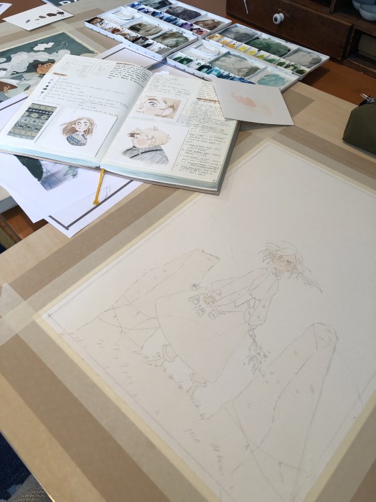
Process: I ALWAYS start with a sketch first. Not everyone has to, but because I do illustration work -- where sometimes a client gets input on a drawing -- I always do a lot of preliminary work before I even begin to paint. At this point, even my personal work usually involves the exact same process:
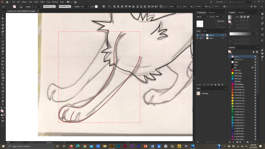
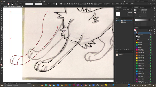
I start with a 3" or so thumbnail that I scan (left; I traced it quickly digtally for clarity to myself here) and then either clean up digitally or print out and clean up traditionally with tracing paper (right):

Then I scan the cleaned sketch in and color rough it digitally (left, this was for a gallery show, so no one had to approve my color roughs, so it's messy!) then I transfer my sketch to my paper (with either carbon transfer paper or a light table), stretch my paper, and paint (right):
I obviously changed my mind about the color of the ribbon in the trees, ha, and made everything a lot more vibrant. The benefit again of gallery work is no pre-approval!
You are correct, I paint in a series of washes, going from lightest to darkest, where I apply the same color beneath all shapes that are the same warmth (cools under all upcoming cools, warms under all upcoming warms). I paint a piece usually in one or two days, depending on complexity. I didn't take pictures of the above painting, but here's a different painting to show you a little bit what I mean:
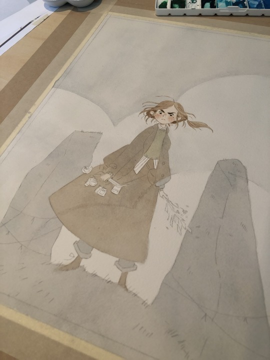
I painted the peach color under everything (and twice for skin tones), and the gray color of the sky under everything that would be grayish (the rocks, trees, her pants, her skirt, and coat). I do this to stop me from getting darker lines where two different colors butt up against each other, and also for color harmony. I have step by step photos of this in my process stories highlight on my instagram; also check my FAQ and tip highlights for more info on all this stuff. Most pieces take around 25-30 washes before I start adding in the details (sometimes I add in face details early though because if I mess those up it's not worth finishing the rest of the painting! 😅)
All this might seem like a lot of work (...it is) but I do it so that I can show clients previews of the final piece and so I don't have to repaint the finals. I also used to pre-test all of my washes on scrap paper like this:
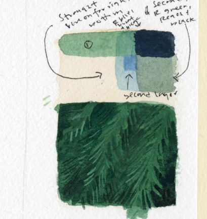
I still recommend doing this if you're just beginning! But at this point I only do it when testing techniques because I know my paints really well. (the above was my test for the pine boughs in this piece)
Painting by far is the longest part of the process, so I do more work up front to not have to do it twice. Every piece takes about 6-24 hrs of actual work time to produce. Stretching watercolor paper takes about 24 hrs to dry, and because I sell most of my originals in galleries, they need to be flawless, so planning ahead is useful and in the end saves me time.
And to conclude this novel of an explanation, don't be overwhelmed by all the information I've given you! I put it here so that people at various stages of their artistic journey can maybe find something useful in it. But seriously, the first step to learning how to paint whether it's traditionally or digitally is just to have fun. Try it out, see what's working and what isn't, and then try to solve specific issues that you're struggling with. I've been doing this for a loooooong time at this point, but here's my first watercolor piece from when I was re-teaching myself how to paint traditionally nine years ago:
Obviously, I was destined for greatness. Ha, yeah, no. If you scroll back through my tumblr archive, you can see me learning how to use these paints in real time. And keep in mind that I'd been working digitally for years before then, and years before that where I didn't post my work online at all.
So for anyone who needs to hear it: there's no such thing as talent, just hard work, patience, and trying again and again and again...and sometimes again. What I do is a skill and anyone can learn it. Sometimes, progress is slow. I'm 38. I only really feel like my art was half-way decent starting a few years ago, but I've been making art my entire life, and I went to art school at 18. 20 years later I'm kind of figuring it out.
The best advice I can give, whether it's about art or not, is find the thing you love so much that you'll keep at it even when you suck at it, because most skills you'll suck at to begin with -- and perhaps for a long time. I sucked at art for yeeeaaaaarrrrs. On top of the usual learning curve, I struggled with fine motor control and dexterity. But I loved it so much I kept trying every time I failed. If I can do it, so can all of you, no matter what stage of art you're at now, and no matter how old you are.
Anyway, thank you to those still reading this deep in. I wish you all the best on your artistic journey. Art can kick your butt sometimes, but it's also pretty dang rewarding 💛
543 notes
·
View notes
Text

It's in the Cards: Chapter One Excerpt
(It's in the Cards is an adult rom-com with speculative elements. Please note: this is a draft and is subject to change!)

Elliott Beck was getting good at lying.
When it came to lies, the devil was in the details, and nothing taught them details like managing Betsey’s Metaphysical Boutique on Ocean Avenue. They lied about candles for rituals, which customers could learn by purchasing beautiful spellbooks. They lied about herbs and sigils and crystals, sometimes giving multiple explanations for the same item within a single shopping day. Of course they used the spell jars! In fact, they’d used one that week to cleanse their apartment of negative energy! They wouldn’t mention that the “negative energy” was actually the smell of stale weed from their downstairs neighbors, but that was fine. People who came to Betsey’s weren’t interested in reality, anyway.
In the back of the narrow shop, Elliott sat in the corner they’d designated specifically for tarot readings. For customers, they’d provided a sofa strategically covered with blankets to hide its concerning stains. For themself, they’d found a wooden chair that was gorgeous to look at and hell to sit on. It was far from the elaborate setup they’d originally envisioned, but Betsey had only given them so much space in the already-cramped shop. What she hadn’t given them was a budget.
But the furniture didn’t matter, because they could wow customers with their most beautiful set piece: themself. Presently, they wore a purple button down dotted with shimmering stars. Mismatched earrings, a gold sun and moon, dangled from their ears. God, they hated the earrings. Elliott’s fingers knocked into them whenever they re-tousled their chin-length shag of blond hair.
“I love your earrings,” their current customer said. She was dressed for the beach, a shoulder bag of towels sitting on the floor beside her flip-flopped feet. “And I love your cards! What a pretty color.”
“Thanks! We have plenty of decks for sale!” None like Elliott’s, though. They should’ve flaunted a deck from the shop, but instead, they used the Dungeons and Dragons themed deck they’d bought for themself as a housewarming gift. The backs of the cards were a shimmering purple, a twenty-sided die in the center of each. The faces featured items from the game—adventurers, monsters, weapons—illustrated similar to a Rider-Waite deck. When they’d tried to explain the references to Betsey, they’d ended up trapped in an hour-long lecture about the history of tarot art.
“I might look around later,” the woman said in a way that meant she wouldn’t. “I was supposed to meet my family at the beach, but of course, none of them showed up on time. I thought this would be a fun way to wait instead of cooking in the sun!”
Probably a smart idea, considering she was the same shade of pasty white as Elliott, who’d sometimes get burnt in the time it took them to walk from their car to the shop. They placed a hand on their tip jar, as if to say, please look at my tip jar. It was actually a tip mug shaped to look like a fat orange cat, the handle made from its black-striped tail. This particular cat’s name was Norman, the unofficial mascot of Garfield Beach who the locals called Not Garfield as a nod to the town’s not-copyright infringement. On Not Garfield’s round belly, Elliott had taped a small sign: Tips appreciated - ELLIOTT BECK, they/them, cash or Venmo!
They began to shuffle. “Is there anything specific you’d like me to consider when I read your cards?”
“Nope! You’re the expert!”
They were glad she thought so, considering they’d only just started offering tarot readings a few weeks ago. “Then for your three-card spread, the first card will reflect your past, the second, your present, and the third, your future.” At least, that was one technique they’d learned while watching tarot YouTube tutorials while cooking. They set the deck on the table and spread the cards in an arc.
The woman reached forward. “Do I pick?”
“No.” They weren’t eager to have people’s hands on their personal deck…or their personal anything for that matter. “I’ll do all the touching. So, let’s start with your past.”
They flipped a card: The Eight of Wands.
“Ah,” they said.
“What does it show?” the woman asked.
Elliott wasn’t sure, because for the life of them, they couldn't remember what the Eight of Wands meant. Usually, the illustrations helped them remember meanings, but this one looked like a bunch of ambiguous sticks. Taking a deep breath, Elliott bobbed their head, hoping they appeared lost in thought. They didn’t need to provide a perfect interpretation—tarot was less about memorization and more about helping people gain insight into their lives. That was the advice given by someone with an unrepeatable username on Reddit, and Elliott intended to follow it.
“Wands are good,” they remembered. “But…sometimes, you can have too much of a good thing. It looks like you’ve recently had a lot on your plate.”
She wrinkled her nose. “I did do a ton of laundry before leaving to come here.”
“And besides that?”
“Well, there were dishes too.”
Elliott nodded calmly, internally screaming.
#writeblr#writing#writers on tumblr#it's in the cards#elliott#we do not get to the main conflict in this snippet but it’s cool#the full scene is a little long for a tumblr excerpt so…this is enough I think??#a little taste#behold! a rom-com protagonist
27 notes
·
View notes
Text
Devlog #001 - Starting Progress
Hello! This is the first devlog for my current game project called "Love, Death."
As stated in my previous post, this project was originally a research assignment for one of my university classes. As I had already made quite a few assets already, I have lots of stuff to show off in this devlog!

(Pictured Above: A screenshot of a work-in-progress shot of one of the opening scenes of the game)
Characters
So far, I have created the two central characters that I want the game to be focused on: Ghost and Shepherd. As this is incredibly early in development, I hope to update these sprites in the future should I make any major changes! (Especially Shepherd's sprite since it feels the roughest)

(Pictured Above: A gif of Ghost and Shepherd's sprites doing their walk-cycles)
Concept Art
While most of the concept art I have so far are in the rough-sketch stage, here is one piece that I've been working on for a while now that takes place further into the game's story :)

(Pictured Above: A work-in-progress illustration of Ghost and a mysterious man in the foreground)
Level Design
With the original rooms I made in the prototype, I learned a lot about how RPG Maker MZ handles parallax mapping and in general, how maps should be laid out.

(Pictured Above: the opening room of the "Love, Death" prototype - a long blue room with a glowing door to the left and a gravestone to the right.)

(Pictured Above: another room from the "Love, Death" prototype -Shepherd's office which is basked in hues of red. In the far left, there is a desk in front of a window.)
With all that information, I've started planning out the room layouts of the levels I want players to go through with an emphasis on good composition, exploration, and different points of interest.
In the coming days and weeks, I hope to assemble some placeholder rooms with layouts I've created to see how they turn out and figure out ways I could improve upon them.

(Pictured Above: A mock-up of a level with different rooms and interaction points)
Tilesets
(Pictured Above: A screenshot of a test room with a custom tileset.)
When planning out this game, I was unsure of whether or not I should use RPG Maker's default tiling system or if I should focus more on parallax mapping for the game's maps. In the end, I decided to do a little bit of both!
I've created a placeholder tileset for the first area of the game that works with RPG Maker's autotile system and some other tiles that I could use for different variants.
When it comes to parallax mapping, I'll save the maps and their tiles to a png and use those as a reference point for the elements I want to parallax map. These include lighting effects, foreground elements, and scrolling backgrounds.
Gameplay Mechanics
Below are a few things I've been working on during my testing!
(Pictured Above: A video showing a few tests in the game.)
Idle Animations
I made simple idles which happen to characters when they are idle for more than 5 seconds.
Character Switching
When pressing the [TAB] button, players will be able to quickly switch between playing as Ghost or Shepherd. Depending on who they are playing as, new mechanics would become available to them.
Shepherd Crawling
One of the unique mechanics that would be available to Shepherd would be crawling! While small spaces would be unreachable to a tall sprit like Ghost, Shepherd can reach them with ease!
When interacting with small spaces, Shepherd would crawl into the space, giving players access to whatever lies within.
Goals for Next Update:
Complete a draft layout of the tutorial area of the game
Create at least one area-specific puzzle
Create a Ghost-specific mechanic
Fun Facts and In Closing!
I thought I'd take this portion of this post to talk a little about myself and why I'm developing this game.
For those of you who don't know me, I'm Somewhatcold (you can call me Jan), an 18-year-old university student in Canada interested in game design and concept art. I've always been in love with RPGs and some of my favourite games include the Dragon Age series, Final Fantasy XV, and OneShot.
I'm currently doing a Bachelor's of Design in Illustration with a minor in Games and Play and hope to use this experience as well as further projects to learn more about game development.
Although I've made different RPG Maker games in the past for a few school projects, I've never actually made something of this scale. It's always been a long-term goal of mine to create something like this so I'm incredibly excited to see where this goes!
Feel free to ask me anything in my ask-box or to contact me via the instagram I linked above!
The next devlogs are definitely not going to be this long - this one in particular had a lot of information simply because I already started this project a few weeks ago. Going forward in the future, the devlogs are mostly going to be smaller updates and new things I've added to the game.
Below, I've also included some samples of my previous illustration work just for funsies :D
(Pictured Above: An illustration of Hebra Mountain from The Legend of Zelda: Breath of the Wild)
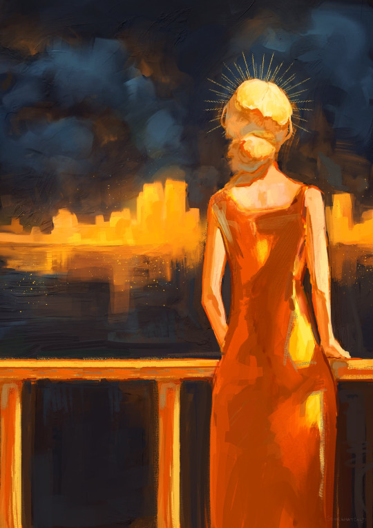
(Pictured Above: An illustration of a woman on a balcony overlooking a cityscape.)
4 notes
·
View notes
Note
not really sp related but what got you into crocheting? is there any other types of crafts that you do or would like to do? :3
ive always been interested in it, esp amigurumi in particular, but i had a very hard time self-teaching. i had also at some point when i was younger tried to teach myself to knit and i could NOT figure it out, so for years i just assumed yarn crafts and i were not meant to be. i could figure out how to chain but i really couldn't get any further than that.
but in late 2019, i started having dinner with my grandma once a week, and to give us something to do after i cooked for us, i asked if she'd teach me to crochet. she's taught other family members and friends, and i thought maybe i'd learn better with a live demo and someone to tell me what i was doing wrong. she taught me the basics, i got really into making simple blankets when the pandemmy hit in 2020, and then i fell out of it pretty quick.
then earlier this year, i decided to get back into it on kind of a whim. i had a lot more free time and i bought a kit for making a crocheted flamingo, figuring it could help me learn now that i knew the basics. it did NOT! it was more confusing that guides i had seen online.
but i realized i had never bothered trying to watch a youtube tutorial for it, which is like, almost embarrassing, because i am learning shit from youtube all the time. i watched and crocheted along with this video
youtube
and was able to make a successful ball and from there i just went nuts. i was able to finish the flamingo (a gift for my mom, flamingos are her ~mom animal~) and found the aradiyatoys south park patterns and decided to give them a go as something to keep me busy while mal was at work when i was visiting them. i'd kind of like to redo them now that i'm better at crochet, but the last thing mal needs is duplicates of stuff ive already made orz
as for other crafts i do, i was doing figure painting on 3d printed guys for a while, as well as bedazzling them (where my icon comes from, actually), but i haven't touched that in a while. i also have a button press ive been getting a lot of use out of lately and i like to make keychains with shrink plastic (be kind, my art is 4 years old here). for a short while i was doing shaker keychains with resin as well. i also took a studio art class where i learned how to make paper, do embossing/debossing and how to carve plaster. i would LOVE to do another plaster carving but i don't have the materials at home.
i do this thing where i fall in love with a craft, get deeply obsessed with it for a few weeks, then see a youtube tutorial for something else and move on to a new craft. the fact that ive stuck with crochet this long, is a bit of a surprise to me, but im just very deeply in love with it right now and i think its here to stay for a while.
im also adept at sewing plushes! and i'd like to get back to that, i haven't sewn anything in a long time (i dont even have any examples of my plush work to show, it's been that long 😭) but first i need to reorganize my work space so i have room to lay out fabrics and cut them. i have a couple projects i'd really like to sew, but i need to figure out the pattern for them first.
im also upping the level of detail i can get on my crochet dolls, by incorporating needle felting! my friend sent me this video and while i'm not felting over entire dolls like this, it's been a godsend for adding small details. i'm working on a commission with tiger striping right now and needle felting has completely changed how i decided to approach that project and it looks much better for it.
i've always deeply respected crafting, and i LOVE to see people doing fandom related crafts. like don't get me wrong, i also deeply respect illustrators and authors, but there's something really uniquely special to me about seeing someone channel their love of a piece of media into crafts that are written off as like 'granny activities'.
for crafts i'd like to learn, i am so so so into the idea of customizing dolls. it's basically an amalgamation of a lot of crafts and skills i've already done, and at the end of it i'd have a dolly of my special little guys (i am constantly rotating the idea of making a doll of my next gen oc CC. shes so special to me). i did 3d print a doll and string it. i got as far as making & inserting the eyes and making a wig cap, but i never finished the wig because i lost my straightener so i can't make wefts for it.
as of right now, i'm really only focused on crochet though! it's my income at the moment, so i can't afford (literally haha) to get distracted from it
a huge thank you and a lot of love to anyone who actually sat there and read thru this whole thing lmao. i love crafting so so so much and i am always willing to talk about it with anyone who will listen. esp other crafters! please show me your crafts, show me your wips, tell me about your processes, i cannot emphasize how much i love hearing about it all.
#ty for this ask#i amso passionate about crafting you really enabled me here anon#kzask#kzpost#crafts
2 notes
·
View notes
Text
Places Of Words And Process Book Tutorials
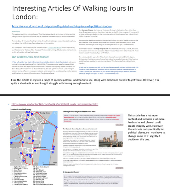
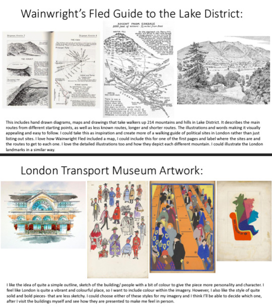
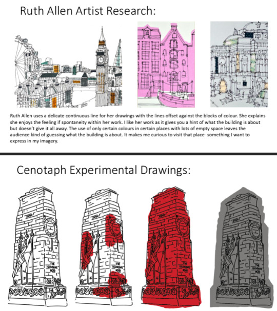
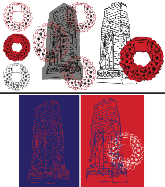
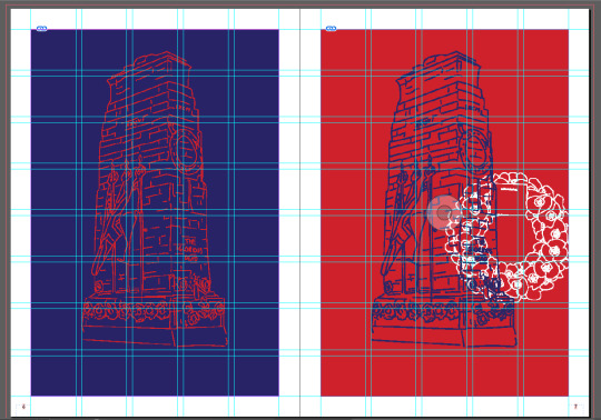
After my tutorial last week, I decided to change my article to one that included all sites and landmarks. I looked at an example of a guide to get inspiration and to help me create an easy to follow magazine too. Researching The London Transport Museum, I was able to get a feel of what style I wanted my magazine to be in. I researched Ruth Allen who creates continuous line drawings and creates illustrations of London. Inspired by this, I tried to create my own of the Cenotaph, one of the landmarks in my article. I experimented with colour, using red, white and blue to represent London, as well as the natural grey stone colour. I did the same with the poppy wreath and experimented with layering the two drawings on top of each other, as well as using plain blocks of colour in the background of my drawings. I also laid out my process book, an A4 size and composed my images. I tried to choose a font that was quite structural due to my architectural buildings but also not perfect, as the continuous line drawings I had completed were also not perfect, just rough sketches.
Process Book:
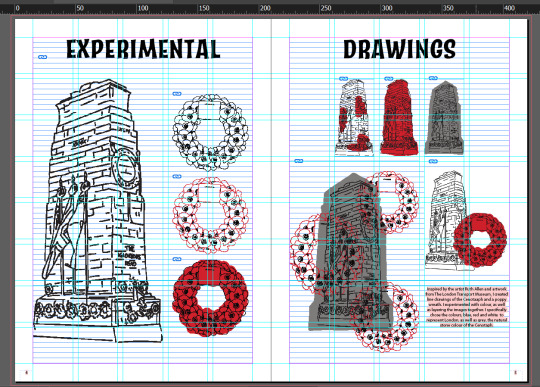
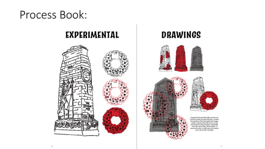
Receiving feedback from Briony, I was advised to try drawing another landmark to see if the same style works for it and to think about what landmarks I would actually draw. I could draw the ones that have more text written and draw them bigger, than ones with less information and draw them smaller. Or, I could do lots of small drawn images. I could draw the ones that look the most appealing, or the interiors of landmarks, such as the War Rooms. I was also advised to consider the layout of magazine, to have an idea of how many I would draw. For my process book, I was advised rethink my size, as A4 is quite a boring, standard size, so I could cut off a few centimeters from the top. I could layout some more of my text to see if the grid works, as this process book plan was very image based. It would also look better if my text was aligned to the left instead of the centre.
0 notes
Text
new year new news
hey everyone! wow! 2022 is over! what a year! i made a lot of art, had some cool opportunities (painting a mural!!!) and some challenging transitions (quitting my job, switching academic programs!) but i think, overall, i’m glad to put this one in the rear view mirror.
now, to get out of the rear view mirror and look forwards into the metaphorical windshield - my resolution this year is to MAKE MORE ART and to GET OUTSIDE OF MY COMFORT ZONE and with that in mind, my first actionable goal for 2023 was...
to start a patreon!
not gonna lie, i’ve been just as nervous as i’ve been busy setting this up the past few weeks (and the imposter syndrome has kicked in HARD), but hey, doing new things is always scary and awkward. and i really wanted a good excuse to put some time and energy into behind-the-scenes stories, progress shots, sketchbook pages that aren’t pretty enough to post on their own, and rambling talks about the winding path my own art tends to follow. so maybe check it out and throw some money my way, if you’ve got extra and are curious!
currently i’ve just got one $3 tier up, but i’m sure that will change and evolve as i figure out what i’m doing. but what can i access with three dollars, i hear you ask? well...
full digital copies of all of my zines! with transcripts, and personal commentary!
polls! maybe i'm making new stickers and don't know which design to go with, maybe i'm amassing work for an update and don't know if i should make some more selkies or some more sphinxes - these polls will help ME decide what to make more of, and help YOU ALL see more of what you want from me. win-win!
behind the scenes posts and videos! i have to admit that i harbor a secret love for video editing, but I have so far had no real outlet for it (aside from the AMVs that i occasionally make in a fugue state and NO i’m never showing them to a soul) - but i've just filmed and edited the first full start-to-finish process video for patreon! watch me make a ceramic beasty from sketch to glaze firing, with full voiceover commentary (my voice was once described by a child as “why do you sound like that? you sound like you’re going to cry” so look forward to that!) i have plans in the future for tutorial posts and videos, more process timelapses, and full behind the scenes zine-making retrospectives, from writing to illustrating to binding.
this month (january 2023) only, sign up as a patron and i will personally send a little doodle to your house! yes, like in the mail. feel free to send me a prompt with your pledge, otherwise it’ll probably be some sort of creature with a human face and stars on it. maybe it will still be that, even if you give me a prompt.
finally, you will get my eternal gratitude! i truly cannot thank you all enough for the support and love over the years. it's been such an amazing honor to find other people who like the wacky little critters i make, and whether you've purchased art from me, follow me, or are even just someone who's seen and liked a piece of mine, i am forever grateful to be able to connect across space and time, with you, over art.
whether or not you decide to pledge, from the bottom of my heart, thank you! i am so lucky to have this space on tumblr to share my work - every kind comment means the world to me, and i just hope my work can be enriching to your worlds in some small way, too! i know making it enriches mine :^)
561 notes
·
View notes
Text
Completed Zine
-Pact Coffee
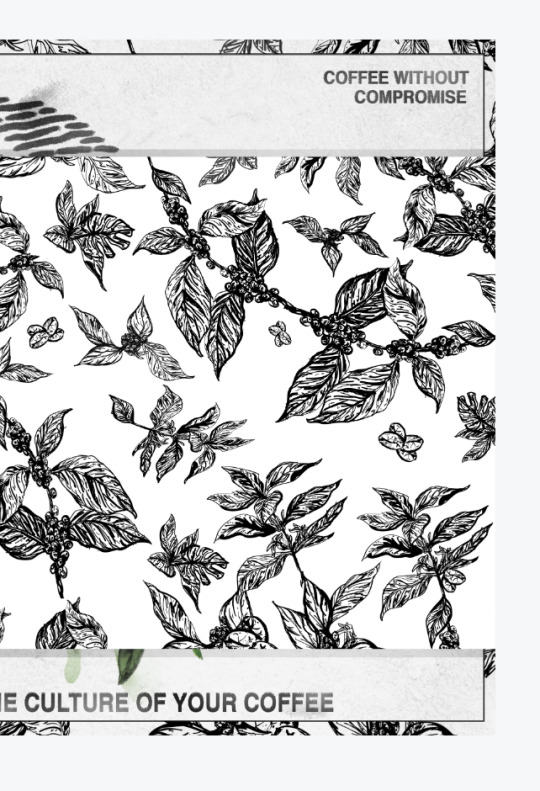
My zine at first look is entangled with a sleeve, the sleeve is a mix of expressively detailed coffee plants and beans. I chose to have it wrapped to help keep the zine packed together but to also instantly make the theme about nature clear while keeping the coffee company in mind.
The front cover with the sleeve looks like this and the back cover looks like,
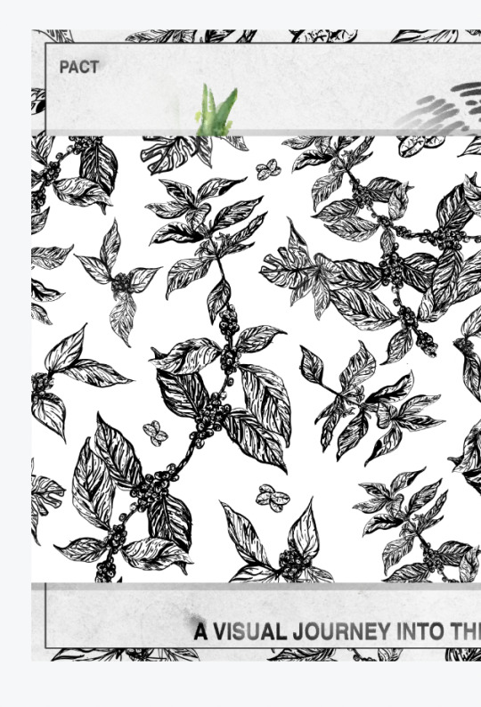
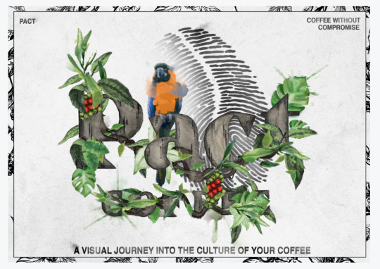
Once the sleeve is removed the original analogue and digitally made front cover is used, where I changed the size of the zine to make it more accessible to all types of coffee drinkers it spreads over both front and back however I believe that it still works and is quite interesting because it makes u want to open the zine to see how it looks completed.

I chose to keep in the coffee bean finger print as I tried to create something else to feel the space or to fully lose it but the cover felt empty without it.
The next pages took a lot of experimenting and I have made more detailed posts about the choices I made and experimentation I did to get to the final product. I personally am very happy with each page especially when looking at the first ideas I had for each one.
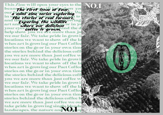
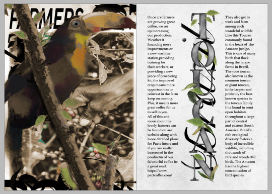
The introduction pages would be similar in each issue just with a few things changed like the photo, and colour as the zine is made to be one in four for pacts campaign promoting the nature and farmers in each of their single blend countries. This one is green as its about Brazil.
The next page is the first that goes into detailed information about the animals the first animal is a Toucan however the text after that goes on to explore and talk about other birds commonly found in brazil. This text also talks a little about the farmers and I used this as a way to control the narrative by saying the farmer works in and near these jungles with all this exotic life.
This page was hard to do as I first made it as a spread however if you see previous posts it was very messy and had to many colours to feel professional so I decided to change it and make each page individually, and I really think it turned out successfully. I did tone down the colours and made it more earthy and coffee like as I felt it was very fitting.
The pages with more illustrative and collaged art will be placed around the cafe as posters these would then be able to change and be refreshing with each zine providing new and some what exclusive art as it will only be available to see in the shops for a set amount of time, producing a little must have feeling in pacts loyal customers who would want to collect all zines.
The next page was made as a slight homage to classic wildlife magazines such as The National Geographic and Nature, I did try to include more text on the left page however decided against it as part of the zines idea and theme was to be visual the last page is purely informal and talks about three animals found in Brazil.

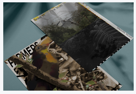
The back cover then ties together to the front but looks like this on its own,

The front and back cover together look like this,
Overall I am very happy with how the zine as come together and I believe the theme and the idea is clear throughout and I'm proud to have made it flow easily and actually retain visuals so that it is aesthetically pleasing to go through.
Notes after tutorial, I already addressed my decision to keep the thumb print in and I do believe that it works with the design, I have used multiple type faces in the first pages but as the green text is really just the background I don't really feel the need to change that, also raised was the question about stopping the readers to just litter the zine after and I hadn't really thought about this because in my mind I was under the impression that the zine wouldn't be free. I realise now that charging for such a small zine for a profit would be ridiclious so my idea would be to have the zine sold but with all profits going towards preserving the nature in these countries with the 4 issues. Each country they represent would be the country where pact would make a donation with these profits. This then helps the zine have a bigger impact with its theme it will also stop the litter. Especially as the zine is going to have original or exclusive content I do believe that pacts loyal customers would want to help and even just environmentally cautious customers in these independent coffee shops. This also opens up the ideas for more products such as posters of the art in all of these zines to be sold as prints, the tote bag and even the coffee cups could have its profits or a percentage given to the cause. I think this is a really smart way of solving that problem while tightening the theme of the zine. I also believe that these customers will be willing to spare a few pounds especially as the limited edition of 500 or less of each issue it will create a slight sense of hype. This isn't unusual of pact to do limited edition campaigners and events either.
The designs and art made in this zine will also be created as posters and a tote bag for the front cover. These would then change during the other issues so it gives a lot of extra product opportunity for pact.
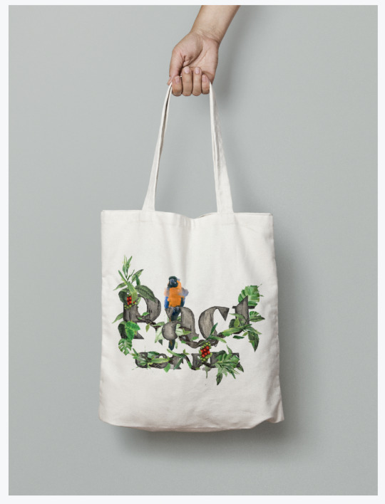
There would be a handful of posters available for customers with each issue changing, this would make more opportunities to help the farmers out.
The sleeve illustration was also made with the idea to be placed on to disposable coffee cups, I didn't really want to explore the branding to much with these as I wanted them to be used in independent coffee shops while still being tied to Pact just more subtly. These could also be turned into a cup that is reusable further linking to the charity side of this idea.

Also a few examples of the same print on packaging, however this doesn't show origins or blends but Is just an example of what work from the zine could like look like on packaging. I chose to use the brazil zine front cover illustration on one mock up as an idea of other ways the zine art could be used.

overall I believe the project was a success and Im happy with how my work turned out, through development shown on previous posts I was able to explore and experiment until finally coming to an end product that I am now happy with.
6 notes
·
View notes
Text
Dragon Age Tarot Style Guide: Part Two

The second of my at least three part set of tarot tutorials. This sentence will link to the first one on composition if you haven’t seen it. It’s been a four year gap between these, and I apologize for that. To all you who messaged me and reminded me of this project, thank you. You kept me from forgetting and I’m glad. <3
It won’t be another four years until I post the next segment, which will be pattern and texture focused. It’ll hopefully be in the next month or two.
This is going to be a long post, so I’m putting it under the cut. Apologies to the mobile users!
As a general disclaimer, this is an unofficial guide, I’ve never worked with Bioware. All of this is based on how I approach tarot design, my inspiration being heavily rooted in Dragon Age Inquisition’s companion card designs.
Secondly, I know nothing about tarot. I tend to use http://www.ata-tarot.com/resource/cards/ heavily as a resource for my understanding of the cards and their meanings.You don’t need to know anything about tarot to do illustrations, just have as much fun as you can. <3
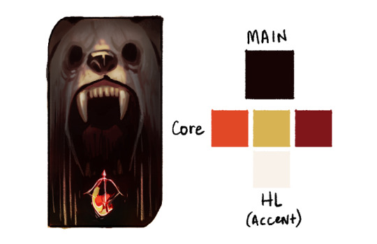
So I typically work with a color composition in mind, but for those who are struggling to imagine a color scheme, my best advice for coming up with a palette is to just throw down some colors in this sort of an arrangement.
Your Main is going to be whats forming the base of the card, or it’ll be the most widely used color. Backgrounds usually make up the main, but sometimes it’s a foreground element or the character’s clothing.
Your Cores are going to be colors that accent the base. You can make these pretty wild to be honest, but complementary colors and triads tend to work best for a balanced color composition. That’s what you’re trying to achieve with these--balance. Think about what’s drawing the most attention. The red in this example I did with the Iron Bull is very strong, and the teal I chose is fighting with it so my last color is something a bit more desaturated that accents the teal instead of picking another aggressive color, like a saturated yellow.
The Accent or HL color is whatever you’re going to use to add the final focus notes. It will typically be your brightest or your most saturated color, though not always. Sometimes your HL color might be the darkest of the composition because your main and core colors are naturally bright. It should be used sparingly, or if you’re using a lot of it, focused in one area.
You can use more colors than this! For my example card with Bull, you can see I made his pants a sort of subdued yellow and added accents to the background and lit parts of his body in in different colors, But you’ll want to keep your major colors limited to keep it cohesive. If you start losing cohesion, I recommend using a gradient map over your picture set to multiply or soft light (not at 100%) to tone down your most divergent colors, and you can mask out areas where appropriate.
This Bull card is one I made by picking my colors first then deciding on the content and composition. Color picking can be done first, or second as I’ve done with the rest of my examples.
Card #1: Rayne Amell [ @dracoangel ]
The Queen of Cups
This card went though several iterations with color, and the end product is less about story and more about atmosphere. The drawn composition reflects more of the story: she conceals her thoughts and feelings, but the world bends around her like water. I wanted to add more purple to this card, considering the character’s preference for it, so I skewed the color scheme in the final to be more purple. The first version probably makes for a more cohesive palette, but it lacks the same depth and drama as the one with purple. I added another core color to the second palette, which is totally okay to do. Sometimes the core palette might be 7 colors, sometimes it’s 2. The idea is to strike a balance. Colors that are super eye catching like the red in the scarf might better serve the composition as a lesser accent, whereas the purple core is a great fill because it’s fairly desaturated and doesn’t demand as much attention.
The HL color takes up a fair amount of this composition, but note that it’s strongest in the top two thirds, and is centered in the top third. The foreground water also cradles it against one of the darkest purples of the card, which helps center focus up top.
Card #2: Valora Lavellan [ @kylorensprettymuchanasshole ]
The Devil
This was the most difficult of the palettes, I’m working with two separate light sources in two wildly different locations. On the one side you’re at an ancient elvhen temple, on the other, in a burning chantry. It only made sense to have two different palettes for this composition. Where I really failed here was in not having a color that bridged the two sides. If you can engineer a color to be in between two differing palettes, you’re in a good place.
With that in mind, I revisited the thumbnail.
The execution is a little weak, but the idea works. The bridge color could work in either of the palettes and is a midway point between the two most similar values of the core colors. It’s used primarily where the separate palettes meet each other smoothing that transition. In this instance, it also helps to define the figure and double down on where the focus is, since before it was fighting between the top left and bottom right corners. Now the focus works as a diagonal from one corner to the other.
Double palettes are hard, but can make for some truly dynamic color compositions.
Card #3: Iothari Mahariel [ @theuselesspotoo ]
Six of Swords

This card was a struggle for completely different reasons. The palette is pretty homogeneous, primarily purple, with a hint of green. This one could use far more variation, and the challenge is in driving interest with such a limited palette. This is where your values are going to be super important. Your darks vs lights are always hugely apart of composition, but in limited palettes they do the most work in driving interest. Make sure to break up some of your larger and more prominent shapes with value differences, the snow vs the dark stone beneath it.
If that isn’t enough though, there’s a few tricks that can help push focus where you want it without heavily changing the color scheme.
We have three very distinct planes in this; the sky, the distant mountains and skyhold, and the cliff the figure is standing on. We can push the far mountain plane back by reducing the brightness of it, and we can pull the nearby plane closer by adding stronger highlights to the lit areas. I also brightened up the figure since they were getting lost in the sky a bit.
In addition, I popped the foreground colors with just a bit more red, to separate that plane from the more bluish purple mountain plane.
Just those small changes really sharpened up the focus of the composition, and we were able to keep the palette fairly limited.
Card #4: Tighe Lavellan [ @queen-scribbles ]
Nine of Wands
This palette was a breeze compared to the others. We’re working with complementary colors, reds versus greens, and very little divergence in either direction. The bottom half is primarily reds, the top greens, and they meet in the middle with a soft orange and harsh yellow. Palettes with complementary colors are the easiest to work with, the important part is making sure their balance works with your drawn composition because they like to fight. All of my reds are limited and desaturated because the greens and yellows, by the nature of the composition, are the most demanding elements.
Card #5: Lathari Lavellan [ @jisabeau ]
The Chariot
I knew what I wanted for this one immediately when I started it. I really wanted the character to be falling into a void, to mirror their emotional crisis when dealing with the deadly white bear of their past. But though this works fairly well as a base palette, it’s really missing the intense horror I wanted when I started.
So in my edits I pulled them further apart, and pushed the darks even further. The challenge here is having a dual focus, since I don’t really know if either stand out enough from one another at this phase. I have to pick a focus, either the bright whites of the bear or the strong orange/green tones of the character.

This is probably the strongest focus-wise.
But I enjoy the color notes of this one far more.
The point here is, sometimes things aren’t perfect, and that’s also okay. Pick your favorite, or at least pick one, and take that to completion. It’ll occur to you while finishing it what I needs. Which brings us to the final point, similar to that of tutorial part one:
Final Note: Don’t spend overlong on one thumbnail. I’ve spent days in the thumbnailing stage, that’s fine, but don’t spend more than 1 hour on any one color thumbnail drawing; it’s not worth it. If an idea is good but not great, just start a new thumbnail of something similar, and you’ll stumble onto the right composition.
Remember to explore your own color intuition. My way of doing this might be helpful, but if it’s not, don’t feel compelled to follow it. Everyone has a unique vision, and we’ve got to feel out our own paths.
If you have any questions, send them to paperwick [at] gmail [dot] com under the heading “Color Tutorial: Questions”, OR comment on this post (I might not see them on a reblog) and I’ll pool them into one area and answer as many as I can in a separate post.
Finally, I’d like to give another shout out to everyone who sent their character breakdowns to me for this. I wish I had time to get to all of them, and I really appreciate you taking the time to put them together! Thank you all so much!
Not making promises on when Part Three will come out, but it WILL be coming out. Thanks for reading through all this, I hope it’s been helpful.
#dragon age#dragon age tarot card#art style guide#tarot card tutorial#color tutorial#tutorial#color#dragon age 2#dragon age inquisition#the iron bull#palette#color palette#da2#da#da3#dai#thumbnails#thumbnail#thumbnailing#jisabeau#dracoangel#kylorensprettymuchanasshole#theuselesspotoo#queen-scribbles#lavellan#amel#mahariel#my tutorials#my art#2019
1K notes
·
View notes
Text
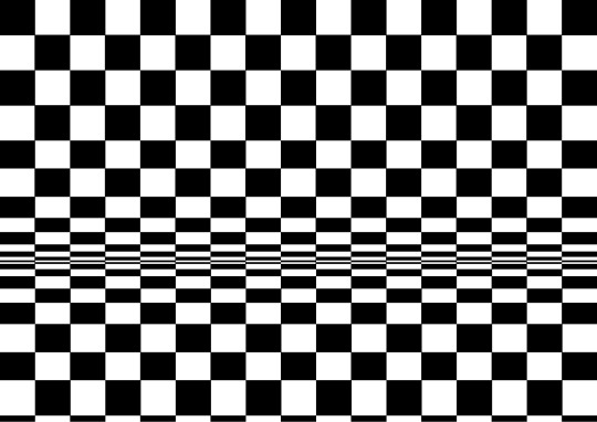
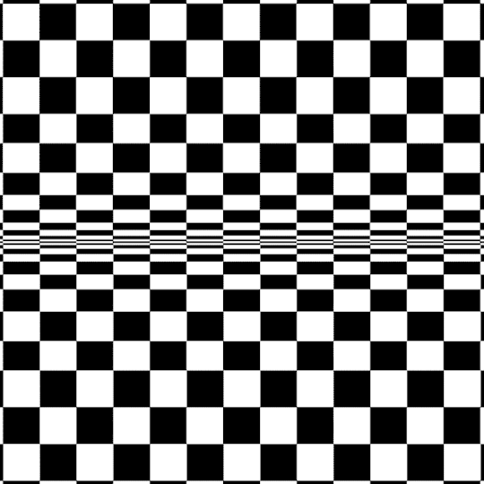
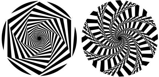
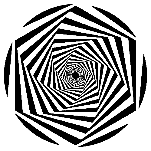
Op Art Digital Task
Creating ‘Op art’ digitally is a much quicker, and simpler process than doing it by hand. And it can often give out much more refined outcomes. Every design that I will be creating this style will be done using Illustrator, which also means I have an infinite quality as it uses vectors. Illustrator is my favourite design program, and creating work like this is always a great way to explore all the little features and tricks I’d be yet to find out.
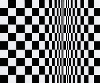
Movement in Squares, 1961
This ‘Op art’ design is inspired by Bridget Riley’s ‘Movement in Squares’. This is an interesting piece of art work, because it appears to be curving without using anything but black rectangles. It’s an amazing effect, and something that I intend on exploring. However, I do not want to exactly copy the work.
The first step in this design was to create a grid background. I wasn’t sure which grid size I was going to be using so opted for a pattern instead. To achieve this it was easy as creating a small black and square, and holding ALT + SHIFT whilst dragging it diagonally. After making sure it is completely aligned,
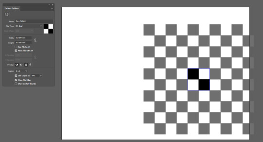
The key to this effect lies in the size of the squares. This essentially means that the squares need to get gradually smaller as they go down to give the illusion that they are going around a curve. To make sure I did this in an effective manner, I selected one row at a time and right-clicked to go to Transform > Scale. Here is where I changed the vertical percentage and went down 10% at at time. As I got to the last few, I went down 5% a time instead.
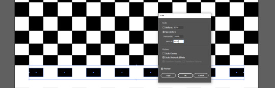
Below you can see that it is beginning to look more like ‘Op art’ is the illusion starts to become visible, but this is obviously only the top half of the image.
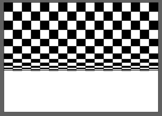
Adding the bottom half of the image was easy as all I had to do was duplicate the top, rotate it and delete a layer. Below you can see the final result of this piece of art and I am very happy with it. It employs the same effect as used by Bridget Riley, but obviously features a different orientation and is still functional.
When scrolling up and down this webpage when writing this post, I noticed a strange effect happening to the image I just created. Upon doing this several times, I decided I would make a GIF from this effect by moving it up and down. I did this using the Timeline window in Photoshop while the design is a Smart Object.
It was something I found just by coincidence, yet I feel the outcome is very effective and almost hard to look at. Even if it is just squares moving up and down.
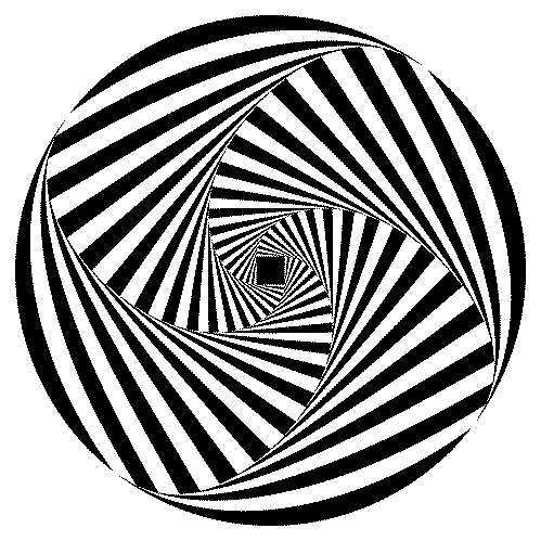
This next design is another ‘Op art’ piece that I created in Illustrator. When initially making the first variant of this design, I followed this step-by-step tutorial on YouTube. It is a quick effect to create, but is very effective.
The first thing I did was create a square. I did this from the centre of the artboard using CTRL+SHIFT whilst dragging. This made sure that the square would stay a square, and not become a rectangle. The square itself had a 1pt stroke with no fill.
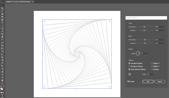
The next step was to create the spiral effect. I did this by selecting the square and going to Effects > Distort & Transform > Transform, which opened up the Transform Effect window. Here is where I changed both Scale values to 92%, the Angle value to 5%, and the Copies to 36. Upon checking the Preview box, I could see that it had been successful. I then clicked OK to be finished with this window.
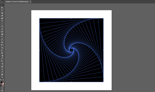
After the previous step, I clicked the outer square several times until it was selected by itself. I then pressed the double-ended arrow above the swatches on the Tool Panel to convert the stroke to a fill. It was then as easy as selecting the whole image again and going to Object > Expand Appearance. This left me with every part of the design as individual squares.
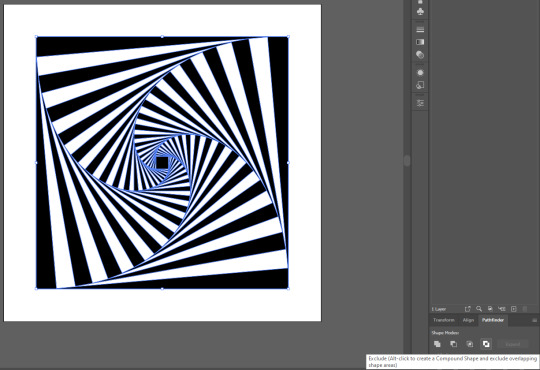
After ensuring that the black square was the very top object by pressing CTRL+SHIFT+], I went to the Pathfinder panel. I selected Exclude on the far right to convert the design into what you see below.
The step below was just to select the Ellipse Tool by pressing L and create a circle. I did this from the centre by using ALT+SHIFT.
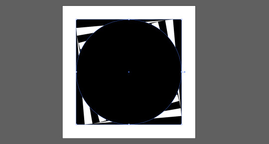
I then pressed CTRL+A in order to select every shape within the document, double checking that the circle I had created was the top layer. Then I went to Object > Envelope Distort > Make With Top Object. This both fitted the shape into the circle, and curved the lines to make it look seamless.
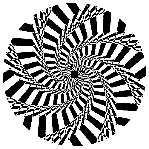
Below you can also see that I experimented with a Metal gradient and a grainy textured pattern from the Swatch Library.
Below you can see a side-by-side comparison of the same design but using different Swatches.
What I liked about this design was the ability to use it with other shapes. The process could be kept exactly the same aside from the Make with Top Object. This distorted the design too heavily, so I opted for a Clipping Mask instead (CTRL+7). The design on the left is using a hexagon, and the one on the right is using an 8 point star. I created this by using the lesser known feature of the Star Tool, which is you can subtract and add points with the up and down arrow keys. It will only work whilst you have started dragging to display the star.
Although the images are by themselves optical illusions, I thought animating them to rotate could produce some interesting results. This was a simple process of rotating them within the Timeline window in Photoshop, and exporting them as a GIF. I further speeded up the process by relinking the image each time, so I didn’t even have to do the Timeline settings again.
3 notes
·
View notes
Text
How to draw a fantasy or alien creature
Here’s an easy way to draw some special creatures and that’ll still look good even if you got zero drawing talent.
To illustrate the guide a little, I’ll be adding notes, thoughts and process pictures of an example I did. (I apologize for the suboptimal quality of my camera in advance)
You'll need:
a piece of paper
pencil
eraser
optional: coloured pencils (or water colors, felt pens etc)
a computer / iPad etc. (a mobile phone works too but it gets small)
Or if you don’t have a computer or so or the pictures you want (See step 3) are already printed. However, I do recommend to use digital pics because they hold many advantages.
printed pictures of the components
a window or light source
-
Step 1:
The Basic design of your animal
Think about the basic body-form: Shall it be long, round, tall etc. ? Or use looks of other animals as reference. Decide what perspective you will draw it from. (from the side or the front? Or maybe from above?)
Try to come up with a few features about its habitat: Is it hot or cold, dry or wet, or in mountains? Maybe it lives in the air or underwater. This’ll help you with the colors or the skin texture later on or even has influences on the body-form.
Even humanoid aliens are possible with that guide, just use a human as the main reference, then change parts to make them look different. (Though I never tried that before yet)
My animal
It shall be a predator-species called Orinthio that lives in a tropical area. It’s a rather bulky animal and I’ll draw it from the side. Although in my case I mostly want to draw the creatures because I inculded them in a story, so the habitat and maybe a rough description was already given. (Not for the Ornthio though, I invented that for the tutorial, which was a mistake because I did not prepare everything as carefully as I usually do when introducing a new animal.)
-
Step 2
Divide it into sections
Split your animal into different body parts such as: head, legs or arms, main-body, extras (wings, tail, horns, hairs etc.). Of course you won’t need all the parts for each animal but these are just ideas. Also think of details such as: eyes, ears, hairs, fur, spikes, feet, hands, fingers, claws, tip of tail, teeth etc.)
Then collect ideas for what the parts you defined could look like. Search an object or existing animal as reference.
But in all your creativity, pay some attention to physical "rules" (Like tiny, thin bird legs for an elephant shaped animal? Or a thickly furred, black panther for a desert? Better not)
The parts for my Orinthio will be:
head -> shall look like a rhino’s
horn -> will look like a croissant
main body -> shall be the one of a horse
legs -> like a crab
tail -> shall be a baseball bat
tail tip -> is a spade (from the cards)
-
Step 3
Find the pictures
Now you’ll need to search pictures of your objects of reference. Try to pay attention to perspective, chose such that make ‘sense’ with the rest of your drawing. Don’t just take the first picture you see coming up in Google images. Do some research and also try other animals or objects that look similar. Often you’ll find an even better solution
Of course these pictures don’t need to be the definite ones, maybe you’ll want to change the head after you drew the main body. And you don’t need to find images for all details. Like you can just draw the eye or teeth by hand if you want… But it can’t hurt to search for some reference.
My tip is to leave the Browser tabs (one tab per picture / body part) open and copy the images into a Word file (or PowerPoint or another design programme if you have one). Because if you got them in a file, you can easily move, crop, flip, transform, scale or spin them.
Attention here to copyright. If you just draw the animal for yourself or to show it to friends it doesn’t matter what you take. As soon as you want to share it on the internet or even make money with it, you should read more about it to be on the safe side…
My pictures
I’ve cropped, transformed and put them into an order that they kinda already form the animal in a way, as you can see. Doesn’t look to bad, eh?

-
Step 4
Trace the contours
That works best by attaching the piece of paper to the screen (eg. with a post-it tape or “normal” tape that you put onto your clothes first that it doesn’t stick to the screen forever. Or adjust your laptop / monitor that the screen is flat on the table and facing up (but don’t break it!).
Then start tracing the contours. (Or if you’re good at copying, do that if you want) It doesn’t need to be perfect, especially at places where it it’ll connect to other body parts. It doesn’t matter with which body part you start, but I prefer starting with the main body because it’s mostly the center.
Once you’re happy with the part, take care of the next one. You might need to edit the picture a little bit that it fits better. You don’t always need to remove the paper from the screen, unless you want to have a look at it. Also make sure the “connection” to the other part is smooth, feel free to retrace a few lines if you have to. (Like remove the paper from the screen altogether)
Now just draw all the parts until you’re done.
Tips: if it’s hard to see the contours of the picture you chose, increase the screen’s brightness or the pictures contrasts, whatever fits best in the situation. And Protip: hide the pics that you’re not working with at the moment to not get distracted by them (Yes, you can do that in MS Word or PowerPoint! Here’s how to do it )

Tracing the main body of my animal

Connecting the head to it (as you might can see I had to move / scale the pic a little before I could draw)

For the legs i just flipped, scaled and moved the crab’s legs. Thankfully I chose a pic with more than one example.
-
Step 5
Edit your animal
Remove the paper from the screen and have a look at it. You’ll find places where you need to correct some lines to make it look smoother, or maybe you need to change a few proportions a little (Eg making legs a bit thicker)
In this step you should also add the other details you didn’t bother getting pictures for. Sometimes I notice that suddenly something doesn’t look good anymore, so I need to change a whole arm or so.

My first look at my Orinthio after I removed the paper from the screen. There’s a lot that I want to correct. E.g. the nape pf his neck, the tail and erease some lines. (Note: I’ve just learnt that solid and hard objects don’t make good tails... you’ll also find out your own ‘rules’ after drawing a couple of those)

And here the edited version. Looks smoother, doesn’t it?
-
Step 6
Unleash your fantasy
This step is optional but highly recommended. Give your animal some finishing touches.
Like trace the outer line with a pen. Add more details or give it a skin structure (fur, scales etc). Add colours! (Tip for that: use layers, like start with the brightest colour, then draw over it with a darker shade and so on. You can also add shadows like this. In the end, it often helps to ‘blend’ the colours by adding another layer with the brightest colour. Or watch some tutorials about drawing)
You can also give it a background or draw objects of size reference next to it (eg a small human to show the dimensions. Or a huge apple if your animal is tiny)
Or you can name the species (or the individual) and write it down as well.
And done! Here’s your fantastic beast. Feel free to send me pics or tag me in posts if you chose to share an example

The first layer of color. Of course, it could arleady be left like that.

But if you have a little more patience it’ll look more realistic. I chose not to draw a background because I wanted the focus to be on the animal :) But there are no limits to your creativity
#fantasy#fantastic beasts#this is fantastic#fantasy creature#fantasy animal#animal#animal drawing#drawing#my drawing#drawing tutorial#how to draw#tutorial#my art#art tutorial#how to#alien#alien creature#step by step#cool drawing#creature#creature drawing#sketch#you can do it#easy drawing#design#guide#drawing guide#unleash your creativity#send me pics
10 notes
·
View notes
Text
Illustrator Tutorial
So for quite a while I’ve been mulling over the idea of making a tutorial of how I create art in Adobe Illustrator. I’m not the best at explaining things but I just thought I’d share how I make my art! Warning—this is a super long post. And it’s not exceptionally interesting. Sorry about that….
I draw traditionally, so when I’m satisfied with my drawing, I open up Illustrator, make a new file, and place the artwork in it.
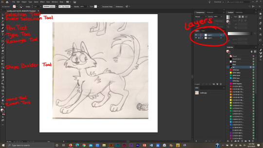
This is how I set up my file and work space. My layers are at the right of the screen (the top layer is my drawing layer, the bottom layer is my “sketch” layer, locked and usually set on 65-72% opacity). If I wanted to change the size of my Artboard (the file, basically) I would go to the Artboard window (located above my layers) and make my changes there. To the left is the Toolbar. It contains a ton of useful tools, such as the Selection tool (basically the “mouse”), Direct Selection tool (helpful for editing line work), the Pen tool (what I use to trace over my drawings), Type tool (for typing), Rectangle tool (for making quick shapes like squares, stars, circles, etc), Shape Builder tool (for merging shapes), the Hand tool (for moving the screen around—if that makes sense…) and the Zoom tool (lol pretty self-explanatory). There’s many more tools of course, but these are the ones I utilize the most. (Uh unfortunately the tools I am using aren’t showing up in my screenshots while I work…so I’ll just point them out as I use them)
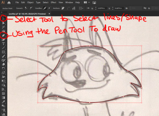
Now that I’ve got my file set up and drawing in place, I trace over it with the Pen tool. There is also another way to make line work. If you’ve got nice line work that you’re satisfied with you can simply select your drawing, then click “Image Trace.” Illustrator will make a vector image of the drawing. Personally I don’t like making line work that way because, well, I’m sorta odd when it comes to line work and I prefer to use the pen tool.
When I make a shape and connect two anchor points together, they make a single shape, like this head. You don’t necessarily have to make shapes in Illustrator, but it does make things easier imo.
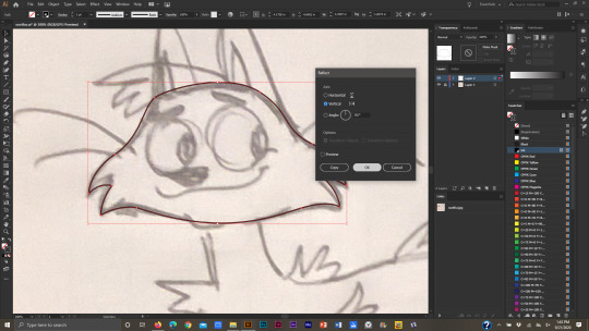
To edit my line work, I select the line work itself using the Selection tool, then go to Object>Transform>Reflect.

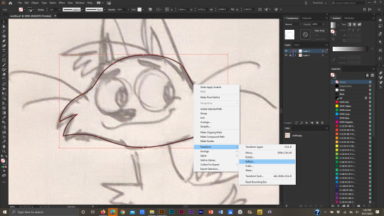
Another window will pop up, and from there, I can choose if I want the image to be flipped horizontal or vertical. Then I click “Ok.”
I make edits using the Direct Selection tool. Then I flip the line work back to how it was. I can do this by right clicking the line work and going to Transform>Reflect. The same window will pop up again, and I click Ok.
But how do I make lines in Illustrator? I use the mouse when I work in Illustrator (I used to just use my laptop’s track pad, but uh…I highly suggest that you don’t do that! Using the mouse is a lot easier on the hand, and the track pad is pretty bad for carpal tunnel). You can also use a Wacom tablet or whatever, but I prefer using a mouse. Anyway, to draw in Illustrator using the Pen tool, simply click anywhere on the canvas to make an anchor point and drag the mouse away from where you clicked. As the mouse moves around, a line will follow it. If you click again, a straight line will appear.
To make curved lines though, after you click on the canvas, drag the mouse around to make a curved line.

To merge shapes, select each shape with the Selection tool (click on a shape, and while holding down the Shift key, click on another shape. Two shapes are selected at once now…or just drag the Selection tool over multiple shapes at the same time).
Drag over the selected shapes with the Shape Builder tool…
…and one shape will be formed.
So that’s how I make line work and shapes in Illustrator. If I want to rearrange which shape is “in front” or “behind” another shape, I select the shape, right-click on it, go to Arrange>then Send to Back or Bring to Front.

If I want to make a duplicate of a shape, I select it with the Selection tool, click “alt” (on Windows) then drag the new shape away. Then I de-select it.
When building shapes, sometimes I have to “delete” part of a shape so that it doesn’t show up in the final illustration. For example, when I make pupils. To do this, I select the shapes that have to be edited: the iris, pupil, and the eye itself. The eye won’t change, but in order to make the iris and pupil fit inside the eye, I’ll have to select it. If I don’t then all I’ll manage to do is merge the iris and pupil together.

So after they’re all selected I use the Shape Builder tool and drag it over the part of the iris and pupil that I don’t want anymore. While doing this I hold the “alt” key down, so that when I’m done editing the eye, the extra shape will be deleted.
And finally the line work is DONE!

Now to add color. To change the color of a shape, I select it with the Selection tool then change the color from the Swatch window.

When the artwork is colored, I get into the intricacies of line work! I like bold line work, and I like to create tapering lines for legs, mouths, and other little details. To make a bold outer line, I select all the major shapes that form the “outside” of the image, make a copy of them, and send them to the back (Arrange>Send to Back)

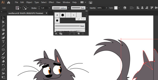
To make the lines bold I change the stroke to a 5 pt. Oval (the upper left section is where the lines, or “strokes,” can be edited) then increase the stroke weight to 4 points.
I slide all the shapes back behind the “front” shapes like so.

For the front leg, I don’t want to keep the line work near the shoulder odd-looking like this.
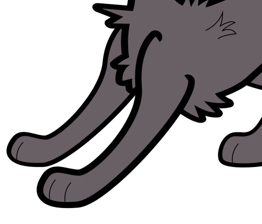
So I use the Direct Selection tool, select the anchors at the shoulders, and move them around till I’m happy with how they look.

To further edit my lines I can select individual lines and change their shape from the “Uniform” line to any design I want. I like using this triangle-shaped line for whiskers and toes. Then I can edit the stroke width to be bigger or smaller.

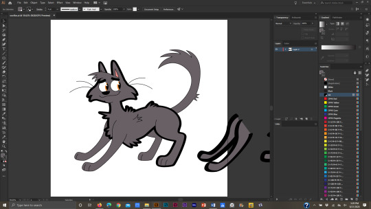
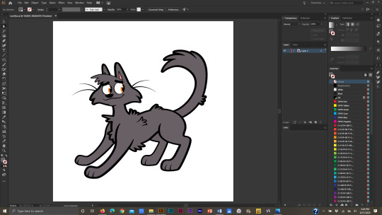
And finally, a cat is born!
I’ll go over how I make backgrounds too. It’s not all that interesting though XD When I make backgrounds for my Warrior Cat drawings, I like to include patterns and gradients in them. First though, I make a simple shape.
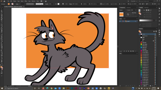
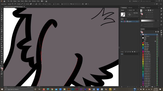
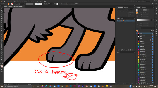
I try to avoid tangents at all costs so I use the Direct Selection tool to move the anchor points and lines around the main drawing. (BTW a “tangent” is when two lines touch each other without intersecting. It isn’t the most desirable thing to have in a piece of art). For example, the edge of the background square touching the bottom of the cat’s foot forms a tangent.
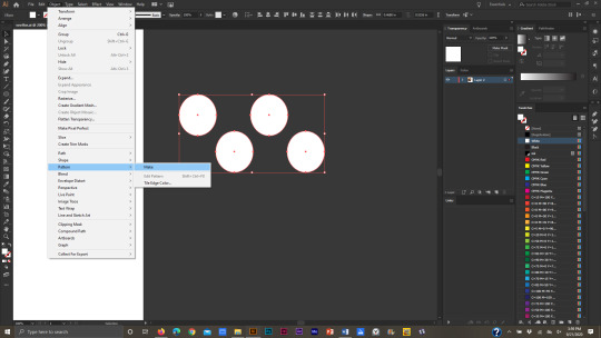
When I’ve settled on a final design for the background shape, I make a pattern to fill it.

I like to keep my patterns simple, so for this one, I made a circle pattern. To make the pattern, select the shapes you want for the pattern…

…go to Object>Pattern>Make. A window will pop up saying that a new pattern has been added to the Swatches panel; click ok.
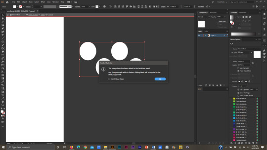
In the dialogue box to the far right, the pattern can be edited even further. When I’m done editing it I click “Done” in the upper left corner of the screen.

And a new pattern has been added to the Swatches! I make a duplicate of the background shape and change the Fill color to be the new pattern.

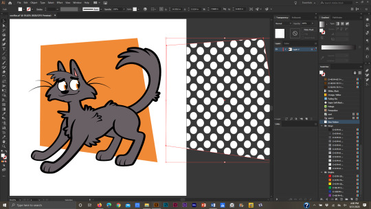
Then I slide the patterned box in front of the orange one, but behind the cat, then I adjust the opacity.

I make a third copy of the background shape, move it in front of the last two shapes, then click on the gradient box in the gradient window. It automatically makes a white and black gradient in the shape.
To edit the gradient I click on the Gradient tool in the Toolbar. Then I can adjust the direction of the gradient.


In the gradient window I can change the colors. I also change the opacity of the shape and switch it to “Overlay.”

I add a bold white line behind the illustration, add my watermark, and I’m done!
If I want to add shadows, I draw them over the illustration and adjust the opacity of the “shadow-shapes” till it looks decent. I change the shadow-shapes to “Multiply” as well. (I uh was just too lazy to add them to this pic but I have examples of cell-shading in a lot of my other pics).
Like I said, I’m not the best at explaining things, so here’s one of my speed drawings that show me using all the tools mentioned to make my drawings: https://www.youtube.com/watch?v=hD3wA_pwn4k
To finish this long (and probably boring) post, Adobe Illustrator is a vector based program. It doesn’t utilize pixels—I am NOT eloquent enough to discuss the differences so here’s a few sites that do:
https://stinajones.co.uk/the-difference-between-vector-and-pixel-graphics/
https://www.printcnx.com/resources-and-support/addiational-resources/raster-images-vs-vector-graphics/
https://www.ionos.com/digitalguide/websites/web-design/pixel-graphics-vs-vector-graphics-a-comparison/
Anyway I hope this was useful, even if in a small way! If any other Illustrator artists have tips, tricks, or tutorials they’ve made or have found useful, please share!!
2 notes
·
View notes
Text
It Started with the Hawkeye Initiative & Ended with Safespace & Snowflake: GAME OVER
This is how the comic book industry dies. Or is it a dawn of self-publishing?
If it wasn’t for years of horrific ad sales, it was definitely insulting the vast majority of it’s consumer base. Or more specifically for Marvel’s case, CATERING AN ENTIRE MARKET THAT DOESN’T BUY COMICS IN THE FIRST PLACE. Regardless of intentions, YOU CANNOT MAINTAIN A BUSINESS OF CONSTANTLY FLIPPING OFF YOUR FANS AND EXPECT THEM TO PAY YOU FOR YOUR VIRTUE SIGNALING.
There’s a difference between being progressive with fiction and being a radical activist for the sake of retweets and likes, followed by a selfie for more self-esteem boosts. In a society where there’s no turning back from capitalism, money is your God, whether it’s right or wrong. You could suddenly be hit with a car and you better damn respect that the more money you have, the more likely everything will be fine afterwards. It pays the bills, it puts food on the table, and you better understand, it’s not going to change, outside of an act of God or Aliens simply invading our planet and enslaving humanity. Your pick.
It’s no secret that working in comics sucks, regardless of country. The pay is bad, the deadlines are killer and it has always been the least practical way of storytelling for a mass market, especially in America. Case in point, you don’t really need a colorist, a letterer or anything else, outside of a distributor (RIP DIAMOND). Anyone with a graphic design degree knows, you can easily be a one-man publisher without the need of an entire crew of mouths to feed. Not saying it wouldn’t be helpful, but given the future economy, it will be the norm.
See, the old buzz word of digital publishing really is a big deal, especially when it comes to the incoming job market change. No longer can you simply “specialize” in just one area of expertise, but you will be expected to fill in multiple roles to be successful. Even if time is against you in certain projects, it is entirely possible to save more money by just doing everything yourself. Here are the major hurdles and solutions to creating a new comic in the new landscape of comics next year:
1. STORY - This is where EVERYONE gets it wrong. Do not follow the trend of IDW publishing by planning out an ENTIRE world building graphic novel that will span DECADES.
Stick to what exactly you’re good at telling. Tell a short story. Polish every line of dialog. Make it shorter. Polish every line of dialog, make it shorter.
Third and most important advice is leave politics out of your story, unless it is about politics. Most older women buy trashy romance novels to escape their shitty sex life. Most middle-aged men by comics for the tits and ass and possibly the articles? Again, all ways of escape reality, yet you have Marvel comics for years that kept interjecting real world politics and views in their titles. Trust me when I say this, less than 10% of the United States is on Twitter. That means most people could give two fucks and a shit about Trump, Biden or Bearnie, BELIEVE OR NOT. So when most of America retreats after a long day of work and not TWITTER, they are spending money on things to make their lives tolerable. Being told Orange Man Bad is not one of those things, nor is bringing up Obama, again and again. Don’t make market assessments based on social media, leave politics out of your comic. Additionally, learn about basic story telling and especially learn from other mediums outside of comics. Films and actual books will teach you a lot about pacing. You can learn basic writing skills by taking a community college course or higher. The goal and mindset should be to be humbled and not a place to be bitter when you get criticism.
2. ART - KNOW YOUR AUDIENCE. If you’re catering towards a WOKE AS FUCK CROWD OF TRUMP HATING LIBERALS, make sure you book will actually sell and not retweeted... Simply collecting a check and going unemployed for months on end is not an actual goal in life, much less beg your followers for coffee money. Example, see the animation industry.
Art is your mode of presentation, the book cover (not literally), the point of sale. If you want to cater towards a crowd of people of color, who happen to be gay, trans, and dealing with PTSD, etc, then make fucking sure your art matches with the story. You cannot have “tumblr” artists doing action intensive comics, where they spend more time creating people of color of diverse identity politics, than learning to draw a simple choreographed action sequence. You can’t have an action comic with ONLY 2 small panels of action to sell your comic. Again, no shame or secret to point out that the VAST majority of comic sales are made off of issue #1s and tits and ass. Disposable income of middle-aged men cannot be underestimated, regardless of what cherry pick data you want to argue with. The older you get, the less progressive and liberal most Americans become as well. That’s called “reality” of real politics. So my advice, if you’re into action comics, learn to draw action, learn about the demography that buys those titles and don’t interject your politics in it, especially if you want to put food on the table. I’m not telling anyone to suddenly put Trump as the “good guy” president, but I am telling you that you shouldn’t include real world politics in your comic. You’re not offending either side of the political spectrum, IE, you’re not insulting your customers.
If you want to make a rom-com comic like Archie, sure those years of learning tutorials off of tumblr might pay off, but again, know your audience. Archie continues to sell steadily with a profit from the boomer generation, white women (vast majority), Christians, etc. Don’t expect your rom-com comic of a gender-less trans-protagonist that may or may not want to be dependent relationship with another person of color. You see where I’m getting with that? You’re welcomed to write and draw a book like that, but don’t expect anyone to buy it. Getting your book retweeted by your favorite SJW, doesn’t mean sales, it just spells virtue signaling for them.
My advice in the art category is DIVERSIFY your portfolio. Don’t just learn off tumblr. That boat has sailed and failed, as seen with every sale of tumblr picked artists at Marvel. Go out there (when the virus gets under controlled) and learn to draw from life. Don’t worry about gender, people of color, none of that stuff. Draw stuff that you actually care about and not for political points with your peers. If you wanna draw short men struggling to open a can of coke, then draw. If you wanna draw hot women, draw hot women. You wanna draw a cute tennis player with short shorts and looks like Swedish male model, then pack some sun screen. You’re not looking to be judged, you’re not looking for internet points of how woke you are. You are simply expanding on things that interest you and how it will indirectly help you grow.
Think Mr. Miyagi, but do it 80,000 times. You’ll master drawing short men struggling to open cans of soda!
When creating the art, DO NOT THINK ABOUT COLORING. It is way more profitable to create BW comics than color. Not only do you save money printing, but the amount of time you free up helps you to micromanage yourself better.
3. DIGITAL PUBLISHING - You don’t need anyone else if you have a computer and some basic digital programs. Once you understand how to write a short story, present marketable characters, then you’re set. The only enemy is time.
Learn Adobe Illustrator and Photoshop for art. Learn Adobe Indesign for lettering, page layouts, etc. A few talks with a local printer and you can independently self-publish any book.
So to sum things up, learn to self-publish, respect your readers and the politics/baggage that industry houses and understand that things revolve around money. If you want to be a stereotypical far-left wing tumblr artist that wants to create a superhero of a trans-black girl/binary that may or may not want to be involved in a relationship with another binary/trans person, which could be their sister/brother/internet gas, then by all means make that comic. It won’t be profitable nor will it sell compared to other titles, but I guess you can’t claim victim-hood without a self-afflicting handicap and an arrow to the kneecap.
After all, Marvel’s done it for years without profitability and look where the industry is headed towards... This was all pre-Covid-19 mind you. The virus, if anything, is just the nail on the coffin after Diamond distributors quit. The comic industry might be dead, but books as a medium will never die.
8 notes
·
View notes
Text
Personal Project
The Lewis Dresser (working title)
The purpose of this project is to produce 10, A3 Fine Art images on a common theme, “The Lewis Dresser”. (15 types of photography genres to pursue as a professional photographer, 2020)
Creative idea: last year during my NQ I took images for my painting with light project of an old typewriter and an uncooked Plaice on a platter. The latter turned out fairly well, but more importantly it sparked within me an enthusiasm and desire to progress in this medium.
The platter was part of a collection that we had “rescued” from my late father-in-Law’s Croft on the Isle of Lewis before its sale, they have no real value apart from sentimental.
The croft is located near the cliff edge, overlooking the sea and is a beautiful windswept location just a few minutes’ walk from the lighthouse at the end of the Island.
As I have wanted to develop the idea further (I jot down potential ideas for projects in a wee notebook that I carry around with me) I have been considering ways I could do this.
Using the large collection of crockery we brought from the island I propose a series of still-life using a painting with light technique. I want to give it a flavour of the isles and as Lewis is known predominantly for its, fishing, weaving and crofting (The Isle Of Lewis, 2020).
My Initial thought was of limiting it to seafood which I would source through a fishmongers who sell seafood caught from the Loch Fyne area , but in the current climate with shops closing every day, I may have to widen my food sources but keep within the theme of ingredients for traditional Scottish fare. (Redirecting..., 2020)
Technique: during this project I want to develop and improve my painting with light technique.
As I said previously It is a medium that I have been interested in since it was first introduced to me in my NQ class and it has always been my intention to develop it, but the briefs this year have been fast and furious and opportunities to explore our own projects have been few .
I have been looking forward to this brief and the chance it offers to pursue my own interests.
Research: As part of this project I will expand my knowledge of photographers and artist who have inspired and influenced my work. (How to Plan a Photo Project * Anthony Epes, 2020)
Harold Ross
(PhotoBiography: Harold Ross | International Photography Magazine, 2020)
(MacDonald, 2020)
When painting with light my first thought is Harold Ross, I really admire his work. The way he uses light to accentuate the details of his subject creates stunning, surreal photos. Ross uses a variety sizes and softness of light tools to sculpt the images and builds up his photographic images incrementally building layer upon layer in Photoshop. He describes the process as more intuitive than technical and there is a great deal of artistry evident in his work.
This method requires the subject to be shot in a darkened room, the camera should be on timer and tripod mounted (as you are layering the camera needs to remain in a fixed position and at a fixed focal length.) I find it best to focus your subject in auto and once it is fixed, change to manual. If you try to shoot in auto the lens will move in and out of to focus when you paint the light onto your object.
The room needs to be darkened for this to be effective and I intend to shoot in late afternoon or early evening to avoid the “borrowed light” that comes in through the opening near the ceiling of my studio (if I am unable to access my studio I will set aside an area in the flat to work in).
Ross advises that he shoots tethered and this is something I have never done but I would like to add this to my skills set and will research the method further. I have begun accessing online tutorials and been having discussions about this with other Olympus users on the Facebook group I am part of. (Step by Step Tutorial for How to Shoot Tethered, 2020)
Laura Letinsky
(Laura Letinsky → THE DOG AND THE WOLF, 2020)
Letinsky is another photographer that I have come to admire since I began studying photography, I love the way she uses light, and the narrative quality of her work. Her compositions, which at first glance seem haphazard shots of the remnants of hurried meals, abandoned dishes, vestiges of parties, are in fact very carefully arranged.

She uses light to pick out every crease, crumb and fragment within the frame, telling us not only what we see in front of us, but what happened before and what will come after. My earlier shots were very tightly focussed on the subject but perhaps there is scope to pull back and tell a bigger picture.
Mat Collinshaw
(Last Meals on Death Row, Texas - Photo Essays, 2020)
Collinshaw is categorised along with Letinsky, and many notable others, such as Paulette Tavormina and Margriet Smulders, as a photographer who can be defined, at least in his still life, as “Vanitas”. (Still Life Photographers Who Give a Fresh Meaning to Vanitas, 2020). That is that the work either through lighting, content or context leans towards works of the old masters of the Dutch and Flemish painters of the 17th century. Messages such as the transience of life and the beauty of nature were intrinsic in these paintings and strong symbolism was seen in the inclusion of skulls, dead animals or dramatic chiaroscuro lighting.
These traits can be seen in the contemporary work of both Collinshaw, and Letinsky, she with her depictions of dead creatures and decaying food and flowers, he with his slightly voyeuristic look into the thoughts of the condemned man and his deeply dark lit photographs.
There is something slightly morbid about working with a dead creature, particularly in the dark, exploring piece by piece, that I find chilling and it is important to ensure that the beauty of the subject exceeds this, a difficult balance I have found in the past.
Alicide d’Orbigny
(Dance of the Aymara People | Old Book Illustrations, 2020)
D’ Orbigny was neither a photographer nor an artist, he was a French Micro Palaeontologist in the early 19th century. (Alcide Dessalines d' Orbigny | French paleontologist, 2020)
His anatomical illustrations, particularly those of sea creatures are stunning. He not only created biologically accurate depictions but used colours which captured the vibrance and other worldliness that many of these creatures possessed and that caused so many myths to grow up around them.
I came upon one of his images as an illustration in a cookbook that I was gifted and was so struck by the beauty of it that I researched him and found a wealth of beautiful illustrations (sadly my knowledge of palaeontology has made no progress). I cite D’Orbigny as an inspiration for this project as I think painting with light reveals much hidden beauty in subjects such as sea-life and yet retains a realism.
My “ambitious outcome” for this project is that I produce something that is well crafted, beautiful and could be considered fine art. I hope that the images will be finely detailed and that the process through which they are shot adds a dimension to them which cannot be captured in a single shot alone. This is hugely ambitious for one photograph but to produce 10 such images seems unimaginable. It is a very time-consuming process and time is limited but it will be a photography adventure and without doubt a learning experience.
Exhibition
The question “how would I like it to be viewed” is a complex one as ,first and foremost ,this is a personal journey and in a way a homage to the father-in-law I never met but have heard so much of, to his homeland and the place that is held dear in the heart of my husband and his family.
It is also a way of placing a new value on these old and fragile objects imbuing them with fresh life; sentimental and personal.
Alongside this is a need to show progression in my photography skills and my creative ability, both to friends and peers, and finally if the work holds any merit as fine art then I would like to organise a small exhibition.
The campus where my studio is based has an exhibition area which would be ideal for this type of informal exhibition preferably in conjunction with some of my fellow classmates. I have contacted the building’s owner* to check on the viability, the space is freely available to tenants for non-commercial ventures and has dates open for this year. At this stage I haven’t spoken to any of my classmates about it, but I am confident that there would be enough interest to set up a class launch.
*see attached email.
I have given some thought on how I think I would display my work; prints sized A3 and mounted will be printed on Hahnemuble German etching, Hahnemuble photo rag ,or Hahnemuble smooth as I want the images to have a fine art textural quality to them and reduce any shine. I like the textures of each of these products but will obviously make a final decision once the images are edited and optimised.
Technically a good knowledge of the camera, use of lens, depth of field and focal point and lighting techniques is essential, as is an understanding of the aesthetics of the technique, my skills in this area are adequate but I hope by the end of this project they will be considerably improved.
The main pieces of gear I will be using for this will be:
My Olympus EM1X DSLR mirrorless camera
An Olympus micro 4/3 lens 12- 40 mm Lens
A tripod
Light tools modelled on those demonstrated on Harold Ross’ websites
Black card flags
A reflector
A MacBook air with photoshop software.
Approximate settings: (based on previous shoots)
2.0 secs @ F8.00, ISO 100, focal length 18 mm
This type of shoot is really a solitary activity and, because of current restrictions due to the Corona virus precautions, is one of the main reasons I have chosen this rather than my other plan, I will be able to do it without assistance.
Materials needed;
Workroom which can be darkened.
Small backdrop and base
Seafood – I have already purchased and frozen a selection of this which can be thawed as required.
A selection of Lewis crockery
Consumable items as required, see costs:
Costs –
Backdrops/base materials - 4 backdrops from Black velvet - £36.00
Food products - Fish, meats vegetables Approx. £30.00
Printing costs - 10 prints @ £8.00 £80.00
Travel N/a working from home
Misc Buffer for incidentals £20.00
Total £166.00
1815 Words.
RISK ASSESSMENT
Project: The Lewis Dresser
Location Name: Home address
Tel:XXXXXXXXXXX
Tick any identified hazard.
o Access (blocked or restricted) o Dangerous surfaces (slippery, wet)
o Vehicle parking at location X Trip Hazards Found
o Dangerous Services (elec/y, water). o Derelict Buildings (unsafe floors)
X Working in confined spaces oHazardous Substances (chemicals)
o Flammable Materials o Water (proximity to water)
o Rubbish/Vermin o Machinery (working, turning parts)
o Working at Height o Working on/near roads
o Driving in traffic o Noise (high sound levels)
o Weapons o Stunts
o Extreme Heat/Cold o Physical Exertion
o Using animals o Hostile Environment (violence)
o Special Needs (inexperienced, child, elderly) o Public/ Crowds
o Other Hazards.
Please specify
HAZARD SEVERITY - H / M / L Confined space - Low, Trip hazards - Low
People at Risk - Who photographer, how many? -1
Likelihood. H / M / L
Risk Control Adequate - Yes / No
Are the precautions proportionate to the overall risk?
Please expand this document as required to properly assess your risk
Details of Activity
Photography, low light photography using darkened room, tripod ,handheld lights.
Set up will be confined to blocked of area of 1 room, wire to be secured using heavy duty tracking.
Confined space in darkened room.
Trip Hazards
Ensure floor is clear of obstacles before switching off lights.
Use of headlamp for safe visibility.
Make sure no items are near edges or trailing. Secure cables with heavy duty cable.
Source of safety advice at location
Name : Julie Balfour
Signed:
Julie Balfour
Date:
25.03.2020
College Contact
Name:
Faculty Admin Assistance
Tel:
0141 375 5226
Signed:
(Donna Wilkins)
Date:
Session 2019/ 20
Risk Assessment undertaken by:
This must be signed before the Shoot can go ahead.
I have read the above risk assessment and am satisfied that:
· Constitutes a proper and adequate risk assessment in respect of the programme activity.
· The precautions identified above are sufficient to control the risks.
· Adequate arrangements are in place to communicate risk assessment findings and to co-ordinate the safety arrangements of all those affected.
Plan your first 8steps – whilst this is likely to change, it can provide a loose framework Remember to account for additional opportunities
As I have a small studio space it is my intention to work from there, if however the studio has to close for any reason I will relocate to a space in my flat.
I have ordered some online backdrops which may compliment my compositions
I will be visiting the local fishmongers and buying in the foods I plan to shoot, these can be frozen until needed.
I will set up my backdrops and experiment with lighting etc until I am happy with the set up.
From my research it seems that it would be beneficial if I could shoot tethered so I will be researching how to do this while I await feedback on my proposal.
I have a number of Light tools already but I will research this further and add to these.
I will continue to work on my photoshopping skills so that I can get the best possible results from layered images.
As I want the final images to be in the Fine Art genre I will be printing on a Hahnemuble paper, type to be decided.
References
Anthony Epes. 2020. How To Plan A Photo Project * Anthony Epes. [online] Available at: <https://www.citiesatdawn.com/how-to-plan-a-photo-project/> [Accessed 25 March 2020].
Digital Photography School. 2020. Step By Step Tutorial For How To Shoot Tethered. [online] Available at: <https://digital-photography-school.com/tutorial-shoot-tethered/> [Accessed 25 March 2020].
Encyclopedia Britannica. 2020. Alcide Dessalines D' Orbigny | French Paleontologist. [online] Available at: <https://www.britannica.com/biography/Alcide-Dessalines-d-Orbigny> [Accessed 25 March 2020].
Facebook.com. 2020. Redirecting.... [online] Available at: <https://www.facebook.com/pg/kennycaedonia/about/?ref=page_internal> [Accessed 25 March 2020].
Internationalphotomag.com. 2020. Photobiography: Harold Ross | International Photography Magazine. [online] Available at: <http://internationalphotomag.com/harold-ross-photo-biography/> [Accessed 25 March 2020].
Isleoflewischessset.co.uk. 2020. The Isle Of Lewis. [online] Available at: <https://www.isleoflewischessset.co.uk/isle-lewis.html> [Accessed 25 March 2020].
Lauraletinsky.com. 2020. Laura Letinsky → THE DOG AND THE WOLF. [online] Available at: <https://lauraletinsky.com/photographs/the-dog-and-the-wolf/> [Accessed 25 March 2020].
MacDonald, F., 2020. Sculpting A Photograph With Light. [online] Lens Blog. Available at: <https://lens.blogs.nytimes.com/2012/01/05/with-light-sculpting-a-photograph/> [Accessed 25 March 2020].
Old Book Illustrations. 2020. Dance Of The Aymara People | Old Book Illustrations. [online] Available at: <https://www.oldbookillustrations.com/writers/orbigny-alcide/> [Accessed 25 March 2020].
Pixpa. 2020. 15 Types Of Photography Genres To Pursue As A Professional Photographer. [online] Available at: <https://www.pixpa.com/blog/types-of-photography> [Accessed 25 March 2020].
TIME.com. 2020. Last Meals On Death Row, Texas - Photo Essays. [online] Available at: <http://content.time.com/time/photogallery/0,29307,2095889_2316169,00.html> [Accessed 25 March 2020].
Widewalls. 2020. Still Life Photographers Who Give A Fresh Meaning To Vanitas. [online] Available at: <https://www.widewalls.ch/still-life-photographers/> [Accessed 25 March 2020].
2 notes
·
View notes
Note
Looking to get into digital art. Any advice/sources/beginner tips you could share? Thanks a ton
Heyo! Thanks for your question! It took a while to get back to you, I know, but hopefully this lengthy post makes up for it, hehe. :D
Here’s some general advice/mini tutorials I thought might be useful for a beginner (some of it is just general art advice that I think is useful to remember when getting into digital art). Hope this helps and let me know how you go!
***
The boring important stuff
What kind of digital art do you want to create?
Might seem kind of redundant, but knowing what kind of art (highly realistic, illustration, manga etc.) will help you develop the right skills for you.
Focusing on one, maybe two, big styles/techniques/skills at a time will help you improve faster rather than focusing on a bunch of little things at once.
So just pick something you know you want to learn/improve etc. and go from there.
Draw. draw, draw. Play around and experiment.
The best thing you can do to learn and improve your digital art is draw a lot. When I first started there weren’t a lot of resources, especially the kind of stuff I wanted to do. And the tutorials I did find were so complicated I couldn’t do them anyway. Because of this, I think I did something like five drawings in three years. Pretty sad, huh? My work hardly improved at all and it felt demoralising. Sometimes I think back and wonder how much I could have grown if I had practiced regularly.
Resource: https://youtu.be/emcO79uteN4 (drawing advice)
Learn how to use your chosen tablet and program.
You don’t have to become a master at it, but learning the basics will go a long way. There’s a lot of tutorials for most of the digital art programs. You can just do a quick search and find videos explaining the basics. This will make your life easier!
Now for the basic digital art, mini tutorial stuff:
Linework basics:
Pen pressure
Each tablet will feel different, as will each program, so it never hurts to play around with your pen settings to find what’s comfortable. You can find quick tutorials that will show you how to adjust your specific pen pressure.
Stability
“Everyone has such clean, smooth lines! Except me! Mine are wobbly and terrible! They suck!”
No, friend, they have their pen stability adjusted to suit them, or have downloaded a brush set that helps them. Stability settings will depend on what program you’re using.
There are heaps of brush packs out there, but for linework specifically you’d want something that has a kind of slanted tip.
I often change what brushes I use, but some I like are:
https://gumroad.com/l/JYdba
https://sellfy.com/georgvw (lots of stuff here but costs a little. Inktober set it good)
They’re for procreate, but you could easily find some for photoshop or other programs too.
Inking/Line weight
This can be a little bit difficult to explain, and I’m not sure of any tutorial in particular that I think explains it completely. Your line work will add depth to your piece (unless the kind of art you’re doing is without linwork, then feel free to skip this).
The basics are:
Thicker lines are generally for things that need to be bolder, materials/substances that are more coarse or dense (e.g. thick jacket, boulders), for objects that are closer to you, and also for things that are more in shadow.
Thinner lines are generally for things that need to be more transparent, wispy (hair, for example), for light materials/substances (e.g negligee, leaves), objects that a further away or less important, and things that are in bright light.
Small example:
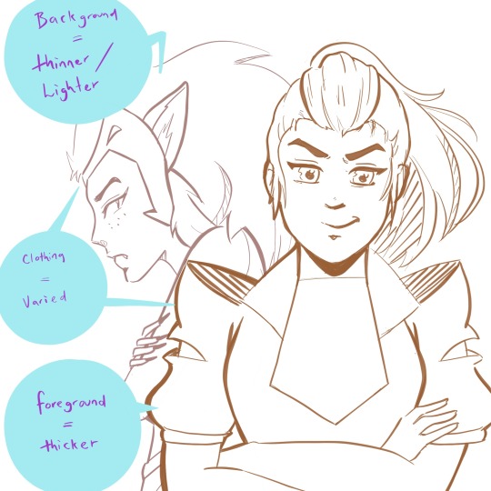
(yeah I couldn’t help but add a little she-ra to this post...)
The exception to the rule:
Overall, most people would agree that they want their art to look good/be compelling over something that is technically accurate. If this means making bolder lines on something that would typically be thin (maybe someone’s hair, for example) because it adds extra depth and an interesting look -- then you should do that.
Example, what I generally do with my lines:
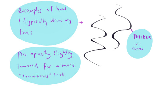
Shadows/Light Source
This can make your art go up a notch, and give greater depth to your illustrations -- even if you’re doing just some sketching. Knowing where your light source is will add more depth to both colour and black and white works. It can be tricky getting them right sometimes, but here are some general examples/rules.
(also, I’m no expert at this. these are just some things that I find generally useful).
Light source/Shadow examples:
Depending on the direction of the light source, will depend on where the shadows are.
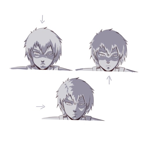
(and of course I had to use zuko too because the dramatic lighting is perfect on him)
Shadows will change depending on the object, and the direction of the light.
Some things to keep in mind:
Things in shadow will generally have less detail (unless you decide you don’t want to do that for certain effects).
Interesting shadow shapes will usually win over making things technically correct.
Even googling “light source references” shows some decent results:
https://www.google.com/search?rlz=1C1CHBF_en-GBAU805AU805&biw=1536&bih=754&tbm=isch&sxsrf=ACYBGNQPqF22f6P5Fsz2VnrUFzOJ-RV8TA%3A1574554362929&sa=1&ei=-srZXfmuOPSH4-EPwOWouAs&q=light+source+refernce&oq=light+source+refernce&gs_l=img.3...568.1258..1376...0.0..0.274.1470.2-6......0....1..gws-wiz-img.......0j0i5i30j0i8i30.X4dgUAjeEVQ&ved=0ahUKEwj5k-2LyIHmAhX0wzgGHcAyCrcQ4dUDCAc&uact=5#imgrc=_
Also, this is a good resource too:
https://youtu.be/ZJkIaMECW6c
Basic Colour Theory/Colour Tips
Complementary colours are those that are found opposite one another on the colour wheel. They go great together in work because it can add contrast, drama, intensity, and just some great colour design.
When using complementary colours, it’s easy to just pick two colours opposite each other and decide to colour with them in equal amounts.
While this can be nice, if it’s the look you’re going for, it can also be overbearing if that’s not the look you wanted. One of the things I was taught by an artist friend, was to try and use the complementary as an accent colour -- to make things pop and come to life in the work.
These are just some things to keep in mind, and either way is good.
Resources:
https://youtu.be/Qj1FK8n7WgY
Colour theory continued -- Building Palettes:
So, building palettes that work/using only a few colours (something I’m still trying to learn!). There are many ways to do this. You can use a complementary pallet, an analogous palette for a harmonious effect, or even a monochromatic palette .
There’s also a triadic approach (plus a few other ones I don’t often use), but I honestly haven’t thought much about this so I’m not sure what advice I can give.
It’s basically three colors that are equally apart on the wheel, for example: red, blue and yellow. If you find this interesting and end up using it, show me the results -- I’d love to see!
*I’m a big fan of doing things either complementary or analogue when building colour palettes, but monochromatic paintings can have an amazing effect and it’s something I will definitely be trying in the future.
note: colour theory is in-depth, and a lot more complicated than this (largely due to most of us being taught incorrect colour theory as children -- technically some of the colour theory above is not quite correct but a comprehensive colour theory guide would take tutorial of it’s own). So if you’d like to know more just let me know.
Resources:
https://www.google.com/search?q=color+palette+ideas&rlz=1C1CHBF_en-GBAU805AU805&sxsrf=ACYBGNQJtnt9SzKjFpxC-HXzuivXPW6vGg:1574906679811&source=lnms&tbm=isch&sa=X&ved=2ahUKEwjViNHJ6IvmAhUv6XMBHaaHAp8Q_AUoAXoECAwQAw
Over Saturation
Saturated work can look really great if that’s what you’re going for, but a lot of the time this is something that happens by accident when learning how to use colours and it can look quite garish.
There’s a few things you can do to help with this.
Make a colour palette or guide before you begin to colour so don’t accidentally over saturate
Find a colour palette that suits your work and use them as your palette
If you’ve finished a piece, and it’s already too late to change it you can play around with the colour settings in your program (photoshop and procreate both have some settings you can toy with that can reduce saturation intensity)
*just like using complementary colours as an accent, you can use minimal bits of saturated colour to draw attention to certain aspects of your work you want noticed
A few other little things
● Another thing to think about is composition -- planning how you want your art to look (which could be something like: including negative space, using the rule of thirds, making a specific feature the anchor of the piece, line of sight etc.)
● Make a pinterest board (or whatever else might help). I make boards for things that inspire me, tutorials I might like to try, references, and even separate boards for individual projects. It can be a great place to store your ideas!
● Also, remember that you don’t need to start doing all these things at once. Start small. Small is good. :)
● Every once and a while go over the things you think you know well. You’ll be surprised how much a little revision can improve your skills, even with something you’re good at.
● USE REFERENCES!!!
So how was this? If you’d like me to go more in-depth in a specific area, I can sure try! Excited to see how your journey goes and I hope this helped! ^_^
xoxo
Rora
7 notes
·
View notes
Text
DnD bookshop inspiration
I don't know about you, but I'm dm'ing a party full of Nerds and their characters are book hoarders, so I need to Provide, I guess.
You can always stock book shops with expensive scrolls, skill tomes and magic books, but that gets boring after a while. So have some ideas for a more fully stocked shop, that doesn't really require you to actually write all these damn books yourself.
For reference, these are for a world that has an (early) printed press.
Lore teasers
Heavily depends on the world, of course, but these books can provide characters with background information for the world they live in. The idea here is that you can't force your characters to care about the political climate, or to listen to the sage's soliloquy, but you can give them that option.
Think of things like a theoretical tract full of wild speculation on a continent far away that they may or may not visit, a first person account on some recent war whose wounds are still visible in the land and its people, or an in-depth study of a monster that the party has just encountered. The last one is fairly fast to make, since you can probably steal bits from the Monster Manual.
Examples:
Boobs, beers and blackjack, by Callindra A Very Crass guide to the best taverns in various port towns.
Fable or truth? The horrific existence of deep scions and their tragic origins, by Vestnet Press
Random stories that color the world
Folklore tales, customs, religious tracts, hair tutorials, cook books. Random things that put a little life into the world. If you're the worldbuilding type of DM, you probably know exactly why the Guild wears that particular outfit, and you overthought the significance of that Royal Shield Emblem, but the player characters, much to your dismay, have just ignored such details altogether in favor of smashing things and seducing royalty. This is your chance to bring them into the light again. Some caution is necessary here, since the party may invest in one of these details Too Much and try to turn it into a quest.
Examples:
Fashion as a Cultural Statement, a dossier on the significance of foreign vêtements and their meanings within society, by Meredith Hornsdale Briar
Guided by starlight: An introduction into constellations and making sense of your future, by virtue of the night sky, by Saisin Millet
The man who fell in love with the Sea, by Judith Toussaint The man looked out over the dizzying, glittering, deadly expanse, ever moving, ever changing, And he knew in his heart that he would never belong to another.
This is a published version of what appears to be a local tale. The book is fairly simple and thin, a durable paper cover with a simple pen drawing of a boat sailing on a calm sea. The tale itself is written in rhyme, of an unsofisticated elegance. It tells the story of a fisherman who fell in love with the sea. It speaks of how he would gaze out over the water at night, watching as the moon reflected on the softly eddying waves, until one day he quit his job, said goodbye to his friends and left, alone, in small sailing boat. His friends waited for him, before finally, they mourned him. Several years later they woke up one early winter morning to see a small vessel loom up out of the rolling mists. People ran out onto the beach to await it and possibly aid this reckless sailor. Inside, they found the man holding a heavily bundled, small child. A gift, he said, from his lover the sea.
'Popular fiction'
Let's be real here, if your world has a printing industry, it's gonna have popular press, which is overwhelmingly either the cookbook/almanac variety, or romance novels. The last ones are By Far the most fun to offer up.
Some examples
M/F novels
For straight romances, you can go the full Harlequin route:
In a Sailor's Arms By Firelight Through rough Seas he cometh The Widow on the Shore - with Lithographs The Storm in her Heart His Armor shines Bright Breaching the Countesses' Defenses The Hunter and the Maiden
Prey to the Emperor, by Clara Orchard A story about a young warrior that gets captured by a haughty, dominant king. Slowly, after many verbal fights and more than a few moments of tension, she manages to melt his icy heart. Fairly brutal in execution and style.
M/M romances
Fighting for Booty, by Vestnet Press A tittilating novel about a handsome pirate boarding the ship of an easily impressed merchant. The young men get shipwrecked together on a small lifeboat. There is only one bed roll.
F/F romances
The Mermaid, By Unknown This one is hand written and heavily thumbed through. It tells the story of a female deckhand that falls in love with a mermaid. Soft writing, but with a tragic ending.
My Queen, My heart, By Unknown Speaks of a forbidden romance between an empress and one of her female bodyguards. Slow burn, with a spectacular pay-off.
'Other'
Choosing Love, by Cyna Biruda A choose-your-own adventure. The unnamed protagonist is a commoner, called to the Royal Court as a lookalike to the royal hair, who is bedridden. Their job is to take over some of the tasks while the heir recovers, without the public knowing. Shenanigans ensue, but the protagonist also gets the chance to find love. Notable interests are the Royal Guardsman, a strict man with a heart of gold, the Kitchen Maid, fun and innocent, the Courtesane, who is beautiful behond belief but perhaps not to be trusted, The Blacksmith, broad shouldered and mild mannered, and the Foreign Princess, a reserved and studious but very gentle soul harbouring a secret anxiety.
Porn If you wanna go there, erotica novels have been a Thing since people knew how to write. In an early printing industry, they would be illustrated with lithographs, some crude, some true works of art. Examples of titles:
The obscene youth of Mary May A book of 'vignettes' from the life of a milk maid who is rather inquisitive and keeps losing her clothes for some reason. Humorous, albeit pretty blunt in its execution.
The conquests of Zan Yi The young mercenary Zan Yi is notable for his wit, his charming smile, his rapier and his… other rapier. The novel lists down his many adventures as he fights and seduces his way through the land, from a lowly sellsword to the highest courts. Surprisingly well made for how clichéd the stories are. The lithographs are of exquisite quality and this book is on its 36th edition, proving quite popular.
#dnd#dungeons and dragons#fantasy#campaign resources#is it obvious that i play with fanfic writers yet
29 notes
·
View notes